Day 21 – Nicolas Poussin, The Finding of Moses, 1651, National Gallery, London.
Originally posted on 8 April 2020
Happy Passover! It isn’t every year that Passover coincides exactly with Easter, but of course it is no coincidence when it does. It was the Seder – the ceremonial Passover meal – which brought Jesus and the apostles together in what became known as the Last Supper: more of that tomorrow. Passover this year must be especially significant, as it marks the last of the ten plagues of Egypt, when the Lord smote all the firstborn of the land. As we know, it is unlikely that the firstborn will suffer this year, but my heart goes out to all those who can’t be with their families, or who have suffered loss.
According to the Book of Exodus, to protect the firstborn of Israel, a lamb was sacrificed. The doors of Jewish households were marked with its blood as a sign that no Egyptians lived there, so that the avenging angel would know to pass over – hence the name of the feast. The lamb itself was roasted and eaten, and is still often part of the Seder. But no lambs for me today (I don’t eat meat) – instead I’ve stepped back in the story of Exodus to the Discovery of Moses. After all, it was him who was trying to persuade Pharaoh to let his people go, and it was Pharaoh’s refusal that led to the 10 plagues.
I’ve chosen a painting by Poussin that is sometimes in the National Gallery in London. It was bought jointly with the National Museum Wales, so it spends half of its time in Cardiff – like the Tribes of Israel it is continually on the move, but, unlike them, it will probably never find the Promised Land. I’ve chosen it because it holds a special place in my heart, as a result of the following. One December I was booked to take a group of Year 2 pupils (so, aged 6-7) round the National Gallery, and asked to show them ‘Stories, but not Christmas stories, they come from Hampstead’. I’m not sure (a) why they didn’t say ‘It’s a Jewish school’ or (b) how I intuited this. Anyway, the day came, and this painting was in the first room we got to. I sat them down in front of it, and after my usual introduction asked, as I always did, ‘What can you see here’. Around half of them piped up, without hesitation, ‘It’s baby Jesus!’ Given that they were 6 or 7, I didn’t go into the fact that medieval Christian theologians had identified Moses as a ‘type’ of Jesus, and mapped all of his life story onto the Life of Christ, and I’m not going to do that here either. Well, not today anyway. I can’t remember how I got round this corner, but I probably said something like, ‘Well, yes, it does look like the baby Jesus, doesn’t it, but it’s actually the baby Moses’. Next question: ‘And where is the baby Moses’? Several little hands went up, but the first answer was, ‘Well, it’s a bit like a crib, and it’s a bit like a nest’. And I melted slightly in the middle – such a perfect answer.
He is, of course, in a basket of bulrushes. Pharaoh had decreed that all Hebrew boys should be drowned at birth, but Moses’ mother hid him until he was three months old, then made a basket of bulrushes in which she floated him down the Nile. Her daughter Miriam watched to see what would happen next. The basket caught in the reeds, and was discovered by none other than Pharaoh’s daughter, who had come down to the river to bathe. She decided to adopt the baby – at which point Miriam came out of hiding to ask if a wet nurse would be required. The end result was that Moses and his mother were surreptitiously reunited.
Poussin’s paintings are often solemn, and always measured. The Princess stands aloof in a yellow toga, which modestly covers her head. She is placed about a third of the way across the painting. Two thirds of the way across is the peak of a rocky outcrop, on which reclines a river god with one arm around a Sphinx and the other gesturing towards the water. This is a personification of the River Nile, which we can see flowing across the back of the painting and down towards the bottom right. As if the Sphinx weren’t enough, an Obelisk rises directly above the Princess’s head, and two pyramids can be seen in the distance in the gap in the trees above Moses, just in front of an even further blue mountain. We are obviously in Egypt.
The Princess didn’t go out alone, of course. As it says in Exodus 2:5:
‘And the daughter of Pharaoh came down to wash herself at the river; and her maidens walked along by the river’s side; and when she saw the ark among the flags, she sent her maid to fetch it.’
It doesn’t say how many maidens there were, but Poussin includes nine – although one of them could conceivably be Miriam. The general assumption is that she is the maiden in white holding the basket. The maid sent to fetch the child is still clambering out of the Nile, looking in our direction as if she wants us to share in her adventure. Her legs mark the diagonal leading from the bottom right, which then passes through the heads of the two women kneeling with the basket and that of the Princess, until it reaches the tree at the top left – just another example of Poussin’s measured composition. The maidens themselves wear brightly coloured clothes which echo each other across the painting and surround the baby with an almost rainbow-like aura. Moses alone is naked – although pointedly placed above royal blue fabric – and stands out because of the pallor of his skin.
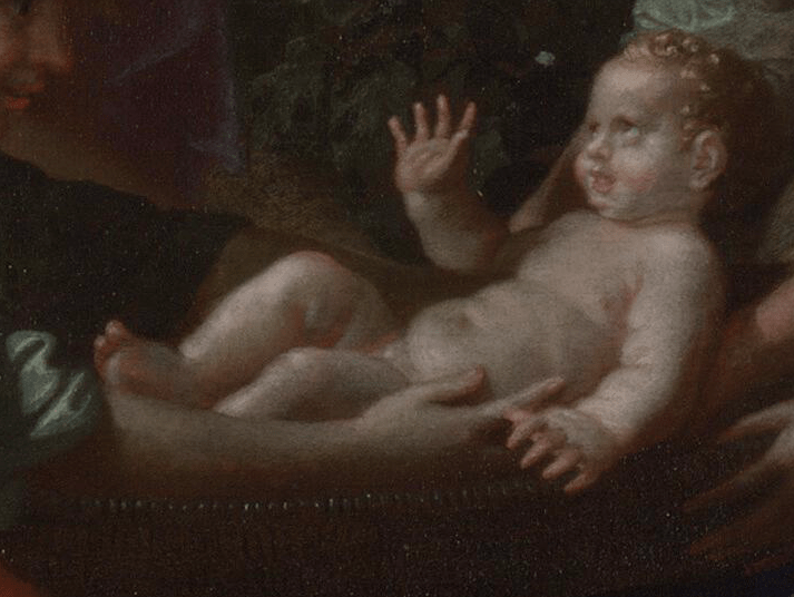
He reclines in his nest-like crib, already the little leader, waving up toward the Princess. I’m sure there’s a reference here to Jesus’ precocious ability to bless with his right hand. He looks like a chubby baby version of Michelangelo’s Adam on the ceiling of the Sistine Chapel, and, if he is Adam, the Princess, who gestures towards him, stands in for God. In her own way she gives him life, as her choice to adopt him means he will not die.
Our continued well-being rests with young and old alike, and our ability to look after each other in different ways however distant or isolated. Traditionally, during the Seder, hands are washed at least twice, sometimes three times. Whatever our beliefs, we should all take part in this ritual every day.