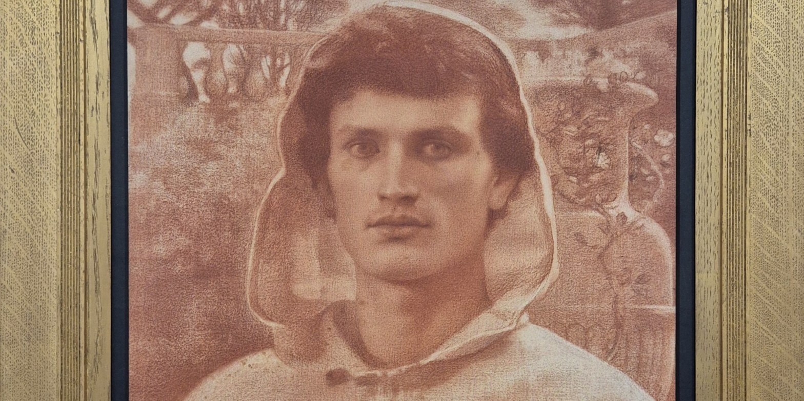
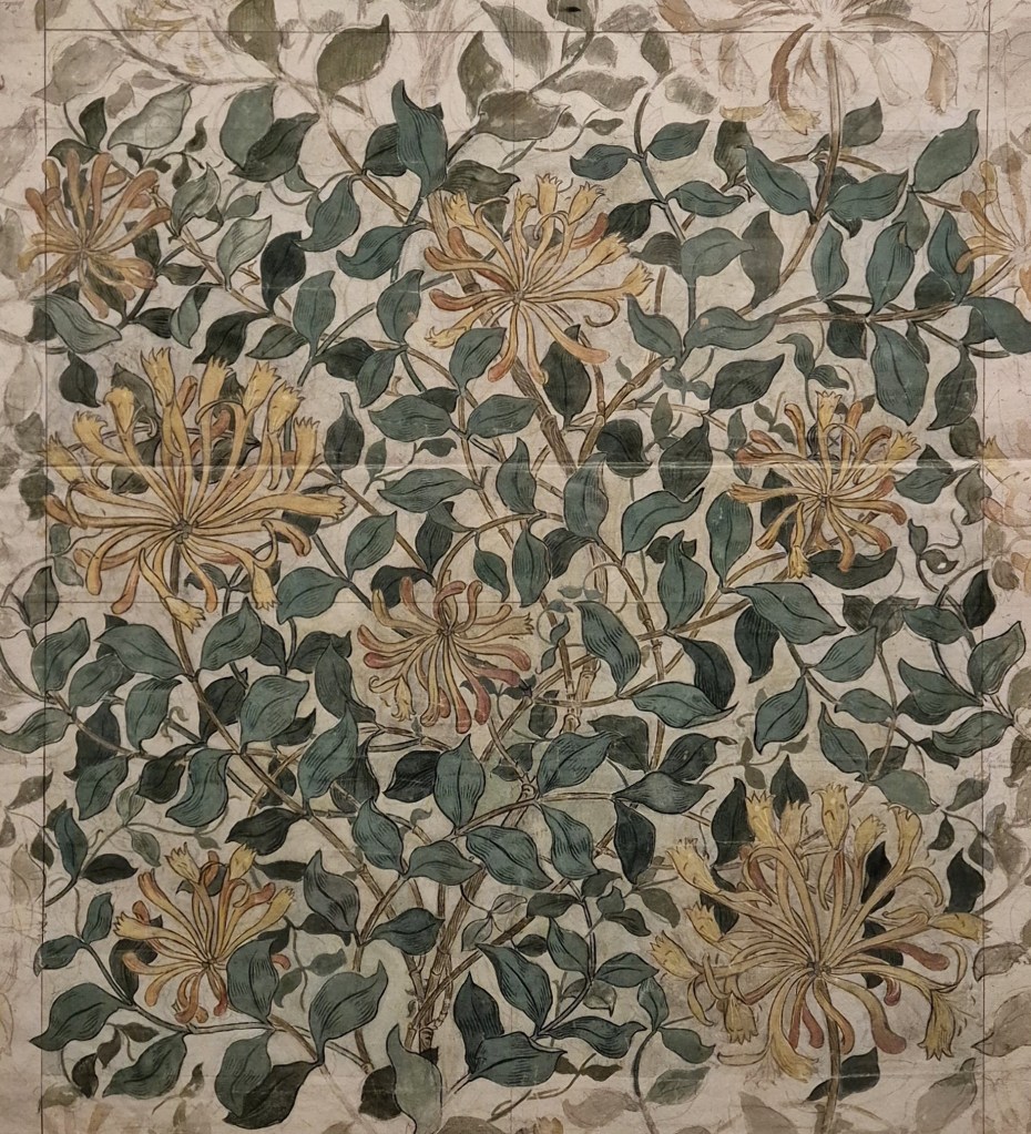
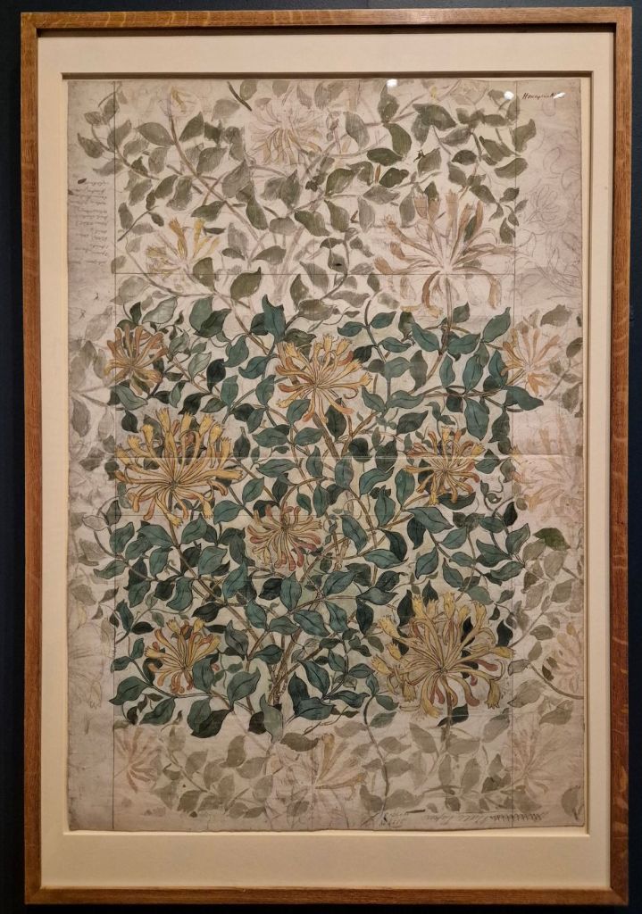
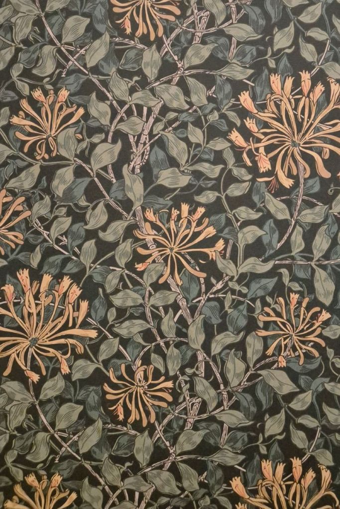
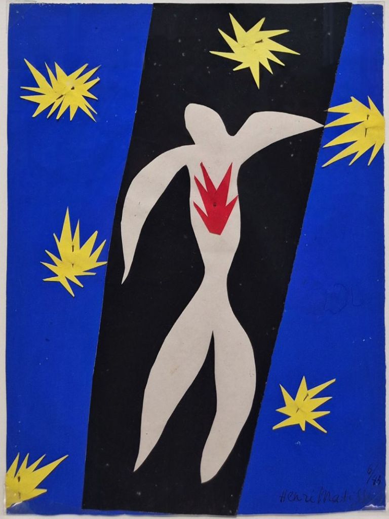
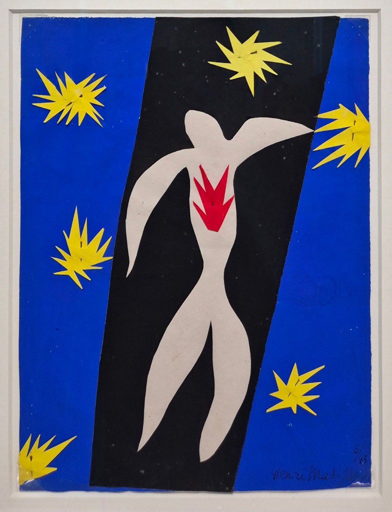
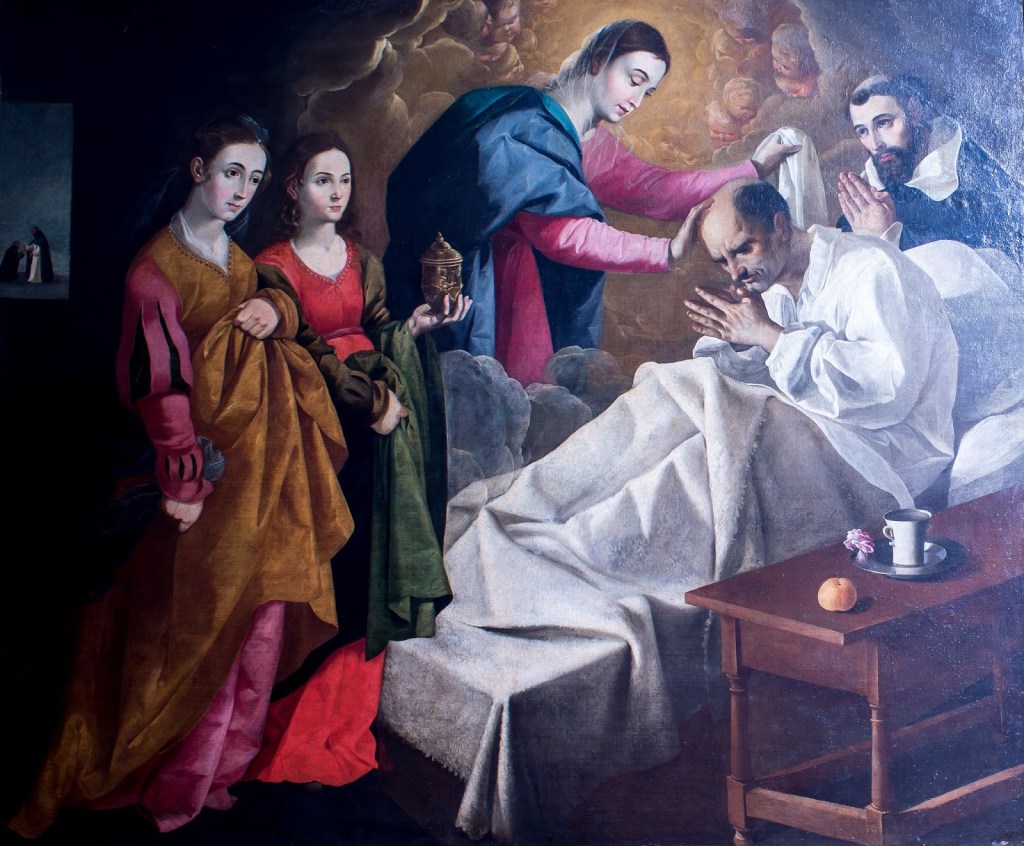
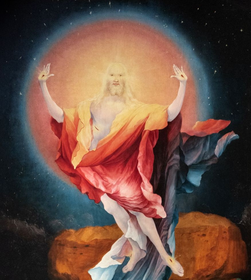
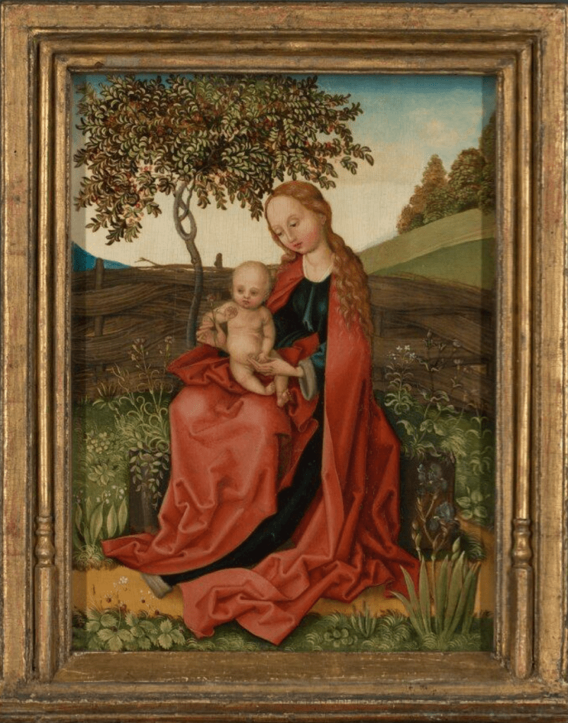
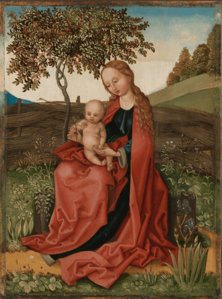
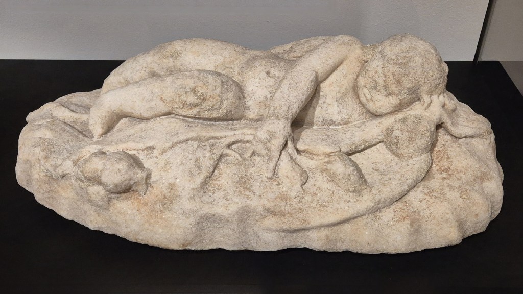
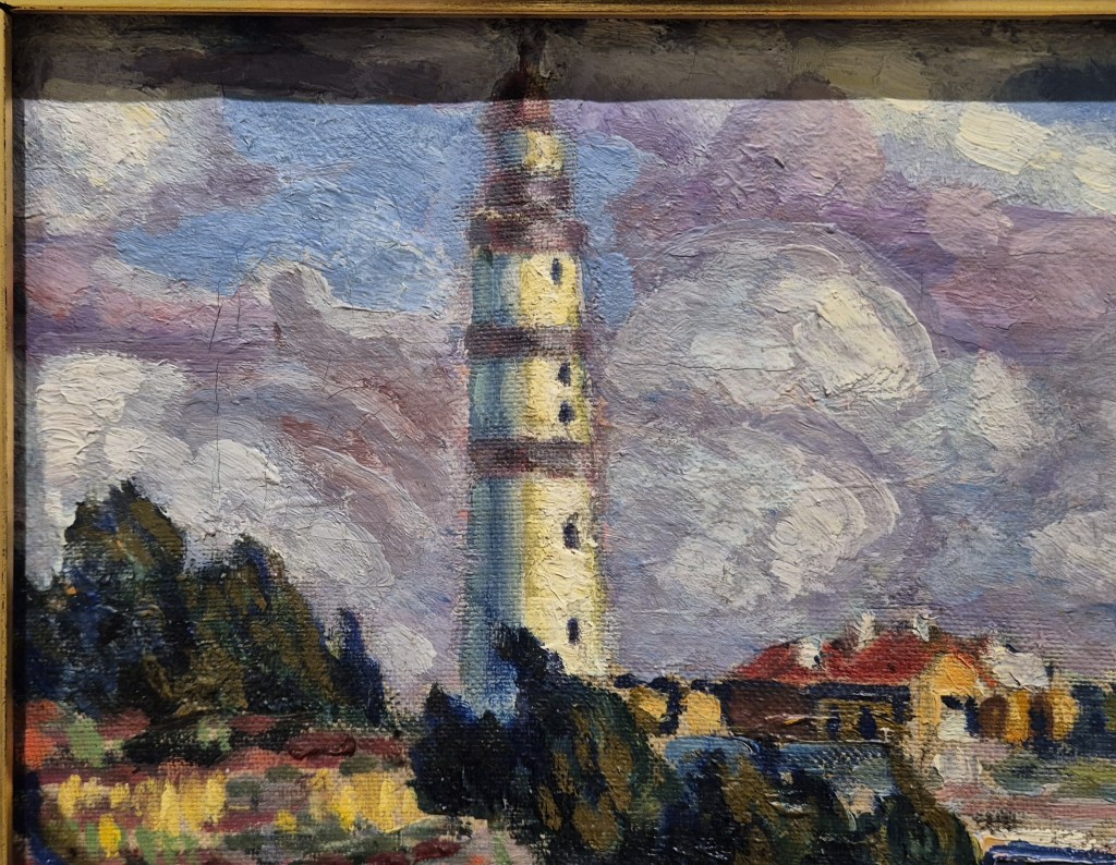
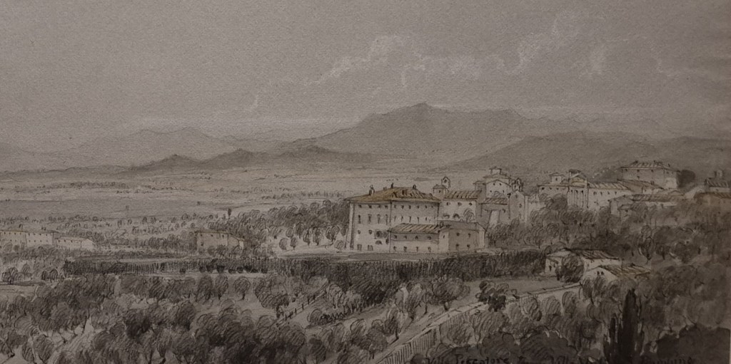
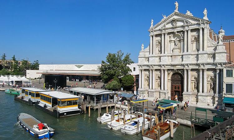
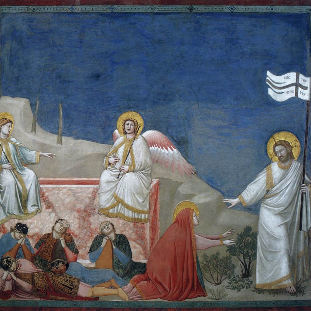
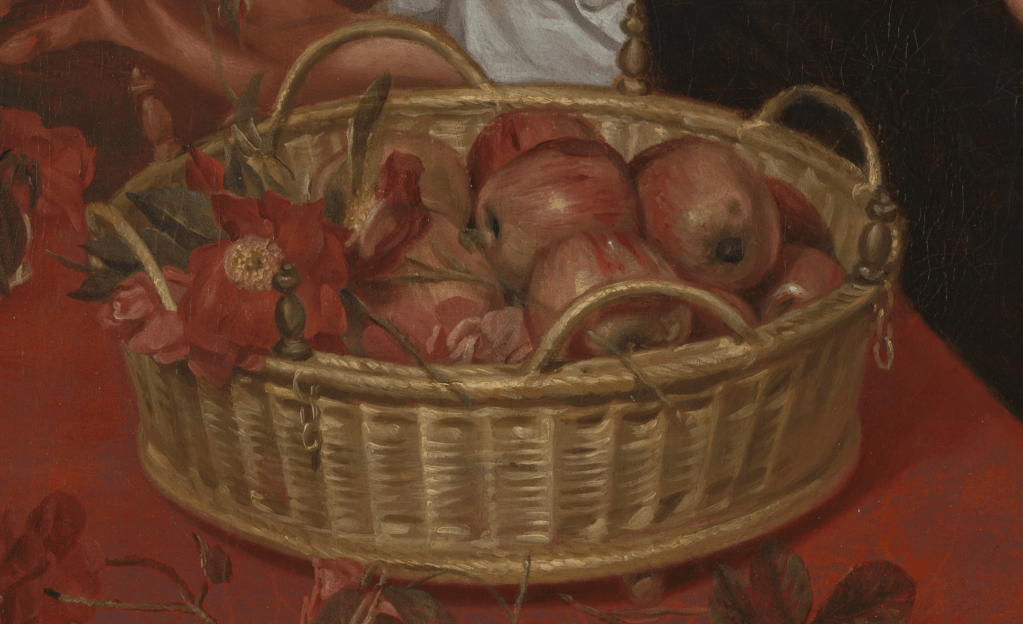
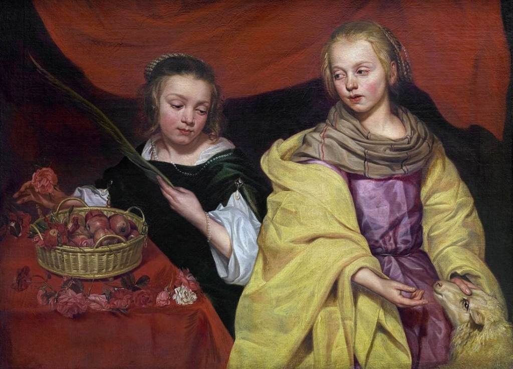
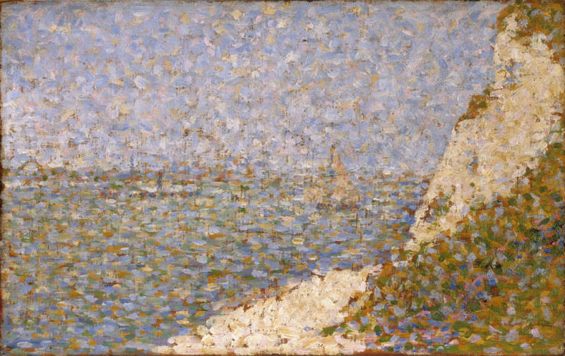
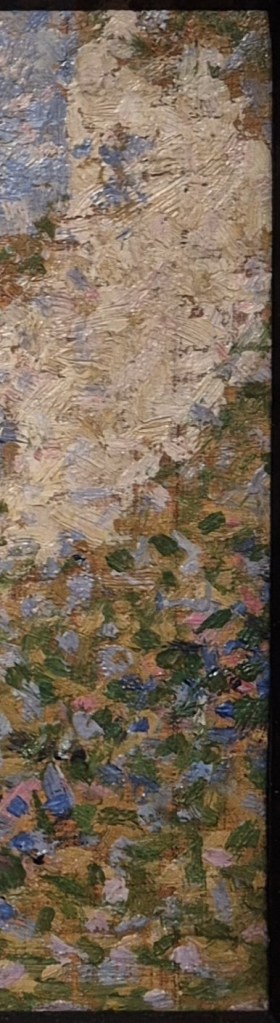
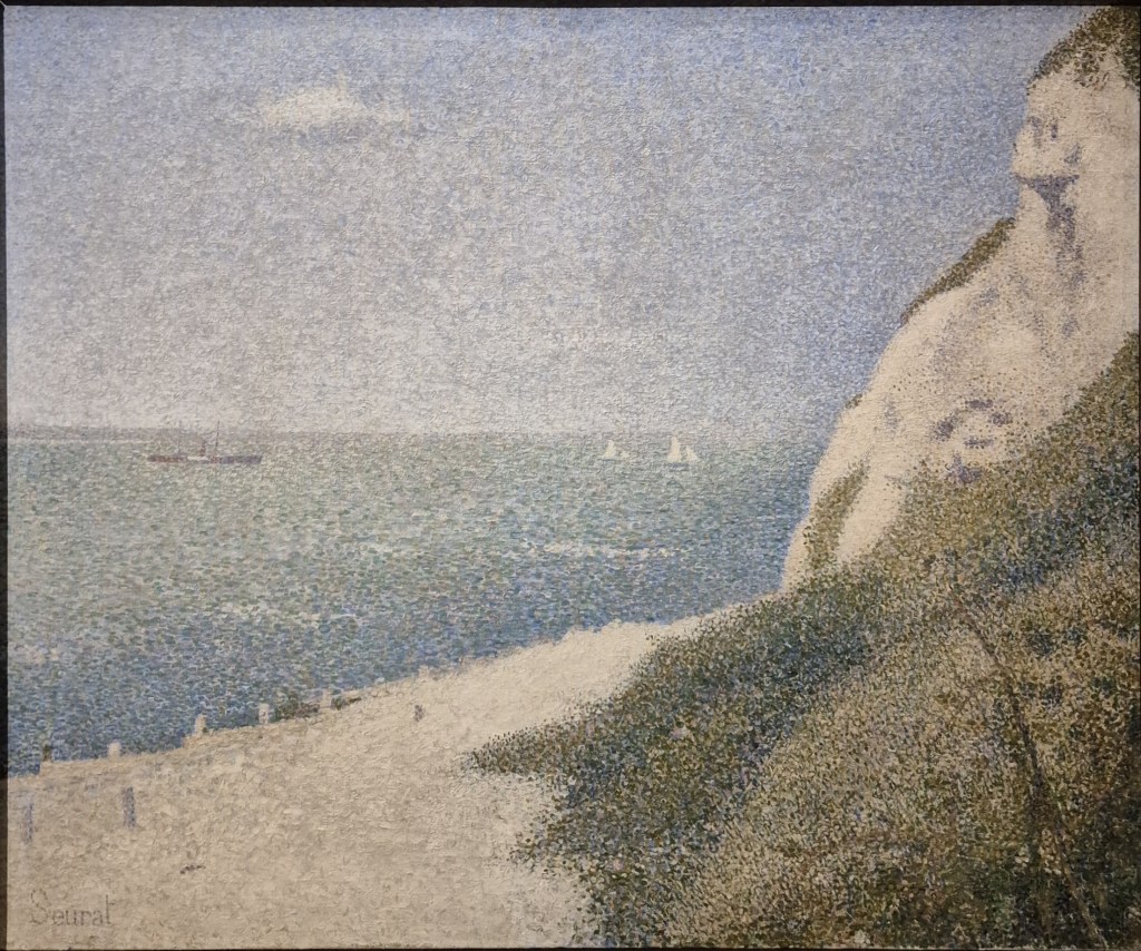
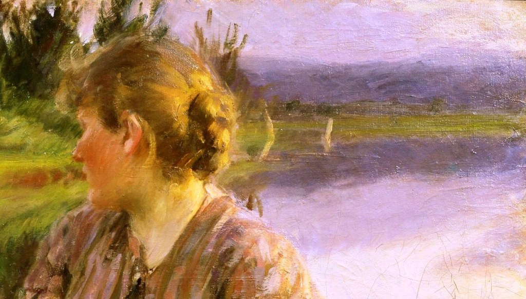
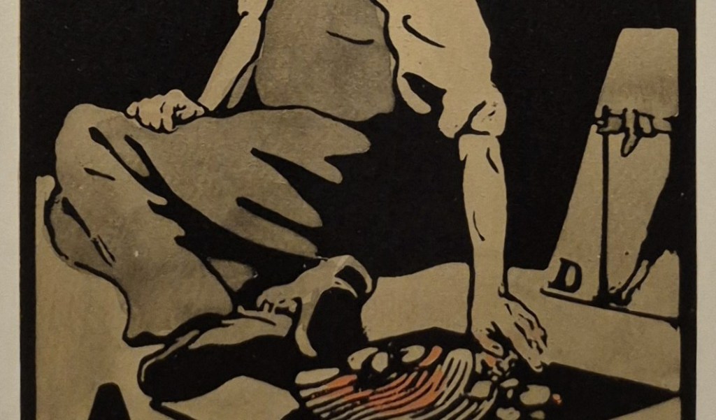
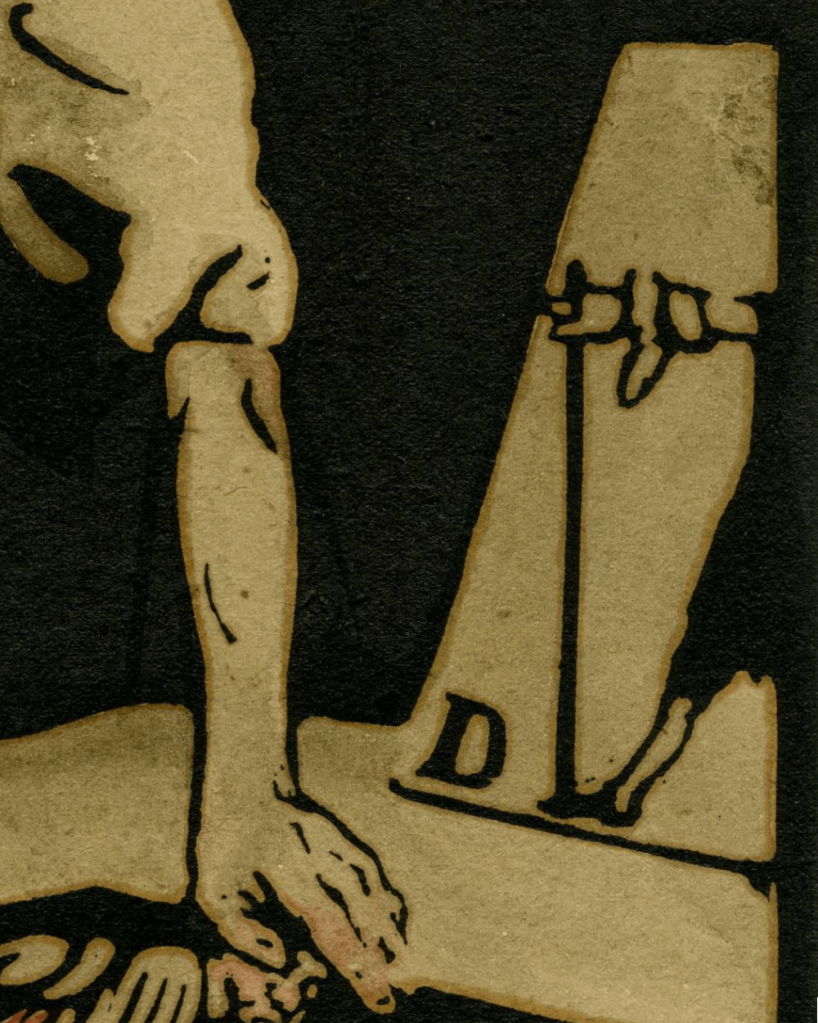
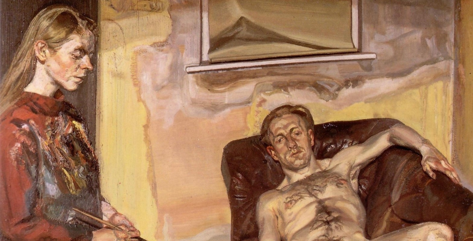
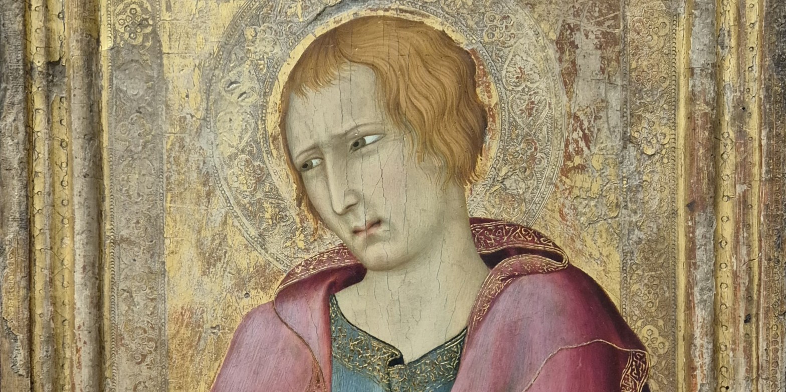
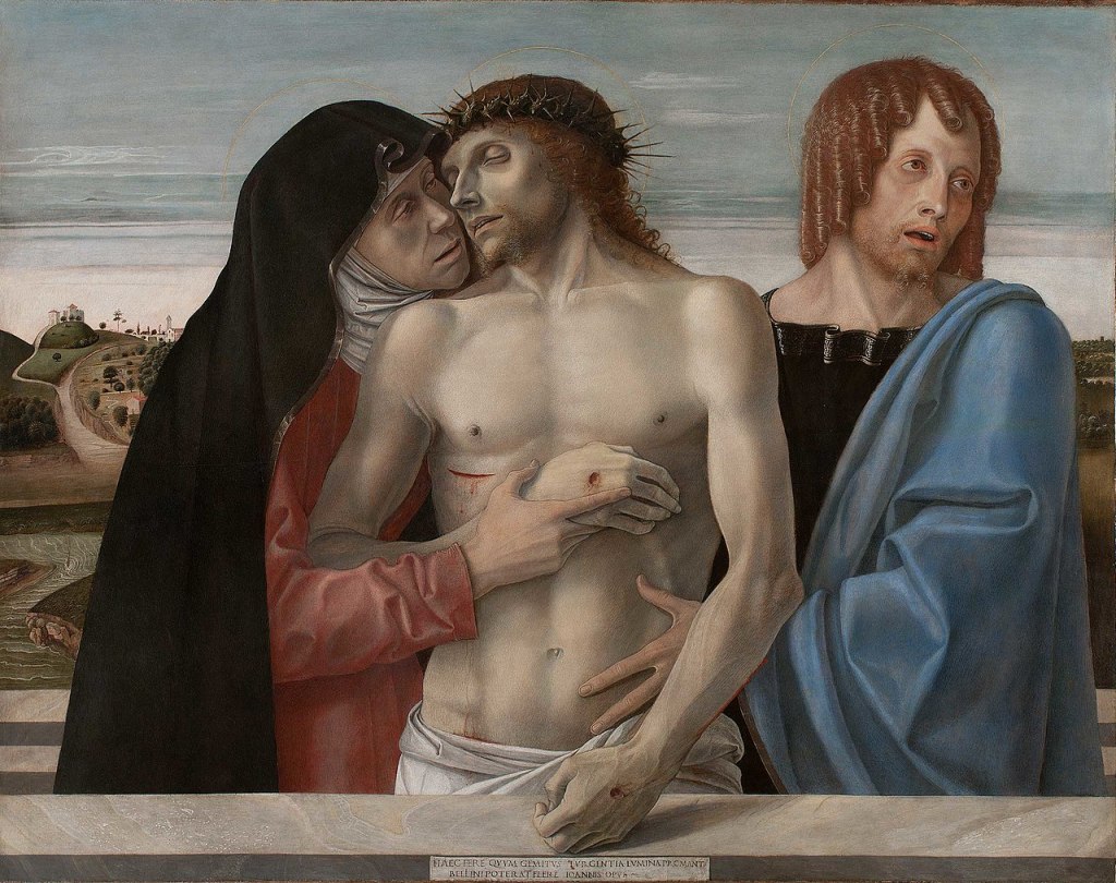
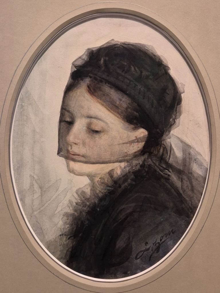
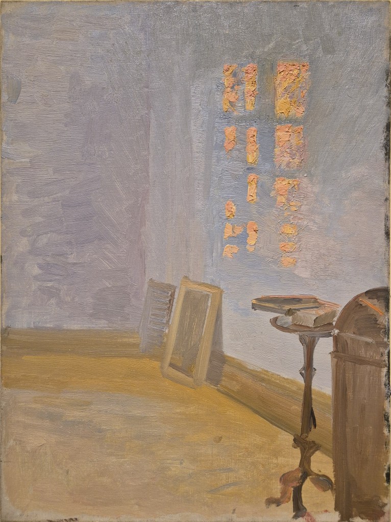
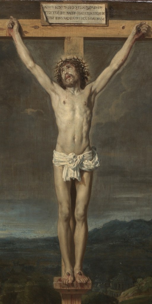
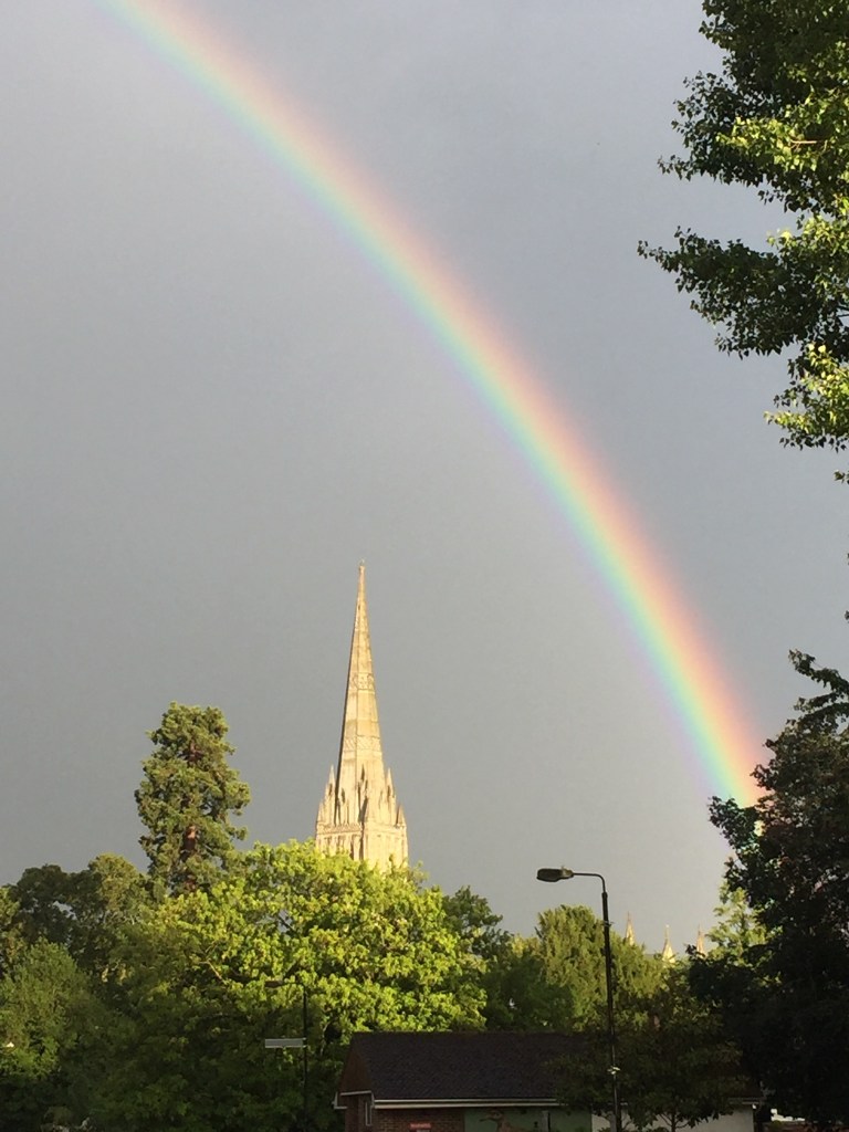
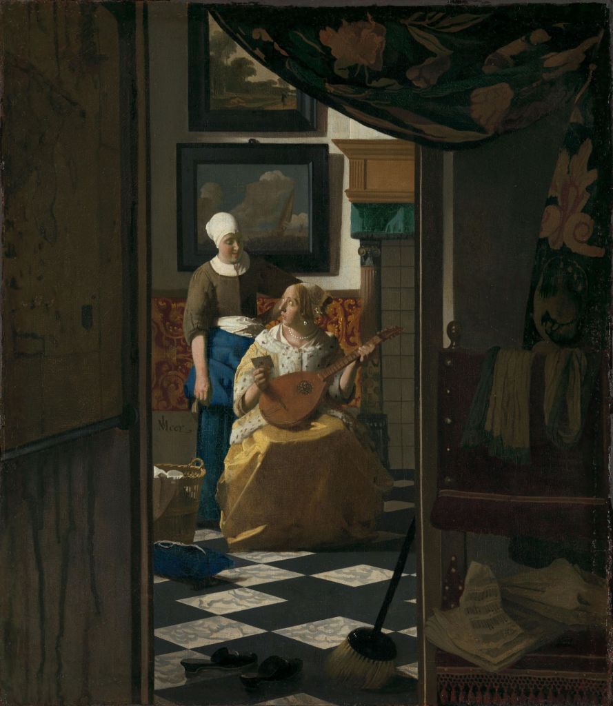
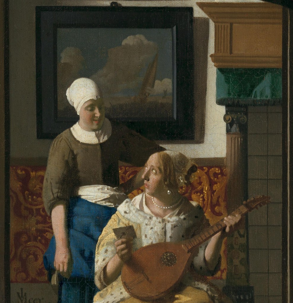
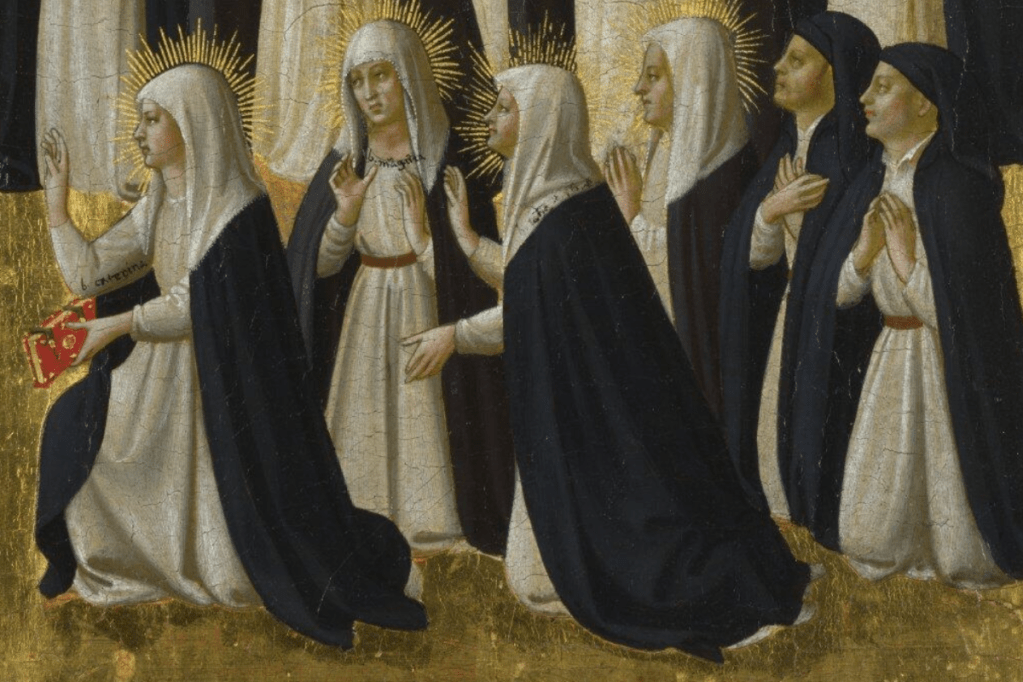
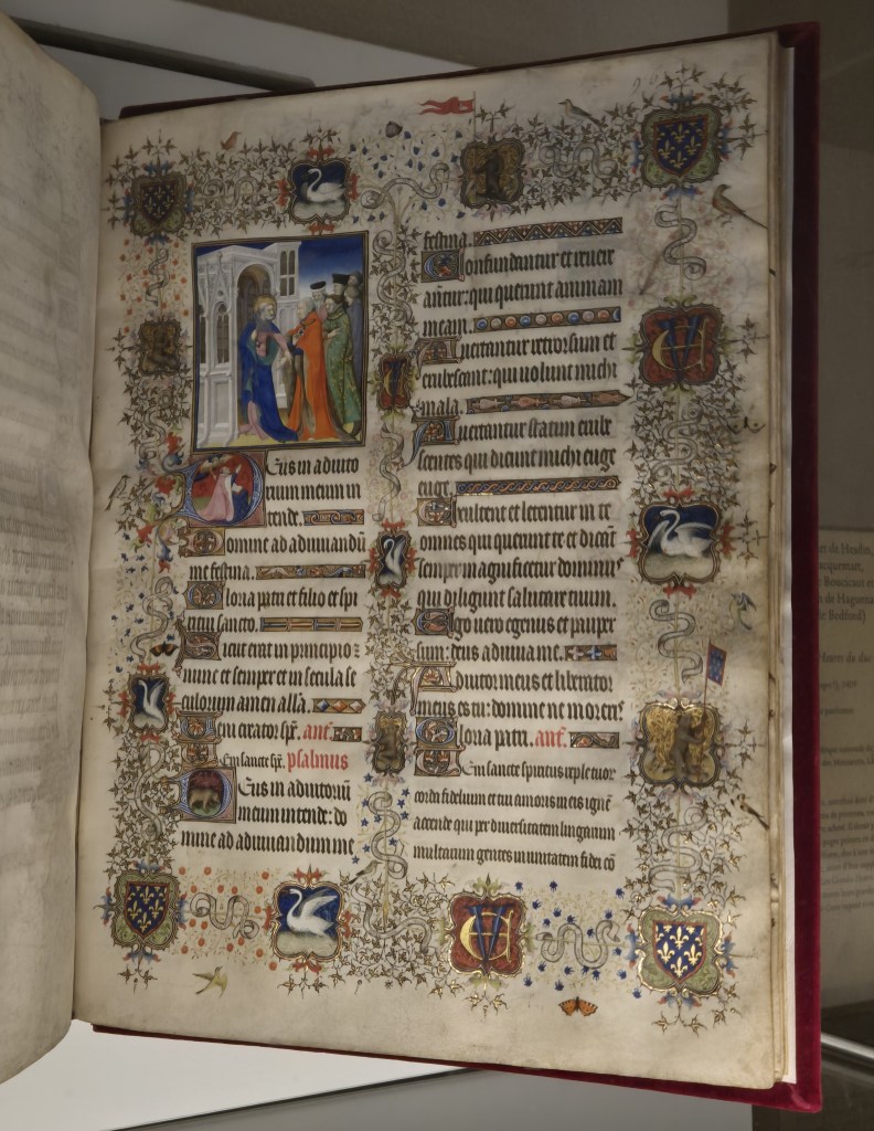
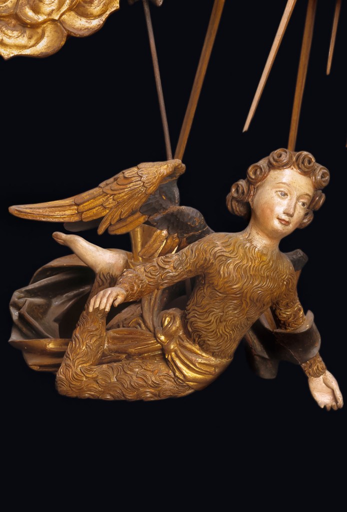
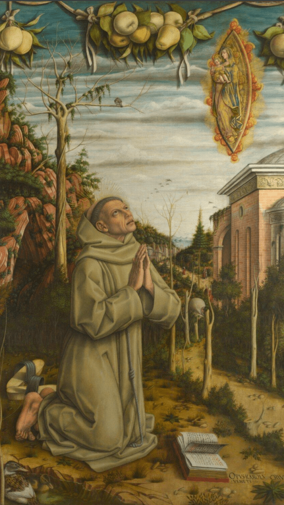
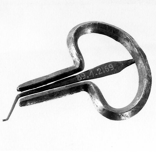
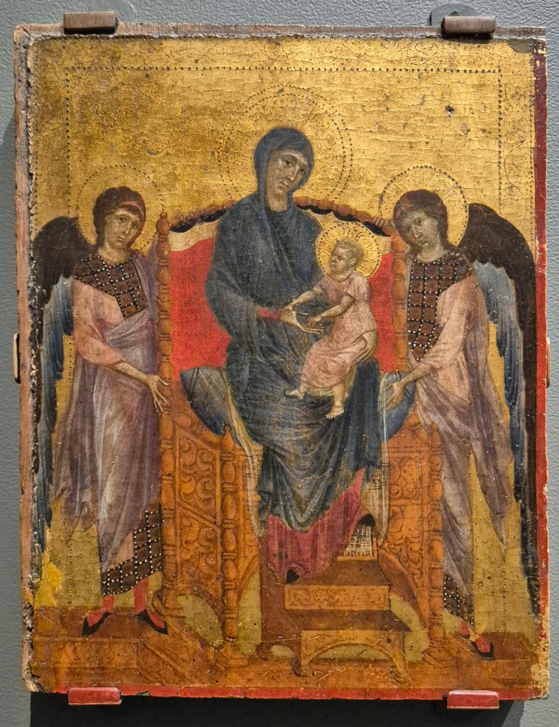
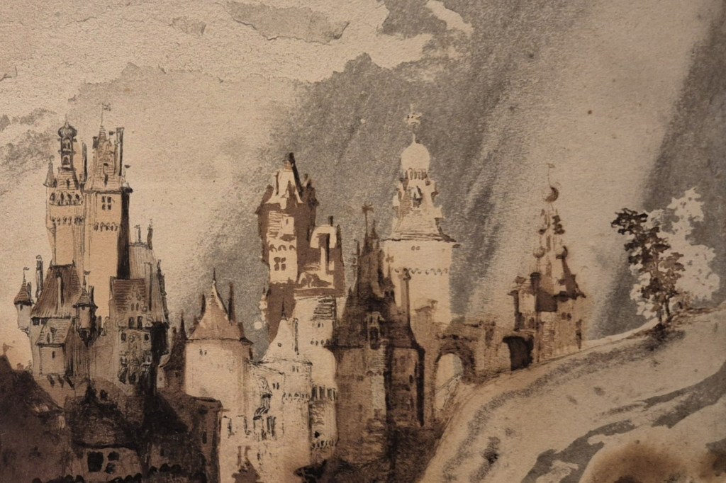
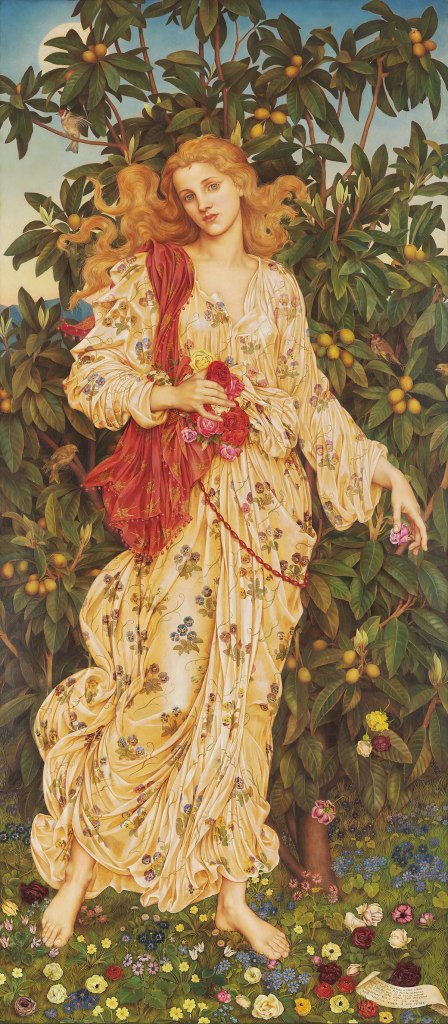
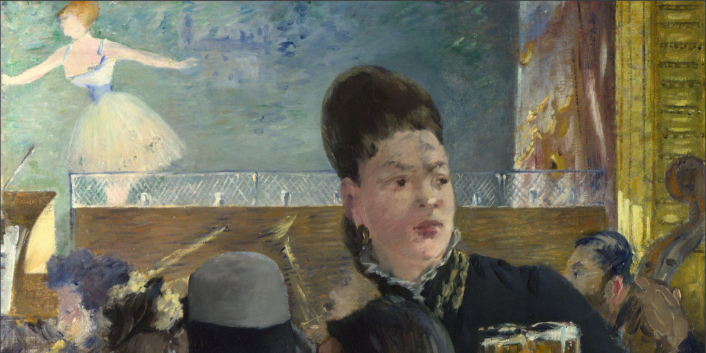
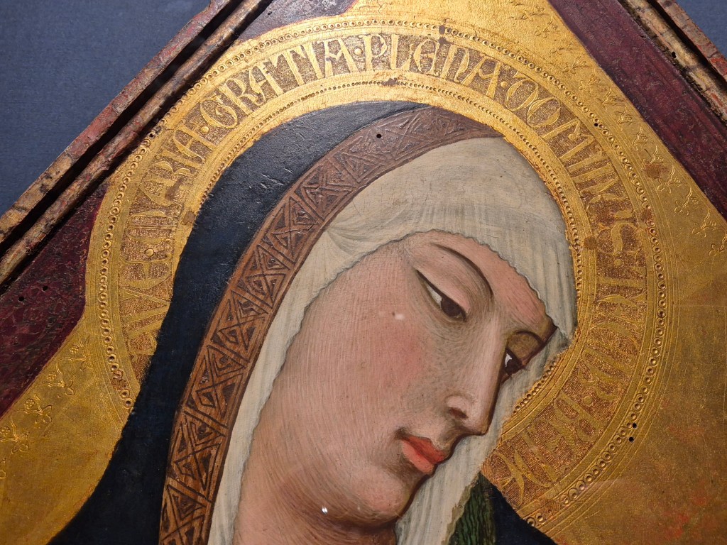
Edward Robert Hughes, Study for a Picture: Fra Lippo Lippi, 1893. Williamson Art Gallery and Museum, Birkenhead.
I am only just starting to get to know the Williamson Art Gallery and Museum in Birkenhead. It’s a little bit out of the way for me, on the Wirral, but only 20 minutes to drive… However, I prefer walking, or going by public transport – so the Lady Lever in Port Sunlight, or the Walker in Liverpool are more convenient. Nevertheless, as my talk this Monday, 13 July at 6pm will demonstrate, it has the most fantastic collection. They don’t have enough wall space to display all of their paintings, drawings, prints and sculptures – there are about 6,000 works altogether – and so they focus on different aspects of the collection by arranging temporary displays. This week I will talk about one of these, Beyond the Brotherhood: The Legacy of the Pre-Raphaelites – which I introduced all too briefly two weeks before. As well as a few familiar names there are the most fantastic paintings and drawings by artists I had never heard of. Some are local to Merseyside, and were inspired by the Pre-Raphaelites – becoming known as ‘the School of Liverpool’ – whereas others had connections to the artists who were at the heart of the movement. Edward Robert Hughes is one of the ones I was previously unaware of. I find his drawing style quite breath-taking – so why haven’t I heard of him before? Today’s drawing is just one example of the fabulous material on view – so I do hope you can join me on Monday.
There will also be a superb array of media, techniques and imagery to see in the following two talks, both of which are dedicated to a fantastic exhibition I saw in Ghent earlier this year. Sadly, it closed at the end of May, but I still thought you might like to see the extent of the material it covered – or rather, I really think you should see it! It was a thorough exploration of the many women working in the low countries – the Netherlands, and what later became Belgium – between 1600 and 1750, and, like the Williamson exhibition, there are familiar names and brilliant new discoveries. You can book either talk separately, or both together at a reduced price, on the following links.
Unforgettable I & II: 3 and 17 August at 6pm
Unforgettable I – Building a Career: 3 August at 6pm
Unforgettable II – The Community of Artists: 17 August at 6pm
I will then talk about the Courtauld’s current exhibition, Hepworth in Colour, on 24 August, and am hoping to keep the summer colourful on 31 August with the Scottish Colourists, who are currently on show at the Arc in Winchester. However, I’ll post these on the diary as soon as I have confirmed, as I’ve just realised that I may not be able to get to Winchester when I had planned to…

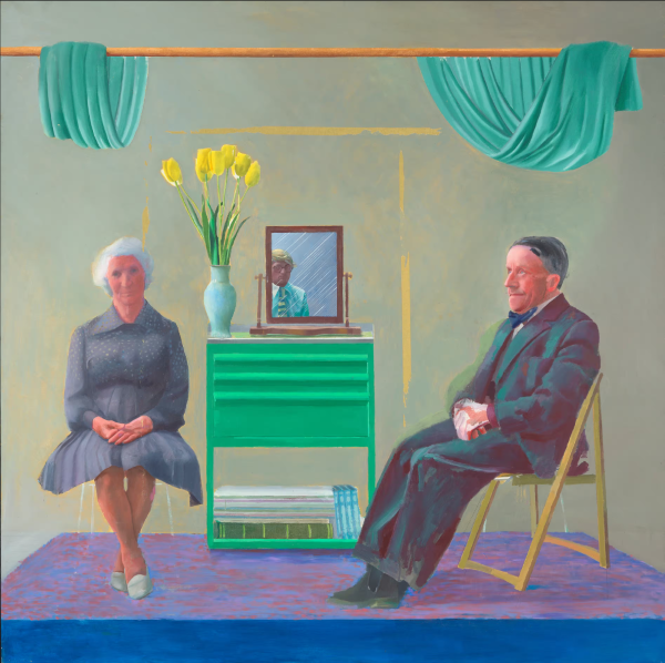
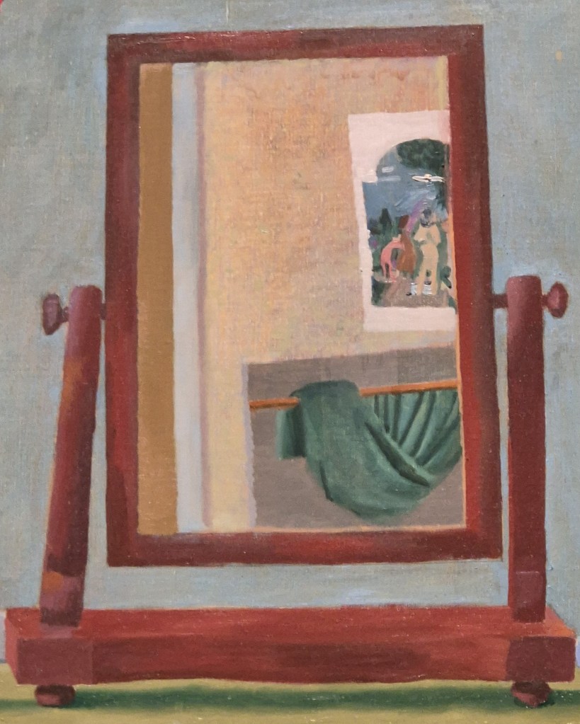
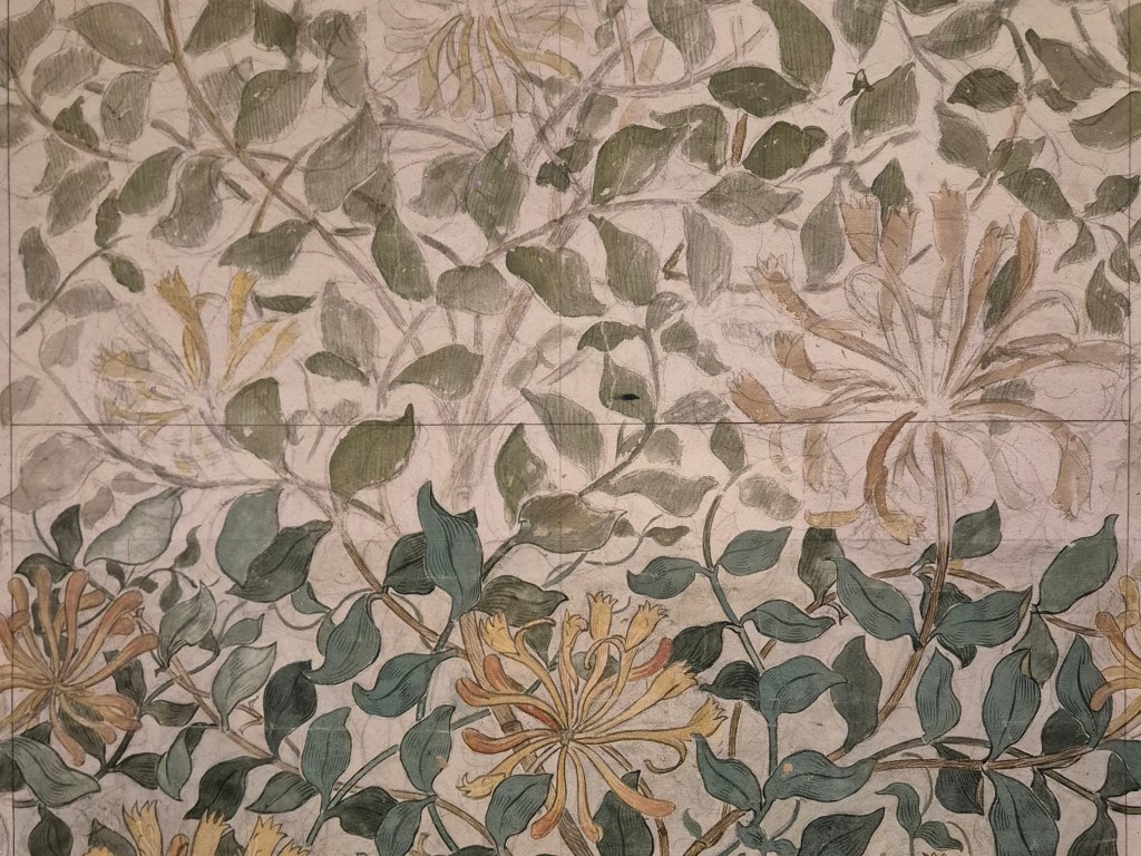
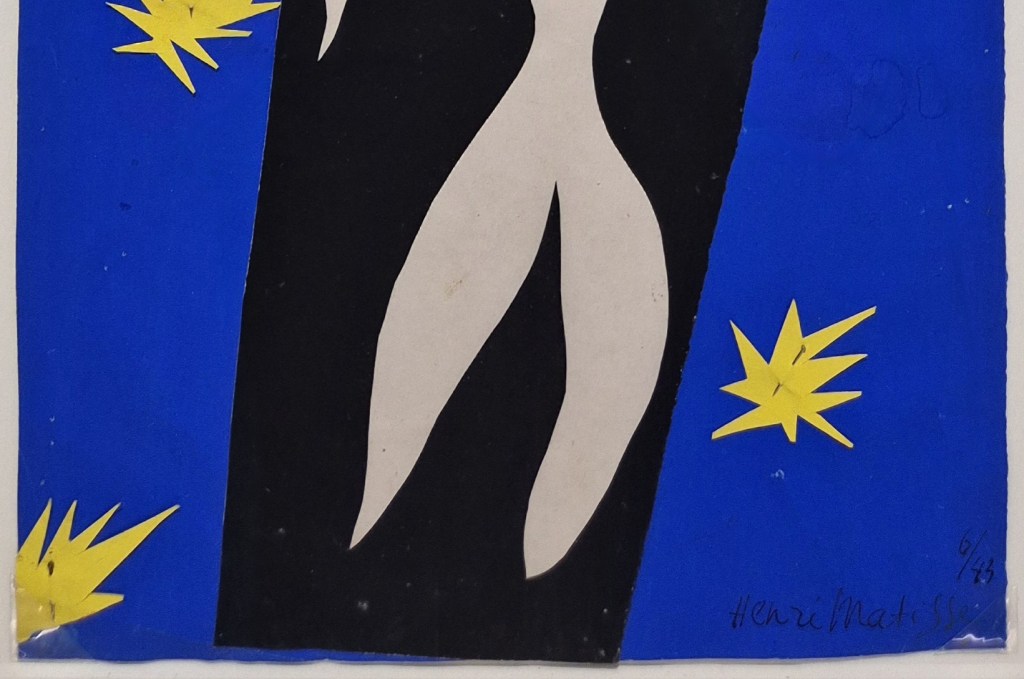
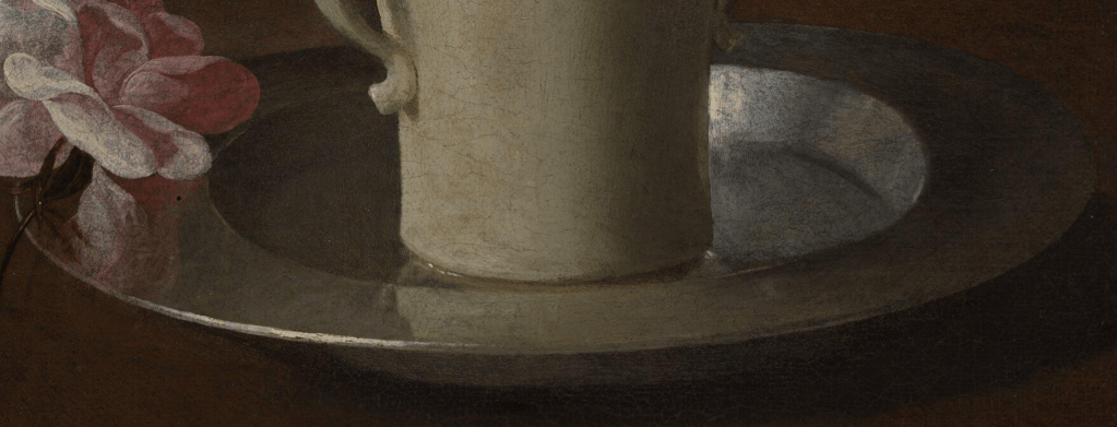
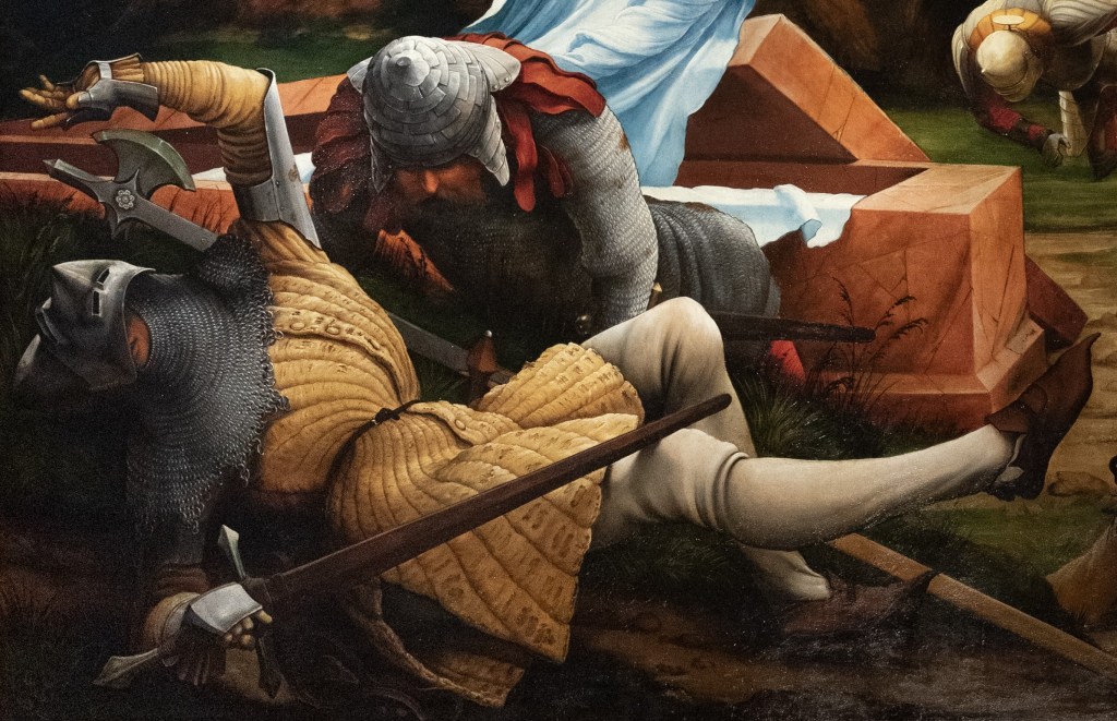
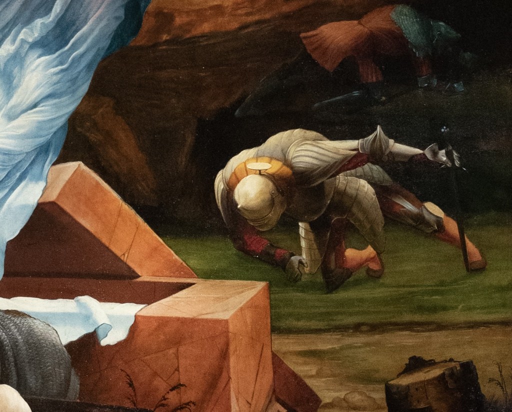
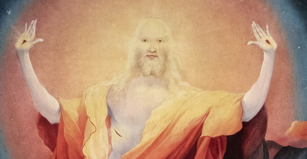
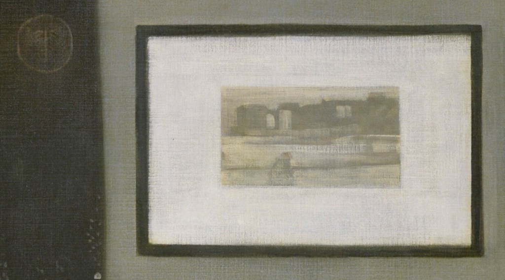
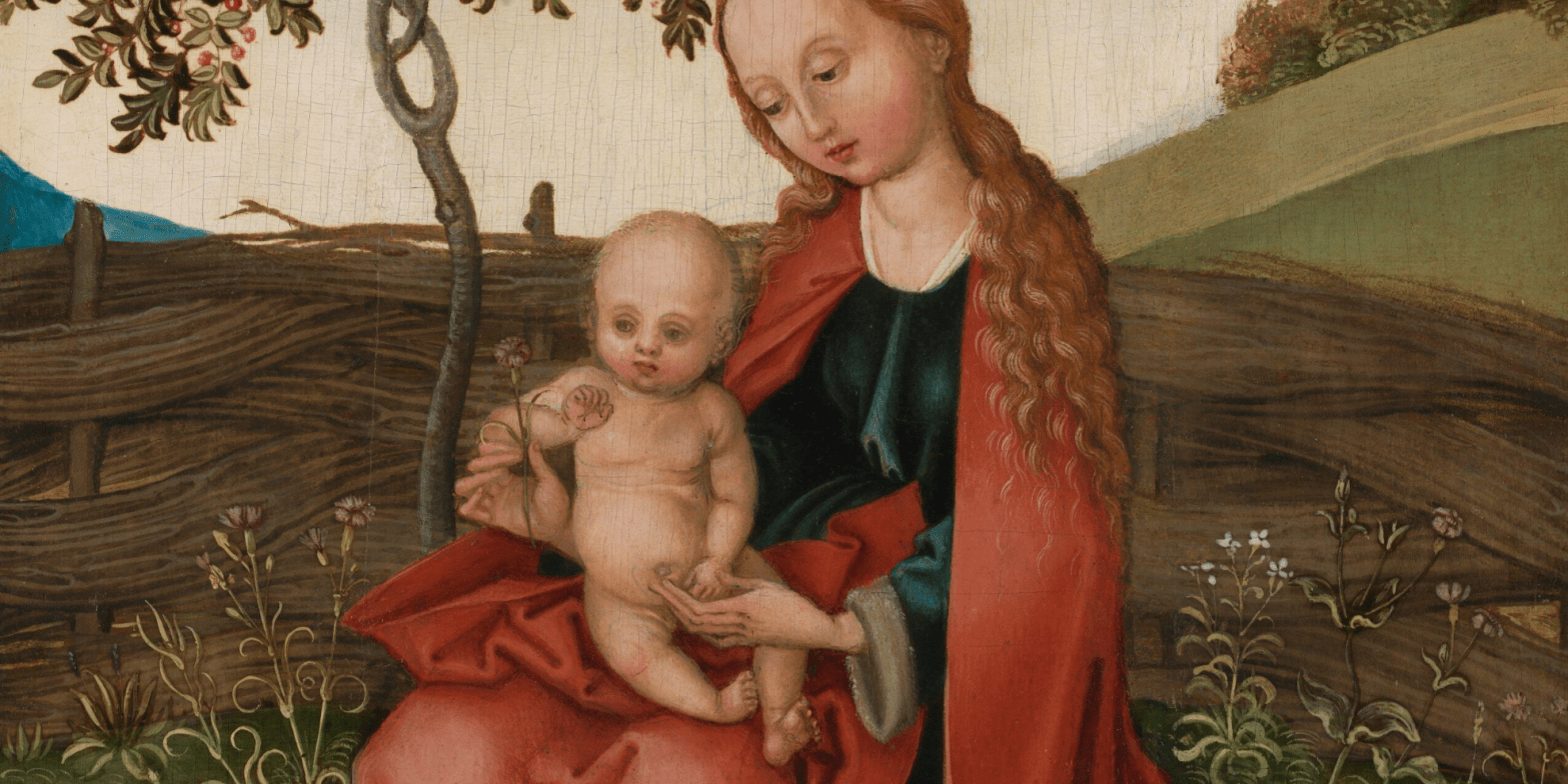
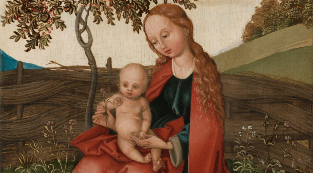
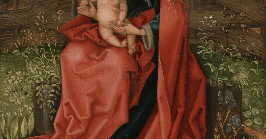
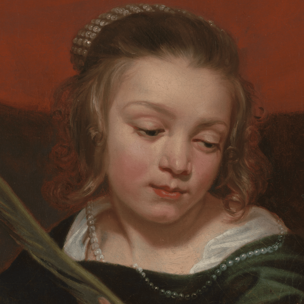
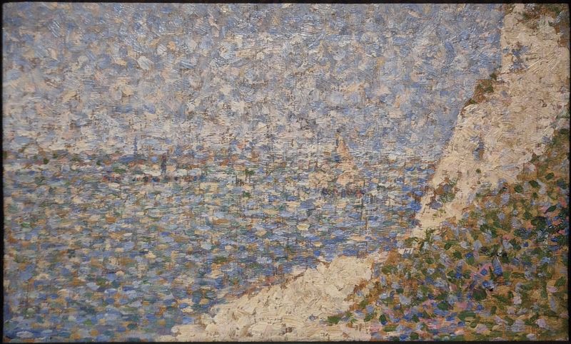
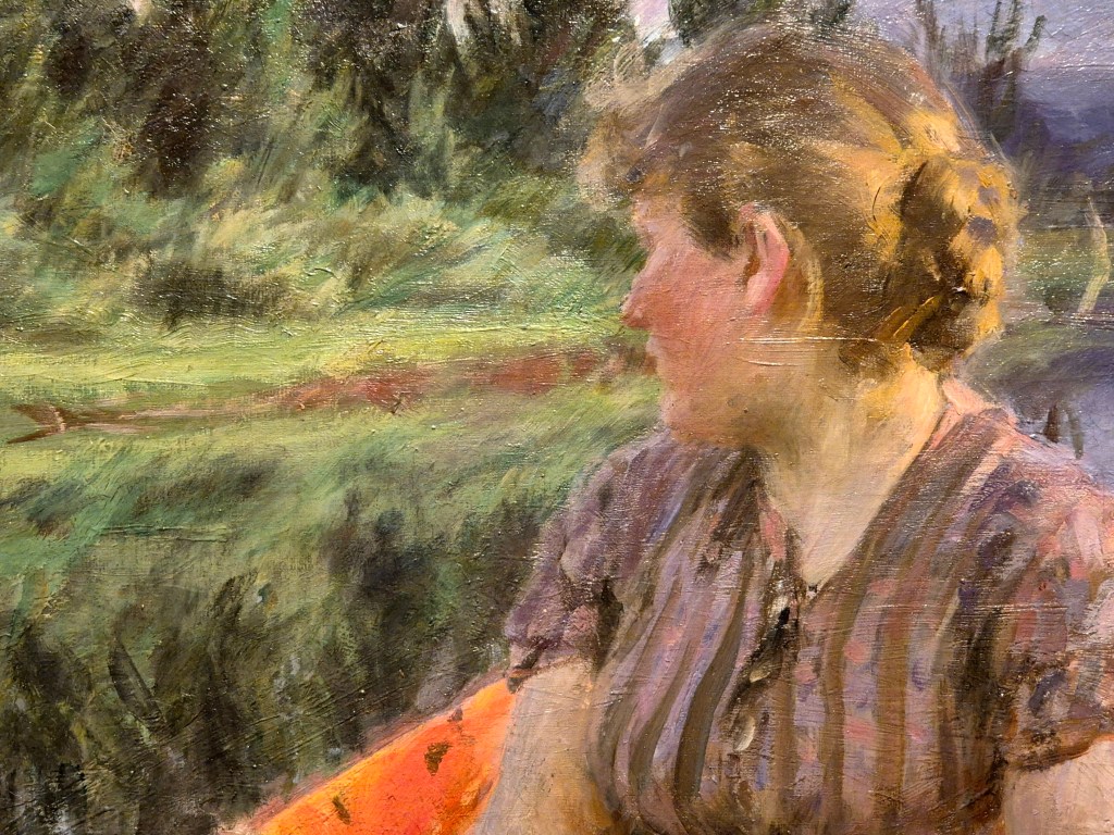
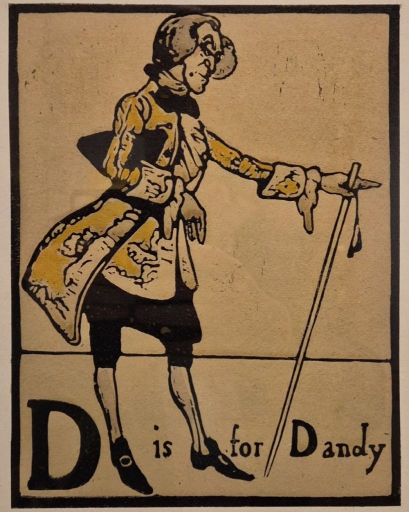
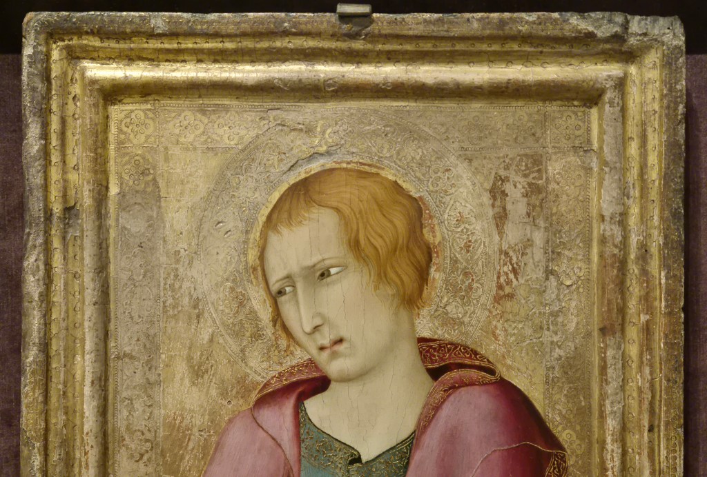
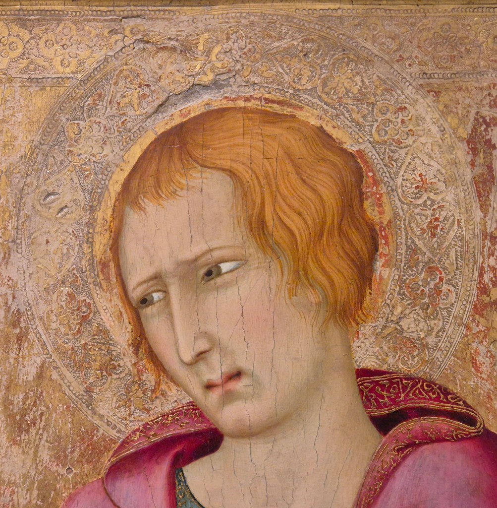
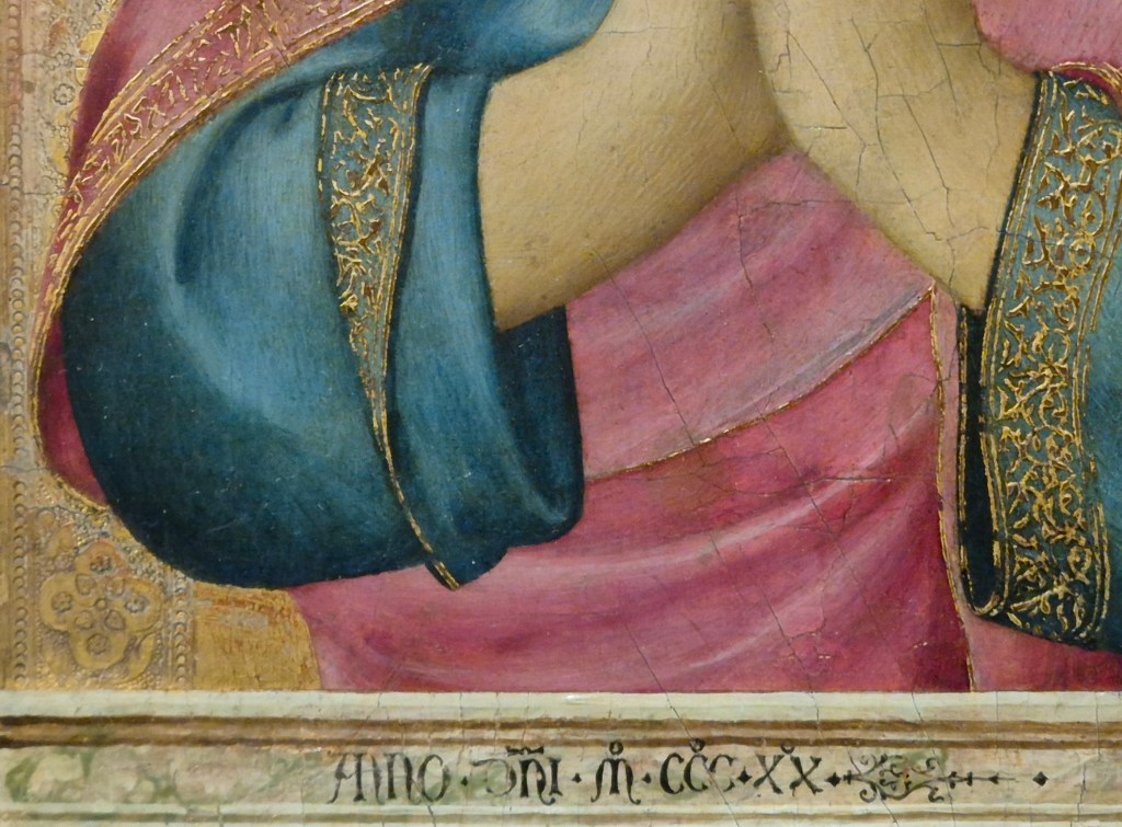
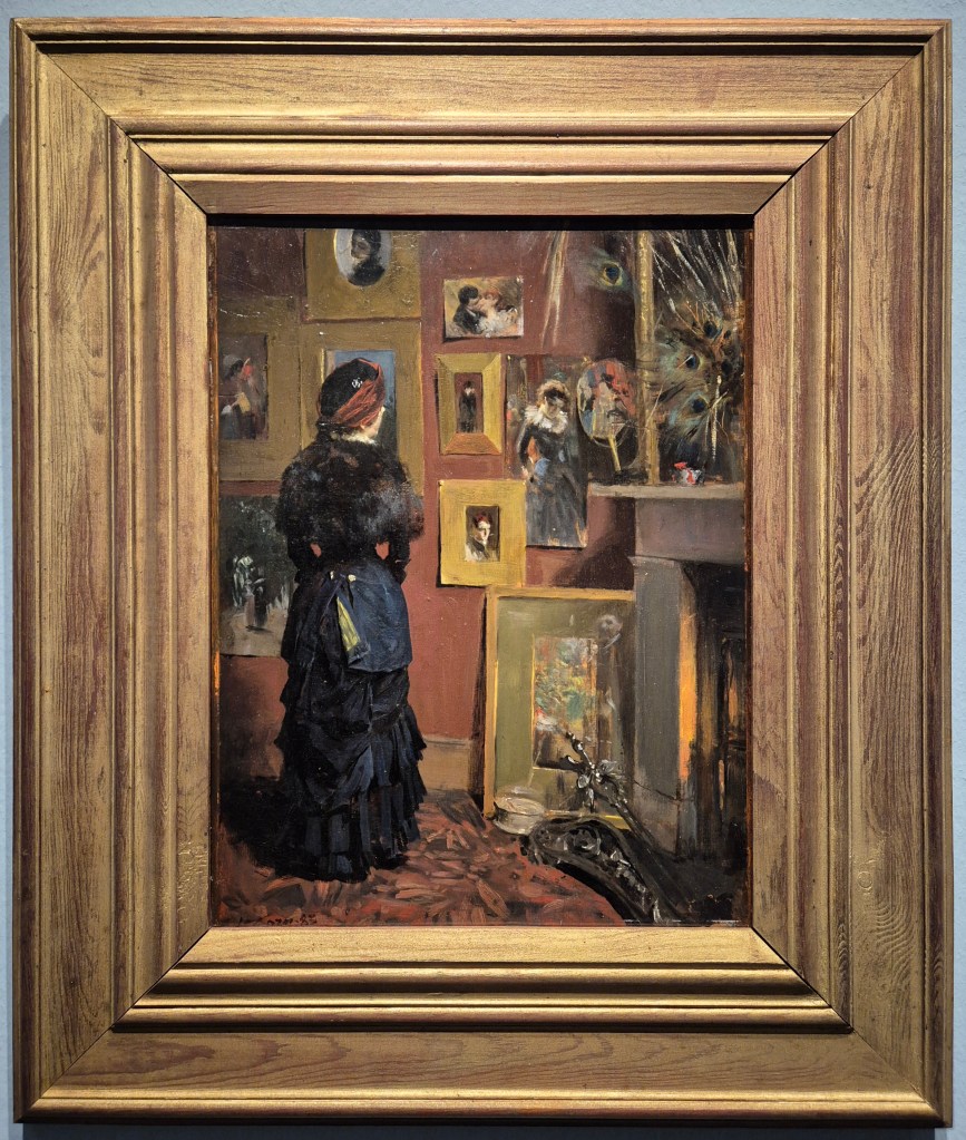
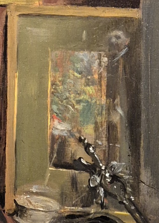
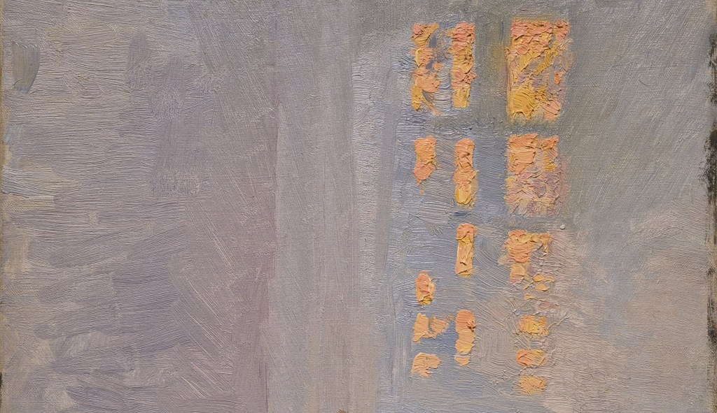
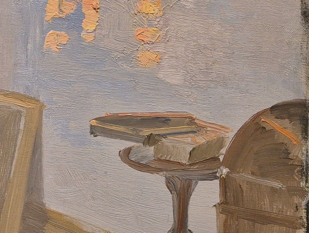
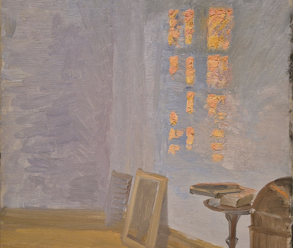
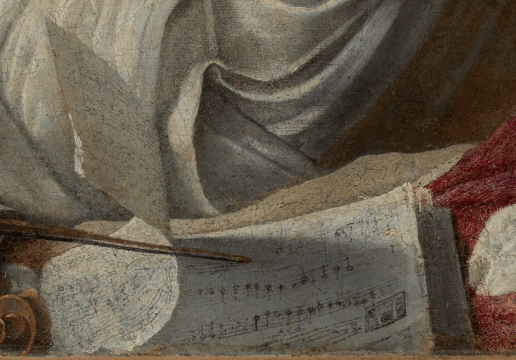
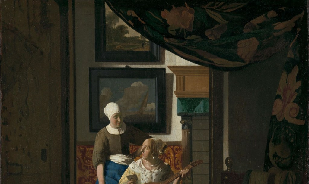
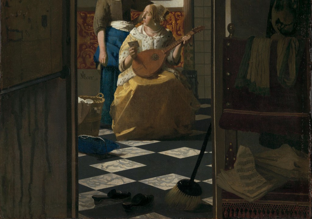
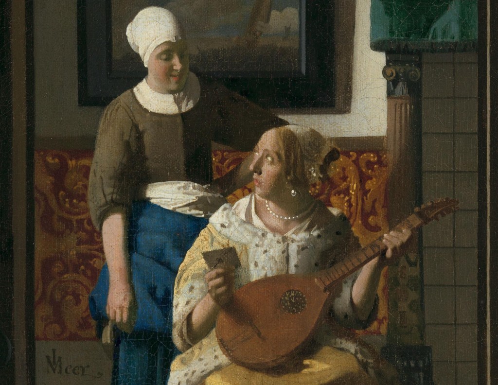
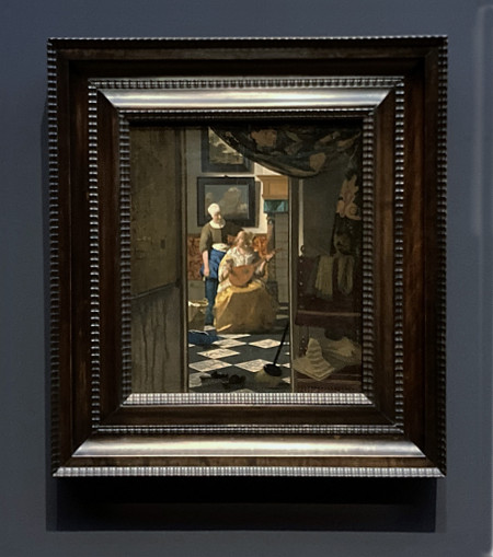
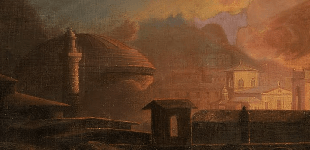
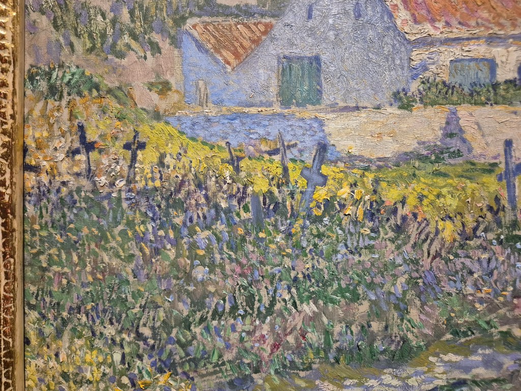
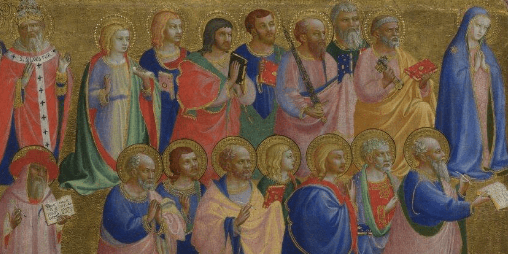
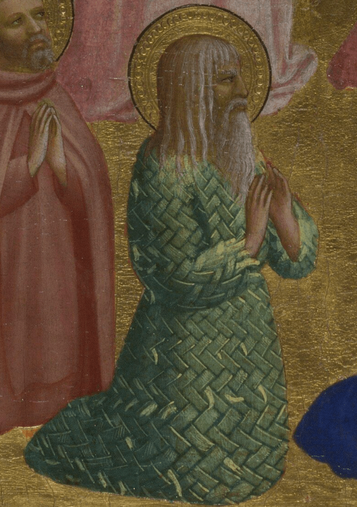
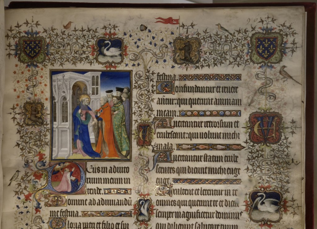
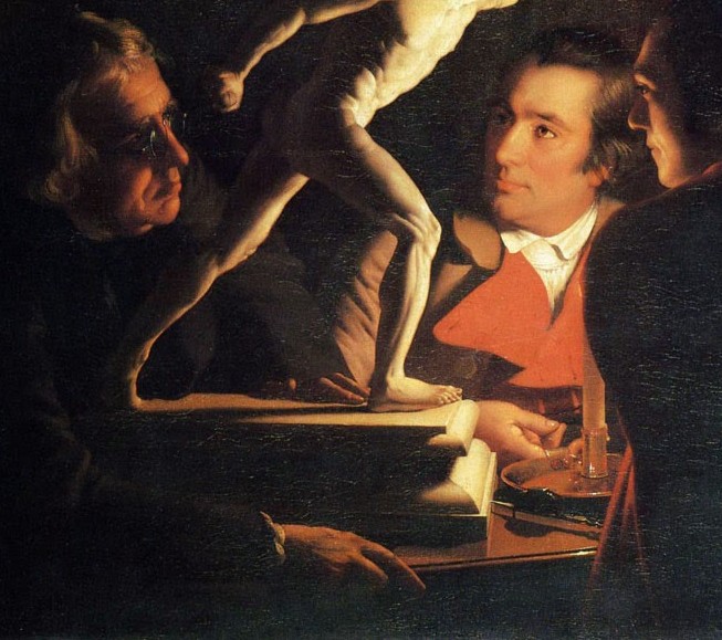
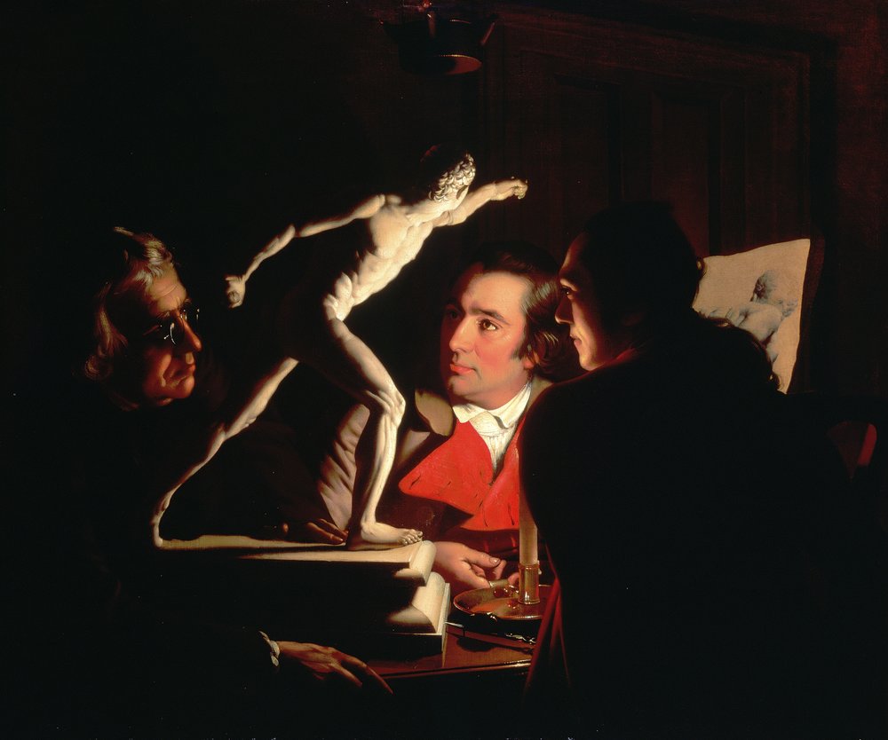
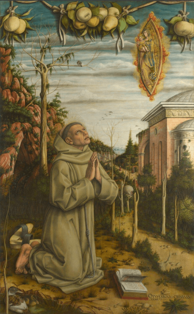
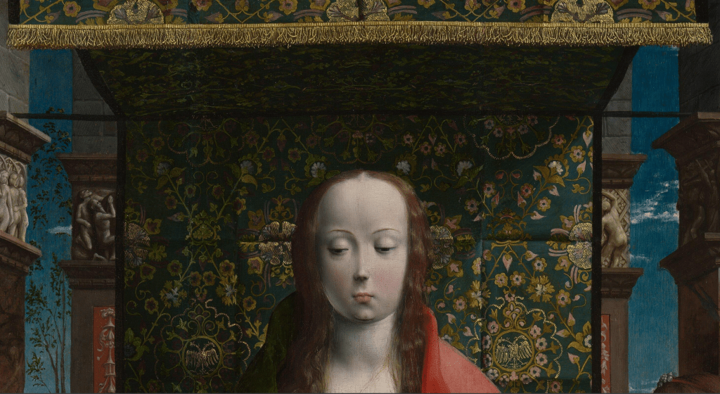
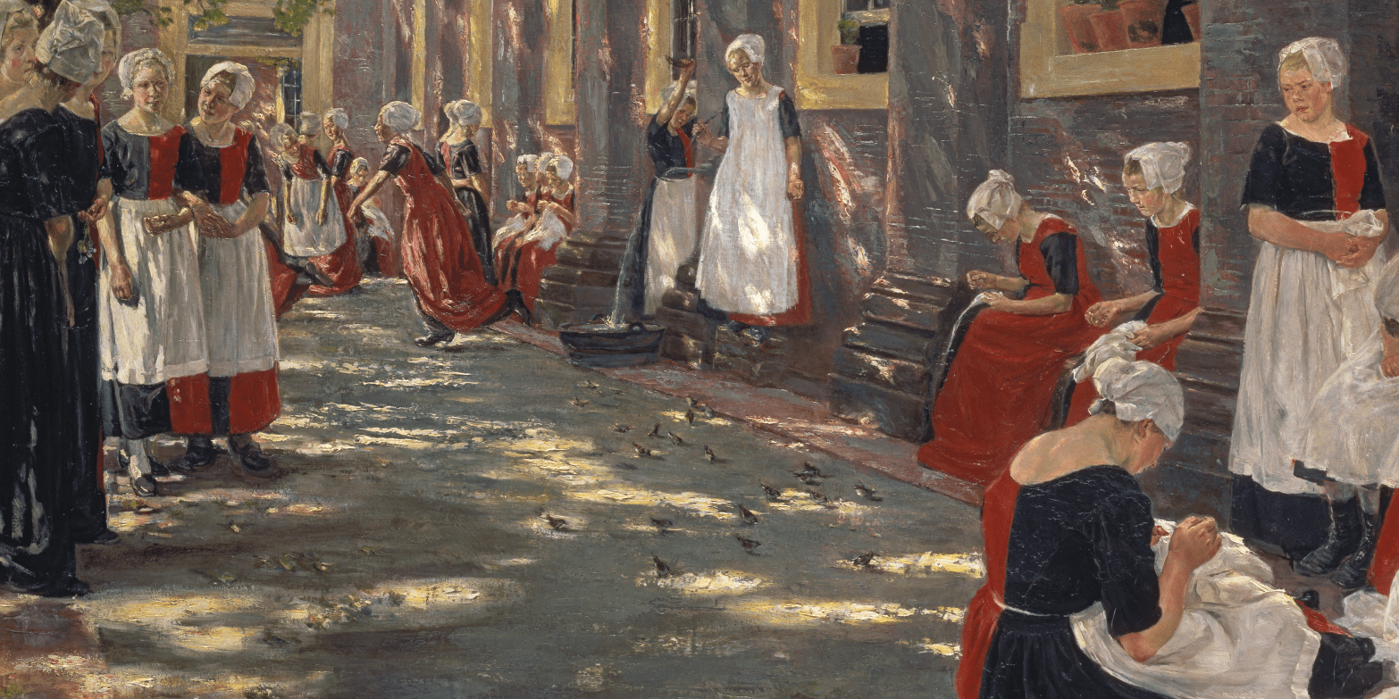
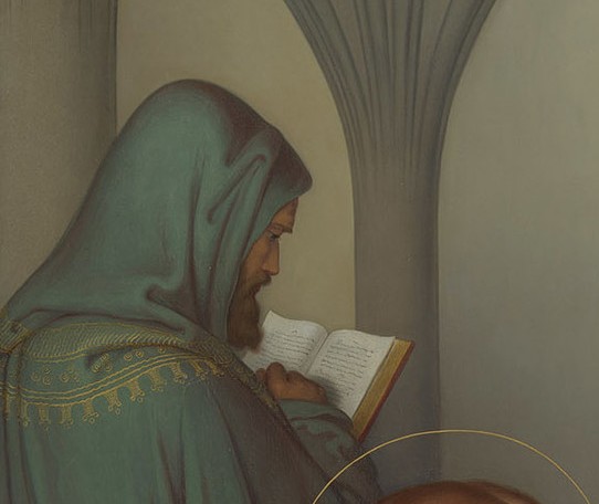
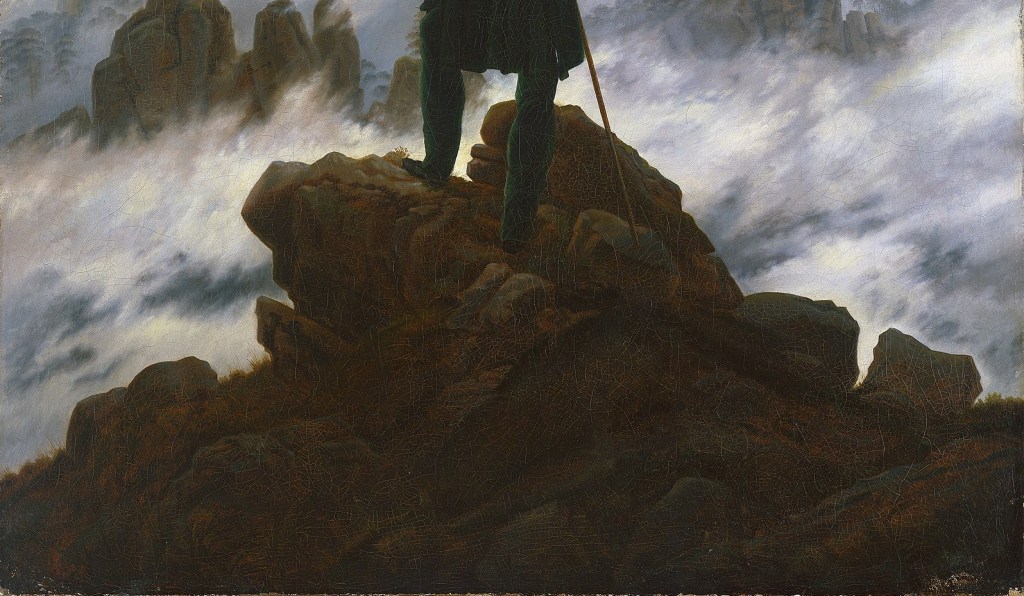
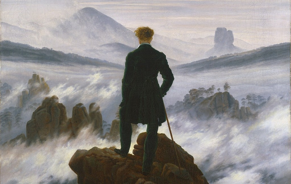
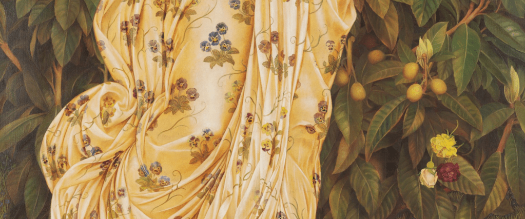
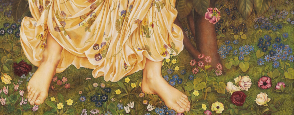
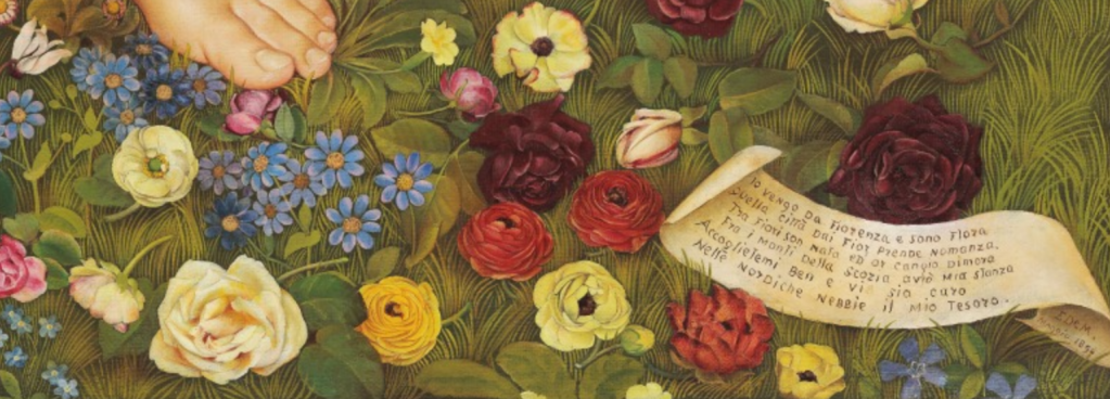
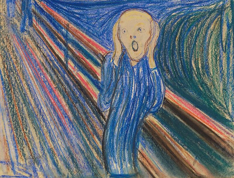
This is how Hughes’ drawing is displayed at the Williamson, where it seen as part of a wall of faces, portraits, and character studies. It could almost be a portrait itself, and that was probably the intention. The subject is standing in a walled garden, holding a white rose, and appears to have been caught unawares. He looks towards you with a calm, well-mannered expression – but more as if he is waiting to see what happens next, rather than wanting to instigate conversation himself. He has something on his mind, I think. Drawn in red chalk on paper – the medium which perhaps best approximates to the texture and colour of White European flesh tones – the image is of a young monk or friar, wearing a white habit with a cowl or hood. The colour of the drawing is set off by the simple, gold-coloured frame, with the image itself given extra impetus by the plain black border around the inner edge. There is a reflection from the glass at the top of this photograph, but I have a clearer version below.

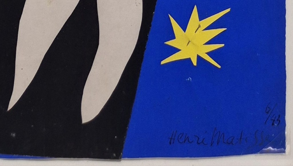
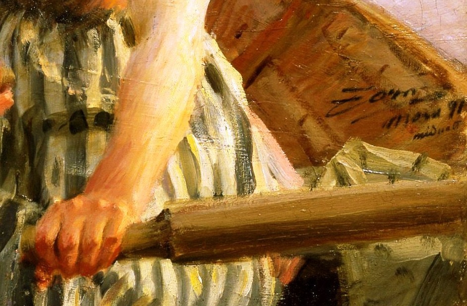
The artist’s signature appears in the bottom left corner – ‘R HUGHES 1893’. Edward Robert Hughes was the nephew of Arthur Hughes, who joined the Royal Academy Schools in 1847, the year before the foundation of the Pre-Raphaelite Brotherhood by older students in the Schools. However, it seems that he didn’t meet Millais, Hunt and Rossetti until 1850, after he had read their journal, The Germ, which only stretched to 4 issues, all of which were published that year. He never officially became a member of the group, but was enormously influenced by their stylistic innovations. Arthur’s nephew, Edward Robert, was at an even greater remove – but he did go on to assist William Holman Hunt, who late in life was suffering from glaucoma. His most significant contributions were to the third and final version of The Light of the World (c. 1900-04) in St Paul’s Cathedral, and The Lady of Shallott (c. 1888-1905) at the Wadsworth Atheneum – which was one the last of my 100 ‘Pictures Of The Day’ towards the end of lockdown (see 97 – The Mirror Crack’d) – in retrospect, the perfect pandemic painting.
Hughes was 42 when he drew today’s image, and had forged a career in portraiture. Notably, from the point of view of Monday’s talk, from the 1870s he regularly spent several months every year painting portraits in Birkenhead – which might explain how two of his drawings found their way into the Williamson (I will include both in the talk). He was also well known for fantastical watercolours, and in the year that this drawing was created he came to the end of a two-year term as Vice-President of the Royal Watercolour Society.

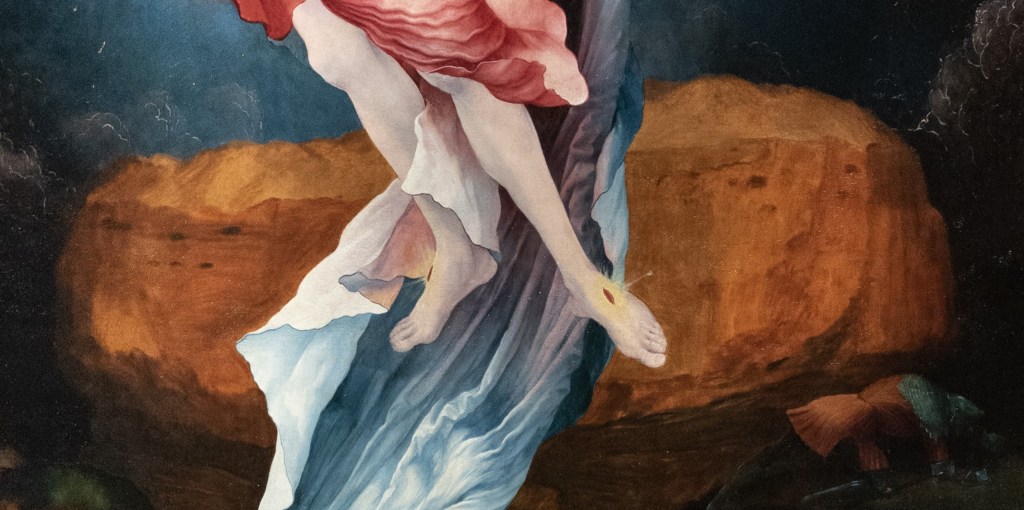
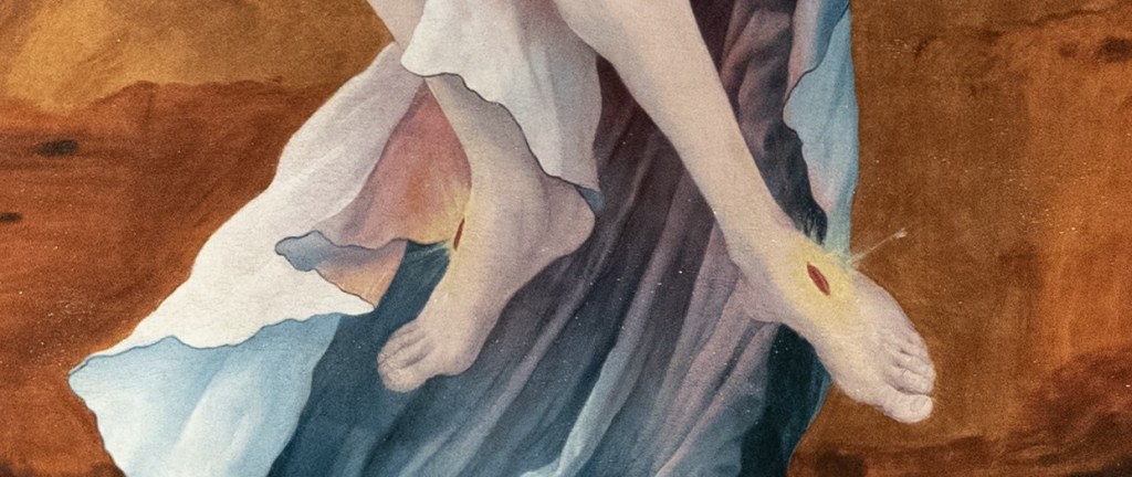
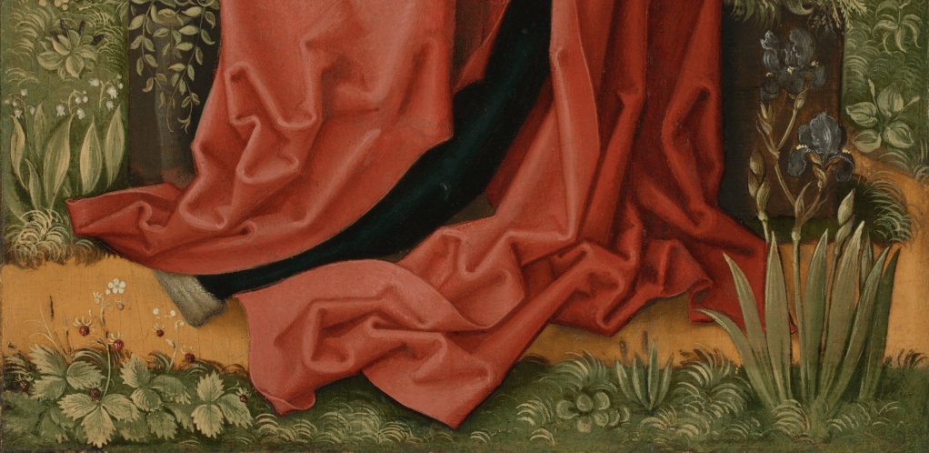
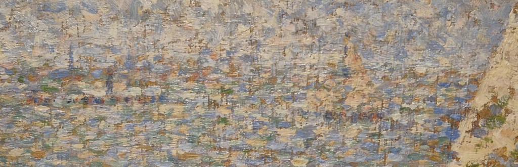
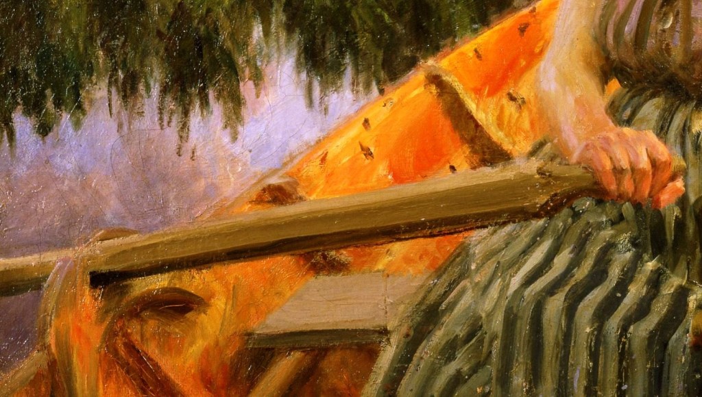
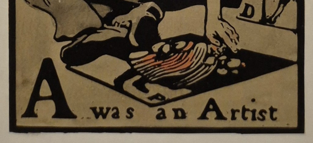
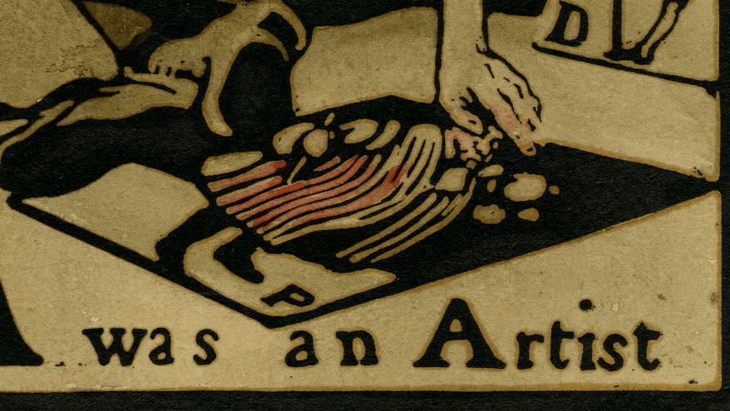
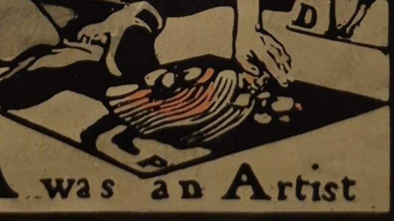
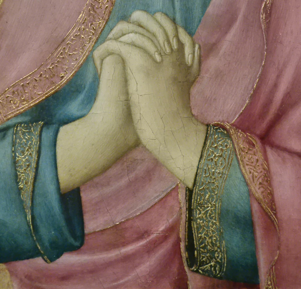
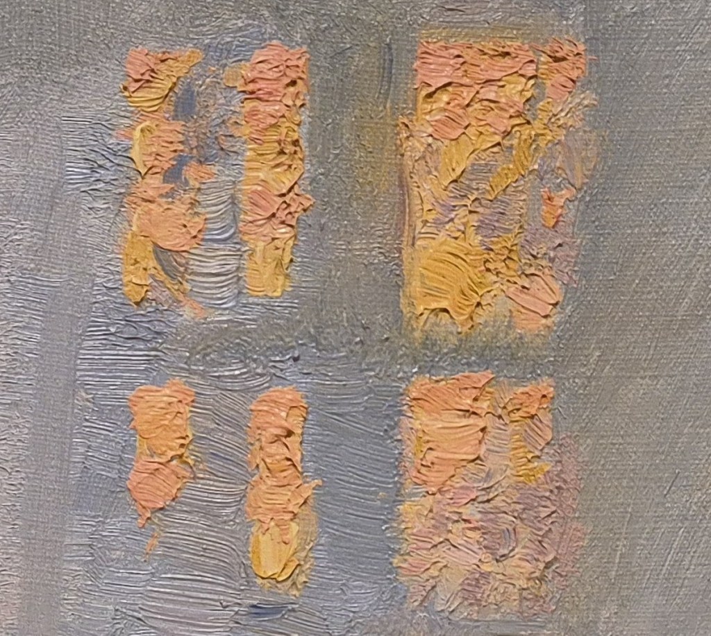
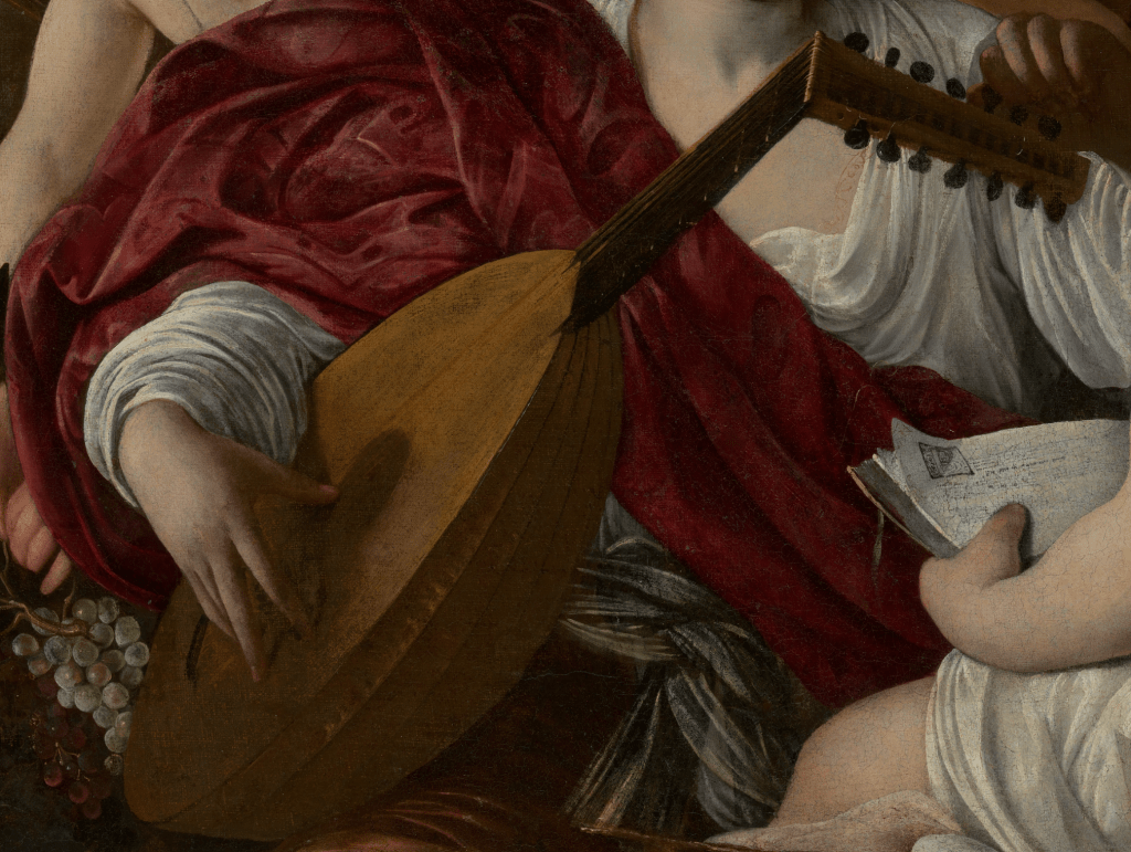
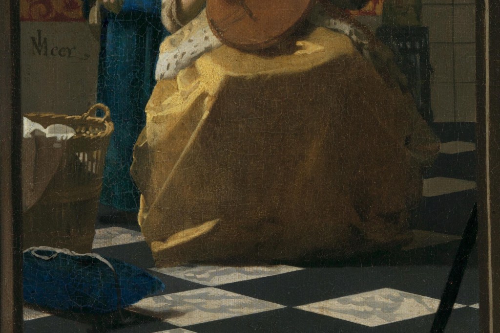
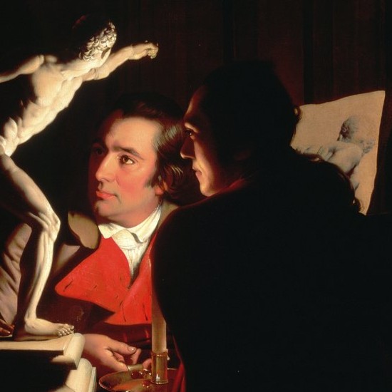
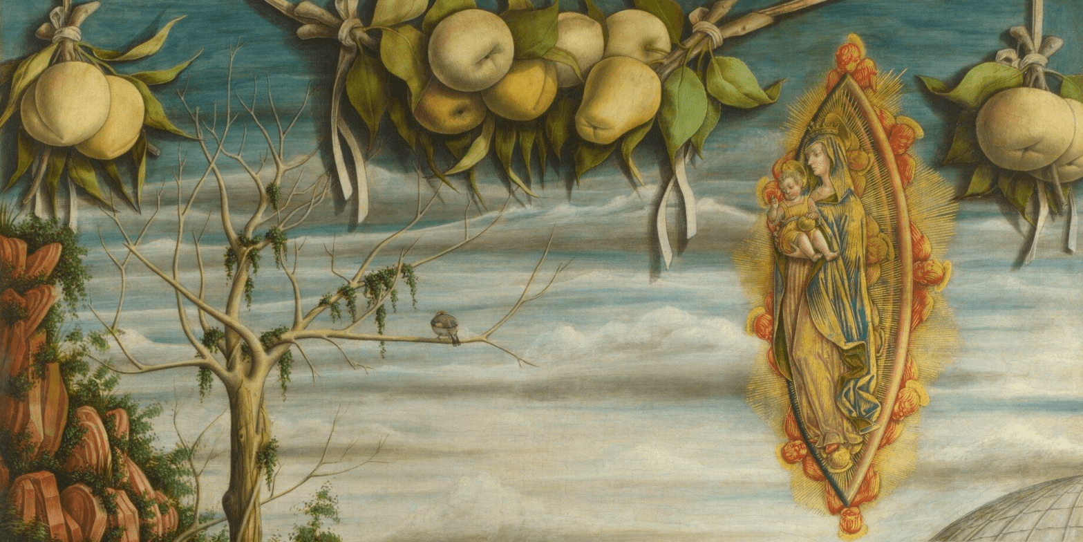
I think it is the delicacy, subtlety and precision of the drawing style which really grabbed my attention. In this detail the white rose shines out, each petal differentiated, the top edges curling back to catch the light which appears to be falling from above, so that the curls cast shadows on the outside of the petals themselves. The forefinger of his left hand is crooked, and appears to be about to pluck one of the petals, as if he were playing what would be a fairly lengthy game of ‘she loves me, she loves me not…’ – there are a lot of petals to go. The thumb is out of sight, and the remaining three fingers are bent, lying alongside one another and separated by the subtle shading of the red chalk, which also models the knuckles and the veins running across the back of the hand. The fingers of the right hand – holding the rose – seem more tightly pressed together. Is there a symbolism to the rose? Possibly – and its brilliance suggests that it is, at least, important to the drawing as a whole. It is white, so it could refer to purity – but it might just be an artistic choice, matching the friar’s habit. It might refer to the Virgin Mary – a pure, white, rose without thorns – but I’m not sure that Hughes would have been aware of that particular aspect of the rose’s symbolism. Mind you, given the Victorian love of ‘the language of flowers’, it is possible. The lower hem of the cowl crosses behind both hands, and on the right of the drawing it flexes out over the crook of the subject’s left elbow, allowing Hughes to show off his ability to modulate the red chalk and create a superb sculptural effect. The dark shadow underneath this curving section of the hem creates a real sense of depth.

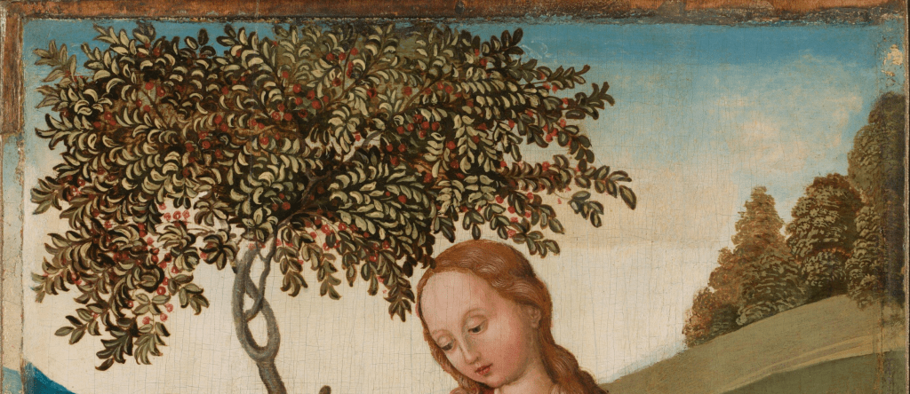
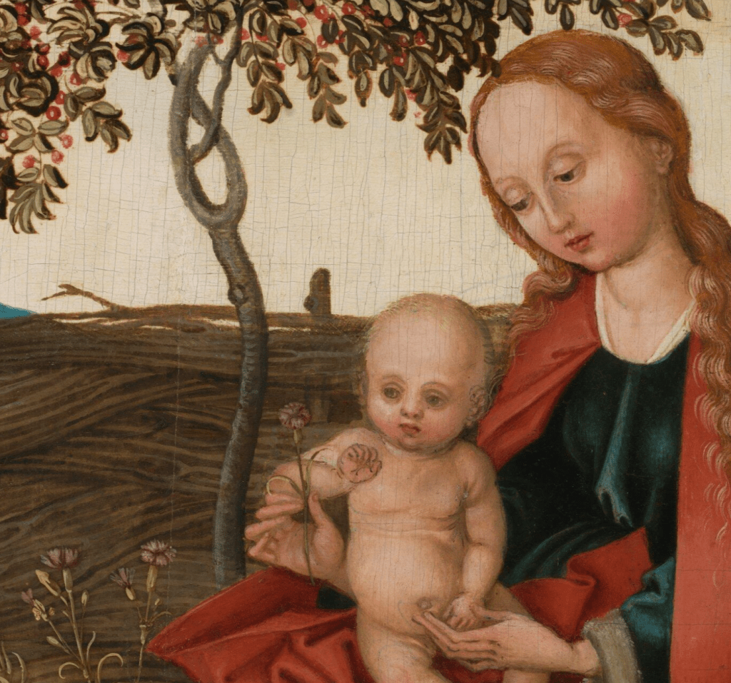
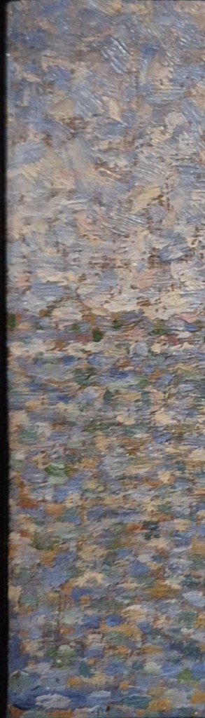
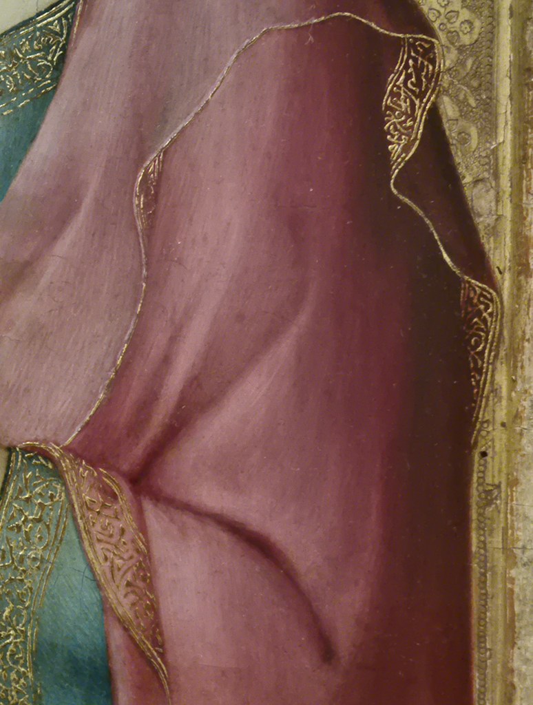
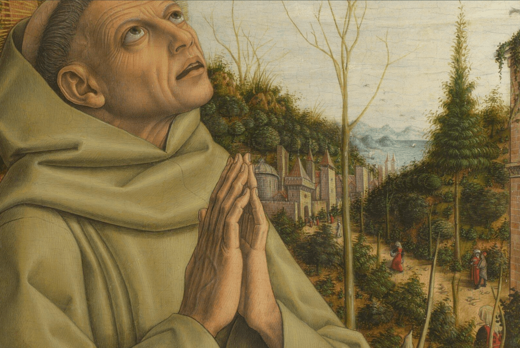
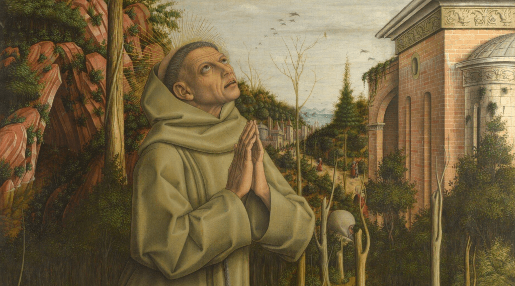
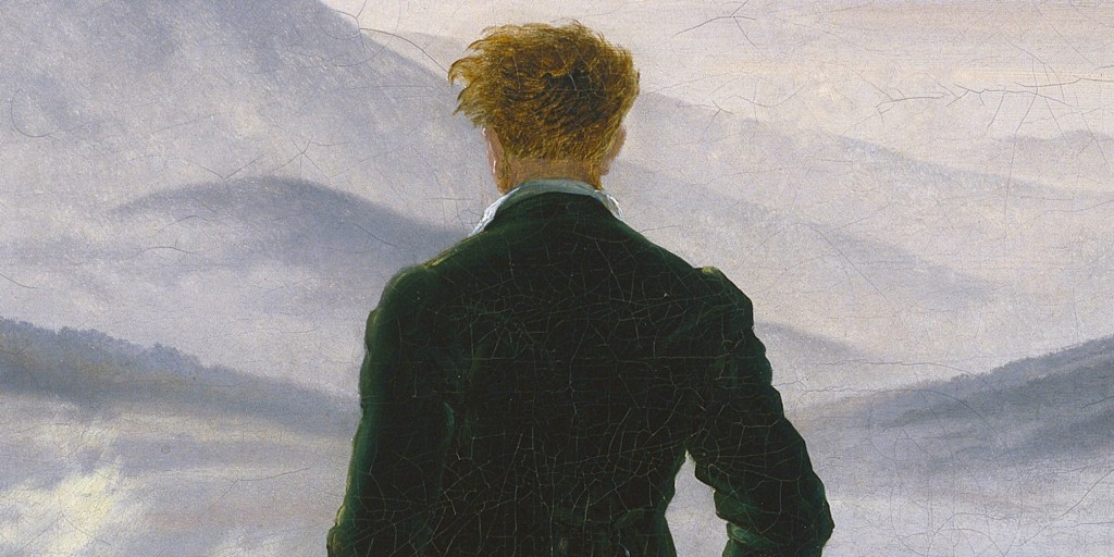
This young man is undoubtedly the most handsome member of a religious order I have ever seen. Hughes delights in the subtle variation of tone which defines the depth of the eye sockets, the curve of the chin, the slight hollowing of the cheek next to a slightly protruding mouth, with its full, soft lips. The subject has a healthy head of brown hair, short to medium-length and slightly tousled, framed by the thin white hood of the cowl, which falls, translucent, on either side of the neck. It seems to glow from behind, once more enhancing the sculptural nature of the depiction, and creating space around the columnar neck. His deep-set brown eyes look out, maybe slightly distracted by something over your right shoulder. Behind him is an urn, with a plant growing around it – possibly the rose from which he has plucked the bloom – and above that is a balustrade, implying that this is a garden set on more than one level.
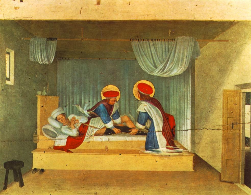
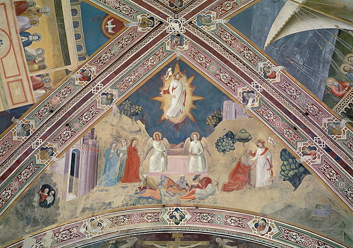
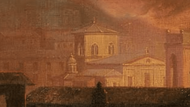
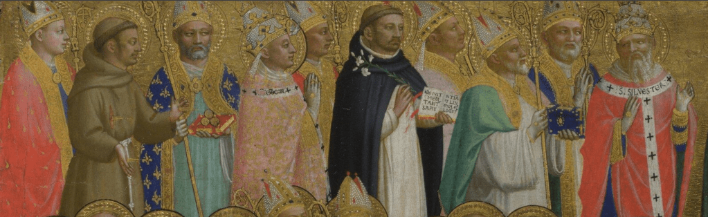
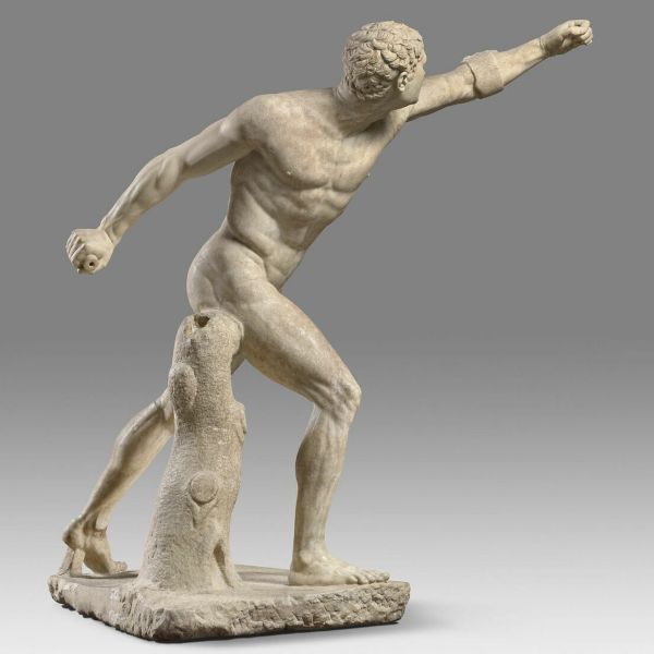
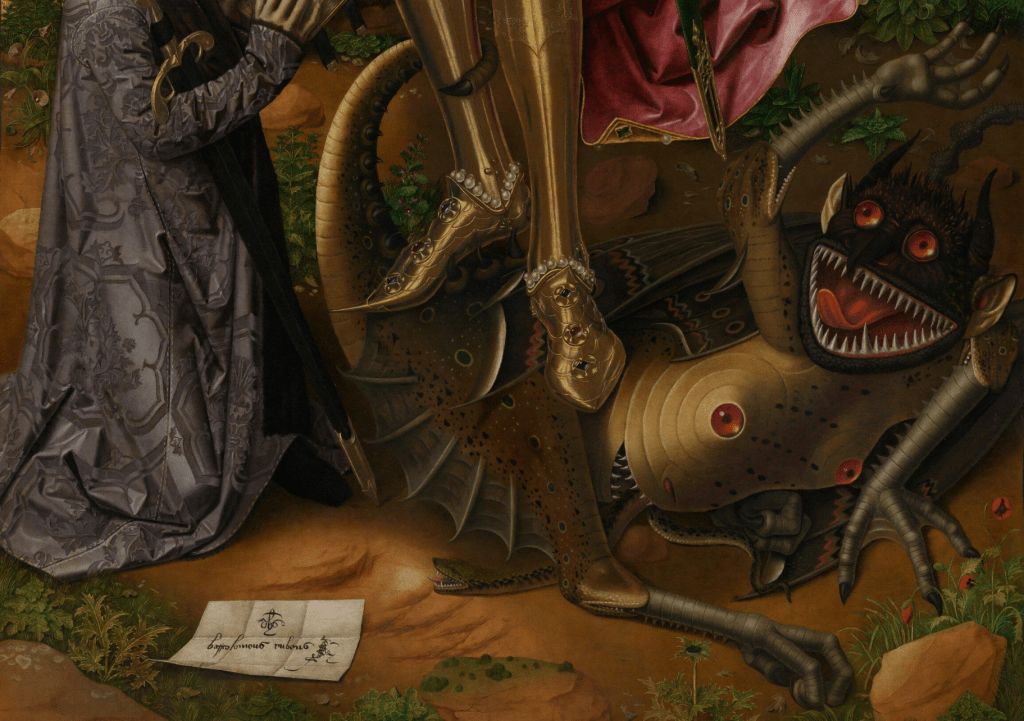
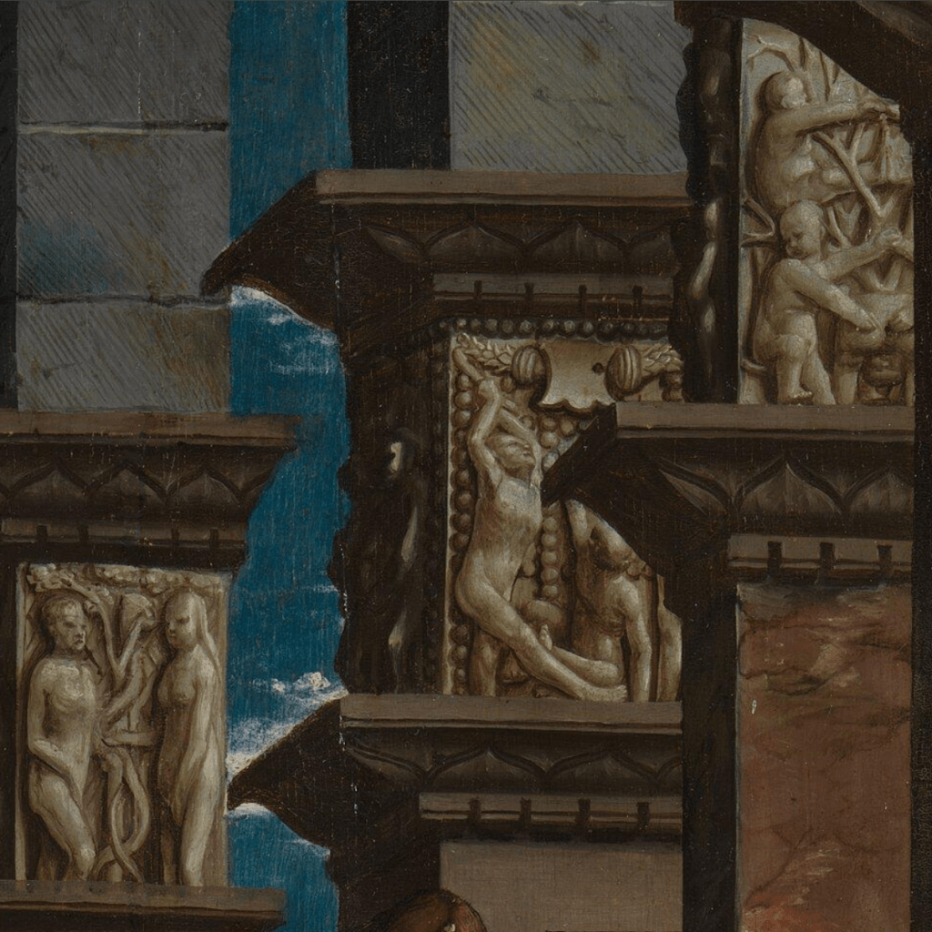
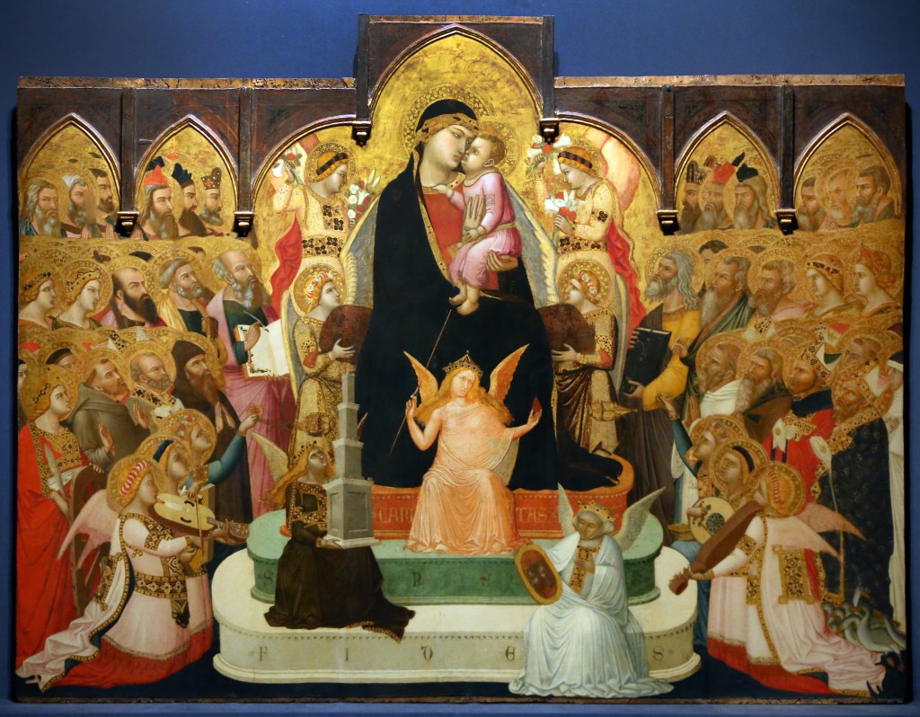
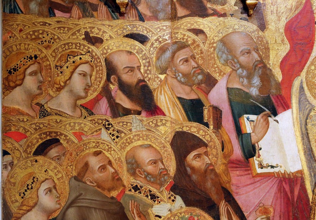
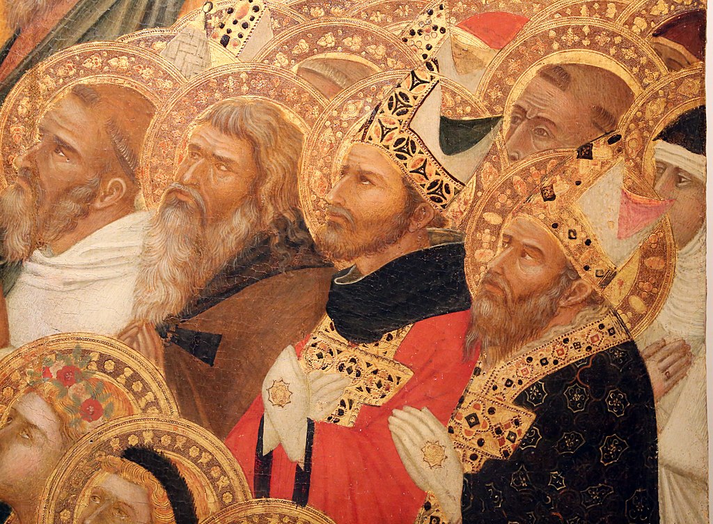
He belongs to the Carmelite order – known in Britain as the White Friars, after the white cloak and cowl worn over their brown habits. Originally hermits on Mount Carmel in Palestine from as early as 1150, they moved to Western Europe around 90 years later as a result of conflict in the ever-warring ‘Holy Land’. They were friars rather than monks – a mendicant order – so they were not expected to live an enclosed life. The most significant Carmelite convent for the History of Art is quite possibly Santa Maria del Carmine in Florence – as that is where Masaccio and Masolino painted the Brancacci Chapel, often referred to as ‘The Cradle of the Renaissance’.

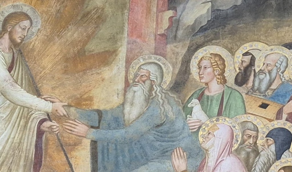
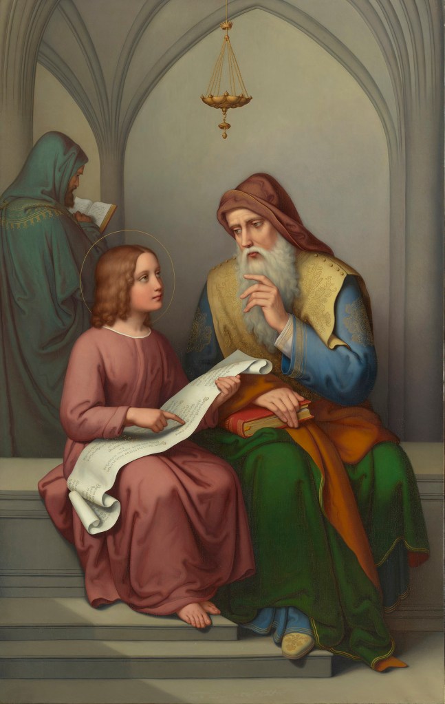
Just to make the point, here is St Peter Enthroned by Masaccio – from the Brancacci Chapel. Unexpectedly, perhaps, it shows a number of Carmelites as witnesses, despite the fact that this event – if it ever happened – would have been over a millennium before the order was founded. But Carmelite myth, not to mention artistic license, would suggest otherwise. However, our subject today is a very specific Carmelite – as is made clear by the drawing’s title, not to mention the words written in a reserved section of white paper in the top right corner:

All the Latin I construe is, ‘Amo’ I love!
Some of you will, no doubt, have been thinking of this already. The clue is partly given by the name in the title, ‘Fra Lippo Lippi’, as art historians nowadays almost always (well, always, as far as I am aware) refer to this man as Filippo Lippi – or Fra Filippo Lippi – who was indeed a friar of the Carmelite order. But the quotation above is from Fra Lippo Lippi, the title of a poem by Robert Browning – who lived for a while on the Oltrarno in Florence, close to the Palazzo Pitti, and not so very far from Santa Maria del Carmine. As Lippi says in line 7 of the poem, ‘The Carmine’s my cloister: look it up’. Both his father, a butcher, and his mother had died by the time he was two, and as his aunt could not afford to look after him, she placed him in the convent at the age of eight. It was hardly a calling – and he wasn’t always entirely saintly. He left the Carmine in 1432, but did not renounce his vows… nevertheless, commissioned to paint for an Augustinian nunnery in Prato, he had an affair with the young novice Lucrezia Buti, the result being ‘little Filippo’ – Filippino Lippi, the artist who, with no little irony, completed Masaccio and Masolino’s frescoes in the Brancacci Chapel.
Filippo would have been about 50 when Filippino was born… so the younger artist would not even have been a glint in his father’s eye when Hughes imagines this ‘portrait’ as having been taken: I would say he looks in his mid-20s, but I’ve never been a good judge of people’s ages. Nevertheless, as the quoted line suggests, there does seem to have been some sort of a glint inended…
The poem is one of the dramatic monologues which Browning made his speciality. At the beginning of the poem, Fra Lippo has been taken by the police – perhaps Browning was thinking of the Ufficiali di Notte – the ‘Officers of the Night’ – who had been established in 1432 (when Lippi would have been about 26) to keep an eye out for sexual activity between men, clearly deemed to have been a problem at the time. But that’s not what Lippi has been up to. As he says towards the beginning of the poem,
What, ’tis past midnight, and you go the rounds,
And here you catch me at an alley’s end
Where sportive ladies leave their doors ajar…
However, precisely what he was doing there we only gradually discover. He tells us of his parent’s deaths, and about his aunt taking him to the Carmine, and then, how the other Carmelites treat him:
“Let’s see what the urchin’s fit for”—that came next.
Not overmuch their way, I must confess.
Such a to-do! They tried me with their books:
Lord, they’d have taught me Latin in pure waste!
…
All the Latin I construe is, ‘amo’ I love!
The implication is that he didn’t see himself fit to be a friar, and learning Latin would have been no use. The line quoted in the drawing implies as much… he knows what love is, but little more, and Hughes shows us a young man in love, or looking for love, or longing…
But what is it, specifically, that attracted Hughes to this poem, and to Browning’s version of Filippo Lippi? Is the romantic notion of a lovelorn cleric enough? More specifically, Lippi’s discussion – in the poem – of what art is, and what it should be, was probably more important. Browning imagines Lippi’s superiors being sceptical of his naturalistic depiction of humanity, the flesh and bones, as if this were all too worldly, not nearly spiritual enough. They claim that he would never match the ‘old masters’ Fra Angelico and Lorenzo Monaco – a Dominican friar and Calmaldolese monk respectively. Lippi tries to explain his ideas, but,
The heads shake still—‘It’s art’s decline, my son!
You’re not of the true painters, great and old;
Brother Angelico’s the man, you’ll find;
Brother Lorenzo stands his single peer:
Fag on at flesh, you’ll never make the third!’
Keep going with your naturalism, they say, and you’ll never rank with the greats. You should be more spiritual. How has Lippi tried to justify his work? It’s quite simple, really.
If you get simple beauty and nought else,
You get about the best thing God invents…
I find it hard to disagree with that. It’s also clear that Lippi believes in naturalism, the depiction of details, as that brings us close to the truth – as opposed to a spiritual idealism that has little to do with the world we live in. In many ways, his views are those expounded by the Pre-Raphaelites, who very often concentrated on the minutest details of the natural world – as we will see on Monday. And maybe it was this that inspired Edward Robert Hughes to make this Study for a Picture. The ‘picture’ itself was never painted – perhaps he never meant it to be – but I can’t regret that. The drawing is perfect… the painting may have let it down.


