
Johannes Vermeer, The Milkmaid, c. 1660. Rijksmuseum, Amsterdam.
The Milkmaid, to whom I want to return today, rejoices in a room to herself in the Rijksmuseum’s stunning Vermeer. Brilliantly reviewed, and now completely sold out, the exhibition will be the subject of my talk this Monday, 13 February at 6pm which I have called Vermeer: Amsterdam ’23. If you are lucky enough to have secured a ticket for the exhibition, I hope this talk will be a good introduction. If you haven’t, I will give you a (virtual) guided tour of the paintings, so you’ll know what is there, with the added advantage that no one will get in your way! Spoiler alert: I will only talk about the Vermeers in the exhibition. The will be no comparative materials, just Vermeer, just looking, in line with the clean-cut design of the display itself. Second spoiler alert (and a date for your diaries, perhaps): on 5 June, the day after the exhibition closes, I am thinking of celebrating its success by talking about the ‘other’ Vermeers – the ones which, for one reason or another, didn’t make it to Amsterdam this year. Trust me, there’s always more to be said! And there will be plenty more before then, of course. On 3 April, for example, I will talk about the Estorick Collection’s fantastic display of paintings, etchings and drawings by Giorgio Morandi from the Magnani-Rocca Collection – you can find more details on the blue link.
Last week I mentioned that one of the women waiting for the ferry in the foreground of the View of Delft looked familiar. Wearing a yellow bodice and blue apron, she is remarkably similar to The Milkmaid. I wrote about her first on 14 February 2021 (during lockdown 3?), and re-posted the blog in the September of the same year when I was in Dresden for the exhibition Vermeer: On Reflection. The Milkmaid was not in that exhibition, but as she has the honour of a room to herself in Amsterdam, I thought I would use this as an opportunity, for the first time, to give her the admittedly dubious honour of re-posting a blog for the second time…

When I first posted this blog I was having trouble deciding whether I find this painting disarmingly beautiful or beautifully disarming – I’m sure there’s a difference. But also, I was wondering, if it is one, or other, or even or both of these things, what is it that creates this impression? It is a painting that, for whatever reason, I do find very beautiful, and this always makes me try to analyse where that beauty lies – a process which can all-too-easily kill the simple pleasures of looking. It is disarming, I think, because at first glance it looks so simple, and yet it is hypnotically compelling. Vermeer paints everything with such apparent honesty and conviction that we remain convinced that there must be something more profound going on than the simple act of pouring milk. To try and work out if there is, I’m going to start at the top and work my way down.

I’ve always loved the way Vermeer paints walls. It’s never a case of getting out the roller and covering the whole surface with white matt. What we see is subtly modulated, with every square centimetre differentiated from every other. The setting – a corner of a room with a window on the left – was not his invention: it had already been used by artists for about 10 years by the time he picked up on it, it seems, and from then on he used it regularly, often returning to the same, or similar, corners. With the window a little way in from the back wall, the corner itself is left in shadow. The light passes through the glass at a diagonal, and illuminates the back wall away from the corner, the illumination getting ever brighter as we move to the right. Two nails are driven into the wall, and the higher of the two, further to the right, is in the light. It casts the sort of diffuse shadow that suggests this is large window, far higher than the part of it we can see in the painting. On the left a wicker basket – used for shopping, presumably – hangs from a similar nail, with a highly-polished copper pail hanging from another on the back wall. Above the basket we see what is probably a small picture: it’s too high to be a mirror. To the left of the nail from which the basket is hanging one of the panes of glass has been broken – there could easily be a a breeze coming through – and in the pane below this the glass is cracked, with the broken edge catching the light. If you go down one more pane, and two to the left, another of the small plates of glass threatens to fall into the room. The attention to detail is breathtaking.
The fall of light from left to right illuminates the maid’s face, showing its bold, simple forms: a down-to-earth presence, whose broad features would have been interpreted as indicative of her lowly status. The light also charts the very specific folds of her simple linen headdress, especially to the left of her face, where the sharp fold at the level of her forehead gradually opens out, so that, as it gets lower, less light falls on the fabric. As the hem curves forward the lower edge is left in shadow.

The light is one of the features which creates the attention-grabbing boldness of the central figure, and renders her monumental. Her right shoulder (on our left), the top of her right arm, and especially the back of her right hand – the one holding the handle of the jug – are brilliantly illuminated, making them stand out against the shadows on the wall. On our right, the shadow which forms the curve of her left shoulder, and the right side of her left arm, stand out against the brilliantly illuminated wall behind. Vermeer enhances this by painting the thinnest of white lines around the edge of the sleeve as it comes down from the shoulder. The reversed contrasts of light and shade push her towards us, making her more immediate, more sculptural, more entirely present. Not only that, but the perspective pulls our eyes towards her. The horizontals of the window frame and the leading which holds the glass in place form orthogonals receding towards a vanishing point, placed at the crook of the maid’s right arm. As the vanishing point is theoretically our point of view, this means that our attention is focussed on the action of holding the jug and pouring.
The colour is also subtly vital. Her bodice is yellow, and she wears a blue apron. For me this is still a surprising colour for an apron (even given that I know nothing of the history of aprons), especially as Vermeer has used that most prized of pigments, ultramarine. The bodice uses lead-tin yellow, another good, traditional pigment, but nowhere near as expensive. For the sleeves – which are rolled up – he mixes the two to create green. It is almost a lesson in basic colour skills: yellow mixed with blue makes green – and in this case, the specific yellow of her bodice mixed with the distinctive blue of her apron makes this particular green.
The attention that the maid gives to the act of pouring also demands our attention: if she takes it this seriously, then so should we. This is not a haphazard act, but a careful, determined action, the support given to the milk jug by her left hand helping to make sure the liquid flows at precisely the right speed.
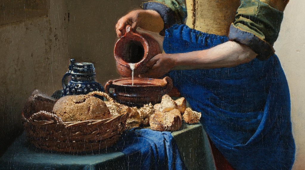
The measured flow of the milk has made people think that she is doing something specific, and one suggestion is that she is preparing a bread pudding. There is plenty of bread on the table, after all, and some of the pieces next to her bowl appear to have been broken. You have to put in exactly the right amount of milk, apparently, or the pudding would either be too soggy, or the bread would dry out and become too hard and crunchy. This is simple fare, made from wholesome ingredients with good honest labour. Again the light plays a major part, showing us the deep, sculptural folds in the sleeves and apron, and the form and textures of the bread and basket. Yet it does not do this with the highly focussed detail of a fijnschilder – or ‘fine painter’ – the name for artists like Gerrit Dou whose every surface is an almost microscopic exploration of precise surface textures, without a single brushstroke being visible. In contrast to the fijnschilder, and as if he were a precursor of Seurat and the divisionists, Vermeer builds these objects up through a myriad of dots and dabs of paint. You don’t believe me? Look at this.

When talking about Vermeer it is hard to get away from the theories which try to explain his peculiarly focussed vision by suggesting that he used a camera obscura – basically a form of pinhole camera that projects an image onto a surface and allows you to trace the outlines. However, this would only provide the outlines, and not the colours or textures. Admittedly, the images a camera obscura produces can sometimes include some of the effects he uses – the bright, blurred highlights, for example. Although, if you think about it, you only get bright highlights on shiny objects, not on matt loaves of bread. This may well be the sort of effect you could see with a camera obscura, and that may be where he got the idea – but he would never have seen the particular highlights painted here. They are part of the magic of the image, and create the wonder – and some of the texture – of this fresh bread, the bounty of this work-a-day basket. As it happens, the construction of the perspective also suggests that he didn’t use a camera obscura: it isn’t traced, but drawn. Technical examination has revealed a pin hole in the canvas itself, at the crook of her right arm – the vanishing point. Vermeer would have inserted a pin, and tied a piece of thread to it. This could be covered in something like charcoal dust, pulled taut, and then snapped against the canvas to ‘draw’ lines onto it. It was a common way of working out perspective, as the lines drawn inevitably lead to the vanishing point.

When we get down to the bottom of the painting the lesson in colour continues. Under the apron the maid’s skirt is red – so she is wearing muted versions of the three primary colours, yellow, blue and red. This particular shade also harmonises well with the brick-red floor, and the ceramic pot, one of the truly revealing details in this painting. It is part of a footwarmer – a wooden box, with a perforated top – and the pot would have held hot coals. A practical object perhaps, given that we are presumably in a cold kitchen, ideal for keeping and using dairy products, although the footwarmer is very small compared to the size of the room. In any case, footwarmers were used when seated. Behind it is the wainscoting, made of Delft tiles – local produce, of course, as it was in Delft that Vermeer lived and worked. Three tiles are visible, and the imagery of two of them can be read. On the left is cupid, wings to the left, firing his bow and arrow to the right, and to the right of the footwarmer, there is a man with a walking stick. Are these relevant? Probably. Have a look at this picture from the Sinnepoppen, an emblem book published by Roemer Visscher in 1614.
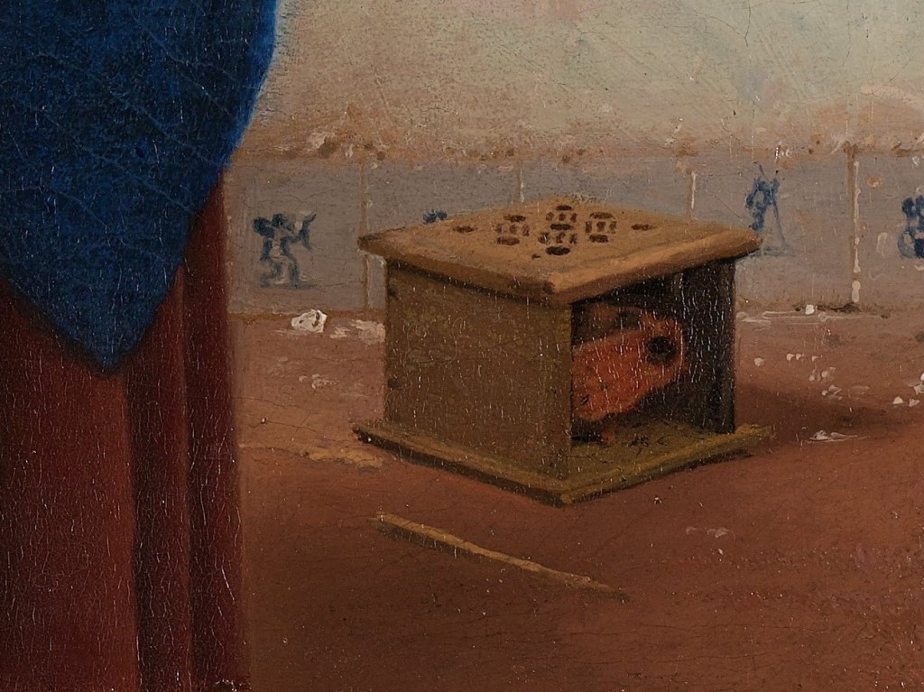

Any emblem has three elements, ‘pictura’, ‘inscriptio’ and ‘subscriptio’ – or picture, heading, and explanation. For the title of his book, Visscher invented a new word – where ‘sinne’ means the ‘sense’ of the emblem, and ‘poppe’ means the image. By creating a word that combines two elements from which we can determine the meaning, he is echoing the function of an emblem precisely. Neither the pictura nor the inscriptio gives the full sense on its own – they have to be considered together. The relationship between them – what, together, they mean – is explained in the subscriptio. In the example above, ‘Mignon des Dames’ means “the ladies’ favourite” – as in sweetheart, or lover. The subscriptio goes on to explain that modern ladies love nothing so much as a foot warmer, as it provides them with constant warmth. Any man who wanted to pay her court would find himself playing second fiddle to this household object. They can be seen often in Dutch 17th Century genre paintings, but even Visscher’s explanation doesn’t fully account for their presence. That is because Visscher wants you to be as clever and inventive as himself, and is always expecting you to make connections and take the meaning further. Think about it: when seated, the hot coals would fill the user’s skirts with warmth. Presumably, any potential lover would have to prove as reliable if he wanted any degree of success. Combined with the image of cupid shooting an arrow towards the source of heat, the implications are that our maid could easily be the subject of inappropriate attentions, welcome or otherwise. It’s worthwhile bearing in mind that it was usually assumed (by men, of course) that milkmaids were sexually forthcoming.

Having said all that, from this point on you can make up your own mind. And that’s not because I don’t want to tell you what is going on here, or because I don’t know what is going on here, but because Vermeer’s great genius includes the ability to leave things open. Is it coincidence, for example, that her skirt plays with the same tonalities as the earthy floor and the glowing coals, which we can imagine but not see? Does it imply a heat within? Or does the fact that she is standing, at work, rather than sitting down enjoying the welcome updraft, suggest that she is a figure of virtue, rather than potential quarry, worthy of pursuit? It’s possible that the very title of this painting is incorrect, as it happens. A milkmaid would work outside, with the cows, milking. The woman in the painting is really a kitchen maid (although in some households they did double up, apparently). But then, kitchen maids often had the same reputation.
I cannot get away from the care with which she pours, and I suspect that Vermeer is questioning the assumptions we make about the people, and objects, depicted by his contemporaries. The first assumption is that milkmaids – or kitchen maids, for that matter – were bound to be ‘up for it’. After all, in this case, she seems entirely focussed on her work. The tile with cupid and the footwarmer might imply sexual impropriety – but do either have any effect here? In other hands the jug itself might seem suggestive. Artists like Jan Steen regularly show women holding vessels with open apertures towards men who reciprocate with any number of phallic equivalents, from bulging bagpipes to pistols cocked. And yet here the act of spilling – which could be a sign of incontinence – of sexual incontinence, that is – is entirely controlled, and measured. If our maid represents anything, then maybe, for Vermeer, she could be a modern-day Temperance. Compare her with this print by Jan Saenredam, made in Haarlem in 1593, based on a design by Hendrick Goltzius.


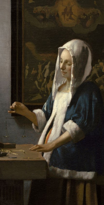
This is the most common representation of Temperance – although not the one we saw painted by Giotto, who has her sheathing her sword (see Day 59 – Virtues vs Vices), or for that matter, the version painted by Ambrogio Lorenzetti in his Allegory of Good Government, in which she watches the first known image of an hour glass. In Saenredam’s personification she carefully pours liquid from one vessel to another – usually interpreted as watering down the wine, a true sign of Temperance, as opposed to complete abstinence. This careful, measured pouring is precisely what our maid is doing. And if she is Temperance, then maybe we could interpret another of Vermeer’s paintings, Woman Holding a Balance, as a personification of Justice. The comparison here is also from the series designed by Goltzius in 1593, but this time executed by different student, Jacob Matham. I don’t have time to say more about this painting now, unfortunately, but, as it is in the Amsterdam exhibition, I will include it in Monday’s talk, Vermeer: Amsterdam ’23.

Before then, though, what conclusions can I draw about The Milkmaid? Is she awaiting an assignation, or, conversely, distracting herself from temptation by concentrating on her work? Is she a figure of virtue, expounding the positive values of honest labour? Could she be a personification of Temperance? Vermeer’s focus, his attention to detail, the care with which he has structured the composition, combined colours, balanced tones, and modulated light, not to mention the dignity he gives to his subject, an apparently commonplace maid made monumental, suggests that there must be more than meets the eye. What is this painting about? What is going on? Well, there is a woman pouring milk. What more do you need?

Can I REALLY get a ticket to this exhibition by clicking on the link? It seems to good to be true!
>
LikeLike
No. You really can’t. And I’m afraid nothing here says that you can. It says you can get a ticket to my talk about the exhibition. Sorry to disappoint you.
LikeLike
Thank you so much for taking the time to reply. I’m so sorry to have missed your Vermeer talk as it must have been utterly fascinating.
LikeLike
Loved your Artscapades/Vermeer lectures. Havenât got a ticket but may try and go to Delft and Amsterdam.
You may not remember but I asked you for a possible list of the treasures that you introduced on your Christmas lectures. I really would like to head to the Wallace and search them out.
Looking forward to your next Blog
Kind regards
Rosemarie McGurk
LikeLike
Thank you, Rosemarie, I’m so glad you enjoyed the talks… such a pity that exhibitions like this have to have limited numbers, but the Delft exhibition is worth it in its own right – and it is the perfect time to go to Delft. After 1 April it would be worth going to The Hague (it is, anyway), as The Girl with the Pearl Earring will return to The Mauritshuis, which also has the The Goldfinch. Delft is 10 minutes from The Hague on the tram, and so you could get a good full day there – but then, it’s only an hour on the train from Amsterdam!
LikeLike
Big thank you for your prompt response.
LikeLiked by 1 person
Thank you for a stonker of a talk tonight!! After you twiddled with your images you froze so I thought I should let you know sorry, hate interrupting your train of thought. You are SO brilliant please book a longer session we need to enjoy your vast knowledge and big thanks for talking and taking us through the exhibition, so blissful for those of us who aren’t going.!! Enjoy Lisbon, my husband’s favourite European capital!
LikeLike
Oh, thank you, Mo – I’m so glad you enjoyed it. And thank you for pointing out the technical blip – it’s really important as I have no support crew, apart, of course, from my wonderful audience. I was just confused because no one else seemed to have a problem. Even after it was resolved I hadn’t realised it was only me you couldn’t see, rather than the presentation – and I’m glad people were focussing on the paintings rather than me!!! I know there was so much to cover, I could have made two talks of it… but I don’t want to take up too much of people’s time.
LikeLike
Dear Richard,
A huge thank you for this utterly superb post – your attention to detail and fresh insights are simply breathtaking. You have made us really look at The Milkmaid and see it in a totally new light.
We watched your Artscapades talk last night, as we couldn’t watch your Vermeer talk on March 6 . What a tour de force – it was magnificent. Thank you, you really brought both exhibitions into our home.
We were just wondering what you thought of the Rijksmuseum catalogue of the exhibition as the reviews are very mixed and we, as yet, haven’t seen it for sale. Unfortunately we won’t be going to Amsterdam but would consider buying the catalogue if you thought it worthwhile.
Many, many thanks for the incredible talks you give and we look forward to watching your talk about Morandi.
With very best wishes,
Angela and Ken Carruthers, Bristol
LikeLiked by 1 person
Thank you so much! I’m so glad you enjoyed the post, and the talks.
The catalogue has a lot of great material in it, and a lot of useful visualisations: reproductions of all of Vermeer’s paintings (including the 3 disputed ones, all of which the Rijksmuseum accepts) to scale – so you can see their relative sizes. There is also all of the previous bibliography in a separate section at the end (but only an academic would read all of that!). The reproductions are good, and the essays are interesting. However, their division into themes is problematic – as it is for the exhibition, I think – as so many of the paintings could sit in so many of the themes. Rather than an individual essay for each painting, there is one for each theme, from different authors, which is probably a good thing – hearing different voices is (almost) always valuable, I think. However, it doesn’t come close to the Wheelock catalogue of the 1996 Mauritshuis/NGA exhibition catalogue, I don’t think… Admittedly, I haven’t had time to read it all – my talks came so soon after I got it, and now a colleague has it… But the Amsterdam ’23 probably is the best Vermeer book in print now, I think.
LikeLike
Dear Richard I very much enjoyed the sessions you did on the Delft and Vermeer exhibitions a month or so ago. Are they still accessible anywhere? I have a friend who is going to the Vermeer exhibition in May, and is keen to do as much preparation as possible, and I’m sure would love to see them. Any pointers would be very gratefully received. Many thanks Barbara Maughan
LikeLike
Thank you, Barbara, I’m so glad to hear you enjoyed the talks – although I’m afraid that, for all sorts of reasons, I never record them, so I’m afraid they are not available anywhere. However, if your friend is based in London, I am giving an introduction to the Amsterdam exhibition at the Dutch Centre next Wednesday evening, 26 April:
https://dutchcentre.com/eventer/highlights-from-the-vermeer-exhibition/edate/2023-04-26
All best wishes, Richard
LikeLike