271 – Drunk on light

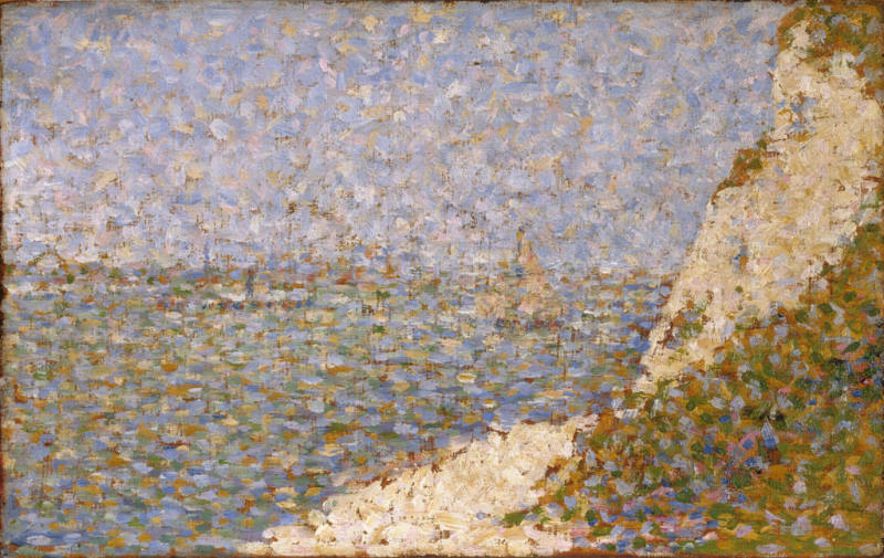
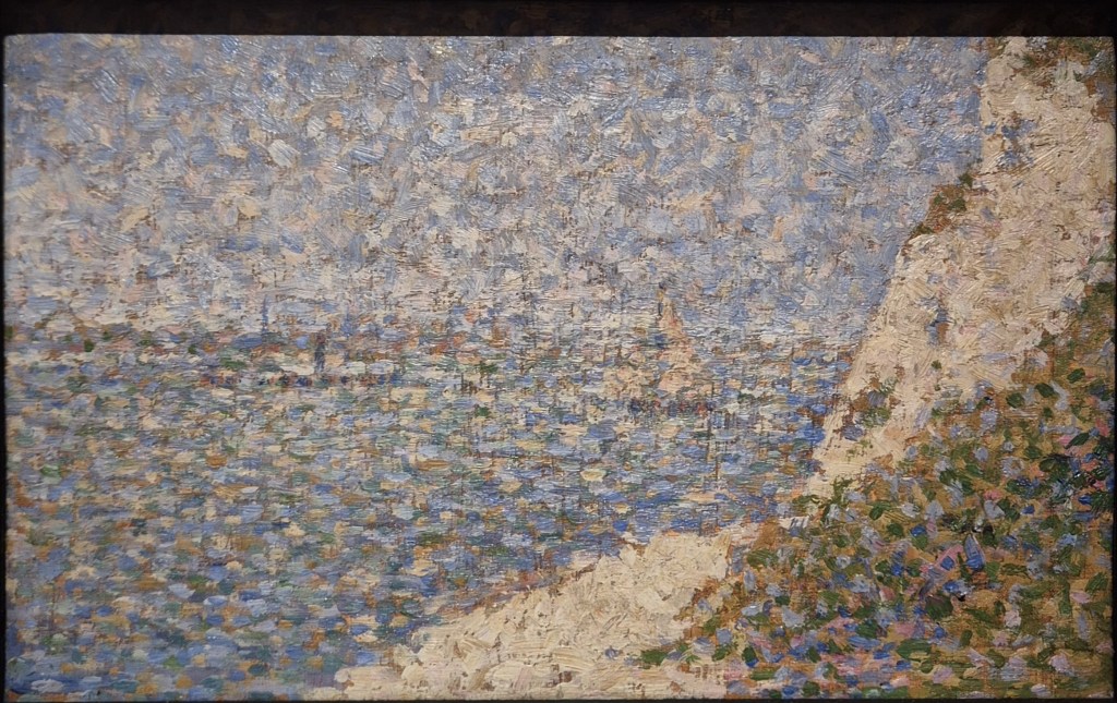
Georges Seurat, Study for ‘The Shore at Bas-Butin (Honfleur)’, 1886. Baltimore Museum of Art.

I’ve mentioned it a couple of times already, but The Courtauld’s enormously successful Seurat and the Sea is selling out regularly – but not too far in advance, fortunately (most days next week are still available, for example). I will be talking about the exhibition at 6pm this Monday, 23 March if you want any encouragement to book!  The following week, Monday 30 March, I will introduce the Royal Academy’s display of works by the wonderful Michaelina Wautier, which I will have seen just a couple of days before. This will give me time to assess whether she really was ‘one of Europe’s most important artists’ as the RA’s website claims. From what little I’ve seen in the flesh – and from photographs – she does seem to have been truly remarkable. However, I’m never entirely sure what the word ‘important’ means – there are so many different ways of assessing importance. I’m sure it will be one of the things that we will consider during the talk, though. Before then I am heading to the Kunsthistorisches Museum in Vienna to see – and review – their next exhibition, Canaletto & Bellotto. This will be the first to compare the travels of the artists who, as well as being master and pupil, were also uncle and nephew. I will let you know what I’ve seen on Monday 20 April, focussing, as the exhibition will, on the artists’ travels outside of Venice. The above events are already in the diary, and soon I will add more: introductions to The Courtauld’s A View of One’s Own (landscapes by women) on 27 April, and Michelangelo and Rodin, at the Louvre, on 11 May – and I’ve already planned what I want to talk about after that.

If you do book any of these events, Tixoom will send an email with the ticket – effectively a link to the talk – within seconds. If it doesn’t arrive within 24 hours, do let me know and I’ll try and sort it out: it would be easier to do then, when there’s time to spare, than 5 minutes before the talk! You should also get reminders 24 hours and 15 minutes before the talk, and these too will include the link.

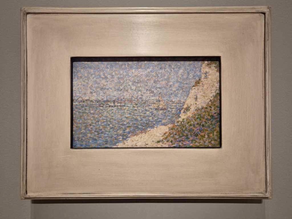
This is how today’s painting, Seurat’s Study for ‘The Shore at Bas-Butin (Honfleur)’, appears in The Courtauld’s exhibition, and presumably how it is exhibited at the Baltimore Museum of Art, which owns it. A small wooden panel, measuring 17.1 x 26 cm, is framed by a flat white frame which must have at least twice the surface area of the painting itself. It is so often the way that the status of small works of art is proclaimed by giving them relatively large frames, thus making them take up more wall space. As a ploy it is perfectly understandable, but counter-productive for close viewing: it doesn’t necessarily help us to see them any better. Seurat did regularly exhibit such small works, though, either individually, or framed as a group. They were created either as works in their own right, or as studies for paintings on canvas. He also used them to get to know a motif better, an exploratory process which helped him to understand a particular location and so to decide which views to focus on. He gave these studies the name ‘croquetons’, a term derived from the French word ‘croquis’, meaning sketch. He produced them regularly during his short life, and after his premature death, at the age of 31, 163 were recorded in his studio. Like so many preparatory, or exploratory works, they are relatively freely painted, spontaneous, and sometimes (as far as I’m concerned) more interesting than the controlled and contained works which are derived from them.

In order to look at the imagery with greater clarity, I am going to cut out most of the frame.

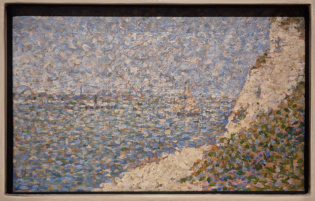
We appear to be looking out over the sea, but a faint horizontal line of cream-coloured dots about halfway up the painting on the left would tell us – if we could read it more clearly – that we are looking across the mouth of the River Seine. Bas-Butin is on the Normandy Coast, very close to Honfleur, which Seurat visited in summer of 1886. It is on the other side of the river, and a little upstream, from Le Havre. The sky is a mixture of mottled dabs of light blue and cream, while the water varies from dark blues, near the shore, to greens further out, with the same cream colour intermixed throughout. This cream is the basic colour of the beach, a triangle of which appears at the bottom of the panel in the middle, and the cliff, also seen as a triangle, coming down from the top right of the painting. The bottom right corner is filled with vegetation, defined by a range of greens, blues and pinks. More patches of plants can be seen at the top of the cliff, and across its surface.

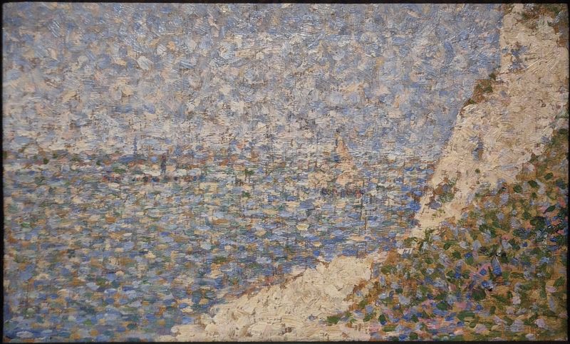
I took the photograph above myself, and, as usual, the works in the exhibition are illuminated from above. However flat the frame is, it still casts a shadow across the top of the painting, although there is very little we cannot see. The first image below is a rather low-resolution file (which also seems to be out of focus) from the Baltimore Art Gallery’s website, the second is my image with the shadow cut out.

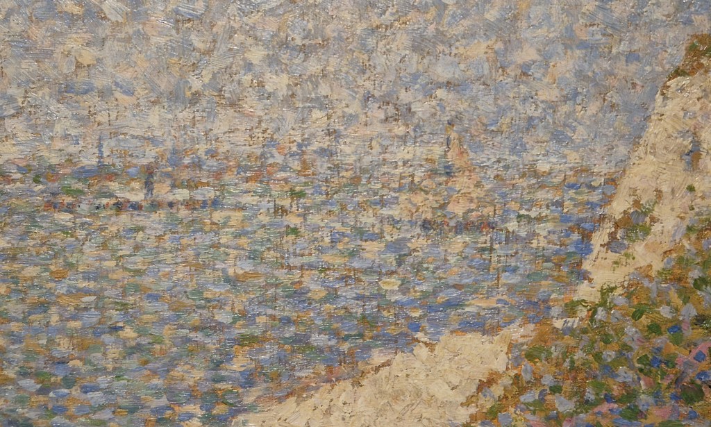
There’s just a little bit of vegetation missing from the top right corner in my photograph – together with the equivalent strip of sky, of course. The colours are a bit different… probably the fault of my phone, although the following detail, which I also took, appears to be closer to the lighter, sunnier colours of the Baltimore file.

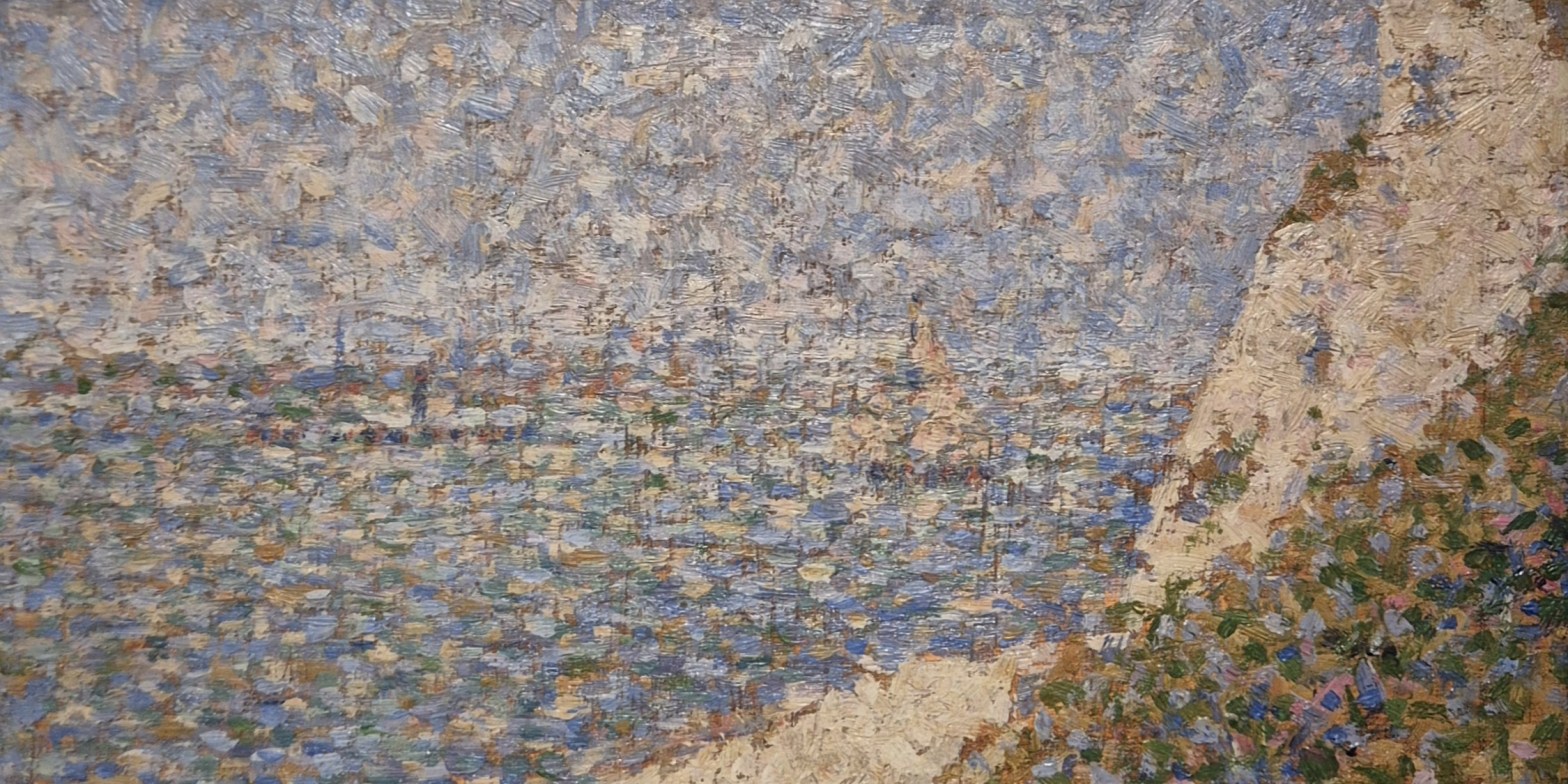
The detail focusses on the part of the composition which I think had attracted Seurat to this motif – the place where the lower point of the cliff (the triangle tumbling down from the top right hand corner) touches the upper point of the beach (the triangle reaching up from the bottom). The seaward boundaries of these areas continue as intersecting diagonals which, opposite the sea, define the area of vegetation in the bottom right corner. It is almost as if a strip of a cream-coloured ribbon, dividing the blue of the water from the green of the plants, has been twisted in the middle, bringing its two edges together to a single point. The just-off-vertical lines which cross the image are the result of the paint brush skipping over grooves in the panel which Seurat may well have scratched in to create exactly this sort of effect – although it’s not entirely clear to me why he wanted to do this.  

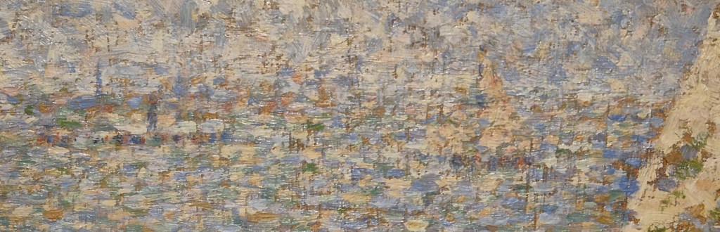
The horizon runs a little way above the kink which joins the cream triangles, and just below it you may be able to make out two vessels on the water. To the left of the cliff is a sailing boat, its mast and sail projecting above the horizon. To the left of that a horizontal row of dark dots, with a vertical line roughly in the middle, define a steamboat with its funnel. A little higher, and reaching to the left edge of the detail, are some of the cream dots which mark the opposite bank of the Seine. These undetailed details may be easier to read if I trim the image slightly.

I don’t know if that does make it any clearer. However, Seurat knew what he was looking at, and knew how he wanted to translate it into his own visual imagery – this study was for himself as much as anyone else. One of the things that makes it harder to read is the persistent repetition of the same colours, the result, I suspect, of both practical and stylistic choices. Seurat painted this study ‘en plein air’ (‘in the open air’) in front of his ‘motif’ (or ‘subject’), in true Impressionist fashion – even though he was in the process of re-imagining and re-inventing the Impressionists’ techniques. Plein air painting was made easier by the contemporary development of portable painting boxes, know as pochades or ‘boîtes à pouce’. The latter got its name because, like a palette, the box had a hole into which you could insert your thumb (‘pouce’ in French) to hold it more easily. The small wooden panel for the sketch could be inserted in the open lid of the box, with the palette, and paints, in the shallow box itself, which would be held horizontally. A small box could only contain a few different tubes of paint – and I assume that the fewer paints you took with you the easier it might be. Of course, the other reason for repeating the colours – the stylistic choice – was to create pictorial unity, and thus a harmonious composition. In this respect it is worthwhile comparing strips of the study from the far left and far right of the painting.

The strip on the left (oddly a bit out of focus, I realise) is almost equally sky at the top and sea at the bottom, with the opposite shore – just a few dabs of cream coloured paint – dividing them. On the right we see the cliff, the vegetation at the top (what little remains after I’ve cut out the shadow cast by the frame), and the vegetation at the bottom right corner. Notice how the cream colour of the cliff (on the right) can also be seen in a few dabs of paint at the bottom of the same strip, but also in the sky and sea on the left. But then the lighter greens of the vegetation – and to a lesser extent the darker greens – can also be seen in the sea on the left. The pale blue of the sky continues through the sea, but can also be seen in the vegetation on the right, and, to a very small extent, in the cliff as well. The darker blues of the sea are intensified in the vegetation at the bottom right. The same continuity of colours can be seen if we compare strips from the top and bottom.

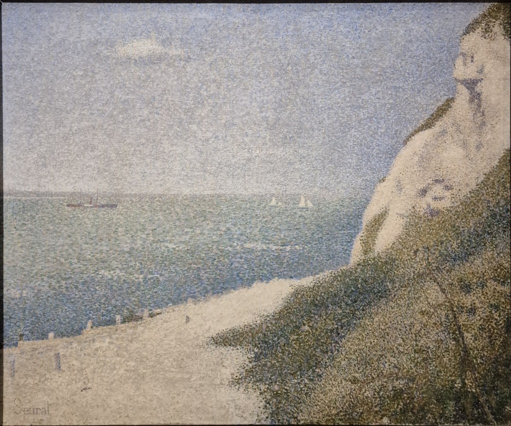
I’ll let you look for the matching colours these two details, but suggest you pick out the creams and the light blues in particular. As suggested earlier, Seurat is seeking pictorial unity, showing us that this seascape, or ‘marine’, to give it the name he used, is all lit by the same light, and takes on the same colours. This makes sense, if we remember that the sky, cliff and beach could all be reflected in the water, and that the light reflecting from the water will in its turn fall on the cliff, beach and vegetation, thus having an effect on the way we see them. Seurat was also drawing on colour theory known and practiced by the Impressionists – although very subtly in this case. This theory was, of course, one of the key driving forces of his own personal technique. The creams and light blues can be seen as a lighter, less intense version of one of the main complementary pairings, blue and orange. Placing them next to one another helps to make the surface sparkle, thus creating a fresher image. In the case of this croqueton the individual pointillés (or ‘dots’) are relatively large – but in the finished painting based on this composition they become far more refined. Conveniently, both are included in The Courtauld’s exhibition – so here they are.

There are several differences between the two images, and it’s not just a matter of size (not that you can see that here): the Study measures 17.1 x 26 cm, while the finished painting is 65.5 x 82 cm. Unlike the Study, which is painted on wood, the finished work, now in the Musée des Beaux-Arts in Tournai, is on canvas. The proportions are considerable different, with the canvas far taller in proportion to its width. When buying supplies, Seurat always selected croquetons in this particular format. Each pre-prepared format had its own name which related to the genre of painting it was considered suitable for – and this one, not coincidentally, was known as a marine. As far as Seurat was concerned, this was also, presumably, the format which would fit into his boîte à pouce. Given the taller format of the canvas, there was some extra space, which Seurat filled at the bottom of the canvas. He added a broad, sandy path leading down to the beach, and the posts of the breakwaters (which help to prevent coastal erosion). There are also more fully formed plants in the bottom right corner. Notice how he subtly shifted the top of the cliff so it leads in from the top right corner, rather than from a little way along the top of the painting, making it more obviously a diagonal.

The smaller, more refined dots mean that features are more precisely defined. The canvas has a cloud in the sky – but if you look back to the Study you might be able to distinguish the sketchy way in which this is notated. The steamboat and distant shore are far clearer – and also echo one another in form. However, rather than the single sailboat, with its sail reaching above the horizon, in the canvas he has included two small yachts, creating a sense of perspective, and therefore a greater sense of distance. The variation in the colour of the sea – from blue near the shore, to a lighter green further out, is not only more marked, but also very subtle. In some way this is a reflection of what we see in the sky, where the colours are paler on the horizon, darkening towards the zenith, with touches of the darker blue at the very top of the painting. The whole has a calm, limpid atmosphere which is enhanced by the omnipresence of lighter tones, and especially of the cream colours of the beach and cliff. It is a celebration of light.

The summer of 1886 was the second of Seurat’s five marine campaigns, the subject of The Courtauld’s exhibition. Although one of his most productive, the weather was not always kind to Seurat that year. As he told Paul Signac in a letter written two weeks or more after his departure from Paris (quoted in Karen Serres’ superb catalogue),

“The wind and therefore the clouds have bothered me these past few days. The stability of the first days should come back … What else can I say? Well, that’s it for today, let us get drunk on light once again, it’s a consolation.”

Today’s Study was clearly painted on one of the days when the winds were gentle and the seas calm (after last week’s Sondheim, today I feel a Mozart aria coming on…). During the winter months Seurat worked on his more theoretical paintings in Paris, but he took his summers away from the city to clear his eyes. Perhaps as a result of this, the paintings we will be looking at on Monday all turned out like the memories of an ideal holiday: gentle and calm, with every element corresponding to what we wanted.

270 – Don’t sing a nocturne just yet

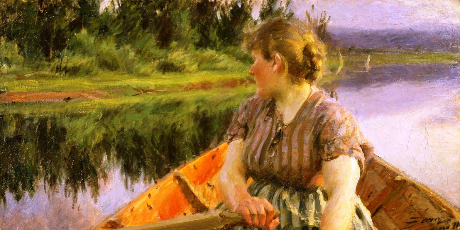
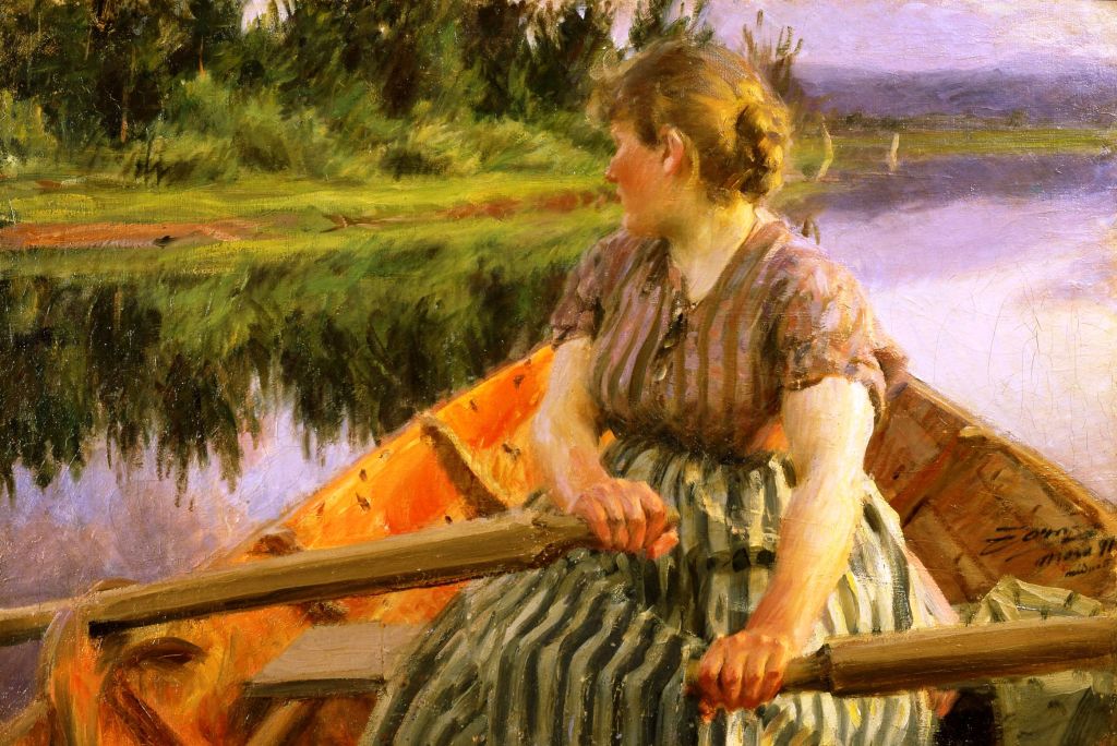
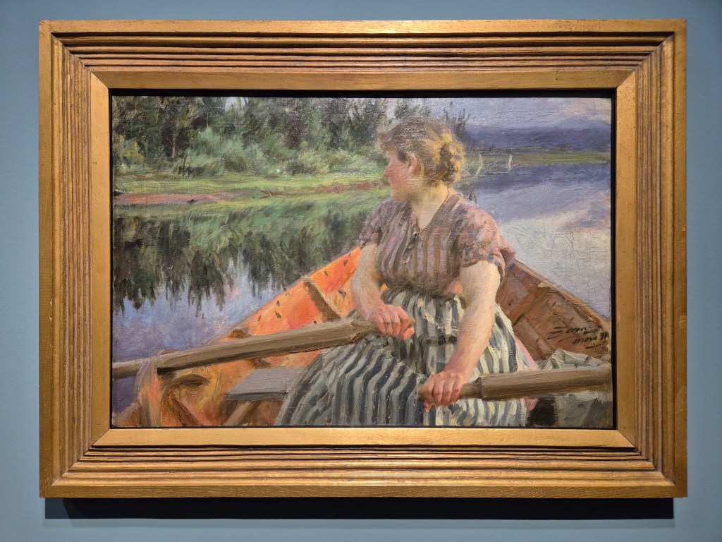
Anders Zorn, Midnight, 1891. Zornmuseet, Mora.

I am looking forward to paying a return visit to the wonderful exhibition I saw in Hamburg earlier this year for Anders Zorn (Part II) at 6:00pm on Monday, 16 March. This will be a second chance to enjoy the rich colour and painterly splendour of Sweden’s great artist, a friend and colleague of both John Singer Sargent and Joaquín Sorolla, and just as superb. The talk will be perfectly self-contained for anyone who couldn’t be there for Part I, and will include completely different, but equally fabulous images for those who could. The exhibition has moved, in a slightly different form, to Madrid, where it will be on show at the Fundaçion MAPFRE until 17 May. As you are unlikely to be able to see quite so many of this wonderful artist’s works in the same place for quite a few years – unless you head to his hometown of Mora, in Sweden – I would really recommend it. And if you can’t get there, I suppose the talk might be the next best thing! A week later, on Monday, 23 March, I will introduce The Courtauld’s enormously successful Seurat and the Sea. If you want to see the exhibition in person, book now if you can, as the tickets are rapidly selling out. Talking of popular exhibitions, last Sunday I tried to see Tate Modern’s Tracey Emin retrospective, but it was so crowded that I couldn’t even walk through the spaces. I’ll head back when I can (on a weekday, and when the rush has died down), and may plan a talk for a later date. Instead, on Monday 30 March, I will talk about the marvellous Michaelina Wautier, an unparalleled 17th century female artist who – surprise, surprise – has been almost completely forgotten. An exhibition of her work will have opened at the Royal Academy just a few days before, having arrived fresh from the Kunsthistorisches Museum in Vienna – which, by then, will be hosting an exhibition dedicated to uncle and nephew Canaletto & Bellotto. This will be the first to compare their travels outside of Venice – to London and Vienna – and so to compare the paintings which were the result: I will talk about it on Monday 20 April. All of these events are already in the diary, but you can check there for anything else that might be coming up, including (potentially) The Courtauld’s A View of One’s Own (landscapes by women) and Michelangelo and Rodin, which will be at the Louvre.

If you do book any of these events, Tixoom will send an email with the ticket – effectively a link to the talk – within seconds. If it doesn’t arrive within 24 hours, do let me know and I’ll try and sort it out: it would be easier to do it then than 5 minutes before the talk! You should then get reminders 24 hours and 15 minutes before the talk, and these will also include the link.
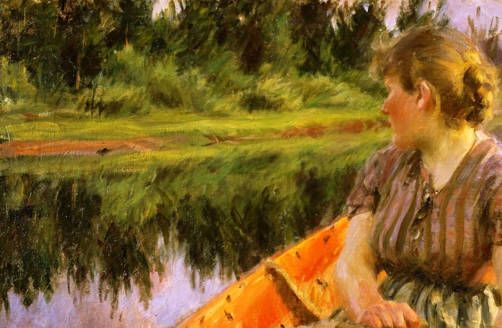
A woman is rowing away from us, heading towards the bank of what could either be a river or a lake (we can only see one bank, so it is impossible to tell). She is looking over her right shoulder to check her direction of travel. We can only see the bow (i.e. the front) of the boat, and our point of view suggests that the artist was a passenger, sitting towards the stern: we are effectively travelling with him. The weather is calm, without even the hint of a breeze. If there were one, the surface of the water would surely be rippling, but as it is, the mirror-like surface reflects the emerald-green grass and verdant profusion of bushes and trees growing on the bank, as well as the lavender sky and distant purple hills.

A thin line of reddish-brown runs through the middle of the green. This is the river bank, standing proud rather than sloping into the water. Because of the freedom of Zorn’s technique, the light green grass on the flat surface of the bank and its reflection in the water are rendered with different brushstrokes. He has not restricted himself to exact symmetry, and this creates an ambiguity: is that the reflection of the grass you can see below the bank, or are there also light green plants growing out of the water? The bushes beyond the grass are a mixture of light and dark green according to the fall of the sunlight. Judging by the yellow/gold light on the woman’s hair and on the back of her neck, the sun is very close to the horizon, and so presumably not reaching all of the bushes. The trees are darker still, which could either be due to the species, or to the fall of light – or both. Whatever the reason, the increasing darkness of the plants as you move away from the water helps to create a sense of depth. The interior of the boat is a rich, orangey-red, the separate brushstrokes stretching the full range from touches of yellow to a glowing vermillion.

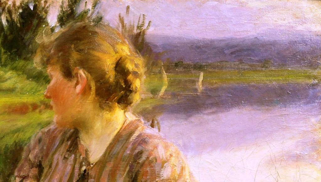
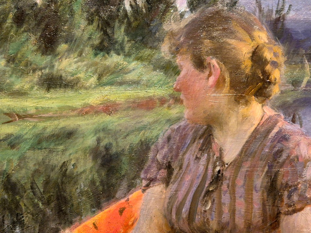
Behind the woman’s head the green bank stretches off into the distance. Her hair is plaited, and fixed up in a bun. It is only brightly lit (and not that brightly even then) on our right. The horizontal fall of light on her hair, together with the colour of the sky and hills, suggests that it is either dawn or dusk. I find the two pale, vertical forms behind her head hard to read, but the more I look, the more I think they are the sails of yachts moored at the riverbank.

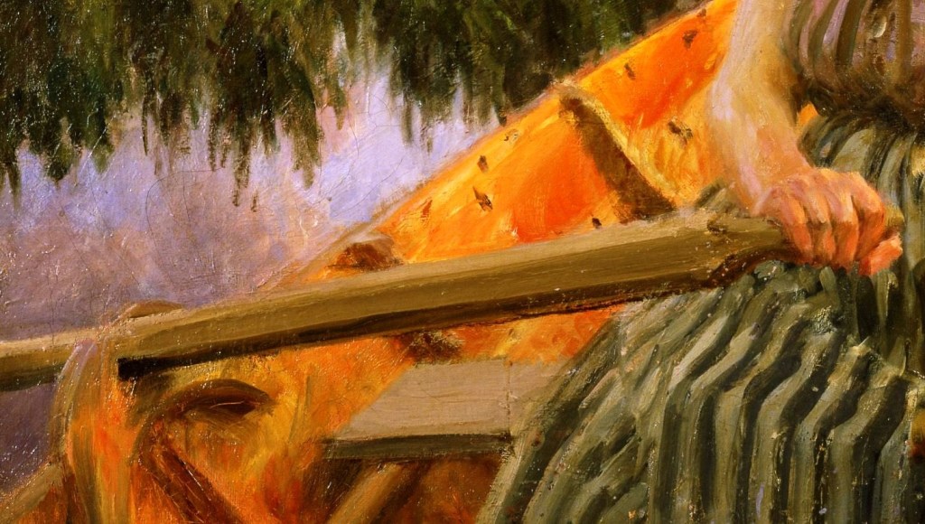
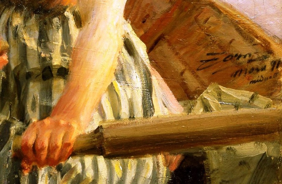
Zorn has carefully observed the geometrical cross-section of the oar handle (hexagonal, but tapering to a rounded handle, I would suggest) and models it with long, smooth brushstrokes of light, mid- and dark brown on the three visible facets. The rowlocks (pronounced rollocks) – ‘fittings attached to the gunwhale (top edge) of a boat that hold an oar in place, serving as a pivot point or fulcrum for rowing’ – are sketchily depicted, looking a bit like two wooden hands reaching around the oar. However, the firm grasp of the woman’s right hand on this oar, with the index finger projecting slightly more than the other three, and the thumb wrapped around the end, suggest that everything is in working order. Her green, striped skirt billows out from her waist, kinking in over her lap and down to her knees, and flares out slightly over the wooden bench on which she is sitting. Dark marks on the orange/yellow interior of the boat suggest the nails which are holding the planks in place. Significantly, the gunwhale (see above) leads directly from the bottom left corner of the painting (which is the bottom left corner of this detail) thus leading our eye into the painting along the diagonal which runs from bottom left to top right.

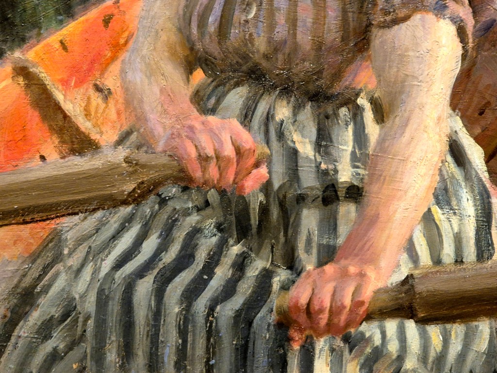
In the bottom right corner of the painting, the left oar (on our right) has far less clearly defined facets, maybe the result of the lighting – which is true of so much in this painting. The interior of the boat here looks brown, like wood – which is, after all, what it’s made of – and this confirms the position of the sun. At the horizon, its rich orange glow colours the interior of the boat where it falls, on our left. The woman’s left hand is, if anything, slightly better articulated than her right, with the knuckles standing proud, catching the light of the sun, and the lower joints darker as they wrap around the oar. The signature is painted against the brown interior of the boat, just above some yellow-green fabric lying under the oar. In three lines it says ‘Zorn/Mora 91/midnatt’ – the artist’s name, the location and date, and the title of the painting: Midnatt (in Swedish), or Midnight. But the sun is just rising or setting!

Anders Zorn, the artist, was born in Mora, in the Swedish province of Dalarna, in 1860. At the age of 15 he headed south to Stockholm to attend the Royal Swedish Academy of Fine Arts. He left the Academy in 1881 – without graduating – and moved to London the following year. He returned to Sweden in 1885 and married Emma Lamm. The couple spent an extended period in Paris (1888-1896), although they returned to Sweden for regular visits, as well as travelling extensively elsewhere. In 1896 they settled back in Zorn’s hometown, Mora, and remained there until the artist’s death in 1920 – although they did continue to travel widely during that time. Mora lies at 61° north – on a very similar latitude to Muckle Flugga (at 60° 51’), which, with exception of the odd rock, is the northernmost point of Shetland, and therefore also of the United Kingdom. Zorn described this painting as “a bright and chilly Nordic summer’s night” – and yet, to the eyes of those of us living further south, it doesn’t look like night at all. Although this is not the land of the midnight sun (the Arctic Circle lies at 66° north), summer nights can be remarkably luminous this far north. It reminds of a song from Stephen Sondheim’s A Little Night Music, which is set in Sweden. Shortly after the couplet “The sun sits low/ As low as it’s going to go,” it concludes with the following verse:

The sun won’t set
It’s fruitless to hope or to fret
It’s dark as it’s going to get
The hands on the clock turn
But don’t sing a nocturne
Just yet

If you would like to hear the whole song (which is relatively short) sung by the original Broadway cast, just click here.

The pictures so far have all come from a digital file I found online (I’m afraid I can’t remember which one), and the colours are, I think, slightly heightened, if not garish. The details just above and below are ones I took myself, and I think they give a better idea of the true colour, and certainly give a better sense of the surface of the painting, how it is worked and how the paint is applied – even if you can see the gallery light reflecting off the top edges of the brushstrokes. Between them I think they emphasize how the woman rowing the boat is in harmony with her natural surroundings, her mauve top echoing the sky and hills (and their reflections) while her green skirt relates more to the vegetation on the river bank. She is located in the midst of earth, air and water, with the fire of the sun illuminating both her and the interior of the boat.  As such, I find it somehow significant that the red-brown line of the riverbank coincides with the position of her mouth. I don’t know what relevance that has, but it somehow seems apt, and is (to me, at least) visually satisfactory – she is at one with the landscape. The blouse is beautifully painted, with dabs and dashes of the lavender of the sky and the purple of the hills alternating with a pink, not unlike her flushed cheeks. It is as if Zorn is nodding toward Seurat, and his Divisionist brushstroke, which was first fully realised in 1884 with Sunday Afternoon on La Grand Jatte (the subject of another Sondheim musical!), eight years before Midnight was painted. However, I don’t remember Zorn using the Divisionist – or Pointilliste – brushstroke anywhere else.

Looking at both hands together it is immediately apparent that the woman is changing direction. If she were rowing in a straight line, her hands would be next to each other. The hand on our right is lower down, suggesting (to me at least, who has very little experience of rowing), that she is holding the starboard oar (‘right’ in the direction of travel) out of the water, whilst pulling hard on the port oar. I’m trying to work this out logically – although logic often fails me. I think this means that the boat would turn to port – which would imply that she is steering towards the bank. Who knows where she is going, or why, at this time of night? Maybe she is quite simply heading home after a party – the Midsummer Dance of one of Zorn’s most famous paintings, perhaps? We will see it on Monday, when one of the themes we will cover will be Zorn’s return to the province of Dalarna, and the paintings – like this one – that he continued to paint on his regular visits ‘home’ even before he settled back there.

269 – A – Z (II) – William Nicholson was an Artist

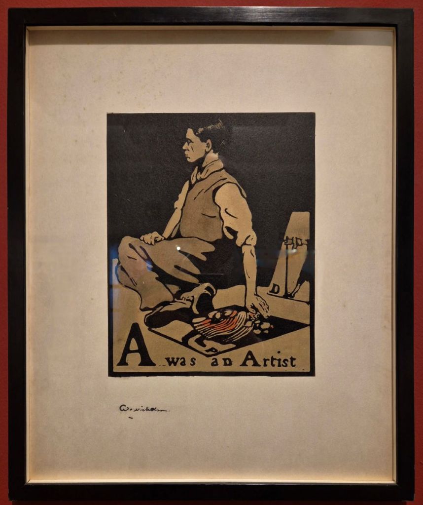
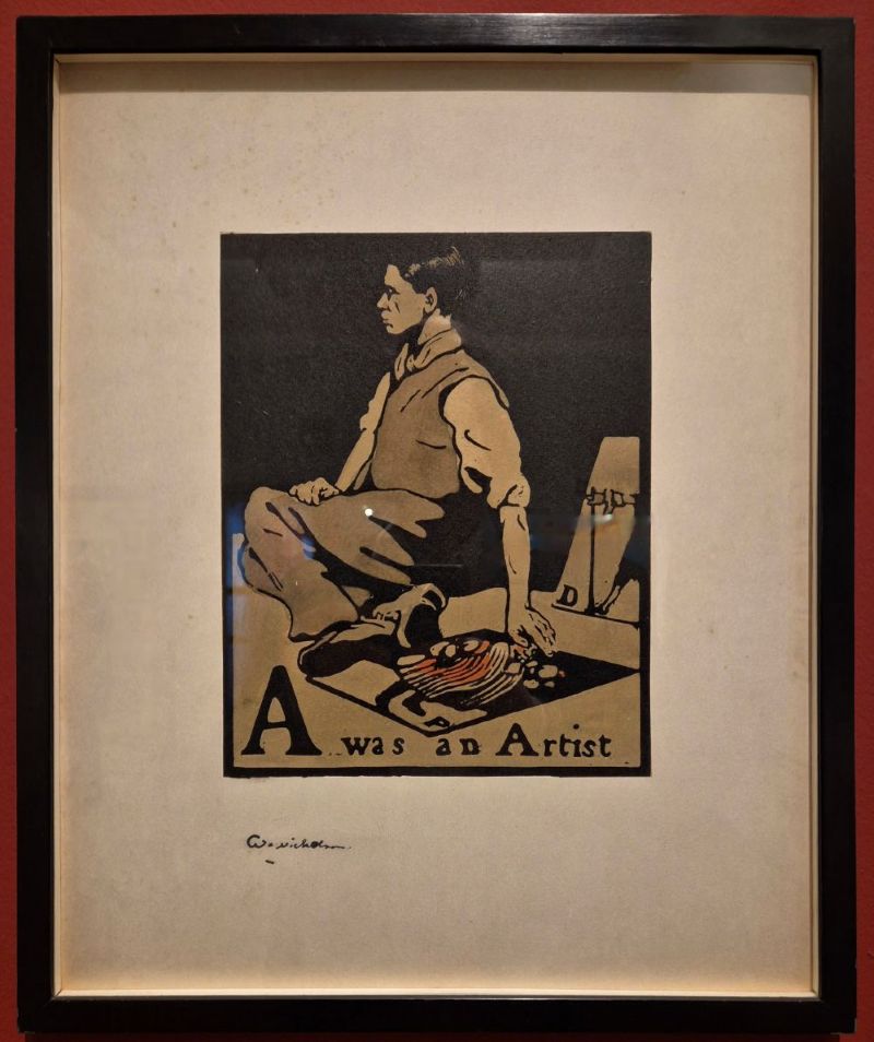
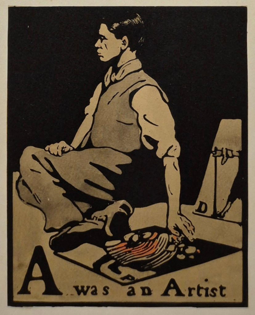
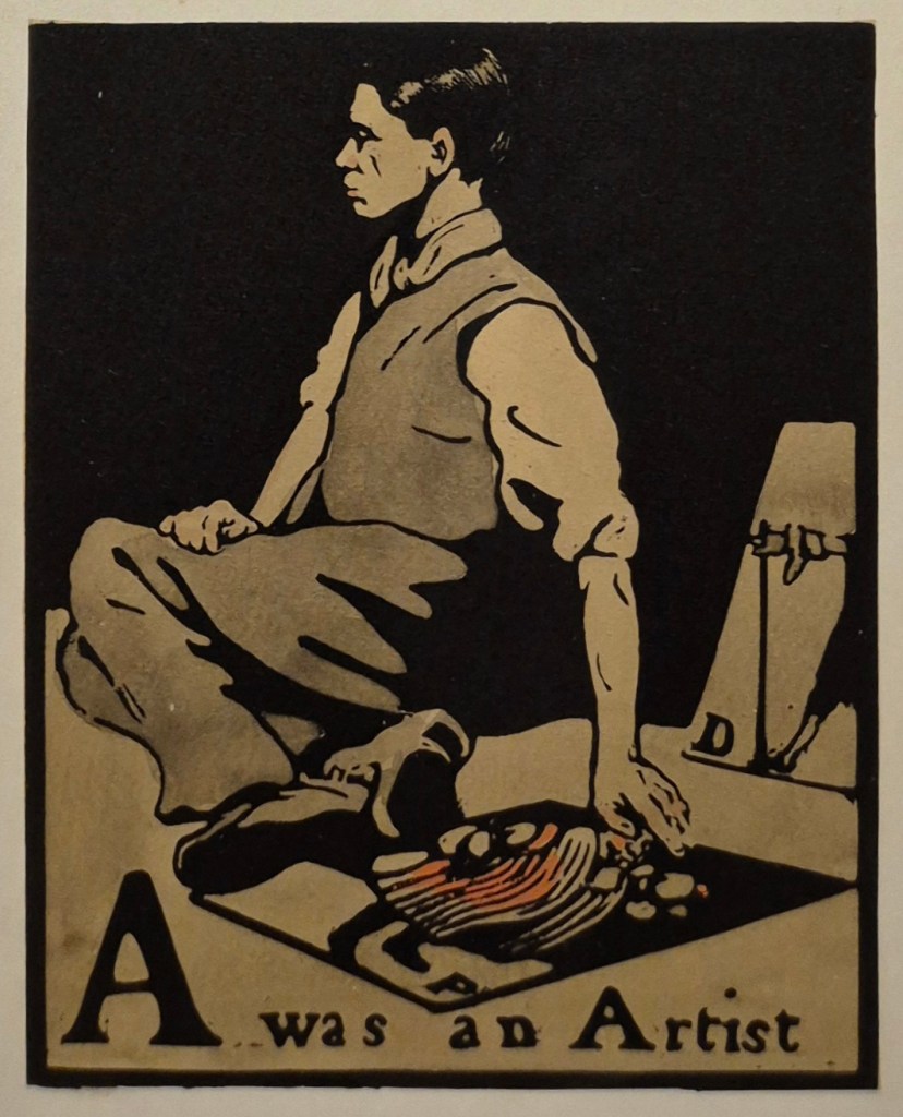
William Nicholson, A was an Artist, from An Alphabet, published by William Heinemann, 1897. UK Government Art Collection.

A few weeks back I wrote a post From A – Z playing on the idea that the letters were Anders Zorn’s initials. I hadn’t remembered at the time that one of the earliest independent works by William Nicholson – whose brilliant paintings, prints, theatre designs and book illustrations I will be discussing this Monday, 2 March at 6pm – was an illustrated alphabet. Today I want to introduce the exhibition at the Pallant House Gallery by looking at the first image from the sequence – the letter ‘A’. However, the following talk, on 16 March, will also be A – Z (II), or rather Anders Zorn (Part II) – a second chance to enjoy the rich colour and painterly splendour of Sweden’s great artist. A friend and colleague of both John Singer Sargent and Joaquín Sorolla, his art is every bit as brilliant as theirs. The talk will be perfectly self-contained for anyone who couldn’t be there for Part I, and will include completely different, but equally fabulous images for those who could.

This will be followed on 23 March by a second visit this spring to The Courtauld for their hit show Seurat and the Sea. If you want to see the exhibition in the flesh, I’d book now. I was planning to go this week, but it’s sold out until the second week of March – so I’ve booked then, in plenty of time for the talk. However, I won’t get to see the other exhibition there for a while, so on 30 March I will talk about Tate Modern’s Tracey Emin retrospective. There will be more on that in the diary soon.

If you do book any of these events, Tixoom will send an email with the ticket – effectively a link to the talk – within seconds. If it doesn’t arrive within 24 hours, do let me know and I’ll try and sort it out: it would be easier to do it then than 5 minutes before the talk! You should then get reminders 24 hours and 15 minutes before the talk, and these will also include the link.

This year’s trips with Artemisia are rapidly booking up, but there are still a few places left to visit Strasbourg from 5-8 June. As well as the city itself, with its rich history, one of France’s most beautiful cathedrals and a notable collection of old master paintings, we will have a day trip to Colmar, a truly picturesque town and home to Grünewald’s Isenheim Altarpiece, one of those remarkable renaissance paintings which really should be seen in the flesh.

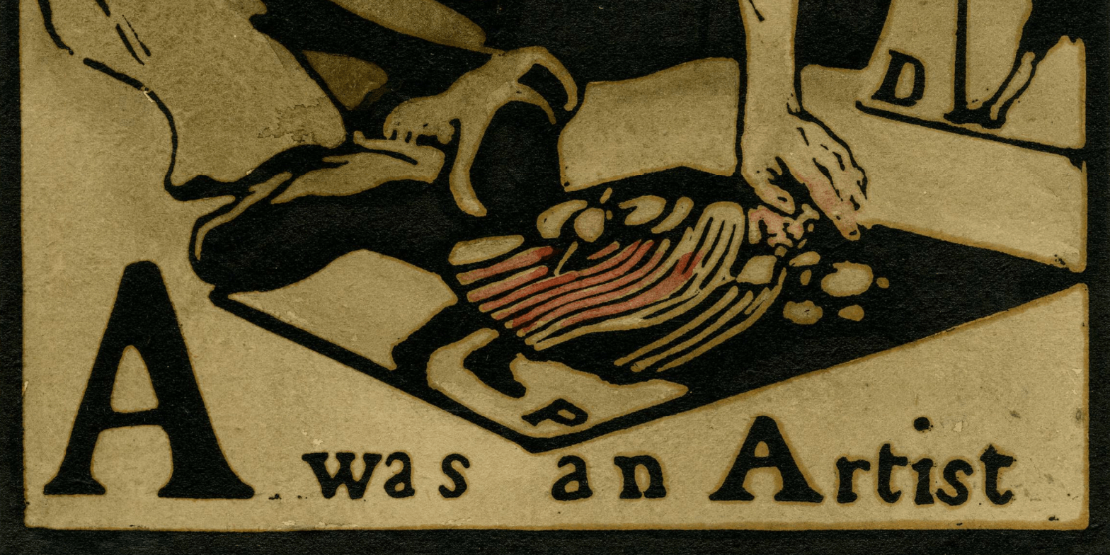
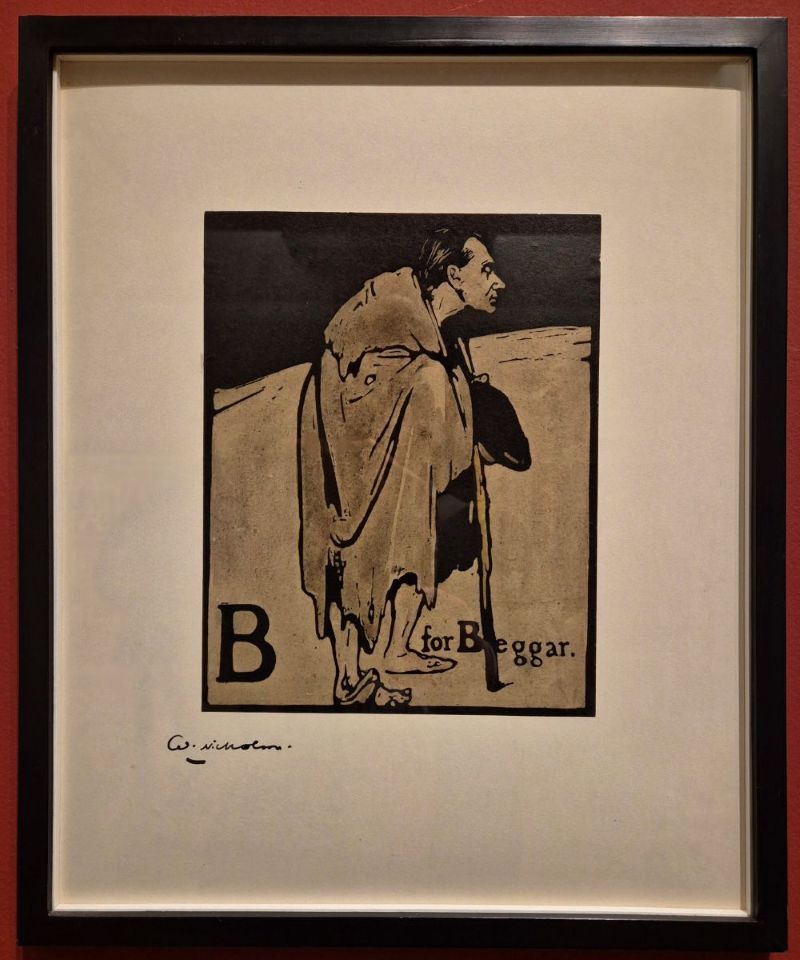
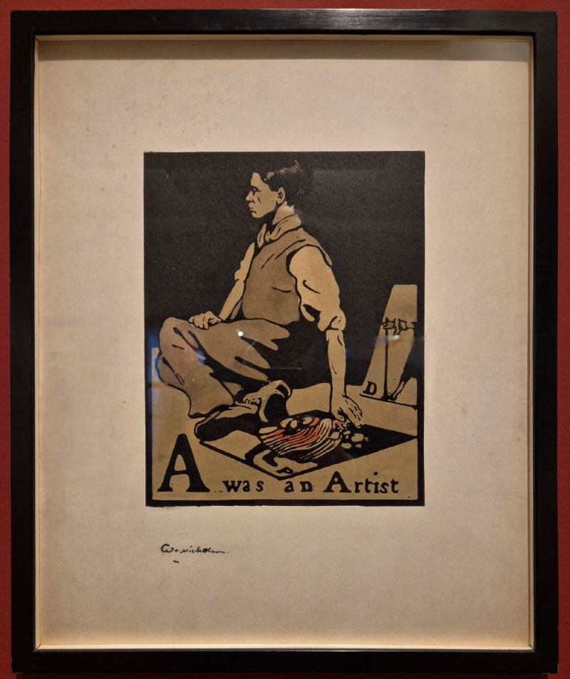
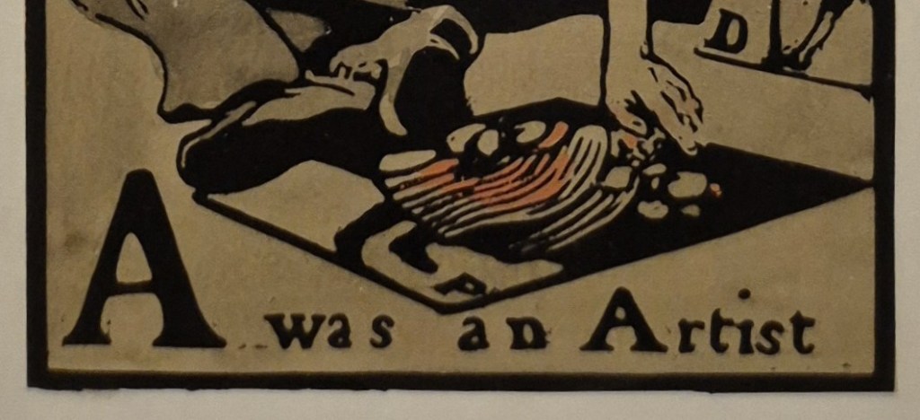
Today we have a print – a hand-coloured woodcut on paper. It is the first in a set of 26 – the entire alphabet – all of which are included in the exhibition I will discuss on Monday. Admittedly this isn’t a great photograph – it’s one I took in the exhibition, complete with reflections, but we’ll get to better ones. I wanted you to see the full size of the paper, with a wide, white border around the printed image, and Nicholson’s signature floating below. Often a print like this would be framed with a mount covering most of the border, leaving only the imagery visible – but here the whole extent of the sheet can be seen. In many ways I think it is preferable, as it shows the balance of positive and negative space that Nicholson intended, allowing the bold, powerful imagery to be read clearly. This has then been sympathetically framed in a simple black, which echoes the printed frame around the imagery of the woodcut itself. The red at the outer edge is the colour of the wall in the gallery. The first two letters of the alphabet are displayed on one wall, with the remaining 24 on another. They appear together like this:

Why haven’t they hung them in alphabetical order, though? I always get hung up on little (and probably irrelevant!) details like this. I suspect this choice was made because it is pictorially more satisfactory to have the two figures looking in towards each other: it makes the ‘composition’ of the hang look more contained. But it is also relevant that these two prints are separated from the rest of the sequence because they are both portraits. ‘A’ is a self portrait, while ‘B’ is Nicholson’s friend, former collaborator, and brother-in-law, James Pryde. ‘Beggar’ might appear to be an odd choice for an illustrated alphabet, let alone a friend, but not if you know a bit more about these two artists. They were students together at Hubert von Herkomer’s Art School in Bushey, Hertfordshire, and their friendship was strengthened when Nicholson married Pryde’s sister Mabel – also an artist – in 1893. From 1894 the two men collaborated to design posters for theatrical productions and other advertisements. Notice that the beggar is holding a staff. Rather than using their own names, the pair took their collective title from one they saw – and were apparently amused by – printed on a sack of hay: Beggarstaff. As J. and W. Beggarstaff, most of their surviving work was produced in 1895 and 1896, and, although other designs are documented in later years, most are lost, and their appearance unknown – but they don’t appear to have collaborated after 1900.

Is it a coincidence that An Alphabet was Nicholson’s first major independent commission, and that, if placed in alphabetical order, the two turn their backs on each other? Or that Pryde is cast as the beggar, with an uphill struggle ahead of him? These days, Pryde’s work isn’t nearly as well-known as Nicholson’s, and, as his Wikipedia entry states, ‘He is principally remembered as one of the Beggarstaffs’. However, it’s not as if Nicholson looks entirely positive about his own artistic future, given the intriguing caption – A was an Artist – but more of that later.

The boldness and clarity of conception of this image is what helps to make it memorable. Both colour and line are kept to a minimum, with a matt black background in the upper half, and a grey/beige colour for the floor. These limited means show the influence of Japanese woodblock prints, very much in vogue in the second half of the 19th century, and collected by artists such as Monet and Van Gogh. If you think about it, the composition of today’s print is not entirely dissimilar to that of Van Gogh’s Sunflowers… Japanese art was also an influence on many other artists, including Whistler, whom Nicholson greatly admired. Indeed, it was Whistler who had introduced him to another William – William Heinemann – who published An Alphabet in 1897. The limited colour range of A was an Artist is also typical of Whistler – just think of Arrangement in Grey and Black No. 1 (see 151 – Mommie dearest).

The artist (a self portrait by Nicholson, as I’ve said) sits on the ground with his knees to one side and his feet towards us, resting his left hand on the ground on another print from An Alphabet. The label in the exhibition says that ‘Nicholson depicts himself as a pavement artist’, but I’ve always thought that the term ‘pavement artist’ refers to someone who draws – with chalk, usually – on the pavement itself. I’m not sure about its application to a man who has laid a print on the pavement. This reminds me more of the people who hawk prints at tourist destinations, or along the park fences on Piccadilly and Bayswater Road in London. Another print is propped up on the right-hand side, but cut off by the bold black frame.

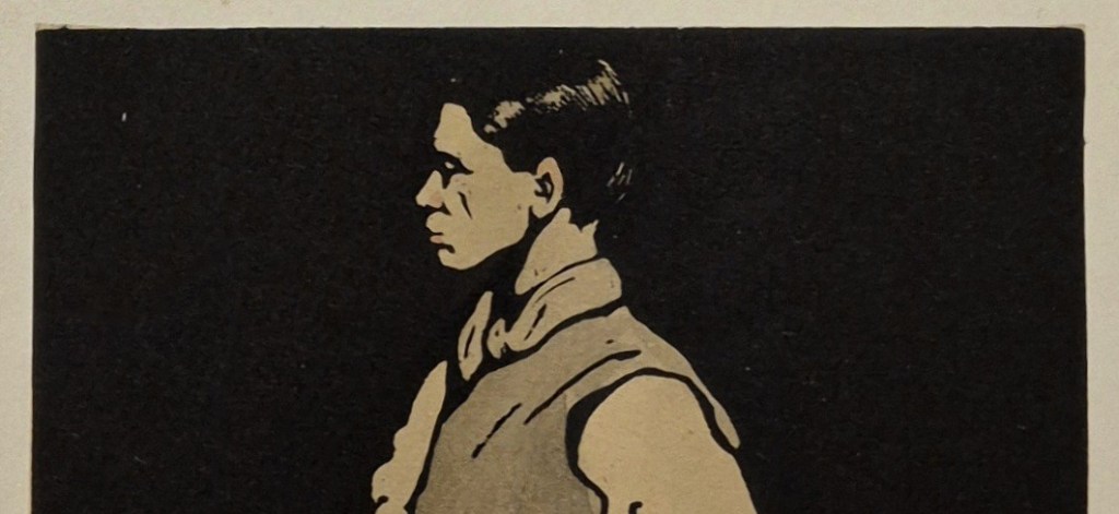
Nicholson shows himself in profile, which makes the image less personal, but also stronger. His black hair is apparently brilliantined, with the shine created by bright patches of white paper in the black ink, suggesting the reflection of light. A woodcut is a relief print, meaning that areas which are not to be coloured are cut away. It is the top surface, the original surface of the block, which takes the ink. The reflections of light in the hair were made by cutting into the block so that the ink wouldn’t reach them. Thin lines, like the wrinkle in between Nicholson’s nose and cheek, or the folds on the scarf and waistcoat, are especially bravura examples of cutting, as they are made by thin ridges of wood standing away from the rest of the block which was cut away all around them. It would be so easy to take them out with one slip of the chisel or gouge, and impossible to replace.

Nicholson’s head is upright and his chin held high, suggesting a certain pride, even if he is seated on the ground, and dressed in his shirtsleeves. Yes, he has a waistcoat, but without a tie or jacket this outfit would read as working class, suggesting the subject is a humble street trader.

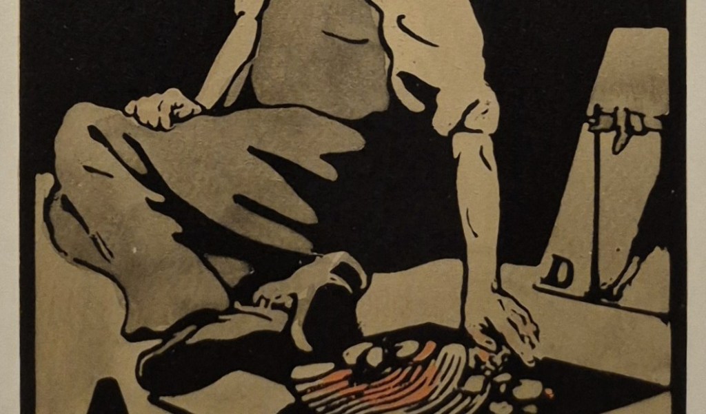
This reading is confirmed by the rolled-up sleeves – a real sense that Nicholson is at the ‘coal face’ of making, entirely down-to-earth, but proud of his honest labours. To the left of the knees we can see what is effectively the ‘horizon’ – the join between the ground and the black background. To the right, the horizon would appear to be lower – but that is the result of Nicholson’s shadow cast on the ground: the light is coming from the left. This shadow has the same intensity as the shadows in the folds of the trousers and the background itself, all of which are therefore unified into one area of black. This lack of variation in tonal values is another of the features which makes the image so clear and so striking. Oddly, the left arm, resting on the floor, does not cast a shadow – but that is presumably to simplify the composition. It also helps to draw a parallel with the image propped up on the right: Nicholson’s left arm reaches out behind him, and rests on the floor, in a similar way to the figure in the print marked ‘D’, whose right arm reaches forward and rests on a stick. There is some form of symmetry, or echo, between these two figures, which implies that the selection of this print is relevant to the interpretation of the image as a whole. The flesh tones of Nicholson’s arms may have a pink wash, but I might be imagining that – or it might have faded. However, the clothing of the figure in the print on the floor is coloured red.

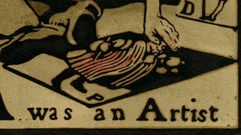
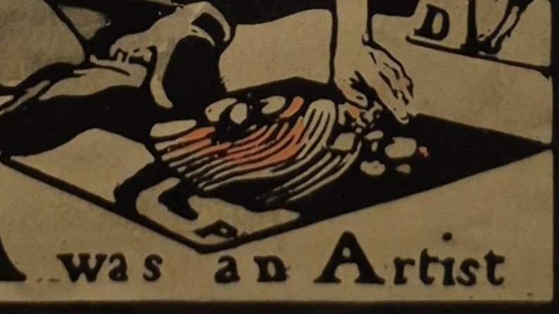
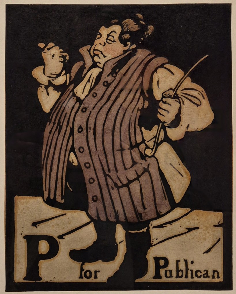
The print of ‘P’, like ‘A’, has a grey-beige floor and plain black background. We’ll see below what these images were, and consider what relevance they have to Nicholson himself. However, what most intrigues me is the choice of the word ‘was’ in the caption, A was an Artist. What was Nicholson thinking? Why not A is an Artist? He was only just starting his career, after all. He was 25 when this print was published, with another 52 years to live (not that he was to know that). Is it a sign of insecurity, not knowing if he could make it on his own without the help of James Pryde (on whom he has, nevertheless, turned his back, and who he has imagined as a beggar)? Or is it the opposite? Maybe Nicholson had supreme confidence in his legacy, and knew that people would still be looking at this woodcut in the future – as indeed we are in 2026. The print reminds us that we are looking at a portrait of an artist who was working in the past, and a self portrait, at that. As such he could have used the image to illustrate a different letter: I was an Artist. This works as a statement, even if it doesn’t function in the standard terms of an Alphabetical sequence. W was an Artist would also make sense, as would N… Whatever the explanation, the phrase is strange, and it is the only print out of 26 in which he uses the word ‘was’. Elsewhere we have the format of B for Beggar, which is one of sixteen uses of the word ‘for’ on its own. There are eight examples of ‘is for’, and one where it is just the letter and the word (X Xylographer – a man cutting a woodblock). ‘A’, though, is where the alphabet starts, and where Nicholson starts – and where he all but suggests he is already finished!

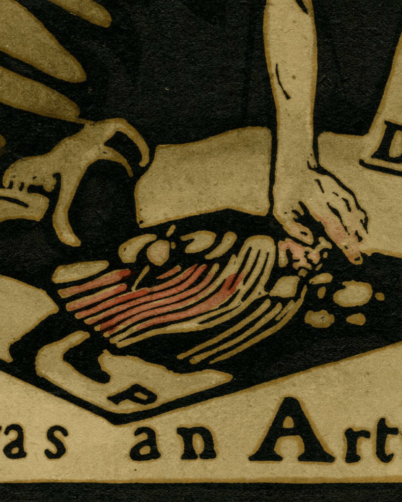
I said above that these are ‘hand-coloured woodcuts’ – but what does that mean? Compare and contrast the next two images.

The one above is a detail from a version in the British Museum, while the other is a detail of the print in the UK Government Art Collection – the one in the exhibition that we have been looking at. I hope you can see that the basic composition, printed in black, is exactly the same: it was printed from the original block. However, the red colour on the print is applied differently. In the BM version (top) the red goes all the way down to the hem of the man’s garment, with a slightly darker brushstroke over the chest. The face is also consistently pink. In the Government print (bottom) there is less colour on the face, the paint does not go down to the hem, but does colour some of the sleeve over the right shoulder. They are, simply, hand-coloured: Nicholson took each individual black and white print, and added colour to the robes of the figure with a brush and watercolour paint. He also added a grey wash to the clothing of the self portrait and grey-beige to the floor. This technique was highly personal, making each print a unique ‘original’, but it was enormously time-consuming. When the sequence was re-released, it was reproduced via lithography: the edition was more consistent, and cheaper to produce.  

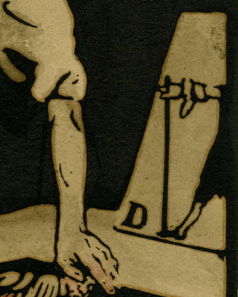
But what are the two prints he appears to be selling? And how relevant were they to his personal life, and his career as an artist?

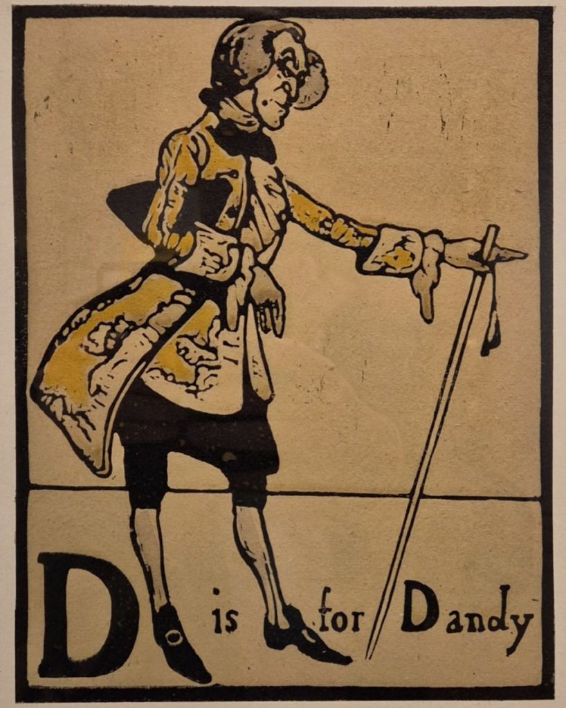
D is for Dandy would turn out to be entirely relevant. One of the aspects of Nicholson’s life and creativity that the exhibition explores – and which I will touch on this Monday – is his self-presentation. Like many artists, he was one of his own best creations, and was always dressed to the nines, whether formally in public, or informally at home – his dressing gown was notorious! He also loved the precise shade of yellow which this Dandy is wearing. Not only did he use it in the costume designs for one of Noël Coward’s earliest plays, but he also had a favourite waistcoat in this shade: in a family portrait by William Orpen (which is in the exhibition) he is wearing it underneath the dressing gown…

Notice how, being a print, in A was an Artist the pose of the Dandy is reversed, a mirror image of the original. However, he has made sure that the letter ‘D’ is the right way round, and appears at the bottom left of the image, as it does in the original – it is a deliberate choice to make sure that the ‘D’ is seen – a confirmation that the identification of the subject is relevant. Unlike ‘A’, D is for Dandy has a white background and floor, with a single thin line for the horizon. Nicholson omits this line in the version seen in A was an Artist, presumably for simplicity’s sake.

There are minor variations in P for Publican. The long, sleeveless coat is maroon, rather than the reddish pink used in Artist, and the front panel of the coat is completely and consistently coloured. Although the image is reversed (with a simplified, and shorter, pipe), he has made sure we can read the ‘P’, but has left it in the bottom right, its position in a mirror image. While the choice of this character alongside his self portrait might appear strange, it is – surprisingly perhaps – another autobiographical reference. When he married Mable Pryde in 1893 it was without her parents’ permission, or even knowledge. They eloped, married in Ruislip, and went to live in a former public house, the Eight Bells in Denham, Buckinghamshire. Shortly afterwards James Pryde came to visit for a couple of weeks – but stayed for a couple of years. They were, indeed, at home in the pub. Or, put another way, they were the publicans…

As it turns out, the basic elements of this composition would serve Nicholson well. In several of his still life paintings, and at least one portrait, the main subject rings out against a profoundly black background. The difference with the later works – as we will see on Monday – is that these subjects are brilliantly detailed, almost mesmerically so. However, the flashing, flashy highlights we can see in the slicked-back hair of this print have their own life in Williamson’s virtuosic application of oil paint which became a hallmark of his portraits and still life paintings. A was an Artist who started as a printmaker.

Freudian (time) slip

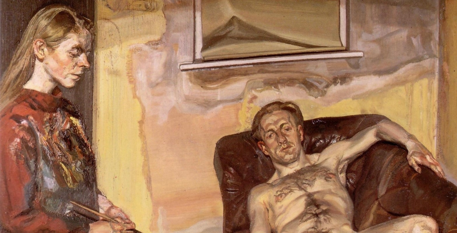
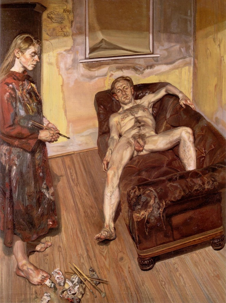
Lucian Freud, Painter and Model, 1986-7. Private Collection.

When I first published this post I suggested that it was an unacknowledged sign of ageing that I am increasingly aware of a succession of artists’ retrospectives. For example, there was the exhibition to celebrate Lucian Freud’s 80th Birthday at the then relatively-recently renamed Tate Britain in 2002. Or the 90th Anniversary exhibition in 2012, the year after his death, at the National Portrait Gallery. Then it was the celebration of the centenary of his birth at The National Gallery in 2022… Nevertheless, with each iteration I have seen something new, and something which has come as a surprise. This time, it is the extent and variety of his works on paper – I had no idea that he drew so much. I will talk about this more thoroughly this Monday 23 February at 6pm when I introduce the exhibition Lucian Freud: Drawing into Painting which has just opened at the National Portrait Gallery. Yes! They are having another Freud exhibition, so soon after the last one! However, the ‘last one’ at the NPG was 14 years ago. How does that happen?!

The week after (2 March) I will talk about William Nicholson, whose career spanned numerous genres and techniques. I always used to think of him as the overly ‘Academic’ father of arch-modernist, and leader of the St Ives School, Ben. However, he was far more than that, as the current exhibition at the Pallant House Gallery in Chichester shows – but then, their exhibitions are always superb. I will return to Sweden for Anders Zorn (Part II) on 16 March. The talk will make perfect sense for anyone who wasn’t able to join me for Part I. There will be many superb paintings from across his career – a result of the way that the exhibition was structured in Hamburg – and there will be plenty more luscious colour and effortless brushstrokes to enjoy, not to mention some even more spectacular painting, for those who did see Part 1. This will be followed on 23 March by a second visit (this year) to The Courtauld, to see what promises to be a truly sparkling exhibition exploring the relationship between Seurat and the Sea. A while back I had suggested a third talk about a Courtauld exhibition, but I’ve decided that it would be a better idea to see the exhibition in question before deciding if it would be a good idea – so keep your eyes on the diary for more information.

If you missed my talk on the Wallace’s exhibition Caravaggio’s Cupid I have recently given an expanded version as a study evening for ARTscapades, and as they have the facilities to record their talks (unlike me) you can catch up with the recording if you book on that link. Today, though, I want to re-post my thoughts about a painting in which an artist gets to grips with the nature of painting itself.

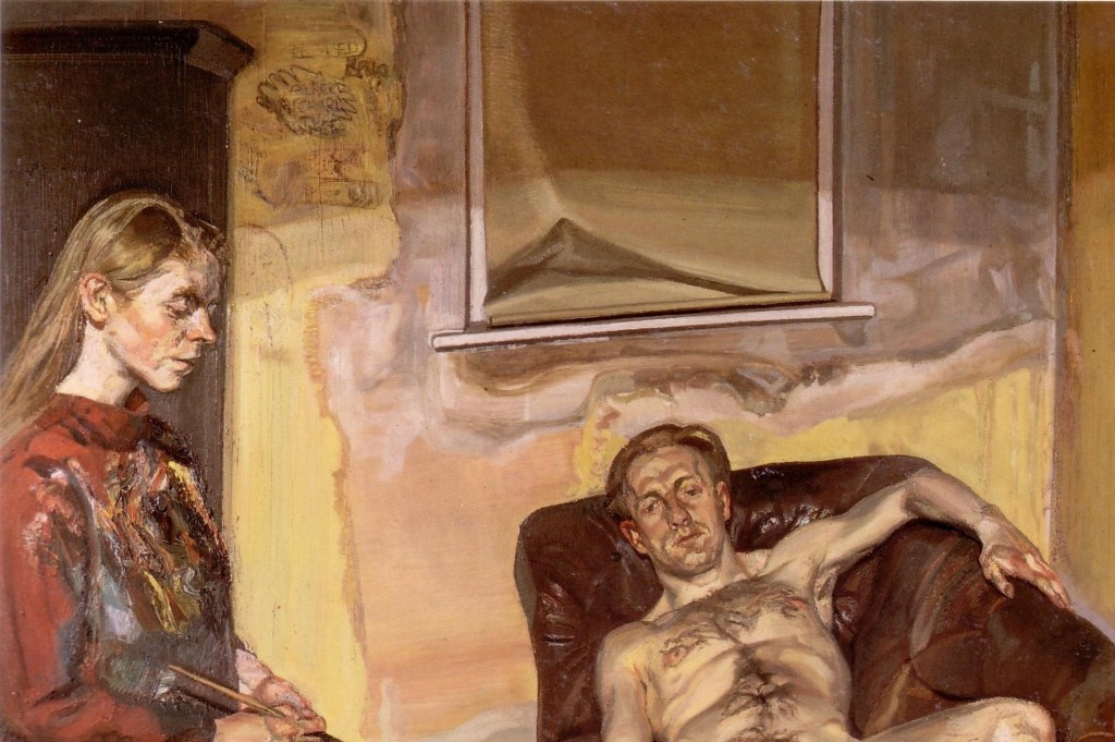
Called Painter and Model, we see a woman standing on the left wearing a brick-red painting smock, covered in paint, and holding a paintbrush between both hands. She is effectively in profile, looking down towards the bottom right corner of the painting, with her pale face standing out against a dark wardrobe which occupies the back left corner of the space. On the right is a battered leather sofa, the colour of which is strikingly similar to the woman’s smock. Lying on it, on his back, is a naked man. If her head is framed by the wardrobe, his is placed against the far arm of the sofa, and is seen full face, rather than in profile. Binaries, and contrasts, are always an important aspect of Freud’s work. The man’s left forearm lies along the back of the sofa, while the right rests on the seat, with the hand just sticking over the edge. His right leg, extended, stretches down so that the heel of his right foot is resting on the floor. The lower half of this leg, and the foot, cast intense, dark shadows on the meticulously detailed floorboards. His left leg is bent, and leans against the back of the sofa. His left foot is tucked up behind the near arm, and can’t be seen. Lying on the floor in the foreground is some of the paraphernalia of painting – tubes of paint, and paintbrushes of different sizes. The walls are in an appalling state of repair – painted yellow, but re-plastered with pink plaster, which has not yet been repainted. However, it still seems to be showing signs of damp, presumably the initial cause of the repairs. A blind has been pulled down over the window, and crumples untidily as if in need of replacement itself. The top of the walls are deep in shadow, but brightly illuminated further down, with the boundaries marked by uneven half shadows, probably cast by an uneven lampshade.

Lucian Freud was renowned for making what might seem to be unreasonable demands of his models. Once his career was established, he became a man of habit, and would paint regularly, either during the day, in natural daylight, or after nightfall, in artificial light. This is clearly a night-time painting – the stark shadows tell us as much. He would work on more than one painting at a time, with the daytime models making way for those arriving in the evening. They would return every day at the allotted time for weeks or months, or even, in some cases, for years. In order for him to discover something ‘unexpected’ and create something new, he would often pose the models in unusual positions, or in surprising relationships to one another. It might seem that he was being entirely controlling, making the models obey his whim. And yet, of course, they didn’t have to be there. Often they were friends or family, but above all, they were people in whom he was interested. If he wasn’t interested, he couldn’t paint. Nevertheless, as a substantial number of his models were women, and, moreover, women who were naked, he was sometimes criticized as a voyeur. I’m sure this painting was intended to confront this claim, as it turns the idea of ‘the male gaze’ on its head.

In terms of the title, Painter and Model, it is surely clear which is which. The woman on the left is the painter, the naked man is the model. In this one bold gesture Freud manages to subvert the whole history of the Western European nude, in which, we imagine, a fully clothed man paints a naked woman, and in the process, he objectifies her. In this painting it is the man who becomes the object, subject to the whim of the female artist. She is standing, upright and secure, whereas he is supine, passive and vulnerable – apparently a complete reversal of gender stereotypes. Of course, it’s a little bit more nuanced than that. Or, to put it in other words, it’s nowhere near that simple. I’m intrigued, for example, that the painting is called Painter and Model rather than Artist and Model, but paint is clearly of the essence. And, whether Painter or Artist, is the woman really the one who is in control? One of the problems for women over the course of Western European Art History was the nature of the female gaze, because, quite simply, it wasn’t allowed. ‘It’s rude to stare’, as I’m sure many of you were told by your parents, and it was particularly rude for women to stare. You were supposed to stand with your hands politely held in front of you, and look modestly down. And if you’re looking ‘modestly down’ all the time, then you can’t look at things to paint them. Women weren’t allowed into life drawing classes until the 20th Century (on the whole): for them to look at a naked man was considered to be inappropriate. But in this painting we see Freud reconsidering the whole issue. Or do we? Maybe we should have another look at the painting. Even in this detail, although more pointedly if we look at the whole image (above and below), it becomes clear that the woman is standing in precisely that appropriately ‘modest’ feminine way, hands held in front of her body, and her face looking down towards the floor. She is not staring at the man, not even gazing at him, despite his unabashed nudity. Indeed, the male gaze is still fully active, but it is the naked model in the painting – the man – who is gazing – even staring – at us. The model seems to be more in command, and more commanding, than the painter.

It becomes more complex when you realise that, given the title of the painting, the woman on the left is both painter and model. Although she holds a paintbrush, she is modelling for Freud as a painter. And she is painted – in more ways than one. First, she is one of the subjects of the painting, one of the models that Freud has painted, but second, her smock is covered in paint. She appears to have used the fabric to clean her brushes in between different brushstrokes, as Freud used to, either on the walls of the studio or using the rags which can often be seen lying on the floor in the background of his paintings. So, Freud has painted her, and she has ‘painted’ herself. Look again, and you will see her smock covered with the same yellow as is used for the walls, the light greys of the damp and of the window frame, and the darker shades of the wardrobe and of the shadowed areas of the sofa, with the smock itself more or less the colour of the sofa. Indeed, the smock is effectively Freud’s palette, an inchoate mass of paint which is surely not unlike whatever palette he used to form this image.

We add yet another layer of complexity when we realise that both models were also artists. On the right is Angus Cook – described as ‘model and artist’ in the National’s 2022 exhibition, or ‘artist and filmmaker’ at the NPG currently, although I can find little about his work online. One source describes him as a poet, and there are also some of his texts about art. Above all, he was part of a nexus of friends and lovers, several of whom feature in Freud’s work. On the left is Celia Paul, a respected artist in her own right. She came to Freud’s attention as a student at the Slade School of Fine Art, where he was a visiting tutor. They went on to have a ten-year relationship, with Paul often modelling for Freud, as she does here.

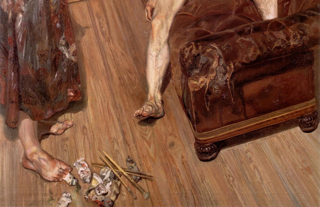
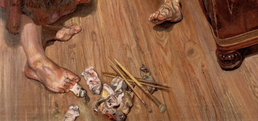
In the bottom half of the painting we can see five feet – three human, two sofa. It’s a sort of game, and one that Freud played in different ways in different works. Each foot has a different relationship to the floor (and Freud was always interested in relationships). The two carved wooden feet are connected by the sharp line of shadow cast by the edge of the sofa which, together with the glints of light on the curving bulges of these feet, reminds us that this was a night-time painting. Cook’s right heel rests on the floor, while his left foot remains unseen. Paul’s two feet, on the other hand(!), are firmly and securely planted, the toes turned out a little from the heels. And yet, how secure are they?  A curious detail suggests that something might be awry.

Whose paints are these? Stop and think about it: have you seen an easel, or even a canvas? If Paul is the painter, what is she painting, and where, exactly, is the painting itself? Or is she just posing as a painter, for Freud? Are these her paints or his? And look – her right foot is planted on one end of a tube of paint. A tube of green paint. You can see that: the lid was not put back on the tube, and some of the green paint (more brightly coloured in the original than in this reproduction) is squeezing out. Am I wrong in seeing some form of sexual connotation here? Would I be right in going so far as to say that it seems a little bit, well, Freudian?

In case you didn’t know, Sigmund was Lucian’s grandfather. This must have had an impact on the boy, but more so on the student, and, as he came to a fuller understanding of the world, and of the significance of his grandfather’s work, on the adult artist. Both spent a lifetime analysing people lying on couches, for one thing. On Monday we might just find that there were other things that they had in common.

268 – Martini, shaken… and stirred

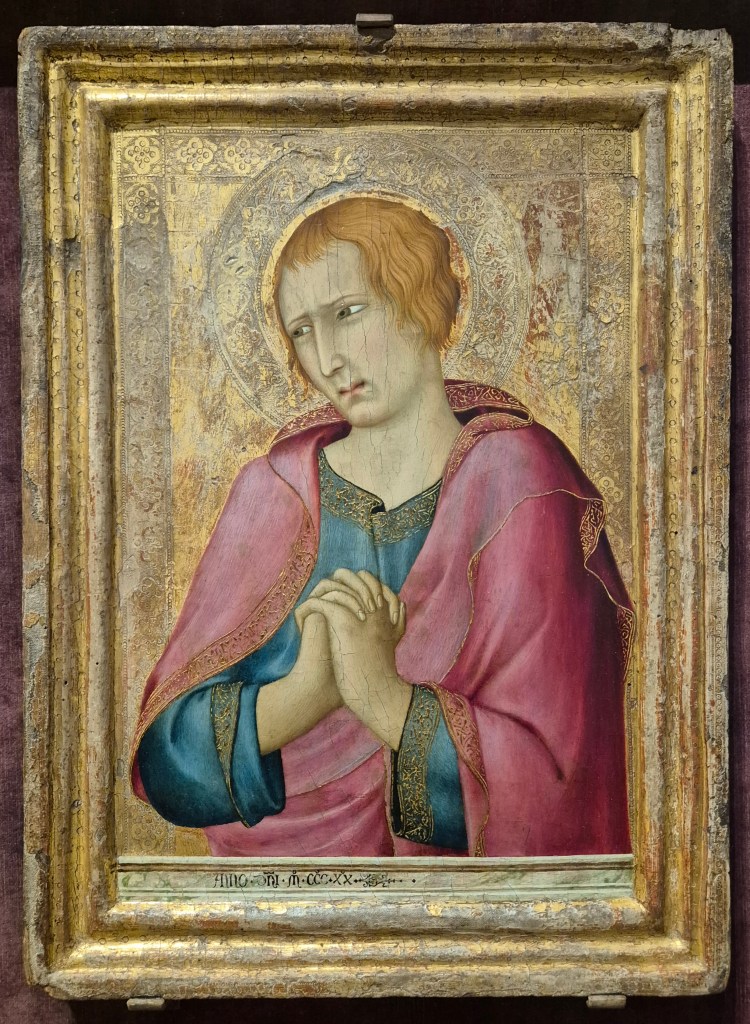
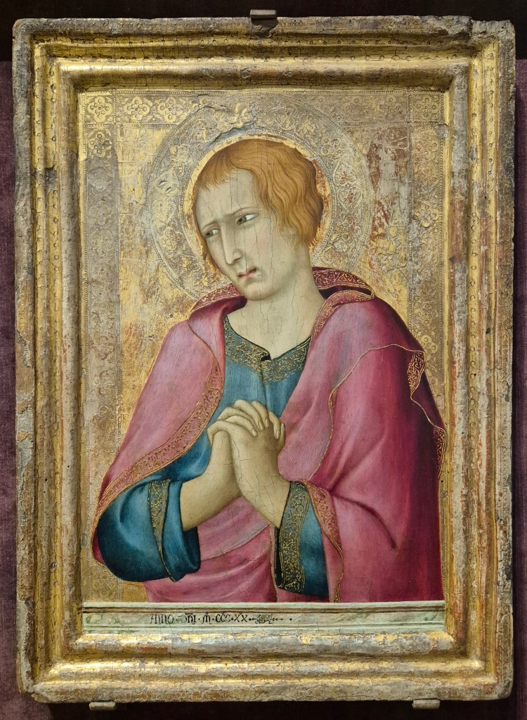
Simone Martini, St John the Evangelist, 1320. The Barber Institute of Fine Arts, Birmingham.

I’m really looking forward to talking about The Barber in London this Monday, 9 February at 6pm and I can’t wait to go back to the museum itself. The Barber Institute is part of the University of Birmingham, and I’ve only actually visited once, but it does have the most fantastic collection. However, there is no point going there now, as the building is being renovated, which is why some of the best paintings are currently on loan to The Courtauld. There aren’t a huge number, so we should be able to look at each one in some depth. However, there are paintings by Bellini, Gossaert, Hals, Rubens, Van Dyck, Poussin, Claude, Vigée Le Brun, Reynolds, Turner, Whistler and Monet – among others – so there will be more than enough to see!

I will then talk about two British artists who both painted portraits – although I think that the first, Lucien Freud, who I will look at on 23 February, was really only interested in portraiture to the extent that a face was part of a human being as a whole. The current exhibition of his work– at the National Portrait Gallery – is called Drawing into Painting, and is the first to focus on works on paper. The following week, 2 March, I will turn to William Nicholson, who started life as a printmaker, became successful as a portraitist, and today is best known (perhaps) for creating some of the most exquisite Still Life paintings of the 20th century. His work can currently be seen in a superb exhibition at the Pallant House Gallery in Chichester.

If you weren’t able to make last Monday’s talk, my enjoyment of the Anders Zorn exhibition in Hamburg – which will open soon in Madrid – was such that I gathered enough material to put together two talks. I am hoping to deliver the second, covering the most spectacular portraiture, etchings, the nude and Zorn’s homeland, on 16 March, but I’ll have to wait for a few things to settle down before I can be sure of that – so keep your eye on the diary. I’m hoping that subsequent talks will include Seurat and the Sea, Michaelina Waultier, Tracey Emin and possibly even an introduction to the Canaletto and Bellotto exhibition in Vienna… but more on them soon.

If you do book any of these events, Tixoom will send an email with the ticket – effectively a link to the talk – within seconds. If it doesn’t arrive within 24 hours, please let me know and I’ll try and sort it out: it would be easier to do it then than 5 minutes before the talk! You should also get two reminders, at 24 hours and 15 minutes before the talk, and these will also include the link.

Today, though, I want to look at a painting from The Barber Institute which is not currently at The Courtauld. However, it’s not far away: it’s in the Sainsbury Wing, at the other end of The Strand, in Room 58 of The National Gallery. It travelled to London for the Siena exhibition, which ended on 22 June 2025, and has yet to return to it’s Birmingham home… It probably won’t get there before 28 June 2026, though, as that is when The Courtauld’s exhibition ends.

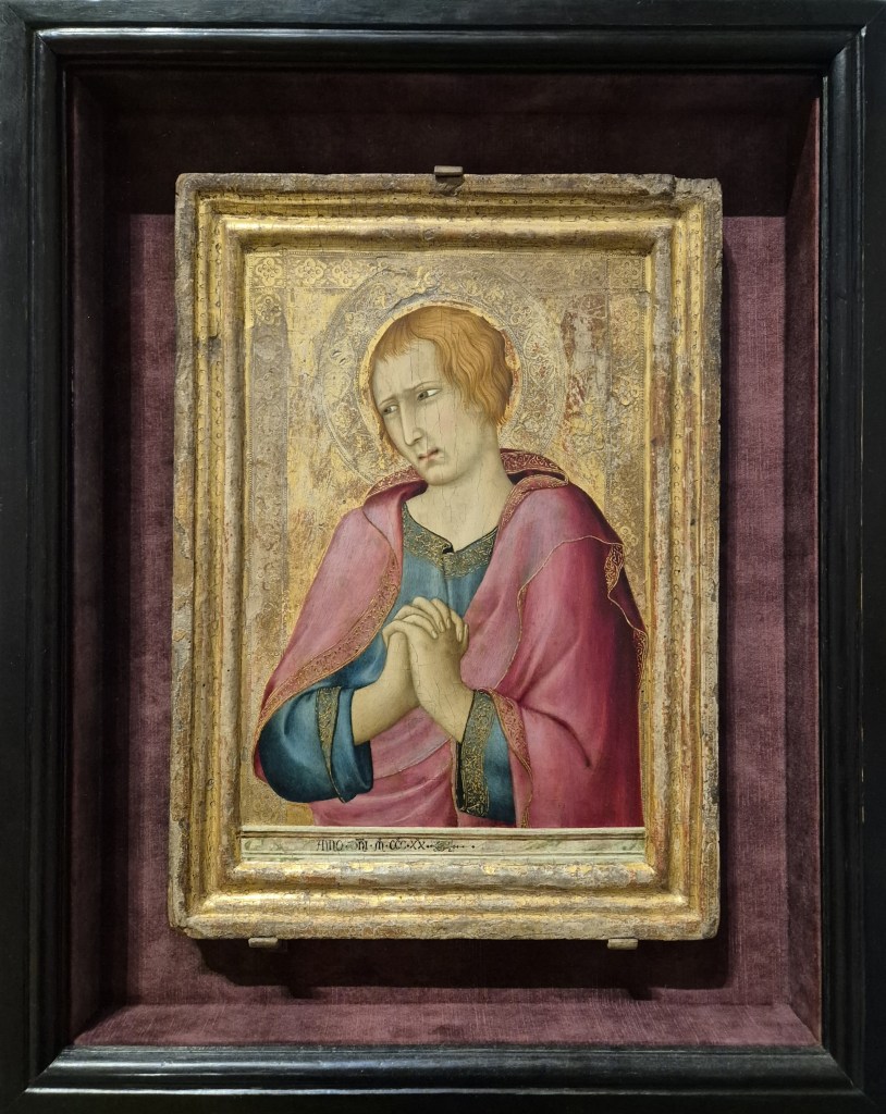
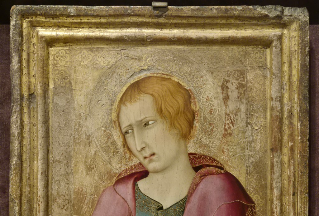
At some point during last year’s Siena exhibition at the National Gallery I was talking about Simone Martini, and mentioned today’s painting – one of the treasures of the Barber Institute in Birmingham – and the next comment, from someone else, was that it wasn’t an especially significant example of his work … or words to that effect. When I wrote about Simone Martini before (last February, as it happens – see 243 – Our most delightful Simone) I started by saying how, as an undergraduate, I and my fellow students held Simone in the highest regard. I wanted to write about this painting today to explain why, however ‘significant’ or otherwise it is, it is still a remarkably beautiful image, and also why, even if there doesn’t appear to be much to say there is still a lot to see, a lot that we can still enjoy, if we slow down and take the time. Yes, it is a relatively simple painting, a single male figure, half length, wearing a blue robe and red mantel, with his hands clasped – but that’s not all it is. That someone has considered it to be significant at some stage in its history is demonstrated by the fact that, framed as it is, it has also been set within an outer, black ‘box’ frame that is lined with red/pink velvet – matching, more or less, the figure’s mantel – which makes the painting itself ring out like a valued jewel mounted in a well-crafted, but not obtrusive, setting.

As originally painted it had – and still has – an engaged frame. Either the flat wooden panel and surrounding frame were carved from a single piece of wood, or the frame was fitted to the panel before the painting began. The whole surface – panel and frame – would have been sealed with size, a fish-based glue, and then covered with a fine linen fabric, the weave of which can be seen on the outer, flat element of the frame where the subsequent layers have worn away. This would have been coated with several layers of gesso, made from gypsum (calcium sulphate), a bit like plastering a wall to create the smoothest of surfaces on which to paint. The initial design would have been drawn onto the white surface, and then the whole frame and all of the background – the areas which were to be gilded – would then have been painted with bole, a red, clay-based paint. This would enhance the orange colour of the gold leaf, which was then applied, burnished, and tooled (patterned with small metal shapes tapped lightly onto the surface with a tiny hammer). This whole process means that the frame is firmly attached to the painting, and the surface of the gold is continuous from one to the other. However, on the left-hand side there are holes in the frame (which you can’t see in this photo, as they are on the side) telling us that this panel was originally attached to another with hinges: this man is looking to our left towards an adjacent figure in what is generally assumed to have been a triptych, or three-panelled painting.

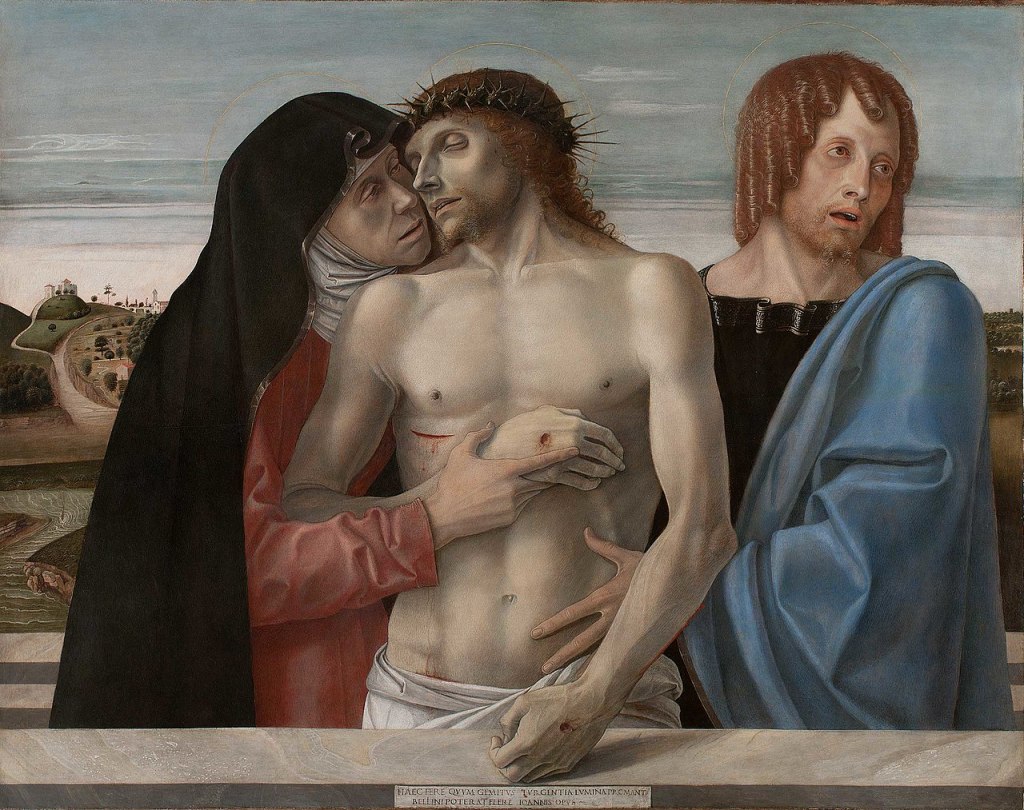
The subject has a halo, so is a saint, and is clean-shaven – the most common way of suggesting that a man was young. Wearing a pinkish-red over blue, the most likely identification is St John the Evangelist, always said to be the youngest of the apostles, and no one has ever doubted this identification. But why would we assume this was part of a triptych, rather than just a diptych? Quite simply, because of his attitude, or mood – one of intense, but suppressed, grief, lamenting the death of Jesus, who was presumably depicted in the panel to the left of this one. At the far left, in the third panel, would have been the Virgin Mary. I can’t find an equivalent as a triptych, but overall the effect would have been similar to the following painting from the Brera in Milan by Giovanni Bellini, dating from about 1460.

The other two panels by Simone Martini – showing Mary and Jesus – have never been located, but then it is surprising that anything has survived from 1320, over 700 years ago. Even this panel shows signs of damage, particularly around the frame – hence the fact that we can see the linen weave, not to mention a number of dents and cracks. Nevertheless, it is still possible to see that the gilding on the frame was itself tooled with a series of circles and dots of different sizes. The flat gold background is also tooled, and is framed by bands containing quatrefoils (four-leafed shapes) which are themselves built up from leaves and flowers surrounded by small circles. St John’s halo appears to sit in front of the tooled frame. However flat we might consider gold ground paintings to be, Martini creates space behind the Saint. The frame is three dimensional, but then if the halo is in front of the tooled framing, and St John’s head is in front of that, then he is being pushed into our space, thus making him look three dimensional, a real presence, standing just in front of us and worthy of our devotion.

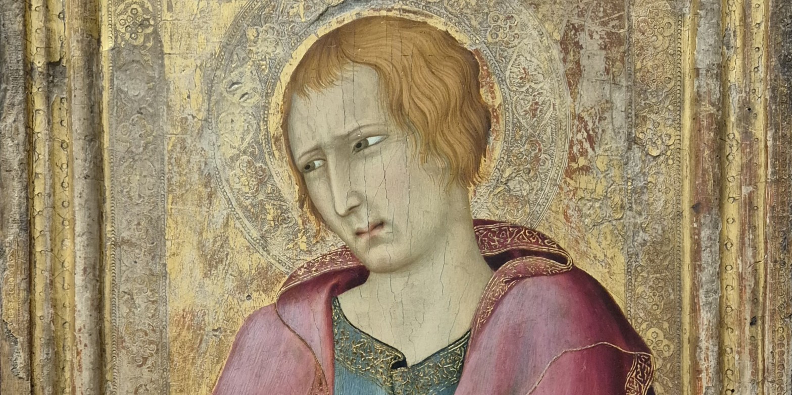
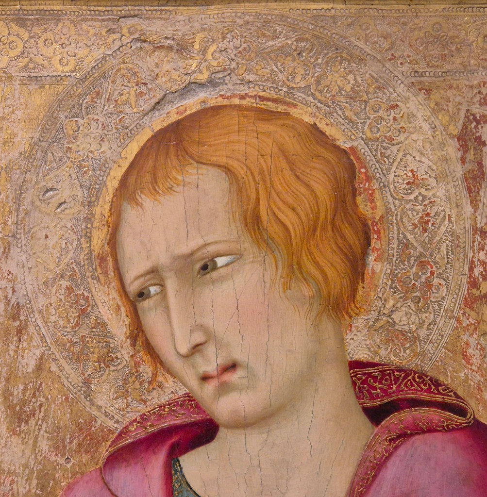
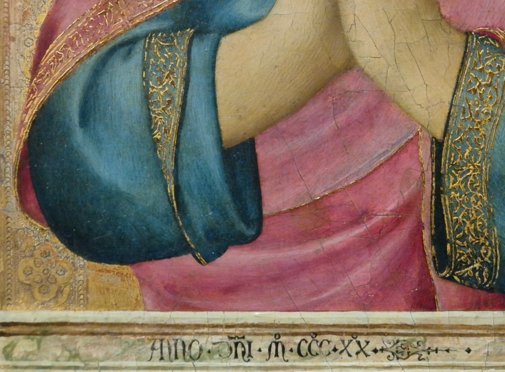
The halo is a circular band slightly wider than the tooled frame of the background, and contains similar quatrefoils as well as larger leaf shapes, or hearts. The inner circle of the halo is just wider than St John’s head, which would therefore originally have been encircled by a thin band of flat, burnished gold. Sadly, much of this has been worn away, with the result that in places we can see the reddish bole which would originally have been under the gold. This additional framing element would have helped to make the head stand out just that little bit more – remembering that, as well as patterning the surface, the tooling was also designed to reflect flickering candlelight: the halo itself would have flickered around the more evenly illuminated head. When seen this close we realise how carefully Martini has controlled the level of John’s grief. The brow is just slightly furrowed, the eyelids narrowed (as they always are with Simone), and the eyes looking out of the far corners – as if he cannot bear to look at the dead Christ full on, but has his head turned slightly away. The mouth is also puckered, tight together at the centre but parted on either side, trying to keep his mouth closed, but on the verge of giving way to intense sobbing. However, as the ‘collar’ of his mantle falls around his neck it casts shadows. The deep red space that this creates is like a gash, suggesting a crying mouth, or open wound. The hem of the garment is folded over, revealing an intricate pattern in mordant gilding (gold leaf which has been stuck on top of the paint). The top of this band corresponds to the level of the Saint’s mouth, and the lower edge to the base of his head: every detail has been carefully planned and precisely measured.

The tooled frame of the gold background continues down either side, but does not get to the bottom of the image, which is crossed by what appears to be a parapet with an inscription on it. However, this parapet is not as deep as the tooling is wide: I get the feeling that the tooling is ‘supposed’ to continue to the ground, framing the full length of the standing figure, it’s just that we can’t see it because the parapet gets in the way, and anyway, the painting doesn’t go that far down. The tooling can barely be seen on the right of the painting, and is hidden by John’s right elbow (on our left), where the mantel loops around the blue sleeve.

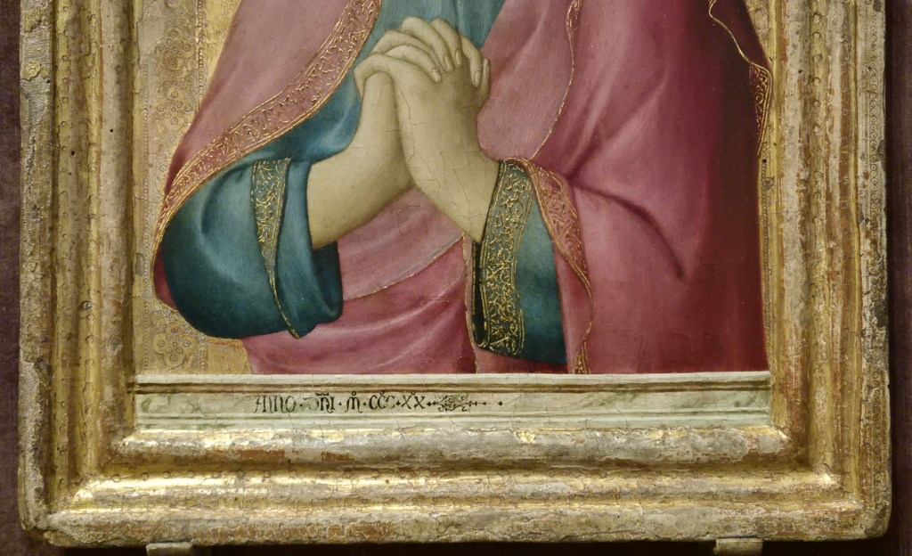
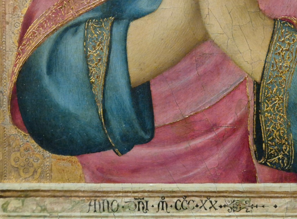
The parapet itself is marbled – it is clearly supposed to be made of stone. The parallel with the Bellini example is coincidental, but may have a common meaning. Bizarrely perhaps, in the Bellini, the Virgin and St John appear to be standing inside Christ’s sarcophagus, the top of the edge of which can be seen far more than the very thin strip at the front. However, there is still space for an inscription, an elaborate, but stirring, signature: “When these swelling eyes evoke groans, this work of Giovanni Bellini could shed tears”. Simone Martini, on the other hand, has simply written “Anno Dni MCCCXX” – ‘the year of Our Lord 1320’. But then, there were two other panels which could have include his name… and potentially something else. I’m intrigued that St John stands behind this parapet though. Does it imply that he and the Virgin were conceived as being in the sarcophagus, as they are in the Bellini? Or does it relate more to the later tendency, in portrait paintings by Jan van Eyck among others, to show their subject behind a similar structure. Parapets like this work in a contradictory fashion, both separating us from the subject, but also forming a bridge towards them. Practically speaking, it also justifies the half-length image: what is the point of painting the legs if they are behind a parapet? Were images like today’s painting the origin for the use of such structures in early Renaissance portraiture? I’ll have to keep thinking about that!

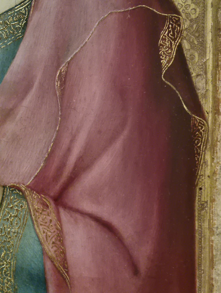
Simone does make the draperies unnecessarily complicated – although that only adds to my enjoyment of the painting. I love the way that the curve of the mantel around the elbow echoes the equivalent curve of the blue sleeve, and also how the sleeve parallels the continuation of the hem of the mantle from left to right as it emerges from behind the sleeve. I’m also intrigued by the way in which John’s right sleeve has been rolled up. We see the left sleeve (on our right) at full length. There is a deep shadow within the opening, framed just to our left by the vertical fall of the mantel, which also casts shadow. On our left, the right sleeve has been folded back, and then back out again, thus revealing the top of the embroidered gold band.

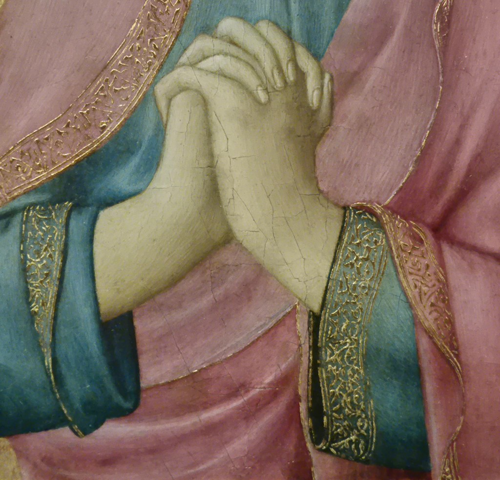
Great care has been spent on the interleaving fingers which create arcs curving from right to left and then back again, almost like a bridge going over the hands. Martini has even tried to show the thumb of John’s right hand, and even if this is not entirely successful, no one else at the time was getting this close to a naturalistic depiction of hands. There is something about the rhythmic play of the fingers, the different ways in which they overlap, and the arching backwards and forwards, that expresses to me the movement inherent in the wringing of hands. They sit neatly against the blue background, while the right arm, bent at the wrist, also echoes the upward curve of the lining of the red mantel, which appears to be marginally lighter than the outer side. This detail somehow captures the reflection of light from the gilding of the hems rather beautifully, hinting at the magical effect that illumination by flickering candlelight in a dark setting must have created. At John’s left wrist the gold embroidered hems of both the blue sleeve and red mantel emerge from behind the arm at the same point. While the embroidery on the blue sleeve is fully visible as it falls, that on the red mantel flares out and folds back, with the hem undulating to the bottom of the painting. Meanwhile, the very edge of the mantel continues upwards from the same point behind the wrist. I find all of these delicate coincidences, the echoes, the concentric curves and flowing folds astonishingly beautiful – and remarkably expressive.

The hem of the mantle is mapped carefully as it rises in front of the chest and then falls again just below the level of the shoulder. The lighter lining is delicately trimmed by one edge of the embroidered gold, defining its journey around the upper arm in broken curves with a nervy, tentative quality. In a few places the ‘outside’ of the mantel is partially revealed, with different widths of the embroidered gold band becoming visible, glowing out of the darker shadows to our right of the figure. Most of the tooled frame of the background is hidden here, and there is even the suggestion, at one point, that the mantel has actually fallen outside the frame, and so into our space. St John is present, in front of us. Originally, the Virgin would have joined him in lamentation over the dead Christ, in front of whom we must imagine ourselves standing. John is undoubtedly shaken by everything that has gone before, his emotions are stirred, but under control. Nevertheless, the depth of his feelings are made clear in the subtle turn of his head, the angle of his eyes, the pursing of his lips and the delicate, detailed sensitivity of the fall of light and shade, and in the flow of every line. I’ve quoted from the opening speech of Shakespeare’s Twelfth Night more than once recently, and I’m going to do so again – but not the first line, this time. I’m more interested in the fourth today: That strain again! it had a dying fall… Orsino is talking about the emotive power of music, but I’m seeing that ‘dying fall’ in every line of this painting. It is a wonder. I am so glad that it can currently be seen at the National Gallery, an introduction, at some remove, to the rest of The Barber in London.

267 – From A – Z: All about Zorn

267 – From A – Z: All about Zorn

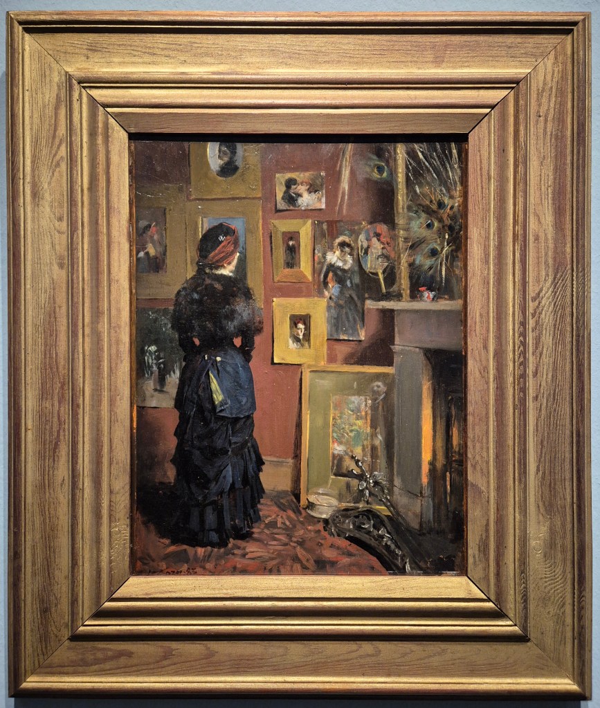
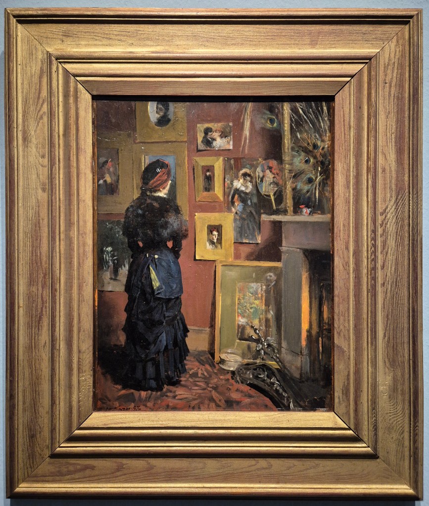
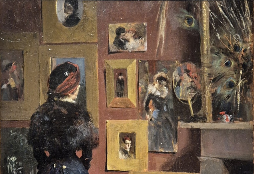
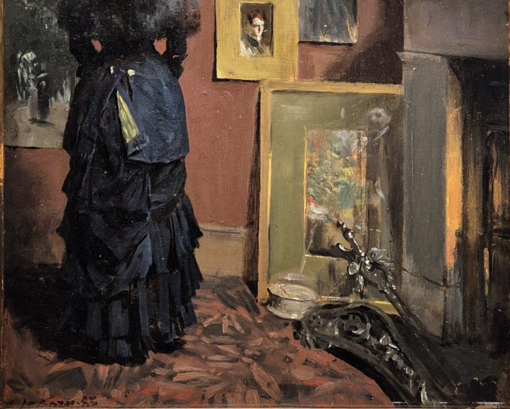
Anders Zorn, Zorn’s London Studio on Brook Street, 1883. Zornmuseet, Mora.

I would love to say that I planned this, but I really didn’t. Last week I was talking about Anna Ancher, who was born on 18 August 1859, and this week I’m moving on exactly 6 months, to Anders Zorn, born on 18 February 1860. Both Scandinavian, they were born far from the capital of their respective countries, Denmark and Sweden, but both trained in the capitals – Copenhagen and Stockholm – and both travelled widely… though few travelled as widely as Zorn. So today I’ve called the post ‘A – Z’, which you can read as Ancher to Zorn, or simply as the latter’s initials. This would make sense, given that I’m writing about a painting that, despite its female protagonist, is really all about Zorn. This Monday, 2 February at 6pm I will talk about the exhibition of his work that I saw in Hamburg a couple of weeks ago, which unfortunately has just closed. However, it is transferring to Madrid (19 February – 17 May) in what I believe will be substantially the same form, although with the addition of a subtitle: Anders Zorn – Travelling the World, Remembering the Land. If you like John Singer Sargent and/or Joaquín Sorolla I really recommend that you join me: Zorn’s work is every bit as colourful, exuberant, and painterly as theirs, and sits in the same area of ‘Realism influenced by Impressionism’ that they – and Anna Ancher – all inhabit. The following week, 9 February, I will look at The Barber in London, the paintings from the Barber Institute in Birmingham which, thanks to the refurbishment of their usual home, are currently on display at The Courtauld. The Barber really does have an astonishing array of masterpieces, including paintings I love by artists I don’t always like.

I’m then going to turn to two British artists who are often associated with portraiture, even though this was only really a minor interest. The first is Lucien Freud, who is being celebrated at the National Portrait Gallery with Drawing into Painting, the first exhibition to focus on his works on paper. I’ll introduce that exhibition on 23 February, and then on 2 March I will turn to William Nicholson. His work can currently be seen at the Pallant House Gallery in Chichester in the next of their superb series of exhibitions looking afresh at unjustly neglected British artists.

I’m entirely convinced that Anders Zorn was one of those artists who not only loved what he did, and never took a break, but who always knew exactly how to present himself. The result of this was that, from the very beginning of his career, people took him entirely seriously. Born in Mora, a little over 300km northwest of Stockholm, he studied at the Royal Swedish Academy of the Arts from 1875 – when he was only 15 – until 1880. He arrived intending to study sculpture, but before long switched to a focus on watercolour, at which he excelled – as we shall see on Monday.

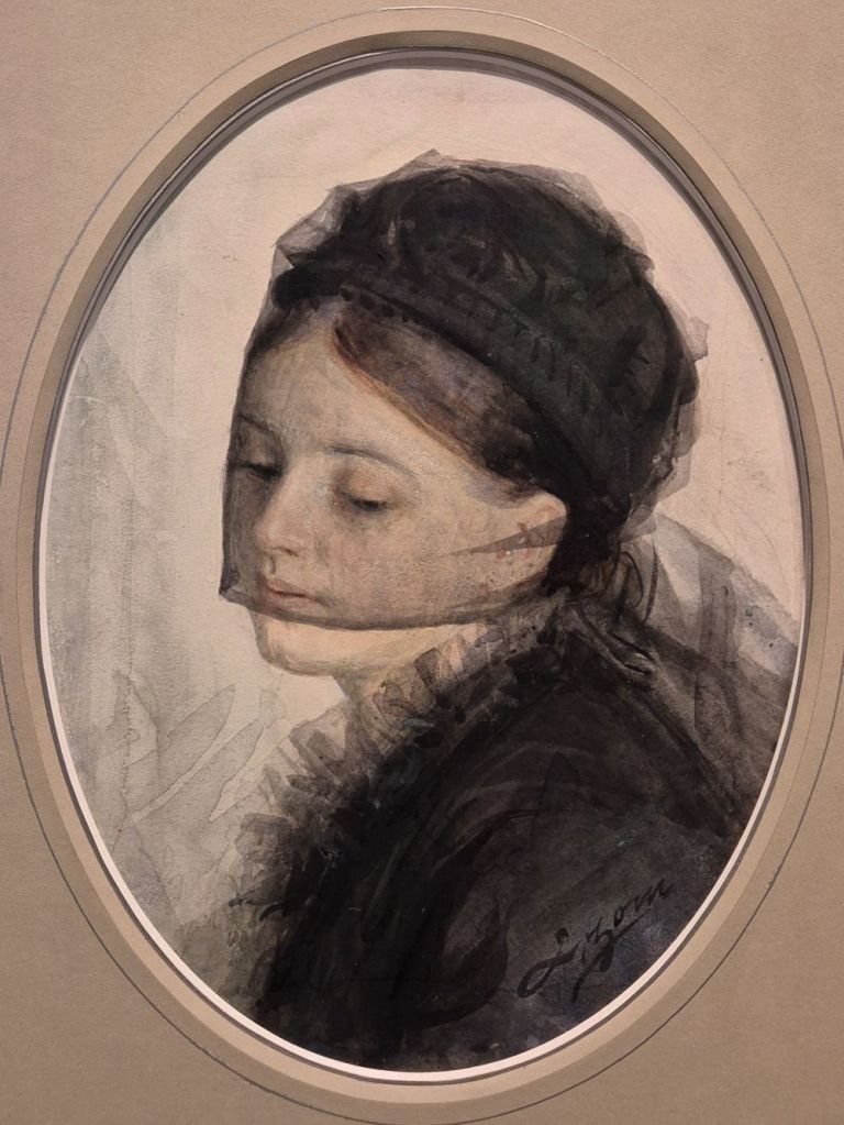
At the Academy’s annual exhibition in 1880 he exhibited a watercolour called In Mourning to great acclaim, and he built on this success by producing several versions of the same subject in the following years. Along with the acclaim, the painting also brought numerous portrait commissions from local wealthy families. However, not satisfied with success at home, he decided to try the international market, and headed to London in 1882. This could so easily be the story of an ambitious young artist (he was still only 22) starving in a garret, but it really isn’t – far from it. He got in touch with the Swedish Embassy to be assured of some good contacts, and after a few months in Richmond, he took an apartment in Brook Street in the heart of Mayfair. He also ordered expensive suits, tasteful calling cards and quality furniture, setting himself up with all the appearance of a successful artist, even if he hadn’t yet had the time for a career. By doing this, though, he was able to present himself as exactly the right, classy, artistic outsider that the great and the good of London would seek out in order to be portrayed. He might have chosen Paris, which was considered the ‘centre of the art world’ at the end of the 19th Century, but he headed to London because it was in England that watercolour first became a Fine Art rather than just a desirable accomplishment for amateurs – thanks to Turner as much as anyone – and he wanted to hone his craft. It is Zorn’s position in London that is celebrated in today’s painting.

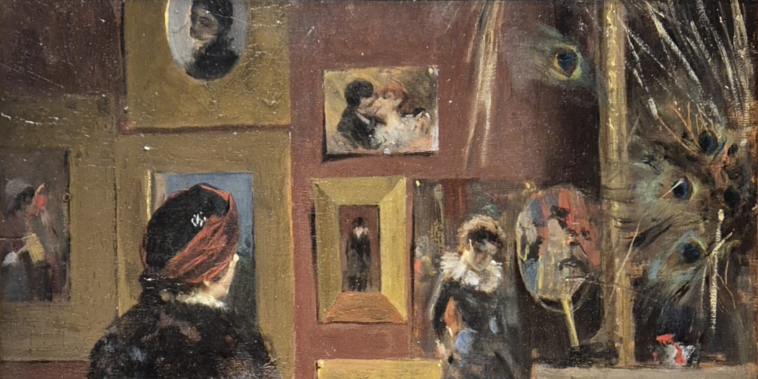
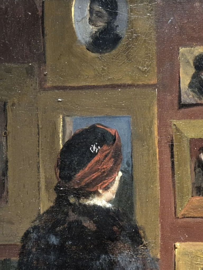
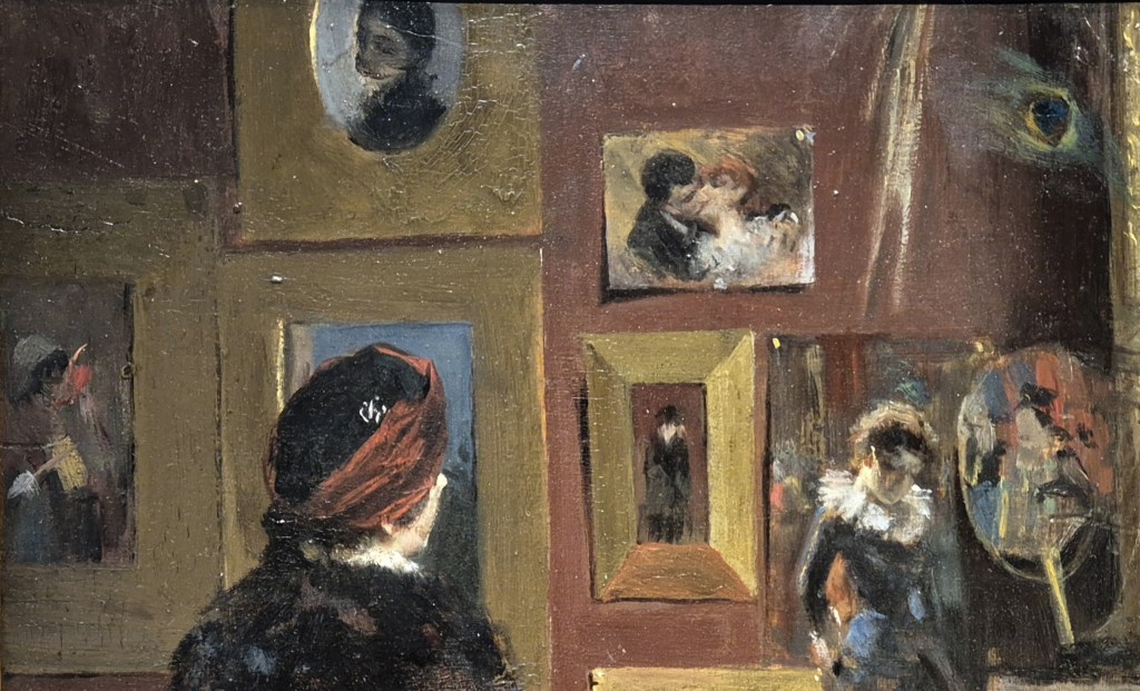
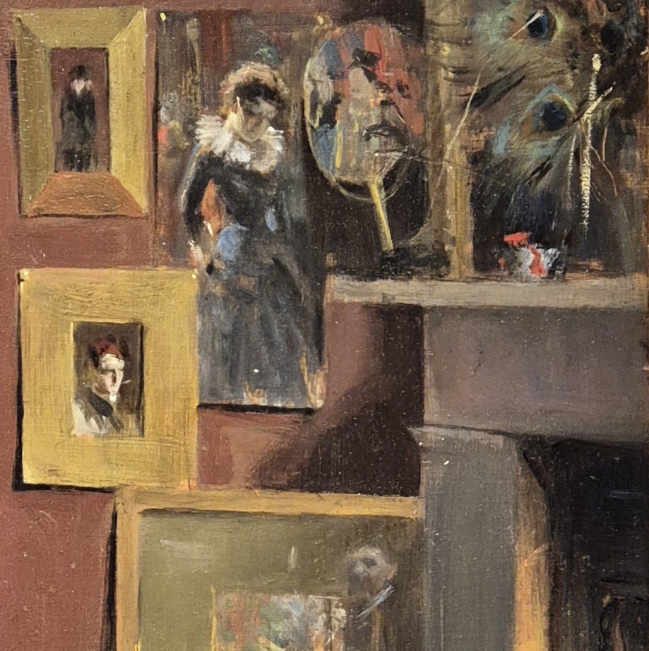
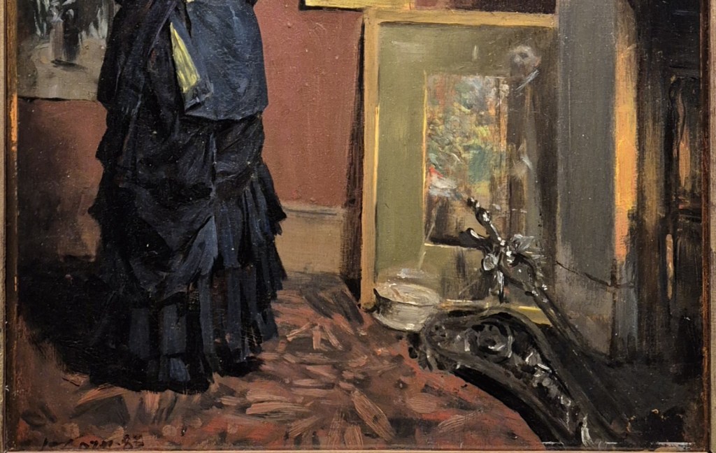
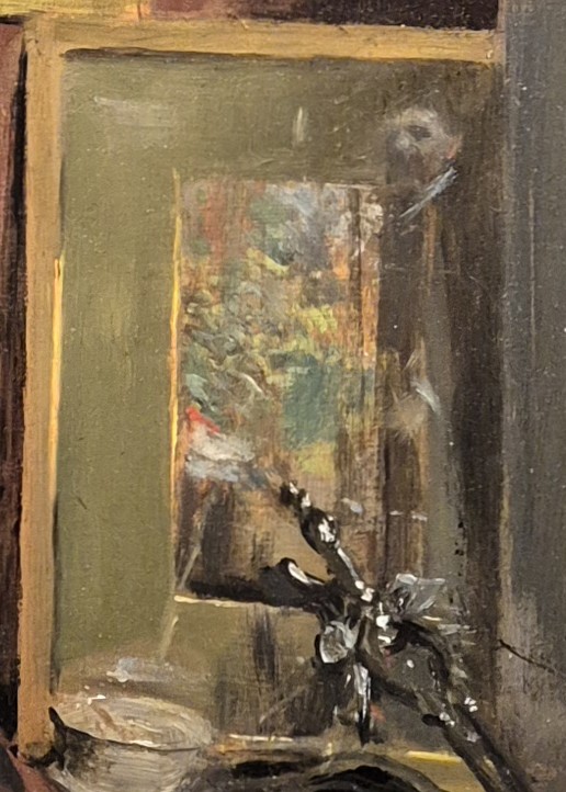
At first glance it might not appear to be about Zorn at all – even if we can assume, given the title (Zorn’s London Studio on Brook Street), that this woman has come to look at Zorn’s paintings. We could also assume that all the images in this room are by the Swedish artist – however, there is one exception. It is a well-appointed room – richly decorated with brick red walls and a fitted carpet patterned with brick red and black. We don’t see any of the ‘quality furniture’ I mentioned above, but there is a warm glow coming from the fire, so there is no economising on fuel. Given that the top of the frame of the highest exhibited painting is not visible, we can also tell that there is a high ceiling. This is a large room, warm and comfortably appointed: Zorn shows us that his lifestyle is very far from the romantic idea of a starving young artist. He also shows us how productive he is. Even in this corner of the room nine of his works can be seen, framed or unframed, on the wall or on the floor. A fashionably-dressed woman, clad in black, has arrived to look at the work, and is standing with her back to us, looking to her right so we just see her face, her gaze encouraging us too to look at the pictures on display – she is, effectively, a repoussoir.

These are all details from photos I took in Hamburg, and sometimes the lighting is not ideal. In places you can see light reflecting off the textured oil paint. Details like this are a reminder that, despite being a two dimensional art form, a painting is, in itself, a solid, three dimensional object. This fact is often disguised by official, ‘professional’ photographs. Although Zorn truly was a master of watercolour, the art-loving public would expect to see oil paintings from any self-respecting master. However, this is oil on wood – an oddly old-fashioned support for the 19th century – and this might reflect Zorn’s relative inexperience with the oil medium. Wood provides a harder, less flexible surface, and so it can be useful for painting small details: this isn’t a large work (38.9 x 29.6 cm).

The woman wears a black hat with a very broad maroon ribbon wrapped around it – or a headdress that is mainly built up from this ribbon (…I’m not a milliner!). Her head is beautifully framed by a painting in a flat, broad, gilded frame, and painted sky can be seen around her hat. The ‘profil perdu’ – or lost profile – stands out brightly against what is probably dark vegetation in one of Zorn’s many early landscapes. The visiting woman is looking at a painting of another woman, who also wears a black dress, but with a large white collar, almost like a ruff. This painting is not framed, and two white dots in the top left and right corners tell us that it is a watercolour, on paper, which is pinned to the wall. Two other images have been placed over it. The bottom left corner is covered by another broad, flat, rectangular frame, containing an image of a young man (probably…) looking down. The top right of the watercolour has a Japanese fan (… or at least a Japanese-style fan) propped in front of it. This is the one image I mentioned that is not by Zorn. It shows him to be a member of the avant garde: artists such as Whistler, and others in the Aesthetic Movement, who were strongly influenced by Japanese art. The peacock feathers which are in front of what I assume is a mirror are another feature connecting Zorn to the latest trends in British art: the Aesthetes would swoon.

Sitting on the mantelpiece is a small white box with a red ribbon: little flashes of red like this are almost a signature motif for Zorn. If we tone this colour down to the maroon of the woman’s hat, we can see the same colour echoed across the painting. It is used on the fan, in the watercolour (between the woman’s wasp waist and her arm), and in the painting on the far left. It isn’t that different to the brick red colour of the wall, all of which adds to the sense of a warm, harmonious setting. At the top of the painting is an oval image in a flat, gold frame. It shows a veiled woman looking down to our left. Anyone who knew Zorn’s work – or his reputation – would have heard about this painting. You have too: I mentioned it above.

In the lower half, there is another watercolour pinned to the wall. As far as I can see it shows two women walking arm in arm, the one on our left wearing a long lavender-taupe skirt, and on our right a long black dress and a broad, pale-coloured hat. She may also have a furled umbrella over her arm… Light comes into the studio from a window behind us, to the right, and casts the visiting woman’s shadow onto the patterned carpet – the pattern built up over black with short, painterly strokes of the brick red paint. The woman’s outfit includes a cinched black jacket, which falls below the hips, vented at the back. There are two yellow buttons at the top of the vent, one side of which is turned back to reveal a yellow lining. The skirt is gathered beneath a form of tail, which hangs down below a bustle, and there are two more layers of the skirt further down (and yes, I know as little about describing dresses as I do about hats). The painting of the young man appears to look down towards the fire, and beneath it is a narrow, portrait-format painting which is probably also a watercolour. It has a broad, olive-coloured mount (usually used for works on paper) and a narrow frame, and, judging by the sheens of pale paint which cover the surface, it is also glazed. The greens and yellows in this painting – together with a splash of red – suggest that it is an image of a garden. There are some fire irons lying on the floor in front of this framed, glazed watercolour, and they lead our eye into the room from the bottom right corner of the painting. The glow of the fire, illuminating the interior of the fireplace and the edge of the mantel, is a deliberate contrast with the daylight shining into the room. The framed watercolour, resting on the floor, casts a shadow on the wall. I think Zorn is showing off his ability to paint different types of light, even in these small details.

The painting at the top that I said people would have known about is none other than In Mourning, the watercolour that made Zorn’s name at the Royal Swedish Academy of the Arts in 1880. The one depicted in the studio is presumably one of the later versions which he is using as a form of calling card in London. The version on the right is the one I saw in Hamburg – the original – which now belongs to the Nationalmuseum in Stockholm. What won people over was the extreme delicacy of the depiction – both in terms of technique and emotional involvement. Particularly admired was the transparency of the veil: extraordinary skill for someone who was only just graduating. Zorn’s ability to articulate the subject’s neck is also commendable. Not only is her head tilted to her left, but also twisted round towards us slightly. As a result, as she looks down, she appears to be looking at the ground in between us and her – a modest, averted gaze meant to disguise the extremity of her loss, but which, artistically speaking, also encourages empathy in the viewer. The gossamer collar is another remarkably virtuosic detail, while the broad wash of colour, in bold strokes at the bottom left, is a clear reminder that this is a painting – a performance of skill. For his whole career Zorn’s paintings are always performative: he is always reminding you precisely how brilliant he is, although in an entirely charming way.

However, the idea that the woman In Mourning is looking at the floor in between us is determined by the context, when we are only looking at her. Where does she appear to be looking when hung high on the wall in Zorn’s studio?

I am entirely convinced that he has set up a trail, a series of shared glances to lead our eye around the painting. In the small oil version we cannot see the position of the mourning woman’s eyes, but the position of her head suggests that she is looking towards the painting below her to the left. There are flashes of red and yellow in this latter painting, which make me think that it is one of the images painted during his first visit to Spain at the age of 21. It appears to show a woman looking to our right – so effectively towards the visitor in the studio. The visitor is also looking to our right, at the woman with the large white collar in the watercolour, who is looking down. It’s not just the visitor looking at her: the figure in the Japanese fan is facing to our left, and so also looking at the woman with the white collar. The latter’s neck is strongly tilted downwards, as are her eyes – as if she were looking towards her feet.

In the broader context she could even be looking at the painting below her – as could the young man in the small, framed image, who I previously suggested was looking towards the fire. If we follow their gazes we can see another face – but it isn’t a face in a painting: it appears in front of the olive mount, and so must be one of the reflections in the glass.

It is, in fact, a full-length reflection of a man in a dark suit with a white collar. His hair is dark, and his eyes are seen as pools of dark shadow. The edge of his nose catches the light, but his mouth also appears to be shadowed: it looks like he has a moustache – as Zorn did. Half-way down the right-hand edge of the garden scene we can see the reflection of a hand and a bright flash of white cuff. Who else could it be but Anders Zorn, watching over the visitor’s shoulder, offering information and advice, on hand to take a commission to make her look just like the woman with the large white collar? The fire irons lead our eyes into the painting, yes, but specifically they lead us to the glazed image bearing the reflection of the artist, a self portrait which is effectively looking out towards us. The fire irons lead us to his image, and they are balanced in the bottom left hand corner by his name, the signature on the patterned carpet. This really is all about Zorn – his studio, his works, his image, his name… his visitor.

His technique is superb, his understanding of the craft unparallelled, and his ability to promote himself, frankly, second to none. If In Mourning was the starting point of his career – the ‘A’, if you like, then ‘B’ is for Brook Street. On Monday we will see the rest of the journey, taking us all the way to the ‘Z’ for Zorn.   

266 – A Room of One’s Own

Anna Ancher, Evening Sun in the Artist’s Studio at Markvej, after 1913. Skagens Museum, Skagen, Denmark.

Over the next two weeks I will be giving two talks about Scandinavian artists. This Monday, 26 January I’m starting with Anna Ancher, the wonderful but relatively little-known (as far as the UK public is concerned) Danish artist. Her exhibition is on at the Dulwich Picture Gallery until 8 March, and so still accessible to many of you. The following week, Monday, 2 February I will talk about Anders Zorn, whose work I have just seen in Hamburg. The exhibition I visited closes this Sunday, which doesn’t give you much notice. However, it is travelling to Madrid, so if you like what you see – which I’m sure you will, if you like either John Singer Sargent or Joaquín Sorolla – you will have several months to get there (19 February to 17 May). A week later (9 February) I will introduce The Barber in London– the selection of masterpieces from the Barber Institute in Birmingham which are currently on loan to The Courtauld. Further events will be listed in the diary as soon as I have pinned them down, but should include introductions to the National Portrait Gallery exhibition Lucien Freud: Drawing into Painting on 23 February and to the William Nicholson exhibition at the Pallant House Gallery in Chichester on 2 March.

If you do book any of these events, Tixoom will send an email with the ticket – effectively a link to the talk – within seconds. If it doesn’t arrive within 24 hours, do let me know and I’ll try and sort it out: it would be easier to do it then than 5 minutes before the talk! You should then get reminders 24 hours and 15 minutes before the talk, and these will also include the link.

One of the glorious things about the paintings of Anna Ancher is that they are so simple, so straightforward, and so easy to understand. And yet there is nothing banal about them: she got to the heart of a scene and saw the beautiful in the everyday. Admittedly this particular painting is not entirely typical of her work – but it does include many elements that are. It was never formally exhibited in her lifetime, and was only found, in her studio, after her death. This is why it is exhibited without a frame: the photograph shows it against the buttercup-yellow wall on which it is currently hung in Dulwich.

The painting is like a character study, preparatory for a more fully thought-out work, but it is the character study of a room, and of a specific time of day. It is an exploration of light at a particular moment, when, as the sun heads towards the horizon, light refracts across a tangent of the earth’s surface and only the orange wavelengths reaches us – or, in this case, reach the far side of the room opposite a casement window. The city of Bath, in the South-West of England, can look especially beautiful at this time of day. The orange light enhances the already-warm colour of the Bath Stone – a ‘honey-coloured oolitic limestone’ – from which most of the city is built. The glow is enhanced when seen against its complementary colour, the darkening blue of the sky. But that’s Bath, in England, and this is Denmark, and the very north of Denmark at that. This is ‘evening’, and in Skagen, where Ancher was born, where she grew up and where she worked, evening could come within a 7-hour range, according to the time of year. The sun sets at 15:30 in the depths of winter, and 22:23 at Midsummer, when the day is 10 ½ hours longer than it would be in December… but then, it’s only slightly further North than Aberdeen, in Scotland, or at about the same latitude as Sitka, Alaska…

Born Anna Kirstine Brøndum on 18 August 1859, her parents ran Brøndum’s Hotel in Skagen, a coastal town at the very Northern tip of Denmark which saw an influx of artists keen to explore the light of this coastal fishing colony. The 19th century saw many such ‘retreats’, including St Ives in Cornwall (visited by Anders Zorn, whose work we will enjoy next week). There was also Cullercoats, just North of Newcastle (frequented by the American Winslow Homer), and Staithes, in Yorkshire (where Laura Knight lived for a while) – and these are just the ones I’ve mentioned in my talks. I say ‘retreats’… They may have been a chance to get away for the artists, but for the local residents their remoteness, and the harsh climate they had to endure in order to eke out a living, was anything but a choice. For Skagen, it was a new phenomenon in the 1870s, with the first two artists staying at Brøndum’s Hotel in 1872. More came the following year, and in the summer of 1874, there was a young artist from the island of Bornholm, South East of Copenhagen: Michael Ancher. Anna was on the verge of turning 15, but the two bonded over art, with the older man offering tuition to the younger girl. They were engaged three years later, and married on Anna’s 21st birthday, 18 August 1880, at which point they moved into the Garden House of Brøndum’s Hotel. In 1884 they moved into a larger house in a street called Markvej, ‘Field Road’ or ‘Way’. Michael was extremely supportive of his wife’s career – they collaborated, and exchanged ideas (as we will see on Monday) – and yet she didn’t have her own studio until an extension to the Markvej property was built in 1913. This very studio is the subject of today’s painting: a room of her own (precisely what Virginia Woolfe said a woman needed to be a successful writer). Given that the extension was built in 1913, this painting is dated ‘after 1913’.

However, I do wonder if this is actually 1913 itself: the room is so tidy, to the extent of being empty. But then, Anna Ancher seems to have had a habit of putting things away. In the 1960s, when the Markvej house became a museum dedicated to the work of both Anna and Michael Ancher, thousands of sketches were discovered. Anna had, apparently, ‘hidden her oil studies away in drawers, cupboards and closets’, according to the catalogue of the exhibition. I’d be interested to know why the think the studies were ‘hidden away’ rather than just ‘put away’ – in order to be tidy… Either way, this sketch is not something Ancher had exhibited. Maybe she was just trying to capture this phenomenon, this effect of light, in order to be able to use it elsewhere, or maybe she was using the study as a tool to look more closely at the subtle variations of colour and light, and to practice her ability to paint them. Alternatively, she could have been worried that, as a painting in its own right, it might not have been received well – or even, understood – unpeopled as it is, and devoid of narrative. For its day, it is remarkably innovative, especially given the more conservative attitudes prevalent in Denmark at the time. Things have changed, though, and studies such as this are now key to our understanding of Anna Ancher’s work. And despite what I said, this room is not empty: it is full of light – and colour. And it is, of course, the colour of the light that affects everything else we see.

This is the very top of the painting, with the sunlight glowing somewhere between orange, amber and peach on the right-hand wall. We do not see the ceiling of the studio at all, and in the dim light of dusk, at the top of the painting the corner of the room cannot be distinguished. However, at roughly the same level as the top of the patches of orange light, the corner comes into sharp focus. The right-hand wall is slightly lighter, while the wall facing us takes on a marginally darker shade of lavender.

This differentiation in tone is even clearer if we look lower, seeing the full extent of the patches of sunlight. The darker area on the opposite wall reaches from the sharply-defined corner past irregular, diagonal strokes to bolder, horizontal marks. Gradually, as the contrast between the lit wall (on the right) and the wall in shadow becomes less significant, these get lighter: further from the corner the opposite wall is, of course, closer to the window itself.

If you have the opportunity to get even closer to the paint surface, the way in which the golden glow is established seems remarkable – even incredible. There are small, tentative dabs of the brush in subtly varied shades – orange, amber and peach I have suggested, but I would add salmon, terracotta and a deep buttercup yellow as well (although the perception, and naming, of colour is notoriously personal). The rectangles of light are only loosely defined, separated by sections of the apparently-lavender wall. However, the framework of the window itself, projecting the light and shade onto the wall, does not seem regular. This is presumably due to obstructions to the sunlight both inside and outside the room. There could be trees in the garden, and often – and we know this from other paintings which we will see on Monday – Ancher arranged plants on her window sills. The irregularity of the brushstrokes implies a sense of movement, though, as if the sun might be shining through leaves which are rustling in the breeze.

The furnishing of the studio is spare – although of course it could be that clutter has been cleared, and space has been created, simply to allow the artist to paint a study of space. However, the arrangement of objects looks spontaneous, rather than the controlled composition of so many still life paintings (you could, however, argue that this painting is exactly that: a Still Life). Two canvasses lean against the right wall in the back corner. The further one is built up with extreme economy of means – two vertical strokes of paint framing several loosely-applied horizontals. The nearer canvas has a cream-coloured frame, and a darker, taupe or mushroom-coloured surface – presumably a ground, as there is no visible imagery. The bottom of the frame stands away from the wall, and the canvas casts a triangle of shadow behind it – or rather, almost a triangle, as the wall has substantial wainscotting which affects the fall of the shadow. The contrast between the pale lavender of the wall on the right, and the darker tones of the opposite wall are particularly clear in this detail.

Closer to us, in the corner of the painting, are a small, circular console table with a slender stem supported on three curving legs, and what looks like a bureau or desk – it appears to have a roll top. On the far right, coming down the edge of the canvas, there are black details – but I’m afraid I haven’t been able to work out what, if anything, they represent. The edge of a curtain, hanging in the corner, perhaps?

This detail is taken from a different photograph to the one I started with, and I think the colours are slightly closer to the original – although I’m not convinced it is possible to remember exact colours. What is clear is that, around the bottom left of the patches of sunlight, the wall looks more blue. The wall may not have been ‘coloured’ at all, though. In all probability it would have been painted white, or off-white. One of the phenomena that Ancher was investigating is the way in which we experience colour. Not digitally, in an absolute sense, but by comparison. Blue and orange are opposite each other on the colour wheel – they are colour opposites, or complementary contrasts. It is the orange light that makes our mind read the colour of the wall as the absence of orange – or the opposite of orange: blue. This was an essential element of Impressionist Colour theory, and it’s worthwhile remembering that the Impressionists were contemporaries of Anna Ancher, if from an oldeer generation. She first met her future husband in 1874, the year of the first Impressionist Exhibition. However, her first visit to Paris, with Michael, was not until 1885. The 7th Impressionist Exhibition had been in 1882, and the 8th – and last – was in 1886, so she didn’t get to see them. However, in 1899 the couple settled in Paris for 6 months: they would have had more than ample opportunity to see the work of Claude Monet, for example, to whose experiments with light and colour this study comes closest. But then, she could also have seen his paintings in Copenhagen.

Getting closer still the precise forms of the furniture become clearer – as does the way in which Ancher has put them together. The rim of the circular tabletop is defined by two, maybe three curving brushstrokes, and the stem by three or four which splay out as they rise. Of the two objects – boxes, or books? – on top of the table, one is formed by small, overlapping parallel strokes, while the other has a few bold, straight lines. Maybe this is actually her palette! Both objects, together with the roll top of the desk, catch orange light reflecting from the wall. The left side of the tabletop is lighter than the right, the light reflecting from the wall being shadowed from the side that is closer to us by the lower object.

Stepping back again, the way in which the darkness of the opposite wall is affected by the light on the right becomes clearer now, I hope – the patch of deeper lavender coloured brushstrokes seems to spread from the corner at a level with the sunlight, the colours being subtly modulated across the surface. Close up we see the material of the paint itself, the brushstrokes and the subtly modulated tones and hues. From a distance we see the light of the setting sun, like a solid entity hovering, immeasurable, just in front of the wall.

Above all what Anna Ancher painted was a precise, compassionate observation of the way people lived. However, far rather than being banal, mundane, or down to earth, she lifts these situations out of the particular into the timeless and universal. She captures the beauty of everyday life, relishing the calm, the space, and especially, the light. One day I would love to make a ‘pilgrimage’ to Skagen, but am glad that, until 8 March, I can see these paintings in Dulwich. I do hope you can make it, too. If not, maybe you could join me for the talk on Monday?

265 – Dance of Death

Pablo Picasso, The Three Dancers, 1925. Tate Modern, London.

Last year, Tate Modern was 25 years old, and Picasso’s The Three Dancers, painted in 1925, was 100. This has inspired an exhibition of Tate’s entire collection of works by the Spanish master – something which was notably lacking when the museum first opened. Indeed, as I remember it, today’s painting was the only work of his to go on show. As you may have noticed, people love to complain about things, and the absence of most of the work by one of the 20th century’s unchallenged geniuses meant that the new institution was instantly awarded a black mark by many observers… Still, they are all on view now (well, almost all), and I will be talking about the resulting exhibition, Theatre Picasso – staged truly dramatically by artist Wu Tsang and curator Enrique Fuenteblanca – this Monday, 12 January, at 6:00pm.

After this I will give two talks about Scandinavian artists, responding to exhibitions of their work. The Danish Anna Ancher, who I will talk about on 26 January, is currently being exhibited beautifully at Dulwich Picture Gallery. Anders Zorn is on show in Hamburg – and if you can’t get there before it closes on 25 January, you will be able to catch the exhibition later in Madrid… I will talk about him on 2 February, so you’ll be able to see if its worth a trip (spoiler alert: it is!). A week later (9 February) I will introduce The Barber in London – the selection of masterpieces from the Barber Institute in Birmingham which are currently on loan to The Courtauld. Further events will be listed in the diary as soon as I have pinned them down.

If you do book any of these events, Tixoom will send an email with the ticket – effectively a link to the talk – within seconds. If it doesn’t arrive within 24 hours, do let me know and I’ll try and sort it out: it would be easier to do it then than 5 minutes before the talk! You should then get reminders 24 hours and 15 minutes before the talk, and these will also include the link.

At first glance the relationship between this painting and its title is entirely straightforward: we can see The Three Dancers clearly. All three stand on one leg, with the other raised and bent at the knee. The central dancer raises both hands, holding those of the other two. They in turn hold hands behind the central figure’s back. And that – for me at least – is our first ‘clue’: something is going on behind someone’s back. They are all inside, dancing next to a pair of French windows which open onto a balcony. The right door is partly open, with the head of the central dancer framed against the sky, shown as darker blue when not seen through glass. The balustrade, made of thin metal balusters and an equivalent thin rail, can be seen behind the figures through the windows. The wall on either side is decorated with patterned wallpaper. It seems a surprisingly mundane, domestic space for such a performance to be taking place, even if the sight of three people dancing together might be familiar. One reasonably famous example would be the Three Graces in Botticelli’s Primavera (c. 1480, Gallerie degli Uffizi).

The formal similarities are clear: three people dancing, each holding hands with the other two, some arms raised, some lowered, and even a suggestion that the dance might, in some ways, involve a circular, twisting movement. At least two of Picasso’s figures appear to be female – at least, they have breasts – but that might be deceptive. In 1924, the year before this was painted, Picasso designed – and staged – the ballet Mercure for Count Étienne de Beaumont – a rival of Diaghilev and the Ballets Russes, for whom the Spanish master had previously been working. The piece was choreographed by Léonide Massine, with music by Erik Satie. One element of the performance involved three male dancers cross-dressing as the Three Graces, with sexually specific characteristics made out of crudely cut cardboard – hence the ambiguity about what we might be looking at here. Before I take this any further, though, I wonder if another painting – more recent than Botticelli – could have been a source for Picasso. If these are two women and one man (which is possible), then, once they have finished dancing, they might go out onto the balcony and sit down. If they did, they might end up looking like Manet’s The Balcony (1868-9, Musée d’Orsay). Or maybe this is just a result of both artists living and working in Paris at the time, where such balconies were commonplace.

But why do I think that at least one of the dancers might be male? It comes down to a statement Picasso made in 1965 to the British Surrealist artist (and collector) Roland Penrose, who was arranging the sale of the painting to the Tate Gallery (as it was then known) at the time. Picasso suggested that, rather than The Three Dancers, the painting should have been called The Death of Pichot – and this has led art historians to try and work out what the relevance of that event to the painting might have been.

The mention of Surrealism is not coincidental. Picasso was always his own man. He never wanted to be part of a group – however much the Surrealists themselves might have wanted him to join them. He employed so many of the same tools, after all – notably the fact that anything can be read in more than one way. Like the multiple viewpoints of Cubism, which fragment the picture surface and layer the imagery, the interpretation of art can also involve seeing things from different points of view. Visual imagery can be read in more than one way: not so much double entendre as double voir… The different ways in which Picasso uses this slippage between one thing and another helps to build up both the meaning of the painting, and the different characters of the individuals depicted. To be honest, I’m not sure how much of what follows is written down elsewhere, it’s not something I ever remember reading about, apart from the basic idea of who the three dancers might be. It is an interpretation I developed working for the Education team at Tate Modern from May 2000, when the museum opened, to 2008, when I ran off to join the ‘circus’ (again).

Ramon Pichot was, like Picasso, a Catalan artist: they met in Barcelona, and both travelled to Paris in 1900, together with a third man, Carles Casagemas. After the First World War Pichot went back to Spain, but returned regularly to Paris. On one of these visits he died suddenly, and unexpectedly – even though it had been known for some time that he was ill. The date was 1 March 1925, and Picasso was painting The Three Dancers, inspired, no doubt, by the Three Graces in Mercure. Technical analysis shows that he changed his original ideas, though – possibly as a result of Pichot’s death. The figure on the right can be read in a number of different ways. I find the main profile more ‘masculine’ than that of the other dancers, but I don’t think there is any real measure to justify that. You could, however, argue that it isn’t really a profile at all, but a shadow. There are two faces here: a small, brown one, with an angular profile and a black eye, and a larger, black one, the forehead and the nose defined by the pink arm of the central dancer, with the lips and chin delineated by the sinuous black outline curving against the blue sky. This face has a small, pale dot of an eye near to the brown face’s nose. As the black outline continues behind the figure, it could represent the shadow of the smaller person. Or maybe this dark, looming presence, more substantial than the small brown face, expresses Pichot’s death. His left arm, painted white, is raised above his head, where his hand meets the pink equivalent belonging to the central figure. In both cases the fingers are defined by the black lines between them, which terminate in small dots. However, as these lines start at the black head, they could also be read as the black profile’s hair. I wouldn’t worry about ‘either/or’ with these interpretations: ‘both’ is usually closer to the mark.

The dancer on the left is more complex. Arched over, its head tipped back, and with a leg kicking up behind, this is the most energetic figure. It is also, apparently, the most clearly gendered: there are breasts. As to how many breasts there are – well, that is open to question. I’d argue for four, seen from multiple view-points, expressing the energetic nature of the dance, as if they have been seen at different times from different angles. One looks like an eye – or at least a black ‘eye’ shape containing a pink circle with a black dot in the centre. Above and to the right of it is the corner of another black ‘eye’ shape, but with a rounded breast and very protuberant nipple in solid black seen ‘in profile’ at the base of the arm. To the left of that is another pink shape, more like the naturalistic profile of a breast, in pink, but edged with black on our left and white on our right. This dancer holds the white hand of ‘Pichot’ with her pink right hand, the black lines – the fingers – intertwined. The curving arm looping away from the torso leaves a circular gap through which the sky can be seen, as can the top of the balcony, and a section of one of the balusters. But there is also a red circle, with white lines, apparently floating in space. Given Picasso’s tendency to read anatomical details in terms of geometry, I have little doubt that this blue circle can be read either as a gap, though which we see the sky, or as an alternative (blue) breast. This superfluity of anatomical detail shouldn’t surprise us: this woman has two faces, after all. One is like a crescent moon, looking to our right, with a blank, vertical black oval for an eye and a profile showing her nose and slightly parted lips, a concave forehead and rounded chin. It has an innocent, awe-filled expression. The other is more animalistic, violent even, with blood-red lips on either side of an open, downturned mouth bristling with the sharpest of teeth. The ear, at the top of the head, appears to belong to this face, as does the vertical black eye containing a white dot for a pupil. Who is this two-faced woman? And is the term ‘two-faced’ relevant in the way that the English would use it: someone who is dishonest in some way, doing something behind someone’s back (that’s the second time I’ve used that phrase)?  Or is it just a hangover from Cubism? Before I answer that question, though, let’s have a closer look at their dance.

Although there was never a doubt that these dancers are, indeed, dancing, their activity is confirmed by the position of their legs. They are all standing on one foot, and not all of them in a position that would be stable were they still. The woman on the left raises her right foot behind her, bending the leg at the knee. Notice how the toes are defined in the same way as the hands at the top right of the painting: black lines, terminating in small dots, in between each. This helps to create some of the unity of the painting: however disparate the different elements may appear, they do all belong together. The central figure appears more poised, the weight born on the right leg, with the left bent up behind it. The figure on the right – Pichot – raises his left knee, keeping the weight on his straight right leg (notice how the black shadow comes down behind the white leg, spilling onto the floor as a rectangular pool).

At the top of this detail you can see the circular element of sky – or breast – with the dancer’s arm curving around it. A similar section of blue sky, with the black bar of a baluster, can also be seen, inexplicably, in the middle of the diagonally-striped skirt. Could this be another sexual reference? Another part of her anatomy? Picasso was capable of being remarkably crude.

In my interpretation of the painting, I think it is entirely relevant that the face of the central figure appears against the deep blue sky. The window on the left is closed, that on the right is partly open, and in the space between we see the head of the central figure. This may appear to be another woman – the circle could be one breast, the curving black line around the pink and white form another. However, I think this figure represents a man: knowing that the ballet Mercure had three men cross-dressing as the Three Graces could be relevant. Why do I think that it’s a man? Well, for one thing, the position of the arms. Both are raised on diagonals going away from the torso. For those with a knowledge of Italian art, this won’t mean much, but if you are more familiar with Spanish painting – as, let’s face it, Picasso was – the gesture may be more familiar. Compare it, for example, with this painting from the Prado by Diego Velázquez.

Spanish artists are more likely to show the crucified Christ in this way – but why would it be relevant to the Three Dancers? If one of them is Ramon Pichot, who are the other two? As I’ve said, Picasso arrived in Paris in October 1900 in the company of two other artists: Ramon Pichot, and Carles Casagemas. Both Picasso and Casagemas got to know a woman called Laure Antonie Gargallo, also known as Germaine, who had married the sculptor Vital Florentin in 1898 – this marriage was short lived. She worked as a model for both Picasso and Casagemas, but Casagemas wanted more. He fell desperately in love with her, even asking her to marry him – but his love was not requited. In his desperation he even tried to shoot her – but only succeeded in grazing her temple. However, he then turned the gun on himself, with greater success. His suicide is often cited as triggering Picasso’s ‘Blue Period’. This didn’t stop Picasso himself having an affair with Germaine between 1901 and 1903. And then, in 1908 (or 1906, sources on the internet are contradictory) she married Ramon Pichot, staying with him until his death in 1924.

Casagemas died in 1901, and Pichot in 1925. Germaine, however, lived on until 1948, and so was the only one of the three still alive when The Three Dancers was completed. This is why I can’t help seeing this painting as a Dance of Death, with the windows representing the passage to a world beyond the one we are in. The window on the right is partially open, with Casagemas, crucified by his own obsessive love, seen against the open sky. Pichot is next to the open door, and is the next to pass on, his looming, black, shadowy profile in front of the sky seen through the glass. Germaine, however, is still in the room, her head – her faces – seen against the wallpaper. And, looking at the wallpaper, I’ve realised something today that I should have noticed before: the pattern is made up of three vertical strokes bound together, like The Three Dancers tied together – forever – by their tangled relationships.

I don’t know if this interpretation is what Picasso had in mind, but it makes sense to me. Maybe it all came from Picasso’s subconscious. Or maybe it is just a coincidence. I know that the dance we see doesn’t express their precise relationships, but it does at least allow for connections which evolved over time. Other people – most people, apparently – interpret the figure on the left as Olga Khokhlova, Picasso’s first wife, a dancer with the Ballets Russes. They married in 1918. I can’t see that this image would represent Picasso’s feelings towards her in 1924, but then I don’t know what they were. Their son Paulo had been born in 1921, and his affair with Marie-Thérèse Walter didn’t start until 1927… but that’s another story. There are many other stories, and some of them will come up on Monday. I’ll leave you to think about this one, though.

The End of the Rainbow

John Constable, Salisbury Cathedral from the Meadows, 1830-31. Tate Britain, London.

Happy New Year! I’m looking forward to getting going straight away, and even before Christmas has officially ended. On 5 January 2026 at 6:00pm (which is the 12th Day of Christmas) I will be talking about Tate’s superb Turner & Constable exhibition, which is worth seeing for a superb selection of works from both artists, including many which haven’t been seen in the UK for decades, if not for more than a century. It is also worthwhile for the exploration of the ways in which the careers of thee two artists intertwined. I find it astonishing that there has never been a large-scale exhibition looking at the relationship between Turner and Constable before: they had so much in common, and yet were so remarkably different, they were colleagues, and rivals, and yet, also… but we’ll talk about that on Monday.

This will be followed by another Tate exhibition, Theatre Picasso, on 12 January. I will then give two talks on Scandinavian artists. The Danish Anna Ancher, whose works are currently exhibited so beautifully at the Dulwich Picture Gallery, will be on 29 January, and the great Swedish painter Anders Zorn will be the following week, 2 February. An exhibition of his work is just about to close in Hamburg, but as it is then travelling to Madrid (where his stylistic relationship to Joaquín Sorolla will become all the more clear) it will still be topical!

In the spring I’ll be giving three talks related to The Courtauld, and the first will be on 9 February, covering the superb selection of paintings from the Barber Institute in Birmingham which are on loan to the former – as The Barber in London – while the latter is being refurbished. But back to Turner & Constable – well, Constable, at least. It’s an old blog, as you know, but edited considerably while still retaining references to the days of lockdown.

I originally wrote the post in May 2020 as Picture of the Day 47 – Salisbury Cathedral, and reposted it in January 2022 as Return to the Rainbow, partly because I needed to correct a mistake I had made, which was all the more embarrassing because somewhere, in an admittedly obscure publication, I had committed the error to print. I’m posting it for a third time because it has become relevant in a whole new way…

Sometimes a painting is asking to be talked about. I heard on the radio, shortly before I originally wrote this, that the foundation stone of Salisbury Cathedral was laid on 28 April 1220 – 800 years before the post. This, in itself, made me think about today’s painting, but then I had been reminded of it the day before while writing about the Pathetic Fallacy (Day 46 – Psyche III). Having said that, it was already in my mind. The preceding week I had been challenged to include three words in my blog – ‘crepuscular’, ‘vicissitudes’ and ‘antidisestablishmentarianism’. I succeeded with the first two in POTD 41 and 42. This is the only painting I can think of for the third.

On October 23, 1821, Constable wrote to his friend, John Fisher, saying that, ‘It will be difficult to name a class of landscape in which the sky is not the key note, the standard of scale, and the chief organ of sentiment’ – by which he meant that the sky would set the emotional tone of the painting. This is, as close as you could reasonably want, a statement acknowledging something that would not be named for another 35 years: the Pathetic Fallacy. It was defined, and discussed at length, by John Ruskin in the third volume of his Modern Painters, published in 1856. We use the word ‘pathetic’ in such a different way now. Back then it was related to feeling, as in pathos, and not to being weak. It was a mistake, or fallacy, Ruskin said, to attribute feelings (pathos) to inanimate objects – such ideas would be the imaginings of an unhinged mind. However, he did go on to say that, poetically speaking, this was not a bad thing, as long as the emotion it produced was genuine: ‘Now, so long as we see that the feeling is true, we pardon, or are even pleased by, the confessed fallacy of sight, which it induces’. Even if it gets the name of an error, the Pathetic Fallacy is one of the essential tools of the artist’s – and poet’s – craft.

It came into play a decade after Constable’s letter, when he worked on this particular painting. His wife Maria had died in 1829, and Fisher wrote to him suggesting that he might want to paint Salisbury Cathedral as a way of occupying himself during his grief – effectively a form of therapy – saying, ‘I am quite sure that the “church under a cloud” is the best subject you can take’. 

Before I go any further, I should clear up a potential source of misunderstanding. Constable had two friends called John Fisher, one of whom was also a patron, and both of whom lived in Salisbury. One, the patron, was Bishop of Salisbury, and the other, with whom Constable corresponded more regularly, and in whom he confided, was the nephew of the Bishop, and was an Archdeacon at the Cathedral. This can only have led to confusion in the 19thCentury, and it still does today.

Constable’s letter of 1821 had been written after a summer of ‘skying’, as he called it – going out onto Hampstead Heath and painting the sky, so he could get better at it, and it would become easier, and more natural for him. He was already familiar with the weather. He was the son of a corn merchant who owned mills, and young John often had to man them himself. You need to know when a storm is coming, because if you don’t disable a windmill it could be destroyed. As a result he was entirely adept at reading the weather. By the autumn of 1821, he was also adept at painting it. He favoured a contrast of light and dark, of blue sky and cloud, so that the ground itself would be a patchwork of sunlight and shadow. But the sky in today’s painting is more than usually stormy: he really does seem to have taken Fisher’s suggested title, the “church under a cloud” to heart. Indeed, so bad is it, that lightning is striking the roof of the North Transept – the part of the church to the left of the crossing if you are looking at the High Altar.

Is this an autobiographical reference? I would say ‘yes’, particularly given that Fisher had suggested this very subject in his letter of August 1829. But other things were going on at the time, things in which both Johns – Constable and Fisher (Jr) – were particularly interested. In 1829 the Catholic Emancipation Act was passed, and both thought this might pose a threat to the Church of England, the Established Church. Not only that, but debates were already underway for what would become the Reform Bill of 1832, one result of which was to give the vote to a large number of nonconformists. Another threat, perhaps, to the Established Church. Indeed, one subject for debate was that the church should actually be disestablished, a notion strongly contested by both Constable and Fisher, who were both ardent supporters of antidisestablishmentarianism. The church was under more than one cloud. In the painting it appears as a physical storm, with lightning striking the roof of the church. Constable himself was undoubtedly going through ‘Stormy Weather’ after the death of his wife. And ‘The Church’ as a whole – not just this building – was going through its own political storm, a result of changes in political thought. Would the Established Church survive? 

The answer would seem to be given to us by the rainbow. As we saw in POTD 37 – Noah, the rainbow is a symbol of hope and optimism, given to Noah as a sign of God’s covenant that he will never again destroy the earth, as he had with the deluge. Constable acknowledges this symbolism, and with it, tells us that not only will he personally be alright – he will survive his grief – but also that he knows that the church will ride the political storm. However, the rainbow was not part of Constable’s original plans for the painting: it was not in his first sketches. It is an idea which came to him later on. It is certainly not something he witnessed first hand. No one ever has – nor ever could. [Or that’s what I thought when I first wrote this post – and I’m going to leave the next paragraphs so you can see what I said first time around…]

How can I be so sure? Well, it comes down to the geography of the church, which is, as churches should be, orientated: the altar faces the East (POTD 38). The North Transept sticks out to the left of the building – where we see the lightning strike – and the façade of the Cathedral that is so clearly visible (Constable was a master at manipulating light) is at the West End. The rainbow forms an arc of a circle (following the science of optics it cannot do otherwise), which appears to stretch from Northeast to Southwest, given that it cuts across the Cathedral on a diagonal. I don’t know if you know this, but you only get a rainbow when it is both rainy and sunny, and if you are looking at a rainbow, then the sun must be behind you. The sunlight travels over your head into the rain, and the light reflects back from the back of the raindrops. As it enters and leaves each raindrop it is refracted, each wavelength of light being refracted by a different amount, thus splitting white light into a rainbow. The light then comes back towards you, and makes it look as if the rainbow is in front of you. Here’s a diagram, thanks to the Met Office:

So, if we are looking at the rainbow as Constable has painted it, the sun must be behind us, i.e. in the Northwest. But Salisbury, and indeed, the whole of Europe, is in the Northern hemisphere, and so the sun never gets anywhere that is not South. It is impossible to see a rainbow in this position. But that doesn’t matter. This isn’t science, this isn’t a photograph, this is art – and the rainbow expresses hope. After all, the spire of the Cathedral passes in front of the darkest area of cloud and then up into the light. Again, this is a symbol of optimism.

Nowadays Salisbury Cathedral has gained something of a reputation as the must-see building for any self-respecting Russian spy, and they are not wrong – it is a fantastic building. The spire is the tallest in the country, and the cloister and cathedral close are also the largest in the land. The main body of the church is remarkably coherent stylistically, having been completed in a mere 38 years – not long for a building of this size that was started 800 years ago. It is well worth the visit, and, once we can travel again, I would recommend that you go. We are all “under a cloud” at the moment, but like Noah, like Constable – and like Salisbury Cathedral – we will get through it. 

By the way, Constable was not being careless when he chose to paint the rainbow here. It’s worthwhile remembering that other myth about rainbows – that there is a pot of gold at its end. Even if this is, in itself, unscientific (were there no ground in the way a rainbow would form a complete circle, and so it wouldn’t have an ‘end’) there isn’t gold at the end of this rainbow, but lead. Or rather, a house, called Leadenhall. Which is precisely where Archdeacon John Fisher lived. I’ve said it before: art is alchemy, turning base metal into gold. Constable is not only showing us his gratitude to Fisher, he is also reminding us where true value lies. The gold at the end of the rainbow is friendship.

OK – so that’s what I said back in April 2020. But compare and contrast the following:

When I set up these blogs I see the images in a certain way, but I know that sometimes they shift: I do hope you are seeing them side by side. I am incredibly grateful to Brian Plummer – a resident of Salisbury and one of the trustees of the Salisbury Museum – who both took and sent me the photograph on the right. Clearly Salisbury has changed a bit in the last two centuries, but this is the cathedral seen, if not from exactly the same place, at least from almost exactly the same angle. To the right of the lamppost, and just above the trees, you should be able to see the very tops of the pinnacles of the façade, which is in the same relationship to the spire as it is in the painting… and a rainbow can be seen very clearly arcing around them. I still can’t entirely explain how this is possible! The physics are right, and the Met Office diagram confirms the fact: if you are looking at a rainbow then the sun should be behind you. Or rather, if you are looking at the centre of a rainbow while facing it flat on, the sun must be behind you. But you could then turn away from it, and still look over your shoulder to see it… the sun wouldn’t be behind you then. That’s not a very good explanation, but it must be something like that. We humans don’t exist as infinitesimal points in space, after all, and we also have a tendency to move around and look all around us as we go. It is probably relevant that a rain drop is a small sphere – so maybe the ‘behind you’ idea of the sun can relate to a wider arc… Whatever the explanation, it doesn’t get away from the fact that Constable would never have stood outside painting one of his ‘six footers’ in the rain, nor does it take away from the idea that the rainbow in his painting is primarily a symbol. He may well have seen a rainbow here, or hereabouts, and then adjusted it to curve so beautiful around the other forms in the composition to land on Fisher’s house…

However (and this is me coming back to the painting in 2025), it is worthwhile pointing out that even if rainbows can, and do, occur in this geographical location, this particular rainbow is impossible in Constable’s painting: the sun is in the wrong position to create it. The light is coming from the upper right corner of the painting, and the sun might even be too high for a rainbow to form. I’m not the only person to say that – here’s a link to an article in The Guardian from about 11 years ago, in which John Thornes, an emeritus professor of applied meteorology at Birmingham University, says as much. However, I have recently learnt (and probably should have known before) that the rainbow was only added after the painting was first exhibited in 1831. This idea is expounded by a Tate Research Publication from 2017, in an introductory essay by Amy Colcannon, the main curator of Turner & Constable. To make things clearer, I’m just going to quote from that:

The absence of any mention of the rainbow in descriptions by critics reacting to the painting on its debut showing in 1831 – critics who, as detailed below, fixated on the ‘chaos’ of Constable’s sky – as well as our knowledge from Constable’s correspondence that he reworked the painting after its debut, point towards the possibility that the rainbow was a posthumous tribute, added after Fisher’s death on 25 August 1832.

The painting has a very important place in the current exhibition as Constable himself chose to exhibit it in the same room as a painting by Turner in the Royal Academy’s Annual Exhibition of 1831. The critics had a field day, as the comparison between the two paintings summed up everything they had always said about the two artists, with one of them referring to ‘Turner’s fire and Constable’s rain’ while another talked of ‘Fire and Water … the one all heat, the other all humidity’. But of course, it is comparisons like this that we will be discovering on Monday – so I do hope you can join me!

264 Caravaggio: If music… (b).

Michelangelo Merisi da Caravaggio, The Musicians, 1597. The Metropolitan Museum of Art, New York.

The two one-painting exhibitions in London at the moment have a lot in common, and so do the artists who are represented. Apart from anything else, music and love are major themes, and in my blog last week I quoted the opening of Shakespeare’s play Twelfth Night – ‘If music be the food of love…’ The same quotation is relevant today, so… play on! However, in Caravaggio’s Cupid, currently on show at the Wallace Collection (the subject of my talk this Monday 15 December at 6pm) love triumphs over music – and everything else, for that matter: omnia vincit amor. This is my last talk for 2025, but I’ll be back in the New Year to introduce Tate Britain’s superb show tracing the relationship and rivalry between Turner & Constable. That will be on Monday 5 January, and I’ll visit Tate Modern the following week (12 January) to explore Theatre Picasso. This truly lives up to its name: it is the most dramatically staged exhibition I have seen for years. I’ll be going to Hamburg shortly after to see the Kunsthalle’s exhibition dedicated to Swedish master Anders Zorn. He was one of a triumvirate of painterly, impressionist-inspired masters, perhaps not as well known as the other two, John Singer-Sargent and Joaquín Sorolla, but equally brilliant: I’m really looking forward to it, and to telling you all about it on 2 February. Before that, though, I want to look at another Scandinavian artist, Anna Ancher, to give you more of a chance to see her marvellous, calm and colourful paintings which are currently on show at the Dulwich Picture Gallery. I saw the exhibition earlier this week, and was completely won over. I will be talking about her on 26 January, and will get more information onto the diary as soon as I can!
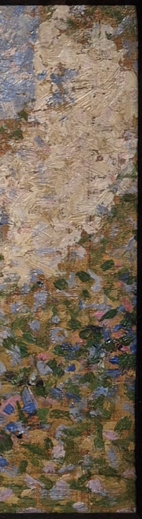
Today’s painting is typical of Caravaggio’s early work, depicting half-length, contemporary figures clearly and crisply, using rich colours, and often including beautifully detailed still life elements. His subjects were cardsharps and fraudsters, fortune tellers and gullible youths, boys offering food and wine, performing or being out-manoeuvred: the vulnerable and the manipulative inhabitants of the low-life world he had come to occupy in Rome. He settled in the Eternal City in 1595 at the age of 24, having first arrived there a few years before. In this particular work there are four youths who seem more interested in us, or in what they are doing individually, than they are in each other. They are closely, almost claustrophobically arranged, a compact composition in which the figures overlap and interlock, thus making them, of necessity, a ‘group’, even if they are not currently interacting. This is demonstrated most clearly, I think, if we try and focus on the individuals. In the details that follow, I have cropped the image to include everything that we can see of each of the four figures – and have added other details in between.

Most prominent is the lutenist. While music is clearly a major theme of the painting – these are, after all, The Musicians – no music is being played. This boy, or man – it is hard to pinpoint his age – is currently tuning his lute. His left hand turns one of the tuning pegs, while his right thumb plucks a string, the tips of his fingers resting on the teardrop-shaped soundboard. Rather than looking at his instrument, he gazes out towards the viewer – towards you – his eyes half closed and his mouth half open, a face that is totally relaxed, and either seduced or seducing. His auburn hair contrasts with dark, arching eyebrows, creating an appearance that is both unusual and arresting. We know that this is one of the first paintings – if not the first – that Caravaggio made for his patron and host the Cardinal del Monte when he became part of the prelate’s household, the Palazzo Madama, not far from the Piazza Navona. As well as being interested in the visual arts, del Monte was also an active patron of music, providing financial support for the training and performance of young castrati, the male sopranos who were an essential feature of the musical culture of the time. If this musician was one of their number, it might explain why his appearance is so arresting, and why his precise age is hard to pin down.

Technical analysis shows that his right arm was painted first, and then the full, red drapery which encompasses it was added on top. The brocade cloak, or shawl, flows over his elbow and frames his hand, its curve echoing the arch of his wrist. It fills out the figure, and broadens the form, and it is this, as much as anything else, that gives the lutenist his prominence. From his shoulder the brocade crosses his body on a diagonal, in opposition to the neck of the lute. Together they form an ‘X’ in front of his chest, the top ‘V’ of which helps to frame his sultry gaze. His left elbow is hidden behind the unclad arm of the boy on the right, while his head tilts towards that of the figure at the back.

The sculptural form of the lute is precisely defined. The soundboard catches the light entering the room from the top left, while the back, or shell of the instrument is cast into shadow, with the exception, perhaps, of the top ‘rib’. However, there is not much detail, and we can’t see all the strings. Sadly, despite its wonderful appearance, the painting is not in a very good condition. After the death of the Cardinal, the painting passed into the hands of a French collector, and was later briefly owned by another Cardinal, the famous (or infamous) Cardinal Richelieu. However, by 1675, we know it belonged to the Duchesse d’Aiguillon, as it is mentioned in an inventory of her collection. By then the canvas had been stuck to a wooden support, from which it was later removed. At either stage this may have resulted in losses to the surface, and could, consequently, explain the lack of detail in some parts of the painting (I’m indebted to Keith Christiansen’s 2017 catalogue entry for this painting on the Met’s website – you’ll have to scroll down and click on their ‘catalogue entry’ button – and, while I’m about it, I’d also recommend his Instagram feed: @keithartnature).

Despite the damage, details have survived – the subtle variation in the angles of of the fourteen pegs, and the light catching the strings passing over the end of the fingerboard, for example. There is even a beautiful and delicate arabesque formed by a long, untrimmed string, spiralling away from one of the pegs and over the lutenist’s brightly illuminated chest.

The figure at the back is also a musician: he holds a cornett, or cornetto. In case you are, like me, unfamiliar with this baroque instrument, I have included an image of a 17th century version – from the Museu de la Música in Barcelona – which I have rotated to be in a roughly equivalent position (however, they do come in many different lengths and forms). If you want to know how a cornett is played, and what it sounds like, there is a good video on YouTube made by The Academy of Ancient Music (apologies for the ad – you’ll be able to skip it after a few seconds).

The cornett player in our painting, like the lutenist, looks out towards us with his mouth slightly open, and has similar dark, arched brows – although they are a better match with his hair. Being in the background he is also more in the shade – helping to create what limited depth in the painting there is. This is enhanced by the darkness of his hair, and the black fabric which is draped over his left shoulder (at the back) but not, it seems, his right (the shoulder closer to us). We can see the curve of this shoulder outlining the hand tuning the lute, not far from his own right hand, holding what must be a fairly short, so high-pitched, cornett. We also see the hint of a white sleeve – but that could be either around the cornett player’s right wrist, or the lutenist’s left forearm. This apparent elision of forms brings the two figures together, as does the mutual lean of their heads, tilting towards each other on the picture plane, even though one figure is closer to us than the other. The implication is that these people are in harmony with one another, even when they are not playing. I was about to say ‘even when they are not performing’, but they are definitely performing – either for us, or for Caravaggio – turning to to look at us with their mouths open and those ‘come hither’ eyes. They might conceivable be singing, but I think sighing would be more likely. Having said all of that, you may recognise the cornett player, as the same model occurs in paintings throughout Caravaggio’s career.

It is universally accepted as a self portrait. These two images may not look identical, but it’s worthwhile remembering that the artist was 26 when he painted the image on the left (although I can’t help thinking that he was flattering himself somewhat – making himself look more like ‘one of the boys’), whereas Ottavio Leoni’s drawing, a detail of which is on the right, dates from 1621, eleven years after Caravaggio’s premature death at the age of 39, when he had lived through at least a decade of difficulty. Why he should choose to put himself into this composition is not clear – although it would undoubtedly have placed him at the heart of the Cardinal del Monte’s establishment, thus making him look both cultured and sophisticated: he clearly knows about music… and love. You could even argue that he was trying to show us that he had risen above the low-life… although we know that he himself hadn’t, and wouldn’t. His paintings, however, did, becoming predominantly Christian in subject matter, and he would later show himself as an onlooker at many religious events, and even, sometimes, as a participant, as we saw last April with 221 – Caravaggio: the witness witnessed.

If we move on to the third character, the way in which all four are interlocked and indivisible is especially clear. Although I have cropped the detail to include everything we can see of this boy, and nothing more, we can still see all of the self portrait – cornett included – and half of the lutenist. Caravaggio painted directly onto the canvas from the live model, rather than relying on preparatory sketches, whether drawings or painted studies (none of either survive). This was one of his most remarkable innovations. However, it would be a mistake to think that he had all four people in front of him at the same time. They appear to have sat for him individually, and the precise, controlled composition slots them close together like a well-cut jigsaw. Precisely how these four figures could have occupied the three-dimensional space is not entirely clear: if this were a real space, there might not even be enough room for all of their limbs. However, until we start to question this, it is not a problem, especially given that the patterning of the surface is so good. In some ways, the composition is not unlike another form of composition: music. Primary and secondary themes play off one another, with melodies interlocking and interweaving just like these people. The character of each is distinct, although not necessarily thoroughly developed. This boy in particular is a bit of a mystery: we don’t know what he looks like, even if we can see ‘more’ of him: he appears to be wearing the fewest clothes. If we hadn’t realised before, what becomes clear from the figure in white is that, if this is a scene from contemporary life, then these models are in costume: no one has ever dressed quite like this in everyday life. He appears to have a sheet slung over his right shoulder, which crosses his otherwise naked back (which is accurately, subtly and brilliantly modelled) on a diagonal. It is tied around his waist with a thick, dark, plum-coloured sash. The boy is sitting on the edge of a box, or table, slightly higher than the lutenist, and looks down at a musical score in what I read as calm, focussed preparation.

However damaged the surface of the painting, we can tell how brilliantly crafted this manuscript was. The music cannot be read, but we can tell the difference between the thick, pinkish cover of the book and the darker edges of the pages, and then see the light catching the corners, where the top page has curled up, casting its own corner, decorated with a large letter ‘B’, into shadow.

This book is just one of the still life elements in which Caravaggio both delighted and excelled in the earlier stages of his career. Another score sits on the table with a violin resting on it. They are so brilliantly conceived that I will show you more details below. The sash is tied in a bow, the ends of which appear to caress the white fabric beneath them. Bows like this occur more than once in Caravaggio’s oeuvre, and here, as in other places, it is as if we are being invited to tug on the end, and release the bow, or to toy with the loops, or the knot – but that’s probably an idea that I am transferring from another painting, Caravaggio’s voluptuous, seductive Bacchus in the Uffizi. If you don’t know it, click on that link! In our painting, the white drapery forms a turbulent swirl just beneath the belt, and wraps in numerous folds around the boy’s thigh. There is clearly enough fabric to cover his knee, but enough leg is visible to prove a point: these models are wearing less than they would normally.

This manuscript is an especially bravura piece of painting, with one page curled up, catching the light on one of the battered corners at the top, and casting shadow on the page beneath. The curl of the page mirrors the curl of the drapery next to it, and forms a counterpoint with the folds behind. Again, the music is illegible – which it may always have been – although this section was so badly damaged that a fair amount has had to be reconstructed, apparently.

The still life continues to the left with the violin – we have just seen its bow resting on the shadowed page. Caravaggio is known to have owned both a violin and a lute, and both appear in the Victorious Cupid currently on show at the Wallace Collection which we will be looking at on Monday. However, it seems too small to be a violin, certainly when compared to the lute. It could be a violino piccolo – a feature of baroque music – but it might simply be that, like the models, Caravaggio was looking at the instruments at different times, and adjusting the size according to what would work for the composition.

The still life extends to the bottom left corner of the painting, where we see vine leaves just catching the light, extending from the perfectly painted bunches of grapes above them. In between them and the end of the violin is the knee of the lutenist, who, like the boy with his back to us (is he the violinist? Or a singer?) has an uncovered knee, so close to the front of the painting that you might even think that it is in easy reach. Close to his hand resting on the soundboard – the hand that will pluck the strings – are two more hands plucking grapes.

These belong to the figure who takes up the top left corner of the painting. We see almost the full length of his right arm – a vine leaf gets in the way of his wrist – and just the ends of his left fingers. We can also see his shoulders and some of his chest, but there is no evidence that he is wearing any clothes at all. But then he does have wings: is this Cupid, or another performer dressed up as Cupid? His quiver hangs over his right shoulder on a very thin thread, with the sharp points of five or six arrows projecting from behind his right arm. Apart from this very thin strap, there is no sign of any other attachments: he is not ‘wearing’ the wings, so they must be part of him. This tells us that it is the God of Love himself, Cupid. He echoes – and transposes – the pose of the figure on the right. One of them is turned towards us, the other is turned away, but each has an unclad arm fully visible, and both look down, intent on what they are doing. Both also convey a sense of innocence, in opposition to the open-mouthed worldliness of the companions they are framing.

But why grapes? One suggestion is that, if this is Cupid, then we are clearly in the world of allegory, and while the other three are musicians, they are also a representation of the idea of ‘Music’ – which is what an allegory is. Most artists at this time, when painting an allegory, would have turned to the textbook, Cesare Ripa’s Iconologia. Published first in Rome in 1593, I would suggest that this may just be too early for it to be entirely familiar in 1597. In 1603 a second edition included illustrations, which were often more influential – and we are definitely to early for that. As a feminine noun, La Musica, like so many other personifications, was seen by Ripa as a woman – but Caravaggio was never one to follow the party line. As it happens, Ripa does mention a lute and a viol (an early form of violin, which the latter ‘eclipsed’ in the 17th century) and an open score, but he also says that music should be shown with wine, ‘perche la musica fù ritrovata per tener gli animi allegri come fà il vino…’ (‘because music was found to keep the spirits cheerful like wine does’). Maybe we’re getting in there early with the grapes, which Cupid is plucking in preparation. This was Caravaggio’s first Cupid – young, innocent, busy. A few years later, and painting for Vincenzo Giustiniani, his next major patron (who lived just round the corner from del Monte), Caravaggio would produce a very different image, brash, bold, and inherently destructive. It is that Victorious Cupid which we will be talking about on Monday.