
James Abbott McNeill Whistler, Arrangement in Grey and Black No. 1, 1871. Musée d’Orsay, Paris.
This coming Monday’s talk, White: Whistler’s Woman… is an introduction to the Royal Academy’s exhibition entitled Whistler’s Woman in White. This does not refer to one specific painting, though, but to a person, as the subtitle of the exhibition makes clear: Joanna Hiffernan, one of Whistler’s regular models, and much more…. Curiously I’ve just noticed that the catalogue has a slightly different title – Whistler and the Woman in White, but I’ll try and explain why that might be so on Monday 7 March at 6pm. It is interesting, however, that none of the paintings for which Hiffernan modelled was ever called The Woman in White. The first, completed in 1863 (although it was reworked later) was called The White Girl, for example, although it is now known by the title that Whistler gave it some years later: Symphony in White No. 1. Today I’d like to think about a painting with a similar title, Arrangement in Grey and Black No. 1. This may not be ringing any bells, but if I were to call it Whistler’s Mother I’m sure the reaction would be different.

This is one of those paintings that seems to have entered the public imagination as ‘famous’ and therefore even ‘important’. It has even been given that most dubious of labels, ‘iconic’. I’ve spent quite a bit of time over the past few years trying to work out what, exactly, gives a painting this status. There are relatively few paintings which could be said to have some sort of ‘celebrity’ in the world of art. The Mona Lisa is the best example, I suppose, followed by Van Gogh’s Sunflowers. But there are others, like Klimt’s The Kiss, Munch’s The Scream or Grant Wood’s American Gothic which are so readily identifiable that they accrue their own type of fame, or infamy, or even notoriety, and which leads to them being quoted, re-purposed and even parodied. Whistler’s Mother is no exception. Among other appearances, it is a key element in that unmissable classic Bean – starring Rowan Atkinson as the eponymous ‘Mr’, who, in this case, works as a security guard at the National Gallery. OK, so the painting is in the Musée d’Orsay in Paris, but that’s a minor detail: we are talking about a work of fiction. And yes, I’m wrong, it is miss-able, but when I saw it with a group of National Gallery educators it was very funny. But putting that aside, why is this painting, or any painting, for that matter, iconic?
Simplicity is of the essence, I think. You need to be able to take it all in, so that, even at a second glance, you recognise it. Before you’ve finished looking at it the first time, it is already familiar. I suspect that a strong 2-dimensional design plays an important part – and Whistler’s painting has that in spades. I know that the Mona Lisa has a distant, atmospheric landscape, and The Scream has a bridge in exaggerated perspective, but what you notice first in each is the single figure facing resolutely towards you. In this case, Mother sits in profile, looking to our left, with her feet up on a low rest. This makes her lap almost horizontal, a feature which I think is also relevant: it ties her into the rectilinear composition of the painting as a whole. She is parallel to the picture plane, which is in itself slightly unnatural, as we rarely choose to arrange ourselves in line with the walls of a room. It implies stasis, and deliberate choice: she is somewhat abstracted from reality.
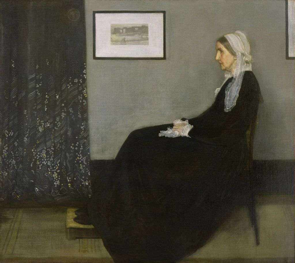
Two images hang on the cool grey wall. A monochrome picture – a print, perhaps, with a white mount and a black frame – hangs in a landscape format in the space between Mother’s head and the dark grey curtain on the far left. There is another, similar frame and mount at the top right corner, although there is barely anything of it, little more than a sliver, which gives it a compositional power far stronger than the small percentage of the picture space it occupies would suggest. There is no way of knowing whether this picture is in landscape or portrait format, but what we see implies the latter. As such, the two images echo the composition of the human figure, the picture on the right paralleling the stiff back, while that on the left is equivalent to the sitter’s lap. The strong, black horizontal of the wainscoting also emphasizes, and gives weight to, the horizontal placement of the thighs. These parallels are enhanced explicitly through the colouration – or rather, the lack thereof. The black of the frames and the white of the mounts are the same as those of Mother’s dress and of the headdress, collar, cuffs and handkerchief, the last of which she holds placidly on her lap. The silver grey of her hair is linked to the grey-scale of the engraving. The curtain also echoes this tonal range, although not going to the extremes of deep black or high white. It is Japanese, or in Japanese style: the influence of Asian visual arts on Western European painting was profound in the second half of the 19th Century.
All of these details emphasize the two-dimensional nature of the painting, and of its design. Looking forward to the 20th century, we might be reminded of Mondrian’s contemplative abstractions. But then, looking back, Vermeer inevitably springs to mind, with his careful placement of human actors against backgrounds defined by the rectilinear forms of paintings, picture frames, mirrors and other furniture. The only hint that we are seeing a three-dimensional space – apart from our inherent understanding of the structure of the human body – is the rug on which both chair and footstool are placed, with its woven border leading from the bottom left corner of the painting ever-so-slightly to the right, and some other, parallel lines in the rug which lead towards the footstall. But there is nothing that really grabs our eyes, and drags them into the distance – there is no real distance after all. There is nothing we could call a repoussoir, pushing our gaze back into the space. It is all statement, on the surface, and instantly recognisable. It is this, I think, which makes the painting ‘iconic’ – like an orthodox icon, flat, abstracted from reality, to make it more ‘ideal’. And yet, it is just a little bit approachable, as the skirt hangs down in front of the rug, just possibly reaching into our space – almost as if Mother’s self-contained composure is, in some way, accessible, if we could only just touch the hem of her skirt…
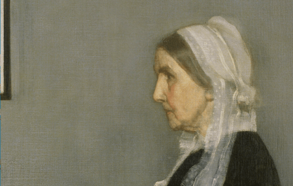
She seems to be intently focussed, with slightly pursed lips, her head slightly lowered, perhaps due to old age. Anna McNeill Whistler was 67 when this was painted. Not so terribly old, you might be thinking, but things were different then. She was enormously proud of her son’s success, although also despairing of his failings – including his dubious morals. At one point, after Whistler had received a legacy from an aunt, Anna wrote to Jemie, as she called him, suggesting that he use the £100 ‘to bestow on your model’. Why should he do that? The letter continued, ‘…you promised me to promote a return to virtue in her. I never forget to pray for her.’ The fact that Joanna Hiffernan was a model was not a problem, but, as models effectively sell their bodies, it was only a small step away from prostitution. And, to put it bluntly, Hiffernan was sleeping with the artist, whereas Mother clearly wanted him to settle down with a respectable woman. His response? He gave Hiffernan power of attorney over his affairs while he was away for seven months, and signed a will bequeathing his entire estate to her. Not exactly filial obedience.
It is not known for certain how the painting came about, although the most common version of the story is that Whistler’s model for the day couldn’t turn up, so he asked his mother to stand in for her. However, standing in – or at least, standing – turned out to be a problem. Anna was getting on a bit, and not able to stand for long periods – hence the fact that she is sitting. I can believe the first part of the story, but not the second. Or rather, if the first part is true, he would instantly have decided to turn the canvas on its side. Everything about this painted is geared towards a seated figure, after all. Alternatively, the fact that he used his mother as a model could be related to a sense of filial duty, or it could also reflect the fact that money was scarce at the time. Three years earlier Anna had complained to a correspondent, ‘he must pay models for them every day a shilling the hour & they must be well fed!’ Presumably mother did not need to be paid.
I’m intrigued how one should categorise this painting. Although it is commonly called Whistler’s Mother, is it really a portrait? I have the same qualms about some of the paintings in the Royal Academy exhibition, about which I hold strong views (with which I will undoubtedly regale you on Monday). After all, Whistler called it Arrangement in Grey and Black – it is the abstract values that concern him, and if it hadn’t been his mother, it could have been a different model, perhaps. However, the same is not true of Arrangement in Grey and Black No. 2, which is subtitled Portrait of Thomas Carlisle.
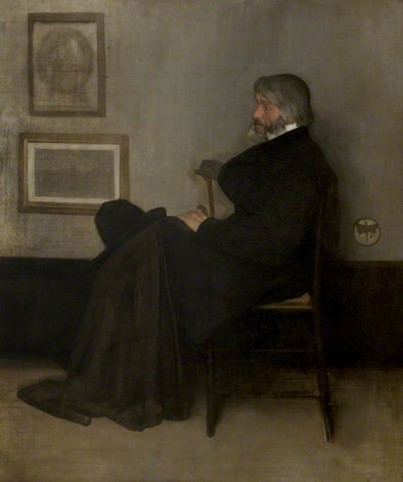
The title claims it is a portrait, and there is a greater sense, I think, that Carlisle’s appearance and character are important here. Having said that, when today’s painting was first exhibited at the Royal Academy Annual Exhibition it was given the subtitle Portrait of the Painter’s Mother – probably because, even in 1872, the Academy was not ready for the developments of the Aesthetic Movement, with which Jemie was becoming firmly aligned. ‘Art for Art’s Sake’ would be the best short explanation of this term, but again, more about that on Monday. Nevertheless, there are aspects of Arrangement in Grey and Black No. 1 which show that identity is important.
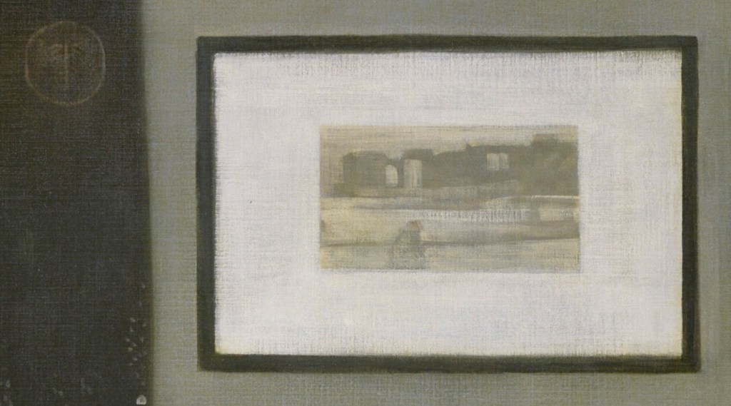
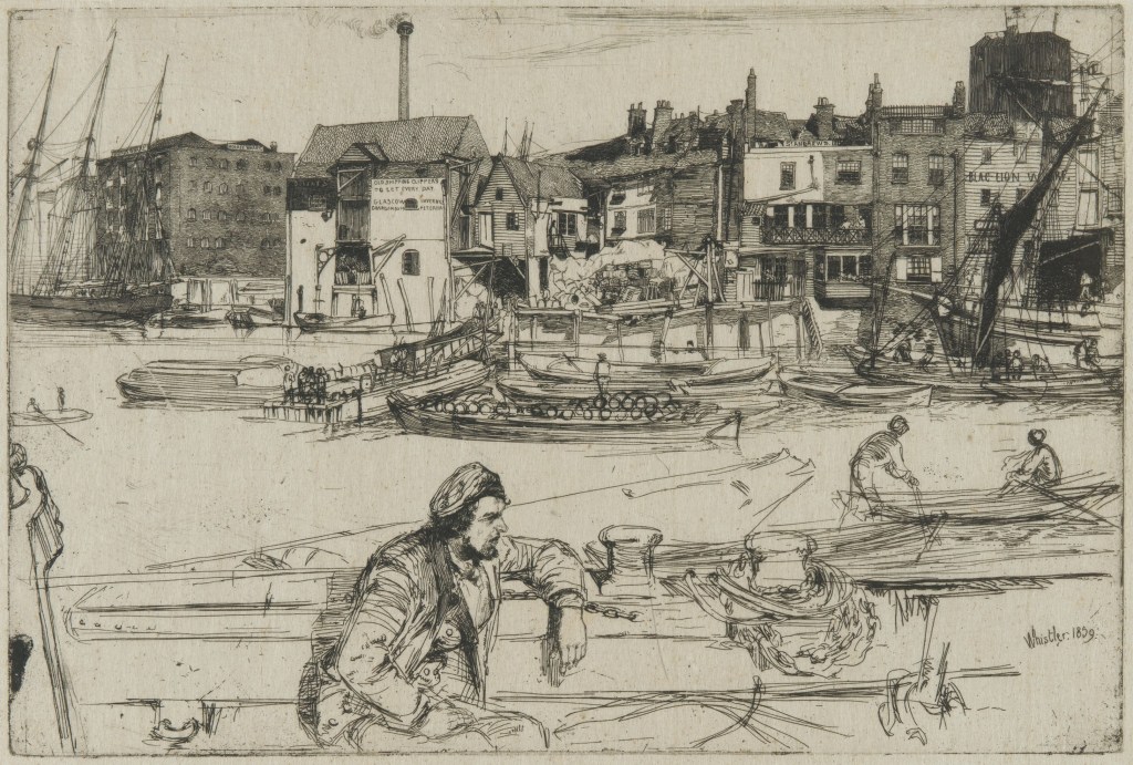
Take this detail for example – the top right hand corner of the curtain, and the framed engraving. The circle on the drape contains a highly stylised butterfly formed from the letters J and W – for James Whistler. This is his signature (a clearer version can be found in No. 2 above) and it is placed close to the print. The forms of this image are so specific that you would think it would be possible to identify the original – and indeed it is. It is a simplified version of his engraving Black Lion Wharf, dating from 1859. The example I am showing you here comes from the Freer Gallery of Art in Washington D.C.
Whistler is identified as the maker of today’s painting by his signature on the curtain, and by its proximity to the engraving of which he was also the author. So we see his signature and some of his art while we are looking at another example of his art – the painting itself – which includes his mother. This is almost as much a self portrait of as it is a portrait of his mother, as if he were saying, ‘This is where I came from, and this is where I am now.’ On her arrival in London Anna was, apparently, surprised by her son’s ‘flamboyant bohemian lifestyle’. If her own lifestyle expounded the same rigidity with which she appears, metaphorically, in this painting (which, as it happens, it did), then that is not surprising. The modern, interior décor was presumably not to her liking.
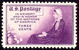
The painting has an interesting, if coincidental, link with The Red Boy, the subject of my last talk. Lawrence’s portrait (and it is definitely a portrait – it was commissioned as such) has the curious distinction of being the first painting to appear on a British postage stamp. That was in 1967. Anna McNeill Whistler pipped young Charles William Lambton to the post, though – quite literally, in this case – as she appeared on an American stamp 33 years earlier, in 1934, ‘In memory and in honor’, as the inscription on the stamp itself says, ‘of the mothers of America.’ Such a pity she didn’t get on better with Joanna Hiffernan – but we’ll talk about her, and look at the paintings for which she modelled, on Monday.

Very interesting
LikeLiked by 1 person
If anyone’s in Paris, I can highly recommend the current Whistler exhibition at the Musee d’Orsay. “Whistler’s Mother” hangs on the opposite wall to three of the Frick Collection’s full-length portraits. There are also some pastels, etchings and “The Ocean” from the Frick and “Man Smoking a Pipe” from the d’Orsay’s collection. Makes an interesting counterpoint to the RA’s show.
LikeLiked by 1 person
Thank you, Sophie – I’ll try and remember to mention this in the Whistler talk – and also in the next blog! Wish I could go…
LikeLike
Perhaps you could arrange a group visit Richard?
LikeLike
Thank you for your trust in my organisational skills, but trust me, it’s hard enough organising myself. If you have a group of friends, though, my colleagues at Art History Abroad could probably organise something. Sadly, I won’t have time to go…
LikeLike
Dear Dr. Stemp, Let me begin by thanking you for all your excellent presentations. I have been listening to as many of your individual Monday lectures as possible, and I look forward to this Mondayâs on The White Girl. (In preparation I just finished reading the exhibition catalogue.) My major hobby has always been the appreciation of fine art. This has centered on European Painting for the past 30 years. Since retiring a few years ago, I have spent almost all my free time on the subject. When I was a young man however, I centered my collecting on stamps. Obviously, I was delighted to see your mention of the Red Boy stamp at last weeks lecture. One of my children is very involved with the philatelic world, particularly the Royal Philatelic Society London. (see attached photo from just before covid where he is in conversation with the most honored member of that Society). The collecting of stamps is no longer popular, at least here in the USA. I believe thatâs too bad since it often lead to  considerable intellectual development in young people. Therefore, whenever I lecture to groups, particularly students at all levels, I try to throw in a bit of philately. When discussing the stamp honoring Motherâs Day, I always like to point out that Franklin Roosevelt was so egocentric that he deemed to ârepaintâ Whistlerâs composition in gray. He added the flowers at the lower left. Yes, the stamp helped develop the iconic nature of the painting⦠although perhaps not as much as Mr. Bean! But the addition of the flowers somehow just seems wrong⦠I am trying to rearrange my life to accompany you on the tour of Lille in December. Hopefully it will be possible. Thank you again for all the wonderful lectures and informative emails which have greatly enriched my retired life…particularly during covid. Mark H Haimann, MD, FACSBloomfield Hills, Michigan
Sent from the all new AOL app for iOS
LikeLike
Dear Mark,
Thank you – I’m so glad to hear you have been enjoying the talks! It’s also good to know your first name (I remember your last name coming up a few weeks ago, but that was all I could see). Sadly this system doesn’t like attachments, so I can’t see what you’ve sent…
I noticed the flowers, too – definitely out of place! Probably an attempt to make the painting look more ‘motherly’ as it doesn’t scream ‘affection’ by any means!
I do hope you enjoy Monday too – although I can’t help thinking you might just be a little bit better prepared than I!
All best wishes,
Richard
LikeLike
Dear Richard,
I may previously have asked to be added to your email mailing list relating to lectures, etc.
I know through a friend you are proposing further lectures – could I please ask that you add me to your circulation list.
Many thanks.
Brian Foord
LikeLike
Dear Brian,
All you have to do is to put your email address into the box on the title page of this website – http://drrichardstemp.com – or look on the diary page – https://drrichardstemp.com/about/
All best wishes,
Richard
LikeLike