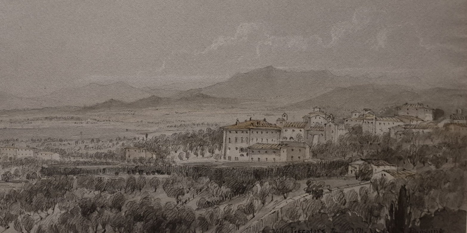
Lady Elizabeth Susan Percy, View of the Villa Pescatore from Villa Muti, Piombino, 1833. Courtauld Gallery, London.
One of the things I’ve found interesting about delivering my own talks is finding out what is and isn’t popular – and surprise, surprise, there are several star artists that people always want to hear more about, however much they’ve heard about them already – and quite right too! However, artists who aren’t as famous, and even artists who people have never heard of, turn out to be far less interesting it seems – which always surprises me. I would urge you not to give way to that tendency, as you miss so much: there’s always something new to discover, and probably, to enjoy! That is particularly true this week (Monday, 27 April at 6pm) when I will be talking about The Courtauld’s A View of One’s Own. On display are some of the most delicate, sensitive landscape drawings I’ve seen, made by ten women artists from the 18th and 19th centuries that I didn’t know – it’ll be a real treat: today’s drawing is a good example! The week after is another case in point. Konrad Mägi, who I will talk about on 4 May, was the leading Post-Impressionist artist in Estonia. As it happens, I don’t know anything about Estonian art – but he is wonderful. His paintings are richly coloured, with echoes of Monet, Van Gogh and Munch, but he always remains himself. The works vary in mood from joyful and ebullient to tense and moody – so there’s something for everybody. The exhibition is a fantastic example of the way in which Dulwich Picture Gallery manages to find northern, or Nordic artists who are not so well known in Western Europe. I decided to go to the exhibition, and talk about it, thanks to the enthusiasm of one of you – and would invite the rest of you to join me on 4 May to see why!
Michelangelo and Rodin (11 May), who are currently being exhibited alongside one another at the Louvre, need no introduction. The comparison is, in some ways, so obvious I’m surprised the exhibition hasn’t been staged before. I’ll be seeing it next week, and so will be well placed to report back. I’ll also be able to catch up with another Louvre exhibition, dedicated to Martin Schongauer, who was so highly regarded in the 15th century that Albrecht Dürer travelled all the way from Nuremberg to Colmar to see him and learn from him – although he arrived too late: Schongauer had recently died. I will talk about that exhibition – which includes almost all of Schongauer’s paintings and many of his innovative prints – on Monday 18 May. The details are in the diary, of course, and the links above will take you to Tixoom if you want more information, and if you want to book.
If you do book any of these events, Tixoom will send an email with the ticket – effectively a link to the talk – within seconds. If it doesn’t arrive within 24 hours, do let me know and I’ll try and sort it out: it would be easier to do when there’s time to spare than it would 5 minutes before the talk! You should then get reminders 24 hours and 15 minutes before the talk, and these will also include the link.
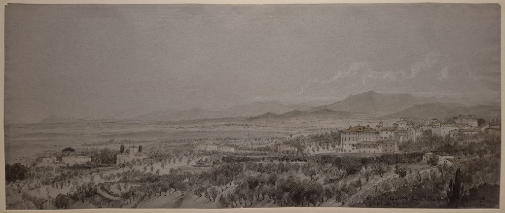
Today we are looking at a drawing on a slim, landscape-format sheet of paper. It is a reasonably standard width, but not particularly ‘tall’, measuring 19 x 46 cm. This is ideal for charting the development of the horizon, which, despite its name, is rarely ‘horizontal’. In this case it rises from left to right as it tracks the peaks of the Tuscan hills. We know this is Tuscany from the title of the drawing: Piombino is due south of Pisa, and southwest of Siena, on a promontory projecting from the coast towards the island of Elba. However, despite the gradually fall of the terrain towards the left of the drawing, there is no suggestion of the sea: we must be some way inland. The drawing is on wove paper, a smooth, uniform paper type created by laying the paper pulp onto a finely woven brass wire screen that leaves no pattern or “laid lines” on the sheet. This technique was invented in the 1750s, and thus before any of the drawings I will be talking about on Monday. Rather than being white paper, which was then given a grey wash, the paper was made from grey pulp, and this mid-tone is used for the sky. It is lightened with white chalk for the clouds, buildings and other highlights, and detail is drawn in with graphite – effectively pencil. Watercolours add a hint of colour where required. The paper is tightly and irregularly cropped – meaning that the drawing is now mounted on top of a backing sheet, rather than being framed by a mount – which gives it, I think, a far greater sense of being a hand-made, three-dimensional object.
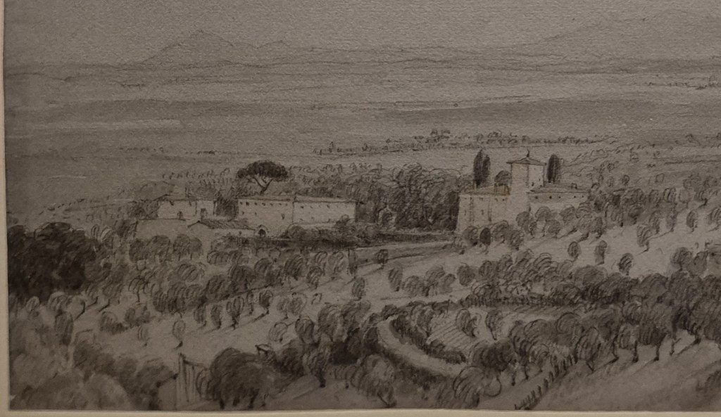
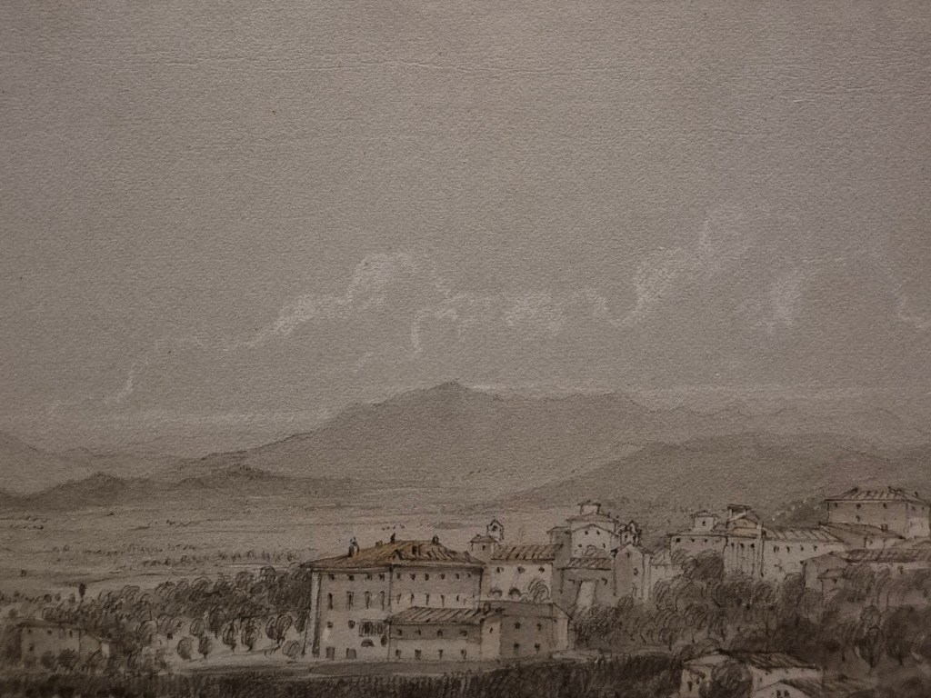
The borders in this detail show us that we are looking at the bottom left corner of the drawing. At first glance, it appears to be monochrome, working through the grey scale, but the more you look – I hope – the more you can see very subtle variations of colour – mainly greys, yes, but also pale ochres and greens. This might evoke a slightly misty day, were the details in the distance not so crisp, the result of the delicately drawn outlines of the distant hills. The light falls from the top right – shadows of the trunks of the trees in the foreground are on a diagonal from top right to bottom left – and their length suggests the sun is not high in the sky. My guess would be that this is morning, and we are looking roughly north-east. In accordance with the ‘rules’ of atmospheric perspective, the foreground details are darker, the others gradually lighten towards the horizon, which is far paler – thus encouraging us to look towards the light, and so into the distance. Three or four buildings are visible. From left to right they could be classified as ‘small’, ‘medium’ and ‘large’, with some form of outhouse slightly closer that the ‘medium’ building, which has a large umbrella pine behind it, and a dark, arched entrance on our side. The ‘large’ building is topped with a tower roughly in the middle of the structure, although it does not appear to be entirely symmetrical. A long, diagonal form stretches away from it towards the bottom left – maybe some form of avenue, even if we can’t see two distinct rows of trees. Nevertheless, it would seem to be a building of some status.
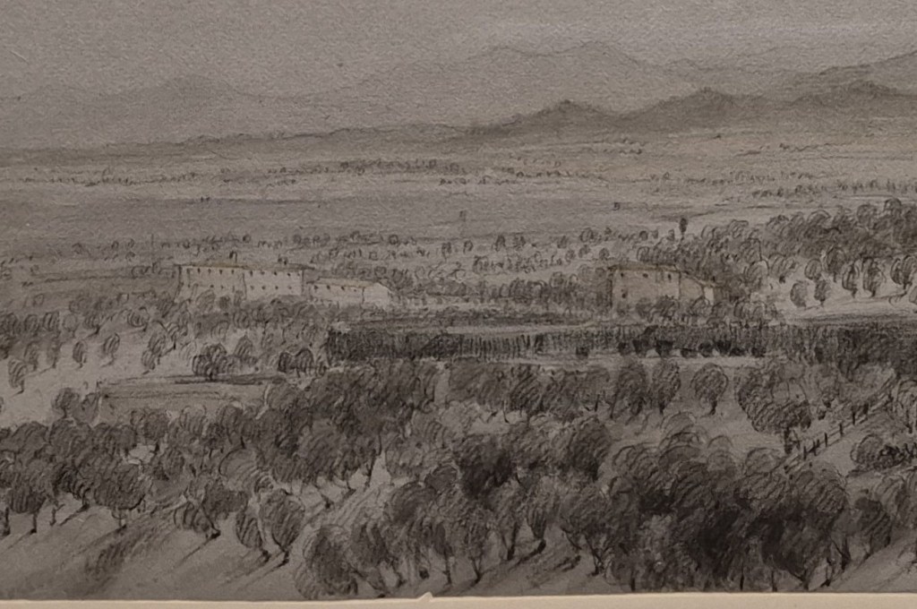
Moving to the centre of the drawing more buildings are visible, each wall perforated regularly with relatively small windows. A second range of hills, smaller, lower, and darker than the distant range (which continues from the first detail) emerges on the far side of the undulating plain which lies beyond the foreground trees. Whisps of cloud trail horizontally from the tops of the distant hills. This is the result of orographic lift, apparently (I had to look it up), when moist air wafting from the sea is lifted over the hills: as the air cools, the water condenses and forms these clouds. The breeze continues, and the clouds form long, horizontal streaks. At the right of the detail, towards the bottom, a fence rises diagonally through one of the open fields: this is not wilderness, but land which is owned and enclosed.
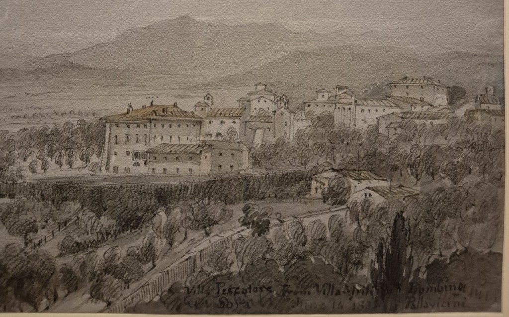
This is the bottom right corner of the drawing. The fence we saw in the previous detail can be seen again (on the left), climbing the hill towards the largest structure in the landscape: a sizeable mansion. There are doors visible in the ground floor, what could be the windows in a mezzanine level, and above that, far larger windows. Presumably this is the piano nobile, the rooms for living and entertaining. Just below the roof are far smaller windows, possibly bedrooms, and probably for the staff. The mansion forms part of an agglomeration of buildings of indeterminate use, although at least one appears to have some grandeur, with what could be classical columns in the centre of its façade. Cutting off the bottom right corner on a low diagonal is a structure with what I initially thought were repeated arches, but now realise are trees in front of a high wall: the enclosure of a sizeable estate. This wall effectively frames the inscription in the bottom right corner, ‘Villa Pescatore From Villa Muti Piombino/Sora June 14 1833 Pallavicini’. This is both helpful, and a little confusing.
It is helpful, because it tells us what we are looking at, and gives us a precise date. This is a landscape showing a location somewhere near Piombino, drawn, or seen, on ‘June 14 1833’. However, given the resources I have to hand, I have been unable to locate either of the villas. Before long, any internet search leads back to this drawing. In Rome, the word ‘Villa’ refers not to an individual building, but to building together with the land around it. For example, the Museum Borghese is in the middle of the Villa Borghese – the parkland which surrounds the Borghese’s suburban palazzo. It could easily be that neither of the villas in the drawing survives, having been subsumed by the 20th century town, and I’m not sure which is the Villa Pescatore. It could be the area around the ‘large’ building which we saw in the first detail, with the avenue leading from it, or it could be centred on the mansion with mezzanine and piano nobile in the third… I suspect it is the latter: the delicate pink of the terracotta roof is the richest use of colour in the painting, however soft it is, and the wall, half shadowed, half in light, is the most expansive area of construction we can see. The trees which surround it (there might also be a wall), also define a sizeable area of clear space.
I’m confused by the mention of ‘Sora’, which is where I assume the drawing was made, and the word ‘Pallavicini’. Sora, as a place, according to google maps (which I know is not infallible), is south of Rome – nowhere near Piombino – and although there are two places called ‘Pallavicino’ (rather than ‘Pallavicini’, ending in an ‘i’), one is outside Genoa and the other is on Sicily. I suspect that studies for this drawing were made on location at the Villa Muti, and the finished drawing – which is surely too refined, too delicate, and too detailed to have been made in front of the motif – was completed later, in Sora. The date could either represent when the view was seen and sketched, or when the drawing was completed. My guess would be that Lady Percy was staying with some friends or acquaintances in Sora: the Pallavicini – but this is all hypothesis. Or, to put it more honestly, complete guesswork.
Lady Elizabeth Susan Percy – the artist – was the daughter of Algernon Percy, 1st Earl of Beverley. Her earliest works were made in her late teens: she probably learnt to draw as one of the accomplishments of any refined young lady. She seems to have made her first visit to Italy in 1802, at the age of 20, during a brief pause in hostilities during the Napoleonic wars. Whilst abroad, she drew avidly: the Vatican Museum has 47 of her drawings from this period. There are also drawings in the Tate Collection – which names her as Lady Susan Elizabeth Percy, the order of names being the same as those given in the research carried out by a member of her family. The Vatican, on the other hand, goes with Elizabeth Susan – and as that is the order also given in her last will and testament, that is the order the curator of the Courtauld exhibition has chosen. Lady Elizabeth Susan Percy never married, and settled in Italy in the 1820s. She lived in Rome, as part of the ex-pat community, until her death in 1847. Among her friends (and colleagues) was the poet, and landscape artist, Edward Lear. There is no evidence that she ever exhibited her work, even if she must have shown it to her friends, so this could be the first time this View has been viewed by a wider public.
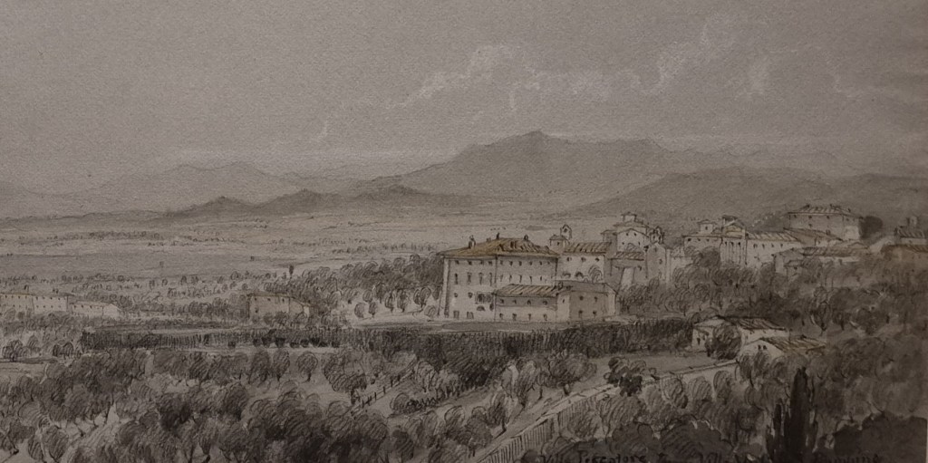
This detail alone, I think, shows us how brilliant she was. The differentiation between the ranges of hills is quite astonishing, given the delicacy of the outlines and the subtlety of the tonal shading creating both height and distance. The choice of viewpoint also enhances harmonies in the landscape itself. The agglomeration of buildings is nestled under the tallest hills, the rooves of the varied structures echoing the inflections of the hilltops. These forms are rendered ethereal by the clouds floating up above, which also echo the details below, while the horizontal streaks caused by orographic lift continuing their wispy flow from left to right below them. These echoes and resonances become all the more clear if we pull back a little, to see how the boundary wall itself parallels the incline of the hills. It’s a beautiful drawing: her work clearly deserves to be far better known – and she is just one of the artists I will be talking about on Monday. I do hope you can join me!

The work that has gone into this astounds me.
And those clouds, I just love those clouds.
LikeLike
Carolyn LambourneMobi
LikeLike
Hi Carolyn – thanks for taking the time to contact me – however, I’m afraid your comment hasn’t come through!
LikeLike