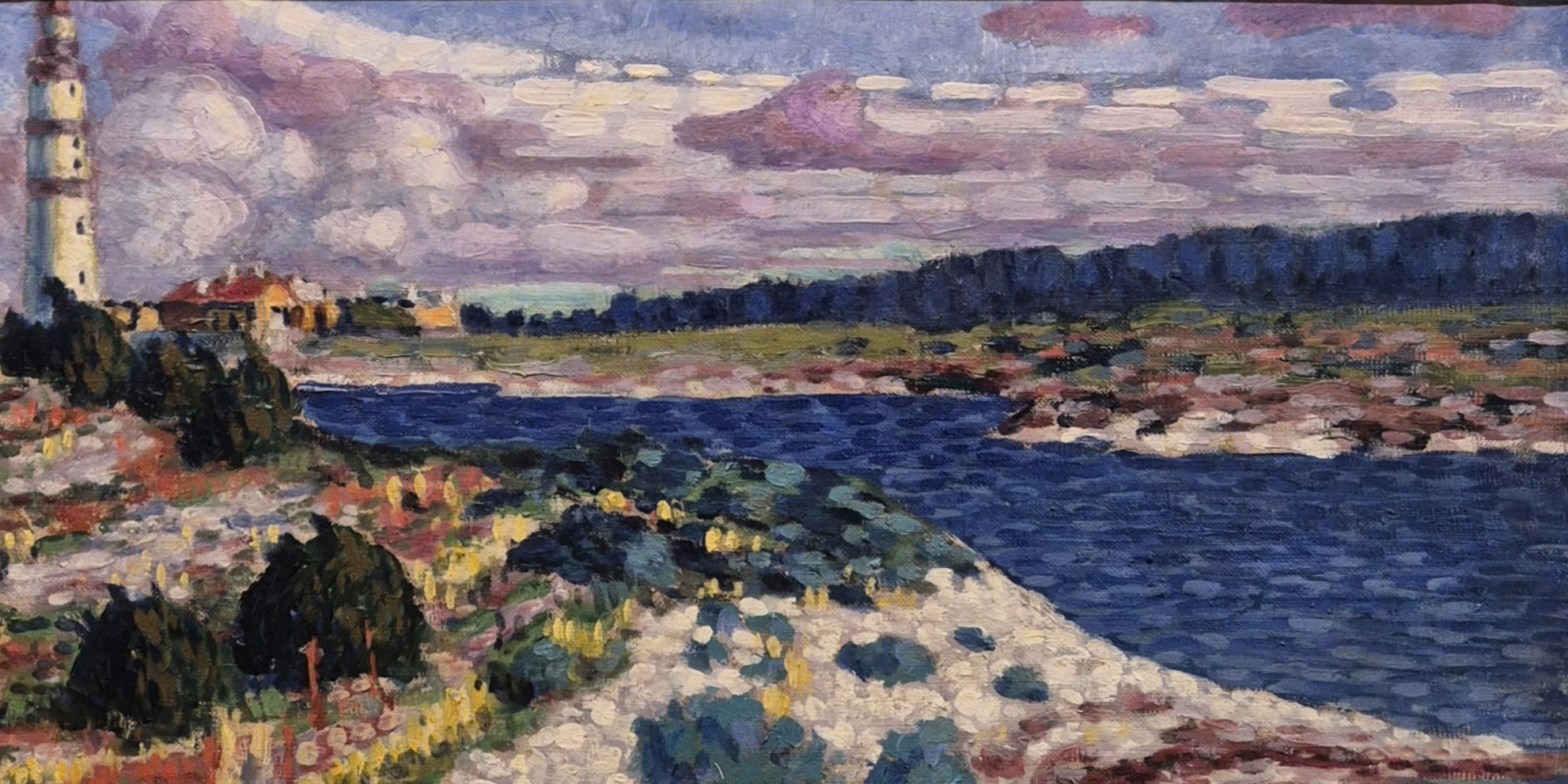
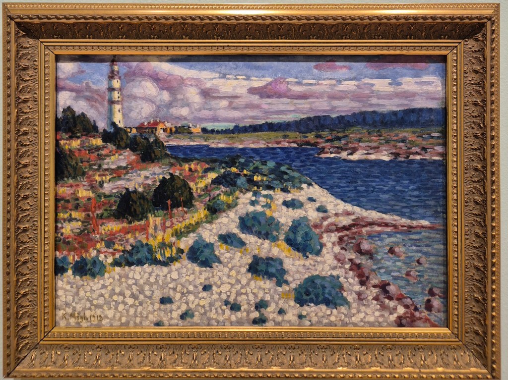
Konrad Mägi, Saaremaa Motif, 1913. Art Museum of Estonia, Tallinn.
After last week’s delicate, subtle drawings by ten wonderful women from the 18th to the 19th centuries, today I’m looking forward to the rich colour and bold brushstrokes of Konrad Mägi, who I will talk about this Monday, 4 May at 6pm. I’m hoping that you’ll see how wonderful his paintings are from today’s post, which is, in some way I think, about the very nature of hope. The talk will be an introduction to the fantastic exhibition which is on at Dulwich Picture Gallery until 12 July.
As I type, I am on my way to Paris to see the exhibition Michelangelo and Rodin which I will talk about on 11 May, comparing the shared interests of these two greats: the human figure in motion, and an exploration of the incomplete (although I am dubious about this latter concept as a shared interest). The Louvre is also hosting an exhibition of the work of the man who did as much as anyone to turn printmaking into a fine art – even before the ‘Fine Arts’ were a concept: Martin Schongauer. Having seen a couple of his engravings and most of one of his altarpieces in his hometown of Colmar last week, I am really looking forward to it – and I’ll let you know what I think on Monday 18 May. After this, the next two talks will cover Tate Britain’s exhibition James McNeill Whistler on 25 May, and then an introduction to a second great Germanic artist whose work is now in Colmar, Matthias Grünewald. That will be on 1 June, just before I head out to that part of the world with Artemisia. Most of these are already in the diary, and I will add more information about the others as soon as I have set up the events.
If you do book for any of these talks, Tixoom will send an email with the ticket – effectively a link to the talk – within seconds. If it doesn’t arrive within 24 hours, do let me know and I’ll try and sort it out: it would be easier to do when there’s time to spare than 5 minutes before the talk itself! You should also get reminders 24 hours and 15 minutes before the talk, and these will also include the link.
We are looking at a highly coloured landscape, with what at first glance appears to be a river running between its two banks, flowing potentially from top left to bottom right. However, if we stop and notice the lighthouse at top left – tall, tapering, and white, ringed with red – we should realise that we are close to the sea, in a place where boats and ships are in danger of running aground. The banks of the ‘river’ are really the coastline, the increasing sparsity of the vegetation towards the water’s edge in line with the way in which plants colonise such liminal spaces: the Ecologist tells me it is called ‘primary succession’.
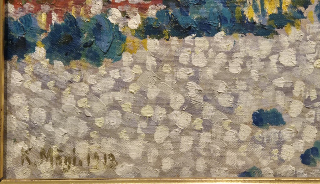
In the bottom left corner of the painting we can see the artist’s signature, and the date – ‘K. Mägi. 1913.’ It does look a little more like ‘Màgi’ – but that is probably because it’s easier to do a single line with a paint brush than the two tiny dots needed for an umlaut. It will come as no surprise that I don’t speak a word of Estonian, but the people I asked at Dulwich Picture Gallery told me that the name is pronounce ‘Maggie’. I was thinking of it with a German pronunciation of ‘ä’ which would be more like ‘Mehgi’, but I presume the accent distinguishes the ‘a’-sound from ‘ar’. By the time he painted this, Mägi has spent two periods in Paris – from 1907-1908 and then again from 1910-1912 – at which point he used a French spelling of his name, ‘K. Maegui’.
He would have had plenty of opportunity to see the works of the leading artists of the day – and of previous decades – including the Impressionists, Neo-Impressionists and the Fauves, although he doesn’t seem to have expressed (verbally) any particular enthusiasm for any of them. Nevertheless, this detail clearly shows their influence. The blobs of paint show how indebted he was to pointilisme, with its separated brushstrokes, here seen as dabs of paint building up the surface, thus taking the idea even further. The beach was created with a pale, off-white ground over which he has added blobs of white, cream and pale lavender. As well as conveying the overall colour, he manages to give the distinct impression that the beach is covered in pebbles, each mark representing a potential agony for the shoeless foot.
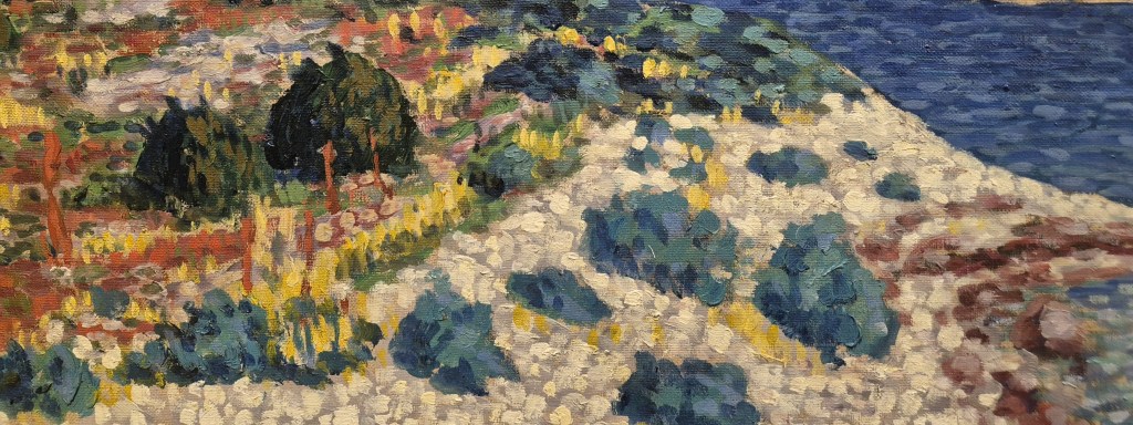
The colours of the vegetation are heightened, and although not as extreme and non-naturalistic as the expressive colours unveiled by the Fauves (‘wild beasts’) in 1905, they are still more expressive than naturalistic. They also use a variety of brushstrokes, the darker clumps built up from blobs of lighter and darker greens, mixed with different quantities of blue, while the yellow – presumably some sort of flower – is added with short vertical strokes. The rust-red vegetation – possibly the dead stems of last year’s plants? – is applied in tall, thin lines, or shorter, broader strokes. This technique, using the application of the paint to differentiate the qualities of the things being depicted, could have been learnt from Vincent van Gogh. Having said that, once you have seen several of Mägi’s paintings (and certainly by the time you come to this one in the current exhibition) you will realise that it couldn’t be by anyone else: the influences have been fully absorbed, and used by the artist to express a unique understanding of the world around him and his own relationship to it.
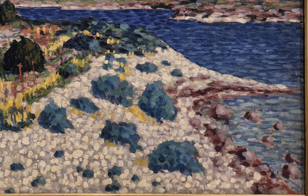
A recurring feature of Mägi’s coastal scenes (and there is a whole room dedicated to them in Dulwich) is the way in which he explores distance through the colour of the sea. Lighter in the foreground, and closer to the colour of the beach (probably because the pebbles can be seen through the shallow water) it gets darker and deeper in colour the further away it is. One of the things I learnt early in my career at the National Gallery came from Jonathan Miller’s thought-provoking 1998 exhibition On Reflection in which he pointed out that you can’t paint water: it is clear and colourless, there is nothing to paint. You can only paint the effect that water has on other things – the light reflecting off it, or refracting through it – or the impurities, such as mud and silt, which are carried by it. I have seen the Danube beautiful and blue – but only from the right position on an adjacent hill when the sun was shining. The blue is the reflection of the sky. Most of the time it has been a dull, greyish brown, like the Thames. The same is true of the sea – so given the colour of the sea in this painting, we should expect a beautiful blue sky.
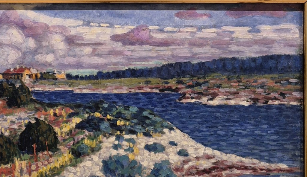
However, the sky is not so blue. Predominantly pink clouds, with layers of white, reveal small patches of light blue, far paler than the water. However, the distant forest is that dark, and different trees are picked out – or at least implied – by different strokes of the same mid- and dark blues as used in the further reaches of the sea, which is presumably flowing between two islands.
As well as the darkening blues, another aspect of Mägi’s landscapes is the way in which different features ‘funnel’ our vision in certain directions. Not only does the blue of the sea get darker as it gets further away, but the distance between the two islands (if that is, indeed, what we are looking at) appears to get narrower. Similarly the section of land between the shore and the forest becomes narrower as we go from right to left, and the trees, likewise, look shorter. In this way our attention is pulled towards the houses on the horizon. The clouds, on the other hand, ‘open out’ as we go from right to left. A dashed white line at the top of the clouds curves upwards. While the land – with the water – ‘funnels’ our attention to the left, the clouds become more dominant, opening out to frame the feature which is just to the left of the detail above…
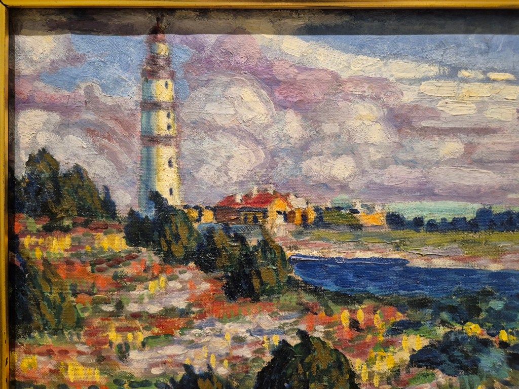
…the lighthouse. The clouds, colouristically, are like a pale emanation of its whites and reds, trailing off to the right – or conversely, leading our eyes from right to left along the white, dashed clouds to its summit. The sea, on the other hand, leads to its base, behind the green bushes on the nearer shore. Here in the top left corner we see the painting’s full palette, from darkest blues and greens, through bright yellows, oranges and occasional reds to hints of mauve. The chromatic variety tells us that this to be the focal point of the painting, the most interesting section, however marginal it might appear to be in the top left corner.
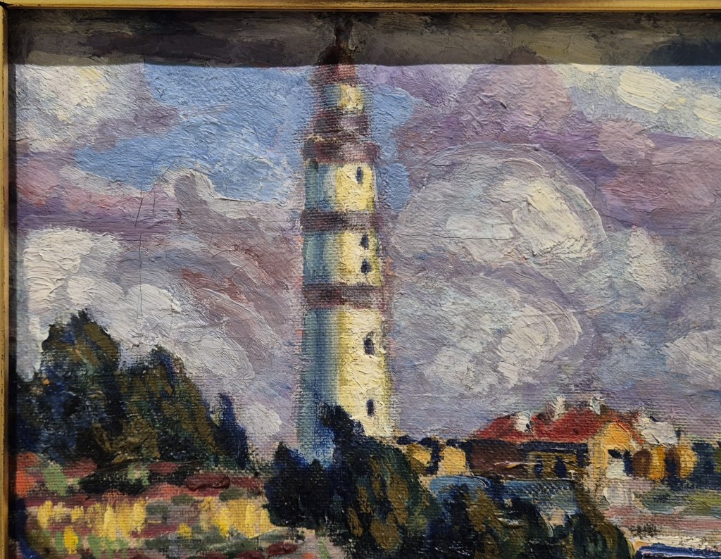
The lighthouse itself is painted quite differently from the rest of the landscape, with more smoothly applied and more blended brushstrokes which are, predominantly, vertical – expressing the verticality of the structure itself. Having said before that the clouds could be an emanation of this building, it could equally well be that the lighthouse is the solidification of the sky, the whites, pinks and burgundies being the same as those used for the clouds, while the blue shadow defining the left hand side is a darker version of the cloudless sections of the sky. This blue is, of course, shadow – and is related to the Impressionist colour theory, adapted by Seurat and the Neo-Impressionists, that the absence of sunlight should be represented by the complementary colour of that light. As a blue shadow, we might expect the sunlight to be orange. Indeed, there is a gently dabbed line of orange/ochre which stretches down the closest face of the lighthouse, although this fades subtly to a delicate primrose yellow. Where the sun hits the structure most directly, we still see the walls as white. Looking at the other, lower buildings, the walls which face the sun do glow orange – but this might be the result of the materials they are made from. Very few artists followed such theory rigidly, but use it as a starting point for their own artistry, allowing it to give way to an aesthetically driven interpretation of what they could see. Despite all of this, I do wonder if the deep blue seen on the lighthouse – connected to the sky as it is, and representing the shadow – is nevertheless in some way more closely related to the sea.
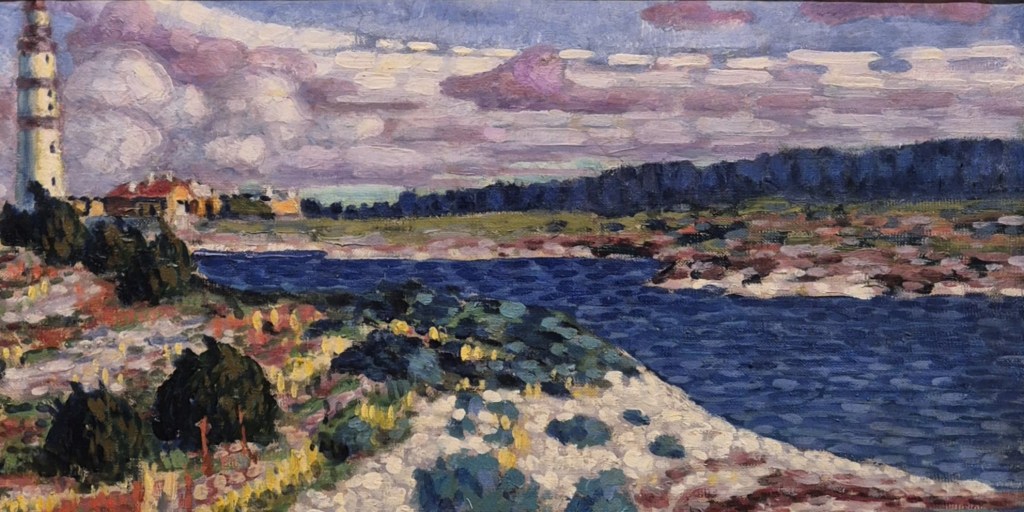
When seen as part of the landscape as a whole, I get a very clear sense that the deep blue of the sea, leading us along a curving path to the base of the lighthouse, even if hidden behind the bushes, rises up the side of the building, thus joining the sea to the sky. The depth of the blue resonates. The title of the painting, Saaremaa Motif, tells us we are on the island of Saaremaa, which lies in the Baltic sea to the west of Estonia, and north of Latvia, all but closing off the Gulf of Riga. Mägi visited twice, in 1913 and 1914. This painting dates to the first visit, a summer noted for its bad weather – although that is not obvious from the painting. While there, he made several daytrips to Vilsandi, a smaller island, on which this very lighthouse still appears to be standing, even if the red sections have now been painted white (you can find it on my go-to, google maps, as Vilsandi Tuletorn). He regularly travelled in the summer months. In 1913 he was have suffering from extremely painful joints (he was never a well man) and Saaremaa was well-known for its mud baths. There were also increasing worries about his mental health, and he enjoyed remote places with few buildings and just as few people… However, I can’t help seeing the deep blues of the distant sea as reflecting a sense of longing, while the connection between the sea and the sky is optimistic. The lighthouse is a stable structure, clearly depicted – its very purpose is to warn people of danger, and to keep them safe. He painted this, and a similar lighthouse, more than once – as we shall see on Monday – and, like the landscape itself, it surely had a symbolic value for him. Representing stability, security and protection, it is nevertheless almost out of reach. However, it is still, by its very function, a beacon – something to aspire to, perhaps – which could explain why he went back for a second visit, painting the same structure in different conditions, communicating a range of subtly varied moods. He is definitely an artist we should know better!

