264 Caravaggio: If music… (b).

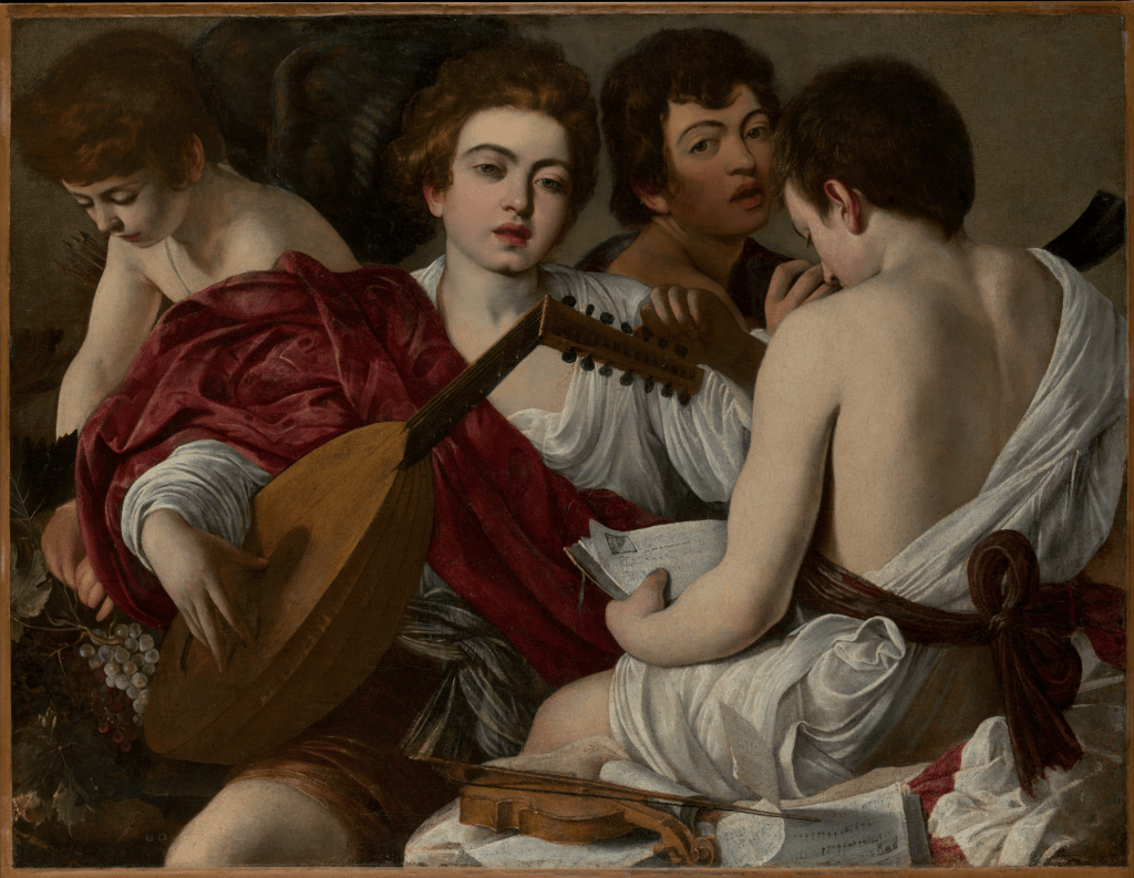
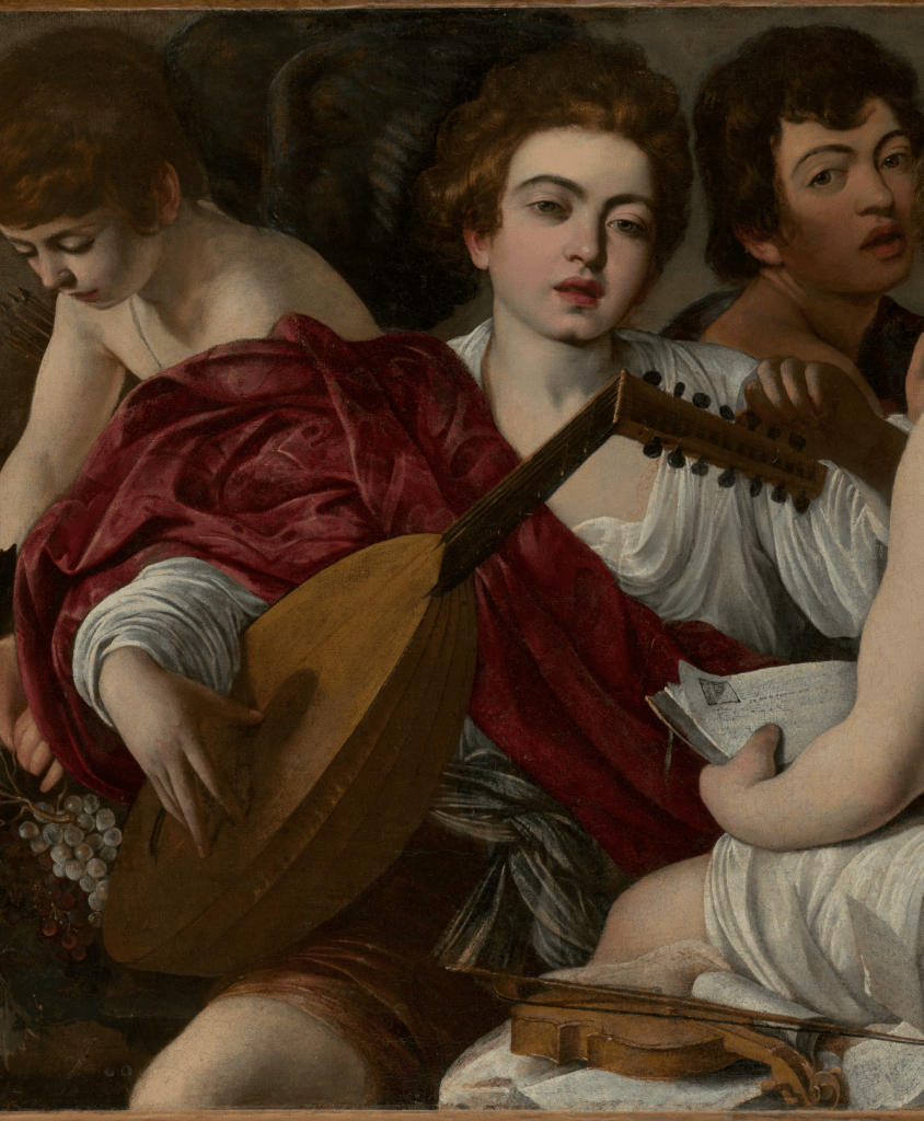
Michelangelo Merisi da Caravaggio, The Musicians, 1597. The Metropolitan Museum of Art, New York.

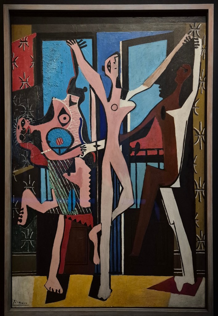
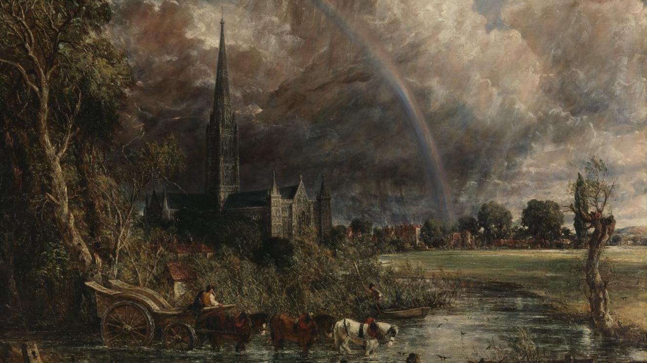
The two one-painting exhibitions in London at the moment have a lot in common, and so do the artists who are represented. Apart from anything else, music and love are major themes, and in my blog last week I quoted the opening of Shakespeare’s play Twelfth Night – ‘If music be the food of love…’ The same quotation is relevant today, so… play on! However, in Caravaggio’s Cupid, currently on show at the Wallace Collection (the subject of my talk this Monday 15 December at 6pm) love triumphs over music – and everything else, for that matter: omnia vincit amor. This is my last talk for 2025, but I’ll be back in the New Year to introduce Tate Britain’s superb show tracing the relationship and rivalry between Turner & Constable. That will be on Monday 5 January, and I’ll visit Tate Modern the following week (12 January) to explore Theatre Picasso. This truly lives up to its name: it is the most dramatically staged exhibition I have seen for years. I’ll be going to Hamburg shortly after to see the Kunsthalle’s exhibition dedicated to Swedish master Anders Zorn. He was one of a triumvirate of painterly, impressionist-inspired masters, perhaps not as well known as the other two, John Singer-Sargent and Joaquín Sorolla, but equally brilliant: I’m really looking forward to it, and to telling you all about it on 2 February. Before that, though, I want to look at another Scandinavian artist, Anna Ancher, to give you more of a chance to see her marvellous, calm and colourful paintings which are currently on show at the Dulwich Picture Gallery. I saw the exhibition earlier this week, and was completely won over. I will be talking about her on 26 January, and will get more information onto the diary as soon as I can!

Today’s painting is typical of Caravaggio’s early work, depicting half-length, contemporary figures clearly and crisply, using rich colours, and often including beautifully detailed still life elements. His subjects were cardsharps and fraudsters, fortune tellers and gullible youths, boys offering food and wine, performing or being out-manoeuvred: the vulnerable and the manipulative inhabitants of the low-life world he had come to occupy in Rome. He settled in the Eternal City in 1595 at the age of 24, having first arrived there a few years before. In this particular work there are four youths who seem more interested in us, or in what they are doing individually, than they are in each other. They are closely, almost claustrophobically arranged, a compact composition in which the figures overlap and interlock, thus making them, of necessity, a ‘group’, even if they are not currently interacting. This is demonstrated most clearly, I think, if we try and focus on the individuals. In the details that follow, I have cropped the image to include everything that we can see of each of the four figures – and have added other details in between.

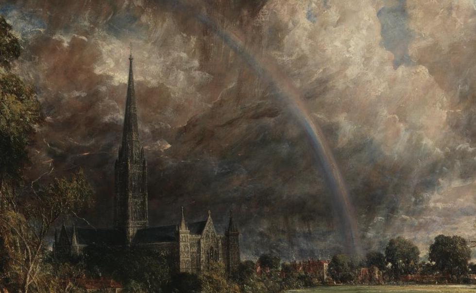
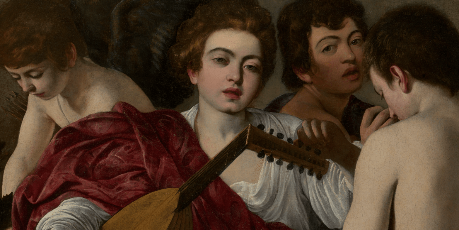
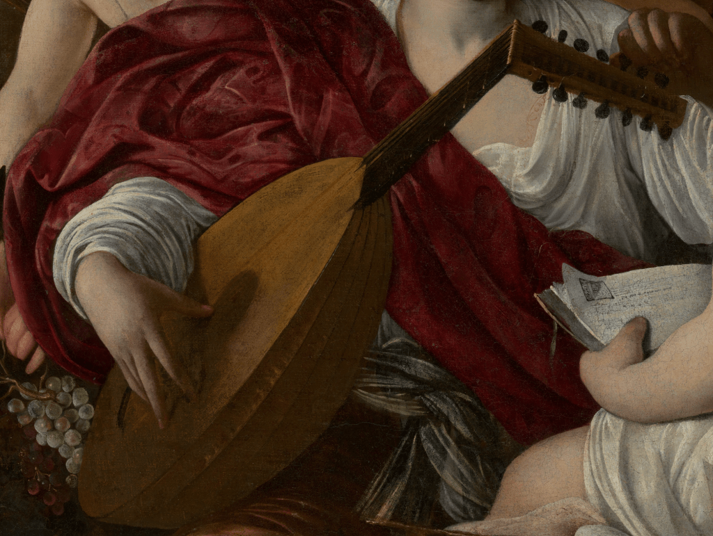
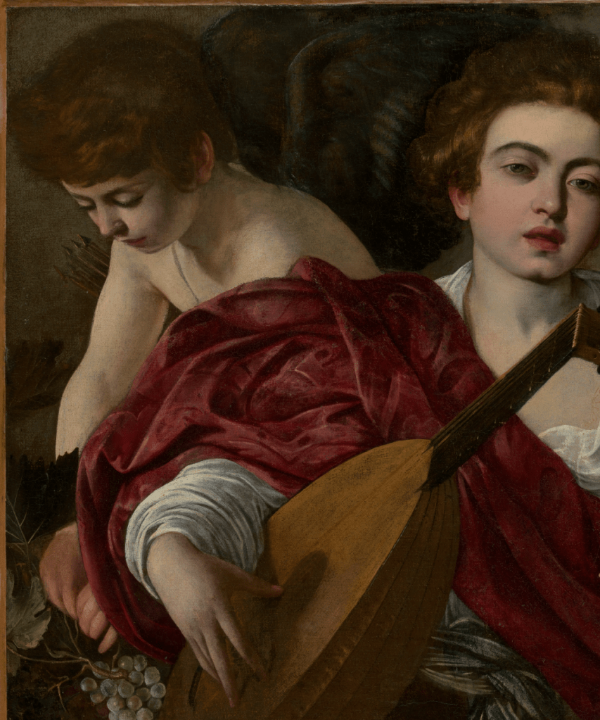
Most prominent is the lutenist. While music is clearly a major theme of the painting – these are, after all, The Musicians – no music is being played. This boy, or man – it is hard to pinpoint his age – is currently tuning his lute. His left hand turns one of the tuning pegs, while his right thumb plucks a string, the tips of his fingers resting on the teardrop-shaped soundboard. Rather than looking at his instrument, he gazes out towards the viewer – towards you – his eyes half closed and his mouth half open, a face that is totally relaxed, and either seduced or seducing. His auburn hair contrasts with dark, arching eyebrows, creating an appearance that is both unusual and arresting. We know that this is one of the first paintings – if not the first – that Caravaggio made for his patron and host the Cardinal del Monte when he became part of the prelate’s household, the Palazzo Madama, not far from the Piazza Navona. As well as being interested in the visual arts, del Monte was also an active patron of music, providing financial support for the training and performance of young castrati, the male sopranos who were an essential feature of the musical culture of the time. If this musician was one of their number, it might explain why his appearance is so arresting, and why his precise age is hard to pin down.

Technical analysis shows that his right arm was painted first, and then the full, red drapery which encompasses it was added on top. The brocade cloak, or shawl, flows over his elbow and frames his hand, its curve echoing the arch of his wrist. It fills out the figure, and broadens the form, and it is this, as much as anything else, that gives the lutenist his prominence. From his shoulder the brocade crosses his body on a diagonal, in opposition to the neck of the lute. Together they form an ‘X’ in front of his chest, the top ‘V’ of which helps to frame his sultry gaze. His left elbow is hidden behind the unclad arm of the boy on the right, while his head tilts towards that of the figure at the back.

The sculptural form of the lute is precisely defined. The soundboard catches the light entering the room from the top left, while the back, or shell of the instrument is cast into shadow, with the exception, perhaps, of the top ‘rib’. However, there is not much detail, and we can’t see all the strings. Sadly, despite its wonderful appearance, the painting is not in a very good condition. After the death of the Cardinal, the painting passed into the hands of a French collector, and was later briefly owned by another Cardinal, the famous (or infamous) Cardinal Richelieu. However, by 1675, we know it belonged to the Duchesse d’Aiguillon, as it is mentioned in an inventory of her collection. By then the canvas had been stuck to a wooden support, from which it was later removed. At either stage this may have resulted in losses to the surface, and could, consequently, explain the lack of detail in some parts of the painting (I’m indebted to Keith Christiansen’s 2017 catalogue entry for this painting on the Met’s website – you’ll have to scroll down and click on their ‘catalogue entry’ button – and, while I’m about it, I’d also recommend his Instagram feed: @keithartnature).

Despite the damage, details have survived – the subtle variation in the angles of of the fourteen pegs, and the light catching the strings passing over the end of the fingerboard, for example. There is even a beautiful and delicate arabesque formed by a long, untrimmed string, spiralling away from one of the pegs and over the lutenist’s brightly illuminated chest.

The figure at the back is also a musician: he holds a cornett, or cornetto. In case you are, like me, unfamiliar with this baroque instrument, I have included an image of a 17th century version – from the Museu de la Música in Barcelona – which I have rotated to be in a roughly equivalent position (however, they do come in many different lengths and forms). If you want to know how a cornett is played, and what it sounds like, there is a good video on YouTube made by The Academy of Ancient Music (apologies for the ad – you’ll be able to skip it after a few seconds).

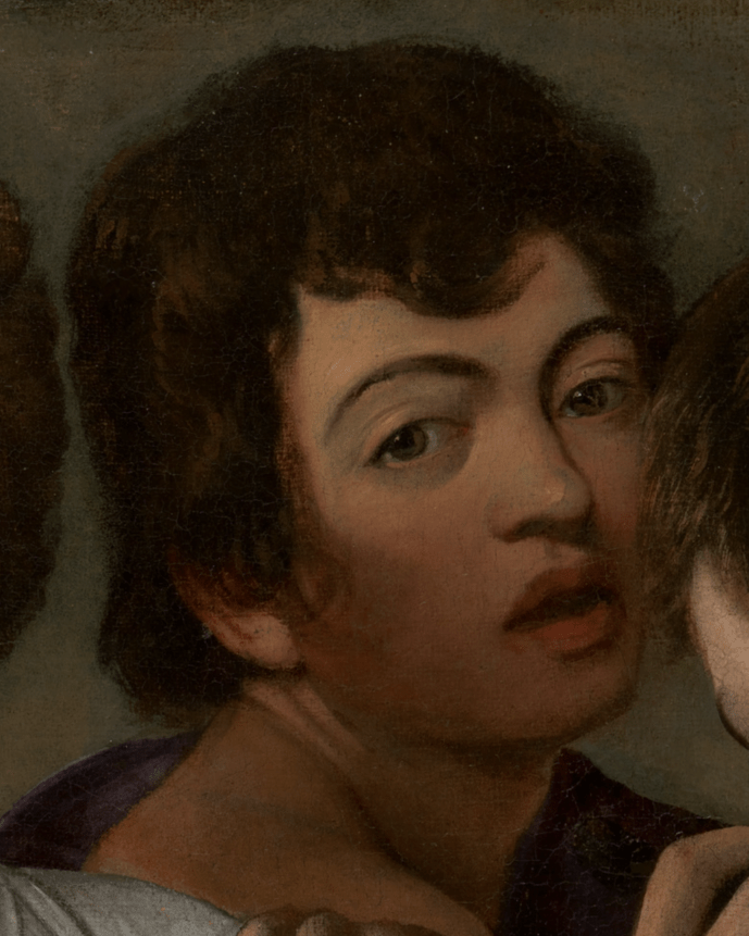
The cornett player in our painting, like the lutenist, looks out towards us with his mouth slightly open, and has similar dark, arched brows – although they are a better match with his hair. Being in the background he is also more in the shade – helping to create what limited depth in the painting there is. This is enhanced by the darkness of his hair, and the black fabric which is draped over his left shoulder (at the back) but not, it seems, his right (the shoulder closer to us). We can see the curve of this shoulder outlining the hand tuning the lute, not far from his own right hand, holding what must be a fairly short, so high-pitched, cornett. We also see the hint of a white sleeve – but that could be either around the cornett player’s right wrist, or the lutenist’s left forearm. This apparent elision of forms brings the two figures together, as does the mutual lean of their heads, tilting towards each other on the picture plane, even though one figure is closer to us than the other. The implication is that these people are in harmony with one another, even when they are not playing. I was about to say ‘even when they are not performing’, but they are definitely performing – either for us, or for Caravaggio – turning to to look at us with their mouths open and those ‘come hither’ eyes. They might conceivable be singing, but I think sighing would be more likely. Having said all of that, you may recognise the cornett player, as the same model occurs in paintings throughout Caravaggio’s career.

It is universally accepted as a self portrait. These two images may not look identical, but it’s worthwhile remembering that the artist was 26 when he painted the image on the left (although I can’t help thinking that he was flattering himself somewhat – making himself look more like ‘one of the boys’), whereas Ottavio Leoni’s drawing, a detail of which is on the right, dates from 1621, eleven years after Caravaggio’s premature death at the age of 39, when he had lived through at least a decade of difficulty. Why he should choose to put himself into this composition is not clear – although it would undoubtedly have placed him at the heart of the Cardinal del Monte’s establishment, thus making him look both cultured and sophisticated: he clearly knows about music… and love. You could even argue that he was trying to show us that he had risen above the low-life… although we know that he himself hadn’t, and wouldn’t. His paintings, however, did, becoming predominantly Christian in subject matter, and he would later show himself as an onlooker at many religious events, and even, sometimes, as a participant, as we saw last April with 221 – Caravaggio: the witness witnessed.

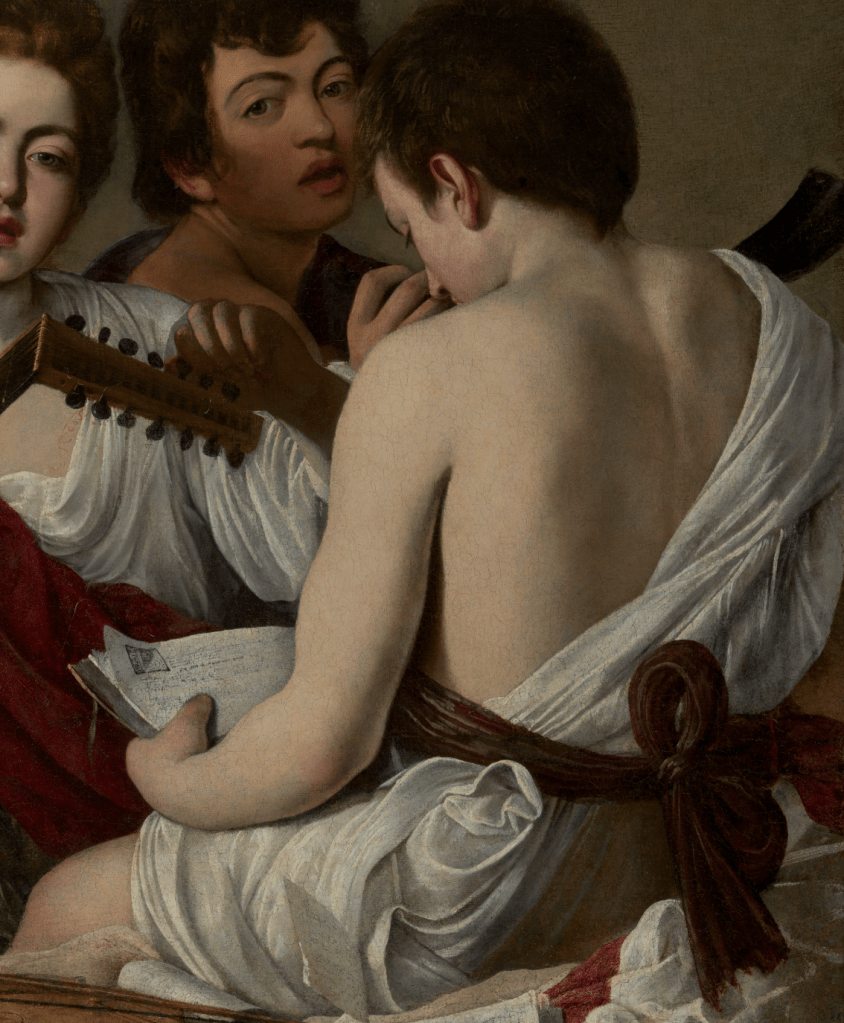
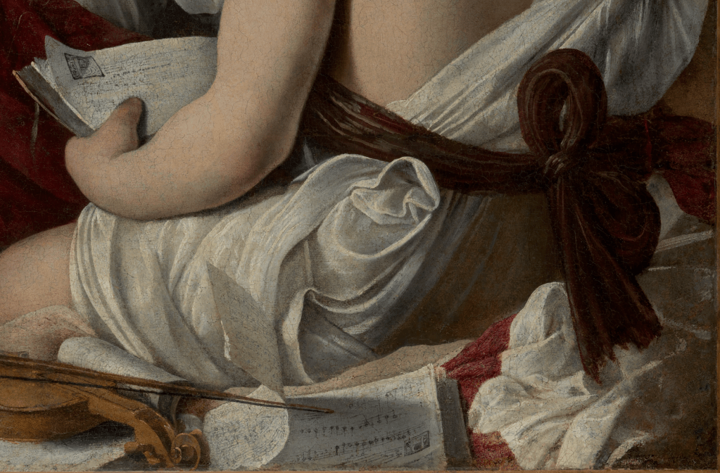
If we move on to the third character, the way in which all four are interlocked and indivisible is especially clear. Although I have cropped the detail to include everything we can see of this boy, and nothing more, we can still see all of the self portrait – cornett included – and half of the lutenist. Caravaggio painted directly onto the canvas from the live model, rather than relying on preparatory sketches, whether drawings or painted studies (none of either survive). This was one of his most remarkable innovations. However, it would be a mistake to think that he had all four people in front of him at the same time. They appear to have sat for him individually, and the precise, controlled composition slots them close together like a well-cut jigsaw. Precisely how these four figures could have occupied the three-dimensional space is not entirely clear: if this were a real space, there might not even be enough room for all of their limbs. However, until we start to question this, it is not a problem, especially given that the patterning of the surface is so good. In some ways, the composition is not unlike another form of composition: music. Primary and secondary themes play off one another, with melodies interlocking and interweaving just like these people. The character of each is distinct, although not necessarily thoroughly developed. This boy in particular is a bit of a mystery: we don’t know what he looks like, even if we can see ‘more’ of him: he appears to be wearing the fewest clothes. If we hadn’t realised before, what becomes clear from the figure in white is that, if this is a scene from contemporary life, then these models are in costume: no one has ever dressed quite like this in everyday life. He appears to have a sheet slung over his right shoulder, which crosses his otherwise naked back (which is accurately, subtly and brilliantly modelled) on a diagonal. It is tied around his waist with a thick, dark, plum-coloured sash. The boy is sitting on the edge of a box, or table, slightly higher than the lutenist, and looks down at a musical score in what I read as calm, focussed preparation.

However damaged the surface of the painting, we can tell how brilliantly crafted this manuscript was. The music cannot be read, but we can tell the difference between the thick, pinkish cover of the book and the darker edges of the pages, and then see the light catching the corners, where the top page has curled up, casting its own corner, decorated with a large letter ‘B’, into shadow.

This book is just one of the still life elements in which Caravaggio both delighted and excelled in the earlier stages of his career. Another score sits on the table with a violin resting on it. They are so brilliantly conceived that I will show you more details below. The sash is tied in a bow, the ends of which appear to caress the white fabric beneath them. Bows like this occur more than once in Caravaggio’s oeuvre, and here, as in other places, it is as if we are being invited to tug on the end, and release the bow, or to toy with the loops, or the knot – but that’s probably an idea that I am transferring from another painting, Caravaggio’s voluptuous, seductive Bacchus in the Uffizi. If you don’t know it, click on that link! In our painting, the white drapery forms a turbulent swirl just beneath the belt, and wraps in numerous folds around the boy’s thigh. There is clearly enough fabric to cover his knee, but enough leg is visible to prove a point: these models are wearing less than they would normally.

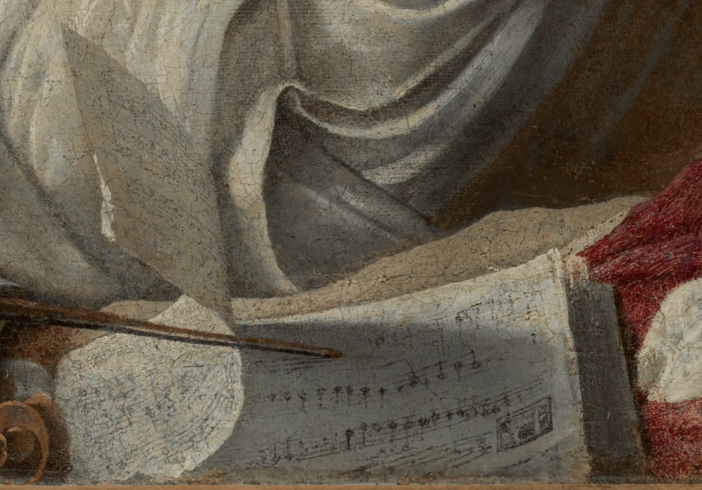
This manuscript is an especially bravura piece of painting, with one page curled up, catching the light on one of the battered corners at the top, and casting shadow on the page beneath. The curl of the page mirrors the curl of the drapery next to it, and forms a counterpoint with the folds behind. Again, the music is illegible – which it may always have been – although this section was so badly damaged that a fair amount has had to be reconstructed, apparently.

The still life continues to the left with the violin – we have just seen its bow resting on the shadowed page. Caravaggio is known to have owned both a violin and a lute, and both appear in the Victorious Cupid currently on show at the Wallace Collection which we will be looking at on Monday. However, it seems too small to be a violin, certainly when compared to the lute. It could be a violino piccolo – a feature of baroque music – but it might simply be that, like the models, Caravaggio was looking at the instruments at different times, and adjusting the size according to what would work for the composition.

The still life extends to the bottom left corner of the painting, where we see vine leaves just catching the light, extending from the perfectly painted bunches of grapes above them. In between them and the end of the violin is the knee of the lutenist, who, like the boy with his back to us (is he the violinist? Or a singer?) has an uncovered knee, so close to the front of the painting that you might even think that it is in easy reach. Close to his hand resting on the soundboard – the hand that will pluck the strings – are two more hands plucking grapes.

These belong to the figure who takes up the top left corner of the painting. We see almost the full length of his right arm – a vine leaf gets in the way of his wrist – and just the ends of his left fingers. We can also see his shoulders and some of his chest, but there is no evidence that he is wearing any clothes at all. But then he does have wings: is this Cupid, or another performer dressed up as Cupid? His quiver hangs over his right shoulder on a very thin thread, with the sharp points of five or six arrows projecting from behind his right arm. Apart from this very thin strap, there is no sign of any other attachments: he is not ‘wearing’ the wings, so they must be part of him. This tells us that it is the God of Love himself, Cupid. He echoes – and transposes – the pose of the figure on the right. One of them is turned towards us, the other is turned away, but each has an unclad arm fully visible, and both look down, intent on what they are doing. Both also convey a sense of innocence, in opposition to the open-mouthed worldliness of the companions they are framing.

But why grapes? One suggestion is that, if this is Cupid, then we are clearly in the world of allegory, and while the other three are musicians, they are also a representation of the idea of ‘Music’ – which is what an allegory is. Most artists at this time, when painting an allegory, would have turned to the textbook, Cesare Ripa’s Iconologia. Published first in Rome in 1593, I would suggest that this may just be too early for it to be entirely familiar in 1597. In 1603 a second edition included illustrations, which were often more influential – and we are definitely to early for that. As a feminine noun, La Musica, like so many other personifications, was seen by Ripa as a woman – but Caravaggio was never one to follow the party line. As it happens, Ripa does mention a lute and a viol (an early form of violin, which the latter ‘eclipsed’ in the 17th century) and an open score, but he also says that music should be shown with wine, ‘perche la musica fù ritrovata per tener gli animi allegri come fà il vino…’ (‘because music was found to keep the spirits cheerful like wine does’). Maybe we’re getting in there early with the grapes, which Cupid is plucking in preparation. This was Caravaggio’s first Cupid – young, innocent, busy. A few years later, and painting for Vincenzo Giustiniani, his next major patron (who lived just round the corner from del Monte), Caravaggio would produce a very different image, brash, bold, and inherently destructive. It is that Victorious Cupid which we will be talking about on Monday.

263 – Vermeer, playing with your imagination

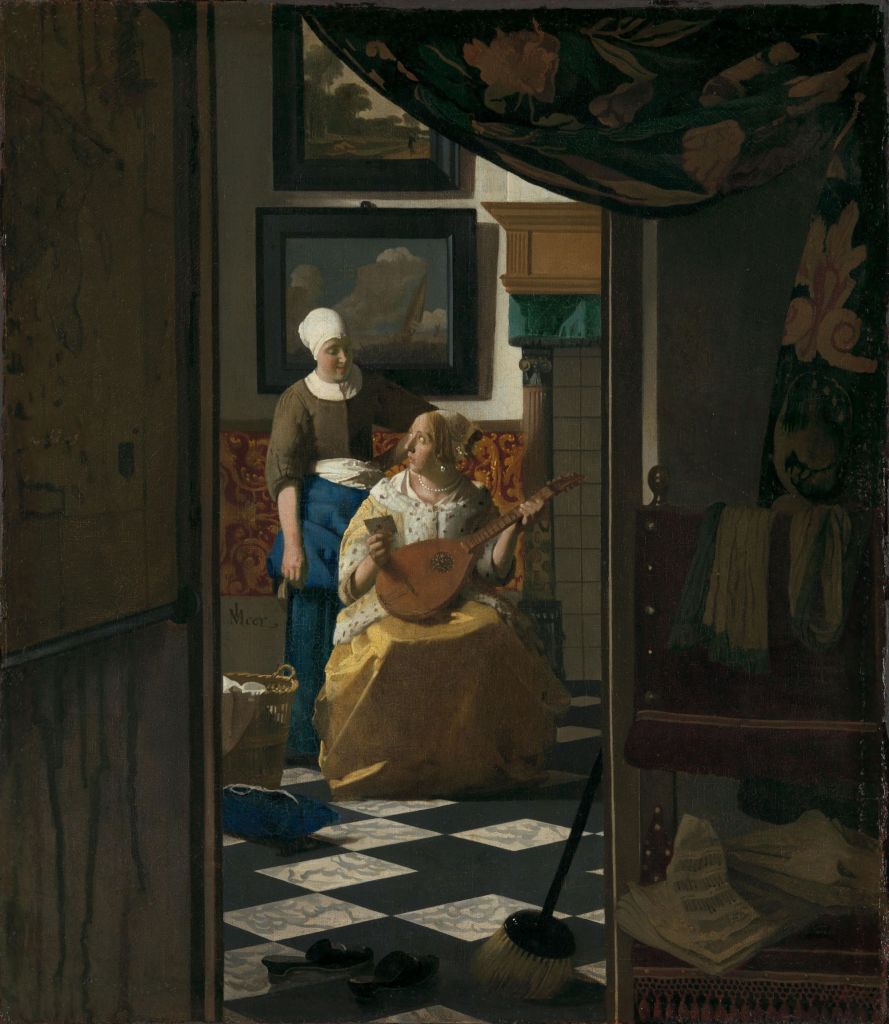
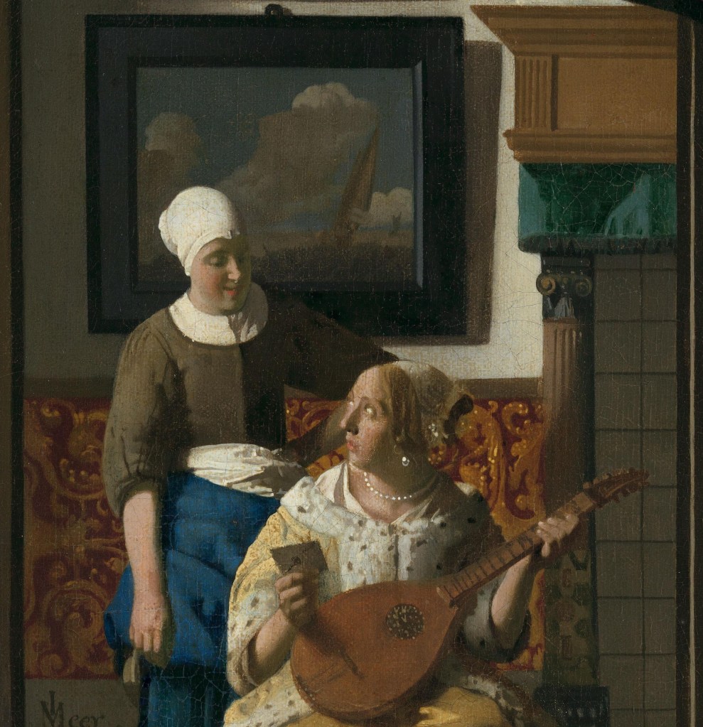
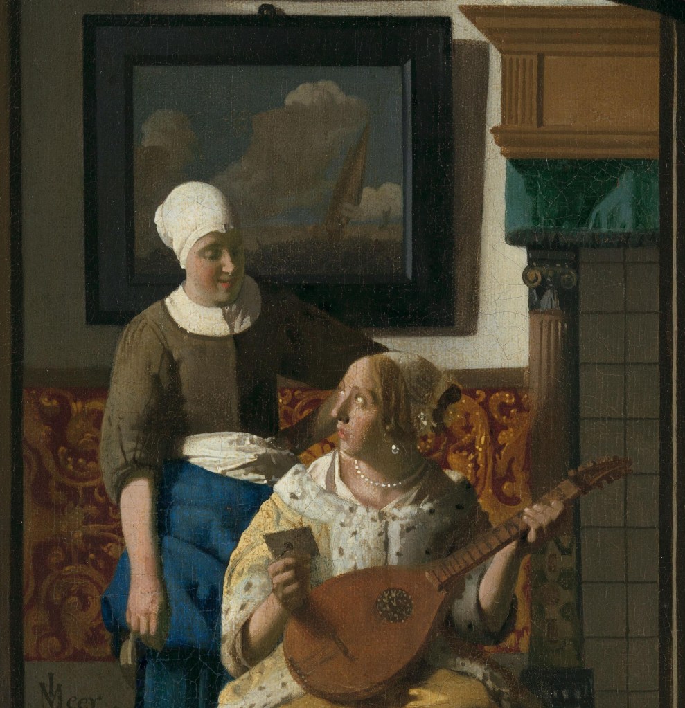
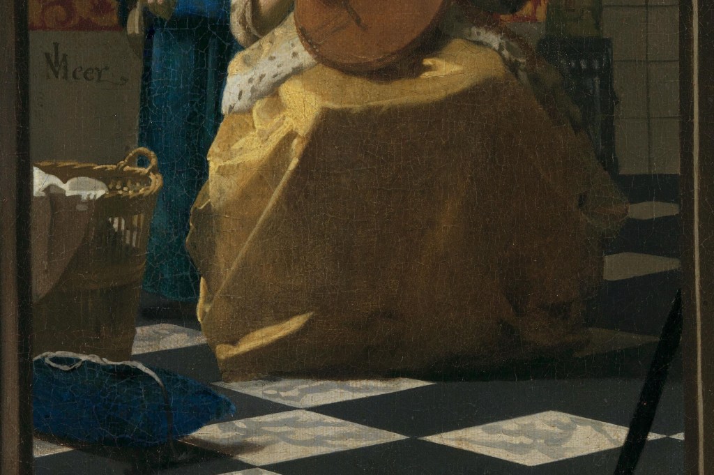
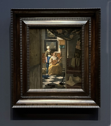
Johannes Vermeer, The Love Letter, about 1669-70. Rijksmuseum, Amsterdam.

My next two talks are dedicated to single works by two artists who had a lot in common – and yet were completely different: Vermeer and Caravaggio. They both worked in the 17th century painting religious subject matter and genre scenes, and both produced relatively few works. They died young, and were all but forgotten soon after their early deaths, only to be rediscovered in the 19th and 20th centuries, reaching an unparalleled level of popularity in the 21st. As a result, every painting by them is fascinating – and the arrival in London of even a single work associated with either of these masters is something to be celebrated. This Monday, 1 December (how is it December already?) we will start with Seeing Double: Vermeer at Kenwood. We will explore the Guitar Player in depth, taking it as a stepping-off point for a consideration of Vermeer’s career as a whole, and compare it to a remarkably similar, although by no means identical painting which is on loan to Kenwood House from the Philadelphia Museum of Art. Two weeks later, on 15 December, I will turn my attention to Caravaggio, as his remarkable Victorious Cupid will be on display at the Wallace Collection: it has never been shown in public in the UK before.

The New Year kicks off with talks introducing two Tate exhibitions, Turner & Constable at Tate Britain on 5 January and the following week (12 January), Theatre Picasso at Tate Modern. After that my sights will be set on Scandinavia, with the Dulwich Picture Gallery’s exploration of the richly coloured paintings of Danish artist Anna Ancher. At the moment I have this planned for 26 January. Just before then I’ll be heading to Hamburg to see an exhibition of the great Swedish artist, Anders Zorn. Despite giving a couple of talks about his work around five years ago, and a few visits to Stockholm, I’ve seen very few of his paintings – so I can’t wait! He was a contemporary of, and equivalent to, John Singer Sargent and Joaquín Sorolla. Like them, his works are highly painterly, with full, lush brushstrokes, and, like Anna Ancher, his paintings are vibrantly coloured with a richness that contradicts the dark and brooding notion of ‘Scandi Noir’. That talk should be on 2 February, but I’ll post more details in the diary in the New Year… if not before. Today, though, I want to look at a painting by Vermeer which has some features in common with Kenwood’s The Guitar Player. Music is one of its themes, and yet it goes by the name of The Love Letter.

Vermeer manages to give us the impression that we have stumbled on something we should not see. We’ve arrived at a doorway to witness a scene which appears to invert the standard social order – a maid lording it over her mistress. Not only that, but neither has been doing what they should, judging by the appearance of the outer room – dark, dirty and messy – not to mention the inner room, which may be well appointed, but is nevertheless showing signs of neglect.

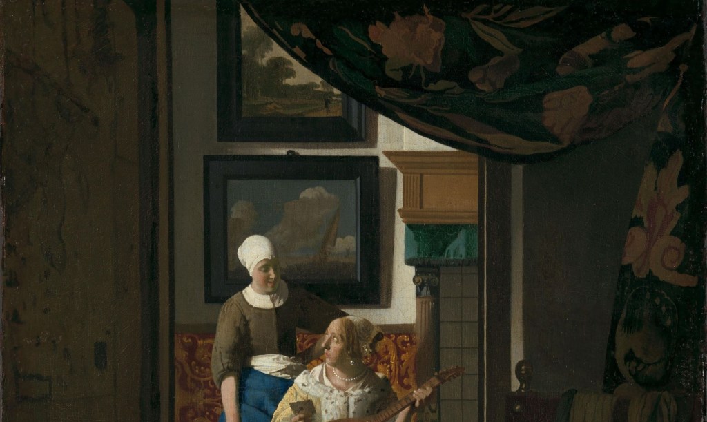
A curtain has been drawing back – and maybe it shouldn’t have been. There is a real sense of theatrical revelation though, a bit like someone sharing the gossip: ‘look what I’ve just seen…’. It is a curtain that very probably belonged to Vermeer, and he used it in other paintings, notably The Art of Painting. It’s also worthwhile remembering that some paintings were covered by curtains on rails – in part, to keep the dust off them – and sometimes artists even painted trompe l’oeil curtains to make what was being revealed appear more real, and to remind you that it was a valuable work of art by an esteemed artist. The curtain also has a classical reference, but I won’t go into that now. In this case, Vermeer is playing with both ideas – what is being revealed in the back room, and the suggestion that this is a painting that is worth looking after. On the left wall of the entrance hall – or whatever the room is – there is a map, a reference to the world outside this house. Vermeer may well have owned several maps (although I can’t see any in the inventory of his belongings), but he could equally well have borrowed them, choosing them sometimes for their significance, and sometimes, simply for their appearance. Here, I think it is a reminder that we are coming into the story from ‘elsewhere’, but also that whatever is going on in these rooms is in some way connected to the world outside this house – which is where the letter that the lady is holding must have come from.

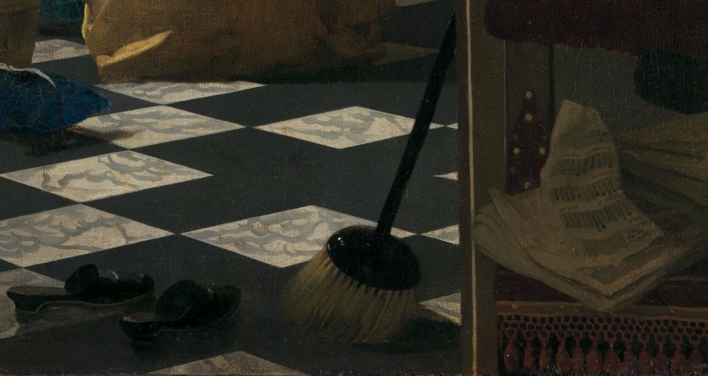
Although drawing back the curtain has revealed the inner room, the lower half of the painting is, in some ways, more revealing. For one thing, our point of view becomes apparent. On the right is a chair, upholstered in red velvet with gold trims. It is facing directly towards us, so that the front of the seat is parallel with the bottom of the painting. Our view is cut off just below the tassels along the front of the chair. The bottom of the painting probably coincides with the threshold of the adjacent room. This implies that our viewpoint is relatively high, with our supposed eye-level demonstrated by the perspective. The bottom edge of the map, and the diagonals of the diamond floor tiles, create orthogonals which continue to the vanishing point of the painting, just above and to the right of the brass ball on the chair back. Looking at the bottom of the map, though, what is most striking is the state of the wall – dark muddy drips staining the light paintwork. This is the only painting by Vermeer that I can think of in which something is actually dirty – and this is just one of the signs of neglect. The messy, crumpled paper on the chair itself, and the objects in the doorway, are others.

A broom leans against a wall behind the door, and two slippers are left on the floor. Between them they take up the full width of the doorway. They are not in their proper place, and nor are they put to their proper use. The household chores – and the management of the household – are apparently being neglected. The maid would be responsible for the former, and the lady of the house the latter. Maybe the lady of the house has other things on her mind… Not only that, but once you get close enough you can see that the crumpled paper on the chair is actually sheet music. Even though what is written makes no sense, musically speaking (Vermeer seems not to have been worried about that), the implication is that the harmony created by well-played music has been set aside. This might have a bearing on the state of the household: there may be discord, and disorder.

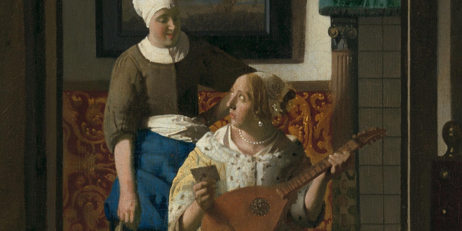
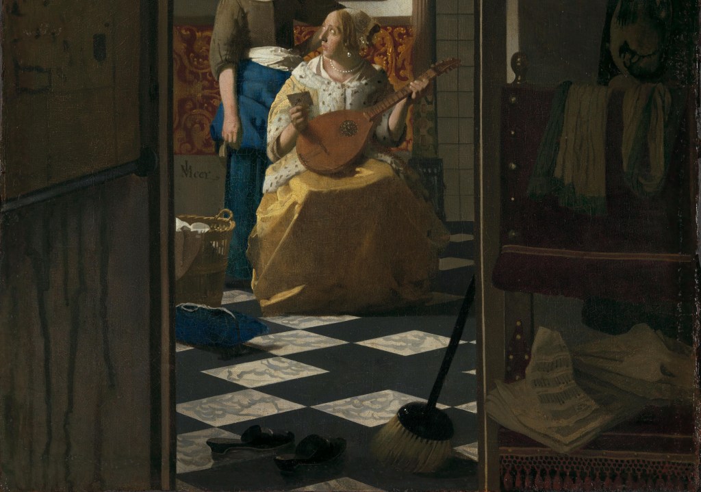
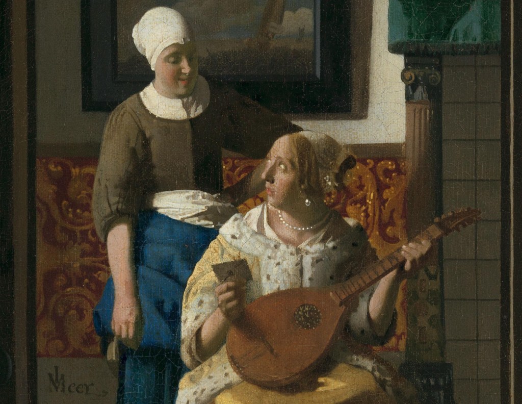
Having negotiated these obstacles to get into the room, we are in the presence of a finely dressed lady and a maid – presumably her maid. The difference in status is marked by their clothing. Whereas the lady wears a yellow satin jacket trimmed with broad bands of fur, as well as a pearl necklace and earrings, the maid has a plain brown top over a chemise, plain blue skirts, and no jewellery. However, the maid stands over her mistress, dominating her. Not only that, but her left arm is ‘akimbo’ – a pose almost always adopted in 17th century Dutch portraits by men rather than women (although there are a few exceptions). You could see this as an equivalent of contemporary ‘manspreading’, allowing the men to take up more space and so look more important. Not only that, but the maid’s headdress is quite tall, and catches the light brilliantly, thus enhancing her importance within our visual field. Nevertheless, there seems to be a good relationship between the two. We do not know what has happened – and that is one of the great strengths of Vermeer’s art. He gives us so much of the evidence we need to work out what is going on, but not everything: we can tell our own stories through his paintings, and they can all be different. The lady is holding a letter, which appears to be unopened. She looks round, and up, towards her maid – who has presumably given it to her (although we have no way of proving that she has) – and the maid looks back, her face slightly lowered, with the hint of a smile. The lady is clearly concerned, the maid, somewhat amused. Her stance is down to earth, matter of fact, though: whatever the contents of the letter (and how could she know?), it clearly isn’t going to affect her that much. However, the two are pictorially bound together. Quite apart from the fact that they are perfectly framed by the door, the top of the maid’s white apron, which we see above the blue overskirt which has been hitched up, continues along the line of the white fur trim of the lady’s jacket, tying them together visually. The upper edge of the brown sleeve on the maid’s left arm also leads to the top of the lady’s head, and the inside of the crook of her elbow is level with the top of the gilded leather panel we can see through her arm. Both coincide with the lady’s right eye: everything in Vermeer’s compositions was always very precisely planned, and extremely specific. Notice the placement of his signature at the bottom left of the detail above, for example – not stuck away in a corner at all, but conveniently close to the action.

Given the title the painting has now, how do we know it is a love letter that the lady is holding? The musical instrument is one of the clues – as is the crumpled music we have already seen.

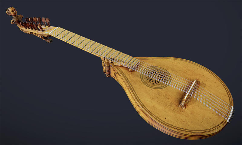
It is a cittern, as you can see by comparison with this example (from the Ashmolean Museum in Oxford), which was made in Italy around 1570, and is attributed to Girolamo Virchi. Citterns tend to have a flat back, as opposed to the rounded back of the lute, and the strings are made of metal, as opposed to the gut, which is used for lutes. As a result, they sound very different. In the interpretation of Dutch 17th century paintings this difference is important for a very specific reason: the Dutch word ‘luit’ was used as slang for the female genitalia – which can have implications for any woman holding a lute, or any man playing one anywhere near a woman… Nevertheless, the cittern is still a musical instrument, and given that we are in the 17th century, and that Shakespeare probably wrote Twelfth Night around 1601-02 at the beginning of the century, it is well worth remembering that the play opens with the lines,

If music be the food of love play on
Give me excess of it, that, surfeiting,
The appetite may sicken, and so die.

So, as likely as not, given that the woman is (or was) playing music, we are probably being invited to think that she is in love. The paintings in her room support this suggestion.

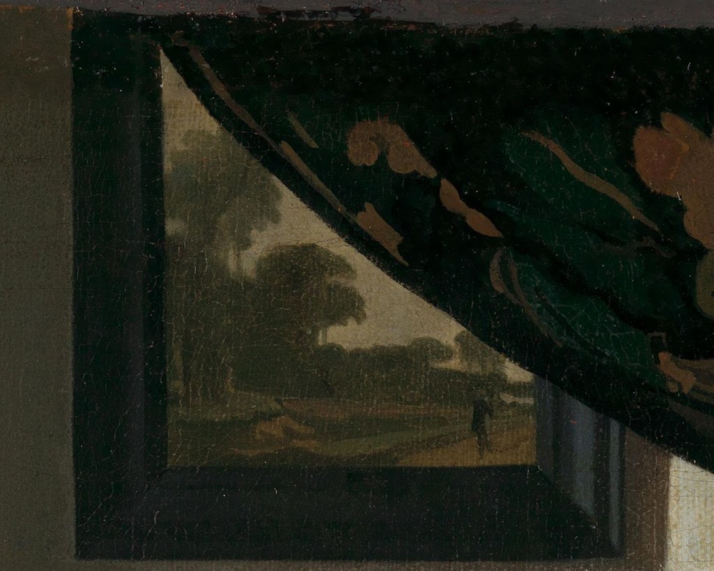
Not only has drawing back the curtain allowed us to see what is going on in the inner room, but, as this detail shows, it has also revealed most, but not all, of the upper of two paintings. I’m sure there’s not much we can’t see, as the curving line of the fabric traces the height of the distant trees: all that is hidden must be sky. This could be a version of a real painting. As we will see on Monday, it was quite common for Vermeer to use paintings he knew. Some were in his mother-in-law’s personal collection, some were by artistic associates – members of the Guild of St Luke in Delft – and some might have been passing through his hands as an art dealer. However, he would often edit them, taking just one detail, or changing their scale, according to the composition he was working on. I don’t know if anyone has ever found a source for this particular image, but I’m sure the trees have been edited to fit the curve of the curtain. It is a landscape (though in a portrait format, but this isn’t unusual), with a path or track leading towards us in the bottom right corner. There is a single figure, which I see as a man walking towards us – his two legs are distinct (a woman would be wearing a full-length skirt). I’m assuming he’s walking towards us as that was a reasonably common occurrence in Dutch landscape paintings. He is, arguably, the last thing to be revealed by drawing back the curtain, leading us to ‘dis-cover’ (quite literally) a man approaching us. This may well relate to the contents of the letter, which might inform the lady that a man is returning from the outside world.

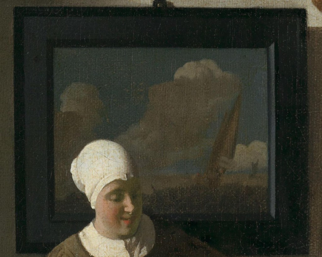
The lower painting is another common genre in Dutch 17th century painting: a seascape. Billowing clouds are seen against a clear blue sky, and are lit at the top by bright sunlight – fair weather, if windy. There is a single sailing ship approaching us, listing to port (OK, I don’t know ships well enough to tell if it is approaching us or going away – but it makes sense to me that it would be approaching, in which case I can at least tell it is listing to port… or, leaning towards the left in the direction of travel). Notice how the maid is so overtly associated with this painting: her shoulders are painted against the lower edge of the frame, so that her head is framed by the ebony surround. Her tall, rounded, white headdress catches the sunlight coming through the window of the inner room in the same way that the clouds catch the light in the painting.

Seascapes can refer to many different journeys – our journey through life, for example, or the status of a relationship: ‘Stormy weather, since my man and I ain’t together’, to quote Ted Koehler (1933). Here the sky is blue, the clouds are fluffy, and even if the sea must be rough because of the wind (the bottom of the painting is not at all clear) it does imply that the person on the ship is making a speedy journey. The two paintings suggest – to me at least – that someone is on their way home and making good time. I’m assuming it is the lady’s lover… It is not clear whether she is married or not, though. And is she really the lady of the house, or one of the daughters? Is this an accepted relationship, or a secret between her and her maid? Again, Vermeer gives us all of the clues – but doesn’t draw any conclusions. We are left to decide, and then, if we so choose, to moralise.

There is no doubt that this woman is a member of a wealthy household, though. It’s not the art – most members of the merchant classes in the Dutch Republic (who were, after all, the ruling classes in the 17th century) had paintings, and many paintings, on their walls. But the brilliant illumination implies large windows, which implies a lot of glass, which implies a lot of money. The gilded leather panel also suggests wealth, even if it wasn’t especially expensive: this example was one of Vermeer’s studio props, and also appears in his Allegory of Faith. The mantel piece was also a way of showing off your wealth, with carved columns supporting a projecting shelf. It could be carved from wood or stone, or, for the richest, fine marble. To be honest, it’s hard to tell what this one is made of – it could be painted wood, or it could be stone, but not, I think, marble: this isn’t the richest of houses. There is also a dark green satin pelmet around it to make it look more refined. One of the things that is not as expensive as it appears is the lady’s jacket, which is the same as the one worn by The Guitar Player. The original probably belonged to Vermeer’s wife, and is mentioned in the inventory drawn up in 1676, the year after the artist’s death: a ‘yellow satin mantle with white fur trimmings’ – it was kept in the ‘groote zael’, or great hall. For those of you familiar with ermine, the fur worn by members of royalty, you will realise that this doesn’t look quite right: the black spots are too large and irregular – and don’t look like the tips of tails. This is a cheaper white fur (possibly rabbit) which has been died with black spots – to look like ermine. This is the sort of information you can find in what is my go-to source for Vermeer – Essential Vermeer. People often ask me what books I recommend, but I think this website beats everything for the amount of information it covers, the detail it includes, and the number of different approaches to Vermeer and his art that it explores. I’ll see you in 2027 when you’ve finished reading it all…

Whatever its material, the mantelpiece is profoundly rectilinear, with the vertical column supporting a horizontal mantel. The paintings, too, emphasize horizontals and verticals, and are framed by the vertical door jambs. This allows us to measure the movement of mistress and maid – the former leaning to our right, the latter tilting her head to our left. Notice how these movements echo the forms of the two highest billowing clouds in the painting behind them, and how the lean of the lady echoes that of the ship, as if she too is listing in the wind.

As I’ve already suggested, neither is doing what they probably should be doing. A laundry basket has been placed on the ground in what I presume is the groote zael of this house – which I imagine is not the right place for laundry. The maid could have plonked it there while delivering the letter. Next to it is a blue sewing cushion – and sewing, which implies occupying yourself in a focussed manner to put something right or to make something good, was commonly seen as indicating domestic virtue, something that every good woman should aspire to. And yet, the sewing cushion has been put aside, left on the floor (not even on a table), while the lady sits and strums. But then, If music be the food of love…

Despite the blue sky in the painting, maybe things are stormier than we think – it’s not plain sailing. The dark, dirty streaks on the wall beneath the map could have told us as much – and despite the brilliantly illuminated interior maybe the outlook is not as bright as it might appear: there could be clouds on teh horizon. But remember, this is just one interpretation – there are many others which could be equally (or more) valid. And, as we shall see on Monday, that is one of the things that keeps bringing us back to Vermeer.

262 – Stand well back

Joseph Wright of Derby, The Annual Girandola at the Castel Sant’Angelo, 1775-76. Walker Art Gallery, Liverpool.

Wright of Derby: From the Shadows – the exhibition at The National Gallery which I will be talking about this Monday, 24 November at 6pm – is one of those exhibitions which takes a small slice of an artist’s life and covers it both beautifully and thoroughly. It’s not a large exhibition, but it is very rich, and there is more than enough to look at and think about to make a visit to Trafalgar Square worthwhile even if you do nothing else. The paintings look superb, the design is perfect, and the lighting is both evocative and appropriate. To avoid cutting further into that ‘small slice’ – which in some ways I did in August with 254 – Joseph Wright, changing your point of view – today I will look at a superb painting by Wright which falls outside the range of the works in the exhibition. Nevertheless, it does use many of the techniques the artist had learnt from the ‘candlelights’ and ‘moonlights’ which are the subject of From the Shadows.

The following week, 1 December, my starting point will be the first of two exhibitions in London this winter which focus on one loaned painting, Double Vision: Vermeer at Kenwood. The second will follow two weeks later, on 15 December, when I will look at – and around – the Wallace Collection’s Caravaggio’s Cupid. These two talks will be followed in the New Year with two more which will introduce exhibitions at Tate – Turner and Constable (Tate Britain) on 5 January, and Theatre Picasso (Tate Modern) on 12 January. More news is bound to follow soon in the diary.

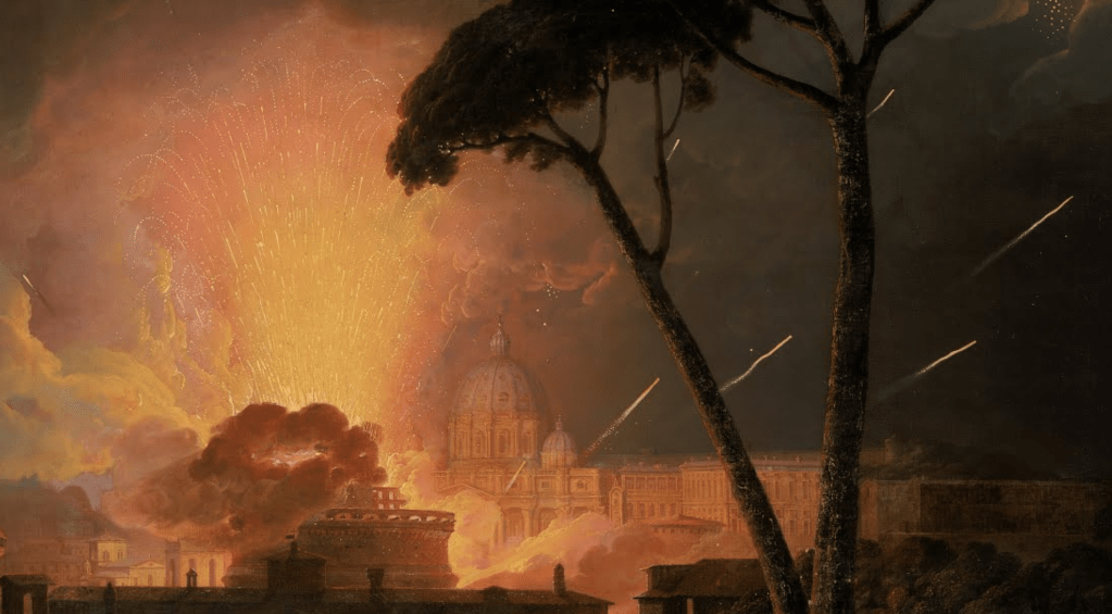
At first glance you might wonder if we are looking at a natural – or manmade – disaster. In the dark of night the most enormous explosion seems to have taken place, an eruption of fire amid sizeable buildings. Fortunately, though, we are at a safe remove, with two tall umbrella pines acting as a screen, letting us know how far away we are from the fire, the smoke and all the sparks: we are definitely standing well back. A dark row of buildings marks the edge of a town, or city, with the furthest building – as far as we can see so far – being a large church with a notable dome. To one side of it, palaces are lit up with the golden glow of the conflagration, and facing it a round building is all-but enveloped by smoke. Sparks fly up into the sky in all directions.

Looking closer, though, the sparks might seem a little too ‘tidy’ to result from an uncontrolled fire. It may have been obvious to you before, but all this heat and light is the result of a firework display. The concentrated energy of the upward motion of the sparks allows us to track their origin to what appears to be an open space in front of the church. As the sparks rise their colour shifts from yellow to orange as they lose their energy – both in terms of movement and heat – and their parabolic trajectory starts to be noticeable. However, there is more than one type of firework. The main column of sparks, which opens out rather like a display of tall flowers in a narrow vase, is clearly bursting up from the ground, but there are also rockets which, in this detail at least, shoot along diagonals behind the trunks of the pines. The smoke which envelops the circular building would also appear to have developed from the base of the firework display.  

Getting closer still another thing becomes more obvious (although to some, again, it may have been obvious before). We are in Rome – or near Rome, at least. The church is none other than St Peter’s, and the round building in front of it the Castel Sant’Angelo. To the right of St Peter’s is the ‘Loggia di Raffaelo’, decorated by the great renaissance master, but almost completely inaccessible to the public today.

The top floor is open, supported by a row of columns (although it has now been glazed, to protect the frescoes), whereas the floor below has an arcade, with each arch framed by pilasters. Compare and contrast the above: I think it’s fair to say that Joseph Wright has been pretty accurate in his depiction – although he has heightened the drum of Michelangelo’s dome.

Accurate, that is, until you think about the relative locations of St Peter’s and the Castel Sant’Angelo. The latter is far closer to us in the painting – so it should appear to be far larger, potentially even blocking our view of the basilica, given the distance between them. However, Wright clearly wants us to see both: he wants us to know where we are. Given the angle of the rockets, they would appear to be flying out from the Piazza San Pietro, inside the enclosing arms of Bernini’s colonnades. However, the title of the painting tells us that this is not the case – the girandola was taking place at the Castel Sant’Angelo. Apart from the rooves of this structure, and the land immediately around it, there wasn’t much more open space in this part of Rome in the 18th century: the dramatic avenue leading from the Castel Sant’Angelo to the Piazza San Pietro – the Via della Conciliazione – was only started in 1936 on the orders of Mussolini. It involved the destruction of a row of buildings between two narrower streets to create the impressive width of the avenue, which wasn’t completed until 1950. There is no evidence of these buildings, or of the distance between the castle and the basilica, in Wright’s painting, though: this is a topography that depends on the ‘symbolism’ of notable buildings rather than on geographical accuracy.

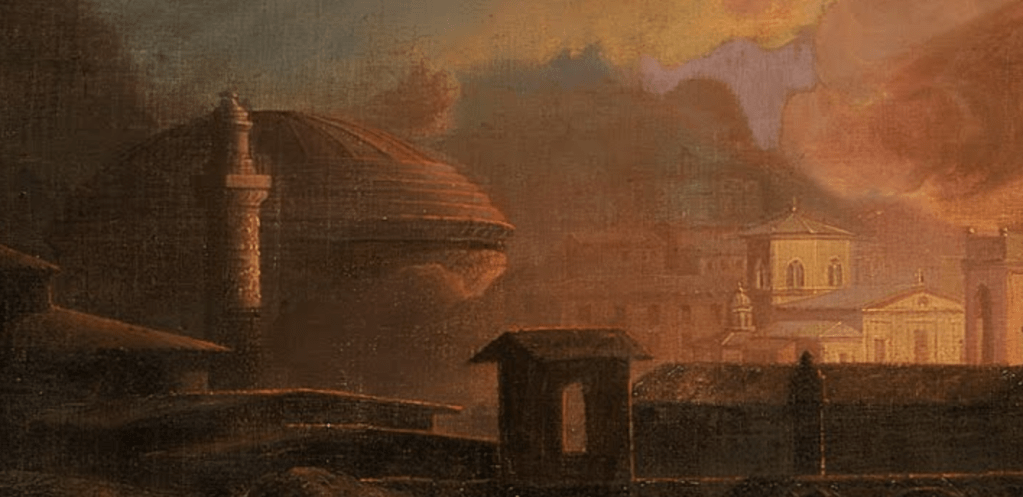
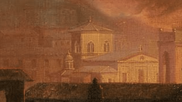
The same is true further to the left. What stands out is the dome of the Pantheon, resting on its cylindrical walls. Standing a little closer to us is a column, with specks of light reflecting from its surfaces, suggesting that they are highly decorated with sculpture. This must be one of the two columns in Rome with spiralling reliefs. The assumption, in the texts that I have read, is that it is Trajan’s Column, probably because it is the more famous of the two (just to make the point, there is a plaster cast of the entire thing in the Victoria and Albert Museum in London). However, the Column of Marcus Aurelius would make marginally more sense. Looking from the right place on the Pincian Hill the Castel Sant’Angelo would appear to be to the left of the façade of St Peter’s, and the Pantheon would be off to the left – but far further off than Wright has suggested. You might even be able to find a place where the Column of Marcus Aurelius appears in front of the Pantheon – but it wouldn’t be the same place: this may be an amalgam of different views from the Pincian, with the buildings out of scale to allow them to be identified, and visible. However, this suggestion is thrown out of kilter by a building that could be a church with an octagonal ‘dome’ – although the structure is really a broad lantern with sections of a sloping roof. I think this is the Ospedale di Santo Spirito in Sassia. Again, compare and contrast:

On the façade Wright has painted the standard tripartite division of a church, whereas the building is divided into four – an early Renaissance ‘error’ in the revival of classical architecture, perhaps. It could be that he was making assumptions about the way in which such a gable-ended building is usually structured. I don’t know any other buildings in Rome with this sort of octagonal lantern, although they may have been altered, or hidden, since the 18th century. The gothic tracery of windows of the Ospedale’s lantern do seem very close to what Wright has depicted. If this is the Ospedale, though, it is at the Tiber end of the Via della Conciliazione – Mussolini’s 1930s avenue – and so not far from the Castel Sant’Angelo. It is nowhere near the Pantheon or either of the two columns. What Wright has painted is not an accurate cityscape, but a genre of painting known as a Capriccio – an imaginary landscape (or cityscape) ‘cutting and pasting’ known buildings – or invented ones – into a ‘capricious’ arrangement. It is a fantasy, a scrapbook of known monuments. However, the occurrence he is depicting – La Girandola – was a matter of historical fact.  Here’s another, more topographically accurate version of a similar occasion – or possibly even the same one – that Wright painted at about the same time (1776), which is now in the Birmingham Museums and Art Gallery: Firework Display at the Castel Sant’Angelo.

The Girandola of the title was a mechanism for mounting fireworks. They were set into a circular structure, and aligned in such a way that the force of the rockets firing out of it caused the entire thing to revolve – like a Catherine wheel, or pin wheel firework, but on a far larger scale. It took place annually – as the title of the painting suggests – on Easter Monday, but there could also be a girandola to celebrate the inauguration of a new pope. Wright left England on his own version of the Grand Tour in 1773, and was in Rome from 1774 to 1775. He would have been there for the conclave which elected Pope Pius VI in February 1775, but it seems far more likely that he witnessed the girandola of Easter 1774. On returning to England he would have used sketches he made in Rome, together with his memories of the event, to complete the paintings, adding in more or less artistic license along the way.

In both cases – the paintings in Liverpool and Birmingham – he paired the image with an equivalent of Vesuvius erupting. Although he did travel south to Naples to see the volcano, which was going through what is termed an ‘eruptive sub-cycle’ in the 1770s, it is very unlikely that he witnessed a ‘major’ eruption – although you wouldn’t know that from the paintings. He was an artist, after all. The pairing was quite deliberate – fireworks from the earth compared with handmade eruptions, or, to put it in his own words, “The one the greatest effect of Nature, the other of Art that I suppose can be”. Both would have been considered manifestations of the Sublime, defined by Edmund Burke in 1757 as the experience of encountering something that inspires awe, terror, and astonishment, producing the strongest emotions the mind can feel, saying that ‘whatever is in any sort terrible or is conversant about terrible objects or operates in a manner analogous to terror, is a source of the sublime’.

Fireworks are, of course, dangerous, hence the instruction I remember from my childhood to ‘light blue touch paper and stand well back’. I suspect that the people operating the girandola may not have been given this luxury – nor was ‘health and safety’ a consideration for the people lowered by rope from the lantern of the dome of St Peter’s to light all the candles you can see illuminating it in the background of the Birmingham painting. The candlesticks are still there: you can see them if you look over the balcony of the lantern of St Peter’s to this day (but only on the side facing Rome).

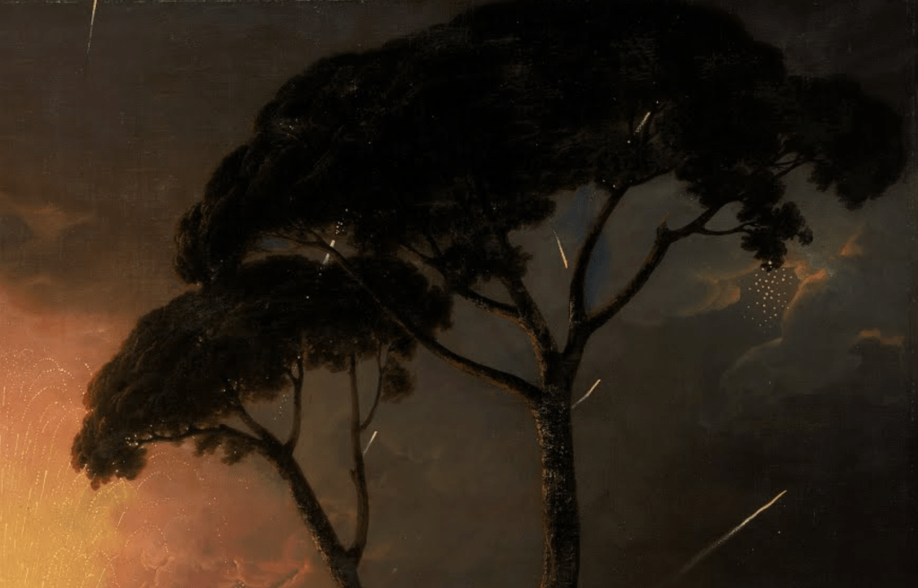
In both paintings, though, Wright clearly was standing well back. For the Liverpool version he imagined himself to be far enough away to allow him to include the two umbrella pines – even if experience would suggest that he probably invented the entire foreground landscape. As I said above, the pines create a dark screen against which the strength of the brilliant illuminations can be measured, and they also allow us to trace the almost random path of the rockets – one of which has exploded, illuminating the edges of nearby clouds. They also encourage us to look into the depth of the painting, thus acting as a form of repoussoir.

And yet – as this detail suggests – even this far away may not be far enough: a rocket is landing at the foot of the pines, in the foreground of the painting. This would surely induce anxiety in the minds of anyone physically present – but safe as we are at home, looking at our screens, or in the comfort of the art gallery, it need not concern us too much. This too is part of the experience of Burke’s ‘Sublime’ – the knowledge that such awe and terror exist, and yet, we need not be afraid: we get the thrill, but not the danger. It even allows us a space to enjoy the fear – not unlike watching a thriller on T.V. The British, in particular, seem to love a good murder – just think about Agatha Christie or Arthur Conan Doyle – maybe (just ‘maybe) this is the heritage of the Sublime gradually bubbling away… The paintings in From the Shadows are, on the whole, more domestic, and might not, at first glance, appear to produce that much of a threat. But the size and scale of the solar system, or the inevitability of death, are nevertheless bound to present an undeniable sense of awe… as we will find out on Monday.

261 – Joining the dots

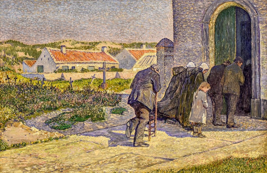
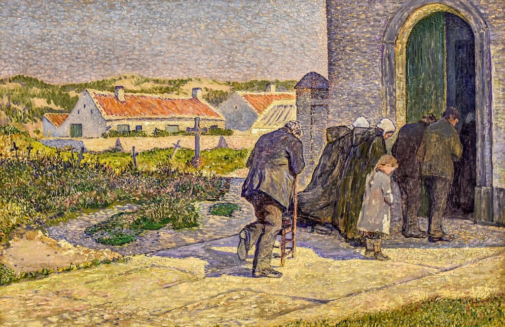
Anna Boch, During the Elevation, 1893. Mu.ZEE, Ostend.

I confess that I have never visited the Kröller-Müller Museum in Otterlo, despite the fact that it has the most extraordinary collection of paintings: before the opening of the Van Gogh Museum in Amsterdam, for example, this was the best collection of his work. The majority of the paintings in the National Gallery’s sparkling exhibition Radical Harmony: Helene Kröller-Müller’s Neo-Impressionists come from there, and have been loaned as the result of a major expansion. Having seen the exhibition – which I will be discussing this Monday, 17 November – I am keener than ever to go: a stunning building, in extensive parkland far from the madding crowds, with one of the best collections of early modernist paintings – I can’t think why I’ve waited so long! More of that on Monday, though. The following week, on 24 November, I will return to the National Gallery to see the truly illuminating (and beautifully lit) exhibition Wright of Derby: From the Shadows. This will conclude the first part of my 2 + 2 + 2 series – two talks about exhibitions at the National Gallery, two talks on exhibitions inspired by the loan of a single painting, and two on shows at Tate. Next up will be Double Vision: Vermeer at Kenwood on 1 December and Caravaggio’s Cupid (at the Wallace Collection) on 15 December. Tate Britain’s Turner and Constable and Tate Modern’s Picasso Theatre will follow in January – keep an eye on the diary for more information. Meanwhile, back to Radical Harmony.

It is a sunny day, with bright light flooding the path which leads from the bottom left corner of the painting to a shadowy building located in the top right, thus creating a diagonal which also draws our eye into the painting. The building, and the people outside it, cast purplish shadows along an opposite diagonal. These people appear to be approaching the large, half-open doorway with their heads bowed. As this is a painting they do not move, of course, but other details suggest that they are not moving anyway: a child has her feet placed firmly on the ground next to each other, and a man leans over a chair, his right knee resting on its seat. The heel of his right foot falls on the central vertical axis of the painting, and this, like the gentle diagonals, helps to create a sense of harmony and balance across the painting. This order is enhanced – subconsciously perhaps – by the placement of the building. The bottom of the wall is located roughly a third of the way up the right-hand edge, while the left side of the wall is just over a third of the way from right to left.

There is nothing about the architectural detailing to tell us that this is a church. The dappled walls are a purplish grey – not that dissimilar in hue to the shadows on the ground – while the inner edge of the door frame, which is catching the sunlight, is built up from dashes of a cream-coloured paint. There are flecks of this same light colour among the darker shades of the purple-grey walls. It is clearly a large building – the door is nearly twice the height of the people outside – but there is no decoration, no ‘symbolism’, to tell us that it is a church. So how do we know? In part, we rely on the behaviour of the people depicted: they bow their heads in reverence. Of course, the title also helps: During the Elevation. This is a key moment during the Mass: it is during the elevation of the host, when the priest ceremonially lifts the communion bread, or wafer, above the altar, that transubstantiation takes place. In Roman Catholic belief this means that the bread becomes the actual body of Christ. Hence the reverence: God is imminent, physically present among these people. So strong is the faith of this devout community that the church is full, and people remain outside. One of the large, green shutters of the door has been pushed open to reveal the shadowy interior, but all we can see is a dark grey rectangle, and the indistinct form of a woman near the door who is wearing what is presumably the same sort of dark, hooded cape and white headdress worn by the two women stood next to the child outside. It is not clear why the man at the back of the group has a chair – but maybe he cannot stand for the full duration of the Mass. Nevertheless, he is standing at this significant moment, having turned the chair around for support.

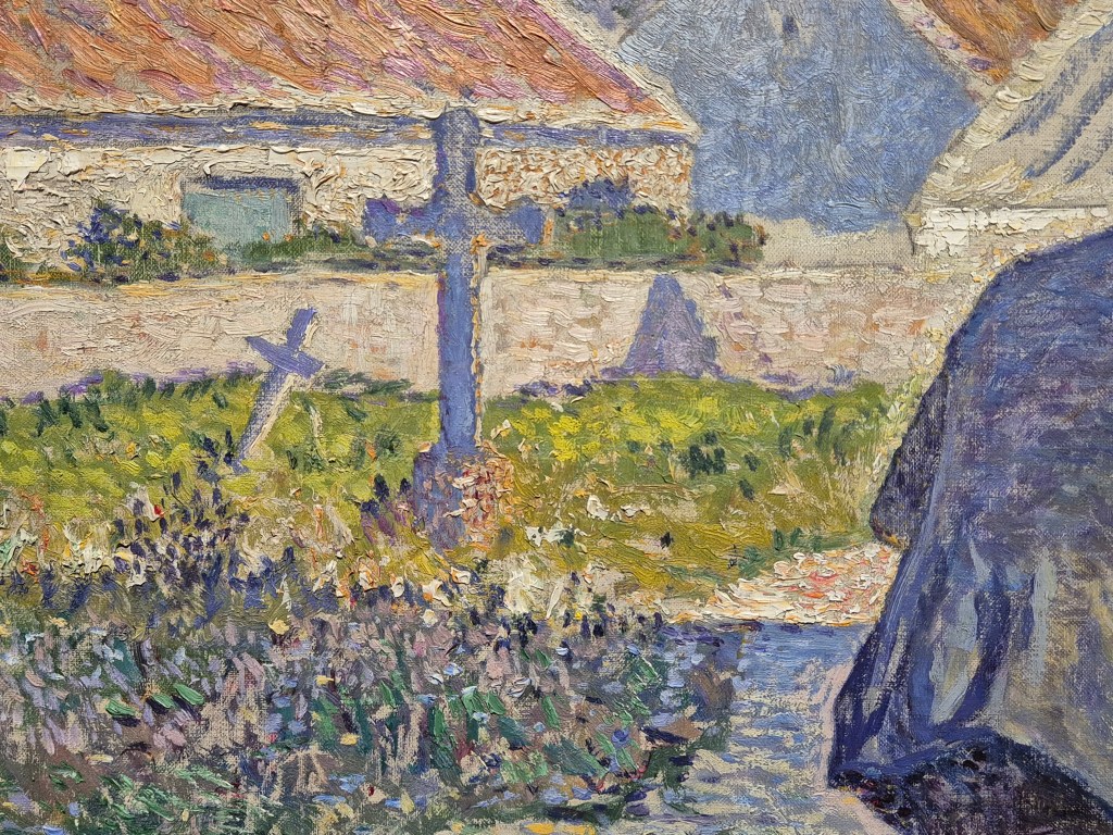
Behind him – or rather, to our left of him, on the picture surface – we see the clues which, even without the title, would have told us that this is some form of church, or chapel: crosses in a graveyard. The shadow of the church cuts a firm, straight line through the grass and plants, with both light and dark greens surrounding the two crosses we can see here. One tilts dramatically to the right, almost as if in reverence, just like the members of the congregation, but also implying that this is an old settlement, its fabric subject to decay. Both crosses appear to be the same purple as the shadow – and that is because the side we see is in the shade: only the right edges catch the sun.

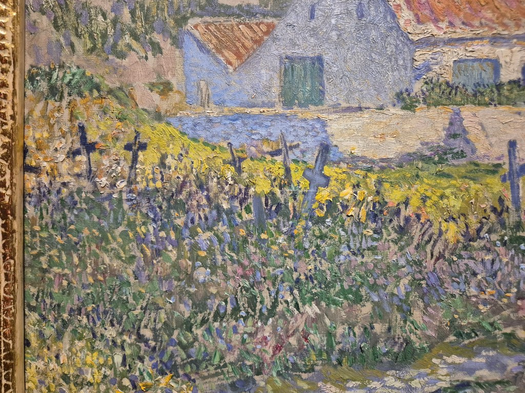
There are maybe as many as eight more crosses visible here – one is cut off by the frame at the far left of this detail, and one is just a vertical stroke of paint (so might not be a cross at all). Again, a sense of history (or geographical insecurity?) is revealed by the various angles at which they lean. The shadow of the church does not create such a clear-cut line here, but that is presumably because the ground is not so flat, or the plants are growing more unevenly. The sun shines brightly on parts of the wall surrounding a building beyond the graveyard. It has an orange-red slated roof, and its gabled end is in shadow. Behind it are dunes, with patches of vegetation growing in the sand. We are on the edge of the sea, in a small fishing village in Belgium not far from Ostend.

If we move down the left-hand side of the painting a little, we see a riot of different coloured brushstrokes. While the roof of the back section of the building has a series of parallel strokes, elsewhere the application of the paint is not directional. There are short flicks of the paint, dabs of light and shade, and small, luminous dots. The colours in the shadow are far more varied than they are in the sunlight, where there is a pale lime and a darker bottle green, almost as if the brilliance of the sun is bleaching some of the colour out. In the shadow we can see pale blues, lavenders, pinks and greens, and touches of black (or is that a very dark purple?). The crosses, on the whole, are built up from single bold strokes, although these are modulated somewhat according to what is growing around them. This variety of types of brushstroke really goes to show the problems with naming this style ‘Pointillism’. First, in English, the word ‘point’ has a slightly different meaning to the equivalent in French. The translation into English of the French word ‘point’ (pronounced ‘pwuh’) would be ‘dot’, whereas in English, the word ‘point’ suggests – to me at least – an almost infinitesimal, dimensionless mark. Even if we define ‘point’ as ‘dot’, this painting is not built up from dots. Yes, there are dots, but there are also dabs, dashes, flicks, and strokes, not to mention some broad areas of palin colour. A better name for the style might be ‘Divisionism’, a term which is often used. This is because the individual colours are divided into separate brushstrokes, rather than being blended together on the palette before being applied to the canvas. The reasoning behind this comes from Seurat, who thought that, when mixed on the palette, the colours lost their original brilliance. However, if applied separately, and in small brushstrokes, the original colours would blend in the eye, and not only would they maintain their luminosity, but they would also interact with one another to create an unparalleled freshness. This freshness, together with the liveliness of the painted surfaces, are just two of the most striking features of the National Gallery’s exhibition. However, the name which the artists themselves settled on was ‘Neo-Impressionism’. They saw themselves as taking a new approach to Impressionist ideas about light and colour, and the ways in which these technical means were used to say something about the contemporary world, while also giving their paintings a greater sense of permanence, harmony, and often, even, political relevance – which was, in its own way, radical.

Whatever the initial impulse, many artists adopted Seurat’s technique – but they all had their own way of doing it, in the same way that we all have different handwriting. The Belgian artist Théo van Rysselberghe was impressed by the paintings by Seurat and Signac which he saw at the eighth (and final) Impressionist exhibition in Paris in 1886. He invited them to contribute to the next outing of the Brussels-based group Les XX (Les Vingt – ‘the twenty’), of which he had been a founding member just three years before. The roll call of artists changed, inevitably, and as one moved on, another was invited to take their place. In 1885 they were joined by the only woman ever invited to become one of Les Vingt, Anna Boch – the artist of today’s painting.

She too had taken up the gauntlet thrown down by Seurat and Signac, and, like her male contemporaries, she did so in her own way. In the detail above, taken from the bottom left corner of the painting, we can see that she must have sketched the long, thin lines which define the flagstones of the path using the purple ‘shadow’ colour, before continuing with a variety of colours and strokes. The grass in the shadow is particularly dark here, but there are also some wonderfully rich buttery yellows along the edge of the path. The tendency with these paintings is to stand at a distance – to try and get the effect of the brushstrokes blending in the eye – and that is a good way to see them, but not the only way. The artists wanted to create optical vibrations, so it is also rewarding to get as close as you can to see how just how they managed this – if indeed they did – and precisely how they applied the paint. Just beyond the path Boch uses short, horizontal, apparently ‘painterly’ strokes (even if they are too short for this to be truly ‘painterly’, you can at least see the marks of the individual hairs of her brush, reminding us that this is indeed paint). Elsewhere there are flicks of colour, and tiny dots – notably in the lavender of the shadows at the top right.

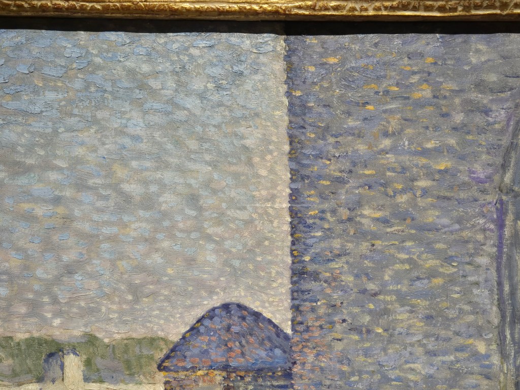
The dots are most evident, though, around the sharp edge at the front left corner of the church. Note especially the tiny off-white dots which come down in a band to the left of the wall and over the blunt pyramid on top of the feature projecting to our left of the church, the architectural function of which I can’t explain. These light dots contrast strongly with the dark corner of the wall itself, built up as the purple of the shadows increases in intensity as it gets closer to the edge. Most of the rest of the sky appears to consist of light, powder-blue dabs on top of a slightly greyer ground. The intention is to make the edge of the wall more vivid: boundaries are often a key feature of Neo-Impressionist paintings. There is a certain artificiality to many of them, and this was intentional: seeking geometrical forms, and simplifying what you see, as if trying to discern the Platonic ideals behind the vagaries of our worldly existence, while also creating harmony within contrasts. When thinking about Neo-Impressionism we tend to focus on colour, but tone – the variation of light and dark – was also fundamental to Neo-Impressionist thought. They were interested, whether they knew it or not, in abstract values, and their art turned out to be an important stage in the development of abstraction – not that this was a conscious goal. However, the idea that abstraction was on the horizon (a deliberate choice of word) is perhaps best illustrated in some of the later landscapes by Henry van de Velde – as we will see on Monday.

The extreme variation in brushstroke adopted by Anna Boch is best seen on the roof of the building to our left of the curious architectural form. The edges of the roof are defined by short, curved, brushstrokes of white paint, almost like the rectangular ‘tiles’ of the Impressionist tache, or ‘mark’, created with one short stroke of a flat brush. The roof itself, though, is made up of a series of long, parallel, diagonal strokes made with a fairly dry brush. This has left little paint behind, with the pale beige ground visible behind the broken, uneven strokes. This technique might remind you of another artist, one who is far more famous now than he was then. To my eye, this roof looks just like Van Gogh. The painting dates to 1893, whereas Vincent died in July, 1890. His work was still not well known to the general public – but Anna Boch was not the general public. Van Gogh’s reputation amongst his colleagues was running high, and in January 1890 – just six months before his death – he was invited to exhibit with Les XX. Six of his paintings were exhibited, and one of them, The Red Vineyard, was actually sold – the only one of his paintings sold from an exhibition during his lifetime. And yes, it was Anna Boch who bought it. Until recently, if she was known at all, she was known as the woman who bought a Van Gogh. Independently wealthy, she was able to pursue a career as an artist, and to collect the works of colleagues she admired. However, until recently her own paintings were relatively little known. An exhibition of her work staged at two venues, Ostend and Pont-Aven, took place between 2023 and 2024, and this has finally put her more firmly on the map. It has certainly led to her inclusion in Radical Harmony at the National Gallery, even though her work was not collected by Helene Kröller-Müller. We can’t be sure why not.

This detail is from a different digital file – most of the rest are my own photographs. I didn’t have this particular detail, or at least, I didn’t have it with this clarity. I’ve mentioned several times that the shadows are ‘purplish’. Here, admittedly, there is no ‘ish’ about it – purple, mauve, lavender, however you see this colour, that is what it is. This complements – optically – the colour of the path, a light, creamy yellow. Anna Boch, like the other Neo-Impressionists – and the Impressionists before them – is relying on a colour theory which, however much it must have been inherently understood by artists across the centuries, only dates in a systematic form to 1839, when Eugène Chevreul published On the Law of the Simultaneous Contrast of Colours. Simply put – and you know this already – the three primary colours red, yellow and blue can be mixed to make the three secondary colours green, purple and orange. In a colour wheel, the opposite colours are called ‘complementary’. This is a version published by Chevreul 25 years later which makes the point more subtly – and with 72 different hues.

Basically, we don’t see digitally, but by comparison. On entering a dark room we are first struck by the absence of light, but our eyes – and minds – soon get used to it. It is the same with colour. The absence of light is dark, and if the light is seen as yellow – as sunlight so often is – then the absence of that light will be the opposite of yellow on the colour wheel – purple. Hence the purple shadows in this painting. Not only that, but if painted next to each other, the yellow will make the purple look more purple, and vice versa – so if dots of these colours are intermingled, the surfaces will look all the more vibrant. This is the basis of the use of colour in Neo-Impressionism. The artists constantly sought harmony in contrast. They applied the same rules to colour, to light and dark, and, for that matter, to people. I’ve never seen anyone state it this explicitly – or simplistically – but we are all like the individual dots of colour. Each of us has our own character, and we all work together to build society. All you have to do is to join the dots, sharing different opinions to connect with the rest of your community with harmony – and preferably, with respect, just as Anna Boch paints her subjects here. Precisely how you interpret this idea is, like the way in which the different Neo-Impressionists applied their paint, completely up to you. We’ll look at the choices they made on Monday.

260 – Saints, Martyrs, and Saints in waiting (More of the ‘More things’)

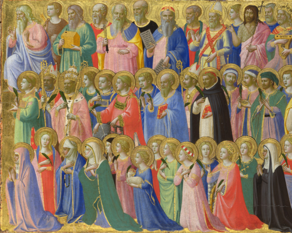
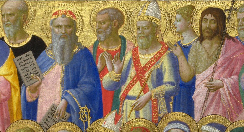
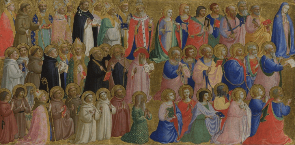
Fra Angelico, The Forerunners of Christ with Saints and Martyrs and The Dominican Blessed, about 1424-25. The National Gallery, London.

This week I reach the end of my exploration of the Fra Angelico exhibition in Florence, looking at his Students and Successors on Monday, 3 November at 6pm. This will include popping back into the Palazzo Strozzi to see the last section of the exhibition I haven’t covered, dealing with the work that he – and his workshop – carried out in Rome. It will also introduce the ‘School of San Marco’ with a rich array of paintings by artists who flourished in the 16th century whose work, like the work of Fra Angelico himself, can best be seen in San Marco itself. If you haven’t managed to catch all four of the talks, I did a slightly reduced version for ARTscapades, and they are still available as ‘catch up’ recordings of two study evenings which I named (slightly inaccurately it turns out) as ‘Origins’ and ‘Influence’.

After so much time among religious orders, I will take a week off before switching to political radicals, with the socially engaged and artistically engaging works of Seurat and his Neo-Impressionist circle. The talk, Radical Harmony, will introduce the National Gallery’s popular exhibition of Helene Kröller-Müller’s Neo-Impressionists on Monday 17 November. I will then move back a century, and to the Enlightenment, with another National Gallery exhibition, Wright of Derby: From the Shadows on 24 November. The last two talks this year will look at two single-painting exhibitions, Double Vision: Vermeer at Kenwood  (at Kenwood House, Hampstead) and Caravaggio’s Cupid (at the Wallace Collection), on 1 and 15 December respectively. They’ll go on sale soon, so keep your eye on the diary!

If you read last week’s post you’ll realise that I’m playing catch up. Last week I wanted to talk about all of this painting, the panel to the right of centre of the predella from Fra Angelico’s Fiesole Altarpiece, but I realised that there was just too much to say. So this week I will look at the rest of this panel, and cover the two outer panels as well – although maybe not in quite so much depth. Having talked about the top row of figures already – the forerunners of Christ – what remains are the Saints and Martyrs. I’ll start in the centre row, going from left to right, and then carry on with the bottom row from right to left… I’ve found a different digital file for this week – one which is embedded in the online catalogue entry by Dillian Gordon – and I’m using that here as it isn’t cropped as close as the other version available on the NG’s website. If you look closely you can see the wooden edge of the panel, and the barb where the engaged frame has been removed. Using this one allows you to see the figures round the edges more fully.

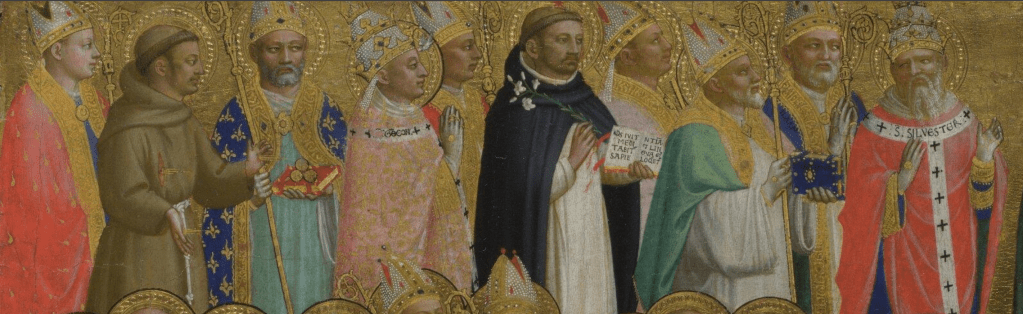
The five figures we can see clearly in this detail are all carrying palm leaves – a symbol of victory over death, and often held by angels who are about to hand them to someone who is being martyred: these people are all martyrs, they were all killed because of their beliefs. At the front of the group, on our left, is the protomartyr, the first person to be killed because he was Christian: St Stephen. His story is told in the Acts of the Apostles, Chapters 6 and 7. A deacon in the early church, he criticized the Sanhedrin for not following God’s law, and this led to him being being dragged out of the city of Jerusalem and stoned. He is often shown with a stone, or stones, resting on his head or shoulders, and there is one, looking like a small white blob, at the top of his back where the green robe joins his gold collar. Behind him are Sts Cyprian and Clement, a bishop and a pope respectively, whose names are written on the gold bands of their hats. The next two, in blue and red, have the same robes as St Stephen, with a small, patterned rectangle in front of their chests, apparently hung over their shoulders. They must also be deacons. One supports a millstone, and the other, a grill: the latter is perhaps one of the better known saints, St Lawrence. The other is St Vincent of Saragossa, who was thrown into the sea with this millstone tied around his neck. However, as so often in the attempt to murder Saints, this didn’t work: even tied to a millstone his body floated to the surface.

Moving further back the first two of of these martyrs cannot be identified, but they are followed by St Thomas Becket, Archbishop of Canterbury, whose name is on his mitre. He was a widely revered figure, and, with a feast day on 29 December, he was a regular part of the extended Christmas celebrations. There was a chapel dedicated to him in Santa Maria Novella, the mother church of San Domenico for which this predella was painted, which might explain his inclusion here. Next to him is the early Dominican martyr, St Peter, his head and shoulder red with the blood from wounds inflicted by the cleaver (head) and dagger (back) with which he was killed. The two men in pink, with blue hats (rather than the red, which becomes more common) are the brothers Cosmas and Damian, doctors, who are best known as patron saints of the Medici family because, unlike the Medici, they were actually medics. However, at the time this was painted the Medici had not yet attained the level of power, or patronage, for which they are now famous, and the inclusion of Cosmas and Damian in this image relates to their high status within the church from as early as the 4th century.

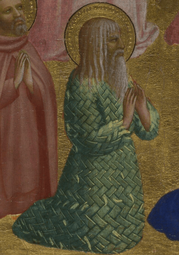
In this detail, the man holding an arrow at the far left is assumed to be St Sebastian – even though he is fully dressed. This seems unusual in Tuscany, where he is almost always depicted in little but a loin cloth (however, he is often shown as a young, well-dressed nobleman in the Marche – notably in paintings by Carlo Crivelli). It is not as if a saint couldn’t be shown nearly naked: the hermit Onuphrius on the opposite panel is wearing nothing but a garland of leaves around his waist, for example. The bishop saint, holding a heart with ‘yhs’ (an abbreviation of ‘Jesus’) inscribed on it many times is St Ignatius, Bishop of Antioch, and the soldier with a silver helmet could be St George – but there are plenty of other soldiers to choose from, if we’re honest, and without a dragon we can’t be sure. It is suggested that the man with blood round his forehead could be San Miniato – but he had his head chopped off at the neck, so this wound would seem irrelevant. St Nicasius of Rheims had the top of his head removed, but he doesn’t seem to have been revered much outside of France. However, his story is told in the Golden Legend, apparently – and as that was compiled by a Dominican, Jacopo da Voragine, it would have been well known among the Dominicans who commissioned (and painted) this altarpiece. The identification of St Christopher seems more secure, even if he doesn’t appear in the way you might expect (the Christ Child is not sitting on his shoulder). As a giant who acted as a ferryman across a deep river, he usually carries a staff, which, given his size, is often shown as an uprooted tree – and he is certainly carrying one here. Also, given that he was regularly striding through water, he tends to have bare legs. This figure is one of the four in the predella who are kneeling on one knee rather than two (I mentioned them last week), and this allows Fra Angelico to show that he does indeed have bare legs. Finally, we have Sts Sixtus II and St Erasmus, another pope and bishop, who once more are identified by the inscriptions on their hat bands. However, for three of the martyrs here there is no possibility of guessing who they are – which again begs the question: did Fra Angelico know? Given that there is no documentation for the altarpiece, it is very hard to say. In most commissions for altarpieces, or any church decoration, the patron would get advice from a religious figure, and usually someone from the church for which the work was being commissioned, to help in deciding who or what should be included, and this advisor could also make suggestions to the artist. But in this case, the artist was one of the patrons, as he was painting for his own church. He, and all of his fellow friars, were very well educated… so they could have discussed it amongst themselves. Alternatively, they could have turned to the prior – or some especially gifted theologian among their number – for advice. It seems likely that the Fiesole Altarpiece as a whole was one of the first paintings that Fra Angelico executed on taking the Dominican habit – and I wonder if he is including all of these saints, martyrs, and forerunners of Christ as part of his preparation, or as ‘revision’ of what he has learnt so far having joined the order? I even wonder if these are the ‘notes’ he is taking to visualise – and so learn – who all the saints and martyrs were.

Apart from the Virgin Mary, in the position of honour at Christ’s right hand (at the top right of the left-hand panel), this is the first time we have seen any women. So here they are, finally, on ‘the distaff side’ – at the left hand of Jesus. Unfortunately, though, there is very little that is certain, and few clues to identify the paltry number of figures represented – but then, this was an all-male convent. The woman carrying the cross is St Helen, mother of the Emperor Constantine, who travelled to the Holy Land and discovered the True Cross – the Cross on which Jesus was crucified. Her name is also written on her crown: Sancta Lena. Behind her is a nun carrying a lighted candle. This is St Bridget of Sweden – who we will see on Monday in a later painting by Fra Angelico: the reason for the candle will become clear. Before founding her own order (the Bridgettines), she had been a Franciscan tertiary – one of whom is shown in the Franciscan habit, with a rope belt, just next to her… This could be one of her companions, I suppose, but there is nothing to say precisely who it is.

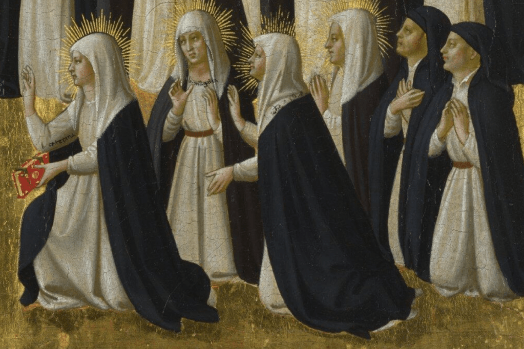
Again, with the exception of St Catherine, with her wheel, in the centre of this detail, it is hard to tell who any of the figures are – although the woman carrying a cross just next to her is probably St Margaret of Antioch. However, like St George, without her dragon we can’t be sure (there are some tentative suggestions for more of these saints in the catalogue entry, if you would like to follow them up). The fact is, although the names of many saints were known, it’s not as if anyone had researched them and their history. The Golden Legend, the collection of stories of the lives of the saints which I mentioned earlier, was gathered together in the 1260s by Jacopo da Voragine, a Dominican friar and later Archbishop of Genoa. The fact that he was a Dominican is probably not coincidental – but everyone knew the Golden Legend anyway: it was one of the texts which was used to teach people to read.

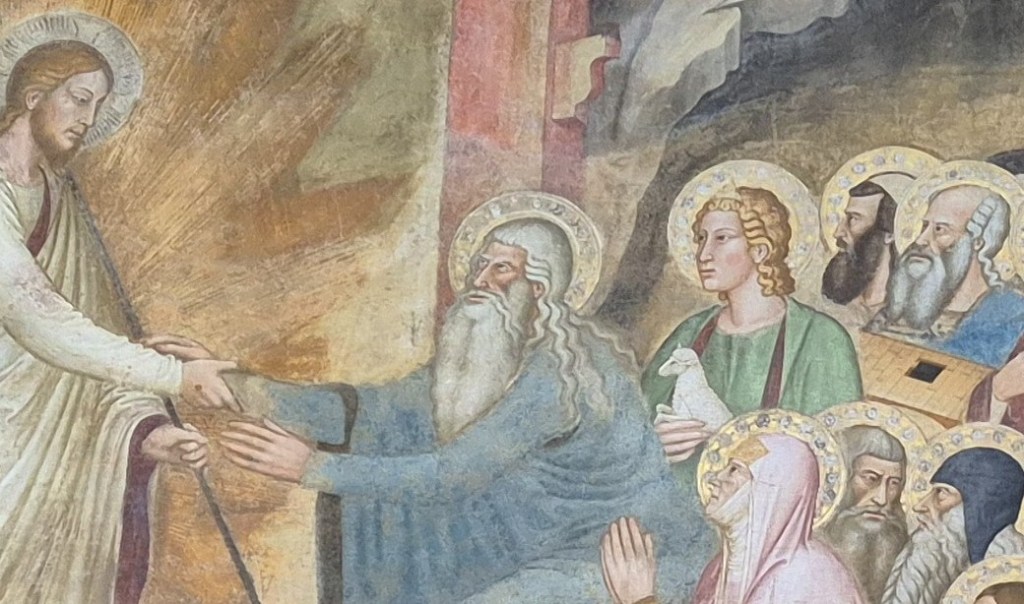
Even at the front of the group, closest to Jesus, the identification of these women is not obvious – with the exception of St Agnes. She is usually shown carrying a lamb (‘agnus’ in Latin), but here it has become, specifically, agnus dei, the Lamb of God, with the addition of a crossed halo and a red wound in the chest. This is relatively rare, but not unknown. Two of the women are not carrying palms leaves – so they must be saints who were not martyrs. The catalogue suggests they could be Mary and Martha – i.e. Mary Magdalene, identified since the time of Pope Gregory the Great as Martha’s sister – but I can’t see any signs or symbols which could confirm that. Neither is wearing red, nor are there signs of penitence, to imply that one of them could be the Magdalene. Nor is there a jar of precious ointment, which, with her long red hair, is her main attribute. Even the identity of the woman at the front of the group is not clear. She is not a martyr – unlike the woman in red next to her, who is holding a palm leaf. The first female martyr is said to be St Thecla, a follower of St Paul, although as her life is first reported in the apocryphal Acts of Paul and Thecla, dating to the second half of the second century, her feast day was removed from the General Roman Calendar in the 1960s. Nevertheless, she is still revered in some churches, and would have been, generally, in the 15th century. It would certainly make sense to have the female protomartyr just below St Stephen, her male equivalent. However, if this is her, this is the first time I have seen her in a painting. This leaves one last woman, the closest woman to Jesus after the Virgin Mary, but who would that be? The National Gallery catalogue states, quite simply, that it is ‘Saint Anne (diagonally opposite the Virgin)’. This would make sense, but there is no visual evidence to support the identification, nor have I ever come across ‘diagonally opposite’ as a category. Not only that, but I can’t think of another representation of St Anne by Fra Angelico, and I have a feeling that the Dominicans weren’t especially interested in the story of the Virgin’s origins. The Immaculate Conception was a specifically Franciscan doctrine, and the feast day was not approved for the church as a whole until 1476 – and that was by a Franciscan Pope, Sixtus IV. Not only this, but St Anne usually – but not always – wears red: this woman wears a cangiante blue/pink robe. You could argue, of course, that Fra Angelico doesn’t always use the ‘standard’ colours, and indeed, that these colours weren’t ‘official’ anyway. For example, he dresses St Peter in yellow and pink rather than yellow and blue, as we saw when we looked at the opposite panel a couple of weeks ago. However, the blue/pink colours of this woman’s robes are the same blue and pink as the clothes worn by Adam, two rows above her. If Adam leads the forerunners of Christ, who better to lead the only row of women than Eve? A comparison with Andrea Bonaiuti’s Harrowing of Hell (also known as The Descent into Limbo, by the way) might help here, as it did last week.

In Bonaiuti’s painting, Adam is wearing a long blue robe. At his left side (the ‘distaff side’) – just in front of him from our point of view – is a woman in pink. Who else would this be at the front of the gathering than Eve? Fra Angelico’s work for San Marco makes several references to paintings in Santa Maria Novella – most notably the Crucifixion – and I think this is another example. I’m sure that, in this predella panel, he is painting Eve – he’s even chosen to paint Adam and Eve in similar blues and pinks. Bonaiuti shows another woman, in red, in the top row, and this is a similar red to the one worn by St Anne in Masolino and Masaccio’s Virgin and Child with St Anne in the Uffizi. Having said that, I can’t see any reason why St Anne should be placed here in the crowd. At Noah’s left hand, this woman is far more likely to be Mrs Noah, who had a far greater presence in Christian mythology than she does in the Bible.

The remaining two panels include characters we have already met, and who we will meet again when we discuss the School of San Marco in the talk this coming Monday. Narrower than the other panels, they were placed at the base of the two pilasters on either side of the altarpiece. They frame the rest of the predella, and all of the people depicted have something in common: they are members of the Dominican Order, the Order of Preachers. You can see this clearly: they are all wearing the black and white habit – although, if you look closely, a few people are wearing minor variants, a result of their differing status within the order. They kneel in adoration of Jesus and of the heavenly host – which they frame – and, in doing this, they are effectively the predecessors of the Dominican intercessors who are present in the frescoes of Fra Angelico we saw in last Monday’s talk: people setting a good example which we should follow. And the people depicted here are especially good. All but two have beams of light radiating from their heads – and at this point in history, that means that they are on their way to Sainthood, but haven’t got there yet, so are not worthy of a full halo. They have been beatified as a result of their sanctity, but, as yet, no miracles have been performed in their name, so they have not yet been canonised as Saints – although after this image was painted, some were.

This is the bottom row on the left hand panel. The four women at the front wear a white tunic and scapular just like the men above them, but rather than the black, hooded, cappa they have a black cloak, and a black veil over their heads. They are Dominican nuns – considered the secondary order, with the friars as the primary order. Behind them is a man who appears to be one of the friars, but he is wearing a black scapular, rather than a white one. He is a member of the tertiary order – the third order of Dominicans. He follows the Rule of St Dominic, but does not live in the convent – he lives at home, and carries out the normal life of a layman, while remaining entirely devout.

On the other side there are four more women, but they have a white veil over their heads, rather than a black one. Rather than nuns, they are female tertiaries – who, like the male tertiaries, also live outside a convent while following the Rule. Behind them are two men dressed a bit like the others in black and white, but we can see their belts clearly: they are not wearing the scapular, and nor are they wearing the cappa. They wear a cloak without a hood, but they do have black hats. Also, unlike the others in these two panels, they do not have the radiance of the Blessed. In some way they must be related to the commission, they could even be the patrons of the altarpiece. As I’ve said before, though, the Fiesole Altarpiece was paid for by the bequest of Barnaba degli Agli (hence the appearance of St Barnabas, the ‘fourteenth apostle’, on the altarpiece and in the predella). These may be some of his relatives. Dillian Gordon suggests they could be Jacopo and Domenico, two of his sons, as he left his ‘right of patronage’ of the convent to them: their appearance here makes perfect sense. If you want to know more about the Blessed who can be identified it would be worthwhile consulting the catalogue yourselves, as I only want to mention three of them.

All are labelled, either in black or white script, and usually against their white or black clothing: the writing reflects their Dominican heritage. However, this man, in the top row, and closest to the centre on Jesus’s left – so the highest in status on this particular panel – has his name written on his open book. His mitre – the two-pointed hat – tells us he was a bishop, and the open book suggests he was either a preacher, or was learned (or both). That might not help much, as this is the Order of Preachers, so they all preached, and they all had to be learned in order to preach orthodox beliefs as part of their mission to combat heresy. However, they had to learn from someone. Even a scholar as great as St Thomas Aquinas had a master – and this is the man. The Blessed Albertus Magnus, as he is named here (c. 1200-1280), was a German Dominican who wanted to align Aristotelian philosophy with Christian belief, a task that St Thomas Aquinas perfected. He was finally canonised, as St Albert the Great, in 1931.

Two rows below him is the most important of the women in the right panel. She is named as ‘b. caterina’ – Beata (or Blessed) Catherine. Look at the delicacy with which she is painted – the tiny dots of white marking the fringing all around the hem of her headdress, for example, and the gilding of her bible, including the edges of the leaves of parchment. A Dominican tertiary who used her freedom to travel widely and speak truth to (male) power, in 1461 she was canonised as St Catherine of Siena (1347-80) by Pope Pius II – notably a Sienese pope. In 1939 she became co-patron of Italy (alongside St Francis, thus bridging the two major mendicant orders), and since 1999 she has also been one of the patrons of Europe. At the beginning of the 16th century a convent for nuns was dedicated to her on the opposite corner of the piazza from San Marco, and that is where the artist of the image on the right must have learnt to paint: Plautilla Nelli, some of whose works we will see on Monday.

And finally, on the left panel, in the second (or even third?) row down, and third from the right – so in no especially important place – is ‘.b.vi˜ce˜ti.’ – although the squiggles are above the vowels. They mark abbreviations: the Blessed Vincenzo (1350-1419), who was canonised as St Vincent Ferrer in 1455. Given that both St Catherine of Siena and St Vincent Ferrer are named among the Blessed, these names must have been written before 1455. As I said a couple of weeks ago, given that it would have been difficult to add names to the altarpiece after it had been completed – which would have involved either moving a sizeable, weighty altarpiece, or clambering over the altar with the black and white paint – it seems far more likely that these names, and those on the other panels, were part of the original conception of the predella. St Vincent Ferrer would later be painted by one of Fra Angelico’s successors as an ‘official’ Dominican artist, Fra Bartolomeo, and that’s St Vincent, above one of the cells of the extended convent of San Marco, in the detail on the right. We’ll talk about Fra Bartolomeo more on Monday, too – so I do hope you can join me.

If you got to the end of this excessively long post – congratulations! And if you’ve read all four – well, I just hope that they will encourage you to spend more time with the panels themselves the next time you can get to the National Gallery. Thank you!

259 – There are more things in Heaven and Earth…

Fra Angelico, The Forerunners of Christ with Saints and Martyrs, about 1423-4. The National Gallery, London.

So far I have discussed most of what can be seen in the glorious Fra Angelico exhibition/s in Florence, covering the first room in San Marco and most rooms in the Palazzo Strozzi. However, if you manage to get to Florence, there is always more to see, and that is the reasoning behind the third and fourth talks. This week, on Monday 27 October at 6pm, we will be At home in San Marco, even though Fra Angelico didn’t actually change his allegiance from his own ‘house’ as a friar, San Domenico, just outside Fiesole. He was certainly at home there, and I will start with the work he produced for that convent, before moving back down the hill to San Marco. The majority of the talk will be about the frescoes he and his workshop carried out in the cells and communal spaces there. The week after (3 November) we will will thinks about his Students and Successors, looking at the work he executed outside of Florence towards the end of his life – in Orvieto and Rome – and introducing some of the assistants who worked alongside him (including Benozzo Gozzoli and Zanobi Strozzi). The talk will also cover the so-called ‘School of San Marco’ – artists associated with the convent in the 16th Century who could, as both artists and Dominicans, be counted as Fra Angelico’s ‘successors’. These include Fra Bartolomeo, Fra Paolino, and Suor Plautilla – the first Florentine woman recognised as having had a successful career as an artist.

I’ll need a week off after that for a change of gear, with two talks about exhibitions at the National Gallery: Radical Harmony – Helene Kröller-Müller’s Neo-Impressionists on 17 November, and the week after (24 November), Wright of Derby: From the Shadows. I’ve nearly settled on the talks for December, but keep changing my mind – so keep your eyes on the diary for more information.

Today though, having talked about two of the panels from the predella of Fra Angelico’s first major altarpiece (or, at least, the first that survives) I will move on to a third – the one to the right of centre. I had originally intended to cover the whole panel, but there’s so much in it I’ve decided I’ll have to look at it in two posts. This week we’ll look at the top row of figures, with the others to follow next week – and I’ll add in the last two smaller panels at the far left and right as a coda. Trust me, with a couple of notable exceptions the people represented in them are really rather obscure – unless you are a Dominican historian.

At first glance, the structure of this panel looks much the same as the one I discussed last week. Apart from the fact that everyone is facing to our left (because they are looking towards Jesus in the centre of the predella) there are, again, three rows of holy figures kneeling in prayer or adoration. We know that they are all holy, as all have haloes, and, once you get closer, you will see that, as before, the haloes in the lower two rows are ringed with black, but in the top row they are not. However, if you look back at last week’s panel – The Virgin Mary with the Apostles and Other Saints – there is a difference. In that composition there was more space, with figures like the Virgin Mary, St Jerome, and St Paul the Hermit slightly isolated from the others. In this panel the composition is more crowded, and even though one or two figures stand out, on the whole they appear more tightly packed. Indeed, last week’s panel included 52 individuals. This week, there are 65… I can’t explain why this should be, apart from the fact that, in Hamlet’s words (Act 1 Scene 5) ‘There are more things in Heaven and Earth, Horatio, than are dreamt of in your philosophy’. OK, so Shakespeare had not been born when this was painted, but you get the idea – and that’s why I’ve decided to talk about the panel over two posts. The haloes tell us that these figures are holy, and the word ‘saint’ comes from the Latin ‘sanctus’, which also means ‘holy’. However, not all of these figures are Saints, in the traditional sense.

Unlike last week, when I started with the characters nearest to Jesus, who would therefore appear to be the most important, I want to start with those furthest away, at the top right. This will make it far easier to understand what they have in common, and so to work out who some of them are.

The ease of identification is the result – as it was for some of the otherwise obscure Saints last week – of having their names clearly painted on the panel. Two of the characters here have scrolls on which their names are inscribed – we would call them Zeccharia and Habakkuk. They are Old Testament prophets – people from the Jewish scriptures whose prophecies Christians interpret as referring to the coming of Jesus Christ. Even without their names, we would suspect that they are Old Testament prophets, as they hold scrolls. It’s not a hard and fast rule, but more often than not anyone holding a scroll comes from the Old Testament, and anyone with a Codex (a book with turnable pages, as opposed to one you unroll – basically what we would now call a ‘book’) is from the New. That’s quite simply because scrolls came before codices, the latter appearing in the 1st century, and developing to become more dominant by the 4th – thus paralleling the development of Christianity itself. Each of the two prophets points to his scroll, and looks at the other – but neither seems that happy. It could be that they disagree about what will come to pass, but I suspect it’s because they know that things will go badly before they get better: the Messiah will suffer before we are redeemed. The other two in this detail are also thought of as prophets – Daniel’s name is written just below the gold neckline of his robe, while Jonah’s is written on his book – the Book of Jonah (thus demonstrating that the scrolls vs. codices distinction is not clear cut). Why did Fra Angelico use their names rather than symbols to identify them? Well, he’s got to fit 65 people onto this panel, and there probably wasn’t space for a den of lions, let alone a whale.

More prophets in this detail: Joel has his name on his shirt, like Daniel, while Ezekiel’s is on his rather fancy hat. Isaiah and Jeremiah on the other hand have theirs on their scrolls. David’s is on his harp, which is odd, as it is unnecessary. He is wearing a crown, and and everyone here is a prophet. Only two Kings are thought of as prophets, David and Solomon, and David was the one who played the harp (he is believed to have written the Psalms). He would be instantly identifiable, even without the name. However, there are two more here who must remain anonymous: the men in yellow and black. With no name and no identifying features we would be guessing. Nevertheless, they have haloes – so must be ‘holy’. On reflection, this might appear odd. In the Catholic church such Old Testament figures were rarely given the title of ‘Saint’. However, in the Greek Orthodox faith they were – Agios Esaias would be St Isaiah, for example. Because of the close ties between Venice and Constantinople, this tendency crossed the Mediterranean, and there are churches in Venice dedicated to St Moses and St Job as a result. For Fra Angelico’s painting, it is clear that the forerunners of Christ are worthy of a place in heaven, and also that as holy men they should have haloes too.

Getting closer to the centre, and so to Jesus in the central panel, there are two more unidentified people, in black and red. The character in blue is Joshua – his name, written as ‘Jesue’, is on his blue robe (but I couldn’t read that until I found out what it said from Dillian Gordon’s catalogue entry!). The identity of the figure at the left of this detail should be straightforward: a man holding two stones slabs – which we tend to call ‘tablets’ – with writing on them. The one in his right hand is held up towards us, and is inscribed ‘NON ABEBIS DEOS ALIENOS’ – ‘you shall have no other gods’. This is the first of the ten commandments, held by Moses. His brother Aaron, the High Priest, is further to our right. Apart from the fact that the gold band around his hat is labelled ‘ARON’, this type of conical headgear – not unlike the papal triple tiara, but without the three crowns – was often used to represent the High Priest in Italian art. The crossed bands over his chest also suggest a priestly air, as does the otherworldliness of the blue/yellow cangiante robe, even if he is not wearing the breastplate of 12 precious stones with which he is often depicted. The final figure here might come as a bit of a surprise. It is, undoubtedly, St John the Baptist. He wears a camel skin robe under a pink cloak, and carries a staff topped with a cross, picked out in silver leaf. This is an entirely traditional way of representing him. He also looks out and gestures towards our left – so towards Jesus – as if to say ‘Behold the Lamb of God’, the words with which he recognised Jesus as the saviour. I’m not convinced he’s looking at us, though – he seems to be looking over my right shoulder. John the Baptist is an entirely New Testament character, even if he did quote Isaiah (‘I am a voice crying in the wilderness’) – but he was one of the forerunners of Christ. Indeed, because of the quotation from Isaiah 40:3 in John 1:23 he is often regarded as the last in the line of the Old Testament prophets, and is sometimes referred to as the Precursor – the man who came immediately before the Saviour – hence his place among the forerunners of Christ.

One last group – for today. The man in red remains unidentified but the others do not – even if there is some question as to who one of them is. On the right, holding a knife, the silver blade of which has largely worn away, is Abraham, prepared to sacrifice his son, Isaac (who is not seen). The colour combination of a pink robe covered by a blue cloak, lined with yellow, is especially attractive, I think. The man holding the house-shaped box is also well known, although it’s worthwhile bearing in mind that the object he holds is symbolic, or a model. Made up of small sections of light brown material, the ‘roof’ also has a series of dots. These are nails, hammering together planks of wood, and together they make the ark. This is Noah, although clearly you couldn’t get a pair of every animal into this tiny model. It has a hole in the roof – presumably for the raven and the dove to fly out, and for the dove to fly back in.

So, who are the last two? Who would be closest to Jesus in this image? An old man (he has long white hair, and a long white beard), wearing pink and pale blue. All of the people we have discussed so far are probably kneeling: we cannot know that for sure, as we cannot see as far down as their knees, but as the bottom row in this panel – and in the one we saw last week – are all kneeling on two knees, it seems likely. This figure is one of only four in the two panels who are kneeling on one knee, with the other raised (there was an unknown Franciscan and St Peter in last week’s panel, and we’ll get to the fourth next week). This makes him take up more space, and overall he also seems a little larger than the others, suggesting that he must be important in some way. Not only that, but we can see one of his feet – the only visible foot in this panel (and it may be relevant that he is not wearing shoes). It’s also worthwhile noting that, going from left to right, these characters are in the order they appear in the Old Testament – until you get to St John the Baptist, that is. Indeed, those with large, easily identifiable names or symbols are all in order – with the exception of Zechariah and Habakkuk… which might explain their debate. I did wonder if the small names in black could have been added later, but Dillian Gordon points out that, ‘The inscriptions identifying the figures, written in minute white letters on a black background or black letters on a white background, following the Dominican colours, are clearly contemporary. It would have been extremely difficult, not to say impossible, to add them neatly once the altarpiece was in situ’. I should have thought of that. It would have involved clambering over the altar – but I’ll come back to it next week! However given that the figures on the left – at least – are in ‘chronological order’, it would imply that the man on the far left of the panel should have come first – and indeed he did. This is Adam. I’ve always found it surprising that, in paintings of The Harrowing of Hell, the first person out is the first person in: Adam. Even the man responsible for the fall is forgiven, and enters heaven. So who is that who comes just after him? It’s interesting that Dillian Gordon isn’t sure – and I can see why. She suggests that it is either Eve, or Abel. My first response is that this figure has short hair, and so is probably male – but then, so do some of the female martyrs we will see next week. However, the hairstyle and the face look more like those of a young man to me – the cheeks have less of a rosy glow, and the hair doesn’t seem to have been ‘dressed’ in any way – unlike the women. Also, if Adam is fully dressed, in pink and blue, why would Eve be wearing animal skin? I’m sure it’s Abel, Adam’s able son.

However, he has three ears of wheat which appear to be tied to his right thumb (the left hand is covered by his animal skin: I wanted this pale area to be the lamb that he sacrificed, but you can see that it really isn’t, if you zoom in close enough on the National Gallery’s website). This doesn’t seem to make sense, as ‘Abel was a keeper of sheep, but Cain [his brother], was a tiller of the ground’ (Genesis 4:2). So it might make more sense if this were Cain holding wheat, although as Cain was the first murderer (a result of the first example of sibling rivalry) he seems even less likely to get into heaven. I am convinced that it is Abel. I do think Eve is in the painting, though, and we’ll come back to her next week, and I do have circumstantial evidence that this is Abel.

As I’ve said before, Fra Angelico’s Fiesole Altarpiece was painted for the high altar of the church of San Domenico, just outside of Fiesole. San Domenico was the second Dominican convent in the area of Florence, and was the ‘daughter house’ of the first, Santa Maria Novella. The detail above was painted between 1367 and 1369 by Andrea Bonaiuti in the Chapter House, now known as the ‘Spanish Chapel’, of Sant Maria Novella. I wrote about it over five years ago when discussing The Devils – although I have trimmed them off the right hand side of the image to make the remaining section clearer. Jesus has beaten down the gates of hell, crushing a devil beneath them, and has taken Adam by the hand to lead him out.

Immediately behind Adam is a young man in green carrying a lamb – surely Abel’s sacrificial lamb – and he is followed by Noah, clutching the model ark with a hole in the roof, not unlike the one we’ve seen before. This is effectively – with the exception of one unidentifiable figure – the same order as in Fra Angelico’s painting. This fresco could even have been his model. As the mother convent of his own, it is extremely likely that Fra Angelico would have been familiar with the Chapter House in Santa Maria Novella, and as an artist, he would have been especially interested in the work of his artistic forerunners. I can only assume that the three ears of wheat in the Fiesole predella panel are a reference to an obscure element of Dominican theology… unless you know otherwise?

Further back Aaron and Moses are standing next to David, and beneath the latter’s harp is St John the Baptist, who, as a relatively recent arrival, still appears to be making his way to the back, introducing the saviour to people who would never have seen Jesus in the flesh before. Again, the arrangement is not entirely dissimilar to Fra Angelico’s composition. I think Eve is also one of the number, as is Mary’s mother, St Anne – but not in this detail: I will come back to them next week. Before then, though, we will explore San Domenico, and it’s daughter house, San Marco, in the talk on Monday.

258 – Who’s Who in Heaven?

Fra Angelico, The Virgin Mary with the Apostles and Other Saints, about 1423-4. The National Gallery, London.

Greetings from Florence! I’m currently in the middle of introducing a second group to the delights of the first half of the 15th century, with a rich array of works related to the career of Guido di Pietro, who we now know as Fra Angelico. The day before I left home I talked about the earliest works in his career (as currently exhibited at the exhibition Fra Angelico in San Marco), and on Monday 20 October (the day after I get back) I will explore the superb range of paintings spanning the rest of his life As seen at Palazzo Strozzi.  We will return to the convent to think about Fra Angelico: At Home in San Marco on 27 October, exploring the frescoes he painted for the friars’ cells, and for the communal areas of the building, as well as a selection of manuscripts he made for the Dominican order. My last talk in this series (3 November) will introduce some of his Students and Successors, as well as discovering what remains of the artist’s work after he left Florence. We will also explore the ‘School of San Marco’: painters including Fra Bartolomeo, Fra Paolino and Plautilla Nelli – the first woman recognised as having a successful career as an artist in Florence – who were the most important Dominican artists of their day.

Subsequent talks will cover two exhibitions from the National Gallery, Radical Harmony on 17 November and Wright of Derby: Out of the Shadows on 24 November, and they will go on sale soon. In December I will probably be talking about Vermeer at Kenwood, the Barber Institute at the Courtauld, and Constable and Turner at Tate… Details will be in the diary before too long!

As a reminder, this is the predella of Fra Angelico’s first major altarpiece, originally painted for the high altar of San Domenico in Fiesole, the priory he joined sometime between 1418 and 1423. The convent (a term which can refer to the homes of either nuns or friars) remained his ‘House’ for the rest of his life, despite the widespread assumption that he moved to San Marco in Florence when the Dominicans took over that building in 1436. The church of San Domenico developed over the centuries, and the altarpiece was adapted by Lorenzo di Credi in 1501, changing it from a polyptych to a single-panelled pala. At some point in the 19th century the predella was removed from the convent, ending up in the hands of a dealer, and later, in 1860, it was acquired by the National Gallery. I talked about the central panel two weeks ago, so this week I will turn to the panel which has the next highest status – at Jesus’s right hand (or, from our point of view, to the left of centre).

Similarly to the way in which the angels are arranged in the central panel, there are three rows of figures in brightly coloured clothing. However, as you look from right to left (and so away from the centre of the altarpiece) there is a gradual decrease in colour, with more neutral hues and monochrome costumes. This is related to the decreasing status of the subjects the further away from the centre they are and, more specifically, who they are and why they wear those clothes. Even on this scale it is possible to see that all of the figures have circular gold haloes, and so they must all be saints. What you might not be able to see is that the haloes of the bottom two rows are ringed with black paint, just like the angels in the central panel, whereas those in the top row are not. However, you should be able to see that here.

Starting closest to the centre (on our right), no figure is closer to Jesus than the woman at the top right. Kneeling in prayer – as all the figures are – she wears a long blue cloak which also covers her head. This cloak has an olive green lining, and is trimmed with a gold hem. Her dress is pink. On her shoulder we see a star, derived in part from the medieval canticle Ave Maris Stella – ‘Hail, Star of the Sea’. In it, she is compared to the Pole Star, which sailors use to navigate, the implication being that we should use her example as our guide in life. The Latin for ‘of the Sea’ – Maris – was also a pun on her name: Mary. All Catholics are supposed to have a special devotion to the Virgin Mary, but for Dominicans she has a particular significance. In his superb book, Fra Angelico at San Marco, William Hood compares each convent to a beehive, and,  ‘…like a honeybee every friar had his place in the collective at whose heart was the Virgin Mary, the legal abbess of every Dominican convent, or by extending the metaphor one could even say its queen’. It is perhaps for this reason that Mary is seen not only closest to Jesus in the predella, but also separated from everybody else. Just below her is St John the Evangelist in his older embodiment as the author of the gospel, rather than being shown as the youngest of the apostles. His quill is held, rather curiously, in his left hand: I can only assume that this is for purely aesthetic reasons. But then, he is using his right hand to offer his gospel to Jesus, which might explain also explain it: holding the bible in his right hand might be seen as more suitable (everyone trustworthy was assumed to be right-handed, especially given that the Latin for ‘left’ is sinister). John’s arm is clad in the same rich blue worn by Mary, and this colouristic similarity creates an affinity between them – as does his pink cloak lined with green, colours which are also used for the Virgin’s clothing. Bizarrely, the open page of his bible is illegible, made up of scrawled lines, whereas elsewhere on the panel there is writing which can be read – but perhaps that is because the first verse of St John’s gospel is so well known ‘In the beginning was the word, and the word was with God, and the word was God’. His gesture is therefore important: the bible – the Word of God – is here being held towards Jesus – the Word of God…

The remainder of the figures in this detail (I’ve repeated the same one), have been identified as ‘apostles’, but that creates a bit of a problem. We ‘know’ there were twelve of them, but here there are fourteen. Even after Judas’s suicide there were twelve: the community gathered together to appoint a replacement, St Matthias (see Acts 1:15-26). Nevertheless, St Paul is often represented as one of the number, because, together with St Peter, he was seen as one of the first heads of the Church after Christ. Indeed, he is depicted in this panel. Just to our left of Mary there is a figure with short grey hair and a short grey beard carrying a pair of keys. These are the keys to the Kingdom of Heaven which Jesus said he would give to St Peter. Now, St Peter very often wears yellow and blue, but here he has yellow and pink. There is a real sense that Fra Angelico wanted Mary to stand out, and if Peter was also wearing blue that might not happen. However, given that he is wearing pink he is more closely associated with the man to our left of him, who has a longer, darker beard and a receding hairline. He carries a sword, which, like one of Peter’s keys, is picked out in silver leaf: this is St Paul. Consequently, the first two heads of the Church are in the top row, and are more-or-less the closest to Jesus after Mary. It’s only ‘more-or-less’ because there is another figure squeezed between Peter and Paul. He has white hair and a long white beard, and is wearing green – which is the most common way in which Italians represent St Andrew, the brother of St Peter. However, as yet we haven’t sorted out who all these people are. If we have St Paul and St Matthias numbered among the apostles, that would still only bring us up to thirteen. So – who is the fourteenth? This is what it says in Acts 14:13-14

Then the priest of Jupiter, which was before their city, brought oxen and garlands unto the gates, and would have done sacrifice with the people.
Which when the apostles Barnabas and Paul heard of, they rent their clothes, and ran in among the people…

So Barnabas – who travelled widely with St Paul and is mentioned more often that Matthias – also appears to be counted as one of the twelve. It’s clear, though, that the role of ‘apostle’ is not strictly limited to the number originally chosen by Jesus. Nevertheless, if we include Barnabas together with Matthias and Paul we have arrived at fourteen. However, although St Paul is clearly distinguishable, the others are not. Have a look, though, at one of the figures who stands out in the lower row in the detail above. He wears a cangiante pink and yellow cloak (see the previous post for an explanation), which in itself makes him more prominent. He also seems to take up a bit more space than anyone else in this row, with one elbow sticking out to our left, and the book held up to our right. Now compare him to the figure standing in the position of honour – at the right hand of the throne (i.e. on our left) – in the Fiesole Altarpiece. This part of the predella would have been directly below this Saint.

It is surely no coincidence that both have short grey curly hair and beard, and have a receding hairline. They wear cloaks which are mainly pink, but also include yellow, and their other clothes are blue. Both figures are carrying a red book. It is also no coincidence that the figure in the main panel is St Barnabas. He occupies the position of honour as he is the patron saint of the donor, Barnaba degli Agli, who died in 1418, twelve years after the convent had been founded. It took a long time to finish the building – partly, no doubt, because the Dominicans have a vow of poverty, and had run out of money. In his will Barnaba ‘left 6000 florins towards the completion of the church, as well as liturgical furnishings and chalices’ (quoting from Dillian Gordon’s superb catalogue entry, to which I am also indebted for many of the identifications below). This sum covered not only the completion of the church (which was consecrated in 1435) but also twenty cells for the friars.

It would be all but impossible to name all fourteen of the figures in the detail above, although that hasn’t stopped people trying. St John the Evangelist and St Matthew were both apostles and evangelists, and it is possible that St Matthew is the figure holding a quill to our left of St Barnabas. But then, St Barnabas has a quill as well, and he didn’t write any of the bible. Admittedly there is an apocryphal Epistle of St Barnabas, but no one after the fifth century or so seems to have considered it relevant.

There are even fewer certainties about the members of the group at the bottom right, although it may include the remaining two evangelists, Sts Mark and Luke. Three figures hold a book, and one, on the far right, a quill, so these attributes wouldn’t appear to help. However, it has been suggested that the saint at the bottom right is St Luke. He is closest to Jesus in this row, and as the patron saint of artists, he might have been granted a higher status by one of his own trade. Luke does often (but not always) wear red and blue.

The top row on the left of the panel has some figures who are more easy to recognise. Going from right to left (and so, theoretically, in decreasing order of importance) we can see St Silvester, an early pope, who can be identified quite simply because his name is painted across the white strip on his robes. Behind him are three bishop saints, each wearing a mitre – St Hilary, Bishop of Poitier (with his name on his blue cope), St Martin of Tours (the name is on his book), and another, who remains unidentified. If you can’t see the writing – or any of the other details – look up the panel on the National Gallery website and zoom in! The next figure stands out because he wears the black cappa and white tunic of the Dominican order. He is also wearing the white scapular, which hangs across the chest and down below the waist, although here the end is out of site, hidden behind the saints below. This is the founder of the order, St Dominic himself. The lily is a sign of his purity, while the star in his halo denotes his unquestioned sanctity. The book is open at a paraphrase of Psalm 37:30, ‘The mouth of the righteous speaketh wisdom, and his tongue talketh of judgement’ – which could be taken as expressing the Dominican mission to suppress heresy though preaching, their wisdom founded on a profound study of orthodox beliefs. Next to him is another unidentified bishop, and then St Gregory the Great. He was a pope – hence his ‘hat’, the triple tiara – and was considered to have been especially inspired by the Holy Spirit. Indeed, if you can see a small white blob on his halo in front of his forehead, it is a tiny representation of a dove speaking into his ear. Next to him is another bishop wearing a deep blue cope covered in what I would have assumed were fleur-de-lis – which might have led me to assume that this is St Louis of Toulouse. However, he doesn’t have a Franciscan habit under his cope. Instead, there are three golden balls resting on his bible: it is St Nicholas of Bari (aka Father Christmas – the gold is for giving). The saint to our left of him is wearing a Franciscan habit (brown, with a rope belt) quite simply because this is St Francis – he is holding his hands out to show the stigmata. The row is completed by (yet another) unidentified bishop.

In the middle row, again going from right to left, we can see St Jerome, in his red cardinal’s hat and, unusually, a pink robe, then St Anthony Abbot, with beard and staff. There are two Benedictines in black, one with a stick, St Benedict, and another, who might be one of his followers, St Maurus. The two bishops could be St Augustine and St Zenobius (one of the patrons of Florence), and then another Dominican. Slightly plump, with a star at his chest and a book, this is the great theologian Thomas Aquinas. Another Franciscan is followed by two monks in white. I realise I am in danger of merely listing, and it really is worthwhile looking closely at the details – so here is St Paul the Hermit, wearing something that looks surprisingly like a basket.

St Paul was said to be the first ever Christian hermit, living in the Egyptian desert for 97 years – dying at the age of 113. He lived near a spring of clear water, next to which grew a palm tree which provided not only his food, but also all the materials he needed for clothing – and the detail is fantastic. Look at the care with which every strand of the woven palm leaves is depicted – the frayed ends, the veins, the variations of light and shade, and even the projecting fronds at his right wrist, everything seems so delicately painted, and the figure can only be around ten centimetres high. Now have another look at the predella as a whole (either at the top or bottom of this post), and think about the level of detail which Fra Angelico has included in almost every figure, and you’ll realise that this painting is truly remarkable.

I think it’s rather charming that, as the first hermit, St Paul is shown suitably isolated. Behind him a monk in brown is followed by two Carmelites in white, and then St Giovanni Gualberto, founder of the Vallombrosan Order, with one of his companions. Usually they wear a greyish brown habit, often darker than this, and with far fuller sleeves, but here they really doesn’t look that different from the Franciscans – although there’s no rope belt. Next to them is a bishop saint with a Franciscan habit under his cope – so this is St Louis of Toulouse. The last three are St Onophrius, a hermit who wore nothing but leaves, and two other unidentified monastic figures.

There are several things I find remarkable about all of this. The first is that, although we can’t identify every figure now, Fra Angelico would have known who every single one was. The second is that he could characterise them all, and had designed every single figure – even though there must be a considerable contribution from the workshop. Having said that, the panel is too small for more than one person to be working on it at any one time – but the master could have handed it over to his assistants when he had done the most important parts. The next is that this is just one of five panels from the predella, which would have been on the high altar out of reach of everyone except the officiating Dominicans. Even then, how could they have stopped to look at the whole company of heaven during Mass? Or would they have returned later, individually, for prayer and contemplation, gradually working their way through, naming every figure and addressing a different, appropriate prayer to each individual saint? Or is this painting ‘simply’ an act of devotion, painting each figure to illustrate the respect due to them, even if no one subsequently bothered to address them individually? Or – and this may make more sense – is the fact that we know that the artist knew who they all were enough? This would mean that we know that they are all identified saints, which adds to our understanding of the power of Christianity, given that so many recognised figures witnessed their faith, and died in that faith (the saints who are called ‘confessors’) or died for that faith (the martyrs)? We don’t need to know who they all are, we just need to know that somebody did, and that there are so many of them. And remember, so far we have only seen two of the five panels of this astonishing predella. What we find in the remaining three is in some ways more surprising. But then, the remarkable richness of Fra Angelico’s work is surprising, and that is one of the things we will think about on Monday.
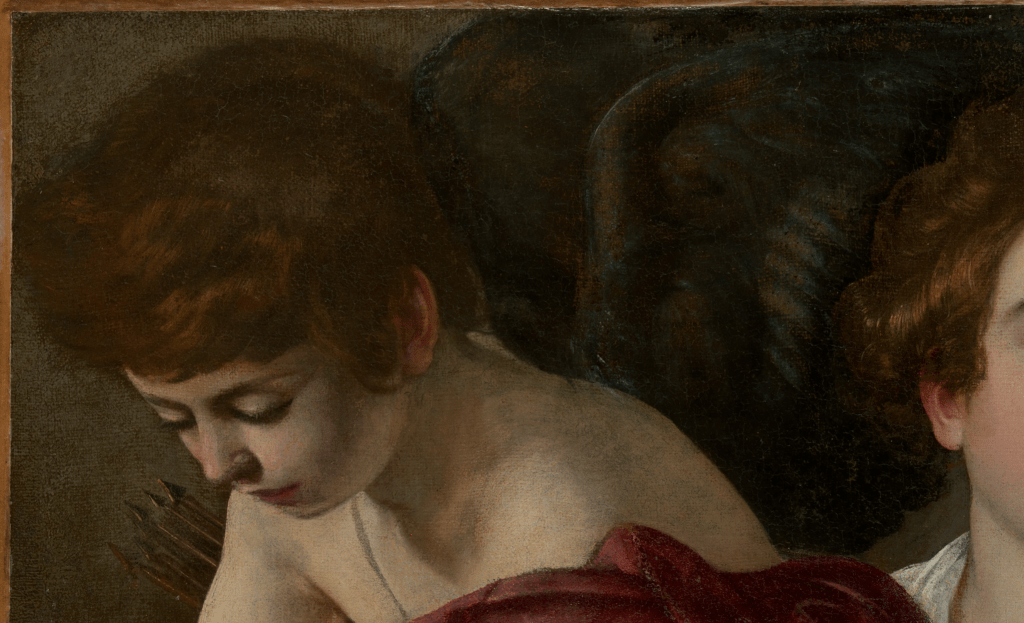
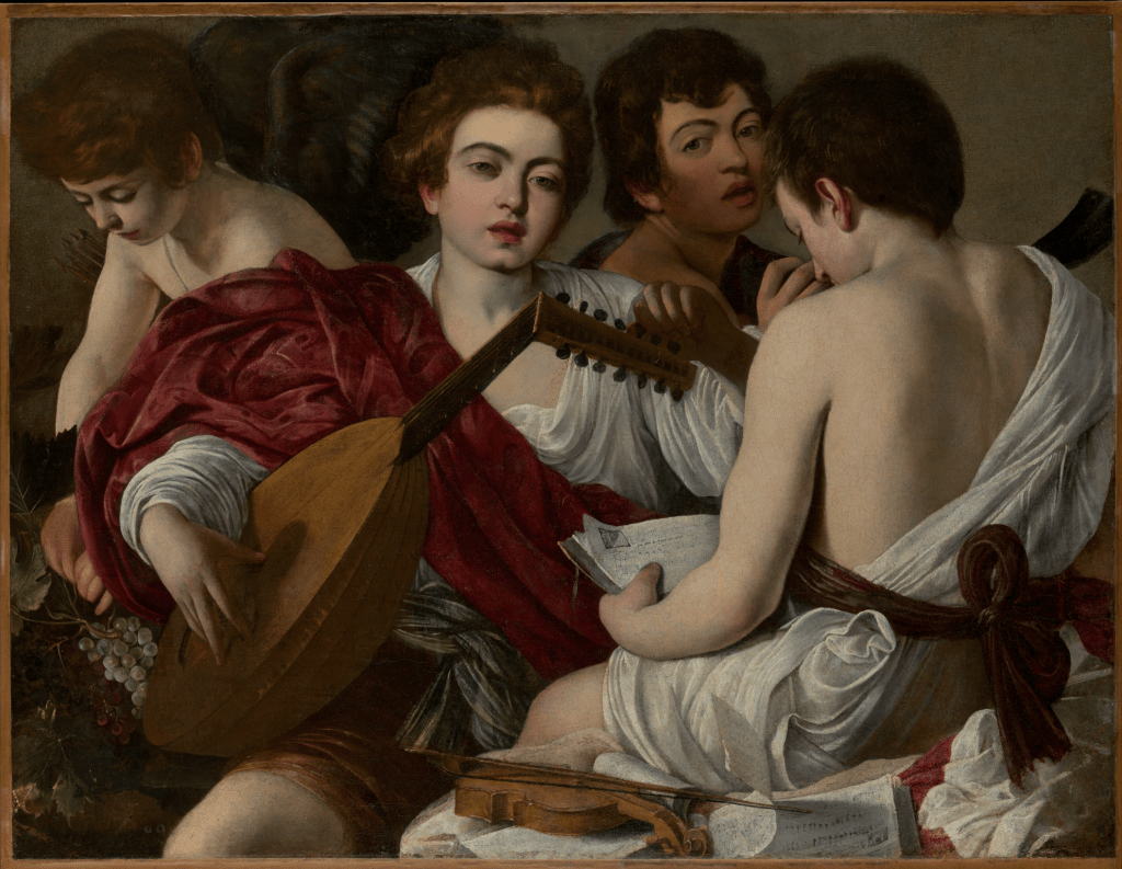
257 – Unite the Kingdom (of Heaven)

Fra Angelico, Christ Glorified in the Court of Heaven, about 1423-24. The National Gallery, London.

I have just returned from my first visit to the glorious exhibition Fra Angelico in Florence. Spread across two venues – Palazzo Strozzi and San Marco – it is the most comprehensive collection of works by this Dominican master that have ever been brought together. The curators want us to reassess the way we appreciate his works – and they are entirely successful. Since the 19th Century Fra Angelico has been seen as clinging on to the tails of the medieval (and, as a result, he was very much in vogue post-Pre-Raphaelites), but he now emerges as one of the great innovators of the Florentine Renaissance, up there with Masaccio who was, as it happens, slightly younger than him. To understand his work fully, and to put it in the appropriate contexts – both the artist’s life and faith (which were pretty much one and the same thing) and also the artistic developments of the time – I have planned four talks. The first, this Monday 6 October, is called The Melting Pot, and will reflect the remarkable range of styles and influences current in Florence in the first quarter of the fifteenth century. It will build, as much as anything, on the San Marco section of the exhibition, and on the first room in the Palazzo Strozzi. In addition to the earliest paintings by Fra Angelico, there will also be works by Ghiberti, Masaccio, and Gentile da Fabriano, not to mention an artist from another religious order, Lorenzo Monaco (the clue is in the name). After I’ve been back to Florence to see the exhibition again, I will return to continue the series with As seen in the Palazzo Strozzi (20 October), which will walk us around the remainder of this, the larger part of the exhibition. Fra Angelico 3: At Home in San Marco on 27 October (going on sale after the first talk, with a reduced price for those who have attended that one) will take us back to the Priory to look in detail at the many frescoes which the artist and his workshop carried out in the friars’ cells, and in the communal spaces. Finally, Fra Angelico 4: Students and Successors (3 November) will look at the artist’s work after he left Florence, and at his heritage. This will include not only the students and assistants with whom he worked, but also some ‘official’ Dominican artists from subsequent generations, including Fra Bartolomeo and Plautilla Nelli – arguably the first successful woman who worked as a painter in Florence.

Beyond that, I’m already looking to cover two exhibitions from the National Gallery (Neo-Impressionism and Joseph Wright of Derby), and three exhibitions of Loans to London (from the Barber, of a Vermeer, and a Caravaggio). But more news about them later – keep an eye on the diary, as I’m still juggling my dates! Today, though, I want to look at one of the National Gallery’s paintings by the hero of the moment.

There are actually eight paintings by Fra Angelico listed in the gallery’s catalogue, only one of which has made it to Florence. Five of them (see above) originally belonged together as the predella panel of one of his earliest surviving works: the San Domenico Altarpiece – painted for the high altar of the eponymous church in Fiesole, which is where Fra Angelico’s vocation and career are first recorded, and which remained his ‘house’ throughout his life. Because of its rich detailing, these five panels are hard to look at thoroughly in the National Gallery. It is, in its own way, encyclopaedic, and given that the individual figures are so small, it is all too easy to assess the amassed company of heaven, marvel at the multitudes, and move straight on without really looking. I’ve shown it to several groups, but don’t feel that I have ever done it justice. As a result, I think it’s time to slow down our looking, and look at each of the five sections individually. Well, one each for the first three weeks, and then two together for the fourth – using each text to introduce one of the talks. Although we read words from left to right it doesn’t make sense to approach the painting in this way. Instead, we will start in the middle this week, and then gradually work our way out.

The title of the central section could equally well be the title for the predella as a whole, Christ Glorified in the Court of Heaven – but that will become clear as we work our way through the panels over the next month or so. Starting from this point we see Jesus himself at the centre of the painting, splendidly isolated against a golden background. He wears something akin to a white toga, its colour barely distinguished from that of his skin, or for that matter, the background colour of the flag he is holding – white. The flag also has a red cross, as does his halo. He is surrounded, at a discreet distance, by a vast number of figures dressed in what at first glance appears to be a multitude of colours, but which could be broken down to red, pink, green and blue, with a hint of yellow here and there. Precisely who they are and what they are doing will become clearer as we get closer. Remembering that the best place to be is at the right hand of God – the position of honour – we will start by looking at the top left corner of the panel.

Every single figure has a halo, and every single figure has a pair of wings: these are just some of the angels. All of them also have a flame above their heads – something I would usually associate with Pentecost – which suggests to me that they are all inspired by the Holy Spirit. While there might not appear to be any way to distinguish these angels, the top row are all wearing red or pink, which implies that they are the Seraphim, the highest of the nine choirs of angels. Their name comes from the Hebrew word for ‘burning’, and they were considered by some authorities to be the only beings who could withstand the full glory of the deity. Isaiah describes them as being ‘above’ the throne of God, occupied in constant prayer and praising: ‘And one cried unto another, and said, Holy, holy, holy, is the Lord of hosts: the whole earth is full of his glory’ (Isaiah 6:3). Thomas Aquinas – a leading Dominican theologian – considered them to burn with the love of God, and as Fra Angelico himself was a Dominican this is surely relevant. Looking from right to left you can see how one has both hands raised, one has the palms of his hands pressed together, and a third crosses his hands over his chest. As you keep going along the line you will see that these gestures are repeated: they are all associated with prayer. Fra Angelico went as far as demonstrating these acts of devotion in frescoes for the novices’ cells at San Marco, as we shall see when we get to Fra Angelico 3. Having said that, the two Seraphim at the far left appear to be practicing the hand jive – but then, dance has often been considered an essential part of worship (the National Gallery’s catalogue entry, to which I am indebted, suggests that most of the angels are dancing – but I’m not sure that I would go that far). The second row down in this detail has a wider range of colours, with the addition of green and two shades of blue. Several of the angels play musical instruments. From left to right I can see a tambourine and a tabor, beaten with a drumstick. There is also a portative organ (i.e. a portable organ – the right hand plays the keys while the left hand pumps the bellows) and a harp. The angels at far left and right repeat some of the gestures of prayer we have already seen.

If it is ‘higher’ status to be at the right hand of God, it is not at all bad to be at his left hand: at least you are close – unless you are a soul at the Last Judgement, of course, in which case you be be heading down to hell. The second most important group, then, is made up of the angels at the top on our right. They are all clothed in a rich deep blue – the blue of heaven – and represent the Cherubim. Thomas Aquinas associated them with knowledge – and so in some way, they are the ‘head’ as opposed to the Seraphim who could be seen as the ‘heart’. Having said this, different theologians – and artists – had different ideas, and as a result the colours with which they are represented can also vary. In this case the Cherubim echo the Seraphim’s constant prayer and praising – including the dance-like gestures with one hand held to the chest, and another indicating Christ: this gesture is repeated in some of the larger-scale figures in other altarpieces. Many angels have their mouths open – they are singing – and one, on the far right, looks up towards God the Father in the highest firmament. I’d recommend taking this opportunity to look at each angel individually, as it’s hard to spend the time doing this when you’re surrounded by the general public – and when there are another 2000 or so other paintings to look at in the Gallery. In the second row the angels sport a similar colour palette to the figures on the opposite side, although there is a figure strumming a lute whose robe shifts from yellow to green. Just to our left of him one of the number plays a viol.

If we move back to the left of the painting, and down a tier, there is another colour shift in the figure on the far right. He is clasping a zither, and his robes are a combination of pink and yellow. This is a fabric in which the warp and weft are made from two different coloured threads – a shot silk, effectively – and the colour you see depends on the way the light is catching the fabric as you look at it. In paintings, this changing colour is described with the Italian word cangiante (‘changing’), and although it does exist down here on earth, in paintings it is especially associated with angels, as it tends to dematerialise the form and gives them an other-worldly air. Just to our left of this cangiante robe, one of the angels, wearing the deepest blue, holds an orb in his left hand. He could be a Dominion. According to the most common hierarchy, they were the fourth rank of angels – after Seraphim, Cherubim and Thrones – and they helped to maintain order in the universe. However, although the orb is a common symbol for the Dominions, and we have already seen the Seraphim and Cherubim, Fra Angelico doesn’t appear to be concerned with the enumeration of all of the nine choirs of angels, as described by a number of different theologians, not to mention Dante (who some considered was a theologian anyway). In this painting it would be difficult to point out the Virtues, Powers, and Principalities, for example, or to distinguish between an Archangel and an Angel. I’ll have to try and do that with another painting in another post on another day… There are more musicians here, though, with the angel on the far left blowing a long trumpet picked out in what is now tarnished silver leaf (the organ pipes in the row above were also made of silver). In the centre of this row the angels playing the harp and lute look at each other, as if to keep in time, but none of this row appears to be singing, as none has their mouth open – with the exception of the zither player on the far right, perhaps.

The equivalent, central row of angels on the right of the painting is similarly disposed. Two may be singing, most are praying, and three are instrumentalists. There is another long, silver trumpet – although most of this is hidden behind other angels. Nevertheless, a figure playing double pipes (also silver leaf) looks towards the trumpeter – who is wearing a helmet. It is possible that he represents one of the Powers, the fifth choir of angels, who are sometimes shown wearing armour. Just below the double-pipe player, a figure in blue holds what I take to be an angelic shawm. I say ‘angelic’, as shawms, which can be this shape (particularly if they are higher-pitched examples), tend to be made of wood, whereas this is clearly silver leaf, which I’m taking as being simply more heavenly. On the left of this choir is the only angel in the company that we can name.

In many ways he looks exactly like all the others – short, blonde, curly hair and an innocent face with a perfect complexion. These features remind us that the angels are in a state of grace – they have no taint of sin, and so are without mark or stain: they are immaculate. Like all the other angels (you can go back and check!) his halo is picked out with a black circular outline, and tooled with one circle just inside the black, and two more further in. In between these is a ring of small, circular marks each of which would have been made by tapping a small ring-shaped tool (basically a tiny tube) onto the burnished gold leaf, using a small hammer or mallet. His clothes and wings are all blue, but touched with gold, and while the feathers appear to continue across his clothing, if you look carefully at the gold trims at the shoulders, elbows, cuffs and skirt, you should be able to see that he is wearing blue armour – a different version of ‘heavenly’, perhaps. He also holds a silver shield and sword. This is St Michael, one of the archangels (the 8th choir, just higher in status than the ‘angels’ themselves), responsible for weighing the souls at the Last Judgement. He also defeated the dragon – “that old serpent, called the Devil and Satan” (Revelation 12:9) when some of the angels rebelled – and fell.

At the bottom left of the painting it is worthwhile noticing that relatively few of the figures are dressed in the deeper, richer tones – there are more light blues and pinks, a few yellows, and maybe as deep as a salmon pink and jade green – but this is partly to make a lighter, more ethereal contrast to the dark blue ‘ground’ which slopes up from the bottom left corner of the painting towards the right of this detail. On the right there are more trumpeters, and on the left, two viol players. Others sing, and even dance – there is a sense of movement from left to right, towards the centre of the image, and so towards Christ. All of the haloes are depicted in the same way as St Michael’s, although they overlap here more than anywhere else, telling us not only that the angels are several layers deep, but also that Fra Angelico already knew how to create imaginary space and depth on a two dimensional surface.

For whatever reason there is a greater preponderance of musical instruments at the bottom right: two more trumpets, a tabor, silver cymbals, two more shawms and two more viols (one of which is not being played). The angels on this side lean also lean towards the centre, and again they are layered several rows deep. They are also standing on the same sort of blue slope. On the far right, one of the angels appears to have turned away from us – but look how beautifully his wings are foreshortened, another indicator of Fra Angelico’s spatial awareness.

The blue base of the painting reaches a curved summit in the centre. It is the very top of a blue sphere, the vault of heaven, or, to put it another way, the sky. We are down on earth, in the middle of this, with the blue sky above and around us. Were we to penetrate this blue sphere – which surrounds us on every side – we would be in heaven. The medieval mindset saw the cosmos as being structured by a series of nine crystalline spheres, each of which was moved by one of the nine choirs of angels. Set in these were the sun, moon and five known planets (though not in that order), and the ‘fixed stars’. The blue of the sky – which we now know to be a result of the dispersal of sunlight – was seen as the last boundary between our ‘world’ and the golden light of heaven. The angels in this painting are therefore seen as dancing on the sky, or poised in the heavens above. In the centre of the painting here we see the full length of five silver trumpets, the cheeks of the angelic musicians puffed out as they look up towards Jesus – whose feet are just visible. Below him, two angels kneel playing portative organs, the one in pink again shown with the most brilliantly foreshortened wings, both of which come down on a slight diagonal. It is a beautifully conceived figure, I think, with the back of the head seen tilted subtly to the left, and a twist through the torso. The feet come back to our left, while the shoulders are facing more fully away from us. Even in this tiny detail the colour chords are superb – on the left, blue and gold wings with pale green robes lined with red, and a yellow underskirt. On the right the subtly modulated pink robe is lined with a violet blue, almost as if breathing in the sky beneath, and it is trimmed with the finest hem of gold.

Christ stands in the centre, made prominent not only by the golden radiance surrounding him, but also the white of his robes and flesh, as well as the brilliant red of the crosses on his flag and halo. The gold is incised regularly with lines which – as the word ‘radiance’ suggests – radiate from behind him, reaching slightly different distances into the burnished gold background. They would have been made using a ruler as a guide, and a stylus gently applied to indent the thin gold leaf without cutting through it. As candles flickered in front of this, the central panel of the predella, the glow around Jesus would have been modulated, reflecting the flickering of the candles, while the white of his robes would have maintained a more steady brightness. His right hand is raised in blessing, and shows the wound from one of the nails which held him to the cross. The wound in his chest, caused by a spear, is also visible. This is after the resurrection – indeed, it could be the resurrection itself. His white robe is effectively the shroud in which he was buried, now used as a form of toga, and the pallor of his skin reminds us that he was dead. He stands, as he does sometimes in the resurrection, on wispy white clouds. They are almost invisible now, as they were painted on top of the gold, in between the silver leaf of the trumpets, and much of the paint has worn away: it doesn’t adhere well to gold leaf. His halo is picked out, like those of the angels, with concentric circles, but there is more texturing: groups of four rings arranged in diamonds, and additional indents in the form of dots. His subtly rosy cheeks hint at his new life, and pick up on the red of the cross in his halo. And then there is the flag.

This is the flag of Christ Triumphant. It shows the red of his blood, and of his suffering, in the shape of the cross, the instrument of torture on which he was executed. The red stands out against the white of his purity and innocence. This is the flag he carries to mark his victory over death, and over sin, and he carries it, as often as not, at the resurrection. As a soldier fighting for good, and for God, it was adopted as a sign for St George, a figure shrouded in myth – but, as the first churches dedicated to him appear to date from the 4th century, it seems he was a very early Christian martyr. The dragon, of course, is just a symbol… His precise ‘nationality’ is by no means clear, but the most common belief is that he was from Cappadocia, in Turkey. As soldiers fighting for Christ – theoretically, at least – St George and his flag were adopted by the Crusaders, and finally, at some point in the late 1340s, he became one of the patron saints of England – gradually eclipsing St Edmund and St Edward the Confessor. He may have been born in Turkey, although some people think he may have come from Palestine, Syria, or even Israel. Let’s face it, he was not ‘English’ – even if he is now. Indeed, he is arguably England’s most successful immigrant. So the ignorance of people who have perverted this flag with their racist and xenophobic views appals me. As Jesus himself said (Matthew 25:35-36),

 35For I was an hungred, and ye gave me meat: I was thirsty, and ye gave me drink: I was a stranger, and ye took me in: 36Naked, and ye clothed me: I was sick, and ye visited me: I was in prison, and ye came unto me. 

If you’re doubting the ignorance of these people we may have a problem on our hands. I would go further: it is stupidity. If they are using the flag to support the notion of ‘uniting the Kingdom’ then they have the wrong flag. It is the United Kingdom of Great Britain and Northern Ireland (for the moment, at least), and, although England is a Kingdom, there is no United Kingdom of England. They should have the Union Flag – or at least a whole collection, including the saltire and dragon alongside the flag of Christ Triumphant.

Pardon the rant, but… But no, I stand by every word of it. However, on Monday I guarantee we will just look at the paintings, with not a word of politics. Well, that’s not true, of course. Art has always been about politics, and in this case there will be the politics of the Dominicans, and of Florence: the politics of the unelected Medici, for example. But that’s history, so it tends to be less divisive (with an emphasis on ‘tends to be’). The pictures are glorious, though – and we are free to make of them what we will. My aim is just to pick out the more relevant interpretations.

256 – Larger than last time

Jacquemart de Hesdin, Pseudo-Jacquemart, Master of Boucicault and Haincelin de Hagenau (Master of Bedford), Grandes Heures du Duc de Berry, fol. 96r., 1409. Bibliothèque nationale de France, Paris.

After last week’s saunter through the twelve calendar months of the Très Riches Heures du Duc de Berry, as currently exhibited at the Château de Chantilly, and the subsequent hurried leafing through the remainder of the manuscript, I am sure I will return to the book just before Christmas to look at the some of the remaining illuminations more thoroughly: they are really worthy of attention. Not only that, but it will be a treat – for myself, if no one else! This week, though (22 September), I am going to head back to Chantilly, stopping off at Saint-Denis on the way out of Paris, in order to think about The Duc de Berry: the man himself. Thereafter, as you’ll know, I’m heading to Italy and the Palazzo Strozzi’s much-heralded exhibition on Fra Angelico:

6 October, Fra Angelico 1: A Melting Pot
20 October, Fra Angelico 2: As seen at the Palazzo Strozzi
27 October, Fra Angelico 3: At home in San Marco
3 November, Fra Angelico 4: Students and Successors
(3 & 4 will go on sale on 6 October)

Subsequent talks will cover the National Gallery’s exhibitions Radical Harmony: Helene Kröller-Müller’s Neo-Impressionists and Wright of Derby: From the Shadows. They will probably be on 17 and 24 November – so there’s plenty of time before I need to post more details. Meanwhile, my next trips with Artemisia are already online – visiting Strasbourg and Colmar (to see the astonishing Isenheim Altarpiece) in June, returning to Liverpool in September and celebrating Siena in November. There is more information in the diary

Last week we enjoyed the Très Riches Heures. However beautiful – and rich – the manuscript is, had it been finished it would have been just one of the books of hours commissioned by the duke. His library consisted of around 300 books – a large number in the days when all books were written by hand. A hundred years later, Pope Julius II had 220 volumes, housed in the Stanza della Segnatura, famously decorated by Raphael – although the Vatican Library was larger, already numbering 3,500 manuscripts by the time of Julius II’s uncle, Sixtus IV. At around the same time, Federigo da Montefeltro, Duke of Urbino, had about 900 volumes… But still, 300 was a lot, and around 127 survive, with many of them in the exhibition we will explore on Monday. They give a remarkable sense of the man, his interests, and his personality. As well as books covering science, history, philosophy and theology, among the books dedicated to his personal faith he owned 6 psalters (books of psalms), 13 breviaries (containing the religious services for each day), and 18 books of hours (for prayer and devotion during the ‘canonical hours’, the regular cyclical of worship established for each day). Of the 18, he commissioned six of them himself. Several of them, like the Très Riches Heures, get their name from references in the inventory created after his death. To give a sense of scale, each folio of the Très Riches Heures measures 290 x 210 mm, whereas the page we are looking at today is a lot larger: 400 x 300 mm. It comes from a manuscript which would have been rather unwieldy for private devotion, which also takes its name from the inventory, which lists “les belles grandes Heures de monseigneur que on appelle les trés riches heures, garnies de fermoers et de pippe d’or et de pierrerie, qui sont en un estuy de cuir” – ‘the beautiful large Hours of monseigneur which are called the very rich hours, adorned with clasps and piping of gold and precious stones, which are in a leather case’. It might seem to be confusing, perhaps, that they were also referred to as ‘very rich’, but the size would have been most striking. Les Grandes Heures, is probably best translated as ‘The Great Hours’, as ‘great’ has far more grandeur than ‘large’…

The Grandes Heures was probably the most richly decorated of the books of hours to be completed during the Duc de Berry’s lifetime, although sadly it has not survived intact. It came into the possession of King Charles VIII by 1488 (we don’t know how), but by then it was already in need of repairs. Originally there were full-page illuminations by Jacquemart de Hesdin. These were cut out – to be exhibited, presumably – and only one has survived. Even that isn’t in a great condition. It is in the exhibition, though, and together with the one surviving full-page image, the Grandes Heures are displayed open at a single spread. This is, as ever, frustrating, but what else could they do? And there are, in any case, many more single spreads to enjoy, with some decorated on both folios. There may have been some double-page illuminations in the Grandes Heures – there are several in the Très Riches Heures – but if there were, they haven’t survived. So today, we are just looking at one page, folio 96 recto – the front of the 96th leaf.

Two columns of text are framed by filigree decorations which extend the full height and breadth of the folio at top, bottom and right, with a narrower version of the same motifs on the left and between the two columns of text. There are also four vignettes at the top and bottom, and three more of the same size on the right. Smaller vignettes are included in the decoration of the left margin and in the centre. A relatively large image is included at the top left, with an illuminated initial – the letter ‘D’ – just below it. What they all represent can be seen more easily if we get a little closer.

I admit that I find the text difficult to read. The vertical strokes use to create the letters ‘i’, ‘m’, ‘n’ and ‘u’ are all the same, so that when you get a word ending ‘-ium’, for example, you have a combination of six identical strokes. On top of this, some words spread from one line to the next with no hyphens. Fortunately, though, I could read ‘Deus in ad…’ in the very first line on this page, and typing this into google instantly suggested ‘Deus in adiutorum intende’. This is followed by ‘Domine, ad adiuvandum me festina’. Together, these form the first verse of Psalm 70 (69 in the Vulgate). In the King James Version of the bible this is translated as ‘Make haste, O God, to deliver me; make haste to help me, O Lord’. This verse is used as the introductory prayer to almost every ‘hour’ that is celebrated… which doesn’t help us much. However, I can see that this invocation is followed by the ‘Gloria’: ‘Glory be to the Father, and to the Son and to the Holy Spirit. As it was in the beginning, is now and ever shall be, Amen’. At the bottom of the left-hand column (not visible in this detail), the text then returns to the first verse of Psalm 70 – you can see the repeat of the word ‘festina’ at the very top of the right-hand column. This is then followed by verses 2-4 of Psalm 70, all of which are included in the detail above. It is a plea for God’s help, asking him to confound and confuse the enemies of the devout. As it says in verse 2:
Let them be ashamed and confounded that seek after my soul: let them be turned backward, and put to confusion, that desire my hurt.
However, the joyful nature of the decorations do not reflect this almost desperate sense of need. Perhaps this represents the security of the faithful (in this case, the Duc de Berry) that God will come to their aid.

All four of the vignettes in the top margin are quatrefoils – ‘four-leafed’ shapes, with points along the sides. Top left and right we see the gold fleur-de-lis on a blue ground that remind us that the Duc de Berry was a member of the royal family of France. The red border (called a bordure in heraldry), cusped and with points along the inside, tells us that he was not the eldest son of a king. Indeed, he was the third of John II’s four sons – the eldest son succeeding his father as King Charles V in 1364.

The second vignette from the left shows a swan, which first appeared as one of the dukes ‘devices’ or ‘emblems’ around 1377. Notice the red mark on its chest: it is wounded. In addition, the beak is open. Wounded, it is about to die, at which point (according to myth) swans are supposed to sing – quite literally, their ‘swansong’. In medieval chivalry this can be seen as bravery in the face of death. The wound in the heart could also be love, and the pure whiteness of the feathers, purity – in a Christian sense, the purity of love for Christ. However, the swan can also be interpreted as a symbol of romantic love: it was regularly associated with courtly love and fidelity. The myth of the Knight of the Swan was widespread across medieval Europe, and even as late as the 19th century it inspired Wagner’s opera Lohengrin (1850), not to mention the castles of Hohenschwangau (1836) and Neuschwanstein (1869). The great power of medieval and renaissance devices was that they could be susceptible to more than one interpretation, and the more meanings each had the better they were.

That is certainly true for the duke’s other main device, the bear, which he adopted before the swan. The first example dates back to 1364, and he continued to use it for the rest of his life – and even beyond. After his death in 1416 he was buried in the chapel of his château in Bourges (the capital of the Dukedom of Berry), and the heraldic beast at the feet of his effigy was a bear (we’ll see it on Monday). But what was the connection with the duke? He certainly kept bears, and, as we saw last week, he is wearing a bearskin hat in the depiction of January. But why? It helps to know the word in both English and French – and, for that matter, Latin. The French for ‘bear’ is ‘ours’, and that comes from the Latin ‘ursus’. It is not a coincidence that the first Bishop of Bourges – and indeed, the man who is supposed to have converted the town to Christianity – was St Ursinus. By choosing the bear, the duke acknowledged his devotion to this saint, and therefore also to the region of which he was made duke in 1360. In that same year, the Treaty of Brétigny was signed between the English and French, just one of the events of the Hundred Years’ War. The duke’s father, King Jean II, had been captured in 1356 at the Battle of Poitiers, and was still being held by the English four years later. By the terms of the Treaty, Edward III would renounce the title ‘King of France’, but still gained extensive territories in France. Meanwhile Jean II was held to ransom for 3 million écus, but was allowed to return home, with hostages used as a guarantee for the payment. In all around 63 men were sent to England, including two of the King’s four sons: Louis I of Anjou and Jean, now Duc de Berry. By the time Jean II died in 1464, the Duc de Berry had been in England for four years – and would remain for another five. It was at this time that his older brother became King Charles V, but 1464 was also when his use of the bear is first recorded. In the four years since he had arrived in England he must have learnt a lot of English. But then, as an educated man, he probably knew quite a bit before he went. He would certainly have known that the English for ‘ours’ is ‘bear’. And the English, who have always loved a pun (just think about Shakespeare), would surely have pointed out that, with his accent, it sounded like he was the Duke of Bear-y. And, believe it or not, most people think it’s that simple. It is worth pointing out that the bear often wears a collar, and sometimes it is also chained (it certainly is on his tomb): a captive bear, which perhaps also represents the duke’s captivity, the captivity of a strong and valiant warrior.

Some years after his death his great nephew, René d’Anjou, suggested that, in England, the duke had fallen for a woman called ‘Ursine’ – but my guess is that that is pure imagination… Given the homonym of ‘bear’ and ‘Berry’, and the existence of St Ursinus, we already have enough potential sources for his choice. In the vignette above, the bear carries a banner – red, with a white swan. Either the bear is one of the duke’s followers, or even, the duke himself: there is a strong sense of identification. Scattered about the margin in the detail above there are also a wren, a butterfly, what might be a thrush, and a pheasant – wonderful, naturalistic details, just for the joy of it, it would seem.

In the lower half of the page there are two more swans, and three more bears – one walking on the grass, another climbing a tree and a third wielding the duke’s royal standard, with its red bordure. There is also, at the bottom, a slim greenfinch and a large tortoiseshell butterfly. Another butterfly, a red admiral, can be seen above the swan in the left margin. At the top right there is a blue tit (I think – the colours are right, but it’s very long and slim) and further down, a beautifully delicate goldfinch. As elsewhere on the folio, the vignettes are joined by what appear to be the stems of the highly stylised vine, around each of which is wrapped a narrow scroll. To see what that is we will have to look closer.

It may still be too small to read, but each version of this scroll is inscribed with the same phrase twice: ‘le temps venra’. This is medieval French, meaning ‘the time will come’. Elsewhere the same idea is stated in a slightly different way: ‘le temps revient’ – ‘the time is coming back’. I’m intrigued by this, as the second version was one of the mottoes of Lorenzo the Magnificent of Florence – and he also used it in French, with a sense of medieval chivalry. The meaning is not entirely different from the soundtrack to Tony Blair’s New Labour: ‘Things can only get better’. The idea, in all cases, is that we are in good hands, that things will be managed well, and the time is coming that we can Make Berry, (or Florence, or the UK) Great Again. Enough said.

There is another ‘device’ or ‘emblem’ in this detail: the letters ‘EV’ written as a monogram – there are several examples on the page as a whole. The ‘V’ could be meant as a ‘U’ – they are often interchangeable. However, its meaning remains a mystery, even if there are several ideas. One suggestion is that, as a ‘U’, this could be an abbreviation of ‘UrsinE’ – the woman for whom the duke is supposed to have suffered love. I find this interpretation a little dubious. It could stand for Eveniet Tempus, Latin for ‘le temps venra’, while a third idea is that it stands for the words ‘En Vous’ – ‘in you’, as in ‘I believe in you’. This would be a sign of the Duc de Berry’s devotion to the Virgin Mary (with the ‘V’ also standing for ‘Virgin’). But, as I say, no one has been able to pin it down. Nevertheless, it is fair to say that the Duc de Berry was a religious man.

At the top of the folio we see him twice. He is in the centre of the illuminated capital ‘D’ of the word ‘Deus’ – God. In a pink, ermine-lined cloak he kneels at a prie-dieu covered in the fleur-de-lis and royal blue of the house of France. An angel puts one hand on his back and points up – towards heaven, or towards the image directly above, which might be the same thing. The duke looks in the same way while holding his hands aloft in prayer. To the left of this, in the margin, is a rather slim coal tit, and above it yet another bear which, like the duke, also appears to be praying.

In the larger image we see the duke again, this time wearing a red, fur-lined cloak, and holding a jewel which hangs from a thick gold chain round his neck. He is followed by a number of courtiers. More relevant, though, is the fact that his left wrist is being held by a man with short grey hair and a short grey beard who wears a blue cloak. He also has a halo and holds an enormous silver key in front of his shoulder: this is St Peter. A white dove descends from heaven, followed by diagonal beams of light: Peter is clearly inspired by the Holy Spirit, and stands in the round-topped entrance to what is otherwise an elaborate gothic porch with glazed windows. As St Peter is holding the key to the Kingdom of Heaven – as promised him by Jesus – I can only imagine that these are the very gates. In the smaller image Jean, Duc de Berry, humbly kneels in the first letter of the word ‘Deus’, and prays ‘Make haste, O God, to deliver me; make haste to help me, O Lord,’ while the angel is pointing him towards his reward: being led into Heaven by none other than St Peter himself. Judging by this manuscript – and everything else we will see on Monday – this would be a wonderful way to go.

255 – Come on in! Let the Good Times begin…

The Limbourg Brothers, January, from Les Très Riches Heures du Duc de Berry, 1411-16. Musée Condé, Chantilly.

After a wonderful week in Liverpool with Artemisia, I’ve just been to Chantilly, about half an hour by train from Paris, to see a remarkable exhibition developed around an even more remarkable manuscript: Les Très Riches Heures du Duc de Berry. This is all the more imporantant given that, when a facsimile was made in 1984 (current price €3000-€7000, apparently), it was stated that the manuscript would no longer be shown to anyone – not even specialists in the field. “Maybe a visiting head of state might be able to see it”, they said, with the implication that if they wanted to they’d have to ask nicely! Even before then it was probably only seen by 5 or 6 specialists each year… Although it has been seen once in public since then (about 20 years ago), the current exhibition gives unprecedented access, thanks to necessary work to conserve the fragile masterpiece: the 12 calendar pages are all on view, having been taken out of the binding. The Très Riches Heures are joined by as many books belonging to the Duc de Berry as could be located, illuminating (literally… and metaphorically, practically and pictorially) his life and times, his interests, and the role the Limbourg brothers played in the manuscript’s production and in the development of manuscript illumination generally. To give this exhibition the time it deserves I will be delivering two talks. As the title suggests, it is a very richly decorated book of hours: a prayer book related to the different religious church services which take place at different times of the day (the canonical hours) and of the year. The first talk will therefore be dedicated to Good Times: the book itself, and will be this Monday, 15 September, at 6pm. The following Monday, 22 September, I will talk about The Duc de Berry: the man himself – putting the Hours into the context explored by the rest of the exhibition.

After these talks, I will turn to another much-heralded exhibition which opens in Florence later this month: Fra Angelico at the Palazzo Strozzi and San Marco. I will give four talks relating to what promises to be the autumn’s ‘must-see’ blockbuster. The first two are on sale now, and the second two will go on sale after the first, with a reduction in price for those who have just seen it: 
6 October, Fra Angelico 1: A Melting Pot
20 October, Fra Angelico 2: As seen at the Palazzo Strozzi
27 October, Fra Angelico 3: At home in San Marco
3 November, Fra Angelico 4: Students and Successors

But for now, I’d like to start with the image that gets the good times rolling – the illustration for the month of January in the calendar at the beginning of the Très Riches Heures.

As I will be talking about the manuscript as a whole on Monday, I’m just going to focus on this particular image today. Painted on parchment with the richest of pigments in a medium of gum Arabic (or maybe tragacanth) mixed with water, the illuminations are also decorated with the finest gold leaf. The initial impact is of wealth and of profusion – these ‘heures’ really are ‘très riches’ – especially in this, the first image from the manuscript. It is an illustration of a regular event in the Duke of Berry’s life in the month of January. At the top is a semi-circle, with rich blues and golds, some figures and a latticework of gold lines. Below this is a depiction of a feast, in which some characters wear the same blues that are seen at the top. The Duke himself, seated behind the table on the right, is in this rich blue (and yes, it’s ultramarine), with the added expense of gold. Others are in reds, greens, and whites, and are gathered around the table, which is covered in a white cloth and laden with food. Yet more appear to enjoy the throng as they push their way in, and some even appear to be arriving on horseback (but don’t trust everything you see).

The top section of the imagery – the semicircle, or lunette – might not, at first glance, be easy to interpret, but it is what marks this out as a calendar. On one side a goat emerges from a shell and on the other a figure pours water. The location of these figures against a blue background covered in gold dots gives us an important clue: they are stars in the night sky. These are the constellations that cover the month of January. The first is Capricorn, which means ‘horned goat’, but is usually shown as a ‘sea goat’ with a curving fish’s tail. Here, rather than a tail, it has a seashell – or conceivably, and octopus’s tentacle. The second is the ‘water bearer’, Aquarius. In the Western astrological systems nowadays Capricorn has the dates 22 December – 19 January, while Aquarius covers 20 January – 18 February. However, this calendar tells us that these dates have not always been fixed. The ‘latticework’ is divided into 31 sections – because there are 31 days in January – and the division between Capricorn and Aquarius comes between what would be the 11th and 12th of January. In other months the dates, and the names of the constellations, are included in these white boxes, but not here: the calendar remained unfinished as a result of the death of the patron – and all three of the artists, Paul, Jean and Herman de Limbourg – in 1416, presumably as the result of plague. As we will see on Monday, the manuscript was completed – as far as it would ever be – by other artists. In the central section of this lunette a bright gold disk sheds light all around, but more so to the lower right. It appears above a form of chariot, pulled by horses with golden wings. This is the chariot of the sun, driven by Phoebus, whose name means ‘bright’: the name was an epithet used by Homer for Apollo, the god of the sun. As the sun crosses the sky, the days pass, and we go from the beginning to the end of the month.

Below the unfinished calendar, we see an image which is chosen to represent the month down on earth. We are in a large room in which the floor is covered with elaborately depicted rush matting. The room is heated by a monumental fireplace which dominates the top right of this detail. A trestle table covered with a white, patterned table cloth stretches two thirds of the width of the image, projecting beyond the picture field so that we cannot see how wide it is – but my guess would be that the Duc de Berry – whose blue and gold robe can be seen both above and below the table – is probably meant to be sitting in the middle. Notice how, at the very top of this detail, there is a sliver of red directly above his head: we will see what that is later. The table is laden with plates, and food, and on the left of the picture a credenza is piled high with golden vessels. People are holding cups and bowls, and there are flagons which presumably contain beer or wine. The man at the bottom left in the bright blue robe is holding both a bowl and a lidded cup: he may well be the Duke’s official cupbearer. This is clearly some form of celebration. January, the first month of the New Year, was associated with parties and gift giving. This could either be New Year’s Day itself, 1 January, or the Feast of the Epiphany on 6 January. Either would fit, but given that this is the Duc de Berry, we are witnessing the étrenne – an exchange of gifts celebrated on New Year’s day, a custom among the royal family of Valois (and elsewhere). Although you can’t see any gifts changing hands in the illumination, it would certainly be one of the ways in which the Duke had acquired so many gold vessels. One New Year the Limbourg Brothers gave the Duc de Berry a book. Only it wasn’t a book, it just looked like a book – a facsimile if you like – a block of wood carved and covered and painted to look exactly like a book. It was a form of trompe l’oeil – a clever work of art (a sculpture in this case) designed to trick the eye into thinking it really was a book. However, you couldn’t leaf through any pages, as there weren’t any. You couldn’t even get into it. As Michael Camille pointed out in a brilliant article published in 1990, this was exactly the experience everyone had of the Très Riches Heures after 1984 – until now, that is! At the top left of the detail above are the people I mentioned earlier who appear to be arriving on horseback – which seems highly inappropriate given the crowded nature of the interior.

The blue at the very top here is the bottom of the semicircular calendar. The gold horizontal feature, which is decorated, and curves away from us, is the ceiling of the room in which the feast is taking place. However, the golden brown colour appears to give way to a blue sky. Two details help us to interpret this. First, the top of the blue is scalloped, curving down and back up to and from specific points: this is a piece of fabric hanging from fixtures at the top of the wall. There are also three sets of four lines of white writing. On the far left, apparently above a gateway with a portcullis, the writing slopes down from left to right: the perspective suggests that this writing must be ‘written’ on the left wall of the room. What we are looking at is, in fact, a tapestry hanging from the top of the wall, and wrapped around the corner to hang in front of the left wall as well. It is long enough to hang down behind the people in the room, and, as the colours used for the real people and the people in the tapestry are the same, it is easy to confuse them. I’m sure this is a game the artists are playing – what is real and what is imaginary? In fact, the tapestry also hangs over the fireplace which projects into the room at the bottom right of this detail. There is a golden brown cornice above the blue headdresses of the two men at the bottom right, and the tapestry seems to be scrunched up over it, tumbling down to the left of the fireplace. Two ranks of foot soldiers, flags raised behind them, charge at each other with spears, while men on horseback, carrying the same flags as the men on the left, arrive from the gateway to support them. The words on the tapestry can be read, and at the top right of the illustration (to the right of this detail) are the words ‘de troyes le grant’, medieval French for ‘of Troy the great’: this is a tapestry depicting the Trojan War. The manuscript was being created during a civil war between two branches of the French Royal Family, the Bourguignons and the Armagnacs, which in itself impacted the 100 Years’ War with England – the tapestry of war might therefore be a very deliberate contrast to the amicable celebrations taking place in the foreground.

The gold-brown bar at the bottom of this detail is the top of the fireplace, whereas the line going up the right-hand side (and across to the left) is the ‘picture frame’: this is the top right corner of the image. The green hills, and, on the right, the helmets, pikes and flags are all part of the tapestry, with the second of the four lines on the right including the words ‘de troyes le grant’ – although it would take quite a while to get your eye in to be able to read that. The undulating profile at the bottom of the tapestry tells us that it has been bunched up over the mantelpiece. The tapestry clearly wasn’t designed for this room, but, like so many courtly luxuries, it could have been be packed up and transferred to any room in any palace – wherever it might be needed, according to the demands of ceremony or festivity. The bottom of the red fabric, which is hanging vertically in front of the tapestry, also seems to be piled up on the mantelpiece. It is topped with an equivalent canopy fringed in red, white and green. This is a throne canopy, with its cloth of state – the same as a cloth of honour you would see in paintings of the Virgin and Child. It tells us that the man sitting below is royalty, while the gold fleur de lis on the blue background tell us that he is a member of the royal family of France. The swans and bears (top left and right) were personal emblems of the Duc de Berry: this is precisely how the patronage of the Hours was identified when they were acquired by Henri d’Orléans, Duc d’Aumale, in 1856 – the date taken to mark the ‘rediscovery’ of the manuscript. Obviously I’ll talk more about the Duc de Berry – The Man Himself – the week after next, and we’ll see plenty more bears and swans then.

But how about the feast itself? The table may be laden with plates and dishes, but how many people are actually eating? Two men stand in front of the table, one of whom is wielding a knife. On the left a man in red and white also has a knife, and is cutting some of the food. They are the Duke’s carvers, responsible for cutting the meat into slices. Given that there are no knives and forks (they weren’t yet in common use) everything had to be finger food. There are more people standing behind the table, but, having eliminated all of them, you will realise that only two people are seated: the Duke, on the right, in blue, and a man wearing a red cloak over a white, hooded robe, on the left. He is identified by some as Martin Gouge, a canon from Bourges (where the Duc de Berry had one of his castles, and where he would be buried), who in 1402 became the Duke’s treasurer and, in 1406, the Bishop of Chartres. However, others suggest that this is Cardinal Alemanno Adimari, Archbishop of Pisa, who had been negotiating for a peace in the civil war between the Armagnacs and Bourguignons, and who was on his way to the Council of Constance. Given that he is dressed in red, it seems more likely that he is a Cardinal rather than a Bishop… Directly above him, two men are dressed in elaborate clothes, with richly coloured and decorated hats. Their arms are extended and their hands raised. At first it might look as if they are greeting the Duke. However, we should remember that it is January, and it is cold outside: they have only just arrived, and they are warming their hands at the fire. Behind them (to our left) are two other guests who are not dressed nearly so elaborately.

The first two men (with blue hats) sport the ‘must-have’ headgear of the day, known as a chaperon. These included three elements: a round bourrelet, a long ‘tail’, called the liripipe, and sort of cape or patte, which flopped over the head rather than the shoulders. The man with the lighter blue version has his liripipe, copiously fringed with gold, hanging over one shoulder, whereas the man next to him, with the brighter, richer blue, has wrapped it round his neck like a scarf: it clearly was cold outside. The artists emphasize the excessive amount of this bright blue material by making it hide the face of the man behind, who wears a far more modest black – and his headgear would appear to be just the bourrelet, without either patte or liripipe. He may have a small fur collar and cuffs, but there are none of the gold decorations which the two guests in front of him display. At the back of this group of four men, the last has far more ‘workaday’ headgear, a modest grey cap. It is baggy, perhaps, but not really tailored or decorated. This face appears in other works by the Limbourg Brothers – and it is usually assumed to be a self portrait by Paul. Yes, he has a bright blue collar, with gold decorations – but maybe this was a gift from the Duke, in recognition of his service? And am I wrong in seeing the letter ‘P’ embroidered on it? I suspect there’s another visual game going on here. If that is Paul, then who is the man in black? And why is his face hidden? Maybe it is another of the Limbourg brothers (Jean has been suggested), with the artist, Paul, rendering his brother ‘anonymous’ by covering his face (but beware of such identifications: the attribution of individual folios in the manuscript is strongly contested!)

Hats are often relevant – whether worn or not. The two young men in the foreground, and the usher in red behind the table, all have the ‘pudding bowl’ haircuts fashionable for young men at the time, with stubble and paler skin where the hair has been shaved from backs of their necks and above their ears. Their lack of headgear marks a lower status, however richly they are apparelled. The host himself wears a bearskin hat – a reminder of his emblem, and an indication that he is, himself, the ‘bear’ (more about that on 22 September, though). There is a small gold bear standing on the far end of the ship-shaped salt cellar at the far right, with a swan standing on the nearer end. Items such as this, and the damask tablecloth, are mentioned in the inventory made after the Duke’s death in 1416 – and this inventory is one of the exhibits currently on show in Chantilly! Also listed in it are “plusiers cayers d’unes très riches heures qui faisoient Pol et ses frères, très richement historiez et enluminez…” – or, ‘several gatherings of a very rich book of hours, richly historiated and illuminated, that Paul and his brothers made’. This entry, first identified in 1881, gives us the manuscript’s now-familiar name – Les Très Riches Heures – and tells us that it was, indeed, created by Paul, Jean and Herman de Limbourg.

The Duke sits by the fire in front of a circular firescreen, with sparks shooting up behind it. It is towards this that the new arrivals are holding up their hands on the left and right. It has exactly the same effect as the The Virgin and Child before a Firescreen, by a follower of Robert Campin, in the National Gallery, which was painted just a couple of decades later. The firescreen frames the Duke, thus emphasizing his presence and status. However, given its larger size, and the fact that the Duke is off-centre, it doesn’t look as much like a halo. The usher in red behind the table wears a very expensive gold collar and carries a staff of office. Above his head, in gold, are written the words ‘aproche, aproche’ – basically ‘come on in!’ He welcomes the new arrivals to the feast, and invites them to approach and greet the host. However, I’m sure these words are also encouraging us to enter the magical world of the book – this is the first page, after all. If you can make it to Chantilly before 5 October it really is worthwhile – and there may not be another chance in the next 20 years or more to see this masterpiece. However, if it’s just not possible, there are two websites where you can examine the manuscript in detail in the privacy of your own home:
Les très riches heures du Duc de Berry as part of the virtual library of medieval manuscripts.
Les Très Riches Heures on the Château de Chantilly website – with ‘turnable’ pages! I’d go for this one.

And of course, we will explore its riches as fully as possible on Monday, so please, ‘aproche, aproche!’ And in case you were wondering, this is what the illumination looks like when you turn the first page: