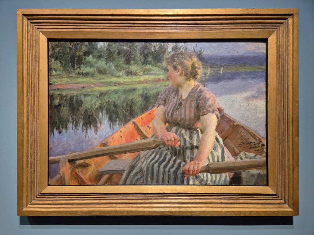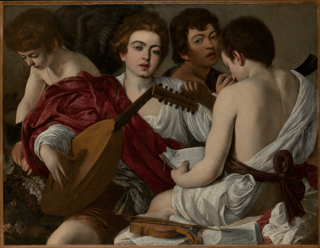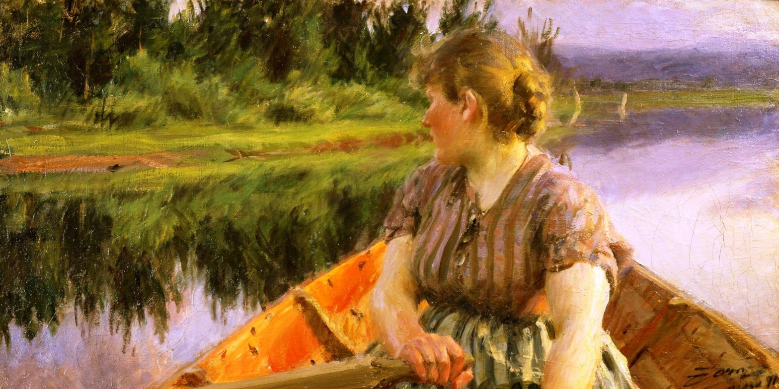
Anders Zorn, Midnight, 1891. Zornmuseet, Mora.
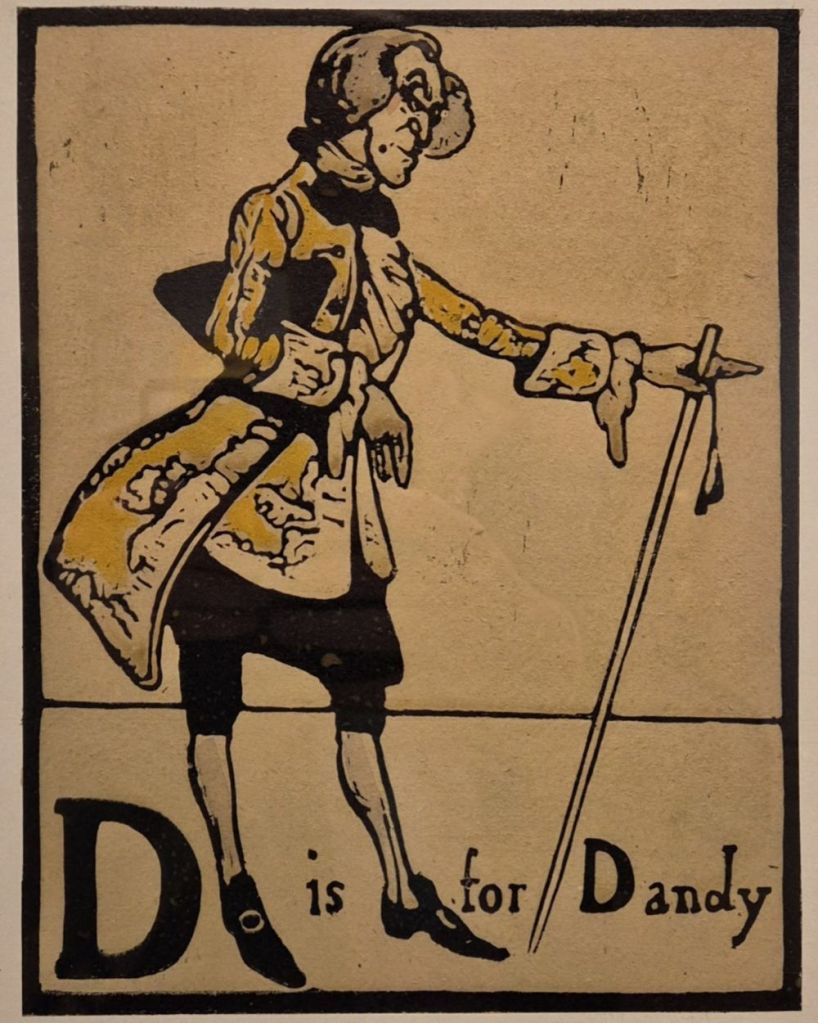
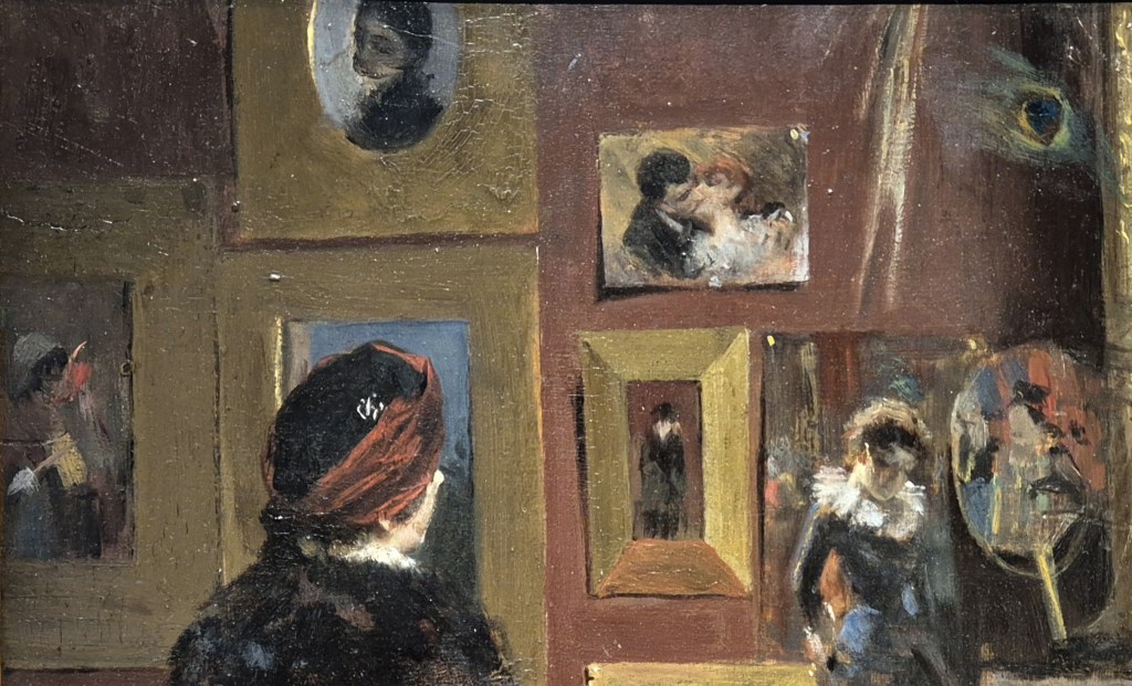
I am looking forward to paying a return visit to the wonderful exhibition I saw in Hamburg earlier this year for Anders Zorn (Part II) at 6:00pm on Monday, 16 March. This will be a second chance to enjoy the rich colour and painterly splendour of Sweden’s great artist, a friend and colleague of both John Singer Sargent and Joaquín Sorolla, and just as superb. The talk will be perfectly self-contained for anyone who couldn’t be there for Part I, and will include completely different, but equally fabulous images for those who could. The exhibition has moved, in a slightly different form, to Madrid, where it will be on show at the Fundaçion MAPFRE until 17 May. As you are unlikely to be able to see quite so many of this wonderful artist’s works in the same place for quite a few years – unless you head to his hometown of Mora, in Sweden – I would really recommend it. And if you can’t get there, I suppose the talk might be the next best thing! A week later, on Monday, 23 March, I will introduce The Courtauld’s enormously successful Seurat and the Sea. If you want to see the exhibition in person, book now if you can, as the tickets are rapidly selling out. Talking of popular exhibitions, last Sunday I tried to see Tate Modern’s Tracey Emin retrospective, but it was so crowded that I couldn’t even walk through the spaces. I’ll head back when I can (on a weekday, and when the rush has died down), and may plan a talk for a later date. Instead, on Monday 30 March, I will talk about the marvellous Michaelina Wautier, an unparalleled 17th century female artist who – surprise, surprise – has been almost completely forgotten. An exhibition of her work will have opened at the Royal Academy just a few days before, having arrived fresh from the Kunsthistorisches Museum in Vienna – which, by then, will be hosting an exhibition dedicated to uncle and nephew Canaletto & Bellotto. This will be the first to compare their travels outside of Venice – to London and Vienna – and so to compare the paintings which were the result: I will talk about it on Monday 20 April. All of these events are already in the diary, but you can check there for anything else that might be coming up, including (potentially) The Courtauld’s A View of One’s Own (landscapes by women) and Michelangelo and Rodin, which will be at the Louvre.
If you do book any of these events, Tixoom will send an email with the ticket – effectively a link to the talk – within seconds. If it doesn’t arrive within 24 hours, do let me know and I’ll try and sort it out: it would be easier to do it then than 5 minutes before the talk! You should then get reminders 24 hours and 15 minutes before the talk, and these will also include the link.
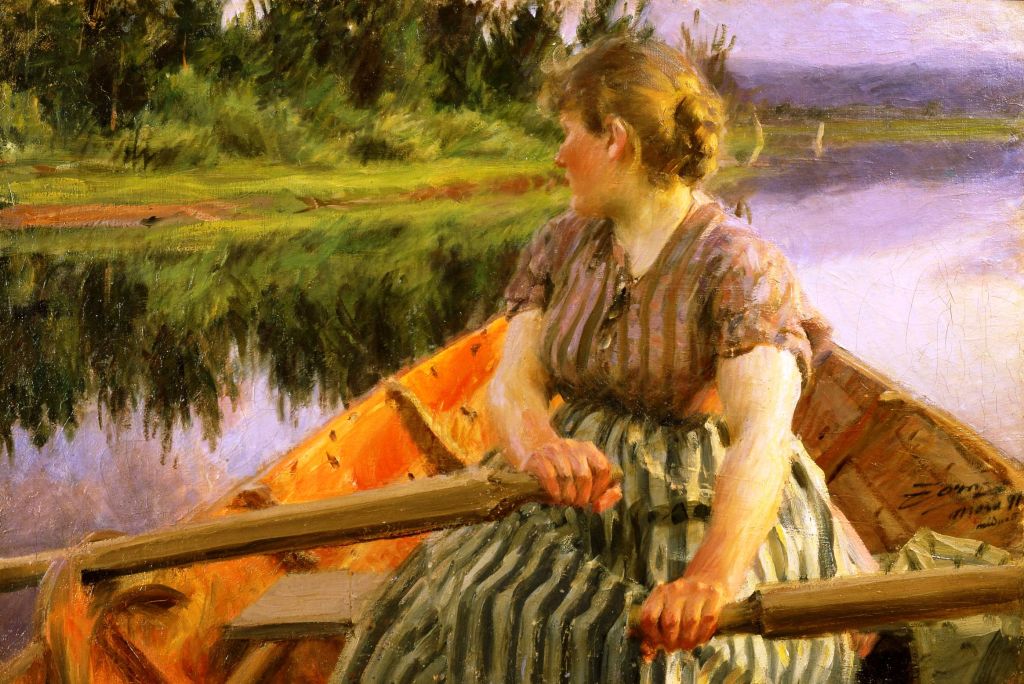
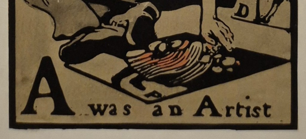
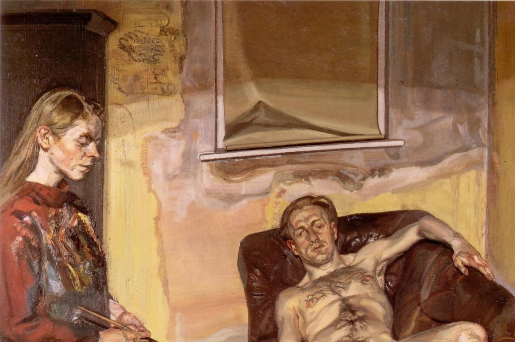
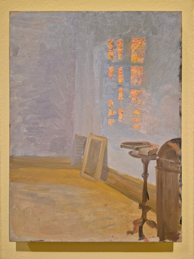
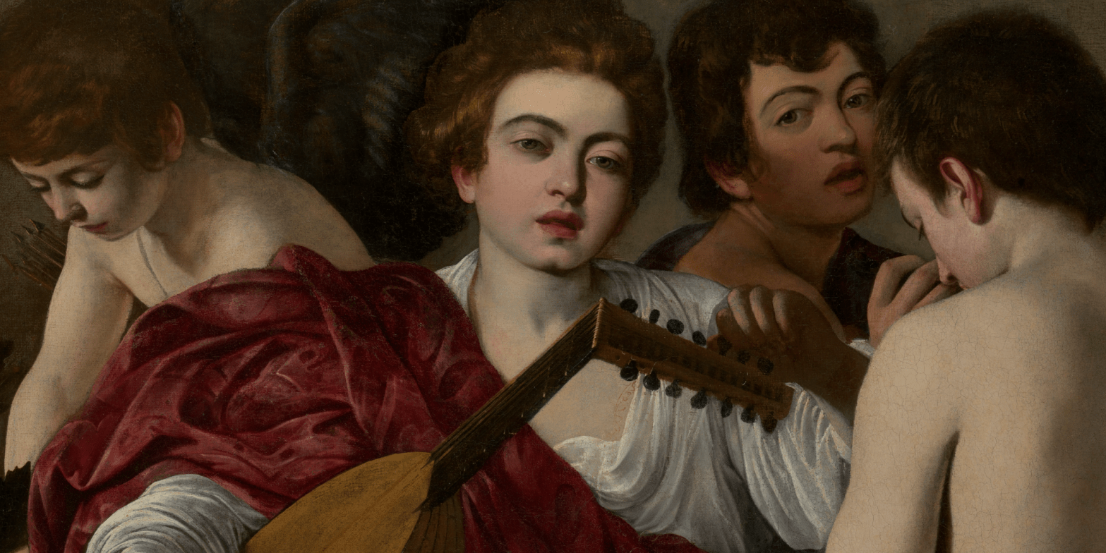
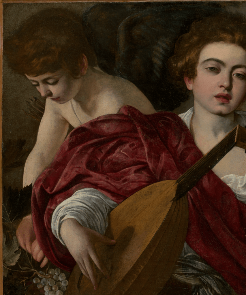
A woman is rowing away from us, heading towards the bank of what could either be a river or a lake (we can only see one bank, so it is impossible to tell). She is looking over her right shoulder to check her direction of travel. We can only see the bow (i.e. the front) of the boat, and our point of view suggests that the artist was a passenger, sitting towards the stern: we are effectively travelling with him. The weather is calm, without even the hint of a breeze. If there were one, the surface of the water would surely be rippling, but as it is, the mirror-like surface reflects the emerald-green grass and verdant profusion of bushes and trees growing on the bank, as well as the lavender sky and distant purple hills.
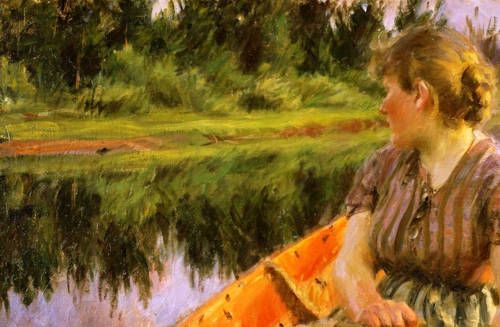
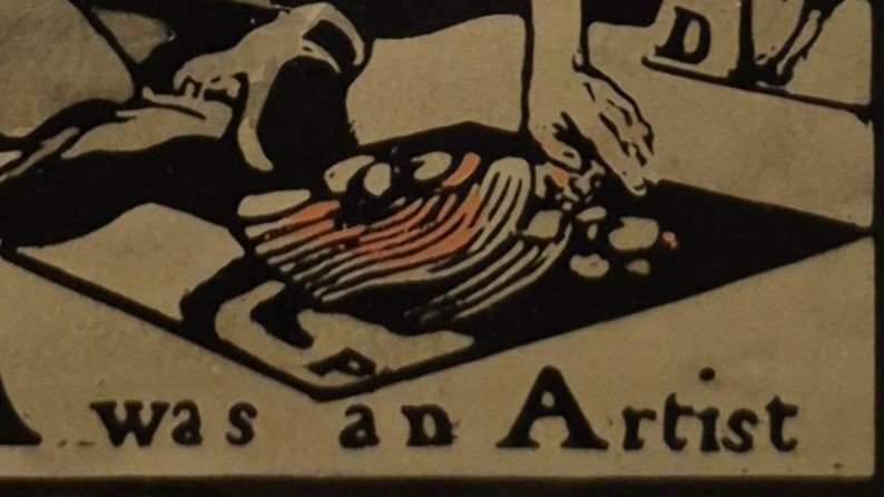
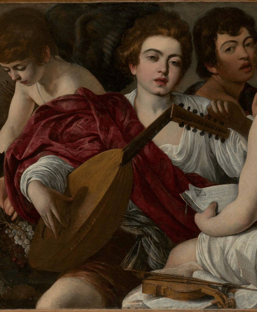
A thin line of reddish-brown runs through the middle of the green. This is the river bank, standing proud rather than sloping into the water. Because of the freedom of Zorn’s technique, the light green grass on the flat surface of the bank and its reflection in the water are rendered with different brushstrokes. He has not restricted himself to exact symmetry, and this creates an ambiguity: is that the reflection of the grass you can see below the bank, or are there also light green plants growing out of the water? The bushes beyond the grass are a mixture of light and dark green according to the fall of the sunlight. Judging by the yellow/gold light on the woman’s hair and on the back of her neck, the sun is very close to the horizon, and so presumably not reaching all of the bushes. The trees are darker still, which could either be due to the species, or to the fall of light – or both. Whatever the reason, the increasing darkness of the plants as you move away from the water helps to create a sense of depth. The interior of the boat is a rich, orangey-red, the separate brushstrokes stretching the full range from touches of yellow to a glowing vermillion.
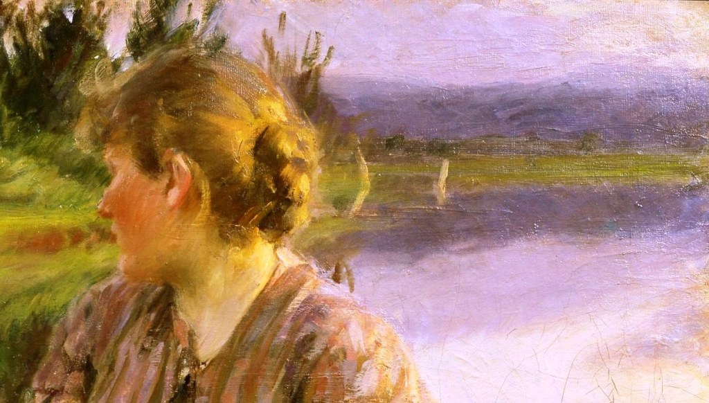
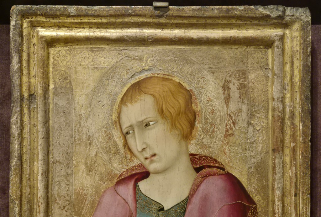
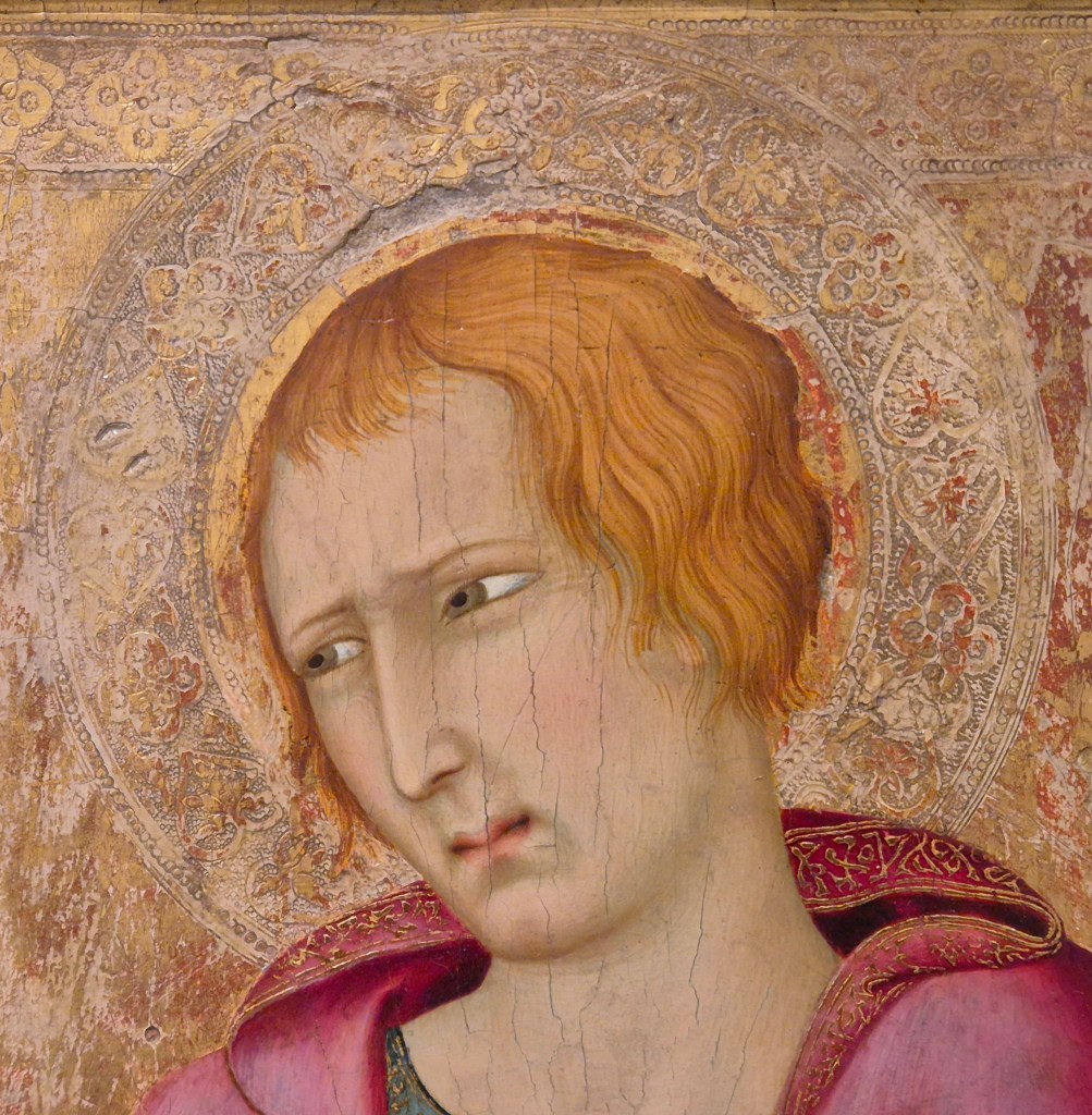
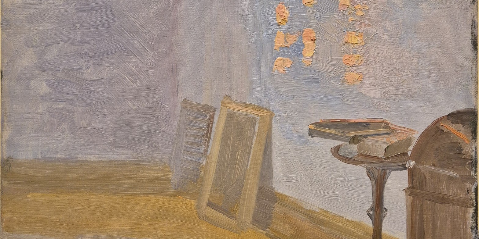
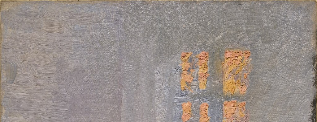
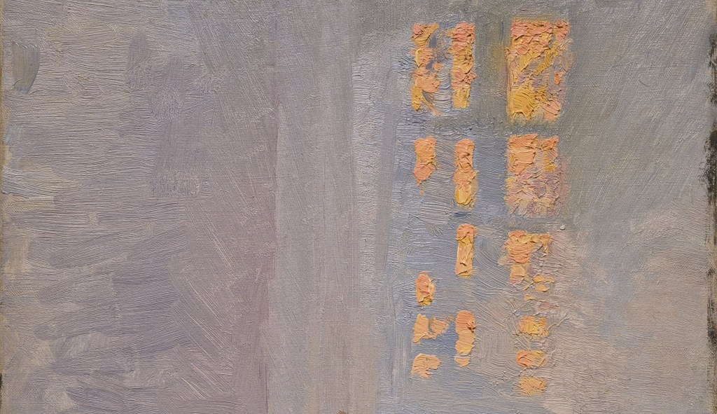
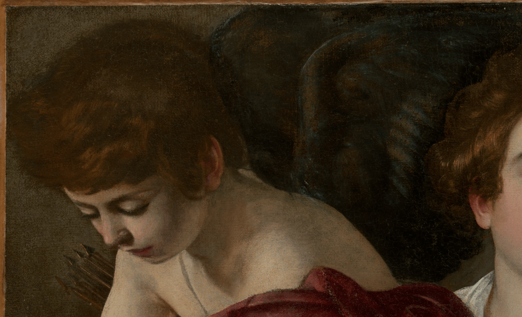
Behind the woman’s head the green bank stretches off into the distance. Her hair is plaited, and fixed up in a bun. It is only brightly lit (and not that brightly even then) on our right. The horizontal fall of light on her hair, together with the colour of the sky and hills, suggests that it is either dawn or dusk. I find the two pale, vertical forms behind her head hard to read, but the more I look, the more I think they are the sails of yachts moored at the riverbank.
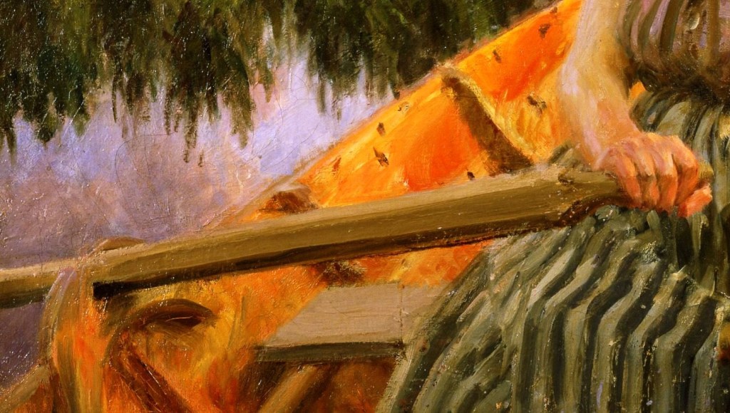
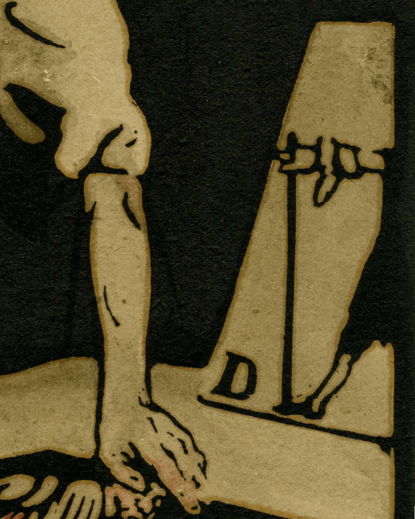
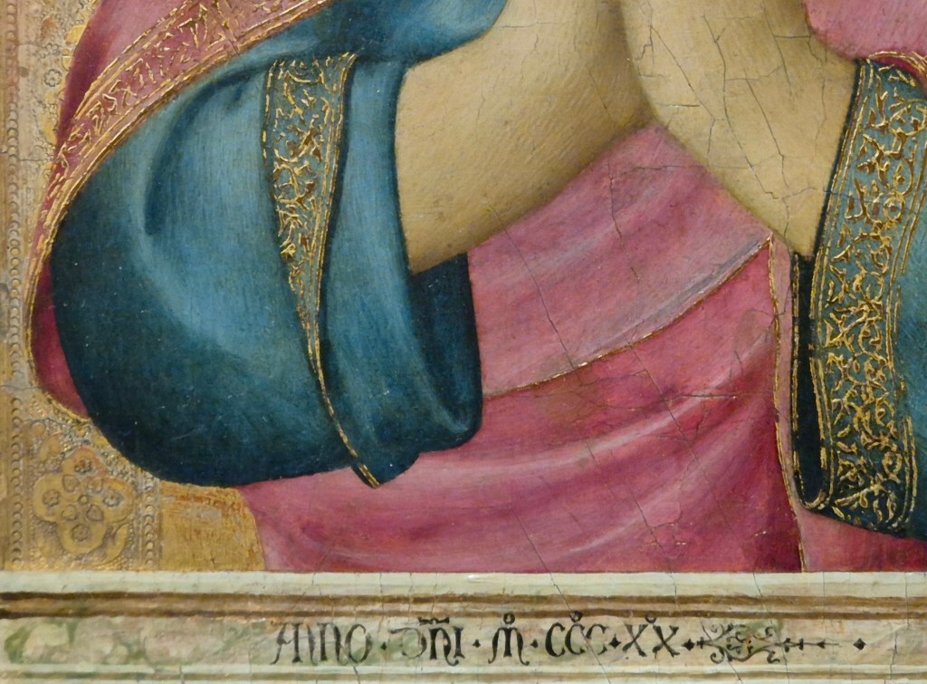
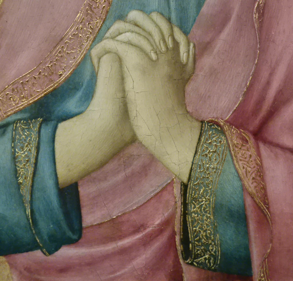
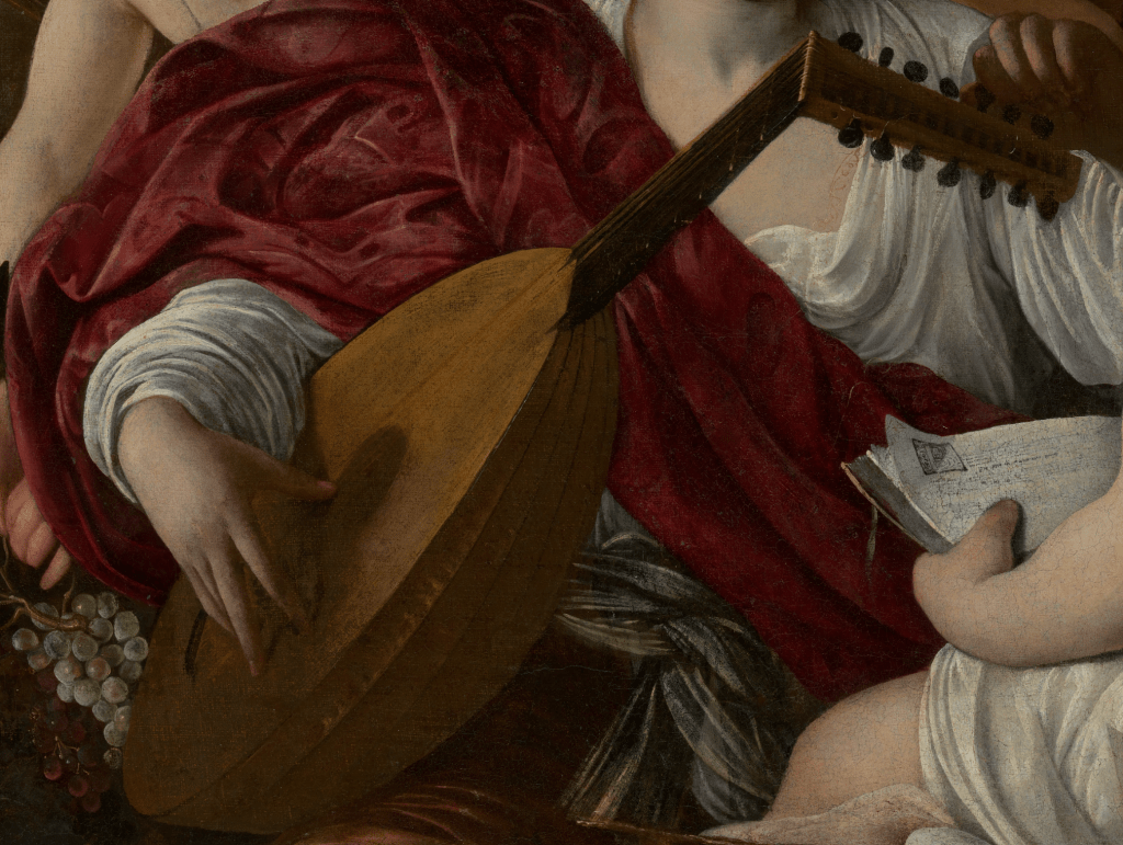
Zorn has carefully observed the geometrical cross-section of the oar handle (hexagonal, but tapering to a rounded handle, I would suggest) and models it with long, smooth brushstrokes of light, mid- and dark brown on the three visible facets. The rowlocks (pronounced rollocks) – ‘fittings attached to the gunwhale (top edge) of a boat that hold an oar in place, serving as a pivot point or fulcrum for rowing’ – are sketchily depicted, looking a bit like two wooden hands reaching around the oar. However, the firm grasp of the woman’s right hand on this oar, with the index finger projecting slightly more than the other three, and the thumb wrapped around the end, suggest that everything is in working order. Her green, striped skirt billows out from her waist, kinking in over her lap and down to her knees, and flares out slightly over the wooden bench on which she is sitting. Dark marks on the orange/yellow interior of the boat suggest the nails which are holding the planks in place. Significantly, the gunwhale (see above) leads directly from the bottom left corner of the painting (which is the bottom left corner of this detail) thus leading our eye into the painting along the diagonal which runs from bottom left to top right.
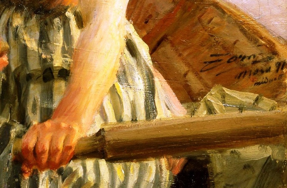
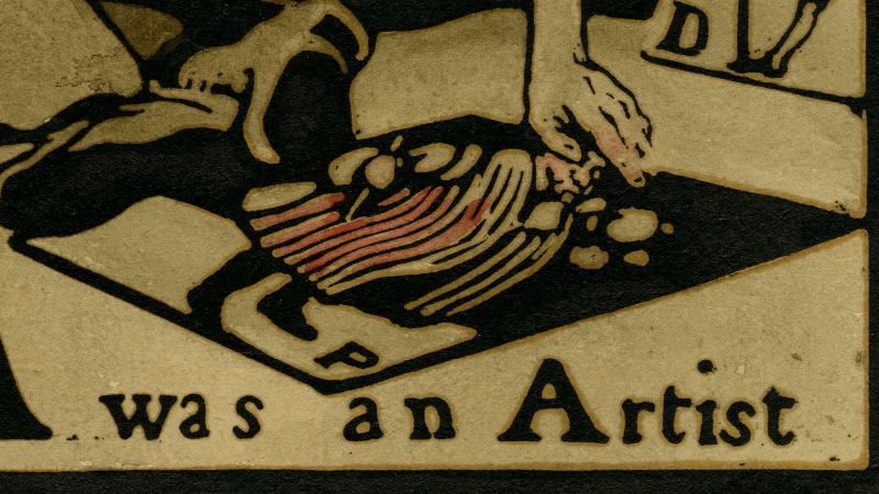
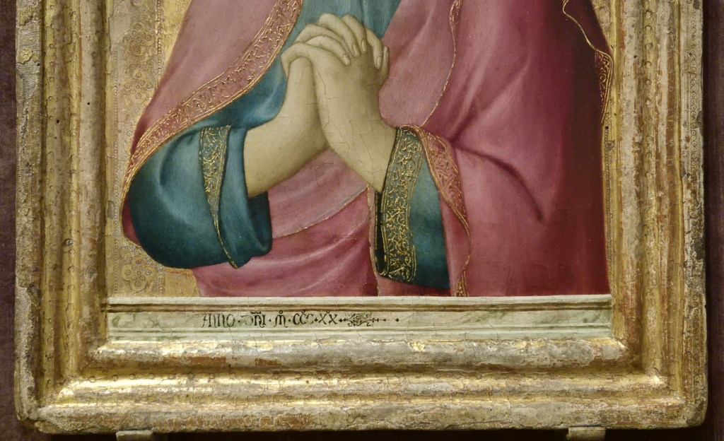
In the bottom right corner of the painting, the left oar (on our right) has far less clearly defined facets, maybe the result of the lighting – which is true of so much in this painting. The interior of the boat here looks brown, like wood – which is, after all, what it’s made of – and this confirms the position of the sun. At the horizon, its rich orange glow colours the interior of the boat where it falls, on our left. The woman’s left hand is, if anything, slightly better articulated than her right, with the knuckles standing proud, catching the light of the sun, and the lower joints darker as they wrap around the oar. The signature is painted against the brown interior of the boat, just above some yellow-green fabric lying under the oar. In three lines it says ‘Zorn/Mora 91/midnatt’ – the artist’s name, the location and date, and the title of the painting: Midnatt (in Swedish), or Midnight. But the sun is just rising or setting!
Anders Zorn, the artist, was born in Mora, in the Swedish province of Dalarna, in 1860. At the age of 15 he headed south to Stockholm to attend the Royal Swedish Academy of Fine Arts. He left the Academy in 1881 – without graduating – and moved to London the following year. He returned to Sweden in 1885 and married Emma Lamm. The couple spent an extended period in Paris (1888-1896), although they returned to Sweden for regular visits, as well as travelling extensively elsewhere. In 1896 they settled back in Zorn’s hometown, Mora, and remained there until the artist’s death in 1920 – although they did continue to travel widely during that time. Mora lies at 61° north – on a very similar latitude to Muckle Flugga (at 60° 51’), which, with exception of the odd rock, is the northernmost point of Shetland, and therefore also of the United Kingdom. Zorn described this painting as “a bright and chilly Nordic summer’s night” – and yet, to the eyes of those of us living further south, it doesn’t look like night at all. Although this is not the land of the midnight sun (the Arctic Circle lies at 66° north), summer nights can be remarkably luminous this far north. It reminds of a song from Stephen Sondheim’s A Little Night Music, which is set in Sweden. Shortly after the couplet “The sun sits low/ As low as it’s going to go,” it concludes with the following verse:
The sun won’t set
It’s fruitless to hope or to fret
It’s dark as it’s going to get
The hands on the clock turn
But don’t sing a nocturne
Just yet
If you would like to hear the whole song (which is relatively short) sung by the original Broadway cast, just click here.
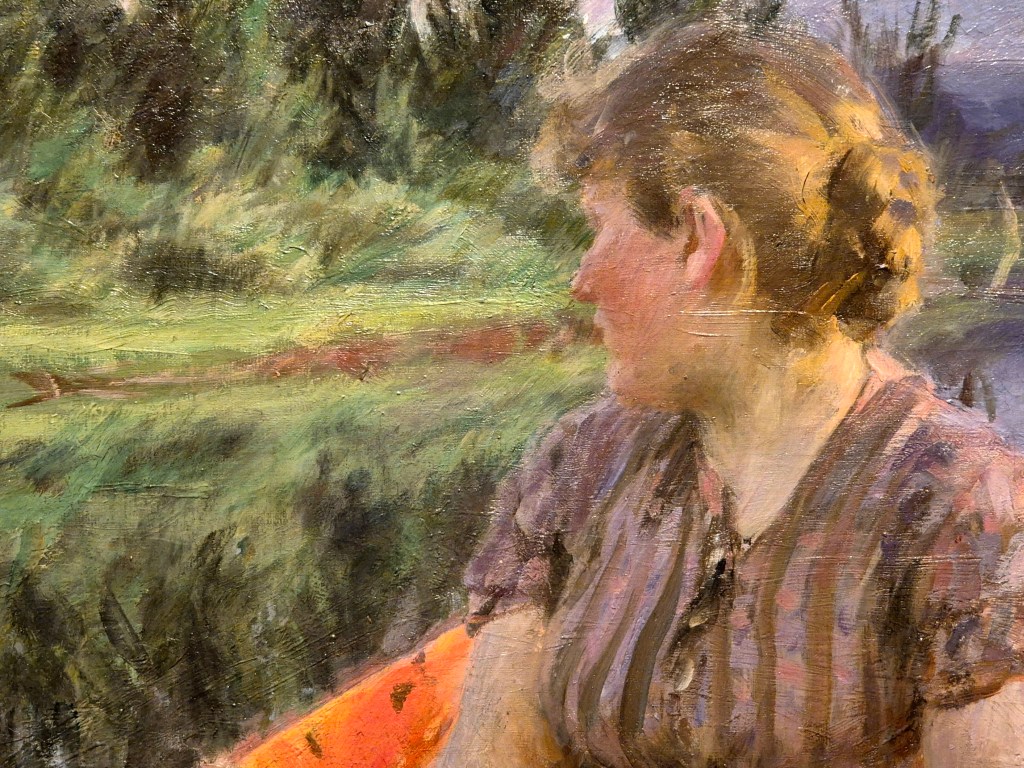
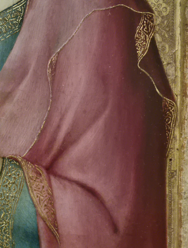
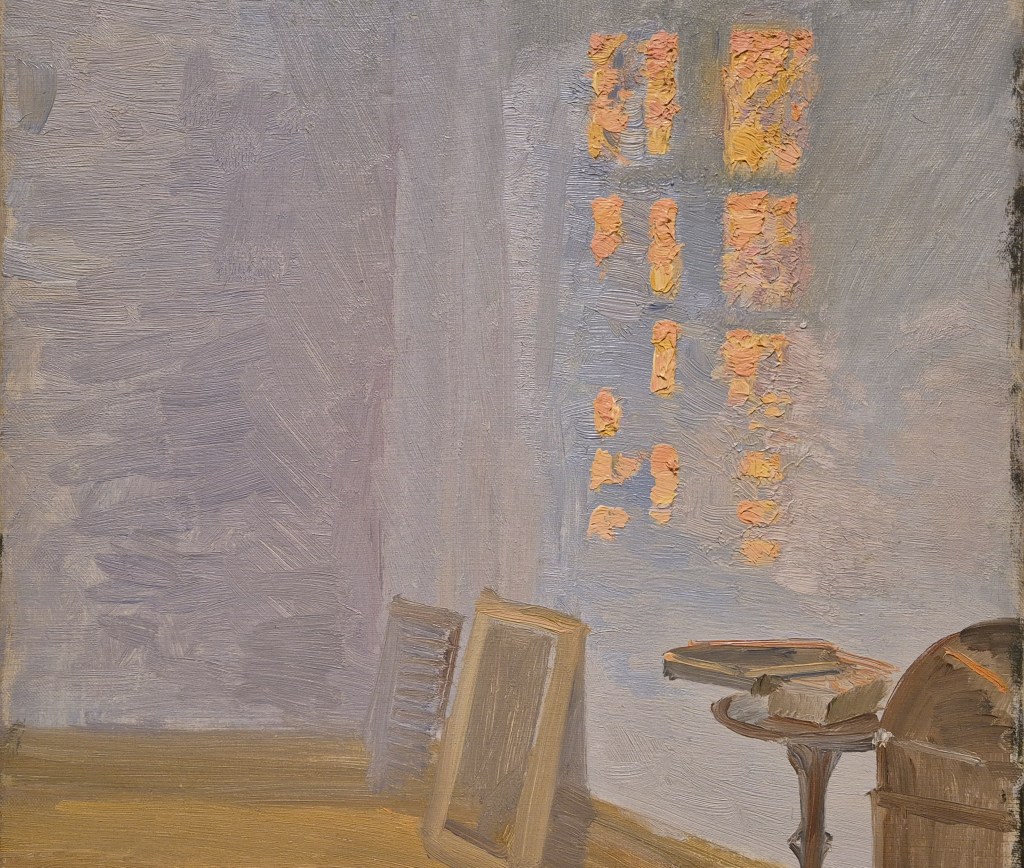
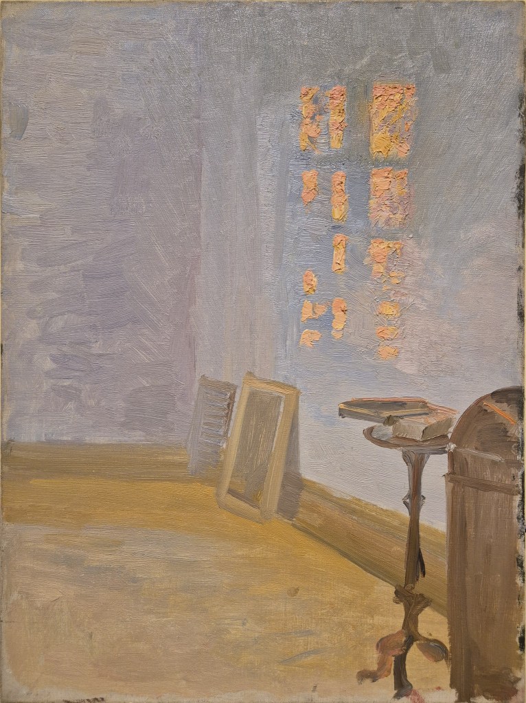
The pictures so far have all come from a digital file I found online (I’m afraid I can’t remember which one), and the colours are, I think, slightly heightened, if not garish. The details just above and below are ones I took myself, and I think they give a better idea of the true colour, and certainly give a better sense of the surface of the painting, how it is worked and how the paint is applied – even if you can see the gallery light reflecting off the top edges of the brushstrokes. Between them I think they emphasize how the woman rowing the boat is in harmony with her natural surroundings, her mauve top echoing the sky and hills (and their reflections) while her green skirt relates more to the vegetation on the river bank. She is located in the midst of earth, air and water, with the fire of the sun illuminating both her and the interior of the boat. As such, I find it somehow significant that the red-brown line of the riverbank coincides with the position of her mouth. I don’t know what relevance that has, but it somehow seems apt, and is (to me, at least) visually satisfactory – she is at one with the landscape. The blouse is beautifully painted, with dabs and dashes of the lavender of the sky and the purple of the hills alternating with a pink, not unlike her flushed cheeks. It is as if Zorn is nodding toward Seurat, and his Divisionist brushstroke, which was first fully realised in 1884 with Sunday Afternoon on La Grand Jatte (the subject of another Sondheim musical!), eight years before Midnight was painted. However, I don’t remember Zorn using the Divisionist – or Pointilliste – brushstroke anywhere else.
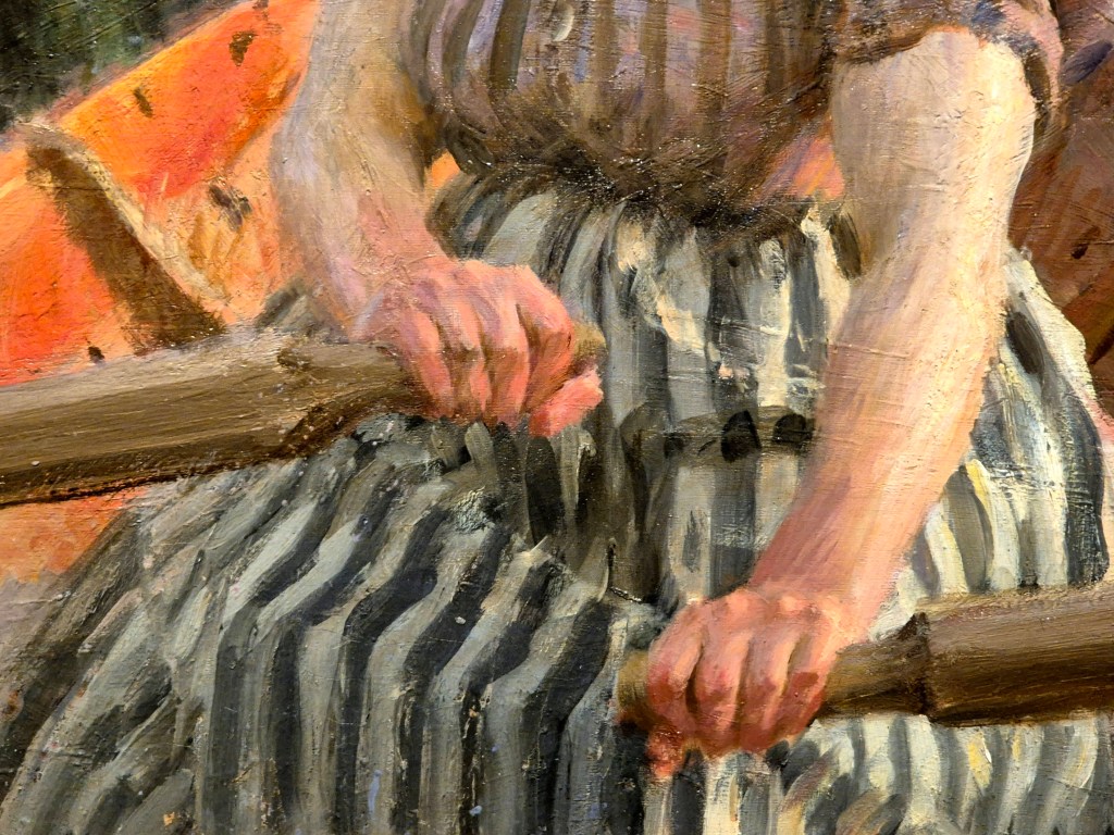
Looking at both hands together it is immediately apparent that the woman is changing direction. If she were rowing in a straight line, her hands would be next to each other. The hand on our right is lower down, suggesting (to me at least, who has very little experience of rowing), that she is holding the starboard oar (‘right’ in the direction of travel) out of the water, whilst pulling hard on the port oar. I’m trying to work this out logically – although logic often fails me. I think this means that the boat would turn to port – which would imply that she is steering towards the bank. Who knows where she is going, or why, at this time of night? Maybe she is quite simply heading home after a party – the Midsummer Dance of one of Zorn’s most famous paintings, perhaps? We will see it on Monday, when one of the themes we will cover will be Zorn’s return to the province of Dalarna, and the paintings – like this one – that he continued to paint on his regular visits ‘home’ even before he settled back there.