
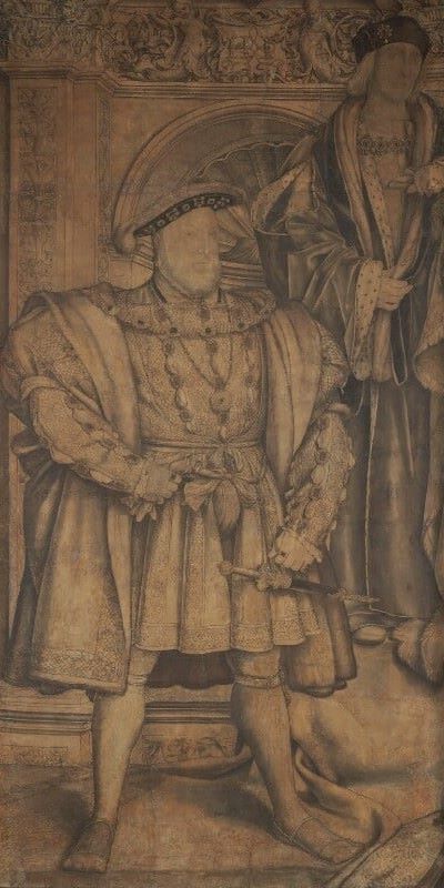
Hans Holbein the Younger, King Henry VIII; King Henry VII, c. 1536-37. National Portrait Gallery, London.
This week I will start what might turn out to be an occasional survey of the recently refurbished, refocussed and reopened National Portrait Gallery in London (whether I get all the way through depends on what other ideas take my fancy after the first two weeks), and it would seem to make sense, as the song says, to ‘start at the very beginning’. Although not the earliest person represented in the collection, the earliest painting is an anonymous early-16th Century portrait of King Henry VII. However, given the motto, ‘like father, like son’, today I am going to write about two kings – if not three. Although titled The Tudors, my talk on Monday, 2 October will also include a brief history of the NPG, and the ‘new’ experience you would have if visiting (while I’m on the subject I’m thinking of starting some ‘in person’ tours of this and other museums – do let me know, preferably via the contact page, if you’d be interested). The following week I will carry on with The Stuarts, and, as with the first week, as well as the dynasty in question, I will also look at people other than royalty. The NPG is essentially a museum of British history rather than an art gallery, however much art it may appear to contain, and as well as kings and queens, that includes the great and the good, and increasingly, the normal and down to earth. After two weeks I’ll break off the survey (for now) as by then the autumn’s exhibitions will have bedded in, in my mind, if nowhere else. I will continue with portraiture, though, talking about Frans Hals (at the National Gallery) and Rubens (at the Dulwich picture gallery). I hope to have those on sale by Monday, but keep your eye on the diary just in case.

This image of Henry VIII is remarkably familiar, presumably from historical dramas and films. Holbein’s depiction of the monarch has often been used as a character note for any actor taking on the role of a man who is just beyond his prime, both in terms of physical fitness and ruling power, and in the first stages of a descent into morbidity. At this stage – in 1536-7 when the image was made – Henry was in his mid-forties, with a decade left to go. He adopts the ‘power stance’, which may be familiar given that it was revived by the Tory party from 2015 onwards to disastrous effect. It really doesn’t work if you don’t have the appropriate clothing. A tight skirt, rather than a pleated under-coat with britches, really gives the wrong impression (Theresa May), and, while your legs should be firmly planted, they really shouldn’t be too widely spread (George Osborne – check the link if you doubt me). If you really do have majesty, and gravitas – and the best portraitist of the day, let’s face it – then it works. It helps to wear the right layers: an overcoat with short, padded sleeves over a long-sleeved undercoat enhances the effect. Henry VIII had probably not reached the full degree of his ‘obesity’ at this stage. Remember that, as a young man, he was tall, fit and sporty. The appearance of ‘heft’ here is achieved by the layers of clothing which are hung from, and draped around, that broad, lofty frame.

The point is made clear by comparison with the image of his father, King Henry VII, founder of the Tudor dynasty. He appears far slimmer, with a narrower, taller hat (as opposed to his son’s broader, flatter headgear, just visible at the bottom of this detail). The hat alone adds to the sense of ‘tall and slim’, which is enhanced by the vertical fall of the collars of his two coats and the rest of his drapery, as we shall see below. Both monarchs – father and son – stand in front of an architectural setting, using the new (to England) classical language of architecture, with overlapping pilasters supporting an entablature consisting, it would seem, of only a frieze. While the pilasters (on the left side of the detail) are carved with decorative vases and flowers – a feature given the somewhat inaccurate term ‘candelabrum’ – the frieze shows two mythical creatures, a mermaid and merman, possibly, or what would be termed as ‘grotesques’ (the sort of decoration you would find in a grotto) with vegetal and animal forms morphing one into the other. These two hold a plaque, or shield, which is inscribed with two letters, and elaborately patterned. It reads ‘H & I’, which can be interpreted as ‘H & J’, given that the letters I & J were effectively interchangeable. The plaque celebrates the union of Henry VIII and his third wife, Jane Seymour, who is, nevertheless, nowhere to be seen. But then, the image has obviously been cut down: apart from anything else, Henry VII has lost his left elbow.

The contrast between father and son is most obvious here. Henry VIII’s ‘breadth’ is emphasized, not only by the flat, wide hat, but also the jewelled chain around his neck which stretches wide to rest on his wide, wide shoulders, themselves enhanced by the broad, fur-lined, turned-out collar and the padded short sleeves. Compare the number of horizontal, or near-horizontal lines used to depict the son with the preponderance of verticals used for the father. The materials depicted are also different. The royalty of Henry VII is emphasized by the use of ermine, a weasel-like creature with pure white fur and black tip to the tail, whose pelts were reserved for royalty. You can see it used for the collars and cuffs, and even for lining the sleeves of the overcoat. This is visible thanks to a rather large cut in the sleeves themselves, ‘slashing’, a fashion choice intended to display the structure of the garments and the layering and material value of the expensive fabrics being worn. Given that neither of his parents was a monarch – Henry VII seized the crown in 1485 – it was of vital importance to emphasize his royal status. However, as Henry VIII was the son of a king, he didn’t have to worry so much about his ‘royalty’. Instead it was power – and particularly power as expressed through wealth – that was important. Although the image I have chosen is monochrome, I can see numerous jewels – on chains, as pendants, and sewn into the fabric – and I am imagining materials in rich colours and cloth of gold. ‘Unlike father, unlike son,’ you might think, unless you look at the right hands. Father holds onto his robes, and son to his right glove (a sign of elegance and sophistication, removed to reveal the powerful hand, with yet more jewellery), and yet the hands themselves are exactly the same. If we doubted Henry VIII’s potency, the codpiece reminds us of his manliness and vigour, which was far more of a concern for him than his royalty, as his first two wives had failed to give him a son.
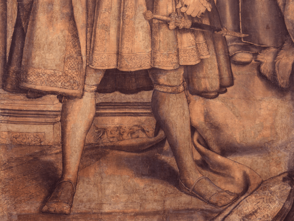
The first detail I showed you might have suggested that Henry VII was considerably taller than his son, but clearly he was not – as you can see here, he is standing on a higher step. Rather than having his feet rest on the cold stone, a cloth is spread out to keep his shoes clean and his feet dry and warm. The cloth seems to pour over the step onto the lower level, and Henry VIII is also standing on it. This is just one of the details intended to promote the idea of the continuity of Tudor rule. Henry VIII’s feet are set wide apart (though not too wide), thus helping to create the stable pyramidal composition of which (as you’ll know) I am so fond, and this structure is enhanced by the spreading skirts of the coats above, which taper towards the waist. The under-skirts are short enough to reveal Henry’s knees, beneath which he wears garters holding up his short stockings. That on the left leg reveals him to be a member of the Order of the Garter, as every monarch since Edward III has been. It’s hard to read, but you might be able to make out the lettering ‘Y PENSE’, part of the order’s motto ‘honi soit qui mal y pense’, usually translated as ‘evil to him who evil thinks’.
The above description looks at the image as we see it, but doesn’t explain what’s going on at all. The reason for this is that Holbein never meant us to see it: it is a cartoon, a preparatory drawing the same size as the work for which it was prepared. I would show you the work itself, The Whitehall Mural, but that was painted onto a wall (which is, after all, the meaning of the word ‘mural’: think of ‘le mur’ in French, or ‘il muro’ in Italian: both mean ‘wall’). The wall in question was part of the Palace of Whitehall, which was all but completely destroyed by fire in 1698, during the reign of King William III. However, we know what the mural looked like from copies and engravings. Here is one currently on display in the NPG (I’ll explain where you can find it on Monday):

The engraving was made in 1743 and is attributed to ‘George Vertue (after Remigius van Leemput)’. It shows us that what we have been looking at is only about a third of the design as a whole. What we are missing is an altar-like plinth in the middle (meant to be a sarcophagus) bearing a lengthy inscription, and two women: Elizabeth of York, consort of Henry VII and mother of Henry VIII, and Jane Seymour, third wife of Henry VIII. We are also missing some of the architecture at the top. What I described as a frieze is actually an elaborately carved architrave. Above this there is a frieze – decorated and bulging – which is surmounted by a narrow cornice, and crossed by brackets supporting sculptures. We can now see that the cloth both Kings (and their consorts) are standing on is an elaborate rug. It’s worthwhile remembering that only people of the highest status would have a rug on the floor, as they were usually considered too expensive to tread on (an exception being the Arnolfini, who had pretensions above their station). The large, spreading rug assures us that the continuity of Tudor power which the mural was meant to promote was entirely royal. The painting was effectively a family tree. The union of Henry Tudor, a Lancastrian, and Elizabeth – of York – put an end to the Wars of the Roses and initiated the Tudor dynasty. Henry VIII and his wife Jane Seymour would strengthen the family’s rule, thanks to his potency, manliness and vigour, combined with her modest virtue (she holds her hands meekly in front of her body) and fidelity (she looks loyally towards her husband, and has a little dog at her feet).
But why did George Vertue rely on Remigius van Leemput for the design of this engraving, given that in 1743, when it was printed, the mural could still be seen?

The reason is simple enough: George Vertue was relying on a small-scale painted copy which already existed, and which would be far more convenient, given that he would not need to have access to the royal apartments. The Whitehall Mural had been copied by the Flemish artist Remigius van Leemput for King Charles II, who was, for obvious reasons (which we will discuss when we get to The Stuarts) all-too-conscious of the continuation (or otherwise) of the monarchy. In 1688 the painted copy, like the mural, was recorded as being in the Palace of Whitehall – so we are lucky that, unlike the mural, it has survived. Thanks to the subsequent continuity of the monarchy (give or take the odd ‘glorious’ revolution), it is part of the Royal Collection to this day. It reveals the rich colours and cloth of gold I had ‘imagined’ earlier, even if we can’t be sure of van Leemput’s accuracy. Nevertheless, the repeated use of full, rich reds, a colour associated with royal households, not to mention the gold, not only creates a suitably regal appearance, but also creates a visual relationship between the four characters, the implication being that this is a unified dynasty which will last. Apart from a slight difference in the proportions of the figures – hardly surprising given that a life-sized image has been reduced to a mere 88.9 x 99.2 cm (Henry VIII was probably 188 cm tall) – what we see is remarkably similar to the cartoon. However, there is at least one minor difference. Rather than being inscribed ‘H & I’, the plaque on the left says ‘An Do’, short for Anno Domini, or ‘the year of our Lord’. On the right the plaque reads ‘1537’ – thus confirming the date of the cartoon. Whether or not this minor difference was true to Holbein’s completed mural, it is certainly picked up by Vertue in the engraving. Vertue also adds the names of the characters in the string course which separates the architrave from the frieze, although the lettering is probably too small for you to read in this reproduction. But back to the cartoon – why was it made?
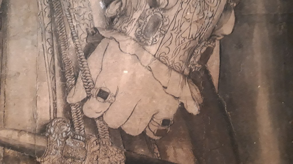
This is a detail of Henry VIII’s left hand, holding onto the cord from which his decorative dagger is hanging – more a statement of power than a declaration of violent intent. Drawn and painted with different sized brushes, ink and watercolour on paper, this cartoon is nearly 500 years old, and clearly fragile. Despite recent conservation, cracks and splits are visible, and, particularly along the top edge of the black sheath, there are small white dots which might suggest decay. However, I’m only really including this detail so you can see where the next detail comes from: it is the bottom jewel on the right side of the sleeve, just next to the hem, and above the white cuff of the undershirt.

Aside from wanting to point out the delicate patterning of the sleeve, and subtle shadows modelling the white undershirt as it emerges from the slashing, I am interested in the small dots – appearing either black, or white, or sometimes both – around the jewel, the shirt, the sleeve – indeed, around most of the outlines. They are black and white as they cast shadows, or catch the light, and they do that because they are three dimensional: they are holes in the cartoon, which has been ‘pricked for transfer’. The word ‘cartoon’ comes from the Italian carta, meaning ‘paper’, and specifically cartone, meaning ‘large sheet of paper’. This one is made up of a number of smaller sheets stuck together, as paper wasn’t available in large sizes in the 16th century. Having completed the design, the cartoon would have been placed on top of a blank sheet of paper of the same size, and all of the important outlines were pricked with a pin, the pin going through both sheets of paper. The plain paper, with pin pricks, would then have been held against the wall, and a bag containing soot, or crushed charcoal, would have been banged against it in a process known as ‘pouncing’. The black powder would pass through the loosely woven fabric of the bag, through the pin pricks, and onto the wall. To paint the mural all you would have to do then would be to join the dots, and colour it in – simple really. But if you did that, surely there would be little black dots all over the painting? Well, often they were painted over, so you can’t see them. But sometimes they weren’t. Here is a detail from Lorenzo Monaco’s Coronation of the Virgin with Adoring Saints in the National Gallery, dated 1407-9. This is from the right-hand panel: the blue and yellow robes are St Peter, the white is St Romuald.

The ‘black dots’, or spolvere as they are known (effectively meaning ‘sprinkled with dust’) can be seen quite clearly along the hems of St Romuald’s white robe. But it does make you wonder if the process wasn’t unnecessarily complicated (and wasteful), given the inclusion of the blank sheet of paper. If the cartoon was only a preparatory drawing, rather than a work of art in its own right, why bother? You could just prick the holes in the cartoon, and use that for the pouncing, surely? Well, not if you wanted to hold onto the cartoon.


It could be that the cartoon was saved as the basis for copies of the original design – and, as you can see, such copies were made. This portrait of Henry VIII, from the Workshop of Hans Holbein the Younger, is in the Walker Art Gallery in Liverpool, and you can see it in their newly opened display, ‘Renaissance Rediscovered’ in rooms 1-4 (despite the title, it also includes medieval and baroque works, and covers the 13th-18th Centuries). Like the NPG, this is the result of a three-year refurbishment. While portraits of Henry VIII would have been important across the realm, and throughout his reign, those of his parents and wife might not have been so vital. This might explain why only the left third of cartoon survives. The image of Henry VIII would go on to become the model for the very continuation of the Tudor dynasty which the mural had promoted, as embodied by Edward VI, the longed-for male heir to the English throne. This portrait – also in the NPG – truly is a case of ‘like father, like son’, with the young and sickly Edward being portrayed with the same manliness and vigour attributed to his father, the power of the image intended to counteract historical fact. But that’s another story, of course, and one I shall leave for Monday.


2 thoughts on “207 – Making a monarch, a mural, and more”