
Hans Holbein the Younger, Jane Seymour, c. 1536-7. Royal Collection Trust and Kunsthistorisches Museum, Vienna.
On Monday I talked about Hans Holbein the Younger’s origins in Augsburg, and his career in Basel, and next week I’m looking forward to talking about his time in England with Holbein II: Realism and Royalty (Monday 27 November at 6pm). It will be an introduction to the Queen’s Gallery exhibition Holbein at the Tudor Court, focusing on the master himself, as there is much else on show besides: the exhibition does more than it says on the packet. If you missed the first talk, and can’t make the second, I’ll be delivering an edited version of both as a study evening for ARTscapades on Thursday, 30 November – they record their talks, so you can always catch up later. I’ll be away the following week (in Hamburg with Artemisia), and so there will only be two talks in December, bringing some much-needed colour with the Ashmolean’s spectacular Colour Revolution (11 December), and then the Royal Academy’s promising Impressionists on Paper (18 December). I’m still planning the New Year – so do keep your eye on the diary. And of course, if you have any ideas, including anything you would like me to talk about, do let me know via the contact page.
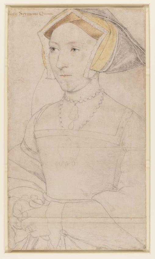
I’ve recently written about the Whitehall Mural (see 207 – Making a monarch, a mural, and more) and Holbein’s portrait of one of Henry’s potential wives, Christina of Denmark (199 – The One that Got Away), but today I would like to go back to the Mural, and look at the woman who was on the other side from Henry VIII, his third wife, Jane Seymour. This drawing of her is typical of Holbein’s beautifully delicate use of coloured chalk. Many drawings like this survive, and, as we shall see on Monday, they document Holbein’s circle of patronage and the increasing success and status he enjoyed as a portrait painter. However, although they are part of the process of developing a finished portrait, they are not sufficient: they have a great deal of detail in the face, but other elements have only been sketched in. It seems highly likely that there were other drawings – for the hands, and details of the costume, for example, which this image, along with the others, does not provide. This particular drawing seems to have been used more than once: it was lengthened by the addition of an extra strip of paper along the bottom, and lines have been drawn below the join, and just below the neckline of the bodice, implying that there might have been versions of the portrait in different formats.
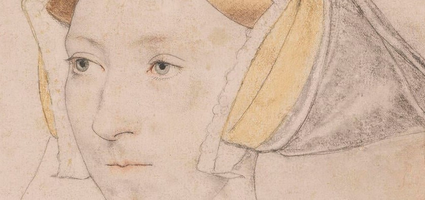
Holbein knew how to work efficiently. The drawings are all on paper which was prepared with a pink wash before he even started. This meant that he didn’t have to worry about the flesh tones. He would sketch faint outlines in black chalk, and gradually refine and strengthen them. Different elements were shaded in coloured chalks – black, yellow and brown for the headdress and red for the lips in this example. The eyes are picked out with green watercolour. The outlines, once secure, were heightened with pen and ink, which is particularly clear along the outline of the face on our left, and around the tip of the nose, the top of the nostril, and between the lips. He also uses it to define the eyelashes, the space between them and the whites of the eyes telling us the thickness of the eyelids. There are delicate suggestions for the patterning of the headdress, but, as I said above, this is not enough to explain his understanding of the costume in the finished painting.

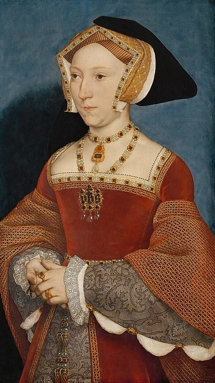
Not all of the painted versions after Holbein’s drawings which survive are by the master himself, but this one, in the Kunsthistorisches Museum in Vienna, is. It is really worthwhile looking at in detail… so we shall.

Jane Seymour wears a typical Tudor headdress known as a gable hood – so called, because its structure is reminiscent of the gables at either end of a pitched roof. The white band which frames the face is decorated with a motif repeated in Seymour’s jewellery. Flowers with four gold petals surrounding a dark gemstone alternate with squares of four equally sized pearls. A striped, golden fabric folds over her high forehead, and a patterned red and gold cloth wraps around the ‘gable’, with a black hood stretching behind and folded over the head.

The alternating flowers and pearls frame the neckline, hemming the bodice and sleeves, and also make up the necklaces. From one of these, effectively a choker, hangs a pendant. A second necklace hangs lower, and is tucked into the bodice. This strikes me as an odd thing to do, as it could be scratchy, but it was common practice: women in several other portraits wear necklaces in the same way. It looks as if the brooch, which is pinned to the front of the bodice, is hanging as a pendant from the longer necklace – even if the red velvet of the bodice is in between them. A pattern of triangles – or diagonal and horizontal lines – is embroidered in gold thread around the hems of the velvet (‘inside’ the flower-and-pearl bands), and in the lining of the oversleeves, which are folded up so that we can see them (they are more visible in one of the details below). Small, individual stitches – again in gold thread – can be seen along the seam to our right of the bodice. The brooch itself is both intricate and delicate. It shows Jane Seymour to be an observant Christian, as it is made up of the first three letters of Jesus’s name in Greek – ‘ihs’ – with the horizontal line which tells us that this is an abbreviation being used to turn the ‘h’ into a cross. This was a formulation devised by St Bernardino of Siena in the 15th Century. It was used by him as the ‘Name of Jesus’, at which, according to the bible (Philippians 2:10), and the well-known hymn, every knee shall bow. With no little irony, given what had just happened to the church in England, and the way in which the break from Rome would develop, this symbol – the Name of Jesus – would soon be adopted by the Society of Jesus (the Jesuits), which was founded just three or four years after the portrait of Jane Seymour was painted. As a jewel, though, this brooch could easily have been designed by Hans Holbein himself.

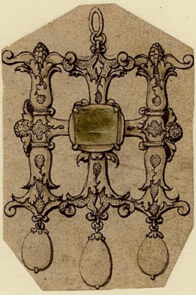
The British Museum has many of Holbein’s designs, including nine for brooches. The one on the right was almost certainly designed for Jane Seymour: it combines the ‘H’ of Henry VIII with the ‘I’ equivalent to the ‘J’ of Jane – as seen in the Whitehall Mural. The letters in the brooch Seymour is wearing are defined by cut stones, whereas those in the drawing are probably meant to be worked in gold, but apart from that, the combination of letters hung with three pearls is remarkably similar.

Seymour also wears rings: there are three on her left hand, one of which looks remarkably like a simple wedding band. She has a belt made of the flower-and-pearl pattern, from which hang chains which vary this motif with the addition of tiny paired chalices decorated with spiralling gold patterning and gold handles. The undersleeves appear to be a richly patterned grey (or silver?) brocade, buttoned to allow the chemise to puff out. The latter has delicate black embroidery on the cuffs. The panel of the underskirt is made from the same grey/silver brocade as the sleeves.

The costume Queen Jane wears in the Whitehall Mural is remarkably similar. The painting was destroyed in the Whitehall Palace fire of 1698, but this reduced-size copy by Remigius van Leemput, still in the Royal Collection and included in the current exhibition, was painted in 1667, so we know (roughly) what the original looked like. The cut of the clothes is not identical – the neckline is notably different, for example. Apart from that, the posture is the same, and the structure of the clothes very similar. The fabrics are different, though: the oversleeves are lined in ermine – emphasizing Seymour’s royalty in this dynastic portrait – and the undersleeves and skirt are red velvet. Other details are identical: the three white ‘puffs’ of chemise visible below the sleeve on our right, for example. It seems highly likely that the original drawing, at the top of the post, was used to develop a cartoon for the mural much like that for Henry VIII which survives in the National Portrait Gallery. Here is an edited version to suggest how they might have worked together.


We don’t know why the cartoon for Henry (and his father, Henry VII) survives, but that for the other side of the mural doesn’t. There were many copies of Henry’s portrait, which might explain the cartoon’s survival. However, as mother of the heir to the throne, Jane Seymour was also important, which would explain the different versions of the portrait which were made. Nevertheless, she wasn’t queen for long. The couple married in private on 30 May 1536, and their son, the future Edward VI, was born on 12 October 1537, just over sixteen months later. But within two weeks Jane had died, from complications arising from the birth. Heartbroken, Henry VIII was nevertheless on the hunt for a new wife the following year: the portraits of Christina of Denmark and Anne of Cleves are the result.
Jane Seymour was Queen for little more than 16 months, but it coincided with Holbein’s presence at the Tudor Court, and for that we must be thankful. At least we have a beautiful, delicate drawing and a stunning, intricately executed painting to remember her by.


One thought on “211 – Hans Holbein: the other side of the mural?”