
Giorgio Morandi, Still Life, 1936. Magnani-Rocca Foundation, Mamiano di Traversetolo, Parma.
Thank you to everyone who signed up for my two Vermeer talks: it made it so worthwhile to have such an eager audience. However, if you weren’t free, I will be delivering another introduction to the Rijksmuseum’s Vermeer – in person this time – at the Dutch Centre in London on Wednesday 26 April: it would be great if you could come along and say hello! Contrary to my concerns in the last ‘Third Anniversary’ post, my next online talk will be this coming Monday, 3 April, as originally planned, and, as planned, I will look at the wonderful Italian artist Giorgio Morandi. Why was I concerned? Well, I’m currently in Bucharest. I should have been on holiday in Lisbon, but I only managed two days of that before being torn away for a few days filming: I still don’t know when I’ll be back in the UK. However, it will be in time for the talk on Monday, by which time I will have listed more of the following talks in the diary.
Like Vermeer, who was born, worked and died in the same city – Delft – Morandi also led a relatively still life, by modern standards. He too passed his entire career in one place – Bologna, in Northern Italy – although, unlike Vermeer, he did occasionally travel abroad. Coincidentally, Morandi also claimed Vermeer as one of his major influences, particularly during the time-frame of today’s painting. But that’s not the reason for the talk: it is an introduction to the exhibition of the Magnani-Rocca Foundation’s collection of works by the Italian master – fifty in all, including paintings, drawings and etchings – which is currently on show at the Estorick Collection, in North London. It’s been so successful that the catalogue has already sold out once, and the exhibition has been extended until 28 May.
At first glance the connection to Vermeer might not seem obvious, but listen carefully and you might just hear it: quiet, isn’t it? Both artists created paintings of stillness, order, beauty, and calm. These qualities are evoked through a harmonious palette, with muted colours and gently graded tonal values, absolute precision in the positioning of individual elements to create unexpected but satisfying compositions, and a slight softness around the edges. There is visually enough to let us know where we are, but nothing too bold to bring us up short. And the colours themselves allow a comparison – the blue and yellow on the left of this Still Life are so similar to those worn by The Milkmaid or The Girl with a Pearl Earring, for example. But although Vermeer often included Still Life details in his paintings, Morandi rarely painted the human figure. Still Life was his focus, together with regular forays into the landscape. But even in the outside world he treated every building, hill or tree much as he would a bottle, bowl, vase, or tin.
Morandi enrolled in Bologna’s Accademia di Belle Arti – the Academy of Fine Arts – at the age of 17, in 1907. Two years later his father died, and the family – his mother, three sisters and a younger brother – moved into a house on the via Fondazza. He was still there when he graduated from the Accademia in 1913, and it was there that his career developed, flourished and brought him fame. He was still there when he died, at the age of 74, in 1964. I lived on the same street for six months a quarter of a century later, although I’m sad to say I was barely aware of the fact at the time. However, in retrospect, being nestled in one of the least frequented arcs circling the medieval city centre seems entirely appropriate for this, the most focussed of artists. During his lifetime his style formed, evolved, crystallised and then gradually evaporated as he got ever closer to visualising the essence of things. Most of his time in the studio appears to have been taken up with the meticulous arrangement of an ever-growing collection of household objects – they had to be reasonably mundane, or they didn’t really interest him. After that, the actually painting didn’t take so long. By then he knew exactly what everything looked like, and precisely what its relationship to everything else was: he had already spent so long considering those very details, after all. Roberto Longhi, one of Italy’s most important art historians in the 20th Century, described this process as ‘a meditated slowness’. Throughout his oeuvre objects appear and reappear, stepping forward into the limelight, or shyly peering from behind a bolder form, for all the world like characters in a long-running serial.

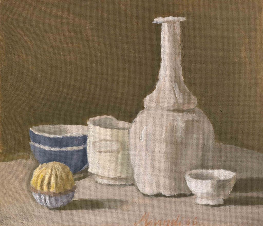
In this detail we see what is described as ‘a spherical toy’ standing directly in front of two blue bowls stacked on top of each other. The left edge of each element, the ‘toy’ and the ‘two bowls’, lies on the same vertical line, a precision of placement that reminds me of Vermeer’s decision to place a hand, or a flask at the bottom corner of a picture frame, or a book just in front of a chair leg. There is some harmony at work there which creates that longed-for quietude. In the same way, the white rim of the lower bowl is at the same level as the ‘label’ on the unevenly-topped white vessel, which I recognise from a painting in the Tate collection. Its shape has always slightly unnerved me. The curvature of this vessel is mapped subtly by a change in colour, left to right, from a cold, bluish white, through the lightest of pearly pinks, to a duller fawn-grey. The bluish white is probably the colour of the bowls bleeding into that of the vessel. Morandi painted wet on wet: he didn’t wait for one colour, or layer of paint, to dry before continuing with the next – a reminder that the painting, although careful, didn’t take so very long.

The modelling of the tall white vase – one of the leading actors in the subtle drama of Morandi’s career – reminds me of Vermeer’s painting of sleeves, with dabs and dashes of pure white functioning as highlights, puffing out from the shadows of the folds. This bottle has almost human proportions, with full hips – or a voluminous skirt – waisted below a billowing blouse, the torso gradually tapering towards an impossibly long, slim neck. One of the great skills for an artist to acquire is concision, and I suspect that Morandi didn’t paint the shadows at all. They appear to be cast – given that the light is coming from the left – by the body of the object itself, and also by the groove which forms the ‘waist’. But the colours of the shadows are so close to those of the background, I suspect that he was probably painting the vase on a mushroom-coloured ground, only reinforcing the precise shape of the vase with more strokes of the same colour later. The white highlights, indicating the individual swelling forms running vertically, certainly appear to be painted on top of a colour midway between the mushroom and the white. The painting of the highlights of these elements leaves their own shadows behind.

The small bowl in the right foreground is painted a far ‘higher’ white – or, more simply put, it is brighter. This helps to push it forward. The dark shadows underneath both it, and the vase behind it, separate them from the table top, making them just that little bit clearer than might, in ‘reality’, have been expected. This adds a slightly visionary status to the image. The same is true of the way in which the brilliant white edge at the left of the bowl stands out against the vase, which is itself slightly darker than perhaps it should be at that point. If you stare at something for long enough the image burns itself onto your retina and starts to become other-worldly. I think this happens often in Morandi’s paintings, with similar visual phenomena seen in his drawings and etchings as well – we’ll see several examples on Monday. The visual impact of that small, brightly lit bowl even appears to have a physical impact on the vase, the front right curve of which appears slightly dented.
The artist is always aware of the geometry of his forms: the shadow on the inside of the small white bowl is mapped out horizontally, whereas on the outside, to the right, another shadow scans down a diagonal from top right to bottom left, concentric to the right-hand edge of the form. The abstract values of these shadows – horizontal and diagonal – add to the artist’s pleasure in the composition, I think. His signature sits at the very bottom of the canvas, scanning the visible section of the base of the bottle. ‘Morandi 36’ is painted in thin, dark salmon paint, almost like an emanation – a thin wisp of ectoplasm – from the pale pink of the table. Or am I seeing things?

The white vessel, toy and vase reappear in one of Tate’s two paintings by Morandi (they also have two etchings). This Still Life was painted in 1946, ten years after the Magnani-Rocca painting (which is one from a collection of seventeen), and has a more ethereal, lighter mood. I think this is because the blue bowls have left the stage, their departure followed by the entrance of two more predominantly white forms. One, centrally placed in front of the vase, has a brick-red rim, the other, spiralling fuchsia stripes. The ‘toy’ stands downstage right again (at the front left, from our point of view), and notably, again, in front of another object, this time the unevenly-topped white vessel. And this is precisely where it stands – although on the other side of the image – in an etching in the V&A. As printmaking reverses appearances, though, the position is effectively the same. Dating to 1946, the same date as the second painting, this etching shows us how slowly the drama unfolds. In the intervening decade all that has happened is that the blue bowls have left the stage. The small white bowl is still there, but the ‘new’ forms have not yet entered: there can’t be long to go!

I both admire and respect Giorgio Morandi’s patience and skill. As a printmaker he was an autodidact, learning from old manuals, and relying on his own abilities, rather than using professional printing studios, as most printmakers would. Everything was etched and printed in the house on via Fondazza. His control of the medium was superb, and in 1930 he became Professor of Printmaking at the Accademia di Belle Arti, a position he held for 26 years. But then, I also admire and respect his constant search for stillness and calm. As reported in a superb review of the Estorick’s exhibition in The New European, Morandi once refused an invitation to exhibit his works because the curator’s flashy ideas made the artist worry that his paintings would be denied ‘that tiny degree of quiet that is vital for my work’. As ever, he was using the full force of understatement. I am always happy to spend the time to seek out that deafening ‘tiny degree of quiet’. I think it is something that would do us all the world of good amidst the wittering noises of the 21st century, the 24-hour news, social media, the traffic. Time for some slow looking, I think.

Wonderful! And thank you for writing about this often overlooked artist. A minor correction: the etching you show, ‘Grand natura morta circolare con bottiglia et tre oggetti’, was done in 1946, no 1942. It’s dated in the plate (faintly visible at lower left) and the same date is in the catalogue raisonne by Lamberto Vitale (plate 113).
Of interest as well: when the Italian government chose to honor Morandi with a postage stamp in 1990, they chose this etching rather than an oil painting (https://www.alamy.com/stock-photo-giorgio-morandi-july-20-1890-june-18-1964-49808156.html).
LikeLike
Thank you Mark – especially for the date correction. I thought I was following the V&A website, but I was being confused by a badly written sentence, which says, ‘This etching is one of four still lives set in tondos, which Morandi began in 1942.’ I presume they mean that the series of four was begun then… However, they do give the date ‘1946 (printed)’ which I think I assumed to mean that the plate had been etched prior to this print being drawn. And by the fact that some of Morandi’s etchings have dates on them which are not the date of the print – I have yet to check it out, but one, printed in 1928, has the date 1917. I presume it is the date of a painting on which the etching is based.
I’m not at all surprised that an etching was chosen for a postage stamp – at that scale the clarity of line would have been invaluable. I’m sure I remember seeing it, as I was living in Italy at the time!
LikeLike