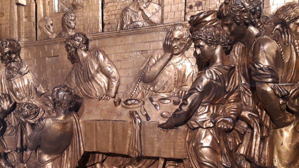
Donatello, The Feast of Herod, 1423-7. Baptismal Font, Battistero di San Giovanni Battista, Siena.
‘Please, sir, I want some more.’ OK, so it seems extremely unlikely that these words, said by Oliver Twist in the eponymous novel by Charles Dickens, and so often misquoted, nor indeed anything like them, would ever have been uttered at the Feast of Herod, an event that would have put even the hungriest off their food. And yet, I want to return to the Feast. This is, in part, because I want to return to the fantastic exhibition in Florence, Donatello: The Renaissance – and maybe I’ll find the time to do so. At least I will be able to revisit it in my mind’s eye when I deliver Part II of my introduction to this rich and inexhaustible display this coming Monday, 9 May at 6pm. Of course, even single works of art can be remarkably rewarding, and any painting or sculpture can benefit from repeated viewing: there is always more to see, and so there is always more to say. A month ago I looked at today’s gilded bronze relief, putting it in its context as part of the decoration of Siena’s Baptismal Font (154 – A Feast for the Eyes), and today I want to look at its immediate impact on local artists. As an aside, people have asked a number of questions about sculpture as a result of the Donatello exhibition, so I thought I would dedicate a series of four lectures to the subject, stretching across all the Mondays in June – but I’ll give you more information about them nearer the time. Before then I will talk about Women painting Still Life in the 17th Century on Monday 16 May. The talk will be entitled Forbidden Fruits, and is inspired by Colnaghi’s focussed display of the same title – click on one of the links for more information. To return to Donatello, I want to start by comparing his relief to its equivalent on the front of the font, The Baptism of Christ by Ghiberti (if you want the context, have a look back at A Feast for the Eyes).
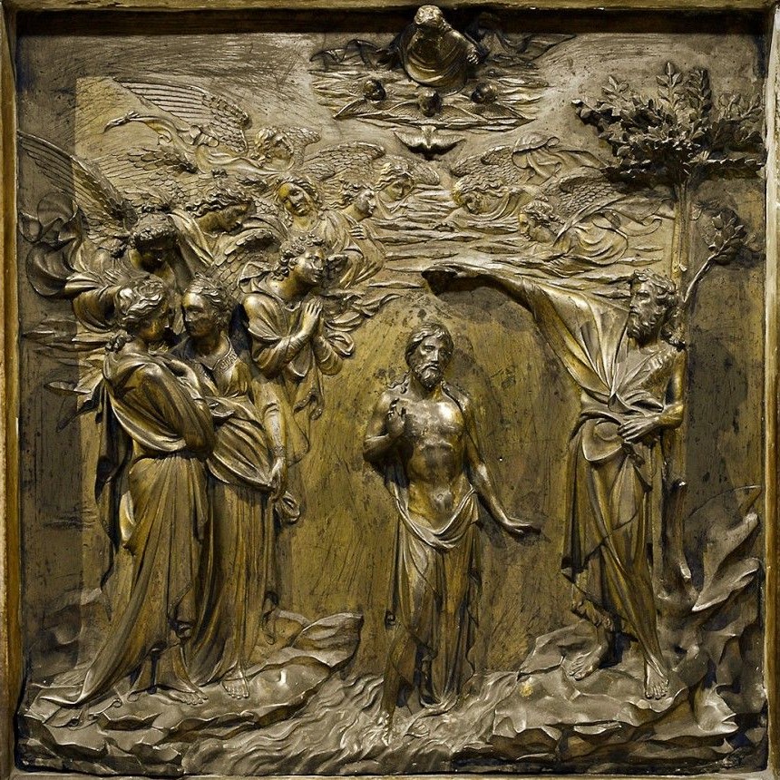
When you walk into the Baptistery, Ghiberti’s relief is the first that you see, and this is, of course, a deliberate choice. Any separate baptistery is effectively a church dedicated to St John the Baptist, and it is where the Sacrament of Baptism – recognised as a sacrament by Catholics and Protestants alike – was, and is, celebrated. Nowadays, of course (and for many centuries, it should be said) Baptism can take place in any church. St John the Baptist is overtly defined by this act, the ritual purification which Jesus undertook at the beginning of his mission. Not that he needed purification (and John was aware of this), but he was, in every way, acting as a role model. As this particular episode defines John’s role in God’s plan, it must be in the prime position on the font – the first thing we see. This also means that the decoration of the font had to be planned with the other ‘chapters’ of the story arranged appropriately around it. But this is all slightly beside the point for this post. It the style of the relief which really interests me today. Notice how all of the figures stand out in relief against a flat background. Jesus is in the centre, of course, where he is framed by John on the right, and two full-length, standing angels on the left. John’s elongated right arm stretching out over Jesus’ head is a curious throwback to gothic ideas for Ghiberti, an artist who had made so many strides into the Renaissance, but it is remarkably expressive, and may well relate to Sienese precedents: the late 13th century sculptures by Giovanni Pisano for the façade of Siena Cathedral, for example. The four figures I have mentioned are in the highest relief, together with the foreshortened, half-length figure of God the Father at the top of the panel. Below the Father is the Holy Spirit: it was at this point in the narrative that the bible says ‘And the Holy Ghost descended in a bodily shape like a dove upon him, and a voice came from heaven, which said, Thou art my beloved Son; in thee I am well pleased’ (Luke 3:22). In one verse we have (a) an explanation why artists usually depict the Holy Spirit as a dove and (b) the whole doctrine of the Holy Trinity. Joining the two full-length angels and John is a multitude of the heavenly host, arcing up and over Christ. The figures go into lower relief as they get higher up and further away. Nevertheless, however low the relief, the figures are still built up from a flat background. Let’s compare this technique with Donatello’s in The Feast of Herod (as so often, I hope these two images end up next to each other for you, it’s easier to see…).


In Ghiberti’s panel, the representation of the ‘sky’ is indistinguishable from the material nature of the gilded sheet of bronze from which it is made. I get the feeling that, if we were to imagine this as a ‘real’ space, and if we were to walk past Jesus into the depth of the landscape, we would soon bump into a featureless gold barrier. Donatello’s space doesn’t seem to be limited in the same way – it just keeps going. There is, eventually, a wall – through two sets of arches – but it is a wall which limits the progression of space, rather than the background of the sculpture. He is creating the same pictorial illusion as a painting does, and although Ghiberti hints at this idea with the ‘fading’ of the angels, his background remains a sheet of gilded bronze, rather than a brick wall at the back of the third room in. This difference may have resulted from the practical technique used: rather than building the image up from a flat background, Donatello appears to have dug into the depth of the wax, or clay, from which his original model would have been made – almost a carver’s technique, rather than a modeller’s.
Ghiberti’s relief had been commissioned in 1417, and he was supposed to have finished it, together with the next relief in the sequence (showing the arrest of the Baptist) within 20 months. However, they weren’t finished until 1427, the same year in which Donatello submitted his relief. Meanwhile, Ghiberti had started work on his second set of doors for the Florentine Baptistery. Compare these two panels, one from the first set of doors – the ‘North Doors’ (made between 1403-24) – and one from the second, the so-called ‘Gates of Paradise’ (1425-52). The format changed, and so did the style.
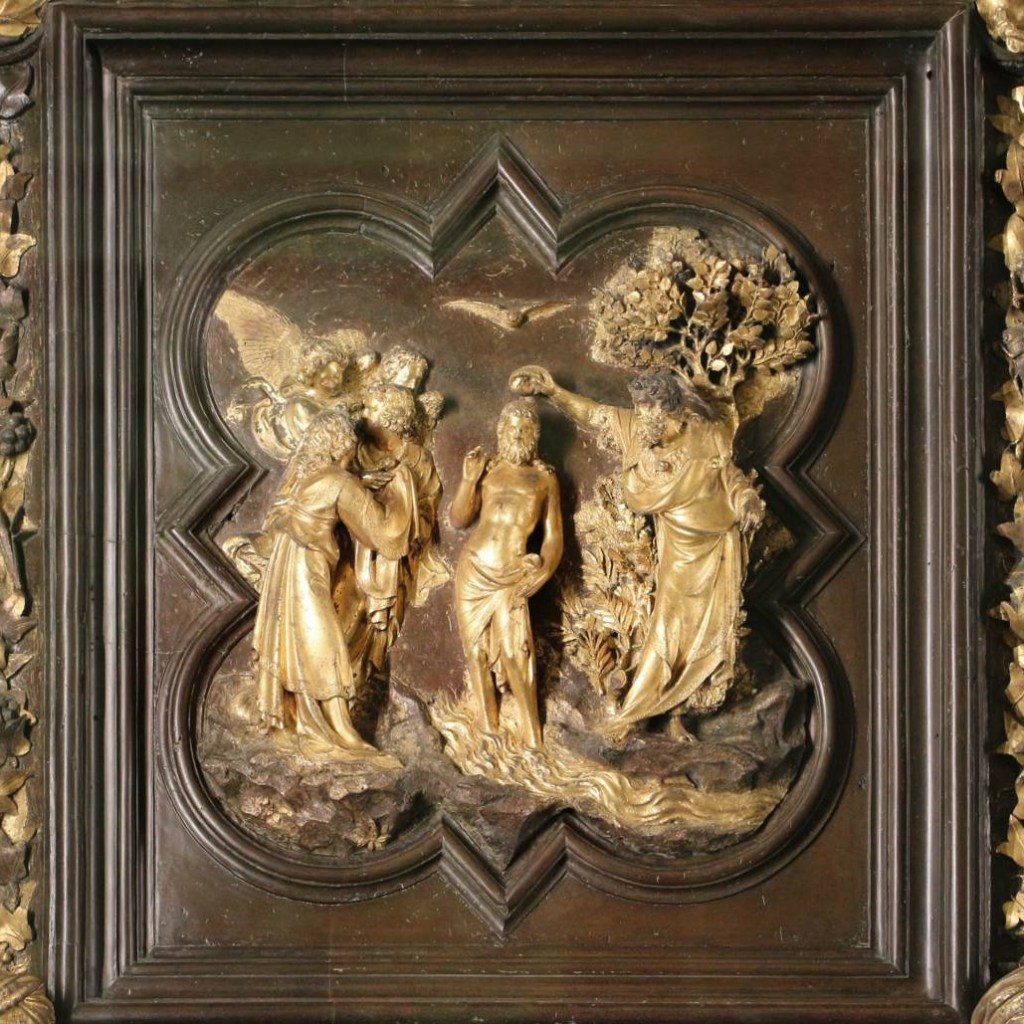

Although the second example is still based on a flat background, it shows a far greater interest in painterly effects and the recession of space defined by linear perspective. Admittedly not all of the panels from the Gates of Paradise use linear perspective, but overall their interest in spatial illusion is far greater, and, to a large degree, I think this is because Ghiberti was influenced by the work of his former pupil (Donatello is documented in Ghiberti’s workshop from 1403 – 1407, at the beginning of the work on the North Doors). The change in format, from quatrefoils to rectangular, painterly fields, was also influenced by the experience in Siena – the overall design of the font being a collaboration, it would seem, between Ghiberti and Jacopo della Quercia, with the latter taking the lead. So let’s compare Donatello’s Feast of Herod with Jacopo della Quercia’s Annunciation to Zacharias. This is the story which starts the sequence, and is found at the back of the font – it is next to Donatello’s relief, which marks the end of this abbreviated biography.


Jacopo’s relief was modelled and cast in 1428-29 – the years immediately after Donatello’s was completed – and the influence is clear. You’ll have to take it on trust for now, but his other relief sculptures place mid-relief figures against a plain background. The insistent brickwork of the walls should be enough to show that he was keen to capture something of the remarkable originality of Donatello’s creation, and as if that isn’t enough, look at the two figures in profile on the left, visible in the adjacent room through the archway. Even if they are not exactly a quotation, they are certainly an interpretation of the figures seen through the arches on the left of the Feast. Jacopo even tries trimming the edges of his figures, as if they are disappearing into the wings. However, he hasn’t quite got it, and doesn’t commit to the idea as fully as Donatello – and he certainly doesn’t understand perspective. The projecting arch, which frames the altar, seems to be folded back, as if it were made of jointed cardboard and someone has pushed the front edge of the structure to the right, a flat-pack temple that could be collapsed into one plane. Don’t get me wrong – I love Jacopo della Quercia’s work, and when he’s doing his own thing (look up the Tomb of Ilaria del Carretto, for example, or the reliefs around the portal of San Petronio in Bologna) he is quite fantastic. But he’s not Donatello. Another person who wasn’t Donatello is Giovanni di Paolo, one of Siena’s leading painters.
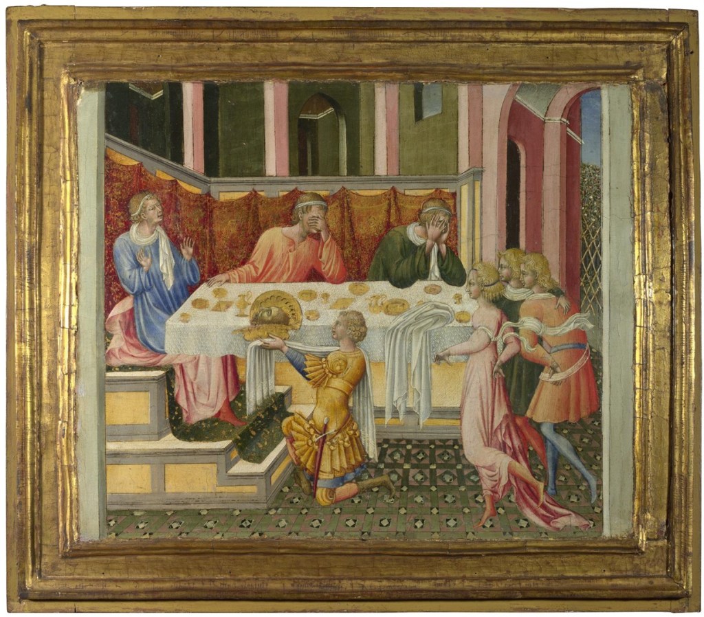
His Feast of Herod – one of four predella panels illustrating the Life of St John the Baptist painted in 1454 and now in the National Gallery in London – is so obviously inspired by Donatello’s relief that his failure to get anywhere close to it is almost inspiring. It has a naïve charm which makes it a wonder to behold. Compare and contrast!

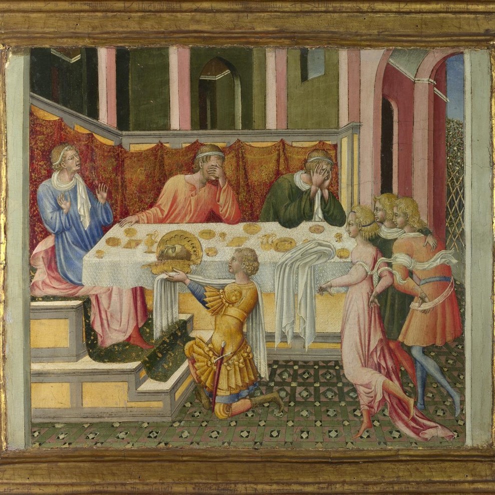
Although excess ‘staffage’ has been thinned out, almost all the main characters have equivalents: Herod, the kneeling servant, one of the people behind the table, Salome and the two men behind her. The last pair is the most interesting feature for two reasons, I think. First, it’s not immediately clear in the Donatello that there are two men, until you notice the hand on the nearer man’s shoulder, and then pick out he headdress above Salome’s own head (you’ll have to zoom in, or look at the details below). Paolo has made it more obvious that there are two men, the one at the back with his arm around the other, and both enjoying the view. The second reason, and perhaps even more intriguing, is that he has also quoted from Jacopo. The nearer man, in the Donatello, has his hand on his hip. Jacopo’s equivalent figure, framing the right-hand side of the relief of the Annunciation to Zacharias, has his hand tucked into his belt. It is this detail that Paolo has picked up on. Paolo has noticed the tiles of the floor – but cannot reproduce them – and the spaces in the background – with which he struggles even more. On the right-hand side the opening up of the doorway into a garden – not based on Donatello – takes on an almost Escher-like impossibility. He has noticed the way that Donatello frames the narrative, with figures actively leaving the space on both left and right, and even though he doesn’t have the same transitional figures he clearly wants to hang onto this idea of framing, and has painted two vertical grey strips, like the proscenium arch in a theatre. It would be possible for the characters to exit stage left or right, even if none of them is currently doing so. But the borrowing that always delights me the most is the cloth hanging over the edge of the table. Donatello does it, Paolo likes it and wants to do it too, but gives it form without function. He really hasn’t understood why the cloth is there: not as a serviette, or anything to do with the feast, really, but as a marker of the perspective, leading our eyes back towards the vanishing point. That’s what it represents for Donatello, who makes the section of the cloth lying on the table inflect to the left accordingly. Paolo makes it go to the right, and misses the point entirely. It’s hardly surprising that the man at the back of the table behind it has got his head in his hands. Again, don’t get me wrong: it’s not bad art, it’s a very different thing. OK, so it’s not great art either, but it is entirely delightful – and an important example of the transmission of ideas.
Somehow, Donatello only managed to make great works of art, and there is a lot which I haven’t spoken about yet currently on view in Florence – so do join me for Donatello: The Renaissance II on Monday!


Thank you for another eye-opener. I’ve just been to the Museo del Duomo, and marvelled at how infinitely more sophisticated Ghiberti’s Gates of Paradise are than the North Doors (admittedly 20 years earlier). Now I understand why. PS would love your view on the three Michelangelo Pietas currently grouped there.
LikeLike
So true – the ‘Gates of Paradise’ are so much more sophisticated than the North Doors – and yet I often feel they lack the charm of the earlier set.
As for the Pietas – well, that would be the subject of a whole talk, probably!
LikeLike