
Gerard ter Borch, Woman Writing a Letter, 1655. Mauritshuis, The Hague.
In her beautifully written and wonderfully readable book Thunderclap, Laura Cumming leads us through her life with art and her experience of the works of the brilliant, but ill-fated Carel Fabritius. As she takes us on this journey we also encounter a number of other artists who mean a lot to her, and it is some of these that I will talk about this Monday, 19 August, at 6pm. Thunderclap: the ‘other’ artists will look at Rembrandt, Cuyp, ter Borch and Coorte – some of whom I have known for years, others who have become favourites more recently, thanks, in one case, to Cumming’s writing. I will write about one of them today (although without the same ease, I fear). The week after, I will introduce the National Gallery’s Hockney and Piero, and then, in September, it’s ‘back to school’. I thought it was time for a revision course on Who’s Who in Heaven? There are two talks: part 1, on 2 September is entitled Around the Queen, while part 2, two weeks later, is Behind the King. You can find more information via those links, or on the diary. And if anyone is interested in New Music, and just happens to be free next week, I will be narrating a couple of pieces in an informal, free concert at one of the city churches, St Vedast, Foster Lane, on Wednesday 21 August at 6.30pm: there’s no booking, so just drop in and say ‘hello’ afterwards!

A woman sits writing a letter. It’s a familiar idea, especially in Dutch art: Vermeer, among others, painted the subject more than once. But this is a first – the first in a series of women writing letters painted by Gerard ter Borch, and, it is said, the first by any Dutch artist. What was the fascination? We’ll get there. But first, let’s look. Unlike some other paintings of this subject that I know, there is no sense of urgency, worry or threat. It is calm, and relaxed, and the woman appears to be focussed: intent on her task and in control. There is a warmth, created by a variety of reds. The background is dominated by a deep red canopy bed (somewhere on its website the Mauritshuis describes this as a four poster, but I can’t see any evidence of any posts). A different shade – brick red? – can be seen in the carpet on the table, and the woman is sitting on a brilliant vermillion cushion. She herself wears a bodice which is a light red or pink, maybe salmon. The other colours blend in with these reds – the dark brown of the wall, and the lighter brown of the table on which the woman is resting.

The top 40% of the painting is given over to the ‘background’ – the dark grey-brown wall and the canopy hanging in front of it. There is also a rectilinear form at the top, just to the left of the canopy, which in the picture as a whole, if not this detail, reads as a painting, indistinct in the darkness at the back of the room. The canopy itself appears to be circular – although it could be oval – and hangs from the ceiling. At the top there is a red fabric sphere with a gold trim, and a black line rises above it out of the painting – a rope, or chord, which must be attached to the ceiling. To the right we can see the shadow of this sphere, and of the chord: the length of the shadow implies that the ceiling is some way above the picture frame: it is a large room, which tells us – as if the bed and the clothing didn’t – that this is a wealthy woman. Below the sphere a circular fringe crowns the conical top of the canopy. At the bottom of the cone the fabric hangs over a circular loop, with another fringe, forming a sort of pelmet. The curtains of the canopy are just open at the front. They are also trimmed with gold, and slightly parted to reveal a dark interior.

At the bottom of the painting is the table, which would normally have been completely covered by the carpet. Not only would this help to display the carpet – an expensive item of interior decoration – but it would also keep the table clean and free of dust for times when it is used. This is one of those times, and the carpet has been pushed back to provide a firm, flat surface on which to write. People often ask – when looking at a Vermeer, in particular – why is the carpet pushed back? This is why – so that part, at least, of the table can be used. And also, because it looks more interesting. There might be other implications, as well: something is not quite as ordered as it should be, perhaps. The table itself is elegantly carved but not overly elaborate. The flat surface is made up of two leaves: if this were a contemporary table I would say that it could be extended, but I’m not sure if that’s applicable to the 17th century. The leg that we can see is topped with a square section, fluted like a pilaster, and this is is supported by a round leg. It stands directly beneath the woman’s torso, visually (and perhaps, by implication morally) acting as a firm support. She holds her quill in her right hand, with her left lying on the bottom of the paper to keep it steady. Next to her writing hand is an open pewter ink well, and next to that is another pot, the function of which is not clear – perhaps powder, or sand, to dry the ink? I confess I don’t know the technicalities of 17th Century Dutch letter writing. The brilliant cushion is a surprising highlight – by far the brightest and most intense hue in the painting, which might suggest that there is more to this woman than meets the eye, something bold and daring. The vivid colouration is enhanced by the contrast with her dark skirt – which, at the other end of the visual spectrum – is quite possibly the darkest thing depicted, apart, perhaps, from the shadows. The contrast also serves to show us how caught up in her letter the woman is, as it helps us to see that she is leaning forward to write. The skirt flows back behind her before being tucked firmly under her thighs, which must be resting on the forward edge of the cushion.
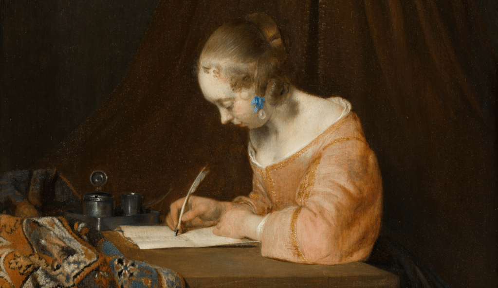
The focus of the woman is complete. If we follow her gaze as she looks down at her writing, the diagonal from her eye to the page passes through the tip of her nose, the feathered end of the quill and then down to the black, ink-stained tip. The light from the window – which must be large, and behind our left shoulders – lights up both the letter and the woman’s flesh, making them equivalent in colour and intensity. Her forehead, the seat of memory, reason, and intellect, is the most brilliantly illuminated part of the painting. Her neck and shoulder are also bright, as is the pure white chemise which ruffles up underneath the well-tailored bodice, perfectly fitted to her form. Particularly brilliant, and even a little sensuous, is a dimple of shadow where the neckline passes around her right shoulder, the result of the right arm being brought forward to write. It marks the transition from the shoulder to the top of her breast, and carries the suggestion that the bodice might even fall off the shoulder. The slightly parted curtains disappear behind the back of her neck, the dark shadows contrasting with the brightly illuminated flesh.

The paper has already been folded, and yet she is still writing. I would assume you would write on a flat piece of paper, and fold it when you were finished. It has been suggested that she is correcting something, having noticed a mistake. Or she could be adding something, to make a point. She has only written on the top half of this page – although there is another sheet underneath. I particularly love the way in which the corner of the paper to our right curves up. A shadow is cast along the full length of the page, but this curl makes it more visible. It also allows us to see the shadowy underside of the paper, not to mention the thinnest line of its beautifully lit edge. While many of the forms are evocatively vague, in this case Ter Borch has shown us how skilled he was: he has painted the thickness of a sheet of paper.
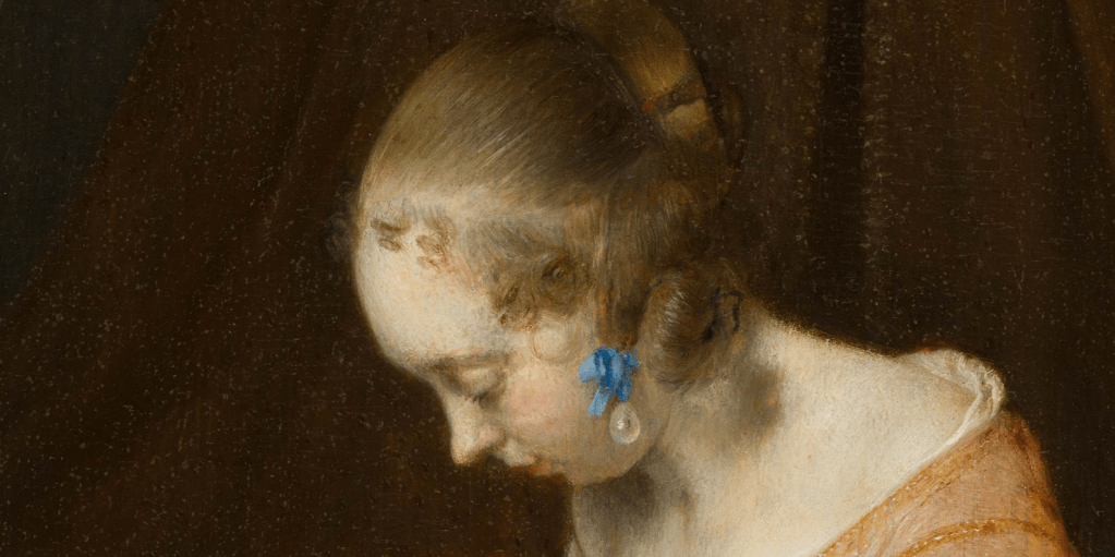
The woman’s hair is clean and lustrous. It has been thoroughly combed and pulled back into a number of bunches. One is wound round the back of her head, while another – presumably two others, one on each side – is arranged at the side of her head, casting a shadow on her neck. Ringlets, formed from strands of hair which are too short to tie back, frame her forehead. And she has a pearl, but it is not an earring: it is hanging from a sky-blue ribbon. With the exception of some of the patterning in the rug, this is the only touch of blue in an otherwise red-brown painting. And rather than her ear, it is attached to one of the locks of her hair. You can see the strand being pulled down vertically by its weight. It’s not an earring – but then, it’s probably not a pearl. A pearl that size would have cost an enormous sum, well beyond the reach of an artist. It’s probably an imitation pearl: the Venetians were highly specialised at making them from glass. The same is true for The Girl with the ‘Pearl’ Earring, which currently hangs next to this painting in the Mauritshuis, a clever nod by the curators to the connections between these two works and their artists.

When we look back at the painting as a whole, it now seems ever clearer to me that the table leg is a support for the woman. Her left arm, on which she is leaning, rests on the table above it, and it is lined up so precisely with her torso. However, the opening of the canopy is slightly to the right of this vertical axis, which feels somewhat disjointed. The gap widens slightly as it falls from behind the pelmet down to the woman’s brilliantly illuminated back, and, if anything, lines up with the dark shadow to the right of the table leg, and the darkest of the woman’s skirts. The cushion pulls our eye in that direction, framing the darkness, and if I’m right that its glowing red suggests something unexpected about this woman, then maybe that would give us a clue about the content of her letter. But it can only be a clue – there are no legible words, no real evidence. As so often, our interest is aroused by the very lack of certainty. However, she is almost certainly writing about love – people in paintings almost always are.
This was the fascination behind women writing letters – or reading letters – or men writing letters, because women would read them (there’s a beautiful pendant pair of this last coupling by Gabriel Metsu in the National Gallery of Ireland). Young women of a certain class were not allowed out of the house unchaperoned, but were kept safe in their gilded cages. Only specified men could come calling. And yet letters could travel unobserved, especially if there was a pliable servant, or maid, or a window that could open. There were whole books containing model letters – what to write to [insert name here] if you wanted to tell him/her about [see list of concerns in index]. As ever, Shakespeare sums up the problem. In As You Like It, Rosalind is in disguise as Ganymede, and has promised to cure Orlando of his love for Rosalind by getting him to woo Ganymede, who is ‘pretending’ that he is Rosalind (…and the woke generation think they’re on to something new…). In Act IV, Scene I, Orlando, frustrated with Ganymede running rings around him (and Shakespeare is often aware that a lot of the women are smarter than a lot of the men), starts to despair, with the phrase, ‘O, but she is wise’. To which Rosalind (as Ganymede) replies, ‘Or else she [i.e. ‘I’] could not have the wit to do this’. He (she) continues:
The wiser, that waywarder. Make the doors upon a woman's wit, and it will out at the casement. Shut that, and 'twill out at the keyhole. Stop that, 'twill fly with the smoke out at the chimney.
Young women were not allowed out of the house unaccompanied – but letters could ‘out at the casement’ (i.e. go out the window), be slid under the door, or simply be carried to their destination by a maid. The more I look at this painting, the more the bed becomes a looming presence, with the spreading canopy linking the rucked-up carpet and the scarlet cushion, while the gradually parting curtains suggest where the story is going. Which makes me wonder about the model for this painting, and what she thought of it all. And the reason why I wonder is that, unlike so many others, we do know who she was: Gesina ter Borch, the artist’s half-sister, who was also an artist. I’ll show you some more pictures of her – and by her – on Monday.

Another lovely exploration.
Thank you.
LikeLike
Thank you, Michael!
LikeLike
About the bed….We are probably all familiar with the more common (and maybe more economical) 17 century Dutch bed box or closet bed. Perhaps any bed that contained a large fabric cover like the one in this painting was, by default, a 4 poster bed?
LikeLike
Dear Dr Stemp,
Many thanks for another wonderful talk yesterday and for your fascinating blog.
I was very taken with your revelation about your own ”Thunderclap” experience when you first saw our Caravaggio ”The Taking of Christ” at our National Gallery in Dublin. Thank you so much for telling us about that.
Last night I watched a great programme on American PBS about Marianne Stone, the 19th-century biologist and botanical artist. Her gallery in Kew has been added to my bucket list!
I wonder if you have already written a blog about her? Or, have you already given a talk? If you have, I have missed both of them. If you have not, would you consider treating us to a blog or talk about this amazing woman?
Very best wishes and thank you again for everything,
Eithne White.
LikeLike
Thank you, Eithne – I’m glad you enjoyed it. I wish I could get to Belfast to see the ‘Betrayal’ alongside ‘Supper at Emmaus’.
I am aware of Marianne Stone, and have visited the gallery at Kew. I still don’t know much about her though, and have certainly never talked about her. I’m not sure that I will, to be honest, but you never know!
LikeLike