Ambrogio Lorenzetti, Madonna del Latte, about 1325. Museo Diocesano, Siena.
I will complete my series of talks relating to the National Gallery’s truly glorious exhibition Siena: The Rise of Painting this Monday, 31 March with Ambrogio Lorenzetti. I always thought I knew his work, but there is so much more than I imagined – although his masterpiece, The Allegory of Good and Bad Government in the Palazzo Pubblico, does loom large: we will look at it in depth on Monday. However, today I want to have a look at a painting which is in the exhibition, the Madonna del Latte, bearing in mind that this Tuesday (25 March) was the Feast of the Annunciation. The painting belongs to the Museo Diocesano in Siena, a museum I have never visited. However, I am hoping to get there next year as part of a visit to Siena with Artemisia. We will also go on a daytrip to Massa Marittima to see the painting I posted last week. We’re still very much in the planning stages, but if you are interested at all, contact Charlie Winton via the Artemisia website and she will get in touch when the plans are more secure.
If you’ve missed my talks in this series, I am repeating them in an edited form for ARTscapades, combining my five talks into a two-part short course, Four Sienese Artists. I delivered part one, about Duccio and Pietro Lorenzetti, on Tuesday, but it was recorded and will be available on catch up for a month. Part two, Simone Martini and Ambrogio Lorenzetti, will follow next Tuesday, 1 April – you can book them separately via those links.
After Siena, April will be taken up with talks based on exhibitions in London, introducing shows at The Courtauld, the National Portrait Gallery, and the Guildhall Art Gallery. They are, respectively, Goya to Impressionism (7 April), Edvard Munch Portraits (21 April), and Evelyn de Morgan: The Modern Painter in Victorian London (28 April). I plan to dedicate May to German art – but more news about that soon. Of course, you can always check on the diary! But for now, back to Ambrogio Lorenzetti.

The painting is called the Madonna del Latte – a literal translation would be ‘Madonna of the Milk’ – i.e. the breastfeeding Madonna. It is a subject that was relatively common in medieval and renaissance art, stressing the humanity of the holy mother and child, something which is also clear from the child wriggling in its mother’s firm grasp, and distracted from feeding by something over our left shoulders. At the same time as making the figures entirely human, Lorenzetti assures us of their sanctity through the prominent inclusion of richly tooled haloes. These touch the gabled frame at top left and middle right, ensuring that we focus on the couple and nothing else. The composition is beautifully rigorous, with Mary leaning to our left, so that her elbow (and, almost, Christ’s right toes) are effectively touching the frame, while the hem of her cloak, which hangs down from her left hand, leads down to the bottom right corner. The flat gold background is delicately tooled around its edges, and is surrounded by a red-brown painted frame. The base of the outer, wooden frame of the triangular gable is slightly narrower than the rectangular base on which it rests. It forms an equilateral triangle, triggering thoughts of the Holy Trinity: Father, Son, and Holy Spirit, and the realisation that God the Son is now also a man, sprawling in his mother’s arms. Whether or not the triangular form of the gable does refer to the Trinity, its combination with the lower, rectangular shape seems to imply something more about this painting, an idea confirmed by comparison with Ambrogio Lorenzetti’s earliest known work, the Madonna di Vico l’Abate, painted in 1319 and currently in the Museo di Casciano in Val di Pesa, about 19km outside of Florence.

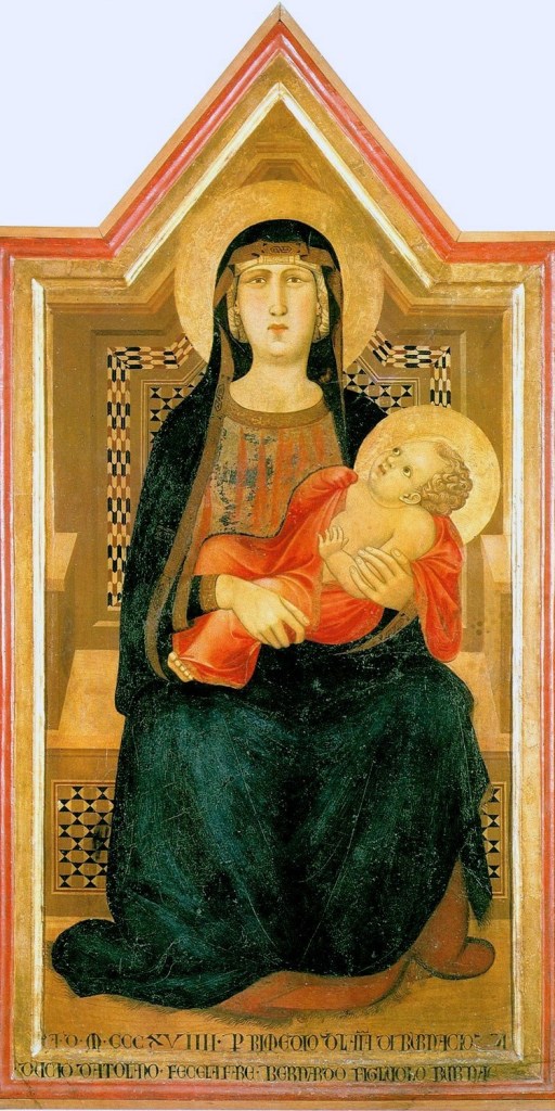
The rigid and sculptural qualities of the earlier Madonna (on the right) echo not only the paintings of Giotto, but also the sculptures of Arnolfo di Cambio, reminding us that Ambrogio, like his elder brother Pietro, spent a considerable time in Florence in his early years. That the later work is more fluid, and lyrical, suggests a return to the ethos of Siena, even if we don’t know the original location of the Madonna del Latte. However, by this stage he had been painting frescoes alongside Pietro in the Chapter House of San Francesco in Siena, which we will look at on Monday. The main point of this comparison, though, is not necessarily to point out Ambrogio’s stylistic development, but to explain the shape of the frame. The earlier work, named after the town for which it was painted, has a similar shape, although the triangular gable is narrower in relation to the rectangular section below. The shape of the painting is defined by the shape of the throne on which Mary is seated. Its arms are depicted in an early form of perspective, with the result that the nearer, splayed ends are cut off by the frame of the painting. Nevertheless, the inlaid panel behind Mary’s legs fits the width of the picture surface perfectly, while the equivalent panel behind her back is further away, and so appears narrower, allowing it space for a flat, fictive frame of its own. This upper inlaid panel is equivalent to the flat gold background of the Madonna del Latte, while the framing element, painted as if made of a pale wood, is replaced by the red-brown frame in today’s painting. When we look at the panel of the Madonna del Latte what we see is actually the throne itself, with Mary and Jesus painted in front of it. By doing this, Ambrogio presents mother and child with an unparalleled immediacy – not unlike the image of Christ in his brother Pietro’s Cut-out Crucifix.

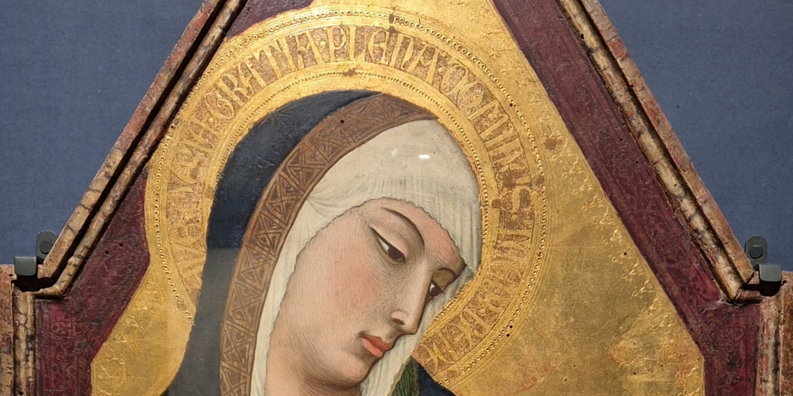
Mary’s apparent proximity is enhanced by the layering of forms: her halo is in front of the painted frame, and her head is in front of the halo, thus pushing her closer to us. I can’t be certain how the red-brown frame was made, and I don’t have access to any technical reports, but if you look in the corners where the halo touches the wooden frame, there are small patches where the colouring seems to have flaked off, revealing gold. I am fairly sure that the painted frame is a rich, reddish, translucent paint applied over tooled gold leaf – but don’t quote me on that! You can see the gold through the paint, which creates a slightly unusual effect, almost like tooled and gilded leather. The asymmetry of the placement of Mary’s head – with the halo covering the painted frame on the left, but clear of the delicate tooling along the edge of the flat gold background on the right – emphasizes the way she is leaning back to get a better look at her son. Her gaze is incredibly subtle, but I can’t help seeing a contained, inner radiance, a subtle look of profound love combined with awe, and the slightest hint of a smile on her pink lips.
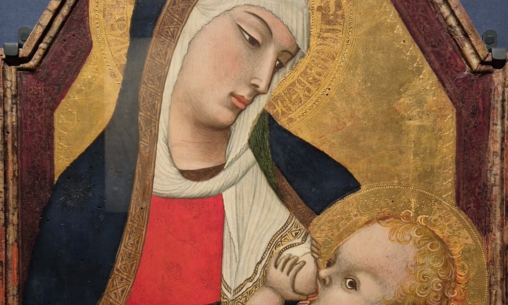
Jesus does not return this gaze, but looks out beyond us, his tiny hands firmly clasping Mary’s breast. Admittedly Ambrogio wins no prizes for anatomy here, but there is the possibility that he was trying not to be too explicit – or naturalistic. The Madonna Lactans – the Latin term for the genre of breastfeeding Madonnas – fell out of popularity in the second half of the 16th Century, a victim to the Counter Reformation, which considered it ‘inappropriate’ – in a somewhat 21st century way. The decorated pattern at the end of Mary’s white veil curves around the breast, and the veil hangs down in narrow, wrinkled folds, implying that it is made of the thinnest and most delicate of fabrics. Ripples of the hem frame Mary’s face, and the veil is twisted, rope-like, as it curves across her chest and under her blue cloak, which appears to be turned back near her left shoulder to reveal a green lining.

The same green appears as a belt around Mary’s waist, gathering her dress which is a bright, un-patterned red. Jesus has got himself into one of those awkward positions in which babies excel, wriggling so much that Mary looks in danger of losing her grasp. His left foot is lifted, and rests in the crook of her right elbow, while the right foot hangs down by her side. Ambrogio has tried to emulate the folds of flesh in a chubby baby’s limbs and stomach with curving lines which I suspect were more subtle, and less evident, when the painting was first completed. Their curves clearly show us the three-dimensional forms of his body. I am intrigued by the pink swaddling cloth in which Jesus is wrapped. It is not the usual white, which so often looks forward to the shroud, and I am not aware of an others of this colour (although it could be that I have simply not registered them). It may relate to the red loin cloths with which Jesus was painted in Crucifixions of the late 13th Century (and also, later, by Raphael, in the Mond Crucifixion), a reference to Christ’s royalty – but that might be an interpretive step too far. What is clear is that Ambrogio has thought very carefully about the way it hangs: notice the folds that are pinched up by Mary’s right forefinger, and the sagging of the drapery behind the child’s back, held up by the middle finger.

The same is true for her left hand, where her fourth and fifth fingers pull up curves of drapery, marked by little pools of shadow ringed by highlights above. The flat back of her hand is strongly marked by shadow, and separated from the light on her fingers by the knuckles. The pink cloth curves over the thumb and forefinger, falling down to the left and right, hemmed by the thinnest of black lines. The gold hem of her cloak cuts between the pink cloth and the back of her hand with an almost abstract geometry. This photographic detail was taken from a different file to the others, and dates from before the recent conservation. It still shows signs of woodworm in the panel – the tiny black holes in Jesus’s forehead, for example. But it also shows clearly the delicacy of the tooling of the halo, a splayed cross-shape marked out to remind us that this is indeed Christ, created with a variety of tools. There are smaller and larger rings, dots, and a stippling between the shapes in the one arm of the ‘cross’ that we can see clearly. The leaf-like forms were probably ‘drawn’ into the gold leaf with a stylus after the gold had been burnished. The rings would have been made then too, using a tiny tube tapped onto the gold with a hammer. After this, a thin stylus would have been repeatedly pressed onto the gold to make the stippling which fills the gaps in between.
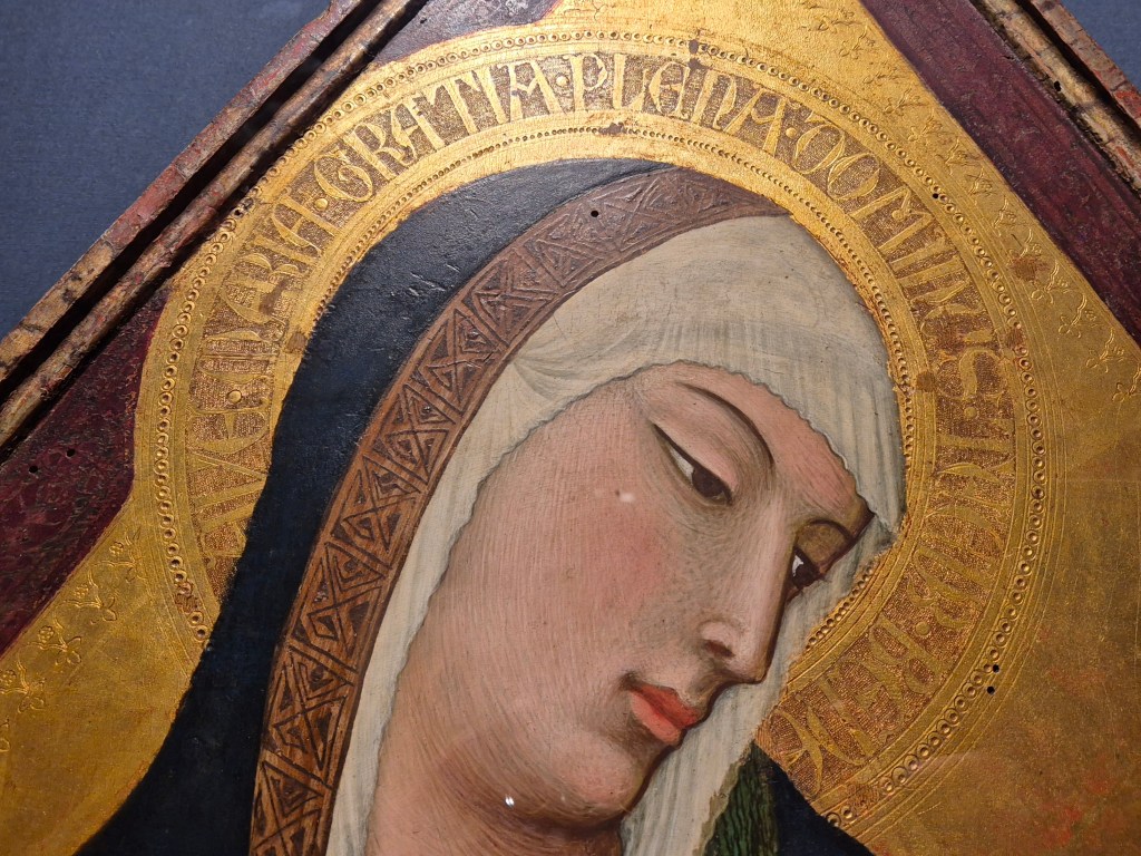
I took this detail at an angle from below in order to catch the reflection of the light. Up close you can see how egg tempera is applied, with small, unblended brush strokes in different colours. From a distance they combine to create the overall effect. The brush strokes themselves help to define the form of the jaw and chin, modelling the contours, and creating shadows as more dark strokes are introduced. The thicker black lines along the nose and the profile cut the face away from the veil which hangs behind, thus making the head look more sculptural. The veil itself hangs in thin folds in front of Mary’s forehead, and faintly reveals the hair underneath. But the point of the photograph was really to look at the intricacy of the tooling. The halo is defined by the thinnest of circular guidelines, created with a sharp stylus and a pair of compasses. There are eight of these, and going in from the outside, between the third and fourth is a circle of rings containing dots. Between the fifth and a sixth guidelines, letters were incised in the burnished gold and surrounded by stippling. Further in still is another circle of dots, but without the rings. This is hidden at a point in front of Mary’s forehead by the veil, enhancing the sense that all this is real and solid. As for the letters, they can be read more easily where the light is reflecting from the gold, but if you move your head as you look at the painting itself you can read quite easily the words of the angelic salutation:
AVE · MARIA · GRATIA · PLENA · DOMINUS · TECUM · BENE
‘Hail Mary, full of grace, the Lord is with thee’. The ‘BENE’ is cut off, but is the beginning of the next phrase ‘benedicta tu in mulieribus’ – ‘blessed are you among women’. This is a quotation from Luke 1:28 in the Vulgate, the official Roman Catholic version of the bible. In this context, ‘grace’ refers to acceptance and goodwill, regardless of whether or not it is deserved. Another term would be ‘favour’ – which is why the King James Version renders the phrase as ‘Hail, thou that art highly favoured, the Lord is with thee: blessed art thou among women’ – Mary’s name is not included in either translation, but it becomes an essential part of the one of Christianity’s most essential prayers – the ‘Ave Maria’, or ‘Hail Mary’.
Ambrogio’s inclusion of this prayer in Mary’s halo is a first, and the combination of word and image would become one of his areas of expertise. We will certainly see it as vital to the interpretation of the Allegory of Good and Bad Government on Monday. For now, though, the inscription in the halo is a fitting reminder that the good news brought to the Virgin on the Feast of the Annunciation – celebrated on Tuesday – was fulfilled by the birth of Christ. Full of grace, Mary now holds Salvation in her arms.


Please remove Peggy King from your mailing list as sadly she has recently passed away
thank you
Anthony [husband]
>
LikeLike
Anthony, I am so sorry to hear your news. I will do that immediately,
Thinking of you,
Richard
LikeLike