
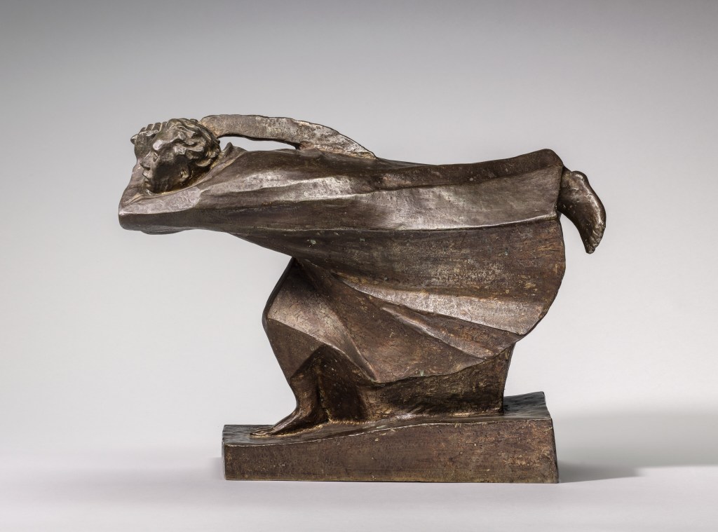
Ernst Barlach, The Avenger, 1922. Ernst Barlach Haus, Hamburg.
I can’t remember when I fell in love with the work of Ernst Barlach, about whom I will be talking on Monday 26 May. It could have been soon after the opening of Tate Modern, 25 years ago, when I included a version of today’s work in my schools’ workshops, but I’m sure he was familiar even then. On Monday, as well as Barlach, I want to sneak in the drawings currently on show at The Courtauld in the small exhibition With Graphic Intent (which is open until 22 June) as these will give us different ideas about German Expressionism. Given that we tend to look at, and talk about, paintings far more than sculptures, as well as writing about one of Barlach’s most famous works today, I also want to give you some hints about how to look at sculpture in general. But we’ll get to that shortly.
Monday’s talk will conclude my May series about German art, which I will follow with three talks related to Paris in different ways. On 2 June I will explore the remarkable mind of Victor Hugo, whose drawings are currently exhibited in the Royal Academy. As the title of the exhibition suggests, they truly are Astonishing Things – I haven’t seen anything quite like them, and many are 60 years, or even 100 years before their time. And yes, this week I have actually included the right link for the talk! Having discussed someone from Paris, I will move on to an exhibition which is currently in Paris, a wonderful and rich exploration of the works of Artemisia Gentileschi, whom the Jacquemart-André Museum describes as the Heroïne de l’art. That will be on 16 June. The day after, for the first time in seven or eight years, I will give a free lunchtime talk at the National Gallery, Seeing the Light: the Art of Looking in and around Duccio’s ‘Maestà’. It would be great if you could all be there (apologies to all those of you who are not in London). However, the following week (23 June) I will be Revisiting Cimabue – looking back before Duccio, and to an exhibition at the Louvre which has sadly already closed. Thereafter my last three talks this summer will explore the new hang of the National Gallery’s Sainsbury wing – but keep your eye on the diary for more information about them.
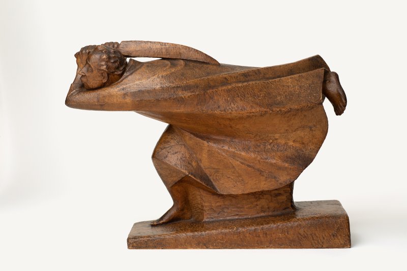
When looking at paintings we tend to think about colour and composition, tone (light and dark), mood and meaning. Or rather, unless it is an abstract painting, we start by identifying what is depicted – the people, places and things. Looking at sculpture is no different. In this case, a man is running, and running at speed. This sense of movement is created in a number of ways. His right leg is bent, with the foot resting on the ground. As far as we can tell, the left leg is straight, and held out directly behind: either he is running, or has a remarkable sense of balance. Admittedly the human body is usually more upright when running, maybe leaning forward a little, but not on a complete horizontal like this. Clearly, however recognisable the forms, this is not an entirely naturalistic depiction. It is stylised, with the stylisation used to express a mood or sensation. This figure is so entirely intent on moving forwards that this very intent, ‘to move forward,’ has effectively become personified. Not only is the left leg trailing, but the left elbow projects forward, pointing the way. The chin and the nose also jut forward. The left hand is held behind the head (from our point of view), and the fingers of the right hand can just be seen clasping the handle of a long, curving knife, or sword – a sabre, or scimitar, maybe. This trails behind the head, as if it has been left behind in the impetus to move forward. The figure is wearing a long robe which also flies out behind him, as if blown backwards by the slipstream caused by the rapid movement. Two long, continuous folds develop from the arm and continue, almost parallel, to end above the heel of the raised left foot. Another emerges from below the arm and trails back to a kink in the hem of the robe. Other, shorter folds flow back from the hip and the knee, the latter fold joining the hem which then continues back before curving up towards the foot. The ground is represented by a sloping wedge, which itself adds to the impetus of the figure’s movement. A block of material fills the space between the ground and the robe, but this is purely practical: it would be difficult to support the balanced mass of this figure on the slim ankle of the right foot. The sword, and the urgency of the forward movement, imply that the figure is on the attack, a violence enhanced by the angular forms and folds, and by the jutting anatomical details. This reading of what we have seen is confirmed by comparison with the title of the piece, The Avenger (or, in the original German, Der Rächer). But what is he avenging? The date of the piece might help us to understand the artist’s meaning – but 1922 doesn’t mean anything significant to me. So how much more can we say?
Well, a fair amount. After all, this is a sculpture: we have hardly begun to look (and, in truth, we haven’t looked at it at all: we are looking at a photograph). With a painting you can stand closer, or further away – and both are useful. Close up, you can see the details, understand the structure of the paint, and pick out the different brush strokes. Further away it is easier to understand the composition, how the image is balanced (or not), and how the colours are distributed. But, in a museum (with obvious exceptions), you only get to see one side of a painting. This is a sculpture, so another thing to consider is the format: what type of sculpture is it? Is it a relief? In which case is it high or low relief? What would the best viewpoint be? Would it look better placed high up, or low down, for example, or on the left or right side of a wall? Or is it a sculpture carved fully in the round? In which case, is it equally interesting from all points of view? Or does it have a predominant, primary viewpoint? To work that out, you’re going to have to walk round it. Ay, there’s the rub. With most sculptures, in a book or on a website, you will only get one photograph. And that’s why we don’t look at sculptures nearly as much as paintings: we are never given the right tools in reproduction, so we don’t know how to look at them in the flesh. Having said that, I am incredibly grateful to the Barlach Haus Museum in Hamburg who have published numerous photos of this work. Let’s take a stroll around it.

If we take just a step to our right, it really becomes obvious how much the left elbow is projecting – how much of the forward movement this conveys – and also how strongly the arm wraps around the head. It is also clear to me that the left foot stands out against the apparently darker background, a smooth, curving space which is an abstraction of the ‘underneath’ or ‘inside’ of the flowing robe. This gives us a couple more ideas of what to look for in a sculpture. How is it carved to receive the light? Are areas designed to create shadows, for example, as they are across the Virgin’s lap in Michelangelo’s Pietà? Or are they there to catch the light (like this foot)? Is the artist more interested in surface or volume? Are we looking at the mass of the material, or the space that is occupied? This sculpture is a solid volume, defined by the surface of the sculpture, with its energy expressed through line. The only place where the solid is perforated is underneath the sword, reminding us that this weapon is not part of the whole, and that the ultimate aim of the figure’s movement is to swing the sword away from the body with all the energy wound up in the spring of the arms, which will be added to the forward momentum of the charging body.

This is the only photograph of this point of view that I could find on the internet – and I wasn’t sure, initially, if I could believe it. Why are there no others? Well, let’s face it, it isn’t very interesting: just the stylised closure of the bottom of the robe, with a naturalistic foot projecting from it. It seems evident to me that Barlach never imagined anyone looking from this point of view – we are encouraged to keep walking round, so let’s keep moving.
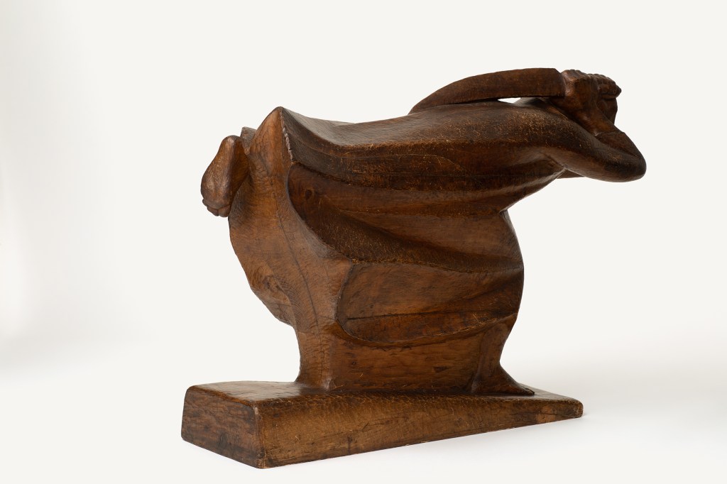
A few more steps, and the figure begins to emerge again. What we can now see is how extremely the right arm is bent, folded back at the elbow like a hairpin.

Yet more steps and we find ourselves on the opposite side of the sculpture from our starting point. Of interest here are the long lines flowing back from the profile of the figure, which again speak of speed and energy. We also become aware of the power of the hands clenched around the handle of the sword, and their proximity to one another, implying that a focussed, driving force will be unleashed when the slashing blow is finally struck. But we cannot see the head of the protagonist, let alone the face, so we are not entirely involved with the figure. I don’t think this view of the figure is by any means as captivating as our starting point.
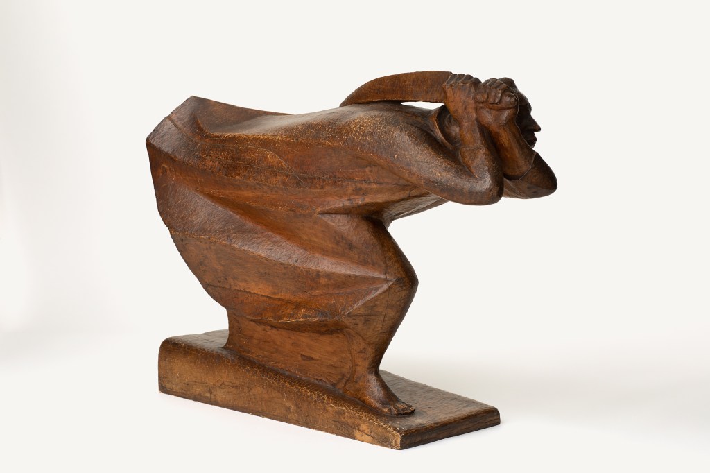
However, another step or two around and new features start to emerge. Both the elbows are pointing forward, and their joint silhouettes create a counterpoint with the jutting chin, the pointed nose, the angled forehead and the pursed lips.
Further round still, and we become the focus of The Avenger’s intent – or maybe he is focussed on something just over our right shoulders. We see more than before how tightly the left arm is wrapped around the chin, and notice that the forms of the chin and elbow echo one another. We can also see how close the sword is held to the head. Fabric flares out from the projecting knee, and there is almost a sense of weightlessness: there is no evidence – from this viewpoint, at least – of the left leg.
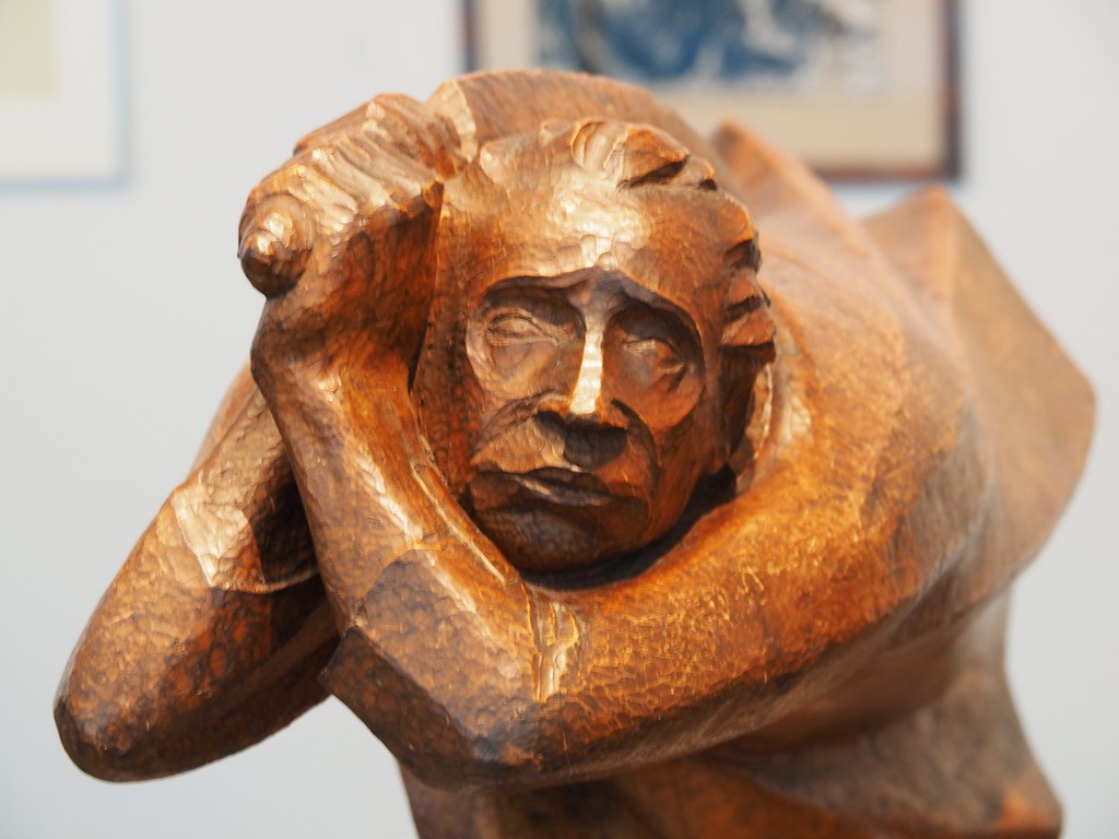
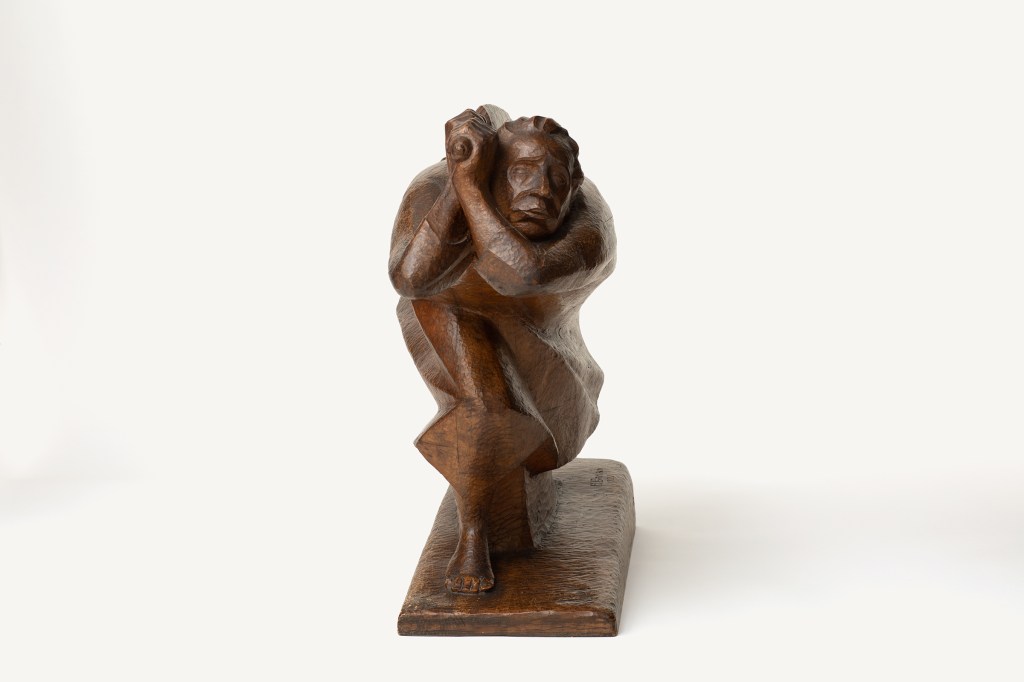
If we step closer now – and yes, like paintings, sculptures benefit from being seen close to, or further away – we get more detail. Apart from anything else, we can see stippling in the surface – not brushstrokes, but small chisel marks, which were used to refine the detail while also retaining a hand-made feel: it has not been polished smooth – the sculpture is not meant to be that ‘slick’. However, given the stylisation seen overall, the accuracy in the depiction of the tendons and the articulation of the wrist and knuckles might be surprising. The bulge formed by the pressure of the palm of the hand against the end of the handle is especially well observed. The brows slant down from the top of the nose, as do the wrinkles from the nostrils to either side of the mouth. The pursed lips are almost pouting. Is this conviction or concern? Is The Avenger really that confident? In a way, that’s up to you to decide, but Barlach really does focus on this expression. The sabre wraps round over the head, the arm wraps round underneath it, and a fold curves up from the figure’s left shoulder (on our right) to form a peak somewhere along its length, that peak echoed by the termination of the fold further away at the hem. The way in which the head is surrounded by these elements was entirely deliberate – the face is something that Barlach wanted us to see.

Having wandered around the sculpture, we are now back to the starting point. Is this a sculpture ‘fully in the round’? Yes. Is it equally interesting from all points of view? Well, my personal opinion is ‘no’. But you might think differently. However, if you google ‘Ernst Barlach The Avenger’ – or ‘Der Rächer’ – the most common photograph you will find is this one. It is undoubtedly the primary or principal viewpoint, and it was where Barlach started. I have only been able to find one example of preparatory material for the sculpture, and it is a charcoal drawing dated 1914 on the website of the Landschaftsverband Westfalen-Lippe.

I think the photograph has been cropped – most of the drawings on the LWL website seem to have suffered in the same way – but maybe this is all of the drawing that survives. The basic ideas are there, though, with the forward movement to our left, the thrusting elbow, the trailing leg, the scimitar wrapped around the head and held over the back. The long, linear folds of the robe are also there, although not in the same orientations. The ground is not sloping, although the long, continuous horizontal lines do imply rapid movement. And the date is informative: 1914. This was the start of the First World War, the ‘war to end all wars’, ‘The Great War’. Like so many people, Ernst Barlach was initially enthusiastic, and this sculpture was designed to express that conviction. He described The Avenger as ‘the crystalized essence of war’, the unstoppable force of the German army, charging forward to cleanse the world in order to leave space for a new and better future. Inevitably, his opinions changed. Having created the initial version of this work from clay and plaster in 1914, this sculpture was carved in wood in 1922. In the process the facial expression changed – from outright conviction to something more ambiguous. By this stage he saw The Avenger as ‘a hammer-wielding butcher’, charging with fury, but without thought, mindlessly swinging out to uphold discredited ideas – as happens all too often after many forms of conflict. It is important to remember, if you ever ask ‘but what does it mean’, that a work of art can change its meaning. Context is so important. Donatello’s Judith and Holofernes is a perfect example of this: what was originally intended as a celebration of the liberty of the people of Florence became a warning to potential despots.
The drawing may show the principal viewpoint, but, as we have seen, it isn’t the only one. Once the initial idea was translated into three dimensions there are many more. And while the Barlach Haus Museum provides a wonderful array of images, they all have one thing in common: they are all taken from the same level, looking horizontally towards the sculpture. But humanity is not that consistent. We are all different heights, and so we all see sculpture differently: from below, from above, from somewhere in between. I have not found a single image of the top of this sculpture. A very few on the internet look down onto it at a slight angle – but none show us The Avenger’s back… The next time I come across the sculpture I’m going to try and see what that looks like. Certain sculptures were undoubtedly intended to be seen from every conceivable point of view, including from above. I’d suggest that Antonio del Pollaiuolo’s Hercules and Antaeus was one of them, but I’ll leave you to look it up. However, the Barlach Haus Museum does have one more image I can show you.
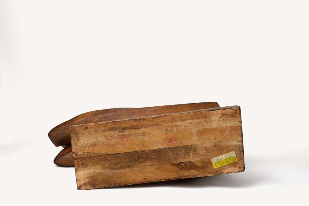
Clearly Barlach never intended the sculpture to be seen from this point of view. It certainly isn’t aesthetically pleasing, even if it is a good, technical photograph. It is useful for research, but maybe not much more. Nevertheless, it is revealing: the base, and so maybe the sculpture as a whole, appears to have been made from more than one piece of wood. That might explain the surface treatment. On the museum’s website it is described as ‘Holz (Linde) mit getöntem Überzug’ – i.e. ‘Wood (lime) with tinted coating’ – and this coating might be there to hide any damage and mending that occurred during the making.
There is always more to say – and we still haven’t finished looking at the sculpture as a whole. If you do google The Avenger, what you see won’t always look the same. We should think about colour and tone again, just like in painting. Not to mention the materials from which the sculpture is made. Compare these three images, for example.


The first image is the 1922 version, carved in wood. However, it is also painted with a ‘tinted coating’, as mentioned above. The second image is from the Harvard Art Museums. It is far darker, and catches the light in different ways: it shines, reflecting light. According to the Museums’ website, ‘an edition of ten numbered bronzes were produced, eight of which were completed before 1934’. They date their version ‘1914 (cast before 1934)’. The third image above, from the Detroit Institute of Arts, is dated ‘1914, cast in 1930’ on the DIA website. It is also bronze – but it looks greener, rather than ‘bronze coloured’. In the same way that, in painting, paints can be treated differently – or can have different media (oil, tempera, or water for example) – sculptures can be treated in many different ways. Wood can be painted, bronze can be polished (in which case it would look ‘gold’ and shiny) – but it is more often given a patina. This is a way of treating the surface to make the bronze respond in different ways, oxidising the surface, for example. It can help to cover faults in the bronze casting process, or it can create an entirely different appearance. The green colour here relates to the copper in the bronze: the patina has encouraged the development of verdigris, which, chemically speaking, is copper ethanoate (or copper acetate as it is still often known). Why would you do this? It’s a matter of personal taste. However, most versions of this sculpture I’ve seen (and there are more than ten) have the more usual dark brown ‘bronze’ look.
The above three examples all use the the ‘principal viewpoint’ – although the Harvard Museum version does have alternative views on its website. However, none of the photographs we have seen is my favourite. That accolade goes to the photographer of the version in the Buffalo AKG Art Museum, who has, I think, a really good eye.

A bronze cast ‘after World War II’ – so not authorised by the artist, who died in 1938. However, it would have been authorised by the estate – altogether I think there are about 21 examples. It is a good cast, I’m sure, but I especially like the photograph: it is lit brilliantly, which always helps, and from a superb angle. The arm, the elbows, the drapery around the forward leg and the face all catch the light. The folds flow along from the left arm, and seem to spiral out from the heart of the sculpture, the doubtful, yet determined face framed by the blockish forms of the sword and the bent left arm. As far as I am concerned it is the photograph which best expresses what the sculpture, for me, is about: a headlong rush to reach the wrong conclusion.

Dear Dr. Stemp
I read your piece with interest, since I use this sculpture in one of my tours in the National Gallery of Art in DC (I like to compare it with Lehmbruckâs Seated Youth of 1917). We have a bronze version which is dated 1914 (certainly cast in bronze later than that). I enclose some pictures here for you as our version looks similar to your preferred one (from Buffalo).
I am not sure I will make it to the lecture on Monday since I am traveling on Tuesday for a month and may be busy. I enjoy your talks!
Best wishes, Marta
Marta Castello Branco 5052 Westpath Terrace Bethesda, MD 20816 (301) 804-8633 (cell)
LikeLike
Dear Marta – thank you! Unfortunately, whatever it says, this website refuses to accept attachments, but I have looked up the photos on the NGA website. It is the quality of the photograph I really like about the Buffalo version – I’m not sure I’m that good at telling the difference between the individual casts, though!
Do enjoy your travels!
Richard
LikeLike
I don’t know how much feedback you get on your blogs Richard – I just wanted you to know that I still absolutely love reading them. You clearly put so much work and thought into them and they always give me something to think about.
Next time I look at a sculpture I’m going to try to make sure I look at all possible angles, although looking from above I suspect will often be tricky!
I had a brief glimpse of the new hang at the NG the other day and thought it was stunning – looking forward to your talks on that (sadly I cant make your walks).
LikeLike
Thank you so much – I’m so glad to know that you read them, let alone enjoy them! And thank you too, for taking the time to let me know.
And yes – I’m looking forward to getting to grips with the Sainsbury Wing in particular!
LikeLike
I very much liked your deep (photographic) dive into this sculpture. I try to think of Der Rächer as a sculpture mid-way between Michelangelo’s David and Lehmbruck’s Der Gestürtzte. Interestingly, the NGA in DC exhibits the Barlach close to the Lehmbruck. Maybe it would be fun for the NGA to add a (small) copy of the David to the two sculptures.
LikeLike
Interesting – someone else mentioned the NGA and Lehmbruck – which certainly have a strong connection. I must confess, I can’t see the connection to the David quite so clearly, though…
LikeLike