Simone Martini, St John the Evangelist, 1320. The Barber Institute of Fine Arts, Birmingham.
I’m really looking forward to talking about The Barber in London this Monday, 9 February at 6pm and I can’t wait to go back to the museum itself. The Barber Institute is part of the University of Birmingham, and I’ve only actually visited once, but it does have the most fantastic collection. However, there is no point going there now, as the building is being renovated, which is why some of the best paintings are currently on loan to The Courtauld. There aren’t a huge number, so we should be able to look at each one in some depth. However, there are paintings by Bellini, Gossaert, Hals, Rubens, Van Dyck, Poussin, Claude, Vigée Le Brun, Reynolds, Turner, Whistler and Monet – among others – so there will be more than enough to see!
I will then talk about two British artists who both painted portraits – although I think that the first, Lucien Freud, who I will look at on 23 February, was really only interested in portraiture to the extent that a face was part of a human being as a whole. The current exhibition of his work– at the National Portrait Gallery – is called Drawing into Painting, and is the first to focus on works on paper. The following week, 2 March, I will turn to William Nicholson, who started life as a printmaker, became successful as a portraitist, and today is best known (perhaps) for creating some of the most exquisite Still Life paintings of the 20th century. His work can currently be seen in a superb exhibition at the Pallant House Gallery in Chichester.
If you weren’t able to make last Monday’s talk, my enjoyment of the Anders Zorn exhibition in Hamburg – which will open soon in Madrid – was such that I gathered enough material to put together two talks. I am hoping to deliver the second, covering the most spectacular portraiture, etchings, the nude and Zorn’s homeland, on 16 March, but I’ll have to wait for a few things to settle down before I can be sure of that – so keep your eye on the diary. I’m hoping that subsequent talks will include Seurat and the Sea, Michaelina Waultier, Tracey Emin and possibly even an introduction to the Canaletto and Bellotto exhibition in Vienna… but more on them soon.
If you do book any of these events, Tixoom will send an email with the ticket – effectively a link to the talk – within seconds. If it doesn’t arrive within 24 hours, please let me know and I’ll try and sort it out: it would be easier to do it then than 5 minutes before the talk! You should also get two reminders, at 24 hours and 15 minutes before the talk, and these will also include the link.
Today, though, I want to look at a painting from The Barber Institute which is not currently at The Courtauld. However, it’s not far away: it’s in the Sainsbury Wing, at the other end of The Strand, in Room 58 of The National Gallery. It travelled to London for the Siena exhibition, which ended on 22 June 2025, and has yet to return to it’s Birmingham home… It probably won’t get there before 28 June 2026, though, as that is when The Courtauld’s exhibition ends.
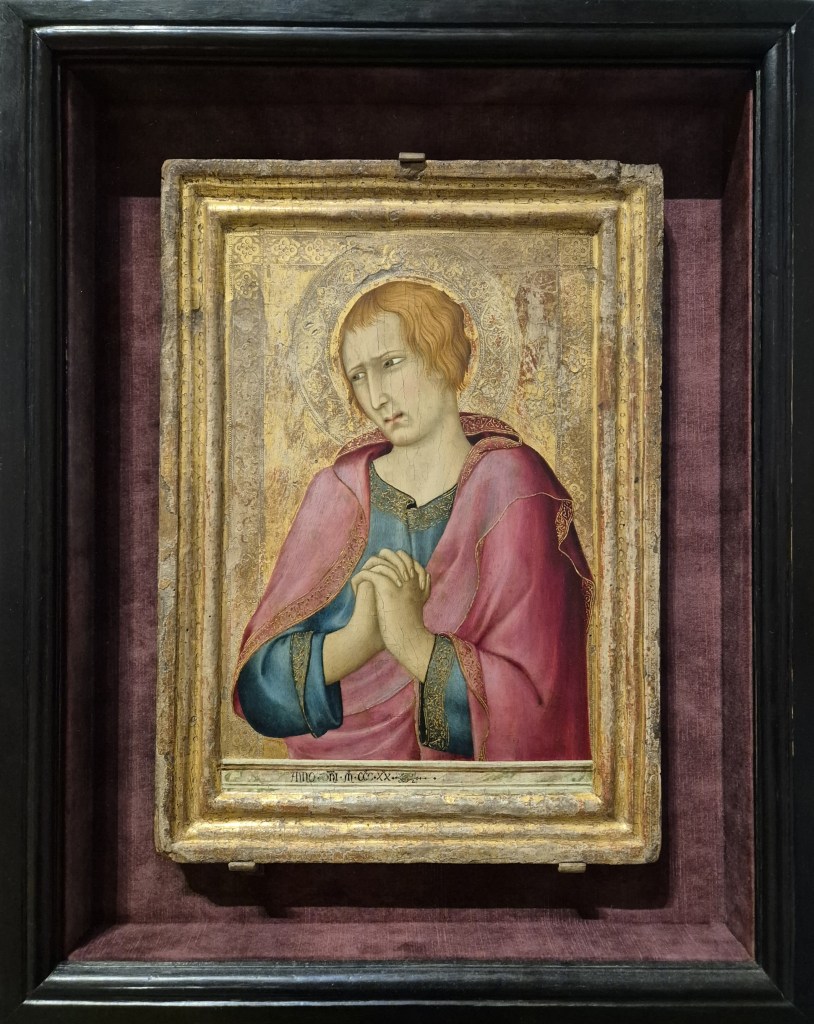
At some point during last year’s Siena exhibition at the National Gallery I was talking about Simone Martini, and mentioned today’s painting – one of the treasures of the Barber Institute in Birmingham – and the next comment, from someone else, was that it wasn’t an especially significant example of his work … or words to that effect. When I wrote about Simone Martini before (last February, as it happens – see 243 – Our most delightful Simone) I started by saying how, as an undergraduate, I and my fellow students held Simone in the highest regard. I wanted to write about this painting today to explain why, however ‘significant’ or otherwise it is, it is still a remarkably beautiful image, and also why, even if there doesn’t appear to be much to say there is still a lot to see, a lot that we can still enjoy, if we slow down and take the time. Yes, it is a relatively simple painting, a single male figure, half length, wearing a blue robe and red mantel, with his hands clasped – but that’s not all it is. That someone has considered it to be significant at some stage in its history is demonstrated by the fact that, framed as it is, it has also been set within an outer, black ‘box’ frame that is lined with red/pink velvet – matching, more or less, the figure’s mantel – which makes the painting itself ring out like a valued jewel mounted in a well-crafted, but not obtrusive, setting.
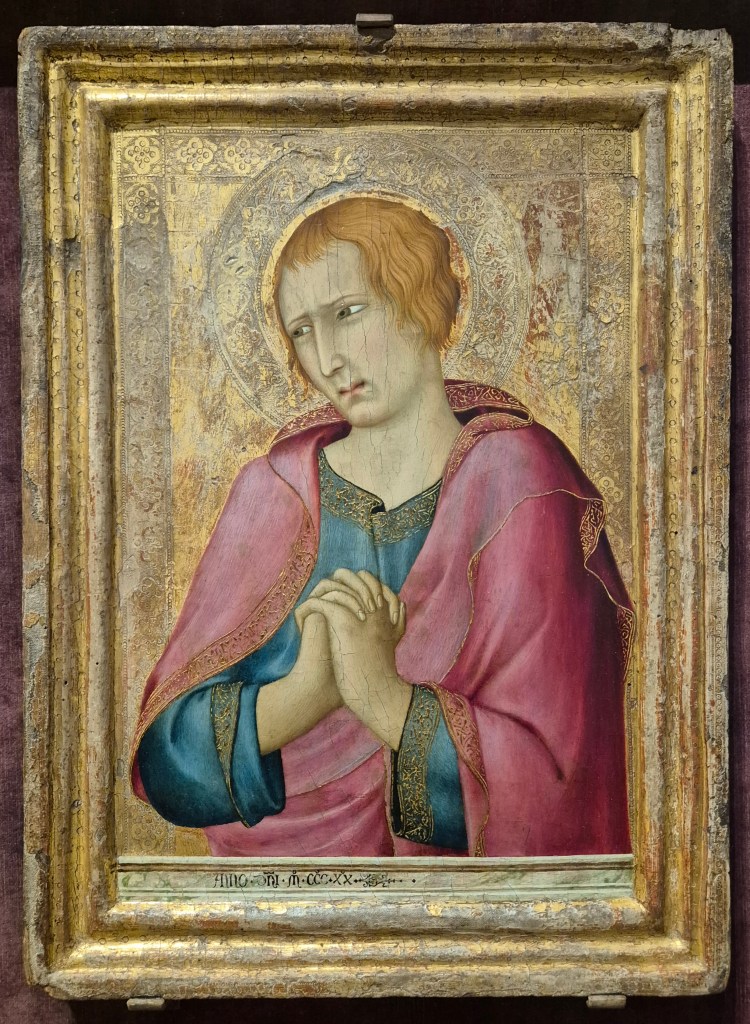
As originally painted it had – and still has – an engaged frame. Either the flat wooden panel and surrounding frame were carved from a single piece of wood, or the frame was fitted to the panel before the painting began. The whole surface – panel and frame – would have been sealed with size, a fish-based glue, and then covered with a fine linen fabric, the weave of which can be seen on the outer, flat element of the frame where the subsequent layers have worn away. This would have been coated with several layers of gesso, made from gypsum (calcium sulphate), a bit like plastering a wall to create the smoothest of surfaces on which to paint. The initial design would have been drawn onto the white surface, and then the whole frame and all of the background – the areas which were to be gilded – would then have been painted with bole, a red, clay-based paint. This would enhance the orange colour of the gold leaf, which was then applied, burnished, and tooled (patterned with small metal shapes tapped lightly onto the surface with a tiny hammer). This whole process means that the frame is firmly attached to the painting, and the surface of the gold is continuous from one to the other. However, on the left-hand side there are holes in the frame (which you can’t see in this photo, as they are on the side) telling us that this panel was originally attached to another with hinges: this man is looking to our left towards an adjacent figure in what is generally assumed to have been a triptych, or three-panelled painting.
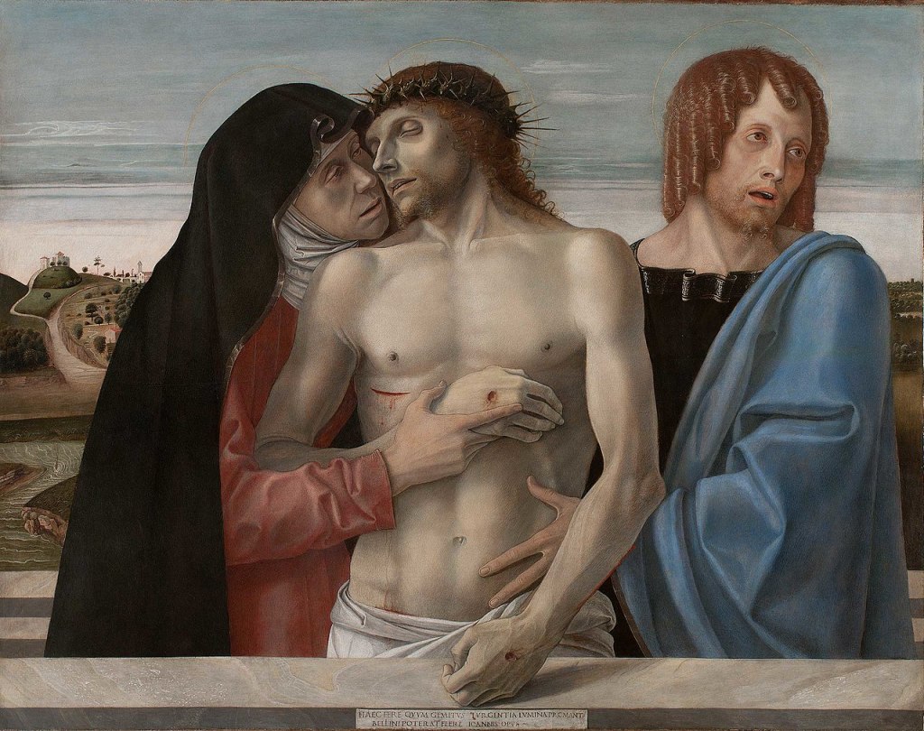
The subject has a halo, so is a saint, and is clean-shaven – the most common way of suggesting that a man was young. Wearing a pinkish-red over blue, the most likely identification is St John the Evangelist, always said to be the youngest of the apostles, and no one has ever doubted this identification. But why would we assume this was part of a triptych, rather than just a diptych? Quite simply, because of his attitude, or mood – one of intense, but suppressed, grief, lamenting the death of Jesus, who was presumably depicted in the panel to the left of this one. At the far left, in the third panel, would have been the Virgin Mary. I can’t find an equivalent as a triptych, but overall the effect would have been similar to the following painting from the Brera in Milan by Giovanni Bellini, dating from about 1460.
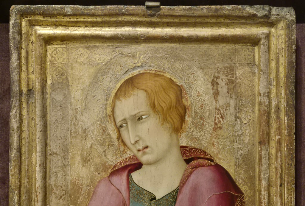
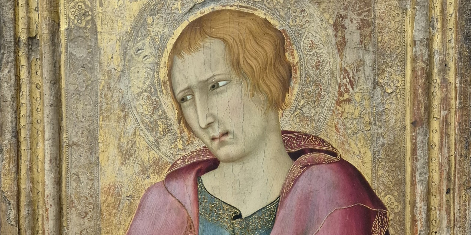
The other two panels by Simone Martini – showing Mary and Jesus – have never been located, but then it is surprising that anything has survived from 1320, over 700 years ago. Even this panel shows signs of damage, particularly around the frame – hence the fact that we can see the linen weave, not to mention a number of dents and cracks. Nevertheless, it is still possible to see that the gilding on the frame was itself tooled with a series of circles and dots of different sizes. The flat gold background is also tooled, and is framed by bands containing quatrefoils (four-leafed shapes) which are themselves built up from leaves and flowers surrounded by small circles. St John’s halo appears to sit in front of the tooled frame. However flat we might consider gold ground paintings to be, Martini creates space behind the Saint. The frame is three dimensional, but then if the halo is in front of the tooled framing, and St John’s head is in front of that, then he is being pushed into our space, thus making him look three dimensional, a real presence, standing just in front of us and worthy of our devotion.
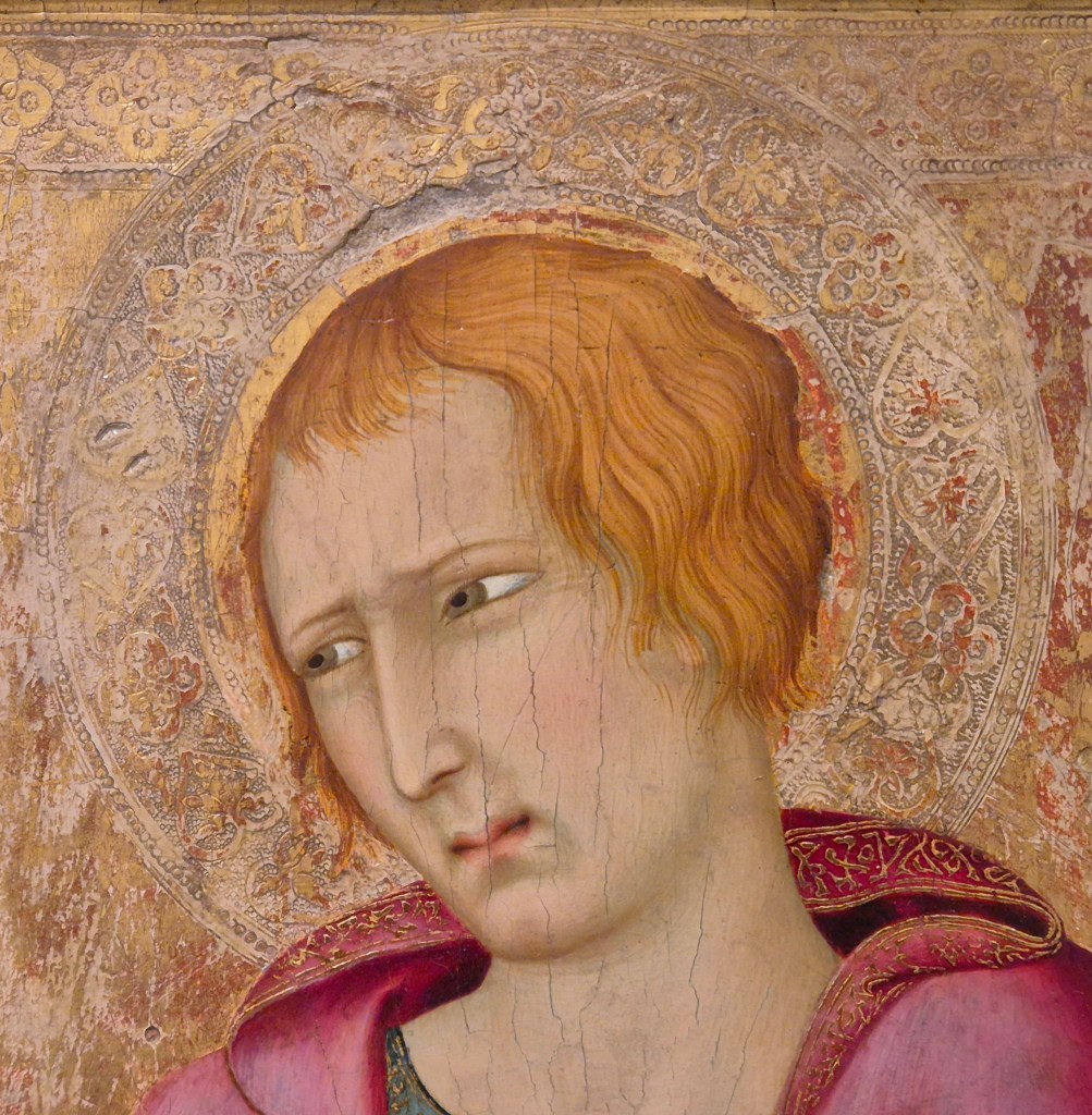
The halo is a circular band slightly wider than the tooled frame of the background, and contains similar quatrefoils as well as larger leaf shapes, or hearts. The inner circle of the halo is just wider than St John’s head, which would therefore originally have been encircled by a thin band of flat, burnished gold. Sadly, much of this has been worn away, with the result that in places we can see the reddish bole which would originally have been under the gold. This additional framing element would have helped to make the head stand out just that little bit more – remembering that, as well as patterning the surface, the tooling was also designed to reflect flickering candlelight: the halo itself would have flickered around the more evenly illuminated head. When seen this close we realise how carefully Martini has controlled the level of John’s grief. The brow is just slightly furrowed, the eyelids narrowed (as they always are with Simone), and the eyes looking out of the far corners – as if he cannot bear to look at the dead Christ full on, but has his head turned slightly away. The mouth is also puckered, tight together at the centre but parted on either side, trying to keep his mouth closed, but on the verge of giving way to intense sobbing. However, as the ‘collar’ of his mantle falls around his neck it casts shadows. The deep red space that this creates is like a gash, suggesting a crying mouth, or open wound. The hem of the garment is folded over, revealing an intricate pattern in mordant gilding (gold leaf which has been stuck on top of the paint). The top of this band corresponds to the level of the Saint’s mouth, and the lower edge to the base of his head: every detail has been carefully planned and precisely measured.
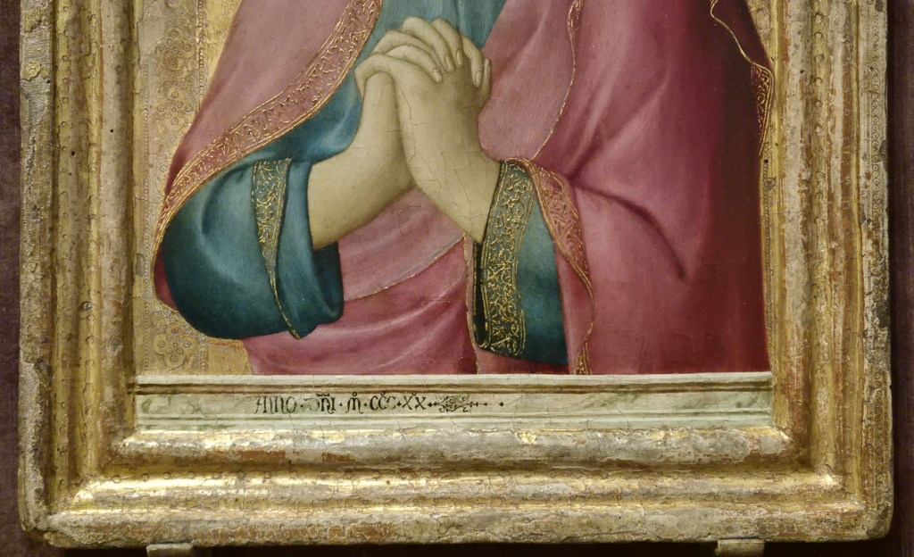
The tooled frame of the gold background continues down either side, but does not get to the bottom of the image, which is crossed by what appears to be a parapet with an inscription on it. However, this parapet is not as deep as the tooling is wide: I get the feeling that the tooling is ‘supposed’ to continue to the ground, framing the full length of the standing figure, it’s just that we can’t see it because the parapet gets in the way, and anyway, the painting doesn’t go that far down. The tooling can barely be seen on the right of the painting, and is hidden by John’s right elbow (on our left), where the mantel loops around the blue sleeve.
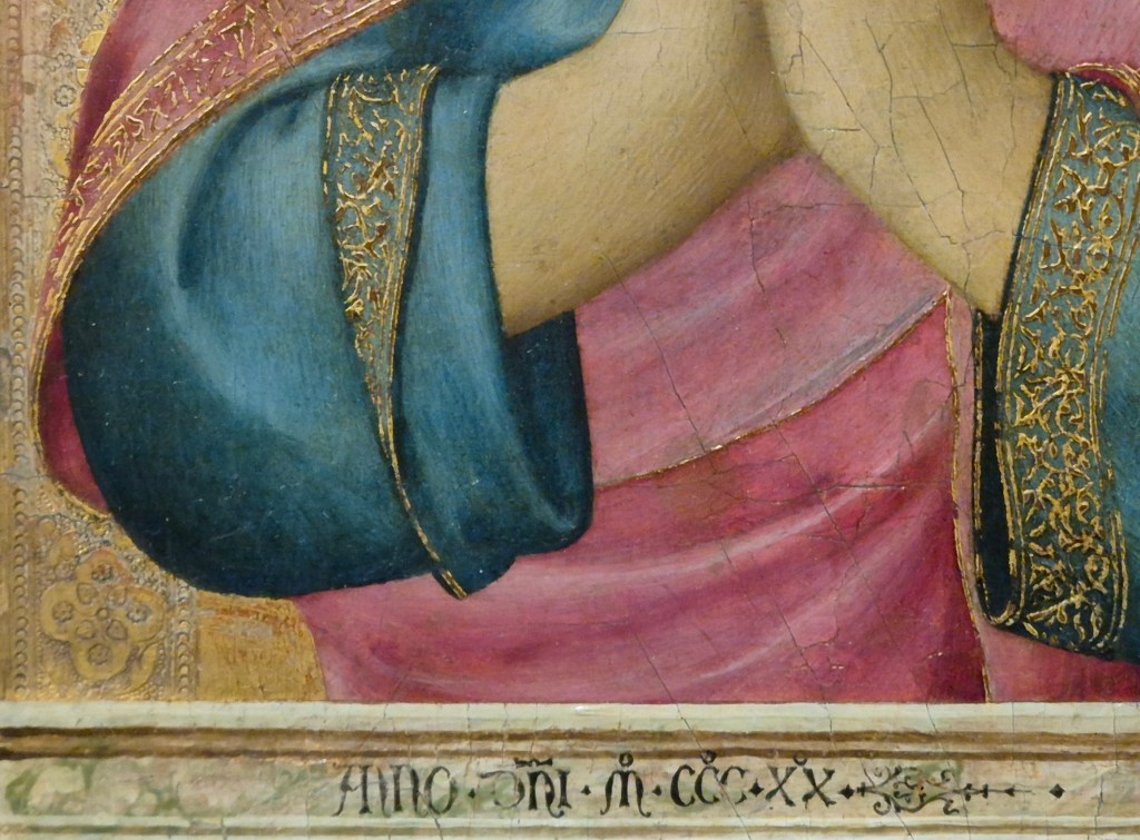
The parapet itself is marbled – it is clearly supposed to be made of stone. The parallel with the Bellini example is coincidental, but may have a common meaning. Bizarrely perhaps, in the Bellini, the Virgin and St John appear to be standing inside Christ’s sarcophagus, the top of the edge of which can be seen far more than the very thin strip at the front. However, there is still space for an inscription, an elaborate, but stirring, signature: “When these swelling eyes evoke groans, this work of Giovanni Bellini could shed tears”. Simone Martini, on the other hand, has simply written “Anno Dni MCCCXX” – ‘the year of Our Lord 1320’. But then, there were two other panels which could have include his name… and potentially something else. I’m intrigued that St John stands behind this parapet though. Does it imply that he and the Virgin were conceived as being in the sarcophagus, as they are in the Bellini? Or does it relate more to the later tendency, in portrait paintings by Jan van Eyck among others, to show their subject behind a similar structure. Parapets like this work in a contradictory fashion, both separating us from the subject, but also forming a bridge towards them. Practically speaking, it also justifies the half-length image: what is the point of painting the legs if they are behind a parapet? Were images like today’s painting the origin for the use of such structures in early Renaissance portraiture? I’ll have to keep thinking about that!

Simone does make the draperies unnecessarily complicated – although that only adds to my enjoyment of the painting. I love the way that the curve of the mantel around the elbow echoes the equivalent curve of the blue sleeve, and also how the sleeve parallels the continuation of the hem of the mantle from left to right as it emerges from behind the sleeve. I’m also intrigued by the way in which John’s right sleeve has been rolled up. We see the left sleeve (on our right) at full length. There is a deep shadow within the opening, framed just to our left by the vertical fall of the mantel, which also casts shadow. On our left, the right sleeve has been folded back, and then back out again, thus revealing the top of the embroidered gold band.
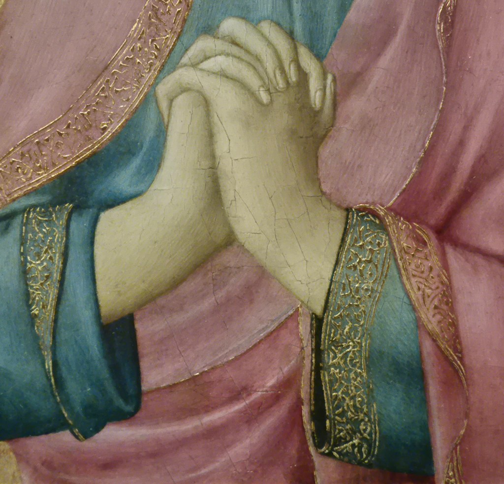
Great care has been spent on the interleaving fingers which create arcs curving from right to left and then back again, almost like a bridge going over the hands. Martini has even tried to show the thumb of John’s right hand, and even if this is not entirely successful, no one else at the time was getting this close to a naturalistic depiction of hands. There is something about the rhythmic play of the fingers, the different ways in which they overlap, and the arching backwards and forwards, that expresses to me the movement inherent in the wringing of hands. They sit neatly against the blue background, while the right arm, bent at the wrist, also echoes the upward curve of the lining of the red mantel, which appears to be marginally lighter than the outer side. This detail somehow captures the reflection of light from the gilding of the hems rather beautifully, hinting at the magical effect that illumination by flickering candlelight in a dark setting must have created. At John’s left wrist the gold embroidered hems of both the blue sleeve and red mantel emerge from behind the arm at the same point. While the embroidery on the blue sleeve is fully visible as it falls, that on the red mantel flares out and folds back, with the hem undulating to the bottom of the painting. Meanwhile, the very edge of the mantel continues upwards from the same point behind the wrist. I find all of these delicate coincidences, the echoes, the concentric curves and flowing folds astonishingly beautiful – and remarkably expressive.
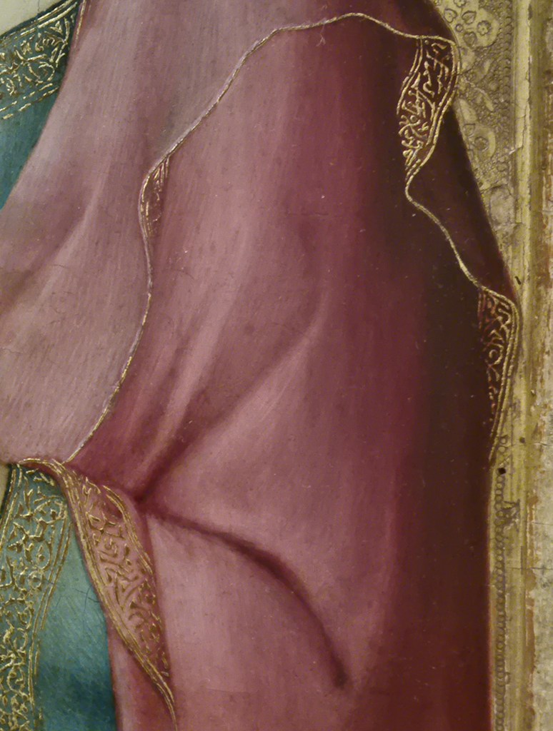
The hem of the mantle is mapped carefully as it rises in front of the chest and then falls again just below the level of the shoulder. The lighter lining is delicately trimmed by one edge of the embroidered gold, defining its journey around the upper arm in broken curves with a nervy, tentative quality. In a few places the ‘outside’ of the mantel is partially revealed, with different widths of the embroidered gold band becoming visible, glowing out of the darker shadows to our right of the figure. Most of the tooled frame of the background is hidden here, and there is even the suggestion, at one point, that the mantel has actually fallen outside the frame, and so into our space. St John is present, in front of us. Originally, the Virgin would have joined him in lamentation over the dead Christ, in front of whom we must imagine ourselves standing. John is undoubtedly shaken by everything that has gone before, his emotions are stirred, but under control. Nevertheless, the depth of his feelings are made clear in the subtle turn of his head, the angle of his eyes, the pursing of his lips and the delicate, detailed sensitivity of the fall of light and shade, and in the flow of every line. I’ve quoted from the opening speech of Shakespeare’s Twelfth Night more than once recently, and I’m going to do so again – but not the first line, this time. I’m more interested in the fourth today: That strain again! it had a dying fall… Orsino is talking about the emotive power of music, but I’m seeing that ‘dying fall’ in every line of this painting. It is a wonder. I am so glad that it can currently be seen at the National Gallery, an introduction, at some remove, to the rest of The Barber in London.

