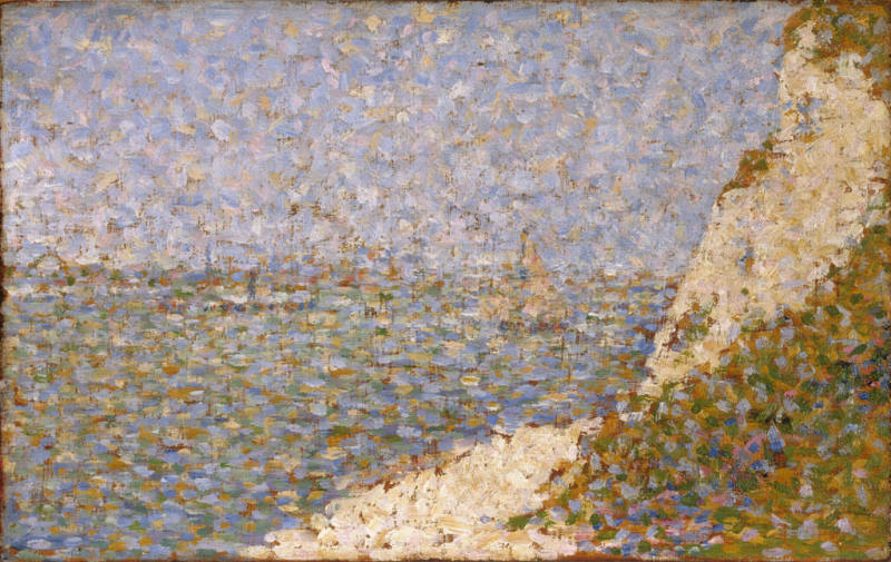
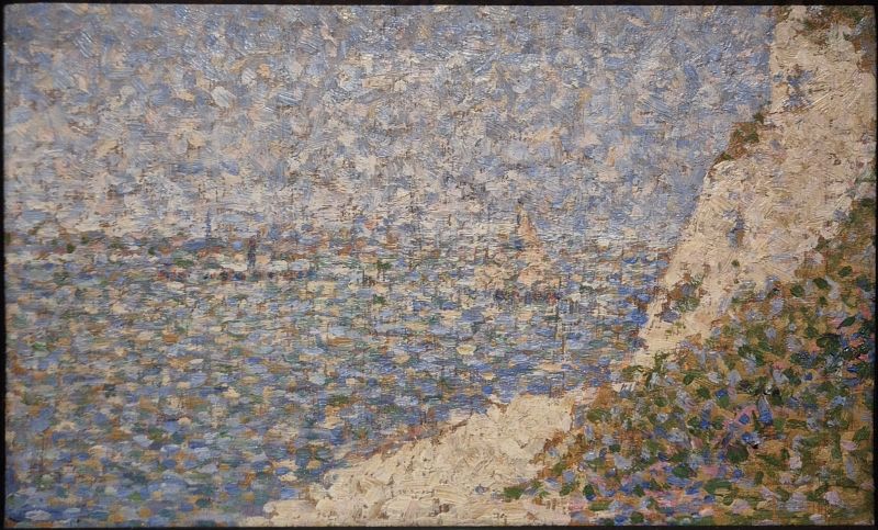
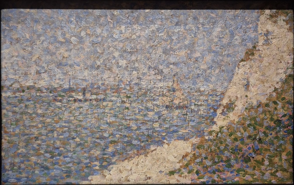
Georges Seurat, Study for ‘The Shore at Bas-Butin (Honfleur)’, 1886. Baltimore Museum of Art.
I’ve mentioned it a couple of times already, but The Courtauld’s enormously successful Seurat and the Sea is selling out regularly – but not too far in advance, fortunately (most days next week are still available, for example). I will be talking about the exhibition at 6pm this Monday, 23 March if you want any encouragement to book! The following week, Monday 30 March, I will introduce the Royal Academy’s display of works by the wonderful Michaelina Wautier, which I will have seen just a couple of days before. This will give me time to assess whether she really was ‘one of Europe’s most important artists’ as the RA’s website claims. From what little I’ve seen in the flesh – and from photographs – she does seem to have been truly remarkable. However, I’m never entirely sure what the word ‘important’ means – there are so many different ways of assessing importance. I’m sure it will be one of the things that we will consider during the talk, though. Before then I am heading to the Kunsthistorisches Museum in Vienna to see – and review – their next exhibition, Canaletto & Bellotto. This will be the first to compare the travels of the artists who, as well as being master and pupil, were also uncle and nephew. I will let you know what I’ve seen on Monday 20 April, focussing, as the exhibition will, on the artists’ travels outside of Venice. The above events are already in the diary, and soon I will add more: introductions to The Courtauld’s A View of One’s Own (landscapes by women) on 27 April, and Michelangelo and Rodin, at the Louvre, on 11 May – and I’ve already planned what I want to talk about after that.
If you do book any of these events, Tixoom will send an email with the ticket – effectively a link to the talk – within seconds. If it doesn’t arrive within 24 hours, do let me know and I’ll try and sort it out: it would be easier to do then, when there’s time to spare, than 5 minutes before the talk! You should also get reminders 24 hours and 15 minutes before the talk, and these too will include the link.
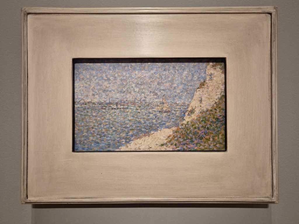
This is how today’s painting, Seurat’s Study for ‘The Shore at Bas-Butin (Honfleur)’, appears in The Courtauld’s exhibition, and presumably how it is exhibited at the Baltimore Museum of Art, which owns it. A small wooden panel, measuring 17.1 x 26 cm, is framed by a flat white frame which must have at least twice the surface area of the painting itself. It is so often the way that the status of small works of art is proclaimed by giving them relatively large frames, thus making them take up more wall space. As a ploy it is perfectly understandable, but counter-productive for close viewing: it doesn’t necessarily help us to see them any better. Seurat did regularly exhibit such small works, though, either individually, or framed as a group. They were created either as works in their own right, or as studies for paintings on canvas. He also used them to get to know a motif better, an exploratory process which helped him to understand a particular location and so to decide which views to focus on. He gave these studies the name ‘croquetons’, a term derived from the French word ‘croquis’, meaning sketch. He produced them regularly during his short life, and after his premature death, at the age of 31, 163 were recorded in his studio. Like so many preparatory, or exploratory works, they are relatively freely painted, spontaneous, and sometimes (as far as I’m concerned) more interesting than the controlled and contained works which are derived from them.
In order to look at the imagery with greater clarity, I am going to cut out most of the frame.
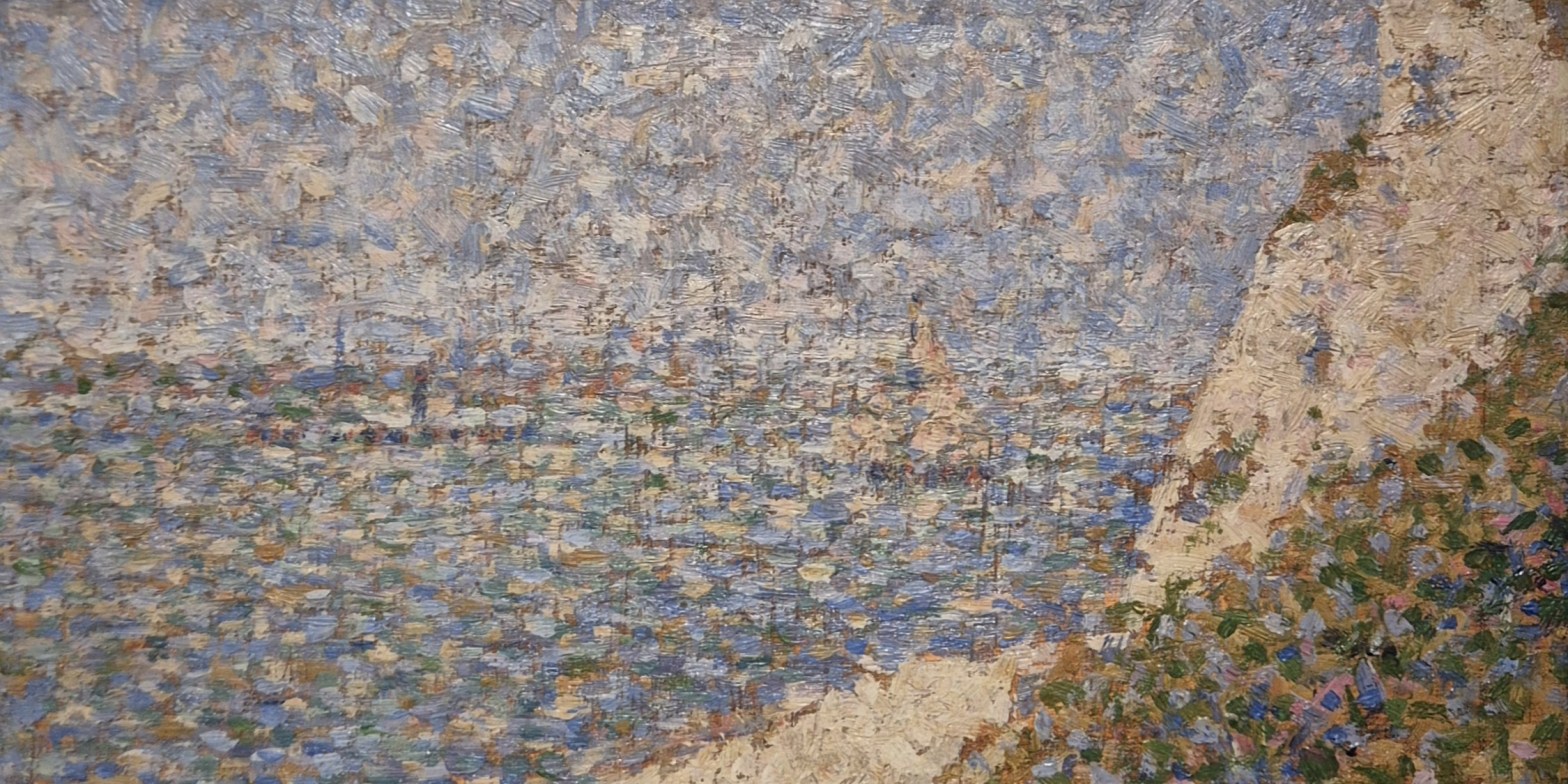
We appear to be looking out over the sea, but a faint horizontal line of cream-coloured dots about halfway up the painting on the left would tell us – if we could read it more clearly – that we are looking across the mouth of the River Seine. Bas-Butin is on the Normandy Coast, very close to Honfleur, which Seurat visited in summer of 1886. It is on the other side of the river, and a little upstream, from Le Havre. The sky is a mixture of mottled dabs of light blue and cream, while the water varies from dark blues, near the shore, to greens further out, with the same cream colour intermixed throughout. This cream is the basic colour of the beach, a triangle of which appears at the bottom of the panel in the middle, and the cliff, also seen as a triangle, coming down from the top right of the painting. The bottom right corner is filled with vegetation, defined by a range of greens, blues and pinks. More patches of plants can be seen at the top of the cliff, and across its surface.
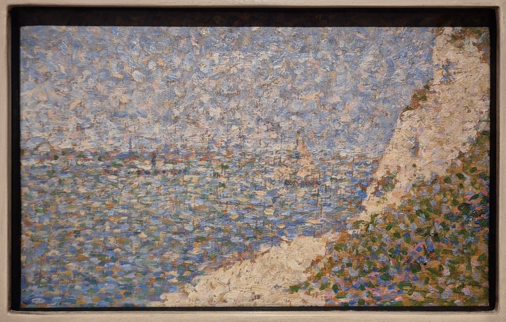
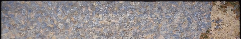
I took the photograph above myself, and, as usual, the works in the exhibition are illuminated from above. However flat the frame is, it still casts a shadow across the top of the painting, although there is very little we cannot see. The first image below is a rather low-resolution file (which also seems to be out of focus) from the Baltimore Art Gallery’s website, the second is my image with the shadow cut out.
There’s just a little bit of vegetation missing from the top right corner in my photograph – together with the equivalent strip of sky, of course. The colours are a bit different… probably the fault of my phone, although the following detail, which I also took, appears to be closer to the lighter, sunnier colours of the Baltimore file.

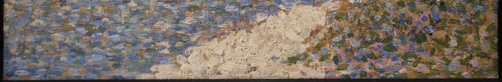
The detail focusses on the part of the composition which I think had attracted Seurat to this motif – the place where the lower point of the cliff (the triangle tumbling down from the top right hand corner) touches the upper point of the beach (the triangle reaching up from the bottom). The seaward boundaries of these areas continue as intersecting diagonals which, opposite the sea, define the area of vegetation in the bottom right corner. It is almost as if a strip of a cream-coloured ribbon, dividing the blue of the water from the green of the plants, has been twisted in the middle, bringing its two edges together to a single point. The just-off-vertical lines which cross the image are the result of the paint brush skipping over grooves in the panel which Seurat may well have scratched in to create exactly this sort of effect – although it’s not entirely clear to me why he wanted to do this.
The horizon runs a little way above the kink which joins the cream triangles, and just below it you may be able to make out two vessels on the water. To the left of the cliff is a sailing boat, its mast and sail projecting above the horizon. To the left of that a horizontal row of dark dots, with a vertical line roughly in the middle, define a steamboat with its funnel. A little higher, and reaching to the left edge of the detail, are some of the cream dots which mark the opposite bank of the Seine. These undetailed details may be easier to read if I trim the image slightly.
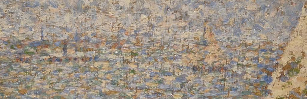
I don’t know if that does make it any clearer. However, Seurat knew what he was looking at, and knew how he wanted to translate it into his own visual imagery – this study was for himself as much as anyone else. One of the things that makes it harder to read is the persistent repetition of the same colours, the result, I suspect, of both practical and stylistic choices. Seurat painted this study ‘en plein air’ (‘in the open air’) in front of his ‘motif’ (or ‘subject’), in true Impressionist fashion – even though he was in the process of re-imagining and re-inventing the Impressionists’ techniques. Plein air painting was made easier by the contemporary development of portable painting boxes, know as pochades or ‘boîtes à pouce’. The latter got its name because, like a palette, the box had a hole into which you could insert your thumb (‘pouce’ in French) to hold it more easily. The small wooden panel for the sketch could be inserted in the open lid of the box, with the palette, and paints, in the shallow box itself, which would be held horizontally. A small box could only contain a few different tubes of paint – and I assume that the fewer paints you took with you the easier it might be. Of course, the other reason for repeating the colours – the stylistic choice – was to create pictorial unity, and thus a harmonious composition. In this respect it is worthwhile comparing strips of the study from the far left and far right of the painting.
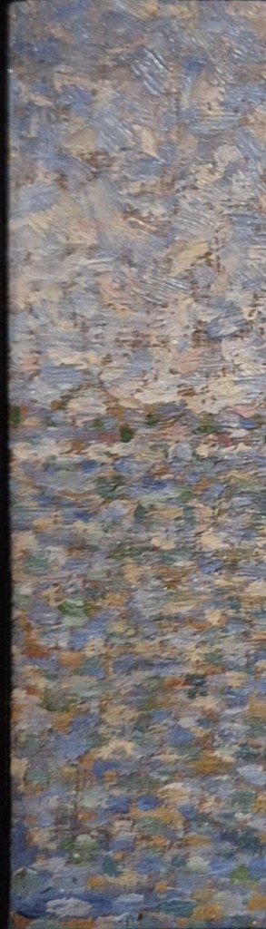
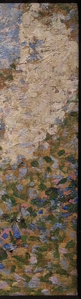
The strip on the left (oddly a bit out of focus, I realise) is almost equally sky at the top and sea at the bottom, with the opposite shore – just a few dabs of cream coloured paint – dividing them. On the right we see the cliff, the vegetation at the top (what little remains after I’ve cut out the shadow cast by the frame), and the vegetation at the bottom right corner. Notice how the cream colour of the cliff (on the right) can also be seen in a few dabs of paint at the bottom of the same strip, but also in the sky and sea on the left. But then the lighter greens of the vegetation – and to a lesser extent the darker greens – can also be seen in the sea on the left. The pale blue of the sky continues through the sea, but can also be seen in the vegetation on the right, and, to a very small extent, in the cliff as well. The darker blues of the sea are intensified in the vegetation at the bottom right. The same continuity of colours can be seen if we compare strips from the top and bottom.
I’ll let you look for the matching colours these two details, but suggest you pick out the creams and the light blues in particular. As suggested earlier, Seurat is seeking pictorial unity, showing us that this seascape, or ‘marine’, to give it the name he used, is all lit by the same light, and takes on the same colours. This makes sense, if we remember that the sky, cliff and beach could all be reflected in the water, and that the light reflecting from the water will in its turn fall on the cliff, beach and vegetation, thus having an effect on the way we see them. Seurat was also drawing on colour theory known and practiced by the Impressionists – although very subtly in this case. This theory was, of course, one of the key driving forces of his own personal technique. The creams and light blues can be seen as a lighter, less intense version of one of the main complementary pairings, blue and orange. Placing them next to one another helps to make the surface sparkle, thus creating a fresher image. In the case of this croqueton the individual pointillés (or ‘dots’) are relatively large – but in the finished painting based on this composition they become far more refined. Conveniently, both are included in The Courtauld’s exhibition – so here they are.
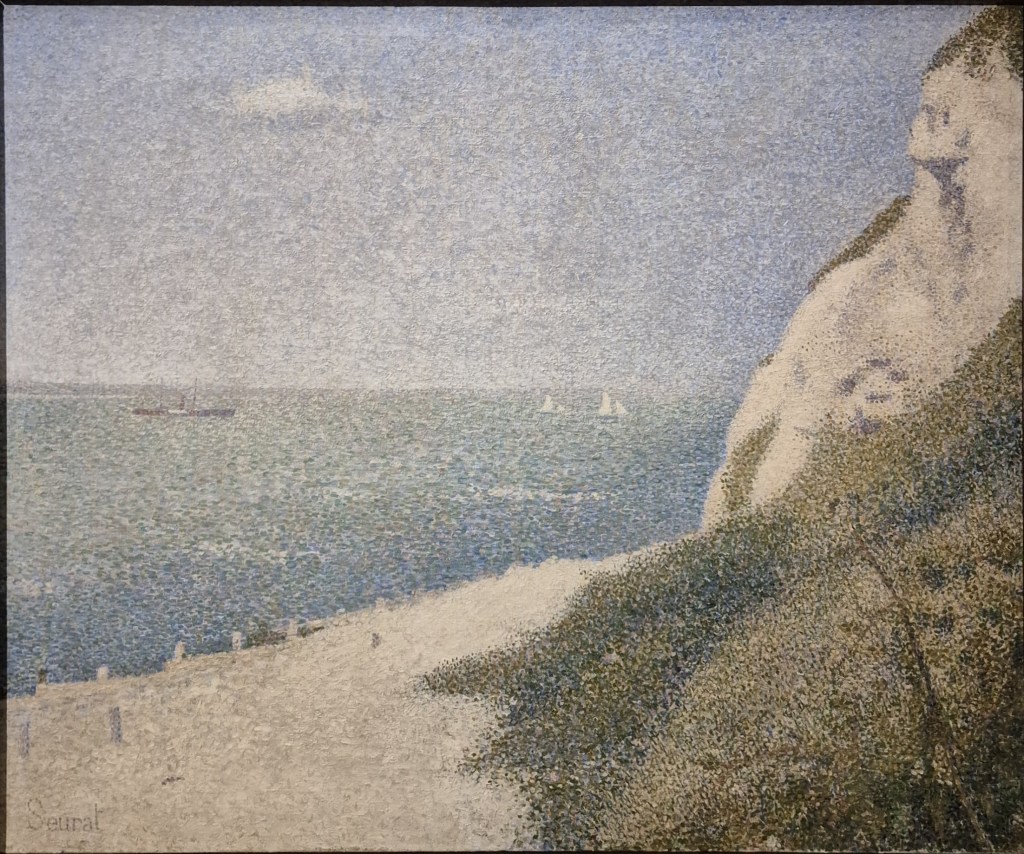
There are several differences between the two images, and it’s not just a matter of size (not that you can see that here): the Study measures 17.1 x 26 cm, while the finished painting is 65.5 x 82 cm. Unlike the Study, which is painted on wood, the finished work, now in the Musée des Beaux-Arts in Tournai, is on canvas. The proportions are considerable different, with the canvas far taller in proportion to its width. When buying supplies, Seurat always selected croquetons in this particular format. Each pre-prepared format had its own name which related to the genre of painting it was considered suitable for – and this one, not coincidentally, was known as a marine. As far as Seurat was concerned, this was also, presumably, the format which would fit into his boîte à pouce. Given the taller format of the canvas, there was some extra space, which Seurat filled at the bottom of the canvas. He added a broad, sandy path leading down to the beach, and the posts of the breakwaters (which help to prevent coastal erosion). There are also more fully formed plants in the bottom right corner. Notice how he subtly shifted the top of the cliff so it leads in from the top right corner, rather than from a little way along the top of the painting, making it more obviously a diagonal.
The smaller, more refined dots mean that features are more precisely defined. The canvas has a cloud in the sky – but if you look back to the Study you might be able to distinguish the sketchy way in which this is notated. The steamboat and distant shore are far clearer – and also echo one another in form. However, rather than the single sailboat, with its sail reaching above the horizon, in the canvas he has included two small yachts, creating a sense of perspective, and therefore a greater sense of distance. The variation in the colour of the sea – from blue near the shore, to a lighter green further out, is not only more marked, but also very subtle. In some way this is a reflection of what we see in the sky, where the colours are paler on the horizon, darkening towards the zenith, with touches of the darker blue at the very top of the painting. The whole has a calm, limpid atmosphere which is enhanced by the omnipresence of lighter tones, and especially of the cream colours of the beach and cliff. It is a celebration of light.
The summer of 1886 was the second of Seurat’s five marine campaigns, the subject of The Courtauld’s exhibition. Although one of his most productive, the weather was not always kind to Seurat that year. As he told Paul Signac in a letter written two weeks or more after his departure from Paris (quoted in Karen Serres’ superb catalogue),
“The wind and therefore the clouds have bothered me these past few days. The stability of the first days should come back … What else can I say? Well, that’s it for today, let us get drunk on light once again, it’s a consolation.”
Today’s Study was clearly painted on one of the days when the winds were gentle and the seas calm (after last week’s Sondheim, today I feel a Mozart aria coming on…). During the winter months Seurat worked on his more theoretical paintings in Paris, but he took his summers away from the city to clear his eyes. Perhaps as a result of this, the paintings we will be looking at on Monday all turned out like the memories of an ideal holiday: gentle and calm, with every element corresponding to what we wanted.

Hello, Richard.
Thank you for this in advance
Question: Are you planning to do a lecture on Zubaran?
Jacky Taylor
LikeLike
Hi Jacky,
Yes, I am – at the moment I’ve scheduled it for 15 June, due to a whole list of other things I will be seeing first… but that may change.
LikeLike