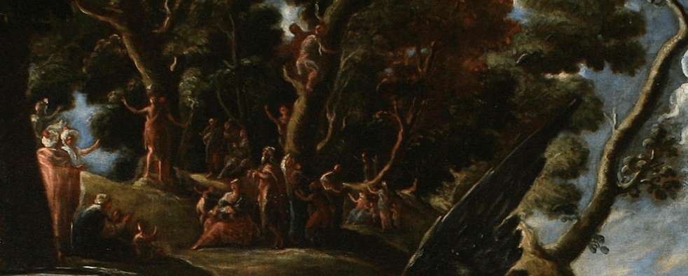
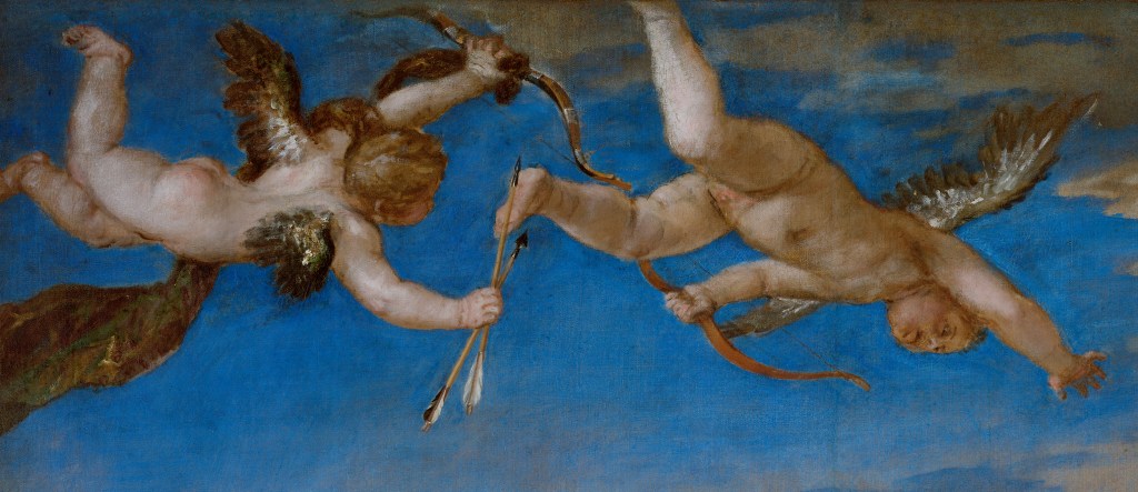
Giotto, The Baptism and The Wedding at Cana, c. 1305, Scrovegni Chapel, Padua.
Bother. Oh bother. I hate it when I get things wrong. Last week I said that we would start today with The Baptism of Christ, saying that it was opposite Christ among the Doctors. But it isn’t, it’s next to it. Here is the opened-up scale model of the chapel which I first showed you for Picture Of The Day 45 – it was made for an exhibition in Australia, apparently.

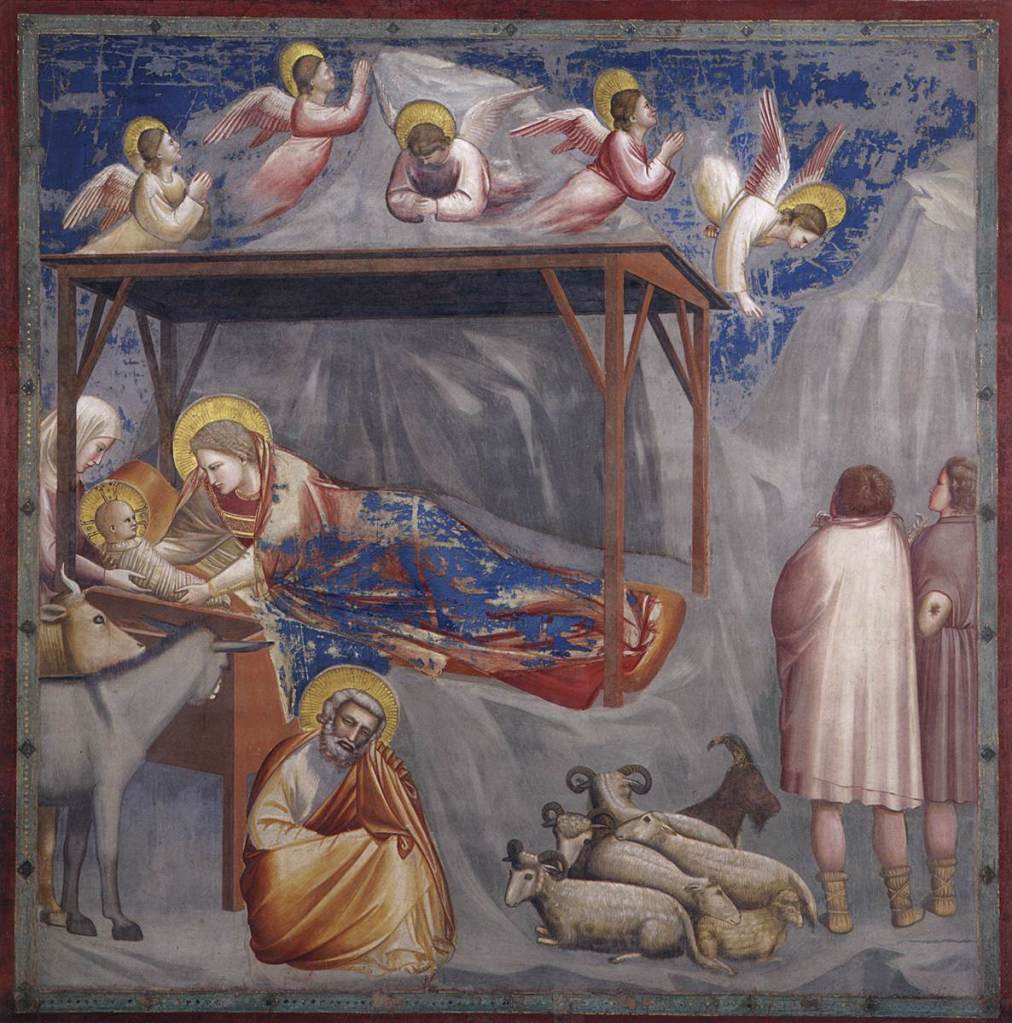
There are six paintings in The Story of Joachim and Anna (POTD 66 & 73) at the top of the South wall (on the left of this photo – you can only see the last two scenes of the six), but only five in The Childhood of Jesus (POTD 87) because of the windows. And I tried to include six. Well, that’s what comes of trying to rush… I mean, covering six images in one blog, what was I thinking? I’ll add some dodgy edits to last week’s entry. Anyway, The Childhood of Christ ends with The Massacre of the Innocents, more-or-less opposite which, on the North Wall, is Christ among the Doctors – even as a boy he had started his Mission. So, the first three scenes in the middle tier of the North wall should look like this:


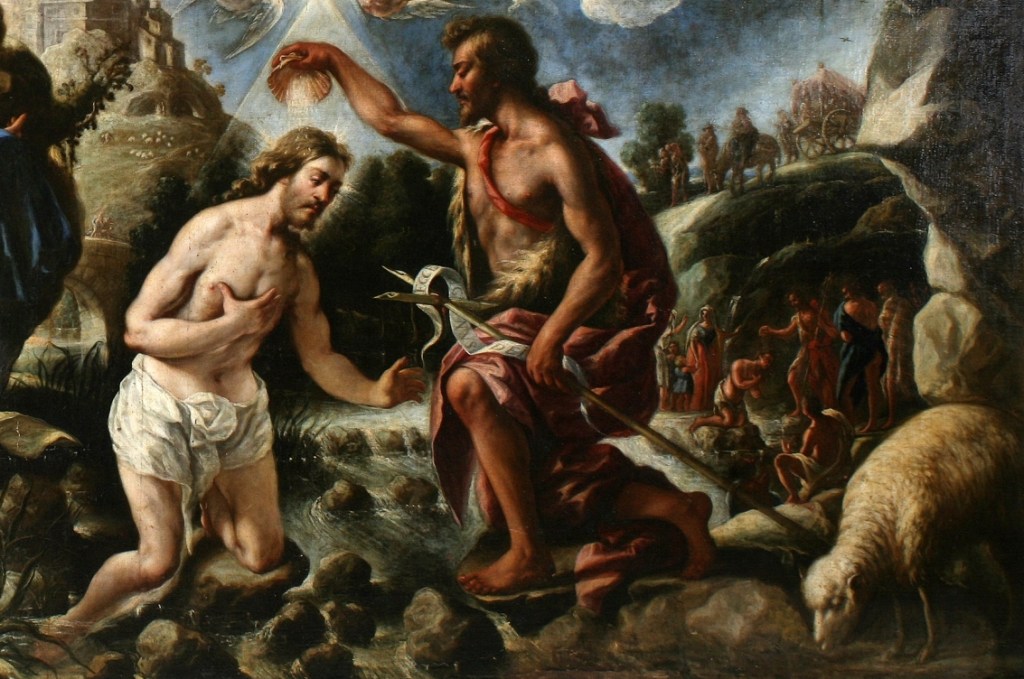
We have Christ Among the Doctors, The Baptism of Christ, and The Wedding at Cana. The first was discussed last week, and the Baptism is fairly straightforward – nothing compared to the Baroque complexities of Juan de Pareja’s version (POTD 89), although it’s more complicated than it might appear at first glance.

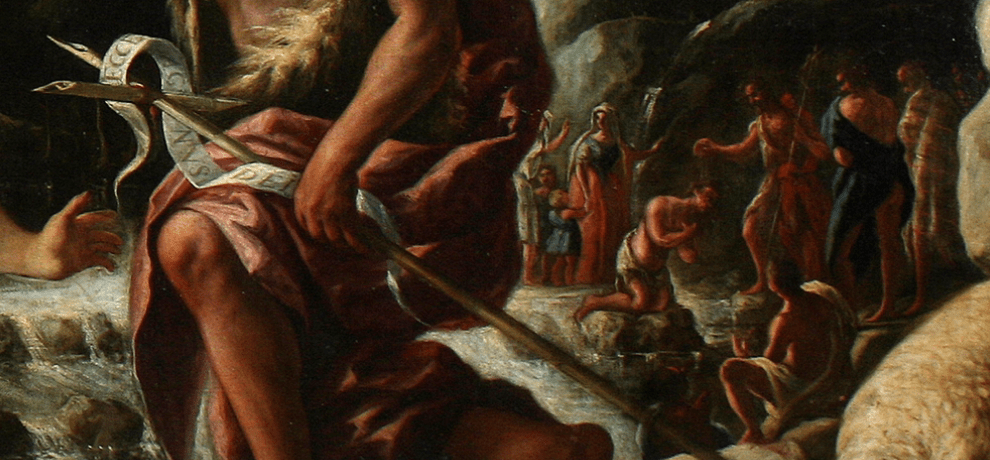
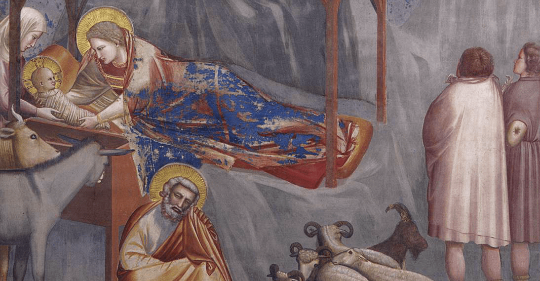
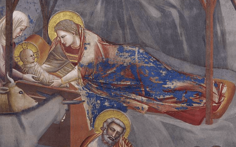
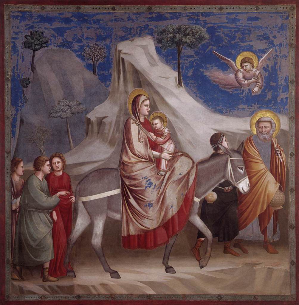
Jesus stands in the centre of the image, up to his elbows in the River Jordan, and completely naked. This was not unusual in Medieval painting, although Giotto is not exactly explicit. It was not unusual for Jesus’s genitalia to be visible, because this would emphasize the theological point that he was both God and man. But Giotto doesn’t feel compelled to drive the point home – there is so much humanity in his painting anyway. There is more interest, I would say, in the swirling water, and, just in case we didn’t realise that it is water, there is a fish swimming beside Jesus’s calves. God the Father appears on high with quite surprising foreshortening – yes we’ve seen Uccello do this upside down (POTD 37), but that wasn’t until 140 years after after Giotto was painting. A glow of white light radiates all around – but there are clear signs that paint has been lost. The blue sky, painted a secco, is not in a great condition, and the Holy Spirit has vanished completely – but I can’t imagine that he wasn’t originally there. Last week, and even the week before, we saw how important the ‘landscape’ can be for the narrative, and here is no exception. The rocks on either side, effectively forming a valley through which the Jordan flows, focus our attention down towards Jesus. They also act as a background for the secondary characters, whereas the protagonists – John the Baptist and God, in the persons of the Holy Trinity (even if we can’t see the Spirit) – appear against the sky.
The Baptist wears his traditional camel skin and pink cloak, and reaches over to Jesus from the shore, while angles stand on the other side of the river, holding onto Christ’s blue robe and red cloak. If you remember, Pareja had added a third angel, but here, Giotto has two additional figures standing in the background, one only visible because of a hint of a halo and a slice of his neck. John the Baptist also has two attendants, one of whom is a Saint, the other isn’t. For their identity we must see what happened after the account of the baptising of the multitudes in the Gospel according to John 1: 35-37 & 40:
Again the next day after John stood, and two of his disciples; And looking upon Jesus as he walked, he saith, Behold the Lamb of God! And the two disciples heard him speak, and they followed Jesus… One of the two which heard John speak, and followed him, was Andrew, Simon Peter’s brother.
St Andrew is the one with the halo. Giotto depicts him as he is often seen in Italian art, with a long white beard and white hair, wearing green. He is considered to be St Peter’s older brother. In the other Gospels St Peter is considered to be the first disciple, whereas John makes it quite clear that Andrew was the first, which makes the Scots happy. Andrew also makes his way into The Wedding at Cana.

This isn’t entirely surprising, as the John’s Gospel – the source for Andrew’s presence at the Baptism – is the only one of the four to recount this particular miracle, always seen as Jesus’s first. The young man in between Jesus and St Andrew could be the second of John the Baptist’s followers, who is not named in the quotation above, and who did not end up following Jesus – hence the lack of halo. But then that begs the question as to what he is doing at the wedding. Andrew’s glance seems to suggest that he too is curious. The account of the wedding takes up about a third of a chapter, but I’m going to quote it in full – John 2: 1-10:
1 And the third day there was a marriage in Cana of Galilee; and the mother of Jesus was there:
2 And both Jesus was called, and his disciples, to the marriage.
3 And when they wanted wine, the mother of Jesus saith unto him, They have no wine.
4 Jesus saith unto her, Woman, what have I to do with thee? mine hour is not yet come.
5 His mother saith unto the servants, Whatsoever he saith unto you, do it.
6 And there were set there six waterpots of stone, after the manner of the purifying of the Jews, containing two or three firkins apiece.
7 Jesus saith unto them, Fill the waterpots with water. And they filled them up to the brim.
8 And he saith unto them, Draw out now, and bear unto the governor of the feast. And they bare it.
9 When the ruler of the feast had tasted the water that was made wine, and knew not whence it was: (but the servants which drew the water knew;) the governor of the feast called the bridegroom,
10 And saith unto him, Every man at the beginning doth set forth good wine; and when men have well drunk, then that which is worse: but thou hast kept the good wine until now.
It’s intriguing that Mary was there, and is mentioned first, but was not named – and also that Jesus’s disciples were also ‘called to the marriage’ – even though Giotto only shows St Andrew (well, there is limited space, I suppose, in these paintings). It is also interesting how Mary tries to take charge, only for Jesus to be downright rude to her, even if he does end up doing what she wants anyway.

On the left Jesus is giving very clear instruction to one of the servants, whose body language is not good. Crossed arms – and the facial expression – clearly indicate that he (I’m going for ‘he’) is not open to Jesus’s suggestion. But Mary (who clearly has some clout) has said ‘do whatever he saith unto you’ – and so the servant is listening attentively.
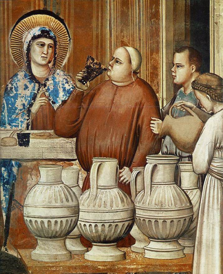
John recounts, ‘there were six waterpots of stone’ – and Giotto has painted all six. On the far right, a servant pours water into one of the pots (her – I’m going for her – face is turned away from us, a very delicate profil perdu), while the Governor of the Feast (I think we’d say Master of Ceremonies – or MC) has already drawn some of the wine, in a silver flagon – which has tarnished and now looks black. Mary raises her hand – as if to instruct him, maybe, or to find out how it is going. Her halo is gold – but it is also built up with a technique known as pastiglio. The wall is plastered, and for true fresco, painted while still wet. But you can add more layers of plaster to make a sculptural effect. In this photograph the fresco is lit (artificially) from below, and Mary’s three-dimensional halo casts a shadow on the wall above. From the floor of the Chapel it makes the halo look like solid light.
The MC is one of my favourite characters in the entire chapel – a man who knows good wine because he has clearly sampled a lot of it – his belly is every bit as round as the waterpots which his form so clearly echoes. I’m also glad that he has brought his son along to help, and, in the fullness of time, I’m sure he would want him to take over the family business. Both have the same snub nose, narrow eyes, square forehead, rounded jawbone and protruding upper lip. The lad hasn’t developed the paunch yet, though.

This is not a great picture, I know, but it gives us a reminder of where we are, looking at the North Wall of the Scrovegni Chapel. At the top tier we see The Birth of the Virgin, The Presentation of the Virgin to the Temple, and The Suitors bringing the Rods (POTD 73 & 31), and then below, Christ Among the Doctors, The Baptism and The Wedding at Cana. Whereas the South Wall has windows, the North Wall does not – leaving space for decorative panels in between the different scenes. Notice how the top tier is decorated in a different way to the lower two, and elements of the decoration keep it quite separate. That is because the top tier involves Mary, and the material is not biblical. The middle and bottom tiers are drawn directly from the bible, though, and concern Jesus himself. Of the decorative strips, those in between the biblical scenes contain important references. Here are the details which occur between the first three scenes in the middle tier.


On the left, we have Circumcision, and on the right, Moses bringing forth Water from the Rock. Both relate to the Jewish scriptures – the Old Testament – and both imply that, as a result of Christianity, the old order has changed. Circumcision is followed immediately by The Baptism – and the implication is that, for men to enter into the Jewish faith they had to be circumcised, seen as an act of ‘making clean’, whereas in Christianity, this ritual has been replaced by Baptism. Circumcision is represented as a symbolic act, rather than using an Old Testament narrative, whereas the small scene showing Moses comes from Numbers 20:11. The Israelites were in the wilderness heading for the Promised Land, but had no water. Moses was instructed by God to strike a rock with his staff, and water sprang forth, thus providing for his people. In the Old Testament, Moses provides water for physical sustenance. In the New, Jesus not only turns that water into wine, but also, later, tells us that the wine is his blood – thus providing spiritual sustenance. And not only that – as the account tells us, he has kept ‘the good wine until now’ – a phrase which theologians interpreted as referring to Jesus himself. The Wedding at Cana is not only Jesus’s first miracle, but it also hints at the events of the Last Supper.

When seen next to each other it should be clear how the interpretation of The Wedding at Cana is enhanced by the image of Circumcision which precedes it: the new order has replaced the old. You will see that there is another decorative panel on the right, and you might be able to see what that is. If not… well, I’ll tell you net week. In the meantime, it’s worthwhile remembering the Jesus was not advocating abstinence. Christian teetotalism is a myth. Cheers!