Day 55 – A Straw Hat

Elisabeth Louise Vigée Le Brun, Self Portrait in a Straw Hat, 1782, National Gallery, London.

I’m no milliner, but I know a straw hat when I see one. And Elisabeth Louise Vigée Le Brun is wearing one here. This is a defiantly confident self portrait. Doubly confident, in fact, because it is a copy she made of one she had only just completed, having written of the first version that, ‘When the portrait was exhibited at the salon, I dare say it greatly enhanced my reputation’. She knew when she was on to a good thing.

Elisabeth Louise Vigée Le Brun, 1755 – 1842 Self Portrait in a Straw Hat after 1782 Oil on canvas, 97.8 x 70.5 cm Bought, 1897 NG1653 https://www.nationalgallery.org.uk/paintings/NG1653

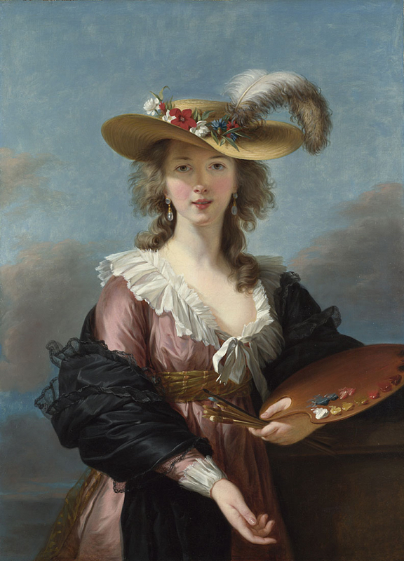
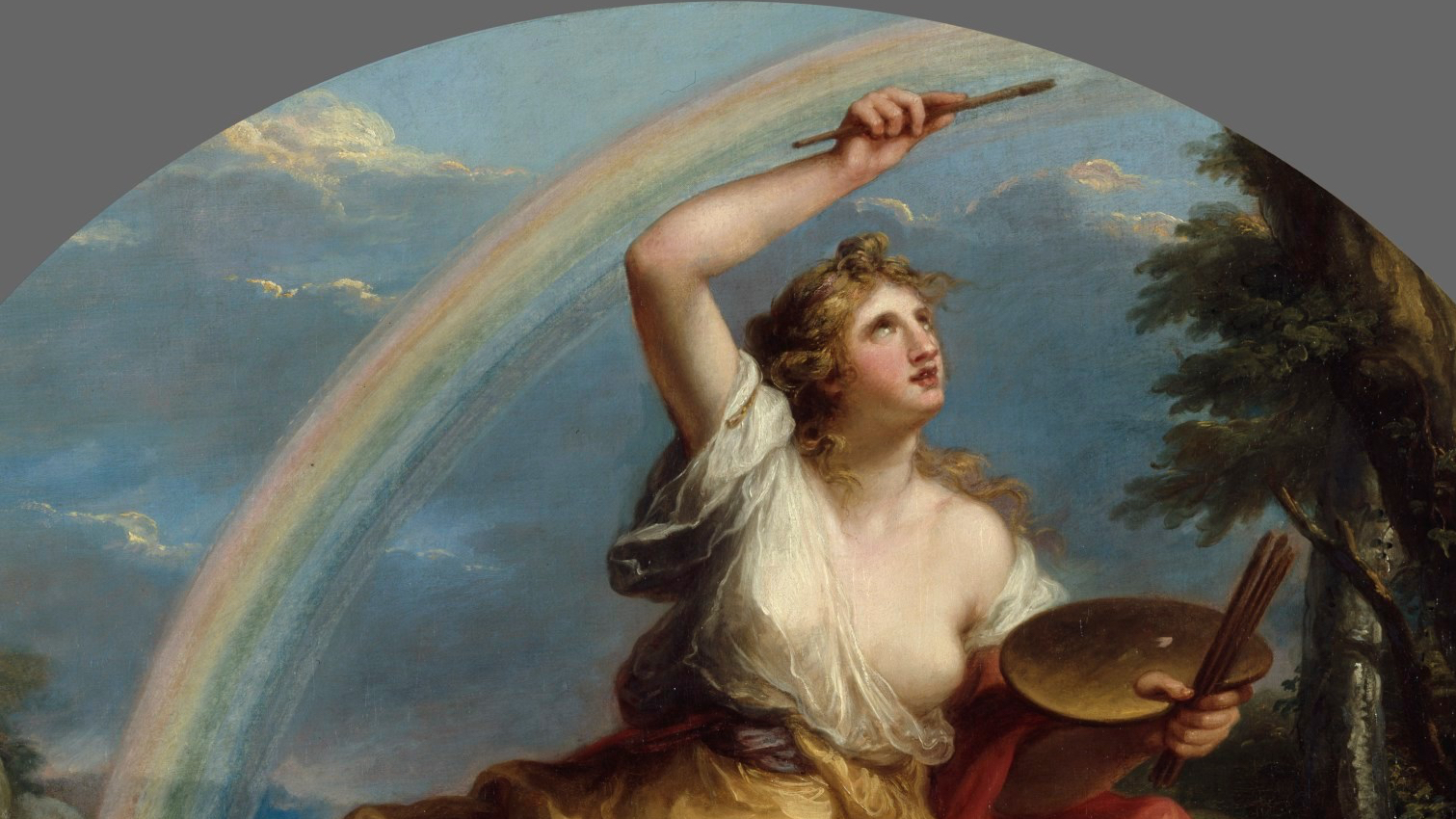
She is dressed in the height of fashion, wearing a pink, high-waisted dress. I think we’d call it ‘Empire Line’ now, but the ‘Empire’ was still a few years off – Napoleon wasn’t to crown himself for another 22 years. Indeed, she was still very actively painting Marie-Antoinette, and would continue to do so until 1789 when the unfortunate royals were arrested – at which point Vigée fled Paris, and ended up painting Marie-Antoinette’s sister Maria-Carolina, who was married to the King of Naples. Elisabeth’s dress has a wonderful, flouncy white collar, and a remarkable décolletage – it’s hard to miss it, as the exposed flesh is not only expansive, but also, with the exception of the collar, the brightest part of the painting. By means of a contrast, she wears a black shawl, which I am reliably informed was a must-have in 1780s Paris – or for that matter, Brussels, where the portrait was painted. And although she is not actually painting now, she was very recently – I suspect she has just laid down her brush, having finished this very portrait. The clue is in the palette, and the brushes she is holding in her left hand. 

Compared to the rectangular palette carried by Catharina van Hemessen back in 1548 (Picture Of The Day 28), Elisabeth Louise uses the archetypal, though more modern, version, far more familiar to us today, designed so that the colour can be laid out in a sweeping curve at an equal distance from the brush. It is arranged from light to dark, from white to black, passing through yellow and red, with blue off to one side, next to some pink which has been made by mixing the white and red. There is not much mess here – which can only mean that Vigée Le Brun is an expert painter, she knows what she is doing. After all, these are all the colours she needs for this painting – no more, no less. The white for the cuff, collar, feather and flowers, the yellows for her hat and the gold sash belt, red for more flowers and her lips, pink for the dress and the flesh tones, black for the shawl, and blue for flowers and sky. Each of the brushes she holds is reserved for a different colour – the white is closest towards us, with black at the top and blue just below it, for example. This isn’t quite the subtly bravura display of Judith Leyster (POTD 34) who was holding at least 18 brushes, a mark of her perception and sensitivity to colour and tone, but it is a mark of precision.

She gazes out at us from under the shade of her hat – the light is fantastic. It cuts diagonally across her right cheek, catching the lustre of her slightly open lips and the tip of her nose. One of her drop-pearl earrings reflects the light, the other is in shadow (what a show off!), and the diffuse light reflecting from her face catches the underside of the rim of the hat. The undulating circles of its woven structure are clearly delineated, and it is dressed with flowers and a feather. This is an ostrich plume, which is not only fashionable and expensive, but it also echoes her natural hair: she is not wearing a wig, as this is a relaxed portrait, not tight-laced formality. The following year (1783) year she would paint the Queen in a simple chemise – which caused a scandal. So much the better for her reputation, and her sales! Not only that, but with this particular painting she was deliberately challenging one of the most revered Old Masters.
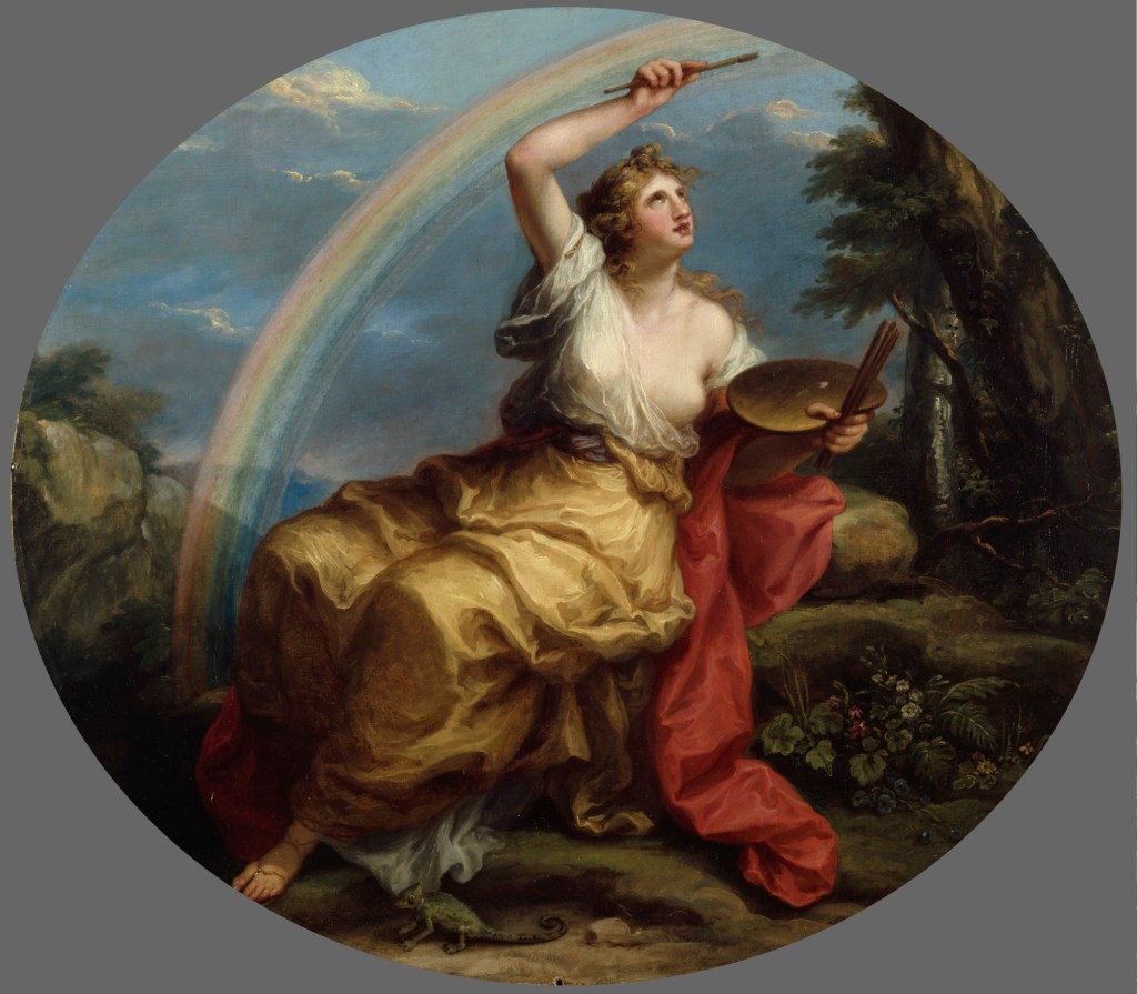
In one of those curious coincidences, both Rubens’s Portrait of Susannah Lunden (?) and Vigée Le Brun’s Self Portrait have ended up in the National Gallery. She had seen the Rubens on a visit to Antwerp, apparently, and was impressed by the combination of direct sunlight and reflected glow – and she deliberately set out to paint her own version. She changes the fashion – from the 1620s to the 1780s – and gives herself a palette and brushes and something to lean on, but it is still an open-air three-quarter length portrait of a woman looking at the viewer, wearing a hat with a feather, two drop-pearl earrings and a remarkably low-cut dress with a brilliantly illuminated décolletage. Apart from this, only the hat is different. Well, that, and the attitude. 

We can almost tell what Rubens’s interest in the sitter was – the clue is in the décolletage, which I’m assuming Ms Lunden – if that is who she really was, we can’t be sure – is displaying to please the men, rather than herself… She is corseted, after all, to give a more Rubensian bust. By the 1780s there was a move against corseting – although it would return.  If this is Susannah Lunden, she would later become Rubens’s sister-in-law. She may look a bit flirty, but she was already married (for the second time, as it happens) – and her younger sister got the eminent artist in the end. She looks out at us with unnaturally large eyes – if you’ve seen Shrek II, it’s what I call the ‘Puss-in-Boots effect’. If you haven’t, you’re probably wondering if you’ve got me wrong all this time. She has also lowered her chin, and is peering out from beneath the brim of her hat – which is what I call the Princess Diana effect. If you understand both references we are probably about the same age…

The Rubens was a remarkably famous portrait, and had already earned itself a nickname back in the 18th Century – Le chapeau de paille, ‘The Straw Hat’. Now, I’m not a milliner, but I know a straw hat when I see one – and that is not a straw hat. The only possible explanation is that it is a felt hat – un chapeau de poil – which actually means hair, but it depends on what type of hair. This is beaver, apparently. Anyway, at some point along the line someone must have mis-transcribed poil as paille and the rest is history. Well, art history. All of which goes to prove that you should never write about a painting without actually looking at it. 

Elisabeth Louise Vigée Le Brun was one of those women who became an artist because her father was: Louis Vigée was also a portraitist, but because he died when she was only twelve, she was mainly self-taught. In her case having a father who was an artist was secondary to her own skill and determination. She married an art dealer, Jean-Baptiste-Pierre Le Brun, which was an astute move, as he could help her find her way to the clients, but it didn’t last and their marriage was eventually dissolved. Precisely how cynical a move the marriage was on her part is hard to determine, but her connection to the art market nearly got her excluded from the Academy – but then, they were trying anything to keep the women out. She wasn’t having that though, and fought her way in. So why the low-cut dress? Does she want to objectify herself? Oh no! She knows exactly what she’s doing. It’s something I said about Judith Leyster (POTD 34) – she’s doing a man’s job, but she wants to show that there is nothing mannish about her. And let’s face it, you really wouldn’t paint in that dress. And certainly not in that shawl. Imagine, every brushstroke with her right hand, the shawl would be flicked forward and catch on the palette, on the spare brushes, on the canvas… it would be a mess. But no, not her – clean, tidy, precise… and feminine. 

Elisabeth Louise Vigée Le Brun, 1755 – 1842 Self Portrait in a Straw Hat after 1782 Oil on canvas, 97.8 x 70.5 cm Bought, 1897 NG1653 https://www.nationalgallery.org.uk/paintings/NG1653

One of the reasons that women didn’t get to be artists was because they didn’t know about art, they just didn’t have the education. Well, that’s what the men said. But Vigée Le Brun does – she knows about Rubens, understands the brilliance of his depiction of light, and can better him. Compare the earrings – there’s no doubting it. Look at the precision of the shadow cast across her face. And look at the indirect light on the underside of the hat – Rubens doesn’t even attempt that.

So there you have it. She is an artist, doing a man’s job, but she’s all woman. And she knows about art. And what’s more, boys, she knows what a straw hat is.

Day 53 – Psyche IV: ‘The Tasks’

Giulio Romano, The Story of Psyche, 1526-8, Palazzo Te, Mantua.

Where are we? Back in the Sala di Psiche – or Room of Psyche – in the Palazzo Te in Mantua. And where were we? Oh yes – we left Psyche sitting and snivelling outside Cupid’s castle, having realised how much she loved him, back in Picture Of The Day 45. And, as I said then, ‘it is at this point in the story that she makes the worst decision possible. She decides to ask Venus if she knows where Cupid is…’ Now Venus hasn’t seen her son for a while, and doesn’t know what he’s up to. She also doesn’t know what has happened in her plot against Pscyhe (POTD 43 & 44) – because she hasn’t heard from Cupid. So when Psyche turns up at Venus’s door, declares her love for her son, and asks the Goddess of Love if she knows where he is – well, Venus is apoplectic. Apart from anything else she doesn’t know. She says she’ll try and find out where he is, if Psyche doesn’t mind helping her out in the kitchen for a while. She then disappears for a moment, Psyche hears a lot of crashing and cursing in the kitchen, and then Venus comes back and says, ‘I’ve had the most terrible accident, and spilt all my pulses – there are kidney beans and borlotti beans – not to mention chick peas and lentils – all over the place. I don’t suppose you could sort them out for me? I’m just popping out for a while to find out where Cupid is, and I’ll let you know when I get back’. With which, she disappeared again, leaving Psyche to clear up the mess. Obviously Psyche wasn’t best pleased, and sat there moping for a while, until eventually she started slowly, and half-heartedly, picking up the odd lentil, and putting it in one corner, then a chick pea in another, etc., etc., fully aware that she would never get it done. Until, all of a sudden, unannounced and out of the blue, a crack team of highly skilled ants appeared, curiously expert at kitchen maintenance and the organisation of ingredients. They ran in, picked a pulse each, and took it to the relevant pile. Sorted! And if you don’t believe me, have a look at this painting by Giulio Romano:

What do you mean, you can’t see the ants? You can at least see the inchoate pile of pulses on the left, from which flow ordered ranks of ants towards the coherent piles on the right. Psyche sits there every bit as miserable as she was in Claude’s Enchanted Castle last week, head in hand, and curled up as foetally as possible while still seated. And in case you still don’t believe me, here is a detail from a pre-cleaning image: on this scale the ants are more visible:

This is one of the episodes which Giulio Romano included in the lunettes (semi-circular paintings) at the tops of the walls of the Sala di Psyche. As a reminder – and so you can see where the lunettes are – this is what the Sala di Psiche looks like (although the ants are on one of the walls behind us):

Venus returned, and was astonished to find that the task had been completed, the pulses were sorted. How was it possible? (Hint: the other Gods were on Psyche’s side – Venus wasn’t always that popular with the others). Now, you may be thinking that this story reminds you of something else: a girl, left to do the kitchen work, with sisters she argues with, and a mother (not hers) who is a bit of a harridan… Yes, this is the origin of Cinderella. And in the original version – known to any fan of Stephen Sondheim and Into the Woods – Cinderella has to pick the beans out of the ashes, or cinders – hence her name. However, Cinderella’s little helpers are birds who fly in, pick out the beans, and drop them into a pot. They then later return to peck out her step-sisters’ eyes. Well, that’s another story, nevermind…

Anyway, as it was clearly taking longer than Venus expected to find Cupid (or at least, that’s what she said), she set Psyche another task. She pointed to a large wood with a river running alongside it, where, she said, there were sheep with golden fleeces. Her request was simple: to get her some of their wool. Psyche’s first instinct was to jump into the river and so end it all – until a friendly reed, growing on the banks of the river (yes, there are some), piped up and told her not to do that, as she didn’t want her river polluted (maybe not so friendly after all). She did, however, advise Psyche not to get too near the sheep, as they were pretty violent, and also suggested that, if Psyche wanted to wait until the sheep were resting, she could then gather strands of the golden wool that had got tangled in the bushes and briars around the edges of the wood. 

Again, this is a story that Romano tells in one of the lunettes. And, remembering that the Palazzo Te was built as a pleasure palace away from the cares of the court, Giulio is intent on being none-too-serious with what is, let’s face it, a none-too-serious story. Most of this painting is taken up by the River God, who reclines, as they do, pouring his river out of a jug. But then Romano makes him entirely watery: his flowing white hair and beard add to the flowing river – the white water being the sort that you wouldn’t even want to go rafting in (although it would, presumably, have suited Psyche’s original purpose). However, given where some of the water is coming from (I did say that this room isn’t the most… respectable… in Renaissance art), I wouldn’t want to swim in it anyway. The reed appears to be popping out from the very rock formation which is also the source of the river. With blond hair, and a suitably reed-green dress, she points Psyche in the direction of the sheep – and the bushes on which the wool has been snagged. Psyche appears to be tugging at some now – notice how she is wearing the same yellow gown as in the previous painting: it is important for characters in long stories to wear the same clothes, or you might not know who they are – just think of any superhero.

Once more, Venus was astonished. And once more (or so she said), she hadn’t managed to find Cupid – so, she sets a third task. This one seemed quite simple – just go and get a flask of water from a river. Which would have been fine, if it weren’t for the fact that it was the River Styx, which leads to the Underworld. Psyche headed off, ready for more despair. Indeed, she would have been a good contender to model for Giotto yesterday (POTD 52). Once more she considered suicide, but even that seemed impossible, as there were dragons appointed to guard the river. She reached down as far as she could to get some water, at which point Jupiter’s eagle took it upon himself to fly down and help her – he grabbed hold of the crystal vessel Psyche had been given by Venus, and filled it for her. 

Once again, Giulio Romano is in what we might today see as comic-book mode, with cartoon dragons on either side sporting long curving necks, tails and tongues. Psyche, who rather unhelpfully, given what I just said, has had time to stop and change into a green dress, is still stooping, trying to reach the water. The eagle is already there, all dignity, calm, and sobering solemnity, just about to take the container from her. Once he has returned it, Psyche heads back to Venus’s palace, her task fulfilled.

Raphael, in the Farnesina, imagines Psyche getting a lift back from accommodating amoretti, and, when Venus is unexpectedly given the filled phial, he shows her with the most wonderfully ham gesture of shock. We will look at this particular cycle in more detail another day, but, if you’re surprised by the slightly mechanical gestures, remember that Raphael may have designed these frescoes, but he didn’t paint them. Likewise, Giulio Romano (who had worked for Raphael in Rome) designed the paintings in Mantua, but had a team of assistants helping him to paint them. Notice how Psyche is wearing yellow (well, almost wearing…) – maybe this is one of the ideas that Giulio took with him to Mantua. Maybe Raphael wasn’t exaggerating Venus’s incredulity, though. In one early English translation of The Golden Ass her disbelief is palpable: ‘What, thou seemest unto me a very witch and enchauntresse, that bringest these things to passe, howbeit thou shalt do nothing more’.

What does she mean, ‘thou shalt do nothing more’? A fourth – and final – task, of course.  One that should shut Psyche up for good. It seems that Persephone (or, if you prefer, Proserpina), who had been carried off to the Underworld by Pluto (or Hades), having nothing else to do had released a new fragrance – as celebrities often do. It was called ‘Everlasting Sleep’ (to be honest, I don’t think this is quite how Apuleius wrote it, but the effect is the same…), and Venus wanted some. So she sent Psyche to get it… Still in green, she heads to the top of the tallest tower, once more to end it all – and, as luck would have it, the tower, like everything else, had her best interests at heart, and gave her some really useful advice. Not only did it tell her which way to go, but also suggested that she should take two cakes and a coin with her. And one other thing: she should not, under any circumstance, smell the fragrance. OK… you know where this is going.

All she has to do is to pay the ferryman (with the coin) to get over the river Styx, and then give the three-headed dog Cerberus one of the cakes, to calm it down (the other one would get her out), and so here she is in the Underworld, with Cerberus looking pleased having eaten his cake on the left, next to Charon, the Ferryman. Persephone, enthroned as Queen of the Underworld at the Right Hand of Pluto, hands over the fragrance in a white urn, while tormented souls look on… Psyche heads back out, wondering what this fragrance could possibly smell like. Of course, this is the point at which she does the one thing that she is not supposed to do. She opens the jar, smells the fragrance – ‘Eternal Sleep’ – and falls asleep for ever. And this is how Cupid finds her.

Day 52 – Three Vices

Giotto, DespairEnvy and Infidelity, c. 1305, Scrovegni Chapel, Padua.

This week, for Scrovegni Saturday, I thought we should cross to the other side of the chapel and have a look at the Vices which are paired with last week’s Virtues – paired with, or rather, opposed to: they are indeed opposite. I haven’t yet enumerated all Seven Virtues (that will have to wait until next week), but you might expect them to be paired with the Seven Deadly Sins – but no: these are Vices, not Sins – although I would assume that the Vices would lead to various sins. As it happens, they are, almost, the exact opposite of their equivalent Virtues.

You might want to look back to last week (Picture Of The Day 45), to remember where we were, but I will post this picture again anyway. It is not actually the chapel, but a very good replica of it – we are looking towards the West End, with the Last Judgement we saw in POTD 38. At the bottom of the left wall, and closest to the West End, you can see Hope reaching up towards Jesus, who is enthroned just below the window at the end of the Chapel. To the left of Hope – after the two decorative panels – there is another figure reaching up: Charity. On the right-hand wall, similarly conceived as a stone sculpture in a rectangular niche, at the far end of the wall, a figure hangs with her arms down – this is Despair. To the right of her, with flames burning around her feet, is Envy. They really benefit from being compared to their opposing virtues.

Despair has led to suicide, and although the church’s teaching on suicide has altered over the centuries, it has never been favourable. Back in the fourteenth century it would have been considered a mortal sin: if anyone who commits a mortal sin dies without repenting, there is no doubt: they will go to Hell. Hence the devil appearing above the figure, so disturbing to visitors across the centuries that it has been vandalized. The scarf that Despair has used to hang herself has suffered the same fate. All is downward – her weight, the direction of the arms, the fall of the head. What a contrast with the upward movement of Hope, which lifts her off the ground, her hands, relaxed and open, reach out to take the crown of salvation held for her by an angel. Despair’s hands are clenched, her arms tense and held out from her body, and although her weight pulls down on the rope, causing the beam it is tied to to bend, her feet still hit the floor. They cannot support her weight, and she buckles at the knees. Remember that both are next to the Last Judgement. In the same way that Hope’s gesture continues across the fresco on the adjacent wall towards the figure of Christ, the demon that comes down to take Despair’s soul seems to have flown – or even flowed – from the rivers of blood that issue from the throne of Christ. Her left arm continues this downward diagonal – a contrast to the upward reach of Hope’s arms on the opposite side of the room. And not only that, but look how she has let herself go! Her hair is undressed, and waves, snakelike, down the left side of the figure. As a contrast, Hope has the most pert coiffeur, wrapped into a bun that seems to stand up almost supernaturally. 

The contrast of Charity and Envy is similarly extreme. Both have a relationship to money – and also, to fire. Whereas Charity tramples worldly wealth underfoot, Envy grasps hold of a moneybag in her left hand. She doesn’t need to: there is a thin cord tying it to her belt in any case. The moneybag is a key symbol in this chapel, as you will remember, because the patron’s father had been condemned to Hell as a notorious usurer. Jesus instructed his followers, ‘lay up for yourselves treasures in heaven’  (Matthew 6:20), and to hold onto earthly treasure, rather than giving all you have, is seen as inimical to God’s word. She is literally burning up with envy – flames lick all around her legs as if she were on a bonfire. Charity  – or Love, to give her her other name – also burns, but with the unqualified love of and for God. You can see three flames around her head, in front of what looks like a halo. I have no doubt that we should imagine a fourth reaching down behind her neck, not unlike the cruciform halo seen so often in images of Jesus. In fact, it is only Jesus – and the Holy Spirit – who are shown with a cross in their haloes. You can always tell the difference, though, because the Holy Spirit is depicted as a dove. By arranging these ‘flames’ around Charity’s head, Giotto creates a very clear parallel between Charity/Love and Jesus – God is Love. She reaches up to the sculpture of God in the niche, giving or taking – or even sharing. Envy also reaches – but it is a grasp. And while Charity’s reach is, beyond the sculpture, towards the figure of Christ in the Last JudgementEnvy is unwisely grasping towards Hell – and maybe, to some of the moneybags that can be seen there too.

Last week I pointed out that the background of the rectangular niches are painted as if inlaid with a slab of dark stone, which I said was serpentine – a dark, olive green, metamorphic rock. Some of these slabs are indeed meant to be serpentine (e.g. for Hope), but I realised, just after I posted, that they are not all the same. Envy’s background, for example, was clearly designed to emphasize the red of the flames: it is painted to look like porphyry, which is a deep red igneous stone with coarse crystals in a fine-grained matrix. Notice how the paler stone which surrounds it is veined: the convoluted patterning adds to Envy’s sense of anxiety, whereas the light marble which frames Charity’s niche is far calmer. Charity is also seen against a porphyry background, although the photograph makes it look like a different shade of red – which it may well be in the original. This red again ties in with the flames (in this case emanating from her head), but it is also fitting because red is often used as symbolic of Charity. The other Theological Virtues are represented by green (Hope – hence the serpentine) and white (Faith). 

Envy has an entirely alarming head, the whole thing seemingly bandaged together. She has sharp horns which curve back and seem about to pierce her neck, and a serpent for a tongue, which forces its way out of her mouth, only to bend back and threaten her. Not only is she burning up with envy, she is about to start gnawing on herself. She also has large ears – which may be a reference to Midas. He is best known as a result of his envy – he was envious of other people’s wealth – and wanted everything he touched to turn to gold. He got his wish, but as everything – from food and drink to his own family – were transformed as requested, he lost far more than he gained.  However, in another story about him he was asked to judge a musical competition between Apollo and Marsyas. Foolishly, he favoured the latter – and Apollo got his revenge by giving him ass’s ears. The reference to one story would be intended to trip a memory of another: ass’s ears, Midas, gold, envy…

While we’re talking about memory, I remember bringing in Marcel Proust last week. Envy is another one of the figures from the Scrovegni Chapel that he discusses in À la recherche du temps perdu, the narrator clearly remembering how off-putting he found the image when he was a schoolboy:

‘…that Envy, who looked like nothing so much as a plate in some medical book, illustrating the compression of the glottis or uvula by a tumour in the tongue, or by the introduction of the operator’s instrument…’ 

However, he learnt how to appreciate these figures:

‘But in later years I understood that the arresting strangeness, the special beauty of these frescoes lay in the great part played in each of them by its symbols, while the fact that these were depicted, not as symbols (for the thought symbolised was nowhere expressed), but as real things, actually felt or materially handled, added something more precise and more literal to their meaning, something more concrete and more striking to the lesson they imparted’.

(For more context, and more of this passage, go to the Public Domain Review)

This use of ‘real things, actually felt or materially handled’ also applies to our final comparison today, between Faith and Infidelity.

Rather than the poise of Fidelity, whose balance shows the security of true belief, Infidelity seems off balance, leaning backwards, on the verge of moving out of the picture altogether. Although she could be similarly statuesque in appearance, she is rather more bulky: she has weight, rather than gravitas. Whereas Faith holds something in each hand, Infidelity has little to hold onto but her own robe. Faith holds a text aloft, something to believe in, and this is echoed by a smaller scroll held by a figure in the top right of Infidelity’s niche. This could represent a prophet that she is ignoring, and signals that she has neglected true authority.

The discarded idol, broken at Faith’s feet, is replaced by the figure held up with respect, looked after, and intact, which is physically – and metaphorically – tied round Infidelity‘s neck. She cannot get away from this pagan god, however hard she leans away from the Hell of the Last Judgement and offers this idol to the devil. The flames are licking at her feet, too.

To be honest, I feel like they are licking at mine! The amount of thought that went into this fresco cycle is astonishing, every detail seems to have been deliberated over, conceived as an entity in its own right, and yet related to the Chapel as a whole. Nothing is left to chance. Each of these individual figures is a masterpiece – and yet there is so much more going on above them. I feel like I’ve barely started! So next week, so as not to delay too long, I shall introduce the four Cardinal Virtues – and their opposing Vices. 

Day 51 – The True Cross

Giambattista Tiepolo, The Discovery of the True Cross, Gallerie dell’Accademia, Venice.

Just over a week ago I talked about Verrocchio’s lively bozzetto, or Model, for the Funeral Monument for Cardinal Niccolò Forteguerri (Picture Of The Day 42), and I mentioned that a bozzetto could be any type of sketch (or model) that an artist creates as part of the development of a new work. That happened to be a relief sculpture in terracotta, and today we have a bozzetto which is an oil painting. In case you were wondering, this should be pronounced ‘bot-tsetto’, the double ‘z’ being pronounced as in pizza, and not as in razzle…

It is a gorgeous little thing, measuring just 50cm across, and shows just how brilliantly Tiepolo could handle paint, with freedom, delicacy and precision. He doesn’t get a great press nowadays. People tend to find his pale pinks and blues a little bit chocolate-boxey – which is a great pity, as they are gorgeous colours, light and airy, and ideally suited to a fine spring day on the Venetian lagoon – or dawn in La Serenissima at any time of the year, to be honest. These colours evoke the spirit of the place, and given the vast areas of ceilings he was required to paint, it is hardly surprising that he chose to simplify matters by painting so much sky. Tiepolo is also seen as being on the frivolous side of religious painting – which is simply not true. If only more people had found quite so much joy in the depiction of saints and of sanctity, the church itself might have had a better press. 

The bozzetto is a sketch for a circular ceiling painting originally made for the Church of the Capuchins, which is not so terribly far from Venezia Santa Lucia (the railway station) or, in Tiepolo’s day, the Church of St Lucy (which was destroyed to build the station). I don’t think I’ve ever been in – but then, that’s probably because the Tiepolos aren’t there: the finished painting has ended up in the Accademia, in the same room as the bozzetto. It shows The Discovery of the True Cross, the high point of a story which is rather wonderful, but far too long to tell here (well, it does start with the death of Adam…) There are two main fresco cycles illustrating the story, one in Santa Croce in Florence (which makes sense, as the Church is dedicated to the True Cross), and the other is in San Francesco in Arezzo – we saw the Annunciation by Piero della Francesca from this cycle back on the Feast of the Annunciation (25 March, POTD 7). It is not a coincidence that both are Franciscan Churches – St Francis himself had a particular devotion to the Cross (POTD 29), and as the Capuchins are a reformed Franciscan order, it’s not surprising that they were interested in the same subject. 

The Legend of the True Cross is recounted in full in The Golden Legend. This episode comes towards the end of the story. After the conversion of the Emperor Constantine to Christianity, it says, his mother, the Empress Helena, went on a pilgrimage to the Holy Land to find the Cross on which Jesus was Crucified. On arrival, none of the locals would tell her where it was, although it was clear to Helena that they knew. So she had one of them, named Judas (probably not a coincidence – it must have been part of God’s plan) thrown into a pit. Seven days later he was more than happy to dig up the Cross himself. However, he got more than he bargained for: he dug up three crosses. Not only was Jesus’s there, but also the two on which the Good and Bad Thief had been Crucified. But which was the True Cross? Judas came up with a cunning plan. As it happened, the funeral procession of a young man came past. I used to think that the deceased went by the name of Lazarus, which also wouldn’t have been a coincidence, but I might have made that up, as I can’t find any evidence for it just now. I’ll stick with it, though, to make things simpler. The funeral bier was placed on the first cross – but nothing happened. It was then placed on the second cross – nothing again. Finally, when they got to the third, Lazarus stirred, came back to life, sat up, and then promptly knelt down in adoration. This was it – the True Cross!

This bozzetto might be the one that Tiepolo would have shown to the Friars to get their approval. Would this composition would suit them? As with so many canvasses designed for a ceiling, it is painted da sotto in su (from below, looking up – POTD 44), as if we are at the bottom of the hole which was dug to find the crosses. The True Cross is held aloft, with the Empress Helena, or St Helen (she became a Saint because of this, and because of her association with Constantine), standing at its foot, and pointing up to it. On the other side of the hole, Lazarus kneels, having fought his was out of the shroud, praying in thanks for his renewed life and in awe of the discovery of the Cross. His funeral bier is dark and discarded in the shadows at the bottom of the sketch. Behind Helena, in the shadows, is a Bishop – his mitre forms a silhouette against the sky. On the other side of the sketch looms the silhouette of a Roman soldier on horseback. Angels float on Tiepolo-pink clouds up above, one of them waving a thurible, or censer, while others pray and throw their hands out in astonishment.

Accademia – Giambattista Tiepolo, L’esaltazion della Crose e sant’Elena

If we get close in, and look at a detail, we can see how effortlessly Tiepolo seems to have thrown it together. St Helen’s creamy white robe flows around her body, picked out by a minimum of brushstrokes made with a loaded, small brush, in shades of dark brown (for the shadows), creams and whites, flicked on to create movement and form. Then, in an even darker brown, he has drawn in the outline to define the shape. You would think he would start with the ‘drawing’ and then do the ‘colouring in’ – but Tiepolo does it the other way round: get everything in more or less the right place, and then check you know where that is. Dufy would do the same a couple of hundred years later.

Helena’s face is almost lost behind her shoulder – we just catch her left eye, and her profile, as she looks down towards the miraculous resurrection, while pointing upwards to explain it. Her red cloak flows back to the edge of the circle, held back by a creeping figure in blue, and wraps around her to show a flash of red to the left. The colour is picked up by a cloak on the other side of the gap between her and Lazarus, drawing our attention towards him. The darkness of the forms below the red, and the purity of the shroud around his legs, make his body ring out. Further back we see the quickest sketch of the face of an onlooker – a daub and some detail – and the head of a white horse, with a rather dashing mane spirited out of two or three quick flicks of the brush. A little flash of red in the distance helps to hold the composition together. I love Tiepolo’s facility with paint, and I love his economy of means. And I also love that fact that, because this bozzetto is exhibited in the same room as the finished painting, you can, in true exam style, ‘compare and contrast’.

If the sketch is a mere 50cm across, the finished canvas is 5m: every measurement is ten times longer – or, in terms of the surface area, one hundred times larger. I would love to know if all of the changes were specified by the patrons: ‘Yes, it’s lovely Giambattista, but you can’t see her face. People don’t like it if you can’t see their faces’ – so he repositions her, makes her stand behind the cross, and look down towards Lazarus so she is more visible to us, more majestic, perhaps, but less original and less intriguing. Lazarus is also slightly turned towards us, and his bier pushed further down into the darkness, marginalized. Helena stands on a classical entablature: the story says that a Temple to Venus had been built over the site of the Crucifixion – maybe this represents its destruction. The soldier on horseback is still very present, a witness to the scene, and framing the image on the left-hand side, but the Bishop has been told to be more reverential. He kneels down, and has removed his mitre: it is held by a servant, who also has his crozier, just a little to the right. One of the other crosses lies, unregarded, to the bottom right, and nearby a banner reads SPQR – Senatus Populusque Romanus – ‘the Senate and People of Rome’. Helena was the wife and mother of Emperors, after all.

The angle of the True Cross has also changed. The upward diagonal leads our eye up to an angel who wasn’t in the bozzetto: the angel with the thurible has been somewhat demoted. The newcomer carries a small plaque saying INRI – Iesus Nazarenus Rex Iudeorum – ‘Jesus of Nazareth King of the Jews’ (POTD 23), an explanation of the ‘crime’ of Jesus which, according to the bible, Pontius Pilate attached to the top of the Cross. It is known as the titulus and is rather important here, as St Helena is supposed to have taken it to Rome. According to tradition, she founded a church called Santa Croce in Gerusalemme (Holy Cross in Jerusalem) in about 325AD to house the relics she had brought back from the Holy Land. The church is still there, heavily rebuilt, although rarely visited nowadays. However, some people believe that the titulus is there to this very day. It would still have been an important relic in the 18th Century, and no doubt the Capuchins would have wanted it to be clearly visible – hence its position at the top centre of the painting.

Sadly, the pink clouds of the bozzetto have gone – and with them the poetic, almost nonchalant air that Tiepolo had conjured up. The finished painting has all the majesty of a grand statement, and, when you get close to it, it has the master’s typical bravura brushstrokes – he lays on paint with a freedom and ease that looks like butter icing applied to a firm cake – but it doesn’t have the refreshing spontaneity of the bozzetto. I like both, if I’m honest, as Tiepolo excelled at both ‘modes’ of painting. But I know which one I’d rather hang in my study.

Day 50 – St George

Paolo Uccello, St George and the Dragon, about 1470, National Gallery, London.

It is now two weeks since St George’s Day, and I did say I was going to tell you the full story – at least, the full story as I know it. In the full story St George gets killed several times, and at one point, I believe, is even chopped up into tiny bits and scattered across the land, only to come back to life. In this, he is related to the Green Man, a symbol of fertility, and inevitably to the idea of death and resurrection – new life being especially important around the end of April when he is celebrated. But today, I just want to talk about the dragon.

Paolo Uccello, about 1397 – 1475 Saint George and the Dragon about 1470 Oil on canvas, 55.6 x 74.2 cm Bought with a special grant and other contributions, 1959 NG6294 https://www.nationalgallery.org.uk/paintings/NG6294

We make certain assumptions about dragons which weren’t common in Paolo Uccello’s day, as we can see from this painting. His source material would have been the Golden Legend – which I have mentioned before (Picture Of The Day 31 & 36), and will mention again tomorrow. We tend to think that dragons live in caves, and breath fire. But that’s not what the Golden Legend said about this one. Apparently, it lived in a large lake, and its breath was so toxic that if you breathed it you would die – it spread the plague. Basically, in future you should remember to stay at least 2m away from any dragon – although personally I would avoid them altogether. 

Uccello is slightly hedging his bets here, as there is a cave, but inside the cave, there is a lake, which seems to have some kind of whirlpool in it – you can see it on either side of the Princess’s shoulders. While we’re talking about assumptions, the other assumption that we commonly make is that princesses are scared of dragons, and need rescuing, but that really doesn’t seem to be the case.

If anything, she looks like she has put the dragon on a lead, and is minding her own business taking it for a walk, when St George has charged up and stabbed it through the head with his lance… She looks mildly irritated, gesturing towards it with a feeble look of dismay. In her place I would be furious. The dragon is clearly suffering – the head being lowered is surely a bad sign, although my understanding of the body language of dragons is sadly limited. But it is bleeding, and a pool of blood is gathering on the ground. Uccello is playing all sorts of games here. One is the pigment: there is a pigment called ‘dragon’s blood’ which was used for red paint, although this red is different. ‘Dragon’s blood’ came came from the resin of a tree, and I have always imagined it dripping down and forming puddles in the forest just like this. I’m not convinced that’s how it works, but Uccello does use the pigment elsewhere – in his other painting in the National Gallery, for example, the Rout of San Romano, where it colours the hat of Niccolò da Tolentino. He is also playing with the idea of feet – the princess’s shoes are of the same red as the dragon’s blood – and very pointy. It is as if her feet were equivalent to the dragon’s talons. Have a look round the painting – there are all sorts of pointy things, including the toes of George’s armour, and the dragon’s fangs: indeed, its open mouth is rather similar to the wide, craggy mouth of the cave. There are also a large number of circular elements – from the whirlpool in the cave, the strange cloud formation in the sky (which no one has ever explained satisfactorily) and the curious crescent moon, to the plates on St George’s armour, and the RAF targets on the dragon’s wings. It seems to be trying to get in on the Englishness of it all (not that Uccello would have known anything about that) – given that St George’s horse is white, and it has red trappings, forming the cross of St George (or as I explained in POTD 36, the Flag of Christ Triumphant) all over it.

Another curious feature is the grass, which appears to be growing in unnatural squares. The fact is, Uccello was slightly obsessed with perspective – Vasari certainly thought so, telling a story in which Paolo referred to perspective as his new mistress, to the extent that he wouldn’t go to bed with his wife. Perspective is fine if you have an avenue of trees, or a train track (which Uccello obviously didn’t), or even a tiled floor, as Donatello did yesterday (POTD 49), but if you’re outside in the countryside, how can you show parallel lines getting closer together? Uccello seems to have decided that the best way to do this was to invent astroturf, and lay the grass in squares.

But apart from that, what is going on? Well, the people of Silene, in Syria (you may remember that the Golden Legend moves George from Cappadocia to Syria – he got around), were being persecuted by this dragon, and, long story short, decided to do a deal with it: they would send two sheep every week. Unfortunately, the sheep ran out, so they decided to send a person instead. Lots were drawn every week, and the person who drew the short straw was sent off to be eaten, a system which seemed to work reasonably well, unless of course, you were the one to get eaten. That was until the Princess drew the short straw, and her father, the king, refused to let her go. I imagine he was planning on marrying her to a handsome prince so that they could live happily ever after – whether she wanted to or not. Eventually, after a while, the dragon started to get hungry and came closer to Silene, at which point the people panicked because they thought they were all going to die from the breath of the dragon. Rather than rushing off into self-isolation, they all rushed to the king, and protested that, as their children had been eaten, so should his daughter be. As the king was about to pull out his Trump card, and say that his daughter was supposed to marry a handsome prince (who would also, I’m guessing, handle the King’s business portfolio), his daughter piped up and said ‘No’! It was better that she should be eaten, than that everyone else should die from the breath of the dragon. So she headed out to die, and at that moment, St George happened by (the Golden legend really does say it like that). At this point, you may be thinking, she would swoon, recognising a Knight in Shining Armour when she saw one, and beg him to save her life. Oh no! Not this princess! She asked him what he was doing there, to which he replied ‘I have come to save you from the dragon’. Now, although she suggested that there really was no point in both of them dying, as that is surely what would happen, he stuck to his guns, repeating ‘I have come to save you from the dragon’ in a needlessly macho way, and an argument ensued. Eventually St George did what men tend to do – which is do what they wanted to do in the first place. He took out his lance and ran it through the dragon’s head. Fortunately lances are longer than 2m.

At this point, he asked the princess to take off her belt. “But we’ve only just met’, she replied. No, sorry, the Golden Legend doesn’t say that, that was a different story.  He asked her to take off her belt and tie it round the dragon’s neck – which she did. At which point (and the Golden Legend really does say this) it lifted up its head and followed her like a little dog. I have two things to point out before we go any further: (1) that is why she looks like she has the dragon on a lead. It is another example of a continuous narrative, with two parts of the story being shown at the same time (i) St George is dealing the dragon a non-fatal blow and (ii) the princess has tied her belt around the dragon’s neck. He has not yet, however, lifted up his head. (2) She is still wearing a belt. From this I assume that any self-respecting princess will always go out with a spare belt. Own up, ladies, I know you’ve all done it.

From thence they headed back to Silene, at which point the inhabitants really did socially distance and ran back home, terrified that they would all die, but somehow the breath was no longer so toxic. They did, nevertheless, scream from their windows, asking George why he was bringing the dragon into their midst. He proclaimed that God had sent him to save them from the dragon, and that if they converted to Christianity, then he would slay it. ‘And on that day, many thousands of people were baptized…’ it says. And the dragon was slain. 

I’ve never been happy with this ending, as it is blatantly blackmail. And also, the poor dragon dies. It was only doing what dragons are supposed to do. Although, of course, it was only ever a symbol in the first place – and we all want good to triumph over evil. So remember: keep 2m away from everyone (but don’t carry your lance around in public as a measure, it might be misconstrued), and remember to wash your hands. And if you want to avoid dragon breath, maybe brush your teeth as well.

Day 49 – Donatello in Lille

Donatello, The Feast of Herod, c. 1435, Palais des Beaux-Arts, Lille.

There must be something about Donatello that means that I keep coming back to him (Picture Of The Day 25 and 35) – it’s probably the simple fact that he was very good. One of the best, in fact. And this particular image – not his most famous work by any means – has been sitting in my mind for a while for all sorts of reasons. One is that I have mentioned Alberti quite a few times, and I might even have said that he was the first person to write down how to ‘do’ single vanishing point perspective. The technique was worked out by Brunelleschi, best known as an architect, around 1415, and first used in paintings by Masaccio in the years 1425 and 1426. However, a relief carved by Donatello in 1417 suggests he’d got a pretty good handle on it already, although the relief is fairly worn now, after centuries outside, and only a little bit of it could be classified as ‘in perspective’. But by the time he carved this masterpiece, there is no doubt that he knew what he was doing. 

It is generally dated to ‘c. 1435’ – which is, coincidentally – and I really think it is a coincidence – the year that Alberti wrote On Painting. Both Alberti and Donatello presumably learnt the technique from Brunelleschi anyway. The other reason it has been in my mind is that this is one of the finest exhibits in the Palais des Beaux-Arts in Lille, which is the next place I am scheduled to travel should we come out of lockdown – and as we’re not due to go until December, I’m hoping it may yet be possible!

When talking about the Resurrection (POTD 25) – one of the reliefs on the South Pulpit in San Lorenzo in Florence – I said that it broke all of the rules – and that is something you can only really do if you know what the rules are. Otherwise you are just doing your own thing.  Donatello really did know the rules, some of which he had effectively written himself. It is a type of sculpture known as rilievo schiacciato (pronounced skee-atch-ee-ah-toh), which means flattened, or squashed relief. It was effectively invented by Donatello himself, although he may have been influenced by some of the passages in low relief by his one-time master Lorenzo Ghiberti in his first set of doors for the Florentine Baptistery. Donatello perfected a technique in which the depth of the carving doubles as an indicator of distance. Anything in the foreground is carved in higher relief, and the further away an object is supposed to be, the lower will be the depth of the carving, until objects in the distance will appear as if scratched into the marble background. The effect is similar to atmospheric perspective, whereby the air, dust and haze in between us and distant objects make them look fainter. There was no precedent for this type of carving at all. Classical relief carving was well known: there were, and still are, Roman Sarcophagi to be seen all over Italy. And by the time this particular sculpture was made Donatello had spent some time in Rome itself, where, in addition to the sarcophagi, relief sculptures could be seen all over the triumphal arches and columns. However, it is only ever carved in what we would think of as high relief. Figures appear like statuettes that have been sliced down the middle and stuck onto a flat background, whereas Donatello’s figures move in and out of space as his chisel moves through the marble like a hot knife through butter. There is hardly any real space here, it is a matter of millimetres deep, what we are looking at is an illusion. And, in accordance with the laws of perspective, it is not just the depth of relief that decreases the further back into the imaginary space you go, but any other measurement too. Simply put, things get smaller.

At the top is a photograph of the whole sculpture, measuring a mere 50 x 71.5 cm, taken relatively recently, after it was cleaned. The next photograph, and the details, were taken before cleaning. I am using them because the translucency of the marble means that, after cleaning, it can be hard to see how delicately it has been carved. The light refracts through surface of the marble, and reflects back out again, creating a wonderful, luminous quality, but confusing the eye. Here, however, the patina allows you to see how remarkable, and how delicate, the detail is. The subject is The Feast of Herod, and Donatello shows it, as so often, as a continuous narrative – more than one part of the story can be seen. Herod had been condemned by John the Baptist for having an affair with his sister-in-law Herodias, and for his pains, John was thrown into prison. During a feast, Herodias’ daughter Salome danced so beautifully that Herod promised her whatever she wanted. Unlike any young girl nowadays, she doesn’t seem to have had a strong opinion of her own (although Oscar Wilde thought differently), so she asked her mother. Herodias was still smarting from the Baptist’s tirades, and told her exactly what to ask for: the head of John the Baptist on a plate. In the centre of the image – indeed, her head is almost exactly in the centre of the panel – we see Salome dancing in quite a frenzy – waving a veil between her raised arms, with her left leg kicked back into the air.

The floor she dances on is marked out with the thinnest of scratches, defining, in perfect perspective, a geometrically patterned tiled floor. Behind her head a pillar supports two arches. To the left of the pillar we see figures standing in conversation in front of a diagonal grid. On the right a flight of stairs goes up diagonally, with a child asleep on the bottom step, and a man in a toga standing and looking to the left. However, he isn’t looking towards Salome. Like the soldiers, standing slightly aghast, and the ragged-looking man who rests on the soldier’s back, his right hand on the soldier’s shoulder, they are ignoring her dance, and looking towards the left of the image. It is as if the dance is a flashback – or as if she is dancing on in triumph, unaware of the consequences. 

On the left we can see what has grabbed the attention of the onlookers. A woman, sitting with her back to us on a bench which runs parallel to the bottom of the image, has shied away in horror. This allows us to see, just to the left of her, a man kneeling down, placing a platter – bearing the head of John the Baptist – onto the edge of the table. The man on the far left – possible Herod himself – places both hands on the table and pushes himself back. The woman next to him – possibly Herodias – puts her hand to her face and looks away. Be careful what you wish for. The other three people at the table appear nonplussed.  In this detail alone there are the most remarkable things: the solidity of the bench, and the fact that we can see the woman’s feet – and Herod’s – underneath it. The ‘wall’ behind them, carved with decorative details at the right end, which, just a little to the left, are cut across by a straight, vertical line. There is a fabric hanging in front of the ‘wall’, which appears to show a circle enclosing a seated woman with a person on either side. The circle itself is supported by two more people. If this weren’t The Feast of Herod I would suggest it was a tapestry showing the Madonna and Child with Angels. And even given its location, it still could be. Whatever it is, the image is repeated twice: it occurs again just to the left. 

So much of this detail is completely unnecessary. The ‘wall’ appears to be at the base of a temple-like building. It supports three fluted columns, which in turn support an entablature, made up of architrave, a plain frieze, and a cornice, all of which is topped by a triangular pediment. Donatello’s studies of Roman ruins have really paid off. The pediment even has relief carvings itself, showing two reclining figures. I’m not sure how Donatello knew that pediments included reclining river gods in the corners, nor why he thought it necessary to include them here. Nor was there any real point in showing two more reliefs at the back wall inside the ‘temple’ – pairs of legs can just be seen emerging from behind the entablature.  And off to the right there is a building at an angle, with one corner towards us. This is an idea he got from a Giotto fresco in Santa Croce in Florence: he would use it again ten years later in Padua. But, like everything else I have just mentioned, it doesn’t need to be there. It doesn’t add to the story, it is simply Donatello showing off, because he can.

It clearly impressed the most important ‘collectors’ in Florence. After Lorenzo ‘the Magnificent’ de’ Medici died in 1492 an inventory was taken of everything in his possession, and one of the items listed was a ‘Panel of marble with many figures in low relief and other things in perspective, that is, of St John, by Donatello’. It has always been assumed that this was the very relief mentioned. It was valued at at 30 florins, and kept in the same room as paintings by Giotto, Fra Angelico and Filippo Lippi, as well as two other reliefs – showing the Madonna and Child – by Donatello. This must have been the room where Lorenzo kept his special treasures. It might originally have been owned by Lorenzo’s grandfather, Cosimo il Vecchio, who had come back from exile in 1434 and effortlessly taken over the reins of power just as the relief was being carved. Or maybe it was acquired by one of his sons. Piero ‘the Gouty’ was a lover of fine things – given his medical ailments he couldn’t lead a very active life. He had a small study with a glazed terracotta ceiling made for him by Luca della Robbia – all that remains of that is now in the V&A. This sculpture would have looked good in there. And to be honest, if not there – apart from in a private collection – we really don’t know where this would have gone. 

The fact is, nobody has any idea what this relief is for. You might say that it doesn’t need to be for anything, it is art. As Oscar Wilde once said – in his preface to The Picture of Dorian Gray – ‘All art is quite useless’. He meant that art has no function, it is simply required to be beautiful. That description fits this sculpture perfectly. However, the attitude is fine for the 19th Century, and is indeed the central tenet of the Aesthetic Movement, but this is an object from the 15th Century. Everything was made to go somewhere or to do something – an altarpiece, a private devotional panel, a cupboard door, some wainscoting, an over-door panel, a clothes chest, a tray for sweets, a portrait to remember someone by. All of these are the functions of paintings from the 13th, 14th and 15th Century in the National Gallery, for example. But if this was carved simply to impress, because it looked good, and because it showed off Donatello’s technique – if it was a collector’s item – then this is quite possibly Western Europe’s first Work of Art.

Day 48 – Colour and Design

Angelica Kauffman, Colour and Design, 1778-80, Royal Academy, London.

We’re back with the rainbow, again, after yesterday – but seen from a different point of view today. It is now a week since the Royal Academy officially announced that they would be cancelling their exhibition of the works of Angelica Kauffman, which, of all the shows that have been closed, is the one that has upset me the most. With Artemisia Gentileschi, there is still the vague hope that it might open late, and I am lucky enough to be fairly familiar with her work already. Not so with Angelica Kauffman, whose works I have rarely seen. Unfortunately, given the upheaval to the RA’s schedule, and the need to fit as much in as possible, and given the fact that many of the paintings simply cannot travel (they all have to be chaperoned, and it’s really the chaperones who can’t travel), there will be no time to collect them all together before they have to be sent back. And that’s if the UK and other, lending, countries, come out of lockdown soon. 

Still, the works are still out there in the world, and the exhibitions may yet be rescheduled – we’ll just have to wait another three years, I suppose. That is the average time it takes to programme and organize an exhibition – if one is being optimistic. But it does give me a good excuse to look at more of Kauffman’s work here, having looked at a self portrait a few weeks ago (Picture Of The Day 14). I’ve chosen a work which is in the RA’s permanent collection, and since their refurbishment a year or so ago, is daily available to be seen for free – or rather, will be, when we come out of lockdown. They own it, because it was painted for them. It was one of four works commissioned from Kauffman to decorate the Council Room of the first home of the RA, Somerset House. It shared the space with several other paintings, including five by Benjamin West. Like Kauffman he was not a native Briton, having been born in North America (not yet the ‘United States’) in 1738, and like her, he was a founder member of the Royal Academy in 1768. He would become the second president of the Academy, following on from Joshua Reynolds, in 1792. No worries about ‘outsiders’ back then – I don’t think the RA is now, for that matter. As you may remember (POTD 14), she was Swiss. It is interesting to note that she was paid £100 for her four paintings, whereas he was paid £125 for his five – they were paid the same amount per painting – there was no gender discrimination, it would seem.

Kauffman’s four paintings show the ‘Elements of Art’ as described by Joshua Reynolds in his Discourses on Art. These were first delivered as lectures – at the Royal Academy, of course – and then published in 1788. It’s not that she was toadying to the boss. They were good friends, for one thing. In any case, she would have been commissioned to paint these very subjects, and she would also have been told the size and shape to paint them in, as they had to fit into the paneling of the ceiling. As a group they represent Colour, Design, Invention andComposition, but I am only going to look at the first two of these.

Kauffman, Angelica; Colour; Colouring; Painting; https://www.royalacademy.org.uk/art-artists/work-of-art/O2834 Credit line: (c) (c) Royal Academy of Arts / Photographer credit: John Hammond /

Some early references to the first call it Colouring – which is a clue that these words are Reynolds’ English versions of the Italian terms disegno and colorito – or ‘drawing’ and ‘colouring’. One of the traditional distinctions between Florentine and Venetian painting during the Renaissance was that they focussed on disegno and colorito respectively – the Florentines defining forms by their outlines, and Venetians by areas of colour. This is, roughly speaking, true, even if it is a vast simplification. Nevertheless, it makes more sense of what we see in Kauffman’s two images. 

Rather than using the rainbow as a symbol of hope, as we have seen previously (POTD 37 & 47) here is used as a source of colourThe personification is shown with her paintbrush resting on the rainbow, which then begs the question: is she painting the rainbow, or extracting colour from it? I think you are free to read it either way. Clearly, it makes no sense practically, as a rainbow does not exist, it is an effect of light, but metaphorically an artist is free to draw on all the colours of the rainbow. This metaphor might be the more logical interpretation, therefore, as the palette which she holds in her left hand has just one small smear of yellowish paint – she certainly doesn’t have all the materials necessary to paint a rainbow. In Italian, both colore and colorito mean ‘colour’. The latter can also mean ‘complexion’, while the former is used for ‘paint’. The word vernice does exist for ‘paint’ or ‘varnish’, but when describing paintings only ‘colore’ is used. Both words are masculine, and yet Kauffman paints Colour as female. OK, she wasn’t Italian – but then she wasn’t English, either. In German, the word is ‘Farbe’, which is feminine. More importantly, of course, so was Angelica Kauffman. Indeed, all four of her personifications in this series are female. This is a statement of intent, as much as anything. It has often been suggested that all four are disguised self portraits – or, at least, that she is using herself as a model. This is very unlikely. For one thing, all four have different hair colouring (easy to achieve, of course), but, for another, they are different ages. Not only that, but, as a woman in the public eye, she had to be wary of her reputation. She would not show herself in the advanced state of deshabille that Colour enjoys.

The rainbow is not the only symbol she uses to express the idea of colour. The figure herself is wearing red, yellow and a small amount of a very subdued blue – the three primaries – just as ‘Painting’ does, if more intensely, in her self portrait (POTD 14). There is also a small group of flowers growing at the bottom right – generic flowers, the Ecologist tells me, not specific ones – chosen, presumably, because flowers grow in all the colours of the rainbow. There is also a creature I have not seen elsewhere in art, even though Vasari does mention it in a lost painting by Uccello. The chameleon is famed for changing its colour according to its environment. Artists too are chameleons, Kauffman says, or rather, their paintings are, as the paintings taken on the exact colours of their subjects. I love the fact that she has painted a chameleon. As I say, you don’t see them very often in paintings – and it does look rather surprised to be there! 

Kauffman, Angelica; Design; https://www.royalacademy.org.uk/art-artists/work-of-art/O2832 Credit line: (c) (c) Royal Academy of Arts / Photographer credit: John Hammond /

Nevertheless, I can’t help thinking that Design is just a little bit cleverer. Of any of the four paintings, this is the one that looks most like Kauffman’s acknowledged self portraits (compare it with POTD 14, for example), and I feel sure she would have been happy to show herself studiously at work. Since Alberti wrote On Painting in 1435, it had been standard artistic practice to start your training by drawing from sculptures. His reasons were quite clear: ‘It would please me more to have you copy a mediocre sculpture than an excellent painting… from sculpture you learn to imitate it and how to recognize and draw the lights’. Not only that, but Angelica has chosen to draw the sculpture of choice for any budding draftsman, the so-called Torso Belvedere. Known in renaissance Italy from the 1430s, it was long believed to be an original Greek sculpture dating to the 1st Century BC. It is signed, “Apollonios, son of Nestor, Athenian”and gets its name from its present location, the Palazzo Belvedere in the Vatican. However, it is now thought to be a copy from the 1st Century BC or AD of an earlier work – possibly 2nd Century BC. Regardless of its origins, it is classical, muscular, and incomplete, it leaves much to the imagination and spawned numerous drawings and nearly as many suggestions for how it should be reconstructed. You could argue that most of Michelangelo’s later career was spent suggesting reconstructions – the figure of Christ from the Last Judgement being just one example.

So, sitting and drawing from the Torso Belvedere, Kauffman puts herself at the centre of artistic tradition. But also, she acknowledges the art of sculpture, whilst in the process of celebrating drawing. And for that matter, she is celebrating architecture as well, given that there are two classical, fluted columns forming the backdrop. Subtly she is asserting that drawing is essential for painting (the one we are looking at), sculpture (represented by the torso) and architecture (the columns) – thus including all of the visual arts in one image. I can’t help thinking that the Academy was getting real value for money here.

The columns frame her, and the solid, upright structure of the one on the right also acts as a counterpoint to the contorted forms of the torso. But then, she is hardly less contorted herself. Like the torso, one of her knees is lower than the other, the implication for the torso being that one foot is stretched out in front, while the other is tucked in behind – just like hers.  Likewise, one shoulder is brought forward, with the other twisted back. Is she, perhaps, reconstructing the torso with her own body? The height of the shoulders is perhaps not right, but it can’t be far off! Life is imitating art, she says – or rather, for Kauffman, life is art. It’s a densely packed painting.

If drawing from sculpture was the first stage for a budding artist, what would they move on to? Well, after drawing from sculptures you would draw from life, and this is where the gender bias would kick in for Angelica. It was inappropriate for a woman to look at a naked man, so she would not have been able to attend life-drawing classes. As a result, she would not be able to paint grand narrative works (or at least that was the theory – see POTD 16) which were, at that time, considered to be the main aim of art – even though that wasn’t what the English wanted, much to Reynolds’ regret. 

Her exclusion is illustrated rather brilliantly in Zoffany’s group portrait, The Academicians of the Royal Academy, completed in 1772, just six years before Kauffman got the commission to paint the Four Elements of Art. It shows all of the founder members of the four-year-old institution gathered together at a life drawing class. Zoffany takes as his model Raphael’s School of Athens – which shows all of the Philosophers of classical antiquity – and updates it. One model is posed for drawing, another is getting disrobed – even though no one is actually drawing – and Zoffany, palette in hand, sits to paint all this in the bottom left hand corner. They are all there. Just above Zoffany, standing in a heroic, if somewhat flashy pose, his straight right leg almost emerging from Zoffany’s palette, is none other than Benjamin West, who would become the second president. Joshua Reynolds, the first, who was famously deaf – and liked to flaunt the fact, perhaps because he created such wonderful ‘speaking likenesses’ – is further to the right, holding his ear trumpet, dressed in sober black, directly in front of a marble relief. They are all there – except for two. The two women who were founder members, Angelica Kauffman and Mary Moser, couldn’t possibly have been there, it would have been improper – so Zoffany includes them as paintings hanging on the wall on the right. Kauffman is on the left and Moser on the right. Moral propriety meant that these two talented women were returned to the passive realm as subjects of art rather than occupying the active realm as makers. At least she got paid at the same rate as West for these two wonderful paintings.

Day 47 – Salisbury Cathedral

Day 47 – Salisbury Cathedral

John Constable, Salisbury Cathedral from the Meadows, 1830-31, Tate Britain, London.

[This is my original version of this post – you may prefer to read the latest, updated – and corrected – version, The End of the Rainbow, from December 2025!]

Sometimes a painting is asking to be talked about. I heard on the radio – yesterday morning I think it was – that the foundation stone of Salisbury Cathedral was laid on 28 April 1220 – 800 years ago last Tuesday. This, in itself, made me think about today’s painting, but then I was reminded of it again yesterday while writing about the Pathetic Fallacy (Picture Of The Day 46). Having said that, it was already in my mind, I suppose. Last week I was challenged to include three words in my blog – ‘crepuscular’, ‘vicissitudes’ and ‘antidisestablishmentarianism’. I succeeded with the first two in POTD 41 and 42. This is the only painting I can think of for the third.

Salisbury Cathedral from the Meadows 1831 John Constable 1776-1837 Purchased by Tate with assistance from the National Lottery through the Heritage Lottery Fund, The Manton Foundation and the Art Fund (with a contribution from the Wolfson Foundation) and Tate Members in partnership with Amgueddfa Cymru-National Museum Wales, Colchester and Ipswich Museum Service, National Galleries of Scotland; and Salisbury and South Wiltshire Museum 2013 http://www.tate.org.uk/art/work/T13896

On October 23, 1821, Constable wrote to his friend, John Fisher, saying that, ‘It will be difficult to name a class of landscape in which the sky is not the key note, the standard of scale, and the chief organ of sentiment’ – by which he meant that the sky would set the emotional tone of the painting. This is, as close as you could reasonably want, a statement acknowledging something that would not be named for another 35 years: the Pathetic Fallacy. It was defined, and discussed at length, by John Ruskin in the third volume of his Modern Painters, published in 1856. We use the word ‘pathetic’ in such a different way now. Back then it was related to feeling, as in pathos, and not to being weak. It was a mistake, or fallacy, Ruskin said, to attribute feelings (pathos) to inanimate objects – such ideas would be the imaginings of an unhinged mind. However, he did go on to say that, poetically speaking, this was not a bad thing, as long as the emotion it produced was genuine: ‘Now, so long as we see that the feeling is true, we pardon, or are even pleased by, the confessed fallacy of sight, which it induces’. Even if it gets the name of an error, the Pathetic Fallacy is one of the essential tools of the artist’s – and poet’s – craft.

It came into play a decade after Constable’s letter, when he worked on this particular painting. His wife Maria had died in 1829, and Fisher wrote to him suggesting that he might want to paint Salisbury Cathedral as a way of occupying himself during his grief – effectively a form of therapy – saying, ‘I am quite sure that the “church under a cloud” is the best subject you can take’. 

Before I go any further, I should clear up a potential source of misunderstanding. Constable had two friends called John Fisher, one of whom was also a patron, and both of whom lived in Salisbury. One, the patron, was Bishop of Salisbury, and the other, with whom Constable corresponded more regularly, and in whom he confided, was the nephew of the Bishop, and was an Archdeacon at the Cathedral. This can only have led to confusion in the 19thCentury, and it still does today.

Constable’s letter of 1821 had been written after a summer of ‘skying’, as he called it – going out onto Hampstead Heath and painting the sky, so he could get better at it, and it would become easier, and more natural for him.  He was already familiar with the weather. He was the son of a corn merchant who owned mills, and young John often had to man them himself. You need to know when a storm is coming, because if you don’t disable a windmill it could be destroyed. As a result he was entirely adept at reading the weather. By the autumn of 1821, he was also adept at painting it. He favoured a contrast of light and dark, of blue sky and cloud, so that the ground itself would be a patchwork of sunlight and shadow. But the sky in today’s painting is more than usually stormy: he really does seem to have taken Fisher’s suggested title, the “church under a cloud” to heart. Indeed, so bad is it, that lightning is striking the roof of the North Transept – the part of the church to the left of the crossing if you are looking at the High Altar.

Salisbury Cathedral from the Meadows 1831 John Constable 1776-1837 http://www.tate.org.uk/art/work/T13896

Is this an autobiographical reference? I would say ‘yes’, particularly given that Fisher had suggested this very subject in his letter of August 1829. But other things were going on at the time, things in which both Johns – Constable and Fisher (Jr) were particularly interested. In 1829 the Catholic Emancipation Act was passed, and both thought this might pose a threat to the Church of England, the Established Church. Not only that, but debates were already underway for what would become the Reform Bill of 1832, one result of which was to give the vote to a large number of nonconformists. Another threat, perhaps, to the Established Church. Indeed, one subject for debate was that the church should actually be disestablished, a notion strongly contested by both Constable and Fisher, who were both ardent supporters of antidisestablishmentarianism. The church was under more than one cloud. In the painting it appears as a physical storm, with lightning striking the roof of the church. Constable himself was undoubtedly going through ‘Stormy Weather’ after the death of his wife. And ‘The Church’ as a whole – not just this building – was going through its own political storm, a result of changes in political thought. Would the Established Church survive? 

The answer would seem to be given to us by the rainbow. As we saw in POTD 37 the rainbow is a symbol of hope and optimism, given to Noah as a sign of God’s covenant that he will never again destroy the earth, as he had with the deluge. Constable acknowledges this symbolism, and with it, tells us that not only will he personally be alright – he will survive his grief – but also that he knows that the church will ride the political storm. However, the rainbow was not part of Constable’s original plans for the painting: it was not in his first sketches. It is an idea which came to him later on. It is certainly not something he witnessed first hand. No one ever has – nor ever could. 

Salisbury Cathedral from the Meadows 1831 John Constable 1776-1837 http://www.tate.org.uk/art/work/T13896

How can I be so sure? Well, it comes down to the geography of the church, which is, as churches should be, orientated: the altar faces the East (POTD 38). The North Transept sticks out to the left of the building – where we see the lightning strike – and the façade of the Cathedral that is so clearly visible (Constable was a master at manipulating light) is at the West End. The rainbow forms an arc of a circle (following the science of optics it cannot do otherwise), which appears to stretch from Northeast to Southwest, given that it cuts across the Cathedral on a diagonal. I don’t know if you know this, but you only get a rainbow when it is both rainy and sunny, and if you are looking at a rainbow, then the sun must be behind you. The sunlight travels over your head into the rain, and the light reflects back from the back of the raindrops. As it enters and leaves each raindrop it is refracted, each wavelength of light being refracted by a different amount, thus splitting white light into a rainbow. The light then comes back towards you, and makes it look as if the rainbow is in front of you. Here’s a diagram, thanks to the Met Office:

So, if we are looking at the rainbow as Constable has painted it, the sun must be behind us, i.e. in the Northwest. But Salisbury, and indeed, the whole of Europe, is in the Northern hemisphere, and so the sun never gets anywhere that is not South. It is impossible to see a rainbow in this position. But that doesn’t matter. This isn’t science, this isn’t a photograph, this is art – and the rainbow expresses hope. After all, the spire of the Cathedral passes in front of the darkest area of cloud and then up into the light. Again, this is a symbol of optimism.

Nowadays Salisbury Cathedral has gained something of a reputation as the must-see building for any self-respecting Russian spy, and they are not wrong – it is a fantastic building. The spire is the tallest in the country, and the cloister and cathedral close are also the largest in the land. The main body of the church is remarkably coherent stylistically, having been completed in a mere 38 years – not long for a building of this size that was started 800 years ago. It is well worth the visit, and, once we can travel again, I would recommend that you go. We are all “under a cloud” at the moment, but like Noah, like Constable – and like Salisbury Cathedral – we will get through it. 

By the way, Constable was not being careless when he chose to paint the rainbow here. It’s worthwhile remembering that other myth about rainbows – that there is a pot of gold at its end. Even if this is, in itself, unscientific (were there no ground in the way a rainbow would form a complete circle, and so it wouldn’t have an ‘end’) there isn’t gold at the end of this rainbow, but lead. Or rather, a house, called Leadenhall. Which is precisely where Archdeacon John Fisher lived. I’ve said it before: art is alchemy, turning base metal into gold. Constable is not only showing us his gratitude to Fisher, he is also reminding us where true value lies. The gold at the end of the rainbow is friendship.

Day 46 – Psyche III

Claude, Landscape with Psyche outside the Palace of Cupid (‘The Enchanted Castle’), 1664, National Gallery, London.

So… Psyche has done the one thing she was supposed not to do, and has tried to find out who her mystery lover really is (if you missed the first parts of the story, head back to Picture Of The Day 43 & 44).  She has learnt that it is none other than Cupid, the God of Love, son of Venus. And whatever her feelings were in the face of this revelation, he was furious that she had gone against his will. Again, I can’t remember exactly what Apuleius says in The Golden Ass, but I’ve always assumed that Cupid would probably take the quickest route available to get away: he just flew straight out of the window. But then, not wanting to lose out, Psyche grabbed hold of his legs, and was dragged out of the window with him. This would then be followed by a rather ungainly and inelegant scene in which he tries to shake her off by flying up and down, backwards and forwards, until she can’t hang on any longer, and finally lets go, only to end up on the ground, outside the castle, all on her own.

Claude, 1604/5? – 1682 Landscape with Psyche outside the Palace of Cupid (‘The Enchanted Castle’) 1664 Oil on canvas, 87.1 x 151.3 cm NG6471 https://www.nationalgallery.org.uk/paintings/NG6471

And this is exactly where Claude paints her, in what is one of his most dismal paintings – in terms of mood, that is, not quality. Her isolation is emphasized by the fact that she really is entirely on her own, a few animals at some distance, and apart from a couple of tiny yachts on the far side of the bay, the only other people who are visible are two men in a rowing boat just off the coast. She had everything, and now she has nothing. She sits there, with her chin on her hand – the ultimate pose of thought, contemplation and melancholy. Above her looms the vast mass of the Castle, on a rocky promontory that reaches out into the sea.

I used to think that there was no entrance to this castle – which would be perfect for Cupid, as then the only way to get in or out would be by flying – so I was a little disappointed, on zooming in for this detail, to see that there is a grand, wooden door at the base of the rectangular entrance wing. This would appear to be a High Renaissance addition to a medieval castle, which stretches out above the cliffs with battlements on top of round turrets and a circular keep. Architecturally, Claude was quite a magpie.  He headed out into the countryside – the campagna around Rome – to draw ruins and trees, and wandered around the city, looking at buildings ancient and modern, and then went back to his studio to paint entirely imaginary landscapes. The nickname of this painting is The Enchanted Castle – and it is a notable presence, another character in the narrative. It combines elements taken from ancient structures like the Castel Sant’Angelo (classical in origin, but rebuilt across the centuries), and grand palaces inspired by the architecture of Michelangelo. The doors of the palace are framed by four tall bases. These support pilasters which reach to the top of the building, passing through the two upper stories of the building. Any column or pilaster which goes through more than one level is known as a ‘Giant Order’, an architectural feature used by Michelangelo to great effect on the palaces of the Capitoline Hill, and on St Peter’s Basilica, for example. Above the doorway, there is a window with a balcony, and on either side are niches with sculptures. The same units appear on the next story up, and above that there is a massive entablature, reminiscent of the one Michelangelo designed for the Palazzo Farnese (although that doesn’t have the same balustrade and obelisks). 

Claude is hailed as one of France’s great artists, which has always intrigued me, because he wasn’t actually French. He is one of relatively few artists we refer to almost exclusively by their first names: Claude. He did have a family name, Gellée, but that is hardly ever used. He also has a nickname, ‘Le Lorrain’, because he was born and grew up in the Duchy of Lorraine, which didn’t become part of France until 1766, 84 years after Claude died. And even since then it hasn’t always been French, as it was, for a while, a part of Germany. So he wasn’t French to start with, and, in any case, he didn’t spend long in Lorraine. He certainly didn’t paint there. He was born in 1604 or 5, and then headed off to Germany when he was orphaned in 1612. Not long after that he moved to Rome, where he was first employed as a pastry chef (which should make him my favourite artist), only to be taught painting by Agostino Tassi, his employer. He visited Naples, and Nancy, and settled in Rome permanently in 1628. That is where all his work was executed – he was basically an Italian artist. He was also one of the very first to work predominantly in landscape. However, it seems that hills and trees on their own were rarely seen as a sufficiently interesting subject for art, and so most of the time the landscapes are part of a narrative. In this case, the Story of Psyche – although at first glance the story itself doesn’t seem to take up much of the picture surface. Without Psyche looking miserable in the bottom left, this could be any coastline, with any imaginary castle. It is only her presence that tells us that this is Cupid’s castle. 

But that is only how it seems at first glance. After all, her mood, the mood of melancholy, pervades the entire picture – she is miserable and so is the weather. In the words of the poet,

Don’t know why
There’s no sun up in the sky
Stormy Weather
Since my man and I ain’t together…

This is what John Ruskin called the Pathetic Fallacy – the erroneous idea that things in nature share the same emotions as the humans who are experiencing them. Artists are especially guilty of falling into this error, as Ruskin saw it, when painting the weather.  But that is precisely what Claude is doing – indeed, it was one of his great strengths.

Psyche herself may only take up a small amount of the picture surface, but the entire painting takes on her mood. He does this through the use of colour and tone – everything here is muted and grey, no bright colours, no strong contrasts, nothing lively or energetic. Given that Psyche saw Cupid by the light of a lamp, and in the painting it is now relatively light, although not exactly bright, it must be dawn. Or rather, shortly after dawn, as the sun itself can be seen just above the tree to the left of the castle, at the same level as the entablature at top of the entrance wing. It is pale and silvery, as if it lacks the energy – or even the will – to shed any more light upon the scene. Claude was one of the first to show the sun itself in his paintings, and he uses its light to unify his paintings and to tell the story: the light creates the mood.  The part of the story he is telling here is one of disillusionment, of failed enterprise, and of hope thwarted. But this mood also arises from Pysche’s realization that she truly does love Cupid. What can she do about that? It is at this point in the story that she makes the worst decision possible. She decides to ask Venus if she knows where Cupid is…

Day 45 – Virtues, again…

Giotto, Faith, Charity and Hope, c. 1305, Scrovegni Chapel

I must break off from the Story of Psyche, as it is Scrovegni Saturday, and I want to return to the consideration of the various Virtues that we began when we were looking at Verrocchio’s wonderful bozzetto in the V&A on Wednesday (Picture Of The Day 42). Again, I would like to look at the three Theological Virtues, FaithCharity, and Hope, to see how Giotto has represented them.

I’ve put them in this order, because that is the way they are laid out in the Chapel – although not this close together. All three are painted in grisaille, which translates as ‘greyness’, but refers to paintings which are monochrome – and specifically, black and white. The technique is used for different reasons: here the intention is to make the figures look like sculptures, carved out of some sort of stone – maybe even marble. Each is set into a rectangular niche lined with a grey, veined stone, with a slab of a darker stone – probably meant to be serpentine, a deep olive green – set into the back of the niche. The base of each niche is made of a slab of red marble, probable intended to be Rosso di Verona, a red stone from the hometown of Romeo and Juliet, which was often used for architectural decoration. You will see that there are inscriptions underneath the red ‘sill’, but please forgive me, I don’t have the time to look up what these say – that will have to wait. 

Giotto has imagined the fall of light into each niche as slightly different – that is how careful he was. In Faith, for example, the top of the niche is in shadow, and a shadow is cast onto the back ‘wall’, falling just above where the name is carved: Fides, Latin for faith (hence Fido for dogs). On either side, the inner vertical faces of the niche are just slightly lighter on the right, and lighter still on the left. The ridge just under the inscription (which has been more or less lost here) is far brighter on top – the light is definitely falling from above, as it would be, given the windows in the chapel are higher up. The fall of light in Charity is pretty much the same, but in Hope the left inner face is far darker than the right: this is, presumably, related to the precise position of the windows on the wall above these frescoes. Because her feet are not touching the ‘ground’ you can see more clearly that the light is falling directly onto the pink shelf, and onto the top edge of the grey slab behind it. This use of light and shade helps to define these spaces as potentially real, and the marble slabs as solid – and the skill with which Giotto does it puts him decades ahead of his colleagues.

Certain elements of these fictive sculptures are painted as if they are carved from stone that is a different colour from the white marble used for the majority of the figure. Faith, for example, carries a processional cross which is carved from a flat slab of Rosso di Verona (there’s no doubt about that here, the darker veins are unmistakable). She may be the most statuesque of the figures, stately and secure, but Giotto is gently nudging us to think again. He appears to be suggesting that painting must surely be better than sculpture – for who could carve the thin shaft of that processional cross on the scale of this painting? Or, for that matter, could anyone ever have carved the paper-thin, unfurled scroll she holds in her left hand? It seems unlikely, but he has been able to paint the ‘sculpture’ with consummate ease: one-nil to painting. Notice how the hands and face have a slight flesh tone to them. Is he perhaps suggesting that the sculpture is so well painted that it could almost come to life, like Paulina in The Winter’s Tale?As it happens, Shakespeare tells us that that particular ‘effigy’ was painted by ‘that rare Italian master, Giulio Romano’ – whose work we saw yesterday – and who is the only artist Shakespeare mentions by name. Above Faith,two angels look down from the corners of the niche, in devotion to the cross, and what we must therefore interpret as a religious text – both are items of Faith.

At her feet lie a broken sculpture, and two rectangular slabs. The sculpture represents a pagan idol, the sort of classical sculpture which had already been an inspiration for Nicola Pisano (POTD 8) and would be even more important for the artists of the Renaissance a century later. Although, yet again, is Giotto saying that we don’t need sculptures, given that he can paint them better than other artists could carve them? The two slabs are probably meant to be the tablets of the Law brought down from Mount Sinai by Moses – the Ten Commandments. The implication is that, with Christianity, the old orders have passed away. Paganism has gone for good, and the Law of Moses has been superseded by the Grace of Christ. That is what Faith means.

Charity tramples moneybags underfoot – worldly wealth is not important to her. In this context the rejection of moneybags should, of course, be seen in reference to Reginaldo degli Scrovegni, father of the patron of the Chapel, Enrico, who Dante had seen in the Seventh Circle of Hell among the usurers, with a money bag tied around his neck. 

In her right hand she holds a basket of fruit, flowers and grain – the overabundant, inexhaustible plenty that is the gift of true love – and she holds something up to God. I’m not entirely sure what this is – it could be something like an artichoke, and she could be offering this bounty to God, or receiving it from him. On the other hand, as a sign of love, she could be giving him her heart. It is a fairly common symbol in images of Charity, and certainly what Marcel Proust thought it was:

By a fine stroke of the painter’s invention she is tumbling all the treasures of the earth at her feet, but exactly as if she were treading grapes in a wine-press to extract their juice, or, still more, as if she had climbed on a heap of sacks to raise herself higher; and she is holding out her flaming heart to God, or shall we say ‘handing’ it to Him, exactly as a cook might hand up a corkscrew through the skylight of her underground kitchen to some one who had called down to ask her for it from the ground-level above.’

Proust was one of the most visual of authors, and referred to more than 100 artists in A la recherche du temps perdu. Indeed, there is an entire book written about the paintings he mentions. You can read more of the above passage – and get details of the book – in the Public Domain Review.

The quotation comes from a passage in which one of the kitchen maids is compared to ‘Giotto’s Charity’ as Proust calls it. He has a point – she is not entirely unlike a kitchen maid. One of Giotto’s greatest innovations was to make the ordinary divine – he gives holy characters and allegorical figures such as these a sense of reality which was unprecedented. You could argue that all his models were from Tuscan peasant stock, the farmers and labourers he grew up with, were it not for the fact that he wouldn’t have used models in this way. But he creates a solid reality for everyone, giving them both physical, and spiritual, weight. 

Hope is perhaps the exception. A solid figure she may be, but her longing for God – and for the Heavenly Crown, which is held out for her by an angel at the top of the niche – has lifted her off the ground. With this image Giotto appears to have given up on the idea that these Virtues are sculptures. Or maybe he is just seeing how far he can push the conceit – will we still believe this is really a sculpture? Or are we just meant to enjoy the game? Could a sculptor make his work fly? No! But a painter can! Notice, again, that her hands are slightly pinker… particularly the one which is further into the shadow of the ‘niche’. Without any symbol or attribute for her to carry, it is the gesture of these hands which most defines her essential quality, and it is for this reason that they are emphasized, almost like being underlined, in red.

Replica of the Scrovegni Chapel

This photograph allows us to see where the Virtues are in the Chapel, but beware! This is not the Scrovegni Chapel! The clue is the over-harsh lighting, and clunky light fitting, at the top. It is actually a photograph of a replica, on the scale of 1:4, which was part of an exhibition at the Eretz Israel Museum in Tel Aviv in late 2009. The opening up of the Chapel is useful, as we can see the layout of the walls more easily, and so understand the location of the Virtues. They are part of a fictive marble wainscoting, which reaches up to the full height of the door at the West End, underneath the Last Judgement that we saw last week (POTD 38). On either side of the door there are two marbled panels, surrounded by a green frame, which in its turn is framed by more decorative panelling. Along the side walls are the ‘sculptures’ in their niches, each one of which is separated by two more of the decorative panels. Even at this scale, I hope you can see that the nearest one to the Last Judgement on the left is Hope, her yearning gesture and upward movement taking her towards the figure of Christ on the end wall.  She could very easily join the progression of the Blessed just above her who are being guided by the angels into the divine presence. Charity, too, holds her heart – or artichoke – towards the Redeemer. They are on the right hand of Christ, on the side of the Blessed – which can only mean that opposite them, on the side of the Damned, are their equivalent vices. For now, though, they will have to wait.