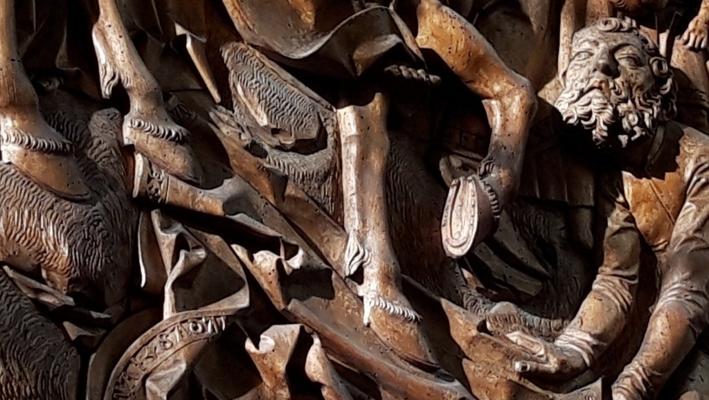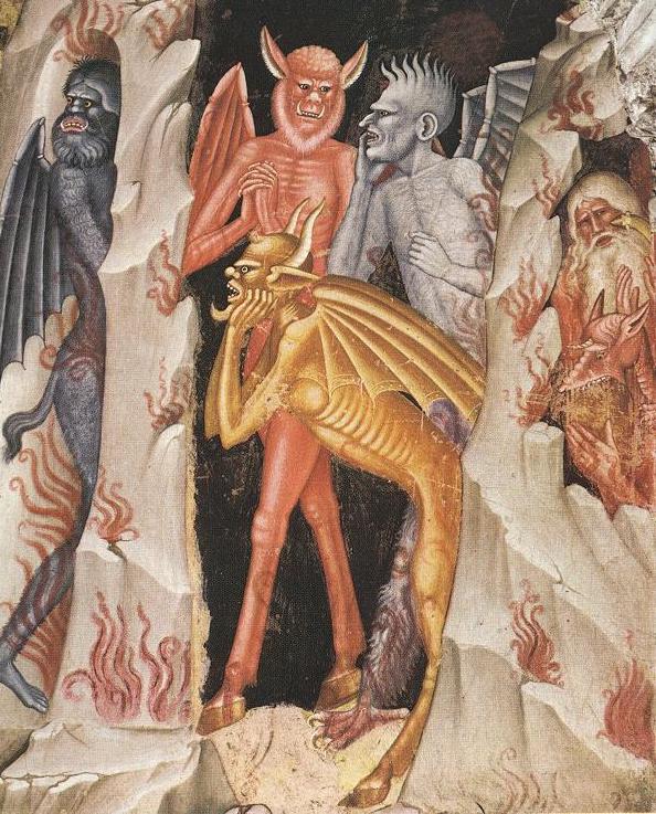
Day 23 – Andrea Bonauiti, The Devils, from The Harrowing of Hell, 1365-68, The Spanish Chapel, Santa Maria Novella, Florence.
It’s Easter Saturday – a day, it might seem, like any other, trapped between two extraordinary days – Good Friday, and Easter Sunday – and we wait, expectant and patient, while nothing happens. Or so it seems. Behind the scenes, in terms of Christian theology, a lot is being prepared. There’s always a slight sense of worry, a sense of foreboding, what if it doesn’t work out? We are all there now, all of us across the world, of all faiths and none, with a sense of waiting to see what happens next. Will the threat of the Coronavirus exceed our society’s ability to overcome it? Or will it beat us in the end? We know it will be the former, we have that faith. But how do we deal with the constant tension? As so often, humour is one way through: by belittling the threat, maybe we can make it seem small. So today, I bring you – the Devils! This is just a detail from an image which is painted as one section of a single wall in a large chapel which is just part of one of the most important churches in Florence: Santa Maria Novella. It’s a tiny detail in a massive whole, and yet, it was a little hint of encouragement for the people who would have seen it when first painted, and I hope it can be for us too.
The Spanish Chapel got its name in the 16th Century. It became the main place of worship of the Spanish Community in Florence, who arrived in the train of Eleonora of Toledo when she married Cosimo I Grand Duke of Tuscany. But before that it was – and remained – the Chapter House of the Dominican friary. The friars would meet here every day, where they would be read a chapter from the Rule of St Dominic, and at these meetings the daily administration of the friary would also be discussed. It was in Santa Maria Novella that Boccaccio’s protagonists were supposed to have met in the Decameron. They then fled the city of Florence to avoid the plague – and not just any plague: the Black Death. Yes, they were Socially Distancing, but in an unfeasibly large group of ten. And how did they pass their time in medieval lockdown? Well, they told good stories. One story each, every day, for ten days. A hundred stories in all. Were the stories solemn, sober, and respectful of those suffering loss? Oh no! They are some of the filthiest things you will ever have read, and went on to be one Chaucer’s biggest inspirations for the Canterbury tales. You get through the daily bread of endurance with the leaven of comedy.
The Chapter House was decorated a couple of decades after the Black Death, but there is still a measure of defiance, a hint of hope. You start by making fun at the biggest threat, and, for the medieval mind, this was the Devil. Here are his minions. Terrifying. The threat is palpable. Or rather – they are completely laughable. To the modern mind minions are banana-coloured, weetabix-shaped creatures, who wish to serve the meanest mind on the planet. But this is how the medieval mind saw them. And yes, one of them is yellow – but scrawny, ill-fed, its rib-cage prominent, its biceps sagging, a comical look of distress on its face. Behind, two of its companions, in red and grey, clasp their hands and bite their nails, looking for all the world as if they are gossiping at a WI meeting with no jam and too much Jerusalem. Another devil, oblivious to the wispy hellfire, looks to see if what it feared is really true, and, because it is, scuttles rapidly back to the relative safety of the inner reaches of hell. What has disturbed them so much? Well, Jesus has just knocked on the door. This always reminds of the bumper sticker subverting any number of evangelical Christian badges: Jesus is Coming! Look Busy!
According to the Apostles’ Creed,
Jesus… was crucified, died and was buried;
He descended into hell;
on the third day He rose again from the dead.
Before we go any further, I want to clear up one point. I’ve often heard people say, ‘after three days he rose from the dead’, and less often, ‘but Easter Sunday isn’t three days after Good Friday’. Well that’s not what the creed says. It says, ‘On the third day…’ Let’s count: Friday – first day; Saturday – second day; Sunday – third day. It’s that simple. Meanwhile, what was Jesus up to? What was going on backstage in the drama of Easter? Well, he descended into hell, it says so in the creed. But what did he do when he got there? The belief was – and maybe still is – that because of Original Sin, mankind was destined to everlasting damnation. Christ’s sacrifice means that mankind is saved, but what about those truly good people who died before Jesus? What hope did they have? Well, in this scene, known as ‘The Harrowing of Hell’, Jesus has come to get them.
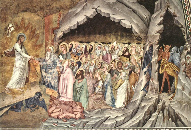
Jesus dies, descends into hell, and knocks on the door. The devils scarper: that’s them cowering on the far right of the image, hiding as far away from the Gates of Hell as they possibly can.

Eventually, one brave devil heads to the door… but by this time Jesus has lost patience, and tramples the door underfoot. The devil is crushed underneath it (and look! It even had a key to unlock the door – or maybe this was a vain attempt to lock it once and for all?)
At this point you realise that hell has a curious ‘first in first out’ policy. The first to greet Jesus is Adam, now enormously old with the longest of white beards – and Eve is kneeling just below in pink. And you thought they would be given the largest share of the blame! Don’t worry: there is hope for all of us. Behind Adam is a young man with a lamb. It’s not the Lamb of God, though, as that is not John the Baptist. It’s not initially clear where John has got to, which is odd, as he didn’t die much before Jesus (three years at the most). So who could it be? Again, on the ‘first in first out’ basis, it must be Abel, the son of Adam and Eve: the son who sacrificed of his best – a nice fat lamb – only to be murdered by his brother Cain. To the right of him is an old man with a wooden box with a dark hole in it: Noah, with a working model of the ark, in between Mrs Noah and one of his sons. But where is John the Baptist?

Oddly he’s made his way back in the crowd, wearing his camel skin robe, with the usual long, messy hair and beard. He might look as if he’s trying to thumb a lift out of hell, but he’s carrying on where he left off, working the crowd as Jesus’s warm-up act, and now that Jesus has brought the doors down (if not yet the whole house), he is once again exhorting ‘Behold the Lamb of God!’ Just above him you can see Moses – with rays of light glowing out of either side of his head, and a stone tablet with illegible script: the ten commandments. Bonaiuti clearly had no Hebrew. To the right of Moses is a man with a crown, and a zither – King David, still harping on the Psalms, which he is supposed to have written. ‘Out of the depths have I cried unto thee oh Lord’ (see #POTD 5) – and now, He is here in person.
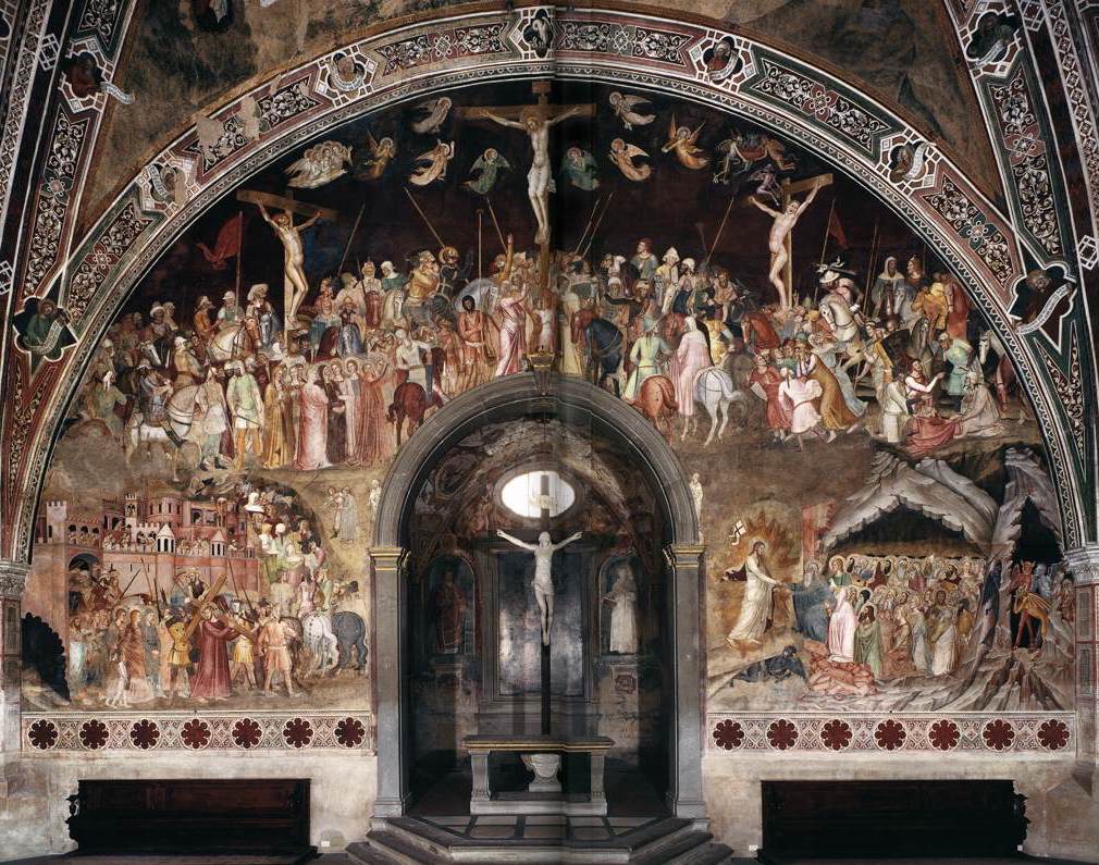
‘The Harrowing of Hell’ is just part of the larger picture. It occurs at the bottom right of the Altar wall in the Chapter House (or Spanish Chapel). At the top we see the Crucifixion, and at bottom left the ‘via Crucis’. Christ, stripped of his blue cloak, is in his red robe, carrying the cross out of the city gate and up the hill to Golgotha. Bonaiuti is using the surface to perfection. With Jerusalem bottom left, he heads up the hill to Golgotha to be Crucified at the very top of the image, and then descends to hell at the bottom right: the gate of Jerusalem and the gates of Hell are equivalent. Although, if we look forward to the New Jerusalem, you realise that the earthly city is shown under Jesus’ right hand, on the side of the Good Thief, whereas hell is on his left, under the Bad. No wonder the devils are scared of Jerusalem. With this wall, we get to the end of a chapter – or the end of an episode – and fortunately, we have the box set. What could possibly happen next? Well, spoiler alert! He rises from the dead! But where can Bonaiuti go from here? He’s filled up the entire wall! In the immortal words of that little-known 80s gospel singer, Yazz, ‘The Only Way is Up’. You’d have to look up at the ceiling.
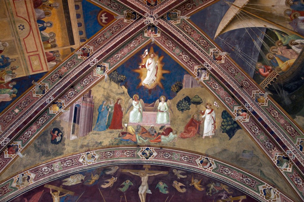
Bonaiuti has planned his storytelling across the wall and through space to the ceiling, which I find remarkable. And this is only one wall, and a bit of the ceiling. This is one of the most remarkable rooms anywhere in the world, and yet so few people know it. But then, the rest of Florence is also remarkable. As is the rest of Italy. And currently, no one can see it. Today’s Italians are being incredibly patient, waiting for the chance to get out. At least they are not as cramped as these souls waiting in hell. But that won’t make the apparently endless waiting any easier, or bring back those who are lost, I know. The threat is real, very real, but in this fresco it is cowering in the bottom right hand corner, risible devils, insignificant in the larger scale of things. This virus might seem to be a greater threat to us in the 21st century, but it dissolves in soap… so… keep washing your hands, and avoid huddling together while we wait for the threat to pass. And tell good stories. At least one a day.