
Jean-Claude Richard, ‘Abbé de Saint-Non’, Two Sisters, 1770. Metropolitan Museum of Art, New York.
On Monday I will be talking about pastel painting, with a brief introduction to the technique and to its history, in the first of my talks about Three Women in the 18th Century – Rosalba Carriera and Power of Pastel. However, I won’t have the opportunity to include today’s image, which I came across while researching, so I shall talk about it today instead. However, I’m not going to cover aspects of technique or history today – nor explain the reasons for the success of pastel in the 18th Century – but if you are interested, there is still time to sign up for the talks on Monday 19 April at 2pm and 6pm BST. What I really want to think about today is the Rococo style: what is it about this image that makes me think of it as ‘Rococo’? The title of the painting (and yes, pastel images are called paintings) is Two Sisters, and we will take that on trust. They could equally well be cousins, or even friends, but as I really don’t know how old the title is, let’s not worry about it.

We see the siblings at play, the younger one seated on a wheeled, wooden horse with her legs towards us. Her right hand rests on the horse’s mane, while her left arm goes around her sister’s back, the hand resting on her shoulder. The more senior girl leans over the back of the horse, with one arm resting on her sister’s lap, holding on to the reins, which are made from a long, flowing, pink ribbon. Her other hand is just visible at the younger sister’s right hip, the right arm of the older girl passing behind her sister’s back. The pose of the elder sibling, leaning over the horse, enhances the sense of familiarity between the two – it does indeed make sense that they are known as sisters – but it also exaggerates the swell of the pink overskirts at the bottom of her tightly laced bodice, and reminds us that, even while the ideas of childhood derived from the writings or Rousseau were still emerging, the children themselves were still dressed as small adults.

Resting on the wooden platform to which the legs of the horse and the wheels are attached is a doll – Policinelle in French, or Pulcinella in Italian – one of the stock characters, or tipi fissi, from the Comedia dell’Arte. This in itself ties the image to the roots of the Rococo, given Jean-Antoine Watteau’s fascination with the theatre, with theatricality, and, in particular, with the Comédie Italienne (as it became known in Paris). In this image the doll reminds us that the girls are still children, although as it might have been discarded, and would find its limbs being dragged along the floor were the horse to be moved, maybe it also implies that nothing will last for ever, and that the girls will inevitably grow up. Is there any significance to the choice of comedia dell’arte character? Well, I’m afraid I’m going to leave you to do the research and make up your own minds. However, I will just let you know that Pulcinella was lazy, felt himself entitled, and always plumped for the winner in any situation – but only when he knew who the winner was. In his efforts to get to the top, he never got the girl, and ended up unwittingly helping others, rather than himself. I cannot see how this could be relevant here – so maybe it isn’t. In any case, this was never meant to be a ‘profound’ image – and its light-hearted nature is another box to tick if we are considering the Rococo. So too, is the colour, chiefly the candy-floss pink, stretching from the bows on the horse’s muzzle and ‘chest’, along the sinuous reins, to the bow on the elder girl’s shoe. Her over skirt is the same pink, as is the ribbon which adorns the hem of her underskirt. The underskirt itself appears to be a shot silk, the warp and weft of which seem to combine the very same pink with a jade green, creating a surprising iridescence.

The younger girl’s skirt is a lighter version of the jade green, and, as silk, it reflects the pink of the reins and of the older girl’s overskirt. Her bodice is a light cream. The similarity of the colours worn by the girls, together with their embrace, helps to unify these two children into a single unit, but whether this is as family or friends is almost beside the point. To describe the colour palette, which is so much part of the inner harmony of the painting, as ‘pastel’ would seem tautological as it is, of course, a pastel painting. You could argue that the impulse given to French painting, and to pastel as a medium, by the success of Rosalba Carriera during her extended stay in Paris between 1720 and 1721 had led to the adoption of this light and airy palette in subsequent French 18th Century art. However, it was very much in place by the time she arrived in the paintings of Jean-Antoine Watteau, whose Embarkation for Cythera, the work for which he was granted full membership of the Académie Royale de Peinture et de Sculpture in 1717, already used very similar pinks, and equivalent blues. The lightness of the palette reflects the lightness of the mood in Paris during the Regency, which I mentioned last week.

Another feature of the painting which, to my mind, locates it in the world of the Rococo is the precise flow of the reins, curving down from the horse’s mouth and back up over the younger sister’s lap, thus forming a sideways ‘s’ shape, with the addition of a long, broad curve as it falls to the floor. As well as echoing the composition as a whole, the long, broad curve being parallel to the older sisters stance, it is also formed from the combination of ‘s’ and ‘c’ shapes so beloved of Rococo designers. On top of this purely formal element, this image has that ineffable charm, the sweetness of the Rococo, deemed by some to be ‘chocolate-box-y’, but which has me reaching for the chocolates. Some people can’t stand it – I find myself loving it more and more. However, I can understand some criticisms of this particular work. The elder sister’s right hand is every bit as small as her younger sister’s left, and her right arm is maybe a little too long. I’m not usually susceptible to this sort of complaint – I seem to remember having a tirade against the notion that the artist ‘got it wrong’ some time back. After all, it is possible that anatomical accuracy was not what the artist was aiming for. But the younger girl’s feet are also poorly defined, in a painting which looks like he was aiming for a greater degree of naturalism. But then that’s not entirely surprising, as the artist was not professionally trained. Indeed, he wasn’t professionally an artist at all, but a remarkably adept, and influential, amateur – which of course means that he was a ‘lover’ of art, rather than having the current meaning in which the word has come to imply that he was, simply, inept. As it happens, he was a rather interesting man.

This is him, Jean-Claude Richard, usually known as the ‘Abbé de Saint-Non’. The imaginative portrait, by Jean Honoré Fragonard, is, in its own way, entirely Rococo. OK, so the palette is darker, but that is because Fragonard has depicted Richard in fancy dress. Apart from the palette, it has the flickering brushstrokes, fragmented diagonals, and sense of fantasy which can also be seen as features of this evanescent style. Not all Rococo works of art have all of the features I have mentioned, but then for any style, not all of the boxes we use to define them will be ticked all of the time.
The artist of our Two Sisters was undoubtedly one of the fortunate in life, and was able to do as he wished thanks to an enormously wealthy father, Jean-Pierre Richard, who had purchased land to the North of Paris to create the his families estate. It was close to the modern-day village of Saint-Nom-la-Bretèche, which takes its name from a 9th Century bishop, Saint Nonne. Over time the saint lost his last ‘ne’, and then the ‘n’ mutated to ‘m’, meaning that, even though Richard’s title contains a memory of his estate’s history, he has no connection to St Non, the 5th – 6th Century Welsh saint who was the mother of St David.
Jean-Claude Richard did take minor orders – and his family had intended him to go into the church – but, although he held a degree in theology, he didn’t really get any further. OK, so he bought himself a benefice, but despite becoming ‘abbé commendataire’ of the abbey of Pothières, subsequently he seems to have paid little attention to the church. The Metropolitan Museum of Art, which owns today’s pastel, says that, ‘he became an amateur artist, writer, and traveler and a congenial figure in Paris society,’ a ‘career’ which I have to say I rather envy. It was while travelling in Italy in 1759 that he met Fragonard. The artist had won the coveted Prix de Rome in 1752, but didn’t travel to the Eternal City until four years later. He was still there when the Abbé arrived another three years after that, and, once their friendship had been formed, they made extensive forays around the Italian peninsular. This culminated in one of the Abbé’s great contributions, the Voyage Pittoresque de Naples et de Sicile, a richly illustrated travel book in four volumes, published between 1778 and 1786, almost entirely funded by the Abbé himself. Until relatively recently it was assumed that he had written it, but recent research has revealed that this was not the case. As an artist his production was varied. He was perhaps most interested in printmaking, and made important contributions to new technique of aquatint. He was certainly enormously influenced by Fragonard, and it turns out that the Two Sisters has a twin. Compare these two images:

‘Abbé de Saint-Non’, Two Sisters, 1770. 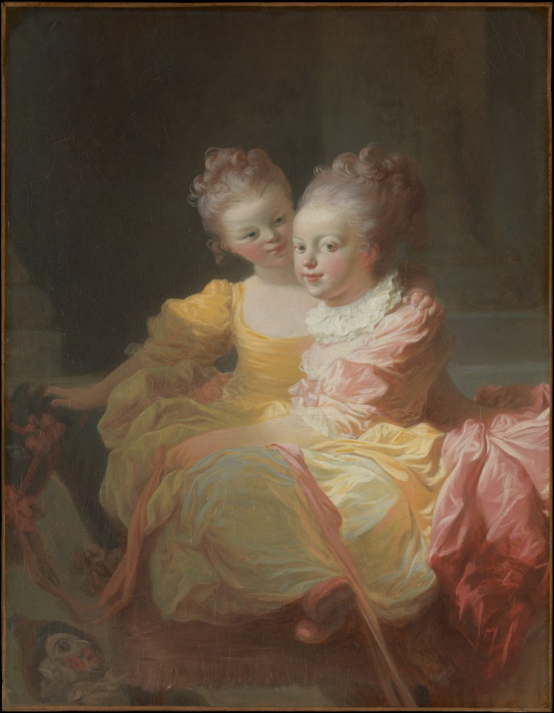
J. H. Fragonard, Two Sisters, c. 1769-70.
As you would probably surmise, the Abbé’s pastel is a copy of Fragonard’s oil painting, which is dated (by comparison with the pastel) c. 1769-70, and which is, by one of those odd coincidences, also held by the Met in New York. You will probably also have realised that Fragonard’s work was cut down – we don’t know when, exactly, or why – so although the two images may appear to be the same size here, in reality they are not. From what we can see the differences are subtle. The Abbé doesn’t go with Fragonard’s brilliant yellow for the young girl’s dress, he sweetens her face, and Fragonard’s energetic drapery folds have been calmed. The pastel is the work of a skilled copyist, but not of such a brilliant artist. Having said that, even in the oil painting we can see that Fragonard’s anatomy isn’t entirely naturalistic – look at the feet, for example, which make the younger girl look somewhat doll-like. Perhaps that is part of the nature of the relationship, and it could explain why Pulcinella has been abandoned: who needs a doll when you have a younger sister?
Why did Saint-Non choose to copy the work in pastel? Well, I will say this much about the technique: one reason for its popularity was the apparent ease of execution. No messy oil paints – although the powdery nature of the pastels meant that they could be messy in their own way. You could buy the crayons already made at a time when oil paints wouldn’t be available in tubes for several decades. And it was far quicker: there was no need to wait for the oils to dry in between periods of work on the painting, and once the image was finished, that was it – again, no waiting. And we should be grateful. Not only is Saint-Non’s Two Sisters a charming object, but it is also important as a record of the intended appearance of Fragonard’s sadly truncated original. As for Fragonard – well, he too was a remarkably interesting character, but one who will have to wait for another day.

😎
Even if he isn’t related to the true St Non…
LikeLiked by 1 person
I like the fact that I got both of our names into one line, though!
LikeLike
Absolutely! 😁
LikeLiked by 1 person
Dont you think they are in three? One behind, one in front and one hiding under the skirt, or kind of cul de paris? The feet on the floor seem to be too far away from the front girls body.
LikeLike
I don’t think so myself, no – but that’s the joy of looking at art, we all see things differently. I think it’s probably part of the problem with the proportions. There is a print of the original, apparently, I should look that up to see if Fragonard’s original gave a similar effect before it was cut down. However, just because I think there are only two doesn’t actually mean that there aren’t three!
LikeLiked by 1 person
the feet are in line with the head of the horse and are linked together by the rose cockades, this makes me think that may be a little brother plays pushing the horse (it has wheels) for his sisters, like this carneval costumes where one person is the horses head and the other one the back.
LikeLike
Crumbs! If anything, the print by Géraud Vidal is even worse. https://www.metmuseum.org/art/collection/search/369329
It eliminates the lightness of touch of the oil and the pastel, and highlights the faults. The standing “Jeune Soeur” looks like a pantomime horse. But – with the reference to Pulcinella (Mr Punch) – perhaps that is deliberate?
LikeLike
Yes, I looked at it and thought much the same. But I decided maybe it was time to move on….
LikeLike
There is also Fragonard’s sketch, in Lisbon – https://commons.wikimedia.org/wiki/File:Jean-honor%C3%A9_fragonard,_due_sorelle,_1770-80_ca._01.jpg
On the whole, I think cutting the oil painting down improved it, but this is not quite Young Girl Reading.
LikeLike
Yes – I was wondering if that was why it was cut down!
LikeLike
I will defend Rococo till I die…People who go queasy looking at it should remember that historical context in Rococo’s case is everything. Artistically, though, I love the characteristic vitality of the kick in Fragonard’s girl’s supple foot, poking out of the fourth wall, almost within our touch. Thank you, Richard, a thousand times, for your wonderful blog.
LikeLiked by 1 person
Thank you – and yes – it’s the best! Hope you’re well!
LikeLike