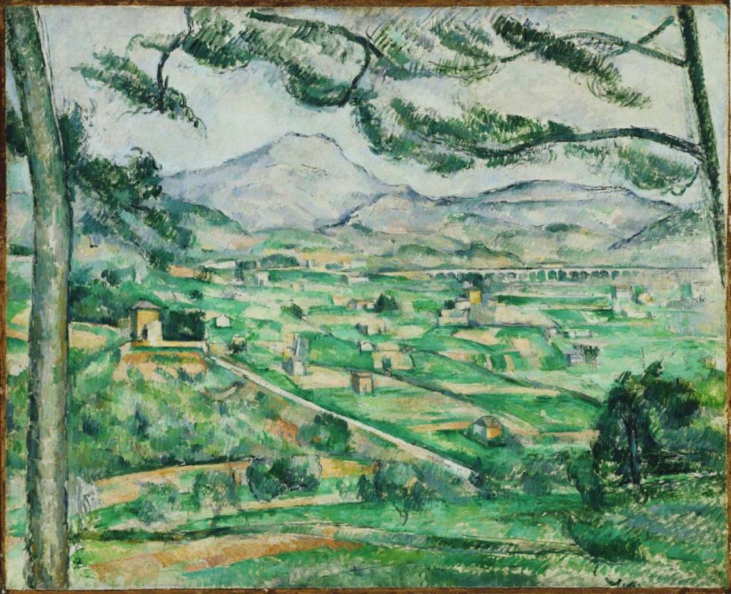
Paul Cézanne, Mont Sainte-Victoire, 1886-87. The Phillips Collection, Washington, D.C.
Mont Sainte-Victoire was undoubtedly Paul Cézanne’s favourite landscape motif. He painted it over 80 times, but, to keep a handle on things, today I’m just going to look at one. However, my next talk, on Monday, 24 October at 6pm, will be an introduction to Tate Modern’s exhibition – Cezanne – and that includes a whole room dedicated to the subject (Tate have omitted Cézanne’s accent, as apparently, in Provence, where Paul grew up, it was not used). It is a monumental exhibition, and if you are planning to go, you might want to plan to go twice. Talking of planning, my Zoom talks are already lined up for the rest of the year – so do check out the diary to see what is on the cards. In November I will pay a visit to The Spanish Gallery in Bishop Auckland, and I am also looking forward to the exhibition of ground-breaking paintings by early-20th-century German women at the Royal Academy, Making Modernism. Throughout Advent I will be hanging around the Wallace Collection – and elsewhere – thinking about The Childhood of Christ in Art. But for dates and details, as I say, you’ll need to check out the diary.
I’ve long been fascinated by Cézanne’s stated wish to ‘make of Impressionism something solid and durable like the art of the museums’. His misgivings were that, in capturing a fleeting impression, the work itself might end up being ephemeral, too closely related to a specific moment in time. His repeated studies of Mont Sainte-Victoire were therefore completely different to Monet’s various series, with which he aimed to show how different his motifs looked at different times, in different weathers, and in different moods. Cézanne was in search of the timeless and unchanging, something universal, which would last. But how to achieve that? He wanted to rely on his sensations – a French word which translates as ‘feelings’ – although ‘feelings’ in terms of ‘sensations’, I suspect. So, effectively, he did want to paint what he felt, as a result of what he saw – he wanted to convey the impressions he had when looking at something (just like the Impressionists) – but he wanted to make it last. Not only that, but the image had to make coherent sense on a two dimensional surface – the painting – while holding true to the three dimensional nature of the motif. Put like that, it seems like a tall order – so it’s hardly surprising he tried so many times to ‘get it right’. Did he ever succeed? And if so, how?

The paintings of Mont Sainte-Victoire are so familiar that it is perhaps hard to stop and look at them properly, or to see them afresh. In this example, as in so many, the Mountain – in reality a limestone ridge stretching over 18km – takes its familiar position on the horizon, rendered blue by the aerial perspective as if enough sky has got in between us and the distance to render it celestial – the colour of the sky (indeed, for Italians, celeste is a different colour from blue, in the same way that, in English, pink is different from red). The view is framed by two trees, one of which leans into the picture and spreads its branches across the sky, while the other is close enough to the artist that we can see neither its base, nor canopy. The lower two thirds of the painting is taken up with farmland, with the upper third being mountains, hills and sky, together with the aforementioned branches. The palette is extremely limited: greens, blues, and sandy browns.

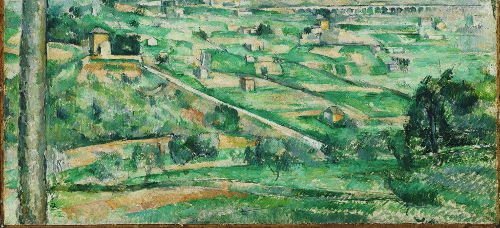
This detail, from the bottom of the painting, is almost all of the ‘farmland’, the lowlands before we get to the foothills. At the top right you can see a railway viaduct – but, without knowledge of the location, it could have been an aqueduct. Quite apart from the fact that it was there, Cézanne may well have painted it to make Provence look a little more like the Roman Campagna. Indeed, it is the sort of thing you can find in some of the paintings of Poussin. In another of his aspirational statements – although one that some doubt he ever made – Cézanne is supposed to have claimed that he wanted ‘to redo Poussin all over from Nature’. This implies that he wanted to paint classical landscapes – in terms of harmony, proportion and monumentality – by looking at the real thing, rather than using his imagination, as Poussin did. In this detail we see him seeking out these harmonies. There is a long, straight track leading from behind the brow of the hill at the bottom right, which rises on a low diagonal toward the top left of the detail. Indeed, if we were to continue this line in either direction, it would stretch to the bottom right-hand corner of the painting, and reach the top left-hand corner of this detail. I cut the detail here deliberately, to show how the top of this diagonal would coincide, more-or-less, with a continuation of the viaduct, were it to stretch all the way across the painting. To the right of this straight track two dark lines – hedges perhaps? – run parallel to the same diagonal. Was this ‘harmony’ really there? Or was the ever-observant Cézanne simply enhancing the classical possibilities of his motif, idealising what he saw to make it more ‘timeless’?
Another way to harmonise the image was to make certain aspects of the painting consistent across the whole surface. Let’s focus in on the bottom right hand corner.

The predominant colours here are green and a neutral off-white. But only the green is painted: the ‘off-white’ is the colour of the primed, but unpainted, canvas – the ‘ground’. This might imply that the work is unfinished, but no, it is a technique Cézanne learnt from the Impressionists: you don’t have to cover every bit of the canvas with paint. Indeed, if you leave some gaps, and providing that your ground is light, it will add a sense of luminosity to your painting. After a certain stage in his career Cézanne did this with practiced regularity: look out for it in the following details. As well as adding luminosity, the repetition of these light areas across the whole surface of the painting lend it a sense of unity. The track – so important for structuring the composition and leading our eye into the distance – was also left ‘unpainted’, although as it emerges from the foliage at the bottom of the hill the artist has decided to emphasize its presence by heightening it with a brighter off-white paint. However, by the time we get to the top left corner of this detail, we seem to be back to the unpainted ground, ideal to represent the track, which is, after all, bare, and free of vegetation. The brushstrokes in this detail are quite scrubby, but many of them are short diagonal strokes going from top right to bottom left. These are Cézanne’s ‘constructive’ brush strokes, themselves derived from the Impressionist tache (blotch, patch or stain), which made up the tesserae from which many of their mosaic-like images were formed. In other, slightly earlier, works, Cézanne’s constructive brush strokes are far more consistent – ‘monotonous’ would be the correct word (but without the implication that they are boring), because they are all the same. The artist uses them, as the word suggests, to build up the entire image, and they also become another way of unifying the surface. The brushstrokes have the same function in this painting, but are used more freely – a sign that Cézanne is relaxing into his technique.


If the unpainted ground and constructive brush strokes can unify the surface – thus making the image coherent on the canvas – how can he imply a sense of distance, while still holding onto this cohesion? The answer is in the palette. The same sandy browns are used from the foreground slopes, through the middle ground (omitted above) and all the way into the foothills of the mountain. The greens – of different shades – are similarly disposed. Notice how the dark bottle green of the shrub in the bottom right – just above the largely ‘unpainted’ section – can also be seen in trees next to the farmhouse on the left of the upper detail here, and all the way over to the viaduct, recurring in shrubs which are growing at almost evenly spaced intervals. Every point where this bottle green can be seen is therefore related to every other one in our eyes, and therefore also in our mind. The same is true of the lighter emerald and jade hues, not to mention the sandy browns, and their more orangey variants, as seen in the cuboid farmhouses to the left and nearer the viaduct, which are exactly the same colour as one of the fields at the lower left.

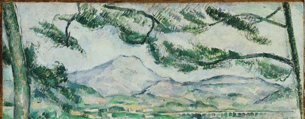
The leaves of the pines at the top of the painting use the same bottle green, thus tying the foreground at the top to the foreground at the bottom – and to the middle ground, in the middle of the painting. But Cézanne also ties the foreground into the horizon by emphasizing the apparently concentric growth of the branches around the curves of the distant hills. There is unity across the surface, and also in depth. Like Lucian Freud (although in reality, of course, Freud was like him) Cézanne was a very considered painter. He would look at the motif and determine what it was he was seeing, then look to the painting and his palette and mix exactly the right colour for a particular brushstroke, before applying it. He was painting exactly what he saw as he saw it, looking directly at the section of the motif he was painting. One effect of this was to deny a sense of perspective. All the branches appear to be growing parallel to the picture plane, even if we do try and make sense of this by pushing some of them further back into the space. The branches and leaves form a two-dimensional filigree across the surface of the painting, and the darkness of the branches echoes the darkness of the edges of the distant hills. Atmospheric perspective does apply though, as somehow there is a softening of the brushstrokes – and undoubtedly a lightening of the tones – for the distant fields.
Another result of this painstaking approach was that every additional brushstroke altered what had already been painted. We do not see digitally, but by comparison. Adding a dark brushstroke would make the previously painted areas look lighter, and so adjustments had to be made continuously. Inevitably, like a game of patience, there were times when both Cézanne and Freud realised that the combination of brushstrokes meant that the painting would not have a ‘solution’, and remained unfinished.

Looking back at the whole painting, you can see colours calling to each other across the painting. For example, the tree framing the painting on the left has one visible branch – even if its connection to the trunk cannot be seen – which appears to reach down to the bottle green of the tree lower down the slope at the bottom right; the nearer face of all the cuboid buildings ring out with the same yellow/orange notes; the brushstrokes of the grass at the bottom echo the leaves of the trees at the top, and even there the constructive brushstrokes of the leaves seem to harmonise with those of the sky, as if tree and sky move together in harmony with the wind. A patchwork of dabs and dashes summons up this whole world, compelling us towards the might of the distant mountain. To answer at least one of my questions at the end of the second paragraph, I think this counts as a success – and this is only one painting. There are six alternative views in the Tate’s impressive exhibition – and that is only one room. Elsewhere Cézanne approaches Still Life and the human figure with an equivalent rigour. Don’t miss it.

Absolutely loved your artifcle on Cezanne andwill definitely go to the Tat3e Modern Exhibition as a result,, so thank you! Also if you watched the latest Universaity Challenge you will see thatthecliffphanger decision question was exactly your quote about Poussinand Cezanne! Victoria
LikeLiked by 1 person
Thank you, Victoria, I’m so glad you liked it.
I rarely get to see the T.V. – some drama on Netflix, but rarely University Challenge – but it does go to show how much people are interested in Cezanne.
And don’t worry about the typos – although I can’t understand what has happened. Obviously I never send myself messages, but I’ve looked at the page on my phone and laptop, and can’t see a problem line… I’m sorry to hear you’ve had difficulties though,
Richard
LikeLike
PSa mass of typos – as there is a line through the middle of the ‘Leave areply’ box, so impossible to see what I had written -please excuse& check! Victoria
LikeLike
Thank you for encouraging me to look again at this painting. Particularly interesting is the colour palette. It has been suggested that Cezanne’s diabetes and retinal colour blindness may have influenced his colour palette. Do you think there is any evidence to support this? Did it change as he grew older?
Barbara
LikeLike
Thank you for this – but I’m afraid I’m not the best person to answer it. There is a huge problem with any form of ‘medical’ diagnosis ‘in absentia’, though. There is no visible difference to us between colour blindness and Cezanne choosing to limit himself to a particular palette – and as his paintings of Mont Sainte-Victoire do not always limit himself to these colours, then perhaps it was artistic choice rather than visual limitations… So yes, the palette changed with his style, with experience as opposed to ‘age’ as a medical condition(!)
LikeLike
Yes I find the definition of “colour blindness” a difficult concept to understand. My partner was diagnosed with being “red green deficient” This suggests lack of any colour but In trying to describe what this was like in practice he said that a green traffic light couldn’t possibly be the same colour as grass.
Which raises more questions for me than answers!
LikeLike
I enjoyed the blog and was looking forward to your talk, Richard. Unfortunately, I was unable to join using any of the links provided. Hope maybe you will repeat the at some point.
All good wishes,
Judith Nash
LikeLike
Dear Judith – I’m so sorry to hear this – but really don’t understand what happened. Perhaps it would be worthwhile contacting Tixoom…
LikeLike
Paul Cezanne Jr. according to Google died October 6, 1947.
LikeLike
Thank you Susan – I tried google but on my phone, which isn’t always terribly compliant!
LikeLike
Richard enjoyed the Cezanne talk. You mentioned that the exhibition catalogue was disappointing – can you recommend any other books on Cezanne.
LikeLike
Thank you, Michael – but sadly, no! I’m afraid I’m not up on what’s good among the books which are available – and there are many! So sorry not to be more help.
LikeLike