
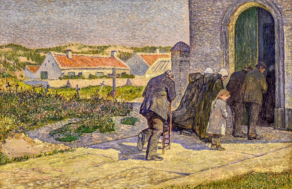
Anna Boch, During the Elevation, 1893. Mu.ZEE, Ostend.
I confess that I have never visited the Kröller-Müller Museum in Otterlo, despite the fact that it has the most extraordinary collection of paintings: before the opening of the Van Gogh Museum in Amsterdam, for example, this was the best collection of his work. The majority of the paintings in the National Gallery’s sparkling exhibition Radical Harmony: Helene Kröller-Müller’s Neo-Impressionists come from there, and have been loaned as the result of a major expansion. Having seen the exhibition – which I will be discussing this Monday, 17 November – I am keener than ever to go: a stunning building, in extensive parkland far from the madding crowds, with one of the best collections of early modernist paintings – I can’t think why I’ve waited so long! More of that on Monday, though. The following week, on 24 November, I will return to the National Gallery to see the truly illuminating (and beautifully lit) exhibition Wright of Derby: From the Shadows. This will conclude the first part of my 2 + 2 + 2 series – two talks about exhibitions at the National Gallery, two talks on exhibitions inspired by the loan of a single painting, and two on shows at Tate. Next up will be Double Vision: Vermeer at Kenwood on 1 December and Caravaggio’s Cupid (at the Wallace Collection) on 15 December. Tate Britain’s Turner and Constable and Tate Modern’s Picasso Theatre will follow in January – keep an eye on the diary for more information. Meanwhile, back to Radical Harmony.

It is a sunny day, with bright light flooding the path which leads from the bottom left corner of the painting to a shadowy building located in the top right, thus creating a diagonal which also draws our eye into the painting. The building, and the people outside it, cast purplish shadows along an opposite diagonal. These people appear to be approaching the large, half-open doorway with their heads bowed. As this is a painting they do not move, of course, but other details suggest that they are not moving anyway: a child has her feet placed firmly on the ground next to each other, and a man leans over a chair, his right knee resting on its seat. The heel of his right foot falls on the central vertical axis of the painting, and this, like the gentle diagonals, helps to create a sense of harmony and balance across the painting. This order is enhanced – subconsciously perhaps – by the placement of the building. The bottom of the wall is located roughly a third of the way up the right-hand edge, while the left side of the wall is just over a third of the way from right to left.

There is nothing about the architectural detailing to tell us that this is a church. The dappled walls are a purplish grey – not that dissimilar in hue to the shadows on the ground – while the inner edge of the door frame, which is catching the sunlight, is built up from dashes of a cream-coloured paint. There are flecks of this same light colour among the darker shades of the purple-grey walls. It is clearly a large building – the door is nearly twice the height of the people outside – but there is no decoration, no ‘symbolism’, to tell us that it is a church. So how do we know? In part, we rely on the behaviour of the people depicted: they bow their heads in reverence. Of course, the title also helps: During the Elevation. This is a key moment during the Mass: it is during the elevation of the host, when the priest ceremonially lifts the communion bread, or wafer, above the altar, that transubstantiation takes place. In Roman Catholic belief this means that the bread becomes the actual body of Christ. Hence the reverence: God is imminent, physically present among these people. So strong is the faith of this devout community that the church is full, and people remain outside. One of the large, green shutters of the door has been pushed open to reveal the shadowy interior, but all we can see is a dark grey rectangle, and the indistinct form of a woman near the door who is wearing what is presumably the same sort of dark, hooded cape and white headdress worn by the two women stood next to the child outside. It is not clear why the man at the back of the group has a chair – but maybe he cannot stand for the full duration of the Mass. Nevertheless, he is standing at this significant moment, having turned the chair around for support.
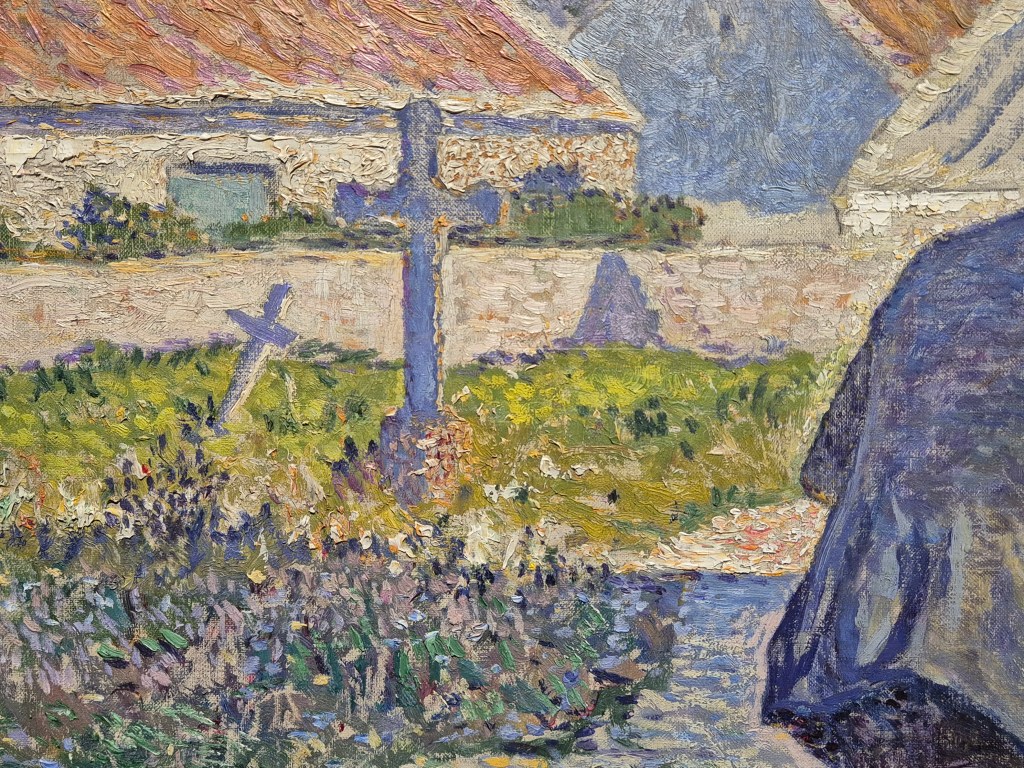
Behind him – or rather, to our left of him, on the picture surface – we see the clues which, even without the title, would have told us that this is some form of church, or chapel: crosses in a graveyard. The shadow of the church cuts a firm, straight line through the grass and plants, with both light and dark greens surrounding the two crosses we can see here. One tilts dramatically to the right, almost as if in reverence, just like the members of the congregation, but also implying that this is an old settlement, its fabric subject to decay. Both crosses appear to be the same purple as the shadow – and that is because the side we see is in the shade: only the right edges catch the sun.

There are maybe as many as eight more crosses visible here – one is cut off by the frame at the far left of this detail, and one is just a vertical stroke of paint (so might not be a cross at all). Again, a sense of history (or geographical insecurity?) is revealed by the various angles at which they lean. The shadow of the church does not create such a clear-cut line here, but that is presumably because the ground is not so flat, or the plants are growing more unevenly. The sun shines brightly on parts of the wall surrounding a building beyond the graveyard. It has an orange-red slated roof, and its gabled end is in shadow. Behind it are dunes, with patches of vegetation growing in the sand. We are on the edge of the sea, in a small fishing village in Belgium not far from Ostend.
If we move down the left-hand side of the painting a little, we see a riot of different coloured brushstrokes. While the roof of the back section of the building has a series of parallel strokes, elsewhere the application of the paint is not directional. There are short flicks of the paint, dabs of light and shade, and small, luminous dots. The colours in the shadow are far more varied than they are in the sunlight, where there is a pale lime and a darker bottle green, almost as if the brilliance of the sun is bleaching some of the colour out. In the shadow we can see pale blues, lavenders, pinks and greens, and touches of black (or is that a very dark purple?). The crosses, on the whole, are built up from single bold strokes, although these are modulated somewhat according to what is growing around them. This variety of types of brushstroke really goes to show the problems with naming this style ‘Pointillism’. First, in English, the word ‘point’ has a slightly different meaning to the equivalent in French. The translation into English of the French word ‘point’ (pronounced ‘pwuh’) would be ‘dot’, whereas in English, the word ‘point’ suggests – to me at least – an almost infinitesimal, dimensionless mark. Even if we define ‘point’ as ‘dot’, this painting is not built up from dots. Yes, there are dots, but there are also dabs, dashes, flicks, and strokes, not to mention some broad areas of palin colour. A better name for the style might be ‘Divisionism’, a term which is often used. This is because the individual colours are divided into separate brushstrokes, rather than being blended together on the palette before being applied to the canvas. The reasoning behind this comes from Seurat, who thought that, when mixed on the palette, the colours lost their original brilliance. However, if applied separately, and in small brushstrokes, the original colours would blend in the eye, and not only would they maintain their luminosity, but they would also interact with one another to create an unparalleled freshness. This freshness, together with the liveliness of the painted surfaces, are just two of the most striking features of the National Gallery’s exhibition. However, the name which the artists themselves settled on was ‘Neo-Impressionism’. They saw themselves as taking a new approach to Impressionist ideas about light and colour, and the ways in which these technical means were used to say something about the contemporary world, while also giving their paintings a greater sense of permanence, harmony, and often, even, political relevance – which was, in its own way, radical.
Whatever the initial impulse, many artists adopted Seurat’s technique – but they all had their own way of doing it, in the same way that we all have different handwriting. The Belgian artist Théo van Rysselberghe was impressed by the paintings by Seurat and Signac which he saw at the eighth (and final) Impressionist exhibition in Paris in 1886. He invited them to contribute to the next outing of the Brussels-based group Les XX (Les Vingt – ‘the twenty’), of which he had been a founding member just three years before. The roll call of artists changed, inevitably, and as one moved on, another was invited to take their place. In 1885 they were joined by the only woman ever invited to become one of Les Vingt, Anna Boch – the artist of today’s painting.

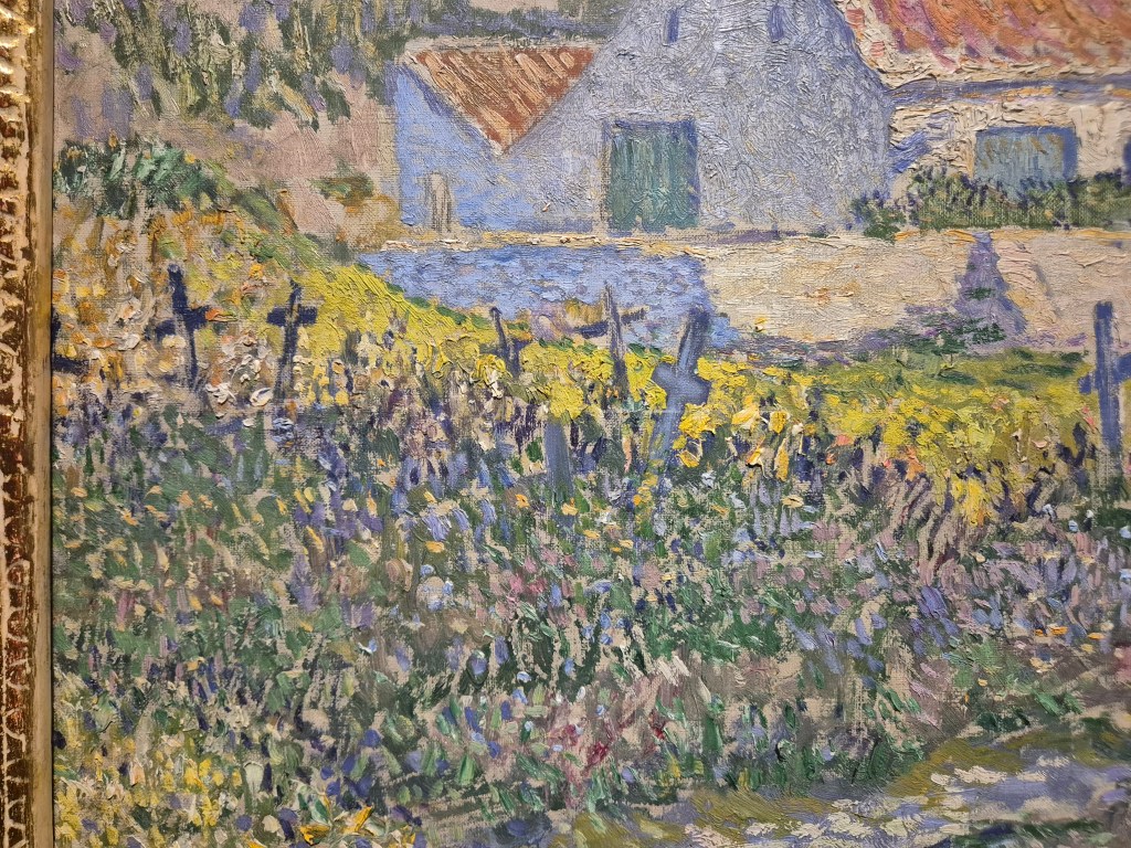
She too had taken up the gauntlet thrown down by Seurat and Signac, and, like her male contemporaries, she did so in her own way. In the detail above, taken from the bottom left corner of the painting, we can see that she must have sketched the long, thin lines which define the flagstones of the path using the purple ‘shadow’ colour, before continuing with a variety of colours and strokes. The grass in the shadow is particularly dark here, but there are also some wonderfully rich buttery yellows along the edge of the path. The tendency with these paintings is to stand at a distance – to try and get the effect of the brushstrokes blending in the eye – and that is a good way to see them, but not the only way. The artists wanted to create optical vibrations, so it is also rewarding to get as close as you can to see how just how they managed this – if indeed they did – and precisely how they applied the paint. Just beyond the path Boch uses short, horizontal, apparently ‘painterly’ strokes (even if they are too short for this to be truly ‘painterly’, you can at least see the marks of the individual hairs of her brush, reminding us that this is indeed paint). Elsewhere there are flicks of colour, and tiny dots – notably in the lavender of the shadows at the top right.
The dots are most evident, though, around the sharp edge at the front left corner of the church. Note especially the tiny off-white dots which come down in a band to the left of the wall and over the blunt pyramid on top of the feature projecting to our left of the church, the architectural function of which I can’t explain. These light dots contrast strongly with the dark corner of the wall itself, built up as the purple of the shadows increases in intensity as it gets closer to the edge. Most of the rest of the sky appears to consist of light, powder-blue dabs on top of a slightly greyer ground. The intention is to make the edge of the wall more vivid: boundaries are often a key feature of Neo-Impressionist paintings. There is a certain artificiality to many of them, and this was intentional: seeking geometrical forms, and simplifying what you see, as if trying to discern the Platonic ideals behind the vagaries of our worldly existence, while also creating harmony within contrasts. When thinking about Neo-Impressionism we tend to focus on colour, but tone – the variation of light and dark – was also fundamental to Neo-Impressionist thought. They were interested, whether they knew it or not, in abstract values, and their art turned out to be an important stage in the development of abstraction – not that this was a conscious goal. However, the idea that abstraction was on the horizon (a deliberate choice of word) is perhaps best illustrated in some of the later landscapes by Henry van de Velde – as we will see on Monday.

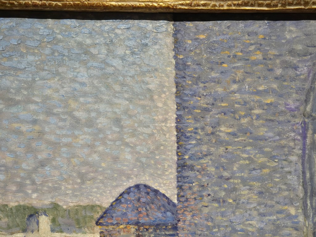
The extreme variation in brushstroke adopted by Anna Boch is best seen on the roof of the building to our left of the curious architectural form. The edges of the roof are defined by short, curved, brushstrokes of white paint, almost like the rectangular ‘tiles’ of the Impressionist tache, or ‘mark’, created with one short stroke of a flat brush. The roof itself, though, is made up of a series of long, parallel, diagonal strokes made with a fairly dry brush. This has left little paint behind, with the pale beige ground visible behind the broken, uneven strokes. This technique might remind you of another artist, one who is far more famous now than he was then. To my eye, this roof looks just like Van Gogh. The painting dates to 1893, whereas Vincent died in July, 1890. His work was still not well known to the general public – but Anna Boch was not the general public. Van Gogh’s reputation amongst his colleagues was running high, and in January 1890 – just six months before his death – he was invited to exhibit with Les XX. Six of his paintings were exhibited, and one of them, The Red Vineyard, was actually sold – the only one of his paintings sold from an exhibition during his lifetime. And yes, it was Anna Boch who bought it. Until recently, if she was known at all, she was known as the woman who bought a Van Gogh. Independently wealthy, she was able to pursue a career as an artist, and to collect the works of colleagues she admired. However, until recently her own paintings were relatively little known. An exhibition of her work staged at two venues, Ostend and Pont-Aven, took place between 2023 and 2024, and this has finally put her more firmly on the map. It has certainly led to her inclusion in Radical Harmony at the National Gallery, even though her work was not collected by Helene Kröller-Müller. We can’t be sure why not.

This detail is from a different digital file – most of the rest are my own photographs. I didn’t have this particular detail, or at least, I didn’t have it with this clarity. I’ve mentioned several times that the shadows are ‘purplish’. Here, admittedly, there is no ‘ish’ about it – purple, mauve, lavender, however you see this colour, that is what it is. This complements – optically – the colour of the path, a light, creamy yellow. Anna Boch, like the other Neo-Impressionists – and the Impressionists before them – is relying on a colour theory which, however much it must have been inherently understood by artists across the centuries, only dates in a systematic form to 1839, when Eugène Chevreul published On the Law of the Simultaneous Contrast of Colours. Simply put – and you know this already – the three primary colours red, yellow and blue can be mixed to make the three secondary colours green, purple and orange. In a colour wheel, the opposite colours are called ‘complementary’. This is a version published by Chevreul 25 years later which makes the point more subtly – and with 72 different hues.

Basically, we don’t see digitally, but by comparison. On entering a dark room we are first struck by the absence of light, but our eyes – and minds – soon get used to it. It is the same with colour. The absence of light is dark, and if the light is seen as yellow – as sunlight so often is – then the absence of that light will be the opposite of yellow on the colour wheel – purple. Hence the purple shadows in this painting. Not only that, but if painted next to each other, the yellow will make the purple look more purple, and vice versa – so if dots of these colours are intermingled, the surfaces will look all the more vibrant. This is the basis of the use of colour in Neo-Impressionism. The artists constantly sought harmony in contrast. They applied the same rules to colour, to light and dark, and, for that matter, to people. I’ve never seen anyone state it this explicitly – or simplistically – but we are all like the individual dots of colour. Each of us has our own character, and we all work together to build society. All you have to do is to join the dots, sharing different opinions to connect with the rest of your community with harmony – and preferably, with respect, just as Anna Boch paints her subjects here. Precisely how you interpret this idea is, like the way in which the different Neo-Impressionists applied their paint, completely up to you. We’ll look at the choices they made on Monday.

I visited this museum a few years ago and when I mentioned the visit to a Dutch lady in Amsterdam, she was not impressed as the museum has a problematic history. Sam van Deventer, the director of the Kröller-Müller Museum during the Second World War, was deeply involved in collaborating with the Nazis, according to a new biography. Ariëtte Dekker has uncovered a disturbing story in her book The Confidant: Sam van Deventer (1888-1972)
LikeLike
Thanks for letting me know, Mai. That is, indeed, disturbing to hear, but without reading the book, I don’t know what he was up against. I’m also not entirely clear why the museum should then become suspect. From what you say, it would have been established by Helene Kröller-Müller before this director took over: his political views are not the museum’s fault. As I said, I haven’t read the book, and there may well be more to it… but none of the artists I know of shared any similar views. History has happened, and, just as a ridiculous comparison, I’m not going to stop going to Germany because Hitler was once in charge.
LikeLike
My impression was of a packed-out church, and the outsiders attending to the service on the porch. The chair indicating this to be a regular occurrence.
Promotion of a deeply devout populace for a conservative art market.
Your analyses are always so stimulating. I look forward to them.
LikeLiked by 1 person