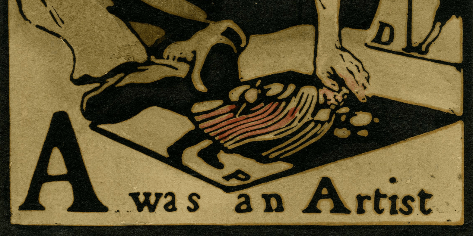
William Nicholson, A was an Artist, from An Alphabet, published by William Heinemann, 1897. UK Government Art Collection.
A few weeks back I wrote a post From A – Z playing on the idea that the letters were Anders Zorn’s initials. I hadn’t remembered at the time that one of the earliest independent works by William Nicholson – whose brilliant paintings, prints, theatre designs and book illustrations I will be discussing this Monday, 2 March at 6pm – was an illustrated alphabet. Today I want to introduce the exhibition at the Pallant House Gallery by looking at the first image from the sequence – the letter ‘A’. However, the following talk, on 16 March, will also be A – Z (II), or rather Anders Zorn (Part II) – a second chance to enjoy the rich colour and painterly splendour of Sweden’s great artist. A friend and colleague of both John Singer Sargent and Joaquín Sorolla, his art is every bit as brilliant as theirs. The talk will be perfectly self-contained for anyone who couldn’t be there for Part I, and will include completely different, but equally fabulous images for those who could.
This will be followed on 23 March by a second visit this spring to The Courtauld for their hit show Seurat and the Sea. If you want to see the exhibition in the flesh, I’d book now. I was planning to go this week, but it’s sold out until the second week of March – so I’ve booked then, in plenty of time for the talk. However, I won’t get to see the other exhibition there for a while, so on 30 March I will talk about Tate Modern’s Tracey Emin retrospective. There will be more on that in the diary soon.
If you do book any of these events, Tixoom will send an email with the ticket – effectively a link to the talk – within seconds. If it doesn’t arrive within 24 hours, do let me know and I’ll try and sort it out: it would be easier to do it then than 5 minutes before the talk! You should then get reminders 24 hours and 15 minutes before the talk, and these will also include the link.
This year’s trips with Artemisia are rapidly booking up, but there are still a few places left to visit Strasbourg from 5-8 June. As well as the city itself, with its rich history, one of France’s most beautiful cathedrals and a notable collection of old master paintings, we will have a day trip to Colmar, a truly picturesque town and home to Grünewald’s Isenheim Altarpiece, one of those remarkable renaissance paintings which really should be seen in the flesh.
Today we have a print – a hand-coloured woodcut on paper. It is the first in a set of 26 – the entire alphabet – all of which are included in the exhibition I will discuss on Monday. Admittedly this isn’t a great photograph – it’s one I took in the exhibition, complete with reflections, but we’ll get to better ones. I wanted you to see the full size of the paper, with a wide, white border around the printed image, and Nicholson’s signature floating below. Often a print like this would be framed with a mount covering most of the border, leaving only the imagery visible – but here the whole extent of the sheet can be seen. In many ways I think it is preferable, as it shows the balance of positive and negative space that Nicholson intended, allowing the bold, powerful imagery to be read clearly. This has then been sympathetically framed in a simple black, which echoes the printed frame around the imagery of the woodcut itself. The red at the outer edge is the colour of the wall in the gallery. The first two letters of the alphabet are displayed on one wall, with the remaining 24 on another. They appear together like this:
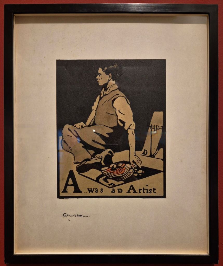
Why haven’t they hung them in alphabetical order, though? I always get hung up on little (and probably irrelevant!) details like this. I suspect this choice was made because it is pictorially more satisfactory to have the two figures looking in towards each other: it makes the ‘composition’ of the hang look more contained. But it is also relevant that these two prints are separated from the rest of the sequence because they are both portraits. ‘A’ is a self portrait, while ‘B’ is Nicholson’s friend, former collaborator, and brother-in-law, James Pryde. ‘Beggar’ might appear to be an odd choice for an illustrated alphabet, let alone a friend, but not if you know a bit more about these two artists. They were students together at Hubert von Herkomer’s Art School in Bushey, Hertfordshire, and their friendship was strengthened when Nicholson married Pryde’s sister Mabel – also an artist – in 1893. From 1894 the two men collaborated to design posters for theatrical productions and other advertisements. Notice that the beggar is holding a staff. Rather than using their own names, the pair took their collective title from one they saw – and were apparently amused by – printed on a sack of hay: Beggarstaff. As J. and W. Beggarstaff, most of their surviving work was produced in 1895 and 1896, and, although other designs are documented in later years, most are lost, and their appearance unknown – but they don’t appear to have collaborated after 1900.

Is it a coincidence that An Alphabet was Nicholson’s first major independent commission, and that, if placed in alphabetical order, the two turn their backs on each other? Or that Pryde is cast as the beggar, with an uphill struggle ahead of him? These days, Pryde’s work isn’t nearly as well-known as Nicholson’s, and, as his Wikipedia entry states, ‘He is principally remembered as one of the Beggarstaffs’. However, it’s not as if Nicholson looks entirely positive about his own artistic future, given the intriguing caption – A was an Artist – but more of that later.
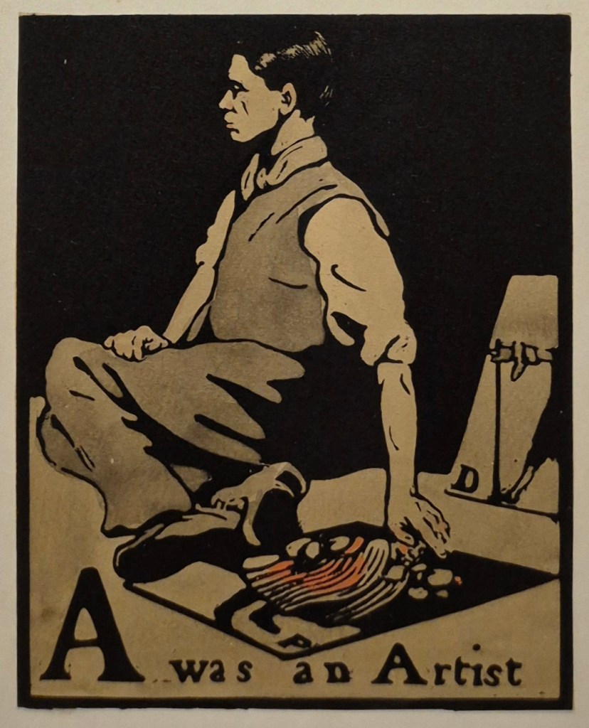
The boldness and clarity of conception of this image is what helps to make it memorable. Both colour and line are kept to a minimum, with a matt black background in the upper half, and a grey/beige colour for the floor. These limited means show the influence of Japanese woodblock prints, very much in vogue in the second half of the 19th century, and collected by artists such as Monet and Van Gogh. If you think about it, the composition of today’s print is not entirely dissimilar to that of Van Gogh’s Sunflowers… Japanese art was also an influence on many other artists, including Whistler, whom Nicholson greatly admired. Indeed, it was Whistler who had introduced him to another William – William Heinemann – who published An Alphabet in 1897. The limited colour range of A was an Artist is also typical of Whistler – just think of Arrangement in Grey and Black No. 1 (see 151 – Mommie dearest).
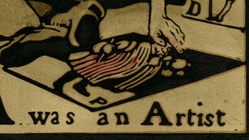
The artist (a self portrait by Nicholson, as I’ve said) sits on the ground with his knees to one side and his feet towards us, resting his left hand on the ground on another print from An Alphabet. The label in the exhibition says that ‘Nicholson depicts himself as a pavement artist’, but I’ve always thought that the term ‘pavement artist’ refers to someone who draws – with chalk, usually – on the pavement itself. I’m not sure about its application to a man who has laid a print on the pavement. This reminds me more of the people who hawk prints at tourist destinations, or along the park fences on Piccadilly and Bayswater Road in London. Another print is propped up on the right-hand side, but cut off by the bold black frame.
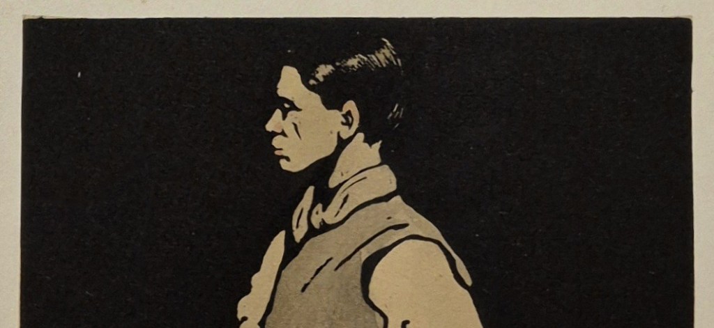
Nicholson shows himself in profile, which makes the image less personal, but also stronger. His black hair is apparently brilliantined, with the shine created by bright patches of white paper in the black ink, suggesting the reflection of light. A woodcut is a relief print, meaning that areas which are not to be coloured are cut away. It is the top surface, the original surface of the block, which takes the ink. The reflections of light in the hair were made by cutting into the block so that the ink wouldn’t reach them. Thin lines, like the wrinkle in between Nicholson’s nose and cheek, or the folds on the scarf and waistcoat, are especially bravura examples of cutting, as they are made by thin ridges of wood standing away from the rest of the block which was cut away all around them. It would be so easy to take them out with one slip of the chisel or gouge, and impossible to replace.
Nicholson’s head is upright and his chin held high, suggesting a certain pride, even if he is seated on the ground, and dressed in his shirtsleeves. Yes, he has a waistcoat, but without a tie or jacket this outfit would read as working class, suggesting the subject is a humble street trader.
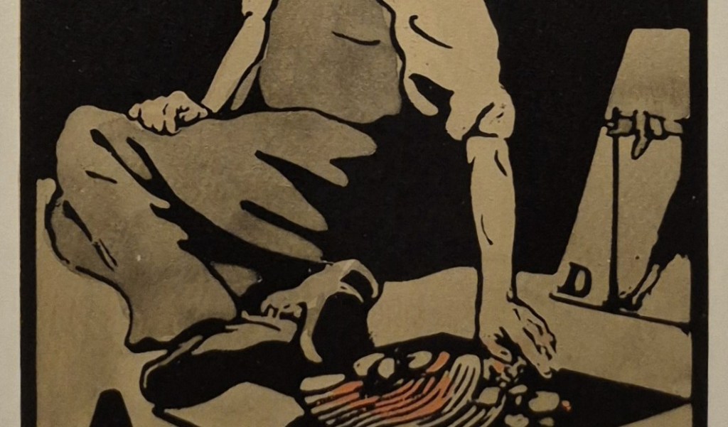
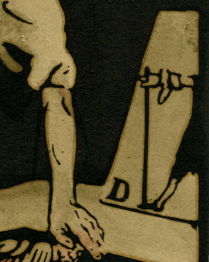
This reading is confirmed by the rolled-up sleeves – a real sense that Nicholson is at the ‘coal face’ of making, entirely down-to-earth, but proud of his honest labours. To the left of the knees we can see what is effectively the ‘horizon’ – the join between the ground and the black background. To the right, the horizon would appear to be lower – but that is the result of Nicholson’s shadow cast on the ground: the light is coming from the left. This shadow has the same intensity as the shadows in the folds of the trousers and the background itself, all of which are therefore unified into one area of black. This lack of variation in tonal values is another of the features which makes the image so clear and so striking. Oddly, the left arm, resting on the floor, does not cast a shadow – but that is presumably to simplify the composition. It also helps to draw a parallel with the image propped up on the right: Nicholson’s left arm reaches out behind him, and rests on the floor, in a similar way to the figure in the print marked ‘D’, whose right arm reaches forward and rests on a stick. There is some form of symmetry, or echo, between these two figures, which implies that the selection of this print is relevant to the interpretation of the image as a whole. The flesh tones of Nicholson’s arms may have a pink wash, but I might be imagining that – or it might have faded. However, the clothing of the figure in the print on the floor is coloured red.
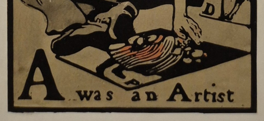
The print of ‘P’, like ‘A’, has a grey-beige floor and plain black background. We’ll see below what these images were, and consider what relevance they have to Nicholson himself. However, what most intrigues me is the choice of the word ‘was’ in the caption, A was an Artist. What was Nicholson thinking? Why not A is an Artist? He was only just starting his career, after all. He was 25 when this print was published, with another 52 years to live (not that he was to know that). Is it a sign of insecurity, not knowing if he could make it on his own without the help of James Pryde (on whom he has, nevertheless, turned his back, and who he has imagined as a beggar)? Or is it the opposite? Maybe Nicholson had supreme confidence in his legacy, and knew that people would still be looking at this woodcut in the future – as indeed we are in 2026. The print reminds us that we are looking at a portrait of an artist who was working in the past, and a self portrait, at that. As such he could have used the image to illustrate a different letter: I was an Artist. This works as a statement, even if it doesn’t function in the standard terms of an Alphabetical sequence. W was an Artist would also make sense, as would N… Whatever the explanation, the phrase is strange, and it is the only print out of 26 in which he uses the word ‘was’. Elsewhere we have the format of B for Beggar, which is one of sixteen uses of the word ‘for’ on its own. There are eight examples of ‘is for’, and one where it is just the letter and the word (X Xylographer – a man cutting a woodblock). ‘A’, though, is where the alphabet starts, and where Nicholson starts – and where he all but suggests he is already finished!
I said above that these are ‘hand-coloured woodcuts’ – but what does that mean? Compare and contrast the next two images.
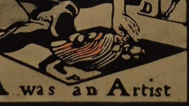
The one above is a detail from a version in the British Museum, while the other is a detail of the print in the UK Government Art Collection – the one in the exhibition that we have been looking at. I hope you can see that the basic composition, printed in black, is exactly the same: it was printed from the original block. However, the red colour on the print is applied differently. In the BM version (top) the red goes all the way down to the hem of the man’s garment, with a slightly darker brushstroke over the chest. The face is also consistently pink. In the Government print (bottom) there is less colour on the face, the paint does not go down to the hem, but does colour some of the sleeve over the right shoulder. They are, simply, hand-coloured: Nicholson took each individual black and white print, and added colour to the robes of the figure with a brush and watercolour paint. He also added a grey wash to the clothing of the self portrait and grey-beige to the floor. This technique was highly personal, making each print a unique ‘original’, but it was enormously time-consuming. When the sequence was re-released, it was reproduced via lithography: the edition was more consistent, and cheaper to produce.
But what are the two prints he appears to be selling? And how relevant were they to his personal life, and his career as an artist?
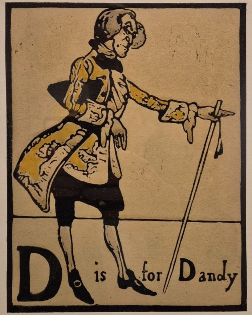
D is for Dandy would turn out to be entirely relevant. One of the aspects of Nicholson’s life and creativity that the exhibition explores – and which I will touch on this Monday – is his self-presentation. Like many artists, he was one of his own best creations, and was always dressed to the nines, whether formally in public, or informally at home – his dressing gown was notorious! He also loved the precise shade of yellow which this Dandy is wearing. Not only did he use it in the costume designs for one of Noël Coward’s earliest plays, but he also had a favourite waistcoat in this shade: in a family portrait by William Orpen (which is in the exhibition) he is wearing it underneath the dressing gown…
Notice how, being a print, in A was an Artist the pose of the Dandy is reversed, a mirror image of the original. However, he has made sure that the letter ‘D’ is the right way round, and appears at the bottom left of the image, as it does in the original – it is a deliberate choice to make sure that the ‘D’ is seen – a confirmation that the identification of the subject is relevant. Unlike ‘A’, D is for Dandy has a white background and floor, with a single thin line for the horizon. Nicholson omits this line in the version seen in A was an Artist, presumably for simplicity’s sake.
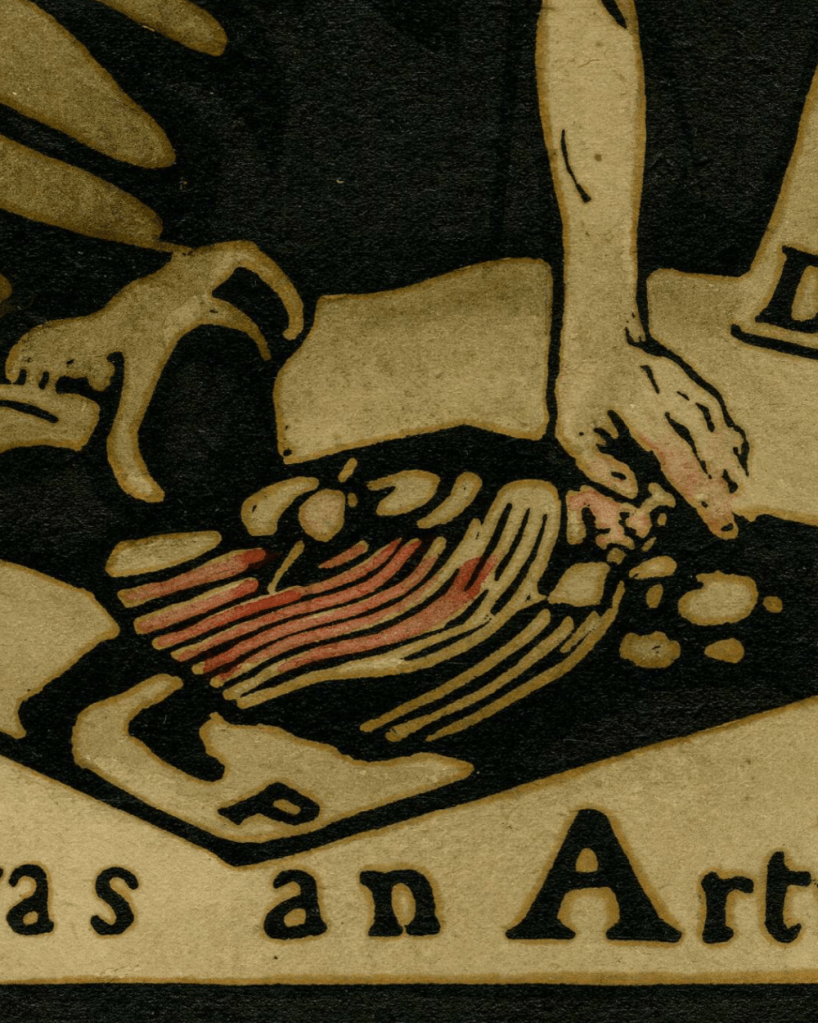
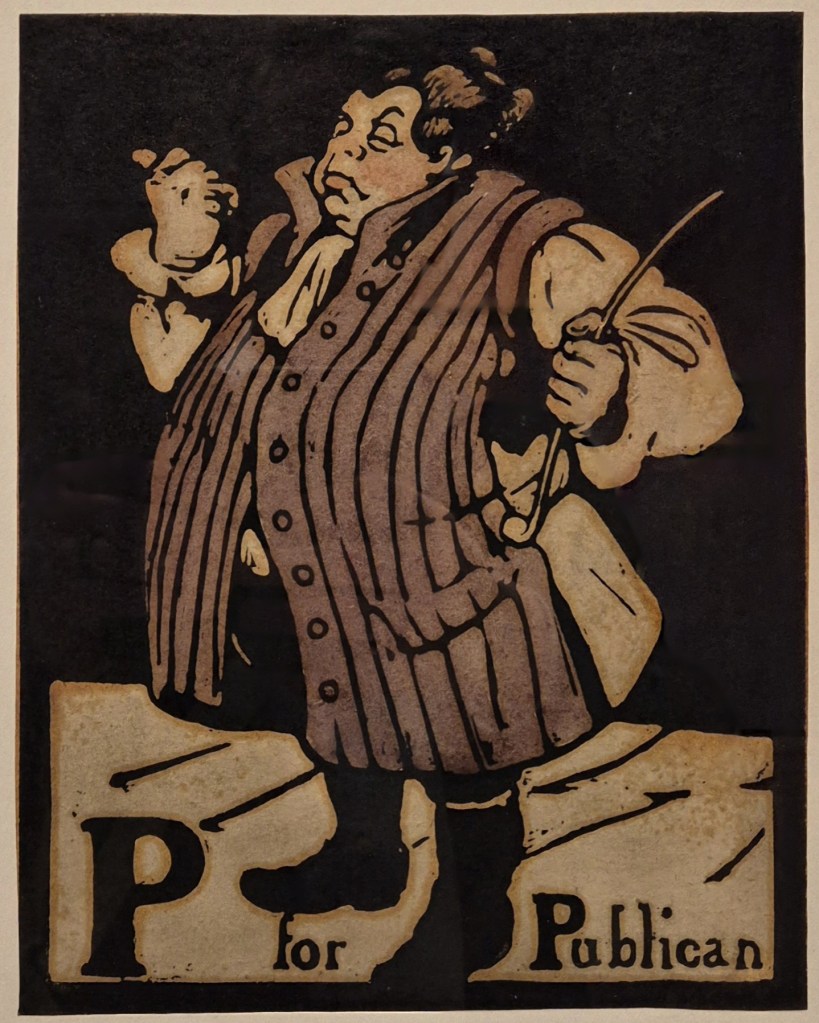
There are minor variations in P for Publican. The long, sleeveless coat is maroon, rather than the reddish pink used in Artist, and the front panel of the coat is completely and consistently coloured. Although the image is reversed (with a simplified, and shorter, pipe), he has made sure we can read the ‘P’, but has left it in the bottom right, its position in a mirror image. While the choice of this character alongside his self portrait might appear strange, it is – surprisingly perhaps – another autobiographical reference. When he married Mable Pryde in 1893 it was without her parents’ permission, or even knowledge. They eloped, married in Ruislip, and went to live in a former public house, the Eight Bells in Denham, Buckinghamshire. Shortly afterwards James Pryde came to visit for a couple of weeks – but stayed for a couple of years. They were, indeed, at home in the pub. Or, put another way, they were the publicans…

As it turns out, the basic elements of this composition would serve Nicholson well. In several of his still life paintings, and at least one portrait, the main subject rings out against a profoundly black background. The difference with the later works – as we will see on Monday – is that these subjects are brilliantly detailed, almost mesmerically so. However, the flashing, flashy highlights we can see in the slicked-back hair of this print have their own life in Williamson’s virtuosic application of oil paint which became a hallmark of his portraits and still life paintings. A was an Artist who started as a printmaker.

Please sign me up for Monday’s lecture on William Nicholson! (I am a semi-regular to your lectures.)
I could not open the ‘portal’ from this email to make my reservation.
Gretchen Adkins
>
LikeLike
I opened another one of your emails and was able to buy a ticket to your Nicholson on Monday March 2. Hurrah!!!! Gretchen Adkins
>
LikeLike
Glad this worked out, Gretchen – thank you for booking. I’m afraid I don’t know why the other link wasn’t working for you – I’ve not heard of any other problems – and I’m glad it’s worked out as I can’t book other people into the talks without their card details…
LikeLike
I found your conversation of “A was for Artist” interesting.
I think the past tense was in keeping with the traditional – and well known alphabet, at least in England – “A was for Archer who Caught a great fish.” The rest of the alphabet, sometimes referred to as Tom Thumb’s alphabet, selects “professions” for each letter: Butcher, Captain, Drunkard (my fav)…. Obviously Nicholson is playing with this concept.
I look forward to your Monday presentation
Gretchen
>
LikeLike
Thank you! I am vaguely aware of the verse versions of these alphabets, and I think you’re right, Nicholson would have been drawing on those. However, it still seems odd that he only uses the word ‘was’ for the letter ‘A’ in which he features, particularly when none of the inscriptions are completed by verses. Curiously, he inscribed the mount of a photograph taken in about 1935 – when he would have been 63 – with the phrase ‘This was Me!’ – he seems to have thought of himself retrospectively!
LikeLike