
Duccio, The Virgin and Child with Saint Dominic and Saint Aurea, and Patriarchs and Prophets, about 1312-15 (?). National Gallery, London.
First thing’s first – I’m giving my own talks! Rather than sheltering under the umbrella of another institution or organisation I’m doing my own thing. More of that after Duccio, but if you can’t wait that long, head to the diary page of my website for news of my series of lectures Going for Gold – which, as you will see, has determined my choice of painting for today. I was lecturing about Ambrogio Lorenzetti last week, and someone suggested a lecture on Duccio, and although I’m not quite going that far, I did want another look at this glorious triptych. It is a small devotional panel that could have been kept in pride of place in a bedroom, study or cell, or, for that matter, given the right members of staff, carried from place to place. On arrival at your destination, miles away from those you knew and loved, you could put it on a table, open it up, and, looking at the picture in front of you, speak to someone a long way away. As video artist Bill Viola pointed out some years ago, this is not unlike turning up to a hotel room, getting out your laptop, opening it up, and skyping your nearest and dearest. To be honest, I don’t think he said ‘skype’ as I don’t think that had been invented back then. And in any case it’s more like zoom. We’re clearly on Active Speaker view, with the Madonna and Child holding court, and thumbnails of patriarchs and prophets, also present at the meeting, lined up above. OK, so the saints on either side don’t quite fit this layout (it’s more like ‘gallery view’ with a limited number of participants) but you get the idea. This painting is about communication, and allowing the viewer to communicate with characters in whom they would have believed 100%, and who they would have believed were actively present and listening intently.

That doesn’t get away from the fact that it is a luxury object of the highest order. It would first require a carpenter to create the panels. There are three here – one in the centre, and two attached by hinges (these are not the originals, though). The panels would have been made, smoothed down, and the framing elements attached before painting began. The vertical and horizontal elements are carved out of wood, while the curving arch is modelled from gesso (see below): you can read the full details of the painting’s construction in Dillian Gordon’s admirable catalogue entry, which the National Gallery has posted online. Duccio’s workshop would then have prepared the panel with size, an animal-based glue, to stop the paint soaking into the wood, and it was common practice to cover the panel with canvas as well. This was then painted with gesso, made of gypsum (calcium sulphate), a bit like plastering a wall to make it nice and smooth (in the north of Europe chalk – calcium carbonate – was used, the choice of material being related to availability). Many layers of increasingly fine gesso would be added, and sanded down, before getting round to the painting. And even before that, any areas to be gilded – and there are many – would also need to be prepared by painting bole – a red, clay-based paint, often containing some form of glue – onto the gesso. This would show through the translucent gold leaf to make it look even richer. And finally the painting. Don’t worry about the expense of the gold – that’s very thin – the blue itself would have been more expensive, as it is the finest ultramarine. Derived from the semi-precious stone lapis lazuli, which, at the time, was only known in one source (modern-day Afghanistan) it was imported along the silk route and then over the Mediterranean – hence the name ultramarine: ‘from over the sea’. However, this is not what you would see of the triptych (a three-panelled painting) most of the time, as most of the time it would have been shut. I’ve never seen what this looks like, but the Museum of Fine Art in Boston has a triptych with exactly the same structure, and it looks like this.

The arched gable at the top is an additional panel, stuck over the panel bearing the main image, to make sure that, when the wings are shut, the painting as a whole is more or less flat. As a result, even when shut, the painting on the gable is still visible. The Boston example shows Christ in a mandorla, possibly representing the Ascension of Christ (or the Second Coming?). The central image is of the Crucifixion, meaning that the scene in the gable follows that seen when the wings are opened. In London, though, the order is different.
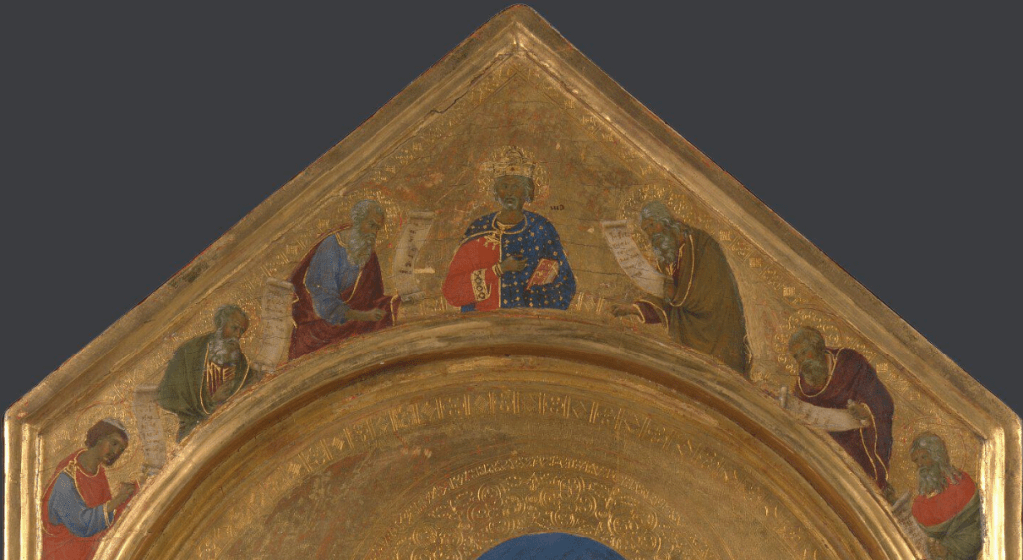
The figures gathered around the top are the ‘Patriarchs and Prophets’ of the modern title. There are seven of them, six of whom have scrolls. This in itself is usually enough to tell you that they are prophets, as anyone from the New Testament is far more likely to hold more modern technology, the codex (i.e. a book with pages you can turn), as opposed to an old-fashioned scroll (a book with one page that gradually unrolls). The first reference to a codex occurs in the 1st century, and by the 4th there were as many codices as scrolls. This development is associated with the growth of Christianity, and so the symbolic division of scroll and codex between old and new testaments is entirely apt. What are the prophets prophesying? Well, the Virgin Birth, and the arrival of the Messiah on earth, naturally enough: prophesies which are realised by opening the wings. This is an interactive work of art, and the act of opening it up fulfils the promise of the exterior. The central image is King David – the crown tells us as much, but then so does the fact that his name is written next to him (or was, at least – some of it has worn away). Notice that he wears the same gilded blue and red as Mary: in the bible Joseph is of the House of David, and, according to the Golden Legend, so is Mary.
When you approach a set of double doors, do you ever hesitate, wondering which one might open first? Clearly the owners of this triptych had a similar problem.

This may seem an odd statement, but both the Boston and London paintings have the same cunning ‘device’ – although in London (at least) this may not have been original, as early in its history the outside of the triptych was extensively repainted, possibly at the behest of the second owners of the painting. Nevertheless, above you can see the ‘back’ of the London painting when it is open. Each wing is decorated with geometrical patterns, five versions of more-or-less the same motif, a single large lozenge with four more small ones, one at each corner. At first glance each panel looks the same – but look closer.


Do you notice that the lozenges on the right are interlinked, but those on the left are separate? Well, if you want to open the triptych, you have to start with the wing where the lozenges are apart, and if you want to close it, you would start with the one where they are together. There is a rebate on the right-hand wing (as seen from the back), over which an equivalent rebate on the left-hand wing will shut, thus keeping the triptych closed.
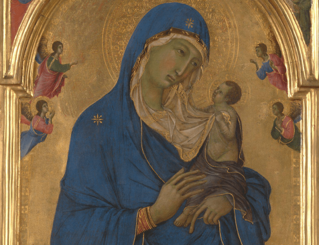
Once open, this is the glory you see: Mary, as Queen of Heaven, in heavenly blue, and as ‘Star of the Sea’ (Maris Stella) – in ultramarine – with stars on her shoulder and forehead. There is a naturalness in the interaction of mother and child, a humanity of emotion, which is not common in earlier art – even if the appearance is anything but naturalistic. We are in a world of elegance and delicacy: her long, slim fingers are rendered longer and slimmer than is humanly possible, devoid of skeleton and articulation, as these would only get in the way of the decorative line. Mother and Child look into each other’s eyes, joined by their mutual gaze, and linked by Mary’s white veil. Jesus holds one end in his left hand, and grasps the hem, higher up, with his right, the crook of his arm echoing the flow of the fabric. He wears an almost-transparent tunic – we need to see that this is God made flesh – with a pale-Imperial-purple cloth wrapped around it, hems picked out by the thinnest line of sinuous gold – as are the hems of Mary’s blue cloak.

The Virgin may look a little off colour. The green faces of trecento Madonnas are well known, but are not what the artists intended (trecento means ‘three hundred’, and is the Italian word for the 14th century – the ‘thirteen hundreds’, to use the ugly modern form). Flesh areas were underpainted with a pigment called terra verde – ‘green earth’ – so that, when the flesh tones were painted on top they would have depth and life. Unfortunately, though, the pinks of the flesh tones have a tendency to fade – thus revealing the green underneath. Nevertheless, it has its own familiar charm – for me, at least. On either side we see angels, looking on in adoration. One prays, one holds his hands over his chest, but two seem to hold objects. Time has worn them away, but originally they would have held thuribles – the metal censers on chains that are swung to create clouds of ethereal odour during worship. The problem here is that, although it is possible to paint on top of gold leaf, the paint doesn’t always stick. This could have been a problem with the identification of the saints on either side.

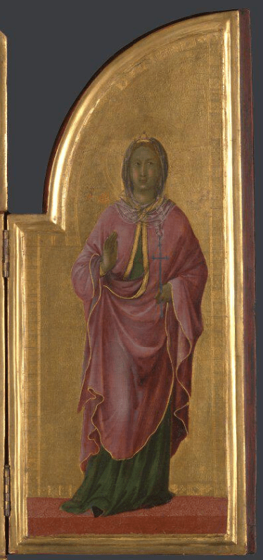
One is well known, the other quite obscure. On the left we see St Dominic, the founder of the Order of Preachers – or Dominicans – wearing the habit of the order – a white robe and tabard, with a black hooded cloak on top. He holds a book in his left hand, to which he gestures with his right: these are the scriptures, which are to be correctly understood. St Dominic was particularly concerned with orthodoxy – the right belief – and so, with the defeat of heresy. The small, red, starred circle just to the right of his head is a reference to his godmother, who, when he was baptised, saw a star on his forehead which appeared to illuminate the entire world. It is a common attribute of the saint, and it is not unusual to see paintings of St Dominic with this star still firmly in place on his forehead. As for his companion – well, a female saint holding a cross is hardly specific…

It is just as well that Duccio painted the names of both saints onto the background. Even though that of St Dominic has all but worn away, his habit and the star tells us who he is. The other saint’s name has gone entirely. However, in this case the paint does seem to have stuck, and when it was brushed off, however that happened, it took the gold with it. What we can see, therefore, is a gap in the gold, revealing the orange bole underneath, and the letters ‘Au’, which, as if by some Divine Revelation, is the chemical symbol for gold. The very absence tells you what has gone. This is no mere coincidence, for this is St Aurea, the golden girl of Ostia, the port of ancient Rome. Because she was a Christian she was exiled there from the nearby capital of the Empire in the middle of the third century. When she refused to worship pagan idols a stone was tied round her neck and she was thrown into the sea. Inevitably she became the patron saint of Ostia, with a church dedicated to her. In 1981 excavations nearby discovered an ancient inscription reading CHRYSE HIC DORMIT – ‘Chryse sleeps here’ – chrysós being the Greek word for ‘gold’.
In 1303 a Dominican, called Niccolò da Prato, was installed as the Cardinal Bishop of Ostia. It therefore seems possible – as both St Dominic (Niccolò was a Dominican) and Saint Aurea (the patron of Ostia) are in this painting – that he commissioned this triptych. Another of Niccolò’s titular churches was dedicated to St Clement, and as the Boston triptych shows St Nicholas (his name saint) and St Clement on either side of the Crucifixion, it seems likely that he owned that painting too. With the infant Christ in one, and the Crucifixion in the other, they could have been used during different celebrations in the church’s calendar. Niccolò’s will, which was written in 1321, the year of his death, specifes that ‘three painted panels to be put on altars’ should be left to the Church of San Domenico in his home town of Prato. These could have been two of them (I’ll leave you to look up the Boston triptych yourselves).
Whatever the origins of this painting, there is no denying its beauty, nor the refinement of the application and decoration of the gold. But I’ll talk more about that during my first lecture, First Light, on 8 February. I was going to put more details here – but why not just look at the details I’ve already put on the diary page! I do hope you can make it.

Intrigued by your comment about a wood panel commonly being prepared by covering it with a canvas, would this have facilitated the (much later) practice of transferring panel paintings to canvas – essentially relining with a canvas support in place of the original wood?
LikeLiked by 1 person
Good point – but, to be honest, I don’t know. Theoretically, yes, because it would have made it easier to remove the wood from the back of the paint, but I’ve never heard a conservator mention it. Nor, to be honest, do I know how common it was for panels to be prepared with canvas….
LikeLike
OK, thanks. I must admit, canvas on wood is not something I had heard of before.
As I understood it, the process of transferring panel paintings to canvas was typically to temporarily support the front of the painting with paper, then shave the wood off the back and remove the mineral ground before pasting the thin paint layer on new canvas, before finally removing the paper from the front. Sounds a pretty hairy process!
LikeLiked by 1 person
Absolutely – a completely terrifying thing to do. When they removed the wooden support from Cima’s ‘Incredulity….’ in the NG, they spent over a year on it, apparently: it’s not something you want to rush. And you would use more than just paper, I believe, as that is a little too flimsy – although you would start with paper, and then strengthen it with something more substantial. I couldn’t tell you what, though.
LikeLiked by 1 person
Hello that is great news!
Barbara Deering
Sent from my iPhone
LikeLiked by 1 person
Thank you, Barbara – I’m glad to hear people are looking forward to the talks!
LikeLiked by 1 person