Sybil Andrews, Via Dolorosa, 1935. British Museum, London.
As my next two talks are entitled Negative Spaces, I wanted to write about the concept, and explain the reasons why I am using it. And I want to do this because the artists to whom I am dedicating the first talk, Mary Beale and Sybil Andrews (on Monday 11 July), would seem to have nothing in common, apart from the fact that they both came from the charming medieval town of Bury St Edmunds. I will explain what inspired the talk towards the end of the post. These two women have even less in common, perhaps, with Cornelia Parker, who is the subject of the following week’s talk (Monday 18 July) – but again, it is the concept of absence – of ‘negative space’ – which brings them together. To try and explain these ideas I shall focus on one of Sybil Andrews’ linocut prints, and one of which I am increasingly fond: Via Dolorosa.
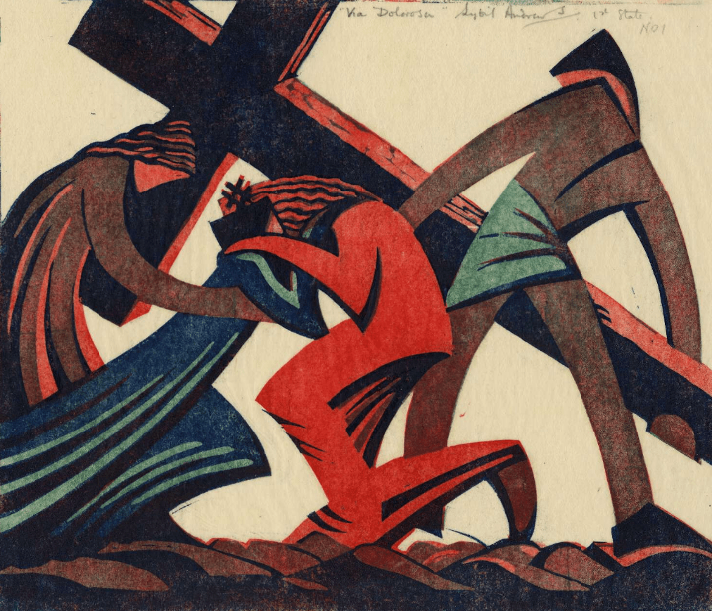
The subject is not strictly biblical, but rather, part of church tradition. The Via Dolorosa is the Way of Sorrow, and is a processional, pilgrimage route in Jerusalem, taken by the faithful who want to follow the steps that Jesus took on the way to his crucifixion. The current route was established in the 18th Century, but is based on earlier, medieval versions. Although this print was executed in 1935, a version of it was later incorporated in a series of Stations of the Cross which Sybil Andrews worked on from 1946-78, in which it represents Station IV: Christ meets his Mother. The series was never completed – Andrews made only 10 of the 14 traditional Stations – and although Station V marks the point at which Simon of Cyrene takes the cross, he is already present. Simon’s role on the road to Calvary is mentioned in all three synoptic gospels. For example, in Matthew 27: 31-32 we read,
31 And after that they had mocked him [Jesus], they took the robe off from him, and put his own raiment on him, and led him away to crucify him.
32 And as they came out, they found a man of Cyrene, Simon by name: him they compelled to bear his cross.
In the linocut Jesus is wearing red, ‘his own raiment’, as opposed to the ‘royal’ purple garment in which he was dressed as part of the process of being mocked by some of the bystanders. Simon, already bearing the cross, which ways down between the broad arcs of both arms, seems to wear nothing but a loin cloth. In her grief, the Virgin, in her traditional blue, lunges at her son in desperation, her left knee bent, her right leg stretching behind. The long, urgent reach of her body makes a strong diagonal from the bottom left corner of the image up towards Jesus’s head. He collapses around her, his face lost behind hers, her face hidden by his left arm, which crosses over her right. Their hands rest on each other’s shoulders, the echoing gestures complemented by the sharp inflections of their elbows: these two people are in harmony, they share a common grief. To the left of the Virgin is Mary Magdalene – identified by her long, red, flowing robe (darker than Jesus’s to ensure that he is the focus of attention), and by her long, red, flowing hair – which echoes that of Jesus.
The Virgin stretches up between the Magdalene and Jesus, as if they are a pair of brackets containing her. The Magdalene’s form curves in from the left, and Jesus’s from the right, showing how they try to comfort Mary in her inconsolable grief, but also how they support her. One of the Magdalene’s arms stretches under the Virgin’s, while Jesus’s rests on it, setting up a rhythm linking all three figures. And yet Mary is left isolated, the blue ringing out clearly against the off-white background of the paper. The space between the Virgin and Jesus reminds me of nothing so much as a bolt of lightning, as if that is what has struck her down. It is this ‘negative space’ which fascinates me. Put succinctly (I hope), the ‘positive space’ is the space taken up by the subject matter – in this case Mary and Jesus. The ‘negative space’ is the space in between – all of the composition which is theoretically not part of the subject. It is something that intrigued Sybil Andrews, and I was, in turn, intrigued to read in a biography (details below), that she found reliefs from the Chinese Han dynasty at the Victoria and Albert Museum ‘“tremendously exciting,”… especially the artists’ use of negative space’. I’d show you an example, but, to be honest, I can’t quite pin down what (in the V&A) is being referred to here, and anyway, it might get in the way…

However, look at the negative space created by Simon of Cyrene’s legs, and the equivalent shape formed by Jesus’s leg and foot: both have a similar, straight diagonal at the top (leading in different directions), and a similar broad curve leading down from the upper end of this diagonal. These similar, off-white forms are part of the rhythm of the image. Notice also the curving, triangular section between Jesus’s legs and Simon’s. The same shape appears under Simon’s left arm: another echo, more harmony.

At the top of the image Andrews has titled and signed the work, labelling it as the ‘1st State, No. 1’ – she made other ‘1st states’, apparently, with only minor variations to the wood grain of the cross, before printing the edition. The looming diagonals of the cross help to structure the composition, and reinforce the energy of the Virgin’s dramatic move towards her son. Indeed, the two diagonals of the cross are an abstraction of the bodies of Mary and Jesus. The cross also frames the figures, with the negative space between it and the embracing figures of Jesus and his Mother pushing them towards us.
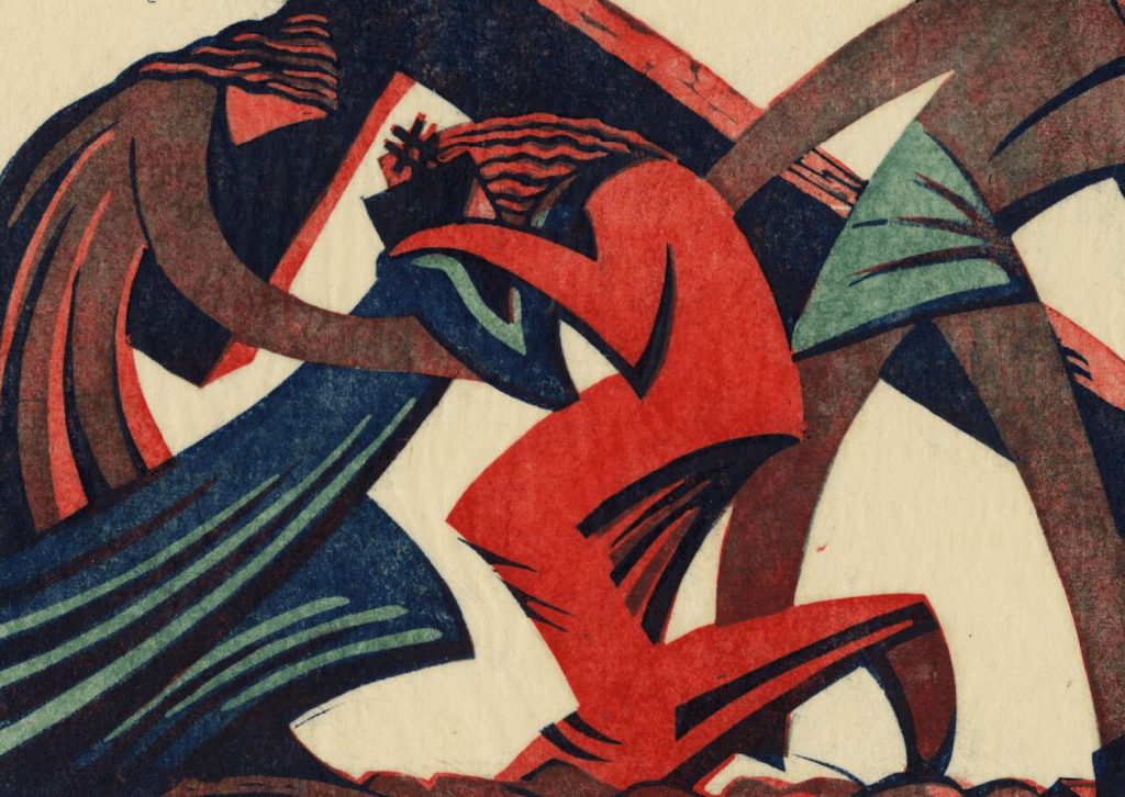
This is a linocut, or linoleum block print, a technique invented early in the 20th Century, of which Sybil Andrews was one of the first exponents. I will talk more about the technique, and Andrews’ use of it, on Monday. For now, I will limit myself to pointing out that this image uses only three colours of ink, described by the British Museum (which owns this particular version) as ‘red, viridian, dark blue’. The red defines Jesus’s robe, the Magdalene’s face and the sides of the cross, the viridian, like a jade green, can be seen in Simon’s loin cloth and the highlights of the Virgin’s drapery, while the dark blue forms the rest of this robe. Everything else you see is a combination of two of these colours, or, in the case of what might look like black, all three. Three different ‘blocks’ were used, each cut into a single sheet of linoleum, with each being inked in succession. The paper was carefully lined up, laid on top of the blocks, and pressed down. Inevitably the ink would ‘bleed’ out from the blocks, so the printed paper, as a whole, looks like this:

When framing a print, the frame is often an equivalent to the size of the paper as a whole, while the mount is cut to reveal only the image – basically, the cropped version that I showed you first. But if this is a 20th Century technique, what could be the relevance to Mary Beale, an artist working in the 17th Century? Well, compare these two details:


A version of the linocut, and the painting from which this detail comes, both belong to the Moyses Hall Museum in Bury St Edmunds, and both are on show there now. The museum is currently exhibiting their collection of Andrews’ linocuts in a display which will be on show until September at the latest – although I couldn’t find any secure information about the dates (I did ask, but to no avail…). Having spent some time looking at Via Dolorosa, I was then struck by this detail from one of Beale’s portraits. The deep blue in the depiction of the Virgin Mary is derived from the traditional medieval iconography, and relates, in part, to the expense of the pigment ultramarine, the very pigment which Beale is using here. Colouristically, therefore, there is a connection between the two images. In addition, though, the highlights and dark shadows in this oil painting create a counterpoint with the Virgin’s robe in the linocut, I think. Beale makes a very specific choice to splay the fingers of this hand, creating curving triangular forms, not unlike those seen in the print, which exist as blue ‘negative spaces’ between the fingers, and between the forefinger and the hem of the bodice. I was also impressed by the way in which the chemise forms a long, gentle curve which approximates to the more linear, geometric form created by the horizontal of the top of the hand and the diagonals of the blue bodice leading up to the shoulders, a rhythmic form which I imagine Sybil Andrews would have enjoyed. The detail comes from this painting:
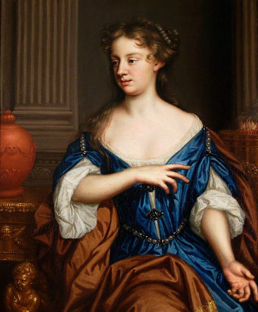
Traditionally described as a self portrait, I was happy to read that Penelope Hunting, author of the most recent and authoritative book on the subject, My Dearest Heart: The Artist Mary Beale, doubts this identification. Again, more about that on Monday, although if you have any thoughts about the urn and brazier, I’d be interested to hear them (I have some ideas, as it happens, and they make more sense if this isn’t Beale!) While I’m talking bibliography, there is also a recent biography of Sybil Andrews, On the Curve, by Janet Nicol, although it has precious little about her art. I’m hoping Jenny Uglow’s Sybil and Cyril: Cutting through Time, which I should get tomorrow, will be more… incisive (pun not originally intended…). I’ll let you know.
Having been struck by the ties between what are otherwise two unconnected images – and let’s face it, if I had seen the works in two separate museums I would never have made the connection – I was also struck by the notion of ‘negative space’ – something which is not, supposedly, the subject of a composition, but is a vital part of it. Had you heard of either artist before? You’re a sophisticated lot, so I’m sure you had. But they do not exist in a standard ‘History of Art’. Indeed, until relatively recently, women had been notably absent – certainly before the 20th Century. And yet, they were vital, even important in their own day. But since their deaths they have become negative spaces – notable for their absence – and I can’t help thinking that the concept is a valuable tool for thinking about a history of the art made by women. Which is precisely why I will be talking about these two artists on Monday…

I find the concept of negative spaces very interesting. It brought to mind two male artist’s working together that were exhibited at Somerset House about 1O years ago.
White negative spaces created by squares and rounds enhanced by shadows created by the specially designed frames.
Perhaps you would describe them as voids rather negative spaces? Or expressing the negativity of the impending war?
LikeLike
Sorry forgot to say the 2 artists were Mondrian and Nicholson
LikeLike
Thanks, Barbara – I’m just using the term which is common in art history, but it’s not necessarily ideal. I think the ‘negative’ is a problem, but ‘void’ would be too, as ‘negative space’ has a positive contribution to the image. If don’t think they are meant to be seen as ‘negative spaces’ as such, but they constitute ‘negative space’ – i.e. space which is not part of the subject, which I think is different to them being ‘spaces’, but it’s a fine line (as it were) – an abstract value, as opposed to a concrete absence. Neither form would exist without the other, which is why I think they are not voids: with Mondrian, certainly, the white is to be seen in balance with the black…
LikeLike
Thanks for your reply. Would you use a different word for negative that would encapsulate the concept?Particularly in the Sibyl Andrews painting the space is meaningful or dynamic or perhaps positive?
Unfortunately I will miss your Cornelia Parker talk and I’m fascinated by her exploration of space in a moment of time that we wouldn’t have the opportunity to explore.
Does negative space apply to sculpture in the same sense?
LikeLike
I think it’s easiest to accept the standard artistic term ‘negative space’ to be honest – take it on board as meaning those areas between the objects. It can apply to three dimensional works, though – I remember applying it to a Borromini balustrade in Rome, for example – the pattern created between the balusters. I may have been wrong to do so. I don’t think it would be wrong to use it for sculpture – again, the gaps between the solids are important, especially for Parker. I will also apply it to Barbara Hepworth for a talk some time in August! I am using the term metaphorically in the talks though, I hope that isn’t too confusing.
LikeLike
“Negative Space” so aptly applies to Linocuts. I saw “The Cutting Edge Of Modernity” Exhibition and have been an avid fan of Sybil Andrews and Cyril Power since then. In “Full Cry” and “Skaters” by Andrews, the negative space is essential to create the movement of the horses and the men. I recommend the book that accompanied the exhibition by Gordon Samuel, available at Amazon at £40 but then Christmas will soon be upon us !
LikeLiked by 1 person
Thanks for the recommendation, Ginny, I’d love to read it. Wish I’d seen the exhibition… I can’t really think how I missed it!
LikeLike
Thanks that isn’t confusing at all. I do tend to reject labels in general so in future I will think of “negative spaces” as a tool to help me look deeper.
Thank you Ginny for the recommendation. It’s on my birthday list
LikeLike
Looks like it!
LikeLike