
James Abbott McNeill Whistler, Arrangement in Grey and Black No. 2: Portrait of Thomas Carlyle, 1872-3. Kelvingrove Museum and Art Gallery, Glasgow.
Last year, in March, I wrote about Whistler’s Mother, and on Monday I will talk about Whistler’s Wife – Beatrix Birnie Philip. However, as the official title of the former is Arrangement in Black and Grey No. 1, today I thought it would be a good idea to talk about No. 2, currently to be found in the Kelvingrove Museum and Art Gallery in Glasgow. As it happens, the best collection of Beatrix Birnie Philip’s work is not far away, belonging as it does to the University of Glasgow, on the other side of Kelvingrove Park. That they can be found in the same city is not entirely coincidental, and yet not entirely connected. I will talk about Whistler – and his Wife this Monday, 11 September at 6pm, and the following week I will be in Glasgow itself. To end my somewhat Scottish September, on the Monday 25th I will introduce the Fleming Collection’s rewarding exhibition of Scottish Women Artists. Mondays in October will be dedicated to portraiture, and particularly that of the 17th Century. I will start by giving two talks dedicated to the recently refurbished and re-opened National Portrait Gallery in London, looking at the 16th and 17th Centuries respectively (later dates, looking at later dates, may follow), and continue with introductions to the Hals and Rubens exhibitions at the National and Dulwich Picture Galleries (the latter not entirely portraiture). Information about all of this will be added to the diary soon.
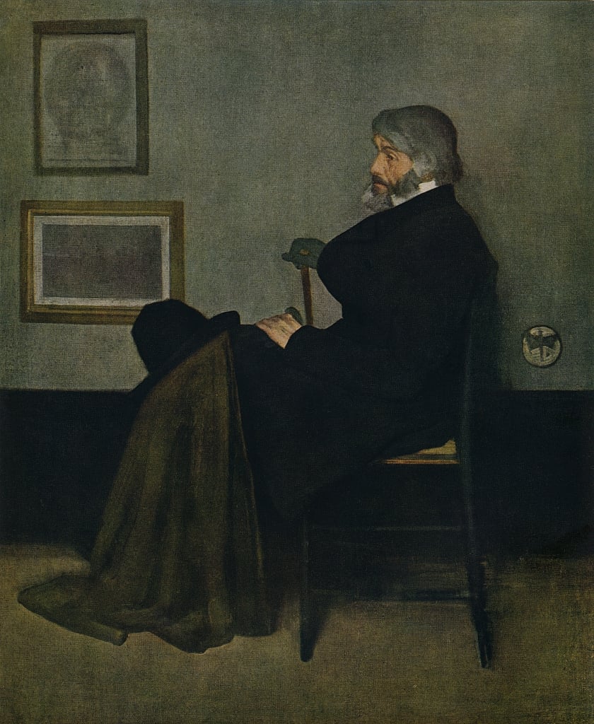
When I wrote about Arrangement in Black and Grey No. 1 (see 151 – Mommie dearest) I pointed out that the title of the painting makes no mention of it being a portrait. Regardless of the ‘subject’, it is, rather, an example of Whistler’s ongoing concern with ‘Art for Art’s sake’ – but more about that on Monday. The same is not true here. Although the painting was displayed under several different titles during Whistler’s lifetime (if you want a full list, go to the University of Glasgow’s encyclopaedic website), it is now generally given the full title Arrangement in Black and Grey No. 2: Portrait of Thomas Carlyle, and the fact that it was a portrait was acknowledged throughout its early history. Carlyle, the great Scottish essayist, historian and philosopher, had seen No. 1 in Whistler’s studio at 2 Lindsey Row, Chelsea (the address is now 96 Cheyne Walk). Carlyle lived just round the corner, at 24 Cheyne Row (you can visit on Wednesdays – Carlyle’s House is now owned by the National Trust), which Google Maps tells me is only 7 minutes’ walk from Whistler’s former studio.
Like Anna McNeill (Whistler’s mother), Thomas Carlyle sits in profile facing to our left, against the same grey wall with the same black wainscot, the same chair sitting on the same beige floor. However, there are notable differences. For a start, No. 1 is almost square, but subtly in landscape format, whereas the format for No. 2 is definitely ‘portrait’. Is this a statement of intent, or was it decided by the ‘necessity’ of the composition? I’m not sure we can say. An ‘oriental’ curtain hangs to the left in No. 1, which might reflect the everyday interior decoration: the critic William Michael Rossetti – brother of Dante Gabriel and Christina – said of 2 Lindsey Row that ‘Whistler has got up the rooms with many delightful Japanesisms’. However, the black drape, speckled with grey, does not make an appearance in No. 2: maybe it is, after all, more of a ‘portrait’ than an ‘arrangement’. There is one print visible on the wall in No. 1, with the edge of the frame of a second just visible behind Mother’s head. In No. 2 there are two prints, which help to balance the vertical of Carlyle’s torso on the other side of the composition.
I don’t know whether these two prints have been identified (the one hanging near Whistler’s mother has, see 151), but Whistler decided on the imagery early on. Prints with the same format, and apparently the same subject matter, appear in a study for Arrangement… No. 2 which is now in the Art Institute of Chicago (I’ll show you the study, and other preparatory material, on Monday). Top and bottom are in portrait and landscape format respectively, with the imagery in the top print apparently contained within an oval, with an inscription running along the bottom. The lower image is a dark rectangle, but with a horizon line above which a tower projects in the centre: it is clearly a topographical landscape. They might well be Whistler’s own prints, and it might be possible to identify them. Someone might have done so already, but I suspect the University of Glasgow’s website would include the relevant images if they had.
Carlyle himself appears rather sad. It has been suggested that he was still in mourning for his wife, Jane, who had died six years previously, in April 1866. He was certainly not a happy man at this time, writing in his journal, ‘More and more dreary, barren, base and ugly seem to me all the aspects of this poor diminishing quack world’ (which reads like a mangled version of Hamlet’s first soliloquy in Act 1, scene 2: ‘How weary, stale, flat and unprofitable, Seem to me all the uses of this world!’). The melancholy aspect of the figure was one of elements of the painting that Whistler himself appreciated, saying, nearly two decades after it had been completed, ‘He is a favourite of mine. I like the gentle sadness about him! – perhaps he was even sensitive – and even misunderstood – who knows!’

The background of the painting is taken up with three bands of colour. At the top is the cool grey of the wall, stretching a little more than half the height of painting. The beige floor (a carpet?) fills the bottom quarter, with the black wainscot taking up the remainder. A brown rug, or cape, falls over Carlyle’s knees – quite possibly related to the fact that he had not been well. His niece once contacted Whistler to say that he was too ill to attend that day’s sitting, but would be there the following week. But the rug, or cape, is also there for the composition, and for the colour and tonal harmony: Whistler’s mature works are all predicated on the balance, and the perception, of closely related tones (the scale from light to dark) and hues (colours). The brown of the cape, or rug, sits half-way between the colour of the floor and the black of Carlyle’s jacket, while the wall translates the floor’s beige to grey and provides a foil to the hair and beard. Having the extra fabric draped over his knees also strengthens the triangular composition of the figure as a whole.

The cape also harmonises with the gold frame of the lower print: these echoes are what makes Whistler’s work sing. Notice how a tiny, triangular patch of the seat is visible. In tone it matches Carlyle’s left hand, which is resting on his knee, perfectly, even if the hue is not exactly the same. There is a contrast between the hands – one visible, resting on his lap, the other gloved, holding his stick, the first light, the second dark. The un-gloved hand has the same hue and tone as the face, which is above the exposed area of the seat, creating a sense of stability: no slouching here! Balancing the un-gloved hand, on the horizontal, is Whistler’s ‘signature’: a butterfly with a sting. These four light ‘notes’ form an irregular diamond, again adding to the sense of stability. Carlyle’s hat rests on his knee – he is a visitor here, certainly not at home, and not entirely relaxed. The hat overlaps the lower picture frame, thus connecting the sitter to the print: does that have any significance for his life? Or character? Unless the print can be identified, we will never know.
Carlyle liked the painting, his niece writing, ‘even my uncle is beginning to be impressed with the portrait; he remarked to me when he returned from his last sitting “that he really couldn’t help observing that it was going to be very like him, and that there was a certain massive originality about the whole thing, which was rather impressive!”’ However, he wasn’t entirely happy about the process of sitting, commenting at one point that Whistler’s ‘anxiety seemed to be to get the coat painted to ideal perfection; the face went for little.’ This is confirmed by the painting itself. There are numerous layers and alterations making up the coat, whereas the face is painted relatively thinly.
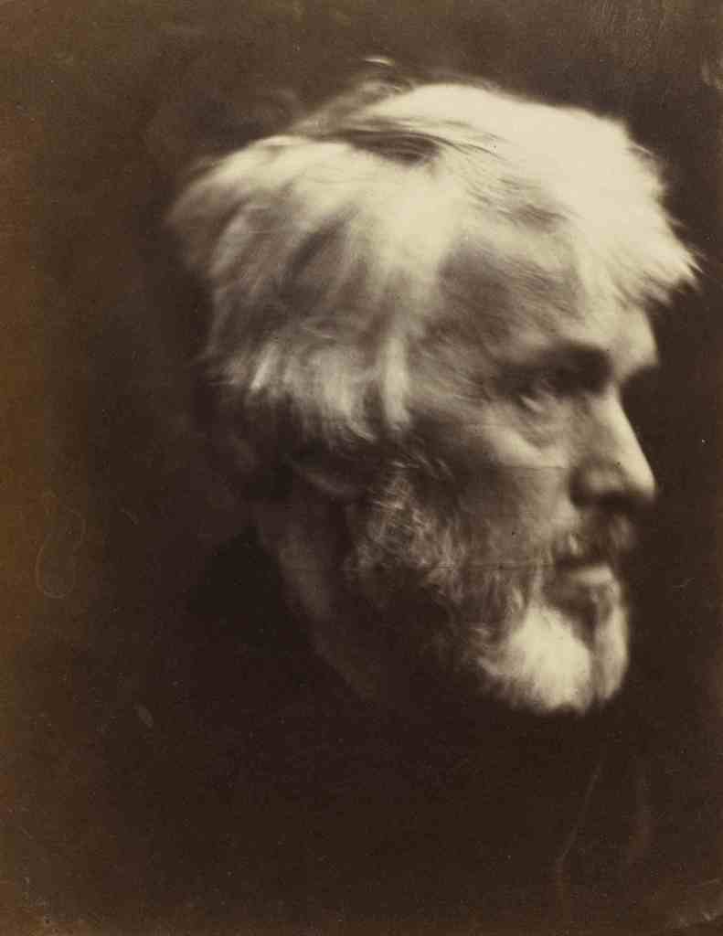
This was not the first time that Carlyle had been the subject of art. Five years before the sittings for Whistler had begun, he was photographed by one of the great, early photographers, Julia Margaret Cameron. She was so determined to take his picture that she travelled all the way from her home on the Isle of Wight to London to meet him – with her camera. Cameras were not the easiest things to transport in the 1860s. One of the resulting portrait is below, on the left. She later wrote, ‘When I have had such men before my camera my whole soul has endeavored to do its duty towards them in recording the greatness of the inner as well as the features of the outer man. The photograph thus taken has been almost the embodiment of a prayer.’ Carlyle also appeared in Ford Madox Brown’s masterpiece, Work – although I’m assuming he didn’t pose for this. He appears in a detail on the right of the picture, and you can recognise him as much from the signature stick, on which he leans, as from the likeness (although as a portrait – or even a face – I think it is sadly lacking: possibly the poorest passage in the painting).

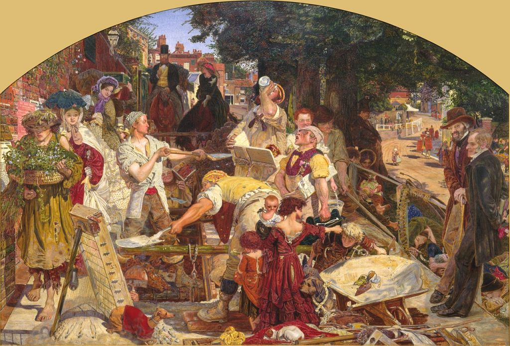
This is the second, smaller version of Work, owned by the Birmingham Museum and Art Gallery, and dated 1859-63. The idea was to encompass the whole of Victorian society, from the wealthy on horseback in the background, to the manual labourers, poor, and indigent in the foreground, the latter grouping chosen from types characterized in Henry Mayhew’s book London Labour and the London Poor (1840). Thomas Carlyle stands on the right of the painting next to F. D. Maurice, one of the founders of the Christian Socialism movement. Carlyle is included as a result of his book Past and Present (1843), in which he praised the work ethic, embodied in the line, ‘On the whole we do entirely agree with those old monks, LABORARE EST ORARE: Work is Worship’. Ironically it was ideas derived from Carlyle’s theories which led John Ruskin to condemn the high prices asked by Whistler, an outburst in print which led to a notorious libel case. I’ll try and cover that on Monday, too.
However much he liked the portrait, Carlyle did not buy it. Completed in 1873, it was finally purchased in 1891 by the Corporation of the City of Glasgow, at the behest of the Glasgow Boys. Not only were the Boys the leading artists in the Second City of Empire at the time, but some of them were also Whistler’s neighbours in Chelsea. Their insistence on this particular painting was related to Carlyle’s position as one of the leading thinkers in recent Scottish history. Whistler himself was also proud of his Scottish heritage: his mother Anna was a descendent of the McNeills of Barra. However, the history of the painting, and its purchase, are far too complicated to relate here, but again you can find the intricate details on the University of Glasgow’s website.
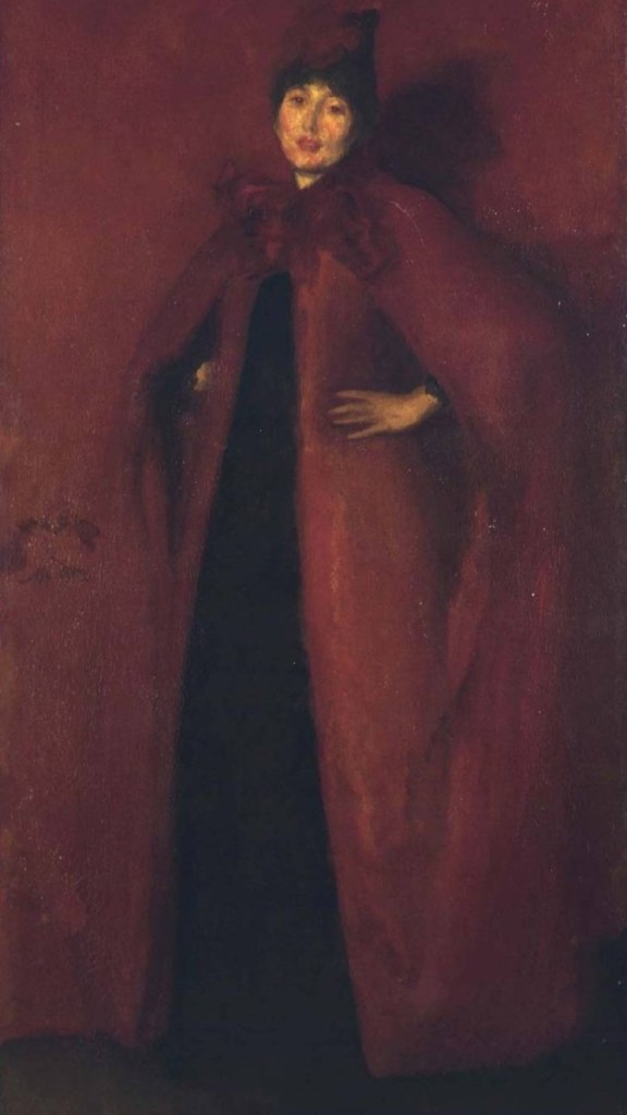
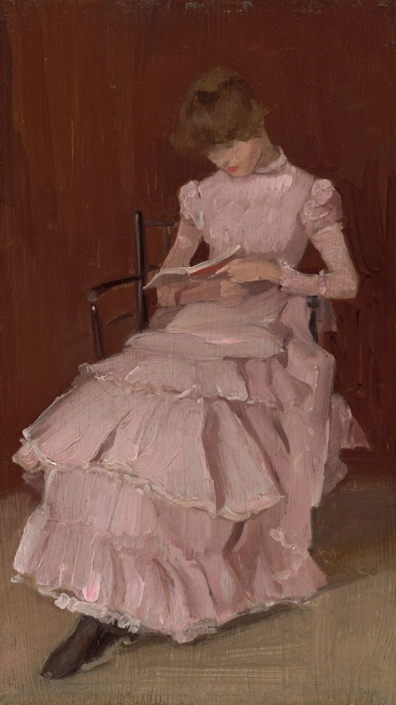
Arrangement in Black and Grey No. 2 was the first painting by Whistler to enter a British public collection – and notably, a Scottish one. In 1903 – the year of his death – he was to receive an honorary degree from the University of Glasgow. This may be the reason why, in 1936, his sister-in-law and heir, Rosalind Birnie Philip, bequeathed his estate to the University. Well, that and the fact that Whistler himself insisted that nothing be left to an English collection. This explains the University’s remarkable holdings of his – and of Beatrix’s – work. One of his paintings, for which Beatrix modelled, is entitled Harmony in Red: Lamplight (c. 1884-86). It is currently on show in the Hunterian Art Gallery, and you can see it below, on the left. Like Whistler’s Mother, there is no implication in the title that Whistler’s Wife is a portrait – although, having said that, they wouldn’t marry until 1888, two years after it was completed. On the right is a painting by Beatrix herself from the National Gallery of Art in Washington D.C. I chose this one because I am intrigued that the colour of the wall is so close to the palette of Whistler’s painting. It is entitled Peach Blossom, giving us no clue as to its meaning or content, nor even why it has that title – presumably the reference is to the colour of the dress. As we will see on Monday, they were clearly meant for each other.

I expect you will explain on Monday evening but can you tell me why Whistler stipulated that nothing should be left to an English collection? Glasgow’s gain was certainly London’s loss.
LikeLike
I’ll do what I can!
LikeLike