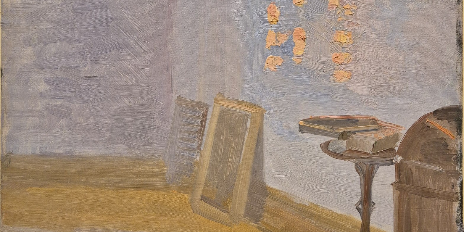
Anna Ancher, Evening Sun in the Artist’s Studio at Markvej, after 1913. Skagens Museum, Skagen, Denmark.
Over the next two weeks I will be giving two talks about Scandinavian artists. This Monday, 26 January I’m starting with Anna Ancher, the wonderful but relatively little-known (as far as the UK public is concerned) Danish artist. Her exhibition is on at the Dulwich Picture Gallery until 8 March, and so still accessible to many of you. The following week, Monday, 2 February I will talk about Anders Zorn, whose work I have just seen in Hamburg. The exhibition I visited closes this Sunday, which doesn’t give you much notice. However, it is travelling to Madrid, so if you like what you see – which I’m sure you will, if you like either John Singer Sargent or Joaquín Sorolla – you will have several months to get there (19 February to 17 May). A week later (9 February) I will introduce The Barber in London– the selection of masterpieces from the Barber Institute in Birmingham which are currently on loan to The Courtauld. Further events will be listed in the diary as soon as I have pinned them down, but should include introductions to the National Portrait Gallery exhibition Lucien Freud: Drawing into Painting on 23 February and to the William Nicholson exhibition at the Pallant House Gallery in Chichester on 2 March.
If you do book any of these events, Tixoom will send an email with the ticket – effectively a link to the talk – within seconds. If it doesn’t arrive within 24 hours, do let me know and I’ll try and sort it out: it would be easier to do it then than 5 minutes before the talk! You should then get reminders 24 hours and 15 minutes before the talk, and these will also include the link.
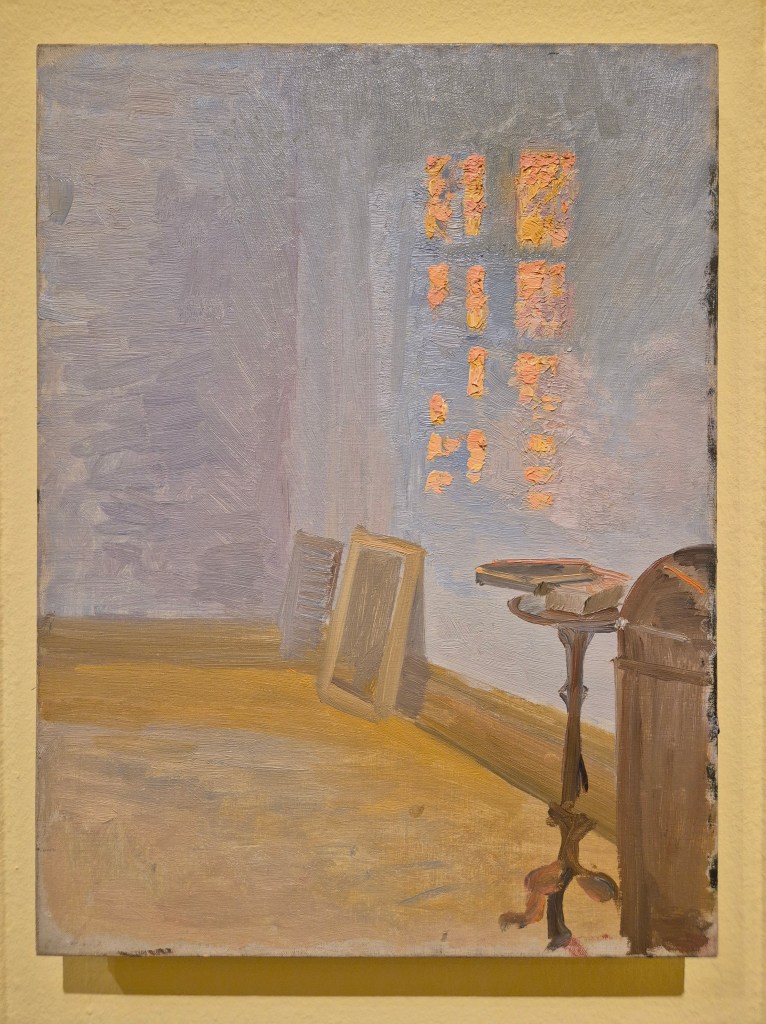
One of the glorious things about the paintings of Anna Ancher is that they are so simple, so straightforward, and so easy to understand. And yet there is nothing banal about them: she got to the heart of a scene and saw the beautiful in the everyday. Admittedly this particular painting is not entirely typical of her work – but it does include many elements that are. It was never formally exhibited in her lifetime, and was only found, in her studio, after her death. This is why it is exhibited without a frame: the photograph shows it against the buttercup-yellow wall on which it is currently hung in Dulwich.
The painting is like a character study, preparatory for a more fully thought-out work, but it is the character study of a room, and of a specific time of day. It is an exploration of light at a particular moment, when, as the sun heads towards the horizon, light refracts across a tangent of the earth’s surface and only the orange wavelengths reaches us – or, in this case, reach the far side of the room opposite a casement window. The city of Bath, in the South-West of England, can look especially beautiful at this time of day. The orange light enhances the already-warm colour of the Bath Stone – a ‘honey-coloured oolitic limestone’ – from which most of the city is built. The glow is enhanced when seen against its complementary colour, the darkening blue of the sky. But that’s Bath, in England, and this is Denmark, and the very north of Denmark at that. This is ‘evening’, and in Skagen, where Ancher was born, where she grew up and where she worked, evening could come within a 7-hour range, according to the time of year. The sun sets at 15:30 in the depths of winter, and 22:23 at Midsummer, when the day is 10 ½ hours longer than it would be in December… but then, it’s only slightly further North than Aberdeen, in Scotland, or at about the same latitude as Sitka, Alaska…
Born Anna Kirstine Brøndum on 18 August 1859, her parents ran Brøndum’s Hotel in Skagen, a coastal town at the very Northern tip of Denmark which saw an influx of artists keen to explore the light of this coastal fishing colony. The 19th century saw many such ‘retreats’, including St Ives in Cornwall (visited by Anders Zorn, whose work we will enjoy next week). There was also Cullercoats, just North of Newcastle (frequented by the American Winslow Homer), and Staithes, in Yorkshire (where Laura Knight lived for a while) – and these are just the ones I’ve mentioned in my talks. I say ‘retreats’… They may have been a chance to get away for the artists, but for the local residents their remoteness, and the harsh climate they had to endure in order to eke out a living, was anything but a choice. For Skagen, it was a new phenomenon in the 1870s, with the first two artists staying at Brøndum’s Hotel in 1872. More came the following year, and in the summer of 1874, there was a young artist from the island of Bornholm, South East of Copenhagen: Michael Ancher. Anna was on the verge of turning 15, but the two bonded over art, with the older man offering tuition to the younger girl. They were engaged three years later, and married on Anna’s 21st birthday, 18 August 1880, at which point they moved into the Garden House of Brøndum’s Hotel. In 1884 they moved into a larger house in a street called Markvej, ‘Field Road’ or ‘Way’. Michael was extremely supportive of his wife’s career – they collaborated, and exchanged ideas (as we will see on Monday) – and yet she didn’t have her own studio until an extension to the Markvej property was built in 1913. This very studio is the subject of today’s painting: a room of her own (precisely what Virginia Woolfe said a woman needed to be a successful writer). Given that the extension was built in 1913, this painting is dated ‘after 1913’.

However, I do wonder if this is actually 1913 itself: the room is so tidy, to the extent of being empty. But then, Anna Ancher seems to have had a habit of putting things away. In the 1960s, when the Markvej house became a museum dedicated to the work of both Anna and Michael Ancher, thousands of sketches were discovered. Anna had, apparently, ‘hidden her oil studies away in drawers, cupboards and closets’, according to the catalogue of the exhibition. I’d be interested to know why the think the studies were ‘hidden away’ rather than just ‘put away’ – in order to be tidy… Either way, this sketch is not something Ancher had exhibited. Maybe she was just trying to capture this phenomenon, this effect of light, in order to be able to use it elsewhere, or maybe she was using the study as a tool to look more closely at the subtle variations of colour and light, and to practice her ability to paint them. Alternatively, she could have been worried that, as a painting in its own right, it might not have been received well – or even, understood – unpeopled as it is, and devoid of narrative. For its day, it is remarkably innovative, especially given the more conservative attitudes prevalent in Denmark at the time. Things have changed, though, and studies such as this are now key to our understanding of Anna Ancher’s work. And despite what I said, this room is not empty: it is full of light – and colour. And it is, of course, the colour of the light that affects everything else we see.
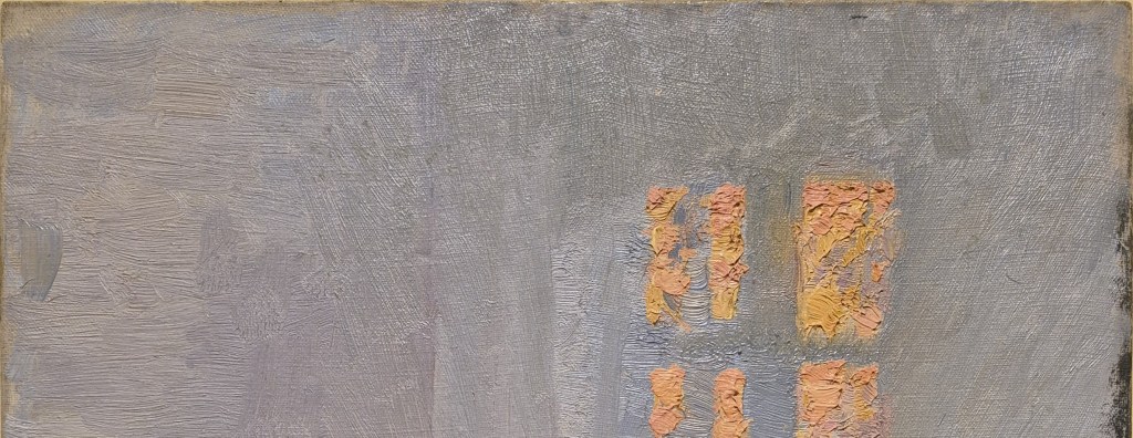
This is the very top of the painting, with the sunlight glowing somewhere between orange, amber and peach on the right-hand wall. We do not see the ceiling of the studio at all, and in the dim light of dusk, at the top of the painting the corner of the room cannot be distinguished. However, at roughly the same level as the top of the patches of orange light, the corner comes into sharp focus. The right-hand wall is slightly lighter, while the wall facing us takes on a marginally darker shade of lavender.
This differentiation in tone is even clearer if we look lower, seeing the full extent of the patches of sunlight. The darker area on the opposite wall reaches from the sharply-defined corner past irregular, diagonal strokes to bolder, horizontal marks. Gradually, as the contrast between the lit wall (on the right) and the wall in shadow becomes less significant, these get lighter: further from the corner the opposite wall is, of course, closer to the window itself.
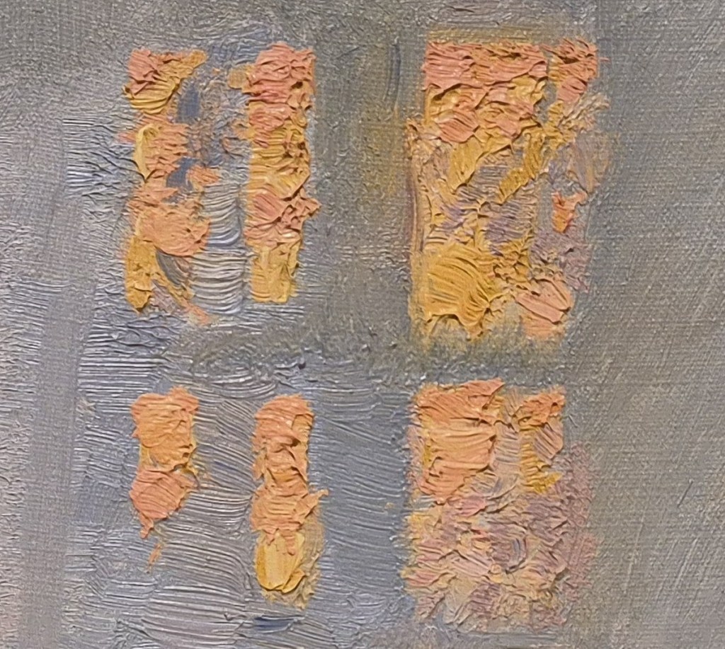
If you have the opportunity to get even closer to the paint surface, the way in which the golden glow is established seems remarkable – even incredible. There are small, tentative dabs of the brush in subtly varied shades – orange, amber and peach I have suggested, but I would add salmon, terracotta and a deep buttercup yellow as well (although the perception, and naming, of colour is notoriously personal). The rectangles of light are only loosely defined, separated by sections of the apparently-lavender wall. However, the framework of the window itself, projecting the light and shade onto the wall, does not seem regular. This is presumably due to obstructions to the sunlight both inside and outside the room. There could be trees in the garden, and often – and we know this from other paintings which we will see on Monday – Ancher arranged plants on her window sills. The irregularity of the brushstrokes implies a sense of movement, though, as if the sun might be shining through leaves which are rustling in the breeze.
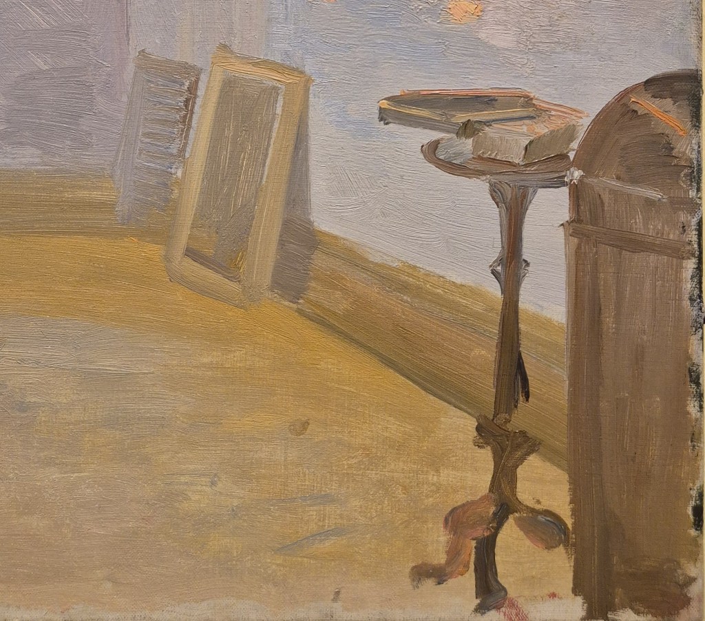
The furnishing of the studio is spare – although of course it could be that clutter has been cleared, and space has been created, simply to allow the artist to paint a study of space. However, the arrangement of objects looks spontaneous, rather than the controlled composition of so many still life paintings (you could, however, argue that this painting is exactly that: a Still Life). Two canvasses lean against the right wall in the back corner. The further one is built up with extreme economy of means – two vertical strokes of paint framing several loosely-applied horizontals. The nearer canvas has a cream-coloured frame, and a darker, taupe or mushroom-coloured surface – presumably a ground, as there is no visible imagery. The bottom of the frame stands away from the wall, and the canvas casts a triangle of shadow behind it – or rather, almost a triangle, as the wall has substantial wainscotting which affects the fall of the shadow. The contrast between the pale lavender of the wall on the right, and the darker tones of the opposite wall are particularly clear in this detail.
Closer to us, in the corner of the painting, are a small, circular console table with a slender stem supported on three curving legs, and what looks like a bureau or desk – it appears to have a roll top. On the far right, coming down the edge of the canvas, there are black details – but I’m afraid I haven’t been able to work out what, if anything, they represent. The edge of a curtain, hanging in the corner, perhaps?
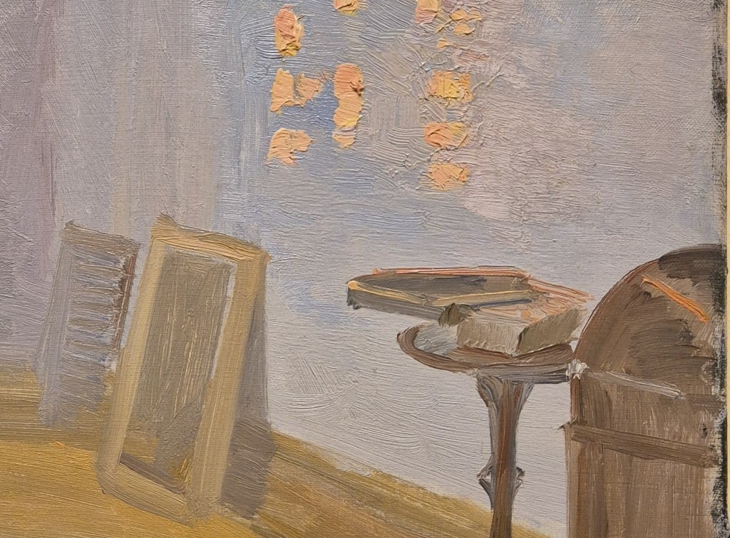
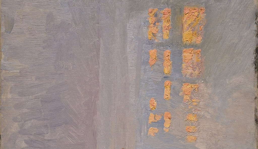
This detail is taken from a different photograph to the one I started with, and I think the colours are slightly closer to the original – although I’m not convinced it is possible to remember exact colours. What is clear is that, around the bottom left of the patches of sunlight, the wall looks more blue. The wall may not have been ‘coloured’ at all, though. In all probability it would have been painted white, or off-white. One of the phenomena that Ancher was investigating is the way in which we experience colour. Not digitally, in an absolute sense, but by comparison. Blue and orange are opposite each other on the colour wheel – they are colour opposites, or complementary contrasts. It is the orange light that makes our mind read the colour of the wall as the absence of orange – or the opposite of orange: blue. This was an essential element of Impressionist Colour theory, and it’s worthwhile remembering that the Impressionists were contemporaries of Anna Ancher, if from an oldeer generation. She first met her future husband in 1874, the year of the first Impressionist Exhibition. However, her first visit to Paris, with Michael, was not until 1885. The 7th Impressionist Exhibition had been in 1882, and the 8th – and last – was in 1886, so she didn’t get to see them. However, in 1899 the couple settled in Paris for 6 months: they would have had more than ample opportunity to see the work of Claude Monet, for example, to whose experiments with light and colour this study comes closest. But then, she could also have seen his paintings in Copenhagen.
Getting closer still the precise forms of the furniture become clearer – as does the way in which Ancher has put them together. The rim of the circular tabletop is defined by two, maybe three curving brushstrokes, and the stem by three or four which splay out as they rise. Of the two objects – boxes, or books? – on top of the table, one is formed by small, overlapping parallel strokes, while the other has a few bold, straight lines. Maybe this is actually her palette! Both objects, together with the roll top of the desk, catch orange light reflecting from the wall. The left side of the tabletop is lighter than the right, the light reflecting from the wall being shadowed from the side that is closer to us by the lower object.
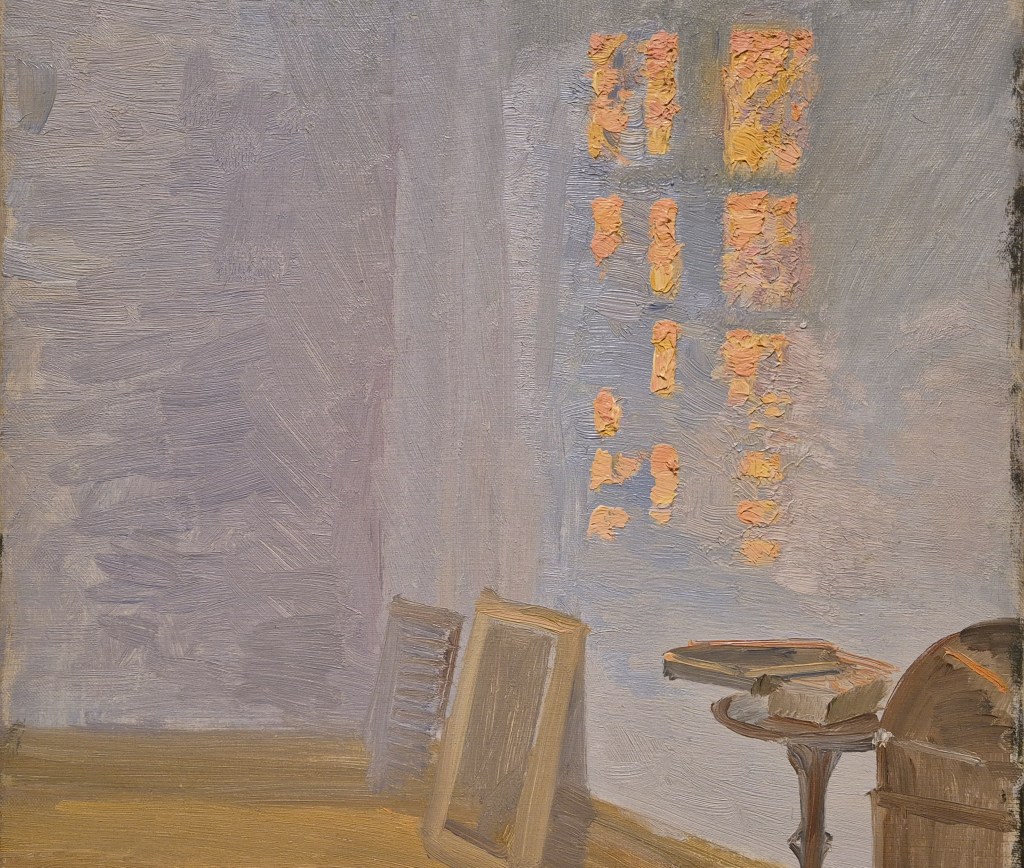
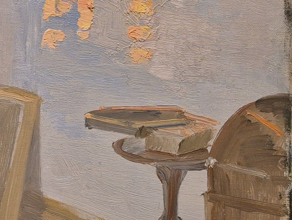
Stepping back again, the way in which the darkness of the opposite wall is affected by the light on the right becomes clearer now, I hope – the patch of deeper lavender coloured brushstrokes seems to spread from the corner at a level with the sunlight, the colours being subtly modulated across the surface. Close up we see the material of the paint itself, the brushstrokes and the subtly modulated tones and hues. From a distance we see the light of the setting sun, like a solid entity hovering, immeasurable, just in front of the wall.
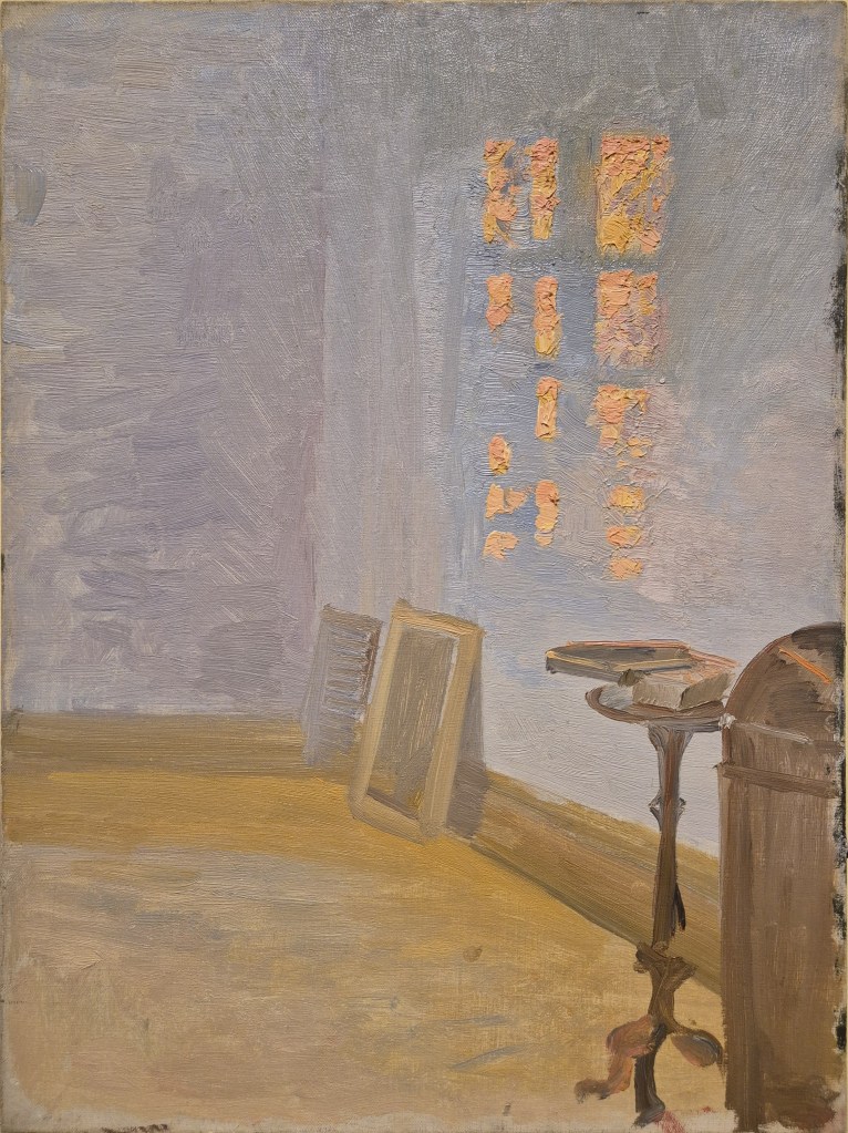
Above all what Anna Ancher painted was a precise, compassionate observation of the way people lived. However, far rather than being banal, mundane, or down to earth, she lifts these situations out of the particular into the timeless and universal. She captures the beauty of everyday life, relishing the calm, the space, and especially, the light. One day I would love to make a ‘pilgrimage’ to Skagen, but am glad that, until 8 March, I can see these paintings in Dulwich. I do hope you can make it, too. If not, maybe you could join me for the talk on Monday?

Richard,
Interestingly, if you look up Michael Ancher on Wikipedia you will see a very similar roll top desk in a photograph of his atelier in the Garden House at Skaugen.
Jane
PS You must have Anders Zorn on your mind – Sweden krypton into today’s post!
LikeLike
Interesting… it may well be the same desk, of course – thank you. And I’m assuming krypton is autocorrect for ‘crept into’… but you’re right. Generic Scandinavian impulse: I’ve corrected it to Denmark. Thanks!
LikeLike
I really should re read my messages before I press send. I wonder why autocorrect thought “krypton” fitted into the sentence?
LikeLike
Dear Richard,I can’t se
LikeLike
Hi Brenda – thanks for your message… but it got cut off. Do get back to me if you need to!
LikeLike
I would love to hear your talk on Anna Ancher
LikeLike
Hi Frances,
Sorry for the slightly delayed reply, but the link to book for tonight’s talk is in this week’s blog post, and also on the diary page… but, to cut to the chase, here it is now:
https://tixoom.app/richardstemp/R5kKRx7WbgIP
Hope that’s helps!
LikeLike
Maybe has similarities with Gwen John’s painting Corner of my Paris room in emphasis on tonality and lighting.
LikeLiked by 1 person