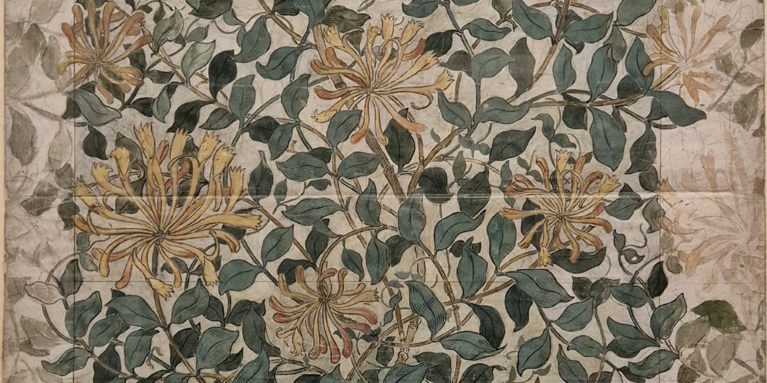
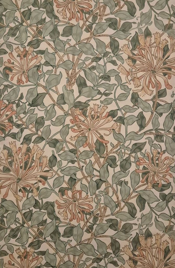
May Morris, Design for Honeysuckle wallpaper, about 1879-83. The William Morris Society.
I spent the weekend with a very slow WiFi connection trying to get my laptop back up to running order. If you’re reading this now, I have clearly succeeded. However, the whole process has given me plenty of time to look at my diary, think about the exhibitions I have seen, and plan my talks up until September – and a little beyond. This coming week, on Monday, 29 June at 6pm, I will deliver my talk May Morris, the Reading Bayeux, and the Post-Pre-Raphaelites, which will take a thorough look at the exhibition May Morris, Crafting a Legacy currently on show at the Lady Lever Art Gallery, just round the corner from me on the Wirral. This exhibition has interesting connections to the replica of the Bayeux Tapestry in Reading, which I will elucidate. I will also give a brief introduction to a second exhibition on the Wirral, Beyond the Brotherhood, at my second-closest museum, The Williamson in Birkenhead. However, working over the weekend – with plenty of time to look at the material while I waited for the WiFi – I realised how good both of these exhibitions are, and I don’t want to sell either of them short – so on 13 July I will dedicate an additional, in-depth talk to the second show, Beyond the Brotherhood: The Legacies of the Pre-Raphaelites. This includes artists who were inspired by, or related to, the PRB (Pre-Raphaelite Brotherhood) in different ways, and so, by definition, must have come after them. This is why I’ve coined the absurd term ‘the Post-Pre-Raphaelites’ for the earlier talk. In between these two, on 6 July, I will give my second ‘Pre-Bayeux’ talk, inspired by the exhibition of David Hockney’s A Year in Normandie – inspired by the topotypical tapestry – at Serpentine North in Hyde Park. I’d planned to see how this exhibition relates to his earlier work even before his recent death: now it will be more obviously a retrospective – although it will only give the briefest of outlines of the development of his long and productive career. Any more detail and I’d have to deliver an entire series of talks!
I’ll be on holiday – somewhere cooler – at the end of July, and when I get back I want to have a good look at an exhibition that I saw far too late to be able to talk about it while it was still on. Unforgettable, at the Museum of Fine Arts in Ghent, was undoubtedly the best summation of recent research into women in the visual arts that I have yet seen. The title, of course, is ironic, given that so many of these artists were forgotten. The subtitle, Women between Antwerp and Amsterdam, 1600-1750, suggests its focus, but despite the geographical and temporal limits it was both comprehensive and intriguing: it definitely deserves to be thoroughly explored. Consequently, I will split the themes it covers into two talks, on 3 and 17 August. You can book for either separately, or both together at a reduced price, on the following links:
Unforgettable I & II: 3 and 17 August at 6pm
Unforgettable I – Building a Career: 3 August at 6pm
Unforgettable II – The Community of Artists: 17 August at 6pm
Although I know what’s coming after that it’ll take me a while to get it all online – so keep an eye on the diary!

May Morris grew up with art and design. Her parents, William Morris and Jane Burden, met in Oxford when Dante Gabriel Rossetti took both under his wing while painting the Oxford Union between 1857 and 1859. Married that year, their first daughter, Jane (known as Jenny) was born in 1861 and her sister, Mary (known as May) the following year. William was an artist turned designer, and effectively the founder of the Arts & Crafts movement. Morris, Marshall, Faulkner & Co. – the interior design firm – was founded in 1861, and it would subtly evolve to become Morris & Co. in 1875. Jane was an expert needlewoman, and famed beauty – a popular model for the other artists associated with the Pre-Raphaelites. It’s not entirely surprising that May Morris also grew up to be a superb designer and seamstress – she had an early start. The Honeysuckle wallpaper is probably her most famous design, and she may have been as young as 17 (according to the dates given in the exhibition) at the time of its inception. Most sources date the design precisely to 1883, though, by which time she would have been 21, and working officially for Morris & Co. – however, that is by no means certain. It’s not entirely clear when she started working for them, for one thing. As daughter of the boss, I suspect it would initially have been an unofficial involvement that only gradually evolved into her becoming a full member of the workforce. However, it was certainly formalised by 1885 when, at the age of 23, she was appointed manager of Morris & Co’s professional embroidery workroom. Nevertheless, when her father died eleven years later she left the company almost immediately, determined finally to strike out on her own.
For a while, it wasn’t even clear who had designed Honeysuckle. An article published in 1890 in the magazine The Woman’s World (published between 1887 and 1890, and edited by none other than Oscar Wilde) attributed the design to William Morris. However, this wasn’t an act of misogyny, or the dismissal of ‘cheap labour’ from his daughter: work by the chief designer Henry Dearle was also credited to William Morris. No one was interested in Dearle wallpaper, but many wanted Morris: it was a purely financial arrangement. In medieval terms (one of William Morris’s main areas of interest), these designs were all products of the Morris workshop, and the firm’s guarantee of their authenticity was what the customers were really interested in. However, May Morris’s name was given as the designer in the Morris & Co. wallpaper catalogue from around 1909, and her authorship of the design is also confirmed in one of her letters which survives in the archives.

There are a certain number of conditions you have to meet in order to create a viable wallpaper design – one that will work, that is, regardless of whether or not it is successful. The most important – and arguably the only important condition – is that the pattern must repeat both horizontally and vertically. This detail is cropped to include the repeat (54cm in the finished product), with some ‘excess’ material – repeated elements – on all four sides. The design features seven different honeysuckle blooms, with two sizeable flowers (a third of the way down on the left, and at the bottom right) and five smaller specimens. These are surrounded by a tangle of stems and leaves which fill the space between the blooms evenly. Judging by eye, they also seem to cover the same amount of the surface area as the white background – thus giving an even balance between light and dark, helping to keep the design balanced across the surface of an entire wall. The pattern is contained within a grid of black drawn lines, just within the edges of this detail. The vertical lines left and right mark the edges of the planned wallpaper (56 cm wide in the completed product). If you look at the small flower top left, its petals project to the left of the line, at which point, in the design, the imagery becomes more diffuse. However, if you now look at the top right of the design, on a level with this bloom, you will see that those same petals are fully realised on the right side of the paper. One of the conditions for a working design is that it must match on a sharp vertical line – the edge of the wallpaper. May has created a pattern which repeats at the same level, although often the design is offset, with the left-hand side matching the pattern half-way down the right, for example. This helps to create a diagonal flow across a wall, the movement helping to create the mood and energy of the design. However, a diagonal is already introduced here by the inclusion the two similarly sized, large blooms on a diagonal. They are not the same flower, but nevertheless create the same effect, with a subtle variation in appearance.
The grid line at the top of the detail goes through the ‘heart’ of one of the ghost blooms – the larger one, which is also seen fully realised at the bottom right. Curiously there doesn’t appear to be an equivalent line going through this complete version – but my guess would be that she wanted to leave the image clear so that the design could be easily and precisely transferred to the wood blocks used to print the paper by hand. Tying the design together vertically – in addition to the repeated flowers – is a woody stem, thicker than the others, which undulates from left to right on either side of the central axis. The two larger blooms grow on slightly thinner stems which grow from this central ‘trunk’, forking to the left and right alternately. The smaller flowers grow on a complex network which is both irregular and inventive. Altogether there is a sense of order and balance, combined with a sense of natural profusion.
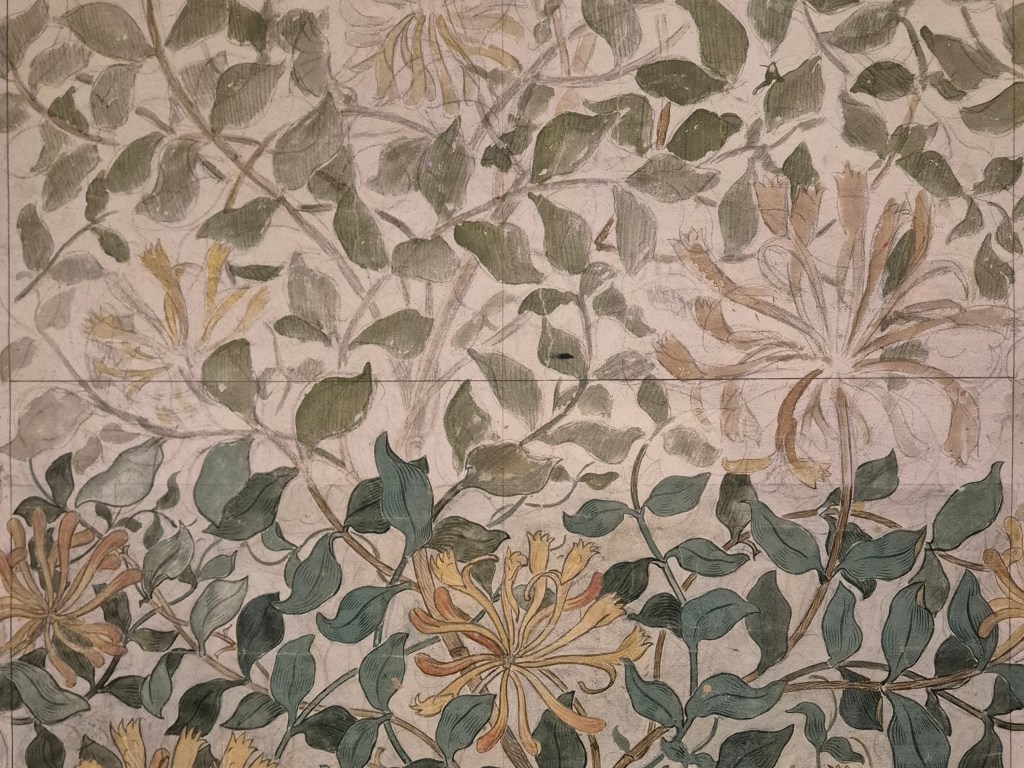
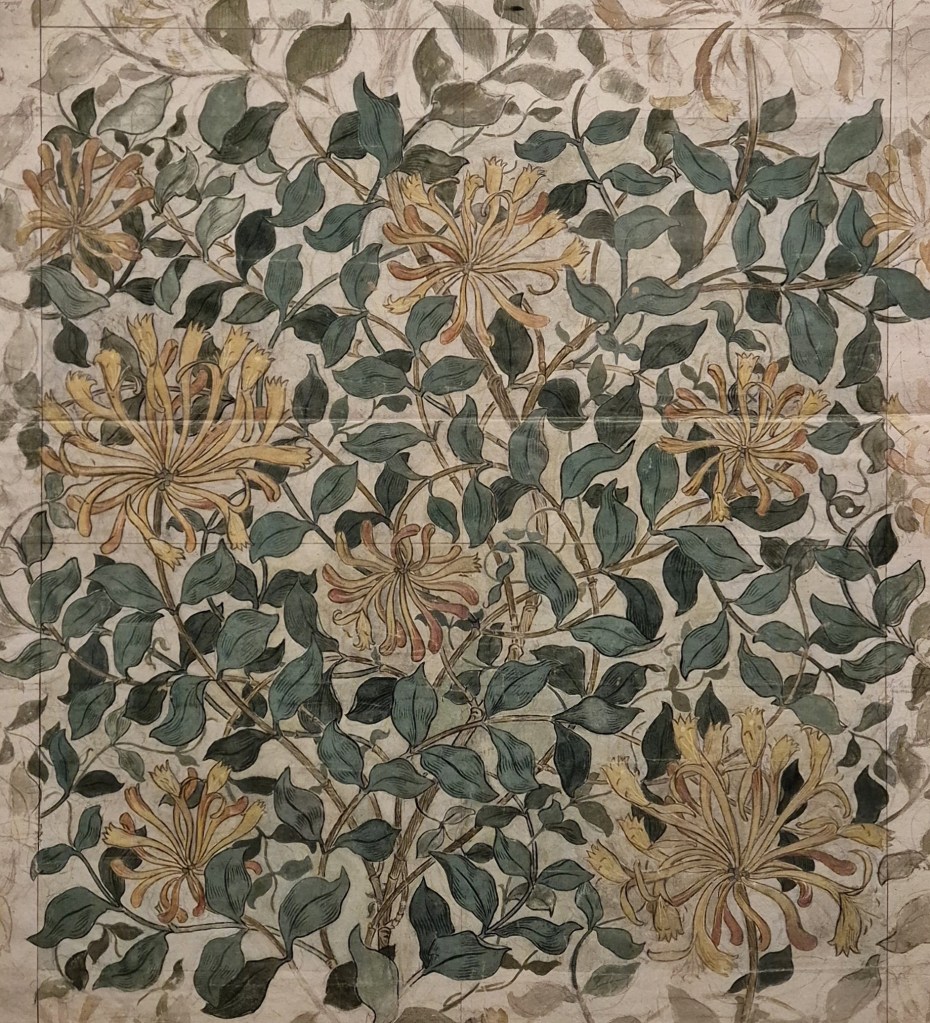
May Morris only designed three wallpapers (we will see samples of them all on Monday), and in the two which followed she did not extend the design beyond the basic repeat in the way that she does here. The full extent of the design is mapped out in the bold colours, while the more diffuse, paler sections suggest that she is checking that the repeat will really work. However, there is also a sense that this was the very piece of paper on which she created the final image, rather than it being a ‘fair copy’ she had transferred from a developmental model. If you look at the large sketchy flower on the right, the pencil outlines of the final design can be seen, freely filled with light brushstrokes of watercolour. However, there are more curves and arcs of pencil lines, suggesting that this is one of the places where she was working out the final form that the flower would take.
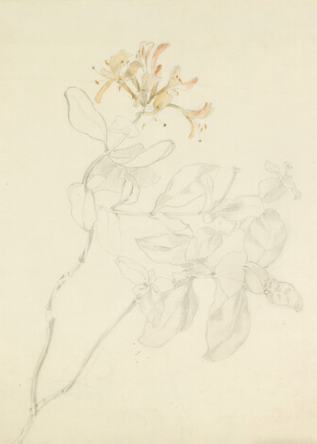
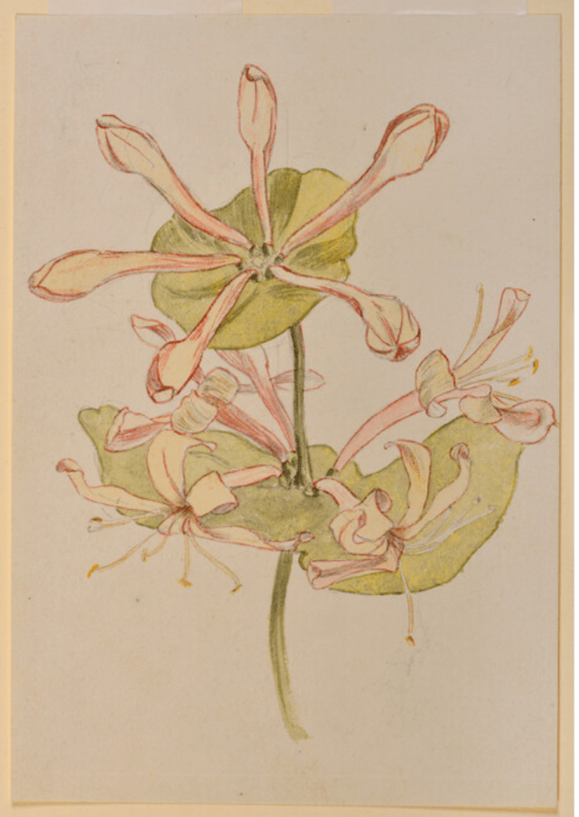
The design evolved from her direct observations of the motif: the flowers and stems of the honeysuckle. The Ashmolean Museum in Oxford has a rich collection of her work, including at least three drawings of honeysuckle – I’m just showing you two. On the left, even if the flowers are given some colour, there is a greater interest in the shapes of the stems and leaves. The curving forms of the left-hand stem could have inspired the undulating axis of the final design. The watercolour on the right has a more careful observation of the shape and form of the individual petals and sepals, an understanding necessary to know how they should be foreshortened, in order to make a convincing three-dimensional form. Let’s face it, this isn’t the easiest flower to draw. I think the wallpaper design is a triumph in this regard. It manages to create a convincing, naturalistic image of honeysuckle which is, at the same time, suitably stylised and entirely decorative.
Having produced the design, the paper then went into production. Below are two photographs – the design, and the finished product, as mounted and framed for the exhibition. Have a close look and see if there have been any changes!
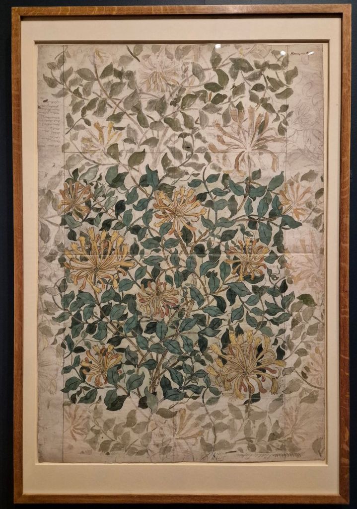
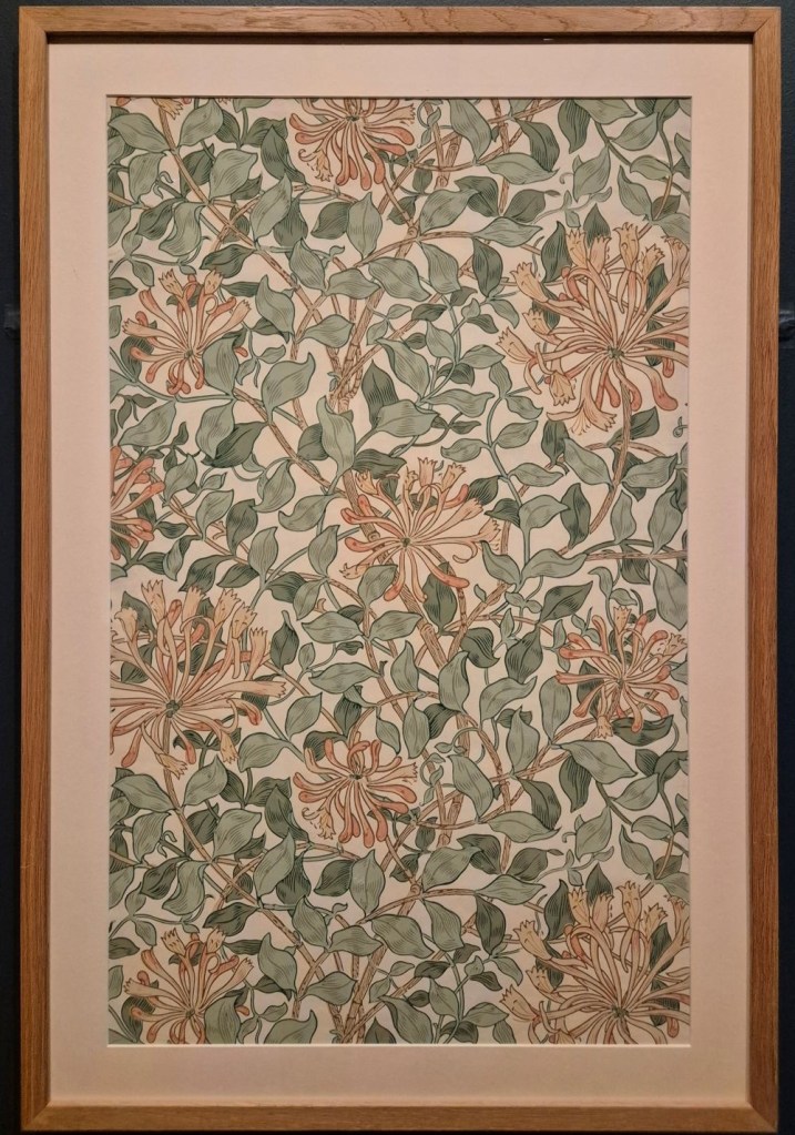
I think the most obvious difference is in the colours. However, there are several reasons for that. First, the design was hand coloured, and the paints may have darkened. Second, and almost more likely, my phone might have responded differently to the lighting conditions, even if the two exhibits are right next to each other. And third – it is probably an aesthetic choice, choosing three green inks – light, mid- and dark green – which would make the design easy to read. A pale or mid-green fills in the body of each leaf, while the mid- or darker green (depending on the base colour) creates the outline and marks the central rib. The other lines on the leaves are effectively hatching, helping to define the three-dimensional form of each leaf. However, the main difference between the two details is in the framing. The sample (on the right), has its vertical edges covered by the mount. The image you see would not work as a wallpaper, as the pattern does not match up from right to left. Most notably, you can only see half of the small flower a third of the way down on the left – there are no matching petals to complete the bloom on the right-hand side. But that is only a matter of framing: underneath the mount, the paper is all there!
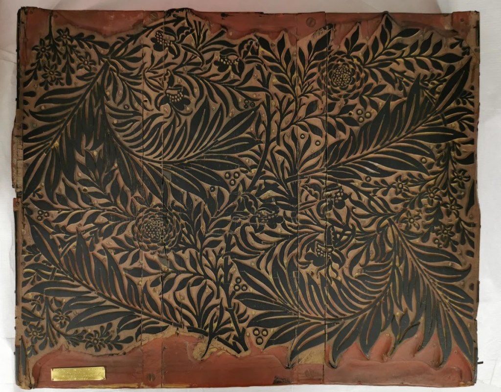
As I mentioned above, the Morris & Co. wallpapers were hand printed, using wood blocks. Having finalised the design, it would be transferred to the block as a line drawing. Specialist carvers cut the design into pear wood – or the wood of another fruit tree – as that is soft enough for delicate detail. However, this is relief printing: it is the raised, uncarved areas of the block which create the image. Any lines – whether outlines or hatching – require thin ridges of wood, which wouldn’t last long given the pressure applied during printing, so they could be reinforced with metal. The printing was carried out by specialists, and Morris subcontracted this work to another company. For Honeysuckle – and many other wallpapers – they went to Jeffrey & Co. Each colour in the design needed a separate block, and each block had to register exactly with the others – but, given the hand-made ethos, if they were slightly out from time to time it wasn’t a major issue. Starting with the broader areas of lighter colours, the pattern would gradually be built up, working towards darker colours and finer detail. Honeysuckle needed eight blocks. Just looking at my photographs, I think there are three greens, three pinks, and two browns, but I could be wrong. Eight was not the most that could be used, though: one of William Morris’s own designs, Chrysanthemum, from 1877, used as many as 30 – which needed 30 blocks to be hand cut… Morris famously exhorted people to ‘Have nothing in your house that you do not know to be useful or believe to be beautiful’ – but hand printed wallpaper is labour intensive, and consequently enormously expensive: not everyone could afford this standard of enlightened living. Nevertheless, there was enough money in Britain to make it a viable concern. Below is just one of the blocks which survive in the archives of the William Morris Gallery. This one was used to print his Larkspur wallpaper, and was produced by Barratt’s of Bethnal Green Road.
In theory, having cut the blocks, they could be inked with any colour. One of the jobs of the designer is to decide which combinations of colour will work. Each different combination is called a ‘colourway’. There are four different colourways for Honeysuckle, two of which can be seen in the Lady Lever exhibition.
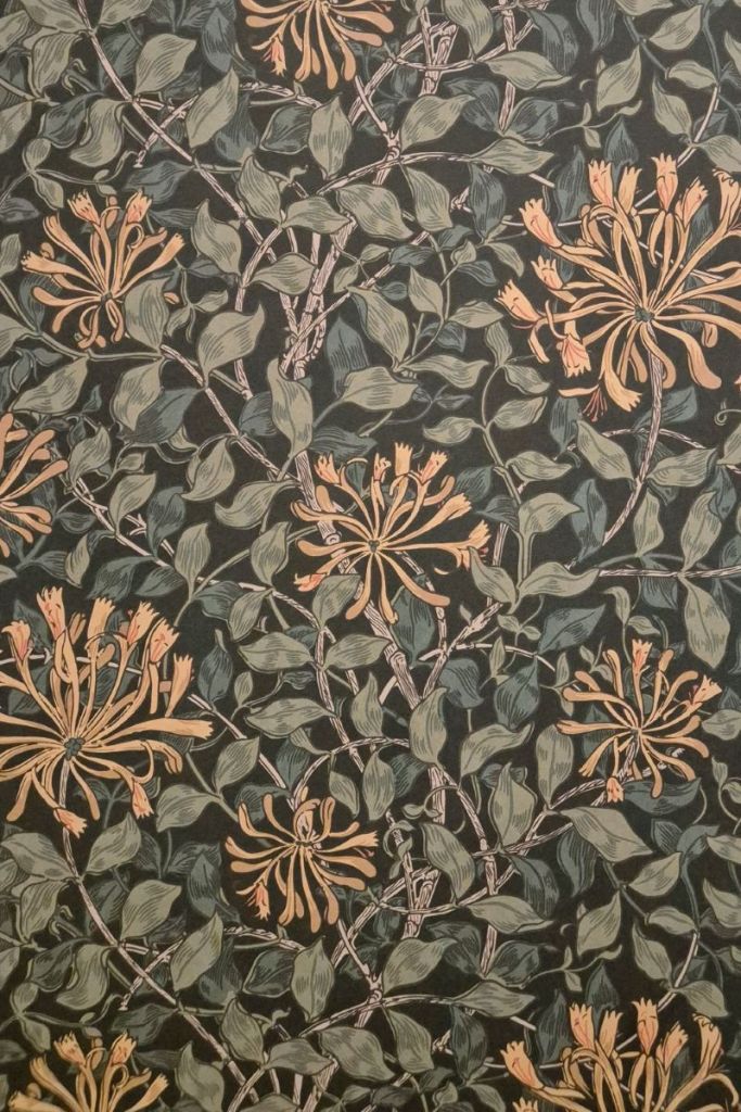
The image on the left is a detail of the framed sample I showed you above, while that on the right is from a wall in the third room of the exhibition. As far as I can see, the main difference, if not the only difference, is in the background. In the first version, I believe the background colour is the natural colour of the paper. As so often, I could be wrong, though! Maybe it is necessary to print the background this light colour to make the design and surface texture more consistent. In the second, darker version, the main difference is that the background appears to be black. It looks as if the lines of the stems, and the outlines of the flowers and leaves are the same black, though, which could, theoretically, reduce the number of blocks needed to print this particular colourway.
If a wall in the exhibition is papered with this design, it does beg an interesting question, the answer to which is ‘yes’! It is still possible to buy these wallpapers. Morris & Co. is still a going concern, even though it has passed through different hands in the last century: it is currently owned by the Sanderson Design Group. No, the papers are no longer hand printed, but yes, they are still remarkably expensive. I have, in the past, considered using a couple of rolls for a feature wall, though! However, May’s other designs – her embroidery, dress-making, and other ventures – are harder to come by, which is what makes the exhibition so valuable… and that is why I am talking about it on Monday!
