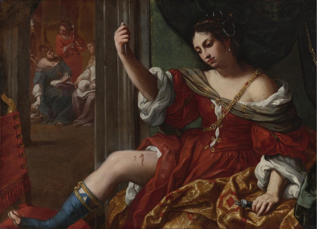
Day 58 – Ottobeuren Abbey

Johann Michael Fischer, Ottobeuren Abbey, 1737-1766, Bavaria, Germany.

Frescoes: J.J. and F.A. Zeiller; Stucco: J.M. Feichtmayr.

Today’s picture is a building! Or rather, the decoration of a building. I’ve named Fischer as the architect, although, to be honest, so many people were involved that it is hard to know who did what – but Fischer is generally credited with the overall concept of the building as it now stands. I’ve been to the abbey three times, once on my own, and twice leading groups – and it is visually one of the most exciting places I have ever been. Each time I have gasped, and I think the groups did too, although maybe not so audibly. Today’s post is a response to yesterday’s (Picture Of The Day 57) – and refers back to POTD 51, in that it is the best illustration I know that, contrary to popular opinion, the Rococo is not, of necessity, frivolous.

The Abbey has a long and complex history, but all I am going to say is that is was founded by the Blessed Toto in 764. Little is known of him, but he was certainly not the patron Saint of Oz. Or Kansas, for that matter.  Long story short – it was secularised in 1802, and re-founded in 1834. The irony about the secularisation was that, after over 1000 years of history, it had only reached its present, glorious form some 46 years before. At first glance it is – incomprehensible. Every surface is decorated – I swear, every square centimetre – but everything has a purpose and a reason. In most books the style is described as ‘Bavarian Baroque’, but that can only be justified by the alliteration, or if you deny the existence of the Rococo – because it is definitely Rococo. The architectural forms are dissolved in the complexity of the decorative details, the walls dematerialise, and nothing is solid.  The predominant colour is white, and the windows – although not visible in this photo, which is part of the genius of the architecture – are large, allowing vast quantities of light to flood the building. It is, simply, heavenly. And that is its very purpose – the dematerialisation, the lack of solidity, the other-worldliness of it all, is the very opposite of the material world in which we live and work – this is a world of light, of spirit and of joy. If Heaven is like this I want to go!

There are quite a few side altars, all dedicated to local saints and Benedictine heroes (it is, and always has been, a Benedictine establishment), but I will just focus on the central themes. In the image above, you have to imagine that we have just entered through the West Door, through the narthex and under the organ loft. We are looking towards the high altar, seen impossibly far away in the distance.  There is one dome above the choir, and a second, closer to us, above the crossing – the large arches opening to the north and south transepts (left and right) are just visible – and that is where we shall start. Imagine walking along the nave until you reach the crossing, and then looking up. This is what you would see.

In the midst of the thin blue luminous sky, the zenith is even more brilliant. At its centre we see a dove – the Holy Spirit is descending, surrounded by a circle of angels. There are seven of them, so they must be all the archangels as mentioned by Raphael (POTD 4). Light flows down past the broken pediment of a monumental arch, which is flanked on either side by two obelisks – which, in their turn, return our gaze to the Holy Spirit. Framed by the arch – a succession of arches, even – is a woman standing in prayer, wearing a red robe and a blue cloak: the Virgin Mary. She is surrounded by a group of men, looking up to the sky, hands raised or clasped in prayer, each with a small flame above their head. We are witnessing Pentecost – the descent of the Holy Spirit, when, fifty days after the Resurrection of Christ, the Apostles were gathered in an upper room, and everyone outside could suddenly understand them as if they were speaking in their own native tongues. This was the point at which the Apostles were truly empowered to go and evangelise, to teach the Word of God. All around the base of the dome we see different trees, different animals – and, above all, different people. The whole world is represented here.

If we head back half way towards the West Door, turn around and look back up at the dome, Mary is just as clearly visible.  The dome is supported by four massive arches. The one on the far side leads to the choir, those on left and right to the North and South Transepts respectively, and the one closest to us, to the Nave, where we are standing. The base of the dome rests on the top of these arches, and in between four triangular forms hang down – we can only see two of them here. They are known as pendentives – because they hang down. Each has an elaborate stucco frame, almost like an inverted pear, containing a fresco. As there are four of them, you can often guess who would be painted there, and in this case you would probably be right – the Four Evangelists, Matthew, Mark, Luke and John. In the pendentive on the left you may be able to see a seated man wearing red and green – the traditional colours of John the Evangelist – and on the right, there is an angel reaching down towards a man in blue. The angel is symbolic of St Matthew. The Holy Spirit has inspired the Apostles to evangelise in the dome, and their message is put into words by these four Evangelists.  The arches supporting the dome spring from an entablature, which is continuous around the whole building. At the crossing it is supported by faux-marble pilasters and columns. Underneath each of the pendentives, sitting on top of the entablature, there is a figure modelled out of white stucco. They are too small to identify here, but the one on the left wears a papal triple tiara, while the one on the right has a Bishop’s mitre. They are two of the four Doctors of the Church – Sts Gregory, Ambrose, Augustine and Jerome. The other two are on the side nearer to us, underneath Sts Mark and Luke, who are in the pendentives that we cannot see.  Their writings, an interpretation of the gospels, have a special authority within the church, and are fundamental to its teachings.

If we bring our eyes down from heaven, we will see the font on our left, and the pulpit on out right. I’ve always liked Baroque and Rococo pulpits, because I know that, should I ever be stuck there in the midst of an especially long and dreary sermon, there would be plenty to look at. Some of the best are in Belgium, as it happens – maybe the preachers there are more than usually dull. Nevertheless, this is where the Priest will interpret the Gospels, and the teachings of the Doctors, to the uneducated masses like myself (I couldn’t possibly speak for you).  He would inevitably be inspired by the Holy Spirit to do this, which is why the dove appears more often than not on the underside of the sounding board.  Both this and the font are remarkable structures, but I am especially fond of the font. In the photograph above, on the left, you can just see the lid of the font itself at the very bottom of the image. It is then topped by the most remarkable superstructure. Standing on what appears to be a platform you can see the Baptism of Christ, with John the Baptist standing on the left, pouring water over the kneeling figure of Jesus. Beams of golden light descend from the Holy Spirit, which is as far above Jesus as he is above the font, and just above him, God the Father peers down from a cloud. As it happens, that is not a platform on which the Baptism is taking place, but a sort of frame. And if you were a baby being baptised, held in the arms of a priest, and looked up, this is what you would see.

It is a remarkably good thing that babies are myopic, because I think this would be absolutely terrifying. The angel at the bottom right is gesturing towards a gilded serpent, with an apple in its mouth. There you are, a tiny baby, about to have water poured over your head, and already temptation is in view. And just over the brow of a marble frame, there is a gilded relief with a tree. You can’t see it from here, but that relief shows the Fall – Adam and Eve are in the process of accepting another version of that self-same apple. And then beyond… let’s get in a little closer…

Yes, the Baptism in full view, and above that, the Holy Spirit, and even higher, God the Father. The Holy Trinity, looking down over you, which, if only you could focus, might calm your nerves – although the Tree of the Knowledge of Good and Evil is still the closest thing to you…

So – overall – we enter the church, and above the crossing we see the Dome in which the Holy Spirit inspires the Apostles with the gift of tongues so that they can go out and preach the word of God. Below them, the Four Evangelists write down the Good News of the Gospels, interpreted by the Four Doctors, who complete the teaching of the church. Once we have undergone the Sacrament of Baptism, we become full members of this church, and the Sermons we hear from the pulpit explain all of this – from the Holy Spirit, through the Apostles to the Doctors – so that we know what to believe, and understand our duties and our responsibilities, and we can head back out into the world to lead good lives. It covers just about everything, really. And ‘everything’ could hardly be called frivolous.

Day 57 – Tobias revisited

Gian Antonio Guardi, The Story of Tobias, c. 1750, Arcangelo Raffaele, Venice.

I’ve told you the story of Tobias and the Angel before (Picture Of The Day 4), so if you’d like to refresh your memory, do have a look there. At the time somebody mentioned the wonderful version of the story as told by a member of the Guardi family in Venice, and it’s taken me until now to get round to looking at it. Talking about Tiepolo last week (POTD 51), I said that he is ‘seen as being on the frivolous side of religious painting’, which reminded me about the Guardi. This is another example of Rococo religious painting which could be considered frivolous – but, as a friend pointed out, frivolity is a rather underrated value. However, the lightness of touch with which this sequence of images is painted does not make the story seem frivolous. If anything, it makes it more magical.

It was painted for the organ loft of the church of the Archangel Raphael. Make a beeline to see it the next time you are in Venice – not only are the paintings a delight, but also this part of Venice is rarely on the tourist trail. However, given that everyone I know seems to want to go to Venice as soon as the lockdown is over, because it has been so wonderfully quiet, I can’t imagine that the quiet will last. A pity, but I want to go – so why shouldn’t other people? The church is one of the oldest religious foundations in Venice – there is a record of it being destroyed by fire back in 889 AD. After all, Raphael is one of the Patron Saints of fishermen, and this is Venice, which is all sea. The current building is the eighth on the site: it was rebuilt for the last time in the 1740s, with work finishing in 1749. The organ was built in the same year by Gaetano Amigazzi. The case is highly elaborate, but a fairly restrained form of Rococo – it is entirely symmetrical, for one thing, and has a rather awkward, inorganic application of decorative details. The story is told on five canvases which have been stretched around the convex and concave bends of the organ loft. The sequence starts and finishes with the small panels to the left and right, which frame two wider canvasses, which themselves frame a bowed inner section. This creates a great rhythm for storytelling: an introduction and development leading up to the prolonged heart of the story, followed by a suitable conclusion, and a coda.  It could be the model for one of the pieces played on the organ itself. Or a five act ballet.

I said above that it was painted by a member of the Guardi family. To be honest, I was hedging my bets. The name you will most often see is Gian Antonio Guardi, the older brother of the better known Francesco. There was a third brother called Niccolò, also a painter, if rather a pedestrian one, and Francesco had a son, Giacomo, who also painted. Their sister married Tiepolo – artists in Venice were especially keen on keeping things in the family. Their father, Domenico, had also been an artist, although nothing is known about his work. He left the workshop to his eldest, Gianantonio, when he died in 1716, at which point Gianantonio was only 17. Very little is known about his work either – there is only one securely documented painting, The Death of Joseph, now in Berlin, which means that the attribution of the Tobias paintings is up for grabs. Even though most people think they are by Gian Antonio, there are still those who hold out for Francesco…

The narrative starts with the departure of Tobias – without bothering to explain any of the back story (I won’t bother to explain it either – head to POTD 4!). All you need to know is that Tobias’s father, Tobit, is blind, and Tobias is heading off in the company of the Archangel Raphael, supposedly disguised as a previously unknown member of the family called Azarias, to collect a debt from some distant relatives. At no point does Guardi try and disguise the fact that Azarias is indeed the Archangel Raphael. On the contrary, the wings are one of the wonders of this sequence, only out-feathered by the brushstrokes with which they are painted. Raphael leads the way, a staff, and Tobias’s left hand, in his right, his left hand held to his breast as a sign of his trustworthiness. Both travellers look back towards Tobit, while the dog, in the bottom right-hand corner, looks towards Raphael to see why they are hanging around. This is probably because Tobit himself is clinging onto Tobias’s right hand – a bit more paternal advice, presumably – while also pointing them the way. Anna, his wife, can’t bear to see her little boy go, and has turned back to the door so he doesn’t see her cry. He’s probably never been away before. Notice how the upward sweep of Raphael’s right wing – at right angles to the other – is matched by the diagonal of the clouds behind. And relish the feathery brushstrokes that we will see in every painting.  Detail gives way to an evanescent evocation of light and airy form.

After some time travelling they go down to a river to bathe – and are attacked by the most enormous fish. It doesn’t look like much of a threat here, but that’s because, following Azarias’s suggestion, Tobias has killed it. It also isn’t that big… it is, as so often, a symbolic fish that will fit better into the composition, and look more elegant as the boy lifts it out of the river with his scarf. The dog tries to get into the action, which is great, as it is only mentioned twice in the story: on departure and at their return. Azarias (Raphael) stands back, issuing instructions with a rather effete gesture – throughout, all characters in this story could be appearing in that five act ballet. Even the dog. I am showing you more than one version of this canvas, for more than one reason. This version gets in closer, so you can see the brushstrokes, and the canvas has been cleaned – so you can see the delicacy of the colours, which matches the light touch of the brushstrokes and the elegance of the gestures – there is nothing muscular about the Rococo. The tree in particular dissolves into an array of almost random dashes of light- and mid-greens: this is Impressionism avant le lettre. Indeed, Canaletto was the universally admired Venetian vedutista – or painter of views – up until the acceptance of Impressionism, at which point people started to re-evaluate the Guardi, and realised how brilliant they were.

In this version, before cleaning, we see more of the composition, and we realise that this is not so much a river, as the Venetian lagoon, complete with a ruined watchtower on a nearby island. And in the background on the right you can see ‘what happened next’ – they roasted the fish and ate it, saving some of its vital organs for later.

We arrive at the sweeping central section, bowing out towards us, with a gap in the centre allowing a view of the distant hills across the water. This gives the impression that the composition is a continuous narrative, showing two separate episodes on one canvas. On the left, we see the ‘distant cousins’ Tobias has come to find. They point towards the right of the image almost as if they are witnessing the arrival of their young cousin, the tall stranger (after all, they can’t see his wings) and the dog – although their gesture also serves to tie the two halves of the composition together, and to direct our attention to Tobias. As chance would have it, he had arrived at just the right time – they have a daughter of marriageable age, and, although Tobias is young, and may never have been away from home before, he is old enough… We see Azarias presiding over the wedding on the right.

The two servants carrying a hefty platter in the bottom left of this detail contradict the idea that this canvas is a continuous narrative, as I suspect they are bringing provisions for the wedding banquet. However, they are on the other side of a narrow stretch of water from the two richly dressed ‘cousins’, but are on the same ‘island’ as Tobias, so I wouldn’t rule it out altogether. If it is a continuous narrative, Guardi has feathered the two scenes together along a shallow diagonal – which seems like an entirely Rococo thing to do. Having said that, it does look as if they’ll have to clamber over a pile of detritus on their way. The outfits of these servants, coordinated in colour and loosely based on Venetian 18th century fashion, tell us that they work for a very wealthy household – but then, the two ‘cousins’, husband and wife, are finely dressed themselves – particularly the husband in his rich red and blue. His turban tell us that we are not in Venice any more – even if, to the right, we can see a gondolier… Just next to him, at the end of the parapet, is a jaunty vase, asymmetrical and quirky. To be honest, I think there is more life and vitality, more invention, in this one vase than in the whole of the organ casing we saw at the start. If only they’d asked the Guardi to design that too!

Azarias presides over the wedding, even though no one in the household knows he has such a very close relationship to God. He points upwards as Tobias kneels, head bowed in prayer, his wife-to-be kneeling devoutly and devotedly by his side. What the cousins didn’t initially mention was that she had been married six times before, and had murdered her husband on their wedding night every time. Azarias didn’t seem too worried about that, though, so they went ahead as planned. Just to the right of the bride you can see a censer burning – nicely framed by an archway, to give it an ecclesiastical feel. This is the heart of the fish which they had saved, sacrificed to bring good fortune at Azarias’s suggestion. And it worked – according to the book of Tobit, at this point the demon, which had been possessing the young woman, was driven out to Egypt, where it was bound in chains by the Angel. He must have been able to fly pretty quickly, as I don’t think they noticed he had gone. The mention of Egypt has led some people to suggest that, earlier in the story, they hadn’t been attacked by a fish at all, but by a crocodile – which would, let’s face it, have been far more threatening. Once married, according to the story, ‘… they went to sleep’. There is indeed a maid preparing a large, canopied bed on the far right. But I’m not sure it’s sleep that they had in mind. The dog, bottom right, continues to build up its part, and remains curious.

Again, two versions of this one – the first to show you what photographs of paintings often look like – flattened out, and made to look like a museum piece – and the second as it really appears on the organ loft, curving back from the central section. I’m not sure how they took the first photograph– maybe it was taken after cleaning: they would probably have removed the canvasses from their curved stretchers to do that. Anyway, Tobias decided to cut the wedding celebrations short, because he wanted to get back to Dad. And here he is, looking far too young to be married, clasping a box in his left hand, and touching his father’s face with his right. Azarias had suggested making a paste from the remaining organs of the fish (which they had probably kept in this very box), and applying it to Tobit’s blind eyes. On washing them, he could see again, he was cured – a miracle! The gathering of the figures in the centre of what is effectively a landscape is entirely charming, I think. Tobit is seated in the centre, with Anna bending down to care for him on the left, so that she and Tobias, reaching in from the other side, are on the same level. This is framed across the diagonal by the ever-curious dog and the angel, the former’s snout on the same line as the latter’s wing. Anna, Tobias and the dog look at Tobit, while Raphael looks over to Tobias – checking he’s doing it right, I suppose.

In the final scene, Azarias reveals himself as Raphael, before flying off back home to the Throne of God. He points up into the blue, as Tobit, Tobias, and the dog kneel in amazement, awe and adoration, their postures revealing their age – and their species. At the top right there is a green curtain, about to fall on this most delightful divertissementLa commedia è finita!

Day 56 – Apollo and Daphne

Gian Lorenzo Bernini, Apollo and Daphne, 1622-25, Museo Borghese, Rome.

This truly is one of the marvels of marble carving – nothing can rival the delicacy of the leaves rustling in the breeze, the firmness of the roots thrusting into the ground, or the varied textures of tree and tresses – nor is there anything to match the scent of fear, and of confused compulsion, which the sculpture exudes.

And to think that Bernini was only 23 when he conceived this masterpiece! Not only that, but it was the third sculpture he completed for the most important patron of his youth, Cardinal Scipio Borghese, nephew of Pope Paul IV. He probably started work on it after finishing the Pluto and Proserpina, but then broke off to execute his David before going back to this. Three larger-than-life-size masterpieces before he was 26, it’s quite remarkable. And this is the tour-de-force.

The story is well known, but just in case, here it is again. Daphne, daughter of the river god Peneus, had asked for something rather special: perpetual virginity. Her father thought this a strange request, suspecting she might grow out of her dislike of men, but she was adamant. After all, she said, ‘Diana’s got it – why can’t I have it’ – just like many teenagers nowadays (although, nowadays, they are more likely to want a new phone). So that’s what she got. Meanwhile, not so far away, Apollo came across Cupid playing with his bow and arrow, and laughed, and teased him: ‘You’re just a baby, playing with your toy bow and arrow set – wait until you’ve grown up, and get some real weapons – then you can have proper arrows like mine, which cause the plague’. Cupid wasn’t having this. He can be vicious when he wants, so watch out. He waited until the right moment and shot one of his best golden arrows at Apollo – so that Apollo would fall desperately in love with the first living thing that he saw. Cunningly, Cupid had waited until Daphne was nearby, and shot her with one of his worst leaden arrows. If you didn’t know he had leaden arrows as well – well, he does. This might explain any problems you’ve ever had chatting people up: a leaden arrow makes you hate the first thing you see. So of course Apollo sees Daphne, and goes up to her, she sees him coming and starts to walk away – already averse to the company of men, but now with a strange new compulsion. So he speeds up – and so does she. Before long, it is an all out race, with him charging full pelt towards her, and her fleeing as fast as her feet will allow. She called out desperately to her father, pleading with him to save her honour, to protect her chastity, to change that beauty that would be her downfall. So he turned her into a tree. How many fathers would do that for their daughters nowadays?

The story is told in Ovid’s Metamorphoses – the changes of form. We live in a fluid world, were things are always in flux, and this is what Ovid explores. It’s not just the physical form, but our shifting moods and emotions as well. His description of Daphne’s transformation is wonderfully specific, and shifts from sensuous to serious: ‘a heavy numbness seizes her limbs; her soft breasts are surrounded by a thin bark, her hair changes into foliage, her arms change into branches; her foot, just now swift, now clings to sluggish roots.” Bernini must have read this carefully, but inevitably he riffs on the idea, and we see leaves growing from her fingers as well – although as yet, there is no bark on her breasts.

A while back I mentioned that I think that Donatello’s Judith and Holofernes is the first sculpture of the Renaissance to be conceived fully in the round (Picture Of The Day 35). By the time Bernini was born, the idea was old hat – but that doesn’t stop him from excelling. It is not possible to see this sculpture from enough different angles… here are just some suggestions.

It rewards continued inspection, looking at it from every possible angle, including stooping down and looking up, if you can. And if I could take in a step ladder, I would. It is also worthwhile getting as close to it as you can (wisely, there is a chain at some distance, this is a remarkably fragile piece) – or for that matter as far away, to get the overall feel of the piece. I would advise a variety of viewing distances for any work of art, to be honest – the further back you get, the more likely you are to be able to take in the overall composition. As it happens, the room in which this sculpture is exhibited is not very big.

Bernini has chosen the moment at which Apollo finally catches up with Daphne – his right foot is firmly planted on the ground, his left is trailing behind, as is his right arm. The left hand rests on her waist, but – almost as if the transformation has responded to his touch – he doesn’t feel flesh. Oddly, and ironically, her feet are not firmly planted – it is almost as if she was trying to fly away. But you can see the roots shooting out of her toes, and bark has grown up between her legs, leaving a tantalising gap between its rough exterior and her soft, shadowed thigh. It grows over her groin, and round her left hip, and that is where his left hand rests, delicately, his thumb and forefinger a matter of millimetres away from her stomach. But he doesn’t quite touch her. As his face approaches her right shoulder, she twists it away, elongating the stretch between her right foot and hand, but she looks round, involuntarily perhaps, to see how close he might be. Her mouth is open with an almost audible cry.

His cloak is wrapped around his left arm, and falls over the protecting bark, his fingers and the folds of the cloak contrasting with the rough and smooth of tree and flesh. The cloak then goes round his shoulder and flies out in a loop behind him, before wrapping around his hips, leaving a inviting gap just like her bark. If you stand at the right angle you can see the light from the window glowing through this cloak – in places it is so thin it is translucent.

When we get closer in, we learn more about their feelings. Bernini has carved their irises and pupils – eyes are always hard to capture in sculpture. Daphne is looking right round, her pupils in corners of her eyes, whereas he looks quite vacant. His lips are slightly parted – but do not seem to express worry, or determination, or even love or longing. He may still be running towards her, reaching out to grab her, but he is not even looking at her – his gaze misses the mark. And I think that is the unrealised genius of Bernini’s sculpture. Neither of these people know what they are doing. They are both bewitched by Cupid, he to run towards her, she to flee. They are acting under compulsion and do not understand their own actions. Her hair flies out behind her, between them and then up towards her fingers, where both hair and hands become leaves. There is just one delicate, stray curl above her right eyebrow. Similarly his hair flies back in the wind, soft and supple – no one could texture marble like Bernini. It is a soft and flowing variant of Apollo’s classical top knot.

Indeed, if we look again, it is clear that the figure of Apollo as a whole is based on the Apollo Belvedere, one of the classical treasures of the Vatican Museums: it has stood in the Belvedere Courtyard since 1511, and is not so far away from the Belvedere Torso which we saw Angelica Kauffman drawing in POTD 48. Bernini was keen to make his mark, not just by his conceptual and technical skill, but also by acknowledging his awareness of the art of others. An early work (and you thought this was early!), which is also in the Museo Borghese, is his Aeneas, Anchises and Ascanius, completed before he reached the ripe old age of 21. Aeneas, carrying his aged father on his back, is modelled on Michelangelo’s Risen Christ. His Pluto and Proserpina includes the three-headed Cerberus, modelled on a classical sculpture of a dog, which, like the Apollo Belvedere, is in the Vatican Museums. By breaking off work on the Apollo and Daphne to carve a sculpture of David he could only have been pitching himself against Michelangelo himself. The face of his David is a self portrait. Bernini casts himself as the giant-slayer, and the giant at whom he was taking aim was undoubtedly Michelangelo. With Apollo and Daphne he pitches himself against the ancients. 

All of this was exactly what his patron wanted – the next bright young thing, who not only had the most fantastic technique, and the most imaginative ideas, but also the intellectual grasp of the subject to make it doubly rewarding. But surely, neither this sculpture, nor the Pluto and Proserpina, were ideal subjects for a Cardinal of the Roman Catholic Church? The former is another fantastic sculpture – a monstrous act, but a fantastic sculpture – and like this, it is another pagan story. But this one is maybe worse, seeing how it flirts and tantalises with its strip-tease like semi-concealment of the figures, and its tempting tactile values. It is just asking to be touched. To be caressed. To be enjoyed. So how could Borghese possibly justify it? Well, there’s an inscription on the base – two in fact, one on either side. On one side, there is a quotation from Ovid – more or less the section I quoted above – and on the other, a moral verse, written by Maffeo Barberini, who would become Pope Urban VIII, the next Pope but one after Scipio’s Uncle. They are held by the eagle and dragon of the Borghese coat of arms.  

On the left, the Ovid. On the right, in a rough translation, it says: ‘If you chase the joys of fleeting beauty, you’re grabbing at leaves and picking bitter berries’. So that’s alright then – this is a moral sculpture, it teaches us a lesson, it warns us of the dangers of physical pleasure. Which might convince me if the sculpture itself wasn’t quite so sensuous. But then, like many Cardinals, Borghese knew how to have his cake and eat it…

There are several theories about how it would originally have been displayed. Is there a predominant view, for example? I’m not sure that there is. Several of Borghese’s sculptures were placed against a wall – this is clear in the David, the back of which hasn’t even been carved. But I can’t see how that would make any sense with this one. Every viewpoint is interesting. However, given that there were so many different, and interesting ways of looking at it, which would be the best view to see first? After all, anyone entering the room where it is exhibited will have their viewpoint determined by the position of the sculpture in relationship to the position of the door. And I favour this final position. Not the most striking perhaps – and this is not quite the right view. Maybe the top left one in the mosaic up above… but, basically, there is a viewpoint whereby you can only see Apollo – and leaves. He appears to be running headlong into a tree. I think that would be a great ‘first view’ as you really wouldn’t know what was going on. Only as you walk into the room and around the sculpture would you discover the story – you see Apollo first, and then the chase, and then the transformation. That sense of the viewer’s participation in the drama is one of the things that can make the Baroque so profound, and so profoundly exciting.

Day 55 – A Straw Hat

Elisabeth Louise Vigée Le Brun, Self Portrait in a Straw Hat, 1782, National Gallery, London.

I’m no milliner, but I know a straw hat when I see one. And Elisabeth Louise Vigée Le Brun is wearing one here. This is a defiantly confident self portrait. Doubly confident, in fact, because it is a copy she made of one she had only just completed, having written of the first version that, ‘When the portrait was exhibited at the salon, I dare say it greatly enhanced my reputation’. She knew when she was on to a good thing.

Elisabeth Louise Vigée Le Brun, 1755 – 1842 Self Portrait in a Straw Hat after 1782 Oil on canvas, 97.8 x 70.5 cm Bought, 1897 NG1653 https://www.nationalgallery.org.uk/paintings/NG1653

She is dressed in the height of fashion, wearing a pink, high-waisted dress. I think we’d call it ‘Empire Line’ now, but the ‘Empire’ was still a few years off – Napoleon wasn’t to crown himself for another 22 years. Indeed, she was still very actively painting Marie-Antoinette, and would continue to do so until 1789 when the unfortunate royals were arrested – at which point Vigée fled Paris, and ended up painting Marie-Antoinette’s sister Maria-Carolina, who was married to the King of Naples. Elisabeth’s dress has a wonderful, flouncy white collar, and a remarkable décolletage – it’s hard to miss it, as the exposed flesh is not only expansive, but also, with the exception of the collar, the brightest part of the painting. By means of a contrast, she wears a black shawl, which I am reliably informed was a must-have in 1780s Paris – or for that matter, Brussels, where the portrait was painted. And although she is not actually painting now, she was very recently – I suspect she has just laid down her brush, having finished this very portrait. The clue is in the palette, and the brushes she is holding in her left hand. 

Compared to the rectangular palette carried by Catharina van Hemessen back in 1548 (Picture Of The Day 28), Elisabeth Louise uses the archetypal, though more modern, version, far more familiar to us today, designed so that the colour can be laid out in a sweeping curve at an equal distance from the brush. It is arranged from light to dark, from white to black, passing through yellow and red, with blue off to one side, next to some pink which has been made by mixing the white and red. There is not much mess here – which can only mean that Vigée Le Brun is an expert painter, she knows what she is doing. After all, these are all the colours she needs for this painting – no more, no less. The white for the cuff, collar, feather and flowers, the yellows for her hat and the gold sash belt, red for more flowers and her lips, pink for the dress and the flesh tones, black for the shawl, and blue for flowers and sky. Each of the brushes she holds is reserved for a different colour – the white is closest towards us, with black at the top and blue just below it, for example. This isn’t quite the subtly bravura display of Judith Leyster (POTD 34) who was holding at least 18 brushes, a mark of her perception and sensitivity to colour and tone, but it is a mark of precision.

She gazes out at us from under the shade of her hat – the light is fantastic. It cuts diagonally across her right cheek, catching the lustre of her slightly open lips and the tip of her nose. One of her drop-pearl earrings reflects the light, the other is in shadow (what a show off!), and the diffuse light reflecting from her face catches the underside of the rim of the hat. The undulating circles of its woven structure are clearly delineated, and it is dressed with flowers and a feather. This is an ostrich plume, which is not only fashionable and expensive, but it also echoes her natural hair: she is not wearing a wig, as this is a relaxed portrait, not tight-laced formality. The following year (1783) year she would paint the Queen in a simple chemise – which caused a scandal. So much the better for her reputation, and her sales! Not only that, but with this particular painting she was deliberately challenging one of the most revered Old Masters.

In one of those curious coincidences, both Rubens’s Portrait of Susannah Lunden (?) and Vigée Le Brun’s Self Portrait have ended up in the National Gallery. She had seen the Rubens on a visit to Antwerp, apparently, and was impressed by the combination of direct sunlight and reflected glow – and she deliberately set out to paint her own version. She changes the fashion – from the 1620s to the 1780s – and gives herself a palette and brushes and something to lean on, but it is still an open-air three-quarter length portrait of a woman looking at the viewer, wearing a hat with a feather, two drop-pearl earrings and a remarkably low-cut dress with a brilliantly illuminated décolletage. Apart from this, only the hat is different. Well, that, and the attitude. 

We can almost tell what Rubens’s interest in the sitter was – the clue is in the décolletage, which I’m assuming Ms Lunden – if that is who she really was, we can’t be sure – is displaying to please the men, rather than herself… She is corseted, after all, to give a more Rubensian bust. By the 1780s there was a move against corseting – although it would return.  If this is Susannah Lunden, she would later become Rubens’s sister-in-law. She may look a bit flirty, but she was already married (for the second time, as it happens) – and her younger sister got the eminent artist in the end. She looks out at us with unnaturally large eyes – if you’ve seen Shrek II, it’s what I call the ‘Puss-in-Boots effect’. If you haven’t, you’re probably wondering if you’ve got me wrong all this time. She has also lowered her chin, and is peering out from beneath the brim of her hat – which is what I call the Princess Diana effect. If you understand both references we are probably about the same age…

The Rubens was a remarkably famous portrait, and had already earned itself a nickname back in the 18th Century – Le chapeau de paille, ‘The Straw Hat’. Now, I’m not a milliner, but I know a straw hat when I see one – and that is not a straw hat. The only possible explanation is that it is a felt hat – un chapeau de poil – which actually means hair, but it depends on what type of hair. This is beaver, apparently. Anyway, at some point along the line someone must have mis-transcribed poil as paille and the rest is history. Well, art history. All of which goes to prove that you should never write about a painting without actually looking at it. 

Elisabeth Louise Vigée Le Brun was one of those women who became an artist because her father was: Louis Vigée was also a portraitist, but because he died when she was only twelve, she was mainly self-taught. In her case having a father who was an artist was secondary to her own skill and determination. She married an art dealer, Jean-Baptiste-Pierre Le Brun, which was an astute move, as he could help her find her way to the clients, but it didn’t last and their marriage was eventually dissolved. Precisely how cynical a move the marriage was on her part is hard to determine, but her connection to the art market nearly got her excluded from the Academy – but then, they were trying anything to keep the women out. She wasn’t having that though, and fought her way in. So why the low-cut dress? Does she want to objectify herself? Oh no! She knows exactly what she’s doing. It’s something I said about Judith Leyster (POTD 34) – she’s doing a man’s job, but she wants to show that there is nothing mannish about her. And let’s face it, you really wouldn’t paint in that dress. And certainly not in that shawl. Imagine, every brushstroke with her right hand, the shawl would be flicked forward and catch on the palette, on the spare brushes, on the canvas… it would be a mess. But no, not her – clean, tidy, precise… and feminine. 

Elisabeth Louise Vigée Le Brun, 1755 – 1842 Self Portrait in a Straw Hat after 1782 Oil on canvas, 97.8 x 70.5 cm Bought, 1897 NG1653 https://www.nationalgallery.org.uk/paintings/NG1653

One of the reasons that women didn’t get to be artists was because they didn’t know about art, they just didn’t have the education. Well, that’s what the men said. But Vigée Le Brun does – she knows about Rubens, understands the brilliance of his depiction of light, and can better him. Compare the earrings – there’s no doubting it. Look at the precision of the shadow cast across her face. And look at the indirect light on the underside of the hat – Rubens doesn’t even attempt that.

So there you have it. She is an artist, doing a man’s job, but she’s all woman. And she knows about art. And what’s more, boys, she knows what a straw hat is.

Day 53 – Psyche IV: ‘The Tasks’

Giulio Romano, The Story of Psyche, 1526-8, Palazzo Te, Mantua.

Where are we? Back in the Sala di Psiche – or Room of Psyche – in the Palazzo Te in Mantua. And where were we? Oh yes – we left Psyche sitting and snivelling outside Cupid’s castle, having realised how much she loved him, back in Picture Of The Day 45. And, as I said then, ‘it is at this point in the story that she makes the worst decision possible. She decides to ask Venus if she knows where Cupid is…’ Now Venus hasn’t seen her son for a while, and doesn’t know what he’s up to. She also doesn’t know what has happened in her plot against Pscyhe (POTD 43 & 44) – because she hasn’t heard from Cupid. So when Psyche turns up at Venus’s door, declares her love for her son, and asks the Goddess of Love if she knows where he is – well, Venus is apoplectic. Apart from anything else she doesn’t know. She says she’ll try and find out where he is, if Psyche doesn’t mind helping her out in the kitchen for a while. She then disappears for a moment, Psyche hears a lot of crashing and cursing in the kitchen, and then Venus comes back and says, ‘I’ve had the most terrible accident, and spilt all my pulses – there are kidney beans and borlotti beans – not to mention chick peas and lentils – all over the place. I don’t suppose you could sort them out for me? I’m just popping out for a while to find out where Cupid is, and I’ll let you know when I get back’. With which, she disappeared again, leaving Psyche to clear up the mess. Obviously Psyche wasn’t best pleased, and sat there moping for a while, until eventually she started slowly, and half-heartedly, picking up the odd lentil, and putting it in one corner, then a chick pea in another, etc., etc., fully aware that she would never get it done. Until, all of a sudden, unannounced and out of the blue, a crack team of highly skilled ants appeared, curiously expert at kitchen maintenance and the organisation of ingredients. They ran in, picked a pulse each, and took it to the relevant pile. Sorted! And if you don’t believe me, have a look at this painting by Giulio Romano:

What do you mean, you can’t see the ants? You can at least see the inchoate pile of pulses on the left, from which flow ordered ranks of ants towards the coherent piles on the right. Psyche sits there every bit as miserable as she was in Claude’s Enchanted Castle last week, head in hand, and curled up as foetally as possible while still seated. And in case you still don’t believe me, here is a detail from a pre-cleaning image: on this scale the ants are more visible:

This is one of the episodes which Giulio Romano included in the lunettes (semi-circular paintings) at the tops of the walls of the Sala di Psyche. As a reminder – and so you can see where the lunettes are – this is what the Sala di Psiche looks like (although the ants are on one of the walls behind us):

Venus returned, and was astonished to find that the task had been completed, the pulses were sorted. How was it possible? (Hint: the other Gods were on Psyche’s side – Venus wasn’t always that popular with the others). Now, you may be thinking that this story reminds you of something else: a girl, left to do the kitchen work, with sisters she argues with, and a mother (not hers) who is a bit of a harridan… Yes, this is the origin of Cinderella. And in the original version – known to any fan of Stephen Sondheim and Into the Woods – Cinderella has to pick the beans out of the ashes, or cinders – hence her name. However, Cinderella’s little helpers are birds who fly in, pick out the beans, and drop them into a pot. They then later return to peck out her step-sisters’ eyes. Well, that’s another story, nevermind…

Anyway, as it was clearly taking longer than Venus expected to find Cupid (or at least, that’s what she said), she set Psyche another task. She pointed to a large wood with a river running alongside it, where, she said, there were sheep with golden fleeces. Her request was simple: to get her some of their wool. Psyche’s first instinct was to jump into the river and so end it all – until a friendly reed, growing on the banks of the river (yes, there are some), piped up and told her not to do that, as she didn’t want her river polluted (maybe not so friendly after all). She did, however, advise Psyche not to get too near the sheep, as they were pretty violent, and also suggested that, if Psyche wanted to wait until the sheep were resting, she could then gather strands of the golden wool that had got tangled in the bushes and briars around the edges of the wood. 

Again, this is a story that Romano tells in one of the lunettes. And, remembering that the Palazzo Te was built as a pleasure palace away from the cares of the court, Giulio is intent on being none-too-serious with what is, let’s face it, a none-too-serious story. Most of this painting is taken up by the River God, who reclines, as they do, pouring his river out of a jug. But then Romano makes him entirely watery: his flowing white hair and beard add to the flowing river – the white water being the sort that you wouldn’t even want to go rafting in (although it would, presumably, have suited Psyche’s original purpose). However, given where some of the water is coming from (I did say that this room isn’t the most… respectable… in Renaissance art), I wouldn’t want to swim in it anyway. The reed appears to be popping out from the very rock formation which is also the source of the river. With blond hair, and a suitably reed-green dress, she points Psyche in the direction of the sheep – and the bushes on which the wool has been snagged. Psyche appears to be tugging at some now – notice how she is wearing the same yellow gown as in the previous painting: it is important for characters in long stories to wear the same clothes, or you might not know who they are – just think of any superhero.

Once more, Venus was astonished. And once more (or so she said), she hadn’t managed to find Cupid – so, she sets a third task. This one seemed quite simple – just go and get a flask of water from a river. Which would have been fine, if it weren’t for the fact that it was the River Styx, which leads to the Underworld. Psyche headed off, ready for more despair. Indeed, she would have been a good contender to model for Giotto yesterday (POTD 52). Once more she considered suicide, but even that seemed impossible, as there were dragons appointed to guard the river. She reached down as far as she could to get some water, at which point Jupiter’s eagle took it upon himself to fly down and help her – he grabbed hold of the crystal vessel Psyche had been given by Venus, and filled it for her. 

Once again, Giulio Romano is in what we might today see as comic-book mode, with cartoon dragons on either side sporting long curving necks, tails and tongues. Psyche, who rather unhelpfully, given what I just said, has had time to stop and change into a green dress, is still stooping, trying to reach the water. The eagle is already there, all dignity, calm, and sobering solemnity, just about to take the container from her. Once he has returned it, Psyche heads back to Venus’s palace, her task fulfilled.

Raphael, in the Farnesina, imagines Psyche getting a lift back from accommodating amoretti, and, when Venus is unexpectedly given the filled phial, he shows her with the most wonderfully ham gesture of shock. We will look at this particular cycle in more detail another day, but, if you’re surprised by the slightly mechanical gestures, remember that Raphael may have designed these frescoes, but he didn’t paint them. Likewise, Giulio Romano (who had worked for Raphael in Rome) designed the paintings in Mantua, but had a team of assistants helping him to paint them. Notice how Psyche is wearing yellow (well, almost wearing…) – maybe this is one of the ideas that Giulio took with him to Mantua. Maybe Raphael wasn’t exaggerating Venus’s incredulity, though. In one early English translation of The Golden Ass her disbelief is palpable: ‘What, thou seemest unto me a very witch and enchauntresse, that bringest these things to passe, howbeit thou shalt do nothing more’.

What does she mean, ‘thou shalt do nothing more’? A fourth – and final – task, of course.  One that should shut Psyche up for good. It seems that Persephone (or, if you prefer, Proserpina), who had been carried off to the Underworld by Pluto (or Hades), having nothing else to do had released a new fragrance – as celebrities often do. It was called ‘Everlasting Sleep’ (to be honest, I don’t think this is quite how Apuleius wrote it, but the effect is the same…), and Venus wanted some. So she sent Psyche to get it… Still in green, she heads to the top of the tallest tower, once more to end it all – and, as luck would have it, the tower, like everything else, had her best interests at heart, and gave her some really useful advice. Not only did it tell her which way to go, but also suggested that she should take two cakes and a coin with her. And one other thing: she should not, under any circumstance, smell the fragrance. OK… you know where this is going.

All she has to do is to pay the ferryman (with the coin) to get over the river Styx, and then give the three-headed dog Cerberus one of the cakes, to calm it down (the other one would get her out), and so here she is in the Underworld, with Cerberus looking pleased having eaten his cake on the left, next to Charon, the Ferryman. Persephone, enthroned as Queen of the Underworld at the Right Hand of Pluto, hands over the fragrance in a white urn, while tormented souls look on… Psyche heads back out, wondering what this fragrance could possibly smell like. Of course, this is the point at which she does the one thing that she is not supposed to do. She opens the jar, smells the fragrance – ‘Eternal Sleep’ – and falls asleep for ever. And this is how Cupid finds her.

Day 52 – Three Vices

Giotto, DespairEnvy and Infidelity, c. 1305, Scrovegni Chapel, Padua.

This week, for Scrovegni Saturday, I thought we should cross to the other side of the chapel and have a look at the Vices which are paired with last week’s Virtues – paired with, or rather, opposed to: they are indeed opposite. I haven’t yet enumerated all Seven Virtues (that will have to wait until next week), but you might expect them to be paired with the Seven Deadly Sins – but no: these are Vices, not Sins – although I would assume that the Vices would lead to various sins. As it happens, they are, almost, the exact opposite of their equivalent Virtues.

You might want to look back to last week (Picture Of The Day 45), to remember where we were, but I will post this picture again anyway. It is not actually the chapel, but a very good replica of it – we are looking towards the West End, with the Last Judgement we saw in POTD 38. At the bottom of the left wall, and closest to the West End, you can see Hope reaching up towards Jesus, who is enthroned just below the window at the end of the Chapel. To the left of Hope – after the two decorative panels – there is another figure reaching up: Charity. On the right-hand wall, similarly conceived as a stone sculpture in a rectangular niche, at the far end of the wall, a figure hangs with her arms down – this is Despair. To the right of her, with flames burning around her feet, is Envy. They really benefit from being compared to their opposing virtues.

Despair has led to suicide, and although the church’s teaching on suicide has altered over the centuries, it has never been favourable. Back in the fourteenth century it would have been considered a mortal sin: if anyone who commits a mortal sin dies without repenting, there is no doubt: they will go to Hell. Hence the devil appearing above the figure, so disturbing to visitors across the centuries that it has been vandalized. The scarf that Despair has used to hang herself has suffered the same fate. All is downward – her weight, the direction of the arms, the fall of the head. What a contrast with the upward movement of Hope, which lifts her off the ground, her hands, relaxed and open, reach out to take the crown of salvation held for her by an angel. Despair’s hands are clenched, her arms tense and held out from her body, and although her weight pulls down on the rope, causing the beam it is tied to to bend, her feet still hit the floor. They cannot support her weight, and she buckles at the knees. Remember that both are next to the Last Judgement. In the same way that Hope’s gesture continues across the fresco on the adjacent wall towards the figure of Christ, the demon that comes down to take Despair’s soul seems to have flown – or even flowed – from the rivers of blood that issue from the throne of Christ. Her left arm continues this downward diagonal – a contrast to the upward reach of Hope’s arms on the opposite side of the room. And not only that, but look how she has let herself go! Her hair is undressed, and waves, snakelike, down the left side of the figure. As a contrast, Hope has the most pert coiffeur, wrapped into a bun that seems to stand up almost supernaturally. 

The contrast of Charity and Envy is similarly extreme. Both have a relationship to money – and also, to fire. Whereas Charity tramples worldly wealth underfoot, Envy grasps hold of a moneybag in her left hand. She doesn’t need to: there is a thin cord tying it to her belt in any case. The moneybag is a key symbol in this chapel, as you will remember, because the patron’s father had been condemned to Hell as a notorious usurer. Jesus instructed his followers, ‘lay up for yourselves treasures in heaven’  (Matthew 6:20), and to hold onto earthly treasure, rather than giving all you have, is seen as inimical to God’s word. She is literally burning up with envy – flames lick all around her legs as if she were on a bonfire. Charity  – or Love, to give her her other name – also burns, but with the unqualified love of and for God. You can see three flames around her head, in front of what looks like a halo. I have no doubt that we should imagine a fourth reaching down behind her neck, not unlike the cruciform halo seen so often in images of Jesus. In fact, it is only Jesus – and the Holy Spirit – who are shown with a cross in their haloes. You can always tell the difference, though, because the Holy Spirit is depicted as a dove. By arranging these ‘flames’ around Charity’s head, Giotto creates a very clear parallel between Charity/Love and Jesus – God is Love. She reaches up to the sculpture of God in the niche, giving or taking – or even sharing. Envy also reaches – but it is a grasp. And while Charity’s reach is, beyond the sculpture, towards the figure of Christ in the Last JudgementEnvy is unwisely grasping towards Hell – and maybe, to some of the moneybags that can be seen there too.

Last week I pointed out that the background of the rectangular niches are painted as if inlaid with a slab of dark stone, which I said was serpentine – a dark, olive green, metamorphic rock. Some of these slabs are indeed meant to be serpentine (e.g. for Hope), but I realised, just after I posted, that they are not all the same. Envy’s background, for example, was clearly designed to emphasize the red of the flames: it is painted to look like porphyry, which is a deep red igneous stone with coarse crystals in a fine-grained matrix. Notice how the paler stone which surrounds it is veined: the convoluted patterning adds to Envy’s sense of anxiety, whereas the light marble which frames Charity’s niche is far calmer. Charity is also seen against a porphyry background, although the photograph makes it look like a different shade of red – which it may well be in the original. This red again ties in with the flames (in this case emanating from her head), but it is also fitting because red is often used as symbolic of Charity. The other Theological Virtues are represented by green (Hope – hence the serpentine) and white (Faith). 

Envy has an entirely alarming head, the whole thing seemingly bandaged together. She has sharp horns which curve back and seem about to pierce her neck, and a serpent for a tongue, which forces its way out of her mouth, only to bend back and threaten her. Not only is she burning up with envy, she is about to start gnawing on herself. She also has large ears – which may be a reference to Midas. He is best known as a result of his envy – he was envious of other people’s wealth – and wanted everything he touched to turn to gold. He got his wish, but as everything – from food and drink to his own family – were transformed as requested, he lost far more than he gained.  However, in another story about him he was asked to judge a musical competition between Apollo and Marsyas. Foolishly, he favoured the latter – and Apollo got his revenge by giving him ass’s ears. The reference to one story would be intended to trip a memory of another: ass’s ears, Midas, gold, envy…

While we’re talking about memory, I remember bringing in Marcel Proust last week. Envy is another one of the figures from the Scrovegni Chapel that he discusses in À la recherche du temps perdu, the narrator clearly remembering how off-putting he found the image when he was a schoolboy:

‘…that Envy, who looked like nothing so much as a plate in some medical book, illustrating the compression of the glottis or uvula by a tumour in the tongue, or by the introduction of the operator’s instrument…’ 

However, he learnt how to appreciate these figures:

‘But in later years I understood that the arresting strangeness, the special beauty of these frescoes lay in the great part played in each of them by its symbols, while the fact that these were depicted, not as symbols (for the thought symbolised was nowhere expressed), but as real things, actually felt or materially handled, added something more precise and more literal to their meaning, something more concrete and more striking to the lesson they imparted’.

(For more context, and more of this passage, go to the Public Domain Review)

This use of ‘real things, actually felt or materially handled’ also applies to our final comparison today, between Faith and Infidelity.

Rather than the poise of Fidelity, whose balance shows the security of true belief, Infidelity seems off balance, leaning backwards, on the verge of moving out of the picture altogether. Although she could be similarly statuesque in appearance, she is rather more bulky: she has weight, rather than gravitas. Whereas Faith holds something in each hand, Infidelity has little to hold onto but her own robe. Faith holds a text aloft, something to believe in, and this is echoed by a smaller scroll held by a figure in the top right of Infidelity’s niche. This could represent a prophet that she is ignoring, and signals that she has neglected true authority.

The discarded idol, broken at Faith’s feet, is replaced by the figure held up with respect, looked after, and intact, which is physically – and metaphorically – tied round Infidelity‘s neck. She cannot get away from this pagan god, however hard she leans away from the Hell of the Last Judgement and offers this idol to the devil. The flames are licking at her feet, too.

To be honest, I feel like they are licking at mine! The amount of thought that went into this fresco cycle is astonishing, every detail seems to have been deliberated over, conceived as an entity in its own right, and yet related to the Chapel as a whole. Nothing is left to chance. Each of these individual figures is a masterpiece – and yet there is so much more going on above them. I feel like I’ve barely started! So next week, so as not to delay too long, I shall introduce the four Cardinal Virtues – and their opposing Vices. 

Day 51 – The True Cross

Giambattista Tiepolo, The Discovery of the True Cross, Gallerie dell’Accademia, Venice.

Just over a week ago I talked about Verrocchio’s lively bozzetto, or Model, for the Funeral Monument for Cardinal Niccolò Forteguerri (Picture Of The Day 42), and I mentioned that a bozzetto could be any type of sketch (or model) that an artist creates as part of the development of a new work. That happened to be a relief sculpture in terracotta, and today we have a bozzetto which is an oil painting. In case you were wondering, this should be pronounced ‘bot-tsetto’, the double ‘z’ being pronounced as in pizza, and not as in razzle…

It is a gorgeous little thing, measuring just 50cm across, and shows just how brilliantly Tiepolo could handle paint, with freedom, delicacy and precision. He doesn’t get a great press nowadays. People tend to find his pale pinks and blues a little bit chocolate-boxey – which is a great pity, as they are gorgeous colours, light and airy, and ideally suited to a fine spring day on the Venetian lagoon – or dawn in La Serenissima at any time of the year, to be honest. These colours evoke the spirit of the place, and given the vast areas of ceilings he was required to paint, it is hardly surprising that he chose to simplify matters by painting so much sky. Tiepolo is also seen as being on the frivolous side of religious painting – which is simply not true. If only more people had found quite so much joy in the depiction of saints and of sanctity, the church itself might have had a better press. 

The bozzetto is a sketch for a circular ceiling painting originally made for the Church of the Capuchins, which is not so terribly far from Venezia Santa Lucia (the railway station) or, in Tiepolo’s day, the Church of St Lucy (which was destroyed to build the station). I don’t think I’ve ever been in – but then, that’s probably because the Tiepolos aren’t there: the finished painting has ended up in the Accademia, in the same room as the bozzetto. It shows The Discovery of the True Cross, the high point of a story which is rather wonderful, but far too long to tell here (well, it does start with the death of Adam…) There are two main fresco cycles illustrating the story, one in Santa Croce in Florence (which makes sense, as the Church is dedicated to the True Cross), and the other is in San Francesco in Arezzo – we saw the Annunciation by Piero della Francesca from this cycle back on the Feast of the Annunciation (25 March, POTD 7). It is not a coincidence that both are Franciscan Churches – St Francis himself had a particular devotion to the Cross (POTD 29), and as the Capuchins are a reformed Franciscan order, it’s not surprising that they were interested in the same subject. 

The Legend of the True Cross is recounted in full in The Golden Legend. This episode comes towards the end of the story. After the conversion of the Emperor Constantine to Christianity, it says, his mother, the Empress Helena, went on a pilgrimage to the Holy Land to find the Cross on which Jesus was Crucified. On arrival, none of the locals would tell her where it was, although it was clear to Helena that they knew. So she had one of them, named Judas (probably not a coincidence – it must have been part of God’s plan) thrown into a pit. Seven days later he was more than happy to dig up the Cross himself. However, he got more than he bargained for: he dug up three crosses. Not only was Jesus’s there, but also the two on which the Good and Bad Thief had been Crucified. But which was the True Cross? Judas came up with a cunning plan. As it happened, the funeral procession of a young man came past. I used to think that the deceased went by the name of Lazarus, which also wouldn’t have been a coincidence, but I might have made that up, as I can’t find any evidence for it just now. I’ll stick with it, though, to make things simpler. The funeral bier was placed on the first cross – but nothing happened. It was then placed on the second cross – nothing again. Finally, when they got to the third, Lazarus stirred, came back to life, sat up, and then promptly knelt down in adoration. This was it – the True Cross!

This bozzetto might be the one that Tiepolo would have shown to the Friars to get their approval. Would this composition would suit them? As with so many canvasses designed for a ceiling, it is painted da sotto in su (from below, looking up – POTD 44), as if we are at the bottom of the hole which was dug to find the crosses. The True Cross is held aloft, with the Empress Helena, or St Helen (she became a Saint because of this, and because of her association with Constantine), standing at its foot, and pointing up to it. On the other side of the hole, Lazarus kneels, having fought his was out of the shroud, praying in thanks for his renewed life and in awe of the discovery of the Cross. His funeral bier is dark and discarded in the shadows at the bottom of the sketch. Behind Helena, in the shadows, is a Bishop – his mitre forms a silhouette against the sky. On the other side of the sketch looms the silhouette of a Roman soldier on horseback. Angels float on Tiepolo-pink clouds up above, one of them waving a thurible, or censer, while others pray and throw their hands out in astonishment.

Accademia – Giambattista Tiepolo, L’esaltazion della Crose e sant’Elena

If we get close in, and look at a detail, we can see how effortlessly Tiepolo seems to have thrown it together. St Helen’s creamy white robe flows around her body, picked out by a minimum of brushstrokes made with a loaded, small brush, in shades of dark brown (for the shadows), creams and whites, flicked on to create movement and form. Then, in an even darker brown, he has drawn in the outline to define the shape. You would think he would start with the ‘drawing’ and then do the ‘colouring in’ – but Tiepolo does it the other way round: get everything in more or less the right place, and then check you know where that is. Dufy would do the same a couple of hundred years later.

Helena’s face is almost lost behind her shoulder – we just catch her left eye, and her profile, as she looks down towards the miraculous resurrection, while pointing upwards to explain it. Her red cloak flows back to the edge of the circle, held back by a creeping figure in blue, and wraps around her to show a flash of red to the left. The colour is picked up by a cloak on the other side of the gap between her and Lazarus, drawing our attention towards him. The darkness of the forms below the red, and the purity of the shroud around his legs, make his body ring out. Further back we see the quickest sketch of the face of an onlooker – a daub and some detail – and the head of a white horse, with a rather dashing mane spirited out of two or three quick flicks of the brush. A little flash of red in the distance helps to hold the composition together. I love Tiepolo’s facility with paint, and I love his economy of means. And I also love that fact that, because this bozzetto is exhibited in the same room as the finished painting, you can, in true exam style, ‘compare and contrast’.

If the sketch is a mere 50cm across, the finished canvas is 5m: every measurement is ten times longer – or, in terms of the surface area, one hundred times larger. I would love to know if all of the changes were specified by the patrons: ‘Yes, it’s lovely Giambattista, but you can’t see her face. People don’t like it if you can’t see their faces’ – so he repositions her, makes her stand behind the cross, and look down towards Lazarus so she is more visible to us, more majestic, perhaps, but less original and less intriguing. Lazarus is also slightly turned towards us, and his bier pushed further down into the darkness, marginalized. Helena stands on a classical entablature: the story says that a Temple to Venus had been built over the site of the Crucifixion – maybe this represents its destruction. The soldier on horseback is still very present, a witness to the scene, and framing the image on the left-hand side, but the Bishop has been told to be more reverential. He kneels down, and has removed his mitre: it is held by a servant, who also has his crozier, just a little to the right. One of the other crosses lies, unregarded, to the bottom right, and nearby a banner reads SPQR – Senatus Populusque Romanus – ‘the Senate and People of Rome’. Helena was the wife and mother of Emperors, after all.

The angle of the True Cross has also changed. The upward diagonal leads our eye up to an angel who wasn’t in the bozzetto: the angel with the thurible has been somewhat demoted. The newcomer carries a small plaque saying INRI – Iesus Nazarenus Rex Iudeorum – ‘Jesus of Nazareth King of the Jews’ (POTD 23), an explanation of the ‘crime’ of Jesus which, according to the bible, Pontius Pilate attached to the top of the Cross. It is known as the titulus and is rather important here, as St Helena is supposed to have taken it to Rome. According to tradition, she founded a church called Santa Croce in Gerusalemme (Holy Cross in Jerusalem) in about 325AD to house the relics she had brought back from the Holy Land. The church is still there, heavily rebuilt, although rarely visited nowadays. However, some people believe that the titulus is there to this very day. It would still have been an important relic in the 18th Century, and no doubt the Capuchins would have wanted it to be clearly visible – hence its position at the top centre of the painting.

Sadly, the pink clouds of the bozzetto have gone – and with them the poetic, almost nonchalant air that Tiepolo had conjured up. The finished painting has all the majesty of a grand statement, and, when you get close to it, it has the master’s typical bravura brushstrokes – he lays on paint with a freedom and ease that looks like butter icing applied to a firm cake – but it doesn’t have the refreshing spontaneity of the bozzetto. I like both, if I’m honest, as Tiepolo excelled at both ‘modes’ of painting. But I know which one I’d rather hang in my study.

Day 50 – St George

Paolo Uccello, St George and the Dragon, about 1470, National Gallery, London.

It is now two weeks since St George’s Day, and I did say I was going to tell you the full story – at least, the full story as I know it. In the full story St George gets killed several times, and at one point, I believe, is even chopped up into tiny bits and scattered across the land, only to come back to life. In this, he is related to the Green Man, a symbol of fertility, and inevitably to the idea of death and resurrection – new life being especially important around the end of April when he is celebrated. But today, I just want to talk about the dragon.

Paolo Uccello, about 1397 – 1475 Saint George and the Dragon about 1470 Oil on canvas, 55.6 x 74.2 cm Bought with a special grant and other contributions, 1959 NG6294 https://www.nationalgallery.org.uk/paintings/NG6294

We make certain assumptions about dragons which weren’t common in Paolo Uccello’s day, as we can see from this painting. His source material would have been the Golden Legend – which I have mentioned before (Picture Of The Day 31 & 36), and will mention again tomorrow. We tend to think that dragons live in caves, and breath fire. But that’s not what the Golden Legend said about this one. Apparently, it lived in a large lake, and its breath was so toxic that if you breathed it you would die – it spread the plague. Basically, in future you should remember to stay at least 2m away from any dragon – although personally I would avoid them altogether. 

Uccello is slightly hedging his bets here, as there is a cave, but inside the cave, there is a lake, which seems to have some kind of whirlpool in it – you can see it on either side of the Princess’s shoulders. While we’re talking about assumptions, the other assumption that we commonly make is that princesses are scared of dragons, and need rescuing, but that really doesn’t seem to be the case.

If anything, she looks like she has put the dragon on a lead, and is minding her own business taking it for a walk, when St George has charged up and stabbed it through the head with his lance… She looks mildly irritated, gesturing towards it with a feeble look of dismay. In her place I would be furious. The dragon is clearly suffering – the head being lowered is surely a bad sign, although my understanding of the body language of dragons is sadly limited. But it is bleeding, and a pool of blood is gathering on the ground. Uccello is playing all sorts of games here. One is the pigment: there is a pigment called ‘dragon’s blood’ which was used for red paint, although this red is different. ‘Dragon’s blood’ came came from the resin of a tree, and I have always imagined it dripping down and forming puddles in the forest just like this. I’m not convinced that’s how it works, but Uccello does use the pigment elsewhere – in his other painting in the National Gallery, for example, the Rout of San Romano, where it colours the hat of Niccolò da Tolentino. He is also playing with the idea of feet – the princess’s shoes are of the same red as the dragon’s blood – and very pointy. It is as if her feet were equivalent to the dragon’s talons. Have a look round the painting – there are all sorts of pointy things, including the toes of George’s armour, and the dragon’s fangs: indeed, its open mouth is rather similar to the wide, craggy mouth of the cave. There are also a large number of circular elements – from the whirlpool in the cave, the strange cloud formation in the sky (which no one has ever explained satisfactorily) and the curious crescent moon, to the plates on St George’s armour, and the RAF targets on the dragon’s wings. It seems to be trying to get in on the Englishness of it all (not that Uccello would have known anything about that) – given that St George’s horse is white, and it has red trappings, forming the cross of St George (or as I explained in POTD 36, the Flag of Christ Triumphant) all over it.

Another curious feature is the grass, which appears to be growing in unnatural squares. The fact is, Uccello was slightly obsessed with perspective – Vasari certainly thought so, telling a story in which Paolo referred to perspective as his new mistress, to the extent that he wouldn’t go to bed with his wife. Perspective is fine if you have an avenue of trees, or a train track (which Uccello obviously didn’t), or even a tiled floor, as Donatello did yesterday (POTD 49), but if you’re outside in the countryside, how can you show parallel lines getting closer together? Uccello seems to have decided that the best way to do this was to invent astroturf, and lay the grass in squares.

But apart from that, what is going on? Well, the people of Silene, in Syria (you may remember that the Golden Legend moves George from Cappadocia to Syria – he got around), were being persecuted by this dragon, and, long story short, decided to do a deal with it: they would send two sheep every week. Unfortunately, the sheep ran out, so they decided to send a person instead. Lots were drawn every week, and the person who drew the short straw was sent off to be eaten, a system which seemed to work reasonably well, unless of course, you were the one to get eaten. That was until the Princess drew the short straw, and her father, the king, refused to let her go. I imagine he was planning on marrying her to a handsome prince so that they could live happily ever after – whether she wanted to or not. Eventually, after a while, the dragon started to get hungry and came closer to Silene, at which point the people panicked because they thought they were all going to die from the breath of the dragon. Rather than rushing off into self-isolation, they all rushed to the king, and protested that, as their children had been eaten, so should his daughter be. As the king was about to pull out his Trump card, and say that his daughter was supposed to marry a handsome prince (who would also, I’m guessing, handle the King’s business portfolio), his daughter piped up and said ‘No’! It was better that she should be eaten, than that everyone else should die from the breath of the dragon. So she headed out to die, and at that moment, St George happened by (the Golden legend really does say it like that). At this point, you may be thinking, she would swoon, recognising a Knight in Shining Armour when she saw one, and beg him to save her life. Oh no! Not this princess! She asked him what he was doing there, to which he replied ‘I have come to save you from the dragon’. Now, although she suggested that there really was no point in both of them dying, as that is surely what would happen, he stuck to his guns, repeating ‘I have come to save you from the dragon’ in a needlessly macho way, and an argument ensued. Eventually St George did what men tend to do – which is do what they wanted to do in the first place. He took out his lance and ran it through the dragon’s head. Fortunately lances are longer than 2m.

At this point, he asked the princess to take off her belt. “But we’ve only just met’, she replied. No, sorry, the Golden Legend doesn’t say that, that was a different story.  He asked her to take off her belt and tie it round the dragon’s neck – which she did. At which point (and the Golden Legend really does say this) it lifted up its head and followed her like a little dog. I have two things to point out before we go any further: (1) that is why she looks like she has the dragon on a lead. It is another example of a continuous narrative, with two parts of the story being shown at the same time (i) St George is dealing the dragon a non-fatal blow and (ii) the princess has tied her belt around the dragon’s neck. He has not yet, however, lifted up his head. (2) She is still wearing a belt. From this I assume that any self-respecting princess will always go out with a spare belt. Own up, ladies, I know you’ve all done it.

From thence they headed back to Silene, at which point the inhabitants really did socially distance and ran back home, terrified that they would all die, but somehow the breath was no longer so toxic. They did, nevertheless, scream from their windows, asking George why he was bringing the dragon into their midst. He proclaimed that God had sent him to save them from the dragon, and that if they converted to Christianity, then he would slay it. ‘And on that day, many thousands of people were baptized…’ it says. And the dragon was slain. 

I’ve never been happy with this ending, as it is blatantly blackmail. And also, the poor dragon dies. It was only doing what dragons are supposed to do. Although, of course, it was only ever a symbol in the first place – and we all want good to triumph over evil. So remember: keep 2m away from everyone (but don’t carry your lance around in public as a measure, it might be misconstrued), and remember to wash your hands. And if you want to avoid dragon breath, maybe brush your teeth as well.

Day 49 – Donatello in Lille

Donatello, The Feast of Herod, c. 1435, Palais des Beaux-Arts, Lille.

There must be something about Donatello that means that I keep coming back to him (Picture Of The Day 25 and 35) – it’s probably the simple fact that he was very good. One of the best, in fact. And this particular image – not his most famous work by any means – has been sitting in my mind for a while for all sorts of reasons. One is that I have mentioned Alberti quite a few times, and I might even have said that he was the first person to write down how to ‘do’ single vanishing point perspective. The technique was worked out by Brunelleschi, best known as an architect, around 1415, and first used in paintings by Masaccio in the years 1425 and 1426. However, a relief carved by Donatello in 1417 suggests he’d got a pretty good handle on it already, although the relief is fairly worn now, after centuries outside, and only a little bit of it could be classified as ‘in perspective’. But by the time he carved this masterpiece, there is no doubt that he knew what he was doing. 

It is generally dated to ‘c. 1435’ – which is, coincidentally – and I really think it is a coincidence – the year that Alberti wrote On Painting. Both Alberti and Donatello presumably learnt the technique from Brunelleschi anyway. The other reason it has been in my mind is that this is one of the finest exhibits in the Palais des Beaux-Arts in Lille, which is the next place I am scheduled to travel should we come out of lockdown – and as we’re not due to go until December, I’m hoping it may yet be possible!

When talking about the Resurrection (POTD 25) – one of the reliefs on the South Pulpit in San Lorenzo in Florence – I said that it broke all of the rules – and that is something you can only really do if you know what the rules are. Otherwise you are just doing your own thing.  Donatello really did know the rules, some of which he had effectively written himself. It is a type of sculpture known as rilievo schiacciato (pronounced skee-atch-ee-ah-toh), which means flattened, or squashed relief. It was effectively invented by Donatello himself, although he may have been influenced by some of the passages in low relief by his one-time master Lorenzo Ghiberti in his first set of doors for the Florentine Baptistery. Donatello perfected a technique in which the depth of the carving doubles as an indicator of distance. Anything in the foreground is carved in higher relief, and the further away an object is supposed to be, the lower will be the depth of the carving, until objects in the distance will appear as if scratched into the marble background. The effect is similar to atmospheric perspective, whereby the air, dust and haze in between us and distant objects make them look fainter. There was no precedent for this type of carving at all. Classical relief carving was well known: there were, and still are, Roman Sarcophagi to be seen all over Italy. And by the time this particular sculpture was made Donatello had spent some time in Rome itself, where, in addition to the sarcophagi, relief sculptures could be seen all over the triumphal arches and columns. However, it is only ever carved in what we would think of as high relief. Figures appear like statuettes that have been sliced down the middle and stuck onto a flat background, whereas Donatello’s figures move in and out of space as his chisel moves through the marble like a hot knife through butter. There is hardly any real space here, it is a matter of millimetres deep, what we are looking at is an illusion. And, in accordance with the laws of perspective, it is not just the depth of relief that decreases the further back into the imaginary space you go, but any other measurement too. Simply put, things get smaller.

At the top is a photograph of the whole sculpture, measuring a mere 50 x 71.5 cm, taken relatively recently, after it was cleaned. The next photograph, and the details, were taken before cleaning. I am using them because the translucency of the marble means that, after cleaning, it can be hard to see how delicately it has been carved. The light refracts through surface of the marble, and reflects back out again, creating a wonderful, luminous quality, but confusing the eye. Here, however, the patina allows you to see how remarkable, and how delicate, the detail is. The subject is The Feast of Herod, and Donatello shows it, as so often, as a continuous narrative – more than one part of the story can be seen. Herod had been condemned by John the Baptist for having an affair with his sister-in-law Herodias, and for his pains, John was thrown into prison. During a feast, Herodias’ daughter Salome danced so beautifully that Herod promised her whatever she wanted. Unlike any young girl nowadays, she doesn’t seem to have had a strong opinion of her own (although Oscar Wilde thought differently), so she asked her mother. Herodias was still smarting from the Baptist’s tirades, and told her exactly what to ask for: the head of John the Baptist on a plate. In the centre of the image – indeed, her head is almost exactly in the centre of the panel – we see Salome dancing in quite a frenzy – waving a veil between her raised arms, with her left leg kicked back into the air.

The floor she dances on is marked out with the thinnest of scratches, defining, in perfect perspective, a geometrically patterned tiled floor. Behind her head a pillar supports two arches. To the left of the pillar we see figures standing in conversation in front of a diagonal grid. On the right a flight of stairs goes up diagonally, with a child asleep on the bottom step, and a man in a toga standing and looking to the left. However, he isn’t looking towards Salome. Like the soldiers, standing slightly aghast, and the ragged-looking man who rests on the soldier’s back, his right hand on the soldier’s shoulder, they are ignoring her dance, and looking towards the left of the image. It is as if the dance is a flashback – or as if she is dancing on in triumph, unaware of the consequences. 

On the left we can see what has grabbed the attention of the onlookers. A woman, sitting with her back to us on a bench which runs parallel to the bottom of the image, has shied away in horror. This allows us to see, just to the left of her, a man kneeling down, placing a platter – bearing the head of John the Baptist – onto the edge of the table. The man on the far left – possible Herod himself – places both hands on the table and pushes himself back. The woman next to him – possibly Herodias – puts her hand to her face and looks away. Be careful what you wish for. The other three people at the table appear nonplussed.  In this detail alone there are the most remarkable things: the solidity of the bench, and the fact that we can see the woman’s feet – and Herod’s – underneath it. The ‘wall’ behind them, carved with decorative details at the right end, which, just a little to the left, are cut across by a straight, vertical line. There is a fabric hanging in front of the ‘wall’, which appears to show a circle enclosing a seated woman with a person on either side. The circle itself is supported by two more people. If this weren’t The Feast of Herod I would suggest it was a tapestry showing the Madonna and Child with Angels. And even given its location, it still could be. Whatever it is, the image is repeated twice: it occurs again just to the left. 

So much of this detail is completely unnecessary. The ‘wall’ appears to be at the base of a temple-like building. It supports three fluted columns, which in turn support an entablature, made up of architrave, a plain frieze, and a cornice, all of which is topped by a triangular pediment. Donatello’s studies of Roman ruins have really paid off. The pediment even has relief carvings itself, showing two reclining figures. I’m not sure how Donatello knew that pediments included reclining river gods in the corners, nor why he thought it necessary to include them here. Nor was there any real point in showing two more reliefs at the back wall inside the ‘temple’ – pairs of legs can just be seen emerging from behind the entablature.  And off to the right there is a building at an angle, with one corner towards us. This is an idea he got from a Giotto fresco in Santa Croce in Florence: he would use it again ten years later in Padua. But, like everything else I have just mentioned, it doesn’t need to be there. It doesn’t add to the story, it is simply Donatello showing off, because he can.

It clearly impressed the most important ‘collectors’ in Florence. After Lorenzo ‘the Magnificent’ de’ Medici died in 1492 an inventory was taken of everything in his possession, and one of the items listed was a ‘Panel of marble with many figures in low relief and other things in perspective, that is, of St John, by Donatello’. It has always been assumed that this was the very relief mentioned. It was valued at at 30 florins, and kept in the same room as paintings by Giotto, Fra Angelico and Filippo Lippi, as well as two other reliefs – showing the Madonna and Child – by Donatello. This must have been the room where Lorenzo kept his special treasures. It might originally have been owned by Lorenzo’s grandfather, Cosimo il Vecchio, who had come back from exile in 1434 and effortlessly taken over the reins of power just as the relief was being carved. Or maybe it was acquired by one of his sons. Piero ‘the Gouty’ was a lover of fine things – given his medical ailments he couldn’t lead a very active life. He had a small study with a glazed terracotta ceiling made for him by Luca della Robbia – all that remains of that is now in the V&A. This sculpture would have looked good in there. And to be honest, if not there – apart from in a private collection – we really don’t know where this would have gone. 

The fact is, nobody has any idea what this relief is for. You might say that it doesn’t need to be for anything, it is art. As Oscar Wilde once said – in his preface to The Picture of Dorian Gray – ‘All art is quite useless’. He meant that art has no function, it is simply required to be beautiful. That description fits this sculpture perfectly. However, the attitude is fine for the 19th Century, and is indeed the central tenet of the Aesthetic Movement, but this is an object from the 15th Century. Everything was made to go somewhere or to do something – an altarpiece, a private devotional panel, a cupboard door, some wainscoting, an over-door panel, a clothes chest, a tray for sweets, a portrait to remember someone by. All of these are the functions of paintings from the 13th, 14th and 15th Century in the National Gallery, for example. But if this was carved simply to impress, because it looked good, and because it showed off Donatello’s technique – if it was a collector’s item – then this is quite possibly Western Europe’s first Work of Art.

Day 48 – Colour and Design

Angelica Kauffman, Colour and Design, 1778-80, Royal Academy, London.

We’re back with the rainbow, again, after yesterday – but seen from a different point of view today. It is now a week since the Royal Academy officially announced that they would be cancelling their exhibition of the works of Angelica Kauffman, which, of all the shows that have been closed, is the one that has upset me the most. With Artemisia Gentileschi, there is still the vague hope that it might open late, and I am lucky enough to be fairly familiar with her work already. Not so with Angelica Kauffman, whose works I have rarely seen. Unfortunately, given the upheaval to the RA’s schedule, and the need to fit as much in as possible, and given the fact that many of the paintings simply cannot travel (they all have to be chaperoned, and it’s really the chaperones who can’t travel), there will be no time to collect them all together before they have to be sent back. And that’s if the UK and other, lending, countries, come out of lockdown soon. 

Still, the works are still out there in the world, and the exhibitions may yet be rescheduled – we’ll just have to wait another three years, I suppose. That is the average time it takes to programme and organize an exhibition – if one is being optimistic. But it does give me a good excuse to look at more of Kauffman’s work here, having looked at a self portrait a few weeks ago (Picture Of The Day 14). I’ve chosen a work which is in the RA’s permanent collection, and since their refurbishment a year or so ago, is daily available to be seen for free – or rather, will be, when we come out of lockdown. They own it, because it was painted for them. It was one of four works commissioned from Kauffman to decorate the Council Room of the first home of the RA, Somerset House. It shared the space with several other paintings, including five by Benjamin West. Like Kauffman he was not a native Briton, having been born in North America (not yet the ‘United States’) in 1738, and like her, he was a founder member of the Royal Academy in 1768. He would become the second president of the Academy, following on from Joshua Reynolds, in 1792. No worries about ‘outsiders’ back then – I don’t think the RA is now, for that matter. As you may remember (POTD 14), she was Swiss. It is interesting to note that she was paid £100 for her four paintings, whereas he was paid £125 for his five – they were paid the same amount per painting – there was no gender discrimination, it would seem.

Kauffman’s four paintings show the ‘Elements of Art’ as described by Joshua Reynolds in his Discourses on Art. These were first delivered as lectures – at the Royal Academy, of course – and then published in 1788. It’s not that she was toadying to the boss. They were good friends, for one thing. In any case, she would have been commissioned to paint these very subjects, and she would also have been told the size and shape to paint them in, as they had to fit into the paneling of the ceiling. As a group they represent Colour, Design, Invention andComposition, but I am only going to look at the first two of these.

Kauffman, Angelica; Colour; Colouring; Painting; https://www.royalacademy.org.uk/art-artists/work-of-art/O2834 Credit line: (c) (c) Royal Academy of Arts / Photographer credit: John Hammond /

Some early references to the first call it Colouring – which is a clue that these words are Reynolds’ English versions of the Italian terms disegno and colorito – or ‘drawing’ and ‘colouring’. One of the traditional distinctions between Florentine and Venetian painting during the Renaissance was that they focussed on disegno and colorito respectively – the Florentines defining forms by their outlines, and Venetians by areas of colour. This is, roughly speaking, true, even if it is a vast simplification. Nevertheless, it makes more sense of what we see in Kauffman’s two images. 

Rather than using the rainbow as a symbol of hope, as we have seen previously (POTD 37 & 47) here is used as a source of colourThe personification is shown with her paintbrush resting on the rainbow, which then begs the question: is she painting the rainbow, or extracting colour from it? I think you are free to read it either way. Clearly, it makes no sense practically, as a rainbow does not exist, it is an effect of light, but metaphorically an artist is free to draw on all the colours of the rainbow. This metaphor might be the more logical interpretation, therefore, as the palette which she holds in her left hand has just one small smear of yellowish paint – she certainly doesn’t have all the materials necessary to paint a rainbow. In Italian, both colore and colorito mean ‘colour’. The latter can also mean ‘complexion’, while the former is used for ‘paint’. The word vernice does exist for ‘paint’ or ‘varnish’, but when describing paintings only ‘colore’ is used. Both words are masculine, and yet Kauffman paints Colour as female. OK, she wasn’t Italian – but then she wasn’t English, either. In German, the word is ‘Farbe’, which is feminine. More importantly, of course, so was Angelica Kauffman. Indeed, all four of her personifications in this series are female. This is a statement of intent, as much as anything. It has often been suggested that all four are disguised self portraits – or, at least, that she is using herself as a model. This is very unlikely. For one thing, all four have different hair colouring (easy to achieve, of course), but, for another, they are different ages. Not only that, but, as a woman in the public eye, she had to be wary of her reputation. She would not show herself in the advanced state of deshabille that Colour enjoys.

The rainbow is not the only symbol she uses to express the idea of colour. The figure herself is wearing red, yellow and a small amount of a very subdued blue – the three primaries – just as ‘Painting’ does, if more intensely, in her self portrait (POTD 14). There is also a small group of flowers growing at the bottom right – generic flowers, the Ecologist tells me, not specific ones – chosen, presumably, because flowers grow in all the colours of the rainbow. There is also a creature I have not seen elsewhere in art, even though Vasari does mention it in a lost painting by Uccello. The chameleon is famed for changing its colour according to its environment. Artists too are chameleons, Kauffman says, or rather, their paintings are, as the paintings taken on the exact colours of their subjects. I love the fact that she has painted a chameleon. As I say, you don’t see them very often in paintings – and it does look rather surprised to be there! 

Kauffman, Angelica; Design; https://www.royalacademy.org.uk/art-artists/work-of-art/O2832 Credit line: (c) (c) Royal Academy of Arts / Photographer credit: John Hammond /

Nevertheless, I can’t help thinking that Design is just a little bit cleverer. Of any of the four paintings, this is the one that looks most like Kauffman’s acknowledged self portraits (compare it with POTD 14, for example), and I feel sure she would have been happy to show herself studiously at work. Since Alberti wrote On Painting in 1435, it had been standard artistic practice to start your training by drawing from sculptures. His reasons were quite clear: ‘It would please me more to have you copy a mediocre sculpture than an excellent painting… from sculpture you learn to imitate it and how to recognize and draw the lights’. Not only that, but Angelica has chosen to draw the sculpture of choice for any budding draftsman, the so-called Torso Belvedere. Known in renaissance Italy from the 1430s, it was long believed to be an original Greek sculpture dating to the 1st Century BC. It is signed, “Apollonios, son of Nestor, Athenian”and gets its name from its present location, the Palazzo Belvedere in the Vatican. However, it is now thought to be a copy from the 1st Century BC or AD of an earlier work – possibly 2nd Century BC. Regardless of its origins, it is classical, muscular, and incomplete, it leaves much to the imagination and spawned numerous drawings and nearly as many suggestions for how it should be reconstructed. You could argue that most of Michelangelo’s later career was spent suggesting reconstructions – the figure of Christ from the Last Judgement being just one example.

So, sitting and drawing from the Torso Belvedere, Kauffman puts herself at the centre of artistic tradition. But also, she acknowledges the art of sculpture, whilst in the process of celebrating drawing. And for that matter, she is celebrating architecture as well, given that there are two classical, fluted columns forming the backdrop. Subtly she is asserting that drawing is essential for painting (the one we are looking at), sculpture (represented by the torso) and architecture (the columns) – thus including all of the visual arts in one image. I can’t help thinking that the Academy was getting real value for money here.

The columns frame her, and the solid, upright structure of the one on the right also acts as a counterpoint to the contorted forms of the torso. But then, she is hardly less contorted herself. Like the torso, one of her knees is lower than the other, the implication for the torso being that one foot is stretched out in front, while the other is tucked in behind – just like hers.  Likewise, one shoulder is brought forward, with the other twisted back. Is she, perhaps, reconstructing the torso with her own body? The height of the shoulders is perhaps not right, but it can’t be far off! Life is imitating art, she says – or rather, for Kauffman, life is art. It’s a densely packed painting.

If drawing from sculpture was the first stage for a budding artist, what would they move on to? Well, after drawing from sculptures you would draw from life, and this is where the gender bias would kick in for Angelica. It was inappropriate for a woman to look at a naked man, so she would not have been able to attend life-drawing classes. As a result, she would not be able to paint grand narrative works (or at least that was the theory – see POTD 16) which were, at that time, considered to be the main aim of art – even though that wasn’t what the English wanted, much to Reynolds’ regret. 

Her exclusion is illustrated rather brilliantly in Zoffany’s group portrait, The Academicians of the Royal Academy, completed in 1772, just six years before Kauffman got the commission to paint the Four Elements of Art. It shows all of the founder members of the four-year-old institution gathered together at a life drawing class. Zoffany takes as his model Raphael’s School of Athens – which shows all of the Philosophers of classical antiquity – and updates it. One model is posed for drawing, another is getting disrobed – even though no one is actually drawing – and Zoffany, palette in hand, sits to paint all this in the bottom left hand corner. They are all there. Just above Zoffany, standing in a heroic, if somewhat flashy pose, his straight right leg almost emerging from Zoffany’s palette, is none other than Benjamin West, who would become the second president. Joshua Reynolds, the first, who was famously deaf – and liked to flaunt the fact, perhaps because he created such wonderful ‘speaking likenesses’ – is further to the right, holding his ear trumpet, dressed in sober black, directly in front of a marble relief. They are all there – except for two. The two women who were founder members, Angelica Kauffman and Mary Moser, couldn’t possibly have been there, it would have been improper – so Zoffany includes them as paintings hanging on the wall on the right. Kauffman is on the left and Moser on the right. Moral propriety meant that these two talented women were returned to the passive realm as subjects of art rather than occupying the active realm as makers. At least she got paid at the same rate as West for these two wonderful paintings.