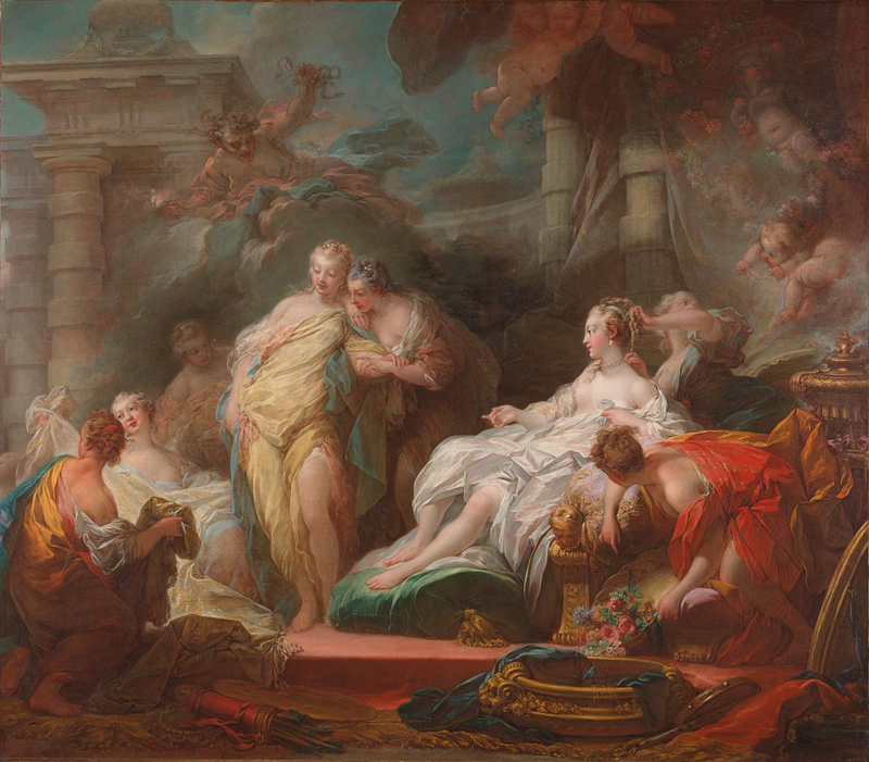
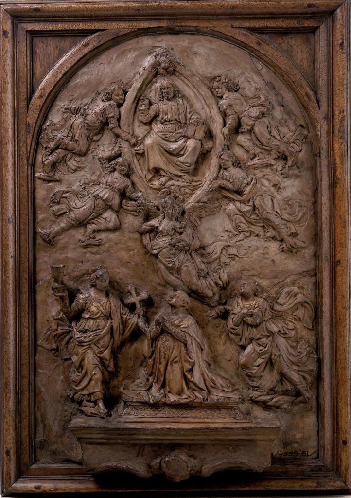
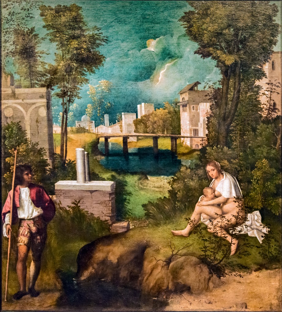
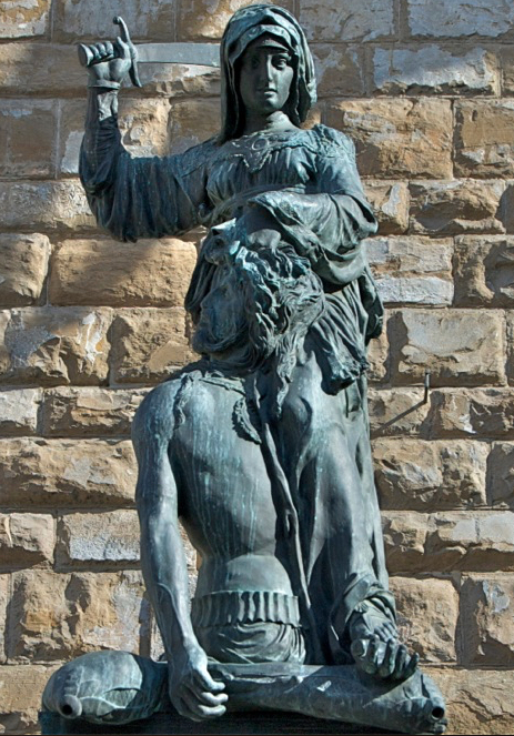
Giulio Romano, The Story of Psyche, 1526-8, Palazzo Te, Mantua.
The Story So Far… Psyche is more beautiful than Venus, Venus is jealous of Psyche, Cupid was supposed to ruin Psyche’s life but has fallen in love with her, and has had her taken to his castle. Psyche is more than happy but falls out with her sisters when they suggest that her lover might be a monster. But what if they are right? She has never seen him, after all, and she doesn’t know his name. Too quick? Well, before we go any further let’s recap more slowly with one of the great Psyche Cycles – painted by Giulio Romano in the Palazzo Te in Mantua between 1526 and 1528. The name of the palace has nothing to do with tea, by the way – that would be Tè, with an accent. It is named after the area in which it was built, on the edge of the countryside just outside the city walls. It was a lime (or linden) grove, which, in Mantua, in the early 16th Century, would have been called a tejeto.

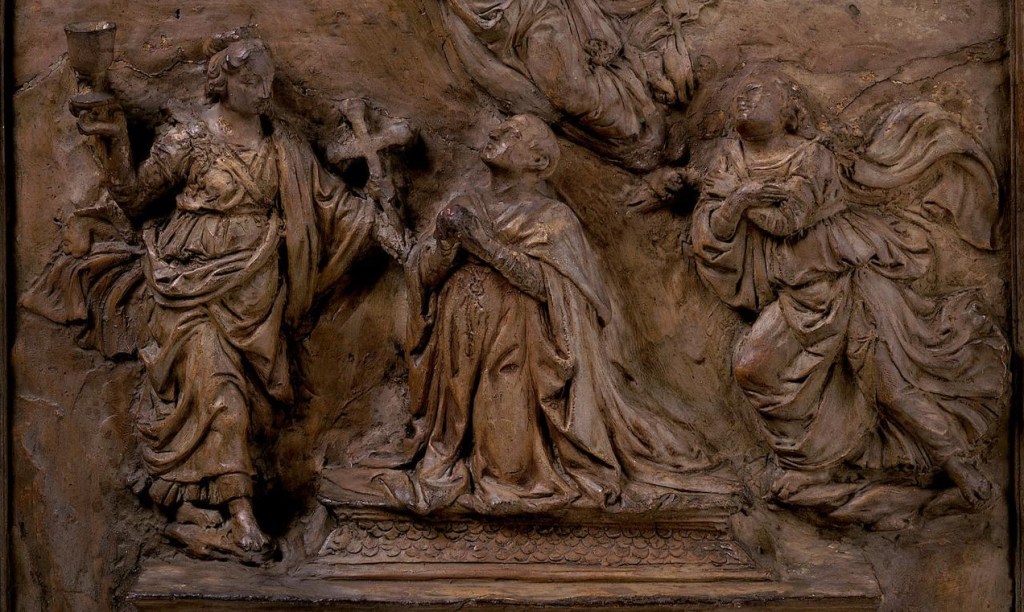
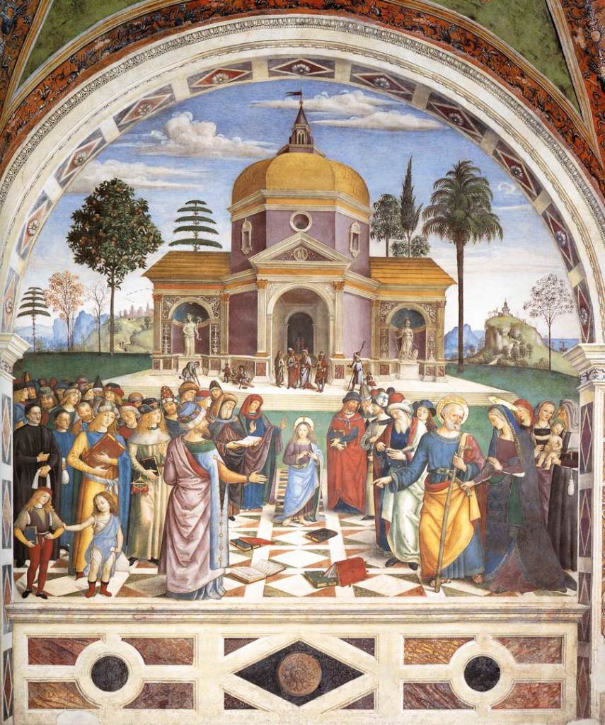
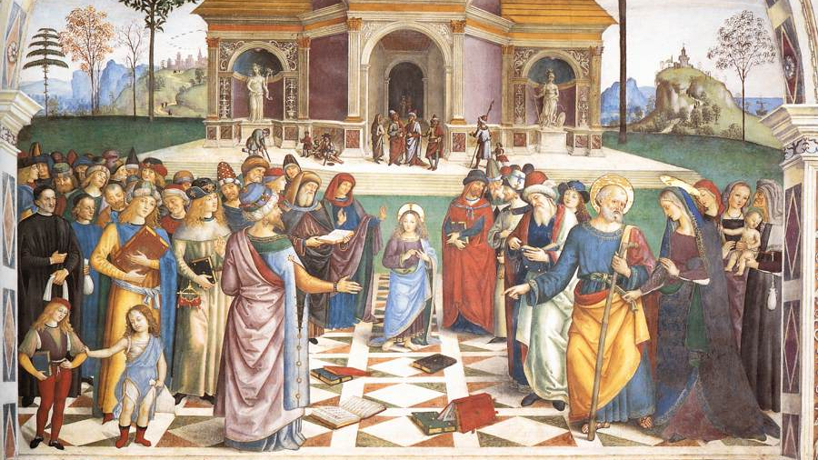
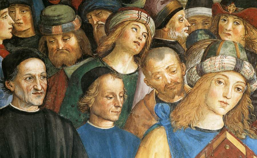
The Palace was designed inside and out by Giulio Romano for Frederico II, Marquis – later Duke – of Mantua as a suburban villa, i.e. just outside the town. It was a pleasure palace, to get away from the cares of the court, and also, so it seems, a place to get away from the wife and spend more time with the mistress. The architecture is playful and so are the frescoes, ranging from theme-park crazy to downright rude. The frescoes in the Room of Psyche are among the rudest anywhere, but I’m not going to show you those bits – just some of the ceiling, which is rather intricate. Looking up, it is hard work to see these pictures, and even harder to follow the story. Unfortunately that also means that the photographs are not so terribly good. Apologies. Above, you get some idea of the room, and below, some sense of the complexity of the ceiling.
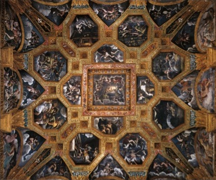
The start – and end – of the story is told in the canvasses which are set into the rich gold coffering of the ceiling, the final image being in the very central square. The stories are set into the octagons, the other sections showing winds and weather deities doing their thing, or putti fighting and playing. Other episodes are painted in the lunettes (semi-circular paintings) at the tops of the walls – you can see them in the photo of the room above. We’ll get to them… one day. For now, we’ll start with the two octagonal scenes you can see at the bottom of the picture.
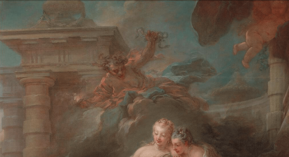
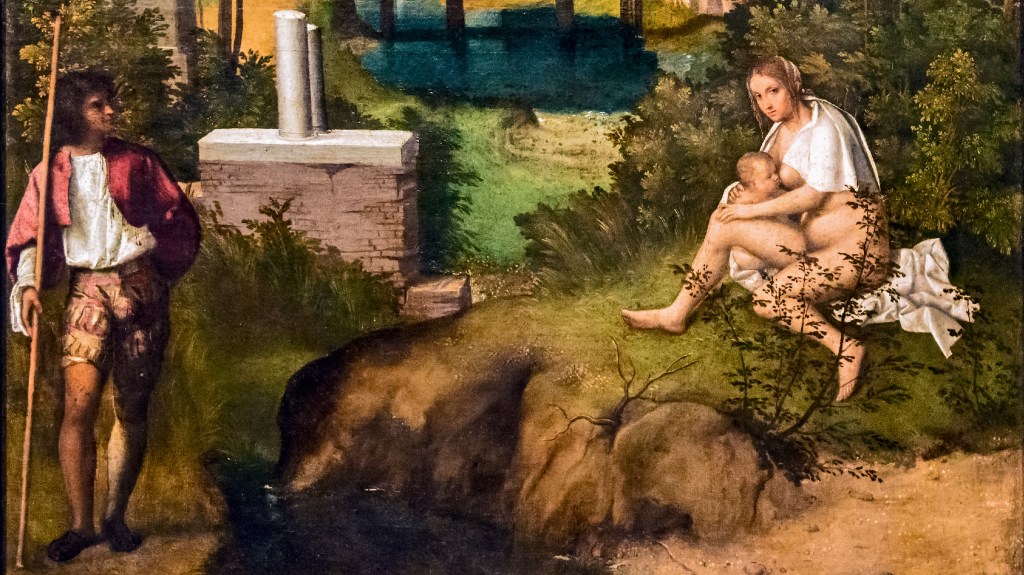
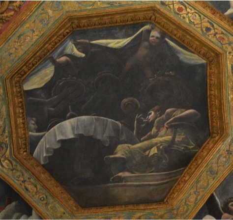
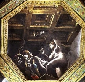
As I was saying, Psyche was so beautiful that people started worshipping her instead of Venus. Despite this, no husband could be found for her, and her parents were so concerned that they consulted the oracle to see what should be done. The news came that she would be married to a monster, and it would be better for her if she were left exposed on a mountain peak. Fortunately it didn’t end too badly, though, as Cupid fell in love with her, and had the wind Zephyr carry her away to his castle. In these two images we see Psyche’s parents taking her to the Oracle on the left: the poor girl is kneeling in desperation at the bottom right, with Dad’s arm around her shoulder. All of these scenes are quite dark – in palette as well as mood – which serves to make them more mysterious and magical, contrasting with the rich gold of the coffering. In the right octagon, Zephyr is carrying Psyche away over the sea. Indeed, that would appear to be Neptune, God of the Sea, who has appeared, trident in hand, as they go past. At the top, a minor goddess pours down rain from the sky. The two scenes in the octagonal coffers miss out part of the story, though – how did she get from oracle to sky? It seems we need a flashback.

In this section of the ceiling, which is actually to the left of the previous two scenes (i.e. going round 90° clockwise) Venus is pointing out Psyche to Cupid, instructing him to make her fall in love with a monster (which would, of course, fulfil the oracle). You might recognise the image – it is remarkably similar to the version painted by Raphael’s workshop in the Farnesina in Rome which I showed you yesterday (POTD 43). That’s hardly surprising, because Giulio Romano was a member of that workshop. Raphael was busy elsewhere, painting the Pope’s apartments in the Vatican, and dying before the Psyche Cycle could be completed – most of the painting had been left to his assistants – including Giulio – anyway. The workshop completed what we see of the frescoes today after the master’s death. When Giulio was tempted away from Rome by Federico II, he would have taken memories of the Roman frescoes with him – and maybe even a couple of drawings. These two scenes are combined – Venus is pointing to Psyce, who we can see in the right octagon, where she is exposed on the mountaintop. By putting these two scenes together, Giulio creates a real dramatic tension. She is effectively about to be sacrificed: what will happen next? As we know, Cupid falls in love with her and gets Zephyr to save her in the nick of time.
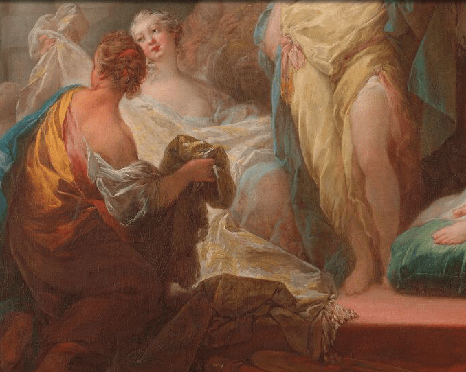
When she arrives at Cupid’s palace, she is treated not like the mere mortal she is, but as a princess – a goddess, even. This section is just round the corner, anticlockwise from the image of her being carried away by Zephyr. It’s a remarkable feat of da sotto in su painting. This means, roughly speaking, ‘from underneath looking up’. We are asked to imagine that Cupid’s castle is effectively upstairs from the Palazzo Te, and we can see it through a hole in the ceiling. We see Psyche seated at the top of a few steps at a table, which looms above us, a circular tablecloth hanging down around its dark underside. A canopy is held up by flying putti, and dark, shadowy waiters appear, bringing platters loaded with fruit and flowers. This is the point we got up to yesterday, really – or rather, just before. After she has been royally – or even, divinely – entertained, Cupid and Psyche meet, by night, and he says that she can stay, on condition that she never tries to find out who he is. She agrees, as long as her sisters can come over, just the once, so she can reassure them that she is alright. I suspect she also wants to gloat. Which is exactly what was going on in yesterday’s picture (POTD 43). As we saw, this meeting ends in an argument when Psyche’s sisters – who, let’s face it, have heard the predictions of the oracle – suggest that the mystery lover might be the very monster that had been augured. But what was she to do? She had sent them away, but what if they were right?
Inevitably, she decides to check up on him. It is one of the essential features of storytelling that, if someone is told not to do something, that is the one thing they will inevitably do. Just think of Adam and Eve. She has been told never to try and find out who Cupid is, or what he looks like. So what does she do? She takes an oil lamp and creeps to his room. Now, it’s a long time since I last read The Golden Ass, but as I remember it, the Palace turns against her. She pushes on the door – it creeks – she creeps softly across the floorboards – and they creek too. Indeed, however quietly she tries to step, the floorboards creek even more. It is as if the Palace is jealous of their love. She finally gets to the bed, and despite stirring in his sleep because of the noise, he hasn’t woken up. But, as she leans over, and finally catches a glimpse of his wings and realises who he is, the lamp – also jealous – sputters, and two drops of hot oil fall onto his arm. He wakes up, furious, knowing that she now knows who he is, and she knows that he knows that she knows. At this point… oh, I’m really sorry, I need to get going. I’ll continue… another day!