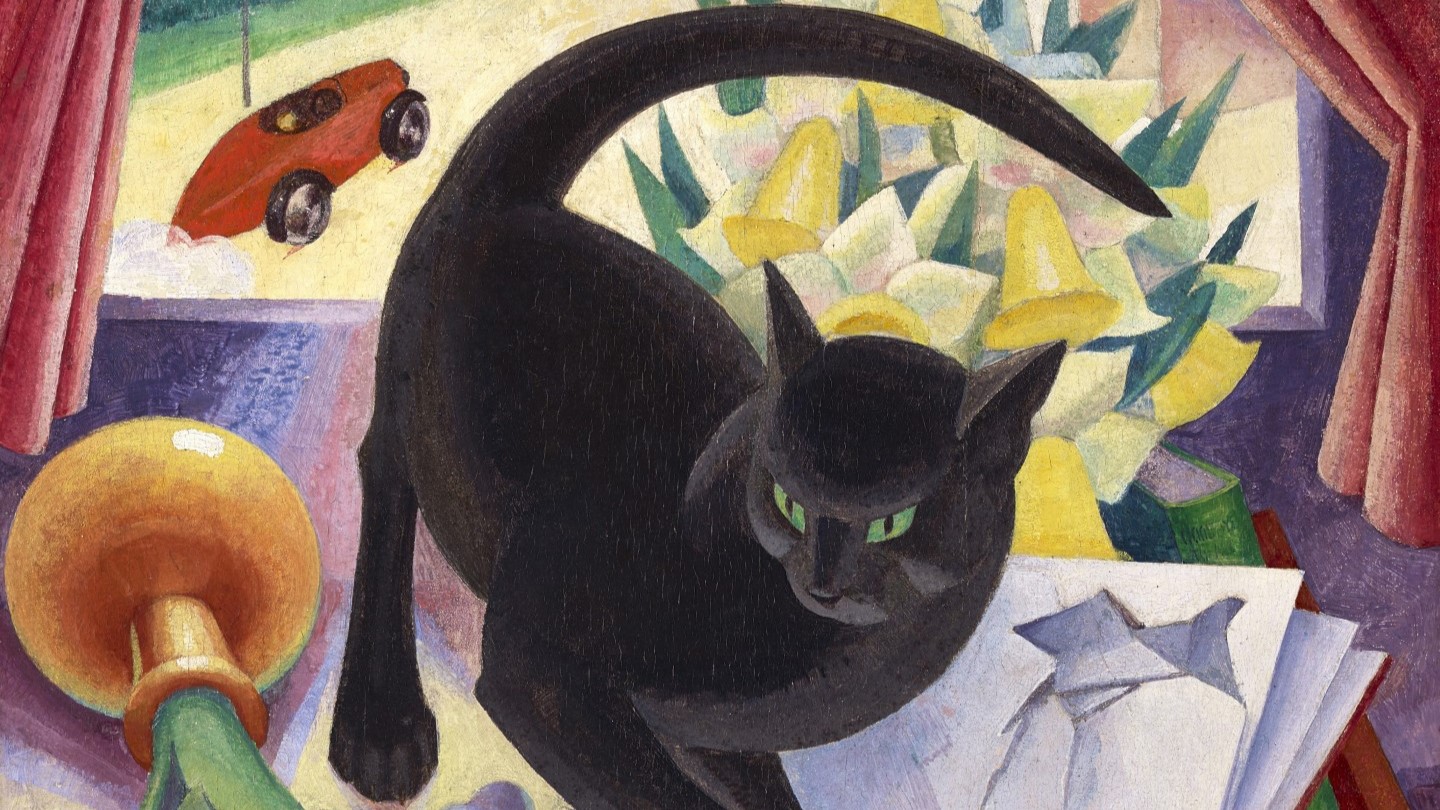
Agnes Miller Parker, The Uncivilised Cat, 1930. The Fleming Collection.
My visit to Glasgow is rapidly drawing to a close, but my Scottish September still has one last blast: an introduction to the Fleming Collection’s rich and rewarding exhibition Scottish Women Artists: 250 Years of Challenging Perception, which you can catch at Dovecot Studios in Edinburgh until 6 January next year. The talk will be this Monday, 25 September at 6pm, after which October will be taken up with a focus on portraiture. The first two Mondays are potentially the start of a survey of the recently refreshed, refocussed and reopened National Portrait Gallery in London, looking at the Tudors and Stuarts on 2 and 9 October respectively. These will be followed by introductions to the Frans Hals and Peter Paul Rubens exhibitions opening soon at the National Gallery and Dulwich Picture Gallery. As ever, keep your eye on the diary for more.
I only became aware of the Fleming Collection relatively recently. It describes itself as a ‘Museum without Walls’, and started life as a collection for the investment bank Robert Fleming & Company, founded by the eponymous Dundonian back in 1873. When the bank was sold in 2000 the paintings came off the walls of the worldwide offices, and were vested in the Fleming-Wyfold Foundation, which now promotes Scottish art through partnerships with public museums, art galleries and other institutions. I saw an earlier version of Scottish Women Artists at the Sainsbury Centre in Norwich last year, but something about the arrangement of the spaces, or the nature of the hang, made me feel that I hadn’t understood it well enough to talk about it. In Edinburgh the collection is presented in a far more coherent way, I think, and the Fleming’s own works are also supplemented with loan paintings, not to mention tapestries and rugs woven and knotted at Dovecot Studios (who are hosting the exhibition) following designs by some of the same artists. Elsewhere in the building, at certain times of the day, you can access viewing platforms to see weavers at work on the latest tapestries, making a visit doubly worthwhile. Sadly there is no catalogue for the exhibition, but I can recommend Charlotte Rostek’s book Scottish Women Artists, published by the Fleming Collection, which draws on the same material. Their website is also a good place to go: it is incredibly thorough, with good images of all of the works in the collection (by male as well as female artists…), accessible via the ‘collection’ button. There is such a wide variety of material on display that it was hard to choose what to write about today, but Agnes Miller Parker’s painting was the work which made the biggest impact which I saw it in Norwich. You could also argue that it is a summation of what the exhibition as a whole has to say.

The History of Art has saddled us with a number of fairly unhelpful terms. However, we seem to be obsessed with putting things into boxes, and these terms can sometimes be useful. In this case, though, to say that the painting is a ‘Still Life’ would tell us very little about it – it is more than usually active. And yet, if we consider why this term is inappropriate, it does help us to understand what the artist was doing. The French term nature morte, or ‘dead nature’ is just as unhelpful. But then, even for the Old Masters still lives were frequently in movement, and the dead nature was often alive. It wasn’t unusual for Rachel Ruysch to paint lizards eating butterflies, for example. In this case we see a cat running amok among what could have been a stylish, civilised, and calm Still Life. It has knocked over a vase of lilies, a small statuette, and a glass, and has torn into the pages of an open book. Meanwhile, in the background, a car is driving away at speed. Let’s try and focus in on the cat, though.
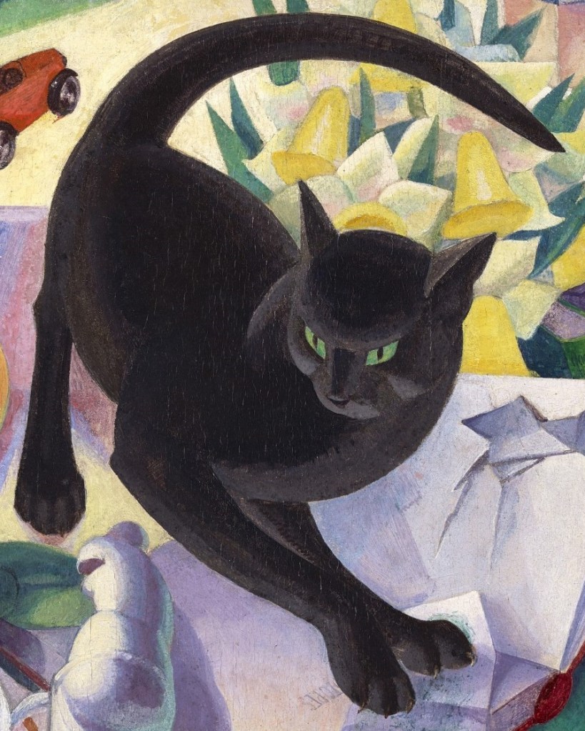
Miller Parker has woven such a taut composition that it is not possible to look at the creature on its own. Nevertheless, cropping the image closely does help us to see how brilliantly it is designed, and allows us to consider what gives the feline protagonist such tension. I’m going to ask you to draw some imaginary lines on the image. Start at the tip of the tail and trace the outline of the top of the form (with your eyes, or even a finger), going round the long arc of the tail that curves over the body beneath. The line curls round the rump, past the rear right leg and under the belly. If you carry on past the front right leg it continues in the boundary between the deep black of the flank and the lighter grey of the chest, until it reaches the muzzle: this is one broad curve. If you then start again and pick up the outline where the lower edge of the grey chest joins the front right leg, there is a second broad curve which stretches as far as the left ear (on our right) and beyond – across the top of the head, and round the face until it reaches the muzzle again. These two broad curves together form a spiral drawing us into the cat’s face, with its focus on the alert and intent emerald-green eyes. The cat is a wound spring.

The green eyes are the brightest and clearest greens of those which are distributed across the painting, and predominant in the lower half, seen here. Even if we cannot see the eyes in this detail their presence is strongly felt, not only across the table top, but also in the leaves of the lilies, the spine of one of the books, the print of the banknote under the cat’s paws, and the shadow on the side of the statuette.

Green shadows are, perhaps, a little unexpected. The Impressionists, aware that the sun is seen as ‘yellow’, and that purple is opposite yellow on the colour wheel, often painted purple or mauve shadows, given that shadow is the absence – or opposite – of light. In this case, where the statuette is brilliantly lit (on the left) it is actually shown as white. Nevertheless, conforming with Impressionist theory, the shadowed areas are purple. The greenish colour we see on the far right is not exactly shadow, but light reflected from the other green surfaces. Having said all of that, such a ‘logical’ explanation might not be relevant. As Cezanne discovered (and Matisse celebrated), we instinctively read the changing colours as a modulation of form, showing us the shape of the object in the three dimensions, and green just happens to be the colour which will create the best harmonies within the palette Miller Parker has chosen.
Whatever the colours used, the identification of the statuette itself is important. It is a reduced version of the famous Venus de Milo – the absence of arms tells us as much – and the toppling of the Roman goddess of love is surely relevant to the meaning of the painting. Can the same be said of the flowers? White lilies are often used as symbols of the Virgin Mary, expressing her purity and innocence, but for that it would be more conventional to depcit Madonna lilies (as the name suggests), Lilium candidum. These are Calla lilies (Zantedeschia aethiopica), and even though, in a strictly botanical sense, they are not actually lilies, they are still sometimes interpreted as symbols of purity, and of beauty, by association with Madonna lilies. However, it is worthwhile bearing in mind that a flower contains the plant’s sexual organs. For the Romans – and Freud, for that matter – the Calla lily was linked to human sexuality thanks to the phallic spadix, the yellow protuberance within the vase-like form. Indeed, one myth suggests that Venus cursed the lily for its beauty by adding the spadix in the midst of the pure white ‘petals’. As a result the Calla lily can be specifically associated with both lust and jealousy. The spadix is actually made up of a myriad of tiny flowers, and is what is known as an inflorescence, ‘the arrangement of the flowers on a plant’. What we see as the petals – the white, admittedly petal-like forms – are actually modified leaves. The pink interior that Miller Parker has given the ‘lilies’ adds to the less innocent reading. Both Venus, and sexuality, are overturned in this painting. Or perhaps it would be better to say that it is male stereotypes of sexuality, as represented by the statuette and lily, which are being toppled. Next to them is a red rectangle, with some writing and a black dot: a tram or bus ticket, presumably, suggesting the possibility of travel – and therefore, of escape.

In the lower right corner of the painting we can see a glass and some glasses. The spectacles are lying flat on the table, as are their ‘arms’ – it could be that they are broken, or simply that the stylisation of the forms has made them appear flat. Either way, the glasses are not being worn, which could imply that someone is not seeing clearly. Does the drinking glass have a specific meaning, or is it just another indicator of the havoc created by the cat? If it were either half full, or half empty, we might be able to discuss relative levels of optimism or pessimism, but as it happens, it is completely empty: things must have got pretty bad (if not exactly broken). The cat’s claws pin a pound note to the book – the detail on the lower corner of the note, from our point of view, clearly contains the number ‘1’. Believe it or not, there are also just enough letters in the book to identify it. Visible under the banknote are the letters ‘ION’ – the first two only just visible – and under the right paw we can see ‘TOPES’. We are looking at Love’s Creation by Marie Stopes, published in 1928, just two years before the picture was painted, and in the year in which women over 21 gained the right to vote. It is a novel dealing with concerns which Stopes encountered in her own life – sexual relations, female sexual fulfilment, and equality in marriage, among others. The following year (1829) Virginia Woolf published A Room of One’s Own, in which she famously stated that, in order to be a successful writer, a woman must have a room of her own – with a lock – and an income of £500 a year. In this light, the pound note could be read as a plea for women’s financial independence. In the detail above it is just possible to see the bottom of the spine of the green book – but not what it is.
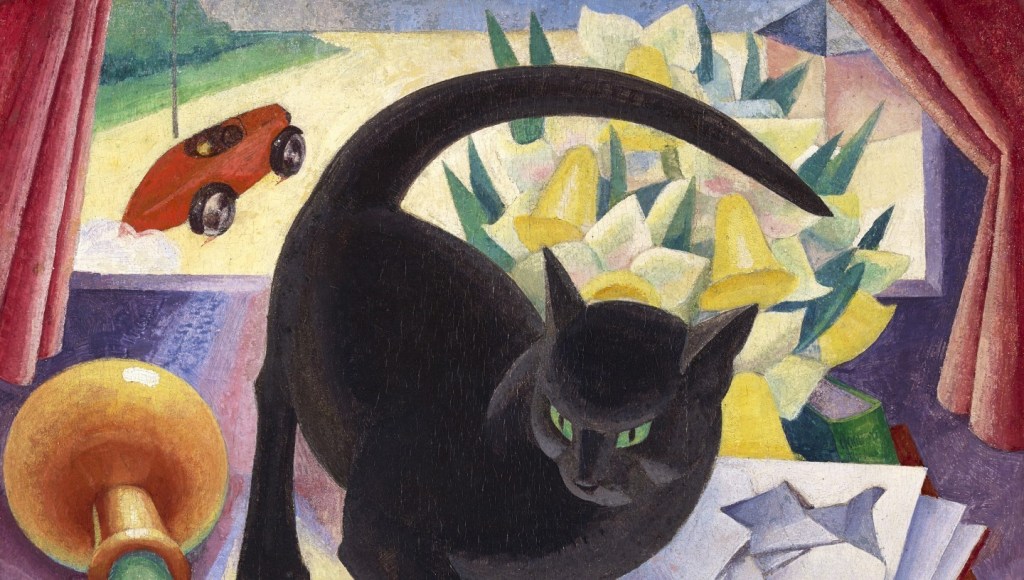
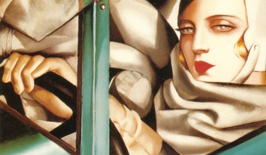
A few details up I showed you the bottom half of the painting – this is the top half. The green book emerges from behind the torn pages of Love’s Creation, revealing it to be Robert Graves’ autobiography of 1929. I honestly can’t read that, but that’s what it says on the Fleming Collection’s website, which also describes the autobiography as talking about, ‘the change of society post WWI, involving the rise of atheism, feminism and socialism, as well as the changes to traditional marriage.’ Above the book is a bunch of daffodils. Given that the scientific name for them is Narcissus pseudonarcissus can we assume that one of Miller Parker’s concerns was narcissism? The brilliant yellow trumpets and pale yellow petals of the flowers are matched by the yellow of the road outside the window, which stretches to the horizon. Yellow and purple, as I mentioned earlier, are opposite each other on the colour wheel, and are described as complementary contrasts. At times artists have used such a contrast to contain, or frame, different elements of a painting, and in this case the daffodils appear to limit the power of all the purples in the lower half of the picture. Another complementary pair is formed by red and green: the red curtains not only frame the view through the window, but also act to contain the plethora of greens in the painting. In the same way, the small red book leans on the larger green one. I would love to believe that the former is A Room of One’s Own, but there is no evidence to support this identification. The curtains and red book also echo the red, cigar-shaped car. My choice of description – cigar-shaped – perhaps implies something masculine and dominant, even phallic… again. The small licks of colour trailing behind the lower edge of each of the visible wheels, and the cloud of smoke, or dust, trailing behind the car might also suggest male power and thrust. However, even if the generation older than me might still go on about ‘women drivers’, there have always been women drivers. We need look no further than artist Tamara de Lempicka, whose style is not so different from Agnes Miller Parker’s, a painterly version of art deco, ultimately derived from very diluted, but streamlined, elements of cubism. This is a detail from de Lempicka’s Self Portrait in the Green Bugatti of 1929, currently in a private collection. In both cases, rather than male power, the car could suggest female independence – and with de Lempicka that is a certainty.
To sum up – the cat has leapt onto Marie Stopes’ Love’s Creation, ripping a page in the process and grabbing the pound note. In doing so it has overturned Venus and the Calla lily and knocked over a glass. There is a tram ticket (the possibility of escape) and a car (definitely escaping) in the background. Maybe women will be able to make a go of it on their own, finally, now that they have the vote, if only they are not faced with the short-sighted approach of some of the more narcissistic men…
As far as I can see this is a plausible interpretation of the painting, but would it make sense for Agnes Miller Parker?

Scottish by birth, she studied at the Glasgow School of Art between 1911 and 1917, and then taught at the school, although only for a while. One of her fellow students, William McCance, was imprisoned as a pacifist during the war. He was released in 1919, they married and moved to London, where they fell in with Wyndham Lewis, foremost artist of the Vorticist movement – from which Miller Parker’s style in this painting is derived. It is, apparently, one of her few paintings: she became better known for her woodcuts and book illustrations. It seems likely that, a decade into married life, this painting expresses her frustrations. Marie Stopes might have been able to write about it, but for most women the practicalities of life in a predominantly male world were fraught with difficulty. Miller Parker and McCance separated in 1955, at which point she moved back to Glasgow. They finally divorced eight years later.
We cannot be certain how specific this painting is to her own life in 1930: it could be society as a whole that she is calling to account. What is clear, though, is that she has taken one of the established genres of painting – Still Life – and has set the cat among the pigeons, as it were. This Uncivilised Cat will not accept the status quo, and will overturn the accepted values of a patriarchal society. In Act V of Hamlet the protagonist opines, Let Hercules himself do what he may, The cat will mew, and dog will have his day. For Miller Parker, though, however much the men may bark, it is the cat who will have her day. Like so many of the women we will see on Monday, she was undoubtedly challenging perception.

Hello Richard
Just to say that I saw the Scottish women artists exhibition at the Dovecot Studios while at the Edinburgh festival in August, and that striking Agnes Miller Parker cat painting probably caught my attention more than any other work. It’s such a powerful image, and so full of imagery, but of course I hadn’t picked up more than a fraction of the detail your commentary covers.
Seeing a photo of the artist (attached), I suspect, as you and Charlotte Rostek’s book hints at, that the painting is a reflection of married life – possibly hers! I wonder if her husband had a red sports car? I can see that he certainly painted a lot of machinery. If only artists would leave accompanying notes to their work!
On another note, I hope to catch your talk on Monday if back from Manchester in time-assuming late signer uppers are allowed. And might you be available to speak to the Arts Society Southampton on this or another subject in 2024-2025?
Best wishes
Gail Gail Alexander (Special Interest Day organiser The Arts Society Southampton) https://www.theartssocietysouthampton.org.uk/
LikeLike
Hi Gail,
Unfortunately the attachment didn’t get to me – this site doesn’t seem to like them – but I have seen the photos online. I had forgotten – if I ever knew – that Robert Graves’ autobiography was called ‘Goodbye to all that’ – and I can just work out the words ‘Good’ ‘to’ and ‘all’ on a higher resolution photograph. It covers the time when he left his wife, according to a friend of mine – so does seem entirely appropriate.
Thank you for your invitation, but I’m afraid I’m not the best match for the Arts Society, as I can’t book myself up a year in advance. This constant need to wish one’s life away really gets me down! Apologies…
LikeLike
Thank you for your posts about the artists during your visit to Glasgow and I will certainly try to get to Edinburgh to see the exhibition.
I have recently moved to Kirkcudbright and the Gallery has had a wonderful exhibition of Joan Eardley’s work, which closes at the end of the month. It is such a great shame that artists that are celebrated in Scotland are little known in the rest of the UK. Have you any thoughts on how they might become accessible to a wider public?
LikeLike
PR is not my area of expertise, unfortunately, but the Fleming Collection are doing a grand job. As I said in the blog, the Scottish Women Artists exhibition was seen in Norwich last year, and possibly elsewhere too, and there are also exhibitions in Sheffield (The Scottish Colourists) and Berwick-upon-Tweed (Anne Redpath and her Circle) drawn from the Fleming Collection. I can’t see how else they can be more accessible apart from mounting exhibitions across the country. T.V. programmes would also be a great idea, I suppose, and there are good ones from time to time.
LikeLike