JD Fergusson, Jonquils and Silver, 1905. Fleming Collection.
I first got to know the Scottish Colourists, about whom I will be talking this Monday, 31 August at 6pm, when I spent seven months in Pitlochry, ‘The Gateway to the Highlands’, nearly twenty years ago. Not far away was the city of Perth (Scotland, not Australia), and as well as a rather wonderful art gallery, they also had a gallery dedicated to JD Fergusson, one of whose works I will be looking at today. I have just discovered, while writing this, that it has closed, though – which is a great pity. Housed in a rather elegant, circular, neo-classical building, originally constructed for Perth Water Works, it stood on the edge of a park near the banks of the River Tay, and was an idyllic place to visit – which I did, quite a few times. The paintings and sculptures by Fergusson have moved to the refurbished Perth Art Gallery, together with works by Fergusson’s partner, Margaret Morris – who is also featured in the exhibition at the Arc in Winchester which I will introduce on Monday. If any of you are closer to Perth than Winchester, they also have an exhibition – The Scottish Colourists Revealed – which is on until 26 October… sadly I won’t be able to see it!
After this, I’ve planned everything up until Christmas already, but I’m just listing the talks in September and October for now:
7 September A Stroll around the Walker VI: ‘The Victorians’
14 September A Stroll around the Walker VII: PRB – Pre-Raphaelites and Beyond
5 October The Bayeux Tapestry: Part I – Harold in Normandy
12 October The Bayeux Tapestry: Part II – William in England
They are listed in my diary as well, and also on my Tixoom page. However, neither of those sites have details of the free online talk I am doing for the National Gallery about The Wilton Diptych on Thursday 3 September at 5pm.
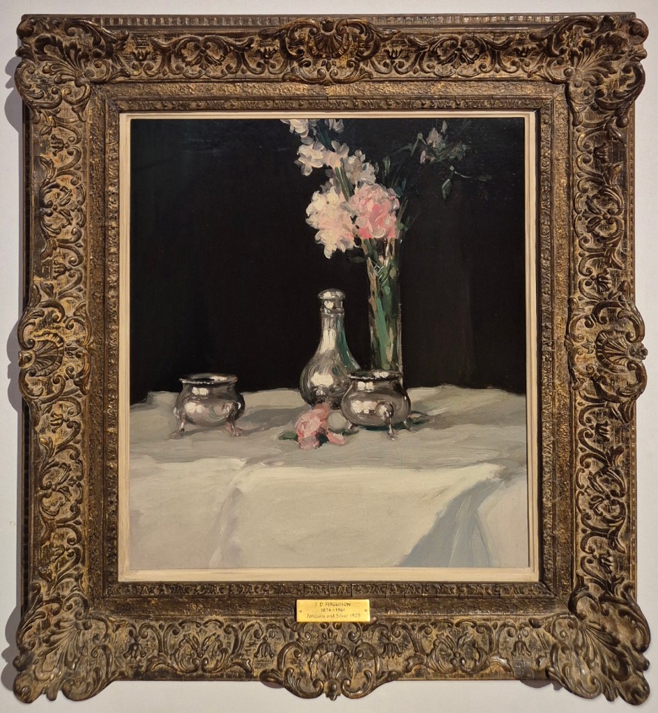
One of the first things that struck me on seeing today’s painting was how much it reminded me of some of the still lifes by William Nicholson which I talked about back in May this year, and I’d never made the connection before. The Lustre Bowl, belonging to the National Galleries of Scotland, would be a good reference point. Both have velvety, deep black backgrounds – impenetrable and immeasurable – against which silver rings out, meticulously painted with what at first glance appears to be photographic realism. However, when you get just a little closer you would realise that, somehow, they are extraordinarily painterly, freely rendered, and made up of clearly distinguishable brushstrokes heading in all sorts of apparently random directions. The Lustre Bowl was painted in 1911, and Fergusson’s Jonquils and Silver just six years earlier, so they are, effectively, contemporary, as were the artists. Born two years apart, (Nicholson in 1872 and Fergusson in 1874), their shared interest in French modernist trends gives Nicholson a context which he would seem to lack among his English contemporaries. These artists have something else in common, too: both have been somewhat neglected by English critics and art historians. The story is different in Scotland, for Fergusson at least, where the Scottish Colourists are widely celebrated, and represented in every major museum.
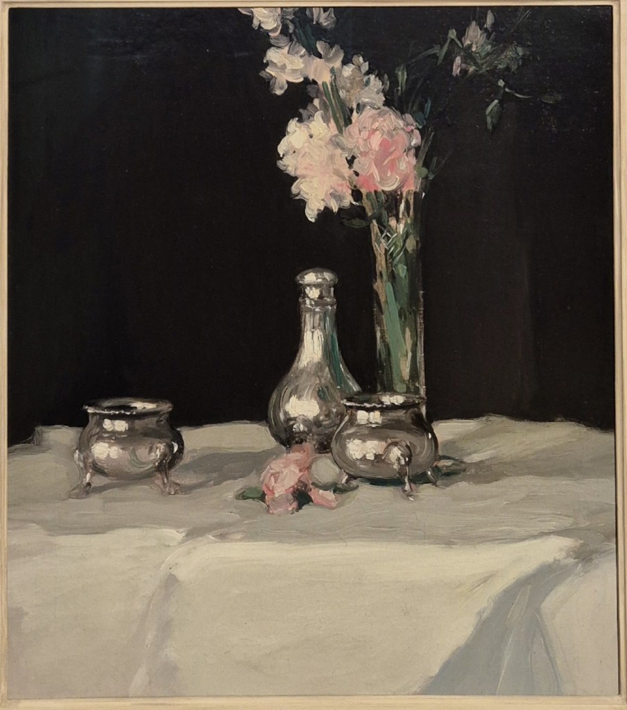
You would be right if you thought that, for a ‘Colourist’, this is not an especially colourful painting. But then, the term wasn’t coined for Fergusson and his associates until at least 18 years after this still life was painted. Both Fergusson and his friend, SJ Peploe, started their artistic careers working with dark palettes and subtle tonal variation, using browns, blacks and greys. However, their frequent visits to Paris, followed by their full-time transferral there in 1907 and 1910 respectively, meant that they had regular contact with the Parisian avant garde. The Fauves, or ‘Wild Beasts’, led by Matisse and Derain, got their name as a result of their wildly coloured paintings, first seen at the Salon d’Automne in 1905. This was the year in which Jonquils and Silver was painted, and so would have been too late to influence Fergusson’s style: later works are far more highly coloured. Nevertheless, the colour which is used here is both rich, and telling. The three silver objects of the title – two identical salt cellars and a pepper pot – stand on a table covered by an ample white tablecloth. Light comes from the front left – from large windows, judging by the distorted reflections in the silverware – and casts shadows which stretch to the back right on the tablecloth. Just behind the right-hand salt cellar is a glass vase containing pink flowers. The title of the painting may be Jonquils and Silver, but true jonquils – Narcissus jonquila, related to daffodils – are yellow. Apparently, horticulturalists have bred pink varieties, but I’m not entirely sure what Fergusson was looking at. As we shall see later, it would be impossible to tell from the shape of the petals. Nevertheless, the pink flowers glow magnificently against the black background, and one bloom has fallen onto the table in front of the pepper pot.
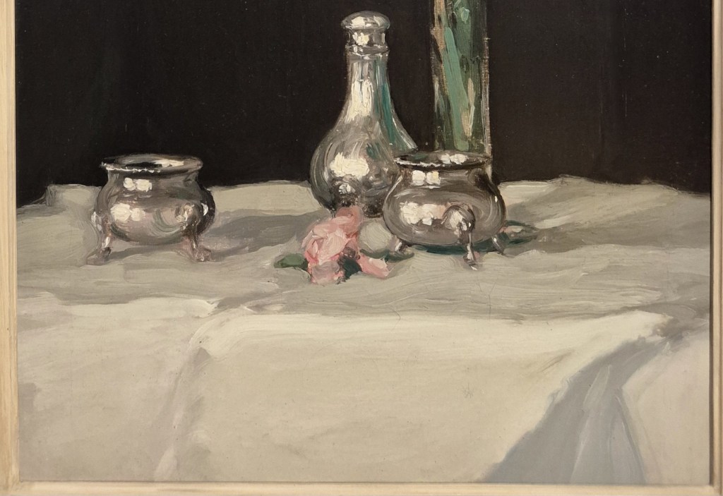
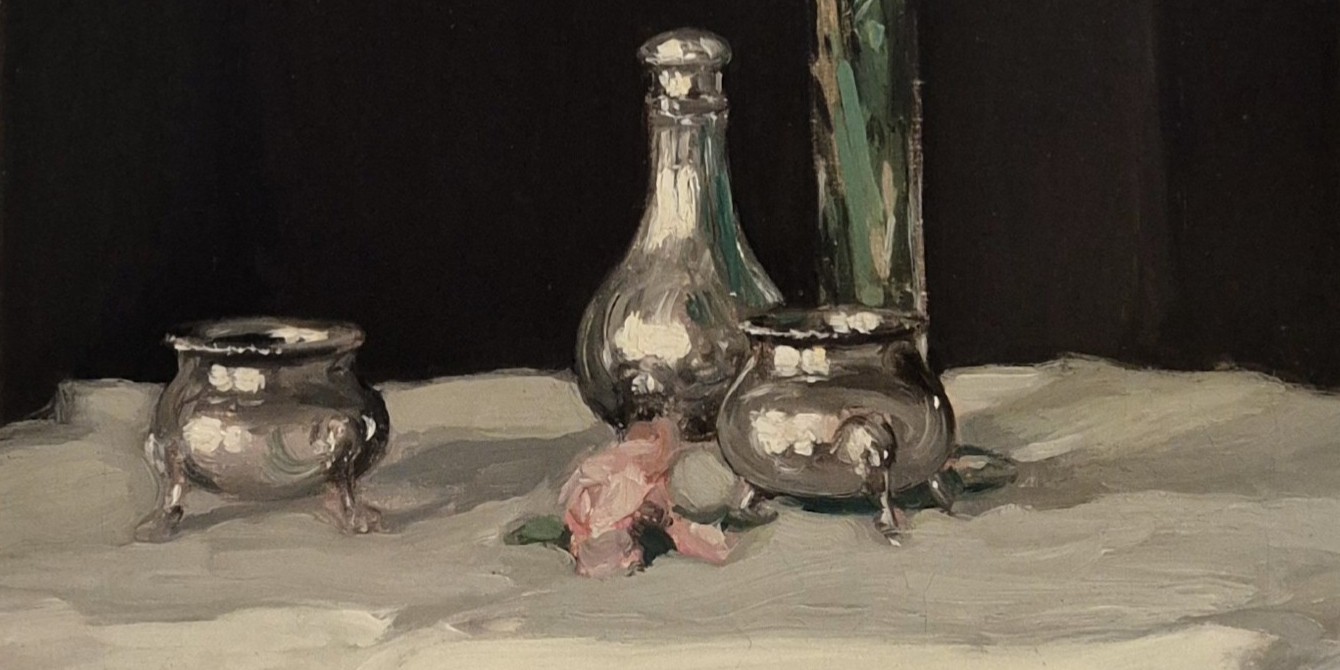
Fergusson’s main interest in the bottom half of the painting is the contrast of strongly different tones. The tablecloth falls in front of the table, catching light most strongly as it curves around the latter’s edge. A fold, or crease, runs back diagonally under the pink flower, and the cloth is rucked up in the bottom right corner of the painting, allowing the artist to explore a variety of whites, off-whites, creams and greys. The paint is applied in thick, buttery strokes, so that we are never given the chance to forget that this is a painting, while it still manages, somehow, to look exactly like a thick, creased, untidily arranged tablecloth. At the back of the table, between the left-hand salt cellar and the pepper pot, the cloth catches the light again, allowing the strongest possible contrast between white and black, with the grey tone of the silverware acting as a mid-point. We know that it is silver, rather than an undefined matt grey material, thanks to the brilliant white of the reflections from the windows, together with the black edging reflected from the background: Fergusson manages to capture the entire grey scale, from white to black, in one object. The different pieces have been carefully arranged, with the pepper pot and one salt cellar close to each other on a diagonal, and close to the vase and flower, which are aligned on the opposing diagonal. The remaining salt cellar is a little way off – almost as if it has broken away from the group, or somehow fallen out with its colleagues, which have now gathered together to confront it.
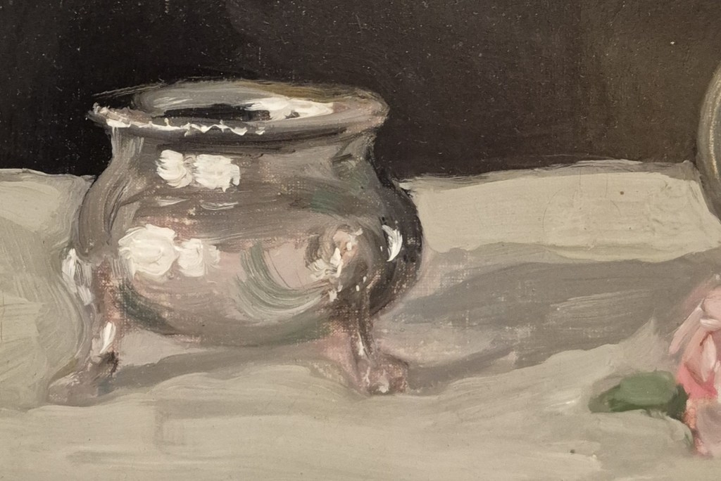
Once you get this close, the isolated salt cellar stops looking like silver, and becomes, more obviously, an amalgam of brushstrokes. There are three or four different greys, although as each stroke was applied rapidly, wet-on-wet, the separate tones have mixed and are hard to separate. A ground layer seems to include some pink – implying a reflection from the flower – while the reflections from the windows are so obviously blobs of thick white paint it is surprising that they ever looked like reflections. What appeared to be the shadowed interior the salt cellar turns out to be a continuation of the black background, surrounded by a couple of flicks of grey paint to make it part of the bowl. There is also some green paint in a couple of the brushstrokes, reflections of the stems seen in the vase. Each stroke is quite thick, and freely applied, but this disguises the fact that, overall, the image is quite thinly painted, and where both front ‘legs’ are attached to the cellar the weave of the canvas can be seen quite clearly. Whatever I said about this object’s separation from the others, the shadow to its right leads to them, thus helping to unify the composition.
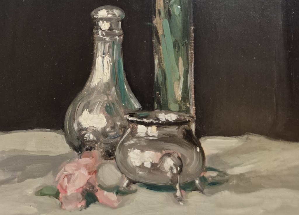
Indeed, the remaining pieces are framed by shadows, both coming from the left-hand salt cellar and leading to the base of the pepper pot, then continuing to the back right from the group of four. This group is held together not only by the proximity of the objects, but also by the way they share light and colour. The two silver pieces reflect light in similar ways, but with different inflections as a result of their different shapes. The pepper pot also reflects the salt cellar – seen as a very squat thing indeed – as well as the rich, deep green of the stems and leaves of the flowers, which can be seen through the glass of the vase. If anything, the reflections are richer and deeper green, but this might be affected by the black background. The salt cellar here also encompasses the pink of the flowers somehow: reflections surround the top of the ‘leg’ – although this seems to defy logic to me. It could be the result of Fergusson moving around as he looked, and painting things which we shouldn’t be able to see from our fixed viewpoint. The inner edge of the salt cellar, at the back left, also catches the green of the stems – and the shadows underneath the bowl take on the deepest green of all. Touches of brown running up the right edge of the vase are actually the result of unpainted canvas – giving a sense of spontaneity which continues to undermine our initial impression of high finish.
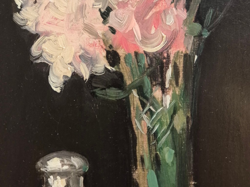
The unpainted sections of brown canvas can be seen more clearly towards the top of the vase, running up the left side, and also higher up in the middle. Meanwhile, opposing diagonals of quickly dashed white paint tell us that there were cut-glass details on the vase, subtly alluded to, maybe, but definitely there. The pink petals, varying in hue from cream to Brighton Rock, are applied as a mess of curving strokes.
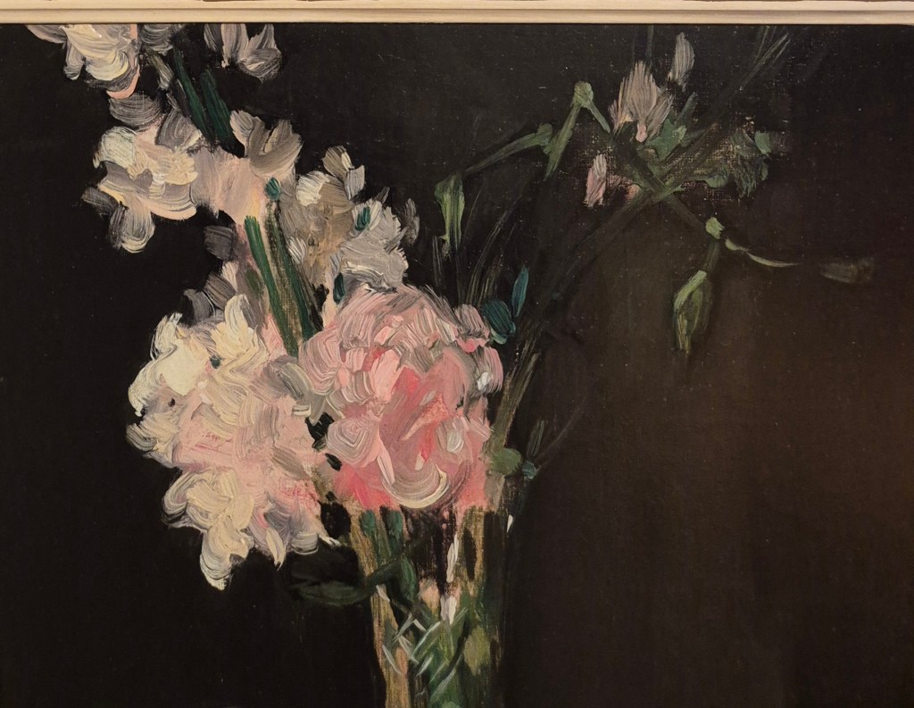
However, even if we focus on the flowers alone, nothing is resolved. There is no sense of the structure of each flower, just of the wonderful richness and variety of the colour, the joy of pink. A freedom of painting which seems different – to my eye – to anything else that was happening at the time. This is not the careful application of taches – the building bricks of Impressionist paintings – nor the clashing hues that the Fauvists were just about to unleash on the world: Fergusson was an original. However, he was profoundly inspired by Manet: I should probably look at his flower paintings more.
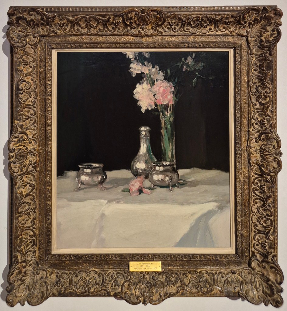
Stepping back to see the picture as a whole, this freely painted explosion of the light and bright pinks hovers in the dark, not unlike fireworks against the night sky. But glowing against the black background, above the silver cruet which stands firmly on the table, we have no doubt that they are real, and that they are flowers. Like his three Colourist companions, Fergusson really was a wonderful painter – as I hope you’ll be able to see on Monday.
 dr richard stemp
Hi Richard Really enjoyed your recent blog on Fergusson. We live in Aberfeldy and Perth is our local art gallery. When the new Museum in Perth opened in 2024, the Gallery took over the whole old building and the Fergusson collection is now displayed beautifully, you’ll be pleased to hear. (Perth holds the entire Fergusson archive). Their Colourist exhibition is very enjoyable – I came away having learned that one of the group is – CADell rather than CadELL – as it’s a diminution of Campbell. Pictures were good too! Looking forward to your talk. Jane Napper
>
LikeLike
Thank you Jane! This is so interesting. I have heard about the new museum, but hadn’t made the connection that this would create more space within the art gallery – so I’m glad to know that this has worked out, and that the Fergusson collection is well displayed. I loved the old building, but suspected there wasn’t enough space there! Do you know what it is being used for now? The pronunciation of Cadell is also good to know!
I haven’t managed to get to Perth for years, but regularly stop off in Aberfeldy to go to the Watermill – a favourite cafe and bookshop! I was there briefly in July…
I do hope you enjoy the talk on Monday – thank you for booking!
LikeLike
I don’t think a plan has been announced for the old waterworks building yet. If you are looking for good coffee in Stromness – can recommend VPCo Stromness Coffee at the Old Bank just along the Main Street from the Peir Gallery ( vintage paper company – nice old printers)
>
LikeLike
Thank you – I was reading about VPCo just the other day for some reason – great to hear it is as good as the internet says it is!
LikeLike