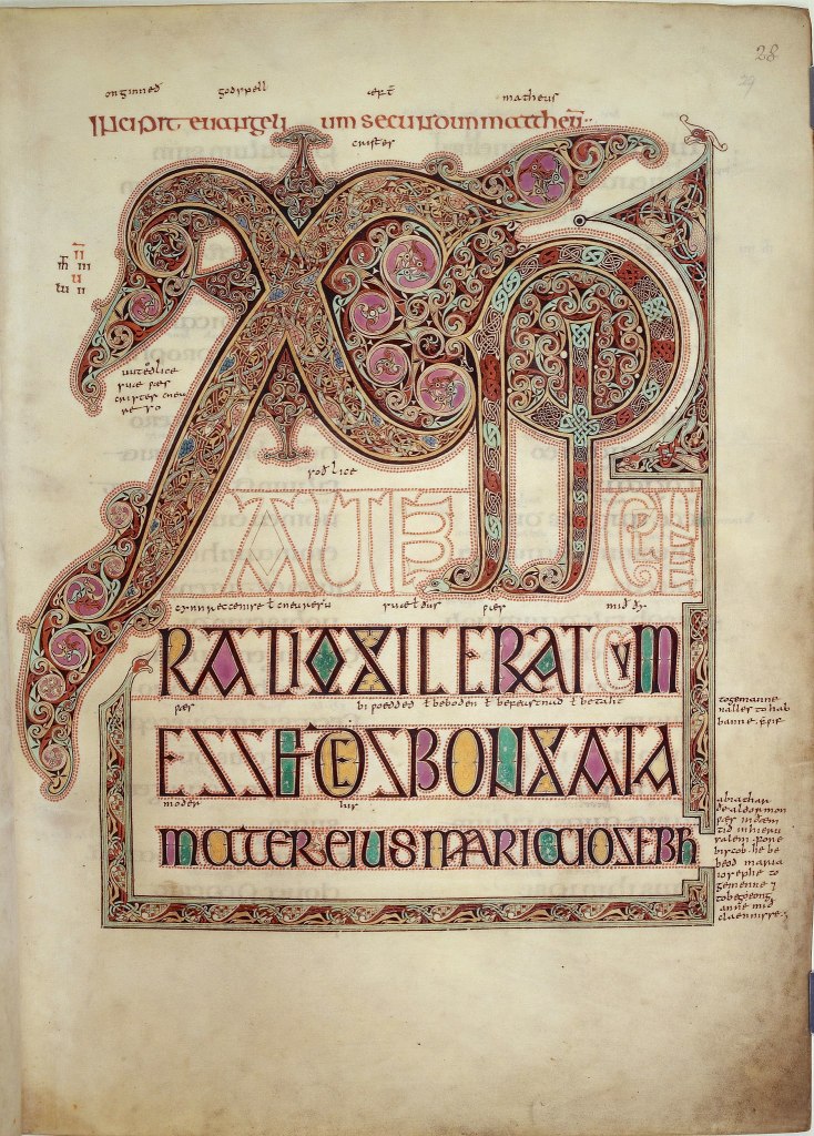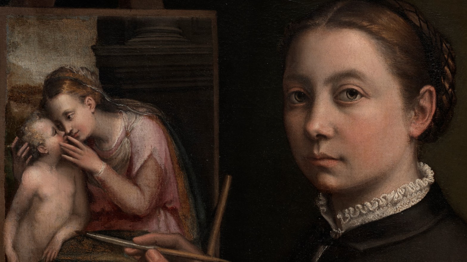
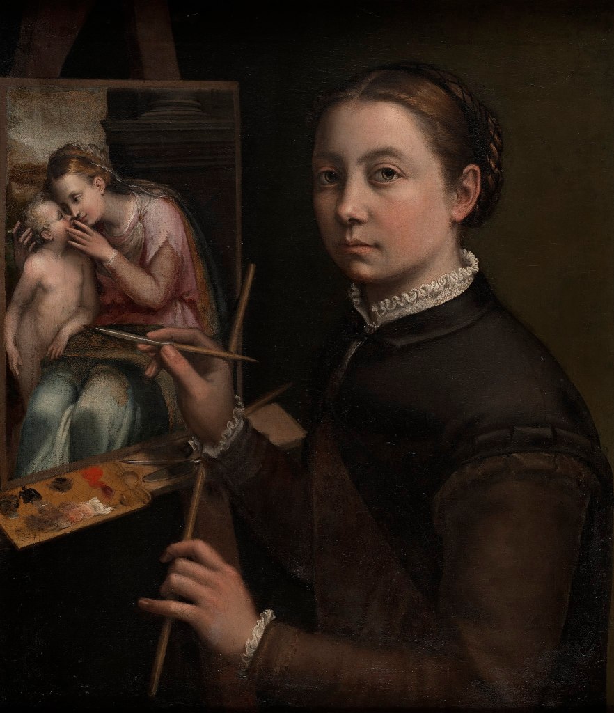
Sofonisba Anguissola, Self Portrait at the Easel, c. 1556. Museum Zanek, Łańcut.
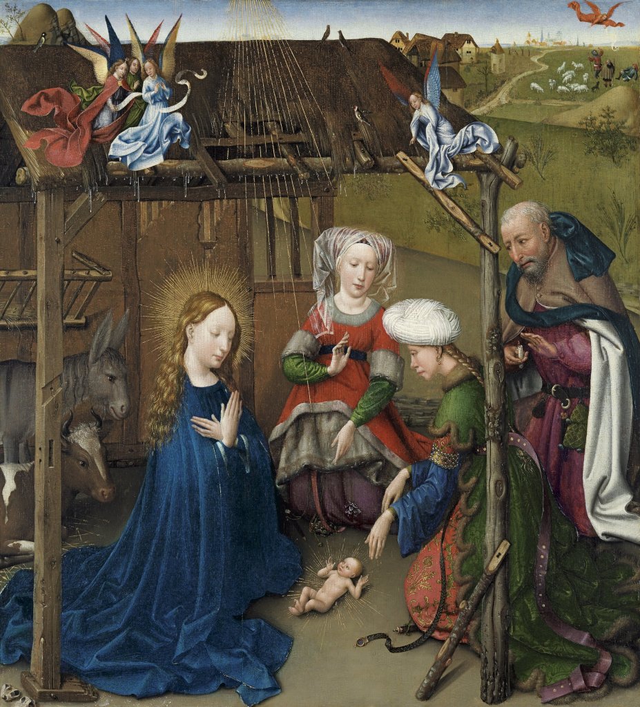
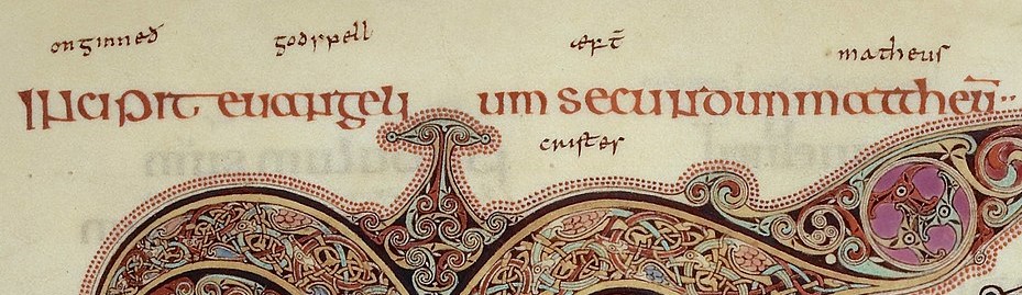
Greetings from Copenhagen! And welcome to a first: I’m doubling up this week, in more ways than one. My series on The Childhood of Christ reaches Week 3, From Epiphany… this Monday, 12 December at 6pm. We will cover everything in Jesus’s childhood from the moment the Kings depart up until the return of the Holy Family from Egypt, at which point Jesus carries on his life as an apparently normal, if supernaturally powerful, very naughty boy. Expect dragons, mobile plants, living toys, and excessive revenge. No, none of them are in the bible, but I’m going to show them to you anyway. And in addition to that, on Wednesday, 14 December I will be reporting back from Copenhagen, having seen Sofonisba in Denmark. So two lectures in one week. To introduce both talks I want to look at a painting which will cover both The Childhood of Christ and Sofonisba Anguissola, so here is a self portrait in which she shows herself painting The Virgin and Child.
I’m doubling up the doubling up, though: I have written about this painting before. This is the first time I have repeated myself without actually re-posting the old blog. That was Day 90, and this is post 180 (so double again, although the numbering doesn’t include the Advent Calendar, the Lenten penance, or the various re-posts…). However, I’m not even going to read Day 90 – Sofonisba, too: I’ll leave that to you, if you have time on your hands. Instead, I’m going to write something completely (?) new.
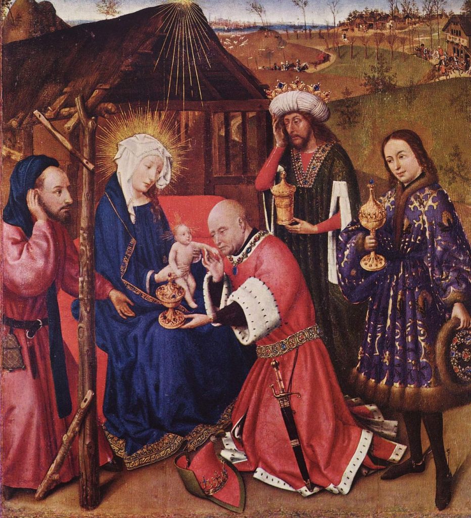
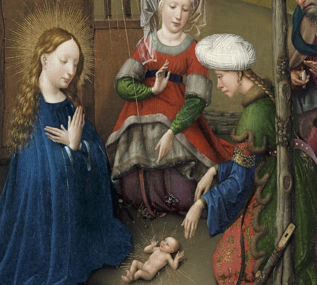
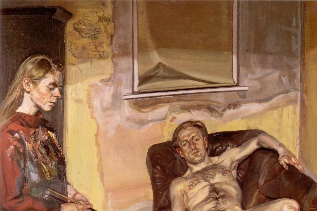
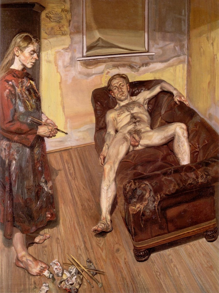
Sofonisba stands – or is seated – in front of her easel. She looks out towards us, as if to make sure that we are aware of what she is doing: she is painting. Not unusual as an artist, perhaps, unless, of course, you are a woman in the 16th Century. Not only that, but a woman who is not the daughter of an artist, which was – up until the 18th Century at least – the most common route for women to become artists. She is probably, of course, really looking at a mirror, so that she can paint her own appearance, although it would be possible to argue that she has already done that. Another self portrait survives showing her in a similar position, and wearing much the same outfit – although in that one she is holding a book. She might have copied that portrait, omitting the book: elsewhere there is evidence that she painted from other images, either paintings or drawings (I’ll come back to that on Wednesday). But would she really have dressed like this while painting? It’s possible – there is nothing too flowing or floaty which could get caught in the wet paint. But we have no evidence, so we can only hypothesize. What we see is a woman who is modestly dressed, with a clear eye and a steady hand.

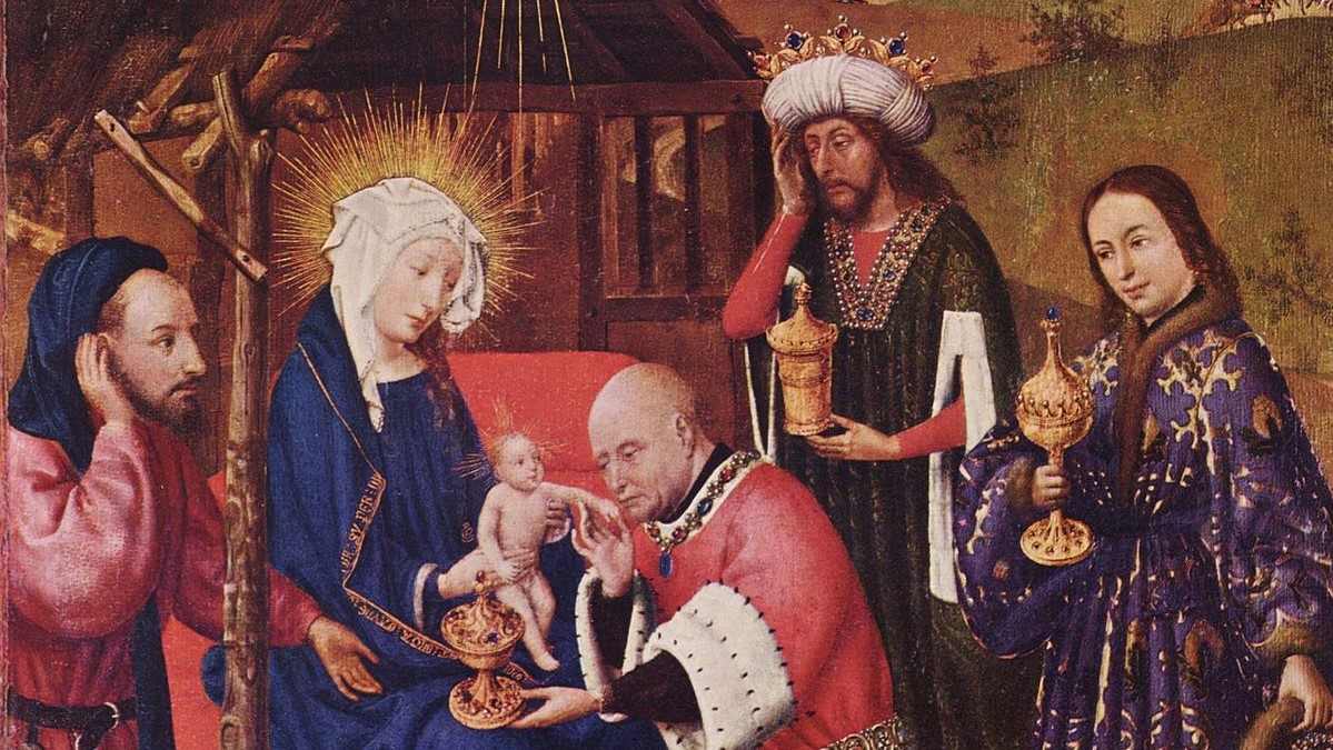
Her hair is centrally parted and plaited, with the plaits bound up in a snood, the black, net-like threads ensuring that none of her hair escapes, giving a sense of control and containment which matches her self-contained demeanour. A small black collar is buttoned underneath the short, frilled collar of her chemise. The subtle handling of light and shade softly models the forms of her face. She has painted the eyes slightly larger than they would be for ‘natural’ proportions, giving us a feeling that she is watching intently, observing us as she might have observed the models she has been painting – or for that matter, the drawing on which the picture she is painting might have been based. The picture itself sits on a standard easel, just visible at the top of this detail, but clearer in the image above. Given that the self portrait is painted on canvas, we could assume that her Virgin and Child is too. She leaves the edges of the canvas blank, as they will later be covered by a frame. The fact that she is painting the Virgin and Child is important. There were very few women painting in Sofonisba’s day, and very few Still Life paintings. Later, that would be the genre which women were ‘allowed’, although portraiture was also a viable option. They would, it is often said, be all but excluded from ‘History Painting’ – the depiction of instructional and uplifting narratives – but these genres of academic excellence had not yet been codified during Sofonisba’s lifetime.
The first self portrait which shows the artist in the act painting – or, at least, the first to survive – was painted by a woman (see Day 28 – Catharina van Hemessen). As far as I can tell, Sofonisba’s is the second. Whereas Catharina is painting a portrait (and, in all probability, she shows herself in the act of painting herself), Sofonisba chooses what could be interpreted as a more noble endeavour: painting the same subject as St Luke, who was fabled to be the first artist to depict the Virgin Mary. She also shows how important Mary was for Christian theology by finding a symbol for her strength. She is seated in front of a high, rectangular pedestal, topped by a cornice, which supports the circular base of the column. As well as a symbol of Mary’s role as a true pillar of the church, this also shows us that Sofonisba was aware of the latest developments in renaissance architecture.
Sofonisba did not always sign her paintings, and so several works attributed to her are still subject to debate. However, when she did, they often follow a similar formula, exemplified by the portrait I mentioned earlier, in which she is wearing what is probably the same outfit. Written in the book she is holding is the phrase, ‘Sofonisba Anguissola Virgo se ipsam fecit’. The apparently bold assertion of her own virginity merely states that she was unmarried – a maiden – and lived in the paternal home. But basically it could be translated as, ‘Sofonisba Anguissola, Virgin, made herself’. The making is important.

The black collar is part of a buttoned cape, which fits tightly around her upper arms, and has a hem that is slashed like the tops of the brown sleeves. It is a sensible, modest, and well-fitting ensemble: she may be a woman doing a man’s job, but she is not a brazen hussy. She rests her right wrist on a mahl stick, which is itself resting on the unpainted edge of her canvas, thus enabling her to paint detail securely and with accuracy: it is a sign of her diligence. She is just about to add a stroke to Jesus’s left arm, which is resting on his mother’s lap. In this sense, what she is doing echoes what the Virgin has done: Mary ‘made’ Jesus, and Sofonisba is ‘making’ him again. Or, to put it another way, Mary may be the mother of Jesuss, but Sofonisba is is the ‘mother’ of this picture. She is also, of course, painting a male nude, something which was inconceivable for a female artist even as late as the early 20th century, although given Christ’s perfection, the innocence of his youth, and the modesty of his stance, posed discreetly as he is behind his mother’s leg, there is apparently nothing untoward in this depiction.
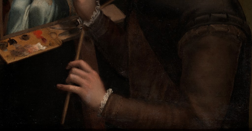
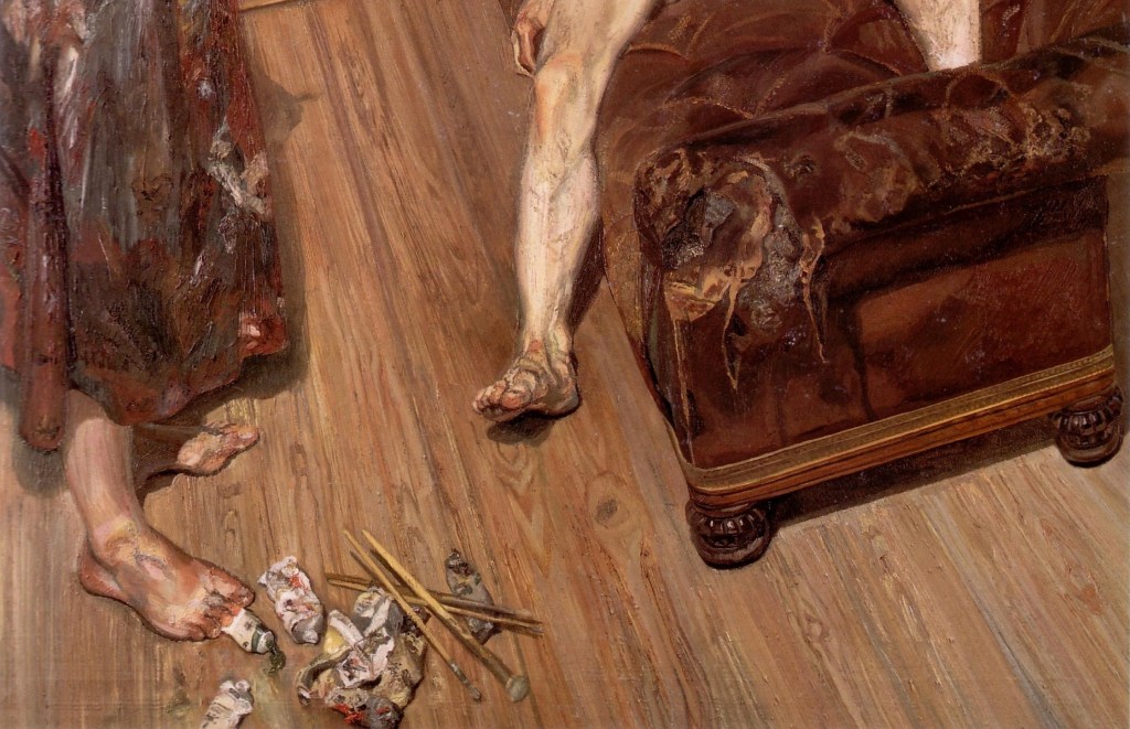
I can’t help reading her left hand, holding the end of the mahl stick, as a sign of her sophistication: the little finger is crooked. However, parallels to the elegant drinking of tea would be more than a little anachronistic. In this detail we can see the unpainted lower edge of the canvas resting on the easel, and in front of it, to the left, is her palate. On it we see black, red and white paint, and a variety of mixtures, mainly grey and pink. Oddly, though, there is very little blue, despite this being the colour of Mary’s cloak. The bottom right corner of the palette might show the ochre which is the basis of the yellow lining of the cloak, but that’s not entirely clear. To the right of the palette is a quill, used for the drawing on which the painting was based, presumably. There is also what I assume to be a palette knife. Once the paint had been mixed, this was used to transfer the paint to the palette – and in later centuries, to apply the paint to the canvas. There is also another brush.
I’m intrigued by the image she is painting. Some of her paintings of the Virgin and Child do survive, and are included in the Danish exhibition (I will show you them on Wednesday), but none look like this. Where do the ideas come from? Perhaps we can answer that by considering how it compares to the work of her contemporaries.


Sofonisba studied with two artists, both called Bernardino. Her first master was Bernardino Campi, and then, when he moved away, she was taught by Bernardino Gatti. I can’t find a Virgin and Child by either which resembles Sofonisba’s, but to me this Pietà resonates in some way. It was sold at auction in February last year, when it received an attribution to Bernardino Gatti. Although in one we see Christ as an adult, and in the other he is a child, there is something about the way the arms fall which strikes me as similar. Notably, the right forearm of the child and the left of the adult seem to curve slightly, and have the same somewhat ‘arch’ flexing of the index finger.


However, as well as looking to her own teachers, there also seems to be an echo from the work of the Florentine master Agnolo Bronzino: this one is in the National Gallery. Compare the long, slim fingers of the Virgins, for example, and the depiction of the loving relationship between mother and son: the way they lean together and look intently into each other’s eyes suggests that they share a similar ethos.

I have no doubt about the function of this self portrait. It is a declaration of the artist’s ability – and of her integrity. If I wanted a portrait of myself looking respectable, this would be the woman to go to. And if I wanted a painting of the Virgin and Child, this would also guarantee the quality I would get: technically skilled, intricate, intimate, and up to date. Having said that, I realise now, despite the number of times I have talked and written about Sofonisba (even before this, I have dedicated three posts to her), I have never seen any of her paintings in the flesh – so I can’t wait to see the exhibition tomorrow! And, as I’ve said, I will report back on Wednesday. Before then, though, on Monday I will consider some of the lesser known of Jesus’s exploits – while also untangling some potentially confusing biblical episodes. I hope you have as good a week as I am planning!