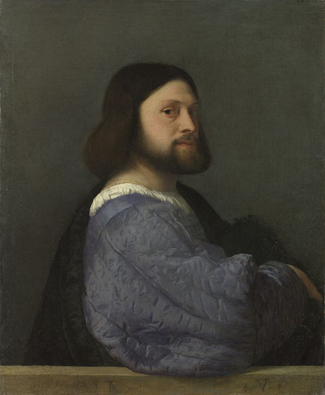
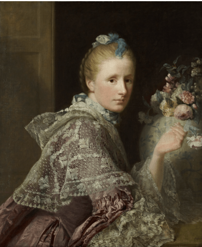
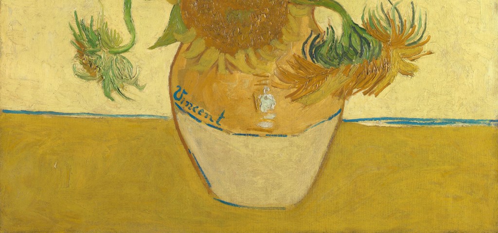
Vincent van Gogh, Sunflowers, 1888. National Gallery, London.
There can be few artists more famous or more popular these days than Vincent van Gogh, and I must confess that each time I hear about a new exhibition my heart sinks a little. But I’m glad to say, I am often wrong! The last one was Tate Britain’s Van Gogh and Britain which I thought would be completely pointless: he was hardly here, and wasn’t even an artist at the time. I was wrong about the former, and the latter didn’t matter – it was a brilliant exhibition, and I would still recommend the catalogue. As for the current one – well – that’s an exception. I knew it would be good. Apart from the fact that charting van Gogh’s career through his self portraits is such a good idea that I’m surprised it hasn’t been done before, exhibitions at The Courtauld are always small, and as a result focussed, and to the point. Van Gogh. Self Portraits is no exception – both magical and haunting – and I am delighted to be talking about it this Monday, 14 February at 6pm. I’m not saying it will be the perfect Valentine’s date, but it could give you something to talk about over dinner! The following Monday I’m having a day off before we commute to Webinars, which will launch on 28 February with a series of three talks entitled Red, White and Blue. There is more information about the series on the diary page, and, via the blue links there, on Tixoom, but the talks will be an opportunity to look at the works of Sir Thomas Lawrence, James Abbott McNeil Whistler, and Thomas Gainsborough, and will focus on two paintings acquired or borrowed by the National Gallery, and on an exhibition at the Royal Academy. But for today, let’s look one of Vincent’s most famous paintings: Sunflowers. Even if it’s not a self portrait, identity is an issue, as we shall see.

One of the problems we have to confront when we look at this painting is that, by now, the image is so familiar that we recognise it instantly, we know that we know it, and we simply don’t look. To be honest, knowing anything about a painting is one of the first boundaries we all have to cross if we want to learn something new. So let’s just look at it. I have done this with a number of different audiences at different times – mainly school groups, often members of the general public, and occasionally on private tours. I would love to ask you a series of questions, but this is a blog and you can’t answer, so I will just give you the answers I get 99% of the time. Here are the questions:
- What is this a painting of?
- Where are the Sunflowers?
- Where is the vase?
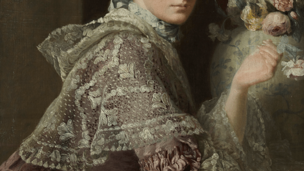
The answer to no. 1, is obvious, really – Sunflowers, the clue is in the title – as is the next answer: in a vase. And the answer to question 3? On a table. It’s that simple. I get these answers every time. The only slight variation is in question three, and fair enough. A few people answer ‘on the floor’ – but very few people say that, simply because very few people have vases on the floor (as far as I’m aware). But, if I asked you to draw me a table, how would you do that? What does it need in order to be identified as a table? A table top, of course, but also legs. And van Gogh hasn’t given us any legs. So why do most people think this is a table? Well, because you tend to keep vases on tables or shelves, and this… well, it doesn’t look like a shelf to me. All this tells me two things. First, the human brain has a remarkable ability to fill in missing details. Second, van Gogh’s had a remarkable ability to abbreviate. How has he painted the table? With a change of colour and a blue line. There are relatively few artists who can convey so much with so little. Let’s face it – there is nothing about the painting of the table that suggests it is a horizontal surface. Imagine cutting out a section of the canvas, like this…

Please don’t actually try cutting out a section of the painting, it would be a rather expensive act of vandalism, and you would certainly get arrested. However, I have done it digitally, which is alright, and you can see that there is no shading, no perspective, nothing to say it is a horizontal, or even flat surface at all. In fact, there is nothing particularly remarkable about this bit of painting in any way, there is just the rough handling of the paint, with almost random brush strokes, used to fill up the space and little more. So we can move on to the next question: what shape is the vase? Or, to put it another way, if you were to take the flowers out and look at the top of the vase from above, what shape would you see?

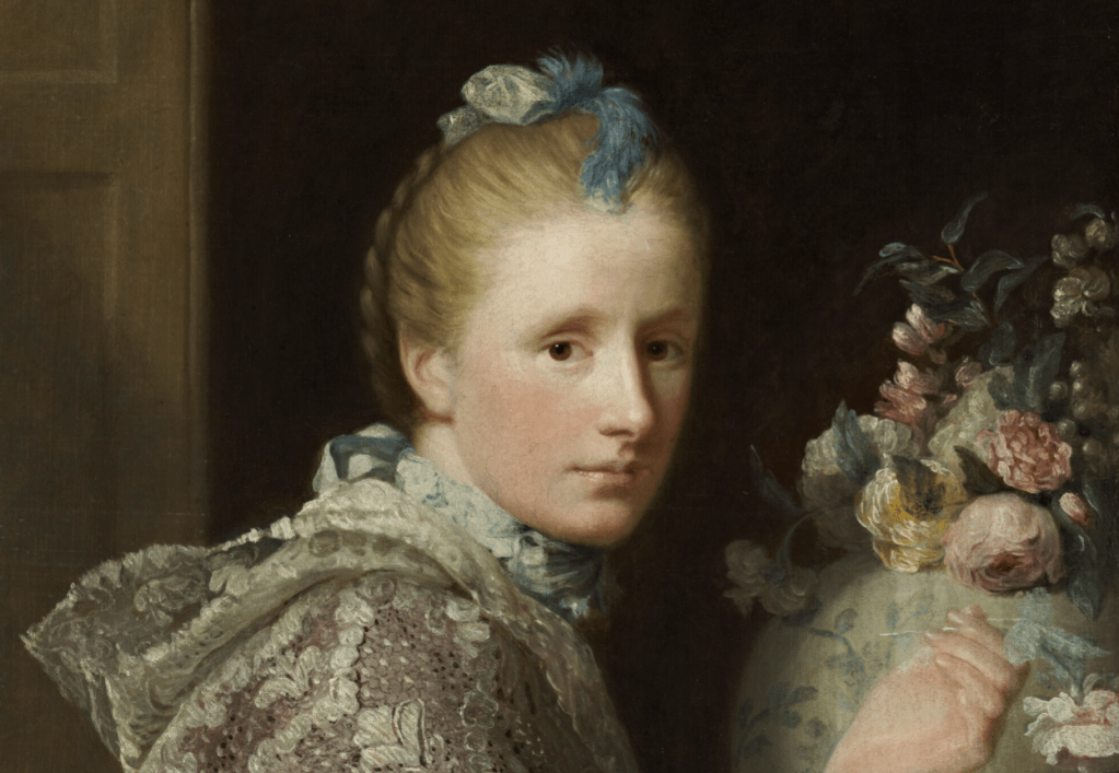
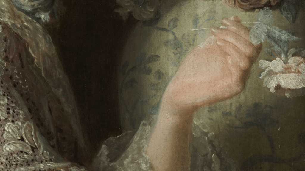
The answer I always get is ‘a circle’. But how does Vincent tell us that? (I say ‘Vincent’ because that’s what it says on the painting.) There is barely any shading on the vase – OK, so the right side is lighter than the left, but it’s not exactly consistent, and it’s certainly not the subtle variation in tone to model the form in three dimensions that was perfected during the Renaissance. What really gives it the shape is a single line – the blue line curving down from one side of the vase and then up again on the other. This, and the slant of the word ‘Vincent’, together with the white blobs of paint. They are so obviously blobs of paint that quite a few people have asked me if the painting is damaged, or maybe unfinished. But no, blobs of white paint are exactly what Vincent wanted, and they represent a highlight reflecting off the vase, a highlight so bright that only white paint would do. It tells us (here’s the answer to the next question, which I shall therefore omit) that the vase is made of glazed ceramic. But wait a second. If there’s that much light reflecting off the front of the vase, what should we see, somehow, behind the vase? A shadow, surely? But no. No shadows. No shadows, no perspective… what else can he avoid using, I wonder? Well, we’ll have to go back to the painting as a whole in order to answer the next questions.

Pick a simple colour for every question. What colour is the wall? What colour are the flowers? What colour is the vase? What colour is the table? The answer to all of these questions should have been ‘yellow’. OK, so I know there are different shades of yellow, plus details in green and brown, and a couple of blue lines, but basically this is a painting of yellow flowers in a yellow vase on a yellow table against a yellow wall. It is almost – but not quite – monochrome, and the creation of a monochrome painting was really rather original in 1888. I know that Degas painted Combing the Hair using only red, but that was about 8 years later, and, while we’re at the National Gallery, Théo van Rysselberghe used only blue (more or less) for his Coastal Scene. But that was in 1892 – a little closer to Sunflowers in date, perhaps, but still four years later. And it still shows that van Gogh’s work was far more innovative that you might have thought. OK, in a letter to his sister Willemien (see below) he cited Monticelli as a precedent, but Monticelli’s paintings aren’t exactly yellow… And we are left with the problem that, if Vincent’s painting is yellow, then how does he make the vase visible?

It’s simple really, which is why it is so brilliant. The wall is lighter yellow than the table, and the top part of the vase is darker than the bottom. He places the dark of the vase against the light of the wall, and then, further down, the light against the dark. Economical, but telling.
And how does he depict the flowers themselves? At the bottom two droop down, balanced, but not exactly symmetrical. Each yellow petal, and each green section of the former bud, curves round in a single, curving brushstroke. One of the things that this painting makes clear is that van Gogh loved paint. He loved the feel of it, he loved the way it moved, and he loved applying it in different ways, with brushstrokes describing the qualities of his subject almost as much – if not more – than their colour and form do.

Just above the vase the composition is again balanced, but not symmetrical – with two thickly-painted seed heads in the centre, made up of thick blobs of glistening paint dabbed onto the canvas. To the left and right, and slightly higher up, are two more blooms with curling petals, tilted down, another tilted out. The petals here are fuller, and formed by a number of brushstrokes, each one with fairly thick paint in which we can see the lines formed by the separate hairs of the brush.

At the top we have a pyramid, with one, central, dominant flower. Admittedly it’s a very squat pyramid, but it focuses our attention on the centre of the image, leaving the top left and right as just ‘background’. Two flowers look out at us, one central, one on the far left, but both appear to be losing their petals, a little be worse for wear. The one on the left even looks a little tipsy – but I probably shouldn’t anthropomorphise. The texture of the paint is fantastic. The large central flowers are built up of the blobs of paint, dabbed and pressed onto the surface with the end of the brush, I presume, while the pale yellow background is applied in short horizontal and vertical strokes, almost as if it were woven.
The ‘story’ of the painting is well known, I think, but just as a reminder, it was painted when van Gogh was about to be visited in Arles by his hero of the moment, Paul Gauguin. They had met in Paris in 1887, but they weren’t exactly friends, and Gauguin only went down south because Vincent’s brother Theo – an art dealer – promised to pay him: Gauguin was desperate to raise cash to escape from France. Around 18 August 1888, shortly before Gauguin arrived, Vincent wrote to artist Emile Bernard saying,
I am thinking of decorating my studio with half a dozen pictures of “Sunflowers,” a decoration in which the raw or broken chrome yellows will blaze forth on various backgrounds – blue, from the palest malachite green to royal blue, framed in thin strips of wood painted with orange lead. Effects like those of stained-glass windows in a Gothic church.
And then, about three days later, he wrote to his brother Theo:
I am hard at it, painting with the enthusiasm of a Marseillais eating bouillabaisse, which won’t surprise you when you know that what I’m at is the painting of some big sunflowers.
I have three canvases going – 1st, three huge flowers in a green vase, with a light background, a size 15 canvas; 2nd, three flowers, one gone to seed, having lost its petals, and one a bud against a royal-blue background, size 25 canvas; 3rd, twelve flowers and buds in a yellow vase
Our painting is the fourth… he mentions it in a letter to Theo written around 27 August:
I am now on the fourth picture of sunflowers. This fourth one is a bunch of 14 flowers, against a yellow background.
And he mentions it again in a letter to his sister, Willemien:
So I myself too have already finished a picture all in yellow – of sunflowers (fourteen flowers in a yellow vase and against a yellow background …).
… which is pretty much the way I have described it for years, even though I only read this letter today! (You can find all the correspondence here – linking first to the letter to Bernard, in a better translation than I’ve quoted). In the end, rather than using this painting for the studio, it was hung in the room which Gauguin would use. The time the two artists spent together is the stuff of legend by now, but if you don’t know the story it will have to wait for another time, I’m afraid. Vincent presumably wanted Gauguin to feel at home, to enjoy himself, and to want to stay, so no wonder he wanted to decorate his room with a painting ‘all in yellow’ – the colour of light, the colour of life. But is it a happy painting? I’ll let you decide.
One last question: why does he sign himself ‘Vincent’. Well, I can assure you I’ve spent hours with every Dutch visitor I’ve ever shown this painting to – including entire school groups from The Netherlands – trying to get them to help me to pronounce ‘Van Gogh’ correctly. So far I have failed. Most English go for ‘van Goff’ (‘van’ to rhyme with ‘can’ – it should be more like ‘von’), the French for a soft ‘van Gog’, and the Americans for an insistent ‘van Go!’. It must have seemed far easier for him to stick to ‘Vincent’. Still, on Monday, when I get to talk about The Courtauld’s poignant Van Gogh. Self Portraits, I’ll give it another go.