171 – All together now…!

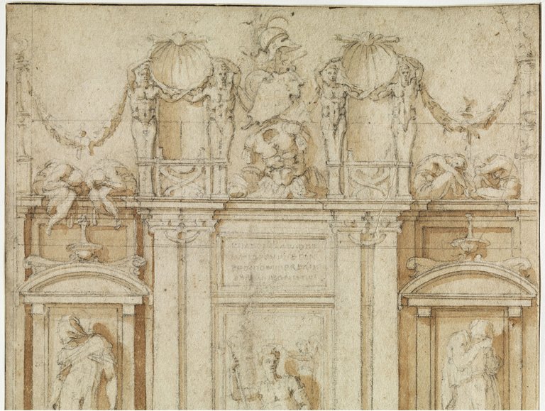
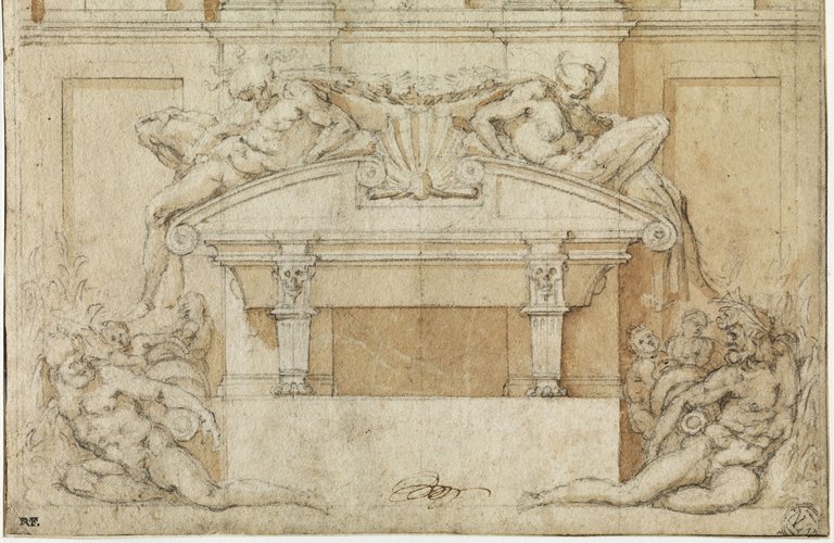
Attributed to Michelangelo, Study for one of the Medici tombs at San Lorenzo, 1524. Musée du Louvre, Paris.

Gesamtkunstwerk. It’s the word that Wagner used in 1849 to describe his ideal art form, with all genres of art working together through theatre. Of course it applies specifically to opera, which involves music, drama, and visual design, which in itself includes painting, sculpture and architecture. But gesamtkunstwerke have existed ever since… well, ever since anybody ever built any environment in which people would gather. A church, for example, has architecture, sculpture, painting and music. And, of course, drama. Birth, death, and resurrection – what could be more dramatic than that? And then, of course, there’s the liturgy. However, there are relatively few artists who were talented enough to create ‘a’ Gesamtkunstwerk on their own, although some, like Michelangelo, were nearly there. He was only really held up by external circumstances. Throughout much of his life he wanted to be known as a sculptor, but he is equally well known for his painting. And as you will know by now – especially if you joined me for the talk this week (thank you!) – he also wrote some rich and complex poetry, and was a great correspondent. As he became more successful, he also became an architect – the subject of the fourth and final talk in my series Almost All of Michelangelo. But of course, being Michelangelo, it’s so much more than just putting up walls. He sculpts with light and space, he creates theatres of public drama, and he even manipulates the way in which we move through the environment. No time to talk about all of that today, so I do hope you can join me on Monday 26 September from 5.30-7.30pm. Today, I just want to talk about one drawing of one element of one of his Gesamtkunstwerke, the Medici Chapel in San Lorenzo.

Buonarroti, Michelangelo dit Michel-Ange, Musée du Louvre, Département des Arts graphiques, INV 838, Recto – https://collections.louvre.fr/ark:/53355/cl020001376 – https://collections.louvre.fr/CGU

This is one of the drawings I didn’t include in the talk this week, having deliberately omitted anything architectural as otherwise there would have been too much to look at. It should be said that not everyone believes this drawing to be by Michelangelo himself, although Carmen Bambach, a curator at the Metropolitan Museum of Art, and curator and author of the catalogue of the exhibition Michelangelo: Divine Draftsman and Designer, which I mentioned, does. And that’s good enough for me. For those of you familiar with Florence, or Michelangelo, you will instantly recognise one of the Medici tombs from the New Sacristy of San Lorenzo, although this is not how the tomb was finally executed. As work progressed on the chapel Michelangelo gradually simplified his ideas, in part because, stylistically, he was moving towards a greater simplicity, and in part because it was proving impossible to get everything done. As executed, we have the architectural structure from this drawing, including the sarcophagus, plus three sculptures: the figure seated in the central bay (a ‘unit’ of architecture) and the two figures reclining on the casket.

If we start with the top half of the drawing, we can see that it is a highly refined image, drawn in black chalk with a brown wash to give the forms volume and to create a sense of ‘atmosphere’ that is more than diagrammatic. It is clearly a highly finished drawing, with few pentimenti (changes). The only hints of ‘planning’ are the vertical and horizontal lines which are ruled in different places across the image, as well as a very faint circle which would define the lunette of the wall above the monument – although that is all but cut off at the top (the circle is most visible on the right). This is clearly a drawing by someone who has made up their mind exactly what they want, and wants to communicate that to someone else: the patron or his agent, in this case Cardinal Giulio de’ Medici, who by this time was Pope Clement VII. I will tell you more about the chapel itself, and its history – both as planned and as executed – on Monday. Today I just want to look at this drawing.

The architectural structure of the tomb is three bays wide, two narrow bays flanking a wider, central bay. The bays are separated by paired pilasters, with slightly taller and simpler pilasters at far left and right. The rhythm of the tomb – narrow, wide, narrow – is not unlike that of a triumphal arch, and inevitably the implication would be that the soul of the deceased will triumph over death because of their Christian faith. The two outer bays contain niches framed by tabernacles – like a temple front but with only one ‘opening’ – topped by segmental pediments (i.e. a segment of a circle). In each we see the top half of a standing figure. The central bay is less shadowy, which implies that it is further forward, and also that it doesn’t have any sculptural framing elements, like the two tabernacles, to contain the seated figure, of which here we can only see the head and shoulders.

The four pilasters support a cornice, which itself supports elaborate decoration, none which was executed (with the exception, perhaps, of one of the crouching figures – I’ll show you that on Monday). Above the outer bays are pairs of seated figures – their legs dangling over the cornice to the left, and tucked up on the right. The paired pilasters support narrow balustrades, the balusters being placed further apart than the combined width of the pilasters, making these units look a bit top heavy, almost like a sense of growth as we go upwards. There is a herm – a flaring column which develops into the torso of a person – standing on each of the balusters, and each pair of herms holds a scallop shell. Garlands hang from the outer herms, looping up again towards the edges of the monument, where each is supported by a candelabrum. In the centre are trophies of war – an empty suit of armour, topped by shields, with a helmet at the very top.

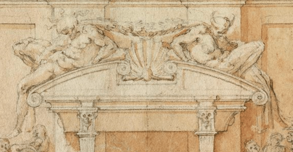
It is the lower part of the monument with which we are more familiar. Not only does it have the most identifiable sculptures – and ones which were actually executed – but also, when we are in the chapel, this is the section at eye-level. Certainly in this detail we can ‘recognise’ the two figures slumped across the sarcophagus, even though there were not finished in exactly this form. But they do have the extreme articulation which is typical of Michelangelo’s ‘early mature’ style, an extreme exaggeration of contrapposto whereby one leg is as bent as it can be, while the other, if not exactly straight – and certainly not ‘weight bearing’ in this context – is at least stretched out. Both figures also twist through the torso, with one arm bent, and the other more elongated. A clue to their identities is given by details sketched around the heads. On the left, the bearded figure has at least four wavy forms radiating around his hair, while the figure on the right has two curving horns. These represent the sun and a crescent moon – unusually diagrammatic elements of symbolism for Michelangelo, which is probably why he simplified the figures and carved Day and Night without them. These figures refer to the passing of time, which is, in itself, a memento mori – a reminder of death – an idea made explicit by the two skulls carved on the capitals of the pilasters which support the sarcophagus.

Seen in the context of the lower half of the tomb, the figures of Day and Night still look familiar – but you’ll know if you’ve seen them in person that there is nothing lying on the floor. Reclining on one arm with both legs stretched out, these characters have circular objects tucked under their arms. These are jugs, and the reclining pair represent river gods – we saw the river Eridanus, who ‘received’ Phaeton as he plummeted to his death, in last week’s blog. Michelangelo did get as far as planning these sculptures. There are drawings of them, and he even made a full-sized model for one of them which is now in the Casa Buonarroti in Florence.

Modelled in terracotta, Michelangelo could have handed this over to an assistant to carve, but chose not to, preferring the bold simplicity which the chapel has now. It’s a remarkable sculpture, but not the most flattering image of a god. Rather than the bold, broadly muscular classical figures he arranged on the Capitoline Hill – one of his great architectural projects which is effectively small-scale town planning – this figure looks somewhat emaciated, with admittedly muscular, but wiry legs, and too much skin, but not enough muscle, around the midriff. It has to be said that the current ‘simplicity’ of the chapel was not just an artistic choice. He left Florence in 1534 never to return, and the chapel was put together by assistants following Michelangelo’s instructions which were posted from Rome, a correspondence course in architecture.

Had the River Gods been included there would have been a strong pyramidal structure, with the seated figure – a portrayal, though not a portrait, of Giuliano de Medici, Duke of Nemours – at the top centre. Notice how the feet of the river gods lie in front of the base of the tomb. Not only would they have been further out to the left and right, but they would also have been further forward, encroaching onto the floor space of the chapel (another potential reason why they were omitted). Day and Night are further back and further in, with Giuliano further back again. The sculpture recedes in space towards the middle of the wall. So although the architecture seems to push forward, the sculpture pulls back, a tension typical in Michelangelo’s work as a whole. This also creates areas of light and shade, with the side niches, the rivers, and the sarcophagus creating the darkest shadows, leaving Giuliano in the light – so as well as being at the apex of the pyramid he is also the most brilliantly illuminated. This is what I mean by sculpting in light – and I’ll talk more about this, and other ways in which Michelangelo achieved it, on Monday.

When I was talking about Michelangelo’s drawings this week, I started with the earliest, which were drawn from frescoes by Giotto and Masaccio. As a young man he learnt from the Masters, and the most sculptural painters at that. Inevitably later artists learnt from him in the same way. How do we know that? Well, apart from the obvious visual influence in their art, there are other drawings which suggest as much. As well as today’s drawing of Giuliano’s tomb by Michelangelo himself, the Louvre also has a drawing by Federico Zuccaro of the opposite tomb – of Lorenzo, Duke of Urbino – as it was executed. If you thought it was busy the last time you visited, that’s not entirely new. Look at what it was like in 1580. These are all artists drawing (plus a dog). I don’t think you’d get away with clambering over the architecture nowadays.

Zuccaro, Federico, Musée du Louvre, Département des Arts graphiques, INV 4554, Recto – https://collections.louvre.fr/ark:/53355/cl020101809 – https://collections.louvre.fr/CGU

170 – Drawing to an end

Michelangelo, The Fall of Phaethon, 1533. The Royal Collection/HM King Charles III.

This week, a drawing from the Royal Collection – it seems apt. And, although Monday sees the funeral of its former owner, Queen Elizabeth (she held it in trust for the nation), I have decided to go ahead with my talk, Michelangelo 3: The Works on Paper. Between those who believe that we should stop our normal activities as a sign of respect, and those who wish to carry on to honour our late Queen’s memory and celebrate a steadfast life, I have decided to leave the choice to you: feel free to join me from 5:30-7:30pm, or to take some quiet time for yourselves. Future plans, including a talk on the National Gallery’s revelatory exhibition Winslow Homer: Force of Nature, are listed in the diary.

The talk on Monday will cover different forms of ‘work on paper’. Drawings, yes, but also letters and poetry. And of course there were many different types of drawing – preliminary sketches, compositional studies, detailed analyses of form, cartoons, and architectural plans to name the most important. But this – this is something else. All the other types of drawing listed are preparatory works, made to enable the completion of a painting, sculpture or building. This is not preparatory, it is a work of art in its own right, to be presented to someone as a completed project in and of itself, and this gives it its title: a presentation drawing. The composition, on a sheet of paper in portrait format, is clearly divided into three main sections structured as a pyramid, with two elements – man and bird – at the apex, six in the centre, and seven or more at the base. We’ll start by looking at the central section, as it is this which gives the drawing its title.

We see a chariot – reduced to a simple box-like element with a wheel on either side – a male nude, and four horses in free fall. Given the small scale (the drawing is 23.4 cm wide) the detail is remarkable. The nude is Phaeton, and he is almost upside down, his left arm curled round his head, the right arm extended. There is a bend in his torso, stretching the skin over his left ribs, and creating folds to the right of his abdomen. The right leg is strongly bent at the knee, with the sole of the right foot just appearing behind the left knee, which is less bent. The right foot, more stretched out, can be seen in front of one of the wheels of the chariot. The horse seem to collide with one another, curling forward, or bending back, their legs flailing as they try to find some form of foothold, vainly seeking security. Each figure has a firm, but soft outline, and the shading is delicate, as if stippled. Individual details are sketched in with the greatest delicacy – tails, manes, facial features. And surrounding them all, there is an atmospheric haze, indicating the horses’ trappings and clouds in the sky.

What can have happened? Well, if you’ve ever given your children driving lessons, look away now.  The story is told in Ovid’s Metamorphoses, in which all shapes change: the poet’s message is that the world we live in, and everything in it, is in a state of flux. Phaeton was the son of Phoebus, God of the Sun (we tend to call him Apollo now) – although he grew up in ignorance of the fact. Long story short: he finds out, seeks out his father, and, to prove his paternity Phoebus offers his son anything he wants. Phaeton asks for the use of the chariot of the sun for a day, which would be a bit like driving a Ferrari at full speed over a revolving race track with no breaks, with the combined engine and steering wheel headstrong and out of control. Of course, despite his father’s warnings, Phaeton never had control, shot far too high, and then plummeted towards the earth, causing forests to burn and oceans to boil. Short story shorter: Jupiter was summoned, and solved the problem the only way possible, by blasting chariot and driver out of the sky with a thunderbolt.

At the very top we see the Jupiter, unusually beardless, seated astride his familiar bird amidst the vaporous clouds. The eagle looks round to its master, its legs fully extended on either side – spread-eagled! – and firmly planted on a cloud as if it has slammed on the breaks having arrived at precisely the right point. Jupiter raises his right hand high, twisted 90˚at the waist – so that his shoulders are at right angles to his hips – the torsion giving him the full force necessary to fling the thunderbolt, which is shown as a suitably indistinct, but jagged, blur.

Down below, on the ground, we see distressed, lamenting figures. On the left is a river god, implacably and impossibly pouring the flowing water from a jug, as classical river gods always do. This is Erídanus, which Ovid describes as ‘the longest of rivers’, and which is now a southern constellation, one of the 48 listed by Ptolemy in the 2nd century. According to Ovid, the river ‘received [Phaeton] and washed the smoke from his charred face’. That is where he was buried, and where his three sisters, the Héliades, mourned him. They spent four months in hopeless lamentation, wishing that the earth would just swallow them up, only to realise that they were indeed setting root. They were metamorphosed into poplar trees, and through it all their tears continued, now falling as drops of amber. Also present was Cycnus. ‘He was related to Phaeton through his mother, but feelings of friendship were stronger than kinship,’ Ovid tells us. A later writer, Servius, makes this more explicit – rather than ‘friend’ he uses the word ‘amator’, or lover. Basically, Phaeton’s boyfriend also mourned his death, and was transformed into a swan – Cygnus – another constellation. The quotations are from the Penguin Classics edition of Metamorphoses, but for something meatier, though not as detailed, Ted Hughes’ Tales from Ovid is more exciting.
The inclusion of Cycnus gives us a hint about the origins of this drawing, and about the person to whom this drawing was presented. In 1532, at the age of 57, Michelangelo met the young nobleman Tommaso de’ Cavalieri, who was probably less than half his age, although his birthdate is unknown. The artist seems to have fallen hopelessly in love. We don’t really know what this meant for Michelangelo, as we know nothing of his relationships in physical terms, or even if there ever were ‘physical terms’ with anyone. However, a correspondence ensued, a number of remarkable poems were written, and several astonishing drawings ‘presented’. They remained friends for life, and Tommaso was one of the few people present at the artist’s death. This is just one of the drawings – I will talk about the others, and how they relate to this one, on Monday. Unlike the other drawings made for Cavalieri, preparatory sketches for this one survive.

The Accademia in Venice has what is probably an initial idea, although the precise ordering of the drawings is not certain. Michelangelo may be rethinking the composition after initially sketching it all out. He is thinking about a more ordered composition here, with Jupiter dead centre, though in a very similar position to the drawing we have seen, at the top of an axis which passes vertically through Phaeton. The main focus is on the horses, though – they are the most highly finished. There are two on either side of a centrally-plummeting Phaeton, with the right-hand pair almost grabbing each other from fear. Phaeton falls headlong, his arms stretching out below him, legs bent above, with the carriage behind. I suspect this idea was rejected as being too neatly arranged given the apocalyptic events of the story. At the bottom the sisters, and possibly also the river, are just sketched in, apparently based, as so often, on male models.

This example is in the collection of the British Museum, and is closer to ours, though less highly finished. It is not so obviously pyramidal, even though Jupiter is still at the top, with the horses below in a different state of disarray, and Phaeton in a similar position. The major difference is down below. Erídanus and the Héliades are in more-or-less the same arrangement, with Cycnus wandering among them. But the sisters are already in a state of transformation, being or becoming trees, their hands close to their faces, or thrown out as branches, with shoots sprouting from their fingers. Unlike the other examples, there is writing on this particular page, probably using the same piece of black chalk with which the image was drawn. It is quite legible, and can be translated. The name referred to is not the city, but Michelangelo’s assistant, and friend, Pietro Urbino. It was he who took the Risen Christ to Rome, installed it, and even carved its final details. This is what it says:

Mr Tommaso, if you don’t like this sketch, tell Urbino so that I have time to do another tomorrow evening as I promised, and if you like it, and would like me to finish it, send it back to me.

What did Tommaso think? We can’t be sure, but the Royal Collection version must be the final, finished work. Either the young man didn’t like it, and what we see is an ‘improvement’, or he did, and rather than finishing the BM’s drawing on the same sheet, Michelangelo made a fine copy, altering his ideas in the process. Both are superb, and I for one would be happy with either. It didn’t end there, though. The drawings Michelangelo sent to Tommaso were highly sought after among the cognoscenti in Rome, to the extent that a highly skilled craftsman, Giovanni Berardi, was commissioned to cut replicas of them in rock crystal. We know this, because Cavalieri wrote to Michelangelo to tell him about it, and I’ll read some of that letter on Monday – as well as suggesting why Michelangelo might have chosen to draw this particular subject. For now, though, I’ll finish by showing you one of the surviving examples in rock crystal, from the Walters Art Museum in Baltimore. The composition is different though (compare and contrast for yourselves) – maybe there was yet another version of the drawing which has subsequently been lost.

169 – Michelangelo’s Lost Love

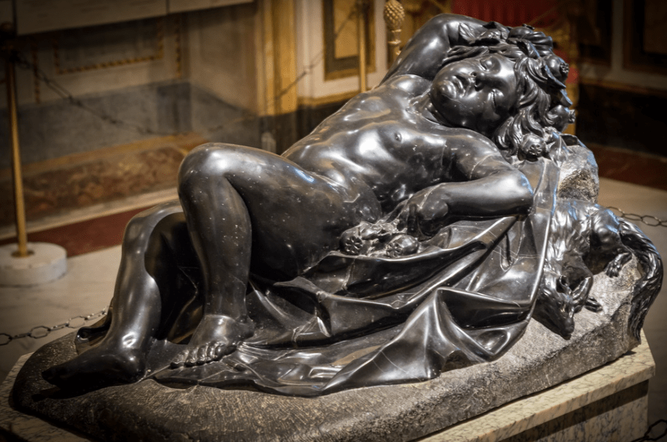
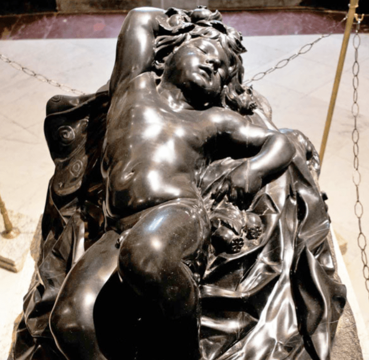
Alessandro Algardi, Sleep, 1635-6. Museo Borghese, Rome.

Yes, you’re right, this is not a sculpture by Michelangelo. Nor is it, for that matter, ‘Love’. You might have realised that already from the photograph – or for that matter, simply by reading the caption. But I do love this work – and after Bernini’s flashy showpieces on the ground floor of the Museo Borghese I love the calm of this glowing gem which you can find upstairs: Algardi may have been outranked, but he was never outclassed. As I can’t show you Michelangelo’s lost ‘Love’ (for the simple reason that it’s lost), I’m showing you the Algardi instead. However, I wanted to tell you about the renaissance equivalent today, as I won’t feature it in my talk on Monday, 12 September (Michelangelo 2: The Sculptures). There are enough sculptures I can show you without taking time for things we can no longer see. After that, weeks three and four of the series Almost All of Michelangelo will look at The Works on Paper and The Architecture – click on those links or check out the diary for more information. And if you missed the first talk, don’t worry – each one is effectively a free-standing entity. Meanwhile, back to Michelangelo, albeit Michelangelo via Algardi. Look first, think later.

This is, in a way, one of my secret pleasures, something I always look forward to seeing, especially as it is something I see relatively rarely. The Museo Borghese in Rome is a hugely frustrating place, you have to book in advance and even then you only get a two hour slot. At one point you had to check in to the ground floor, check out again, and then check into the first floor, but I think they gave up on that complication fairly early on. When I take groups I find I can spend all two hours on the ground floor looking at the Canova, the Berninis and the Caravaggios: five sculptures and five paintings are more than enough for one visit. But if I can get upstairs (where most of the paintings are) then I will make sure I catch at least a glimpse of this sleeping marvel. However, I will rarely say anything about it, short of ‘look at that – isn’t that wonderful’, which, despite my usual verbosity, should be all that anything really needs. What do I like about it? The richness of the colour, the perfection of the forms, their apparent softness (yes, it’s hard stone) and the roundness of most elements, which adds to the sense of repose created by the total relaxation of this child, helplessly abandoned to a deep sleep.

The child is lying on a sloping ground. The latter is differentiated from the rest of the stone by its rough, unpolished surface, created by small, regular chisel marks which make the black stone look grey. Spread over the ground is a cloth, which, like the infant, is highly polished, the sharper, more angular folds of the fabric contrasting with the rounder forms of the body. The child’s left knee is raised, the sole of the foot resting flat on the ground, with the right foot stretched further out. The left arm, slightly bent, lies by its side, resting on some rounded forms, while the right arm is wrapped around its head – you can just see the right hand resting on top of the hair at the far right. The shoulders are turned slightly towards us, and the chubby face lolls, allowing us to see it from this angle – which is presumably why almost every photograph I can find of the sculpture is taken from this side. As ever, with sculpture, this is so frustrating: it is a three-dimensional art form, this is only a partial view! The eyes are closed, and the mouth downturned – looking a little grumpy, perhaps, but really showing the release of sleep. There is also a creature with a long bushy tail curled up on the rough ground (rather than on the cloth), presumably also fast asleep.

This is not a great photograph, I know, but it is one of very few that does not show the ‘predominant viewpoint’ seen above. It’s surprising there are not more, as this side reveals some new information, and helps us to understand what is going on. This is a boy, for one thing, and he has wings, although they look more like butterfly wings than the usual feathered forms you expect to see on amoretti and angels alike. The subtle twist through the body is more evident from this point of view, with the shoulders turned a little to our right, the knees to our left, a movement that is indeed a common feature of works by Michelangelo. However, there is none of the tension inherent in his output, and the cloth lying on the ground is more fulsome, maybe even more generous – look at the rich, unnecessary folds going down the right side in this photograph. It has all the sensuality of the Baroque – which it is, of course, being by Algardi –  and a dramatic naturalism (at least, I think that if sleep can be dramatic, this is how it would look), which is what separates it from the contrived etiolation of Mannerism.

Without a close up – again, the best that I can find – it is hard to see what the rounded forms under the winged boy’s hand are – but they also form a garland around his head. Even here I suspect it’s not obvious, unless you are an avid, and slightly imaginative, gardener. They are the seed pods of a poppy, the source of opium, and a symbol of Sleep. The butterfly wings, too, belong to this pint-sized personification, as, unlike Cupid’s flapping bird wings, which presumably would wake you up, these would flutter noiselessly as you drift away. The small creature we saw before is a dormouse (I would never have recognised it) – just think of Alice’s Adventures in Wonderland and you’ll realise they have always symbolised sleep, because they really do sleep for up to seven months a year. The choice of a black material is, of course, not coincidental, as most sleep takes place at night.

The sculpture was carved in what is called Belgian black marble, although it is not, truly speaking, marble (a metamorphic rock, transformed by high temperature and huge pressure), but a very fine-grained carboniferous limestone – a sedimentary rock. It was commissioned in 1635 by Marcantonio Borghese, nephew and heir of Cardinal Scipio Borghese who had built a phenomenal collection of ‘ancient’ and ‘modern’ art, and who had died just two years before. We don’t know why, exactly, Marcantonio wanted a personification of Sleep, but it was an image derived from antique prototypes which were popular not only in classical times but also in the 16th and 17th Centuries. Here is another embodiment of a similar idea, and another of my ‘secret pleasures’.

Well, not so much a secret, as a treat I look forward to seeing on the way to talk about something else – usually, in this case, the portraits by Raphael or the ceiling paintings of Pietro da Cortona in the Galleria Palatina in the Palazzo Pitti in Florence. It is Caravaggio’s Sleeping Cupid, painted while he was in Malta in 1608. Photography doesn’t always cope well with Caravaggio’s chiaroscuro, and here, if anything, the image is lighter than when the painting is seen in the flesh, when it appears more subtle and evocative, at the same time as allowing the boy greater dignity: the shadows function as a loin cloth, and grant him a deeper repose. He rests on a plank on the stone floor, bow and arrow by his side, his head resting on his quiver. The left wing lies on the ground, the right is just traced across the darkness of the background, both framing the figure and protecting it. Like Algardi’s Sleep, his left arm lies beside him, although the right does not curl round his head. Again there is a Michelangelesque twist through the body, although going the other way – the knees fall towards us, the shoulders are flatter to the floor. But there is still the utter calm of undisturbed slumber.

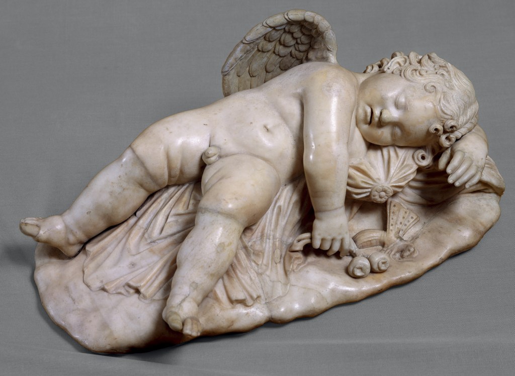
This is one of the classical prototypes, a Sleeping Cupid in the Uffizi dating from the 2nd Century CE. The idea goes back (as so many Roman ideas do) to the Greeks, and there is a wonderful Greek bronze Sleeping Eros, which was restored by the Romans, in the Met in New York – click on that link if you’d like to see photos, and read a very detailed analysis. I’m showing you this one because it was once – like most things in the Uffizi – part of the Medici collection, and so could easily have been known to Michelangelo. More of that in a moment. Like Algardi’s Sleep, this little chap (he’s only 69 cm long) lies on a cloth on the ground holding poppy seed-heads. This is definitely cupid, though – look at the wings – although there is a butterfly (perhaps not the most naturalistic) lying next to the poppies. His legs are spread, and flat out, while his right arm falls over his chest onto the floor. His left arm curves round his head, and holds onto some sort of bag or cushion to make himself more comfortable.

The Ancient Greek for ‘butterfly’ is Ψυχή – or ‘Psyche’ – which also means ‘soul’, while poppies, as well as referring to sleep, can also imply death, the sleep from which we do not wake. Sad as it is, one of the reasons why this particular genre of sculpture was popular in classical times was its suitability as a marker for the graves of dead children. This was not the motivation behind Algardi’s Sleep, though. Instead it was, like many other of the ‘modern’ sculptures in the Borghese collection, made ‘in competition’ with the classical prototypes – an idea which had been essential for the development of the Renaissance a good two centuries before Algardi turned up in Rome from his native Bologna. Sometimes, though, the admiration and emulation which inspired great art could descend into forgery, with even the greatest falling foul to temptation.

As I discussed last Monday when talking about Michelangelo’s paintings, the young genius was an apprentice in the workshop of painter Domenico Ghirlandaio from the age of 12, in 1487, until he was about 15. Then, from roughly 1490-92, he seems to have studied informally at the Medici sculpture garden. Nobody is really sure how it worked, or who taught him to carve, but I’ll talk a bit more about it on Monday anyway. What is certain is that the garden was home to some of the Medici collection of classical sculpture, potentially including the Sleeping Cupid in the Uffizi (above), and another example, in bigio morato (a different type of black limestone), which might be the ‘cupido nero’ which was a gift to Lorenzo the Magnificent from the King of Naples. After Lorenzo’s death in 1492, and just before the Medici were exiled in 1494, Michelangelo fled – the first of several times he did this – heading first to Venice and then back to Bologna, where he carved a number of figures on the Arca of St Dominic (see 159 – Michelangelo, holding a candle). On his return to Florence in the autumn of 1495 he worked for Lorenzo di Pierfrancesco de’ Medici, who was from a different branch of the family to the previous (unofficial) rulers. It was then that Michelangelo carved his own Sleeping Cupid in emulation of the antique. Vasari mentions it the first edition of his Lives in 1550, and in his biography, three years later, Condivi gives us more information, describing it as ‘a god of love, aged six or seven years old and asleep’. Lorenzo di Pierfrancesco approved, and also suggested to Michelangelo that he if he sold it in Rome as an antique, he would get a better price than if it was marketed as his own work. Indeed, a dealer managed to sell it to Cardinal Raffaele Riario, one of the nephews of Pope Sixtus IV, for 200 ducats – although he told Michelangelo that he’d got 30, which is what a ‘modern’ sculpture might have fetched. However, Riario found out it was modern and sent for the young upstart who had deceived him. The Cardinal returned the Cupid to the dealer, but commissioned another work from Michelangelo – which he then also rejected (more of that on Monday, too). In later life Michelangelo claimed that Riario had never bothered to commission anything from him, covering his back, no doubt, for the double rejection.

So what happened to the Cupid? It went back on the market, and initially Isabella d’Este, Marchioness of Mantua, showed an interest in it – until she found out that it was modern. At this point nobody really knew who Michelangelo was. It’s not clear what happened to it next, but somehow it ended up in Urbino, where it was seized by Cesare Borgia (son of the Pope) when he sacked the city. In 1502 he gave it to none other than Isabella d’Este, who, by this time, would probably have heard of the young sculptor who had carved a Bacchus and a Pietà in Rome. She exhibited it alongside a genuine, classical cupid (with an unlikely attribution to Praxiteles) which she acquired a few years later. Both remained in the Gonzaga Collection in Mantua until the 17th Century, when the family’s fortunes had waned, and much of the remains of their collection were sold to King Charles I of England. There are references to it in inventories of the Royal Collection, and even, potentially, a drawing, but sadly it seems that the sculpture could well have been destroyed along with almost all of the Palace of Whitehall in the fire of 1698. But what did it look like? Condivi’s description gives us few clues, nor do any of the descriptions in the Gonazaga or Royal Collection inventories – apart from the fact that, unlike other versions (Isabella’s classical Cupid, for example) it was not lying on a lion skin. However, we might get an idea from a painting in the National Gallery.

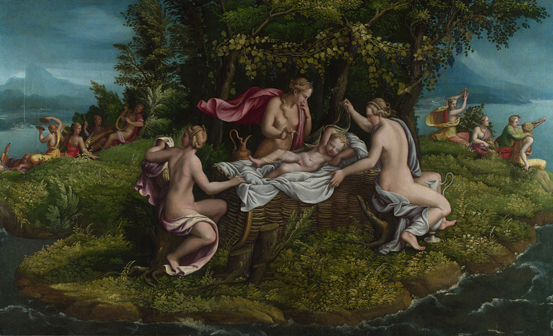
Workshop of Giulio Romano The Infancy of Jupiter mid 1530s Oil on wood, 106.4 x 175.5 cm Bought, 1859 NG624 https://www.nationalgallery.org.uk/paintings/NG624

This is The Infancy of Jupiter from the workshop of Giulio Romano, painted in the mid-1530s. Giulio, you may remember from the recent Raphael exhibition, was probably the great master’s ablest associate, and ran what remained of the workshop after his death. However, with the Sack of Rome in 1527 he fled the Eternal City and headed north, where he did great work for the Gonzaga family, effectively taking over from Mantegna as Court Artist (at 21 years remove). The painting shows the infant Jupiter, who was saved from the fate of his siblings by his mother, Ops. His father, Saturn, did not want to be overthrown, so had eaten his other children at birth. When Jupiter was born, Ops gave Saturn a stone to eat in place of her new-born, and placed the baby in the care of the Corybantes. This was a good choice, it seems, as they were a holy heavy metal group, dancers dedicated to the Goddess Cybele, who played loud music and clashing cymbals to cover the sound of the baby crying (see far left and right) so that Saturn would not discover him.

Jupiter lies on a white sheet in a wickerwork cradle, his legs apart, with his his left arm lying by his side, and the right arm wrapped around his head. The legs are not dissimilar to those of the classical Cupid from the Uffizi, whereas the arms are more similar to Algardi’s Sleep (which is actually the same arrangement as in the Medici bigio morato Cupid).  It is assumed that Giulio’s model was none other than Michelangelo’s fake, which he would have seen as part of the Gonzaga collection. There is a version of it in Corsham Court in Wiltshire – go and have a look if any of you are in the area: I can’t find a good photograph of it. Some people have suggested that it is indeed Michelangelo’s original, but very few have ever been convinced. We’ll just have to imagine a small figure in white marble with legs like the first of following, and arms like the second… and then console ourselves for its loss by enjoying the multitude of Michelangelo’s surviving sculptures which I will talk about on Monday.

168 – Michelangelo: Leaning back, looking forward

Michelangelo, Jonah, c. 1511-12. Sistine Chapel, Vatican City.

I’m just about to start a new series of lectures, Almost All of Michelangelo, and we kick off this Monday 5 September with The Paintings. Unlike my previous online talks, these will be two hour sessions, and will last from 5.30-7.30pm – with a ten minute gap in the middle. So far only this and the second talk, The Sculptures (Monday 12 September) are on sale, but the following two (The Works on Paper and The Architecture) will be released after the talk on Monday evening. As ever, for other in-person and online talks, not to mention overseas tours, please check out the diary. Today, as an introduction (as if any were needed) to the work of this extraordinary genius, I want to talk about my favourite figure in the Sistine Chapel. It’s a hard choice, given that there are so many, and, if I’m honest, I keep changing my mind anyway. But here we go.

This is Jonah. Like the other prophets and sibyls his name is painted on a plaque underneath his feet (as we will see when I show you another detail), but unlike the others, there is enough narrative detail here that we don’t actually need the label. More of that later. He sits on an imposing stone throne, which here, perhaps more than in the other examples, looks profoundly uncomfortable. A massive slab of stone forms the seat, with two square, cylindrical ‘legs’ stretching down to the footrest – not that his feet reach that far. Precisely how these ‘legs’ are attached to the seat is not clear, as they are covered by some red/green drapery, presumably a shot silk, which, together with some folds of his white loin cloth, is the only padding between prophet and stone. Another featureless slab of stone forms the back of the throne, with two ‘arms’ made of square columns, into each of which have been carved a pair of putti. Jonah leans back, away from us and to our left, while looking up to our right and pointing down in the opposite direction. He is looking up towards God, no doubt, and pointing to some aspect of his story, but precisely which aspect is not defined. As well as the loin cloth, short enough to reveal the full length of his legs, he wears a tight, pale bodice clinging to the underlying anatomy. Emerging from this is an undershirt – although what we can see of it is remarkably untidy.  As the closest part of his body to us, the legs benefit from Michelangelo’s full attention, with precise details of musculature and skeletal structure clearly defined subcutaneously thanks to the fall of light from top right to bottom left. Leaning back as he is, his feet do not reach the ‘ground’ – his right foot hovers above it, while the toe of the left, which is slightly less flexed, almost touches the marble footrest. This proximity is also conveyed by the shadow, visible close to the left foot, below and a little to our left. The shadow of the right foot is further from its origin, and only the toe of the shadow lands on the horizontal surface.

The two figures who are not Jonah are presumably agents of God – angels – involved in the miraculous events of the prophet’s narrative, which of course involve an enormous fish. Everyone thinks it was a whale, but no, that was Pinocchio. This is what it says in Jonah 1:17,

Now the Lord had prepared a great fish to swallow up Jonah. And Jonah was in the belly of the fish three days and three nights.

So yes, it is a great fish, although it is still in some way symbolic, as, however big, I can’t quite believe that you could get all of Jonah inside it. Of course, if it were big enough, there would be no space for Jonah on the throne. More than one angler has identified the fish as an Atlantic tarpon, while also wondering how the artist could possibly have seen one – but as I’m not a fish person, I’ll just give you links to the articles posted in 2012 and 2015 and leave you to think about it. What is clearer is that, at the end of the story, Jonah is sitting in the shade of a gourd tree, and we can see that growing up over his left shoulder. And the story itself? Well, there are only four chapters, so why not read it here? Or, short story shorter, Jonah was sent, by God, to tell the people of Nineveh that they were bad, and that He would kill them. Jonah didn’t want to do this, so ran away on a ship, so God sent a storm. Jonah told the sailors to throw him overboard, as it must be his fault. They didn’t want to, but when they couldn’t get the ship to shore, decided that this was, in fact, their best option – at which point God sent the fish. At the end of verse nine of chapter two Jonah states, ‘Salvation is of the Lord’ (remember the idea of Salvation), and this is followed by,

And the LORD spake unto the fish, and it vomited out Jonah upon the dry land.

If we are at this stage of the story, it is hardly surprising that his clothes are in disarray… but there is more. He goes to Nineveh finally, preaches to the people, and they repent. God does not kill them. For some reason this really angers Jonah, and he storms out of the city and sulks, sitting in the shade of a tent and waiting for the city to be destroyed. God causes a gourd tree to grow up and shade Jonah further, ‘So Jonah was exceedingly glad of the gourd’ (Jonah 4:6)– until the next day (4:7):

But God prepared a worm when the morning rose the next day, and it smote the gourd that it withered.  

By this stage Jonah had really lost the will to live. God just chides him gently, saying (roughly speaking) ‘You seem to be more concerned about the gourd than the people of Nineveh. I made the gourd, and I can make another. I also made all the people of Nineveh, so don’t you think I can do what I like and show mercy to whom I please?’ At which point the story ends. But what is the point of the story in the context of the chapel? Well, we’ll come back to that when we’ve seen where Jonah sits.

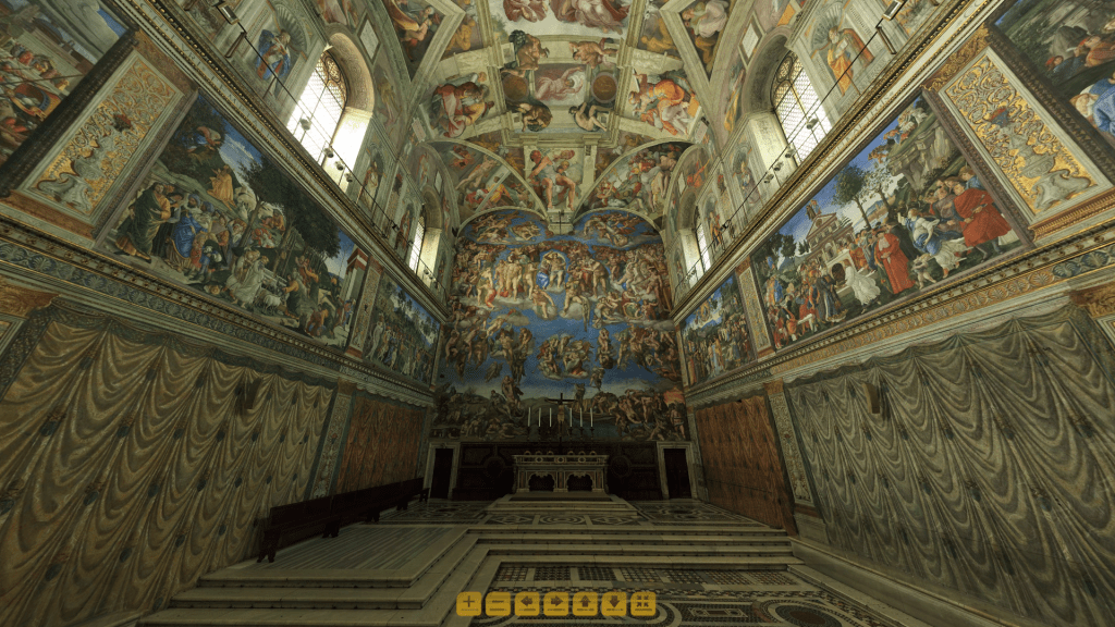
He is in the most prominent position, dead centre, above the altar, not far above Christ at the Last Judgement (which wasn’t there, of course, when he was painted – but more about that on Monday). Like his fellow prophets and sibyls he sits on the curving section of the vault, a transition between walls and ceiling. If we were to enter through the Ecclesiastical West Door (geographically it’s actually the other way round, but never mind), he would be one of the first things we saw. However, tourists enter through the door at the bottom right of the Last Judgement. Suspiciously this is directly underneath the depiction of the mouth of hell – are the directors of the Vatican Museums trying to tell us something? It is as if we, unlike the other damned, are escaping everlasting torment only to endure the purgatory that visits to the Sistine tend to be these days. And what are the little yellow squares at the bottom of this image? Well, it comes from my new favourite website, a high-resolution virtual model of the whole chapel hosted by the Vatican itself. Click on the link, and I’ll see you in a couple of months when you’ve finished looking round.

The four corners of the chapel are filled by four fan-shaped areas often called pendentives, like the triangular units which help support a circular dome above a square space beneath. The stories depicted here are important to understand the relevance of Jonah in this prime position. To our left we see the Crucifixion of Haman, from the Book of Esther (ten chapters…). Haman had secretly plotted to have all the Jews killed. Esther was both Jewish, and Queen, and went to her husband Ahasuerus (the King) to tell him about the plot, even though no one – not even his wife – was admitted to his presence without his express permission. However, he pointed towards her, thus granting her the right to speak (and also to live). Michelangelo has imagined him reclining in bed on the right of the pendentive. Eventually Esther, Haman and the King dine together – the scene in the background on the left – and Esther reveals the plot, which leads to Haman’s execution on the gallows he had previously prepared for Mordecai, Esther’s adoptive father. Now, Haman was hung on the gallows, not crucified, as Michelangelo shows here (in the most tortured foreshortening), but Michelangelo knew his Dante, and Dante said that Haman was crucified. It is the story of Esther which is celebrated by Jews during the feast of Purim. For early Christian theologians, though, Esther was seen as the ‘type’ of Mary. The word ‘type’ comes from printing – the typeface letter ‘M’ will print an ‘M’ on the page, for example – and Esther is the ‘type’ of Mary as she is the idea periods which models the realisation: both are virtuous women whose action results in the salvation of their people. This symbolism was used throughout the medieval and renaissance and well beyond. In this particular instance it is worthwhile remembering that the Sistine Chapel was actually dedicated to the Mary, and specifically to the Assumption of the Virgin, and so this story is especially important. At the other end of the chapel we find Judith and Holofernes, who, like Esther, saves her people through her actions – she is another type of the Virgin.

The story in the other pendentive is perhaps more familiar. It comes from the Book of Numbers, Chapter 21: 4-9. The people of Israel were travelling from Egypt towards the promised land, and were complaining about the lack of food and water. God sent a plague of serpents to punish them, they realised their mistake, asked Moses to intervene, and God told Moses what to do – make a serpent of brass. You can see it erected on a pole in the middle of the image. Numbers 21:9 says,

And Moses made a serpent of brass, and put it upon a pole, and it came to pass, that if a serpent had bitten any man, when he beheld the serpent of brass, he lived.

In the same way that Esther was the type of Mary, the Brazen Serpent (as it became known) was the type of Jesus on the Cross. It even says as much in the bible.  According to John 3:14-15, Jesus himself said,

And as Moses lifted up the serpent in the wilderness, even so must the Son of man be lifted up:
That whosoever believeth in him should not perish, but have eternal life.

Salvation is relevant to the story of Esther, to the story of Moses and the Brazen serpent, and to the story of Jonah. According to Matthew 12:40 Jesus said

For as Jonah was three days and three nights in the whale’s belly; so shall the Son of man be three days and three nights in the heart of the earth.

So the story of Jonah and the whale (yes, it does say whale) is the type of the death and resurrection of Jesus, which is precisely why Michelangelo has given it such an important position in the chapel, directly above the altar. It could even be that, rather than leaning back, Jonah is in the process of sitting up, a physical action expressive of resurrection, having been ‘vomited… upon the dry land’. In terms of his position in the chapel, he is looking up towards God the Father dividing night and day on the ceiling, and appears to be pointing down to the forgiving Ahasuerus – so we have death, resurrection and forgiveness, night and day. This is just as well, as you would be hard pressed to find an image of the Crucifixion in the Sistine Chapel. Rather oddly it is hidden away in the background of one of the scenes on the walls, visible through the one of the windows in Cosimo Rosselli’s Last Supper at the far end of the chapel. Michelangelo uses this figure of Jonah leaning back to look forward to the Crucifixion, to Christ’s death and resurrection, thus making it symbolically more present. However, this theological complexity doesn’t really go all the way towards explaining why he is my favourite figure.

It is, quite simply, the technical brilliance of it all. To unify the ceiling and its many disparate elements Michelangelo has created an underlying architectonic structure. There are seven prophets and five sibyls all seated on these enormous, unforgiving thrones, one at either end, and five atop each wall. Sitting on the arms of the thrones along the sides of the chapel are the twenty ignudi, ten pairs of naked men. You can just see bits of them in this detail, but there is no space for them above Jonah’s throne, as the others are in the way. Behind the ignudi are pilaster strips which link one side of the chapel to the other, and also frame the old testament stories on the ceiling. But just above Jonah’s throne is a detail that is very often missed, partly because it is so plain. Above the cornice which goes round the top of the throne and ties the whole ceiling together – just as, by Michelangelo’s design, there is a cornice that is continuous around the tops of the walls inside St Peter’s – there is a thin strip of pale blue. It is the sky, seen through the ceiling of the Sistine Chapel. You can only see it here, and at the other end of the ceiling, because elsewhere there are pictures in the way – the stories of the creation and fall. The prophets and sibyls are sat where they are to console us. They are intermediaries, letting us know, whatever is painted above them on the ceiling, that, thanks to what is painted below them on the walls, we, at the very bottom of the chapel, will be redeemed.

The continuous cornice implies that the walls of the chapel end above the heads of the prophets and sibyls, and that their thrones are the vertical continuation of those walls. We can buy into that illusion because they appear to be flat in front of our eyes, because this is the part of the vault which curves from vertical to horizontal. As we look up they are effectively on a curving diagonal at right angles to our direction of vision: we could equally well be looking at right angles to the vertical wall. But what that means for Jonah is that he is leaning back on a piece of vaulting which is actually curving forward – and as a feat of foreshortening this is unparalleled. I think Condivi, who wrote his biography of Michelangelo in 1553, put it better. When praising the prophets and sibyls he said,

But marvellous beyond all of them is the Prophet Jonah, placed at the head of the vault. This is for the reason that against the plane of this vault and through the power of light and shadow, the torso, which is foreshortened to recede inwards, is in the part which is nearer to the eye, and the legs which project forwards are in the part farther away. A stupendous work , and one which makes clear how much knowledge this man had of principles and the use of line in creating foreshortenings and perspectives.

Not only that – but Jonah is a true giant, but one so far away that you can’t possibly measure how big he really is. Gianluigi Collalucci can help us. He was a paintings conservator most famed for his work on the Sistine Chapel between 1980 and 1994. This is photograph of him next to Jonah. Enough said. Just as well, you say, but sadly I won’t have time to go into every figure with this much detail on Monday!

167 – Looking back, moving on

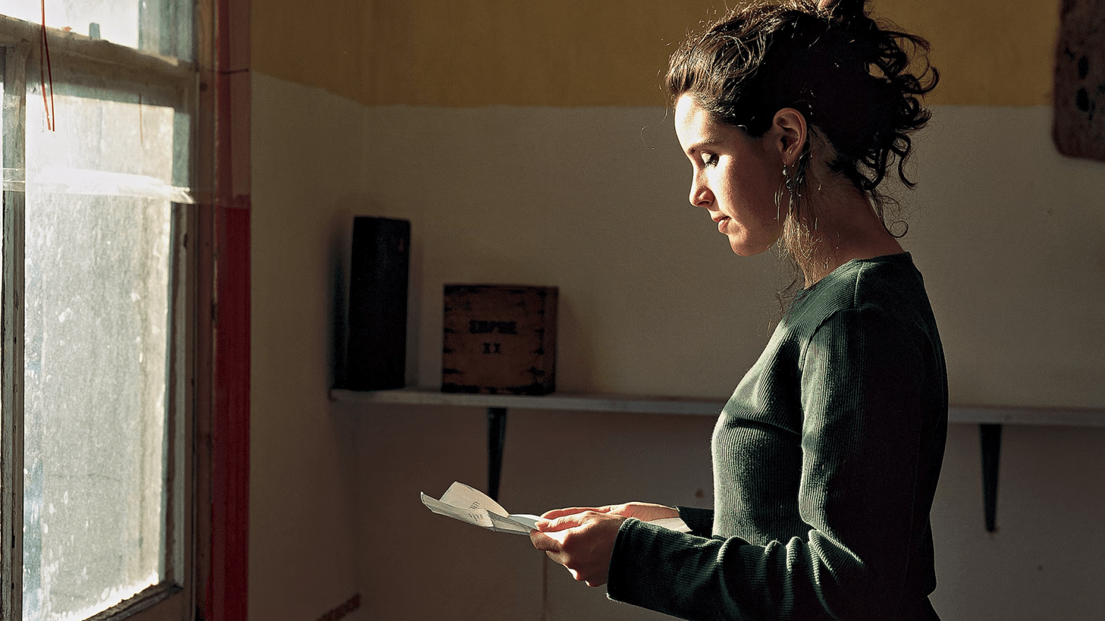
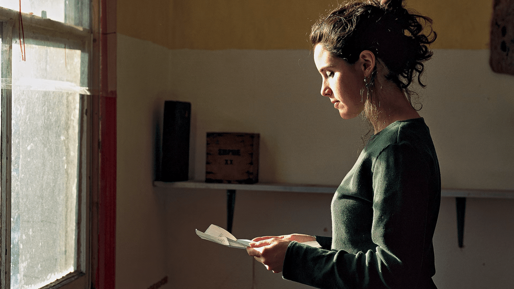
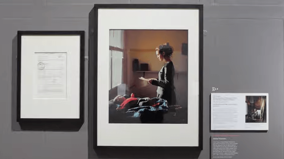
Tom Hunter, Woman Reading a Possession Order, 1997. Victoria and Albert Museum, London.

I don’t think I’ve written about a photograph before (correct me if I’m wrong), but this one is rather beautiful, and featured in the Dulwich Picture Gallery’s exhibition Reframed: The Woman in the Window to which I will be returning this Monday, 29 September to finish my talk from a few weeks back. It turned out that there is just too much there to talk about in one session. The exhibition is a rich and endlessly rewarding investigation of a ubiquitous motif, and this week I will be focussing on the photographic and ‘modern’ works which are on display. The following week I will start my four-part series Almost All of Michelangelo – as ever, each part will be an independent talk, so you don’t have to sign up for all four! You can find details on the diary page, together with information about two in-person talks for Art History Abroad at the National Gallery on 23 September and 20 October. And for anyone who missed my series on sculpture, I am condensing it into two 90-minute online talks for the Watts Gallery at 11am on 5 and 12 September – again, details are in the diary. But today, a photograph from the collection of the Victoria and Albert Museum which I have seen not only in the current exhibition at the Dulwich Picture Gallery but previously at the National Gallery and the Gemäldegalerie Alte Meister in Dresden: you’ll see why very quickly. I did talk about it briefly in Part 1 of Women Seeing… but I’ve learnt a lot more about it since.

A woman stands in a shabby room looking down at a piece of folded paper held between her hands. In front of her is a dirty sash window, which sheds light on her, and on a baby lying on a blue cloth on a table in the foreground of the photograph. This table would block our access to her if we were physically present. Under the blue cloth is what appears to be a rug, rucked up like the broad folds of the blue cloth. The baby, wearing blue trousers and a red top with matching socks, lies on its back with its arms spread out. The top of its head is brilliantly illuminated, the light also catching its right cheek, which tells us that its gaze is turned, deliberately or by chance, towards the woman, who is, by implication, its mother. The walls of the room are painted off-white at the bottom, and a dull orangey-yellow above. The join is at the level of the cross-bar of the sash window. If the woman were to lift her head from the paper, it would be at her eye-level. Two brackets support a simple shelf, which is attached to the back wall with three undefined objects resting on it, two at the left, and one, almost ‘off screen’, at the right. There appear to be nails in the wall, and something, possible a picture, hanging to the far right.

I find the quality of the light really beautiful – it creates an atmosphere of profound calm. A surprising number of people used to doubt photography’s status as art, and perhaps some still do, their attitude based on the misunderstanding that it is ‘merely reproduction’ and that ‘anyone can do it’. But then anyone can paint with oils on canvas. However, in this case, I think the way in which the model has been posed to catch a very specific fall of light is just one of the aspects of the work which reveal Tom Hunter’s artistry. Notice how the light falls directly onto the model’s face and hands, which, as a result, are the brightest elements here, meaning that we focus on them. It falls tangentially across the paper, ensuring that the paper stsand out, but does not pull focus from the hands and face. The dull green top also catches direct light, though interrupted in places by the window frame, and models the form from a light, olive green on the left to deep shadow, almost black, on the right, where it is crisply defined against the off-white wall. I find the model’s expression indefinable. She is deep in thought, undoubtedly, but whether this is good news or bad does not yet appear to have sunk in. Having said that, we are told by the title of the photograph: Woman Reading a Possession Order. This is how the work is currently exhibited in the Dulwich Picture Gallery:

To the far left is a post card by Oscar Kokoschka entitled Woman at a Window, made for the Wiener Werkstätte in 1908. Like our photograph it is on loan from the Victoria and Albert Museum. On the far right is Gerrit Dou’s A Woman Playing a Clavichord, from about 1665, in Dulwich’s own collection. Each has a white label, whereas our piece has three additional elements associated with it: a white label, which also has an image on it; a grey panel (‘Another Perspective’ on the work, written by a perceptive student from a local school); and a mounted and framed piece of paper. This is the last of these:

It would appear to be the very possession order of the title, the paper which the woman is holding in the photograph. However, there are no visible folds. Initially I thought that it must have been ironed, but I went back to Dulwich yesterday to catch the exhibition one last time – and get some better photographs of some of the works for Monday’s talk – which meant I could check the label: this turns out to be a photocopy of the original. Nevertheless, it reveals that what we are looking at in the photograph is not a fiction. The paper is inscribed in (photocopied) pen at the top ‘ORIGINAL SUMMONS’ and bears three official stamps, one of which is dated 17 JAN 1997. The text starts,

IN THE HIGH COURT OF JUSTICE

THE QUEEN’S BENCH DIVISION

IN THE MATTER OF LAND AND PREMISES KNOWN AS 8, LONDON LANE, LONDON E8 AND IN THE MATTER OF 0. 113 RSC

BETWEEN:

THE MAYOR AND BURGESSES OF
THE LONDON BOROUGH OF HACKNEY

and

PERSONS UNKNOWN

There is more, of course, but I’ll leave it there, as we have got to the title of a series of photographs Tom Hunter took in 1997: Persons Unknown. Curiously, as I headed out to Dulwich yesterday there was a man outside my local pub, which, since I arrived here twenty years ago has closed three times and only re-opened twice. For the last three of four years it has been a squat. The man was affixing an equivalent possession order to the door of the pub, similarly addressed to ‘Persons Unknown’.  At the time Tom Hunter took his photograph he was in his last year at the Royal College of Art, and living in a squat in Hackney – 8, London Lane, as specified above – when he, together with the other squatters, were sent a summons for a hearing at which the Mayor and Burgesses would put forward their claim for re-possession of the premises. They were being evicted, and Hunter made this event the subject of his work, using his fellow squatters as his models. I don’t know what your experience of, or feelings about squatting are, but there is a rather lovely video on the Dulwich Picture Gallery’s website with a discussion between Hunter and his model, dancer Filipa Pereira-Stubbs, about their memories of the squat, what they thought they were giving to the community, and of the photo shoot. You can find it via this link on YouTube. She was 27 at the time, and 25 years later she still has the same poise and beauty. And, of course, her daughter Saskia is now more-or-less the age that she was when this photo was taken. From the whole sequence of portraits, both of individuals and groups, this particular image won the John Kobal Photographic Portrait award in 1998, and has been widely exhibited since. But why has it been shown in the galleries I mentioned? If you haven’t recognised it already, the answer is given by the image on the white label next to this work in the exhibition, which you can see (just about) in the photo above.

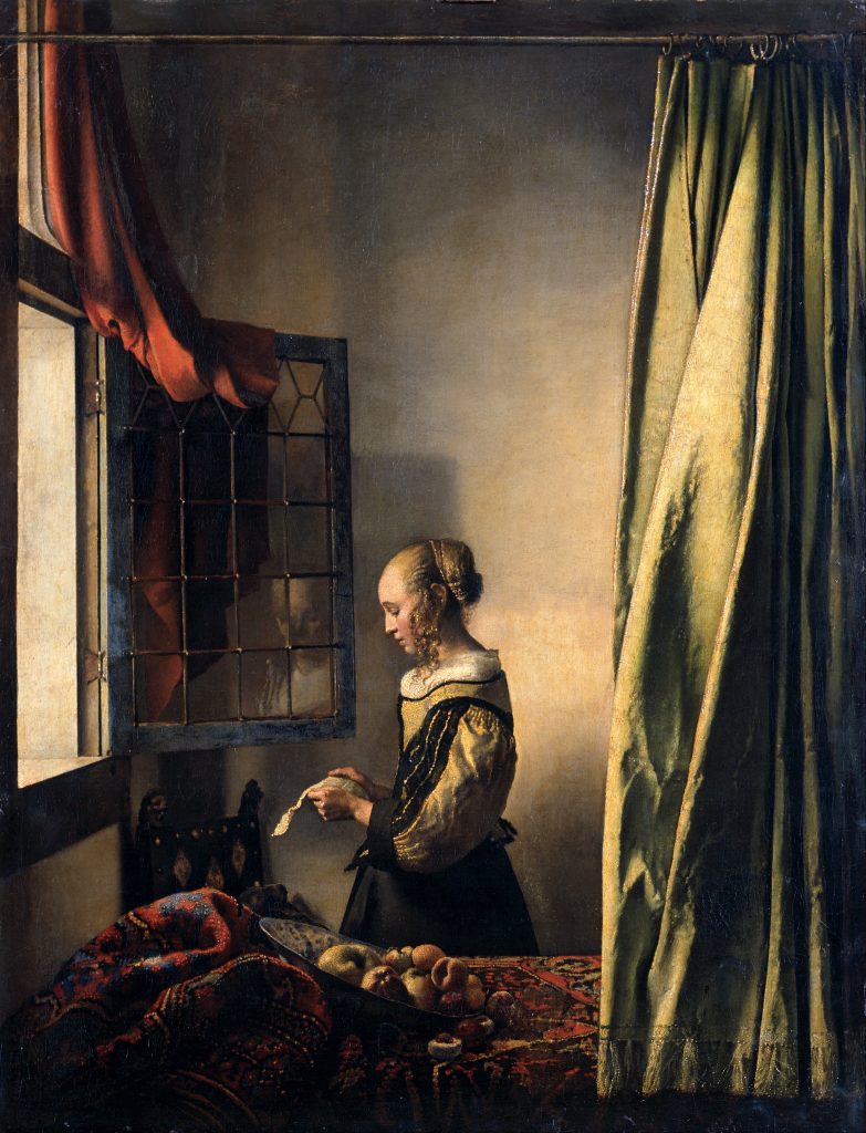
This is Vermeer’s Girl Reading a Letter at an Open Window (1657-9), from the collection of the Dresden Gemäldegalerie. This particular version is the one that Hunter and Pereira would have known in 1997. He gave her a book of Vermeer’s paintings to choose which one they would interpret, and this was the one she went for. He was then incredibly rigorous, insisting that they get the exact pose – the tilt of the head, the precise level of the hands – and so on. In the original, the table which blocks our access has a rumpled carpet, but no baby, although there is a bowl of fruit: a different symbol of fertility. For Vermeer there is a curtain, but no real change in colour on the walls – although there does appear to be a darker patch above and behind the woman’s head, at the level of her eye line. Vermeer’s window is open, Pereira’s closed. Both are assessing the news, with Pereira deciding what to do next. For this reason, perhaps, there is a greater focus on the figure, with less space given over to the blank wall. However, let’s look back to the exhibition in Dulwich.

Even on this small scale, you may notice that the Vermeer as illustrated does not appear to be the same as the reproduction I have shown you. An X-ray of the painting taken in 1979 showed that the dark patch on the wall was covering another image. It was believed back then that Vermeer himself had painted over it. However, when they started to clean the Vermeer just four or five years ago, the conservator involved soon noticed that the paint in this dark patch was responding very differently to that on the rest of the surface. A tiny sample of the paint (which you would only ever take from a part of the painting that was already cracked, in case you were worried) was examined in cross-section. This revealed that the painting had been varnished, and a substantial layer of dirt had built up on top of the varnish, before the image was then painted over. This implies that Vermeer himself had not done it. Indeed, it was probably done after the original painting had got quite dirty: the colour of the wall for the overpainting was matched to the dirty paint of the original section of the wall. When it was subsequently cleaned, the original colour would have been revealed on the original bit of wall, but not on the overpaint, hence the dark patch. An international conference of Vermeer experts and conservators then made the incredibly brave decision to remove the overpaint (the original varnish was acting as a safety net!), and this is what they found:

As they knew from the 1979 X-ray, an entire painting of Cupid had been covered over. It’s not entirely clear when this was done, but probably in the first half of the 18th Century, just before the painting was acquired for the Dresden collection. The presence of the little god of love suggests that the woman is reading a love letter. Her lover is in all probability far away – in the ‘outside world’, hence the open window. It is this restored version that is illustrated on the label, and comes with a suggestion in the catalogue that the baby in the photograph is effectively the result of Cupid’s action. This is not inaccurate, even if it is not what Hunter or Pereira would have known or been influenced by.

The photograph of the Vermeer above shows how the painting is currently exhibited – I am very grateful to Mark Haimann for tracking it down for me. The bottom of the curtain hangs just above the picture frame, suggesting it is not meant to be in the room with the woman, but hanging in front of the painting itself – a trompe l’oeil game implying that Vermeer was good enough to trick us into pulling it back further to see more of the hidden image. I am also interested in what the painting looks like without the frame.

Look at the very bottom right corner of the painting: a rounded shape tells us that there was originally going to be a large Dutch glass, known as a roemer, standing on a shelf in the foreground, out of proportion with everything in the painting. You might just be able to see the ghostly outline of the rest of the glass through the curtain above the base. The implication would have been that the roemer was in our space, on a shelf in front of the painting, which might originally have been set into a perspective box. Vermeer changed his mind, though, and replaced it with the curtain. In the 17th Century paintings in the Netherlands (and elsewhere) were often protected by curtains like this, hanging, it would seem, from rails attached to the frame (just like this one pretends to be). When painted, as well as showing us Vermeer’s skill, it also tells us how learned he was: it is a reference to a story Pliny told about a competition between two artists. Parrhasius, who won the competition, painted a curtain which his rival Zeuxis tried to pull back to reveal a painting – not realising that the curtain was the painting. Having tricked a fellow painter, Parrhasius must surely have been the better artist. All this is coincidental when considering Hunter and Pereira’s beautiful – and, I think, meaningful – collaboration. But it is because Vermeer was such a great artist, who showed an interest in the life of his community, that Hunter chose him – and that Pereira chose this particular image – to be reinterpreted. And, of course, it is precisely because I get easily side-tracked like this that I am giving a second talk, Women Looking 2… on Monday!

166 – From C- to Sea

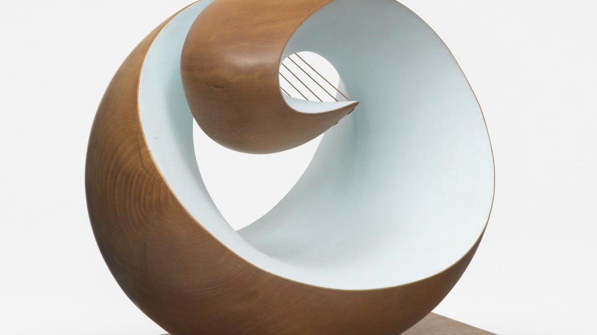
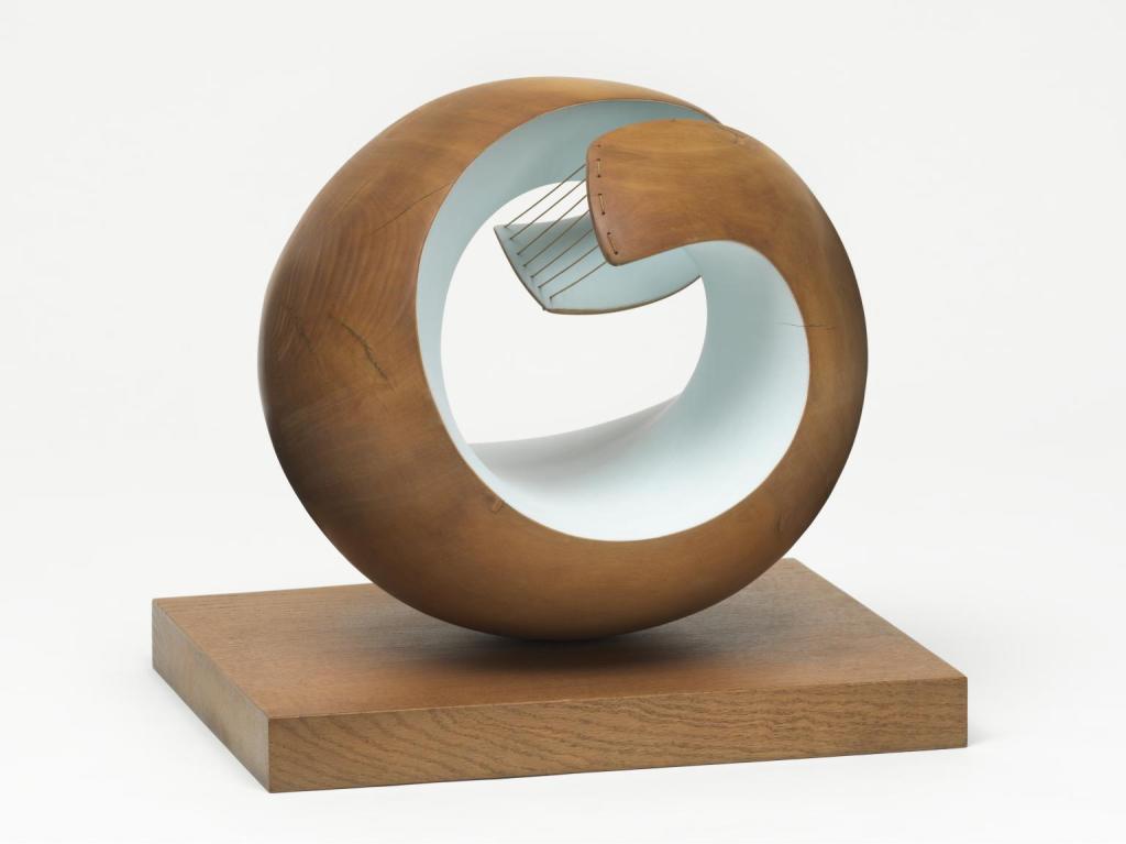
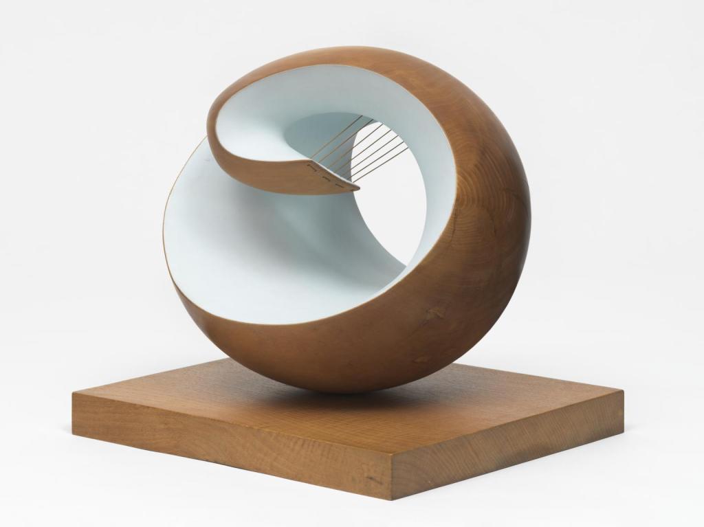
Barbara Hepworth, Pelagos, 1946. Tate.

As so often, things have turned out to be more complicated than I expected – and that refers not just to today’s post, but also to what, exactly, I’m going to be doing in September. This much is settled: on Monday 22 August I will be giving a talk entitled Negative Spaces 3: Barbara Hepworth, as an introduction to the work of one of Britain’s greatest sculptors, and in parallel with the superb, touring exhibition Life and Work which is currently at the Scottish National Gallery of Modern Art in Edinburgh. The following week, I will return to the Dulwich Picture Gallery, with Women Looking 2… Then, as I’m not sure what September holds, and I’m not sure how much travelling and seeing I’ll be able to do, I am going to revive a 4-part course I did for the National Gallery a while back. This will be different to my usual Monday talks, as each one will last 2 hours: for the four Mondays in September, (starting on the fifth) I aim to talk about Almost All of Michelangelo. You can find links to book for each individual talk on the diary page… But for today, I would like to look at one of my favourite Hepworth sculptures, and maybe untangle the strings that tie her to Naum Gabo, the subject of last week’s post.

Pelagos 1946 Dame Barbara Hepworth 1903-1975 Presented by the artist 1964 http://www.tate.org.uk/art/work/T00699

I’d like to start by taking you on a walk around the sculpture, without telling you anything about it, apart from what I see. Admittedly this is led by what I already know is there, but I’ll try to keep my observations to the purely visual. The title, Pelagos, is in the heading above, but I will tell you that Pelagos is one of the Greek words for ‘sea’: this might influence your own interpretation of what we are looking at, which I would strongly encourage. In some ways I want to try and approximate the possibilities of ‘slow looking’ – and at each stage you might want to consider what images or ideas – if any – the sculpture evokes for you. Starting, almost at random, from this particular viewpoint (above), we can see a hollowed out form, which is more-or-less spherical, sitting on top of a rectangular wooden base. As it happens, it is ovoid, but we’d probably need to measure it, or move around (as we shall), to make this clear. Like the base this ovoid is carved from wood, which is left visible on the exterior, while the interior is painted a light colour – white, or bluish-grey. There are two projections, or arms, which curve around, with squarish, but rounded ends. They are joined together seven times by a string which is threaded through holes in the two ‘tongues’.

Pelagos 1946 Dame Barbara Hepworth 1903-1975 Presented by the artist 1964 http://www.tate.org.uk/art/work/T00699

Moving to our right – anti-clockwise around the sculpture – it is perhaps more obvious that the arms are carved out of a single form, but presumably have a gap between them. Seen square on to the long side of the base, the arms reach the same distance across the central void. The exterior of the ovoid is polished, but not highly: it has a matte sheen.

Pelagos 1946 Dame Barbara Hepworth 1903-1975 Presented by the artist 1964 http://www.tate.org.uk/art/work/T00699

The arm which is further back here is far more curved than the other, which is why it appeared lower down in the previous image. The grain of the wood and its sheen are more evident here.

Pelagos 1946 Dame Barbara Hepworth 1903-1975 Presented by the artist 1964 http://www.tate.org.uk/art/work/T00699

Seen flat on to one of the short sides of the base, it is clearer that the two arms are curling round and in, and the distance between the two – which is not that great – becomes more obvious. What I described as the ‘lower’ arm is also the ‘upper one’, the result of its greater curvature – the other arm is far more ‘open’, or less curved. The long diagonal formed by the light interior – from top left to bottom right here – implies that the right side of the sculpture (seen from this point of view) appears more open. At the top, between the arms, the paint looks to be pale blue, whereas below and to the right it looks lighter: this is presumably the effect of the shadow higher up.

Pelagos 1946 Dame Barbara Hepworth 1903-1975 Presented by the artist 1964 http://www.tate.org.uk/art/work/T00699

This side of the sculpture is indeed more open, and the painted interior forms a backdrop to the wood of more convoluted arm. The smooth curves of the interior overlap to create a point: remember this in relationship to the drawing which I will show you below.

Pelagos 1946 Dame Barbara Hepworth 1903-1975 Presented by the artist 1964 http://www.tate.org.uk/art/work/T00699

Seen flat on to the second long side of the base, the negative space created by the two arms takes on its full value, and could be seen as being held in place by the arms. The more open one is hardly visible here, although the strings indicate its position. The more convoluted arm defines three concentric loops – the wooden exterior, the border between the wood and the paint, and the negative space within the paint. It has to be said that Hepworth herself might not have been too keen on these particular photographs – placing the sculpture against a plain, white background takes away the value of the space: something should be seen through every hole. She frequently photographed her sculptures – even the wooden ones – in her garden, thus giving them a place in the world and in our appreciation of it. I’ll leave the last two images for you to describe for yourselves.

Pelagos 1946 Dame Barbara Hepworth 1903-1975 Presented by the artist 1964 http://www.tate.org.uk/art/work/T00699

More about the physicality of the sculpture: the materials are given, both on the Tate website and in Eleanor Clayton’s superb book Barbara Hepworth: Art & Life (which accompanies the exhibition) as ‘Elm and strings on oak base’. There is no mention of the paint, even though a work from more-or-less the same period, Wave, is described as being made of ‘wood, paint and string’. The paint was originally pale blue, which presumably relates to the title, Pelagos, or ‘Sea’. However, Hepworth often had problems with blue paint, as it often faded. In the end she decided that the matte quality of the paint was more important than the colour, contrasting as it did with the sheen of the wood. At one point the interior was even repainted white. Eleanor Clayton, who is also the curator of the exhibition, tells us, when speaking of Wave, that, ‘The strings are fishing line, connecting materially with the sea and the human community whose livelihoods are bound up with this elemental force’. Given that our sculpture is also called ‘sea’ – albeit in Greek – I am sure that fishing line was used again. It is undoubtedly relevant that Hepworth was living in Cornwall, and near to the coast, at the time the sculpture was made. She described the view from her studio, ‘looking straight towards the horizon of the sea and enfolded (but with always the escape for the eye straight out to the Atlantic) by the arms of the land to the left and right of me’ – which makes Pelagos look less like an abstract sculpture than an accurate description of the landscape. Indeed, Hepworth description was completed with the phrase, ‘I have used this idea in Pelagos’.

In addition to this landscape-inspired interpretation of the sculpture, a statement written for a retrospective exhibition of her work in 1954 – eight years after Pelagos was made – includes Hepworth’s summation of three different ‘types’ of sculpture which had long been important to her. Of these, the third was,

… ‘the closed form’, such as the oval, spherical or pierced form (sometimes incorporating colour) which translates for me the association of meaning of gesture in landscape; in the repose of say a mother & child, or the feeling of the embrace of living things, either in nature or in the human spirit.

So, as well as being an image of the landscape, it is also an expression of the relationship between people. Perhaps the two arms of the sculpture could be seen as two arms reaching around a central space, embracing a void – like the gap that parents feel when children leave them. Look back at the pictures above – there is one I find particularly reminiscent of a ‘mother & child’, and I’d be interested to hear if you see that too. But where do the strings fit into this? Well, we all have invisible ties to people and places. Hepworth herself stated that they represent ‘the tension I felt between myself and the sea, the wind or the hills,’ but, like everything else, they are open to more than one interpretation, and refer to more than one ‘tension’. It is all, in some way, related to our experience here on Earth. For this very reason, the base is important. It is not a subsidiary element, but an essential part of the sculpture – the ovoid form, the arms, the strings – everything is seen in relationship to this flat rectangle, everything is part of a specific environment.  

And what of the question hanging over from last week? What is the relationship to the work of Russian Constructivist Naum Gabo? Well, it’s simply the string really. As I said last week, Gabo arrived in London in 1935, and moved to Carbis Bay in Cornwall shortly after his friends Barbara Hepworth and her husband Ben Nicholson moved there in 1939. It was at that point that he started using nylon thread in his sculptures. The first was Linear Construction No. 1 of 1942-3. I included an illustration last week, but here it is again for good measure.

Linear Construction No. 1 1942-3 Naum Gabo 1890-1977 Presented by Miss Madge Pulsford 1958 http://www.tate.org.uk/art/work/T00191

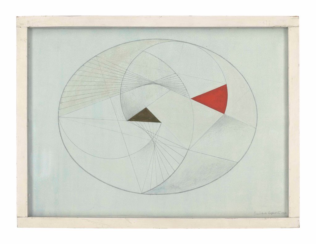
There are several versions and variants of this piece, all of which seem to have more or less the same date. It is called ‘linear’ construction, because of the straight lines made by the nylon filament. Seen together, these become tangents to a virtual curved line. In the 1930s Hepworth and Nicholson became active members of the European avant garde, and became particularly associated with the Constructivist movement. In 1937 the book Circle: International Survey of Constructivist Art was published in London. Its editors were none other than Naum Gabo and Ben Nicholson, together with architect Leslie Martin, while Hepworth designed the layout, as well as being responsible for the production of the book and writing one of the essays. At the time her sculptures had names like Three Forms (1935), Ball, Plane and Hole (1936) and Pierced Hemisphere (1937) – entirely abstract titles. On moving to Carbis Bay in 1939 things started to change. In part, this was the result of the war – materials were not readily available, and she was left with full responsibility for looking after her four children, leaving precious little time to work – and precious little material to work with. When she could grab a moment she would draw. Here, for example, is Oval Form No. 2, from 1942:

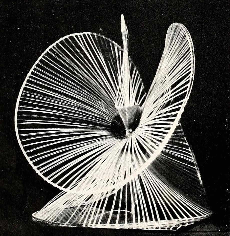
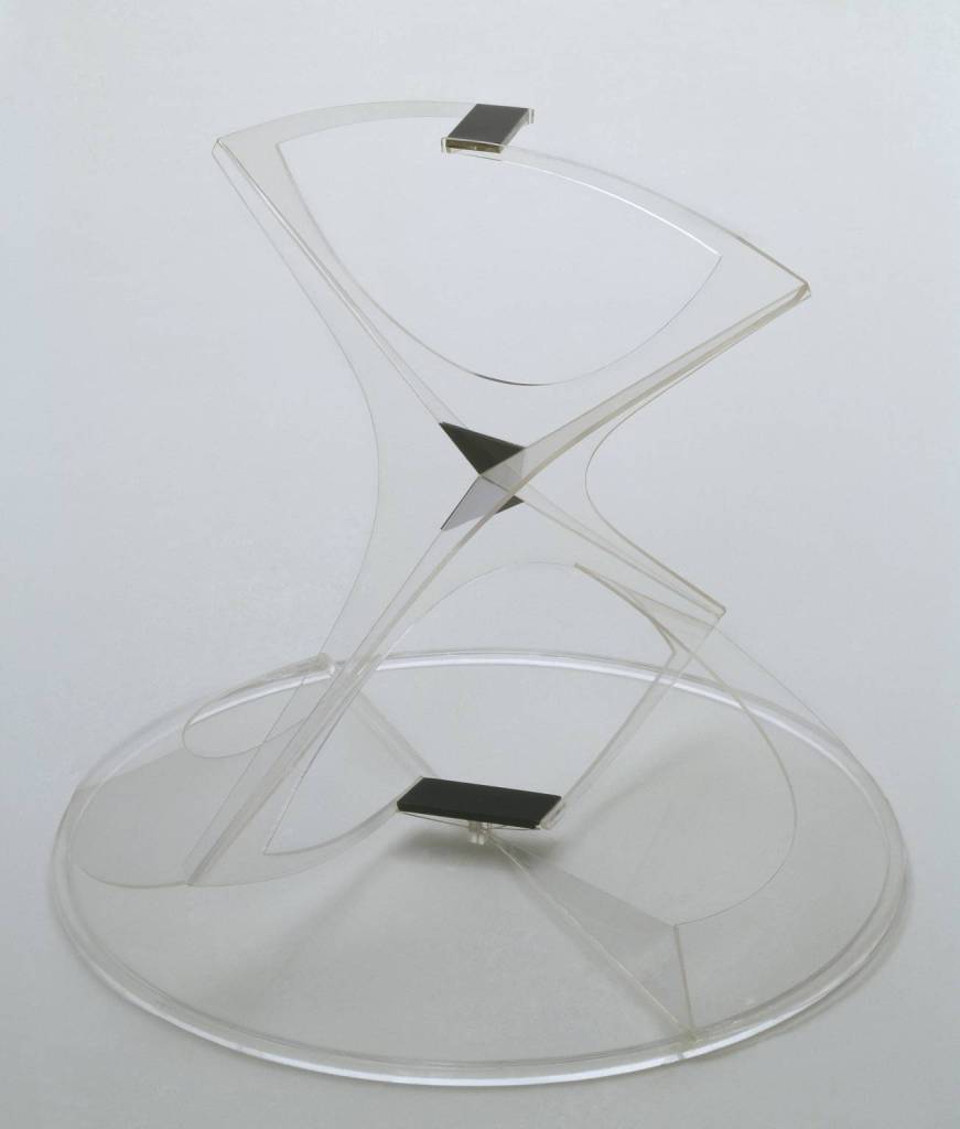
Many of the drawings executed at this time were titled Drawing for Sculpture. These were not plans for sculptures as such, but explorations of the possibilities of three dimensional forms. I have chosen this example because it considers the inner geometry of an oval, as many of them do. If you look back, you’ll see that some of the overlapping curves in this drawing are not unlike some of the views of Pelagos above. Notice how, in a Constructivist way, she builds the drawings from separate lines and geometric shapes. Notice too, that two of the curves are constructed from overlapping straight lines. There is every possibility that this work precedes Gabo’s sculpture (the drawing is dated 1942, Linear Construction No. 1 is 1942-3), rather than being inspired by it. As it happens, there are plenty of drawings from 1941 using similar ideas. And anyway, Hepworth used string for the first time in a piece called Sculpture with Colour (Deep Blue and Red), which she completed in 1940. So maybe it is not Gabo influencing Hepworth, but the other way round? However, I should show you two other works, both by Gabo: Sphere Construction of a Fountain and Construction in Space (Crystal), dated 1937 and 1937-9 respectively.

The former, as far as I am aware, has not survived, while the latter is just about holding on in the Tate collection. Gabo used new materials, not all of which have stood the test of time. Cellulose acetate in particular – from which these two were made – is not as stable as was initially believed. Both use threads of some form. Gabo had also incised lines into his plastics. He didn’t start using nylon thread until 1939, perhaps, but ‘lines’ had been an element of his work for some time before this. What we are seeing is a shared idea, a common interest, a new way of defining space through line, and, as in one of the interpretations of Pelagos, the fact that both Hepworth and Gabo used ‘string’ of one form or another is as much an indicator of their artistic relationship as anything else. However, it is also an indicator of the differences between them. Hepworth was profoundly affected by living in Cornwall, and, having been an avid Constructivist in London, in 1946 she wrote to her friend Margaret Gardiner, ‘I hope my work will always be constructive but I don’t want to be called a “c-ist” any more than “Nicholson”’. By the time she was fully settled into Cornwall, the titles of her works changed: Wave (1943-4), Landscape Sculpture (1944) and Pelagos (1946) are just three examples. Her art was always part and parcel of her lived experience – hence the title of Eleanor Clayton’s book and exhibition – and that applies to the works with abstract titles as well as those with more lyrical, picturesque names. And there are plenty more! On Monday I’m planning to talk about several which are not in the Edinburgh exhibition, hence my comment in the first paragraph that my talk is ‘in parallel’ with the exhibition, rather than an introduction to it, as other talks in this series have been… just so you’re warned!

165 – Sculpture Ban

Naum Gabo, Revolving Torsion, Fountain, 1972-3. Tate, on loan to St Thomas’ Hospital, London.

OK, I’m not suggesting that art has been censored here, but as a fantastic embodiment of Naum Gabo’s art, his Revolving Torsion, Fountain, on long term loan from Tate to St Thomas’ Hospital, has probably been switched off in line with the hosepipe bans which are (or should be) in place by now, given the imminent, if not current, drought. It is, after all, a fountain, and as much as fountains are highly decorative, they are also a profligate use of water. Having said that, when I have walked over Westminster Bridge and past St Thomas’, the fountain has only sometimes been working, but I don’t know if there is any rhyme or reason for this. I want to look at it today only partly because I am interested in the use of water as a sculptural medium, but also because its ethos is related to the work of Barbara Hepworth, the subject of my next talk (Monday 22 August at 6pm). The following week I will return to Dulwich Picture Gallery’s exhibition, The Woman in the Window, for the cut-price part 2 of my introduction Women Looking… I’m also looking forward to more talks ‘in person’ at the National Gallery for Art History Abroad. They will introduce the Winslow Homer and Lucien Freud exhibitions, on 23 September and 20 October respectively, and you can read more about those on the diary page of my website. I will repeat these talks online for those who aren’t free on those dates, or can’t make it to London, and will let you know the dates as soon as they are fixed. Sadly I can no long go on the trip to Porto this year, but AHA will be announcing next year’s tour schedule soon.

So just what is it about this fountain that is relevant to Barbara Hepworth? Before we can answer that, it would help to look at Gabo’s work, so that we know what we are talking about. Resting on a circular base is a geometric, stainless steel framework defined by straight and curvilinear elements. Numerous jets of water issue from the inner curves of the form, projecting both into and out of the sculptural structure. These jets create lines in space, a bit like a three-dimensional drawing, and they break into individual droplets, an impressionistic spray. The concave unit which faces towards us in this photograph is made up of three identical elements, almost triangular, but with the same segment of a circle cut out of each, which are welded together along the straight edges. There are more units exactly the same which go together to form a fourth projecting axis at the back of the framework. At the top the two projecting elements – flared, and looking a little like arrow heads – are braced by a slim, curving piece which you might just be able to see has a kink in it. There is a similar brace at right-angles to this one going across the bottom of the form. The framework is supported by two elements which spiral up from the circular base: the nearest lower projection is held up by one which comes in from the bottom left, and the back lower projection is supported by a unit which starts just behind the front centre (from this point of view) and slopes up to the right of the base. Of course, the best way to see this framework would be to walk around it, but it would take a lot to get you all there. However, I can help by showing you a photograph of a sculpture Gabo made some 35-40 years early, which is also part of Tate’s collection:Torsion, from 1928-36.

Torsion 1928-36 Naum Gabo 1890-1977 Presented by the artist 1977 http://www.tate.org.uk/art/work/T02146

Made out of plastics (polymethyl methacrylate and cellulose acetate, according to Tate’s website), the sculpture espouses Gabo’s belief in using modern materials for a modern age. As most of the materials are transparent, it allows us to see the whole form, without the sculpture itself getting in the way, with the reflection and refraction of light – off and through the transparent form – turning the edges of the piece into a three-dimensional drawing, just like the jets of water in the fountain. The form of the sculpture is essentially the same as that of the fountain, with four of the cut-out triangular elements stuck together, creating four of the arrow-head projections. In this work we can see that the kink in the slim braces at the top and bottom are made of rectangular elements – opaque black here – and that, like the braces, the two black rectangles are at 90˚ to one another. The sculpture – and fountain – use a form of  symmetry regularly adopted by Gabo. For me, the best way to explain it is to ask you to touch the tips of your fingers and thumbs together so that your hands form a broad, curving dome, then twist one hand a bit towards you and the other a bit away. You could then put them together so that they meet between thumb and forefinger – but don’t. This is the symmetry: a mirror image with a 90 degree rotation. It sounds rather mathematical – and it is. The beauty of the geometry, and its mapping of space, is exactly what Gabo wanted. As he said in his Realistic Manifesto in 1920, ‘we construct our work as the universe constructs its own, as the engineer constructs his bridges, as the mathematician his formula of the orbits’.

Head No. 2 1916, enlarged version 1964 Naum Gabo 1890-1977 Purchased 1972 http://www.tate.org.uk/art/work/T01520

In 1916 he had made his Head No. 2 from cardboard, but this version (like everything else today, in the Tate collection) is an enlargement of the original, made in 1964 from cor-ten steel. The shape and volume of the head are mapped out by the edges of two-dimensional planar elements. The fact that it is put together – rather than carved or modelled – was also an innovation: Gabo was one of the first ‘Constructivists’, putting their works together, as the name suggests, from separate elements. He published the Realistic Manifesto with his brother, Antoine Pevsner (Gabo had changed his name to avoid confusion), and as part of it they established five ‘fundamental principals’. In the fourth they stated, ‘We renounce in sculpture, the mass as a sculptural element… we take four planes and we construct with them the same volume as of four tons of mass’. The volume that Head No. 2 occupies is not defined by the solid mass of, say, marble or bronze, but by the planes from which it is constructed. It was the definition of space which really interested them. They had already covered this in their third principal: ‘We renounce volume as a pictorial and plastic form of space; one cannot measure Space in volumes as one cannot measure liquid in yards: look at our space. . . what is it if not one continuous depth?’ Admittedly, with Head No. 2 the depth is not continuous – the planes of cardboard (1916) or steel (1964) get in the way. Not so with the plastic of Torsion, where the transparency allows you to see the continuous space, and to appreciate fully the volume which the piece occupies.

Linear Construction No. 1 1942-3 Naum Gabo 1890-1977 Presented by Miss Madge Pulsford 1958 http://www.tate.org.uk/art/work/T00191

This can also be seen in Tate’s Linear Construction No. 1 of 1942-3. Made from the same colourless transparent plastic as Torsion (polymethyl methacrylate), it also utilises nylon thread, and embodies Herbert Read’s statement that Gabo’s work hovered ‘between the visible and the invisible’. Gabo was born Naum Pevsner in Briansk, Russia in 1890. Staring in 1910 he studied medicine, and then natural sciences, and then engineering in Munich, where he met fellow-Russian Wassily Kandinsky and was intrigued by the possibilities of abstract art: he started making his constructions in 1915. He returned to Russia after the Revolution in 1917 in the hope that they would welcome his revolutionary art, but inevitably this was not to be. He left for Berlin in 1922 and a decade later headed to Paris, then on to London in 1935. Among other artists, he got to know Barbara Hepworth and her second husband Ben Nicholson, following them to Cornwall in 1939, thus escaping the capital as the nation was on the brink of war. The year after the allied victory Gabo left for the States, which is where he died in 1977. It was shortly after his arrival in Carbis Bay – very close to the more artistically ‘famous’ St Ives – that he started using nylon thread, the straight lines defining curves in space in a similar way to the definition of space itself by the edges of the planes in Head No. 2.

When looking back to Revolving Torsion, Fountain all of these ideas coalesce: the construction of a sculpture from separate elements; the definition of its volume by the edges of these elements; an appreciation of the continuity of space through, in, and around the sculpture; the jets of water creating their own, complex and changing lines as the wind, weather, and water pressure also change, in many ways equivalent to the nylon threads. And yes, the water pressure does – or should – change. From a still photograph you wouldn’t be able to tell, but the title gives a clue: this is not a static piece. Unlike Torsion, the plastic embodiment of this form from 1928-36, this is Revolving Torsion, and it does – or should – revolve a full 360˚every ten minutes. At the same time the pressure of the water – and so the projection of the jets – decreases to a minimum and returns to full every 10 minutes, two cycles of change which are synchronised.

Torsion (Project for a Fountain) 1960-4 Naum Gabo 1890-1977 Presented by the artist through the American Federation of Arts 1969 http://www.tate.org.uk/art/work/T01171

The project for a fountain went back to the 1960s. As yet another of its remarkable collection of Gabo’s works, Tate also holds Torsion (Project for a Fountain), 1960-4. Again, the precise forms of the sculpture are far clearer here than in the photograph of the fountain, which is helpful. In 1968, four years after this maquette was completed, the then director of The Tate Gallery (as it was originally called) Sir Norman Reid, visited Gabo in his studio in the States. Gabo told him about the project, and showed him this model. Long story short: Reid made it happen. Alistair MacAlpine, since the age of 21 a director of the engineering and construction firm Sir Robert McAlpine and Sons (founded by his great-grandfather) had by this time reached the grand old age of 26. He agreed to cover all of the costs. The firm drew up detailed plans, the fountain was constructed by Stainless Metalcraft Ltd between 1972-73, and on completion McAlpine gifted it to The Tate Gallery. Two years later it was installed in its present position outside St Thomas’ Hospital, where, since 2016, it has rejoiced in its new status as a Grade II listed building.

Back in 1920 the Realistic Manifesto had proclaimed:

We say . . .
Space and time are re-born to us today.
Space and time are the only forms on which life is built and hence art must be constructed.

In 1905 Einstein had published two articles on the Theory of Special Relativity. One of the things this theory tells us is that time is a fourth dimension. Artists tried to include the fourth dimension in many ways, just as the Renaissance had developed perspective to show the third. Kinetic sculptures – sculptures which move – were just one of these strategies.

Kinetic Construction (Standing Wave) 1919-20, replica 1985 Naum Gabo 1890-1977 Presented by the artist through the American Federation of Arts 1966 http://www.tate.org.uk/art/work/T00827

Gabo had introduced movement, and therefore time, with his sculpture Kinetic Construction (Standing Wave) of 1919-20, just before the publication of the Realistic Manifesto itself (this photograph is of a replica from 1985). It is made from a steel rod – a solid, straight line. It is only its motion, created by a motor in the base, which makes it look curved, and almost transparent. It would be another fifty years before an equally eloquent statement of Gabo’s radical ideas would be realised with the creation of this magnificent fountain.  It may seem sadly inappropriate now, during a time of drought, but let’s hope it won’t last long… However, none of this answers my earlier question: what relevance does this have for Hepworth? Well, you’ll have to read next week’s blog… or come to the talk on Monday, 22 August!

164 – Nude, with clothes…

Glyn Philpot, A Student with a Book, 1920. Ömer Koç Collection.

Glyn Philpot is one of those artists who should never have been forgotten. There’s a long discussion in ‘The History of Art’ which asks who the last ‘Old Master’ was – but of course it’s a question which has no answer. There is also a long discussion about whether the term ‘Old Master’ really has any validity nowadays. However, you could just conceivably argue that one answer to the first question would actually be ‘Glyn Philpot’. There is certainly no doubt that for the two thirds of his career he was consciously working in the tradition of the Old Masters. Not only did he have the most brilliant technique, but he also had a superb understanding of their work – as today’s painting demonstrates. The current exhibition at the Pallant House Gallery in Chichester – the first retrospective of his work in 38 years – is a brilliant introduction to the artist and his career, and I’m looking forward to talking about it this Monday, 8 August at 6pm, as part of my series Looking in Different Ways, in a talk entitled Looking at Men. Two weeks later, and still part of that series, there will be an introduction to the Scottish National Gallery of Modern Art’s comprehensive exhibition Barbara Hepworth, which fits into my subseries Negative Spaces. I thought talks for the summer would end there, but there was so much material in the Dulwich Picture Gallery exhibition Reframed: The Woman in the Window, I ran out of time last week, and decided to do a cut-price sequel, Women Looking 2 – which will be on Monday 29 August at 6pm. All of these exhibitions are accompanied by superb books, rather than a ‘traditional’ catalogue. Chichester has published a monograph on Glyn Philpot – the first in 71 years – written by the curator of the exhibition, Simon Martin, who is also the director of the Pallant House Gallery – none of which is a coincidence. I can recommend it very highly – although it came out after I’d published a list of The best recent exhibition catalogues with Shepherd, a new book sales website, which might interest you.

Today’s painting was exhibited in 1920 under the title A Student with a Book next to another, The Rice Family. The student looks similar in appearance and dress to Mr and Mrs Rice’s son Bernard, and so it has long been assumed that he was the model for this work. The family had recently arrived in England from Austria: Bernard was born in 1900 in Innsbruck, and had studied drawing, painting and wood engraving even before arriving in London. The family had been interned in Austria during the First World War, and, according to the exhibition label for this painting, ‘Philpot found them accommodation in London and helped Rice to secure a place at Westminster School of Art’. Bernard went on to study at the Royal Academy Schools, but didn’t hang around: in 1922 he left for Yugoslavia, and continued to travel for much of his life, not dying until 1998.

Rice sits on a plain wooden table with a large book held open on his lap between the thumb and forefinger of each hand. Visible on the right hand page – the one which has more visual prominence when leafing through – is a monochrome image, presumably a black and white engraving. But then the painting as a whole is more-or-less monochrome, moving through a palette of ivory, creams and browns to black, with nothing quite as bright as high white, or even as dark as the deepest black. It is the palette you would associate with the late works of Leonardo, Rembrandt or Caravaggio, although the clarity of depiction is closer to the earlier, but mature phase, of the third of these. The sitter looks over his left shoulder, creating a strong twist through the body, given that his legs are angled to our left, and his head to our right. He doesn’t appear to be looking at anything, though, but remains deep in thought, maybe contemplating what he had been looking at in the book, or planning something, or maybe even musing on the past – we are not told: this, I think, is part of the allure of the work for me.

At the back right corner of the table is a still life arrangement of rectangular objects: a cuboid box with a lid and a book with a pale cover on which rests a thin, cream-coloured booklet. There is a pencil just in front of the objects, and a piece of paper tucked under the book – together with the book Rice is holding, these can be seen as some of the tools of a student artist. Formally they are also an abstraction of Rice himself – the box is equivalent to his torso, while the booklet resting on the pale book is not unlike the larger open book resting on the student’s lap. As well as echoing Rice’s form, these details also close off the composition, making sure that our eyes don’t follow his gaze. By placing the sitter’s head in the centre of the painting Philpot creates a strong pyramidal composition – a typical construction of the Renaissance and Baroque.

Philpot was a keen observer of fashion, and interested in details of clothing of any sort. The attention he pays to the turned-back left cuff of Rice’s shirt is typical, as is the precise delineation of the folds of the thin cotton of the sleeves. You should see Siegfried Sassoon’s collar in another portrait! The artist was also keenly aware of human anatomy – particularly male anatomy – but apart from his own personal interest in the subject, this was also something he’d learnt from another artist. If you look at the very specific inflection of the right wrist, which is maybe slightly exaggerated, you may recognise the major influence on this painting. But then, if you can work out what the illustration in the book represents, the inspiration is made explicit.

It’s one of Michelangelo’s Ignudi, the naked men who sit atop the imagined continuation of the walls of the Sistine Chapel and frame the outer edges of the ceiling. As nudes they must be in a state of grace (Adam and Eve only started wearing clothes after the fall), and I’ve always assumed they are Michelangelo’s representation of angels. Philpot – and the student Bernard Rice – would both have been interested in the work of the great Renaissance master, but maybe, as curator Simon Martin suggests on the exhibition label, it was also ‘a covert expression of [Philpot’s] interest in the male nude’. Even if this is the case, does that say anything about Bernard Rice? To be honest, it doesn’t really have to, given that this is not a portrait, but a character study, and doesn’t seem to have left Philpot’s possession during his lifetime. However, as Martin points out in the book, this particular ignudo also appears in the background of the Portrait of Montague Rendall, Headmaster of Winchester College – admittedly in an incredibly shadowy form.

The painting to our left of Rendall is far clearer – the prophet Daniel, also from the Sistine, who just happens to be seated above the head of our ignudo, if on the other side of the chapel (which is not far…). Given that Rendall was, presumably, a far more ‘public’ figure than Rice, it seems surprising to me that Philpot might risk expressing his own personal interests in the male form – strictly illegal if acted upon, of course – in this portrait. This in itself might explain why the representation of the ignudo is so unclear. But why choose it in the first place? There are plenty of bold, female figures to choose from: the five Sybils who alternate with the prophets, for example. It would help to know more about Rendall – or Rice, for that matter – and I’m afraid I’m still writing these posts on an extremely ad hoc basis, gradually building up endless possibilities for future research. However, I have tracked down what I believe to be an entry from the Oxford Dictionary of National Biography, which was included on a web entry of imprecise nature. Here are just a few details. Having been awarded a first class degree in Classics at Cambridge in 1887, two years later Rendall ‘…made the first of many journeys abroad to study the masterpieces of continental art, and laid the foundations of his lifelong enthusiasm for medieval and Renaissance Italian painting. In the same year he was appointed to the staff of Winchester College.’ This could, of course, explain everything. A ‘lifelong enthusiasm for… Renaissance Italian painting’ would more than justify the inclusion of two details from the Sistine Chapel. However, the biography also makes reference to ‘his sensitive taste’, and states that he was ‘Almost resolutely unmarried’. I could be wrong to focus in on these phrases, but, as far as I’m aware, sensitivity was not a quality greatly prized in men outside of the 18th and 21st centuries, and for many years, when sexual acts between men were illegal (and for a couple of decades after they weren’t) the term ‘confirmed bachelor’ in obituaries would have been interpreted by anyone even slightly in the know as a euphemism for ‘homosexual’. It’s not as if Philpot’s own tastes were unknown. He was a member of the Official War Artists Scheme during the First World War, when he asked if could paint soldiers bathing – as Michelangelo had intended to – but his request was denied. ‘I will bet anything that Philpot suggested it because it gave him the opportunity of painting the nude,’ according to one official. There are other references in Rendall’s biography which I find intriguing, but my reasons for choosing them could all too easily be misinterpreted by the ill-disposed. Of course, I could be imagining things. It could simply be a love of the work of Michelangelo that Philpot shared with Rendall… but why include the ignudo in the first place, and then go on to disguise it? And why choose Daniel, rather than any other prophet or sybil? I’m not sure there’s any way of answering the latter question. All I know about Daniel (without re-reading the book) is that he was protected by God, and good at languages. The first could possibly be said of Rendall, and the second was certainly true. In later life he was a trustee of the BBC, and devised its motto ‘Nation shall speak peace unto Nation’, for example. Daniel was also a just judge, which would be perfect for applying discipline in a school. As the biography states, ‘In college Rendall upheld high moral standards but softened any severity by his natural sympathy for boys.’  It was Daniel who cleared Susannah of the accusations of the elders, after they had spied on her while she was bathing naked. But we must be wary of drawing too many conclusions about someone who condemned looking on naked women: we could so easily be led up the wrong garden path.

Whatever the reasons for including Daniel, or this particular ignudo, Philpot really did understand Michelangelo’s work. I remain entirely convinced that I recognise the pose of Bernard Rice. Indeed, I’ve been trying to pin it down, to see if it has an exact source, but as far as I can see it doesn’t.

Overall it is remarkably similar to the Delphic Sibyl, who also has her knees to our left, whilst looking over her left shoulder to our right. The arms are in a different position, perhaps, but if you were to lift her right arm and lower the left, they wouldn’t be far off.

I suspect I might have recognised the inflection of Rice’s right wrist from Adam’s – or Rice’s right arm as a whole from Adam’s left, stretched out towards God the Father. But then, it’s not that different from the left arm of the ignudo above, either. There is no exact source for this pose (although I am increasingly convinced that the Delphic Sibyl is a good fit), but the position of the body as a whole and the articulation of every single joint speaks of a thorough understanding of Michelangelo’s work, which has been seen, studied, appreciated, absorbed, digested, and then remade in a new way. The only real difference is in the palette – nothing like the lucid and luminous colouring of Michelangelo. But even here Philpot is being remarkably sophisticated, and subtle, I think. Michelangelo is represented in Rice’s book by a black and white engraving. Modelled on elements derived from similar reproductions, the student appears to us in all his full, three-dimensional, monochrome splendour, every bit a sculptural as a Michelangelo painting, but with the tones of the print. This is Michelangelo remade for the neo-classicism of the 1920s, a trend which has been widely ignored, unless espoused by an acknowledged master such as Picasso – until recently, that is, and with Pallant House at the forefront of its rehabilitation. However, a decade after Bernard Rice was painted, Philpot would have his own ‘Picasso’ moment. He changed direction completely, and started to embrace modernism in his own, remarkable, idiosyncratic way. But to learn more about that you would need to see the exhibition, read the book, or come to my talk on Monday! Keep looking for those sources…

163 – Mary, multi-tasking

Dirk Bouts, The Virgin and Child, c. 1465. National Gallery, London.

I love it when I go to an exhibition which makes me think about something in a completely new way – or for that matter, which makes me look at something differently, or even properly, for the first time. That is certainly what happened with the subject of today’s post. There are so many paintings of the Virgin and Child in the National Gallery that I’m afraid this one has never really had a look in. However, it features in the Dulwich Picture Gallery exhibition, Reframed: The Woman in the Window, which will be the subject of my talk this Monday, 25 July at 6pm, Women Looking. It is one of relatively few religious images included in a diverse and fascinating display, and grabbed my attention straight off: it turns out to be a truly great and surprisingly complex painting! The exhibition itself is superb, and constitutes a prime example of Looking in Different Ways – the title of my current series of talks – which will continue on 8 August with Looking at Men: The Art of Glyn Philpot and conclude with Negative Spaces 3: Barbara Hepworth, on 22 August. But back to Bouts.

Dirk Bouts, The Virgin and Child, about 1465. Oil with egg tempera on oak, 37.1 x 27.6 cm. https://www.nationalgallery.org.uk/paintings/NG2595

What better choice for an exhibition entitled The Woman in the Window? After all, The Virgin and Child appear to us through one window, and there is a second in the background – an idea which is elucidated, along with so much else, in the exhibition’s thoroughly researched and brilliantly written catalogue by curator Jennifer Sliwka. The Christ Child sits on a cushion on the window sill, supported by his mother’s left hand, his legs and back echoing the horizontal sill and vertical frame respectively. Mary proffers her breast for him to feed, and looks down tenderly, swathed in her traditional blue mantle. A red cloth of gold hangs over the wall, and on the left the second window looks out on the surrounding countryside, and a not-too-distant city.

What role does Mary fulfil in this painting? Primarily, of course, she is the mother of Jesus – or, to give her the title bestowed unequivocally by the Council of Ephesus in 431, Theotokos, the Mother of God. This not only defines Mary’s status, but also confirms Jesus’s divinity. Her role as mother is demonstrated through her act of feeding, although, given that it was common for members of the moneyed classes to employ wet nurses to suckle their babies, Mary’s nurturing and care of her own child would have been doubly significant. Her ‘sacrifice’ in this regard also became equated with Jesus’s care for us. In the same way that Mary fed Christ from her breast, the wound in his side, from which blood and water flowed when pierced with a spear at the crucifixion (John 19:34), feeds us spiritually.

As well as Mother of God, Bouts also shows Mary as Queen of Heaven. The red cloth in the background is the same as that hung behind her when enthroned. It is a cloth of honour, used to enhance the status of medieval monarchs and serving to emphasize their physical position while holding court. It can also include a canopy, or baldachin, which effectively crowns the throne, as it does in the National Gallery’s Donne Triptych by Hans Memling. However, when ‘used’ as the cloth of honour, the fabric would be directly behind the monarch. Here it is hung to one side, suggesting that ‘Queen of Heaven’ is just one of several roles that Mary performs. The green trim with which the cloth is hemmed hangs on the central axis of the painting, implying that the cloth takes up half of the background – but notice that the framing is not symmetrical. In the foreground the light comes into the window from above and from the left: the right inner face of the window frame is well lit. The joints between the stones from which it is constructed are angled differently, telling us that Bouts had a good sense of spatial recession, even if this isn’t a geometrically consistent perspectival system. Nevertheless, these lines lead our eye into the painting, and into a space made holy by the presence of mother and child. The underside of the frame at the top, and the inner side on the left, are both in shadow. On the left there is less of the frame visible than on the right, suggesting that our view point is to the left of centre, as if we are directly in front of Mary, who is likewise positioned slightly to the left.

The window at the back is also important. The inside of the frame and its tracery are in shadow (which is not surprising, given that they are ‘inside’). I can’t help myself seeing the shape of the cross in those dark lines. The light would appear to come from the right here, but we can’t see the other side of the tracery to see if it is lighter or darker, so it is not necessarily inconsistent. As so often in paintings of this time (and so, one would assume, contemporary houses) there is glass in the upper sections of the window, but not in the lower (see, for example, the Arnolfini Portrait). The shutters are perfectly defined, and you can even tell that, in bad weather, the lower shutters would be closed first, and then the upper ones shut over them, if you wanted to keep out the light as well as the cold and rain. Rust streaks down from the iron nails in the lower panels. This detail is, I suspect, purely naturalistic, and helps up to believe in the setting. The glass too, is an example of naturalism, but it is also symbolic: light passes through glass without the glass breaking. In the same way, Jesus, both God and Man, passed through Mary, and she remained virgo intacta – intact, unbroken. Glass, and light passing through glass, is symbolic of Mary’s virginity. One of the many epithets applied to her was fenestra crystallina – ‘the crystal clear window’. Placing her blue mantle next to the (anachronistic) church tower, blue as a result of atmospheric perspective, and reaching up to the deeper blue of the zenith, helps to emphasize Mary’s role as Queen of Heaven. But it also, perhaps, suggests another role – Ecclesia, a personification of The Church.

Bouts was not stupid. He painted the blue with the most expensive pigment, ultramarine, but he didn’t waste it. He painted it over a ground layer of azurite, a far cheaper form of blue. This was standard practice, to make the painting look good, but not to be too costly. And he didn’t use gold for the cloth of gold, although this was as much a display of painterly skill as anything else. I can see four different colours there: a ground layer of brown, and then, over the stylised leaves, cross-hatching of a creamy-butterscotch colour. The fruits are stylised pomegranates – I know, they really don’t look much like pomegranates, but comparison with other painted fabrics – not to mention real fabrics – show different degrees of stylisation. They appear to have been woven in a different way to the leaves, and rather than cross hatching Bouts has applied texture with dots, both orangey-brown and a light cream. Seen this close up the vertical line of light cream dots looks unconvincing – but seen from a distance it becomes clear that here, as across the whole surface, the fabric is creased by careful, regular folds. Elsewhere, as below the line of dots, it is the contrast of light and dark which defines the folding.

Jesus is not sitting directly on the cushion, but on a white cloth, held next to his hip by Mary’s hand. This may well be his swaddling, but it is inevitably reminiscent of the shroud to come. That’s the third reference to his death, by the way. The first was Mary’s breast, with its echo of Jesus’s wound, the second was the cross formed by the transom of the rear window. And there is a fourth. Look at the delicate way in which Bouts has painted the creases of the baby’s hands and feet. In 33 years – more or less – they will be pierced with nails. Even as an infant he is showing us his hands much as he will as in some versions of the Man of Sorrows which show his wounds post-crucifixion. We are never allowed to forget why this fragile infant has come to earth. And yet, I find his expression in this painting delightful, if not entirely easy to define. Is he slightly sleepy? And content, maybe, having eaten? I can almost imagine a gurgle.

The light coming from the left casts a shadow on the inside of the front window frame – the edge of his head and his elbow – and indeed, the light on his body is beautifully painted. Look at the way his left hand stands out against the fully illuminated arm behind it, for example, or the subtly varied shadows on the different joints of the fingers of his right hand. Look, too, at the gentle pressure applied by Mary’s fingers on his stomach, and on her own breast, which even wrinkles slightly – such delicacy of depiction!

Dirk Bouts, Portrait of a Man (Jan van Winckele?), 1462. https://www.nationalgallery.org.uk/paintings/NG943

The composition of The Virgin and Child is not unlike a standard formulation for portraiture. Here is Bouts’ own Portrait of a Man from 1462 (the date is ‘carved’ into the wall at the top right) also in the National Gallery. His arms are firmly placed on a window sill, although in this case there is no surface visible: it would have been represented by the original frame of the painting, which no longer survives. We know that he is at a window, though, as the light casts a shadow of his head on the back wall – in the same way that Jesus’s shadow is cast onto the frame in today’s painting. There is also a window in the background, with a similar view, apart from having a distant town, rather than nearby city. However, this window has no tracery. It is more modest than that at the back of Mary’s house, although similar, perhaps, to the foreground window through which we see her. By painting The Virgin and Child with the same formulation as a portrait, Bouts makes them, too, look like they are sitting for a portrait, thus making them look more ‘real’. Not only are they appearing to us in the window, but they are very much a part of our world, the world we live in and see around us. But why did Bouts feel compelled to paint the window frame, when the picture frame could have fulfilled the same function, as it would have done in the portrait?

This is not the original frame – although it is a style that was common for paintings of this period. However, we don’t know if the original frame was painted: many were (for example, the Portrait of a Man by Jan van Eyck in the National Gallery). And if it was, it makes sense that, rather than being cut off by the frame, the white cloth hanging below Jesus may have hung over the frame – as if it were a physical connection between us and the divine. Mary is seen as the Mother of God, the Crystal Clear Window, Ecclesia, and the Queen of Heaven – the last role emphasized by the cloth of honour hanging in the background. Jesus sits on a green cloth of gold cushion, the underside of which is red – the same red as the cloth of honour. But then, the green of the cushion is the same colour as the green trim of the cloth, centrally located and seen only at the very top of the painting, where it leads our eye back down and connects to the cushion. If Mary is Queen of Heaven, Jesus, sitting on inversely coloured fabric, is its King, making Mary the Sponsa Christi or Bride of Christ. This is a title now commonly given to consecrated women whose life is dedicated to Jesus, but it also relates to the interpretation of that most intriguing of Jewish texts, the Song of Songs, or Song of Solomon, long seen by Christian theologians as an allegory of the love of the Church for Christ – or, for that matter, of the mystical marriage of Christ and the Virgin, as King and Queen of Heaven. In that light, Chapter 2, verse 9 is of particular interest:

My beloved is like a roe or a young hart: behold, he standeth behind our wall, he looketh forth at the windows, shewing himself through the lattice.

Admittedly the rich language of the King James Version is not at its clearest here, but the implication is that the bridegroom (Christ, in the Christian interpretation) is outside, and looking in at the bride (‘Mary’) through the window. This is one of the origins of an idea which culminates, poetically at least, with Petrarch (as quoted by Sliwka in the catalogue cited above). In the third verse of his ‘song’ Vergine bella, che di sol vestita (‘Beautiful Virgin, who is dressed by the sun’) is the phrase ‘o fenestra del ciel lucente altera’ –  ‘o noble and bright window of heaven’. As well as fenestra crystallina – ‘the crystal clear window’ – Mary was also seen as fenestra coeli, ‘the window of heaven’. It is through her that we can heaven’s beauty and truth. The window frame through which The Virgin and Child appear to us is a symbol of that concept, and represents yet another of the many roles that the Virgin adopted for the medieval and renaissance church. That is presumably why Bouts wanted to paint the whole stone frame, rather than relying on the painting’s wooden surround.

I do hope you can get to see this wonderful painting in the context of the Dulwich exhibition, given that this is just one of many roles that the window plays in art – but if not, it should be back on view at the National Gallery before too long. And if you can’t get to see the exhibition, but would like to know what else is there, please do join me for my introductory talk on Monday.

162 – Betrayal Redeemed

Cornelia Parker, Thirty Pieces of Silver, 1988. Tate.

Given that my current series of talks is called Looking in Different Ways, Cornelia Parker, about whom I will be talking this Monday, 18 July at 6pm, is a perfect choice. She sees the world in such a completely different way to most artists, and, with all of the advantages of living in the late 20th and early 21st Centuries, drawing on inspiration from decades of modernist thinking, she creates some of the most exciting and innovative work to be seen. She is not someone who has ever been accused of ‘attention grabbing’, unlike some of her contemporaries, which is odd given the unconventional, even crazy ways she has gone about making her work. That’s probably because everything she does has a purpose, which she is incredibly good at explaining. Not only that, but her insights into the way the world works, and into the complexities of modern history and society, are always a revelation. More of that in moment. The talk will be followed, on 25 July, by an introduction to a superb exhibition at the Dulwich Picture Gallery, Reframed: The Woman in the Window – a thematic show, which constitutes very different way of looking at the art itself. Slowing down for the summer, on 8 August I will talk about the Pallant Gallery, Chichester’s Glyn Philpot: Flesh and Spirit – a comprehensive view of a truly great, but sadly neglected, artist. These two talks will be called Women Looking and Looking at Men respectively – for more information, click on any of those blue links. My final talk for the summer (22 August) will be an introduction to the well-reviewed exhibition of the work of Barbara Hepworth currently on show at the Scottish National Gallery of Modern Art. But before then, let’s dip our toes into the world of Cornelia Parker by looking at the work which takes up the first room of the exhibition – Thirty Pieces of Silver.

It’s hard to convey what seeing this installation for the first time is like – and unfortunately, just by showing you this photograph, I will, perhaps, have taken away some of the magic. This is a shot of what is apparently the whole work, although there is more to it than meets the eye, as I will explain below. On entering the room, you find most of the space occupied by the work. It is not a site-specific piece though, and can be hung anywhere – indeed it has been, and the photographs which follow come from at least three different locations. Consequently, it will always look different, as it takes on some of the qualities of the environment (having said that, the same is true of paintings – they always look different when seen against different backgrounds). It is also different though, according to how many people are in the room. As it happens, this photograph makes the work look a little dead, although if you are in the room on you own, it is, however quietly, fully alive. It takes a little time to evaluate what you are looking at, but basically there are a number of ‘pools’ of silver objects – five rows wide, six deep – making up the Thirty Pieces of Silver of the title. These ‘pools’ or Pieces float about 20 cm off the ground – the height is specific but I haven’t seen it written down anywhere – hanging from almost invisible threads, which create a luminous haze throughout the room, like mist over the water. Parker herself has said that the work ‘is reminiscent of waterlilies,’ and inevitably I am reminded of Monet.

Getting closer, you can see that each pool is made up of a number of domestic objects. In this detail there are six spoons top left, and fives forks to the right of top centre, for example. But there are also jugs, teapots and tankards, salt cellars and candlesticks, and what must have been some form of trophy. But these objects are not as they were, they have suffered considerable damage, subjected in some way to violence: they have been flattened. And they are hung from thin wires – the slight kinks tell you these are not cotton threads (for example). Lit from above, they cast shadows on the floor.

Now here’s a thing I don’t know: is each pool, each lily pad – each piece of silver – a separate identity? Are the constituent elements fixed for each one? Although the individual objects are always the same, I don’t know how rigid their arrangement is. In this view (from the current installation) the ‘front centre’ pool (as you enter the exhibition) also has a number of forks, but more than in the last detail. I’ll check next time I’m there to see if I can locate the ‘six spoon, five fork’ piece. I don’t think it matters, as it’s the idea as a whole, the overall appearance, which is important. But even between these two photographs you can see a substantial change: with a different floor the work already looks different. A lighter floor, as in this case, gives the work a more ethereal appearance. But that effect is also enhanced by a more focussed system of lighting, with the shadows overlapping less. This creates a different form of ‘drawing’ on the floor, a two-dimensional representation of the flattened, but still three-dimensional objects hanging above.

The wires must change. If hung in a different room, the ceiling will have a different height, and, if the pieces must be a set distance from the floor, then the wire has to be different. It’s copper wire, and I suspect that is to create a specific feeling, slightly warmer than all-over silver, maybe a hint of sunlight shining down. Although maybe it is because the objects themselves are not solid silver, but silver plate – a very thin layer of silver over another, cheaper metal, usually brass, which is itself an alloy of copper and zinc. Eventually, with polishing, Parker says, the brass will show through. None of the objects were new: as she says in an extended interview with the Tate’s curator, Andrea Schlieker, in the catalogue for the current exhibition, the work ‘is made of objects from ordinary people’s lives. None of it is new’. This gives it a history – gives every pieces a history – an unwritten catalogue of many people’s day-to-day existence. The stories they could tell. But why have they been flattened? And how? It’s quite simple really (this is the ‘more to it than meets the eye’ which I mentioned above).

For a while Cornelia Parker ran a market stall on Portobello Road, selling ‘silver objects,’ among other things. She ended up buying many of them – bags full – from car boot sales, and markets. ‘I used to cycle around with these big backpacks full of silver plate.’ When she had enough, she laid them all out in a strip, on a road, and hired a steam roller to flatten them all – thus starting her act of creation with an act of destruction, as she herself says. These were all discarded items – having seen many meals, sat endlessly, un-regarded, on mantelpieces, or, like the trombone, having uttered music – sacred or profane – thanks to the inspired exhalations of unknown musicians. But eventually all of these objects were rejected. Their original financial value was maybe not as much as it might have seemed, so in some ways they had been deceptive. As for their emotional value – well, who can put a price on what people feel? But all this was given up, betrayed even, when they were thrown out, and then doubly betrayed when they were flattened, so they could not longer be valued as functional objects either. But was it Parker, or the original owners, who were like Judas?

This is Judas accepts the Thirty Pieces of Silver, Giotto’s version of the biblical story which provides the title for today’s work. It was painted in the Scrovegni Chapel in Padua, effectively a thirteenth century ‘installation’ which occupied many of my previous posts, as many of you will remember (for this particular episode, see 102 – Jesus… and Judas). Judas, in yellow, the devil goading him on, accepts a purse containing thirty pieces of silver, as his reward for betraying Jesus to the authorities. As a result, Jesus was arrested, tried, condemned, and crucified. Through his sacrifice, and triumph over death, Christians believe that we are redeemed of our sins, and given new life in Christ. Having betrayed the objects, and having condemned them, Parker gives them new life – she redeems them, and they become art. You could say, more simply, that she recycled them, or made old things new, or gave them a new life, but she sees her artistic practice as a form of transubstantiation. It will not surprise you to learn that she was brought up a Catholic. Transubstantiation is the word used to describe what happens to the bread during mass (and I can’t help noticing that for Catholics, the ‘bread’ comes in the form of wafers, small, thin, circular objects, their shape not unlike that of each of the Thirty Pieces). The bread changes its substance, and becomes the actual body of Christ, even though the ‘accidents’ of the bread – its appearance, its texture, its taste even – remain the same. Well, the objects Parker used are still silver plate objects, and yet they are now art: transubstantiation has occurred. Another word would be alchemy – base metals are turned to gold. Alchemists also used the word ‘redemption’. After all, gold is pure and unchanging, just like God. But did she have to flatten the objects?

At the very centre of Hugo van der Goes’s Portinari Altarpiece, painted in Bruges around 1475 and now in the Uffizi Gallery in Florence, the Christ Child, newly born and naked, lies starkly on the ground. Above him his mother Mary kneels in prayer, and he is flanked by angels who join her in silent adoration. In the foreground is a beautiful still life – a vase and a glass containing flowers, with more scattered on the ground, and a sheaf of wheat. Notice how the wheat lies horizontally in the painting, flat on the ground, and parallel to the infant. The wheat has been cut down, some of the grain will be ground to make flour, and the flour made into bread. Some of the grain will be sown to grow more wheat. If the wheat were not cut down, there would neither be bread, nor new life. Like the wheat, Jesus had to be ‘cut down’ to give us new life. Without his death he could not have become the bread that feeds us, and the bread could not become him. For Parker, if the objects had not been flattened, they could not have been redeemed…

Photo: Shannon Tofts

The objects are resurrected, and even, like Jesus start to ascend, floating above the floor at the average height of the objects when they were new. There is a rigor here which is rather surprising. They are hung in a minimalist grid, and indeed some artists would have been happy arranging circles in a rectangle, five wide by six deep. Think, for example, of Equivalent VIII, the ‘Tate bricks’, the eighth equivalent way Carl André found to arrange 120 bricks. But Parker takes the cold (but, to me, compelling) logic of minimalism, and renders it humane – it holds life, and hope, not just rigor. Nor is her work like the newly-minted Readymades to which Marcel Duchamp (a hero of Parker’s) gave new thoughts: her work has a depth, and thought, and feeling – and more than a little bit of magic. Do try and see the work in person in the exhibition at Tate Britain before it closes on 16 October. Or failing that (or as an introduction to that), come to my talk on Monday! Given all that I’ve said, I wish I’d seen the installation in St Mary’s Church in York…

Photo: Shannon Tofts