Evelyn De Morgan, Flora, 1894. De Morgan Collection.
There have been a plethora of exhibitions of the work of Evelyn De Morgan in the past few years, but I am only now in a position to dedicate an entire talk to her (on Monday 21 August at 6pm), thanks to the exhibition The Gold Drawings at Leighton House. I first encountered her work at the exhibition Botticelli Reimagined at the Victoria and Albert Museum in 2016 – it was today’s painting which was exhibited – and then she resurfaced in the National Portrait Gallery’s Pre-Raphaelite Sisters in 2019: the catalogue of that exhibition includes what is probably the best writing about her. One of the stars of that show, as far as I was concerned, was Night and Sleep, about which I wrote on Day 41 back in April 2020. In my series An Elemental August: different vistas I am taking her to represent Water, because of the fluidity of her line – and there will appropriately water-themed works in Monday’s talk. But, apart from the four elements of the Greek cosmos, there is also her remarkable use of a very specific element – Gold – which will form the focus of the talk, with her intricate Gold drawings being put into the context of the rest of her output, not to mention her life. The week after, the final talk of the series will look at the National Gallery’s exhibition Paola Rego: Crivelli’s Garden (my rationale here being that Earth, as well as being essential for a garden, can also act as a metaphor for the fertile environment necessary to create art). The following two talks will look at artists whose work is well-represented in the Glasgow Collections, Charles Rennis Mackintosh and James McNeill Whistler, in preparation for my upcoming visit with Artemisia – but check out the diary for more information, including dates, and on-sale dates.
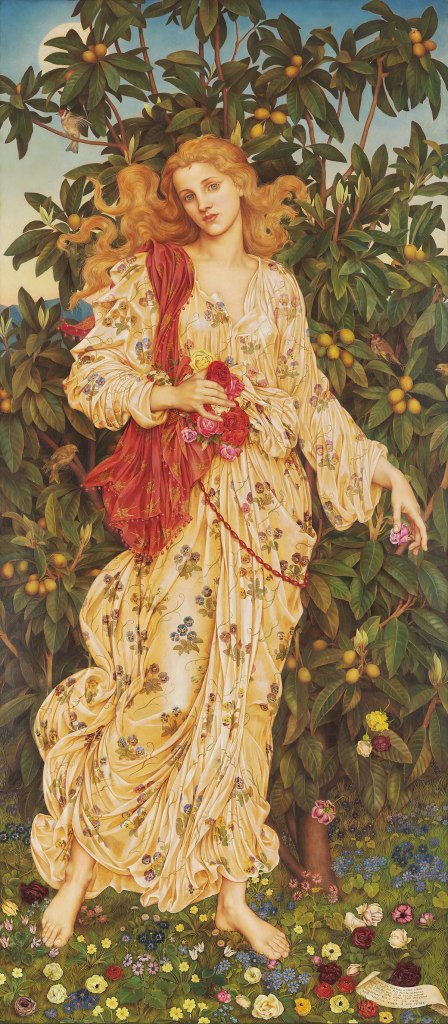
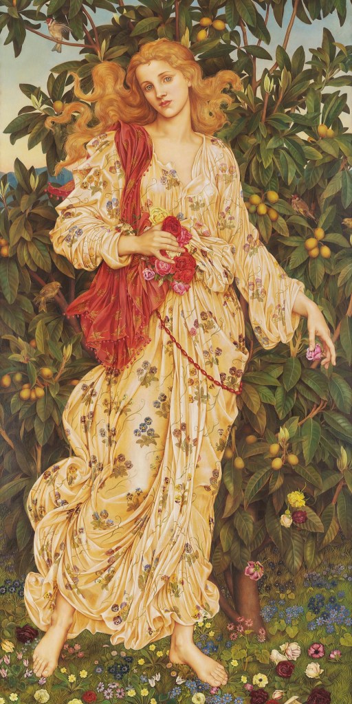
Flora, the Roman goddess of flowers, vegetation and fertility – and so effectively, also, of Spring – is shown full-length in a suitably floral dress, scattering blooms and standing on a lawn growing and strewn with yet more flowers. Behind her is a fruit-laden tree, dark against the clear blue sky, with just a hint of dusk on the horizon. She stands in classical contrapposto, with her weight on her left leg and her right lifting off the ground as if she were walking, or even, possibly, dancing. Over her shoulder is a blood-red shawl, and her hair flies freely in the breeze.

The tree is a loquat (Eriobotrya japonica), presumably chosen as it has the rare distinction of flowering in autumn or winter, so that it bears fruit as early as spring – an ideal demonstration of Flora’s fecundity (for this and all subsequent botanical identification I am, as ever, deeply indebted to the Ecologist, who has recently been offered a chair at Liverpool University, and from January will be Professor of Ecology: congratulations, and thank you!). The loquat has its origins in China, but was known to Europeans as early as the 16th century. It may even have arrived in Portugal back then. The silveriness on the underside of the leaves is diagnostic, apparently, and is one of the many features that De Morgan captures accurately. The full moon hovers in the dusk sky, and below it a goldfinch flaps its wings. Not only is the bird colouristically related to Flora – the red on its face matches that on her shawl – but its association with the Passion of Christ, and therefore Easter, also makes it appropriate for a spring painting, a natural resurrection following the death of winter.

Further down, a second goldfinch looks up towards its mate from the right of the painting, not far from the head of a siskin, whose pair can be seen on the left, just below Flora’s elbow. A third type of bird is shown on her red shawl: picked out in gold, there are stylised swallows. Even if ‘one swallow doesn’t make a spring’ the number represented suggest that the season is well advanced. Admittedly this particular saying is also applied to summer, but I should be able to explain this confusion later on. The red colour of the shawl itself is related to the rich red roses which Flora is clasping, along with the others she is scattering – a metaphor for the way in which the arriving spring brings with it flowers. I particularly like the flick of the beaded red shawl just above Flora’s right elbow which echoes not only the curls of her hair, but also the shapes of some of the leaves and the curve of the siskin’s back and tail.
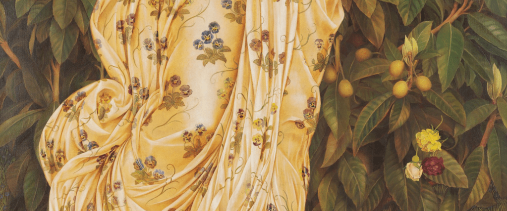
De Morgan captures the fall of the scattered roses rather brilliantly. It is as if they are frozen in time. The swirls of drapery, on the other hand, seem to have a life of their own, clinging to her bent right knee and curling behind, almost as if they are growing. All over the dress – which is modulated from cream in the light to a buttery yellow in the shadow – we see pansies, apparently growing with their leaves, which are either embroidered or printed onto the fabric. The name ‘pansy’ is derived from the French pensée, or ‘thought’, although that probably has little relevance here. They are included, like so much else, as indicators of spring, even if developments in horticulture mean that there are now varieties which will bloom all the year round. They don’t withstand the heat of summer, which could be relevant: as we shall see, De Morgan was painting in Florence, where the heat can be unbearable.
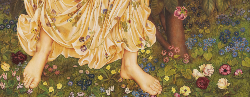
By the time we hit the ground (a final pink rose can be seen falling from the top of this detail) there is an explosion of flora. In between the left border of the painting and the figure’s right toes is a cyclamen, and to the right of the same foot are two primroses (Primula vulgaris), one the more common yellow form, the other a pink variant. There are also pinkish daisies (Bellis perennis) mid-way between the feet and below Flora’s left heel, and below the latter daisies are the flowers of another cyclamen. The rest of the flowers – whether deep blue, light blue or pink – are florist’s cineraria (Pericalis x hybrida), with the exception of some tiny forget-me-nots (Myosotis) to the left of Flora’s right foot (above the cyclamen), and a periwinkle (Vinca) to the left of the second set of cyclamen flowers.
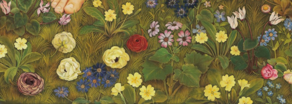
The bottom left of the painting shows the same species, although the deep pink flower at the very bottom left corner might be ‘new’. The periwinkles can be seen more clearly (to the left of the full cyclamen plant and above a yellow primrose), and there are more forget-me-nots in the bottom right corner of the detail.
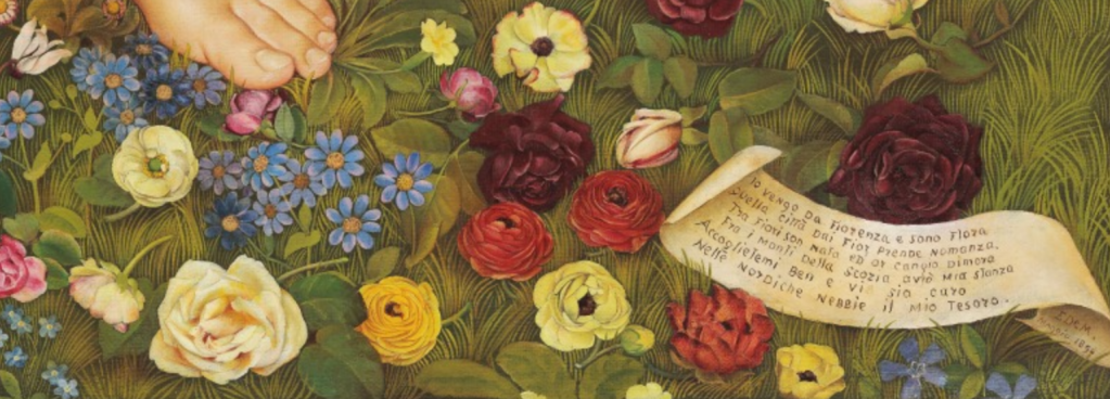
The bottom right of the painting also has the same selection, with more scattered roses, but there are also what appear to be double flowering ranunculus blooms, with tightly-packed petals in either yellowy-orange or red. The ‘new’ flower in the previous detail might also be a ranunculus. In addition, there is a cartellino – a small piece of paper, or label – inscribed with a verse and, on the underside, curled round on the right, the signature: ‘E De M. Maggio 1894’ – Evelyn De Morgan, May 1894. May is the month of spring, even if nowadays we associate its arrival with March. The Romans celebrated Floralia – the festival in honour of Flora – from 28 April – 3 May, and in Britain these rites survived with the celebration of a May Queen well into the twentieth century (there was a maypole in our playground at school, although I don’t remember anyone ever dancing around it). This ‘traditional’ celebration of spring is followed close on its heels by the arrival of summer in June (optimistically speaking – it’s still raining here in August), with ‘Midsummer’ being 21 June. This might explain the confusion over which season is ‘made’ by the arrival of an appropriate number of swallows. From 1890 until 1914 Evelyn and her husband William De Morgan (renowned potter, some of whose work I will include in Monday’s talk) spent the winter months of every year in Florence – and in this particular case at least, that could continue through to May. It was in Florence that Flora was painted. As far as I can read it, I think this is a correct transcription of the verse, for the benefit of those of you who have some Italian:
Io vengo da Fiorenza e sono Flora
Quella città dai fior prende nomanza
Tra Fiori son nata ed or cambio dimora
Fra I monti della Scozia avrò mia stanza
Accoglietemi ben e vi sia caro
Nelle nordiche nebbie il mio tesoro.
It uses antiquated Italian – even for the late 19th Century – including the medieval form of the city’s name, Fiorenza, as opposed to the ‘modern’ version, Firenze. The medieval form (like the English) is closer to the Roman name ‘Florentia’ – the flourishing city – and so to Flora herself, but also ties in with the ‘Pre-Raphaelite’ ethos of the painting, influenced as it is by an artist born many years before Raphael. As a sophisticated group of cognoscenti you will have seen the parallels already, and I hinted as much when I said that I’d first seen the painting in the exhibition Botticelli Reimagined. Before we get to that, though, here is my translation of the verse (you will understand why I never became a poet). It is rough, I know, but I wanted to try and replicate the rhyme scheme, and allude to quaint archaic forms (or rather, in this case, Scots dialect – apologies to my Scottish readers).
I come from Florence, and I am Flora –
That city from the flowers takes its name.
Born among flowers I’m now an explorer:
The hills of Scotland soon will be ‘ma hame’.
Welcome me well so that my treasure
Amid the northern mists will give you pleasure.
The implication is that Evelyn De Morgan painted Flora for a Scottish patron, although precisely who that was remains unknown: the first recorded owner had no known connections north of the border. As for its visual origins, De Morgan’s love – and understanding – of the work of Botticelli must be clear. For one thing, Flora owes a great deal to her namesake in the Primavera, which De Morgan could easily have seen in the Uffizi (in Florence) during her regular winter sojourns.


Dressed as a Florentine bride, with jewelled belt and necklace turned into garlands of flowers, Botticelli’s Flora has a similar dress to that of De Morgan’s, with the draperies folding and flowing in equivalent ways, covered (whether embroidered or printed) with flowers growing complete with their leaves. Both figures also scatter roses. Botticelli associates her with the nymph Chloris, seen emerging from the right edge of the detail. According to Ovid, Chloris was captured and raped by Zephyr, the west wind. To atone for his misdeeds, Ovid tells us, Zephyr transformed Chloris into Flora – hence the flowers coming from Chloris’s mouth as she looks back up at Zephyr whose head is just visible in this detail. This myth explains the origin of spring, as the barren land is made fertile, so it was believed, by the arrival of the west wind. Flora’s dress is also exceedingly like the figure reaching over to clothe the newly born goddess in Botticelli’s Birth of Venus, which is also in the Uffizi.

De Morgan’s Flora has hair more reminiscent of Venus herself, though. The colour may be similar to that of this figure – reddish to fair – but the long curling locks blowing in the wind are closer to those of the goddess. I’ve cut Venus out from this detail for technical, WordPress related reasons, but you don’t need to take my word for it. We know that Evelyn de Morgan knew Botticelli’s painting: she copied a detail from The Birth of Venus, and her study has survived. Like today’s painting is owned by the De Morgan Collection.

In this small sketch De Morgan conveys the gilding which Botticelli used freely across his paintings with strokes of cream-coloured paint, but elsewhere – including in her painting of Flora – she picks out details in gold – real gold – just like her Florentine inspiration. She became especially interested in the use of this particular material, a metal, and an element in its own right, to the extent that she executed a considerable number of drawings using gold, and gold alone. It is a highly unconventional technique and one that was practiced by very few artists. As far as I know, she was the major exponent. But that’s the subject for Monday’s talk, so I shall leave further discussion of it until then. In the meantime, I’m hoping that this discussion of spring will finally herald the belated, and welcome arrival of summer.