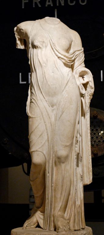
Donatello, The Feast of Herod, c. 1435, Palais des Beaux-Arts, Lille.
Well, I’m just off out to talk about Donatello, so I’m afraid I don’t have the time to write a new post now. Instead, I’m going to revisit a post from 6 May 2020: it was Picture of the Day 49. Re-reading it, I was surprised that I said that I ‘kept coming back to him’, as this was only the third post about one of the most important artists in the Renaissance – but then, it was only day 49. After that, I have only written about him twice more, with an extended double post dedicated to the same work, 154 – A Feast for the Eyes and 156 – Second helpings at the Feast, about a different Feast of Herod. They were published last April and May when I was talking about the Florentine outing of the Donatello exhibition. It turns out that the version currently at the Victoria and Albert Museum, Donatello: Sculpting the Renaissance, which I will be talking about this Monday 27 February at 6pm, could hardly be more different. The V&A have taken it as a rewarding opportunity to re-evaluate its holdings of Italian Renaissance sculpture – the best outside Italy – and the exhibition includes works which were not seen in either Florence or Berlin, which hosted its own variation of the original in the interim, but more about that on Monday. After that, I will give two talks related to Vermeer (that link goes to the first talk which – spoiler alert! – is more contextual, and will include relatively few actual Vermeers – they will all be in Vermeer 2), and then a slight pause. But for now – Donatello! This is what I said ‘back in the day’:
There must be something about Donatello that means that I keep coming back to him (Picture Of The Day 25 and 35) – it’s probably the simple fact that he was very good. One of the best, in fact. And this particular image – not his most famous work by any means – has been sitting in my mind for a while for all sorts of reasons. One is that I have mentioned Alberti quite a few times, and I might even have said that he was the first person to write down how to ‘do’ single vanishing point perspective. The technique was worked out by Brunelleschi, best known as an architect, around 1415, and first used in paintings by Masaccio in the years 1425 and 1426. However, a relief carved by Donatello in 1417 suggests that he’d got a pretty good handle on it already, although the relief is fairly worn now, after centuries outside, and only a little bit of it could be classified as ‘in perspective’. But by the time he carved this masterpiece, there is no doubt that he knew what he was doing.

It is generally dated to ‘c. 1435’ – which is, coincidentally – and I really think it is a coincidence – the year that Alberti wrote On Painting. Both Alberti and Donatello presumably learnt the technique from Brunelleschi anyway. The other reason it has been in my mind is that this is one of the finest exhibits in the Palais des Beaux-Arts in Lille, which is the next place I am scheduled to travel should we come out of lockdown – and as we’re not due to go until December, I’m hoping it may yet be possible [Ha! We finally went in December 2022, two years late…].
When talking about the Resurrection (POTD 25) – one of the reliefs on the South Pulpit in San Lorenzo in Florence – I said that it broke all of the rules, and that is something you can only really do if you know what the rules are. Otherwise you are just doing your own thing. Donatello really did know the rules, some of which he had effectively written himself. The Feast of Herod is a type of sculpture known as rilievo schiacciato (pronounced rill-ee-AY-voh skee-atch-ee-AH-toh), which means flattened, or squashed relief. It was effectively invented by Donatello himself, although he may have been influenced by some of the passages in low relief by his one-time master Lorenzo Ghiberti in his first set of doors for the Florentine Baptistery. Donatello perfected a technique in which the depth of the carving doubles as an indicator of distance. Anything in the foreground is carved in higher relief, and the further away an object is supposed to be, the lower will be the depth of the carving, until objects in the distance will appear as if scratched into the marble background. The effect is similar to atmospheric perspective, whereby the air, dust and haze in between us and distant objects make them look fainter (and this was before atmospheric perspective has developed in painting). There was no precedent for this type of carving at all. Classical relief carving was well known: there were, and still are, Roman sarcophagi to be seen all over Italy. And by the time this particular sculpture was made Donatello had spent some time in Rome itself, where, in addition to the sarcophagi, relief sculptures could be seen all over the triumphal arches and columns. However, it is only ever carved in what we would think of as high relief. Figures appear like statuettes that have been sliced down the middle and stuck onto a flat background, whereas Donatello’s figures move in and out of space as his chisel moves through the marble like a hot knife through butter. There is hardly any real space here, it is a matter of millimetres deep: what we are looking at is an illusion. And, in accordance with the laws of perspective, it is not just the depth of relief that decreases the further back into the imaginary space you go, but any other measurement too. Simply put, things get smaller.
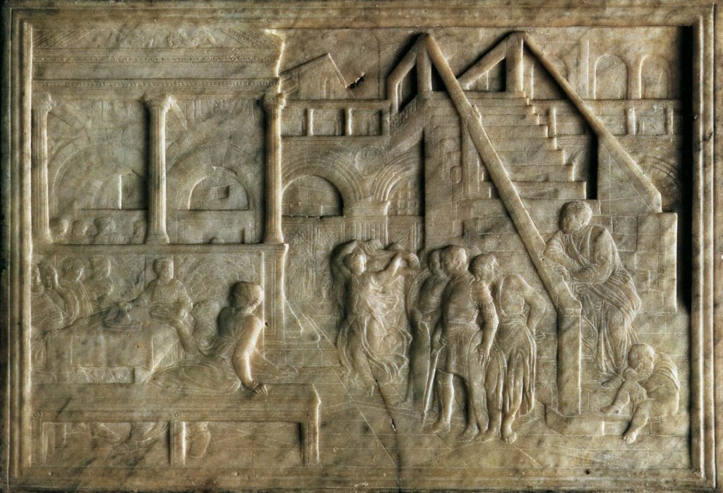
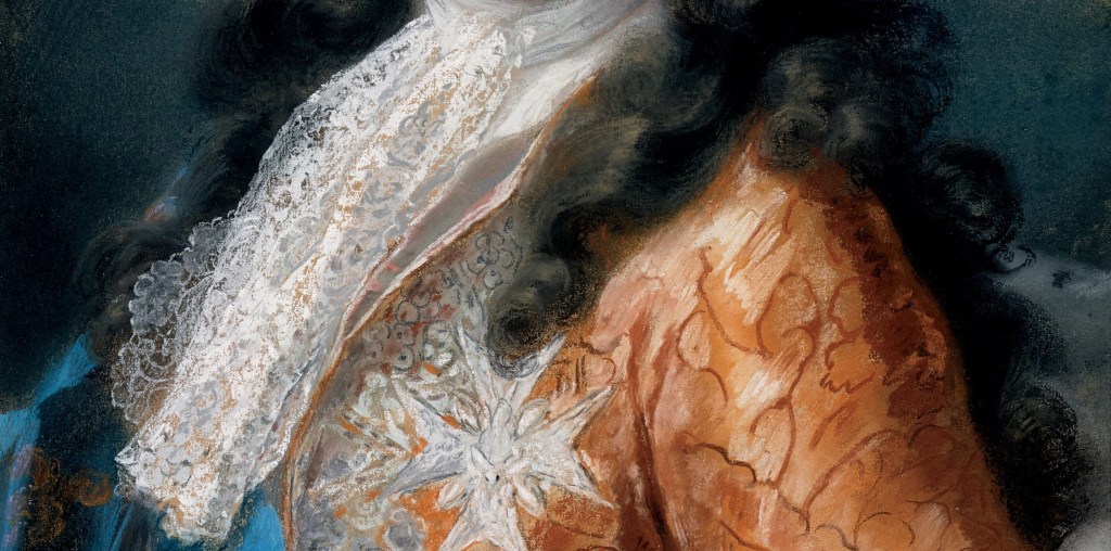
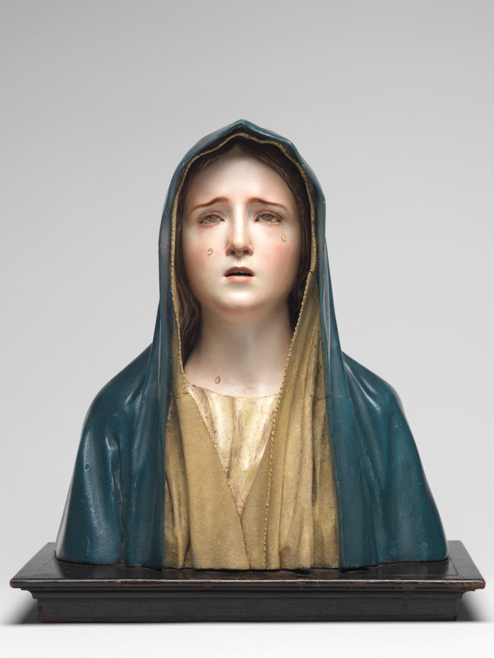
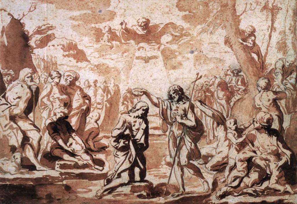
At the top is a photograph of the whole sculpture, measuring a mere 50 x 71.5 cm, taken relatively recently, after it was cleaned. The next photograph, and the details below, were taken before cleaning. I am using them because the translucency of the marble means that, after cleaning, it can be hard to see how delicately it has been carved. The light refracts through surface of the marble, and reflects back out again, creating a wonderful, luminous quality, but confusing the eye. Here, however, the patina allows you to see how remarkable, and how delicate, the detail is. The subject is The Feast of Herod, and Donatello shows it, as so often, as a continuous narrative – more than one part of the story is depicted. Herod had been condemned by John the Baptist for having an affair with his sister-in-law Herodias, and for his pains, John was thrown into prison. During a feast, Herodias’ daughter Salome danced so beautifully that Herod promised her whatever she wanted. Unlike any young girl nowadays, she doesn’t seem to have had a strong opinion of her own (although Oscar Wilde thought differently), so she asked her mother. Herodias was still smarting from the Baptist’s tirades, and told her exactly what to ask for: the head of John the Baptist on a plate. In the centre of the image – indeed, her head is almost exactly in the centre of the panel – we see Salome dancing in quite a frenzy – waving a veil between her raised arms, with her left leg kicked back into the air.

The floor she dances on is marked out with the thinnest of scratches, defining, in perfect perspective, a geometrically patterned tiled floor. Behind her head a pillar supports two arches. To the left of the pillar we see figures standing in conversation in front of a diagonal grid. On the right a flight of stairs goes up diagonally, with a child asleep on the bottom step, and a man in a toga standing and looking to the left. However, he isn’t looking towards Salome. Like the soldiers, standing slightly aghast, and the ragged-looking man who rests on the soldier’s back, his right hand on the soldier’s shoulder, they are ignoring her dance, and looking towards the left of the image. It is as if the dance is a flashback – or as if she is dancing on in triumph, unaware of the consequences.

On the left we can see what has grabbed the attention of the onlookers. A woman, sitting with her back to us on a bench which runs parallel to the bottom of the image, has shied away in horror. This allows us to see, just to the left of her, a man kneeling down, placing a platter – bearing the head of John the Baptist – onto the edge of the table. The man on the far left – possible Herod himself – places both hands on the table and pushes himself back. The woman next to him – possibly Herodias – puts her hand to her face and looks away. Be careful what you wish for. The other three people at the table seem to be unaffected by it all. In this detail alone there are the most remarkable things: the solidity of the bench, and the fact that we can see the woman’s feet – and Herod’s – underneath it. The ‘wall’ behind them, carved with decorative details at the right end, which, just a little to the left, are cut across by a straight, vertical line. There is a fabric hanging in front of the ‘wall’, which appears to show a circle enclosing a seated woman with a person on either side. The circle itself is supported by two more people. If this weren’t The Feast of Herod I would suggest it was a tapestry showing the Madonna and Child with Angels. And even given its location, it still could be. Whatever it is, the image is repeated twice: it occurs again just to the left.
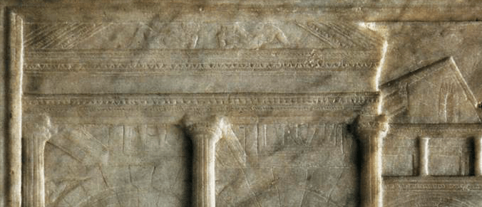
So much of this detail is completely unnecessary. The ‘wall’ appears to be at the base of a temple-like building. It supports three fluted columns, which in turn support an entablature, made up of architrave, a plain frieze, and a cornice, all of which is topped by a triangular pediment. Donatello’s studies of Roman ruins have really paid off. The pediment even has relief carvings itself, showing two reclining figures. I’m not sure how Donatello knew that pediments included reclining river gods in the corners, nor why he thought it necessary to include them here. Nor was there any real point in showing two more reliefs at the back wall inside the ‘temple’ – pairs of legs can just be seen emerging from behind the entablature. And off to the right there is a building at an angle, with one corner towards us. This is an idea he got from a Giotto fresco in Santa Croce in Florence: he would use it again ten years later in Padua. But, like everything else I have just mentioned, it doesn’t need to be there. It doesn’t add to the story, it is simply Donatello showing off, because he can.
It clearly impressed the most important ‘collectors’ in Florence. After Lorenzo ‘the Magnificent’ de’ Medici died in 1492 an inventory was taken of everything in his possession, and one of the items listed was a ‘Panel of marble with many figures in low relief and other things in perspective, that is, of St John, by Donatello’. It has always been assumed that this was the very relief mentioned. It was valued at at 30 florins, and kept in the same room as paintings by Giotto, Fra Angelico and Filippo Lippi, as well as two other reliefs – showing the Madonna and Child – by Donatello. This must have been the room where Lorenzo kept his special treasures. It might originally have been owned by Lorenzo’s grandfather, Cosimo il Vecchio, who had come back from exile in 1434 and effortlessly taken over the reins of power just as the relief was being carved. Or maybe it was acquired by one of his sons. Piero ‘the Gouty’ was a lover of fine things – given his medical ailments he couldn’t lead a very active life. He had a small study with a glazed terracotta ceiling made for him by Luca della Robbia – all that remains of that is now in the V&A. This sculpture would have looked good in there. And to be honest, if not there – apart from in a private collection – we really don’t know where this would have gone.
The fact is, nobody has any idea what this relief is for. You might say that it doesn’t need to be for anything, it is art. As Oscar Wilde once said – in his preface to The Picture of Dorian Gray – ‘All art is quite useless’. He meant that art has no function, it is simply required to be beautiful. That description fits this sculpture perfectly. However, the attitude is fine for the 19th Century, and is indeed the central tenet of the Aesthetic Movement, but this is an object from the 15th Century. Everything was made to go somewhere or to do something – an altarpiece, a private devotional panel, a cupboard door, some wainscoting, an over-door panel, a clothes chest, a tray for sweets, a portrait to remember someone by. These are some of the functions of paintings from the 13th, 14th and 15th Century in the National Gallery, for example. But if this was carved simply to impress, because it looked good, and because it showed off Donatello’s technique – if it was a collector’s item – then this is quite possibly Western Europe’s first ‘Work of Art’.