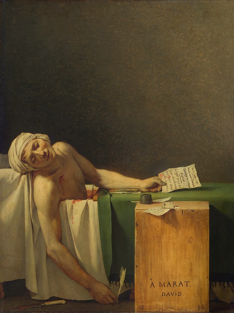
Cosmé Tura, Virgin and Child, 1480s. Gallerie dell’Accademia, Venice.
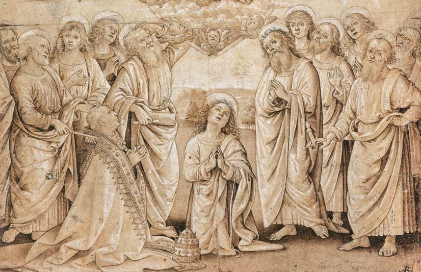
Having spent a fair amount of time in my youth in Ferrara, when I was researching my PhD about the sculptures there, I grew inordinately fond of the idiosyncratic school of painting that flourished alongside my far scarcer sculptures. The paintings themselves are remarkably sculptural, we know that some of the painters designed three-dimensional works. I have always thought that at least two of them may also have carved, or at least modelled, themselves. They are Cosmé Tura – the great genius of the 15th Century Ferrarese school, about one of whose works I will write today, and Francesco del Cossa, who softened Tura’s style, and then moved on to Bologna – quite possibly because he didn’t like the way he was treated in Ferrara. It is one of his paintings – an Annunciation – which is the inspiration for my talk on Monday at 6pm, How to wear your halo – and the Significance of the Snail. Details of this are (a) on this link and (b) listed alongside details of everything I’m up to on the diary page of my website. Apart from the fact that it is a Ferrarese painting, the main reason for my choice today is the nature of Jesus’s halo, given that the ‘History of the Halo’ will form a considerable segment of Monday’s talk…

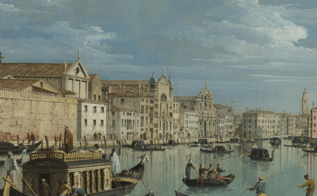
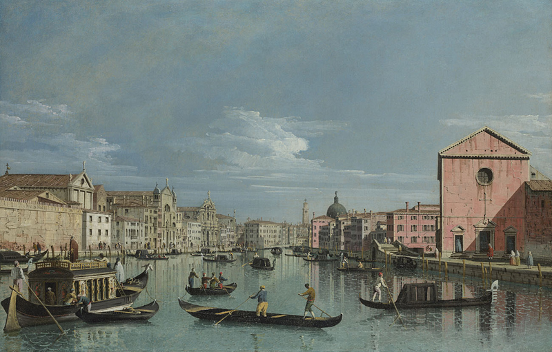
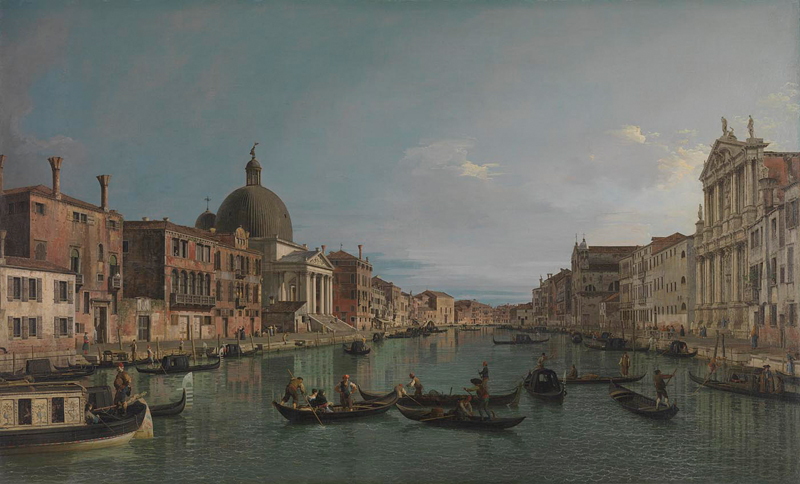
For obvious reasons, when I am taking people around the Accademia in Venice, home to this gem, I focus on the Venetian paintings. It is the strong point of the collection, after all, and I always assume that that is precisely what visitors will want to see. However, it does mean that I rarely get to talk about this image, for which I have a particular soft spot – a Ferrarese Madonna and Child in its original frame. Little is known about its origins, and nothing is known about the patron or the location for which it was intended. Before it was purchased by the Italian State for the Accademia in 1896, the painting’s history is a blank – so we have to rely on the evidence before our eyes. Stylistically it would appear to date from the 1480s, but to explain that would entail a book-length discussion of the work of Cosmé Tura. Let’s just go with his dates – which the National Gallery in London gives as ‘before 1431 – 1495’ – making this a fairly late work. By 1460 he had a salary from the Ferrarese Court (under Marchese, later Duke, Borso d’Este) making him, effectively, the unofficial ‘court’ artist. It has been suggested that the unusual stylisation of his work, with its angular twists, turns and sharp inflections, relates to the complex line of thought followed by the Ferrarese scholars – although, to be honest, Borso was far more interested in partying that listening to erudite conversation. That was more the concern of his predecessor, half-brother Leonello d’Este.
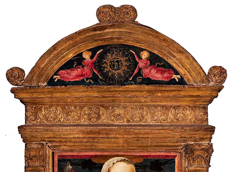
There might be some clue as to the original patron, and/or intended location, from the section of the painting at the top. The frame is a piece of miniature architecture. Two pilasters, decorated with what are referred to as candelabra, are topped by classically inspired capitals, sitting somewhere between Ionic and Corinthian – but this is an early renaissance form, as the full ‘classical language’ of architecture had not yet been fully formulated by renaissance architects. Nevertheless, the two pilasters support a full entablature, made up of an architrave (the ‘beam’ at the bottom), a frieze (decorated with stylised leaves, some of which seem almost anthropomorphic) and a cornice – the three flat strips at the top. In its turn, the entablature supports a segmental pediment, with rosettes sitting to the left and right and at the summit. The pediment itself is also painted with two angels in red holding onto a sun-like symbol. This is the ‘Name of Jesus’, a monogram formulated by the ardent 15th Century Franciscan preacher St Bernardino of Siena. As seen here it looks like ‘yhs’ – with a line through the ‘h’ – but ‘ihs’ would be a more usual formation, being derived from the first three letters of ‘JESUS’ in Greek (ΙΗΣΟΥΣ). The line through the ‘h’ tells us that the monogram is an abbreviation, but also, conveniently, forms a cross with the vertical of the ‘h’. Taking the idea from the biblical text, ‘At the name of Jesus every knee shall bow’ (Philippians 2:10, cue communal hymn singing), Bernardino used this sign to unite warring factions, and to inspire devotion. It would therefore make sense if this painting had been commissioned for a Franciscan church – and there is indeed a San Francesco in Ferrara, and there was from as early as 1232. But then, there was also a church – and convent – dedicated to San Bernardino himself. It is not there anymore, though – it was destroyed in 1825. At one point (1509) the convent was acquired by none other than Lucrezia Borgia (who was, among other things, the second wife of Duke Alfonso I of Ferrara) as a gift for her niece, who eventually, in 1543, became the abbess – but that’s another story.

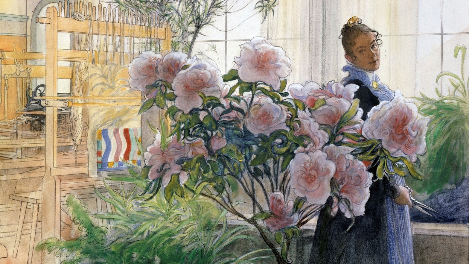
Looking down to the main image – as indeed the two angels in the pediment are – we can see what, at first glance, could be a standard depiction of the Madonna and Child. However, that first glance would have to be a very quick one. The original gilt frame holds a separate wooden panel which has its own trompe-l’oeil frame painted in pink, a bit like a window frame looking out into the countryside (more of that below). Mary is seated on the window sill, her left knee bent, with her shin lying across the sill and her foot hidden behind the frame to our left. Her blue cloak falls over the frame, linking our space to hers, making the image more immediate. The weight of the Christ Child rests on her knee, with one of his feet planted on the cloak where it lies on the window sill – his foot is therefore protected from what could be cold, and potentially dirty, Verona marble. The other foot floats, almost unnaturally, in the air. He is completely naked – a common feature in 14th and 15th century images, although it went out of fashion with the strictures of the Counter Reformation in second half of the 16th Century. His nudity stressed not only his humanity, but his masculinity – he was both God and Man… Nevertheless, for the time being he is fast asleep, his right hand resting on his left shoulder, and his head almost weightlessly resting on that hand. The left hand hangs down limply, almost as it would in a Pietà. Mary looks down at him with tender affection, holding onto him gently with her left hand, and resting the fingers of her right hand even more gently on his shoulder.

When we look closer, we can see more details of the painted frame – the light is coming from the left, lighting up the inside of the right hand frame, but leaving the underside of the top section in shadow. However, you can’t see the inside of the frame on the left. This implies that, in its original location, when the painting was first seen, we would have been standing to the left of it, looking over towards it on our right. Tura seems to have taken the words of Leon Battista Alberti to heart. When writing down an explanation of how to do perspective, Alberti said, ‘I draw a rectangle which is considered to be a window through which I see what I want to paint’. He didn’t actually say ‘paint a window frame’, but more than one artist decided to play this game – Tura, in this instance, was one of them. It’s impossible to pinpoint the vanishing point with just one orthogonal (a line in a perspective scheme that is supposed to be at right angles to the picture plane) but, judging by the diagonal at the top right of the fictive frame, the vanishing point, and therefore our view point, would appear to be – roughly speaking – at the bottom left corner of the painting. This implies that not only would the painting have been to our right, but also quite high up. Mary’s halo barely fits in between her head and the painted frame, which of course begs the question, ‘What, exactly, is a halo?’ – just one of the questions I want to try and answer on Monday. Well, in this case, it seems to be a thin, flat sheet of gold which reflects some elements of Mary’s headdress. Jesus’s halo certainly appears to be solid – Mary’s veil rests on it, with several folds bunching together, wrinkling over the top, and falling over the other side. But if they are sheets of gold, how do they stay up? I’m not going to answer that question today.

Behind Mary’s head a vine has been strung up behind the window frame – or just happens to be growing there – with a bunch of grapes hanging from it on either side. Grapes make wine, of course, and Jesus will offer wine to his apostles at the Last Supper, saying ‘Drink ye all of it; For this is my blood of the new testament, which is shed for many for the remission of sins.’ (Matthew 26:27-28). This eucharistic reference strengthens the echo of the Pietà which we have already seen. But then, so does the goldfinch at the top right, which is a symbol of the passion of Christ. It looks down towards Jesus, echoing Mary’s gaze. The bird at the top left might also add to this meaning – but no one is really sure what it is doing there. The Accademia website says that it is another goldfinch, but it isn’t. It’s rather like a treecreeper, but with a red flash on its wing. In fact, it’s a wallcreeper – or Tichodroma muraria. As for its symbolism – well, I have no idea, although as it clings on hard, it could, like ivy, stand for steadfastness and fidelity.

Further down the painting an intriguing image comes into focus. Apart from the blissful sleep of the child, and his mother’s delicate touch, not to mention the curious folds of the veil going over the solid halo, there are gold patterns surrounding the Virgin’s shoulder. Sadly these have worn away a little – but I hope you can make out the image of a woman in the sky, her head tilted towards the baby much as Mary’s and the goldfinch’s are. This is the astrological sign Virgo – the Virgin. Apt, you would agree, but unusual. Throughout history the Church has had an ambivalent attitude towards astrology. Even when it was indistinguishable from astronomy there were those who thought that, even though God had placed the stars in the sky, the stars themselves could not govern our fates: astrology was superstition and should be discouraged. However, there were also those who thought that God had deliberately placed the stars in the sky as yet another way of communicating his message – which would mean that astrology had a certain validity. Above right of Virgo are also Sagittarius, Pisces and Aquarius, apparently (I can’t make them out here, to be honest), although these are not in the right configuration, and their combined significance has yet to be deciphered. It should be said that he court of Ferrara was especially interested in astrology. One of the city’s great treasures is the Room of the Months, each of which is governed by the appropriate astrological sign – not to mention the three relevant Decans, really obscure personifications – but more of them, briefly, on Monday!

Whatever the implications of these details, the overall symbolism of the painting is clarified when we look at the sill on which Mary is resting. Our attention is drawn towards it by the rich flashes of the deep blue cloak falling over it, and it would in any case have been more immediately present, as it would have been roughly at our eyelevel. It bears an inscription which reads
Sviglia el tuo figlio dolce madre pia
per far infin felice l’alma mia
‘Wake your son, sweet holy mother, so that my soul will finally be happy’
Now, as I’m sure you know, when visiting a mother with a young baby, it is always a bit disappointing if the baby is asleep, as it means that you can’t play with it and have a cuddle. But for the mother, it is a godsend, as her child is finally quiet. However Mary is on the verge of waking her child just for us – her right hand is poised to touch his right shoulder ever so gently, and wake him up without alarm. His little left hand, hanging for all the world as if he is dead, will come to life, and so will he. And our souls will finally be happy, because this reminds us that, in roughly thirty-three years’ time, the dead Christ, lying in a not entirely dissimilar way on his Mother’s lap, will also come back to life. The sleeping Baby Jesus is a symbol both of the death and of the resurrection of Christ – and this applies to any painting in which you see Jesus asleep.
The solidity of the halo is a mystery, though. Surely a halo is just a visual embodiment of the light of God, and the glow of sanctity? Or does this very solidity imply that the light and the sanctity are real? That, however spiritual, they are both solid and dependable? I don’t know the answer – but it is a possibility. The talk on Monday may provide alternative explanations…