126 – Mary Moser

Mary Moser, Spring and Summer, c. 1780. Royal Academy, London.

One of the artists I won’t be able to cover in my admittedly brief series Three Women in the 18th Century is Mary Moser, which is a great shame. Her fame is eclipsed by her contemporary Angelica Kauffman (who will, of course, be the subject of the third talk in the series, on Monday 10 May at 2pm and 6pm), even though they had so much in common. Both were trained by Swiss fathers, for one thing, but whereas Kauffman was born in Switzerland, Moser’s father had moved to London in the 1720s, and she was born there in 1744. George Michael Moser was the son of an engineer and metal worker, and it was as a metal worker that he too was most successful, designing and making candlesticks, watch cases and snuffboxes amongst other things. He also enamelled these objects, attracting the attention of Queen Charlotte, for whom he made a watch case enamelled with portraits of the Princes George and Frederick (who would grow up to be King George IV and the Grand Old Duke of York). But then, George Michael had already been drawing master to King George III when the latter was a boy: these connections would stand Mary in good stead. Dad was well-enough regarded to design and make the seal for the Society of Artists, even if that was destined to be a short-lived group. Its first exhibition was held in 1761, and, although it only lasted six years, its demise was rapidly followed by the foundation of the Royal Academy of Art in 1768. George Michael Moser was one of the founding members – but then, so too was his daughter Mary, and, at 24, she was the youngest. She was also one of only two women, the other, of course, being Angelica Kauffman – this is the other thing they have in common. So why is she not as well known? I suspect it is because, unlike Kauffman, who is well known for her portraits, her allegories, and her narratives, Moser was famed for her paintings of flowers.

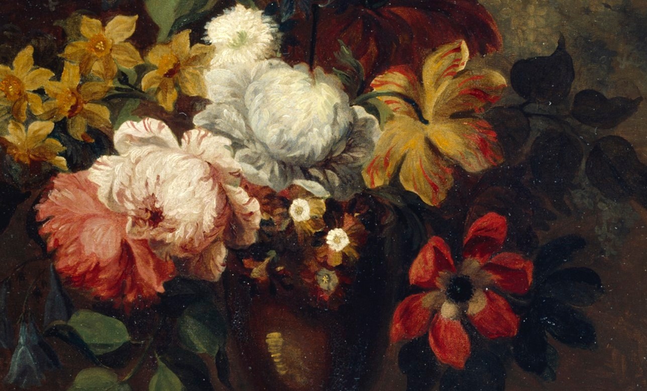
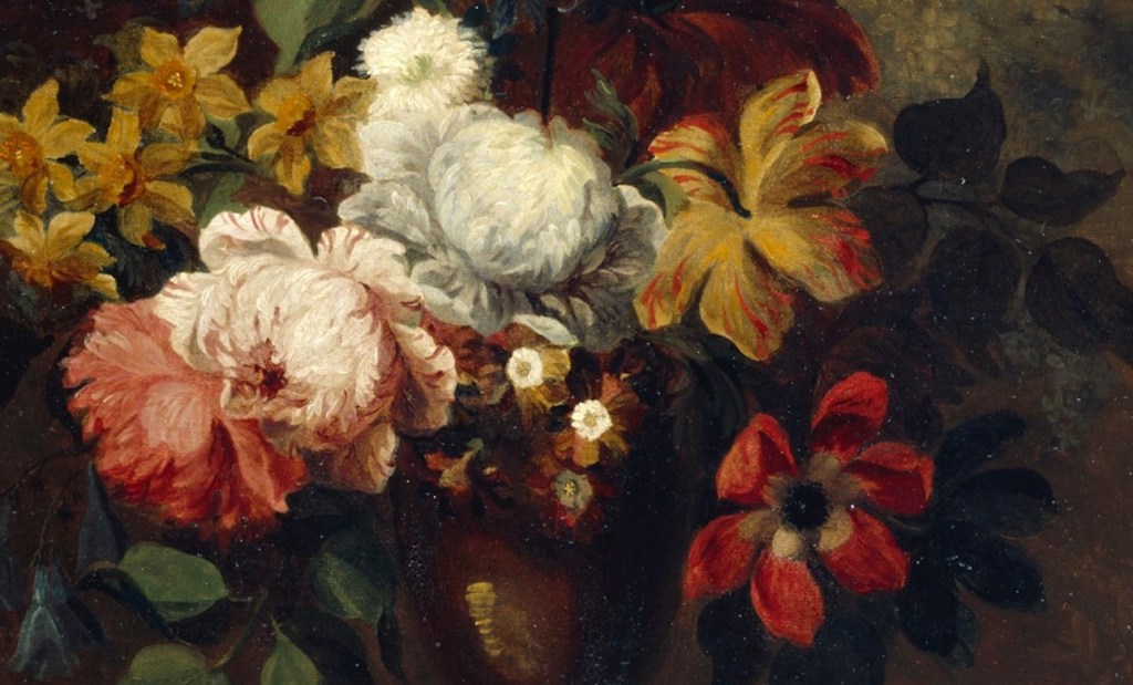
These two are still owned by the Royal Academy, and are dedicated to Spring and Summer. The names are clearly derived from the flowers which are depicted. Spring includes a tulip (top right), two varieties of narcissus, and what I suspect is a hyacinth, before horticulturalists bred them to be more compact (I should really ask the Ecologist, but we’re in different towns right now). Many of you are probably gardeners, and will recognise most, if not all, of the species anyway. Chief among the Summer flowers are roses, at the heart of the composition, a poppy, slightly shaded to the right of centre, and a carnation, more shaded, at the top right.

It’s not just the flowers which give the paintings their titles. I think the compositions themselves also express the seasons. In Spring the blooms look relatively bright across most of the surface, and stand out against a dark background. For me, at least, it is the appearance of flowers and leaves, their brightness most evident when they are freshest, which is the surest sign that the darkness of winter is over, and in this painting they really do shine out against that darkness. In summer, though, there is perhaps even more of a contrast. The brighter, stronger sun creates deeper, darker shadows – which in all probability are lighter than those of spring, but, compared to the brilliant sun, they appear to be darker. In the painting of Summer this contrast is evident in the background – dark, even black, on the left, and far lighter on the right. A subtly sinuous vertical axis of light flowers, white, pale pink and cream, shines out in the dazzling light against the dark foliage, with some of the less illuminated blooms rendered visible by being set against the lighter ground.

Mary Moser, Spring (detail); https://www.royalacademy.org.uk/art-artists/work-of-art/O2361 (c) Royal Academy of Arts. Photographer: John Hammond

The genre of floral still life painting was developed in the Dutch Republic in the 17th Century, but Mary Moser was no fijnschilder. The direct translation of this word would be ‘fine painter’ – someone whose work we might describe, rather inaccurately, as ‘photographic’ in its naturalism. The paintings of a fijnschilder are intricately detailed, with almost no clue that the image has been painted: there is not a brushstroke in sight. Not so with Moser: this is clearly a painting. Most obviously, the highlight on the vase, where light reflects from its lustrous surface, is built up of several separate strokes of cream-coloured paint. There is no attempt to blend these lines, but that does not stop us from seeing an area of light, nor does it make us think that something striped is being reflected: the human mind developed to fill in gaps. Once you have seen her technique, you can begin to see that Moser built up the petals in a similar way, with individual brushstrokes placed over a base colour to create the effect of petals, without their minute and subtle variations. The skill lies in knowing how little, or how much, to do. Mary Moser clearly knew exactly what was needed, and as a result she was enormously successful. So why is she so little known today? I suspect it is quite simply because, although she did paint portraits and history paintings from time to time, she was best known for her flowers.

In terms of Academic values, Still Life came some way down the hierarchy of genres. At the top were ‘History’ paintings, from which the part of the word we want is ‘story’ – narrative images drawn from classical mythology, the bible or the lives of the saints, images which would inspire us by the nobility of the human spirit, or instruct us about the folly of others. After History came Portraiture – paintings of the great and the good, those destined to lead the way and show an example to others – and then Landscape – God’s creation, all the wonders of the world, which mankind was destined to rule. Penultimate, just before Genre painting (normal people doing normal things), was Still Life. The skill is purely aesthetic, you might think, the ability to reproduce appearances, which is, in any case, inherent in all the other genres, and to arrange forms and colours in an agreeable composition.

One of the problems of holding someone’s attention with a floral still life is that there is no narrative to hold on to, and, potentially no greater meaning. Of course, this is by no means always the case. Objects can carry symbolic meaning, and so a Still Life could easily be more fully packed with hidden messages than any narrative – I should show you an example of this one day! Nevertheless, Still Life artists were not as highly celebrated as those who focused on the ‘nobler’ genres, and so their names are more likely to have dropped out of the public imagination. So, in order to make amends in some way, let’s give our artist a face.

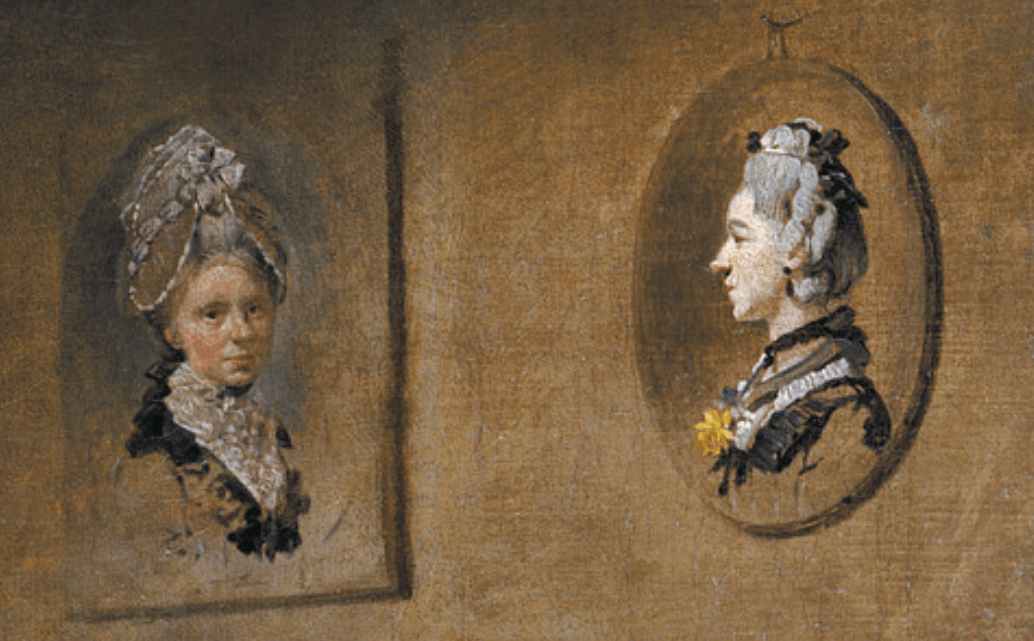
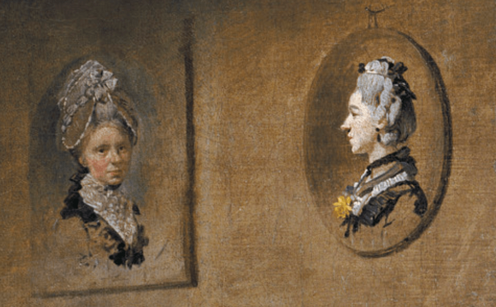
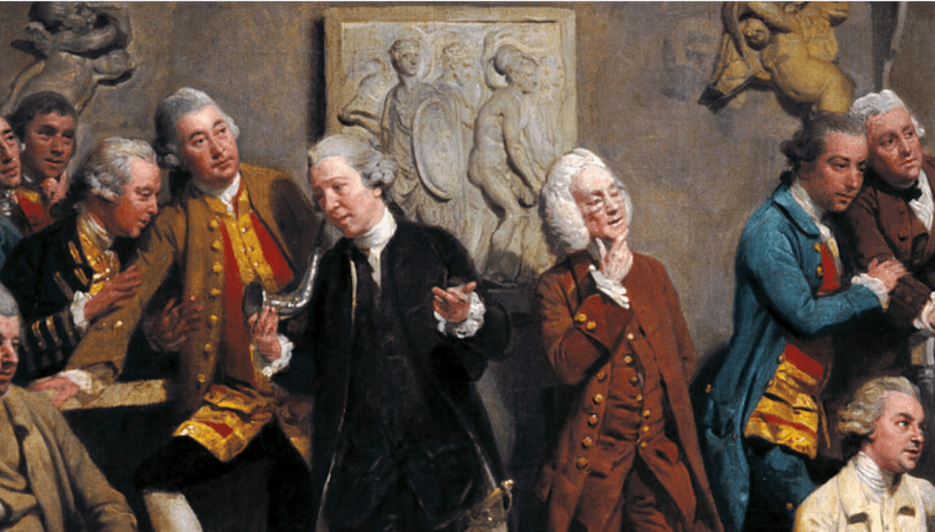
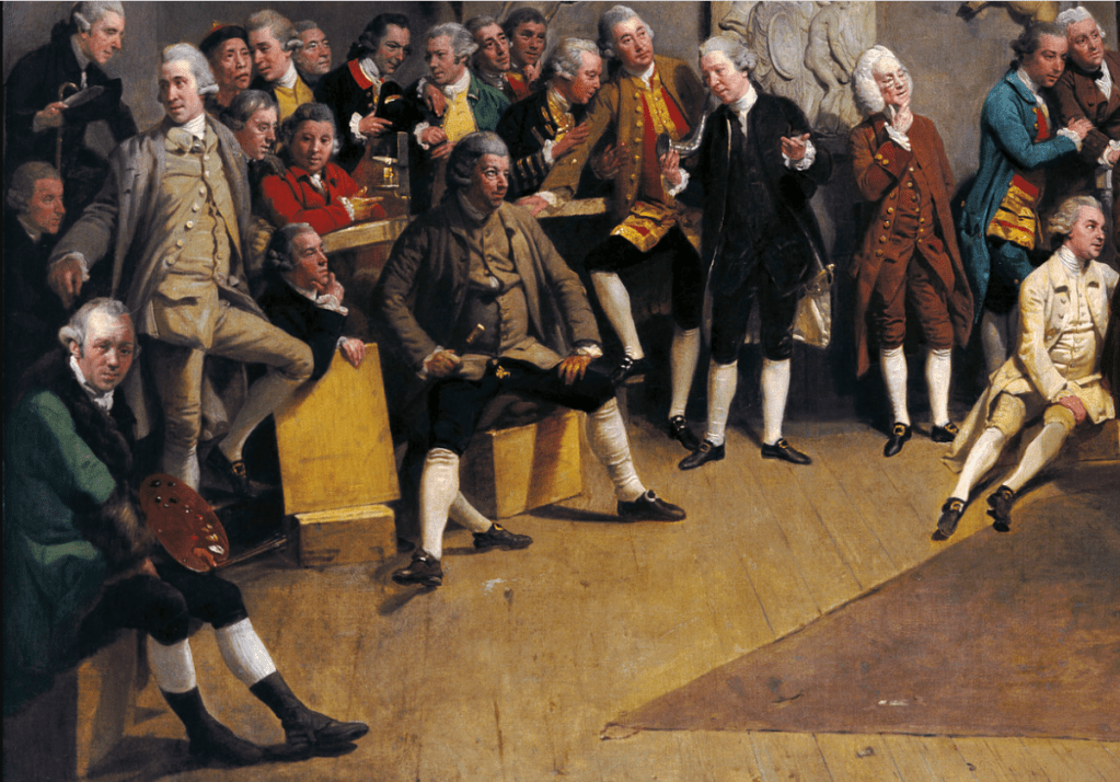
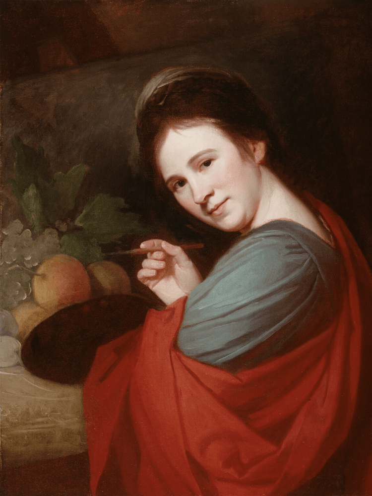
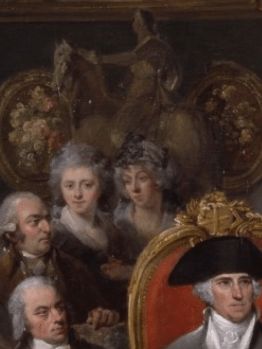
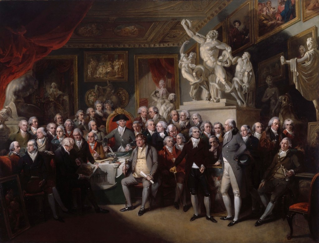
On the left is George Romney’s portrait of Mary Moser, painted around 1770-71, which was acquired by the National Portrait Gallery in London in 2003. It is said to show Mary’s professional status – she stands at her easel working in oils, unlike other women who painted flowers, who used watercolour, not an unusual feminine accomplishment at the time. Despite doing what could be classified as ‘man’s work’ – i.e. painting in oils – she is still clearly entirely feminine. The fact that she is depicted at work, rather than as ‘just’ a decorative object (the fate of many women) is also important, particularly at a time when few women of her class worked. On the right is a detail from a group portrait, The Royal Academicians in General Assembly, painted in 1795 by Henry Singleton – like Spring and Summer it is in the collection of the Royal Academy. Angelica Kauffman stands on our left, looking directly at us, while Moser looks towards her more famous companion. Behind them is an equestrian statue. You might assume it is a reduction of the Marcus Aurelius on the Capitoline Hill in Rome, judging by the other sculptures depicted in the painting, but it is actually a Study for an Equestrian Statue of George III by Academician Agostino Carlini. More importantly, hanging on the wall are Moser’s Summer and Spring – freely painted, which is hardly surprising given how small the detail must be, but recognisable nonetheless.

When you look at the painting as a whole it would be very easy to dismiss the appearance of these two women as ‘marginalised’ – they are, after all, pushed to the back of the gathering. However, they shouldn’t be there at all: Kauffman and Moser were not allowed to attend the General Assembly. So, despite this inexplicable bar, their inclusion in the painting is a sign of the great esteem in which they were held. They may be at the back, but they are more-or-less central, and just over the shoulder of the second President of the Royal Academy, Benjamin West, enthroned on his gold and red-upholstered chair. The women are perfectly placed to be seen. Not only that, but some of their paintings are also depicted – unlike the works of many of the Academicians who are present. We have seen the two by Moser hanging on the wall behind them: there are also two by Kauffman, Design and Composition, set into the coffering of the ceiling. If you want to know more about one of these – and another equivalent painting, Colour, then look back to Day 48 – Colour and Design. The fact is, the women are there, in the painting, their status acknowledged and their work on view: people could see them and know who they were. Next week we will look at a painting in which the situation is really rather different.

125 – Twin Sisters

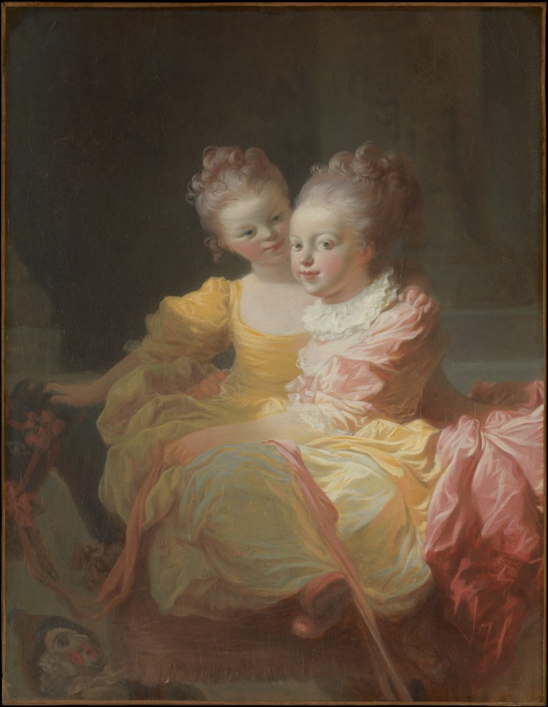
Jean-Claude Richard, ‘Abbé de Saint-Non’, Two Sisters, 1770. Metropolitan Museum of Art, New York.

On Monday I will be talking about pastel painting, with a brief introduction to the technique and to its history, in the first of my talks about Three Women in the 18th Century – Rosalba Carriera and Power of Pastel. However, I won’t have the opportunity to include today’s image, which I came across while researching, so I shall talk about it today instead. However, I’m not going to cover aspects of technique or history today – nor explain the reasons for the success of pastel in the 18th Century – but if you are interested, there is still time to sign up for the talks on Monday 19 April at 2pm and 6pm BST. What I really want to think about today is the Rococo style: what is it about this image that makes me think of it as ‘Rococo’? The title of the painting (and yes, pastel images are called paintings) is Two Sisters, and we will take that on trust. They could equally well be cousins, or even friends, but as I really don’t know how old the title is, let’s not worry about it.

We see the siblings at play, the younger one seated on a wheeled, wooden horse with her legs towards us. Her right hand rests on the horse’s mane, while her left arm goes around her sister’s back, the hand resting on her shoulder. The more senior girl leans over the back of the horse, with one arm resting on her sister’s lap, holding on to the reins, which are made from a long, flowing, pink ribbon. Her other hand is just visible at the younger sister’s right hip, the right arm of the older girl passing behind her sister’s back. The pose of the elder sibling, leaning over the horse, enhances the sense of familiarity between the two – it does indeed make sense that they are known as sisters – but it also exaggerates the swell of the pink overskirts at the bottom of her tightly laced bodice, and reminds us that, even while the ideas of childhood derived from the writings or Rousseau were still emerging, the children themselves were still dressed as small adults.

Resting on the wooden platform to which the legs of the horse and the wheels are attached is a doll – Policinelle in French, or Pulcinella in Italian – one of the stock characters, or tipi fissi, from the Comedia dell’Arte. This in itself ties the image to the roots of the Rococo, given Jean-Antoine Watteau’s fascination with the theatre, with theatricality, and, in particular, with the Comédie Italienne (as it became known in Paris). In this image the doll reminds us that the girls are still children, although as it might have been discarded, and would find its limbs being dragged along the floor were the horse to be moved, maybe it also implies that nothing will last for ever, and that the girls will inevitably grow up. Is there any significance to the choice of comedia dell’arte character? Well, I’m afraid I’m going to leave you to do the research and make up your own minds. However, I will just let you know that Pulcinella was lazy, felt himself entitled, and always plumped for the winner in any situation – but only when he knew who the winner was. In his efforts to get to the top, he never got the girl, and ended up unwittingly helping others, rather than himself. I cannot see how this could be relevant here – so maybe it isn’t. In any case, this was never meant to be a ‘profound’ image – and its light-hearted nature is another box to tick if we are considering the Rococo. So too, is the colour, chiefly the candy-floss pink, stretching from the bows on the horse’s muzzle and ‘chest’, along the sinuous reins, to the bow on the elder girl’s shoe. Her over skirt is the same pink, as is the ribbon which adorns the hem of her underskirt. The underskirt itself appears to be a shot silk, the warp and weft of which seem to combine the very same pink with a jade green, creating a surprising iridescence.

The younger girl’s skirt is a lighter version of the jade green, and, as silk, it reflects the pink of the reins and of the older girl’s overskirt. Her bodice is a light cream. The similarity of the colours worn by the girls, together with their embrace, helps to unify these two children into a single unit, but whether this is as family or friends is almost beside the point.  To describe the colour palette, which is so much part of the inner harmony of the painting, as ‘pastel’ would seem tautological as it is, of course, a pastel painting. You could argue that the impulse given to French painting, and to pastel as a medium, by the success of Rosalba Carriera during her extended stay in Paris between 1720 and 1721 had led to the adoption of this light and airy palette in subsequent French 18th Century art. However, it was very much in place by the time she arrived in the paintings of Jean-Antoine Watteau, whose Embarkation for Cythera, the work for which he was granted full membership of the Académie Royale de Peinture et de Sculpture in 1717, already used very similar pinks, and equivalent blues. The lightness of the palette reflects the lightness of the mood in Paris during the Regency, which I mentioned last week.

Another feature of the painting which, to my mind, locates it in the world of the Rococo is the precise flow of the reins, curving down from the horse’s mouth and back up over the younger sister’s lap, thus forming a sideways ‘s’ shape, with the addition of a long, broad curve as it falls to the floor. As well as echoing the composition as a whole, the long, broad curve being parallel to the older sisters stance, it is also formed from the combination of ‘s’ and ‘c’ shapes so beloved of Rococo designers. On top of this purely formal element, this image has that ineffable charm, the sweetness of the Rococo, deemed by some to be ‘chocolate-box-y’, but which has me reaching for the chocolates. Some people can’t stand it – I find myself loving it more and more. However, I can understand some criticisms of this particular work. The elder sister’s right hand is every bit as small as her younger sister’s left, and her right arm is maybe a little too long. I’m not usually susceptible to this sort of complaint – I seem to remember having a tirade against the notion that the artist ‘got it wrong’ some time back. After all, it is possible that anatomical accuracy was not what the artist was aiming for. But the younger girl’s feet are also poorly defined, in a painting which looks like he was aiming for a greater degree of naturalism. But then that’s not entirely surprising, as the artist was not professionally trained. Indeed, he wasn’t professionally an artist at all, but a remarkably adept, and influential, amateur – which of course means that he was a ‘lover’ of art, rather than having the current meaning in which the word has come to imply that he was, simply, inept. As it happens, he was a rather interesting man.

This is him, Jean-Claude Richard, usually known as the ‘Abbé de Saint-Non’. The imaginative portrait, by Jean Honoré Fragonard, is, in its own way, entirely Rococo. OK, so the palette is darker, but that is because Fragonard has depicted Richard in fancy dress. Apart from the palette, it has the flickering brushstrokes, fragmented diagonals, and sense of fantasy which can also be seen as features of this evanescent style. Not all Rococo works of art have all of the features I have mentioned, but then for any style, not all of the boxes we use to define them will be ticked all of the time.

The artist of our Two Sisters was undoubtedly one of the fortunate in life, and was able to do as he wished thanks to an enormously wealthy father, Jean-Pierre Richard, who had purchased land to the North of Paris to create the his families estate. It was close to the modern-day village of Saint-Nom-la-Bretèche, which takes its name from a 9th Century bishop, Saint Nonne. Over time the saint lost his last ‘ne’, and then the ‘n’ mutated to ‘m’, meaning that, even though Richard’s title contains a memory of his estate’s history, he has no connection to St Non, the 5th – 6th Century Welsh saint who was the mother of St David.

Jean-Claude Richard did take minor orders – and his family had intended him to go into the church – but, although he held a degree in theology, he didn’t really get any further. OK, so he bought himself a benefice, but despite becoming ‘abbé commendataire’ of the abbey of Pothières, subsequently he seems to have paid little attention to the church. The Metropolitan Museum of Art, which owns today’s pastel, says that, ‘he became an amateur artist, writer, and traveler and a congenial figure in Paris society,’ a ‘career’ which I have to say I rather envy. It was while travelling in Italy in 1759 that he met Fragonard. The artist had won the coveted Prix de Rome in 1752, but didn’t travel to the Eternal City until four years later. He was still there when the Abbé arrived another three years after that, and, once their friendship had been formed, they made extensive forays around the Italian peninsular. This culminated in one of the Abbé’s great contributions, the Voyage Pittoresque de Naples et de Sicile, a richly illustrated travel book in four volumes, published between 1778 and 1786, almost entirely funded by the Abbé himself. Until relatively recently it was assumed that he had written it, but recent research has revealed that this was not the case. As an artist his production was varied. He was perhaps most interested in printmaking, and made important contributions to new technique of aquatint. He was certainly enormously influenced by Fragonard, and it turns out that the Two Sisters has a twin. Compare these two images:

As you would probably surmise, the Abbé’s pastel is a copy of Fragonard’s oil painting, which is dated (by comparison with the pastel) c. 1769-70, and which is, by one of those odd coincidences, also held by the Met in New York. You will probably also have realised that Fragonard’s work was cut down – we don’t know when, exactly, or why – so although the two images may appear to be the same size here, in reality they are not. From what we can see the differences are subtle. The Abbé doesn’t go with Fragonard’s brilliant yellow for the young girl’s dress, he sweetens her face, and Fragonard’s energetic drapery folds have been calmed. The pastel is the work of a skilled copyist, but not of such a brilliant artist. Having said that, even in the oil painting we can see that Fragonard’s anatomy isn’t entirely naturalistic – look at the feet, for example, which make the younger girl look somewhat doll-like. Perhaps that is part of the nature of the relationship, and it could explain why Pulcinella has been abandoned: who needs a doll when you have a younger sister?

Why did Saint-Non choose to copy the work in pastel? Well, I will say this much about the technique: one reason for its popularity was the apparent ease of execution. No messy oil paints – although the powdery nature of the pastels meant that they could be messy in their own way. You could buy the crayons already made at a time when oil paints wouldn’t be available in tubes for several decades. And it was far quicker: there was no need to wait for the oils to dry in between periods of work on the painting, and once the image was finished, that was it – again, no waiting. And we should be grateful. Not only is Saint-Non’s Two Sisters a charming object, but it is also important as a record of the intended appearance of Fragonard’s sadly truncated original. As for Fragonard – well, he too was a remarkably interesting character, but one who will have to wait for another day.

124 – A Sign of the Times

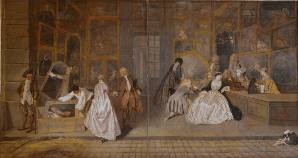
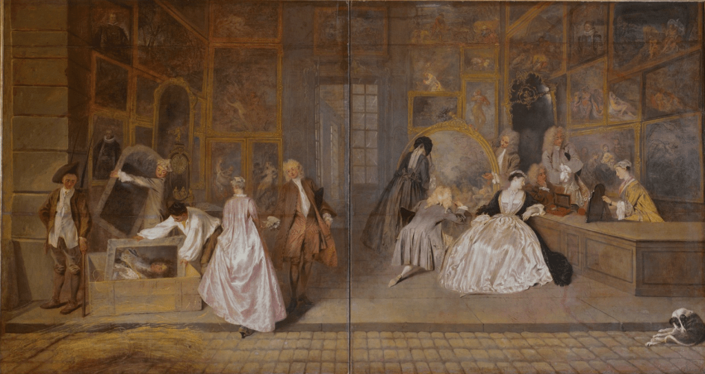
Jean-Antoine Watteau, L’Enseigne de Gersaint, 1720. Schloss Charlottenburg, Berlin.

I wanted to write about today’s painting last year, during the original ‘Picture of the Day’ – but somehow I ran out of days… But even if this is a year later than I had hoped, I’m glad, as I know so much more about it now, and there is no better way to start my ‘18th Century Spring’ as I am re-christening it (it is snowing outside as I write). It is a remarkable image in so many ways, and, in all probability, the very last painting of the man who, it could be argued, gave life to the art of the century: Jean-Antoine Watteau. Sadly his star has long-since waned, but he is due for a revival. Admittedly I am a relatively recent convert to his work, mainly because, until recently, I had failed to look. If I am honest, I have always found him hard to talk about, because the chief quality of his work is an inherent charm, and after that, after you’ve said ‘isn’t that charming,’ anything else you say runs the risk of counteracting the dream-like quality of much of his work, which is precisely where the charm itself lies. Like comedy, if you try to explain charm, it dies.

This, his last work, and one of his undoubted masterpieces, was a new departure. Watteau is known primarily as the originator of a new genre, the ‘fête galante’, in which people in elegant clothing – ball gowns, fancy dress and theatrical costumes – party in the countryside or in parkland settings. It is never clear whether the characters are actors, or ‘normal’ people in costume, or both, and it is never clear where, exactly, they are. The charm lies in this mystery, and in the romance, as couples mingle, flirt, and slip away into the hazy distance, for what ever purpose you, the viewer, imagine: Watteau never tells us. However, in this painting, we know exactly where we are. We’re in a shop. We know that from the title, which I have left in French deliberately, because ‘Gersaint’s shop sign’ is altogether too prosaic. But that is what it is. Or rather was – although not for very long: a shop sign. It was not commissioned by Edme-François Gersaint, a mere 26-year-old junior merchant when it was painted: Watteau volunteered the work, to keep himself busy, and ‘to warm his hands’, as he himself said. He was not well at the time. He had just returned from a few months – at the most, eleven – in England.

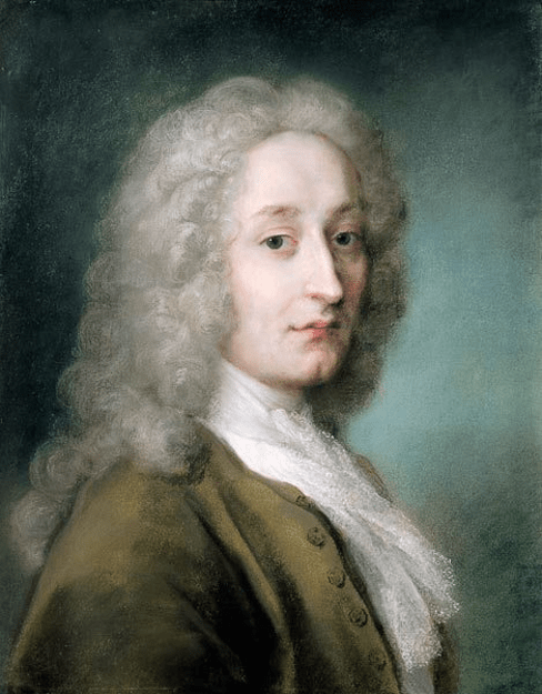
Rosalba Carriera, Jean-Antoine Watteau, 1721. Museo Santa Caterina, Treviso.

This is the only portrait we have of him, a pastel painted by Venetian artist Rosalba Carriera, when she was in Paris between April 1720 and March 1721. We know from a letter written to her, dated 20 September 1719, that Watteau was then in Paris. And according to her own journal entry from 20 August 1720 we know that, by then, he was back. In between those two dates he visited England. We don’t know why he went, but while he was there he got to know Dr Richard Mead, one of the leading physicians of the day, and a notable collector of art: at his death in 1754 he owned at least two of Watteau’s paintings, which may have been directly commissioned from the artist. We don’t know how or why they met, although as he was a specialist in tuberculosis, and as it was from this that Watteau was suffering when he returned to Paris in the late summer of 1720, the initial contact might have been a consultation. However, any medical advice Mead gave was not successful for long: Watteau died less than a year after his return. Carriera’s portrait thus dates from the final year of his life: he was only thirty-six. Artist and sitter were perfectly suited, though – the lightness of touch, both in mark-making and concept, and the lightness of the palette – pastel, in more ways than one – made them equivalents. She will be the subject of the first talk in my series Three Women in the 18th Century on Monday 19th April at 2pm and 6pm. If you would like to see more of her delicate and highly sought-after work, I do hope you will be able to make it – just click on the relevant time to book.

No wonder Watteau wanted to ‘warm his hands’: he was not well. He painted the image in a couple of weeks, and yet somehow managed to sum up the entire epoch. The painting suggests that we are out on the street, with the ‘fourth wall’ of Edme-François Gersaint’s shop removed so that we can see inside. In the foreground are the cobblestones of the road, with some straw, possibly for packing, lying to the left, and a dog – quoted from Rubens’s Marie de Medicis cycle – on the right. It is only this dog – and the hem of a lady’s skirts – which break the long line of the kerb stone which keeps us on the outside. But this same lady’s step, as she is handed into the shop by a young gallant, encourages us too to enter – with our eyes, at least.

Her luxurious pink silk dress shimmers in the daylight as she heads into the darkened space. It would be long enough to reach to the ground, were she on the level, but her step up allows us to catch a glimpse of her shoe, and just a hint of a green stocking. Despite the gentleman’s attentions she looks away from him, down to her left, as a painting – a portrait of Louis XIV – is boxed to be sent to its buyer – or perhaps, to be put into storage.

The Sun King had died five years earlier, when the reins of power were handed to his five-year-old great grandson – or rather, to the Duc d’Orleans, who would act as Regent until 1723, when the young Louis XV came of age. The whole court relaxed, packed up their formalities in Versailles and headed home to Paris. This collective sigh of relief, and the ensuing reminder of the pleasures of home living, resulted in a new, relaxed and even at times frivolous attitude to life and art, not to mention a renewed interest in interior decoration, and a style which we have come to know as the Rococo. Watteau was at the very forefront – as indeed was Rosalba Carriera, in Venice, for altogether different reasons. The idea of packing away the portrait – a bust-length image derived from Hyacinth Rigaud’s formal vision of le Roi Soleil from 1701 – is a metaphor that cannot be surpassed in poetic terms. The old, pompous, rigid rules are being dispatched to make way for newer, fresher ideas – and far more fun. This painting truly is a sign of the times.

On the right of the painting, the great and the good of Paris enjoy art as a sophisticated leisure activity. It is as if the inhabitants of the fêtes galantes had put on their day clothes, headed back into town, and are now set on taking art a seriously. However, if we look closely, well – plus ça change… The couple on the left of this detail are being shown a sizeable oval painting, and while the woman, standing on the left, may be paying close attention to the delicate portrayal of the branches and the foliage high up in the canopy of trees, her male companion, genuflecting in the face of high art, does so to get closer to a number of female nudes appearing en plein air. To the right of this painting three more amateurs – or ‘lovers’ – of art, dilettanti, ‘delighting’ in the finer things of life, pay close attention to a charming, smaller work. Or do they? We’ll see… The shop assistant might be none other than Madame Gersaint, wife of the proprietor, and daughter of Pierre Sirois, who just happened to be Watteau’s first dealer.

The shop was on the Pont Notre-Dame, which had been constructed between 1500 and 1507 as the first stone bridge across the Seine, leading from the Île de la Cité to the North Bank. Once the bridge was complete, a row of buildings was constructed along both sides, a total of sixty-eight identical houses which lasted from their completion in 1512 until they were destroyed in 1786. Gersaint moved into no. 35 in 1719 – the year before Watteau insisted he needed a sign – and years before he became one of the most innovative and influential dealers of the 18th Century. But he was by no means alone. The bridge was home to no fewer than 60 dealers in art and luxury goods at the height of its success: its importance to the 18th Century art market cannot be overestimated. Neither can its reputation. Members of the Académie Royal de Peinture et de Sculpture did not approve. According to a 19th Century historian of the by-then venerable institution, when it had been founded back in 1648,

It was decided that, upon pain of exclusion, all members of the academic body would refrain from having an open shop in which to display their works, from exhibiting them in the windows or other external parts of their residence, and from attaching to the latter any sign or inscription stating that they were on sale, and would do nothing that might confuse the honourable status of academicians with the mechanical and mercenary status of the masters of the community.

Or, as Gilles-André de La Roque said – more succinctly – in 1678:  “there is nothing but nobility in painting when it is practiced without trade.” And yet, look at what Jean-Antoine Watteau, Academician, has done: he has painted a shop sign! Arguably, as far as the Academy was concerned, the lowest form of art. While giving an important role to painting as something worthy of attention, he is also undermining the founding principles of the establishment to which he himself belonged. This was an entirely different ethos to that of the Guild of St Luke, which had been founded by artists to ensure that they got the right price for their work. The guild also freely admitted women, apparently, unlike the Academy. Indeed, as many women as men seem to have held leases on the Pont Notre-Dame, sometimes inheriting their positions – and sometimes their status as peintresse – if their husbands died.

This is art, though, and however much of a political statement it might be, it is also a great exaggeration. Inventories showed that Gersaint initially sold far more furniture than paintings – and there certainly wasn’t as much space inside as Watteau’s masterpiece implies. Nevertheless, the painting was enormously successful. We know that from an almost-contemporary review, written a dozen years after the painting was completed, which appeared in the Mercure de France in 1732:

This Piece, which is 9 feet 6 inches wide by 5 feet tall, has always been regarded as the Masterpiece of this excellent Painter. It represents the Shop of a Dealer, which is full of various Paintings by the greatest masters (…). This famous Sign was on display for only two weeks; it was admired by the whole of Paris.

In his memoirs Gersaint also acknowledged the importance of this un-commissioned painting, saying, ‘We know what a success the piece was […] it drew the eyes of all the passers-by; and even the most skilful painters came several times to admire it.’ Indeed, as the Mercure de France stated, it was only on view for around two weeks. Although the canvas was always rectangular, the painting originally occupied only a segment of the surface – an arched curve can be seen cutting off the top corners, running close to the bottom of the paintings at the top left and right. These, and others, were added some time between 1720 and 1732, possibly by Jean-Baptiste Pater, Watteau’s only student. The painting was initially acquired by a man called Claude Glucq, who passed it on to Jean de Jullienne, one of Watteau’s main patrons, and the man responsible for communicating the artist’s genius by commissioning an extensive series of engravings. Before long it came to the attention of Frederick the Great of Prussia, one of history’s most notable collectors, and that is how it comes to be at the Schloss Charlottenburg now: it was first exhibited there as early as 1748.

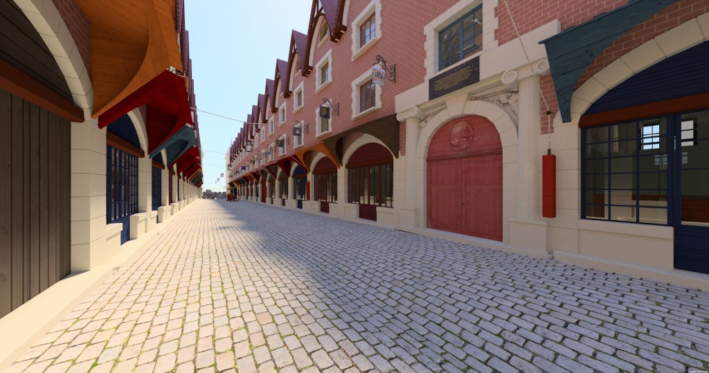
The original curved shape of the painting relates to its intended location, and its function as a shop sign. There are various ideas of how it was attached, and most of them draw on the fact that each of the premises had an arch of an almost identical size and shape. This is what the bridge looked like in 1684, at the festivities which were held to celebrate the return to health of King Louis XIV in the January of that year. You would think the painting would slot nicely into one of those arches, just where the chandeliers are hanging.

In case you were wondering, the bridge was never this wide – this expansive perspective was created by the anonymous printmaker in order to impress on the viewer the magnificence of the spectacle. A recent computer simulation has suggested that originally the bridge actually looked more like this:

Digital reconstruction of the Pont Notre-Dame in 1720, from https://www.journal18.org/issue5/virtual-explorations-of-an-18th-century-art-market-space-gersaint-watteau-and-the-pont-notre-dame/

While each arch might still look like a good place for a painting, when the painted area was made rectangular, the sides were cut down – the curve does not reach its full extent. If the missing sections of the canvas were to be replaced to complete the curve, it would be too wide for one of those arches – and would also block the upper part of the doorway. However, if it weren’t inserted into the arch, but onto the canopy above it, it would fit perfectly.

Digital reconstruction of Gersaint’s shop, from https://www.journal18.org/issue5/virtual-explorations-of-an-18th-century-art-market-space-gersaint-watteau-and-the-pont-notre-dame/

All of this comes from a brilliant article from which I have derived much of the above information. So, if you have the time, and would like to know more about the history of the Pont Notre-Dame and the Parisian art market, I would recommend Sophie Roux’s Virtual Explorations of an 18th-Century Art Market Space: Gersaint, Watteau, and the Pont Notre-Dame published online by Journal 18 – a journal of eighteenth-century art and culture.

But let us finish with the painting. I questioned, above, whether the customers on the right truly were ‘paying close attention to a charming, smaller work.’ Have another look, and see what you think.

Hanging on the wall behind them is what appears to be a 16th Century Venetian altarpiece – a Nativity with the Mystical Marriage of St Catherine of Alexandria, perhaps. It is notable that the rapt attention of the customers, who are looking at the painting held by Madame Gersaint, echoes the heartfelt devotion of St Catherine herself, kneeling before none other than the Christ Child. What has so absorbed them? What could the painting show? How exquisite can it be to inspire such attention? TO be honest, the more I look, the less I am convinced that this is a painting. Madame Gersaint has her left hand on a stand, which hinges from the top of the elegant 18th Century frame, and I’ve never seen a painting that has a stand like this. Admittedly, I’m not an expert on how paintings were displayed in the 18th Century, but everything else I’ve seen suggests that they were hung on walls, much as we would do today, and that would include small paintings, the size of this object. However, just next to the elbows of the two seated customers is a box with an open, hinged lid, containing a brush, and another, similarly-coloured round or oval object – there is another one of these just next to the black frame. This is surely a vanity case. Which makes me think that the black frame with a stand is probably a mirror, and that these people are completely wrapped up in themselves. Watteau really was a gorgeous artist, a clever, and subtle man. He may be advocating art as a sophisticated leisure activity. He may be promoting the art market over the pretensions of the Académie. But he wasn’t above poking fun at the self-absorption of the haute-bourgeoisie. Buyer, beware!

Rosalba Carriera, Jean-Antoine Watteau, 1721. Museo Santa Caterina, Treviso.

Now that Lent is over, I am hoping to blog about once a week – as long as other commitments don’t get in the way. And I will, of course, continue talking! I do hope some of you can join me for Rosalba Carriera and the Power of Pastel on 19th April – not to mention the other two of the Three Women in the 18th Century, full details of which are on the diary page, along with information about everything else I am up to in the coming weeks. In the meantime, I trust you are enjoying the changeable weather: I’m glad to say that it has now stopped snowing and the sun has come out…

Easter!

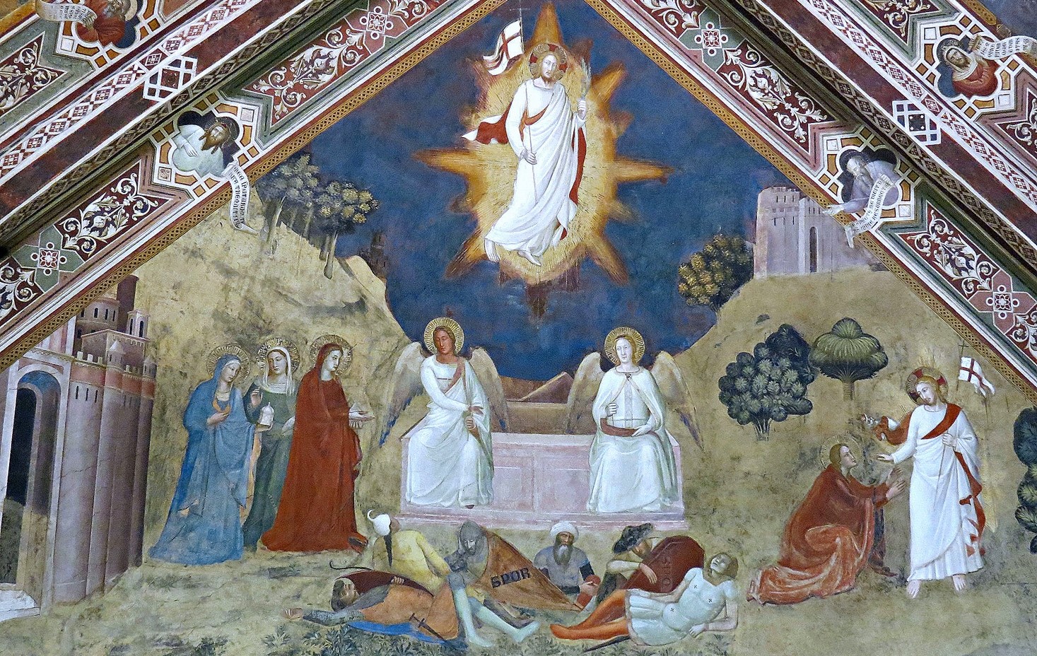
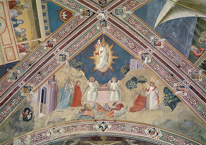
Andrea Bonaiuti, The Resurrection, 1365-8. The Spanish Chapel, Santa Maria Novella, Florence.

Happy Easter! Yesterday I referred to last year’s blog on The Devils in Andrea Bonaiuti’s Harrowing of Hell – and then I thought I ought to read it through, just in case there were any embarrassing typos. I’m glad to say that there weren’t, but I was surprised to see how much of yesterday’s material I had already covered. The focus changed, I suppose, from putting the Harrowing of Hell in context, to using the Crucifixion as a focus. I will do the same today, as last year I included this painting of the resurrection when talking about The Devils, and also referred back to it on Easter Day itself, when I talked about Donatello’s relief in San Lorenzo, which still continues to astonish me (see Day 25 – The Resurrection).

We have already explored the frescoes on this wall, starting at the bottom left, outside the walls of Jerusalem, then looking up to Calvary, and back down again to hell on the right, the position of the narrative on the wall effectively mapping, in relative terms, the supposed geographical locations of the settings. But for the resurrection, where should be go? Clearly, from hell, we must look up, and then look higher still than the Crucifixion: up onto the ceiling.

Once more I think that the use of the available space is remarkable – the resurrection, the culmination of the Easter story, and the confirmation of Christ’s triumph over death, is at the very top of the decoration of the chapel, as close to the apex of the ceiling as is possible. We can see the edges of the other images on the quadripartite vaulting, but we’ll talk about them another day.

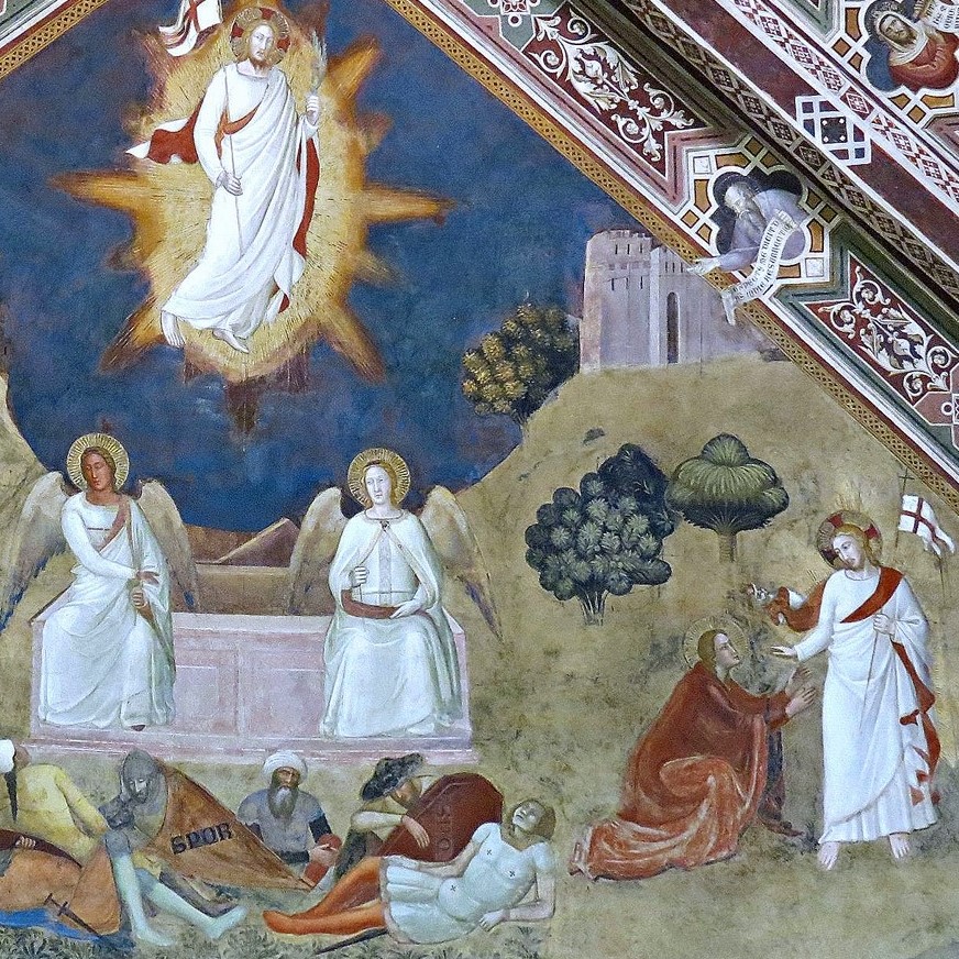
Three Maries approach the empty tomb from the left, the soldiers still fast asleep in front of it, two of them with shields labelled SPQR (although the inscription on the red shield is hard to see). Two angels sit on the edge of the open sarcophagus, the lid having been tipped off to the back – you can see one corner of it next to the right angel’s wing. Christ is resplendent – and glorious – up above. There is no description in the bible of how Jesus emerged from the tomb, but what we see here is a combination of elements derived from all four gospels. Mark 16:1 says,

And when the sabbath was past, Mary Magdalene, and Mary the mother of James, and Salome, had bought sweet spices, that they might come and anoint him.

So – these are the three woman we see to the left of the image. All four gospels say that the stone covering the tomb had been taken away, and most say it had been rolled. The bible implies that Joseph of Arimathea’s tomb had been cut into a rock like a cave, with a stone rolled in front to close it. However, medieval artists knew that people were buried in sarcophagi, and that was what they were going to paint. By the time Bonaiuti was at work in the 1360s, this image was entirely traditional. Mark 16:5-6 goes on to say,

And entering into the sepulchre, they saw a young man sitting on the right side, clothed in a long white garment; and they were affrighted. And he saith unto them, Be not affrighted: Ye seek Jesus of Nazareth, which was crucified: he is risen; he is not here: behold the place where they laid him.

The angel who is gesturing, as if to say ‘behold the place where they laid him,’ is indeed on Christ’s right side, even if (1) Jesus is way above them, and (2) there are two ‘men’ in the painting, not just the one referred to by Mark. Matthew 28:3 also mentions only one angel, saying, ‘His countenance was like lightning, and his raiment white as snow.‘ However, Luke 24:4 says, ‘two men stood by them in shining garments.’ Bonaiuti draws on all of these accounts – the white clothes, which do indeed shine out against the relatively dull background; the gesture towards ‘the place where they laid him’; and, from Luke, the fact that there are two of them. But that is not the only source for this image. Compare these two details:

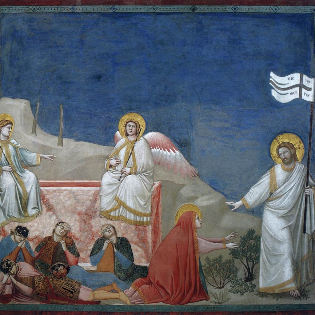
On the right is Giotto’s Resurrection from the Scrovegni Chapel, painted some 60 years before Bonaiuti’s version. I made the mistake last week of saying to a group that Bonaiuti had worked in the Scrovegni Chapel: I was thinking of Giusto da Menabuoi, another Florentine artist, and similarly on the edge of being considered obscure. But I can see why I made the mistake. It does look as if Bonaiuti had seen Giotto’s painting, as he combines the same elements. Both images show two angels sitting on the tomb, with the one on our left pointing to the risen Christ, at whose feet kneels Mary Magdalene. The pointing hand, illustrating the phrase ‘behold the place where they laid him’ could equally well, in the Bonaiuti, illustrate the phrase ‘he is risen,’ which is used in all three of the synoptic gospels. Giotto is being remarkably clever, combing the resurrection with the Noli me tangere (more of that later). It is almost as if, for Giotto, the two angels sitting on the tomb are a ‘flashback’, or as if they are talking to the three Maries who are ‘off screen’, as it were – as indeed they are in the detail I have taken from the Bonaiuti.

I have written about the episode traditionally called the Noli me tangere before, when I discussed Galizia Fede’s version (see 104 – Don’t touch!), not to mention Giotto’s painting in the Scrovegni which we see here (109 – Death and Resurrection). The title itself comes from John 20:17, and means ‘touch me not.’ According to John, Mary Magdalene finds the tomb open, and so goes to tell Peter and John, who run there only to find it empty, before heading back home.  John 20:11-12 then says,

But Mary stood without at the sepulchre weeping: and as she wept, she stooped down, and looked into the sepulchre, And seeth two angels in white sitting, the one at the head, and the other at the feet, where the body of Jesus had lain.

It seems clear that, however much Giotto and Bonaiuti drew from the synoptic gospels, everything they needed is here. In John’s account Mary then turns away from the tomb and sees the risen Christ, but does not know it is him. At the end of John 19 we were told that the tomb was located in a garden, which could explain what happens next in John 20:15-17,

Jesus saith unto her, Woman, why weepest thou? whom seekest thou? She, supposing him to be the gardener, saith unto him, Sir, if thou have borne him hence, tell me where thou hast laid him, and I will take him away. Jesus saith unto her, Mary. She turned herself, and saith unto him, Rabboni; which is to say, Master. Jesus saith unto her, Touch me not; for I am not yet ascended to my Father: but go to my brethren, and say unto them, I ascend unto my Father, and your Father; and to my God, and your God.

Notice that Mary Magdalene is the first witness of the resurrection. Notice, too, that Jesus instructs her to bear that witness to the apostles. Now, given these two observations, I really don’t understand the objection to having women in the priesthood. In fact, in all of the gospels it is the women who are told to tell the apostles that Christ is risen, although in Matthew, Mark and Luke it is the angels who give this instruction. So, if this ministry was valid, what is the problem now? But I’ll get off my soapbox and move on.

In both of the details, and in Bonaiuti’s image of the resurrected Christ above the tomb, Jesus carries the Cross of Christ Triumphant: the red of his suffering, in the shape of the cross, against the white of his purity. He also, in both appearances in Bonaiuti’s fresco, wears red and white, as do the angels sitting on the tomb: these are the colours of the resurrection. Bonaiuti shows the resurrected Christ carrying the flag in his right hand, with, in his left, a palm leaf, denoting his victory over death. In the Giotto, it is the flag itself which gives us this message. Written in the four white corner sections are the letters ‘VIC’, ‘TOR’, ‘MOR’ and ‘TIS’ – or Victor Mortis, ‘victor over death’. I was asked about this on Thursday, but couldn’t get back to the relevant slide to try and read it: thank you to the person who did!

In Bonaiuti’s telling of the story the resurrection seems effortless (especially when compared to Donatello’s version which I mentioned above). Christ floats in the sky, drapery only slightly ruffled by the breeze, a glorious mandorla of light around him which illuminates, ever so slightly, the trees growing on either side. The hills slope down towards the tomb, leaving Jesus beautifully framed in the middle of the blue sky, the apex of a triangle whose base is formed by the sleeping soldiers and sides by the attendant angels. He is at the very top, a joyous triumph at the end of the long, slow period of reflection that is Lent, and the unimaginable suffering of the Passion. A Happy Easter, indeed!

No more to say for now. I look forward to talking to some of you tomorrow, when we will be Getting Carried Away with Michelangelo at 2pm and 6pm, but after that I will take a break for a while, before my next blog… which, almost inevitably, will be about something from the 18th Century. But before then, I do hope you enjoy the rest of the long weekend, both today and tomorrow. Happy Easter!

Lent 46

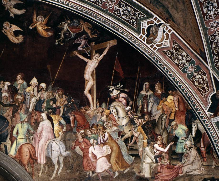
Andrea Bonaiuti, The Crucifixion, 1365-68. The Spanish Chapel, Santa Maria Novella, Florence.

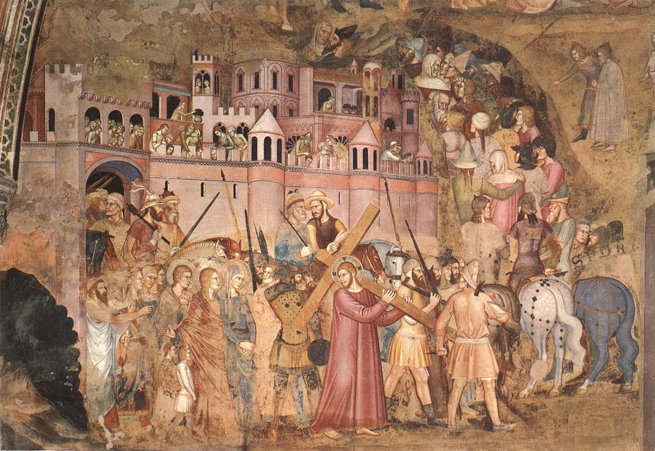
As I said on Thursday, the Master of Delft does not take us any further than Good Friday, and so, for the final day of Lent we will leave the Netherlands and head down to Italy, and to Florence, to consider one of the city’s rich array of decorative schemes which doesn’t receive nearly as much attention as it should. One corollary of this is that the available images are not the best, and most of these are pre-restoration – my apologies, but they should still all be legible. Now the paintings are clearer, and brighter, after the removal of layers of dust and soot, and the careful and subtle reintegration of small areas of loss. We are in Santa Maria Novella, the chief Dominican church of the city, or rather, in the monastery of which the church forms a part. If we have arrived by train we won’t have to go far – the station is ‘Firenze SMN’ – taking its name from the church, and directly opposite the ecclesiastical East End. Nowadays, you enter the complex through the side towards the station, as most of the buildings are now part of an extended museum, even though the Dominicans are still, somewhere, in residence. The room we are visiting is called The Spanish Chapel, as it was here that the Spanish community in Florence used to worship in the sixteenth century. They arrived in the retinue of Eleonora da Toledo, daughter of the Viceroy of Naples, who married Cosimo de’ Medici, the second Duke of Florence and later first Grand Duke of Tuscany, in 1539. However, originally it was the chapter house of the monastery, where the Friars would meet every day to read a chapter from the Rule of St Dominic. This part of the building was completed in 1355, and the frescoes were painted between 1365 and 1368 by Andrea Bonaiuti – although the ‘chancel’, a chapel dedicated to the Holy Sacrament, was redecorated in the 18th Century, which is when the stone arch that you can see in this detail was made. However, there would have been something similar in the 14th Century, as there are frescoed statues peeking out from behind the later arch.

Bonaiuti had a difficult challenge – to fit his fresco around the arch – and that is why I wanted to talk about this image today: to see how well he succeeded. The whole painting is surrounded by a decorative border, which unifies all of the imagery in this remarkable space (more of that another day). In between the patterns made up of stylised vegetation – recognisable to contemporary tourists from the Florentine ‘handmade’ paper available from shops on almost every street – we see prophets emerging holding scrolls, foretelling the coming of the Messiah and his inevitable suffering and death. At the very top you may just be able to pick out a bird on its nest – the Pelican in her Piety. It was believed that the pelican would peck at its own breast to feed its young with its flesh and blood (presumably a misunderstanding of the act of regurgitation), and the Christological significance is clear: in Christian terms Jesus feeds us with the sacrifice of his own body, and notably, the wound in his chest, from which, like the pelican in this symbolic image, the blood flows.

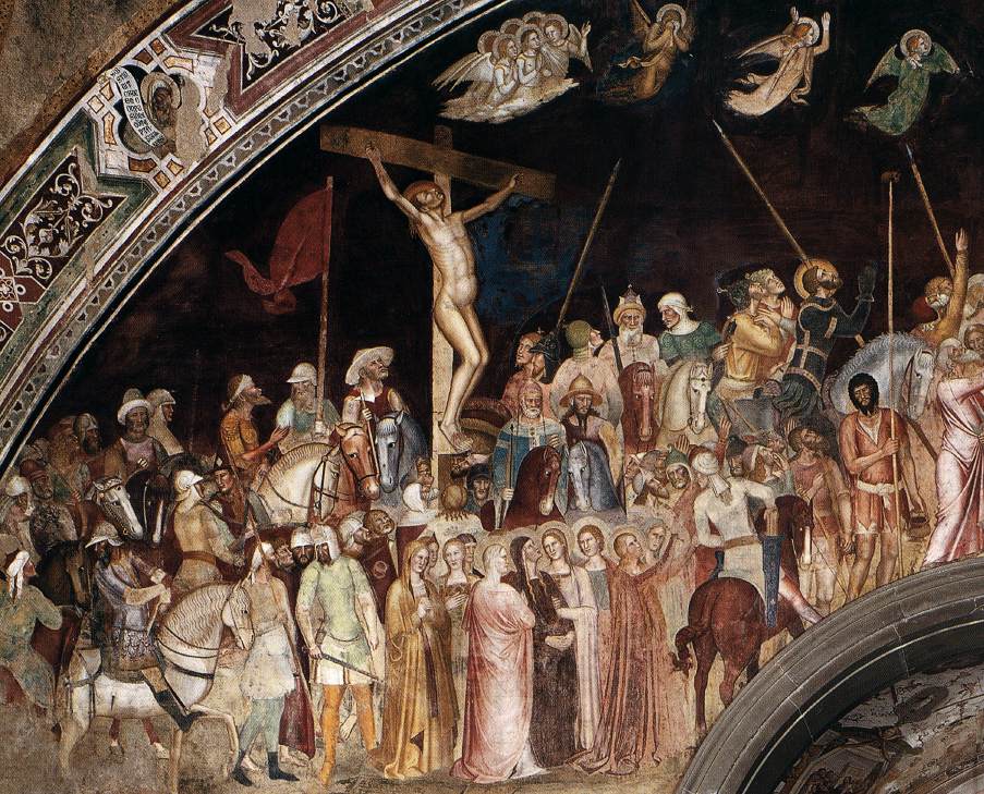
The fresco on this particular wall is, in essence, another Crucifixion. We see Christ, top centre, on his cross, facing forward, flat against the picture plane in much the same way as the Master of Delft was to paint it later: this is entirely traditional. So too are the two thieves, whose crosses are again angled, although both are turned inwards, so that the arms of the crosses lead our eye into the painting and towards the image of Jesus. They are surrounded by a vast multitude, too many to number or name – but let’s see what we can do! We shall start at the bottom left of the image.

You should recognise this, from the Master of Delft, as the Via Crucis, ‘the Way of the Cross’. It is also known as the Via Dolorosa, or ‘the Sorrowful Way’, or, more prosaically perhaps, the Road to Calvary. We see Jesus, in his red robe, though stripped of his blue cloak, carrying his cross and heading off to our right. He looks over his shoulder towards the only three people the crowd who have halos. Prominent in the foreground is Mary Magdalene, her head uncovered, but with her full-length red cloak covering her hair as it goes over her shoulders. To one side of her we see Mary, the mother of Jesus, in blue, and to the other side, St John the Evangelist. Behind them are some other women, presumably the ‘Daughters of Jerusalem’ Jesus speaks to, or some of the ‘many’ who followed him from Galilee. Next to the Magdalene are two small boys, one wearing white, with curly blonde hair, another, in darker clothes, sadly damaged, wearing a cap. We have seen them before, depicted several times by the Master of Delft, and we will see them again. The crowds have left the city gate, and so are now ‘without a city wall’, and they are turning to their left and walking up the ‘green hill’. Bonaiuti imagines the crucifixion as an important event in the life of the city, and the crenellations of the walls, the towers and loggias of the city, even the lookout from the barbican of the city gate, are crowded with the curious. Public executions would always bring out the crowds.

If we follow them up the road, we arrive first at the good thief’s cross. He faces inwards, and up. A small group of five angels, just above his left hand, accompany a sixth person in white, who is praying. The angel on our right gestures upwards, and looks back at the central, praying figure. This is the soul of the good thief, being accompanied to heaven. Below the cross we see the ‘Good’. On the right Mary Magdalene reaches up to Jesus on the cross. Next to her, St John the Evangelist looks back to the Virgin, supported by Mary Zebedee and Mary Salome, and they are accompanied by more of the female followers of Christ. The boys are nowhere to be seen. Amongst this mass of soldiers, many on horseback, the women, and John, look vulnerable, and indeed, a man on a lively brown horse, perched on the edge of the chancel arch, looks down at them as if they are a threat. Just to the right of the horse’s head is a man poorly clad in a pinkish-brown, with a pot in his left hand and a long pole in his right: he has offered the sponge soaked in vinegar to the thirsty Christ. A white horse looks over his shoulder. This steed bears a soldier in dark grey armour, looking up to the cross, hands raised in prayer. He has a halo, and a spear. This is the centurion who declared ‘Truly this man was the Son of God’ (Mark 15:39), here identified as St Longinus, the soldier who pierced Christ’s side with a spear.

When we turn our attention to the centre of the image, we can see that Longinus and the sponge-bearer are at the foot of the cross. This is topped by the titulus, and surrounded by mourning angels. To the right, one of the shields bears an inscription which should read ‘S.P.Q.R.’, although whichever member of the workshop painted this detail, they couldn’t fit it all in, leaving out the ‘Q’. Mind you, this is a good choice for the omission, as it only stands for ‘and’.  The initials are short for Senatus Populusque Romanus, ‘the Senate and People of Rome,’ referring to the ancient Roman Republic, although its use continued throughout the Empire until the reign of Constantine I. However, it was revived, and is still in use today. It can be found, among other places, on the drain covers of roman streets and pavements. Nowadays, however, Italians from other regions have realised that it actually stands for Sono Pazzi Questi Romani – ‘These Romans are bonkers’. At the foot of the cross stand two boys, one wearing white, with curly blonde hair, another, in red, wearing a cap. They have pushed their way to the front, as boys will. These children, present at the crucifixion, appear more and more from the 13th Century onwards, apparently, and, from imagery elsewhere in the Spanish Chapel, have been identified as the Jews and Moslems who would be converted to Christianity – even if Islam did not exist at the time of the crucifixion.

There is only threat and violence on the side of the bad thief. A soldier on horseback wields his club towards a group of onlookers who are fleeing towards the chancel arch. To the left of the bad thief’s legs another soldier, on a brown horse, also wields a club. The thief’s shins are bloodied, following the text in John 19:31-34. It is a result of crucifixion on the eve of the sabbath, and the need to get the bodies down before sunset:

The Jews therefore, because it was the preparation, that the bodies should not remain upon the cross on the sabbath day, (for that sabbath day was an high day,) besought Pilate that their legs might be broken, and that they might be taken away. Then came the soldiers, and brake the legs of the first, and of the other which was crucified with him. But when they came to Jesus, and saw that he was dead already, they brake not his legs: But one of the soldiers with a spear pierced his side, and forthwith came there out blood and water.

At the bottom right some of the men have taken hold of Jesus’s red robe, and stretch it out between them. The one on the left holds out a dice to his companion. Like the breaking of the thieves’ legs, this episode is not represented by the Master of Delft, but is recounted earlier, in John 19:23-24,

Then the soldiers, when they had crucified Jesus, took his garments, and made four parts, to every soldier a part; and also his coat: now the coat was without seam, woven from the top throughout. They said therefore among themselves, Let us not rend it, but cast lots for it, whose it shall be: that the scripture might be fulfilled, which saith, They parted my raiment among them, and for my vesture they did cast lots. These things therefore the soldiers did.

The ‘scripture’ here is Psalm 22:18, ‘They part my garments among them, and cast lots upon my vesture.’

If the good thief has angels to carry his soul away, the bad thief is tormented by devils. One sits astride the cross, threatening him with a barbed spear, while three more bring a large bowl, presumably containing something else with which to torture him, or simply to carry him away – down – to hell. Which is where we shall go next – down to hell.

The Apostles’ Creed states quite clearly that Christ, ‘was crucified, dead and buried, he descended into hell. On the third day he rose again from the dead.’ So what was he doing in hell? The painting does make it quite clear, but, as I talked about this at length last year on the equivalent day (though not the same date – Easter is a moveable feast), I am just going to direct you towards Day 24 – The Devils, while also pointing to the painted statue on the chancel arch which looks down from the top left of this post-restoration detail.

What I love about this fresco is the way that Bonaiuti uses the space available to him. Christ leaves Jerusalem at the bottom left, and follows the procession up the wall, and up the hill of Calvary, where his is crucified at its summit, just visible on either side of the 18th Century keystone. Way below his left hand is hell, as it will be at the Last Judgement, and this is where he now descends. It is a remarkably good use of the awkward format, and entirely appropriate, placing his body on the cross directly above the altar, where mass would take place, and the bread would become the body of Christ, as if lowered down from the cross. Good Friday was the first day, today, Easter Saturday is the second, so tomorrow is the third day, and ‘On the third day he rose again from the dead’. But what space has Bonaiuti left for the resurrection? Maybe we will find out tomorrow.

Looking forward, beyond Lent, and beyond Easter, things will get a little less godly (I’m afraid/I’m glad to say/neither of the above/delete as appropriate). On Easter Monday I will be talking about Michelangelo in love, and the fruits of his infatuation: some of his most beautiful drawings and poems. If you are interested, there is still time to book for Michelangelo Matters 3: Getting Carried Away at both 2pm and 6pm. The following series of talks, Three Women in the 18th Century, is also on sale, and you can find more details, together with links to Tixoom to book, on the diary page. Thank you, as ever, for all of your support. Until tomorrow, have a peaceful day.

Lent 44

On the right hand panel of the triptych, Christ is taken down from the cross. The stark, empty form appears against the sky, which is partially clouded, as we witness the gradual emptying of the top half of the painting. A ladder leans against the cross, one man climbing down, lowering the lifeless form as he goes. Another, probably Joseph of Arimathea, holds the body, as if he is showing it to us, like a monstrance but with the body itself rather than the consecrated host (which is, of course believed by some to be the body itself). At Jesus’s feet Mary Magdalene and another man, probably Nicodemus, play their part. The Virgin Mary kneels at the foot of the ladder. On reflection I have little doubt about this. The other day I forgot to mention that, in the foreground, we can see that Mary does wear a red/pink dress under her blue – which would explain the pink sleeves, not seen elsewhere, but which are revealed at the foot of the ladder.

From this point a diagonal sweeps downwards towards the holy woman who is reaching out to Jesus, a gesture which seems to beseech, to indicate and to welcome. It is as if she is inviting the kneeling Virgin to join them in their sorrow, which indeed she has.  Kneeling down at the same angle as this woman, John tilts his head towards the other representation of the Mother of Christ, who here is helpless in her grief. A woman, in white, but wrapped in rich red, angled outwards, a little like the donor, puts her hand to her chest, .

To me – and this is pure hypothesis – the striking downward diagonal of the composition suggests the continued movement of Jesus’s body towards the beseeching arms of the holy woman. There is a little space at the Virgin’s feet. Maybe we are supposed to imagine his body being carried there, and placed before the mourners, allowing the lamentation to continue as in many other paintings and sculptures. Maybe we are then supposed to imagine it being lowered, still further, into the hands of the priest who has elevated the host during the Mass, and will then turn to the congregation with the body of Christ – the consecrated host, the body itself – as part of the liturgy.

But this is as far as it goes. One of the curious features of this painting, as far as I am concerned, is that there is no image of the resurrection, no hint, even, of the tomb, empty or otherwise. I can only suppose that, elsewhere in the convent, nearby, there was another altarpiece dealing with the entombment, the resurrection and the subsequent events leading up to the ascension of Christ, and to Pentecost. What little has been attributed to the Master of Delft, though, doesn’t include these later episodes, so it probably wasn’t by him. However, I will include some of them, as painted by Giotto, in a free talk entitled Painting the Passion with Passion, which I am delivering for the Churches Conservation Trust at 1pm today, Thursday 1 April. It will be on their Facebook page, and a recording will be posted later on their YouTube channel – I’ll let you know about that when it happens. But as it is not yet Easter, I will continue this Lenten series on Saturday in Florence. No words tomorrow – just images. I do hope you have a calm and peaceful day.

Lent 43

The central panel of the triptych shows The Crucifixion. Christ appears at the top centre of the painting, outlined against the sky, the weather deteriorating from the clear blue we saw yesterday as we move from left to right. He is presented formally to us, an icon outside of the worldly clamour all around. The good and bad thieves are seen to the left and right, their crosses angled and so reaching in and out of the space inhabited by the other characters. Seen together, the individual details we have looked at over the past six weeks take on their full meaning, as their context become clear. The patron, possible Herman van Rossum (Lent 25) kneels, anachronistically, in the bottom left hand corner, next to the Virgin Mary, angled slightly outwards. In context it is clearer that he is not looking at anything depicted in the painting – but he must be contemplating it nevertheless.

The Master of Delft, The Crucifixion, about 1510. National Gallery, London.

I do not know of a painting that is better at illustrating the difference between the good and bad thieves – although I know there are many which match this. The good thief is on Christ’s right hand (on our left), the side of The Blessed at the Last Judgement. His cross rises up behind the group of ‘The Good’ – the Virgin, St John the Evangelist, the Holy Women and the donor. In the background he is flanked by Jesus carrying his own cross, the New Church of Delft, and Judas, hanging on the tree. He faces forwards, towards us, like Christ, and upwards, towards heaven.

The cross of the bad thief, on the other hand, emerges from behind ‘The Bad’ – Pilate on his white horse, the chief priests, and disreputable soldiers. His back is turned, away from us, and away from Jesus, and his head lolls as he looks down to Hell. The painting is, roughly, symmetrical, and in the same way that Jesus appears to the left of the good thief’s feet, he also appears to the right of the bad thief, where he is already suffering the mental anguish of the Agony in the Garden. This is the one point of the triptych in which the narrative does not follow from left to right – it is the earliest episode depicted. But Christ’s sorrow and Judas’s betrayal are associated with the bad thief as much as the Church is associated with his repentant companion. Also next to the bad thief’s feet are the soldiers – the rabble of reprobates who have come to arrest Jesus. And then, there is the weather: the good thief has good weather, the bad thief, bad. It is nearly the sixth hour (Matthew 27:45) –

Now from the sixth hour there was darkness over all the land unto the ninth hour

If you want to know what ‘the sixth hour’ means – and were thinking that I sometimes get a little too detailed with biblical exegesis – why not read What is the sixth hour in John 19:14? on thebiblemadeplain.com

Meanwhile, in the foreground two boys choose where they want to be in the world.

Lent 42

It is Holy Week, and for the remaining days of Lent, I will say relatively little (apart, maybe, from Saturday), but leave you with the painting itself to explore. By now, if you have a good memory, you should find almost all of it familiar, although I am imagining that, if you haven’t located the painting before now, then it would be quite hard to work out, from the details themselves, where everything belongs. And if you did not know this picture previously… well, I am really not surprised! If anything, I have been impressed by the number of people that found it, a few in the first week, and several more during the second. It really is not well known.

The Master of Delft, Christ presented to the People, about 1510. National Gallery, London.

This is the left hand panel, known as Christ presented to the People. In its overall composition, it takes the form of an Ecce Homo. After the arrest, Christ is taken to Annas, and then to Caiaphas, and then to Pilate. He is sent to Herod (we haven’t even mentioned him), and back again to Pilate. Once it is decided that Barabbas will be freed, Jesus is first whipped, and then dressed in purple, crowned with thorns, and mocked a second time. John 19:4-5 tells us what happens next:

Pilate therefore went forth again, and saith unto them, Behold, I bring him forth to you, that ye may know that I find no fault in him. Then came Jesus forth, wearing the crown of thorns, and the purple robe. And Pilate saith unto them, Behold the man!

Behold the man!‘ – or Ecce Homo – is the name given to images like this. However, the narrative has gone a little further, as he no longer wears the purple robe. An ensuing discussion – with the mob heavily influenced by the chief priests – determines that Jesus will be crucified. And Pilate, against his will, submits to this. Although other gospels tell us that the purple robe was removed, and replaced with ‘his own clothes’, John omits this detail. Nevertheless, the precise moment that is painted by the Master of Delft is, I believe, that in John 19:16-17, who tells us what Pilate did next:

Then delivered he him therefore unto them to be crucified. And they took Jesus, and led him away. And he bearing his cross went forth into a place called the place of a skull, which is called in the Hebrew Golgotha

We see the beginning of this progress towards Calvary, with the movement determined in the composition by two overlapping diagonals. Jesus is at the top of the few steps which constitute the Scala Santa, with Pilate looking down at him from his place in the shadows, just above and to the left. The Palace looms above him, and the sculpted archer at the top, when seen in context, seems to be taking direct aim at the Roman prefect himself. The tall, shadowy arcade looks rather oppressive, despite the appearance of the bright yellow sleeve and red hat of the black trumpeter appearing from one of the further arches.  Jesus, and the guard behind him, who holds up Jesus’s robe so he doesn’t fall down the steps, both look down, and their gaze directs us along the diagonal formed by the rope held in the hands of the soldier wearing a pink jacket, behind whom a man crouches to mock Jesus. The rope leads our eye to the cross. This could have already grabbed our attention, as it projects into our space, leading our eyes into the painting, and up to the right – the second diagonal. It is framed by the legs of the carpenter, whose rear side forms the lightest area in the foreground, and claims attention for itself, thus undermining any dignity his profession might have. The carpenter reaches down to reach his auger to make holes to guide the nails. The line of his back, of the auger, and of the cross lead us past the weeping woman and her two children, past the soldier with the full, silvery sleeves, to the two thieves, about to head out through the city gate and turn right to the green hill without the city wall. The weather is lovely. The grass and the trees are green, the sky is blue – and so are the distant hills.

Lent 41

This is the same painting – although you would be forgiven for not recognising it. The work is a triptych – a painting on three panels – and for most of the time it would have been closed, only to be opened when mass was celebrated at the altar on which it was originally found. The ability to close altarpieces like this served several purposes, and one was purely practical: to keep dust off the richly coloured surface. The exterior panels were almost always far less colourful, and here, as so often, they are painted in grisaille – from gris, or ‘grey’, in French – a term for monochrome painting, which is usually intended to look like sculpture.  As such, the exteriors of triptychs are not attention grabbing. When opened, the far richer colours would then draw people to the altar where mass was being celebrated, and conversely, when closed, the colour would be removed – ideal for a season so focussed on withdrawal and contemplation as Lent. This, of course, creates ambivalence. The richly coloured surface we have been contemplating throughout Lent should not have been visible. But by the time it could be opened – on Easter Sunday – then everything that has gone before is all but irrelevant, perhaps, as that is the day to celebrate the joy of the resurrection.

So what do we see here? There are four figures, conceived as stone sculptures, standing on irregular hexagonal plinths, casting shadows onto the backs of the niches in which they stand. The right side of each niche is more brightly lit than the left, which suggests that the main light in the chapel where this painting was originally located came from a window on the worshipper’s left. The ‘sculptures’ represent the Virgin and Child and St Augustine of Hippo on the left wing, and on the right are Sts Peter and Mary Magdalene. St Augustine can be identified because he is a bishop: he wears a mitre – the hat with two points – and carries a crozier, an episcopal equivalent of a shepherd’s crook, which indicates the care of his flock – all of the Christian souls in his diocese. He also wears a cope – the ceremonial cloak, or cape – which is fastened with an elaborate clasp, called a morse. But there have been many holy bishops. It is the heart that tells us this is St Augustine. It relates to a quotation from the the Book of Proverbs (23:26) in the Old Testament:

My son, give me thine heart, and let thine eyes observe my ways.

In a commentary on this text Augustine wrote,

“He says, give me. Give me what? Son, your heart. When it stays with you, it will go ill. You will be drawn to toys and to lascivious and harmful loves. Give me, he says, your heart. Let it be mine, and it will not perish.”

And this is precisely what Augustine is doing in this image – giving his heart to Jesus. Hence the presence of the Virgin and Child, as if any reason were needed. But why did the patron choose St Augustine to go on the outside of this painting? Quite simply because the Premonstratensians followed the Augustinian rule (see Lent 25).

The presence of St Peter, identified by the key he is carrying, one of the keys to the Kingdom of Heaven, is not so obvious, despite the fact that he was the first head of the Church after Christ. Nevertheless, his presence would remind the members of the convent that, after their allegiance to St Augustine, their ultimate responsibility (on Earth) was to the Pope. Also, given his status, Peter is hardly present on the inside of the altar, apart from a brief appearance, asleep, in the Garden of Gethsemane (Lent 10), so a dominant presence here is perhaps to be expected. The Magdalene, dressed differently compared to the interior scenes, but still holding her jar of precious ointment, clearly has a far more central role in the Easter story. She is, in some ways, the closest to Christ in the Master of Delft’s account. She is in the centre of the painting, at Jesus’s feet during the Crucifixion (Lent 32), and then again at the Deposition from the Cross (Lent 39). Given that many of the Canonesses would have been members of aristocratic families, being there against their will might, in some instances, have meant that their repentance from the ‘error of their ways’ would have been constantly required. Her strong female presence, opposite that of the Virgin Mary, would also have been relevant to all members of the convent, though. As for Mary, she too is central at the Crucifixion and the Deposition, serving to remind the Canonesses of their diverse losses, perhaps, and of the Christian endurance necessary to overcome them. Although ‘useful’ as a recipient of St Augustine’s heart, the Christ Child is also present simply to identify the Virgin: he is her chief attribute, or symbol. Indeed, many paintings called ‘Madonna and Child’ are, in truth, predominantly paintings of the Virgin, and Jesus is really there so that we know which female Saint we are looking at.
As for Lent itself – well, I hope you’re learning as much as I am! Cards on the table: I thought, ‘What painting is complex enough to cover the forty days of Lent,’ and this was the answer I came up with. So, on the first two days I planned all forty details. And then I gradually realised that it wasn’t going to stretch all the way to Easter, which, I must admit, was initially confusing. But why should it be ‘forty days’ in any case? Well, as a period of quiet and contemplation, it was made to commemorate Christ’s retirement to the wilderness for forty days. Admittedly, this was immediately after he had been baptised, so approximately three years before the crucifixion, but that is irrelevant. As a period of restraint – and of avoiding temptation – it is entirely appropriate. However, given that every Sunday is effectively a celebration of Christ’s resurrection, it was not deemed appropriate that these should form part of this period of sacrifice. So the Sundays between Ash Wednesday and Easter are theoretically not part of Lent… which is why Lent lasts 46 days rather than 40. And while we’re talking about it the name itself, ‘Lent,’ comes from an Old English word for the ‘Spring season’, which may itself derive from the idea that the days lengthen. And indeed they have – we have entered daylight saving – British Summer Time – and, as of today, we in England no longer have to stay at home. I, however, have planned a week which means I probably won’t leave the flat until Friday! I do hope that some of you are free to join me for some of this – starting with The Sistine Chapel, from ‘Beginning’ to ‘End’ today at 2pm and 6pm – BST! And tomorrow – back to the painting. Somehow.