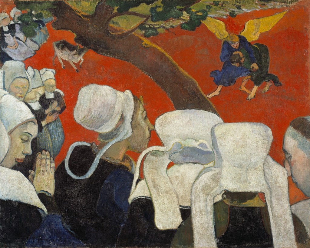
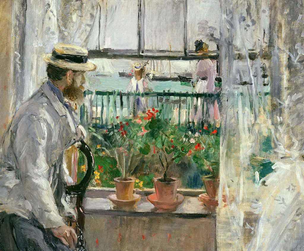
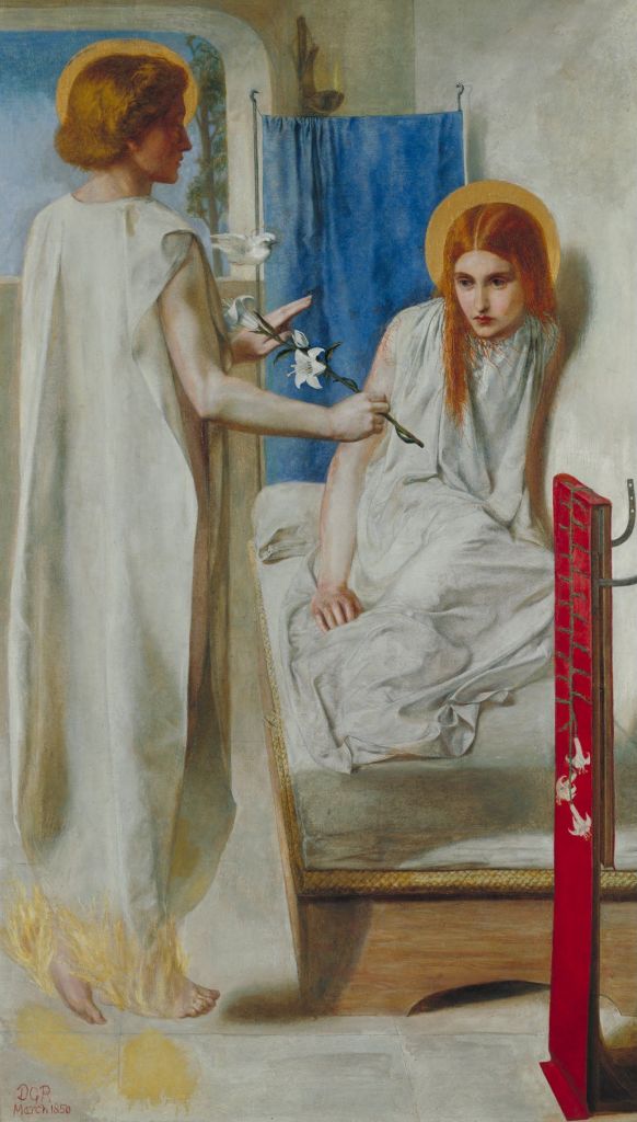
Dante Gabriel Rossetti, Ecce Ancilla Domini! (The Annunciation), 1849-50. Tate.
Today’s painting is the very first thing you will see if you visit The Rossettis at Tate Britain, the exhibition I will be introducing this coming Monday, 15 May at 6.00pm. It’s the perfect choice to start this exhibition, as I will explain below, and a fascinating work in its own right – hence my choice today. On 22 May I will talk about Carpaccio: Paintings and Drawings, covering both the exhibition at the Doge’s Palace in Venice, and also the other paintings by the Venetian master that can be found elsewhere in the city. I’m currently in Dublin to see Lavinia Fontana – it’s a superb exhibition – and I hope to talk about that on 29 May, but I won’t put it on sale until I’m sure that I’ll be in the country that day. However, as you’ll know, I’m already lined up for The ‘Other’ Vermeers – the ones that aren’t in the Rijksmuseum’s sold-out show – the day after that finishes, 5 June. See the diary for more!

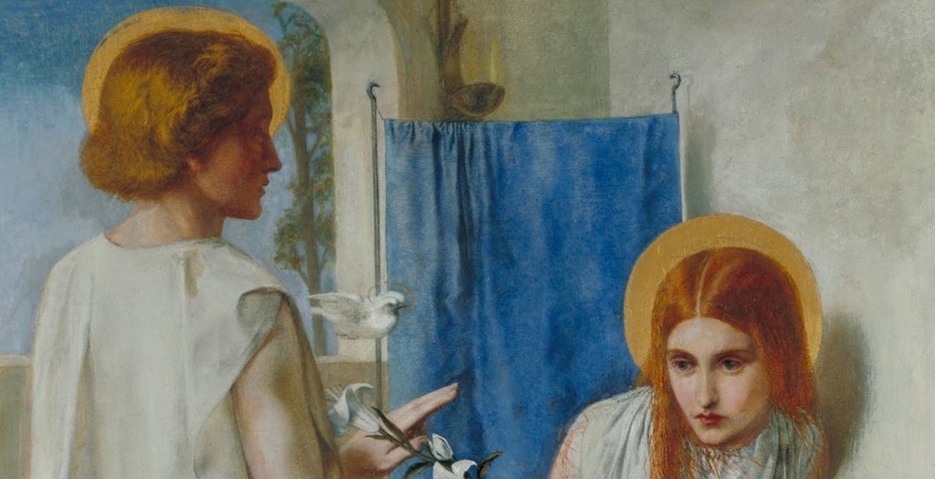
Even if the subtitle of this painting weren’t (The Annunciation) the subject would be clear. The angel Gabriel arrives from the left and announces to the Virgin Mary that she will be the Mother of the Son of God. Initially ‘troubled at his saying’ (Luke 1:29) – and that was only at his initial greeting – Mary accepts her role in the divine plan with the words, ‘Behold the handmaid of the Lord; be it unto me according to thy word’ (Luke 1:38). In the Vulgate, from which the King James Version was translated, this is given as ‘ecce ancilla Domini fiat mihi secundum verbum tuum,’ giving Rossetti the title for his painting. However, he adds an exclamation mark: Ecce Ancilla Domini! This could be translated as Behold! The Handmaid of the Lord. The exclamation mark makes it imperative. Whereas the sentence in the bible implies that Mary accepts her position as the Lord’s Handmaid, Rossetti is effectively insisting that we behold her.
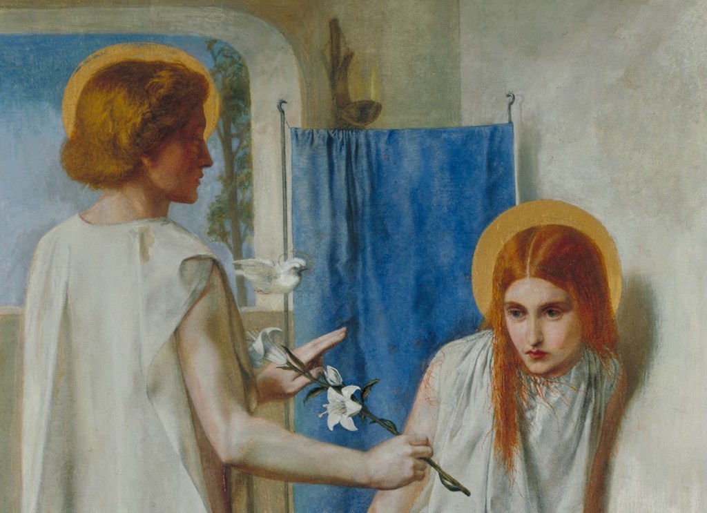
When the painting was first exhibited – at the Old Portland Gallery on Regent Street in April 1850 – it was not well received. One reason was that, unlike all precedents, Gabriel has no wings. Both he and Mary wear white, partaking of the same purity, humility and simplicity, which is also expressed by white of the walls. Gabriel is dressed in a simple robe, a length of white cloth with a hole for the head, like the most basic of chasubles (‘a sleeveless outer vestment worn by a Catholic or High Anglican priest when celebrating Mass’). His right arm is unclad, and its muscularity suggests a very corporeal presence, a physicality that is heightened when seeing his body between the hems of the garment.
Gabriel’s head appears against the blue sky – suggesting that, as an angel, he belongs to the heavenly realm. His divinity is made clear by the halo, but that was a late addition, painted three years after the work had been completed: initially his association with the blue of the celestial realm was more direct. He holds a lily, a symbol of Mary’s purity, with the stalk nearest to her, as if he is inviting her to take it. She looks at it with a mixture of curiosity and concern, uncertain whether to grasp it or not. Had she not been shying away, her head – haloed from the outset – would sit comfortably in front of the blue fabric hanging behind her. If she were to take the lily, thus accepting her role, she would have to lean forward, and her head would be framed by the blue cloth. Both angel and virgin would have blue as a background, but, as yet, it is not certain whether or not she will fulfil her destiny to become Queen of Heaven. Above the bloom closest to Gabriel – and of the same order of size and shade of white – the Holy Spirit, in the form of a dove, bridges the gap between the sky and the cloth, between the celestial and symbolic blues.

In many medieval and renaissance images of The Annunciation there is a bed in the background, but here Mary is actually seated upon one, a simple white mattress on a rush mat, with a simple white cushion. Her white robe reaches beyond her feet, she is chastely covered, making her look like a newly married bride in her nightgown. As the male, wingless figure approaches, she shies away. Notice how he casts a dark shadow across the foot of the bed: the promised birth is a death foretold.
Gabriel’s body could be seen below his elbow, and indeed we can also see the full length of his leg. He is all but naked, which seems surprisingly shocking. At the foot of the bed is a strip of red fabric – like a stole, perhaps – which has been embroidered with a white lily. This ties in with myths not included in the bible in which Mary grew up in the temple with other virgins, spinning thread and weaving the veil of the temple. Mary was given responsibility for the red thread, the colour of royalty, the colour of incarnation, the colour of blood. And the lily is inverted – not so much a symbol of purity here, but perhaps one of death (although I suspect that lilies didn’t really gain that symbolism until the 20th Century).

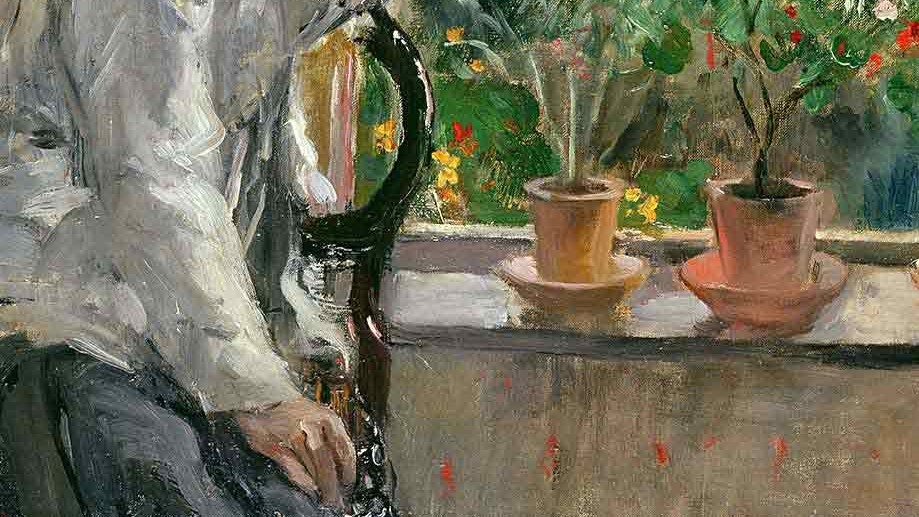
At the very bottom of the painting we see the red cloth hanging to the ground in front of the foot of the bed. The rush matting under the mattress is painted in great detail. Gabriel does not set foot on Earth, but is held aloft on flaming feet – an innovation of the artist’s. His signature appears underneath the left foot: ‘DGR/March 1850’: Dante Gabriel Rossetti, the name by which we know him. He was christened Gabriel Charles Dante Rossetti. His father, Gabriele, who had fled Naples in 1824 under penalty of death, having incurred the wrath of King Ferdinand II, was a scholar of Italian literature, with a particular interest in the author of The Divine Comedy. But compare young Gabriel’s signature here with that on a slightly earlier painting, The Childhood of Mary Virgin (1849).

The signature reads ‘Dante Gabriele Rossetti/PRB 1849’. His second given name, Charles, was for his stepfather, with whom he did not get on. It might also have seemed too ‘English’. For either, or both of these reasons – or for simplicity’s sake – he removed it. He added an ‘e’ to Gabriel, thus making himself look more Italian – and indeed, he was named after his father Gabriele. And, although friends and family alike called him Gabriel, he put ‘Dante’ – his third given name – first because, well… he put Dante first, as an author and authority. ‘PRB’ stands for ‘Pre-Raphaelite Brotherhood’, the movement founded by Dante Gabriel and six other young men, including his brother William Michael Rossetti, in 1848. (Just so you know, the red you can see in the above detail is part of the same piece of fabric as the one at the foot of the bed in (The Annunciation): in this painting Mary is still working on it. It is in The Rossettis, so I will show you the whole thing on Monday.)
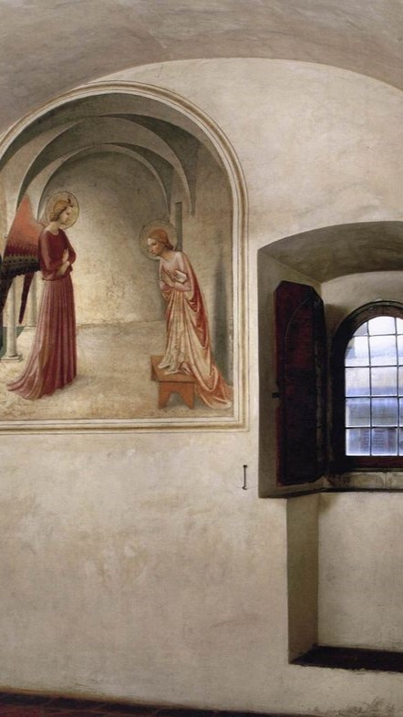
In his painting Ecce Ancilla Domini! Dante Gabriel seems to aspire to the simplicity Fra Angelico achieves in his paintings for the cells of San Marco in Florence. Even the window frame in front of which Gabriel (the angel) appears looks like the recess for the window in the cell. But this seems to be a coincidence, as he had never been to Italy. During the Autumn of 1849 he and William Holman Hunt – another founder member of the Pre-Raphaelite Brotherhood – travelled to France and Belgium, where they saw works by Jan van Eyck and Hans Memling in Bruges. It could be from these that he derived the awkward perspective. It’s not something we notice now, after a century of modernism and abstract art, but in 1850 it was the aspect of the painting that came in for most criticism: the failure to create a coherent space, with a properly foreshortened bed in it.
However none of the above really explains why this is such a good painting to open The Rossettis – but they are almost all there. Painted by Dante Gabriel Rossetti (1828-1882), the models were his brother William Michael Rossetti (1829-1919) and his younger sister, the poet Christina Rossetti (1830-1894). The only sibling who is not represented here, in the first image in the first room, is the eldest, Maria Francesca (1827-76). She was an author, and became an Anglican nun, but there is precious little of hers that can be included in the exhibition, sadly – and the same is true for the other siblings. The bulk of the display constitutes the largest collection of works by Dante Gabriel to be seen together for years. It is quite glorious, and the influence of the family is constantly felt. And there is one more Rossetti – Mrs Dante Gabriel Rossetti – or Lizzie Siddal, as she is better known. Generally thought of as a milliner and model who nearly met her demise posing as Ophelia for John Everett Millais, she has been increasingly recognised as an artist and an important influence on Dante Gabriel. This exhibition states that argument better than ever before. But more about that on Monday.