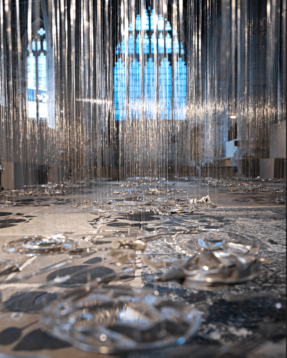
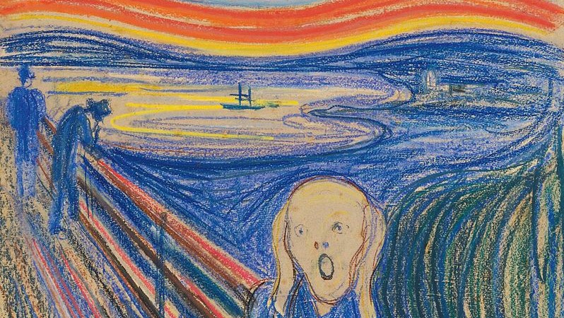
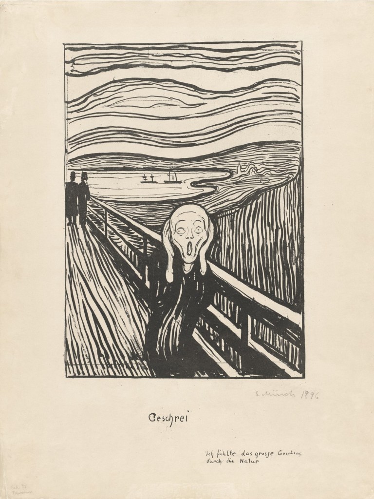
Cornelia Parker, Thirty Pieces of Silver, 1988. Tate.
Given that my current series of talks is called Looking in Different Ways, Cornelia Parker, about whom I will be talking this Monday, 18 July at 6pm, is a perfect choice. She sees the world in such a completely different way to most artists, and, with all of the advantages of living in the late 20th and early 21st Centuries, drawing on inspiration from decades of modernist thinking, she creates some of the most exciting and innovative work to be seen. She is not someone who has ever been accused of ‘attention grabbing’, unlike some of her contemporaries, which is odd given the unconventional, even crazy ways she has gone about making her work. That’s probably because everything she does has a purpose, which she is incredibly good at explaining. Not only that, but her insights into the way the world works, and into the complexities of modern history and society, are always a revelation. More of that in moment. The talk will be followed, on 25 July, by an introduction to a superb exhibition at the Dulwich Picture Gallery, Reframed: The Woman in the Window – a thematic show, which constitutes very different way of looking at the art itself. Slowing down for the summer, on 8 August I will talk about the Pallant Gallery, Chichester’s Glyn Philpot: Flesh and Spirit – a comprehensive view of a truly great, but sadly neglected, artist. These two talks will be called Women Looking and Looking at Men respectively – for more information, click on any of those blue links. My final talk for the summer (22 August) will be an introduction to the well-reviewed exhibition of the work of Barbara Hepworth currently on show at the Scottish National Gallery of Modern Art. But before then, let’s dip our toes into the world of Cornelia Parker by looking at the work which takes up the first room of the exhibition – Thirty Pieces of Silver.

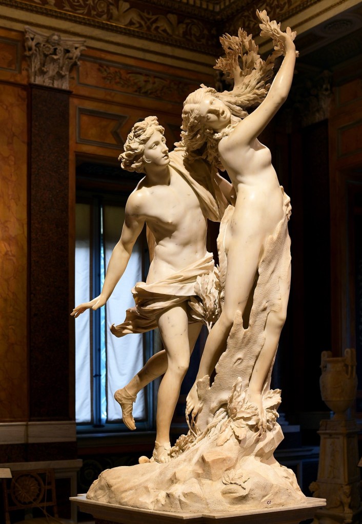
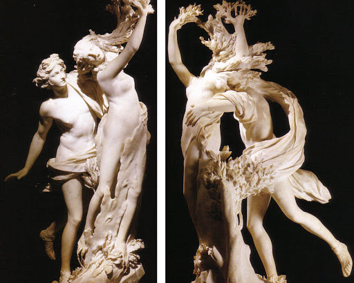
It’s hard to convey what seeing this installation for the first time is like – and unfortunately, just by showing you this photograph, I will, perhaps, have taken away some of the magic. This is a shot of what is apparently the whole work, although there is more to it than meets the eye, as I will explain below. On entering the room, you find most of the space occupied by the work. It is not a site-specific piece though, and can be hung anywhere – indeed it has been, and the photographs which follow come from at least three different locations. Consequently, it will always look different, as it takes on some of the qualities of the environment (having said that, the same is true of paintings – they always look different when seen against different backgrounds). It is also different though, according to how many people are in the room. As it happens, this photograph makes the work look a little dead, although if you are in the room on you own, it is, however quietly, fully alive. It takes a little time to evaluate what you are looking at, but basically there are a number of ‘pools’ of silver objects – five rows wide, six deep – making up the Thirty Pieces of Silver of the title. These ‘pools’ or Pieces float about 20 cm off the ground – the height is specific but I haven’t seen it written down anywhere – hanging from almost invisible threads, which create a luminous haze throughout the room, like mist over the water. Parker herself has said that the work ‘is reminiscent of waterlilies,’ and inevitably I am reminded of Monet.

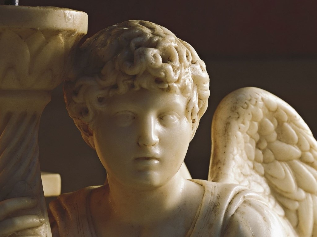
Getting closer, you can see that each pool is made up of a number of domestic objects. In this detail there are six spoons top left, and fives forks to the right of top centre, for example. But there are also jugs, teapots and tankards, salt cellars and candlesticks, and what must have been some form of trophy. But these objects are not as they were, they have suffered considerable damage, subjected in some way to violence: they have been flattened. And they are hung from thin wires – the slight kinks tell you these are not cotton threads (for example). Lit from above, they cast shadows on the floor.

Now here’s a thing I don’t know: is each pool, each lily pad – each piece of silver – a separate identity? Are the constituent elements fixed for each one? Although the individual objects are always the same, I don’t know how rigid their arrangement is. In this view (from the current installation) the ‘front centre’ pool (as you enter the exhibition) also has a number of forks, but more than in the last detail. I’ll check next time I’m there to see if I can locate the ‘six spoon, five fork’ piece. I don’t think it matters, as it’s the idea as a whole, the overall appearance, which is important. But even between these two photographs you can see a substantial change: with a different floor the work already looks different. A lighter floor, as in this case, gives the work a more ethereal appearance. But that effect is also enhanced by a more focussed system of lighting, with the shadows overlapping less. This creates a different form of ‘drawing’ on the floor, a two-dimensional representation of the flattened, but still three-dimensional objects hanging above.

The wires must change. If hung in a different room, the ceiling will have a different height, and, if the pieces must be a set distance from the floor, then the wire has to be different. It’s copper wire, and I suspect that is to create a specific feeling, slightly warmer than all-over silver, maybe a hint of sunlight shining down. Although maybe it is because the objects themselves are not solid silver, but silver plate – a very thin layer of silver over another, cheaper metal, usually brass, which is itself an alloy of copper and zinc. Eventually, with polishing, Parker says, the brass will show through. None of the objects were new: as she says in an extended interview with the Tate’s curator, Andrea Schlieker, in the catalogue for the current exhibition, the work ‘is made of objects from ordinary people’s lives. None of it is new’. This gives it a history – gives every pieces a history – an unwritten catalogue of many people’s day-to-day existence. The stories they could tell. But why have they been flattened? And how? It’s quite simple really (this is the ‘more to it than meets the eye’ which I mentioned above).
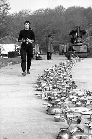
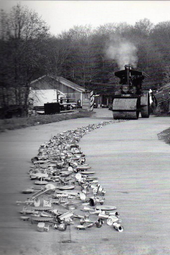
For a while Cornelia Parker ran a market stall on Portobello Road, selling ‘silver objects,’ among other things. She ended up buying many of them – bags full – from car boot sales, and markets. ‘I used to cycle around with these big backpacks full of silver plate.’ When she had enough, she laid them all out in a strip, on a road, and hired a steam roller to flatten them all – thus starting her act of creation with an act of destruction, as she herself says. These were all discarded items – having seen many meals, sat endlessly, un-regarded, on mantelpieces, or, like the trombone, having uttered music – sacred or profane – thanks to the inspired exhalations of unknown musicians. But eventually all of these objects were rejected. Their original financial value was maybe not as much as it might have seemed, so in some ways they had been deceptive. As for their emotional value – well, who can put a price on what people feel? But all this was given up, betrayed even, when they were thrown out, and then doubly betrayed when they were flattened, so they could not longer be valued as functional objects either. But was it Parker, or the original owners, who were like Judas?

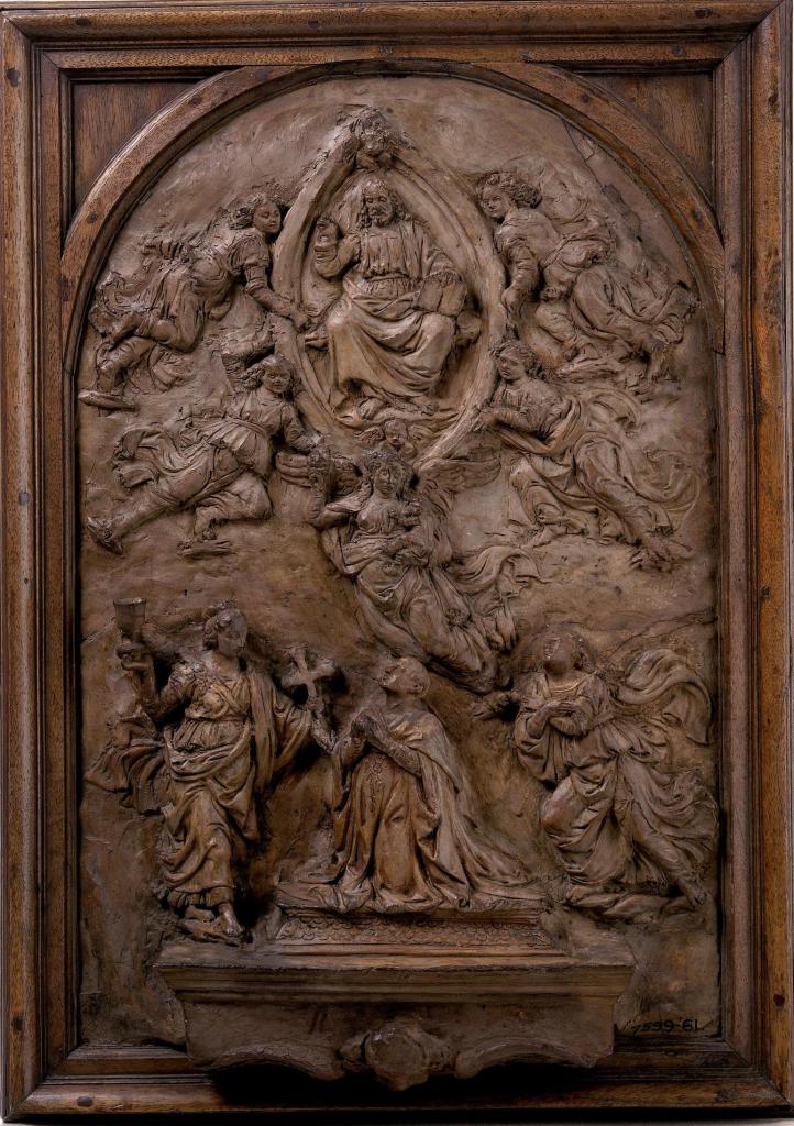
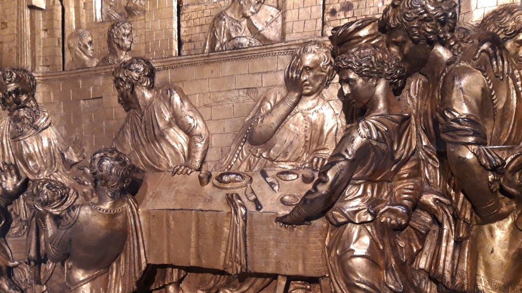
This is Judas accepts the Thirty Pieces of Silver, Giotto’s version of the biblical story which provides the title for today’s work. It was painted in the Scrovegni Chapel in Padua, effectively a thirteenth century ‘installation’ which occupied many of my previous posts, as many of you will remember (for this particular episode, see 102 – Jesus… and Judas). Judas, in yellow, the devil goading him on, accepts a purse containing thirty pieces of silver, as his reward for betraying Jesus to the authorities. As a result, Jesus was arrested, tried, condemned, and crucified. Through his sacrifice, and triumph over death, Christians believe that we are redeemed of our sins, and given new life in Christ. Having betrayed the objects, and having condemned them, Parker gives them new life – she redeems them, and they become art. You could say, more simply, that she recycled them, or made old things new, or gave them a new life, but she sees her artistic practice as a form of transubstantiation. It will not surprise you to learn that she was brought up a Catholic. Transubstantiation is the word used to describe what happens to the bread during mass (and I can’t help noticing that for Catholics, the ‘bread’ comes in the form of wafers, small, thin, circular objects, their shape not unlike that of each of the Thirty Pieces). The bread changes its substance, and becomes the actual body of Christ, even though the ‘accidents’ of the bread – its appearance, its texture, its taste even – remain the same. Well, the objects Parker used are still silver plate objects, and yet they are now art: transubstantiation has occurred. Another word would be alchemy – base metals are turned to gold. Alchemists also used the word ‘redemption’. After all, gold is pure and unchanging, just like God. But did she have to flatten the objects?

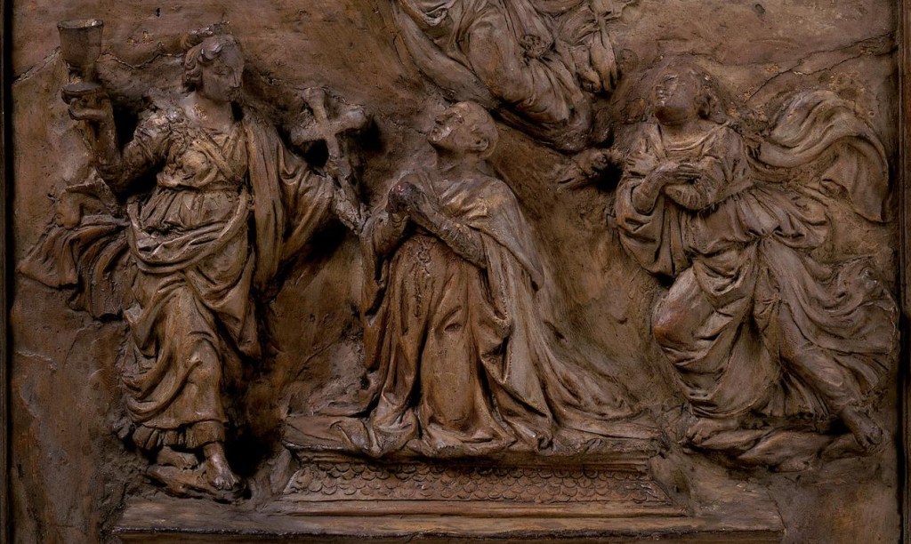
At the very centre of Hugo van der Goes’s Portinari Altarpiece, painted in Bruges around 1475 and now in the Uffizi Gallery in Florence, the Christ Child, newly born and naked, lies starkly on the ground. Above him his mother Mary kneels in prayer, and he is flanked by angels who join her in silent adoration. In the foreground is a beautiful still life – a vase and a glass containing flowers, with more scattered on the ground, and a sheaf of wheat. Notice how the wheat lies horizontally in the painting, flat on the ground, and parallel to the infant. The wheat has been cut down, some of the grain will be ground to make flour, and the flour made into bread. Some of the grain will be sown to grow more wheat. If the wheat were not cut down, there would neither be bread, nor new life. Like the wheat, Jesus had to be ‘cut down’ to give us new life. Without his death he could not have become the bread that feeds us, and the bread could not become him. For Parker, if the objects had not been flattened, they could not have been redeemed…
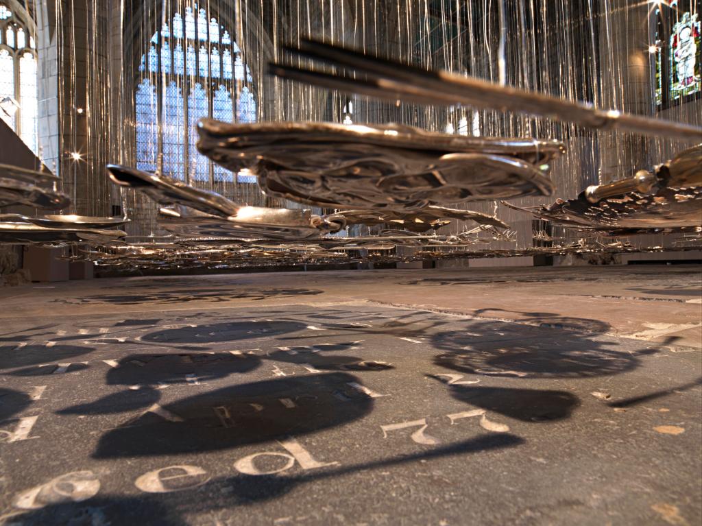
The objects are resurrected, and even, like Jesus start to ascend, floating above the floor at the average height of the objects when they were new. There is a rigor here which is rather surprising. They are hung in a minimalist grid, and indeed some artists would have been happy arranging circles in a rectangle, five wide by six deep. Think, for example, of Equivalent VIII, the ‘Tate bricks’, the eighth equivalent way Carl André found to arrange 120 bricks. But Parker takes the cold (but, to me, compelling) logic of minimalism, and renders it humane – it holds life, and hope, not just rigor. Nor is her work like the newly-minted Readymades to which Marcel Duchamp (a hero of Parker’s) gave new thoughts: her work has a depth, and thought, and feeling – and more than a little bit of magic. Do try and see the work in person in the exhibition at Tate Britain before it closes on 16 October. Or failing that (or as an introduction to that), come to my talk on Monday! Given all that I’ve said, I wish I’d seen the installation in St Mary’s Church in York…