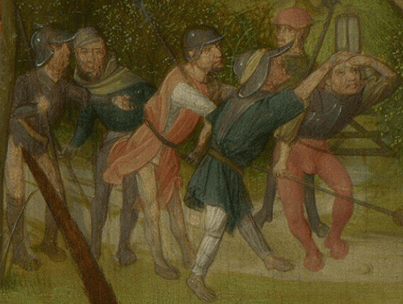
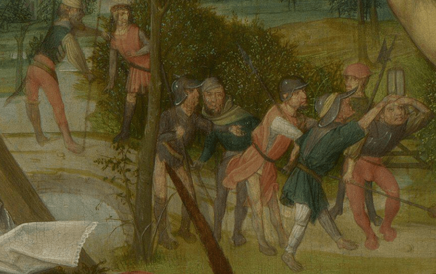
So this is it, the ‘great multitude’ that Matthew describes, who came ‘from the chief priests and elders of the people,’ bearing ‘swords and staves.’ They look like an unlikely bunch of losers and reprobates to me.
It might be as well to see what the other gospels say about them. Mark says almost exactly the same as Matthew. They are two of the synoptic gospels, after all, meaning in this case that they tell more or less the same stories from more or less the same point of view, probably because they have a common source (it is usually believed that Matthew and Luke based their accounts on Mark). Here is Mark 14:43, with only one or two words different from Matthew:
And immediately, while he yet spake, cometh Judas, one of the twelve, and with him a great multitude with swords and staves, from the chief priests and the scribes and the elders.
We still have a great multitude… How about Luke 22:47?
And while he yet spake, behold a multitude, and he that was called Judas, one of the twelve, went before them, and drew near unto Jesus to kiss him.
Some extra information here – the mode of betrayal – but we still have a ‘multitude,’ even if it is not ‘great.’ So how about the remaining, non-synoptic, gospel? Here is John 18:3:
Judas then, having received a band of men and officers from the chief priests and Pharisees, cometh thither with lanterns and torches and weapons.
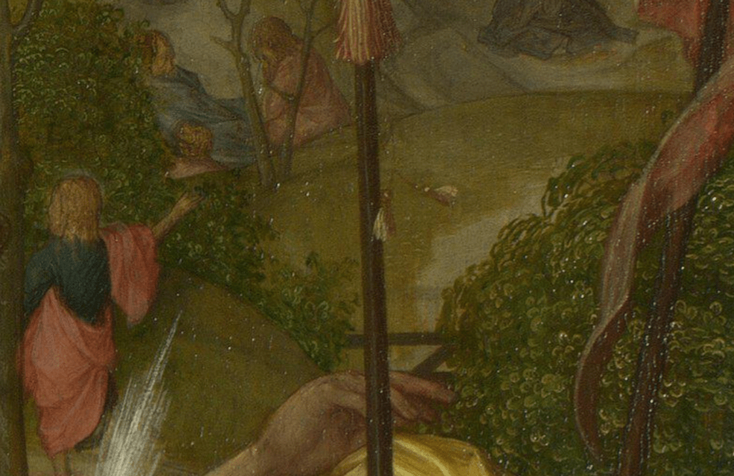
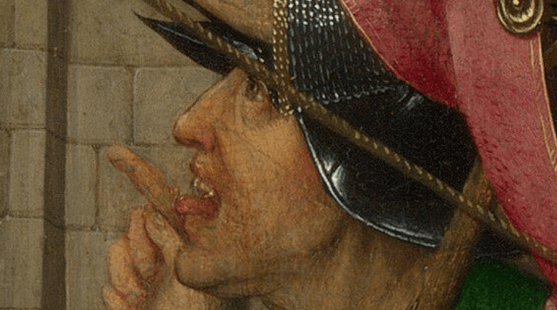
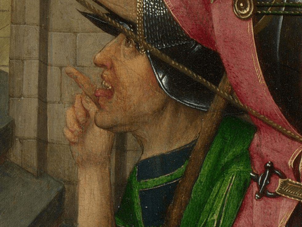
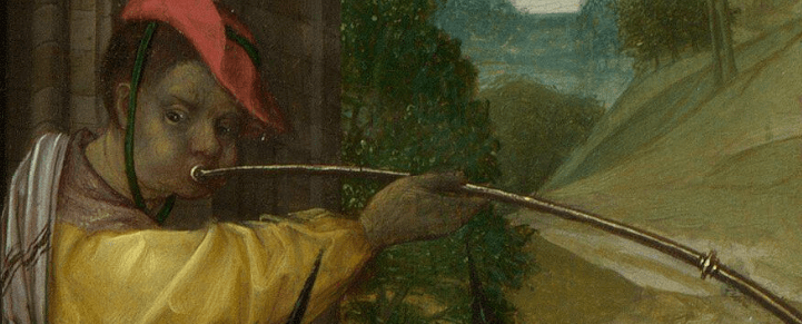
That’s what they are. They are a ‘band of men and officers’. Have a look and try and work out which is which.

Having said all that, it’s important to remember that all of the quotations I have given you are not the original version – they are from a translation, and a very specific one at that: the King James Version, published in 1611. It may not be the most accurate, and certainly not the most recent (!), but it is the one I prefer, and one of the foundation stones of the English language. Whatever the originals actually say, and however we would interpret that today, our artist has definitely painted ‘a band of men’ and not ‘a great multitude’. Although they don’t have ‘lanterns and torches’ in the plural, they do at least have one lantern, and they also have ‘weapons.’ Admittedly Matthew and Mark do both mention ‘swords and staves.’ I’m not sure I would care to distinguish between the ‘men’ and the ‘officers’ though, they all look equally disreputable. They remind me of one of the incompetent bands of local militia that Shakespeare writes into plays like Much Ado about Nothing, Measure for Measure and Love’s Labours Lost: even if they achieve results it is not through any ability or efficiency on their own part. However, there is a difference. For Shakespeare, these people are a comic sub-plot. Here, the mocking is to belittle the evil this rabble does. They can’t even dress themselves – two have no trousers (or 16th Century equivalent), which is a common way to undermine someone, ‘catching them with their trousers down,’ and at least one of them – probably more – has come out without any shoes. They seem hesitant, reluctant even. But ultimately, that won’t stop them from being violent. They all have weapons – swords, staves, spears and halberds – and several also have helmets. They could strike at a distance, and not run the risk of injury. And yet – there are only eight of them. Surely the apostles, if we got all twelve, or rather, the remaining eleven, would be able to take them on? But that’s not the point, really, is it? I mean, imagine if Jesus hadn’t been arrested. Suddenly everything would stop working. The story fails. There is no sacrifice, there is no salvation. Jesus had prayed, ‘O my Father, if it be possible, let this cup pass from me: nevertheless not as I will, but as thou wilt,’ (Lent 10) and this is the result – so now he will go quietly.