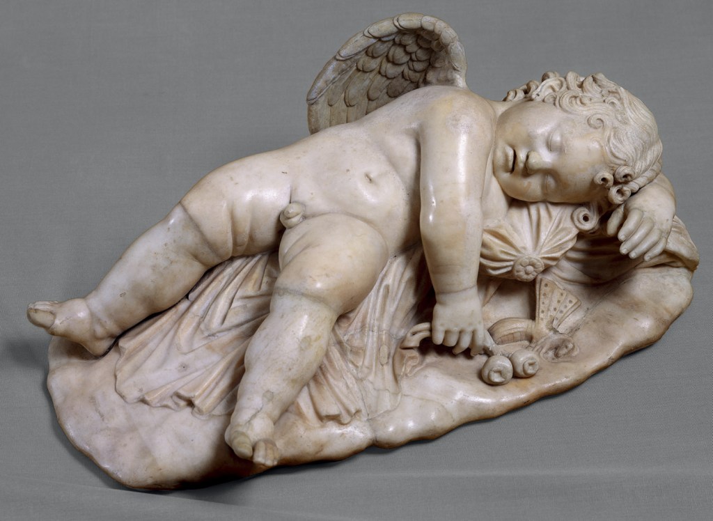
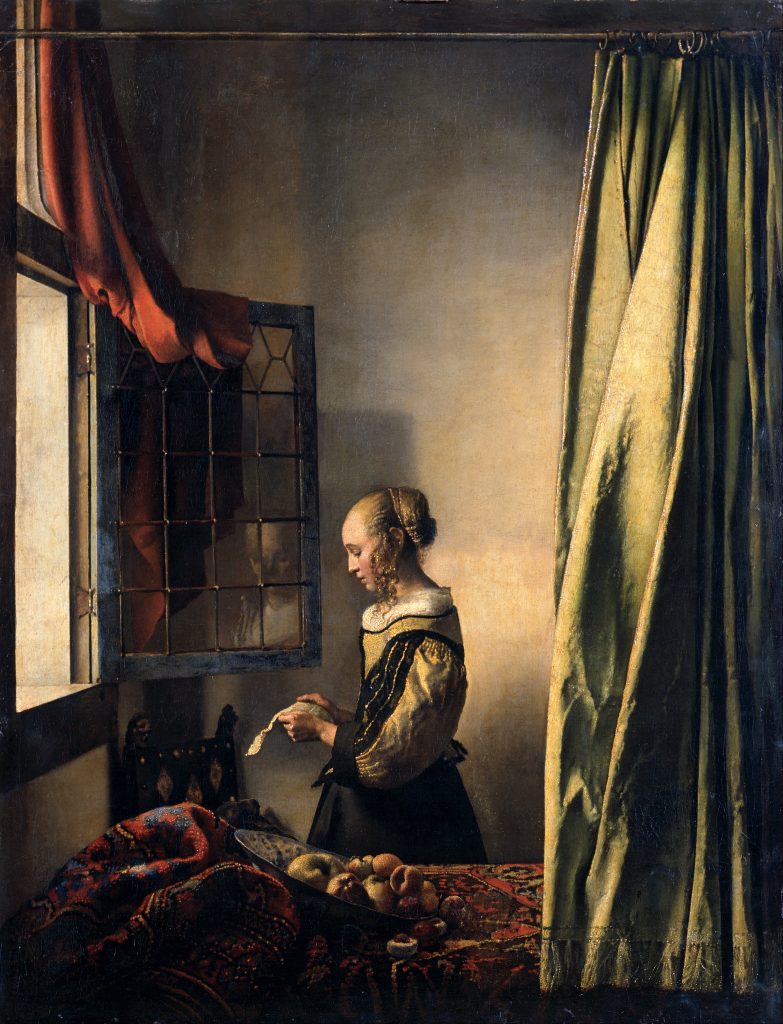
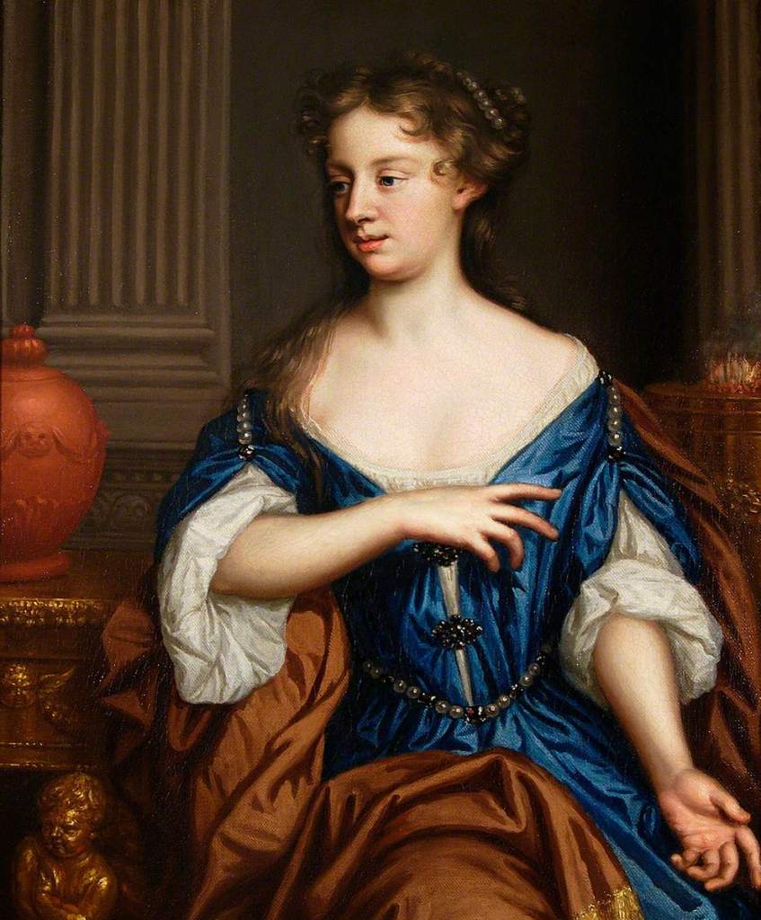
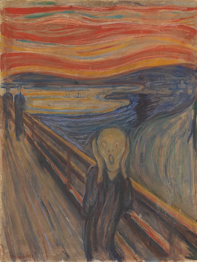
Alessandro Algardi, Sleep, 1635-6. Museo Borghese, Rome.
Yes, you’re right, this is not a sculpture by Michelangelo. Nor is it, for that matter, ‘Love’. You might have realised that already from the photograph – or for that matter, simply by reading the caption. But I do love this work – and after Bernini’s flashy showpieces on the ground floor of the Museo Borghese I love the calm of this glowing gem which you can find upstairs: Algardi may have been outranked, but he was never outclassed. As I can’t show you Michelangelo’s lost ‘Love’ (for the simple reason that it’s lost), I’m showing you the Algardi instead. However, I wanted to tell you about the renaissance equivalent today, as I won’t feature it in my talk on Monday, 12 September (Michelangelo 2: The Sculptures). There are enough sculptures I can show you without taking time for things we can no longer see. After that, weeks three and four of the series Almost All of Michelangelo will look at The Works on Paper and The Architecture – click on those links or check out the diary for more information. And if you missed the first talk, don’t worry – each one is effectively a free-standing entity. Meanwhile, back to Michelangelo, albeit Michelangelo via Algardi. Look first, think later.
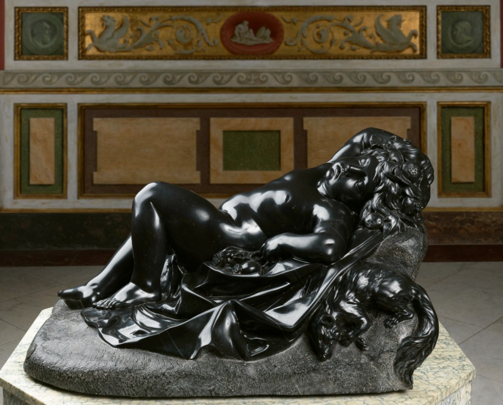
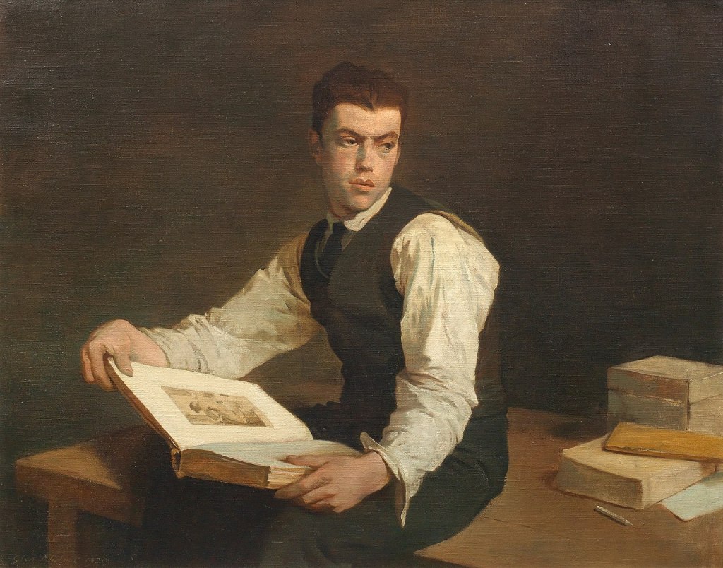
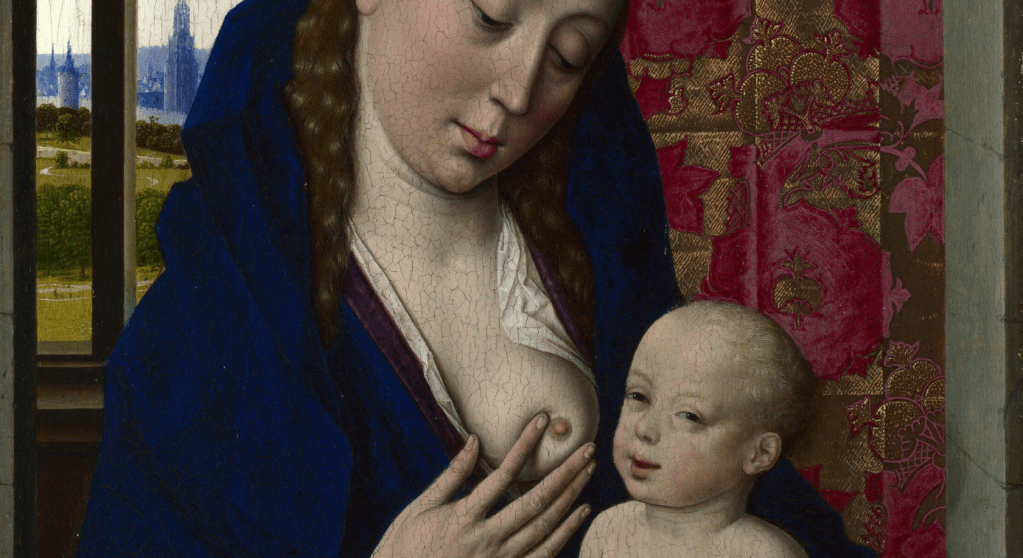
This is, in a way, one of my secret pleasures, something I always look forward to seeing, especially as it is something I see relatively rarely. The Museo Borghese in Rome is a hugely frustrating place, you have to book in advance and even then you only get a two hour slot. At one point you had to check in to the ground floor, check out again, and then check into the first floor, but I think they gave up on that complication fairly early on. When I take groups I find I can spend all two hours on the ground floor looking at the Canova, the Berninis and the Caravaggios: five sculptures and five paintings are more than enough for one visit. But if I can get upstairs (where most of the paintings are) then I will make sure I catch at least a glimpse of this sleeping marvel. However, I will rarely say anything about it, short of ‘look at that – isn’t that wonderful’, which, despite my usual verbosity, should be all that anything really needs. What do I like about it? The richness of the colour, the perfection of the forms, their apparent softness (yes, it’s hard stone) and the roundness of most elements, which adds to the sense of repose created by the total relaxation of this child, helplessly abandoned to a deep sleep.
The child is lying on a sloping ground. The latter is differentiated from the rest of the stone by its rough, unpolished surface, created by small, regular chisel marks which make the black stone look grey. Spread over the ground is a cloth, which, like the infant, is highly polished, the sharper, more angular folds of the fabric contrasting with the rounder forms of the body. The child’s left knee is raised, the sole of the foot resting flat on the ground, with the right foot stretched further out. The left arm, slightly bent, lies by its side, resting on some rounded forms, while the right arm is wrapped around its head – you can just see the right hand resting on top of the hair at the far right. The shoulders are turned slightly towards us, and the chubby face lolls, allowing us to see it from this angle – which is presumably why almost every photograph I can find of the sculpture is taken from this side. As ever, with sculpture, this is so frustrating: it is a three-dimensional art form, this is only a partial view! The eyes are closed, and the mouth downturned – looking a little grumpy, perhaps, but really showing the release of sleep. There is also a creature with a long bushy tail curled up on the rough ground (rather than on the cloth), presumably also fast asleep.
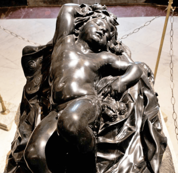
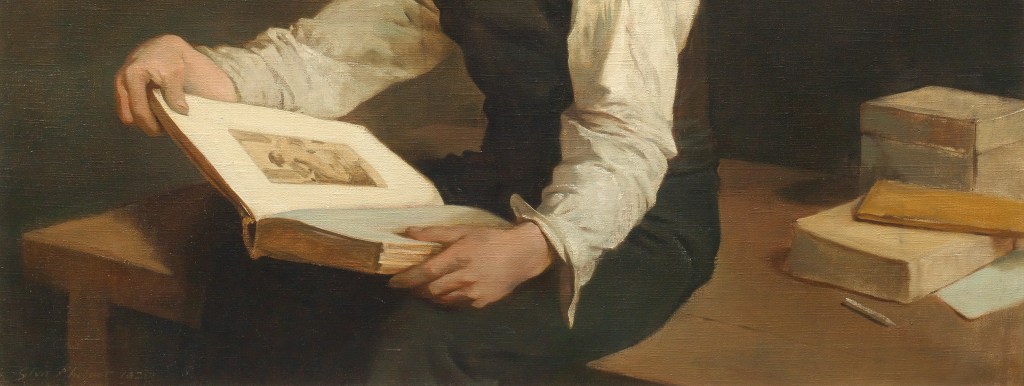
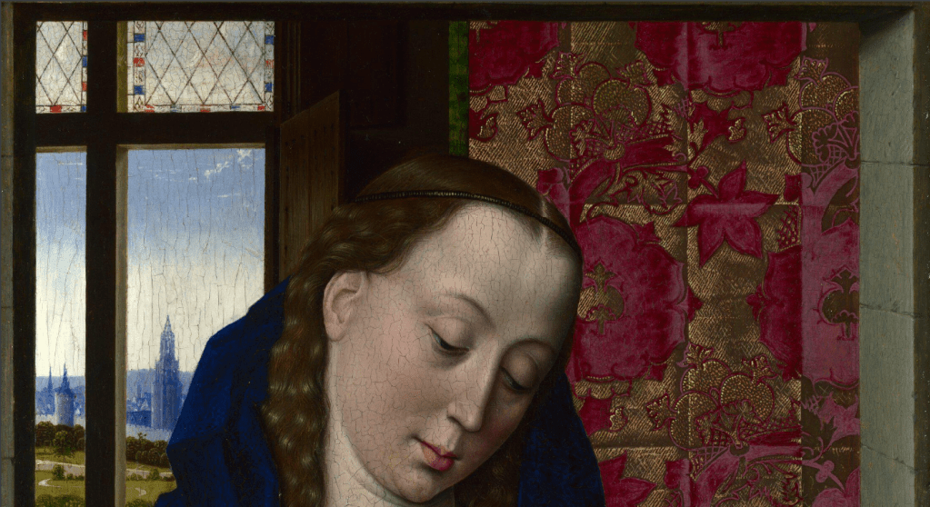
This is not a great photograph, I know, but it is one of very few that does not show the ‘predominant viewpoint’ seen above. It’s surprising there are not more, as this side reveals some new information, and helps us to understand what is going on. This is a boy, for one thing, and he has wings, although they look more like butterfly wings than the usual feathered forms you expect to see on amoretti and angels alike. The subtle twist through the body is more evident from this point of view, with the shoulders turned a little to our right, the knees to our left, a movement that is indeed a common feature of works by Michelangelo. However, there is none of the tension inherent in his output, and the cloth lying on the ground is more fulsome, maybe even more generous – look at the rich, unnecessary folds going down the right side in this photograph. It has all the sensuality of the Baroque – which it is, of course, being by Algardi – and a dramatic naturalism (at least, I think that if sleep can be dramatic, this is how it would look), which is what separates it from the contrived etiolation of Mannerism.

Without a close up – again, the best that I can find – it is hard to see what the rounded forms under the winged boy’s hand are – but they also form a garland around his head. Even here I suspect it’s not obvious, unless you are an avid, and slightly imaginative, gardener. They are the seed pods of a poppy, the source of opium, and a symbol of Sleep. The butterfly wings, too, belong to this pint-sized personification, as, unlike Cupid’s flapping bird wings, which presumably would wake you up, these would flutter noiselessly as you drift away. The small creature we saw before is a dormouse (I would never have recognised it) – just think of Alice’s Adventures in Wonderland and you’ll realise they have always symbolised sleep, because they really do sleep for up to seven months a year. The choice of a black material is, of course, not coincidental, as most sleep takes place at night.
The sculpture was carved in what is called Belgian black marble, although it is not, truly speaking, marble (a metamorphic rock, transformed by high temperature and huge pressure), but a very fine-grained carboniferous limestone – a sedimentary rock. It was commissioned in 1635 by Marcantonio Borghese, nephew and heir of Cardinal Scipio Borghese who had built a phenomenal collection of ‘ancient’ and ‘modern’ art, and who had died just two years before. We don’t know why, exactly, Marcantonio wanted a personification of Sleep, but it was an image derived from antique prototypes which were popular not only in classical times but also in the 16th and 17th Centuries. Here is another embodiment of a similar idea, and another of my ‘secret pleasures’.

Well, not so much a secret, as a treat I look forward to seeing on the way to talk about something else – usually, in this case, the portraits by Raphael or the ceiling paintings of Pietro da Cortona in the Galleria Palatina in the Palazzo Pitti in Florence. It is Caravaggio’s Sleeping Cupid, painted while he was in Malta in 1608. Photography doesn’t always cope well with Caravaggio’s chiaroscuro, and here, if anything, the image is lighter than when the painting is seen in the flesh, when it appears more subtle and evocative, at the same time as allowing the boy greater dignity: the shadows function as a loin cloth, and grant him a deeper repose. He rests on a plank on the stone floor, bow and arrow by his side, his head resting on his quiver. The left wing lies on the ground, the right is just traced across the darkness of the background, both framing the figure and protecting it. Like Algardi’s Sleep, his left arm lies beside him, although the right does not curl round his head. Again there is a Michelangelesque twist through the body, although going the other way – the knees fall towards us, the shoulders are flatter to the floor. But there is still the utter calm of undisturbed slumber.

This is one of the classical prototypes, a Sleeping Cupid in the Uffizi dating from the 2nd Century CE. The idea goes back (as so many Roman ideas do) to the Greeks, and there is a wonderful Greek bronze Sleeping Eros, which was restored by the Romans, in the Met in New York – click on that link if you’d like to see photos, and read a very detailed analysis. I’m showing you this one because it was once – like most things in the Uffizi – part of the Medici collection, and so could easily have been known to Michelangelo. More of that in a moment. Like Algardi’s Sleep, this little chap (he’s only 69 cm long) lies on a cloth on the ground holding poppy seed-heads. This is definitely cupid, though – look at the wings – although there is a butterfly (perhaps not the most naturalistic) lying next to the poppies. His legs are spread, and flat out, while his right arm falls over his chest onto the floor. His left arm curves round his head, and holds onto some sort of bag or cushion to make himself more comfortable.
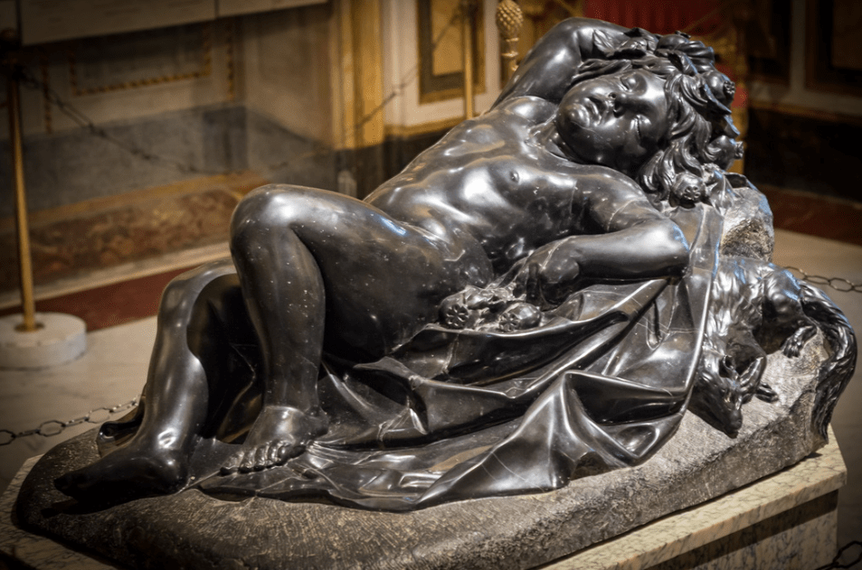
The Ancient Greek for ‘butterfly’ is Ψυχή – or ‘Psyche’ – which also means ‘soul’, while poppies, as well as referring to sleep, can also imply death, the sleep from which we do not wake. Sad as it is, one of the reasons why this particular genre of sculpture was popular in classical times was its suitability as a marker for the graves of dead children. This was not the motivation behind Algardi’s Sleep, though. Instead it was, like many other of the ‘modern’ sculptures in the Borghese collection, made ‘in competition’ with the classical prototypes – an idea which had been essential for the development of the Renaissance a good two centuries before Algardi turned up in Rome from his native Bologna. Sometimes, though, the admiration and emulation which inspired great art could descend into forgery, with even the greatest falling foul to temptation.
As I discussed last Monday when talking about Michelangelo’s paintings, the young genius was an apprentice in the workshop of painter Domenico Ghirlandaio from the age of 12, in 1487, until he was about 15. Then, from roughly 1490-92, he seems to have studied informally at the Medici sculpture garden. Nobody is really sure how it worked, or who taught him to carve, but I’ll talk a bit more about it on Monday anyway. What is certain is that the garden was home to some of the Medici collection of classical sculpture, potentially including the Sleeping Cupid in the Uffizi (above), and another example, in bigio morato (a different type of black limestone), which might be the ‘cupido nero’ which was a gift to Lorenzo the Magnificent from the King of Naples. After Lorenzo’s death in 1492, and just before the Medici were exiled in 1494, Michelangelo fled – the first of several times he did this – heading first to Venice and then back to Bologna, where he carved a number of figures on the Arca of St Dominic (see 159 – Michelangelo, holding a candle). On his return to Florence in the autumn of 1495 he worked for Lorenzo di Pierfrancesco de’ Medici, who was from a different branch of the family to the previous (unofficial) rulers. It was then that Michelangelo carved his own Sleeping Cupid in emulation of the antique. Vasari mentions it the first edition of his Lives in 1550, and in his biography, three years later, Condivi gives us more information, describing it as ‘a god of love, aged six or seven years old and asleep’. Lorenzo di Pierfrancesco approved, and also suggested to Michelangelo that he if he sold it in Rome as an antique, he would get a better price than if it was marketed as his own work. Indeed, a dealer managed to sell it to Cardinal Raffaele Riario, one of the nephews of Pope Sixtus IV, for 200 ducats – although he told Michelangelo that he’d got 30, which is what a ‘modern’ sculpture might have fetched. However, Riario found out it was modern and sent for the young upstart who had deceived him. The Cardinal returned the Cupid to the dealer, but commissioned another work from Michelangelo – which he then also rejected (more of that on Monday, too). In later life Michelangelo claimed that Riario had never bothered to commission anything from him, covering his back, no doubt, for the double rejection.
So what happened to the Cupid? It went back on the market, and initially Isabella d’Este, Marchioness of Mantua, showed an interest in it – until she found out that it was modern. At this point nobody really knew who Michelangelo was. It’s not clear what happened to it next, but somehow it ended up in Urbino, where it was seized by Cesare Borgia (son of the Pope) when he sacked the city. In 1502 he gave it to none other than Isabella d’Este, who, by this time, would probably have heard of the young sculptor who had carved a Bacchus and a Pietà in Rome. She exhibited it alongside a genuine, classical cupid (with an unlikely attribution to Praxiteles) which she acquired a few years later. Both remained in the Gonzaga Collection in Mantua until the 17th Century, when the family’s fortunes had waned, and much of the remains of their collection were sold to King Charles I of England. There are references to it in inventories of the Royal Collection, and even, potentially, a drawing, but sadly it seems that the sculpture could well have been destroyed along with almost all of the Palace of Whitehall in the fire of 1698. But what did it look like? Condivi’s description gives us few clues, nor do any of the descriptions in the Gonazaga or Royal Collection inventories – apart from the fact that, unlike other versions (Isabella’s classical Cupid, for example) it was not lying on a lion skin. However, we might get an idea from a painting in the National Gallery.
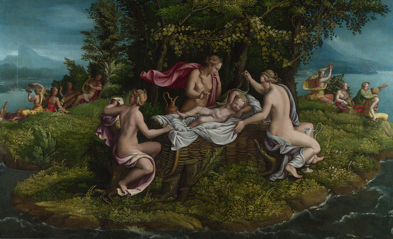
This is The Infancy of Jupiter from the workshop of Giulio Romano, painted in the mid-1530s. Giulio, you may remember from the recent Raphael exhibition, was probably the great master’s ablest associate, and ran what remained of the workshop after his death. However, with the Sack of Rome in 1527 he fled the Eternal City and headed north, where he did great work for the Gonzaga family, effectively taking over from Mantegna as Court Artist (at 21 years remove). The painting shows the infant Jupiter, who was saved from the fate of his siblings by his mother, Ops. His father, Saturn, did not want to be overthrown, so had eaten his other children at birth. When Jupiter was born, Ops gave Saturn a stone to eat in place of her new-born, and placed the baby in the care of the Corybantes. This was a good choice, it seems, as they were a holy heavy metal group, dancers dedicated to the Goddess Cybele, who played loud music and clashing cymbals to cover the sound of the baby crying (see far left and right) so that Saturn would not discover him.

Jupiter lies on a white sheet in a wickerwork cradle, his legs apart, with his his left arm lying by his side, and the right arm wrapped around his head. The legs are not dissimilar to those of the classical Cupid from the Uffizi, whereas the arms are more similar to Algardi’s Sleep (which is actually the same arrangement as in the Medici bigio morato Cupid). It is assumed that Giulio’s model was none other than Michelangelo’s fake, which he would have seen as part of the Gonzaga collection. There is a version of it in Corsham Court in Wiltshire – go and have a look if any of you are in the area: I can’t find a good photograph of it. Some people have suggested that it is indeed Michelangelo’s original, but very few have ever been convinced. We’ll just have to imagine a small figure in white marble with legs like the first of following, and arms like the second… and then console ourselves for its loss by enjoying the multitude of Michelangelo’s surviving sculptures which I will talk about on Monday.