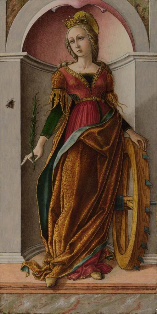
Marie Spartali Stillman, How the Virgin Mary Came to Brother Conrad of Offida and laid her Son in his Arms, 1892. National Trust Collections, Wightwick Manor and Gardens, Warwickshire.
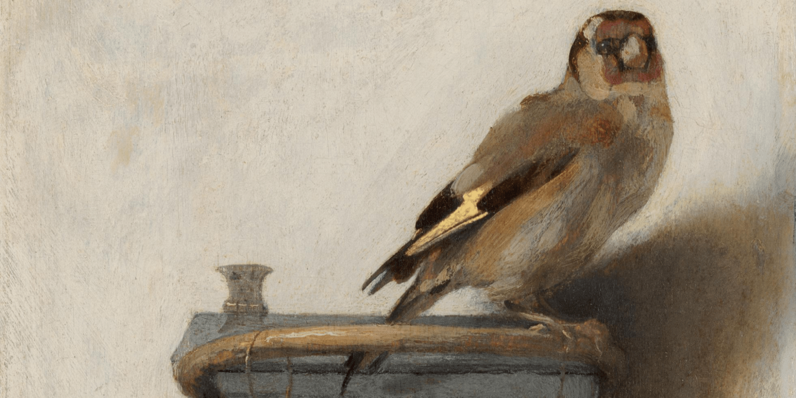
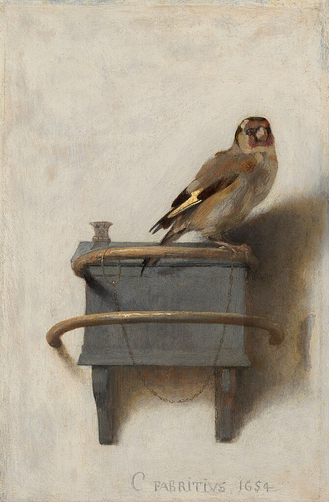
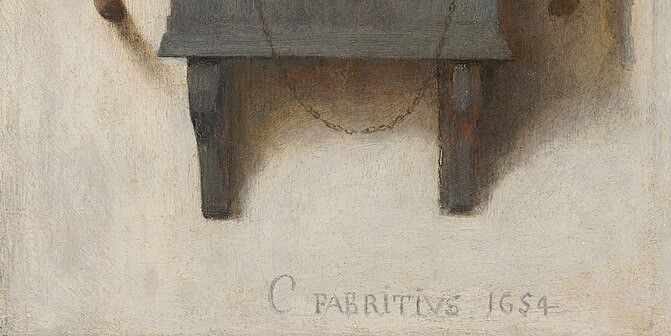
There’s no talk this Monday, but as I have decided (after some delay) what will take up the rest of the Summer, I thought I should let you know. This also gives me the opportunity to revisit a post about one of the artists who is included in both Now You See Us at Tate Britain, and National Treasures: Velázquez in Liverpool, but whose work I have not dealt with fairly: Marie Spartali Stillman (more on her below). My next talk will be the third and final installation of the exploration of Tate’s encyclopaedic exhibition of Women Artists in Britain, 1520-1920, and 3. From photography to something more modern on Monday 5 August at 6pm will conclude the Victorian Spectacle section which I couldn’t get to (I ran out of time: bad planning I’m afraid, having tried to cover too much in the first talk). and go on to look at the small rooms dedicated to watercolour, photography, women’s access to art schools, and their forays into modernism. Thereafter, on 12 August I will visit the Royal Academy’s exciting In the Eye of the Storm: Modernism in Ukraine 1900-1930s. After this I want to revisit Laura Cumming’s beautiful book Thunderclap. I talked at length about the main artist whose life and work she explores, Carel Fabritius, but she touches on a number of other ‘greats’ from the Dutch Golden age, including Hendrik Avercamp, Rembrandt, and two of my recent favourites, Gerard ter Borch and Adriaen Coorte. They will all be included in Thunderclap: the ‘other’ artists on Monday 19 August. Finally, on 26 August, I want to look at one of the National Gallery’s ‘small but perfectly formed’ exhibitions, Hockney and Piero: A Longer Look, which includes paintings by David Hockney and Piero della Francesca, as the title suggests. The details of all of these talks are in the diary, of course.
Meanwhile, let’s look at a rather glorious painting by Marie Spartali Stillman – with apologies for having treated her in a rather cursory manner in two recent talks. This post was originally published as ‘147 – Inspiring Devotion’ on 27 January 2022:

We find ourselves in the middle of a forest of fairly young trees, a landscape in which, from the title of the painting, we would expect to see at least three people – the Virgin Mary, Brother Conrad of Offida, and the Christ Child – and they are clearly visible on the right of the image. Mary stands as far right as possible, wearing a full, pink dress, and blue cloak, and holding her Son in front of her. White lilies, symbols of her purity, grow at her feet. Both mother and child look down towards the man we must assume is Brother Conrad, as it is to him that the Virgin Mary has come. Dressed from head to foot in brown, with a rope belt, he kneels at her feet, and reaches up towards them – an act of humility and devotion, but, from the title, we can assume that he is already hoping for the honour of holding the Christ Child. And indeed, we know Conrad’s hope will be fulfilled, as the title tells us that Mary will lay ‘her Son in his Arms’. But these three are not the only ones present. On the far left is another figure in brown. He could not be further away in this painting, and is also half-hidden by a tree, suggesting that maybe he should not be there. Nevertheless, he holds his hands together in prayer, and leans towards the miraculous visitation. The brown habits and rope belts tell us that these men are Franciscan friars – from the Order of Friars Minor, founded by St Francis – and it is indeed a story which Marie Spartali has taken from one of the devotional biographies of the Saint, I Fioretti di San Francesco (‘The Little Flowers of St Francis’). Most authorities now believe it was written by Ugolino Brunforte (c. 1262 – 1348) some time in the 14th Century – over a century after Francis himself had died.

The image is painted on paper in watercolour and bodycolour (any sort of opaque, water-soluble pigment – watercolour is transparent), with the addition of gold paint. It is intricately detailed, showing every leaf of the dense thicket. (It’s not clear what the trees are: I’ve just asked the Ecologist. They could be holly, not all of which is prickly, or bay, but they’re not willow, as I originally thought, because they’re not by a stream). The simplicity and innocence of Brother Conrad’s devotion is shown by the simple clarity of his face, and his open gesture, stretching his arms full length towards the child (notice the subtle highlights on the top of the sleeves). Both Mother and Child look towards him, their heads lowered, Jesus’s expression being one of determined love, his mother’s perhaps more reserved. But that is not surprising. She knows what is in store, and her head is neatly framed by the Cross at which Conrad was presumably praying before she appeared: you can see in other details that his prayer book is lying open on the ground beside him. The cross itself is a humble as the friars – a tree trunk and a sawn section of a branch tied together with the same rope used for the friars’ belts. Jesus’s head and arm lie in front of the vertical of the cross, an unmistakable reference to his fate. Indeed, the way in which he is held seems to echo some images of the Descent from the Cross, when the dead Christ’s arms fall down to one side of his inert body. Here, however, he stands – almost miraculously, almost weightlessly – on his Mother’s left hand, her right supporting his stomach as he leans towards the devoted friar. For Mother and Child this gesture of their love for the faithful is effortless. Mary’s divinity is different to that of Jesus. His halo is a simple loop, formed from the gold paint, which floats above his head. Hers is a radiant burst made up of beams of light of different lengths. The gold also picks out the hems of the blue cloak, which is slung over her right shoulder and held up by her right arm, so that it falls beneath the Christ Child and makes his pale form stand out. We can also see short brushstrokes of gold defining the shape of the pink sleeve: this is no ordinary occurrence, and in the right light, both Mother and Child would glisten. According to the story, they appeared in a ‘great light exceeding bright’.
The Fioretti tells us that the other figure is Brother Peter, who followed Conrad ‘by stealth’. It’s such a lovely story that I am quoting it in full:
The holy Brother Conrad of Offida lived in the House of Forana, in the Custody of Ancona. He went one day into the wood to meditate on God, and Brother Peter followed him by stealth, for to see what might befall him.
Brother Conrad began to pray, most devoutly beseeching the Virgin Mary to beg of her blessed Son this grace, that he might feel a little of that sweetness that Saint Simeon felt on the day of the Purification, when he held in his arms the blessed Saviour Jesu. And when he had made this prayer, the Virgin Mary of her pity heard him; and behold: there appeared unto him the Queen of heaven with her blessed Son in her arms, with a great light exceeding bright, and coming near unto Brother Conrad, she laid in his arms her blessed Son: who taking Him with great devotion, embracing and kissing Him and pressing Him to his breast, was melted altogether and dissolved in the love divine and consolation unspeakable.
And in like manner Brother Peter, who from his hiding-place saw all that befell, felt in his soul exceeding sweetness and consolation. And when the Virgin Mary had departed from Brother Conrad, Brother Peter gat him back in haste to the house, that he might not be seen of him: but thereafter, when Brother Conrad returned all joyful and glad, Brother Peter said unto him: “ O what heavenly great consolation hast thou had this day!” Quoth Brother Conrad: “What is this that thou sayest, Brother Peter? and what dost thou know of that which I have had?”
“I know full well, I know,” said Brother Peter, “how the Virgin Mary with her blessed Son hath visited thee.” Then Brother Conrad, who being truly humble desired to keep secret the favours of God, besought him that he would tell it unto no one; and from that time forth so great was the love between these twain, that they seemed to have but one heart and soul in all things.

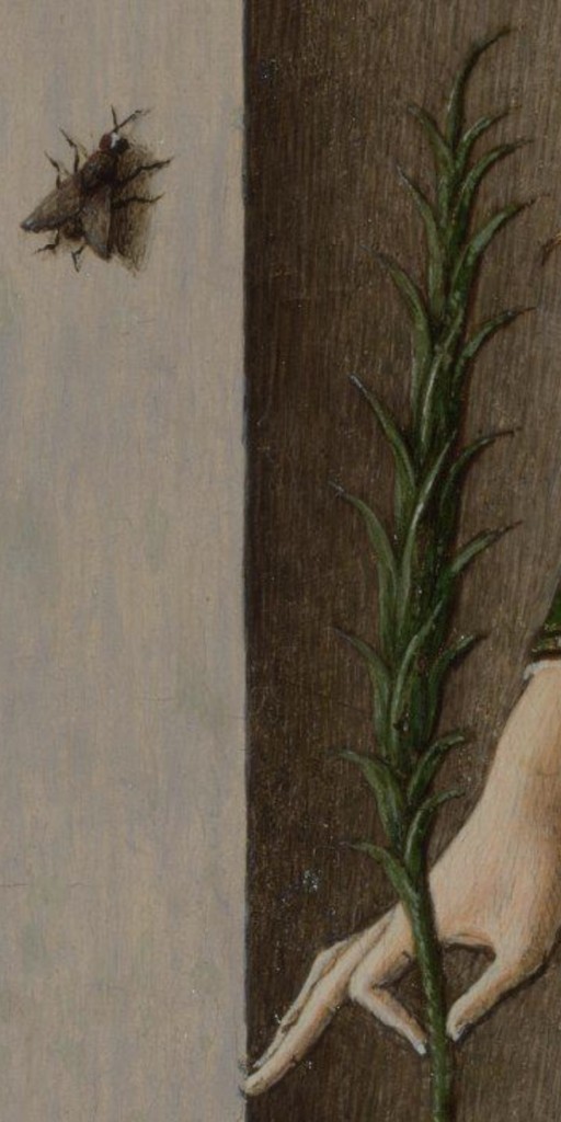
That Brother Peter was an upright and trustworthy man – despite his ‘stealth’ – is clear from the way he echoes the upward growth of the tree behind which he is barely hidden (an oak, as it happens), although as the tree grows left he leans right. He wears sandals: St Francis told his friars they should not wear shoes, much as Jesus tells his disciples in Matthew 6:28-29 not to worry what they wear:
And why take ye thought for raiment? Consider the lilies of the field, how they grow; they toil not, neither do they spin. And yet I say unto you, That even Solomon in all his glory was not arrayed like one of these.
… and there are plenty of flowers growing beautifully here to underline that point. Brother Conrad’s humility is such that he does not even seem to be wearing sandals: the hem of his habit falls over his heels, but this leaves his unshod toes clearly visible. The woodland is beautifully structured. Further back, and to the right of Brother Peter’s tree is another, and at the same distance back and to the right we see a third stand of trunks. Then to the right, and coming forward is fourth.

Coming forward and to the right again we see Brother Conrad – he is as sturdy (in his faith) as these trees growing in the wood, and he kneels between that fourth clump and the Cross, which is itself often described as the ‘Tree’ on which Jesus died – with Jesus as the fruit of the tree.

If we look back to the whole image, we can see that these trees are arranged in an unmistakeable ‘V’ shape, leading back into the woods from Brother Peter, and then forward to Brother Conrad. It is one of the devices which emphasizes the distance between to the two friars. Not only are Peter and Mary at the extremes of the painting (although Spartali makes sure that both Mary and Jesus are higher than Peter), but this ‘V’ creates an open space in the middle of the painting. I do not think it is a coincidence that the diagonal formed by the heads of Mary, Jesus and Conrad lands at the base of the painting directly beneath the central cluster of trees, the point of the ‘V’.

It is just to the left of this central growth that the brightest elements of the distant landscape can be seen – the sky around a church on the horizon. This helps to tells us the extent of Conrad’s devotion. Not only is the church well lit – the source of his enlightenment – but it is also far: in his humility he has retreated far from the world, not wanting his prayers to be witnessed, or to ‘show off’ the strength of his belief. As a result, he has been duly rewarded. The expression on Peter’s face also reminds us that, as the story tells us, he ‘felt in his soul exceeding sweetness and consolation’ – although I can’t help thinking that Spartali has also added in a little hint of guilt, acknowledging that perhaps he really shouldn’t be there spying on his Brother.
I think this image is remarkably beautiful, telling a charming story with clarity and delicacy – both in terms of emotional truth and detailed naturalism. It has all the hallmarks of the Pre-Raphaelite ‘greats’ – but sadly, the artist is little known. Having trained with Ford Maddox Brown, Marie Spartali – part of the Greek business diaspora in London – married the American journalist William Stillman against her father’s wishes. When Stillman was posted to Florence, she inevitably went with him, and there they lived from 1878-83, socialising with the Anglo-American ex-pats, among whom the most interesting must surely have been John Singer Sargent. From ’86-’96 they lived in Rome (I’m not sure where they were in between!), and in 1892, when today’s picture was painted, they spent some time near Perugia – and so not far from Assisi where St Francis himself is buried. In all that time she continued to visit England, and to send paintings around the world, often – like Evelyn de Morgan, who I wrote about way back in April 2020 (see Day 41 – Night and Sleep) – supporting her husband with the income from her sales. There would have been plenty of opportunities for her to see art, and to be inspired – and there are many influences on this painting, as there are for any good artist who will acknowledge their work as part of a greater whole. The story itself is not so terribly far from the story of the stigmatisation of St Francis, which took place at Mount La Verna, in a ‘secret and solitary place’, according to St Bonaventura. On that occasion St Francis was accompanied by Brother Leo, and although Leo was not physically present, but nearby, he gave the first account of the stigmatisation, and many artists paint Leo as if he were in full sight when it happened. Spartali could have seen the fresco by Giotto in the Upper Church in Assisi, although I am showing you the version by Domenico Ghirlandaio from Santa Trinità in Florence (1483-5). Not only is the format similar to that of her painting, but in other works she seems to draw on Ghirlandaio for details of renaissance clothing.

The wooded landscape itself is derived from Giovanni Bellini, and his Assassination of St Peter Martyr (about 1505-7) – presented to the National Gallery by Lady Eastlake in 1870: Spartali could easily have seen it there.

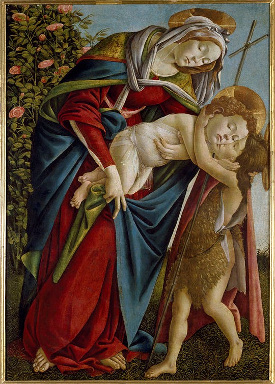
And the last thing I would suggest is a source for the rather precarious way in which Mary holds Jesus. I am sure it is inspired by a Botticelli in the Palazzo Pitti – again, somewhere she is bound to have visited while she was in Florence. In this case Jesus embraces his cousin John – and it is as if Spartali ‘wound back’ the event (as well as reversing it), to depict the moment just before the child was lowered into Brother Conrad’s arms.

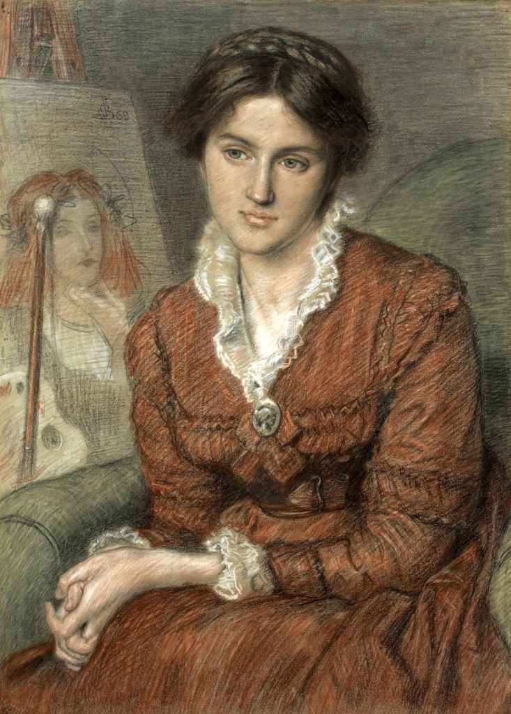
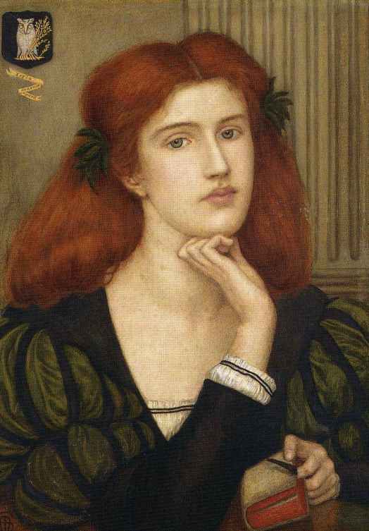
Two last images: the first, a portrait of Marie Spartali-Stillman by Ford Maddox Brown (1869, Private Collection). He is said to have had an unrequited passion for her, but I really can’t speak to that. He does, however – unlike many other male artists painting their female colleagues – show her as a competent, practicing artist. She sits beside her easel on which we can see one of her own works, her palette and mahl stick leaning up against it. This is, to my mind, one of her early works, The Lady Prays-Desire (1867, Private Collection) – the other image I have posted. However, some people wonder if the painting on the easel could be her first publicly exhibited work, Korinna (also 1867, now lost), but I really can’t believe that she would have replicated this precise chin-on-curled-finger pose in two contemporaneous images. Nor that in both the centrally-parted red hair would have been held back by black ribbons.
This is a good place to leave her. After all, she said, ‘it was Madox Brown who encouraged me to become an artist and who taught me to paint. I can never feel sufficiently grateful for his having given this immense interest to my life’. If you would like to know more about Marie Spartali-Stillman, I can recommend the catalogue of the National Portrait Gallery’s exhibition Pre-Raphaelite Sisters. There is also a catalogue to an exhibition held at Delaware Art Museum in 2015, Poetry in Beauty: The Pre-Raphaelite Art of Marie Spartali Stillman, although this is now only available second hand at considerable expense.