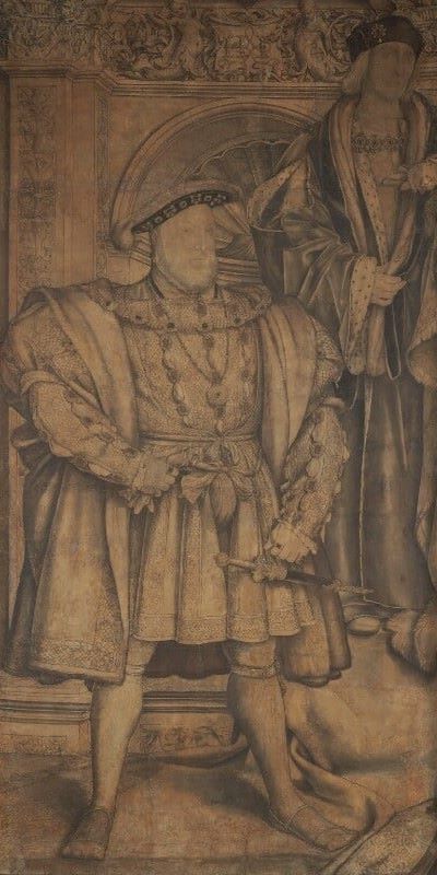
William Hogarth, The Painter and his Pug, 1745. Tate Britain, London.
I’m not much of a dog person, but I have developed a fondness for William Hogarth’s pet pug, not least because it rejoiced in the name of Trump (no relation). This portrait – if that’s what it is – belongs to Tate, rather than the National Portrait Gallery, but as I have been using a different Hogarth Self Portrait, which is from NPG, to advertise my third ‘re-visit’ – looking at some of The Georgians, this Monday, 13 November at 6pm – it seems like a good time to re-visit this particular painting as well. I will then continue this autumn’s theme of portraiture with two talks about Holbein, the first introducing his background and early work (Holbein I: Religion and Reform on 20 November) and the second introducing the Queen’s Gallery exhibition Holbein at the Tudor Court (Holbein II: Realism and Royalty on 27 November). If you click on this link you can by a ticket for both talks at a reduced rate… I will then move on to brighten up the winter with some colour (it’ll be in the diary soon), but that won’t be for a while, so let’s get back to Trump.
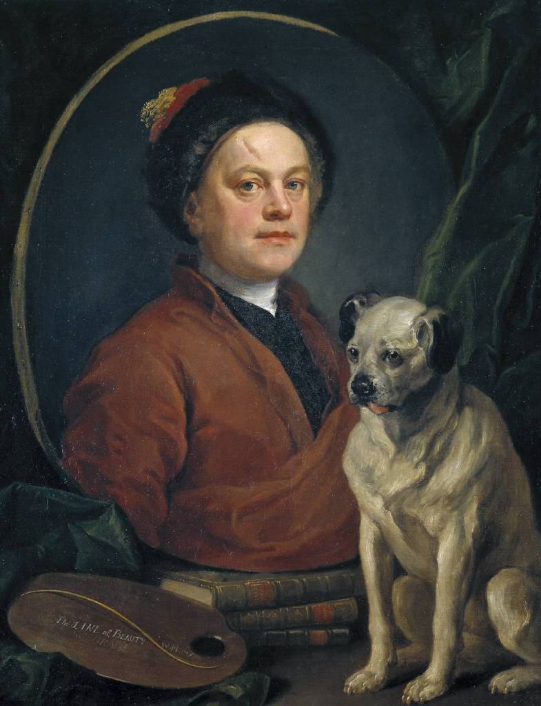
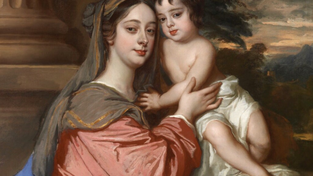
I questioned, above, whether this really is a portrait. It would seem so obvious that it is a self portrait that we don’t stop and question what genre of painting it actually is. After all, Hogarth is not presenting us with a direct image of himself, but shows us a painting within a painting. The image of Hogarth is, in itself, an object which he has depicted. The likeness of the artist is painted on an oval canvas, and rests, unframed, on a pile of three books. If you get in close, you can see light reflecting from the tacks which pin the canvas to the oval stretcher. Next to the painting lies a palette resting on some fabric, and a curtain hangs down from the top right corner, falling behind the dog. This is a collection of objects – canvas, books, palette, cloth: surely it is really a Still Life? The dog features in the same way that birds, insects, or even occasional frogs do in earlier Still Life paintings (see, for example, Picture of the Day 27). Alternatively, you could suggest that this is a portrait, pure and simple, of Trump, the proud and upright pug seen to the right. He is more real than the image of Hogarth, who, in this case, would have been included as one of the ‘attributes’ of the subject, Trump, telling us more about him: not just what our hairy hero looked like, but more about his background. For a dog, that would include the appearance of the owner, an aspect of the canine character that is usually omitted from the genre of pet portraiture. If this is indeed a portrait of a fully rounded hound, then we would expect the other objects to include further references to his occupations – nowadays, I suppose, that would include balls, mangled toys, and possibly even a dog chew or two. But no such luck – there is no other hint of animal husbandry. There are, however, books.

It seems highly unlikely, judging by what little I know about dogs, that Trump could read. Even if he could, it would surely only be the cleverest canine that would enjoy Shakespeare, Swift and Milton (specifically Paradise Lost), the very words written in gold lettering on the spines of the books. These clearly relate more to the owner than the owned, and appear to be the influences or inspirations that Hogarth is claiming for himself. Indeed, as the painting rests upon the books it would seem to suggest that they are the very foundations of his art.

Another way of looking at it is that his painting, sitting on top of Milton, Swift and Shakespeare as it does, represents the very apogee of artistic achievement. But why does he limit his own appearance to a painting, while showing us the ‘real’ Trump? Maybe he wants to say that he is his art – this is not just what he looks like, but his very essence, as if to say, ‘we are what we do’. The palette says the same, in a subtler and more sophisticated way. This is not, it would seem, the palette of a working artist – there is no paint on it (even though he included grey-scale daubs in an engraved version), nor are there any brushes (although technical analysis shows that at one point there were, stuck through the thumb hole of the palette). Instead there is an inscription: ‘The LINE of BEAUTY’, after which comes, in fainter script, ‘And GRACE’. Further to the right is his signature – or at least his initials – and the date, ‘W.H. 1745’.
This is as much the painting of a theoretician as of a practical painter. In 1753, eight years after the completion of this work, he would publish The Analysis of Beauty, a summation of his thoughts on art, expressed in essence by the Line of Beauty – the S-shaped curve we see on the palette. It implies not only a sense of flow in any depicted form, which he says is more interesting and varied than rigid, straight lines would be, but also gives a sense of liveliness and movement to a painting. It also, he believed, echoes the way in which our eyes look around an image.

As ever, things are never that simple. He was still formulating his ideas when this self portrait was completed in 1745, and painted out the words ‘And GRACE’ – only for them to be revealed again as the overpainting gradually became transparent. Even the line itself is not as simple as it may appear. An S-shape, yes, but one that casts a shadow on the palette. It is, in the world of the painting, a three-dimensional object, like a gold wire floating impossibly above the flat surface, resting with the lightest touch at either end. It is, in a way, a statement of the power of art to create things we do not know, or which can not exist within our physical world. In his book he would describe the line of beauty as being two dimensional, whereas the line of grace was three-dimensional – suggesting that this is the latter. However, it seems that he hadn’t settled on this distinction by the time the painting was completed, and so tried to cover ‘And GRACE’. This still leaves us with Trump. Why is he here? And why is he ‘more real’ than Hogarth himself, given that the artist is ‘relegated’ to a painted image?

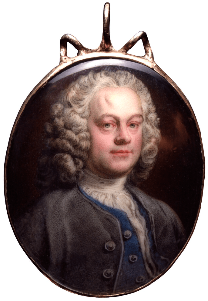
X-ray analysis tells us that Hogarth had initially planned a more formal portrait to feature in this ‘Still Life’. In all probability it was more like the miniature by André Rouquet illustrated on the right. However, that formality – fully bewigged and dressed with cravat, waistcoat and jacket – was relaxed to show the artist in his cap and house coat, the way you would meet him ‘at home’, rather than dressed to the nines in performative fashion when out in Society. This is the man himself. And he was, of course, a man who loved dogs. He had a succession of pugs – Pugg, Trump and Crab are known by name, but Trump was the favourite, and gained the most renown. Apparently Hogarth often remarked how similar they were, and in this painting the proud pooch becomes an emblem of Hogarth’s pugnacious nature. The scar on the artist’s forehead, of which he was rather proud, might even imply that he (like Trump?) was a bit of a bruiser, although as it happens it was the result of an accident in his youth, rather than the trophy of a fight.
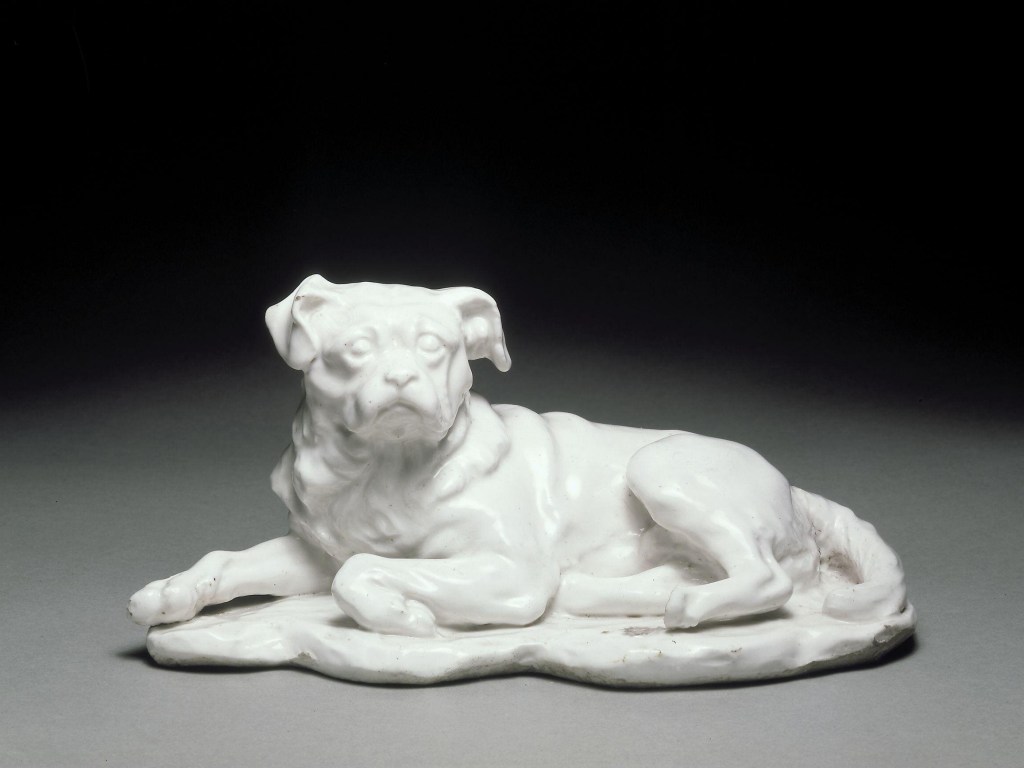
Trump himself became a well-known character. He probably appears in four other paintings, and nowadays he even has his own Wikipedia page, which will tell you what the paintings are. Not only that, but he was modelled in terracotta by the great French sculptor, and friend of Hogarth, Louis François Roubiliac – whose terracotta bust of the artist (which, like the miniature above, belongs to the National Portrait Gallery) I will talk about on Monday. Sadly the original Trump has been lost. Wedgwood made a version in black basalt ware based on a cast he got from a plaster shop owned by a man called Richard Parker. Neither the Wedgwood nor the plaster cast seem to have survived either: I certainly can’t track down any photographs. However, the Chelsea Porcelain Factory also released a white version, probably based on a similar, commercially available, plaster cast. So here is Roubiliac’s Trump in a version by the Chelsea Porcelain Factory, now in the V&A. That’s what I call celebrity.
When I first posted this, the painting was included in the Tate Britain exhibition Hogarth and Europe, which led me to question how our painting related to the rest of the continent. Presenting the artist as a typical British Bulldog (or rather, Pug), and resting on three of the great British authors, there wouldn’t seem to be anything ‘European’ about it, until you realise that The Line of Beauty – that sinuous S-shaped curve – is, in itself, one of the founding compositional principals of Rococo art and design. As so often, Hogarth may have expressed disdain for everything ‘overseas’, but he was a great lover of its art. But was that even what Tate Britain’s exhibition was about? You’d have to look up my review in the Burlington Magazine to find out (and sorry, you’d have to pay for it on that link, but you could look it up in a library).
It’s possible that Trump – or more likely, Crab – originally made an appearance in the NPG self portrait. However, the featured dog was painted out, probably because he had adopted a rather disrespectful stance, as dogs regularly do. I’ll see if I can find an X-ray to show you where he was – and what he was doing – in time for the talk on Monday.