Joseph Wright of Derby, The Annual Girandola at the Castel Sant’Angelo, 1775-76. Walker Art Gallery, Liverpool.
Wright of Derby: From the Shadows – the exhibition at The National Gallery which I will be talking about this Monday, 24 November at 6pm – is one of those exhibitions which takes a small slice of an artist’s life and covers it both beautifully and thoroughly. It’s not a large exhibition, but it is very rich, and there is more than enough to look at and think about to make a visit to Trafalgar Square worthwhile even if you do nothing else. The paintings look superb, the design is perfect, and the lighting is both evocative and appropriate. To avoid cutting further into that ‘small slice’ – which in some ways I did in August with 254 – Joseph Wright, changing your point of view – today I will look at a superb painting by Wright which falls outside the range of the works in the exhibition. Nevertheless, it does use many of the techniques the artist had learnt from the ‘candlelights’ and ‘moonlights’ which are the subject of From the Shadows.
The following week, 1 December, my starting point will be the first of two exhibitions in London this winter which focus on one loaned painting, Double Vision: Vermeer at Kenwood. The second will follow two weeks later, on 15 December, when I will look at – and around – the Wallace Collection’s Caravaggio’s Cupid. These two talks will be followed in the New Year with two more which will introduce exhibitions at Tate – Turner and Constable (Tate Britain) on 5 January, and Theatre Picasso (Tate Modern) on 12 January. More news is bound to follow soon in the diary.

At first glance you might wonder if we are looking at a natural – or manmade – disaster. In the dark of night the most enormous explosion seems to have taken place, an eruption of fire amid sizeable buildings. Fortunately, though, we are at a safe remove, with two tall umbrella pines acting as a screen, letting us know how far away we are from the fire, the smoke and all the sparks: we are definitely standing well back. A dark row of buildings marks the edge of a town, or city, with the furthest building – as far as we can see so far – being a large church with a notable dome. To one side of it, palaces are lit up with the golden glow of the conflagration, and facing it a round building is all-but enveloped by smoke. Sparks fly up into the sky in all directions.
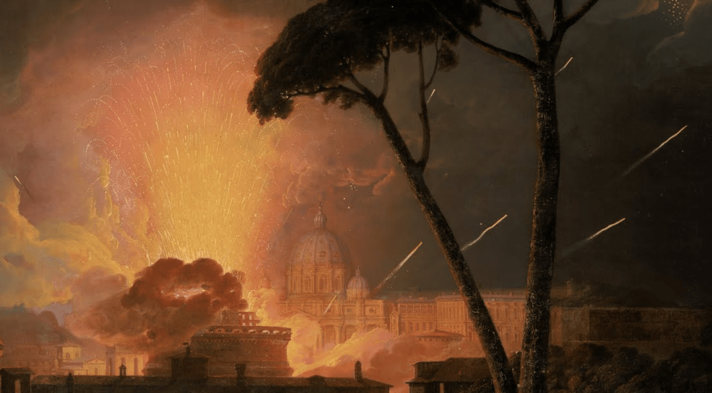
Looking closer, though, the sparks might seem a little too ‘tidy’ to result from an uncontrolled fire. It may have been obvious to you before, but all this heat and light is the result of a firework display. The concentrated energy of the upward motion of the sparks allows us to track their origin to what appears to be an open space in front of the church. As the sparks rise their colour shifts from yellow to orange as they lose their energy – both in terms of movement and heat – and their parabolic trajectory starts to be noticeable. However, there is more than one type of firework. The main column of sparks, which opens out rather like a display of tall flowers in a narrow vase, is clearly bursting up from the ground, but there are also rockets which, in this detail at least, shoot along diagonals behind the trunks of the pines. The smoke which envelops the circular building would also appear to have developed from the base of the firework display.

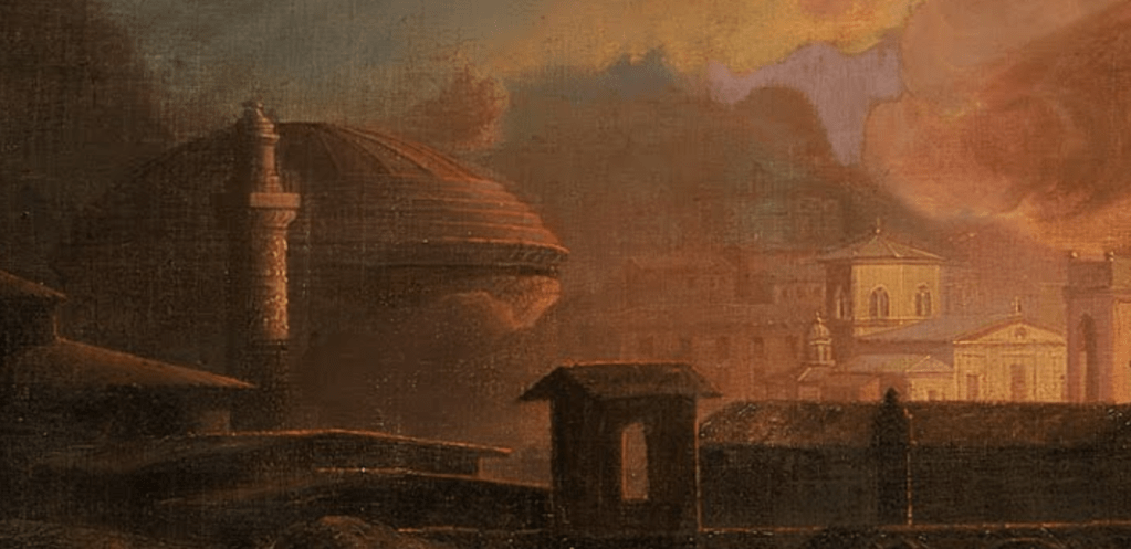
Getting closer still another thing becomes more obvious (although to some, again, it may have been obvious before). We are in Rome – or near Rome, at least. The church is none other than St Peter’s, and the round building in front of it the Castel Sant’Angelo. To the right of St Peter’s is the ‘Loggia di Raffaelo’, decorated by the great renaissance master, but almost completely inaccessible to the public today.


The top floor is open, supported by a row of columns (although it has now been glazed, to protect the frescoes), whereas the floor below has an arcade, with each arch framed by pilasters. Compare and contrast the above: I think it’s fair to say that Joseph Wright has been pretty accurate in his depiction – although he has heightened the drum of Michelangelo’s dome.

Accurate, that is, until you think about the relative locations of St Peter’s and the Castel Sant’Angelo. The latter is far closer to us in the painting – so it should appear to be far larger, potentially even blocking our view of the basilica, given the distance between them. However, Wright clearly wants us to see both: he wants us to know where we are. Given the angle of the rockets, they would appear to be flying out from the Piazza San Pietro, inside the enclosing arms of Bernini’s colonnades. However, the title of the painting tells us that this is not the case – the girandola was taking place at the Castel Sant’Angelo. Apart from the rooves of this structure, and the land immediately around it, there wasn’t much more open space in this part of Rome in the 18th century: the dramatic avenue leading from the Castel Sant’Angelo to the Piazza San Pietro – the Via della Conciliazione – was only started in 1936 on the orders of Mussolini. It involved the destruction of a row of buildings between two narrower streets to create the impressive width of the avenue, which wasn’t completed until 1950. There is no evidence of these buildings, or of the distance between the castle and the basilica, in Wright’s painting, though: this is a topography that depends on the ‘symbolism’ of notable buildings rather than on geographical accuracy.
The same is true further to the left. What stands out is the dome of the Pantheon, resting on its cylindrical walls. Standing a little closer to us is a column, with specks of light reflecting from its surfaces, suggesting that they are highly decorated with sculpture. This must be one of the two columns in Rome with spiralling reliefs. The assumption, in the texts that I have read, is that it is Trajan’s Column, probably because it is the more famous of the two (just to make the point, there is a plaster cast of the entire thing in the Victoria and Albert Museum in London). However, the Column of Marcus Aurelius would make marginally more sense. Looking from the right place on the Pincian Hill the Castel Sant’Angelo would appear to be to the left of the façade of St Peter’s, and the Pantheon would be off to the left – but far further off than Wright has suggested. You might even be able to find a place where the Column of Marcus Aurelius appears in front of the Pantheon – but it wouldn’t be the same place: this may be an amalgam of different views from the Pincian, with the buildings out of scale to allow them to be identified, and visible. However, this suggestion is thrown out of kilter by a building that could be a church with an octagonal ‘dome’ – although the structure is really a broad lantern with sections of a sloping roof. I think this is the Ospedale di Santo Spirito in Sassia. Again, compare and contrast:
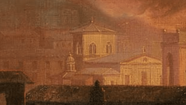

On the façade Wright has painted the standard tripartite division of a church, whereas the building is divided into four – an early Renaissance ‘error’ in the revival of classical architecture, perhaps. It could be that he was making assumptions about the way in which such a gable-ended building is usually structured. I don’t know any other buildings in Rome with this sort of octagonal lantern, although they may have been altered, or hidden, since the 18th century. The gothic tracery of windows of the Ospedale’s lantern do seem very close to what Wright has depicted. If this is the Ospedale, though, it is at the Tiber end of the Via della Conciliazione – Mussolini’s 1930s avenue – and so not far from the Castel Sant’Angelo. It is nowhere near the Pantheon or either of the two columns. What Wright has painted is not an accurate cityscape, but a genre of painting known as a Capriccio – an imaginary landscape (or cityscape) ‘cutting and pasting’ known buildings – or invented ones – into a ‘capricious’ arrangement. It is a fantasy, a scrapbook of known monuments. However, the occurrence he is depicting – La Girandola – was a matter of historical fact. Here’s another, more topographically accurate version of a similar occasion – or possibly even the same one – that Wright painted at about the same time (1776), which is now in the Birmingham Museums and Art Gallery: Firework Display at the Castel Sant’Angelo.

The Girandola of the title was a mechanism for mounting fireworks. They were set into a circular structure, and aligned in such a way that the force of the rockets firing out of it caused the entire thing to revolve – like a Catherine wheel, or pin wheel firework, but on a far larger scale. It took place annually – as the title of the painting suggests – on Easter Monday, but there could also be a girandola to celebrate the inauguration of a new pope. Wright left England on his own version of the Grand Tour in 1773, and was in Rome from 1774 to 1775. He would have been there for the conclave which elected Pope Pius VI in February 1775, but it seems far more likely that he witnessed the girandola of Easter 1774. On returning to England he would have used sketches he made in Rome, together with his memories of the event, to complete the paintings, adding in more or less artistic license along the way.
In both cases – the paintings in Liverpool and Birmingham – he paired the image with an equivalent of Vesuvius erupting. Although he did travel south to Naples to see the volcano, which was going through what is termed an ‘eruptive sub-cycle’ in the 1770s, it is very unlikely that he witnessed a ‘major’ eruption – although you wouldn’t know that from the paintings. He was an artist, after all. The pairing was quite deliberate – fireworks from the earth compared with handmade eruptions, or, to put it in his own words, “The one the greatest effect of Nature, the other of Art that I suppose can be”. Both would have been considered manifestations of the Sublime, defined by Edmund Burke in 1757 as the experience of encountering something that inspires awe, terror, and astonishment, producing the strongest emotions the mind can feel, saying that ‘whatever is in any sort terrible or is conversant about terrible objects or operates in a manner analogous to terror, is a source of the sublime’.
Fireworks are, of course, dangerous, hence the instruction I remember from my childhood to ‘light blue touch paper and stand well back’. I suspect that the people operating the girandola may not have been given this luxury – nor was ‘health and safety’ a consideration for the people lowered by rope from the lantern of the dome of St Peter’s to light all the candles you can see illuminating it in the background of the Birmingham painting. The candlesticks are still there: you can see them if you look over the balcony of the lantern of St Peter’s to this day (but only on the side facing Rome).
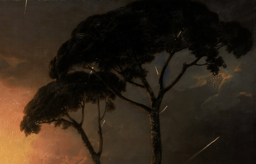
In both paintings, though, Wright clearly was standing well back. For the Liverpool version he imagined himself to be far enough away to allow him to include the two umbrella pines – even if experience would suggest that he probably invented the entire foreground landscape. As I said above, the pines create a dark screen against which the strength of the brilliant illuminations can be measured, and they also allow us to trace the almost random path of the rockets – one of which has exploded, illuminating the edges of nearby clouds. They also encourage us to look into the depth of the painting, thus acting as a form of repoussoir.

And yet – as this detail suggests – even this far away may not be far enough: a rocket is landing at the foot of the pines, in the foreground of the painting. This would surely induce anxiety in the minds of anyone physically present – but safe as we are at home, looking at our screens, or in the comfort of the art gallery, it need not concern us too much. This too is part of the experience of Burke’s ‘Sublime’ – the knowledge that such awe and terror exist, and yet, we need not be afraid: we get the thrill, but not the danger. It even allows us a space to enjoy the fear – not unlike watching a thriller on T.V. The British, in particular, seem to love a good murder – just think about Agatha Christie or Arthur Conan Doyle – maybe (just ‘maybe) this is the heritage of the Sublime gradually bubbling away… The paintings in From the Shadows are, on the whole, more domestic, and might not, at first glance, appear to produce that much of a threat. But the size and scale of the solar system, or the inevitability of death, are nevertheless bound to present an undeniable sense of awe… as we will find out on Monday.