226 – Wise saws and modern instances

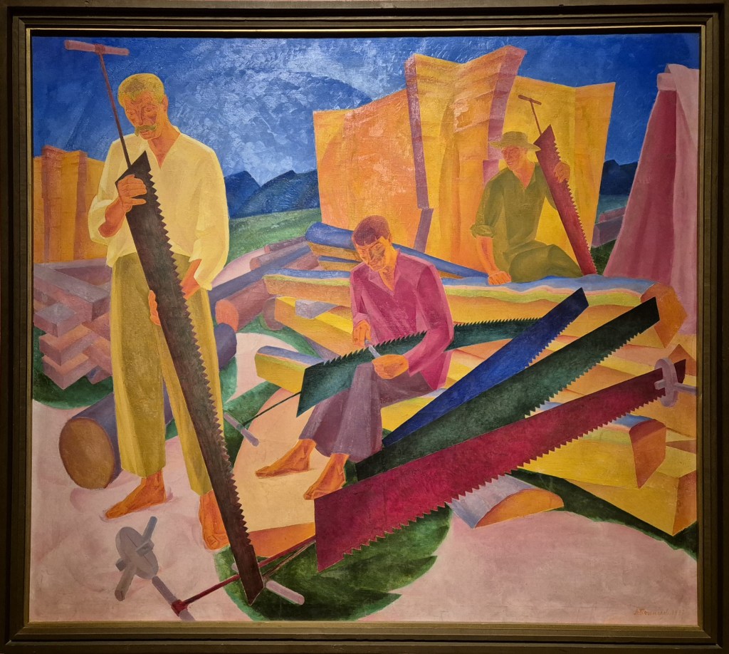
Oleksandr Bohomazov, Sharpening the Saws, 1927. National Art Museum of Ukraine, Kiev.

The Royal Academy’s exhibition In the Eye of the Storm: Modernism in Ukraine, 1900-1930s, about which I will be speaking this Monday, 12 August at 6pm, is undoubtedly one of the most visually exciting exhibitions I have seen for a long time. Relatively few of the artists who are included were known to me, and those who were, such as Kazymyr Malevych (Ukrainian, rather than Russian transcriptions are favoured throughout) and Sonia Delaunay, do not have the same impact as some of the brilliant artists who are, for me, discoveries, such as Vasyl Yermolov or Oleksandr Bohomasov, about whom I am writing today. The fact that the paintings have made it to the UK is a story in itself, and if you can’t make it to the talk on Monday I would urge you to get to the Royal Academy before the exhibition closes in October. The following week, on 19 August, I will return to Laura Cumming’s superb book Thunderclap, to think about at The ‘other’ artists – i.e. the ones she discusses who are not Carel Fabritius. To round off the talks in August, on the 26th I will look at the act of looking itself, alongside Piero della Francesca and David Hockney, by introducing the National Gallery’s Hockney and Piero: A Longer Look, which opened yesterday. After that things are still pretty much up in the air, but will probably include two talks looking at saints from medieval paintings in the National Gallery, an introduction to the NG’s forthcoming Vincent van Gogh exhibition, and a tour around ‘the Piero trail’ – thus returning to one of our heroes from the end of August, in anticipation of what looks like being a very ‘Renaissance’ autumn. But as soon as things are pinned down I will post details in the diary.
This painting was never meant to be seen on its own. It was originally supposed to be part of a triptych, a form which is otherwise unknown in modern Ukrainian (or for that matter, Russian) art. But for now I’d like to look at it as an object in and of itself. We can see three men performing various actions relating to the title of the painting, Sharpening the Saws – and, even if the definite article didn’t tell us that ‘the’ saws were the subject of the painting (rather than the men), the painting itself makes that clear. I can see six, painted in a variety of rich colours, and at two predominant angles: just off vertical and just off horizontal. Both of these features – colour and angle – are essential aspects of Bohomazov’s work. His major concern was how an artist could communicate with his audience, or, in other terms, what it was in a work of art which conveyed the feelings and sensations an artist experiences to the viewer. He wrote several theoretical texts about these concerns which seem to have anticipated the ideas – and art – of the likes of Kandinsky and Malevych, but even now they have been relatively little read (including, I confess, by me). In this painting, for example, both the colours and the angles of the saws help to convey the energy of the activity. Rhythm was another essential aspect of his work, something which he saw as not only quantitative but also qualitative, an element of art which could express concepts as diverse as speed, energy, regularity or mood: something which can be both measured and felt.

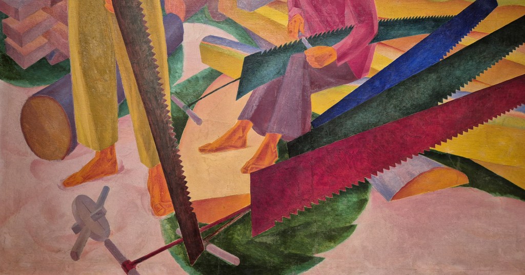
This detail shows the bottom left corner of the painting – which disguises the fact that the titular activity – sharpening – takes place at the exact centre of the canvas. A man in a fuchsia-coloured top and burgundy trousers is sitting on a section of a log with what appears to be a dark green saw resting across his lap. Holding a file in his two hands – the handle in his right, the working end in his left – he is sharpening one of the teeth of the saw about a fifth of the way along: the file is almost at the dead centre of the painting. Given that there are three other saws lying next to him, he clearly has his work cut out. These three saws – in deep blue, an even darker green, and cerise – splay out from a single focus. This is a technique which Bohomazov had developed in his earlier, more abstract works, and is one way in which he conveys movement. This can be read as energy either leading in to the focal point, or radiating out from it. Bohomazov’s prime interest could be rendered as ‘we see what we feel’, and the way you personally see this movement – in or out – is, I suspect, dependent on your own temperament. As well as having this rhythm of forms, there is also a rhythm of colours – blue, green and cerise – which helps to create the visual excitement of the painting, and reminds us that the saws are the subject: the colours are far more intense than those of the partial logs on which the man is sitting, and so they grab our attention. The saws are all tapered, with the broader end closer to us – the exception being the more vertical example held by the man in yellow on the left (we’ll come back to him later). The broader end has a thin bar attached to it, with a ring at the end, through which a small round pole, presumably made of wood, has been inserted. There is an unusual object in the bottom left, the same colour as the poles (so presumably also wood), the function of which is not immediately apparent (unless, perhaps, you are a sawyer). It is circular, with round poles projecting from opposite sides – similar to those on the end of the thin bars – and square protrusions at right-angles to the plane of the circle. There is also a black line describing the diameter of the circle.

The man standing on the left of the painting is checking that the process of sharpening is complete, looking along the saw to check that everything has been done correctly, and that each tooth is correctly aligned and suitably sharp. This is perhaps the most naturalistically coloured example, with the blade arguably a tempered yet slightly rusty steel. The harmonious way in which the men work with each other, and with their tools, seems to be expressed by the way in which the saw is aligned with this man’s left leg, on the same off-vertical diagonal. His weight is supported on his vertical right leg, almost like a classical contrapposto. This leg is the only significant vertical in the painting, suggesting that the man is clearly stable, in control, and, we can therefore assume, reliable. Lying on the ground behind his right foot is a log, a section of a tree trunk which has been cut transversely, but not yet longitudinally. Once the saws are sharpened and put to good use, this log will be turned into a series of rectangular beams, some of which we can see to the left of this standing man’s leg, stacked in an open, square formation to dry, or ‘season’, the lumber.  Above this is an orange structure, presumably constructed from even more beams.

A similar orange structure forms an almost theatrical backdrop to the man in green with a yellow-green hat. The striations in this structure again suggest that it could be formed from a series of cut wooden beams, which admittedly look as if they are rather precariously stacked. One of the problems of interpretation is that, apart from the deep blue sky, the dark blue distant hills, the green grass, and some of the logs, colour is not used for its descriptive function, but for expression, differentiation, and – as ever, with Bohomazov – the creation of rhythm. The man in green smiles, and looks over to his colleague who is hard at work. He looks relaxed – which might imply that the work for the day is almost done. He holds a red-pink saw with a hand that looks slightly oversized – presumably gloved, given the way he wraps his hand around the teeth of the saw: even if it were blunt this wouldn’t be comfortable! On the far right there is a pink cloth draped over a pole – presumably a tent-like construction to store the wood, or the saws.

If we return to the centre of the action – the sharpening of the saws – but this time looking at the bottom right corner of the painting, certain things become clearer. For one thing, we can see the curious circular structure from the bottom left corner put to its proper use: it is at the thinner end of the cerise saw, the black line across the diameter being a slit into which the saw has been inserted. The two short, round poles are handles: the saw could therefore be held at either end, but, given how long it is, it would need two people to operate it. The man in green is sitting on one of several logs which have been sawn longitudinally – along the trunk – but have not yet been refined into rectangular beams. The different qualities of the wood and bark are expressed by different non-naturalistic colours – pale blue on the outside (the bark, effectively), a thin a layer of pink and a thicker one in pale green, and underneath a more-or-less naturalistic wood colour. These hues are less saturated than those used for the saws: while these sawn logs are relevant as part of the process, it is the saws, as ever, which are most important. This is insistently stated, even evoking the action of the saws. The angle between the green saw (being sharpened) and the blue one could be read as describing the sawing motion itself, back and forward, with the repeated regularity of this movement restated by the nearer green and cerise saws.

As a whole the painting is a paean to this process – from the trunk, cut into logs transversely, the logs cut longitudinally, then refined into beams, which are stacked openly to dry, and then, when fully seasoned, stacked more densely.  The work has resulted in the blunting of the saws and the need for them to be sharpened. But, however complete this process may appear, it is not the whole story. As I said above, this painting was just one from a triptych, of which only one other was completed.

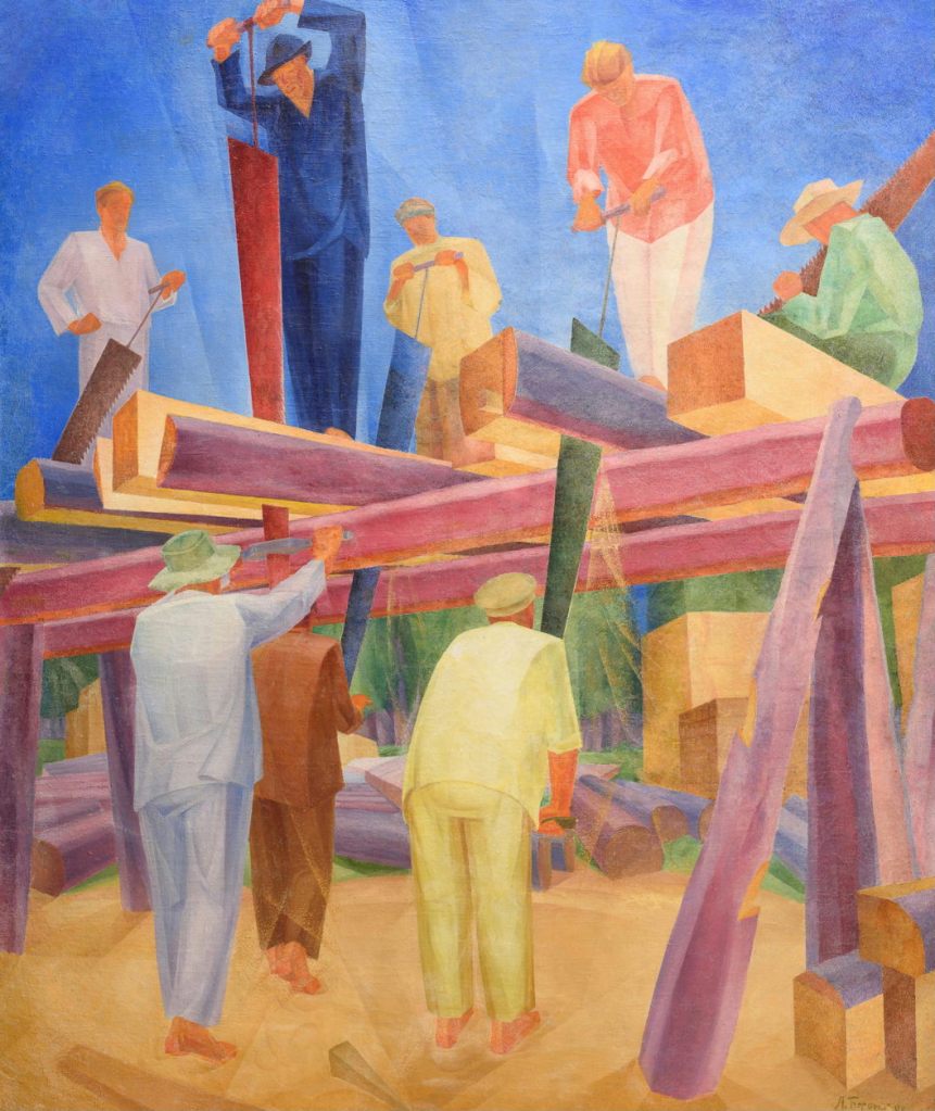
The central section, Sawyers at Work (1929), is also in the National Art Museum of Ukraine – but sadly, not in the exhibition (for historical reasons I suspect it is rather fragile). It shows the saws in action – being used just as supposed. The men standing atop the open platform hold the handles attached to the thin poles at the broader end of the saws, while the men on the ground hold those on the circular structures which are threaded over the thinner ends. The saws are operated vertically, or at a slight angle, as they make the long longitudinal cuts. As they work their way through each trunk, the trunk itself would also have to be moved, edged further out, or they would find themselves sawing through the supporting platform. Note how the most active man wears the deepest colour – a dark blue – and is about to thrust down the most richly coloured, red, saw. Meanwhile, a man in green (possibly the same one as in the other painting – he also wears a pale hat) sits on a completed beam at the top right. Maybe this contrast between action and rest, and the tones and hues used to portray it, could tell us about Bohomazov’s language of colour. And maybe one day I will read Bohomazov’s Painting and its Elements (1914) and find out.

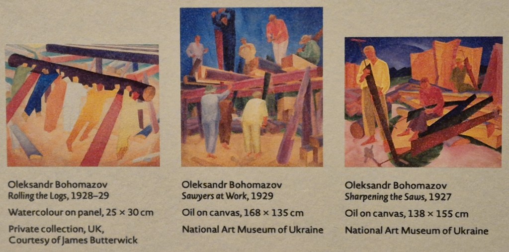
Sadly, as I have said, the triptych was not completed, although it had been fully planned. Among many other drawings and sketches, a watercolour study survives, which was sold relatively recently by James Butterwick, the leading dealer in Ukrainian art (and one of the Partners in the publication of the superb catalogue, £10 from the sale of which goes towards supporting museums in Ukraine). The watercolour has has been used in a reconstruction of the triptych in one of the interpretation panels at the Royal Academy.

When seen together we can see how the rhythms of the painting are all-important – with the dark diagonals formed by the logs in the left hand image leading from the top left down towards the central painting, in which the vertical action is paramount. On the right, the man in yellow frames the edge of the painting, with his saw leading us in, but also framing the man who is sharpening, who is ‘supported’ but the three saws on the right. At a lower level these echo the logs in the left hand painting, and lead our eye in from the right of the triptych towards the centre. The standing man’s saw in the right painting is reflected by the beams which support the platforms in the two other paintings. From left to right – or right to left – the rocking rhythms surely echo – once again – the act of sawing itself. This triptych was executed from right to left, and could equally well be read that way: all the elements of the process – and the art – work together.

Whichever way you read the triptych, the watercolour sketch Rolling the Logs (1928-29) shows what could be seen as the first stage in the process, with the unsawn logs being rolled up onto the wooden frame in preparation for work to begin. The logs are large, and extremely heavy, and six men work together to perform this task – the colours suggest that they could easily be six of the eight men in Sawyers at Work. If it hadn’t been obvious before, this act of collaboration could help our understanding of the overall meaning of the triptych: this is the work of a collective, with the citizens of the soviet working together. The irony of this is that, at the opposite end of the political spectrum, fasces – which give fascism its name – are bundles of sticks. A single stick can be broken easily, but as a bundle it is unbreakable. In both cases the group effort is seen as essential to the survival of the whole society. The problem with both systems is, I suppose, that individual rights get suppressed by the directives of the few in control. But let’s face it, I’m not a political theorist. Yet here we are, realising that art is not necessarily an escape from the everyday world (which, of course, it can be), but also an essential element in understanding who we are and how we live. It’s not the icing on the top – it is an expression of the whole thing.

But what were the politics of the artists themselves? There is, apparently, a lot of work still to be done on the motivation of Ukrainian artists at the time. Bohomazov’s work is some of the first you will see if you visit In the Eye of the Storm – but his early output is unrecognisable when placed alongside The Sharpening of the Saws. Many artists – and Kazymyr Malevych is the most famous example – changed their style from abstract, or at least highly stylised, to a more politically acceptable form of socialist realism, which is how we could describe Sharpening the Saws. However, it is not clear, for each individual artist, whether this was the result of obligation – effectively a pragmatic stratagem for survival – or genuine political conviction, or even inwardly motivated artistic development. Whichever it was for Bohomazov, it is chilling to think that, had he not died of TB in 1930, he may well have completed the Sawmill Triptych, but, even so, he would probably have died in the Stalinist purges of the 1930s, like many of his contemporaries. The fact that these paintings survived at all is effectively an accident of history – but more about that on Monday. And that fact that they have been brought to safety speaks of the dedication of some determined and courageous people who realised that this art – this witness to the power of the human spirit – should be seen more widely. For this reason, if none other – the brilliance of the art, for example – I cannot recommend the exhibition highly enough.

Another look at Laura looking

Laura Knight, Laura Knight with model, Ella Louise Naper (‘Self Portrait’), 1913. National Portrait Gallery, London.

This Monday 5 August at 6pm I will conclude my three part series on Tate’s superb Now You See Us, with a talk entitled From photography to something more modern. I will look at a few remaining paintings in the Victorian Spectacle room, before moving on to think about women and watercolour, photography, and then, as the title suggests (given that photography was developed back in the 1830s), ‘something more modern’, looking at paintings from the first two decades of the 20th century. I revisited the exhibition last week, and there really are some wonderful things to see in these last few rooms (as there were in the ones before, of course). The following Monday, (12 August) I will explore the Royal Academy’s exciting In the Eye of the Storm: Modernism in Ukraine 1900-1930s: it’s the most visually exciting exhibition I’ve seen this year, and really shouldn’t be missed. I’d then like to to revisit Laura Cumming’s beautiful written and highly readable book Thunderclap. Although she is mainly concerned with the enigmatic Carel Fabritius (about whom I have already spoken this year), she also discusses some other ‘greats’ from the Netherlands who mean a lot to her, including Hendrik Avercamp, Rembrandt, Gerard ter Borch and Adriaen Coorte. They will all be included in Thunderclap: the ‘other’ artists on Monday 19 August. And finally, for August, (on the 26th) I will introduce the National Gallery’s soon-to-open Hockney and Piero: A Longer Look, which brings together paintings by David Hockney and Piero della Francesca and looks at the nature of looking itself. More talks will follow: the details of everything that has been arranged so far can be found on the diary page of my website.

The undoubted ‘star’ of the last room of Now You See Us is Laura Knight. Or, if you prefer, Dame Laura Knight: in 1929 she was the first female artist to be granted this honour. Seven years later, she was also the first woman to be elected to full membership of the Royal Academy, and in 1965 she was the first woman to have a solo exhibition there. As I’m currently on holiday, passing through Aberdeen (did you know they have the most fantastic art gallery? I’m on my way there now), it seems a good opportunity, after last week, to revisit another post from January 2022. This one was originally entitled Me, Myself and I? and looks at one of Laura Knight’s truly great paintings.

It’s a remarkably original choice for any artist – a self portrait seen from behind: she is focussing on what she does, not what she looks like. Knight appears sensibly dressed, with a mid-length red jacket over a grey skirt, and what I would interpret as a striped foulard around her neck (although, as you probably realise, I am not an expert on women’s dress). As it happens, it’s not a jacket, per se, but a favourite cardigan, which she called ‘The Cornish Scarlet’. She bought it at a jumble sale in Penzance for half a crown (or 2/6, or 12.5p, depending on your age), and it can be seen in a number of her paintings. Nowadays it would be classed as ‘vintage’ and cost a whole lot more. She also wears a black hat with a colourful ribbon almost hidden by the upturned brim: all respectable women should wear a hat when in public. Her hair appears to have been plaited and pinned up. If she hadn’t turned her head to the right, we wouldn’t be able to tell who she was – and it is not clear why she has turned so far: certainly not to look at the model, as she looks past her, to something out of the frame. She is holding a paint brush in her right hand, and, from the bend of her left elbow, we can imagine that she is holding a palette in her left. The model, who is completely naked, stands with her back to us, on a striped rug which is itself on a raised platform. While her heels are more or less parallel to the picture plane, she is turned to the left, allowing us a partial view of one breast. She raises her arms around her head, with her right and left hands resting on her hair and right arm respectively. Behind her is a red screen. It may be a folding screen, although the right-angled section to the left has a trim not seen in the plain vermillion area behind her, which could even be a brighter cloth hanging over the screen: the construction is not entirely clear. In front of it, though, to the left, and behind the image of the artist, is the canvas that Knight is currently working on. Having seen the model herself, here we see her painted image, and, to the left of her, the part of the red screen that the artist has completed so far.

The inflection of Knight’s right wrist means that her hand is held away from her hip, so that she will not get paint on her skirt. It also serves to draw attention to this hand, and to the gold ring on the fourth finger. It looks like a wedding band, even if it is on the right hand (I don’t think she was looking in a mirror to see what her own back looked like: the clothing itself does not reflect her appearance, and she may well have got someone else, possibly even the same model, to model for the back – so I don’t think that this is her left hand as seen in a mirror). She was born Laura Johnson in 1877, taking her husband’s name when she married artist Harold Knight in 1903, at the age of 26. They were both born in Nottingham, and met at the Nottingham School of Art, where Laura’s mother taught.

In some of her early works Knight experimented with the pointilliste technique of George Seurat, and she continued to return to it when it suited her – as it does here in the separately coloured brushstrokes which define ‘The Cornish Scarlet’. In this case, the brushstrokes are perhaps closer to the Impressionist tache (meaning blot, patch or stain) – a short, broad mark which emphasizes the making of the image. The brushstrokes do not allow us to confuse the painting of the cardigan for the thing itself: it is undoubtedly a painting. What you are looking at, the brushstrokes say, is the work of an artist. How appropriate that she uses this technique as part of her own image, given that she is the person who made it.

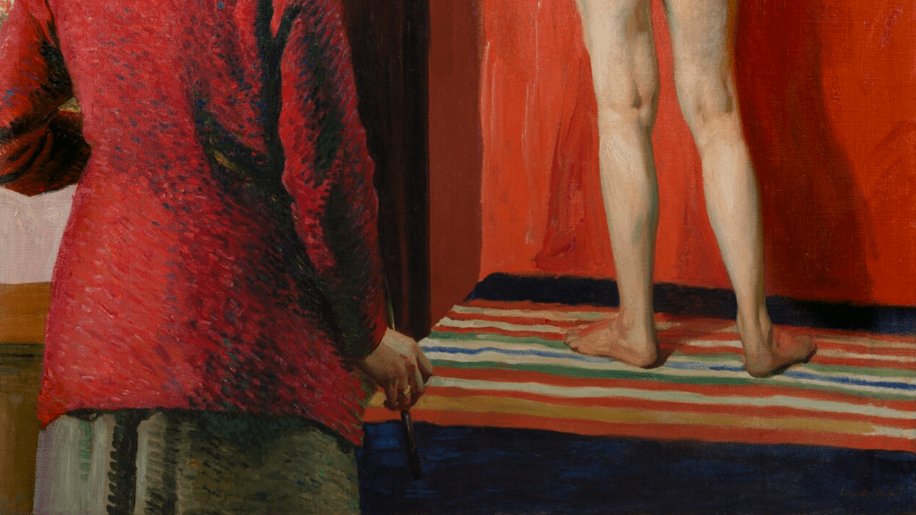
If the depiction of herself – or at least of her clothing – focusses on colour, the depiction of the model is all about form. In the detail above, look how the precise tonal shifts tell us the exact structure of the feet, the slight lift of the right heel from the rug, the width of the Achilles tendon, and the structures of the muscles and the backs of the knees.

Looking at this detail I am more convinced that there is a cloth hanging over the screen – the vermillion appears to wrap around the dark frame. And the painting of this cloth is entirely different to that of the cardigan – extremely ‘painterly’, with long, broad, flowing brushstrokes painted wet-on-wet and blending in with each other. Although not part of the image that she has painted of herself, the use of a different ‘style’ of painting is surely another way in which she is inviting us to enjoy her skills as an artist, demonstrating as it does her ability to choose the brushstroke according to the nature of the material she is representing: here the vermillion cloth is broad, and flows downwards, just like the paint. The subtle but precise modulation of flesh tones continues, defining the curve of the spine and flexion of the muscles, as well as delineating the model’s long, slim fingers. Compared with the impressionistic image seen in Knight’s unfinished painting of the model, this might start to appear like photorealism – but the brushstrokes never let us forget that it is a painting. The canvas she is working on is still clearly unfinished, though. She may have started to paint the model’s shadow on the screen, but not the lit area: the white background remains, and is precisely what allows Knight’s bold profile to stand out so clearly. She is, effectively, in contre-jour – ‘against the day’: her face is depicted in shadow against a light background.

When first exhibited in 1913, at the Passmore Edwards Art Gallery in Newlyn, Cornwall (where the Knights were then living), this self portrait – then called The Model – was well received. But later it was apparently turned down by the Royal Academy for their Summer Exhibition, and instead was seen in London at the Grosvenor Gallery, where reviews were mixed, to say the least. The Telegraph Critic, Claude Phillips, called it ‘harmless’ and ‘dull’ (which it is not, in my humble opinion). However, he seems to have been in two minds, as he also thought it ‘vulgar’, saying that it ‘repels’. As a work which was, he had decided, ‘obviously an exercise’, he thought it ‘might quite appropriately have stayed in the artist’s studio’. So what was his problem with it?

I think that if we focus on this central section we might get a good idea. One of the first things to remember was that women had little or no access to life drawing classes. At Nottingham, the men and women (or girls – Knight studied there for around six years from the age of 13) had been segregated, and the women did not draw from the nude. The model in this painting is Laura’s friend, and fellow artist in Newlyn, Ella Louise Naper. So for one thing, this is a bold statement declaring that women should have access to the same education as men [at the Royal Academy, women gained access to life drawing classes in 1893, as we shall see on Monday]. However, the painting also creates some surprising juxtapositions. The light comes from the left – you can see Naper’s shadow on the screen to her right – and, given that Knight turns to the right, her profile is entirely in shadow. Nevertheless, it stands out clearly thanks to the brightly illuminated canvas. The negative space created by the artist’s profile – the brilliant white patch of canvas – is similar in form to the equivalent area in red around the model’s left side, with a startling echo from Knight’s nose to Naper’s breast. And, as Naper is standing on a platform, her brightly-lit buttocks are more or less on a level with Knight’s shadowy face, surely enough to make any self-respecting (male) critic blush.

As a whole, the contrast between the two women is intriguing. One clothed, the other naked; one has both arms down, the other up; the artist on the left is turned to the right, the model on the right is turned to the left. Their poses, with the shoulders on a diagonal going back into the space, echo each other, inverting only the arms, with Naper’s left arm hiding her profile. Laura Knight, despite the shadow on her face, is the one we can identify, but the various echoes and inversions could lead us to think about substituting one figure for another. With this comes the realisation that the artist herself might easily look the same as the model if she weren’t wearing clothes. I suspect it is this that made men uneasy. It was one thing for them to paint naked women – they could tell the difference between artist and subject – but in this painting, the difference is not so clear. In addition to this, of course, was the fact that Knight’s acknowledged skill was clearly a threat to the men’s supremacy.

One last question: what painting is Knight actually working on? We know that it is not finished, but we only see part of it. Nevertheless, what we do see is entirely consistent with the idea that the work she is painting is the finished self portrait itself, if we assume that we only see around 40% of it – the section which includes the vermillion cloth. Laura Knight is taking a break from painting herself painting herself painting a model – her painted image in this painted image is beyond the frame. Having said that, I do have a sneaking suspicion that she would finish the red screen first.

[Sadly this complexly-conceived portrait is not in Now You See Us – but happily at home in the relatively recently refurbished National Portrait Gallery. Another painting you won’t get to see is one of her most famous, Ruby Loftus Screwing a Breech-ring, as it dates from 1943, which is too late for Tate’s survey. However, I’ve left this link in (from the original post) as it will take you to a wonderful contemporary newsreel clip. If nothing else, it’s worth watching to see Knight being handed a cigarette by the presenter, and both of them lighting up in the Summer Exhibition itself. It also demonstrates how remarkably accurate her portrait of Loftus is. The painting dates from Knight’s time as a war artist in the 1940s. Before Now You See Us I hadn’t realised is that there were also women working as war artists during the First World War: I will look at some of their paintings on Monday.]

Renewed Devotion

Marie Spartali Stillman, How the Virgin Mary Came to Brother Conrad of Offida and laid her Son in his Arms, 1892. National Trust Collections, Wightwick Manor and Gardens, Warwickshire.

There’s no talk this Monday, but as I have decided (after some delay) what will take up the rest of the Summer, I thought I should let you know. This also gives me the opportunity to revisit a post about one of the artists who is included in both Now You See Us at Tate Britain, and National Treasures: Velázquez in Liverpool, but whose work I have not dealt with fairly: Marie Spartali Stillman (more on her below). My next talk will be the third and final installation of the exploration of Tate’s encyclopaedic exhibition of Women Artists in Britain, 1520-1920, and 3. From photography to something more modern on Monday 5 August at 6pm will conclude the Victorian Spectacle section which I couldn’t get to (I ran out of time: bad planning I’m afraid, having tried to cover too much in the first talk). and go on to look at the small rooms dedicated to watercolour, photography, women’s access to art schools, and their forays into modernism. Thereafter, on 12 August I will visit the Royal Academy’s exciting In the Eye of the Storm: Modernism in Ukraine 1900-1930s. After this I want to revisit Laura Cumming’s beautiful book Thunderclap. I talked at length about the main artist whose life and work she explores, Carel Fabritius, but she touches on a number of other ‘greats’ from the Dutch Golden age, including Hendrik Avercamp, Rembrandt, and two of my recent favourites, Gerard ter Borch and Adriaen Coorte. They will all be included in Thunderclap: the ‘other’ artists on Monday 19 August. Finally, on 26 August, I want to look at one of the National Gallery’s ‘small but perfectly formed’ exhibitions, Hockney and Piero: A Longer Look, which includes paintings by David Hockney and Piero della Francesca, as the title suggests. The details of all of these talks are in the diary, of course.

Meanwhile, let’s look at a rather glorious painting by Marie Spartali Stillman – with apologies for having treated her in a rather cursory manner in two recent talks. This post was originally published as ‘147 – Inspiring Devotion’ on 27 January 2022:

We find ourselves in the middle of a forest of fairly young trees, a landscape in which, from the title of the painting, we would expect to see at least three people – the Virgin Mary, Brother Conrad of Offida, and the Christ Child – and they are clearly visible on the right of the image. Mary stands as far right as possible, wearing a full, pink dress, and blue cloak, and holding her Son in front of her. White lilies, symbols of her purity, grow at her feet. Both mother and child look down towards the man we must assume is Brother Conrad, as it is to him that the Virgin Mary has come. Dressed from head to foot in brown, with a rope belt, he kneels at her feet, and reaches up towards them – an act of humility and devotion, but, from the title, we can assume that he is already hoping for the honour of holding the Christ Child. And indeed, we know Conrad’s hope will be fulfilled, as the title tells us that Mary will lay ‘her Son in his Arms’.  But these three are not the only ones present. On the far left is another figure in brown. He could not be further away in this painting, and is also half-hidden by a tree, suggesting that maybe he should not be there. Nevertheless, he holds his hands together in prayer, and leans towards the miraculous visitation. The brown habits and rope belts tell us that these men are Franciscan friars – from the Order of Friars Minor, founded by St Francis – and it is indeed a story which Marie Spartali has taken from one of the devotional biographies of the Saint, I Fioretti di San Francesco (‘The Little Flowers of St Francis’). Most authorities now believe it was written by Ugolino Brunforte (c. 1262 – 1348) some time in the 14th Century – over a century after Francis himself had died.

The image is painted on paper in watercolour and bodycolour (any sort of opaque, water-soluble pigment – watercolour is transparent), with the addition of gold paint. It is intricately detailed, showing every leaf of the dense thicket. (It’s not clear what the trees are: I’ve just asked the Ecologist. They could be holly, not all of which is prickly, or bay, but they’re not willow, as I originally thought, because they’re not by a stream). The simplicity and innocence of Brother Conrad’s devotion is shown by the simple clarity of his face, and his open gesture, stretching his arms full length towards the child (notice the subtle highlights on the top of the sleeves). Both Mother and Child look towards him, their heads lowered, Jesus’s expression being one of determined love, his mother’s perhaps more reserved. But that is not surprising. She knows what is in store, and her head is neatly framed by the Cross at which Conrad was presumably praying before she appeared: you can see in other details that his prayer book is lying open on the ground beside him. The cross itself is a humble as the friars – a tree trunk and a sawn section of a branch tied together with the same rope used for the friars’ belts. Jesus’s head and arm lie in front of the vertical of the cross, an unmistakable reference to his fate. Indeed, the way in which he is held seems to echo some images of the Descent from the Cross, when the dead Christ’s arms fall down to one side of his inert body. Here, however, he stands – almost miraculously, almost weightlessly – on his Mother’s left hand, her right supporting his stomach as he leans towards the devoted friar. For Mother and Child this gesture of their love for the faithful is effortless. Mary’s divinity is different to that of Jesus. His halo is a simple loop, formed from the gold paint, which floats above his head. Hers is a radiant burst made up of beams of light of different lengths. The gold also picks out the hems of the blue cloak, which is slung over her right shoulder and held up by her right arm, so that it falls beneath the Christ Child and makes his pale form stand out. We can also see short brushstrokes of gold defining the shape of the pink sleeve: this is no ordinary occurrence, and in the right light, both Mother and Child would glisten. According to the story, they appeared in a ‘great light exceeding bright’.

The Fioretti tells us that the other figure is Brother Peter, who followed Conrad ‘by stealth’. It’s such a lovely story that I am quoting it in full:

The holy Brother Conrad of Offida lived in the House of Forana, in the Custody of Ancona. He went one day into the wood to meditate on God, and Brother Peter followed him by stealth, for to see what might befall him.

Brother Conrad began to pray, most devoutly beseeching the Virgin Mary to beg of her blessed Son this grace, that he might feel a little of that sweetness that Saint Simeon felt on the day of the Purification, when he held in his arms the blessed Saviour Jesu. And when he had made this prayer, the Virgin Mary of her pity heard him; and behold: there appeared unto him the Queen of heaven with her blessed Son in her arms, with a great light exceeding bright, and coming near unto Brother Conrad, she laid in his arms her blessed Son: who taking Him with great devotion, embracing and kissing Him and pressing Him to his breast, was melted altogether and dissolved in the love divine and consolation unspeakable.

And in like manner Brother Peter, who from his hiding-place saw all that befell, felt in his soul exceeding sweetness and consolation. And when the Virgin Mary had departed from Brother Conrad, Brother Peter gat him back in haste to the house, that he might not be seen of him: but thereafter, when Brother Conrad returned all joyful and glad, Brother Peter said unto him: “ O what heavenly great consolation hast thou had this day!” Quoth Brother Conrad: “What is this that thou sayest, Brother Peter? and what dost thou know of that which I have had?”

“I know full well, I know,” said Brother Peter, “how the Virgin Mary with her blessed Son hath visited thee.” Then Brother Conrad, who being truly humble desired to keep secret the favours of God, besought him that he would tell it unto no one; and from that time forth so great was the love between these twain, that they seemed to have but one heart and soul in all things.

That Brother Peter was an upright and trustworthy man – despite his ‘stealth’ – is clear from the way he echoes the upward growth of the tree behind which he is barely hidden (an oak, as it happens), although as the tree grows left he leans right. He wears sandals: St Francis told his friars they should not wear shoes, much as Jesus tells his disciples in Matthew 6:28-29 not to worry what they wear:

And why take ye thought for raiment? Consider the lilies of the field, how they grow; they toil not, neither do they spin. And yet I say unto you, That even Solomon in all his glory was not arrayed like one of these.

… and there are plenty of flowers growing beautifully here to underline that point. Brother Conrad’s humility is such that he does not even seem to be wearing sandals: the hem of his habit falls over his heels, but this leaves his unshod toes clearly visible. The woodland is beautifully structured. Further back, and to the right of Brother Peter’s tree is another, and at the same distance back and to the right we see a third stand of trunks. Then to the right, and coming forward is fourth.

Coming forward and to the right again we see Brother Conrad – he is as sturdy (in his faith) as these trees growing in the wood, and he kneels between that fourth clump and the Cross, which is itself often described as the ‘Tree’ on which Jesus died – with Jesus as the fruit of the tree.

If we look back to the whole image, we can see that these trees are arranged in an unmistakeable ‘V’ shape, leading back into the woods from Brother Peter, and then forward to Brother Conrad. It is one of the devices which emphasizes the distance between to the two friars. Not only are Peter and Mary at the extremes of the painting (although Spartali makes sure that both Mary and Jesus are higher than Peter), but this ‘V’ creates an open space in the middle of the painting. I do not think it is a coincidence that the diagonal formed by the heads of Mary, Jesus and Conrad lands at the base of the painting directly beneath the central cluster of trees, the point of the ‘V’.

It is just to the left of this central growth that the brightest elements of the distant landscape can be seen – the sky around a church on the horizon. This helps to tells us the extent of Conrad’s devotion. Not only is the church well lit – the source of his enlightenment – but it is also far: in his humility he has retreated far from the world, not wanting his prayers to be witnessed, or to ‘show off’ the strength of his belief. As a result, he has been duly rewarded. The expression on Peter’s face also reminds us that, as the story tells us, he ‘felt in his soul exceeding sweetness and consolation’ – although I can’t help thinking that Spartali has also added in a little hint of guilt, acknowledging that perhaps he really shouldn’t be there spying on his Brother.

I think this image is remarkably beautiful, telling a charming story with clarity and delicacy – both in terms of emotional truth and detailed naturalism. It has all the hallmarks of the Pre-Raphaelite ‘greats’ – but sadly, the artist is little known. Having trained with Ford Maddox Brown, Marie Spartali – part of the Greek business diaspora in London – married the American journalist William Stillman against her father’s wishes. When Stillman was posted to Florence, she inevitably went with him, and there they lived from 1878-83, socialising with the Anglo-American ex-pats, among whom the most interesting must surely have been John Singer Sargent. From ’86-’96 they lived in Rome (I’m not sure where they were in between!), and in 1892, when today’s picture was painted, they spent some time near Perugia – and so not far from Assisi where St Francis himself is buried. In all that time she continued to visit England, and to send paintings around the world, often – like Evelyn de Morgan, who I wrote about way back in April 2020 (see Day 41 – Night and Sleep) – supporting her husband with the income from her sales. There would have been plenty of opportunities for her to see art, and to be inspired – and there are many influences on this painting, as there are for any good artist who will acknowledge their work as part of a greater whole. The story itself is not so terribly far from the story of the stigmatisation of St Francis, which took place at Mount La Verna, in a ‘secret and solitary place’, according to St Bonaventura. On that occasion St Francis was accompanied by Brother Leo, and although Leo was not physically present, but nearby, he gave the first account of the stigmatisation, and many artists paint Leo as if he were in full sight when it happened. Spartali could have seen the fresco by Giotto in the Upper Church in Assisi, although I am showing you the version by Domenico Ghirlandaio from Santa Trinità in Florence (1483-5). Not only is the format similar to that of her painting, but in other works she seems to draw on Ghirlandaio for details of renaissance clothing.

The wooded landscape itself is derived from Giovanni Bellini, and his Assassination of St Peter Martyr (about 1505-7) – presented to the National Gallery by Lady Eastlake in 1870: Spartali could easily have seen it there.

Giovanni Bellini, The Assassination of Saint Peter Martyr, about 1505-7. https://www.nationalgallery.org.uk/paintings/NG812

And the last thing I would suggest is a source for the rather precarious way in which Mary holds Jesus. I am sure it is inspired by a Botticelli in the Palazzo Pitti – again, somewhere she is bound to have visited while she was in Florence. In this case Jesus embraces his cousin John – and it is as if Spartali ‘wound back’ the event (as well as reversing it), to depict the moment just before the child was lowered into Brother Conrad’s arms.

Two last images: the first, a portrait of Marie Spartali-Stillman by Ford Maddox Brown (1869, Private Collection). He is said to have had an unrequited passion for her, but I really can’t speak to that. He does, however – unlike many other male artists painting their female colleagues – show her as a competent, practicing artist. She sits beside her easel on which we can see one of her own works, her palette and mahl stick leaning up against it. This is, to my mind, one of her early works, The Lady Prays-Desire (1867, Private Collection) – the other image I have posted. However, some people wonder if the painting on the easel could be her first publicly exhibited work, Korinna (also 1867, now lost), but I really can’t believe that she would have replicated this precise chin-on-curled-finger pose in two contemporaneous images. Nor that in both the centrally-parted red hair would have been held back by black ribbons.

This is a good place to leave her. After all, she said, ‘it was Madox Brown who encouraged me to become an artist and who taught me to paint. I can never feel sufficiently grateful for his having given this immense interest to my life’. If you would like to know more about Marie Spartali-Stillman, I can recommend the catalogue of the National Portrait Gallery’s exhibition Pre-Raphaelite Sisters. There is also a catalogue to an exhibition held at Delaware Art Museum in 2015, Poetry in Beauty: The Pre-Raphaelite Art of Marie Spartali Stillman, although this is now only available second hand at considerable expense.

A new life for The Death of Cleopatra

Edmonia Lewis, The Death of Cleopatra, 1876, Smithsonian American Art Museum, Washington, D.C.

Greetings from Sunny Sidmouth, where I’m enjoying a brief stint playing the title role in Yes, Prime Minister. It’s a short run, but by the time it ends I will probably have been in post almost as long as Liz Truss. I’ll be back online by Monday, 22 July when I will give the second talk in my scattered series dedicated to Tate Britain’s thorough introduction to Women Artists in Britain, 1520-1920, Now You See Us. The talk is entitled Victorian Splendour, and will start with the gradually introduced restrictions which were imposed by the Royal Academy on submissions to their annual exhibition. They turn out to be rather important, and can help us to understand where our views on what constitutes ‘Art’ come from. This will lead us into the wealth and riches of both painting and sculpture produced by women in the 19th Century. The third and final talk, From photography to something more modern will follow on Monday, 5 August at 6pm, and will look at the new techniques, new approaches, and new means of access to the world of art which were available to women from the end of the Victoria era into the early 20th Century. Today, as my head is still caught up in the world of politics, I am looking back to a post from four years ago, looking at a remarkable American artist whose work is included in Now You See Us because she spent the last years of her life in Britain. I haven’t edited it at all: when I say ‘today’, it was 8 June, 2020.

Today I’m finding it hard to say who or what had the most unusual history – the artist or their art, the subject or the sculpture – and given the fame of Cleopatra, Queen of Egypt that’s really saying something.  But Edmonia Lewis was a remarkable woman, and, if anything, her history is further shrouded by the mists of time, and by whims of the imagination, than that of her famous subject. So let’s start with the sculpture. Cleopatra is seated on her throne, her left arm hanging down, her right hand resting on her thigh, her head tilted to one side, for all the world as if she has just nodded off. But as we know from the title, carved on the base of the sculpture, this is the sleep of death. Rarely has it been portrayed so calmly.

Intricately carved, you may yet be struggling to focus on some of the details: the sculpture is badly worn, the result of an unconventional history. Cleopatra wears an approximation to the headgear of Egyptian pharaohs, a combination of the nemes – the striped head cloth, with its two lappets hanging down behind the ears (familiar to us today from the mask of Tutankhamun) – with a form of pinnacle, perhaps derived from the hedjet – the white crown of Upper Egypt. The stylised leaf decoration on the back of the throne creates a foil to the crisply-carved folds of the dress, making the figure stand out from its background. The half-length sleeves are caught up twice into bunches, and the dress is gathered at a high waist, so that there is a counterpoint between the freely-hanging, more deeply carved drapery and broader areas where the cloth clings to the underlying anatomy. One breast is defined by fabric and folds, the other revealed. Her right hand, apparently relaxed, still holds the asp that killed her.

The queen wears two necklaces, both beaded, and the lower also has a pendant, possibly representing a bucranium– the skull of an ox – although, given the lack of detail, this is not certain. The full skirt flares out behind her hips, and hangs over the arm of the throne, which is carved along the sides with mock hieroglyphs.

The two heads on the arms of the throne, also wearing the nemes, represent the twin sons of Cleopatra and Mark Anthony. Whether the ring she wears on the fourth finger of her left hand represents her relationship with him, or is merely decorative, is not clear. She wears wonderfully inventive sandals, the large loops revealing her delicately carved toes, the smallest of which is slightly lifted. The skirt of the dress hangs down from her knees, wrapping round her left shin, with the hem to revealing her feet. From there, it trails down to the right, falling over the edge of the sculpture. A rose has dropped onto the foot of the throne, and lies there, resting on the dress, the fallen bloom symbolic of the subject’s death. 

On one side, as we have seen, the arm of the throne is covered by drapery. The other is decorated with a leaping griffin holding a leaf in its front paw, and surrounded by other, stylised leaves. From this angle, the tail of the asp can be seen lying across Cleopatra’s right leg.

The Death of Cleopatra was first exhibited at the Centennial Exhibition in Philadephia in 1876, but it had been shipped from Rome. Edmonia Lewis had settled there a decade before, having travelled from Boston via London and Paris. However, it is only the middle of her life that can be documented with any certainty. She was probably born in 1844 in the State of New York, to an Afro-Haitian father and a mother of mixed heritage, African American and Chippewa: as an adult Lewis would claim an affinity with Hiawatha. Both parents had died by the time she was nine, when she was brought up by her maternal aunts. As she said of her own childhood,

Until I was twelve years old I led this wandering life, fishing and swimming … and making moccasins. I was then sent to school for three years… but was declared to be wild – they could do nothing with me.

Apart from this it is hard to pin down her childhood. Like so many artists she became the master of her own history, and like Andy Warhol or Tracey Emin, was arguably her own greatest creation, drawing on different parts of her heritage according to the public she was addressing. She was good at marketing, it would seem, even if not financially secure. Her half-brother had made enough money in the Gold Rush, though, to send her to Oberlin College, which accepted both female and black students. Nevertheless, as part of a tiny minority she was subject to continual racism, and forced to leave after unfounded accusations that she had poisoned two fellow students and stolen from the College itself. She moved to Boston (again, supported financially by her brother), where the sculptor Edward Beckett acted as a mentor and helped her to set up her own studio. Her work was supported by a number of prominent abolitionists and advocates of Native American rights, of whom she modelled portrait medallions in clay and plaster, later carved in marble: one example is illustrated here. Her bust of Colonel Robert Shaw, a white officer who had led a company of African-American infantrymen during the Civil War, was enormously successful. She sold numerous copies, these sales paying for her trip to Europe.

Edmonia Lewis, Wendell Phillips, 1871, NPG, Washington D.C.

In Rome, she was befriended by American sculptor Harriet Hosman, who, like Lewis, was one of very few women to carve marble. On the whole, sculptors would pay stonemasons to carve their works, having first modelled them in clay or plaster. Figures as eminent as Canova would do this (Picture Of The Day 68) but Lewis could rarely afford to pay anyone, so did most of the carving herself. Nevertheless, the connection with Canova was real: when in Rome, she did as he did – and rented his former studio.

The Death of Cleopatra is said to have taken her four years, but by the time it was completed she couldn’t afford to ship it to the States. She travelled back alone, and sold smaller works to pay for it to be delivered. It was the hit sculpture of the Centennial Exhibition, although not universally popular. Traditionally Cleopatra had been seen as very much alive – decorous, alluring, and tantalising with that oh-so-dangerous asp. But definitely not dead. Curiously, there is a precedent – Artemisia Gentileschi painted Cleopatra post-bite, her lips already blue, but I doubt that Lewis would have known that. No slight on her – nobody really knew who Artemisia Gentileschi was in the 19th Century: they were only just rediscovering Caravaggio. 

In this sculpture there is an undoubted sense that Cleopatra, as a strong African woman, had a mastery over her own fate, and Edmonia Lewis, who is also known to have claimed her own biography, was in a position to show her doing so. The material was also ideal: it allowed Lewis to depict a strong African woman, while also giving her license to portray her white – not as white, but carved in white marble – which might have made the image more acceptable to some of the audience, as would the more-or-less fully clad figure. Most artists had portrayed the voluptuous Queen in a more advanced state of undress – including Artemisia, who showed her lying on her bed completely naked more than once, dead and alive. In this case, it really was the fact that she was already dead that some critics didn’t like. One, an artist himself, William J. Clark Jr., thought that “the effects of death are represented with such skill as to be absolutely repellent—and it is a question whether a statue of the ghastly characteristics of this one does not overstep the bounds of legitimate art.” Ironically, this was a form of praise: what Lewis was attempting to do, she had done too well.

Despite its popularity, the sculpture did not sell. Nor did it sell when subsequently exhibited at the Chicago Industrial Interstate Expo, but Lewis could not afford to ship it back to Rome. Somehow it ended up as a feature in a Chicago saloon, until it was bought from there by a shady character named ‘Blind John’ Condon, a racehorse owner and gambler, who used it as the gravestone for a favourite horse – also called Cleopatra – by side of a Chicago race track. The race track became a golf course, then a Navy munitions site, and finally a postal depot. The sculpture was covered with graffiti, until well-meaning boy scouts painted it white. Although rescued in the 1980s, it wasn’t until the 1990s that it ended up at the Smithsonian, where it was cleaned up as much as was possible. However, after decades in the open air, there is no hope of restoring its original finish.

Henry Rocher, Edmonia Lewis, c. 1870, NPG, Washington, D.C.

And Edmonia Lewis? She was successful, for a while, and could employ as many as six assistants. But then she disappeared from view for the last two decades of her life. It was only recently that it was discovered that she died in London in 1907 – she had been living in Hammersmith, and was buried in St Mary’s Catholic Cemetery, Kensal Green. She had disappeared from view, and sadly so had many of her sculptures – but there are just enough, in the Smithsonian, and the Met, to keep her name alive.

[Since I first wrote this post four years ago I have learnt that there are several sculptures by Lewis in the UK – not only the Bust of Christ which is exhibited in Now You See Us, and will feature in Monday’s talk, but also a portrait of Edward Wadsworth Longfellow at my new local, The Walker Art Gallery in Liverpool. And there are more – do let me know if you find one!]

225 – Necessity is the Mother of Inventiom

Angelica Kauffman, Invention, 1778-80. Royal Academy of Arts, London.

Rather brilliantly, Tate Britain’s encyclopedic survey of Women Artists in Britain, 1520-1920, opens with Angelica Kauffman’s Invention. It was one of the four Elements of Art which she was commissioned to paint for Somerset House, where they were installed in the ceiling of the Royal Academy’s new Council Chamber in time for its opening in 1780. Invention was one of the many reasons that it was said that women couldn’t become artists, as it was one of the many qualities that men said women lacked. Indeed, it was probably the chief quality, as the merely practical ability to copy things which already existed – whether portraits or living human beings – was granted them. And that is why I think it is a brilliant opening to the exhibition. It also means that the first of my talks, Up to the Academy, will be framed by Kauffman’s work, as she was, famously, one of the two women who were founder members of the Academy in question. The other, Mary Moser, is far better represented than I was expecting, just one of the many reasons to go. This first talk will be on Monday, 1 July at 6pm, and it will be followed by Victorian Splendour and From photography to something more modern on 22 July and 5 August respectively, scattered as the result of an unexpected theatrical engagement, and a long-planned holiday. If you want to book for all three, I have, against my better judgement, re-instated the tixoom bundle which will give you a reduction on the overall cost of the tickets (available via those links). I will cross my fingers until 5 August, hoping that nothing else gets in the way!

As I said above, Angelica Kauffman’s painting Invention is one of a series of four, and if you would like more background for the commission, I wrote about two of the others way back in May 2020 (see Day 48 – Colour and Design). The series was dedicated to the Elements of Painting, as defined by the first President of the Royal Academy, Sir Joshua Reynolds. The other three are Colour, Design, and Composition. While ‘colour’ and ‘composition’ are standard terms, the difference between ‘composition’ and ‘design’ might not be obvious. Sir Joshua was aware of historic debates among European artists and theoreticians, and chose a direct translation from the Italian ‘disegno’ to give us ‘design’, even if ‘drawing’ would be a more logical choice given its standard use in English. But we’re not thinking about any of these today. Instead, we will focus on Invention, that quality which, as I have said, women were said not to possess. How do you come up with the ideas that make a great work of art? And for that matter, how do you represent that concept? This is how Kauffman chose to personify it.

Invention wears a white dress and a butterscotch-coloured cloak, the former matching the lighter colours of her pale complexion, while the latter blends with her golden hair. She sits in a landscape on a rock, which has undefined vegetation growing around it. Her right knee is raised with the shin vertical, and the ball of the foot planted firmly on the ground, while her left knee is lower, the foot trailing off to our right. A dark blue globe lies on the upper surface of the sloping rock and rests against Invention’s knee. Her right hand, draped with the butterscotch cloak, rests on the globe. Her left arm is raised, the hand upturned, as if towards the heavens. She gazes upwards, past what, at first glance, might appear to be a peculiar form of headdress. On the far right there are distant, blue mountains, with a river, or lake curling around their base – not unlike the mountains of Switzerland, where Kauffman was born. On the other side of the painting, in there middle ground, there are two tree trunks. They cross each other (they grow on opposing, steep diagonals) and close off the composition to the left.

Invention’s right hand is resting on what can be seen to be a celestial globe, with five stars marked quite clearly in white. There are two between her thumb and forefinger and three in a row lower down and to the left. Her index finger points to the globe, and could be pointing to the lowest of these three stars. Below it, and a little to the right, there is a sixth star in the shadows. It’s not a constellation that I recognise, but I have never considered myself to be an astronomer (and yes, before you suggest it, there are hints of Orion). The headdress – if that is indeed what it is – is in the form of two wings, both white, and with well-defined plumage, although it is not clear whether this is part of Invention’s anatomy, or something she is wearing. The clouds are slightly darker behind the head, allowing the face to stand out clearly. Some of the billowing forms between the wings may relate to a pentimento – a change of ideas about the length and form of the hair.

Whatever the meaning of the various elements portrayed, the painting is, surely, incredibly inventive in itself. But what could it all mean? It really helps if we turn to a book published originally in 1593, the Iconologia by Cesare Ripa, in which various ‘abstract’ qualities, whether virtues or vices, arts or sciences, moods and even cities were described as visual, allegorical figures. The work became truly successful – and useful for artists – ten years after its original publication when a new edition was brought out which included woodcuts, thus giving visual form to some of the many concepts described. Many other editions followed, including an English translation, published in 1719. I have chosen this version as a result of its availability: it was digitised in 2009 by the Warburg Institute, and is available online. Below is the title page – I hope you can read it, but don’t worry if it’s not clear – followed by the description of Invention, which I have transcribed for the sake of clarity.

FIG. 168 Inventione: INVENTION.
This Mistress of Arts appears in a white Robe, whereon is written,
NON ALIUNDE; two little Wings on her Head; in one Hand, the
image of Nature, a Cuff on the other, with the Motto, AD OPERAM.
Youth denotes many Spirits in the Brain, where Invention is form’d; the white Robe, the Pureness of it, not making Use of other Mens Labor, as the Motto shews. The Wings, Elevation of Intellect; naked Arms, her being ever in Action, the Life of Invention. The Image of Nature shews her Invention.

To clarify, NON ALIUNDE translates as ‘not from elsewhere’, while AD OPERAM means ‘to work’, as in ‘for the purpose of…’ But how does the illustration from the English edition compare to Kauffman’s painting?

The white dress is more overtly depicted in the painting, a natural result of the medium, even if Kauffman does not append the motto. However, the most obvious similarity between the two are the ‘two little Wings on her Head’, showing ‘Elevation of Intellect’. The ‘image of Nature’ is completely different, though. The woodcut is hard to read, but it is meant to be an image of the Diana of Ephesus, reaching out her arms, just as Invention does. In its original form it is an image of fertility, with many breasts (see below). This was presumably chosen as an illustration of the fecundity of nature, from which we can draw inspiration, which in itself will lead to invention. Kauffman instead chooses a celestial globe, a view of the heavens, which would seem to speak of divine inspiration as much as drawing on the natural world. Unlike both the woodcut and the description, Kauffman’s Invention only has one arm naked – and there is no ‘cuff’, or second motto. The woodcut illustrates two columns, which are not mentioned in the text, and, like Kauffman’s image, has distant mountains on the far right. Kauffman’s choice of two trees (rather than columns) would seem to make sense, and could imply that the background, as much as the object held, might be seen to illustrate ‘The Image of Nature’.

There is, of course, a contradiction at the very heart of Kauffman’s painting, but it is one that is embedded in Ripa’s own work: NON ALIUNDE – ‘not from elsewhere’. Clearly, anyone drawing on Ripa’s idea is taking something from elsewhere, so it is not inventive. Does it even make any sense, therefore, to include this painting at the beginning of Now You See Us? You could argue that Kauffman was not being at all inventive – but then, when commissioned to paint Invention, what else could you do? I would argue, as the title of this post suggests, that necessity was the mother of Invention: where else would you turn, other than a readily available source of almost any personification you might be asked to paint?  

However, not only was she using someone else’s idea, but she was relying on the work of a man. I state it like this because it would really agitate some writers on art made by women. I remember reading a social media post some time ago which berated Tate Britain for stating, on one of the gallery labels, that the work of Marlow Moss, an artist working in Britain in the first half of the 20th Century, was influenced by that of Piet Mondrian. Why should the work of this notable, but neglected woman be directed back towards that of a far more famous man? Could her work not be seen in its own right? To be honest, I can’t remember the exact phrasing used. However, what this particular (and now well-known) commentator had not noticed – or was deliberately ignoring – was that in the same room it was also stated that Ben Nicholson’s work was influenced by that of Piet Mondrian. So, my question would be, should only men be influenced by other men? And does this imply that women have to rely on their own ideas, or are they allowed to take inspiration from other women? Or, and this would be my suggestion, is it maybe that both men and women are part of an artistic community which is a community quite simply because it does have ideas in common? After all, it wasn’t just Angelica Kauffman who relied on the Iconologia of Cesare Ripa. Artemisia Gentileschi’s Allegory of Painting (also in Now You See Us) is drawn from it – but then, as she was also a woman, maybe that’s not such a good example. However, Vermeer’s Art of Painting uses Ripa’s Clio (the muse of history), while his Allegory of Faith draws on more than one of Ripa’s suggested qualities. And then, there is also this painting, which I saw by chance in the Accademia when I was in Venice a few weeks ago:

Pierantonio Novelli’s Il Disegno, Il Colore, e l’Invenzione (or Drawing, Colour, and Invention) is dated 1768-69, ten years before Kauffman’s four Elements of Art, and (coincidentally) exactly the date when the Royal Academy was founded. But then, it’s a very academic idea. If we compare Novelli’s Invention to the version by Kauffman, something should become quite clear.

Saying that Kauffman relied on the ideas of others does not, in any way, belittle her achievement, or make her less of an artist. It shows that she was part of an artistic community, and operated within that community in the same ways that her male contemporaries did. Indeed, one of the definitions which helps us decide what constitutes a work of art is that it is aware of its status as an art object. In other words, it acknowledges the work of other artists. I’m fairly sure that this is another feature of Kauffman’s image. The pose of Invention is not unlike many of Michelangelo’s seated figures, and is ultimately related to the Torso Belvedere, which features in Kauffman’s Design (again I would direct you to Day 48 – Colour and Design). The two trees on the left are also relevant, I think, given that they remind me of those growing in the background of Titian’s Death of St Peter Martyr, which was widely copied and quoted before its destruction by fire in 1867.

I think we should be more specific about the extent to which Kauffman is reliant on Ripa. Her image of Invention is not the same as Novelli’s, which, like the woodcut above – and every other illustration from different editions of the Iconologia I have seen – shows the ‘Image of Nature’ as the Diana of Ephesus. Kauffman is not copying ideas mechanically, and, for whatever reason, she chose a celestial globe instead of the Diana. She also set Invention within an entirely natural setting, rather than including any architectonic elements. In some ways, therefore, she was actually more inventive than Novelli. She was also, undoubtedly, part of an artistic community – indeed, she was part of several. For these reasons, and more, the painting really is a perfect introduction to Now You See Us.

Revisiting Velázquez and Juan de Pareja

Diego Velázquez, Juan de Pareja, 1650, Metropolitan Museum of Art, New York.

The more I think about the Walker Art Gallery’s display National Treasures: Velázquez in Liverpool the more I am impressed. In terms of the way it is curated, it is undoubtedly one of the best exhibitions I have seen this year. I am currently putting together the presentation for my talk about it, which will be this Monday, 17 June at 6pm, and I keep noticing more and more connections between the exhibits: each has its own specific role to play, and is linked carefully to everything around it. I will spend a lot of time looking at the masterpiece that is The Rokeby Venus, before considering the works drawn from the museum’s own collection with which it is exhibited. Not only do they help us to see the painting in a refreshing new light, but they do not get in the way of a traditional interpretation.

Two days later, on Wednesday 19 June at 1pm, you can join me in person, or online, at the Wallace Collection for a free talk entitled Getting carried away with Michelangelo and Ganymede – there are more details on those links. The talk will also be recorded, so you can always ‘catch up’ afterwards if you have booked one of the free tickets. There’s nothing the following week, but the week after, on Monday 1 July, I will give the first of my talks relating to Tate Britain’s encyclopedic Now You See Us: Women Artists in Britain 1520-1920. Entitled Up to the Academy, it will consider works from the 16th, 17th and 18th Centuries.

After that, I’m afraid I don’t know quite what is happening. Something has come up which means that I might have to reschedule the other two talks about this exhibition, but until things are settled (which I was hoping would be yesterday, but it’s looking like it won’t be until next week) I don’t want to do anything too drastic. For the time being I have suspended ticket sales for the other two talks, and for the bundle of all three. If you have booked any of these, I am sorry, but please don’t worry: I will contact you as soon as I know what I’m doing, and let you know what the situation is. And apologies, of course, in advance, for any inconvenience…

In the meantime – because I’m having one of ‘those’ weeks – I thought it would be a good idea to look at a rather wonderful portrait which I originally used as an illustration for an even earlier post back in June 2020. I had written about about Juan de Pareja’s own painting of The Flight into Egypt (See Picture Of The Day 85), but I wanted to look at Velázquez’ portrait of Pereja in its own right, simply because it is rather wonderful – and also because it gave me a good opportunity to talk about both artist and sitter.

The portrait was painted in 1650 in Rome, when Velázquez was visiting Italy for the second time [and it was possibly there and then that he painted The Rokeby Venus]. He was in Rome at the behest of King Philip IV of Spain, and he had been sent to acquire paintings and sculptures for the Alcázar in Madrid. He was accompanied by Juan de Pareja, who had been in his service since the early 1630s. They sailed from Málaga to Genoa, and then travelled through Milan to Venice. There he bought paintings by Titian, Tintoretto and Veronese – all of which seem to have influenced Pareja’s own work, although they were, in any case, already in plentiful supply back in Spain. From there they headed to the Este Court in Modena, and thence to Rome. While there he was commissioned to paint Giovanni Battista Pamphili, better known as Pope Innocent X. ‘In order to get his hand in’ (as Jennifer Montagu phrased it in an article in the Burlington Magazine of November 1983) he practiced by painting ‘a head’ of his assistant. This was the term used by Antonio Palomino, who wrote one of the first biographies of Velázquez, published in 1724. From our point of view this masterful painting is far more than just a head – it is a fully finished portrait – but that was the term they used. Indeed, Palomino went on to say that it was included in an exhibition held in the portico of the Pantheon on 19 March 1650, and that, “it was generally applauded by all the painters from different countries, who said that the other pictures in the show were art but this one alone was ‘truth’.” 

The comment speaks for itself in many ways, even if the portrait does include much ‘art’. It is a herald of Velázquez’ late style, which his contemporary Spaniards called the maniera abreviada , the ‘abbreviated style’. When you look closely, there is the most remarkable freedom in the handling of the paint, however detailed it may appear from a distance.

All of the details are there, we know how every item of clothing fits, where and how it is attached – and yet it is nothing but a mass of paint. Velázquez’ style had been developing a greater freedom ever since his earliest days of minutely detailed precision (see POTD 20), but added to that we might be seeing a way of making a virtue out of necessity. You don’t always get long with a Pope, and Velázquez needed to be sure that he would be able to paint him quickly, and from life, rather than relying on a pre-existing portrait (a very common practice at the time for anything ‘official’) – hence the need to practice on Pareja. The challenges were very different, but even here he might have been rehearsing. 

Apparently the Pope had quite a high, reddish, complexion – but was also to be shown wearing his scarlet biretta and mozzetta – the hat and cape – while seated on a red throne against a red curtain.  Although completely different in appearance, Pareja was also portrayed with a limited palette, but this time of mid- to dark-browns. It is a far subtler portrait, as a result, and I think a far more beautiful one, however brilliant Innocent X may appear – although of course I’m more than happy for you to disagree!

The gentle highlights on the forehead, nose and cheeks give us a real sense of form, while a softness around the mouth and eyes – and especially the double catch-lights that make the eyes seem so moist – create a sense of inner sadness, which may be projection on my part. Pareja may have been very happy at this point. 

He was born in Antequera, not so far from Málaga, in 1606, just three years before the Moors were expelled. His mother, Zulema, was mixed race, and in part of African descent, while his father (after whom Juan was named) was a white Spaniard. Pareja came to Madrid in the early 1630s, probably entering Velázquez’ service soon after the latter returned from his first visit to Italy in January 1631. I say he entered ‘his service’, but it’s not that simple. Pareja was Velázquez’ slave, Velázquez ‘owned’ him, an idea which I still find both astonishing and appalling.

It would have been in Velázquez’ service that he must have learnt how to paint. However, Palomino says that the master wouldn’t allow him to do so because of his status, adding that in the Classical world only free men were allowed access to such sophisticated practices. He goes on to say that Pareja did paint in secret nevertheless, and arranged for one of his own paintings to be in the master’s studio one day when King Philip IV visited. The King was so impressed that he insisted Pareja should be freed, and allowed to practice in his own right. Sadly, this charming story is manifestly not true. A document in the archives in Rome, dated 23 November 1650 – published by Jennifer Montague in the article cited above – is a notarial act granting Pareja his freedom, ‘In view of the good and faithful service the slave has given him and considering that nothing could be more pleasing to the slave than the gift of liberty’ – provided that he stayed in Velázquez’ service for a further four years. This was quite a common clause, apparently, as was the ‘ownership’ of slaves by artists (and, I assume, other members of Spanish society). Francisco Pacheco, Murillo and Alonso Cano all had enslaved assistants, for example.

Pareja’s earliest dated painting is the Rest on the Flight to Egypt – which I mentioned above (POTD 85) – but that was not painted until 1658, four years after his ‘freedom’. It could be that other, earlier paintings have been lost (only ten survive, as far as we know) or it could be that he really didn’t start painting on his own until he was free. But however much he might have relished his liberty, he did not go far, as I said in the previous blog. He continued to work as Velázquez’ assistant until the master died in 1660. He then became the assistant to Juan Bautista del Mazo, Velázquez’ son-in-law, and remained part of that household until his own death in 1670, even though Mazo himself had died three years earlier.

Back in 2020 I finished the post with the sentence ‘I hope to look at another of his paintings tomorrow’ – and indeed I did (see POTD 89 – The Baptism of Christ). More significantly, in 2023 the Metropolitan Museum of Art in New York staged an exhibition of his work, Juan de Pareja, Afro-Hispanic Painter, with this portrait as the centre piece. I only wish I could have gone. Still, all the paintings are out there in the world somewhere, and who knows, there may yet be more to be identified.

Still not ‘ladylike’…

Day 16 – Giulia Lama, Saturn devouring his Child, c. 1720-23, Private Collection (Sold at Christie’s, 2011).

Greetings from Venice! I’m here In Search of Giulia Lama, researching for my eponymous talk this Monday 10 June at 6pm. What better opportunity to revisit one of my early posts from lockdown 1: it dates from 3 April 2020 and was Picture Of The Day 16. As I remember it, lockdown started on Day 5 of the blog, and so today’s repost comes from the first two weeks of that remarkable time. It is the first talk in a summer dedicated to women – even if that’s not entirely clear from the title of the following talk, Velázquez in Liverpool, which will be on Monday 17 June. It will effectively be the fourth in my series A stroll around the Walker, and will celebrate the Liverpool gallery’s superb display of the National Gallery’s Rokeby Venus, one of twelve masterpieces which have been sent on holiday around the United Kingdom as part of the London-based collection’s 200th anniversary. It’s probably not immediately clear why this talk focuses on women as artists but, as I said last week, if you click on either link you can find an explanation: it’s a brilliantly clever and timely exhibition. There will be no talk the following Monday, but then on 1, 8 and 15 July I will take a proper look at Tate Britain’s vital Now You See Us, an exhibition of Women Artists in Britain, 1520-1920 (to quote the subtitle). If you click on either of those links, you can book for all three of the talks at a reduced rate. But if you are only free for one or two of them, I will explore the exhibition as follows: 1. Up to the Academy (16th-18th centuries, 1 July); 2. Victorian Splendour (the 19th century, 8 July); and 3. From photography to something more modern (looking at new media, and new means of expression, 15 July).

In addition to my Monday talks I will also be giving a talk at the Wallace Collection on Wednesday, 19 June at 1pm, entitled Getting carried away with Michelangelo and Ganymede. It is absolutely free and it would be lovely to see you there. You can either attend in person – in which case you just need to turn up on the day – or, if you’re not in or near London, you can watch online then, or over the next couple of weeks, in which case you’d have to book a (free) ticket for the Zoom webinar (and then, the recording) via the links. And finally (for now) if you missed my talk on Tate Modern’s Expressionists, I will be repeating it for ARTscapades at 6pm next Thursday, 13 June.

But for now, back to the remarkable Giulia Lama – the more I look at her, the more I learn, and the more I am enjoying her work. I have edited this post a little more than I would usually for various reasons, but am leaving the naïve wonder about our ignorance of the women who were practicing artists – so much has changed in the last four years! Apart from anything else, you will see that I repeat the received notion that women were encouraged to paint flowers. By the late 18th Century, many did, it is true (and there is a whole room in Now You See Us given over to the genre), but as far as I can see there is no evidence at all to suggest that this was common for women before then. There are a few notable exceptions from later in the 17th Century, of course (e.g. Rachel Ruysch) but it was by no means prevalent, and the field was still dominated by men. Nevertheless, this is what I said back in 2020:

Why do we talk about women artists so rarely? Apparently it wasn’t always the case. According to Grizelda Pollock, one of the earliest and most authoritative feminist art historians, they were regularly included in dictionaries of art and artists until the beginning of the 20th Century, at which point they were all but written out.  This year [2020], with Artemisia at the National Gallery [which was postponed, but then had to close early anyway, both thanks to the pandemic] and Angelica at the Royal Academy [which, for the same reason, had to wait until 2024], let’s hope they are being written back in, and not just as token representatives, but as vital and inventive artists.

The fact is, there always were fewer women who could make a career in the arts – they were not given the training. It helped if their father was an artist, as in the case of Angelica Kauffman (#POTD 14), especially if his studio was very busy – or he didn’t have any sons to help him. But they couldn’t get apprenticeships with another artist, as that would mean living with a man who was not a member of the family, and at the age of 11 or 12 – or any age, quite frankly, for a woman – that was simply not appropriate. When academies were founded, starting in the second half of the 16th Century, women weren’t admitted, because women didn’t get an education anyway. The few women who did succeed usually had unusual fathers – i.e. fathers who were artists (as above), or who believed that their daughters should be educated. Another possibility was that the girls were initially ‘amateurs’, practicing the usual accomplishments any young lady should have – music, and some ability with a little delicate decoration – until they turned out to be outstandingly good at it and so broke through to the ‘mainstream’ [you could argue that this was the case with Sofonisba Anguissola].

In any case, it was thought that women lacked the necessary intellect to understand something like perspective and didn’t have the necessary education to know about classical mythology, so they would never be able to paint great narratives. Women weren’t supposed to paint portraits of men, in case the men assaulted them, and landscapes weren’t a great idea because, out in the countryside, they might be attacked by brigands. So they were left with Still Life, because, on the whole, a still life won’t bite back. The most distasteful thought was that they might attend a life class. Drawing and painting the male nude became the foundation of artistic training, because without a thorough understanding of male anatomy – or at least surface anatomy – an artist would never be able to paint a battle scene, or a martyrdom, those uplifting stories which were the apogee of art. It would be so inappropriate for a woman to look at a naked man, let alone draw him. Ladies were supposed to avert their gaze, and not stare at anything.

So, that’s what we’re left with – pretty flowers, ladies having tea (#POTD 15), or the artist herself indecisive between painting and music (#POTD 14). I have yet to cover the pretty flowers [but would eventually: see 126 – Mary Moser]. It’s all pretty girly really, lets face it. Just like today’s painting… 

Sadly we don’t know a huge amount about this image, and the attribution to Giulia Lama isn’t universally accepted. However, I think few people doubt it now, particularly as her painting is getting better known. We also know relatively little about Giulia Lama herself. She was born in the Parish of Santa Maria Formosa in Venice, the daughter of an artist (it helps). One of her great works is in the church there, a Madonna and Child with Saints on an impressively grand scale [I saw it again yesterday, and will talk about it on Monday]. Her style is remarkably close to that of one the greatest but underrated artists of 18th Century Venice, Giambattista Piazzetta, whose works are the smoky colour of bitter toffee apples, if such a thing exists. His fame was eclipsed by that of Tiepolo, whose candyfloss colours are ideally suited to those of a sweet tooth – I love them both. 

Why was Lama’s style so similar to Piazzetta’s? At this point a discussion arises: was Lama a student of Piazzetta’s, or a colleague? Opinion is tending towards the latter: she was undoubtedly trained first by her father, and then may well have continued her studies alongside Piazzetta in the school run by artist Antonio Molinari – which could make her the first woman to attend any sort of art school.

Today’s painting could almost be a manifesto overthrowing all the reasons why women couldn’t become artists. It’s a classical story, shows a male nude, and has fantastic foreshortening (basically perspective applied to a single object). And it is anything but ladylike – or, for that matter, for a classical narrative, anything but uplifting. It’s a man eating his own child! It is also a story that proves that we don’t learn from history. Saturn made it to the position of Top God after his mother, Gaia (the Earth), got understandably upset because his father (Ouranos, the air) kept imprisoning their children. Eventually she’d had enough, and so gave Saturn (her son – also known as Chronos) a very sharp knife, and encouraged him to castrate his own father (Ouranos), which he did. The severed genitalia fell into the sea, which was therefore made fertile, and the result was Aphrodite – her name means ‘born from the foam’. The Romans called her Venus, or course. This story helps to explain her appearance in Botticelli’s famous painting (#POTD 8) – but in the process stops it looking quite so charming.

Knowing how easily a god could be overthrown, Saturn didn’t want to take risks, and so ate each of his own offspring as they were born. Eventually his consort, Ops (Rhea, to the Greeks), lost patience with this, and handed him a stone, pretending it was the latest baby. The new-born was smuggled to Crete, where it grew up to be Jupiter. As an adult, Jupiter returned, forced Saturn to regurgitate his siblings, and they all got together and overthrew Dad. And you thought Eastenders was bad.

Precisely why Lama chose to paint this subject – or who commissioned her to do so, and why – we may never know. A contemporary account says that many churches wanted her to paint them an altarpiece, so highly was she respected. As well as the one I’ve mentioned in Santa Maria Formosa there is another in San Vidal, just over the Academia Bridge [which will also feature on Monday]. But that doesn’t explain this painting. Maybe she painted it simply because she could. She certainly seems to have been the first female artist to have studied the male nude – and she did so often: I’ve included two of her drawings below, and they are superb. She uses black and white chalk in one and red and white in the other, the light and shade giving the body a sculptural feel, with short, stabbing strokes of the chalk, over broader areas of shading. They show a remarkable ability to articulate the limbs and arrange the body in complex ways, but with the slight exaggeration that creates movement and drama, the essence of all great Baroque art.

The same qualities can be seen in the painting, the limbs of Saturn creating diagonals across the surface, and into the depth of the painting – the power of this foreshortening is unimaginable without the awkward and contorted postures seen in her life drawings.

The legs continue the shallow diagonal of Saturn’s grasping left forearm, while the body of the child, softer, lighter and therefore more succulent than that of his swarthy father, is parallel to the muscular upper arm. It marks the diagonal from bottom right to top left, whilst also creating depth for the composition. All this is set in bright sunlight, making the figures stand out clearly from the dark rock in the background, and creating the deep dark shadows that define Saturn’s muscularity. It’s not pretty, and it really isn’t ladylike. In many ways, it isn’t even very nice. But it is brilliant – an astonishing bit of painting and a fantastic work of art.

224 – Two sides of the same…

Michelangelo, Tityus, 1532. Royal Collection Trust/HM King Charles III. RCIN 912771 r. & v.

The phrase is, of course, ‘two sides of the same coin’, but today I’m looking at a piece of paper. However, ‘two sides of the same piece of paper’ isn’t a figure of speech… The sheet in question is included in the British Museum’s current exhibition, Michelangelo: the last decades, which will be the subject of my talk this Monday, 3 June at 6pm, and I wanted to take the opportunity to tell you how brilliantly I think the exhibition has been curated and designed. This particular sheet of paper, and the way in which it has been displayed, will, I hope, demonstrate the fact. The following day I will be heading off to Venice, In search of Giulia Lama – a forgotten late-baroque master. As well as being the title of my next talk, on Monday 10 June, it is also what I am planning to do: I am physically going in search of her work. A number of her paintings have recently been conserved, with funding from the charity Save Venice, and they are currently on view in an exhibition called Eye to Eye with Giulia Lama – which sadly comes to an end the day before my talk (I couldn’t get there any earlier). As the paintings are usually metres above eye level, and not in the most accessible churches, I can’t wait to see them up close. While I’m in Venice I will also be on the look out for anything else she painted. I already know where to look, to be honest, having encountered a number of her works scattered across La Serenissima during previous visits, and will let you know what I find – and what I think – on 10 June. I will then continue into the summer looking at Lama’s British equivalents – women working from the 16th to the early 20th Centuries as seen (now) in Tate Britain’s Now You See Us. I think it is such an important survey that I want to break it down into three talks, thus doing at least some justice to the artists who are represented. However, I will introduce that series with a talk which might initially seem to go against the grain, Velázquez in Liverpool. You’ll have to check out the description on Tixoom (via that link) to work out why it is completely in line with the rest of the season. The Now You See Us talks will go online soon: keep an eye on the diary. But for now – let’s look at that paper.

It is, of course, one of Michelangelo’s most exquisite drawings, and one of several made for the young nobleman Tommaso de’ Cavalieri. I will talk about these drawings in depth, while also thinking about the relationship between the two men, at the Wallace Collection on 19 June (follow that link for more information). As it happens, I have already written about one of the other drawings (see 170 – Drawing to an end), but wanted to post something new today precisely because there is something on the other side.

The story of Tityus is included in Ovid’s Metamorphoses. The giant had attempted to rape Latona, the mother of twin gods Apollo and Diana. As punishment he was chained to a rock, and his liver was gnawed out by a vulture. The organ – seen as the seat of lust – grew back every night, and the punishment was repeated every day… for all of eternity. While we cannot be entirely clear why Michelangelo’s chose this subject, it seems likely that he wanted to warn the young Tommaso about the dangers of lust.

Any of you who have an eye for the birds might have noticed that the vulture looks more like an eagle – but this was a deliberate choice rather than ornithological incompetence. Another drawing for the young nobleman shows the Abduction of Ganymede, the most beautiful of boys, who was carried away by Jupiter in the guise of an eagle. By making Tityus’ vulture look more aquiline Michelangelo must have intended to link the two stories – the drawings were clearly intended as a pair. However, the meaning of the Ganymede is by no means so clear (as I will explain on 19 June).

Lying on his right side, with his left leg bent and the other extended, Tityus appears like an impotent version of Michelangelo’s Adam. His right arm is extended and tied to the rock, which means that he cannot support his own weight to raise his body from the ground, as Adam does – but then, the vulture looming over him would prevent this anyway, trapping the right hand which Adam raises towards God. This comparison might not be coincidental: as well as giving Tommaso avuncular guidance in moral concerns, Michelangelo might also have wanted to encourage artistic debate, both in terms of formal elements – the similarities and differences in the composition – and also of meaning. As a result of the Fall, Adam introduced sin into the world, and so the possibility of transgression and the need for punishment, as illustrated in the image of Tityus. Both were malefactors, even if their stories were derived from different traditions. By drawing on one of his most famous images, Michelangelo was perhaps putting himself forward not only as a moral advisor, but also as an artistic role model, while also provoking the comparison of different works of art, one of the accomplishments any cultured young person should develop.

Vasari tells us something different: that Michelangelo had produced the drawings to teach Tommaso how to draw. The technique is indeed exquisite, some of the master’s most refined work. While hair and feathers are sketched in with short, curling, expressive lines, the modelling of the flesh is handled with great softness and delicacy, defining tonal variations with small touches of the chalk which look almost like stippling. The outlines of the forms are secured with longer, bolder, taut strokes, which occasionally show signs of repetition, honing the precise form, as they do on the right bicep. The rock and the background are picked out faintly with long, parallel strokes, as is the curious, anthropomorphic tree to the right. The high quality of the work tells us that it was a presentation drawing, made as a work of art in its own right, rather than preparatory for something else – but that didn’t stop Michelangelo’s ever inventive and restless mind from sketching another idea on the back.

There are two figures on the other side of the paper. The one further up is traced from the recumbent body of Tityus, one leg bent, the other stretched, the torso sloping down toward the short edge of the paper, with the lower arm extended. Coming through the paper at the top you should just about be able to make out the dark, ominous form of the vulture’s wings – but no trace of them has been repeated here. The upper arm of the figure, hidden behind the vulture’s neck on the other side, is here more active, and some apparently abstract, geometric lines have been sketched in around the figure’s feet. All of this makes more sense if we rotate the paper by 90° and compare it to another drawing which was also executed around 1532, this one in the collection of the British Museum.

Apart from the fact that the figure has been reversed – possibly the result of another tracing – the compositions are remarkably similar, and clearly represent the Resurrection. The lines drawn around the feet in the sketchier version (on the back of the Tityus) can be seen as representing the sarcophagus from which Christ triumphantly rises, with the higher foot resting on the edge of the lid, which has been pushed back away from it. The other figure on the initial sheet is also identified as a sketch of the Risen Christ, although the way the hands are raised above the head and brought together on either side of the head, which turns to our left, makes it reminiscent of the fresco of God separating Light from Darkness, which, like the Creation of Adam, was also frescoed on the ceiling of the Sistine Chapel.

The dramatic, active pose of Christ in the second drawing – surely a development of the first – might remind you of another image from the Sistine Chapel – but not one from the ceiling. With the right hand raised, the left crossing the body, and the beardless face looking down to our right, this particular drawing would appear to be one of the stages in the development of the central figure of Jesus in the Last Judgement on the altar wall. The commission for this fresco was precisely the reason why Michelangelo returned to Rome, where he would live for the last three decades of his life. Now, it would clearly not be possible to fit the whole of the Sistine Chapel into the British Museum, but the curators – together with the designers and what must be a brilliant team of digital editors – do have a projection of the Last Judgement which pans across the painted surface and zooms in on details which are relevant to the various drawings which are exhibited nearby – making the connection between the preparatory drawings and the completed fresco clear and easy to understand. Here is a photograph I took of the two drawings I have shown you – the ‘back’ of the first and the ‘front’ of the second (verso and recto if you want the technical terms) – and just look what you can see in between.

The curation and design of this exhibition helps you to see the development of Michelangelo’s ideas with such ease and clarity. You don’t have to flick from one page to another, or turn around to see objects on different walls while holding images in you head, or for that matter, head to Rome and back (not that that’s a bad idea…) in order to understand what’s going on. And it was this that made me realise – in the first room of the exhibition – that it would be one of the really good ones: brilliantly conceived, beautifully presented and showing works of the highest order. I do hope you can get to see it, and whether you can or not, I do hope you can join me on Monday. I can also recommend the catalogue by Sarah Vowles and Grant Lewis – highly readable and with a similar clarity of thought and design. They also point out – which I haven’t so far – that with a sketch for the Risen Christ on the back of the Tityus, not only did Tommaso de’ Cavalieri get a warning against sin, but also the possibility of redemption. Two sides of the same coin.

223 – FLY

Yoko Ono, FLY, 1996. Richmond, Virginia.

As I post this I’m on my way home, having talked to a group of Tate sponsors – a well-established firm of lawyers – about the exhibition Yoko Ono: Music of the Mind. I will repeat this talk for a potentially more discerning group (you) this Monday 27 June at 6pm. Having said that, they were great audience, and, from what they said, minds (and maybe even hearts) were opened. Much fascinating conversation ensued, albeit with the inevitable legal exactitude which requires that the precise meaning of each term be made clear. So, to practice my precision, I will focus today on just one word. Next week I will talk about Michelangelo (the first of at least three talks I will be giving about the Renaissance giant this year), and will introduce the British Museum’s beautiful and elegant exhibition Michelangelo: the last decades. The rest of June (on Mondays at least) will be given over to women – starting with a forgotten late-baroque master, Giulia Lama, and continuing with the British artists from 1520-1920 who can be seen at Tate Britain – more about them soon (it should be in the diary by Monday). But now for that word: FLY.

Those of you familiar with my posts will now be wondering what I can possibly say about this image. What I would usually do with a painting or sculpture is, quite simply, to look at it and write about what I see, exploring the full content of the image by picking out relevant details and considering each one in depth. But what details could I possibly select from this photograph? It is a billboard, somewhere in or around Richmond, Virginia, with a single word in bold capital letters – and a short word at that: FLY. What could there be to say? First of all, I would ask you to think to yourself, ‘What was the first thing I thought when I saw this word?’ What does it mean? And not only what does it mean generally, but what does it mean specifically to you, personally? And how many different meanings could the one word FLY possibly have? Well, quite a few, as it happens. First of all, is this a noun or a verb? Or for that matter, could it be an adjective? Well yes, it could. If you want many of the possibly uses of the word you could do worse than look at the entry on the Merriam-Webster Dictionary website.

Of course, in terms of meaning, context is everything, and so to understand this billboard it would really help to remember that it is a work by Yoko Ono: it would be worthwhile using her output as the context. Her first use of the word, as far as I can see (but trust me, this is by no means an exhaustive survey) dates back to 1963. It is a work called FLY PIECE which was published the following year (1964) in her book Grapefruit. Here is the work, together with the cover of the book.

Again, it is a work of apparently utter simplicity – the title (FLY PIECE), the word ‘Fly.’ (with a full stop) and the date, ‘1963 summer’. Grapefruit included over 200 of what are known as her ‘instruction pieces’, which are suggestions for works of art which she, or someone else (including you), might make. Ono was at the very forefront of conceptual art (which I will talk about more fully on Monday), and these instructions include suggestions for paintings and actions which may or may not be made or performed – but whether they are or not, the ideas – the concepts – now exist. The work is out there in the world, even if it is only in peoples’ minds and imaginations. As far as this particular work is concerned, though, if this is an ‘instruction’, that would imply that ‘Fly’ is a verb, something to do. We are being invited to fly. You can imagine for yourselves how you might achieve that. One of the suggested possibilities came the year after the original concept, the year in which it was published. Here is the announcement of an event which took place in Japan on 25 April 1964.

In between the Japanese symbols you may be able to pick out the numbers ‘4’ and ‘25’ – 25 April – and the time, ‘8. P.M.’ The title of the event is clearly printed in English: ‘FLY’. The only photograph I can find of this Japanese performance is almost illegible, but in England it was repeated more than once – both at the Jeanetta Cochrane Theatre in London, and then at Bluecoat in Liverpool, in 1967. This is a photograph from the latter.

Members of the audience were invited to come up onto the stage, climb as far up the ladders as they liked, and then leap off – to experience, however briefly, the freedom of flight. Yoko Ono’s work has always been open – open to interpretation, open to collaboration – and incomplete. It is waiting to be completed by the active participation of the audience, of the viewer, of you. A few months after the original performance in Japan, FLY PIECE was followed by the Yoko Ono Farewell Concert. August 1964 marked the end of a two-year extended visit to Japan (the country of her birth), and this performance was, as the title suggested, her Farewell before she headed back to New York. The Concert included one of her most important works, CUT PIECE. The script – or score – of the concert was published two years later, in 1966, and, as you can see, CUT PIECE was preceded by another version of FLY which is worthwhile considering.

In this case it was a piece of card handed around the audience which bore the same instruction – the same invitation – to FLY. To let yourself go, I suppose, to free yourself from whatever is holding you back. Thirty-two years later, the billboard must have had the same intention. You could even argue that it is the same work, with a billboard better able to communicate to a wide audience than a single, relatively small card. However, the tone shifts – along with the meaning of the word – in 1968. In that year she published Thirteen Film Scores by Yoko Ono, London ’68, which included the score for Fly (Film No. 13).

The words are quite simple, although you have to question how, as a filmmaker, you could make a fly follow instructions. But why publish a score (I’ll talk about her use of the term on Monday) rather than just making the film? Well, Ono had prefaced an earlier collection of film scores – published as part of Grapefruit – with the following explanation – or suggestion: ‘These scores were printed and made available to whoever was interested at the time or thereafter in making their own version of the films, since these films, by their nature, became a reality only when they were repeated and realized by other film-makers.’ As it happens Fly (Film No. 13) was made a few years later (1970-71) by Yoko Ono herself, in collaboration with John Lennon. They both directed, with Lennon also acting as cameraman. He also played guitar on the soundtrack (which was released later in 1971 as one of the tracks on the album, Fly). The film lasts 25 minutes, and is being continuously screened as part of Yoko Ono: Music of the Mind at Tate Modern. Here is a still as a taster.

Suddenly the concept of flying free becomes less… acceptable, maybe even gross, particularly given that the score was not followed to the letter. For one thing, there were a multitude of flies, apparently credited as ‘supplied by New York city’, crawling over the supine, passive, and naked body of actor Virginia Lust. This might, perhaps, come as something of a surprise. However, it would be worthwhile remembering that flies have featured in art for centuries. Here, for example, are two paintings from the National Gallery, together with relevant details. The first is a Portrait of a Woman of the Hofer Family (about 1470) by an unknown Swabian artist, the second, Carlo Crivelli’s St Catherine of Alexandria (probably about 1491-4)) – a panel from one of the pilasters of a dismembered altarpiece.

In both paintings the fly could be seen as a memento mori – a reminder of death – and so also of the transience of life. This is not only because flies themselves do not live so terribly long, but also because they are often associated with dead meat. With St Catherine this would serve as a reminder to be good Christians, so that after death – which is inevitable – the viewer would rejoice in an eternity in paradise. The equivalent meaning could also be true for the unknown member of the Hofer family (who was presumably supposed to be a good Christian), but it could also be a reminder that, although the subject of the portrait is long gone, her memory lives on. This would make the painting an embodiment of the popular Renaissance motto ars longa vita brevis – which can be translated as ‘life is short, but art will endure’. The suggestion that the fly might be related to artistic rather than moral or religious values gains support if you stop and wonder where the fly is actually standing. Has it really alighted on the woman’s headdress, for example, or on the architectural surround of St Catherine’s niche? Or, in each case, is it actually supposed to be standing on the surface of the painting itself? The idea that the artists are trying to suggest that a real fly has landed on top of their paintings is perhaps more relevant for the Crivelli, where the fly is apparently larger than St Catherine’s thumb. Either it is out of proportion, or it is not part of the same visual world. In both cases, though, the fly can be seen as a form of trompe l’oeil.

I’m not trying to suggest that there was any similar trickery in Ono and Lennon’s film: the flies were definitely there. I’m just pointing out that flies have a long history in art, and so the film does have a connection with the Western European tradition. The sense of transience is undoubtedly important. Earlier films by Yoko Ono slowed down simple actions to make us aware of the passage of time, and therefore of the transience of human existence. The stillness of the model in Fly also gives us a sense that time has slowed down for her – even if it hasn’t for the ever-active flies. The wording of the original score is also important, though: the fly was supposed to ‘fly out the window’. It finds its freedom. As I’ve said, Lennon played guitar on the film’s soundtrack. However, the vocals were supplied by Ono. While doing this, she imagined herself as the fly – indeed, she has suggested that both human and insect were effectively self portraits. In Cut Piece she sat passively while allowing members of the audience (mainly male, at the time) to take what they wanted, cutting away sections of her clothing with a pair of scissors left in front of her. This, together with the passivity of the female form in Fly, can be read as a critique of the role that ‘society’ (for which read, ‘mainly men’) required of women. So should we read the flies as the men, crawling all over her? Inevitably, it’s not as simple as that, as the fly eventually soars free – or at least it is supposed to, according to the score. Also, as it happens, she was not entirely against flies. The following is a page from the self-published exhibition catalogue for her irreverently entitled Museum of Modern [F]art – a solo show which (surprise, surprise) was not staged at the (almost) eponymous New York institution in 1971 – even if actions, and photographs, for the exhibition do appear to have taken place there.

To make things easier, here is a transcription of the central section of the script:

flies were put in a glass container the same volume as yoko’s body the same perfume as the one yoko uses was put in the glass container the container was then placed in the exact center of the museum the lid was opened the flies were released photographer who has been invited over from england specially for the task is now going around the city to see how far the flies flew the flies are distinguishable by the odour which is equivalent to yokos join us in the search observation & flight 12/71

Whether or not this actually happened is irrelevant: she has created the situation, told you the story, and now it exists in your mind, whether it happened or not. The words in the left and right columns are also important. In capital letters, but without gaps, is the repeated phrase,

FLY LOOK FOR IT ALL WORDS ARE VERBS MESSAGE IS THE MUSIC

So – we are being invited to look for the fly. However, if ‘all words are verbs’, we are also being invited to fly and look for it. We are being provoked into action, into ‘doing’ – and so we are encouraged to take flight, to be free. Across the bottom of the invitation is the repeated assertion,

JOHN IS A LOVELY FLY JOHN IS A LOVELY FLY JOHN IS A LOVELY FLY

It seems unlikely that she associated her husband with carrion. However, he was undoubtedly a free spirit – just like a fly.

I have one last image for you, which not only adds to our understanding of the billboard (I hope), but also, like the title of the above exhibition, reminds us that Yoko Ono does have a sense of humour. It is her Poem No. 86 – which was published with the announcement of the birth of her first child, back in 1963. The Instructions for Poem No. 86 are quite simple. What does she wish for her child? A long life, happiness, and success, presumably. But how does she put that? How do you encourage people to reach their full potential, to achieve the most, and to reach the heights? If you are being optimistic (and Ono is nothing if not optimistic) what do you suggest they do? Here’s wishing you may do the same.

A Second Storm

Gabriele Münter, Portrait of Anna Roslund, 1917. New Walk Museum and Art Gallery, Leicester.

I’m looking forward to talking about the Expressionists exhibition at Tate Modern this Monday, 20 May at 6pm, but as I’m currently in Delft with Artemisia I’m going to re-post something I wrote for Making Modernism, the Royal Academy’s 2022 exhibition focussing on four women who were themselves Expressionists. Two of them feature in the current show – Gabriele Münter and Marianne von Werefkin – and both are superbly represented. A couple of paintings are the same, but on they whole the exhibition features works I have never seen before, including several I really wanted to see as a result of the RA show, together with paintings by Kandinksy, Marc and Macke, the last of whom I am especially enjoying. The following week I will look at another redoubtable woman, Yoko Ono, also on show at Tate Modern, and then (although it’s not on sale yet) Michelangelo: The Last Decades, introducing the recently-opened exhibition at the British Museum which must be the must-see show for the summer. Beautifully selected and curated, it is also designed with great clarity and a wonderful understanding. Keep your eye on the diary for that.

There are still places for some of the last of this season’s In Person Tours:
Monday 17 June at 11:00am: NG05 – Siena in the Fifteenth Century
Tuesday 18 June at 2:30pm: NG07 – Perugino and Raphael (afternoon)
The day after, on 19 June at 1pm, I will be lecturing at the Wallace Collection. The talk is free, and you can either attend in person, or online, but I would love it if you could come and pack out the room: I would finally get to see you all! Entitled Getting Carried Away with Michelangelo and Ganymede it will explore the relationship between Michelangelo and the young nobleman Tommaso de’ Cavalieri, and will look at the refined drawings, heartfelt letters and complex poems which passed between the two. If you’re coming in person you can just turn up on the day, but for online viewing you should book a ticket via the blue links above. It will also be recorded, apparently, and available to view for the following week or so.

Meanwhile, today I want to look at the ‘Poster Woman’ of Making Modernism, Anna Roslund, as painted by Gabriele Münter. I would say ‘Poster Girl’, but shortly before I wrote this post back in November 2022 I had had my wrist slapped for my careless use of language…

Munter, Gabriele; Anna Roslund (1891-1941); Leicester Museums and Galleries; http://www.artuk.org/artworks/anna-roslund-18911941-80902

I’m afraid I can tell you relatively little about Anna Roslund herself, but we get a strong sense of her character just by looking at this portrait. Apart from anything else, how many women have you ever seen smoking a pipe? I know there are some famous examples in history, but I can’t for the life of me remember who they are. ‘Women smoking’ is something one didn’t used to see ‘back in the day’ (i.e. a long, long time ago), and ‘women smoking a pipe’ make up an even smaller sub-group.  This bold gesture is combined with an open pose, left arm resting on the arm of the chair, with her head resting on her left hand. The right arm is tucked in, holding the pipe to the mouth. Add to that the strong, bold colours of the outfit, royal blue and black, heightened by the bright red of the pom-pom (?) in front of her chest, and you have a strong sense of individuality, the image of self-confidence.

Anna Roslund has the clearest, light-blue, piercing eyes, and a stylish haircut, apparently bobbed with a fringe (although we can’t see what it’s like behind), which makes me think more of the 1920s than 1917. She is clearly a serious, thoughtful woman, her head tilted to one side and her eyes gazing into the middle distance some way above our left shoulders. Like Rodin’s Thinker, with his chin on his fist, or Dalí’s Narcissus, who we saw a while back, his chin on his knee, the head leaning on the hand adds to the sense of contemplation, albeit in a different way. Each finger is clearly demarcated (although the little finger is oddly truncated – I don’t know whether that was an anatomical fact, or an artistic abbreviation), and there is a clear space through to the light background. Presumably, given the curtain, this is a view through a window, with broad, light brushstrokes of white and pink over a darker ground, giving an idea of a light, but cloudy sky. The curtain itself, in a deep turquoise, is angled parallel to the tilt of the head, and completes the ‘virtual’ pyramid which gives this composition – and Anna Roslund – stability, and strength of presence. Another note of stability is the horizontal of the arm, marked strongly by the contrast between the upper edge of the blue sleeve and the light background (and notice how the thumb and fingers echo shapes of the arm and head).

Roslund is clearly comfortable in this chair, and I love the way in which the curve of her right shoulder, clad in blue and enhanced by a subtle black outline, echoes the curve of the left arm of the chair – it is as if she is a completion of the chair on that side. The chair itself, with the yellow arm given texture and form by the darker brushstrokes, is painted in a similar technique and colour to Van Gogh’s more famous example, a symbolic self portrait (having said that, now that I have posted the pictures the chair looks more violet than it did in the file on my laptop!). Indeed, Münter was an admirer of the Dutchman’s work, even naming her home in the country ‘The Yellow House’, as a nod to his home in Arles.

The arms of the chair curve round and in before flaring out again, as if hugging the sitter. The right arm (seen on our left) is more brightly illuminated, and, as a result, appears to be a different colour (but with colour, everything is relative – see above). The left arm (on our right) reminds me of the roads you see in some Dutch landscape paintings, which start in the bottom corner of the painting, and lead you into the middle ground, as if the artist is expecting you to go on a journey with him (I don’t think there was a woman who painted landscapes in the Dutch Golden Age). I think the same is true here: Münter is using these arms, particular the one on our right, to lead our eye into the painting – and also, as the corners of the pyramidal composition.

I’m not an expert on women’s dress (nor on men’s, for that matter), but the blue top appears to continue as an open overskirt, framing the sleeker black skirt. Either that, or she is sitting on a blue cushion of the same hue as her blouse. Whatever it is, this blue, and the uncovered section of the seat of the chair, both form triangles pointing up towards Roslund’s face. Her left leg is crossed over her right – again, a confidence in her body language which we might not think of as ‘lady-like’ for the first half of the 20th Century.  The black outlines to the blue blouse might relate to the clothing itself, or they may be the result of Münter’s interest in Bavarian folk art, particular reverse glass painting (painted on one side of the glass, to be seen from the other), which often had rich, jewel-like colours separated by black outlines, a cloisonné effect not unlike stained glass windows.

Munter, Gabriele; Anna Roslund (1891-1941); Leicester Museums and Galleries; http://www.artuk.org/artworks/anna-roslund-18911941-80902

So who was this remarkable, stylish, self-confident, thoughtful woman? Well, a musician and author at the forefront of the Danish Avant Garde, but that is as far as I can get, I’m afraid. Münter met her while living in Copenhagen during the First World War. However, I can tell you that Anna Roslund had a sister called Nell, who was an artist, and who married a man called Herwath Walden in 1912. And it is this that made the portrait a key image for Making Modernism, one theme of which is the nature of artistic communities and the resulting dissemination of ideas. From 1910 Walden published a weekly journal dedicated to modern art (monthly from 1914-1924). It was called Der Sturm – ‘The Storm’ – the title expressing Walden’s conviction that that was how modern art was going to take Germany. His focus was on Cubism and Futurism (he effectively introduced these movements to the German public) and also on the burgeoning German Expressionist movement. In 1912, the year in which he and Nell Roslund married, they opened an art gallery in Berlin under the same name. Both Gabriele Münter and Marianne Werefkin, stars of Expressionists at Tate Modern, were exhibited regularly. Münter’s introduction to today’s sitter came via her gallerist, effectively. It might even have been this connection that took her to Copenhagen.

One question remains: if these artists were so successful when they were alive, why is their work so little known today? One reason, for the British at least – apart from the fact that the men they were associated with took all the limelight – is that there is very little of their work in public collections. This portrait is one of the few which was borrowed for Making Modernism from a British institution. It forms part of Leicester’s notable collection of German Expressionism, one of the rich seams of great art which, when you find them, are a surprising, but rewarding, feature of our regional museums. The same is true of Expressionists: one reason for Tate Modern’s thematic hang when it opened back in the year 2000 was that the first three decades of the 20th century are notoriously underrepresented, and in a chronological hang the first few rooms would be sparse indeed: just one early Kandinsky, and a scattering of Picassos. This current exhibition provides an ideal opportunity to get to know some truly great, truly influential artists – and to re-balance the view that it was the men who were coming up with all the ideas.