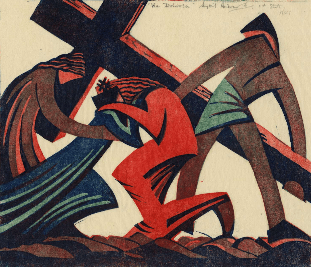
Francesco Pesellino, Saints Mamas and James, about 1455-60. Royal Collection Trust/His Majesty King Charles III.
To introduce my next talk, which is about the National Gallery’s jewel of an exhibition Pesellino: A Renaissance Master Revealed (this Monday, 29 January at 6pm), I would like to talk about a painting which is part of the Royal Collection, which, as a whole, is held in trust for the nation by the King. We’ll get to that soon. The next talk, a week later, will cover the Gallery’s other wonderfully focussed – and free – exhibition, Discover: Liotard and The Lavergne Family Breakfast. After this I will start an exploration of the Walker Art Gallery in Liverpool, my new ‘local’. The talk will celebrate their beautiful refurbishment and rehang, which they have called (whether accurately or not) Renaissance Rediscovered. It will be the first in an occasional series about the gallery which I am calling A Stroll around the Walker. In the real world (rather than online), I’ll be in London next week for some more in-person tours of the National Gallery, and there are still one or two places available for each of the visits - if you’re free. In terms of chronology, if not actual dates, the first will be NG01 – The Early Italians, on Thursday 1 February at 11:00am, looking at work from the 13th and 14th Centuries. However, if you want to jump forward to the 15th Century, then NG02 – The Early Renaissance (in Florence), will take place twice on Wednesday 31 January at 11am and Wednesday 31 January at 2.30pm. The day before I will also deliver NG03 – The Northern Renaissance, starting (I hope!) with The Arnolfini Portrait. Again there will be two talks, on Tuesday 30 January at 11am and Tuesday 30 January at 2.30pm. Details of all of the above are in the diary, of course, together with information about my trips abroad with Artemisia, which are rapidly filling.

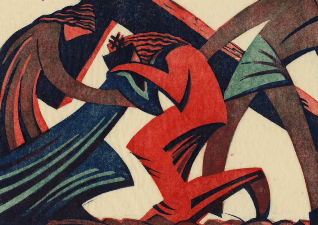
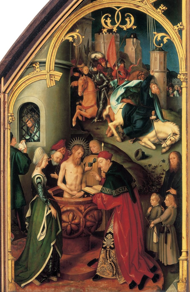
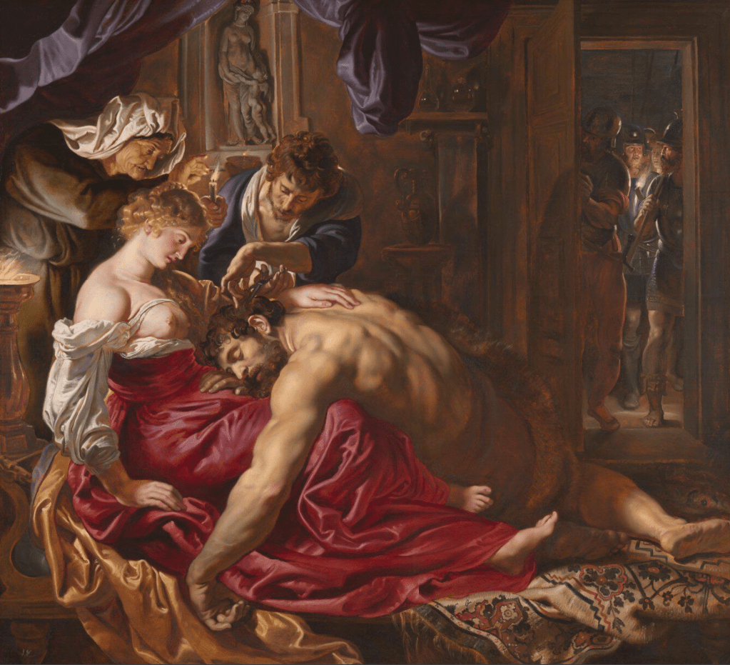
At first glance today’s painting seems simple enough – two standing saints (we know they are saints because both have halos). Closer to us, and on our left, is a young man, or even boy (and yes, it is a boy: remember that miniskirts for women weren’t invented until the 1960s – and his hair isn’t dressed, or covered, as it would be for any respectable woman at the time this was painted). He stands with his weight on his left leg, his right extended behind him, with one hand on his hip. He wears a very short blue tunic and a long olive-green cloak, thrown back over his right shoulder to reveal a golden yellow lining. To our right an older man – he has longer hair and a beard – stands with both feet more firmly on the ground. He wears an ankle length red robe, and an equally long red cloak – they are not easy to distinguish. He holds a staff in his left hand and a book in his right. Lions lurk on the left of the painting, one just nuzzling its way around the boy’s cloak. The most unusual thing about this painting – catalogued on the Royal Collection website as RCIN 407613, described as measuring 140.5 x 58.5 x 3.4 cm (the last measurement being the thickness of the panel), and painted in oil on poplar wood – is its shape: almost rectangular, but with the top right hand corner cut away. This partly explains the full title given on the website: Saints Mamas and James (A fragment).

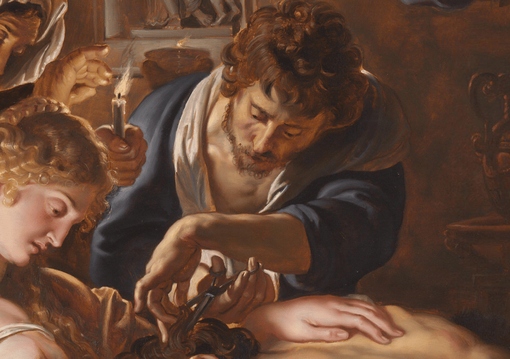
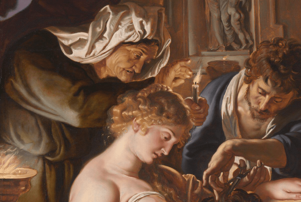
The painting of the faces is both delicate and refined, with subtle outlines defining the most important forms, and an understated modelling of the features: the corners of the saints’ mouths, their eye sockets, foreheads, and necks – and also the dimple in the boy’s chin. The older saint’s staff has two rings carved around the shaft. The lower one can be seen in this detail, level with his cheek, and above his beautifully (and accurately) articulated left hand. This is a pilgrim’s staff, which serves to identify the owner as St James Major, the older of the two apostles called James. His shrine, in Santiago di Compostela (where Sant Iago – St James – is believed to be buried) is the destination of one of Europe’s greatest pilgrimages. The missing corner of the painting is very much in evidence here, as is a stray piece of what might appear to be green drapery running along the diagonal.
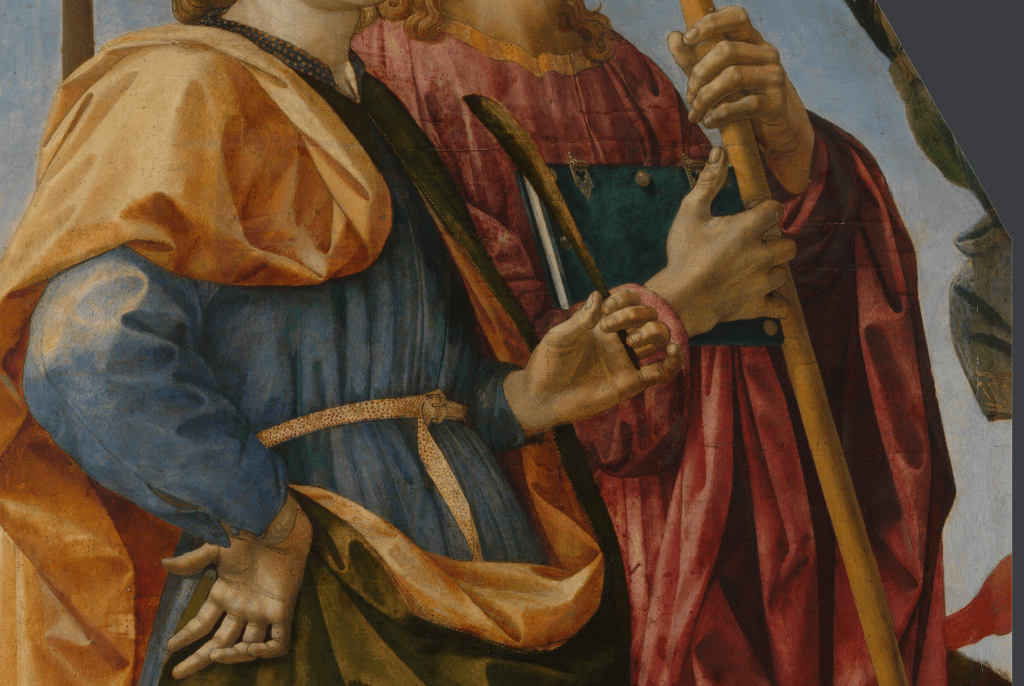
The fabric continues around the oblique corner of the ‘fragment’. Next to it we see the sky, a negative space which, compositionally at least, suggests that the fabric is related to the figure of St James, following as it does the fall of the cloak which is hanging from the Saint’s left arm. Towards the bottom of this detail there is also some red drapery – but what either green or red represent cannot be deciphered from this little evidence.
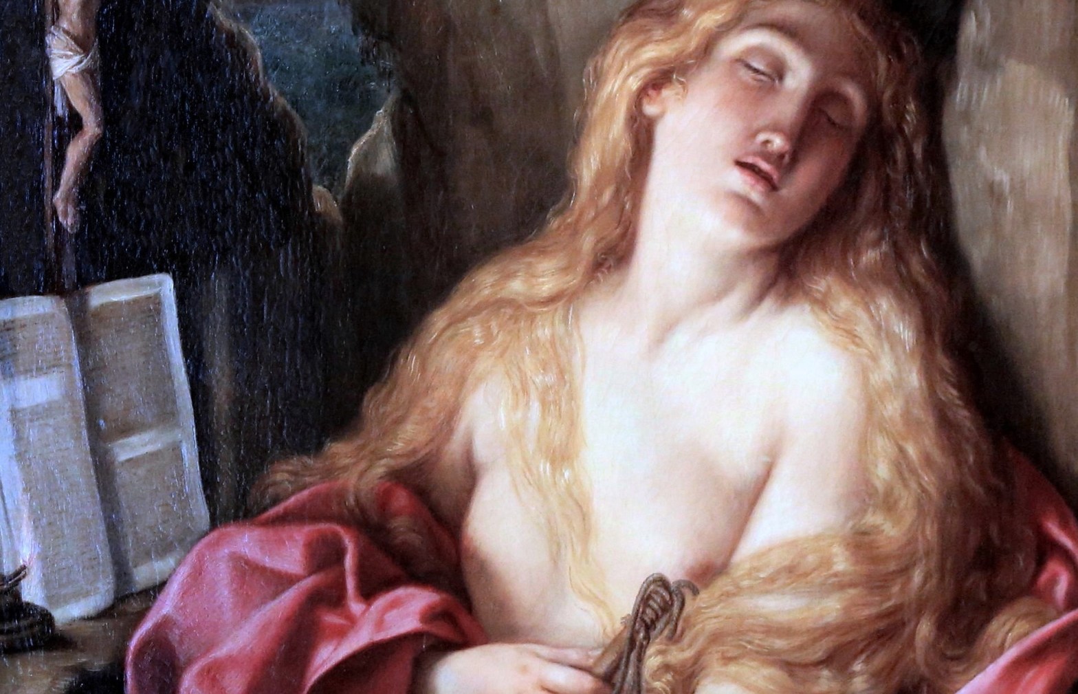
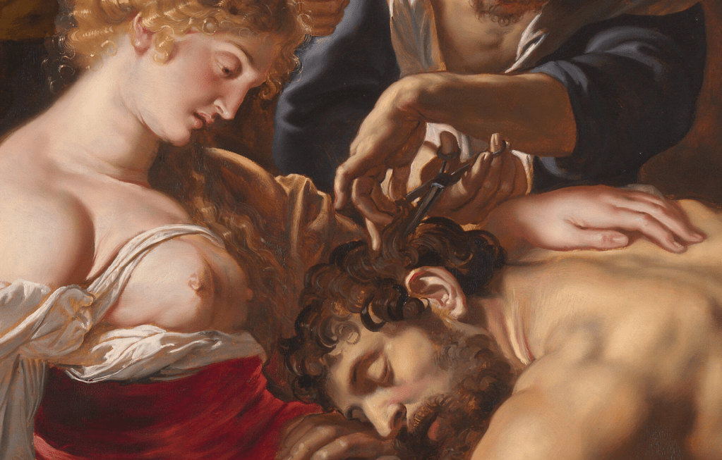
All four of the hands in this detail are superbly painted, and all are articulated in different ways, holding, clasping, or resting. They line up along a loose, low diagonal, leading our eyes towards the impinging green drapery. St James’s right hand holds a book with a dark turquoise cover, delicately painted clasps, and shiny metal studs (at least they are shiny, or reflective, when they are in the light). The boy holds a leaf in his left hand. It represents a palm of martyrdom, which tells us that he was killed as a result of his faith, even if it doesn’t tell us which martyr he is. His right hand rests against his hip, with the palm turned out. It holds up the cloak just next to a clearly delineated belt, gold with red dots. His right elbow projects towards us, pushing into our space, and revealing the hem of the sleeve which runs along the arm and stretches around the point of the elbow.

Like the hands, the feet direct us from left to right, with the exception, perhaps, of the boy’s right foot, which points to the bottom left corner. However, his left is ‘in profile’, pointing to our right, in parallel with St James’s left foot. The older saint’s right foot is at a slight diagonal, giving a sense that he is more fully turned to our right than the boy, and almost implying that the boy’s right foot will also turn in this direction. St James’s feet are unshod, whereas his companion wears curious calf-length, animal skin sandals, with heels and toes uncovered – an attempt, presumably, to create some form of archaic footwear. Pesellino seems to enjoy the interplay of the colours in the drapery, with the looping of the gilded hem of the short blue tunic, the waving alternation of gold and green along the hem of the cloak, and the counterpoint between the boy’s pale legs, and the shadowed, columnar folds of the orange lining. The lions appear all but incidental, although one seems to be attempting to edge its way into the painting, while a second looks up towards the boy. A third remains all but hidden, its muzzle appearing behind and below that of the first. They tell us – if we know the story – that the boy is St Mamas. Never heard of him? Don’t worry, this is possibly the only painting in which he appears, and we only know who he is thanks to some remarkable surviving documentation (more about that on Monday).
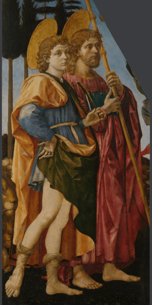
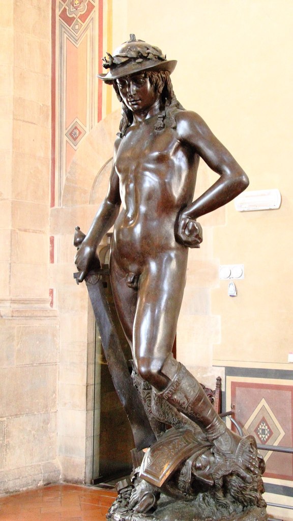
St Mamas’s pose might have struck you as familiar – particularly if you are a fan of of Donatello. It is the reverse of his enigmatic bronze David, with which it shares the hand on hip, and exaggerated contrapposto – the classical pose with one weight-bearing leg straight and the other bent. Pesellino has, admittedly, relaxed the bent leg, and drawn it back behind the other, and has changed the position of the other hand, but otherwise the borrowing is unmistakable: even the peep-toe sandals derive from this precedent, even if the material from which they are made is different. This quotation tells us two things: first, that Pesellino had been in Florence (which, to be honest, we knew anyway) and second, that Donatello’s sculpture must pre-date 1457, the year in which Pesellino died. This is useful, as the bronze has been notoriously difficult to date (current theories suggest ‘1435-40 – or later’ - on the V&A’s website – or ‘c. 1440’ according to the Florentine institution which owns it, the Bargello).
There are so many different aspects to ‘The History of Art’ – which, as I have been discussing recently, should really be ‘the Histories of Art’ – and one of them is the history of collecting. I have stated quite clearly that this painting belongs to the Royal Collection – and it does, even if that’s not where it can be found. Here is a detail from another painting in the Royal Collection which shows today’s work as it was displayed back in 1851.

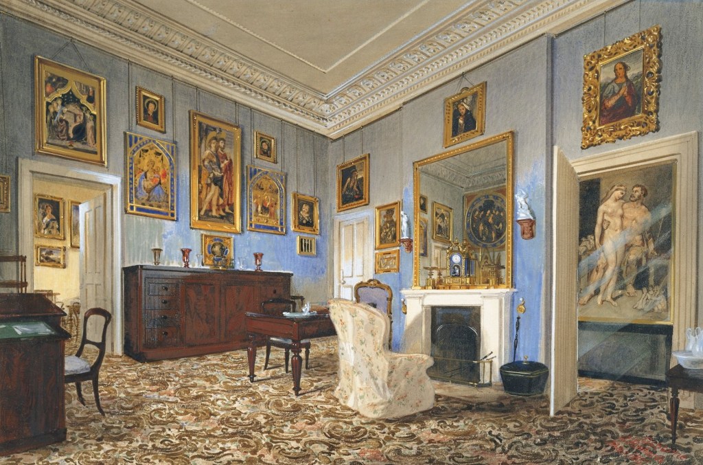
The detail comes from the third image, a watercolour by James Roberts of Prince Albert’s dressing room in Osborne House (on the Isle of Wight), which was painted in March 1851. Albert was one of the first people to collect ‘early’ Italian paintings, and to display them together in a domestic space like this. There is no evidence of a ‘missing top right corner’, though, so how did that come about? The watercolour dates to the middle of the 19th Century. By the beginning of the 20th century it was known that there was a similar painting in the collection of the Kaiser of Germany. Here is a photograph of it, taken from The Illustrated London News of 2 February 1929.
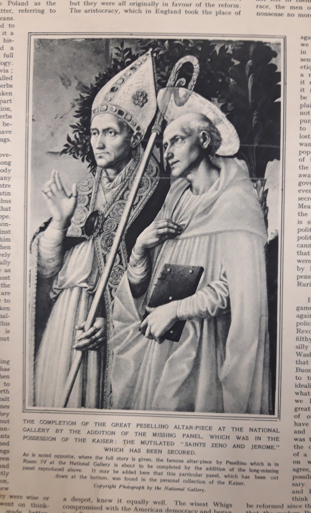
Like the Royal Collection painting it shows two saints. Admittedly only one has a halo, but mitres – as worn by the bishop on our left – create problems if you imagine a halo as a flat gold plate rather than a mystical, symbolic radiance. There is really nothing here to tell us who this bishop is, nor is there much evidence concerning his companion, a bald, beardless man holding a book (like St James’s, it is a bible, presumably). He appears to be wearing a pale grey robe, but as this is a black and white photograph that might be misleading. The text below the photograph mentions a ‘full story’ on the ‘page opposite’ – so here are both pages together.
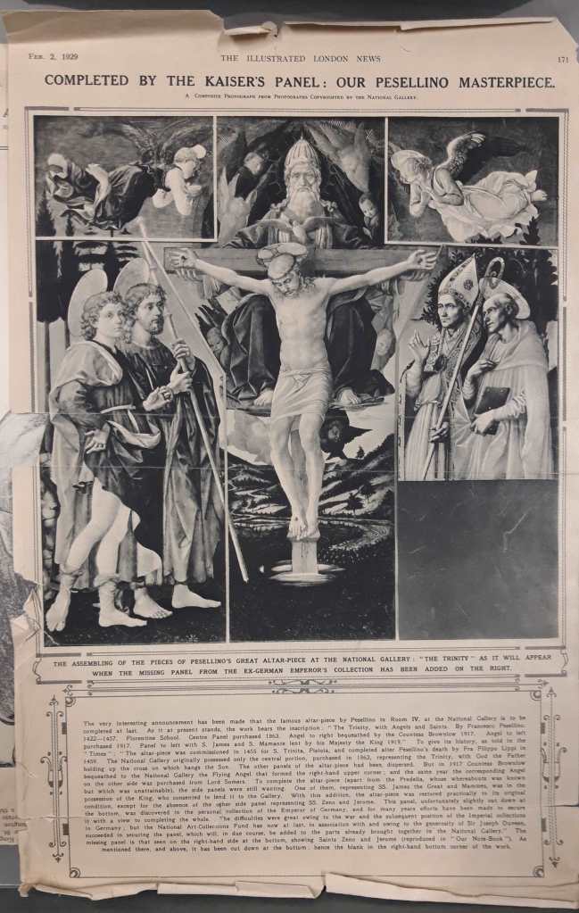

The headline reads ‘COMPLETED BY THE KAISER’S PANEL: OUR PESELLINO MASTERPIECE’, while the story tells us that the painting, The Trinity, with Angels and Saints, by Francesco Pesellino, was in Room IV of the National Gallery. The Trinity was purchased in 1863, it says, while the top left angel was acquired in 1917. Its companion at top right was bequeathed by Countess Brownlow in the same year, while Saints Mamas and James were leant by ‘His Majesty the King’ in 1919 (the King at the time was George V, great grandfather of the present monarch, and the painting is still on long term loan to the National Gallery). Am I right in detecting a vague sense of outrage that part of ‘our’ painting was in the hands of the Kaiser, particularly as, when the gallery acquired the two angels, the two nations were at war? While I’m about it, I’m intrigued by the use of the word ‘our’: to whom does it refer? It is not the National Gallery speaking, but The Illustrated London News – who clearly didn’t own it – it’s not ‘theirs’. The ‘our’ can only refer to the British (or rather, the entire population of the United Kingdom of Great Britain and Northern Ireland). I realise that not all of you are UK citizens, but, for those of us who are, this is indeed ‘our’ painting, as indeed are all of those owned by the National Gallery’s paintings – although not necessarily the loans. That’s why I noted at the top of the post that the Royal Collection is held in trust for the nation. However, I have no idea how long this has been the case, given that it was, in its origins, a private collection, owned by some of the nation’s wealthiest inhabitants (who just happen to be royalty). However, as Neil MacGregor stressed when director of the British Museum, we are effectively holding these artefacts in trust for the world as a whole, and for this reason alone, apart from any other, we owe them a duty of care. Even earlier, while he was director of the National Gallery, MacGregor was thinking in similar terms when he wanted to emphasize the public ownership not just of the paintings in the National Gallery, but of all the British public collections, with the astonishing realisation that almost everyone in the United Kingdom lives within 50 miles (I think – I can’t remember the precise distance) of works of art that can be seen for free. Long may it remain.
As for the ‘outrage’ about the Kaiser – well, we have a short cultural memories. It would be worthwhile considering how ‘our’ Saints Mamas and James entered the Royal Collection in the first place: it was bought by Queen Victoria as a gift for her husband on his birthday (26th August) in 1846. At the same time she bought another painting for her eldest child, Victoria, Princess Royal, which also depicted two saints, Saints Zeno and Jerome – also by Pesellino. Twelve years later Princess Victoria married Frederick III, King of Prussia, who, after three decades of married life, in 1888, became Emperor of Germany – but only for a mere 99 days before he died. He was succeeded by by his eldest son, Wilhelm II, who was Emperor – or Kaiser – until his abdication at the end of the war in 1918. His mother Victoria had died in 1901 – the same year as her mother, ‘our’ Queen – and it would have been then that the Kaiser inherited Victoria’s Saints Zeno and Jerome – if it hadn’t automatically passed to her husband when she married (I know nothing about the legal status of married women and their possessions in Prussia). The painting was finally acquired by the National Gallery in 1929 – as covered by The Illustrated London News – and has remained there ever since. All of the surviving sections have long been integrated as seamlessly as possible. Here is a photograph of the painting as it appears in the exhibition which I will be talking about on Monday – with a suitably devout onlooker included for good measure.

From a distance you might not notice that the main panel is reconstructed from five separate sections, but up close, with light reflecting from the surface, this is entirely obvious. There is so much more to say – and I hope to have time to add a few more details on Monday – but for now I’ll just add that the predella panels arrived separately, even if one is still missing. It’s in the Hermitage in St Petersburg, and although the National Gallery has borrowed it in the past, now is really not the time. Even the main panel isn’t complete: the legs of Saints Zeno and Jerome are still missing. Jerome’s main symbol, or attribute, is a lion, and there must have been one in the missing section: it would have appeared in symmetry with Mamas’s lions in some way. It could still be out there, I suppose, so keep your eyes open. Every time you pass a pub called ‘The Red Lion’ check the pub sign – they tend to be roughly the same format as the missing section of this altarpiece…